geovisualization: a newer gis technology for ... · it aids etiologi[ c investigations and...
TRANSCRIPT
Journal of Geographic Information System, 2015, 7, 20-28 Published Online February 2015 in SciRes. http://www.scirp.org/journal/jgis http://dx.doi.org/10.4236/jgis.2015.71002
How to cite this paper: Yasobant, S., Vora, K.S., Hughes, C., Upadhyay, A. and Mavalankar, D.V. (2015) Geovisualization: A Newer GIS Technology for Implementation Research in Health. Journal of Geographic Information System, 7, 20-28. http://dx.doi.org/10.4236/jgis.2015.71002
Geovisualization: A Newer GIS Technology for Implementation Research in Health Sandul Yasobant1, Kranti Suresh Vora1, Carl Hughes2, Ashish Upadhyay1, Dileep V. Mavalankar1 1Indian Institute of Public Health-Gandhinagar, Ahmedabad, India 2McGill University, Montreal, Canada Email: [email protected], [email protected], [email protected], [email protected], [email protected] Received 4 January 2015; accepted 28 January 2015; published 2 February 2015
Copyright © 2015 by authors and Scientific Research Publishing Inc. This work is licensed under the Creative Commons Attribution International License (CC BY). http://creativecommons.org/licenses/by/4.0/
Abstract Use of GIS in public health is currently limited to tracking immunizations, disease surveillance, and establishing new service areas. The potential of GIS to improve planning, implementation and monitoring of programs and to inform policymaking processes for universal access to healthcare is grossly underutilized. Major reasons for restricted use are paid access to GIS software and diffi-cult interpretation for non-GIS professionals. WebGIS technologies present an opportunity for non-GIS public health professionals to present complex data and findings in simpler manner. Conventional GIS methods and Geovisualization are compared and contrasted in this paper using data from the MATIND project in the Gujarat state of India. In-depth literature review on GIS tech-niques used in health implementation research was conducted. In this paper, MATIND data have been used for comparing conventional GIS methods with a newer web based GIS tool-Geovisuali- zation. GIS software is more useful for analytical purposes; whereas web based geovisualization techniques are much better for visualization and easy interpretation of results by non GIS public health researchers. As the images are easy to interpret, interactive/dynamic and not much tech-nical expertise is required to perform basic analysis, the tool is useful for policy makers and plan-ners. Geovisualization provides a user-friendly tool for presenting large scale community based survey data. Increased use of this tool will help to present implementation research in a creative way to the program planners and policy makers. For program managers, it is a useful tool to mon-itor implementation and impact of a program to improve health of population.
Keywords Geovisualization, GIS, Public Health
S. Yasobant et al.
21
1. Introduction Complex and multidimensional data are examined to assemble meaningful information to improve planning, implementation and monitoring of programs and evidence based policymaking processes to improve population health [1]. Various advanced methodologies are used by program managers and researchers for examining data to serve specific purpose. As public health datasets such as Health Information and Management System (HMIS) and larger health surveys such as Demographic Health Surveys have become increasingly complex; there is a growing need for innovative data analysis methods and data representation tools for optimal utilization of in-formation [2] [3]. A number of quantitative approaches have been used to address the complex analysis of these datasets [4] [5] but critical analysis and visualization methods of spatial data are limited in public health research.
Recently, Geographical Information System (GIS) has emerged as an innovative and important component of research and practice in public health [6]. GIS has proved to be useful for various research purposes including epidemiological surveys/investigation, implementation research, program/policy decision making and dissemi-nation of information. Despite the advancement of computational and GIS technologies [7]; there is an urgent need for novel approaches to represent geographic data in a visual form that can improve pattern recogni-tion/trends and hypothesis generation [8]. More importantly, it should allow for better understanding and wider usage by non-GIS experts working in public health. Visual representations can often communicate information effectively and help decision makers prioritize the actions required to improve public health outcomes [9]. Maps are an efficient means for communication, analysis, synthesis, and exploration, of geographic data and informa-tion [10]. Traditional GIS visualization techniques focus on the presentation of points, lines and polygons in static maps, such as, paper based maps. Newer techniques such as web-based geovisualization allow users to explore specific phenomena in more efficient and effective ways to uncover or clarify dimensions that may be ambiguous in traditional GIS visualizations [11].
Geovisualization is increasingly being used to inform public health research, planning and decision making in developed countries [8]. It aids etiologic investigations and distribution of diseases, optimal deployment of li-mited resources and policy/regulation adoption [12]. However, the best applicability for geovisualization in pub-lic health would be for spatial analysis to get comprehensive view that is easy to understand, for complex data-sets [13]. Geovisualization is often underutilized owing to a lack of training, being relatively new GIS tech-niques and limited landmark examples in public health. Developing countries with weak health systems and higher burden of diseases that require such tools to inform policy making and program planning to maximize li-mited resources have even further underutilization [14]. In India, the disease pattern is complex with current ep-idemiological transition and coexistence of non-communicable and communicable diseases. There is limited evidence from low resource settings on how to design simple, functional geovisualization applications for diffi-cult policy making and program prioritization [15]. To address the gap, this paper aims to demonstrate the po-tential of geovisualization technique and compare it with the traditional GIS methods using data from MATIND project in the Gujarat state of India.
2. Overview of GIS Techniques 2.1. Technique for Bringing Health Data in to GIS Applications of GIS methods require accurate transformation of location information from the data into geo-graphic objects; this process is known as geocoding (latitude and longitude). Geocoding which is transformation of quantitative data to GIS data is not only tough work but also very tedious and base pillar for any visualization with its rewards. Geocoded data can be processed in three major ways before visualization as described here:
2.1.1. Point Patterns Attempt to display of the data points such as public and private health facilities, mothers’ home, village settle-ments etc. It is useful for defining areas of case occurrences, visual inspection of spatial clusters of patients or health facilities and analyzing health care resources distribution. An example of point pattern analysis in mater-nal health is the geographic uptake of a government scheme such as “Chiranjeevi Yojana” (CY) in the MATIND data.
2.1.2. Line Patterns Vectors or road lines are graphic resources that aid understanding the proximity and accessibility of patients to
S. Yasobant et al.
22
health care facilities. Arrows with widths proportional to the volume of flow between areas are important tools to evaluate the health care utilization of different locations.
2.1.3. Area Patterns For spatial descriptive analysis, the administrative boundary like village, block and District data on maps, with the variable of population, no. of house hold and no. of CY users can be used to represent the data in a specific dimension.
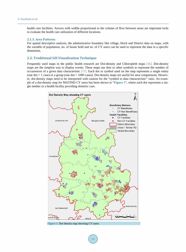
2.2. Traditional GIS Visualization Technique Frequently used maps in the public health research are Dot-density and Chloropleth maps [16]. Dot-density maps are the simplest way to display events. These maps use dots or other symbols to represent the number of occurrences of a given data characteristic [17]. Each dot or symbol used on the map represents a single entity (one dot = 1 case) or a group (one dot = 1000 cases). Dot-density maps are useful for area comparisons. Howev-er, dot-density maps need to be interpreted with caution for the “symbol to data characteristic” ratio. An exam-ple of a dot-density map for MATIND CY users has been shown in “Figure 1”, where each dot represents a sin-gle mother or a health facility providing obstetric care.
Figure 1. Dot density map showing CY users.

S. Yasobant et al.
23
Choropleth maps are area maps in which polygons are shaded, colored, or patterned according to the value of a given attribute for each polygon. Choropleth maps are also called thematic maps or Shaded maps. An example of a choropleth map for concentration of CY users in a district is shown in “Figure 2”. The same information from Figure 1 is presented as shaded areas where darker areas represent higher concentration of CY users.
Figure 2. Choropleth map showing CY users.

S. Yasobant et al.
24
It is important to choose the right features for map presentations as the choice of color, pattern, size, polygon shape, and class intervals can impact how one interprets the information presented in a map. Single-color maps with varying color intensity (shades) are often an effective means of presenting data, but the use of differing patterns can help a black-and-white or grey-scale map. Similar-size polygons are recommended to the extent possible, as a few large polygons can dominate a map, leading to misinterpretation of information. Proportions or rates can be displayed by different class interval schemes, such as equal intervals (equal ranges of values) or quintiles (equal number of polygons falling into each class defined by dividing the range of values). The latter technique is particularly useful for presenting skewed data where distribution of utilization is not known or is very different.
2.3. Web Based Geovisualization Technique Geovisualization is the process of geospatial data analysis where visualization is enabled through tools by the convergence of information, cartographic and geographic methods [14]. Specific use of this technique is for geospatial data displays to explore, analyze and synthesize data for generating hypotheses and developing solu-tions, and comprehensive representation of data. There are two philosophical approaches to geovisualization, the positivistic and phenomenological approach. The positivistic approach uses spatial modeling to best possible represent the real world. The phenomenological approach allows for individual interpretation of space and time and tends to represent space in the abstract [18].
Addition of novel geo-web tools such as application programming interfaces (APIs) and open-source geospa-tial analysis coding packages in the Web 2.0 has further improved the utility through the positivistic approach [19]. Web 2.0 is distinctive with functions such as interaction, attribute filtering (including spatial and temporal attributes), dynamic and animated displays, near-real time data updates and advanced analysis. Because of the flexibility and utility of geovisualization, the only situation where it cannot be used is for non-spatial data [14].
In the context of WebGIS, data representation is called “the science of virtual space”, or the way space is constructed, reconstructed, represented and finally interpreted through a specific method [20]. The degree of realism or abstractedness in the representation of symbols as well as space must be directly connected to the in-tended purpose of the tool. Owing to the size and complexity of datasets, computer integration is necessary to facilitate geographic inquiry. When implementing computational methods, for example, patterned aggregation of features by attribute, the synthesis of false relationships by the user must be avoided by optimizing the inte-gration [20]. The geovisualization interface provides a bridge between the user and knowledge construction from the data and is considered an external representation in that interacting with the tool will alter the informa-tion that is displayed subsequent knowledge that is created [20]. Finally, different user groups will have different user experiences so the target user group needs to be a central consideration for tool design. The choice of data representation, degree of computational integration and interface design can significantly alter the cognitive usability for different users and must be considered together for a comprehensive design [21]. In order to optim-ize its utility, the design of a geovisualization should be based on rigorous methods of data representation, visu-alization-computation integration, user interface and matching of the tool with the intended purpose [22].
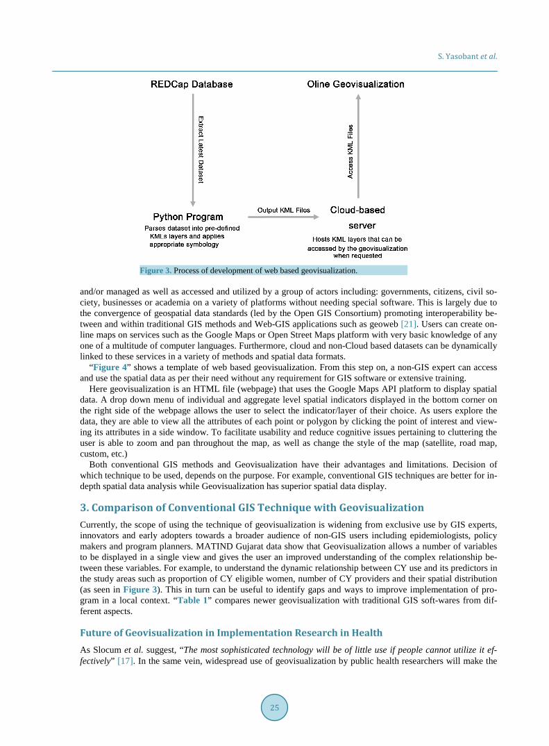
Geovisualization Technique Used on MATIND Data Python program was used to extract the MATIND data from the REDCap [23] (Research Electronic Data Cap-ture is a secure, web-based application designed to support data capture for research studies) database and to convert the data into spatial information. The program utilized the REDCap API to extract the latest version of the database through the use of a unique API URL and key. The dataset was then parsed using the simple KML python module to create point KML features for each individual mother’s home location as defined by the cen-troid (geographic centre) of their home village. Separate KML layers, each indicating the outcome of a certain health variable for each mother (for example, CY status, ANC check-ups, type of delivery etc.), were also created specifically for the research objective requirements. Additionally, aggregated village polygon KML lay-ers were created of the same indicators to represent regional level outcomes. The symbology of the layers (color gradient or symbol size/icon) was chosen based on the requirement. Once the spatial layers were created, and automatically uploaded to a cloud based server (Google Drive) where they could be accessed for the geovisuali-zation as shown in “Figure 3”.
The best part of the tool is hosting large datasets on the cloud that can be accessed, edited and updated re-motely and no longer needs to be on an individual hard drive or server. Subsequently, the data can be created
S. Yasobant et al.
25
Figure 3. Process of development of web based geovisualization.
and/or managed as well as accessed and utilized by a group of actors including: governments, citizens, civil so-ciety, businesses or academia on a variety of platforms without needing special software. This is largely due to the convergence of geospatial data standards (led by the Open GIS Consortium) promoting interoperability be-tween and within traditional GIS methods and Web-GIS applications such as geoweb [21]. Users can create on-line maps on services such as the Google Maps or Open Street Maps platform with very basic knowledge of any one of a multitude of computer languages. Furthermore, cloud and non-Cloud based datasets can be dynamically linked to these services in a variety of methods and spatial data formats.
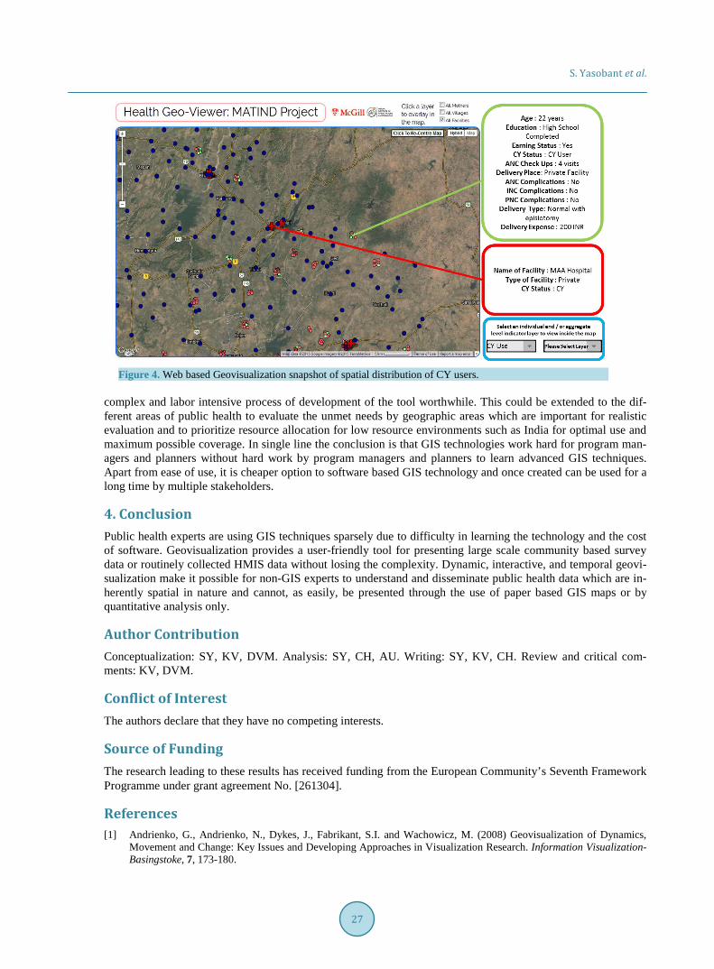
“Figure 4” shows a template of web based geovisualization. From this step on, a non-GIS expert can access and use the spatial data as per their need without any requirement for GIS software or extensive training.
Here geovisualization is an HTML file (webpage) that uses the Google Maps API platform to display spatial data. A drop down menu of individual and aggregate level spatial indicators displayed in the bottom corner on the right side of the webpage allows the user to select the indicator/layer of their choice. As users explore the data, they are able to view all the attributes of each point or polygon by clicking the point of interest and view-ing its attributes in a side window. To facilitate usability and reduce cognitive issues pertaining to cluttering the user is able to zoom and pan throughout the map, as well as change the style of the map (satellite, road map, custom, etc.)
Both conventional GIS methods and Geovisualization have their advantages and limitations. Decision of which technique to be used, depends on the purpose. For example, conventional GIS techniques are better for in- depth spatial data analysis while Geovisualization has superior spatial data display.
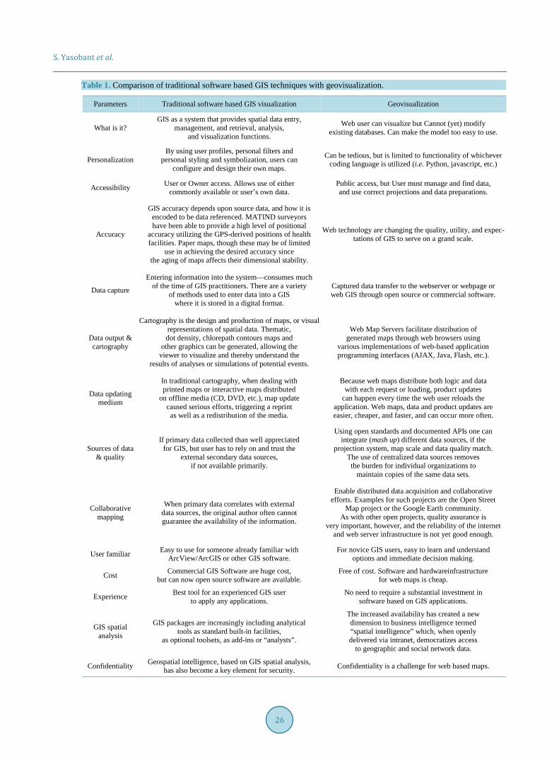
3. Comparison of Conventional GIS Technique with Geovisualization Currently, the scope of using the technique of geovisualization is widening from exclusive use by GIS experts, innovators and early adopters towards a broader audience of non-GIS users including epidemiologists, policy makers and program planners. MATIND Gujarat data show that Geovisualization allows a number of variables to be displayed in a single view and gives the user an improved understanding of the complex relationship be-tween these variables. For example, to understand the dynamic relationship between CY use and its predictors in the study areas such as proportion of CY eligible women, number of CY providers and their spatial distribution (as seen in Figure 3). This in turn can be useful to identify gaps and ways to improve implementation of pro-gram in a local context. “Table 1” compares newer geovisualization with traditional GIS soft-wares from dif-ferent aspects.
Future of Geovisualization in Implementation Research in Health As Slocum et al. suggest, “The most sophisticated technology will be of little use if people cannot utilize it ef- fectively” [17]. In the same vein, widespread use of geovisualization by public health researchers will make the
S. Yasobant et al.
26
Table 1. Comparison of traditional software based GIS techniques with geovisualization.
Parameters Traditional software based GIS visualization Geovisualization
What is it? GIS as a system that provides spatial data entry,
management, and retrieval, analysis, and visualization functions.
Web user can visualize but Cannot (yet) modify existing databases. Can make the model too easy to use.
Personalization By using user profiles, personal filters and
personal styling and symbolization, users can configure and design their own maps.
Can be tedious, but is limited to functionality of whichever coding language is utilized (i.e. Python, javascript, etc.)
Accessibility User or Owner access. Allows use of either commonly available or user’s own data.
Public access, but User must manage and find data, and use correct projections and data preparations.
Accuracy
GIS accuracy depends upon source data, and how it is encoded to be data referenced. MATIND surveyors have been able to provide a high level of positional
accuracy utilizing the GPS-derived positions of health facilities. Paper maps, though these may be of limited
use in achieving the desired accuracy since the aging of maps affects their dimensional stability.
Web technology are changing the quality, utility, and expec-tations of GIS to serve on a grand scale.
Data capture
Entering information into the system—consumes much of the time of GIS practitioners. There are a variety
of methods used to enter data into a GIS where it is stored in a digital format.
Captured data transfer to the webserver or webpage or web GIS through open source or commercial software.
Data output & cartography
Cartography is the design and production of maps, or visual representations of spatial data. Thematic, dot density, chlorepath contours maps and
other graphics can be generated, allowing the viewer to visualize and thereby understand the
results of analyses or simulations of potential events.
Web Map Servers facilitate distribution of generated maps through web browsers using
various implementations of web-based application programming interfaces (AJAX, Java, Flash, etc.).
Data updating medium
In traditional cartography, when dealing with printed maps or interactive maps distributed
on offline media (CD, DVD, etc.), map update caused serious efforts, triggering a reprint as well as a redistribution of the media.
Because web maps distribute both logic and data with each request or loading, product updates
can happen every time the web user reloads the application. Web maps, data and product updates are easier, cheaper, and faster, and can occur more often.
Sources of data & quality
If primary data collected than well appreciated for GIS, but user has to rely on and trust the
external secondary data sources, if not available primarily.
Using open standards and documented APIs one can integrate (mash up) different data sources, if the
projection system, map scale and data quality match. The use of centralized data sources removes the burden for individual organizations to
maintain copies of the same data sets.
Collaborative mapping
When primary data correlates with external data sources, the original author often cannot guarantee the availability of the information.
Enable distributed data acquisition and collaborative efforts. Examples for such projects are the Open Street
Map project or the Google Earth community. As with other open projects, quality assurance is
very important, however, and the reliability of the internet and web server infrastructure is not yet good enough.
User familiar Easy to use for someone already familiar with ArcView/ArcGIS or other GIS software.
For novice GIS users, easy to learn and understand options and immediate decision making.
Cost Commercial GIS Software are huge cost, but can now open source software are available.
Free of cost. Software and hardwareinfrastructure for web maps is cheap.
Experience Best tool for an experienced GIS user to apply any applications.
No need to require a substantial investment in software based on GIS applications.
GIS spatial analysis
GIS packages are increasingly including analytical tools as standard built-in facilities,
as optional toolsets, as add-ins or “analysts”.
The increased availability has created a new dimension to business intelligence termed “spatial intelligence” which, when openly delivered via intranet, democratizes access
to geographic and social network data.
Confidentiality Geospatial intelligence, based on GIS spatial analysis, has also become a key element for security. Confidentiality is a challenge for web based maps.
S. Yasobant et al.
27
Figure 4. Web based Geovisualization snapshot of spatial distribution of CY users.
complex and labor intensive process of development of the tool worthwhile. This could be extended to the dif-ferent areas of public health to evaluate the unmet needs by geographic areas which are important for realistic evaluation and to prioritize resource allocation for low resource environments such as India for optimal use and maximum possible coverage. In single line the conclusion is that GIS technologies work hard for program man-agers and planners without hard work by program managers and planners to learn advanced GIS techniques. Apart from ease of use, it is cheaper option to software based GIS technology and once created can be used for a long time by multiple stakeholders.
4. Conclusion Public health experts are using GIS techniques sparsely due to difficulty in learning the technology and the cost of software. Geovisualization provides a user-friendly tool for presenting large scale community based survey data or routinely collected HMIS data without losing the complexity. Dynamic, interactive, and temporal geovi-sualization make it possible for non-GIS experts to understand and disseminate public health data which are in-herently spatial in nature and cannot, as easily, be presented through the use of paper based GIS maps or by quantitative analysis only.
Author Contribution Conceptualization: SY, KV, DVM. Analysis: SY, CH, AU. Writing: SY, KV, CH. Review and critical com-ments: KV, DVM.
Conflict of Interest The authors declare that they have no competing interests.
Source of Funding The research leading to these results has received funding from the European Community’s Seventh Framework Programme under grant agreement No. [261304].
References [1] Andrienko, G., Andrienko, N., Dykes, J., Fabrikant, S.I. and Wachowicz, M. (2008) Geovisualization of Dynamics,
Movement and Change: Key Issues and Developing Approaches in Visualization Research. Information Visualization- Basingstoke, 7, 173-180.
S. Yasobant et al.
28
[2] Ashish, J. and Chiehwen, E.H. (2012) A Human Centered Geovisualization Framework to Facilitate Visual Explora- tion of Telehealth Data: A Case Study. Technology and Healthcare, 20, 473-488.
[3] Bhowmick, T., Griffin, A.L., Maceachren, A.M., Kluhsman, B.C. and Lengerich, E.J. (2008) Informing Geospatial Toolset Design: Understanding the Process of Cancer Data Exploration and Analysis. Health & Place, 14, 576-607. http://dx.doi.org/10.1016/j.healthplace.2007.10.009
[4] Bhowmick, T., Robinson, A.C., Gruver, A., Maceachren, A.M. and Lengerich, E.J. (2008) Distributed Usability Evalu- ation of the Pennsylvania Cancer Atlas. International Journal of Health Geographics, 7, 36. http://dx.doi.org/10.1186/1476-072X-7-36
[5] Cinnamon, J., Rinner, C., Cusimano, M.D., Marshall, S., Bekele, T., Hernandez, T. and Chipman, M.L. (2009) Eva- luating Web-Based Static, Animated and Interactive Maps for Injury Prevention. Geospatial Health, 4, 3-16. http://dx.doi.org/10.4081/gh.2009.206
[6] Clarke, K.C., Mclafferty, S.L. and Tempalski, B.J. (1996) On Epidemiology and Geographic Information Systems: A Review and Discussion of Future Directions. Emerging Infectious Diseases Journal, 2, 85-92. http://dx.doi.org/10.3201/eid0202.960202
[7] Dennis, A.R. and Carte, T.A. (1998) Using Geographical Information Systems for Decision Making: Extending Cogni- tive Fit Theory to Map-Based Presentations. Information Systems Research, 9, 194-203. http://dx.doi.org/10.1287/isre.9.2.194
[8] Dykes, J., Maceachren, A. and Kraak, M. (2005) Modelling Virtual Environments for Geovisualization: A Focus on Representation. Exploring Geovisualization, Chapter 19, 389-402.
[9] Elwood, S. (2008) Geographic Information Science: New Geovisualization Technologies—Emerging Questions and Linkages with GIScience Research. Progress in Human Geography, 33, 256-263. http://dx.doi.org/10.1177/0309132508094076
[10] Lawson, A., Biggeri, A., Böhning, D., Lesaffre, E., Viel, J.F. and Bertollini, R. (2001) Disease Mapping and Risk As- sessment for Public Health. International Journal of Epidemiology, 30, 405-406.
[11] Maceachren, A.M. and Brewer, I., (2004) Developing a Conceptual Framework for Visually Enabled Geocollaboration. International Journal of Geographic Information Science, 18, 1-34. http://dx.doi.org/10.1080/13658810310001596094
[12] Maceachren, A.M., Gahegan, M., Pike, W., Brewer, I., Cai, G., Lengerich, E. and Hardistry, F. (2004) Geovisualiza-tion for Knowledge Construction and Decision Support. IEEE Computer Graphics and Applications, 24, 13-17. http://dx.doi.org/10.1109/MCG.2004.1255801
[13] Maceachren, A.M. and Kraak, M.J. (2001) Research Challenges in Geovisualization. Cartography and Geographic In- formation Science, 28, 3-12. http://dx.doi.org/10.1559/152304001782173970
[14] Malczewski, J. (2006) GIS-Based Multi Criteria Decision Analysis: A Survey of the Literature. International Journal of Geographical Information Science, 20, 703-726. http://dx.doi.org/10.1080/13658810600661508
[15] Menno-Jan, K. (2003) Geovisualization Illustrated. ISPRS Journal of Photogrammetry & Remote Sensing, 57, 390- 399. http://dx.doi.org/10.1016/S0924-2716(02)00167-3
[16] Robinson, A.C., Chen, J., Lengerich, E.J., Meyer, H.G. and Maceachren, A.M. (2005) Combining Usability Techni- ques to Design Geovisualization Tools for Epidemiology. Cartography and Geographic Information Science, 32, 243- 255. http://dx.doi.org/10.1559/152304005775194700
[17] Robinson, A.C., Maceachren, A.M. and Roth, R.E. (2011) Designing a Web-Based Learning Portal for Geographic Visualization and Analysis in Public Health. Health Informatics Journal, 17, 191-208. http://dx.doi.org/10.1177/1460458211409718
[18] Rogers, M.Y. (1999) Getting Started with Geographic Information Systems (GIS): A Local Health Department Pers- pective. Journal of Public Health Management and Practice, 5, 22-33. http://dx.doi.org/10.1177/1460458211409718
[19] Sarat, M.K. (2009) Interactive Visual Summarization of Multidimensional Data. IEEE Conference on Information Vi- sualization, San Antonio, 11-14 October 2009, 65-72.
[20] Shi, Y., Song, Y. and Zhang, A. (2003) A Shrinking-Based Approach for Multi-Dimensional Data Analysis. Proceed- ings of 29th International Conference on Very Large Data Bases, Berlin, 9-12 September 2003, 1-12. http://www.vldb.org/conf/2003/papers/S14P02.pdf
[21] Van Elzakker, C.P.J.M. (2003) The Use of Maps in the Exploration of Geographic Data. Proceedings of the 21st In- ternational Cartographic Conference: Cartographic Renaissance, Durban, 10-16 August 2003, 1945-1955.
[22] Thrall, S.E. (1999) Geographic Information System (GIS) Hardware and Software. Journal of Public Health Manage- ment and Practice, 5, 82-90.
[23] Harris, P.A., Taylor, R., Thielke, R., Payne, J., Gonzalez, N. and Conde, J.G. (2009) Research Electronic Data Capture (REDCap)—A Metadata-Driven Methodology and Workflow Process for Providing Translational Research Informatics Support. Journal of Biomedical Informatics, 42, 377-381. http://dx.doi.org/10.1016/j.jbi.2008.08.010