global macro shifts...global macro shifts: inflation: dead, or just forgotten? the us and global...
TRANSCRIPT
GLOBAL MACRO
SHIFTS
ISSUE 4 FEBRUARY 2016
with Michael Hasenstab, Ph.D.
JUST FORGOTTEN?INFLATION: DEAD, OR

Contents
Overview 2
Inflation, Deflation, Slowflation… 4
US 8
Money Velocity: The Ghost in the Machine 20
A Bit of History 22
Fed Policy Shift and Outlook for US Yields 24
Conclusion 29

Global Macro Shifts: Inflation: Dead, or Just Forgotten?
Michael Hasenstab, Ph.D.
Executive Vice President, Portfolio Manager, Chief Investment Officer
Templeton Global Macro
Sonal Desai, Ph.D.
Senior Vice President,
Portfolio Manager,
Director of Research
Templeton Global Macro
Hyung C. Shin, Ph.D.
Vice President, Senior Global
Macro & Research Analyst
Templeton Global Macro
Diego Valderrama, Ph.D.
Senior Global Macro &
Research Analyst
Templeton Global Macro
Attila Korpos, Ph.D.
Research Analyst
Templeton Global Macro
Global Macro Shifts
Global Macro Shifts is a research-based briefing on global
economies featuring the analysis and views of Dr. Michael
Hasenstab and senior members of Templeton Global Macro.
Dr. Hasenstab and his team manage Templeton’s global
bond strategies, including unconstrained fixed income,
currency and global macro. This economic team, trained in
some of the leading universities in the world, integrates
global macroeconomic analysis with in-depth country
research to help identify long-term imbalances that translate
to investment opportunities.
Inflation: Dead, or Just Forgotten?
Calvin Ho, Ph.D.
Vice President, Senior Global
Macro & Research Analyst
Templeton Global Macro
1

Global Macro Shifts: Inflation: Dead, or Just Forgotten?
The US and global economy are six years into their post-Great
Recession recoveries. Over these past six years, growth has
proved resilient to a number of shocks, including the eurozone
debt crisis, a variety of policy-induced mini-crises in the US (the
debt ceiling, fiscal cliff and taper tantrum, to name just a few), and
the beginning of an important shift in China’s growth model.
Average global growth during 2010–2014 compares favorably with
the pre-global financial crisis (GFC) record—except for the
exceptionally strong growth of 2002–2007; in the US, the
unemployment rate has declined to 5%, bringing the labor market
close to full employment.1
Financial markets also reflect the conviction that we are now in a
new world, characterized by permanently lower rates of economic
growth and near-zero inflation, and where equilibrium interest
rates will therefore be permanently lower than in the past. This
conviction is shared, to some extent, by the US Federal Reserve
(Fed): Federal Open Market Committee (FOMC) members
forecast a lower equilibrium level of the fed funds rate than we
have seen in previous cycles.
Larry Summers and others have articulated this pessimistic view
by revisiting the Secular Stagnation theory originally proposed by
Alvin Hansen in 1938.2 In a nutshell, the Secular Stagnation
hypothesis posits that the global economy suffers from a
structural lack of aggregate demand and a chronic excess of
desired savings over desired investment. Summers (2013, 2015)
highlights the following factors:
• A decline in the rate of population growth, lowering the pace of
demand and output growth;
• A slowdown in the pace of technological innovation and
productivity growth, which also reduces economic growth and
returns on investment;
• A substantial reduction in the relative price of capital, implying
that a given increase in the stock of capital can be achieved
with a smaller value of investment and borrowing;
• A reduced capital intensity in the economy, driven by the rise of
digital services industries; and
• A rise in income inequality and in the capital share of income,
both increasing the average propensity to save.
These factors combine to create a situation of low aggregate
demand, low returns on investment and low actual investment,
low inflation and low interest rates.
The Secular Stagnation view is often seen as complemented by
the “savings glut” hypothesis, whereby large current account
surpluses and precautionary savings by EMs (oil producers and
Asian exporters) put further downward pressure on interest rates.
In a Secular Stagnation environment, monetary policy cannot
stimulate growth by reducing real interest rates: The nominal
interest rate cannot fall below zero, and weak aggregate demand
caps inflation. Monetary policy can at best fuel financial bubbles—
a temporary solution—or weaken the exchange rate—a zero-sum
game at the global level. A well-designed fiscal stimulus becomes
the only way out, within the constraints of long-term debt
sustainability.
Overview
2
3.7%
3.3% 3.4% 3.3%
5.1%
4.0%
3.7%
0.0%
0.5%
1.0%
1.5%
2.0%
2.5%
3.0%
3.5%
4.0%
4.5%
5.0%
5.5%
1983–19871988–19921993–19971998–20022003–20072010–20142015–2020(Estimate)
Global Growth Remains on Trend
Exhibit 1: Global GDP Growth (% Purchasing Power Parity)1983–2020E
However, a widespread and deep-seated pessimism remains. The
International Monetary Fund (IMF) and other institutions have
repeatedly lowered their growth forecasts; many observers feel
that the pace of US economic growth remains disappointing; the
slowdown in China and other emerging markets (EMs), and the
attendant decline in commodity prices, have raised concerns over
the health of the global growth outlook. Inflation pressures have
remained muted in the US and a number of other advanced
countries, and several economists and commentators have
repeatedly flagged the risk of widespread deflation across the
global economy.
1. Final GDP growth data for 2015 are not yet available at the time of publication.2. Source: Larry Summers (2013, 2015).
Source: International Monetary Fund, World Economic Outlook Database, 10/15.
Global Macro Shifts: Inflation: Dead, or Just Forgotten?
The pessimistic view encapsulated by the Secular Stagnation
hypothesis underpins market expectations that both inflation and
interest rates are set to remain at very low levels for the
foreseeable future. We believe this view is misguided:
• Potential growth in the US and other advanced economies is
indeed lower than was generally assumed during the credit-
fueled pre-GFC expansion;
• However, EMs now account for a significantly higher share of
the global economy, and they have substantially higher growth
potential;
• Prevailing deflation/disinflation concerns give excessive weight
to the decline in headline inflation measures driven by the sharp
fall in commodity prices, a temporary phenomenon.
Concomitantly, these concerns ignore the positive impact on
aggregate demand in commodity importers that derives from
lower commodity prices.
• While inflation dynamics are not perfectly understood, we
believe inflation risks are now squarely tilted to the upside. Our
view rests on three considerations: 1) US consumption remains
robust, and wage pressures have started to rise; 2) a
normalization in money velocity would trigger a significant rise
in inflation; 3) last but not least, we believe hard-earned central
bank credibility has been key to keeping inflation anchored
since the 1980s; if monetary policy lags behind the curve at the
same time as the disinflation impact of commodity prices fades,
this credibility could be damaged, leading to a rise in inflation
expectations.
In the remainder of this paper, we develop an extensive and
detailed analysis of inflation determinants in the US and globally:
recent inflation developments, a rising global and US output gap,
the continuing tightening of a US labor market that is quickly
reaching full employment, base effects from rock-bottom
commodity prices, and the potential pressures from a massive
monetary overhang and historically low velocity and money
multipliers. The weight of this evidence suggests that it would take
a set of heroic assumptions to believe that inflation will remain at
the current extremely low levels. Our inflation forecasts, though
not overly aggressive, are significantly above the Fed’s forecast
and, even more, above those priced by financial markets. In turn,
we believe that widespread underestimation of future inflation,
together with the prospective normalization in the relationship
between long-term interest rates and nominal gross domestic
product (GDP) growth, sets the stage for a significant correction in
Treasury yields.
The rest of the paper is organized as follows: In Section 1, we
assess recent inflation trends in both developed and emerging
economies, and show that the global output gap plays an
important role in driving inflation in individual countries. In Section
2, we provide a detailed analysis of the US labor market and
wage trends, analyze the inflation process, and develop a
structural model to forecast inflation four quarters ahead. In
Section 3, we assess the risk posed by the monetary overhang
created by quantitative easing (QE), and estimate the potential
inflationary impact of a normalization in velocity and money
multipliers. In Section 4, we provide a brief historical overview
centered on the Great Inflation of 1965–1980. In Section 5, we
discuss the Fed’s policy normalization challenge and the likely
response of US yields. We conclude this paper with a summary of
our views.
3
Global Macro Shifts: Inflation: Dead, or Just Forgotten?
Over the past 12 months, many analysts and commentators have
argued that we face a risk of global deflation. A close look at the
numbers, however, quickly reveals these concerns appear to be
far-fetched, an exaggerated reaction to the plunge in commodity
prices.
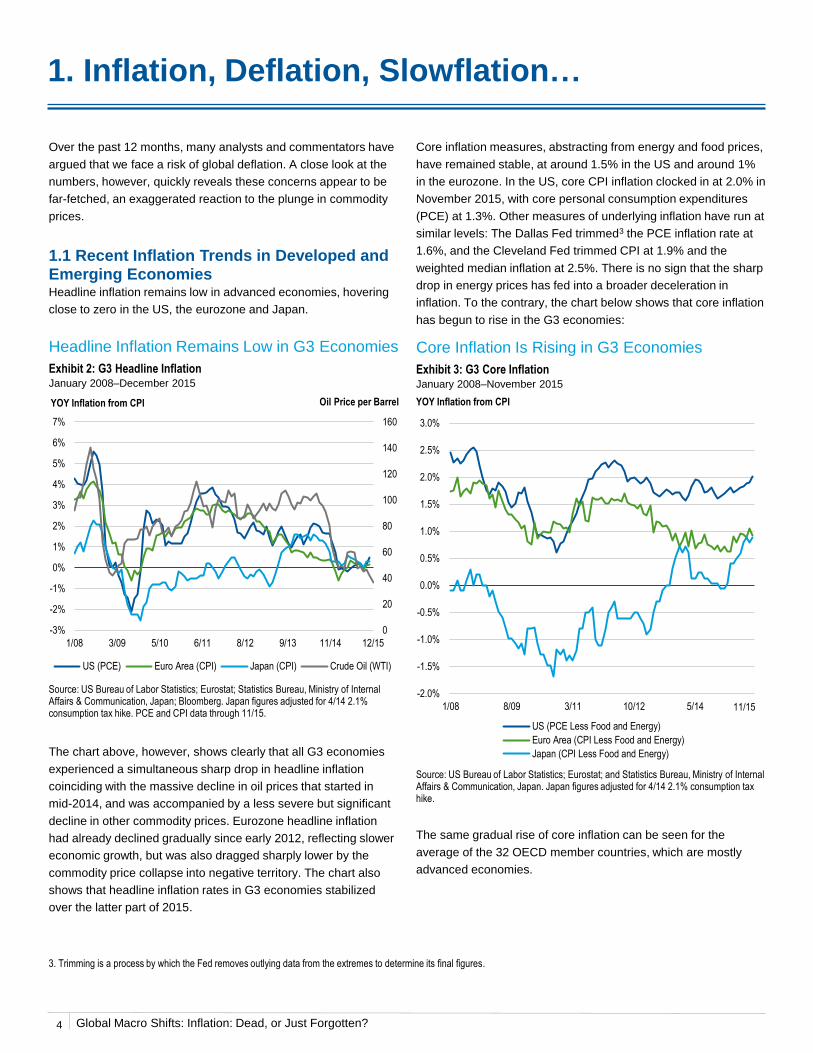
1.1 Recent Inflation Trends in Developed and Emerging EconomiesHeadline inflation remains low in advanced economies, hovering
close to zero in the US, the eurozone and Japan.
Core inflation measures, abstracting from energy and food prices,
have remained stable, at around 1.5% in the US and around 1%
in the eurozone. In the US, core CPI inflation clocked in at 2.0% in
November 2015, with core personal consumption expenditures
(PCE) at 1.3%. Other measures of underlying inflation have run at
similar levels: The Dallas Fed trimmed3 the PCE inflation rate at
1.6%, and the Cleveland Fed trimmed CPI at 1.9% and the
weighted median inflation at 2.5%. There is no sign that the sharp
drop in energy prices has fed into a broader deceleration in
inflation. To the contrary, the chart below shows that core inflation
has begun to rise in the G3 economies:
1. Inflation, Deflation, Slowflation…
Source: US Bureau of Labor Statistics; Eurostat; Statistics Bureau, Ministry of Internal Affairs & Communication, Japan; Bloomberg. Japan figures adjusted for 4/14 2.1% consumption tax hike. PCE and CPI data through 11/15.
Headline Inflation Remains Low in G3 Economies
Exhibit 2: G3 Headline InflationJanuary 2008–December 2015
The chart above, however, shows clearly that all G3 economies
experienced a simultaneous sharp drop in headline inflation
coinciding with the massive decline in oil prices that started in
mid-2014, and was accompanied by a less severe but significant
decline in other commodity prices. Eurozone headline inflation
had already declined gradually since early 2012, reflecting slower
economic growth, but was also dragged sharply lower by the
commodity price collapse into negative territory. The chart also
shows that headline inflation rates in G3 economies stabilized
over the latter part of 2015.
Source: US Bureau of Labor Statistics; Eurostat; and Statistics Bureau, Ministry of Internal Affairs & Communication, Japan. Japan figures adjusted for 4/14 2.1% consumption tax hike.
Core Inflation Is Rising in G3 Economies
Exhibit 3: G3 Core InflationJanuary 2008–November 2015
The same gradual rise of core inflation can be seen for the
average of the 32 OECD member countries, which are mostly
advanced economies.
3. Trimming is a process by which the Fed removes outlying data from the extremes to determine its final figures.
0
20
40
60
80
100
120
140
160
-3%
-2%
-1%
0%
1%
2%
3%
4%
5%
6%
7%
1/08 3/09 5/10 6/11 8/12 9/13 11/14 12/15
US (PCE) Euro Area (CPI) Japan (CPI) Crude Oil (WTI)
YOY Inflation from CPI Oil Price per Barrel
-2.0%
-1.5%
-1.0%
-0.5%
0.0%
0.5%
1.0%
1.5%
2.0%
2.5%
3.0%
1/08 8/09 3/11 10/12 5/14
US (PCE Less Food and Energy)
Euro Area (CPI Less Food and Energy)
Japan (CPI Less Food and Energy)
YOY Inflation from CPI
11/15
4
Global Macro Shifts: Inflation: Dead, or Just Forgotten?
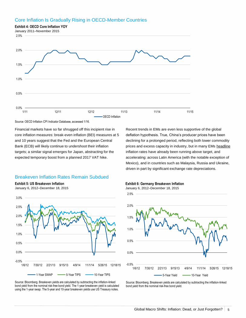
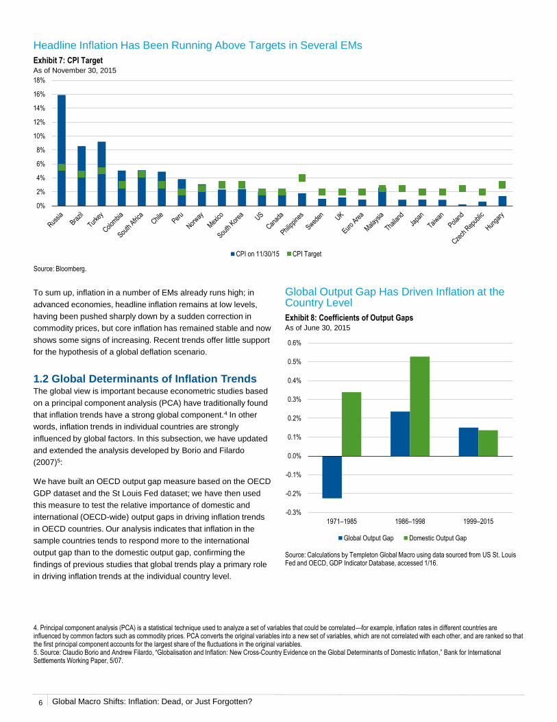
Recent trends in EMs are even less supportive of the global
deflation hypothesis. True, China’s producer prices have been
declining for a prolonged period, reflecting both lower commodity
prices and excess capacity in industry, but in many EMs headline
inflation rates have already been running above target, and
accelerating: across Latin America (with the notable exception of
Mexico), and in countries such as Malaysia, Russia and Ukraine,
driven in part by significant exchange rate depreciations.
Financial markets have so far shrugged off this incipient rise in
core inflation measures: break-even inflation (BEI) measures at 5
and 10 years suggest that the Fed and the European Central
Bank (ECB) will likely continue to undershoot their inflation
targets; a similar signal emerges for Japan, abstracting for the
expected temporary boost from a planned 2017 VAT hike.
Core Inflation Is Gradually Rising in OECD-Member Countries
Exhibit 4: OECD Core Inflation YOYJanuary 2011–November 2015
Source: OECD Inflation CPI Indicator Database, accessed 1/16.
Breakeven Inflation Rates Remain Subdued
Exhibit 5: US Breakeven InflationJanuary 6, 2012–December 18, 2015
Exhibit 6: Germany Breakeven InflationJanuary 6, 2012–December 18, 2015
Source: Bloomberg. Breakeven yields are calculated by subtracting the inflation-linked bond yield from the nominal risk-free bond yield. The 1-year breakeven yield is calculated using the 1-year swap. The 5-year and 10-year breakeven yields use US Treasury notes.
Source: Bloomberg. Breakeven yields are calculated by subtracting the inflation-linked bond yield from the nominal risk-free bond yield.
0.0%
0.5%
1.0%
1.5%
2.0%
2.5%
1/11 12/11 12/12 11/13 11/14 11/15
OECD Inflation
-0.5%
0.0%
0.5%
1.0%
1.5%
2.0%
2.5%
3.0%
1/6/12 7/30/12 2/21/13 9/15/13 4/9/14 11/1/14 5/26/15 12/18/15
1-Year SWAP 5-Year TIPS 10-Year TIPS
-0.5%
0.0%
0.5%
1.0%
1.5%
2.0%
2.5%
1/6/12 7/30/12 2/21/13 9/15/13 4/9/14 11/1/14 5/26/15 12/18/15
5-Year Yield 10-Year Yield
5
Global Macro Shifts: Inflation: Dead, or Just Forgotten?
To sum up, inflation in a number of EMs already runs high; in
advanced economies, headline inflation remains at low levels,
having been pushed sharply down by a sudden correction in
commodity prices, but core inflation has remained stable and now
shows some signs of increasing. Recent trends offer little support
for the hypothesis of a global deflation scenario.
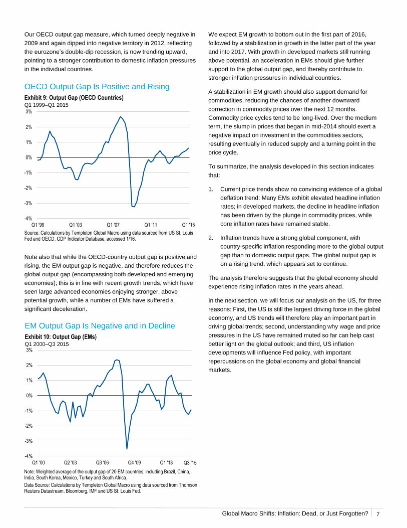
1.2 Global Determinants of Inflation TrendsThe global view is important because econometric studies based
on a principal component analysis (PCA) have traditionally found
that inflation trends have a strong global component.4 In other
words, inflation trends in individual countries are strongly
influenced by global factors. In this subsection, we have updated
and extended the analysis developed by Borio and Filardo
(2007)5:
We have built an OECD output gap measure based on the OECD
GDP dataset and the St Louis Fed dataset; we have then used
this measure to test the relative importance of domestic and
international (OECD-wide) output gaps in driving inflation trends
in OECD countries. Our analysis indicates that inflation in the
sample countries tends to respond more to the international
output gap than to the domestic output gap, confirming the
findings of previous studies that global trends play a primary role
in driving inflation trends at the individual country level.
Headline Inflation Has Been Running Above Targets in Several EMs
Exhibit 7: CPI TargetAs of November 30, 2015
Source: Bloomberg.
4. Principal component analysis (PCA) is a statistical technique used to analyze a set of variables that could be correlated—for example, inflation rates in different countries are influenced by common factors such as commodity prices. PCA converts the original variables into a new set of variables, which are not correlated with each other, and are ranked so that the first principal component accounts for the largest share of the fluctuations in the original variables.5. Source: Claudio Borio and Andrew Filardo, “Globalisation and Inflation: New Cross-Country Evidence on the Global Determinants of Domestic Inflation,” Bank for International Settlements Working Paper, 5/07.
Global Output Gap Has Driven Inflation at the Country Level
Exhibit 8: Coefficients of Output GapsAs of June 30, 2015
Source: Calculations by Templeton Global Macro using data sourced from US St. Louis Fed and OECD, GDP Indicator Database, accessed 1/16.
0%
2%
4%
6%
8%
10%
12%
14%
16%
18%
CPI on 11/30/15 CPI Target
-0.3%
-0.2%
-0.1%
0.0%
0.1%
0.2%
0.3%
0.4%
0.5%
0.6%
1971–1985 1986–1998 1999–2015
Global Output Gap Domestic Output Gap
6
Global Macro Shifts: Inflation: Dead, or Just Forgotten?
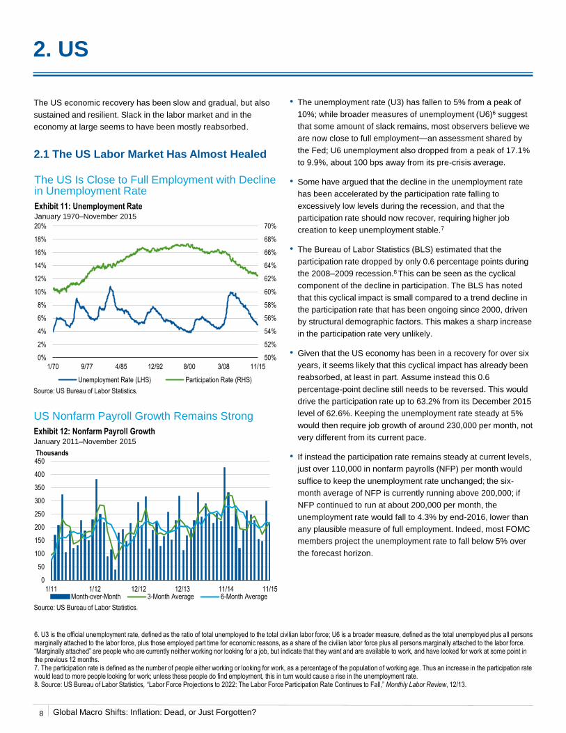
Our OECD output gap measure, which turned deeply negative in
2009 and again dipped into negative territory in 2012, reflecting
the eurozone’s double-dip recession, is now trending upward,
pointing to a stronger contribution to domestic inflation pressures
in the individual countries.
OECD Output Gap Is Positive and Rising
Exhibit 9: Output Gap (OECD Countries)Q1 1999–Q1 2015
We expect EM growth to bottom out in the first part of 2016,
followed by a stabilization in growth in the latter part of the year
and into 2017. With growth in developed markets still running
above potential, an acceleration in EMs should give further
support to the global output gap, and thereby contribute to
stronger inflation pressures in individual countries.
A stabilization in EM growth should also support demand for
commodities, reducing the chances of another downward
correction in commodity prices over the next 12 months.
Commodity price cycles tend to be long-lived. Over the medium
term, the slump in prices that began in mid-2014 should exert a
negative impact on investment in the commodities sectors,
resulting eventually in reduced supply and a turning point in the
price cycle.
To summarize, the analysis developed in this section indicates
that:
1. Current price trends show no convincing evidence of a global
deflation trend: Many EMs exhibit elevated headline inflation
rates; in developed markets, the decline in headline inflation
has been driven by the plunge in commodity prices, while
core inflation rates have remained stable.
2. Inflation trends have a strong global component, with
country-specific inflation responding more to the global output
gap than to domestic output gaps. The global output gap is
on a rising trend, which appears set to continue.
The analysis therefore suggests that the global economy should
experience rising inflation rates in the years ahead.
In the next section, we will focus our analysis on the US, for three
reasons: First, the US is still the largest driving force in the global
economy, and US trends will therefore play an important part in
driving global trends; second, understanding why wage and price
pressures in the US have remained muted so far can help cast
better light on the global outlook; and third, US inflation
developments will influence Fed policy, with important
repercussions on the global economy and global financial
markets.
Source: Calculations by Templeton Global Macro using data sourced from US St. Louis Fed and OECD, GDP Indicator Database, accessed 1/16.
Note also that while the OECD-country output gap is positive and
rising, the EM output gap is negative, and therefore reduces the
global output gap (encompassing both developed and emerging
economies); this is in line with recent growth trends, which have
seen large advanced economies enjoying stronger, above
potential growth, while a number of EMs have suffered a
significant deceleration.
EM Output Gap Is Negative and in Decline
Exhibit 10: Output Gap (EMs)Q1 2000–Q3 2015
Note: Weighted average of the output gap of 20 EM countries, including Brazil, China, India, South Korea, Mexico, Turkey and South Africa.
Data Source: Calculations by Templeton Global Macro using data sourced from Thomson Reuters Datastream, Bloomberg, IMF and US St. Louis Fed.
-4%
-3%
-2%
-1%
0%
1%
2%
3%
Q1 '00 Q2 '03 Q3 '06 Q4 '09 Q1 '13 Q3 '15
-4%
-3%
-2%
-1%
0%
1%
2%
3%
Q1 '99 Q1 '03 Q1 '07 Q1 '11 Q1 '15
7
Global Macro Shifts: Inflation: Dead, or Just Forgotten?
2. US
The US economic recovery has been slow and gradual, but also
sustained and resilient. Slack in the labor market and in the
economy at large seems to have been mostly reabsorbed.
2.1 The US Labor Market Has Almost Healed
• The unemployment rate (U3) has fallen to 5% from a peak of
10%; while broader measures of unemployment (U6)6 suggest
that some amount of slack remains, most observers believe we
are now close to full employment—an assessment shared by
the Fed; U6 unemployment also dropped from a peak of 17.1%
to 9.9%, about 100 bps away from its pre-crisis average.
• Some have argued that the decline in the unemployment rate
has been accelerated by the participation rate falling to
excessively low levels during the recession, and that the
participation rate should now recover, requiring higher job
creation to keep unemployment stable.7
• The Bureau of Labor Statistics (BLS) estimated that the
participation rate dropped by only 0.6 percentage points during
the 2008–2009 recession.8 This can be seen as the cyclical
component of the decline in participation. The BLS has noted
that this cyclical impact is small compared to a trend decline in
the participation rate that has been ongoing since 2000, driven
by structural demographic factors. This makes a sharp increase
in the participation rate very unlikely.
• Given that the US economy has been in a recovery for over six
years, it seems likely that this cyclical impact has already been
reabsorbed, at least in part. Assume instead this 0.6
percentage-point decline still needs to be reversed. This would
drive the participation rate up to 63.2% from its December 2015
level of 62.6%. Keeping the unemployment rate steady at 5%
would then require job growth of around 230,000 per month, not
very different from its current pace.
• If instead the participation rate remains steady at current levels,
just over 110,000 in nonfarm payrolls (NFP) per month would
suffice to keep the unemployment rate unchanged; the six-
month average of NFP is currently running above 200,000; if
NFP continued to run at about 200,000 per month, the
unemployment rate would fall to 4.3% by end-2016, lower than
any plausible measure of full employment. Indeed, most FOMC
members project the unemployment rate to fall below 5% over
the forecast horizon.
Source: US Bureau of Labor Statistics.
US Nonfarm Payroll Growth Remains Strong
Exhibit 12: Nonfarm Payroll GrowthJanuary 2011–November 2015
Source: US Bureau of Labor Statistics.
6. U3 is the official unemployment rate, defined as the ratio of total unemployed to the total civilian labor force; U6 is a broader measure, defined as the total unemployed plus all persons marginally attached to the labor force, plus those employed part time for economic reasons, as a share of the civilian labor force plus all persons marginally attached to the labor force. “Marginally attached” are people who are currently neither working nor looking for a job, but indicate that they want and are available to work, and have looked for work at some point in the previous 12 months.7. The participation rate is defined as the number of people either working or looking for work, as a percentage of the population of working age. Thus an increase in the participation rate would lead to more people looking for work; unless these people do find employment, this in turn would cause a rise in the unemployment rate.8. Source: US Bureau of Labor Statistics, “Labor Force Projections to 2022: The Labor Force Participation Rate Continues to Fall,” Monthly Labor Review, 12/13.
The US Is Close to Full Employment with Decline in Unemployment Rate
Exhibit 11: Unemployment RateJanuary 1970–November 2015
50%
52%
54%
56%
58%
60%
62%
64%
66%
68%
70%
0%
2%
4%
6%
8%
10%
12%
14%
16%
18%
20%
1/70 9/77 4/85 12/92 8/00 3/08 11/15
Unemployment Rate (LHS) Participation Rate (RHS)
8
0
50
100
150
200
250
300
350
400
450
1/11 1/12 12/12 12/13 11/14 11/15
Thousands
Month-over-Month 3-Month Average 6-Month Average
Global Macro Shifts: Inflation: Dead, or Just Forgotten?
• An additional sign of health of the labor market is the rise in the
number of “quits,” or voluntary employment separations. This
normally reflects workers who resign from their current job
because they have found a better opportunity, or are confident
that they will find one.
Insured Unemployment Rate Is Historically Low
Exhibit 13: Insured Unemployment RateMarch 5, 1970–December 18, 2015
Source: US Bureau of Labor Statistics.Hard to Fill Jobs Data Source: Thomson Reuters Datastream, National Federation of Independent Business. Unemployment Rate Data Source: US Bureau of Labor Statistics.
Job Openings Have Been Increasing Significantly
Exhibit 16: Job OpeningsJanuary 2001–October 2015
Source: US Bureau of Labor Statistics. As determined by the National Bureau of Economic Research, there were two recessionary periods from 1/01 to 1/16; they occurred from 3/01 to 11/01, and 12/07 to 6/09. Shaded areas represent approximate recessionary periods.
Availability of Jobs Has Improved from GFC Levels
Exhibit 15: Conference Board Consumer Confidence Survey:
Job Market ProspectsJanuary 2000–November 2015
• Unemployment claims and the insured unemployment rate
(continuing unemployment claims as a share of eligible
employees) are at historical low levels; firms are reporting
greater difficulty in filling jobs, while workers are reporting less
difficulty in finding jobs. Indeed job openings have increased to
very high levels.
Source: US Bureau of Labor Statistics and The Conference Board.
0%
1%
2%
3%
4%
5%
6%
7%
8%
3/5/70 8/15/81 1/25/93 7/7/04 12/18/15
0%
2%
4%
6%
8%
10%
12%
0%
5%
10%
15%
20%
25%
30%
35%
40%
1/90 8/98 4/07 11/15
Diffusion
% of Firms with Hard to Fill Jobs (LHS) Unemployment Rate (RHS)
Unemployment Rate
0%
2%
4%
6%
8%
10%
12%
-60%
-40%
-20%
0%
20%
40%
60%
1/00 8/01 3/03 10/04 5/06 12/07 7/09 2/11 9/12 5/14
Jobs Plentiful Minus Jobs Hard to Find (LHS) Unemployment Rate (RHS)
11/15
9
Hard to Fill Job Level Has Increased
Exhibit 14: National Federation of Independent Business
Hard to Fill JobsJanuary 1990–November 2015
0
0.1
0.2
0.3
0.4
0.5
0.6
0.7
0.8
0.9
1
0.0%
0.5%
1.0%
1.5%
2.0%
2.5%
3.0%
3.5%
4.0%
4.5%
1/01 5/02 10/03 2/05 7/06 11/07 4/09 8/10 12/11 5/13 9/14 10/156/09
Global Macro Shifts: Inflation: Dead, or Just Forgotten?
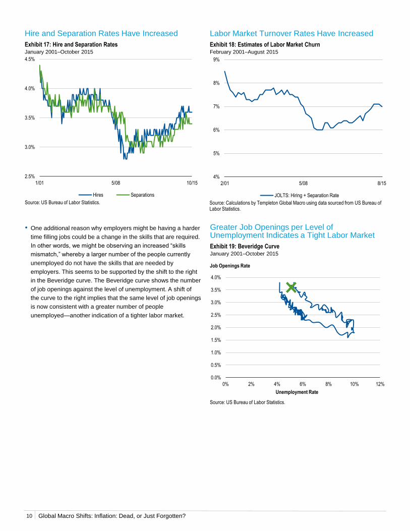
Hire and Separation Rates Have Increased
Exhibit 17: Hire and Separation RatesJanuary 2001–October 2015
Source: US Bureau of Labor Statistics.
Greater Job Openings per Level of Unemployment Indicates a Tight Labor Market
Exhibit 19: Beveridge CurveJanuary 2001–October 2015
Labor Market Turnover Rates Have Increased
Exhibit 18: Estimates of Labor Market ChurnFebruary 2001–August 2015
Source: Calculations by Templeton Global Macro using data sourced from US Bureau of Labor Statistics.
• One additional reason why employers might be having a harder
time filling jobs could be a change in the skills that are required.
In other words, we might be observing an increased “skills
mismatch,” whereby a larger number of the people currently
unemployed do not have the skills that are needed by
employers. This seems to be supported by the shift to the right
in the Beveridge curve. The Beveridge curve shows the number
of job openings against the level of unemployment. A shift of
the curve to the right implies that the same level of job openings
is now consistent with a greater number of people
unemployed—another indication of a tighter labor market.
Source: US Bureau of Labor Statistics.
2.5%
3.0%
3.5%
4.0%
4.5%
1/01 5/08 10/15
Hires Separations
10
4%
5%
6%
7%
8%
9%
2/01 5/08 8/15
JOLTS: Hiring + Separation Rate
0.0%
0.5%
1.0%
1.5%
2.0%
2.5%
3.0%
3.5%
4.0%
0% 2% 4% 6% 8% 10% 12%
Job Openings Rate
Unemployment Rate
Global Macro Shifts: Inflation: Dead, or Just Forgotten?
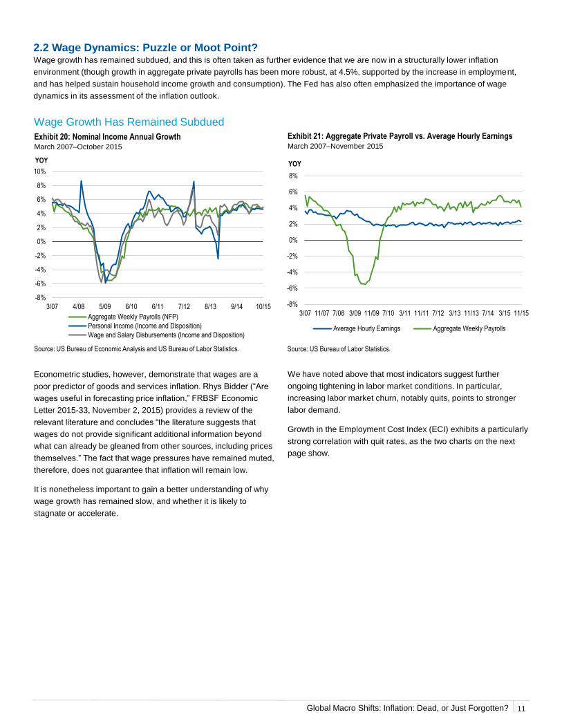
Exhibit 20: Nominal Income Annual GrowthMarch 2007–October 2015
Source: US Bureau of Economic Analysis and US Bureau of Labor Statistics.
Exhibit 21: Aggregate Private Payroll vs. Average Hourly EarningsMarch 2007–November 2015
Source: US Bureau of Labor Statistics.
Econometric studies, however, demonstrate that wages are a
poor predictor of goods and services inflation. Rhys Bidder (“Are
wages useful in forecasting price inflation,” FRBSF Economic
Letter 2015-33, November 2, 2015) provides a review of the
relevant literature and concludes “the literature suggests that
wages do not provide significant additional information beyond
what can already be gleaned from other sources, including prices
themselves.” The fact that wage pressures have remained muted,
therefore, does not guarantee that inflation will remain low.
It is nonetheless important to gain a better understanding of why
wage growth has remained slow, and whether it is likely to
stagnate or accelerate.
We have noted above that most indicators suggest further
ongoing tightening in labor market conditions. In particular,
increasing labor market churn, notably quits, points to stronger
labor demand.
Growth in the Employment Cost Index (ECI) exhibits a particularly
strong correlation with quit rates, as the two charts on the next
page show.
Wage Growth Has Remained Subdued
-8%
-6%
-4%
-2%
0%
2%
4%
6%
8%
10%
3/07 4/08 5/09 6/10 6/11 7/12 8/13 9/14 10/15
YOY
Aggregate Weekly Payrolls (NFP)
Personal Income (Income and Disposition)
Wage and Salary Disbursements (Income and Disposition)
-8%
-6%
-4%
-2%
0%
2%
4%
6%
8%
3/07 11/07 7/08 3/09 11/09 7/10 3/11 11/11 7/12 3/13 11/13 7/14 3/15 11/15
YOY
Average Hourly Earnings Aggregate Weekly Payrolls
11
2.2 Wage Dynamics: Puzzle or Moot Point?Wage growth has remained subdued, and this is often taken as further evidence that we are now in a structurally lower inflation
environment (though growth in aggregate private payrolls has been more robust, at 4.5%, supported by the increase in employment,
and has helped sustain household income growth and consumption). The Fed has also often emphasized the importance of wage
dynamics in its assessment of the inflation outlook.

Global Macro Shifts: Inflation: Dead, or Just Forgotten?
ECI Growth (t+i) AHE Growth (t+i) i
0.686 0.644 0
0.719 0.708 1
0.729 0.758 2
0.726 0.781 3
0.721 0.786 4
0.712 0.779 5
0.702 0.762 6
0.689 0.743 7
0.680 0.713 8
12
Exhibit 23: Quit Rate and AHE Wage Growth February 1990–November 2015
Quit Rates and Wage Growth Are Positively Correlated
Exhibit 22: Quit Rate and ECI Wage Growth February 1990–August 2015
Exhibit 24: Correlation of Quit Rate (at time = t) with ECI Growth and AHE Growth at Time Intervals (t+i)
Source: Calculations by Templeton Global Macro using data sourced from US Bureau of Labor Statistics and National Bureau of Economic Research Working Paper, “Labor Market Flows in the Cross Section and over Time.” by Steven J. Davis, R. Jason Faberman, and John C. Haltiwanger. JOLTS Quit Rate data begin 2/91.
Source: Calculations by Templeton Global Macro using data sourced from US Bureau of Labor Statistics and National Bureau of Economic Research Working Paper, “Labor Market Flows in the Cross Section and over Time.” by Steven J. Davis, R. Jason Faberman, and John C. Haltiwanger. JOLTS Quit Rate data begin 2/91 and ends 8/15. AHE – Total Nonfarm Private Wage Growth data begin 5/07.
t = current time of quit factor; i = time interval in quarters. Source: Calculations by Templeton Global Macro using data sourced from US Bureau of Labor Statistics and National Bureau of Economic Research Working Paper, “Labor Market Flows in the Cross Section and over Time.” by Steven J. Davis, R. Jason Faberman, and John C. Haltiwanger. Data as of 8/15; calculations as of 11/15. Correlation measures the degree to which two investments move in tandem. Correlation will range between 1.00 (perfect positive correlation, where two items historically always moved in the same direction) and -1.00 (perfect negative correlation, where two items historically always moved in opposite directions).
0.03
0.04
0.05
0.06
0.07
0.08
0.09
0.0%
1.0%
2.0%
3.0%
4.0%
5.0%
6.0%
2/90 5/94 8/98 11/02 2/07 5/11 8/15
ECI, YOY
ECI Wage Growth (LHS) JOLTS Quit Rate (RHS)
JOLTS Quit Rate, 4Q MA
0.03
0.04
0.05
0.06
0.07
0.08
0.09
0.0%
0.5%
1.0%
1.5%
2.0%
2.5%
3.0%
3.5%
4.0%
4.5%
2/90 7/96 12/02 6/09 11/15
AHE, YOY
AHE – Production (LHS)AHE – Total Nonfarm Private Wage Growth (LHS)JOLTS Quit Rate (RHS)
JOLTS Quit Rate, 4Q MA
We build on the historical relationship between the ECI and the quit rate, and augment it with the share of firms expecting to raise
workers’ compensation (from the National Federation of Independent Business [NFIB] survey) as a measure of labor demand (Exhibit
24). We use the resulting model to forecast future wage growth. The model predicts that the ECI growth rate should accelerate to 2.8%
by Q4 2016.9
9. These forecasts are based on the subset of data already available for Q4 2015; on the basis of the last complete set of data, for Q3 2015, the model predicts ECI growth of 2.6% for Q3 2016.
Global Macro Shifts: Inflation: Dead, or Just Forgotten?
Exhibit 26: U3 Unemployment Q4 1980–Q3 2015
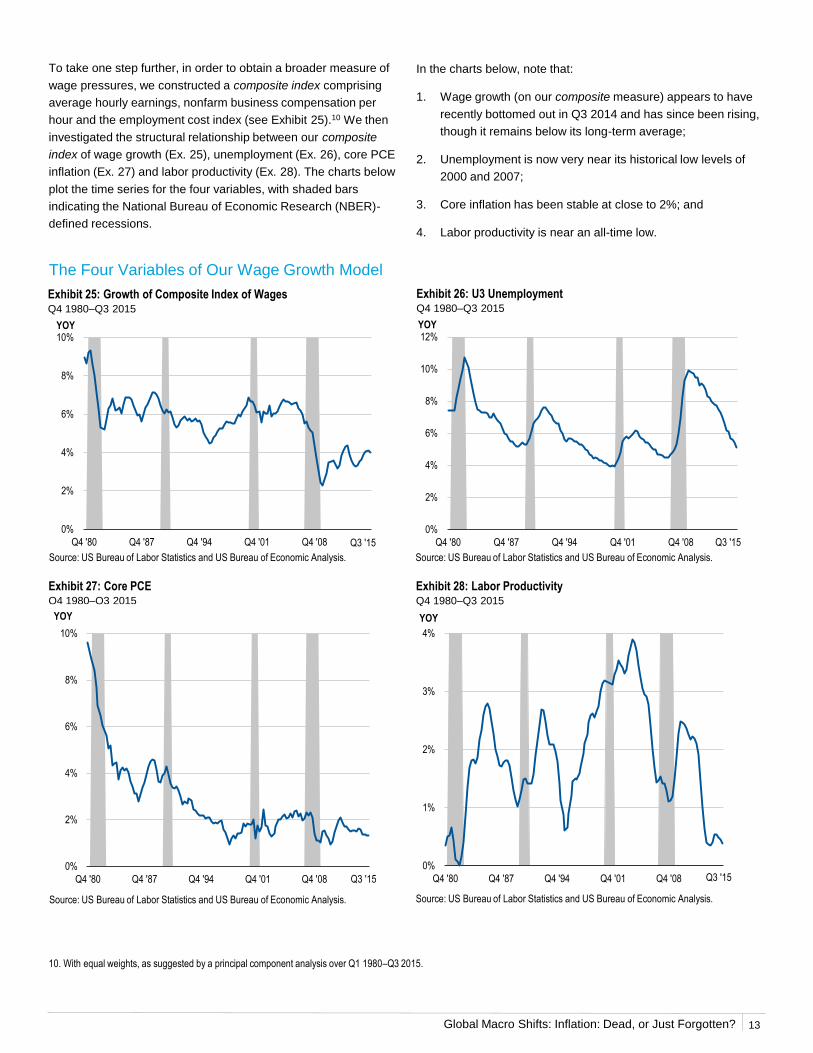
To take one step further, in order to obtain a broader measure of
wage pressures, we constructed a composite index comprising
average hourly earnings, nonfarm business compensation per
hour and the employment cost index (see Exhibit 25).10 We then
investigated the structural relationship between our composite
index of wage growth (Ex. 25), unemployment (Ex. 26), core PCE
inflation (Ex. 27) and labor productivity (Ex. 28). The charts below
plot the time series for the four variables, with shaded bars
indicating the National Bureau of Economic Research (NBER)-
defined recessions.
The Four Variables of Our Wage Growth Model
Source: US Bureau of Labor Statistics and US Bureau of Economic Analysis.
Exhibit 28: Labor Productivity Q4 1980–Q3 2015
Exhibit 27: Core PCEQ4 1980–Q3 2015
In the charts below, note that:
1. Wage growth (on our composite measure) appears to have
recently bottomed out in Q3 2014 and has since been rising,
though it remains below its long-term average;
2. Unemployment is now very near its historical low levels of
2000 and 2007;
3. Core inflation has been stable at close to 2%; and
4. Labor productivity is near an all-time low.
Exhibit 25: Growth of Composite Index of Wages Q4 1980–Q3 2015
Source: US Bureau of Labor Statistics and US Bureau of Economic Analysis.
Source: US Bureau of Labor Statistics and US Bureau of Economic Analysis. Source: US Bureau of Labor Statistics and US Bureau of Economic Analysis.
0
0.1
0.2
0.3
0.4
0.5
0.6
0.7
0.8
0.9
1
0%
2%
4%
6%
8%
10%
Q4 '80 Q4 '87 Q4 '94 Q4 '01 Q4 '08 Q3 '15
YOY
0
0.1
0.2
0.3
0.4
0.5
0.6
0.7
0.8
0.9
1
0%
2%
4%
6%
8%
10%
12%
Q4 '80 Q4 '87 Q4 '94 Q4 '01 Q4 '08 Q3 '15
YOY
0
0.1
0.2
0.3
0.4
0.5
0.6
0.7
0.8
0.9
1
0%
2%
4%
6%
8%
10%
Q4 '80 Q4 '87 Q4 '94 Q4 '01 Q4 '08 Q3 '15
YOY
0
0.1
0.2
0.3
0.4
0.5
0.6
0.7
0.8
0.9
1
0%
1%
2%
3%
4%
Q4 '80 Q4 '87 Q4 '94 Q4 '01 Q4 '08 Q3 '15
YOY
13
10. With equal weights, as suggested by a principal component analysis over Q1 1980–Q3 2015.
Global Macro Shifts: Inflation: Dead, or Just Forgotten?
We have estimated a model forecasting wage growth using our
composite measure, and based on unemployment, labor
productivity and PCE core inflation. The model suggests that
wage growth should be running near 2.7%, similar to the rate
predicted by the ECI. As wage pressures appear to have picked
up, we would expect wage growth to gradually close the gap with
the model’s predicted rates. Moreover, it seems likely that
productivity will eventually pick up from its current record-low
levels; this should give an additional boost to wage growth.
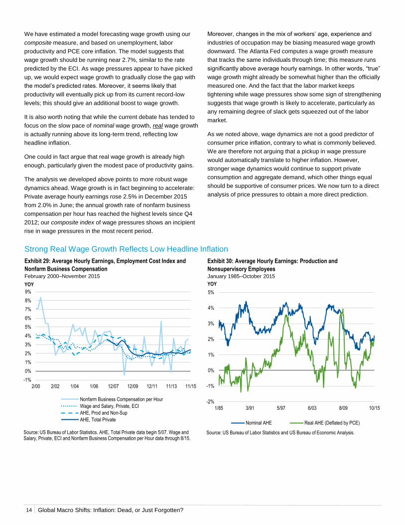
It is also worth noting that while the current debate has tended to
focus on the slow pace of nominal wage growth, real wage growth
is actually running above its long-term trend, reflecting low
headline inflation.
One could in fact argue that real wage growth is already high
enough, particularly given the modest pace of productivity gains.
The analysis we developed above points to more robust wage
dynamics ahead. Wage growth is in fact beginning to accelerate:
Private average hourly earnings rose 2.5% in December 2015
from 2.0% in June; the annual growth rate of nonfarm business
compensation per hour has reached the highest levels since Q4
2012; our composite index of wage pressures shows an incipient
rise in wage pressures in the most recent period.
14
Strong Real Wage Growth Reflects Low Headline Inflation
Source: US Bureau of Labor Statistics. AHE, Total Private data begin 5/07. Wage and Salary, Private, ECI and Nonfarm Business Compensation per Hour data through 8/15.
Source: US Bureau of Labor Statistics and US Bureau of Economic Analysis.
-2%
-1%
0%
1%
2%
3%
4%
5%
1/85 3/91 5/97 6/03 8/09 10/15
YOY
Nominal AHE Real AHE (Deflated by PCE)
Exhibit 30: Average Hourly Earnings: Production and
Nonsupervisory EmployeesJanuary 1985–October 2015
Exhibit 29: Average Hourly Earnings, Employment Cost Index and
Nonfarm Business CompensationFebruary 2000–November 2015
-1%
0%
1%
2%
3%
4%
5%
6%
7%
8%
9%
2/00 2/02 1/04 1/06 12/07 12/09 12/11 11/13 11/15
YOY
Nonfarm Business Compensation per Hour
Wage and Salary, Private, ECI
AHE, Prod and Non-Sup
AHE, Total Private
Moreover, changes in the mix of workers’ age, experience and
industries of occupation may be biasing measured wage growth
downward. The Atlanta Fed computes a wage growth measure
that tracks the same individuals through time; this measure runs
significantly above average hourly earnings. In other words, “true”
wage growth might already be somewhat higher than the officially
measured one. And the fact that the labor market keeps
tightening while wage pressures show some sign of strengthening
suggests that wage growth is likely to accelerate, particularly as
any remaining degree of slack gets squeezed out of the labor
market.
As we noted above, wage dynamics are not a good predictor of
consumer price inflation, contrary to what is commonly believed.
We are therefore not arguing that a pickup in wage pressure
would automatically translate to higher inflation. However,
stronger wage dynamics would continue to support private
consumption and aggregate demand, which other things equal
should be supportive of consumer prices. We now turn to a direct
analysis of price pressures to obtain a more direct prediction.
Global Macro Shifts: Inflation: Dead, or Just Forgotten? 15
The US Phillips Curve Has Steepened
Exhibit 31: Phillips CurvesQ1 1985–Q4 2015
Exhibit 32: Augmented Phillips CurvesQ1 1985–Q4 2015
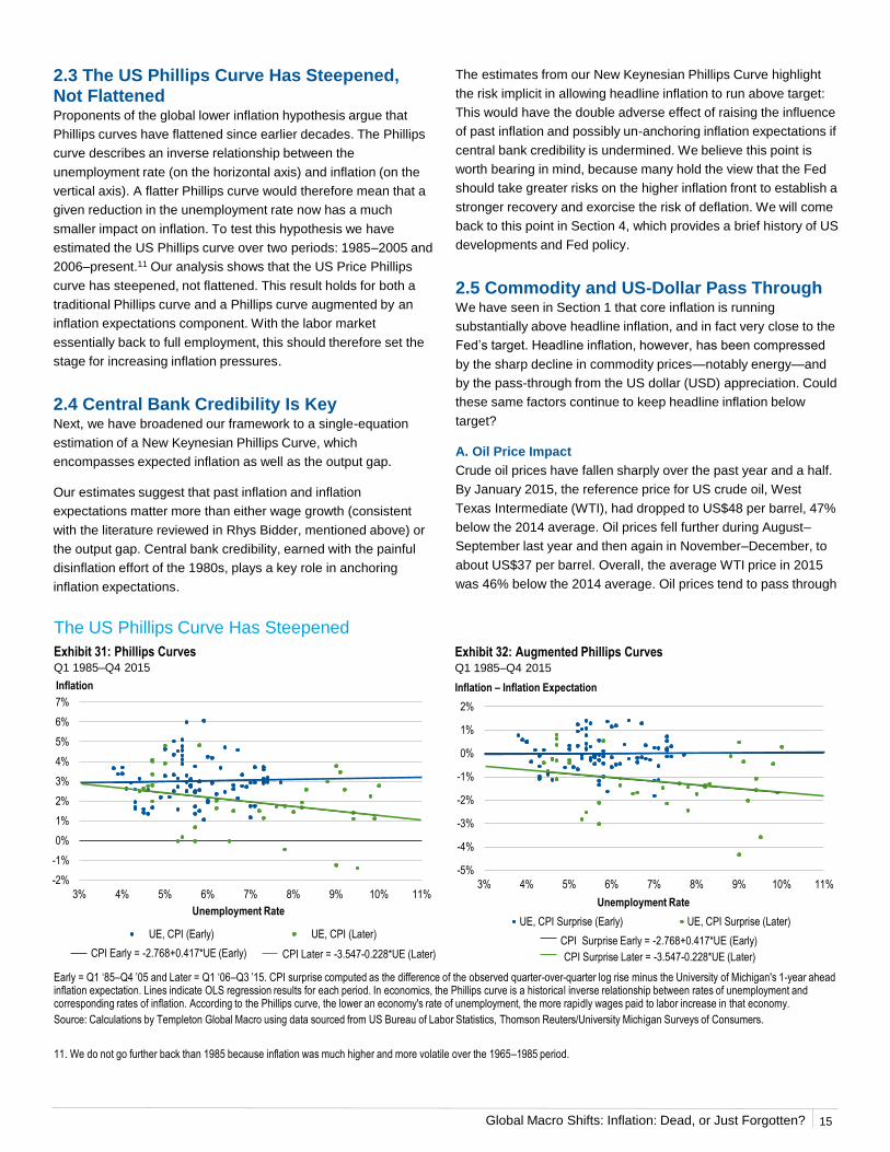
2.3 The US Phillips Curve Has Steepened, Not FlattenedProponents of the global lower inflation hypothesis argue that
Phillips curves have flattened since earlier decades. The Phillips
curve describes an inverse relationship between the
unemployment rate (on the horizontal axis) and inflation (on the
vertical axis). A flatter Phillips curve would therefore mean that a
given reduction in the unemployment rate now has a much
smaller impact on inflation. To test this hypothesis we have
estimated the US Phillips curve over two periods: 1985–2005 and
2006–present.11 Our analysis shows that the US Price Phillips
curve has steepened, not flattened. This result holds for both a
traditional Phillips curve and a Phillips curve augmented by an
inflation expectations component. With the labor market
essentially back to full employment, this should therefore set the
stage for increasing inflation pressures.
2.4 Central Bank Credibility Is KeyNext, we have broadened our framework to a single-equation
estimation of a New Keynesian Phillips Curve, which
encompasses expected inflation as well as the output gap.
Our estimates suggest that past inflation and inflation
expectations matter more than either wage growth (consistent
with the literature reviewed in Rhys Bidder, mentioned above) or
the output gap. Central bank credibility, earned with the painful
disinflation effort of the 1980s, plays a key role in anchoring
inflation expectations.
11. We do not go further back than 1985 because inflation was much higher and more volatile over the 1965–1985 period.
The estimates from our New Keynesian Phillips Curve highlight
the risk implicit in allowing headline inflation to run above target:
This would have the double adverse effect of raising the influence
of past inflation and possibly un-anchoring inflation expectations if
central bank credibility is undermined. We believe this point is
worth bearing in mind, because many hold the view that the Fed
should take greater risks on the higher inflation front to establish a
stronger recovery and exorcise the risk of deflation. We will come
back to this point in Section 4, which provides a brief history of US
developments and Fed policy.
2.5 Commodity and US-Dollar Pass ThroughWe have seen in Section 1 that core inflation is running
substantially above headline inflation, and in fact very close to the
Fed’s target. Headline inflation, however, has been compressed
by the sharp decline in commodity prices—notably energy—and
by the pass-through from the US dollar (USD) appreciation. Could
these same factors continue to keep headline inflation below
target?
A. Oil Price Impact
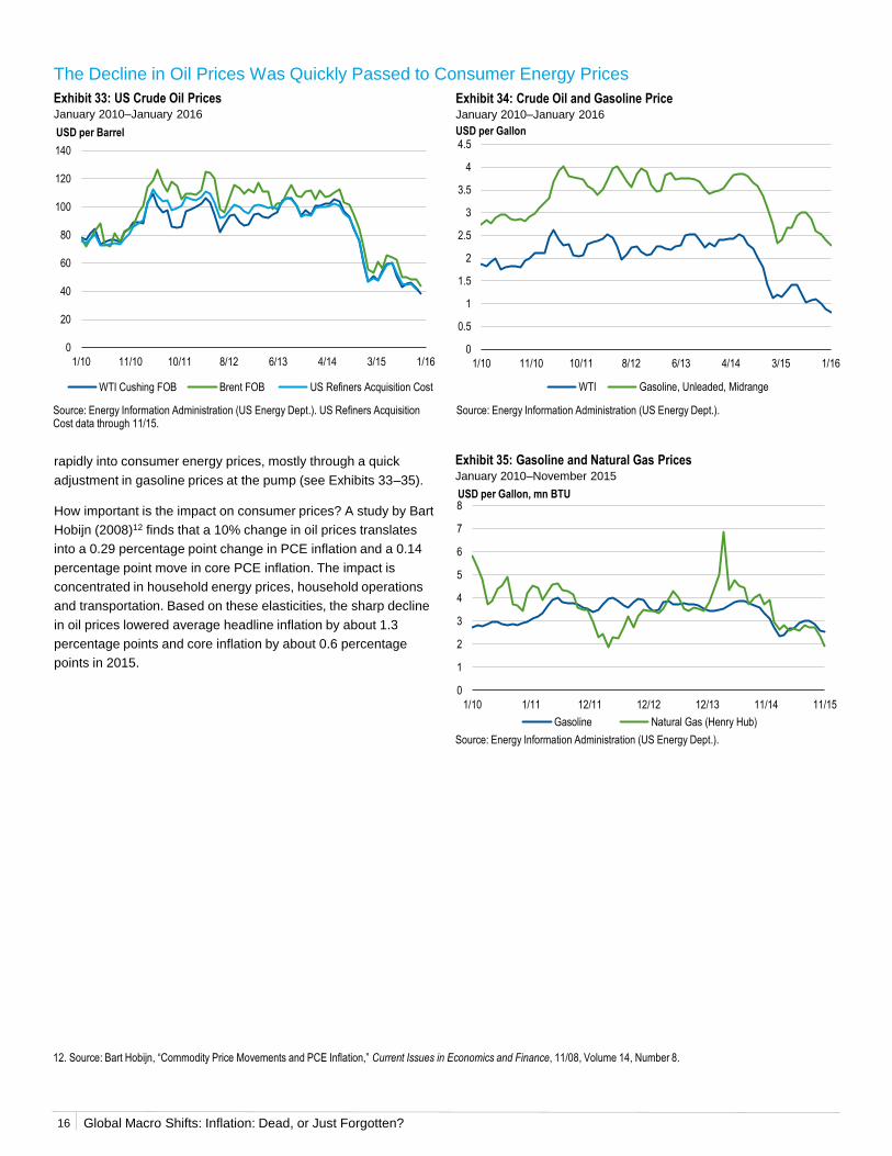
Crude oil prices have fallen sharply over the past year and a half.
By January 2015, the reference price for US crude oil, West
Texas Intermediate (WTI), had dropped to US$48 per barrel, 47%
below the 2014 average. Oil prices fell further during August–
September last year and then again in November–December, to
about US$37 per barrel. Overall, the average WTI price in 2015
was 46% below the 2014 average. Oil prices tend to pass through
-2%
-1%
0%
1%
2%
3%
4%
5%
6%
7%
3% 4% 5% 6% 7% 8% 9% 10% 11%
UE, CPI (Early) UE, CPI (Later)
----- CPI Early = -2.768+0.417*UE (Early)
Inflation
Unemployment Rate
----- CPI Later = -3.547-0.228*UE (Later)
-5%
-4%
-3%
-2%
-1%
0%
1%
2%
3% 4% 5% 6% 7% 8% 9% 10% 11%
UE, CPI Surprise (Early) UE, CPI Surprise (Later)
Inflation – Inflation Expectation
Unemployment Rate
----- CPI Surprise Early = -2.768+0.417*UE (Early)
----- CPI Surprise Later = -3.547-0.228*UE (Later)
Early = Q1 ‘85–Q4 ’05 and Later = Q1 ‘06–Q3 ’15. CPI surprise computed as the difference of the observed quarter-over-quarter log rise minus the University of Michigan's 1-year ahead inflation expectation. Lines indicate OLS regression results for each period. In economics, the Phillips curve is a historical inverse relationship between rates of unemployment and corresponding rates of inflation. According to the Phillips curve, the lower an economy's rate of unemployment, the more rapidly wages paid to labor increase in that economy.
Source: Calculations by Templeton Global Macro using data sourced from US Bureau of Labor Statistics, Thomson Reuters/University Michigan Surveys of Consumers.
Global Macro Shifts: Inflation: Dead, or Just Forgotten?16
rapidly into consumer energy prices, mostly through a quick
adjustment in gasoline prices at the pump (see Exhibits 33–35).
How important is the impact on consumer prices? A study by Bart
Hobijn (2008)12 finds that a 10% change in oil prices translates
into a 0.29 percentage point change in PCE inflation and a 0.14
percentage point move in core PCE inflation. The impact is
concentrated in household energy prices, household operations
and transportation. Based on these elasticities, the sharp decline
in oil prices lowered average headline inflation by about 1.3
percentage points and core inflation by about 0.6 percentage
points in 2015.
The Decline in Oil Prices Was Quickly Passed to Consumer Energy Prices
Exhibit 33: US Crude Oil PricesJanuary 2010–January 2016
Exhibit 34: Crude Oil and Gasoline PriceJanuary 2010–January 2016
Source: Energy Information Administration (US Energy Dept.). US Refiners Acquisition Cost data through 11/15.
Source: Energy Information Administration (US Energy Dept.).
Exhibit 35: Gasoline and Natural Gas PricesJanuary 2010–November 2015
Source: Energy Information Administration (US Energy Dept.).
12. Source: Bart Hobijn, “Commodity Price Movements and PCE Inflation,” Current Issues in Economics and Finance, 11/08, Volume 14, Number 8.
0
20
40
60
80
100
120
140
1/10 11/10 10/11 8/12 6/13 4/14 3/15 1/16
USD per Barrel
WTI Cushing FOB Brent FOB US Refiners Acquisition Cost
0
1
2
3
4
5
6
7
8
1/10 1/11 12/11 12/12 12/13 11/14 11/15
Gasoline Natural Gas (Henry Hub)
USD per Gallon, mn BTU
0
0.5
1
1.5
2
2.5
3
3.5
4
4.5
1/10 11/10 10/11 8/12 6/13 4/14 3/15 1/16
WTI Gasoline, Unleaded, Midrange
USD per Gallon
Global Macro Shifts: Inflation: Dead, or Just Forgotten? 17
The impact of a one-off decline in oil prices on inflation is
temporary: If oil prices stabilize at a higher level, the base effects
disappear, and the impact on consumer inflation fades away as
consumer prices also stabilize at a higher level.
Oil prices, however, fell further in January 2016, with WTI trading
as low as US$30 per barrel at the time of writing. If prices were to
remain at this lower level through 2016, the average oil price for
2016 would be 38% lower than the 2015 average. This would
lower average headline inflation by 1.1 percentage points and
core inflation by 0.5 percentage points this year (see
Exhibit 38).
Headline Inflation Declined with Energy Prices while Core Inflation Remained Stable
Exhibit 36: US: Headline Inflation and Energy PricesJanuary 2007–December 2015
Exhibit 37: US: PCE Core Inflation and Energy PricesJanuary 2007–December 2015
Source: US Bureau of Economic Analysis and US Bureau of Labor Statistics. Headline data through 11/15.
Source: US Bureau of Economic Analysis and US Bureau of Labor Statistics. Core data through 11/15.
We think the latest decline in oil prices to US$30 per barrel is
likely to be an overshoot. It seems to have been driven in part by
fears of a deeper downturn in China’s economy, which we believe
will turn out to be unjustified, for reasons we have discussed in
detail in a previous edition of Global Macro Shifts. We continue to
believe that as the oil market finds a new equilibrium, healthy
global growth will eventually drive a recovery in oil prices,
reversing some of the current disinflationary impact. If, for
example, by February 2016 WTI were to revert to the November
2015 level of about US$42 per barrel—before the latest wave of
China-driven concerns—and remain at that level for the
remainder of the year, the negative impact on average headline
inflation would be less than 0.5 percentage points and on core
inflation just 0.2 percentage points.
Should oil prices remain closer to US$30 per barrel for part of
2016, the eventual recovery in prices would be delayed but would
also probably be sharper, starting from a lower base (as lower
prices would have a stronger adverse impact on investment and
supply).13 In the analysis above we have described the impact of
oil prices on PCE inflation. Assuming a similar impact on CPI
inflation, at the end of this section, we will demonstrate the impact
of US$30 oil on our forecast for inflation this year (Exhibit 41). In
conclusion, we would note that any oil price forecast is subject to
a high margin of uncertainty, but given how far and how fast
prices have fallen, inflation risks from oil seem increasingly tilted
to the upside.
Potential Impact of Today’s Low Oil Prices on Inflation
Exhibit 38
As of January 2016
Source: Calculations by Templeton Global Macro using data sourced from Bloomberg.
-3%
-2%
-1%
0%
1%
2%
3%
4%
5%
1/07 2/08 4/09 5/10 7/11 8/12 9/13 11/14 12/15
YOY
Headline % Points Contribution to Headline from Crude Petroleum
-1.5%
-1.0%
-0.5%
0.0%
0.5%
1.0%
1.5%
2.0%
2.5%
3.0%
1/07 2/08 4/09 5/10 7/11 8/12 9/13 11/14 12/15
YOY
Core % Points Contribution to Core from Crude Petroleum
Headline 2015 Headline 2016 Core 2015 Core 2016
Inflation Impact
Year-End -0.88% -0.52% -0.43% -0.25%
Average -1.31% -1.08% -0.63% -0.52%
2015 2016
Oil Price Change
Year-End -30% -18%
Average -46% -38%
13. We would note that the International Energy Agency (IEA), in its latest World Energy Outlook, expects the oil price will recover to about US$80 per barrel by 2020 in its central scenario.
Global Macro Shifts: Inflation: Dead, or Just Forgotten?18
B. US Dollar Impact
The nominal broad dollar index appreciated by 18.1% between
July 2014 and December 2015, and the real dollar index by
15.8%. The pass-through from the exchange rate into non-fuel
import prices is estimated at about 40%;14 this implies a reduction
in non-fuel import prices on the order of 4.8%–6.2%. How much of
an impact would that have on the overall CPI? The US is a
relatively closed economy: Total gross merchandise imports of
consumer goods, automotive, industrial supplies and food
account for just 13% of total consumption; therefore, a reduction
in non-fuel import prices of 6.2% (the top end of our pass-through
estimate) would lower CPI inflation by less than 0.8 percentage
points, with most of the impact playing out within a year.
Now note that between July 2014 and October 2015, non-fuel
import prices fell 3.8%, implying that about 60% of our maximum
estimated impact from past appreciation has already played out.
The question is how much further dollar appreciation still lies
ahead of us. The real USD currently trades 4.2% above its long-
term average against major trading partners and 14% above its
long-term average against its trade weighted basket, suggesting it
is already overvalued in real terms. As the Fed has embarked on
a tightening cycle while the ECB and the Bank of Japan (BOJ) are
still in easing mode, we are likely to see further dollar appreciation
in 2016; the appreciation, however, is likely to be significantly
more limited than we have seen so far, and more concentrated
against specific currencies. This would have a much smaller
impact on overall CPI inflation. For example, if the USD were to
reach parity against the euro from its current 1.09 level, this would
lower CPI inflation by just 0.1 percentage points; similarly, a 10%
USD appreciation against China’s yuan (CNY) would lower CPI
inflation by 0.1 percentage points.
In sum, any further drag on inflation from USD appreciation
seems likely to be minimal, whereas the base effects from
commodity prices are already getting less intense and will
gradually reverse, pushing headline inflation back toward core.
Indeed, if oil prices have now undershot long-term equilibrium
levels, there is an increasing risk that an eventual rebound could
push both headline and core inflation significantly above policy
targets.
2.6 Where Is US Inflation Headed?The analysis developed above indicates that US headline inflation
will pick up as the disinflationary impact of commodities fades,
and that additional USD appreciation is likely to exercise only a
minimal negative effect on price pressures. To get a more precise
forecast of how quickly inflation is likely to rise, we tested seven
different alternative specifications of a Phillips curve relationship.
The right hand side of the models included combinations of the
current quarterly inflation rate, the overall U3 unemployment rate,
and 1- and 10-year ahead inflation forecasts from the Philadelphia
Fed Survey of Professional Forecasters.
We chose the best forecasting model by minimizing the root mean
squared error of the forecasts compared to the realized values of
inflation. We found that the best-performing specification included
the current unemployment level, the current inflation rate, and
both the 1- and 10-year ahead inflation expectations models.
Using our preferred specification to forecast the four-quarters
ahead inflation rate, we project that, based on current
fundamentals, headline CPI inflation should be greater than 2%
by end-2016—significantly sooner than both the Fed’s and the
The Strengthening US Dollar Has Had Only a Modest Effect on Import Prices ex Fuel
Exhibit 39: Broad Dollar and Terms of TradeJanuary 1990–November 2015
Exhibit 40: Import Prices and the USDJanuary 2014–November 2015
Source: US Federal Reserve and US Bureau of Labor Statistics. (-1) *Import Price Inflation ex Fuels data begin 12/02.
Source: US Federal Reserve and US Bureau of Labor Statistics.
14. Source: Diego Valderrama, “Does a Fall in the Dollar Mean Higher US Consumer Prices?”, Federal Reserve Bank of San Francisco Economic Letter, 8/04; and Giovanni P. Olivei, “Exchange Rates and the Prices of Manufacturing Products Imported into the United States,” New England Economic Review, 2002.
-15%
-10%
-5%
0%
5%
10%
15%
20%
1/90 3/95 5/00 7/05 9/10 11/15
YOY
Terms of Trade Nominal Broad Dollar(-1) *Import Price Inflation ex Fuels
-2%
0%
2%
4%
6%
8%
10%
12%
14%
16%
18%
1/14 8/14 4/15 11/15
Import Prices (-1*) Ex Fuels (-1*)Nominal Broad Dollar Real Broad Dollar
Cumulative Log % Change since 1/14
Global Macro Shifts: Inflation: Dead, or Just Forgotten?
To summarize, the analysis we developed in this section reveals
that:
1. Wage growth is generally a poor predictor of inflation. The
puzzle of subdued wage growth in the face of a tightening
labor market might therefore be a moot point. Still, a closer
look at a broader set of wage indicators suggests an incipient
strengthening in wage pressures, with the attendant positive
impact on aggregate demand.
2. We find that the US Phillips curve has steepened since 2005,
not flattened. With the labor market close to full employment
and tightening further, this points to stronger inflation
pressures ahead.
3. We estimate that further USD appreciation is likely to exert
only a modest negative impact on headline inflation, as the
dollar is already overvalued and about 60% of the impact of
its appreciation to date has already passed through into
consumer prices.
4. Our estimates based on a New Keynesian Phillips Curve
suggest that past inflation and inflation expectations matter
more than either wage growth or the output gap. This
underscores the importance of hard-earned central bank
credibility, and the risks that losing such credibility would
entail.
In the next section we tackle another important element of the
picture: the monetary overhang created by several years of QE in
G3 economies.
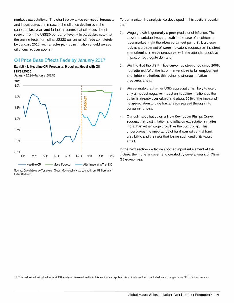
market’s expectations. The chart below takes our model forecasts
and incorporates the impact of the oil price decline over the
course of last year, and further assumes that oil prices do not
recover from the US$30 per barrel level.15 In particular, note that
the base effects from oil at US$30 per barrel will fade completely
by January 2017, with a faster pick-up in inflation should we see
oil prices recover sooner.
15. This is done following the Hobijn (2008) analysis discussed earlier in this section, and applying his estimates of the impact of oil price changes to our CPI inflation forecasts.
Oil Price Base Effects Fade by January 2017
Exhibit 41: Headline CPI Forecasts: Model vs. Model with Oil
Price EffectJanuary 2014–January 2017E
Source: Calculations by Templeton Global Macro using data sourced from US Bureau of Labor Statistics.
-0.5%
0.0%
0.5%
1.0%
1.5%
2.0%
2.5%
1/14 6/14 10/14 3/15 7/15 12/15 4/16 8/16 1/17
YOY
Headline CPI Model Forecast With Impact of WTI at $30
FO
RE
CA
ST
19

Global Macro Shifts: Inflation: Dead, or Just Forgotten?
Eurozone Japan US
Monetary Multiplier (Broad Money/Monetary Base)
Pre-2008 11.0 11.6 8.5
Whole Sample 9.6 10.1 6.5
Latest 7.6 3.8 3.0
Money Velocity (Nominal GDP/Broad Money)
Pre-2008 1.3 0.5 2.0
Whole Sample 1.2 0.5 1.8
Latest 1.0 0.4 1.5
% Change Multiplier (Log) -36% -112% -104%
% Change Velocity (Log) -28% -15% -29%
Total Potential Price Impact 64% 127% 133%
In the aftermath of the GFC, the Fed launched several rounds of
QE. Other major central banks, including the BOJ and the ECB
(as well as the Bank of England) also embarked on a substantial
expansion of their balance sheets. At the same time, both money
velocity (the ratio of nominal GDP to broad money) and the money
multiplier (the ratio of broad money to the monetary base)
declined sharply, reflecting sudden deleveraging and a freezing
up of the financial system. Indeed, the massive expansion of
central bank balance sheets was initially needed to counteract the
sudden contraction in the rest of the financial system.
The declines in velocity and the money multiplier have followed
somewhat different dynamics across the three economies. In the
case of the US, a visible drop in 2009 was followed by a further
gentler decline. In the eurozone, the money multiplier suffered a
second sudden drop at the time of the 2012 eurozone debt crisis,
followed by a partial recovery. In Japan, the money multiplier has
been driven to new lows by the acceleration in QE under
Abenomics. For all three countries, however, both velocity and the
money multiplier currently sit at significantly lower levels than prior
to the GFC (see Exhibit 44).
Source: Eurostat; European Central Bank; Cabinet Office, Japan; Bank of Japan; US Bureau of Economic Analysis; OECD Main Economic Indicators Database, accessed 1/16.
3. Money Velocity: The Ghost in the Machine
Money Velocity and Money Multipliers in the G3 Declined after the GFC
Exhibit 42: Money Velocity (Nominal GDP/Broad Money)March 2000–September 2015
Exhibit 43: Money Multiplier (Broad Money/Monetary Base)March 2000–September 2015
Source: European Central Bank; Bank of Japan; OECD Main Economic Indicators Database, accessed 1/16; US Federal Reserve.
Money Velocity and Money Multipliers Remain Below GFC Levels
Exhibit 44: Price RegressionAs of January 2016
Source: Calculations by Templeton Global Macro using data sourced from European Central Bank; Bank of Japan; OECD Main Economic Indicators Database, accessed 1/16; US Federal Reserve.
0.0
0.5
1.0
1.5
2.0
2.5
3/00 6/03 10/06 1/10 5/13
Times
Eurozone Money Velocity Japan Money VelocityUS Money Velocity
9/15
0.0
2.0
4.0
6.0
8.0
10.0
12.0
14.0
16.0
18.0
20.0
3/00 6/03 10/06 1/10 5/13
Times
Eurozone Money Multiplier Japan Money MultiplierUS Money Multiplier
9/15
20
Global Macro Shifts: Inflation: Dead, or Just Forgotten?
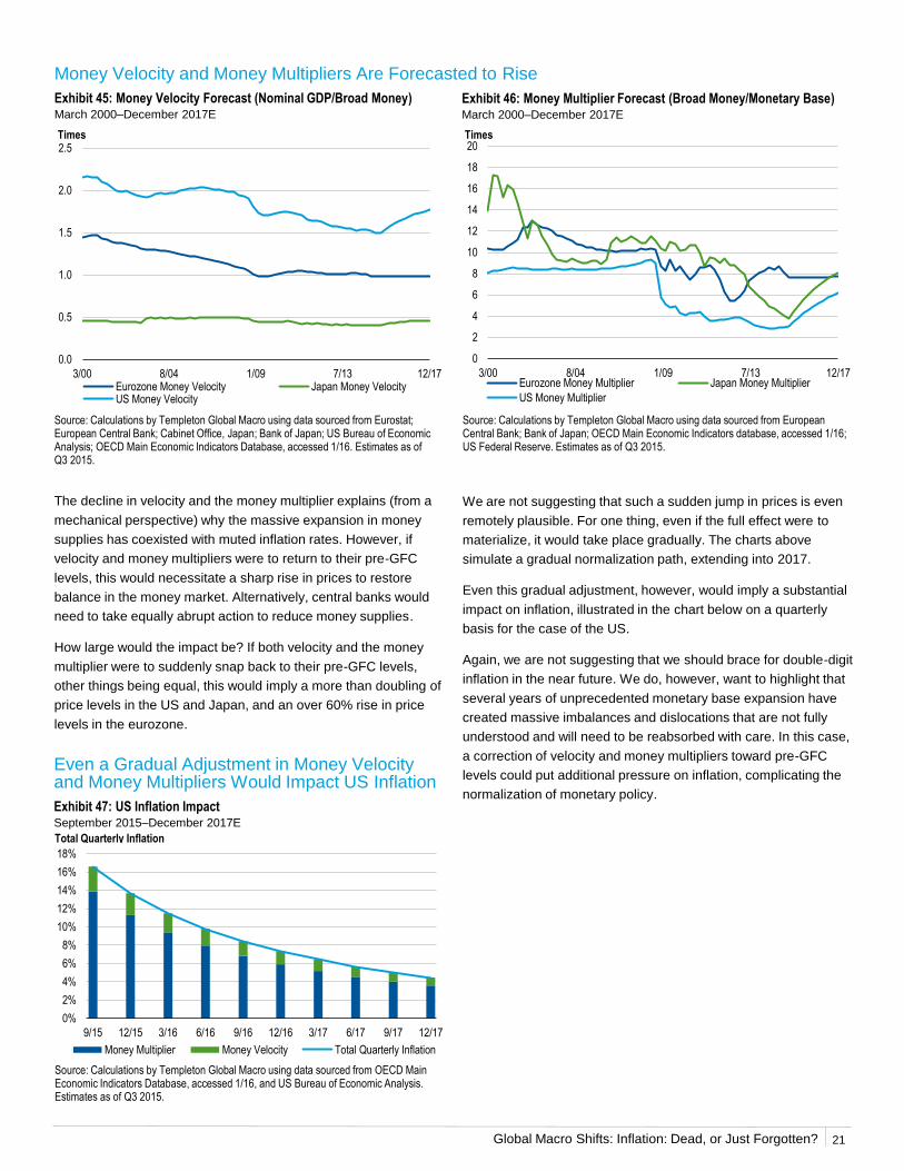
The decline in velocity and the money multiplier explains (from a
mechanical perspective) why the massive expansion in money
supplies has coexisted with muted inflation rates. However, if
velocity and money multipliers were to return to their pre-GFC
levels, this would necessitate a sharp rise in prices to restore
balance in the money market. Alternatively, central banks would
need to take equally abrupt action to reduce money supplies.
How large would the impact be? If both velocity and the money
multiplier were to suddenly snap back to their pre-GFC levels,
other things being equal, this would imply a more than doubling of
price levels in the US and Japan, and an over 60% rise in price
levels in the eurozone.
Source: Calculations by Templeton Global Macro using data sourced from Eurostat; European Central Bank; Cabinet Office, Japan; Bank of Japan; US Bureau of Economic Analysis; OECD Main Economic Indicators Database, accessed 1/16. Estimates as of Q3 2015.
Money Velocity and Money Multipliers Are Forecasted to Rise
Exhibit 45: Money Velocity Forecast (Nominal GDP/Broad Money)March 2000–December 2017E
Exhibit 46: Money Multiplier Forecast (Broad Money/Monetary Base)March 2000–December 2017E
Source: Calculations by Templeton Global Macro using data sourced from European Central Bank; Bank of Japan; OECD Main Economic Indicators database, accessed 1/16; US Federal Reserve. Estimates as of Q3 2015.
We are not suggesting that such a sudden jump in prices is even
remotely plausible. For one thing, even if the full effect were to
materialize, it would take place gradually. The charts above
simulate a gradual normalization path, extending into 2017.
Even this gradual adjustment, however, would imply a substantial
impact on inflation, illustrated in the chart below on a quarterly
basis for the case of the US.
Again, we are not suggesting that we should brace for double-digit
inflation in the near future. We do, however, want to highlight that
several years of unprecedented monetary base expansion have
created massive imbalances and dislocations that are not fully
understood and will need to be reabsorbed with care. In this case,
a correction of velocity and money multipliers toward pre-GFC
levels could put additional pressure on inflation, complicating the
normalization of monetary policy.
Even a Gradual Adjustment in Money Velocity and Money Multipliers Would Impact US Inflation
Exhibit 47: US Inflation ImpactSeptember 2015–December 2017E
Source: Calculations by Templeton Global Macro using data sourced from OECD Main Economic Indicators Database, accessed 1/16, and US Bureau of Economic Analysis. Estimates as of Q3 2015.
0.0
0.5
1.0
1.5
2.0
2.5
3/00 8/04 1/09 7/13 12/17
Times
Eurozone Money Velocity Japan Money VelocityUS Money Velocity
0
2
4
6
8
10
12
14
16
18
20
3/00 8/04 1/09 7/13 12/17
Times
Eurozone Money Multiplier Japan Money Multiplier
US Money Multiplier
0%
2%
4%
6%
8%
10%
12%
14%
16%
18%
9/15 12/15 3/16 6/16 9/16 12/16 3/17 6/17 9/17 12/17
Money Multiplier Money Velocity Total Quarterly Inflation
Total Quarterly Inflation
21
Global Macro Shifts: Inflation: Dead, or Just Forgotten?
New Normal and Secular Stagnation—the catchphrases that have
dominated the economic debate in the last few years suggest that
we have entered a new state of the world, unlike anything that we
have experienced before, and that it is destined to last a very long
time. Slower US economic growth is considered by some
inevitable, a fait accompli. And to younger generations of financial
market participants, the idea of high inflation in advanced
economies must seem quaint, a reference to something they
might have heard about but have never experienced. After all, the
GFC came on the heels of the Great Moderation, which was also
characterized by low inflation rates in developed markets.
Forgetting the lessons of history carries risks. We think it is
useful, therefore, to provide a brief historical overview. The
purpose of this section is threefold: 1) to illustrate how the US has
already alternated between extended periods of low inflation and
extended periods of faster and stubborn price growth; 2) to
analyze the key drivers of previous bouts of high inflation, as well
as the strategies adopted and the costs involved in bringing
inflation back down to lower levels; and 3) to draw potential
lessons for the years ahead.
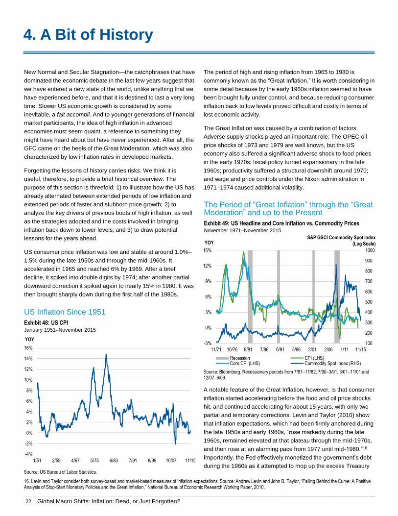
US consumer price inflation was low and stable at around 1.0%–
1.5% during the late 1950s and through the mid-1960s. It
accelerated in 1965 and reached 6% by 1969. After a brief
decline, it spiked into double digits by 1974; after another partial
downward correction it spiked again to nearly 15% in 1980. It was
then brought sharply down during the first half of the 1980s.
US Inflation Since 1951
Exhibit 48: US CPIJanuary 1951–November 2015
Source: US Bureau of Labor Statistics.
The period of high and rising inflation from 1965 to 1980 is
commonly known as the “Great Inflation.” It is worth considering in
some detail because by the early 1960s inflation seemed to have
been brought fully under control, and because reducing consumer
inflation back to low levels proved difficult and costly in terms of
lost economic activity.
The Great Inflation was caused by a combination of factors.
Adverse supply shocks played an important role: The OPEC oil
price shocks of 1973 and 1979 are well known, but the US
economy also suffered a significant adverse shock to food prices
in the early 1970s; fiscal policy turned expansionary in the late
1960s; productivity suffered a structural downshift around 1970;
and wage and price controls under the Nixon administration in
1971–1974 caused additional volatility.
The Period of “Great Inflation” through the “Great Moderation” and up to the Present
Exhibit 49: US Headline and Core Inflation vs. Commodity PricesNovember 1971–November 2015
Source: Bloomberg. Recessionary periods from 7/81–11/82, 7/90–3/91, 3/01–11/01 and 12/07–6/09.
4. A Bit of History
A notable feature of the Great Inflation, however, is that consumer
inflation started accelerating before the food and oil price shocks
hit, and continued accelerating for about 15 years, with only two
partial and temporary corrections. Levin and Taylor (2010) show
that inflation expectations, which had been firmly anchored during
the late 1950s and early 1960s, “rose markedly during the late
1960s, remained elevated at that plateau through the mid-1970s,
and then rose at an alarming pace from 1977 until mid-1980.”16
Importantly, the Fed effectively monetized the government’s debt
during the 1960s as it attempted to mop up the excess Treasury
16. Levin and Taylor consider both survey-based and market-based measures of inflation expectations. Source: Andrew Levin and John B. Taylor, “Falling Behind the Curve: A Positive Analysis of Stop-Start Monetary Policies and the Great Inflation,” National Bureau of Economic Research Working Paper, 2010.
-4%
-2%
0%
2%
4%
6%
8%
10%
12%
14%
16%
1/51 2/59 4/67 5/75 6/83 7/91 8/99 10/07 11/15
YOY100
200
300
400
500
600
700
800
900
1000
-3%
0%
3%
6%
9%
12%
15%
11/71 10/76 9/81 7/86 6/91 5/96 3/01 2/06 1/11 11/15
YOY
Recession CPI (LHS)Core CPI (LHS) Commodity Spot Index (RHS)
S&P GSCI Commodity Spot Index
(Log Scale)
22

Global Macro Shifts: Inflation: Dead, or Just Forgotten?
securities that were flooding the market as a result of President
Lyndon Johnson’s efforts to finance the Vietnam War.
Levin and Taylor show that the evolution of the CPI growth rate
during the Great Inflation is consistent with a Taylor rule, with the
Fed’s implicit inflation target rising by about 2 percentage points
on two separate occasions, in Q2 1970 and in Q1 1976. Levin and
Taylor note that these two break points are consistent with
anecdotal evidence of significant political pressure on then-Fed
Chairman Arthur Burns. Overt political pressure resulting in a
more expansionary monetary policy stance would have
persuaded the public that the Fed had a higher tolerance for
inflation, triggering a rise in inflation expectations.
As our New Keynesian Phillips Curve analysis in Section 2
showed, inflation expectations and past inflation play the greater
role in determining current inflation. The loss of Fed inflation-
fighting credibility would therefore emerge as a primary culprit for
the Great Inflation.
Blinder and Rudd (2013) offer a different reading, and argue that
adverse supply shocks played a significantly more important role
than expansionary monetary policy. Even under this
interpretation, however, the rise in inflation expectations would
seem to support the hypothesis that Fed credibility had been
undermined. The loss of credibility might well have been
exacerbated by the two Fed attempts to bring inflation back down,
as in both cases the tighter monetary stance was abandoned and
reversed before inflation had been brought fully under control,
showing that the Fed could not tolerate the reduction in the pace
of economic activity needed to tame inflation.
US monetary policy changed pace with the appointment of Paul
Volcker as Fed chairman in late 1979. The Fed changed
operating procedures and drove an unprecedented spike in the
fed funds rate and a wider range of short-term interest rates. This
time the Fed maintained a strongly disinflationary stance even as
the US economy contracted by nearly 2% in 1982. Long-term
inflation expectations started falling by late 1980, and inflation
came crashing down, from nearly 15% in March 1980 to 2.6% in
June 1983. Levin and Taylor also note that Chairman Volcker
received the open confidence of President Ronald Reagan,
underscoring the operational independence of the Fed.
What lessons should we draw from the experience of the Great
Inflation? First of all, we believe it highlights the dangers of
assuming that a structural shift has taken the inflation risk
permanently off the table. By 1964, low and stable inflation could
be taken for granted. A few years later, inflation was heading into
double-digit territory, driven by a combination of exogenous
shocks and policy mistakes.
US policymakers have already demonstrated their ability to learn
from past mistakes. The lessons of the Great Depression helped
guide the policy response to the GFC, with successful results.
Nonetheless, there is currently a chorus of influential voices
arguing that the Fed would do well to tolerate—if not explicitly
adopt—a higher inflation target, to support a faster recovery and
position itself at a safer distance from the zero bound for interest
rates. At the same time, the collapse in commodity prices has
increased the risk of adverse supply shocks.
We believe a combination of adverse shocks and policy mistakes
comparable to that of the late 1960s and 1970s is very unlikely. A
more moderate version of it, however, is not totally implausible.
Even after the first fed funds hike last December, the Fed
maintains an extraordinarily loose monetary policy stance while
GDP growth is running above potential and the labor market is
close to full employment. Many influential voices are urging the
Fed to proceed with extreme caution. The December FOMC
statement still indicates “The federal funds rate is likely to remain,
for some time, below levels that are expected to prevail in the
longer run.” Taken at face value, this statement flags a risk that
the Fed will consciously place itself behind the curve, even as the
same statement shows the FOMC is aware that an excessive
delay in policy normalization could require a more abrupt and
possibly contractionary policy response later on.
The Fed is tackling a difficult policy normalization challenge in a
highly uncertain environment. At the moment, however, FOMC
statements indicate that the Fed may want to see a clear pickup
in headline inflation before it steps up the policy tightening pace.
Given that monetary policy acts with a lag, in our opinion this
suggests that if the US recovery remains on track, risks to
inflation will tilt to the upside in 2016—based also on the analysis
we have developed in previous sections.
23
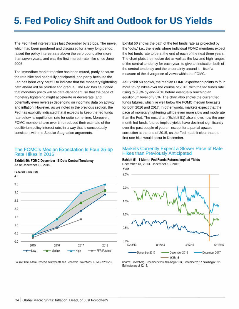
Global Macro Shifts: Inflation: Dead, or Just Forgotten?
0.0
0.5
1.0
1.5
2.0
2.5
3.0
3.5
4.0
2015 2016 2017 2018
Low Median High FFR Futures
Federal Funds Rate
0.0%
0.5%
1.0%
1.5%
2.0%
2.5%
12/13/13 8/15/14 4/17/15 12/18/15
Yield
December 2015 December 2016 December 2017
9/25/15
The Fed hiked interest rates last December by 25 bps. The move,
which had been pondered and discussed for a very long period,
raised the policy interest rate above the zero bound after more
than seven years, and was the first interest-rate hike since June
2006.
The immediate market reaction has been muted, partly because
the rate hike had been fully anticipated, and partly because the
Fed has been very careful to indicate that the monetary tightening
path ahead will be prudent and gradual. The Fed has cautioned
that monetary policy will be data-dependent, so that the pace of
monetary tightening might accelerate or decelerate (and
potentially even reverse) depending on incoming data on activity
and inflation. However, as we noted in the previous section, the
Fed has explicitly indicated that it expects to keep the fed funds
rate below its equilibrium rate for quite some time. Moreover,
FOMC members have over time reduced their estimate of the
equilibrium policy interest rate, in a way that is conceptually
consistent with the Secular Stagnation arguments.
Exhibit 50 shows the path of the fed funds rate as projected by
the “dots,” i.e., the levels where individual FOMC members expect
the fed funds rate to be at the end of each of the next three years.
The chart plots the median dot as well as the low and high ranges
of the central tendency for each year, to give an indication both of
the central tendency and the uncertainty around it—itself a
measure of the divergence of views within the FOMC.
As Exhibit 50 shows, the median FOMC expectation points to four
more 25-bp hikes over the course of 2016, with the fed funds rate
rising to 3.3% by end-2018 before eventually reaching an
equilibrium level of 3.5%. The chart also shows the current fed
funds futures, which lie well below the FOMC median forecasts
for both 2016 and 2017. In other words, markets expect that the
pace of monetary tightening will be even more slow and moderate
than the Fed. The next chart (Exhibit 51) also shows how the one-
month fed funds futures implied yields have declined significantly
over the past couple of years—except for a partial upward
correction at the end of 2015, as the Fed made it clear that the
first rate hike would occur in December.
Source: US Federal Reserve Statements and Economic Projections, FOMC, 12/16/15.
The FOMC’s Median Expectation Is Four 25-bp Rate Hikes in 2016
Exhibit 50: FOMC December 16 Dots Central TendencyAs of December 16, 2015
5. Fed Policy Shift and Outlook for US Yields
Markets Currently Expect a Slower Pace of Rate Hikes than Previously Anticipated
Exhibit 51: 1-Month Fed Funds Futures Implied YieldsDecember 13, 2013–December 18, 2015
Source: Bloomberg. December 2016 data begin 1/14, December 2017 data begin 1/15. Estimates as of 12/15.
24
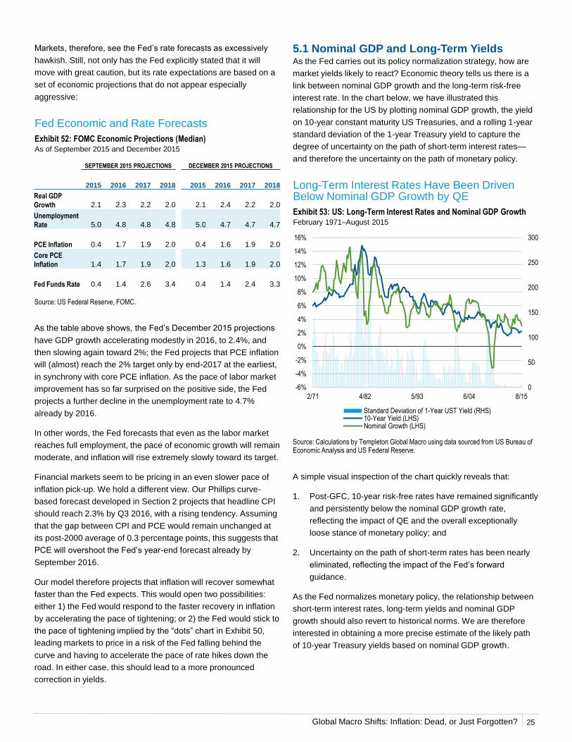
Global Macro Shifts: Inflation: Dead, or Just Forgotten?
As the table above shows, the Fed’s December 2015 projections
have GDP growth accelerating modestly in 2016, to 2.4%, and
then slowing again toward 2%; the Fed projects that PCE inflation
will (almost) reach the 2% target only by end-2017 at the earliest,
in synchrony with core PCE inflation. As the pace of labor market
improvement has so far surprised on the positive side, the Fed
projects a further decline in the unemployment rate to 4.7%
already by 2016.
In other words, the Fed forecasts that even as the labor market
reaches full employment, the pace of economic growth will remain
moderate, and inflation will rise extremely slowly toward its target.
Financial markets seem to be pricing in an even slower pace of
inflation pick-up. We hold a different view. Our Phillips curve-
based forecast developed in Section 2 projects that headline CPI
should reach 2.3% by Q3 2016, with a rising tendency. Assuming
that the gap between CPI and PCE would remain unchanged at
its post-2000 average of 0.3 percentage points, this suggests that
PCE will overshoot the Fed’s year-end forecast already by
September 2016.
Our model therefore projects that inflation will recover somewhat
faster than the Fed expects. This would open two possibilities:
either 1) the Fed would respond to the faster recovery in inflation
by accelerating the pace of tightening; or 2) the Fed would stick to
the pace of tightening implied by the “dots” chart in Exhibit 50,
leading markets to price in a risk of the Fed falling behind the
curve and having to accelerate the pace of rate hikes down the
road. In either case, this should lead to a more pronounced
correction in yields.
Markets, therefore, see the Fed’s rate forecasts as excessively
hawkish. Still, not only has the Fed explicitly stated that it will
move with great caution, but its rate expectations are based on a
set of economic projections that do not appear especially
aggressive:
Source: US Federal Reserve, FOMC.
Fed Economic and Rate Forecasts
Exhibit 52: FOMC Economic Projections (Median)As of September 2015 and December 2015
5.1 Nominal GDP and Long-Term YieldsAs the Fed carries out its policy normalization strategy, how are
market yields likely to react? Economic theory tells us there is a
link between nominal GDP growth and the long-term risk-free
interest rate. In the chart below, we have illustrated this
relationship for the US by plotting nominal GDP growth, the yield
on 10-year constant maturity US Treasuries, and a rolling 1-year
standard deviation of the 1-year Treasury yield to capture the
degree of uncertainty on the path of short-term interest rates—
and therefore the uncertainty on the path of monetary policy.
Source: Calculations by Templeton Global Macro using data sourced from US Bureau of Economic Analysis and US Federal Reserve.
A simple visual inspection of the chart quickly reveals that:
1. Post-GFC, 10-year risk-free rates have remained significantly
and persistently below the nominal GDP growth rate,
reflecting the impact of QE and the overall exceptionally
loose stance of monetary policy; and
2. Uncertainty on the path of short-term rates has been nearly
eliminated, reflecting the impact of the Fed’s forward
guidance.
As the Fed normalizes monetary policy, the relationship between
short-term interest rates, long-term yields and nominal GDP
growth should also revert to historical norms. We are therefore
interested in obtaining a more precise estimate of the likely path
of 10-year Treasury yields based on nominal GDP growth.
0
50
100
150
200
250
300
-6%
-4%
-2%
0%
2%
4%
6%
8%
10%
12%
14%
16%
2/71 4/82 5/93 6/04 8/15
Standard Deviation of 1-Year UST Yield (RHS)10-Year Yield (LHS)Nominal Growth (LHS)
Long-Term Interest Rates Have Been Driven Below Nominal GDP Growth by QE
Exhibit 53: US: Long-Term Interest Rates and Nominal GDP GrowthFebruary 1971–August 2015
SEPTEMBER 2015 PROJECTIONS DECEMBER 2015 PROJECTIONS
2015 2016 2017 2018 2015 2016 2017 2018
Real GDP
Growth 2.1 2.3 2.2 2.0 2.1 2.4 2.2 2.0
Unemployment
Rate 5.0 4.8 4.8 4.8 5.0 4.7 4.7 4.7
PCE Inflation 0.4 1.7 1.9 2.0 0.4 1.6 1.9 2.0
Core PCE
Inflation 1.4 1.7 1.9 2.0 1.3 1.6 1.9 2.0
Fed Funds Rate 0.4 1.4 2.6 3.4 0.4 1.4 2.4 3.3
25
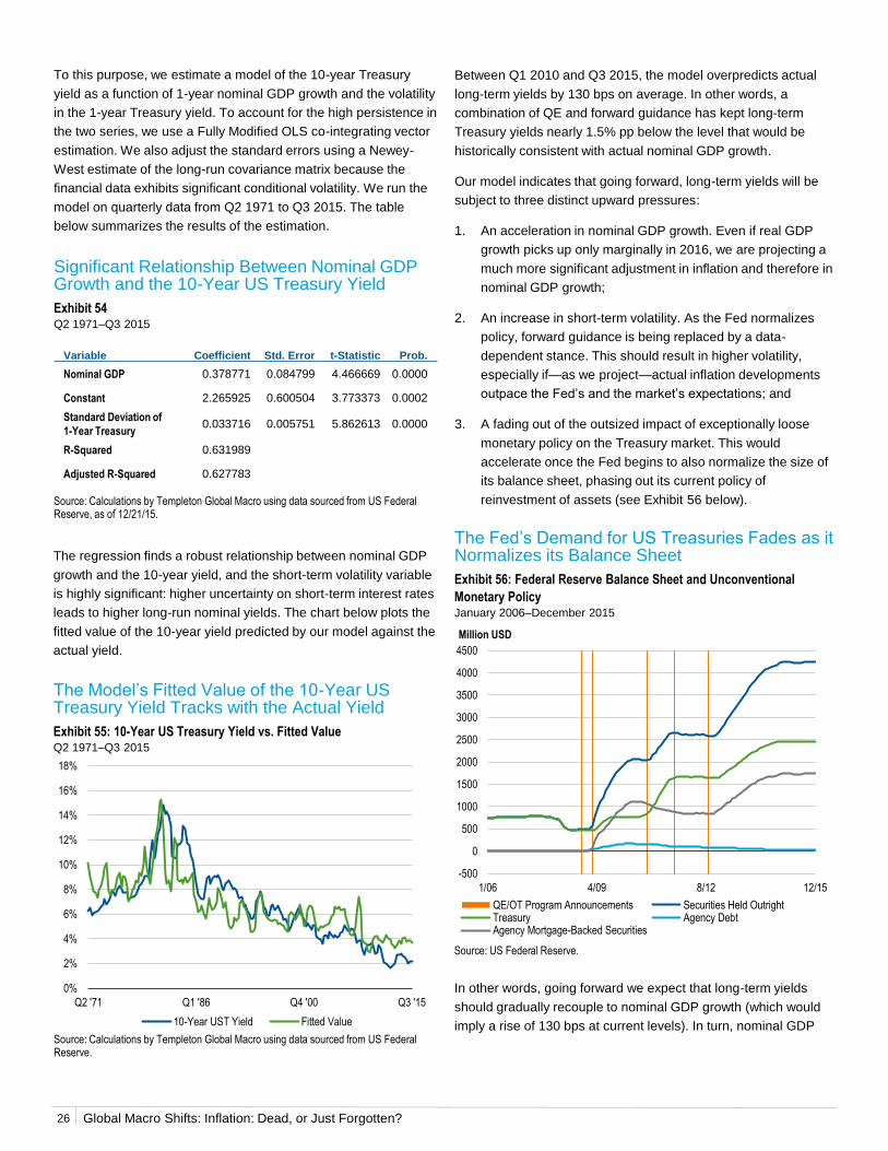
Global Macro Shifts: Inflation: Dead, or Just Forgotten?
To this purpose, we estimate a model of the 10-year Treasury
yield as a function of 1-year nominal GDP growth and the volatility
in the 1-year Treasury yield. To account for the high persistence in
the two series, we use a Fully Modified OLS co-integrating vector
estimation. We also adjust the standard errors using a Newey-
West estimate of the long-run covariance matrix because the
financial data exhibits significant conditional volatility. We run the
model on quarterly data from Q2 1971 to Q3 2015. The table
below summarizes the results of the estimation.
Between Q1 2010 and Q3 2015, the model overpredicts actual
long-term yields by 130 bps on average. In other words, a
combination of QE and forward guidance has kept long-term
Treasury yields nearly 1.5% pp below the level that would be
historically consistent with actual nominal GDP growth.
Our model indicates that going forward, long-term yields will be
subject to three distinct upward pressures:
1. An acceleration in nominal GDP growth. Even if real GDP
growth picks up only marginally in 2016, we are projecting a
much more significant adjustment in inflation and therefore in
nominal GDP growth;
2. An increase in short-term volatility. As the Fed normalizes
policy, forward guidance is being replaced by a data-
dependent stance. This should result in higher volatility,
especially if—as we project—actual inflation developments
outpace the Fed’s and the market’s expectations; and
3. A fading out of the outsized impact of exceptionally loose
monetary policy on the Treasury market. This would
accelerate once the Fed begins to also normalize the size of
its balance sheet, phasing out its current policy of
reinvestment of assets (see Exhibit 56 below).
Significant Relationship Between Nominal GDP Growth and the 10-Year US Treasury Yield
Exhibit 54Q2 1971–Q3 2015
Source: Calculations by Templeton Global Macro using data sourced from US Federal Reserve, as of 12/21/15.
Variable Coefficient Std. Error t-Statistic Prob.
Nominal GDP 0.378771 0.084799 4.466669 0.0000
Constant 2.265925 0.600504 3.773373 0.0002
Standard Deviation of
1-Year Treasury0.033716 0.005751 5.862613 0.0000
R-Squared 0.631989
Adjusted R-Squared 0.627783
The regression finds a robust relationship between nominal GDP
growth and the 10-year yield, and the short-term volatility variable
is highly significant: higher uncertainty on short-term interest rates
leads to higher long-run nominal yields. The chart below plots the
fitted value of the 10-year yield predicted by our model against the
actual yield.
The Model’s Fitted Value of the 10-Year US Treasury Yield Tracks with the Actual Yield
Exhibit 55: 10-Year US Treasury Yield vs. Fitted ValueQ2 1971–Q3 2015
Source: Calculations by Templeton Global Macro using data sourced from US Federal Reserve.
The Fed’s Demand for US Treasuries Fades as it Normalizes its Balance Sheet
Exhibit 56: Federal Reserve Balance Sheet and Unconventional
Monetary PolicyJanuary 2006–December 2015
Source: US Federal Reserve.
In other words, going forward we expect that long-term yields
should gradually recouple to nominal GDP growth (which would
imply a rise of 130 bps at current levels). In turn, nominal GDP
0
0.1
0.2
0.3
0.4
0.5
0.6
0.7
0.8
0.9
1
-500
0
500
1000
1500
2000
2500
3000
3500
4000
4500
1/06 4/09 8/12 12/15
Million USD
QE/OT Program Announcements Securities Held OutrightTreasury Agency DebtAgency Mortgage-Backed Securities
0%
2%
4%
6%
8%
10%
12%
14%
16%
18%
Q2 '71 Q1 '86 Q4 '00 Q3 '15
10-Year UST Yield Fitted Value
26
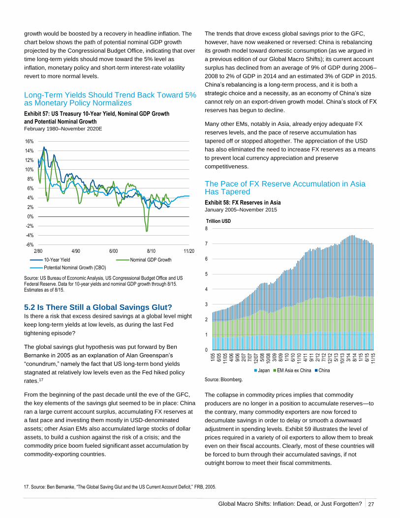
Global Macro Shifts: Inflation: Dead, or Just Forgotten?
growth would be boosted by a recovery in headline inflation. The
chart below shows the path of potential nominal GDP growth
projected by the Congressional Budget Office, indicating that over
time long-term yields should move toward the 5% level as
inflation, monetary policy and short-term interest-rate volatility
revert to more normal levels.
The trends that drove excess global savings prior to the GFC,
however, have now weakened or reversed: China is rebalancing
its growth model toward domestic consumption (as we argued in
a previous edition of our Global Macro Shifts); its current account
surplus has declined from an average of 9% of GDP during 2006–
2008 to 2% of GDP in 2014 and an estimated 3% of GDP in 2015.
China’s rebalancing is a long-term process, and it is both a
strategic choice and a necessity, as an economy of China’s size
cannot rely on an export-driven growth model. China’s stock of FX
reserves has begun to decline.
Many other EMs, notably in Asia, already enjoy adequate FX
reserves levels, and the pace of reserve accumulation has
tapered off or stopped altogether. The appreciation of the USD
has also eliminated the need to increase FX reserves as a means
to prevent local currency appreciation and preserve
competitiveness.
Long-Term Yields Should Trend Back Toward 5% as Monetary Policy Normalizes
Exhibit 57: US Treasury 10-Year Yield, Nominal GDP Growth
and Potential Nominal GrowthFebruary 1980–November 2020E
5.2 Is There Still a Global Savings Glut?Is there a risk that excess desired savings at a global level might
keep long-term yields at low levels, as during the last Fed
tightening episode?
The global savings glut hypothesis was put forward by Ben
Bernanke in 2005 as an explanation of Alan Greenspan’s
“conundrum,” namely the fact that US long-term bond yields
stagnated at relatively low levels even as the Fed hiked policy
rates.17
From the beginning of the past decade until the eve of the GFC,
the key elements of the savings glut seemed to be in place: China
ran a large current account surplus, accumulating FX reserves at
a fast pace and investing them mostly in USD-denominated
assets; other Asian EMs also accumulated large stocks of dollar
assets, to build a cushion against the risk of a crisis; and the
commodity price boom fueled significant asset accumulation by
commodity-exporting countries.
Source: US Bureau of Economic Analysis, US Congressional Budget Office and US Federal Reserve. Data for 10-year yields and nominal GDP growth through 8/15. Estimates as of 8/15.
The Pace of FX Reserve Accumulation in Asia Has Tapered
Exhibit 58: FX Reserves in AsiaJanuary 2005–November 2015
Source: Bloomberg.
The collapse in commodity prices implies that commodity
producers are no longer in a position to accumulate reserves—to
the contrary, many commodity exporters are now forced to
decumulate savings in order to delay or smooth a downward
adjustment in spending levels. Exhibit 59 illustrates the level of
prices required in a variety of oil exporters to allow them to break
even on their fiscal accounts. Clearly, most of these countries will
be forced to burn through their accumulated savings, if not
outright borrow to meet their fiscal commitments.
17. Source: Ben Bernanke, “The Global Saving Glut and the US Current Account Deficit,” FRB, 2005.
-6%
-4%
-2%
0%
2%
4%
6%
8%
10%
12%
14%
16%
2/80 4/90 6/00 8/10 11/20
10-Year Yield Nominal GDP Growth
Potential Nominal Growth (CBO)
0
1
2
3
4
5
6
7
8
1/05
6/05
11/0
5
4/06
9/06
2/07
7/07
12/0
75/
08
10/0
8
3/09
8/09
1/10
6/10
11/1
0
4/11
9/11
2/12
7/12
12/1
25/
13
10/1
3
3/14
8/14
1/15
6/15
11/1
5
Trillion USD
Japan EM Asia ex China China
27
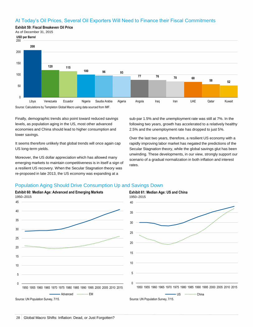
Global Macro Shifts: Inflation: Dead, or Just Forgotten?
Finally, demographic trends also point toward reduced savings
levels, as population aging in the US, most other advanced
economies and China should lead to higher consumption and
lower savings.
It seems therefore unlikely that global trends will once again cap
US long-term yields.
Moreover, the US dollar appreciation which has allowed many
emerging markets to maintain competitiveness is in itself a sign of
a resilient US recovery. When the Secular Stagnation theory was
re-proposed in late 2013, the US economy was expanding at a
Source: Calculations by Templeton Global Macro using data sourced from IMF.
At Today’s Oil Prices, Several Oil Exporters Will Need to Finance their Fiscal Commitments
Exhibit 59: Fiscal Breakeven Oil PriceAs of December 31, 2015
Source: UN Population Survey, 7/15. Source: UN Population Survey, 7/15.
Population Aging Should Drive Consumption Up and Savings Down
Exhibit 60: Median Age: Advanced and Emerging Markets1950–2015
Exhibit 61: Median Age: US and China1950–2015
sub-par 1.5% and the unemployment rate was still at 7%. In the
following two years, growth has accelerated to a relatively healthy
2.5% and the unemployment rate has dropped to just 5%.
Over the last two years, therefore, a resilient US economy with a
rapidly improving labor market has negated the predictions of the
Secular Stagnation theory, while the global savings glut has been
unwinding. These developments, in our view, strongly support our
scenario of a gradual normalization in both inflation and interest
rates.
0
5
10
15
20
25
30
35
40
45
1950 1955 1960 1965 1970 1975 1980 1985 1990 1995 2000 2005 2010 2015
Advanced EM
0
5
10
15
20
25
30
35
40
1950 1955 1960 1965 1970 1975 1980 1985 1990 1995 2000 2005 2010 2015
US China
208
120 115100 96 93
77 76 70 6858 52
0
50
100
150
200
250
Libya Venezuela Ecuador Nigeria Saudia Arabia Algeria Angola Iraq Iran UAE Qatar Kuwait
USD per Barrel
28
Global Macro Shifts: Inflation: Dead, or Just Forgotten?
Six years into a relatively healthy global recovery, the economic
debate is still often dominated by a deep-seated pessimism.
Proponents of the Secular Stagnation hypothesis argue that
global growth will be permanently lower, and that the global
economy is at serious risk of stagnation and/or deflation.
The fact that inflation rates remain low across advanced
economies after several rounds of QE has led many to assume
that inflation has vanished forever. Yet, as the ECB’s Peter Praet
has recently warned, “If you print enough money, you will always
get inflation. Always.”18 To be sure, when aggregate demand is
weak, inflation will first show up in asset prices. But with the
global economy expanding at a decent pace, sooner or later
consumer prices will rise too.
In this paper, we have argued that many observers have given
excessive weight to headline inflation temporarily depressed by
the oil price collapse of the past 18 months. Inflation is already
high in several EMs, and in the US and other developed markets,
a recovery of commodity prices from the currently extremely low
levels would quickly feed into higher headline inflation. The US
labor market is essentially back to full employment, and our
analysis suggests that wage pressures are set to increase.
Wages are not a good statistical predictor of inflation, but higher
wages do support household incomes and spending, which is
consistent with rising prices. Moreover, our analysis has shown
that the US Phillips curve has steepened, not flattened as many
have argued―this implies that prices should respond more to a
tightening labor market.
Assuming that inflation is dead can be dangerous. The Great
Inflation of the 1970s was caused largely by a loss of central bank
credibility, which un-anchored inflation expectations. The Fed has
stated it wants to see a significant pickup in inflation before
stepping up the pace of rate hikes―this might prove a dangerous
gamble. The monetary overhang created by QE poses an
additional risk: Should money velocity and the money multiplier
start reverting to their long-run norms, they would put additional
pressure on inflation, making the Fed’s job even harder.
With all this, we believe financial markets are underestimating the
potential for a rise in US yields―also because the key elements
of the old “savings glut” are no longer in play. Our inflation
forecasts, while not overly aggressive, are significantly above
those of the Fed and the market. We believe widespread
underestimation of inflation risks, together with the prospective
normalization of the relationship between long-term interest rates
and nominal GDP growth, sets the stage for a significant
correction in Treasury yields.
Conclusion
18. Source: European Central Bank.
29
Global Macro Shifts: Inflation: Dead, or Just Forgotten?
IMPORTANT LEGAL INFORMATION
This material reflects the analysis and opinions of the authors as
of February 5, 2016, and may differ from the opinions of other
portfolio managers, investment teams or platforms at Franklin
Templeton Investments. It is intended to be of general interest
only and should not be construed as individual investment advice
or a recommendation or solicitation to buy, sell or hold any
security or to adopt any investment strategy. It does not constitute
legal or tax advice.
The views expressed and the comments, opinions and analyses
are rendered as of the publication date and may change without
notice. The information provided in this material is not intended as
a complete analysis of every material fact regarding any country,
region or market, industry or strategy.
Data from third party sources may have been used in the
preparation of this material and Franklin Templeton Investments
(“FTI”) has not independently verified, validated or audited such
data. FTI accepts no liability whatsoever for any loss arising from
use of this information and reliance upon the comments opinions
and analyses in the material is at the sole discretion of the user.
Products, services and information may not be available in all
jurisdictions and are offered outside the U.S. by other FTI
affiliates and/or their distributors as local laws and regulation
permits. Please consult your own professional adviser for further
information on availability of products and services in your
jurisdiction.
Issued in the U.S. by Franklin Templeton Distributors, Inc., One
Franklin Parkway, San Mateo, California 94403-1906, (800) DIAL
BEN/342-5236, franklintempleton.com - Franklin Templeton
Distributors, Inc. is the principal distributor of Franklin Templeton
Investments’ U.S. registered products, which are available only in
jurisdictions where an offer or solicitation of such products is
permitted under applicable laws and regulation.
Australia: Issued by Franklin Templeton Investments Australia Limited
(ABN 87 006 972 247) (Australian Financial Services License Holder No.
225328), Level 19, 101 Collins Street, Melbourne, Victoria, 3000.
Austria/Germany: Issued by Franklin Templeton Investment Services
GmbH, Mainzer Landstraße 16, D-60325 Frankfurt am Main, Germany.
Authorized in Germany by IHK Frankfurt M., Reg. no. D-F-125-TMX1-08.
Canada: Issued by Franklin Templeton Investments Corp., 5000 Yonge
Street, Suite 900 Toronto, ON, M2N 0A7, Fax: (416) 364-1163, (800)
387-0830, www.franklintempleton.ca. Dubai: Issued by Franklin
Templeton Investments (ME) Limited, authorized and regulated by the
Dubai Financial Services Authority. Dubai office: Franklin Templeton
WHAT ARE THE RISKS?
All investments involve risks, including possible loss of principal.
Investments, The Gate, East Wing, Level 2, Dubai International Financial
Centre, P.O. Box 506613, Dubai, U.A.E., Tel.: +9714-4284100 Fax:
+9714-4284140. France: Issued by Franklin Templeton France S.A., 20
rue de la Paix, 75002 Paris, France. Hong Kong: Issued by Franklin
Templeton Investments (Asia) Limited, 17/F, Chater House, 8 Connaught
Road Central, Hong Kong. Italy: Issued by Franklin Templeton Italia Sim
S.p.A., Corso Italia, 1 – Milan, 20122, Italy. Japan: Issued by Franklin
Templeton Investments Japan Limited. Korea: Issued by Franklin
Templeton Investment Trust Management Co., Ltd., 3rd fl., CCMM
Building, 12 Youido-Dong, Youngdungpo-Gu, Seoul, Korea 150-968.
Luxembourg/Benelux: Issued by Franklin Templeton International
Services, S.à r.l. – Supervised by the Commission de Surveillance du
Secteur Financier - 8A, rue Albert Borschette, L-1246 Luxembourg - Tel:
+352-46 66 67-1 - Fax: +352-46 66 76. Malaysia: Issued by Franklin
Templeton Asset Management (Malaysia) Sdn. Bhd. & Franklin
Templeton GSC Asset Management Sdn. Bhd. Nordic regions: Issued
by Franklin Templeton Investment Management Limited (FTIML),
Swedish Branch, Blasieholmsgatan 5, Se-111 48 Stockholm, Sweden.
FTIML is authorised and regulated in the United Kingdom by the Financial
Conduct Authority and is authorised to conduct certain investment
services in Denmark, Sweden, Norway & Finland. Poland: Issued by
Templeton Asset Management (Poland) TFI S.A., Rondo ONZ 1; 00-124
Warsaw. Romania: Issued by the Bucharest branch of Franklin
Templeton Investment Management Limited, 78-80 Buzesti Street,
Premium Point, 7th-8th Floor, 011017 Bucharest 1, Romania. Registered
with CNVM under no. PJM05SSAM/400001/14.09.2009, and authorized
and regulated in the UK by the Financial Conduct Authority. Singapore:
Issued by Templeton Asset Management Ltd. Registration No. (UEN)
199205211E, 7 Temasek Boulevard, #38-03 Suntec Tower One, 038987,
Singapore. Spain: Issued by the branch of Franklin Templeton
Investment Management, Professional of the Financial Sector under the
Supervision of CNMV, José Ortega y Gasset 29, Madrid. South Africa:
Issued by Franklin Templeton Investments SA (PTY) Ltd which is an
authorized Financial Services Provider. Tel: +27 (11) 341 2300 Fax: +27
(11) 341 2301. Switzerland & Liechtenstein: Issued by Franklin
Templeton Switzerland Ltd, Stockerstrasse 38, CH-8002 Zurich. UK:
Issued by Franklin Templeton Investment Management Limited (FTIML),
registered office: Cannon Place, 78 Cannon Street, London, EC4N 6HL.
Authorized and regulated in the United Kingdom by the Financial Conduct
Authority. Offshore Americas: In the U.S., this publication is made
available only to financial intermediaries by Templeton/Franklin
Investment Services, 100 Fountain Parkway, St. Petersburg, Florida
33716. Tel: (800) 239-3894 (USA Toll-Free), (877) 389-0076 (Canada
Toll-Free), and Fax: (727) 299-8736. Investments are not FDIC insured;
may lose value; and are not bank guaranteed. Distribution outside the
U.S. may be made by Templeton Global Advisors Limited or other sub-
distributors, intermediaries, dealers or professional investors that have
been engaged by Templeton Global Advisors Limited to distribute shares
of Franklin Templeton funds in certain jurisdictions. This is not an offer to
sell or a solicitation of an offer to purchase securities in any jurisdiction
where it would be illegal to do so.
For Exhibits 1, 41, 45, 46, 47, 50, 52 and 57, there is no assurance that any estimate or projection will be realized.
See www.franklintempletondatasources.com for additional data provider information.
30

Please visit www.franklinresources.com to be
directed to your local Franklin Templeton website.
Copyright © 2016 Franklin Templeton Investments. All rights reserved.
franklintempletoninstitutonal.com
US: GM4IN_PERWP_0216
Canada: INST4_PERWP_0216