grade 8 society issues posters
TRANSCRIPT

CAPS Creative Arts Senior phase
Visual Arts, Grade 8
Lesson plan by Cecilia Ferreira
Visual Arts, Grade 8
Term 2: Tackling Societal issues in South Africa focussing on Poster Design and Symbolic Language
What is required from the learners for this lesson according to CAPS? • Art elements and design principles: use in description of artworks, e.g. societal issues • The role of the artist as contributor and social commentator in society; current events and how these are expressed in art, craft, design and popular culture: personal meaning and recognition of images expressed in words; interpret, analyse and recognise symbolic language to talk about societal issues in South Africa • Similarities and differences, respect and understanding of self and community Recommended resources : Photographs and/or examples from life, such as personal comment on societal issues in South Africa Suggested contact time: 3 hours Content/concepts/skills (in other words, what do we want the learner to clearly portray in the work for assessment? • Art elements: shape, line, tone, texture Quick overview of the art elements: Lines and curves are marks that span a distance between two points (or the path of a moving point). As an art element, line pertains to the use of various marks, outlines and implied lines in artwork and design. A line has a width, direction, and length. A line's width is sometimes called its "thickness". Lines are sometimes called "strokes", especially when referring to lines in digital artwork. Shape pertains to the use of areas in twodimensional space that can be defined by edges. Shapes can be geometric (e.g., square, circle, hexagon, etc.) or organic (such as the shape of a puddle, blob, leaf, boomerang, etc.). Tone is a quality of color. It has to do with whether or not a color is warm or cold, bright or dull, light or dim and pure or "otherwise" (not wishing to to slap the perceived moral judgment of

impure on a hapless color). You've most likely heard the phrase "Tone it down". In art, this means to make a color, or an overall color scheme, less vibrant. Conversely, "toning it up" can cause colors to pop out of a piece, sometimes to a rather startling extent.
Texture, another element of art, is used to describe either the way a threedimensional work actually feels when touched, or the visual "feel" of a twodimensional work.
Take rocks, for example. A real, 3D rock might feel rough or smooth, and definitely feels hard when touched or picked up.
• Design principles: contrast, proportion, emphasis, unity Quick overview of the design principles required for this project: Contrast refers to the arrangement of opposite elements (light vs. dark colors, rough vs. smooth textures, large vs. small shapes, etc.) in a piece so as to create visual interest, excitement and drama. Proportion is the relationship of two or more elements in a design and how they compare with one another. Proportion is said to be harmonious when a correct or desirable relationship exists between the elements with respect to size, color, quantity, degree, or setting. Good proportion adds harmony, symmetry, or balance among the parts of a design. Emphasis is a principle of art which occurs any time an element of a piece is given dominance by the artist. In other words, the artist makes part of the work stand out, in order to draw the viewer's eye there first. Unity is the relationship among the elements of a visual that helps all the elements function together.Unity gives a sense of oneness to a visual image. In other words, the words and the images work together to create meaning. Other things required for this project:
• Emphasis on the observation and interpretation of the wider visual world – societal issues in South Africa • Understanding of images as symbols • Planning and preparation: with guidance, collects resources, visual information and makes preliminary drawings and sketches in preparation for the final projects • Variation of paper size and format: different scale and degrees of detail
South Africa is a country full of societal issues which needs to be tackled. It is important to identify these issues with the learners from an early age. It will created an early awareness in them and it will cultivate respect for themselves and for the world around them. Step One: Discuss societal issues with the learners. Just to mention a few, issues to be tackled can be rape, violence, hate crimes, racism, sexual discrimination, crime and child abuse. Step Two: Have a good set of visuals ready. You can either find the visuals in books or on the internet. If you have a projector or a computer, show them on screen. If you don’t, try and make some photocopies of visuals that relates to the topics to be discussed. Step 3: If you prefer, you can let all the learners touch on the same societal issue and all of them can work with the same image. If you have means to rather make them choose their own images individually, this is better. Not all the learners will be able to relate to the same image, or to the same issues. Work with about 3 or 4 images to choose from, so you can provide a photocopy of an image of what the learner prefers. If your learners have access to the internet, you can also allow them to choose images by themselves online and print them for design. Step 4: Give them instructions to use an image for preference with which they will be combining letters and symbols in order to create a poster. The instruction is to create a poster as if they are the graphic designer working towards a campaign. Make it clear, that what would be expected of them would be: a) Good, strong, clear lettering b) A detailed image of a figure or a face portraying the issue touched on with the poster c) Strong symbolic ability, like using a logo, or using a symbol representing the issue, eg. a pink ribbon for breast cancer, or a red ribbon for AIDS. Step 5: Let the learners start with the image of a figure or a face as the focal point of the poster. This is going to be as detailed as what they can manage. If they are doing a figure, make them look at the proportions, the shading and details of the figure. They must try and make the figure of face look as real as possible.
Step 6: Once they’ve mastered the image, they can start placing lettering around it. Discuss what a SLOGAN is with them and rather than copying a slogan from online imagery, encourage them to come up with their own unique slogans and catchphrases. Step 7: Once the image is created and the lettering is placed, discuss colour and if colour would add to the design or rob the design, discuss how certain areas can be left in black and white and how certain areas can have colour and how the black and white can contrast against the parts with colour. Also discuss what to do in the background, as using the right background can bring the letter together with the image and make the whole design work as a whole. Step 8: When they are finished, encourage them to talk about the intent behind the poster. Assess them in front of the class, so other learners can learn from the assessments. Always be positive and never break a learner down. Point the flaws and weaker parts of the poster out in a constructive way. Learners at this age are very sensitive to criticism and we want them to love art, not be afraid of it.

Ten Tips for Poster Design
1. Find a good focal point. Choose a striking image to put on on your poster that catches the viewers eye first thing when they look at it. 2. Choose references carefully. Take time to find the right images to create the impact you would like it to create. 3. Make sure that your facts are correct. If you use facts or statistics in you poster, make sure they are 100% correct. 4. Balance your composition. Make sure you don’t put more things on one side than the other, balance all your poster elements like your images and your lettering. Spread them out on the page. 5. Use details and keep your details consistent. If your image is very detailed, make sure you also spend the time to create the right effect with your lettering and other areas of your poster. 6. Spend time on your poster, it never looks the same the next day. Often when we ‘sleep on it’, we return to a work of art the next day to notice flaws that we didn’t notice the day before. Encourage the learners to take their time, but also to work on a pace daily so they don’t get bored. 7. Find examples of fonts to work with for the text. Use text in a style that relates to the theme you are working in.
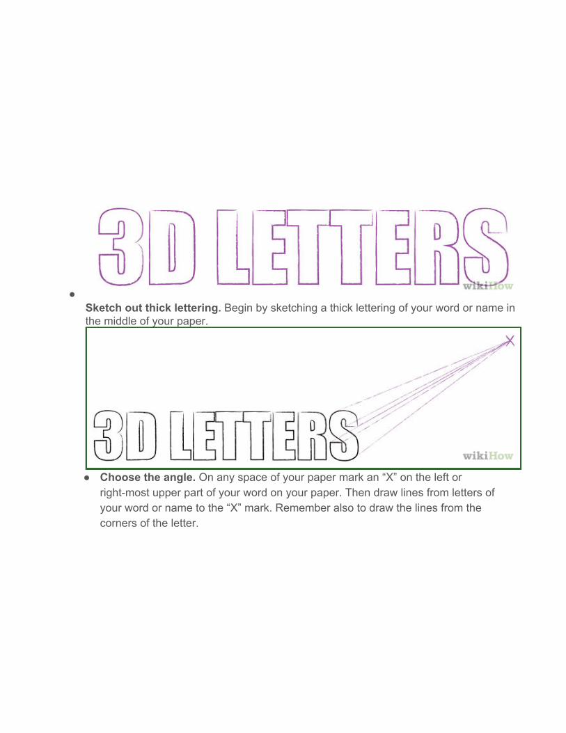
Sketch out thick lettering. Begin by sketching a thick lettering of your word or name in the middle of your paper.
Choose the angle. On any space of your paper mark an “X” on the left or
rightmost upper part of your word on your paper. Then draw lines from letters of your word or name to the “X” mark. Remember also to draw the lines from the corners of the letter.
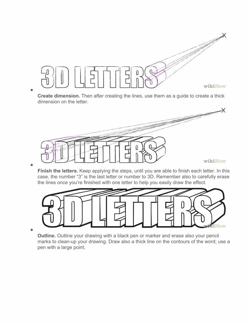
Create dimension. Then after creating the lines, use them as a guide to create a thick dimension on the letter.
Finish the letters. Keep applying the steps, until you are able to finish each letter. In this case, the number “3” is the last letter or number to 3D. Remember also to carefully erase the lines once you’re finished with one letter to help you easily draw the effect.
Outline. Outline your drawing with a black pen or marker and erase also your pencil marks to cleanup your drawing. Draw also a thick line on the contours of the word; use a pen with a large point.

Color it. Use one color with a light and dark variation such as on the illustration purple and dark violet.
Drawing Pyramid Letters
Write it out. Start by writing the letter you want to draw.

Outline it. Outline the letter with ONE thin line.
Connect everything. Connect the ends of the inner letter to the corners of the line around it.

Create the light. Decide where your light source is going to be. You can draw a circle or square or some other symbol that will let you know where the light is coming from.
Shade in. Pretend you are looking at a real block letter sitting in front of you. Shade in the
spots that light isn't shining on.

Image 1

Image 2

Image 3