graphic design portfolio2-amanda peterson
DESCRIPTION
ÂTRANSCRIPT

GRAPHIC DESIGNPORTFOLIO
MANDY PETERSON

GRAPHIC DESIGN?P1
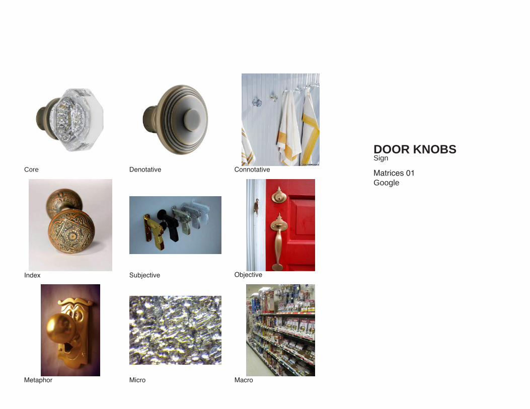
Being an Interior Design major I’m interested in the experience of retail shops and all the elements that make it memorable for a customer. I focused on everything from the entry, including their sign on the storefront and doorknobs, to the shopping experience inside and how one looks at their displays, finishing with the take away if they buy something, their shopping bag designs. You have to keep their eye from the moment they spot your store across the street to the excitement they get looking back at the bag when they get home. A retail stores main focus is selling and moving merchandise, sometimes it is hard to see the big picture. It is a creative field, not only does your merchandise need to be creative and show who you are as a store but everything else that represents you has to show the same creativity. You have to brand everything along a common ground to keep it recognizable to someone, that way even if they forget the name of the store the colors, logo, or even the design of the bag will be noticed by them again. In conclusion, I found people understand and know where they are once they are in the store but the problem resides at the beginning and end of the shopping experience. When people walk into the store often times they are looking at their hands to make sure they are grabbing the handle for the door correctly, what a great opportunity to catch their eye! The other half is the shopping bags. Although all shopping bags typically have the name of the store on them sometimes the color and design are so different from what you thought their brand was. This is why graphic design can make such a difference in the scheme of things
Denotative
Subjective Objective
ConnotativeCore
MacroMicro
Index
Metaphor
DOOR KNOBSSign
Matrices 01Google

GRAPHIC DESIGN?
Denotative
Subjective Objective
ConnotativeCore
MacroMicro
Index
Metaphor
ARCHITECTURESign
Matrices 02Google+Individual Photos

Subjective Objective
ConnotativeCore
MacroMicro
Index
Metaphor
Denotative
STORE DISPLAYSSign
Matrices 03Individual Photos

GRAPHIC DESIGN?
SHOPPING BAGS
Typology 01Authored Theme

TYPOGRAPHY
Typology 02Graphic Design History
FORM AS LANGUAGEP2
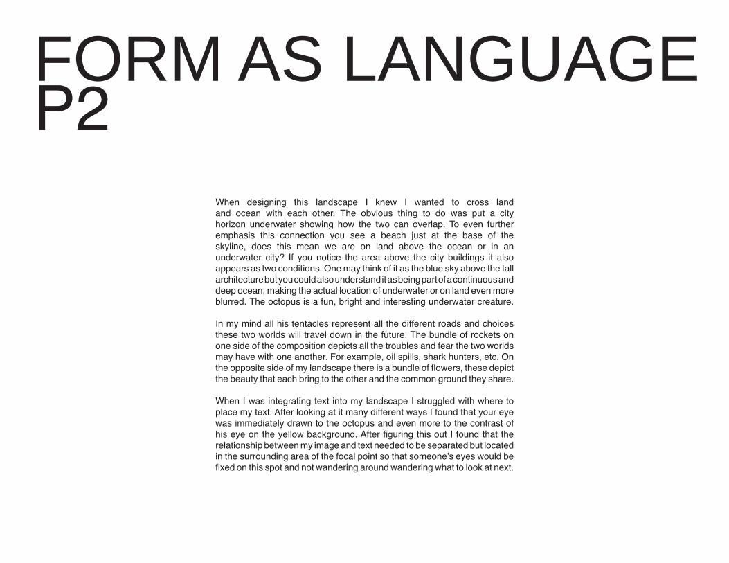
When designing this landscape I knew I wanted to cross land and ocean with each other. The obvious thing to do was put a city horizon underwater showing how the two can overlap. To even further emphasis this connection you see a beach just at the base of the skyline, does this mean we are on land above the ocean or in an underwater city? If you notice the area above the city buildings it also appears as two conditions. One may think of it as the blue sky above the tall architecture but you could also understand it as being part of a continuous and deep ocean, making the actual location of underwater or on land even more blurred. The octopus is a fun, bright and interesting underwater creature.
In my mind all his tentacles represent all the different roads and choices these two worlds will travel down in the future. The bundle of rockets on one side of the composition depicts all the troubles and fear the two worlds may have with one another. For example, oil spills, shark hunters, etc. On the opposite side of my landscape there is a bundle of flowers, these depict the beauty that each bring to the other and the common ground they share.
When I was integrating text into my landscape I struggled with where to place my text. After looking at it many different ways I found that your eye was immediately drawn to the octopus and even more to the contrast of his eye on the yellow background. After figuring this out I found that the relationship between my image and text needed to be separated but located in the surrounding area of the focal point so that someone’s eyes would be fixed on this spot and not wandering around wandering what to look at next.

FORM AS LANGUAGE

FORM AS LANGUAGEFirst iteration of final book cover. Added a water color effect over the whole picture to see if it would enhance the underwater theme.

Second iteration of final book cover. Took out the water color effect over the whole picture and also took out one of the rockets and added the bouquet of flowers.
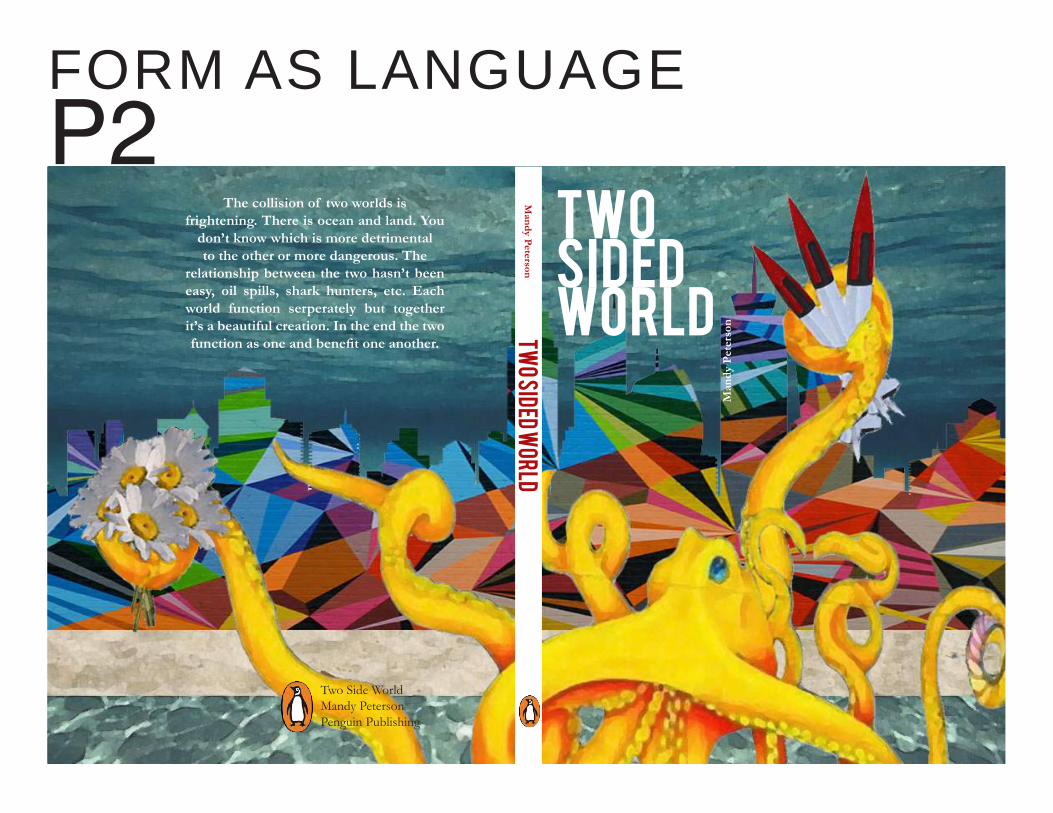
The collision of two worlds is frightening. There is ocean and land. You
don’t know which is more detrimental to the other or more dangerous. The
relationship between the two hasn’t been easy, oil spills, shark hunters, etc. Each world function serperately but together it’s a beautiful creation. In the end the two function as one and benefit one another.
Two Side WorldMandy PetersonPenguin Publishing
Mandy P
eterson
Man
dy P
eter
sonTw
o Sided World
TWOSIDEDWORLD
FORM AS LANGUAGEP2


Scale1. Scale is Relative -graphic elements can appear larger or smaller depending on size, placement, and color of the elements around it. -When all the elements are the same size then the composition feels flat. -Contrast in size creates a sense of tension and movement and provides a feeling of depth -small shapes recede, large ones come forward. a. cropping to imply scale -an object that bleeds off a page will appear larger b. Familiar objects, familiar scale -We recognize the right size of certain objects or images. Playing with that unusual scale creates spatial illusions. c. Scale, depth, and motion -changes in scale and placement can tell a viewer a lot about what is happening in the picture. d. Big Type, Small Pages -having something over exaggerated on a page reads as a loud voice. -It can give off a different feeling when looking at the final product versus the typography being a smaller size. e. Ambiguous Scale -Spatial cues reveal alot about the actual scale of real objects. By cropping out the recognizable objects in the background or foreground there is an illusion of being a normal size.
f. Point of View -photographing small objects up close and from a low vantage point creates an illusion of the object being larger than life. g. Absence of scale -Scale is all messed up when there is nothing to compare an object to where we would be able to recognize the size of something we are familiar with. h. Inflated Scale -When an element is blown up we register the importance of the thing as being more important. I. Environmental Typography -In some instances letters, which we view as being on a piece of paper usually, can be blown up to frame and become the display or focal point.2. Scale is a Verb -To scale a graphic element is to change its dimensions -Scaling an element can transform its impact on a page or screen -When changing scale it makes it easy to skew and distort objects easily a. Scaling Images and Objects -Uneven scaling of objects we recognize and are familiar with begin to look uncomfortable and impossible to use. b. Scaling Letterforms -If the horizontal and vertical dimension of a letter are scaled unevenly, type can too become unrecognizable through our eyes without some level of difficulty.
CHAPTER OUTLINESE1

Rhythm and Balance1. Rhythm and Repetition -The visual result of repeating an element has a densely layered richness and can make the result image empowering.2. Symmetry and Asymmetry a. symmetry -visually having something that is exactly the same on both side, as if it were mirrored across and axis. b.Asymmetry -visually having objects or elements balance each other in weight on either side of the composition. -May not be symmetrical at all.3. Repetition and Change -repetition is an endless feature of the human environment. From corn fields to car lots, repetition and change is everywhere. -These awaken life’s visual juxtapositions. a. Observed Rhythm -Aerial photos are an excellent way to view the patterns, textures, and colors embedded in both man-made and natural forms.
4. Rhythm and Time -Music is a prime example of the underlying pattern changes in time. The layers occur at the same time in music helping support one another and providing contrast a. Frozen Rhythms -key example is long-exposure photography. This allows us to see the movement and pattern of something moving in time. b. Pattern Dissonance -two patterns that contrast each other can play with rhythm and pattern. Watching the forms flow together or even form in tension with one another allows us to see the rhythm in something viewed as simple. 5. Rhythm and Pacing -When content is spread out a sequential design must possess an overall coherence. -surrounding elements are then placed with mindful intention to create focal points and to frame the viewers eye where the artist wants it to be. a. Graceful Entry b. Spinal Orientation -have something focus around a middle axis, such as a spine, lets the spread read as one
Figureground1. Stable, Reversible, Ambiguous -stable figure/ground relationship exists when a form or figure stands clearly apart from its background. -Reversible figure/ground occurs when positive and negative elements attract our attention equally and alternately, coming forawrd, then receding, as our eye perceives one first as dominant and next as subordinate. -Images and compostiions featuring ambiguous figure/ground challenge the viewer to find a local point.2. Interwoven Space -Designers, ilustrators, and photographers often mess with figure/ground relationships to add interest and intrigue to their work. a.Form and Counterform -Objects displace space, creating an active inter play between form a void, like with buildings, sculptures, landscape, etc. b. Figure inside of Figure -The tension between figure and ground acquires an ominous energy -In some compositions one will embed another image inside of the first one to create new meaning to the work or to portray something else. c. Letterform Abstraction -As an example letters can be scaled to begin bleeding off the edge of a page but because of the positive and negative space that we view and because of previous knowledge of what letters look like we are still able to read the letter forms.
d. Optical Interplay -Embedding a positive shape within a negative one allows layers to sink back or come forward giving us two objects to look at in one composition. e. Figure/Ground Battalion -An example would be arrows. When flipping direction of a row of arrows as well as changing the color between the two lines they play into each other and you have to focus on the forms in order to see them both separately because they seamlessly blend together. f. Photo Letter mesh -This is similar to Letterform abstraction but in stead of two opposite colors color and real images are incorporated to build a stronger meaning. g. Contrast and Composition -taking different forms and hanging them through the process of cropping, combining, repeat, roatate, enlarge and reduce. -Celebrate formal differences as well as distribute positive and negative space into fluid, balanced compositions. h. Artful Reduction -when reducing part of an image and exposing just the positive or negative form often times it is still recognizable through our eyes. I. Capturing Tension -challenges the viewer or choose figure or ground as the tension between black and white. J. Counter Hand -simple as cut white paper held against a contrasting ground defines.
CHAPTER OUTLINES

ScaleScale is such an interesting conept. It’s amazing how by making something a little smaller or bigger with or without context around it makes it appear so different. Scale is a powerful tool because as the artist you can choose when to emphasize an object and when to have it recede. With this tool you can guide the viewers eye in the right direction based on the size of the objects in your composition.
I plan on using scale throughout my designs to show either the loss of shapes, the importance of one shape overanother and the movement through the different steps. Scale helps with movement which keeps your composition from being flat, keeping your viewers attention better.
Balance and RhythmBalance and Rhythm are both visually pleasing and calming. Having balance in a composition keeps your head from tilting to the left or right to try and make up the difference for something not having balance. These two principles are around us everywhere. It is a subconscious feeling of pleasure when seeing these two forces working together.
I plan on using balance and rhythm in my composition for those reasons exactly. It helps with the focus of the viewer keeping them visually pleased with the composition and there is a natural draw to things that incorporate these principles.
FiguregoundI am in love with figure ground. I think figure ground is absolutely eye catching. With the use of two or three basic colors so much can happen in one image or composition. You begin to see the positive and negative space and read the objects as receding or coming forward. There is so much you can incorporate and use in figure ground.
I plan on using some of the shapes from the original logo as negative space that sneaks its way into the rest of my composition. I think this will make the viewer excited because they will not know what to expect to see in the next iteration or composition.
FORM AS IDENTITYP3
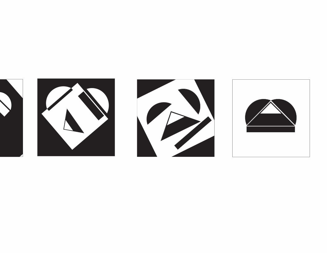
Through out the process of designing a new logo I kept getting caught up on the fact that I wanted to new one to be so different from the original. In the beginning I think I was trying so hard that none of my iterations seemed to have that fluid flow from the original to the final. I kept trying to use the frame to show movement and use scale to help the other unnecessary shapes smoothly disappear, I found that I was stuck in a rut because I was focusing on forcing the elements and principles to happen rather than letting them show themselves throughout my composition.
This new logo represents a new company. The Expedition is a company that focuses on wilderness exploration adventures. They specialize in white water rafting, hiking, rock climbing, skydiving, and zip-lining. They offer a range of services and difficulty levels. Within each activity there is different packages to choose from. You can pick a family package, large/small group packages, or an individual package. With each service comes a range of difficulty levels depending on the age of the members in your group. The Expedition also offers different packages for the length of your expedition, this may coincide with the difficulty level you choose. The time packages range from an hour to a full day of adventure. Using the shapes from the previous logo for “Writers In the Schools” , a program at the University of Arkansas, I created a logo that resembles a landscape. Using the tip of the pencil to resemble a mountain and the curved shapes as a background possibly representing hills or the sun behind the triangle shape.


FORM AS IDENTITY
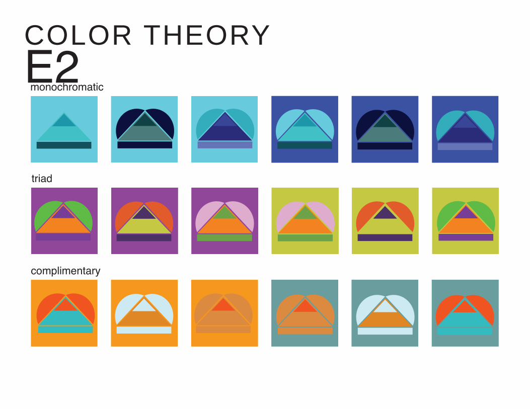
monochromatic
complimentary
triad
COLOR THEORYE2

contrasting pairs of conditions
analogous
wildcard
TYPE + GRIDP4
Grids are interesting to work with. Even though there is a set of lines and modules to work within you can break the barrier or push a space to allow your composition to speak. In the beginning we had to find printed typography that was black and white. I had no idea what I was looking for or was really supposed to be doing with this found text. I wasn’t sure what I was going to get out of this project or how I was going to get started with ideas and then making them into concrete messages on a piece of paper. Being an interior design major we do a lot of board layouts for the final leg of a project when we pin them up and present them to a group of people but we don’t typically use grids for our final boards. It made it easier to follow the grid because we were allowed to cut up our typography. We were allowed to fit reach words and compositions that couldn’t be read which I think made it a lot easier to come up with creative ideas to lay everything out. It has granted a little more freedom and expression for us to be creative and allow our iterations not only to be about words but the bigger picture. The hardest part for me was creating the compositions to fit in a system and read as though they came from the same author or could be part of the same story.


TYPE + GRID


PORTFOLIO WEBSITESE3


JONATHAN BARNBROOK
www.emigre.com/EFfeature.php?di=19 www.designerandbooks.com/designer/bio/jonathan-barnbrook www.barnbrook.net
HISTORY_Born 1966 in Luton, England_Graphic Designer and typographer_Graduated with distinction in graphic design from _Saint Martin’s School of Art and the Royal College of Art in London_Cites record cover artwork as an early design influence and possibly the interest that drew him to graphic design
_Developed a multifaceted practice that includes activism, graphic design, typeface design, industrail design, and motion graphics_Founded his design studio, Barbrook, in 1990_Established his own font company, Virus Fonts, in 1997_2007, Contributions to british graphic design was recognized with a major retrospective at the design museum in London_2008, exhibition “Collateral damage” presented a retrospective of his more political design output
AWARDS
_Art Directors Club of New York Gold Prize_Tokyo Type Directors Club Non-Members Grand Prize_New York Type Directos Club Best in Show_Two D&AD Awards and Epica Grand Prix for film work_Work was selected for 10th Istanbul Biennale in 2007_Exhibiting artist at the 17th Biennale of Sydney
ACCOMPLISHMENTS
INFLUENTIAL POLITICAL WORK
_Barnbrook has Art Directed for the anti-corporate magazine Adbusters_Participate in the “First things First 2000 Manifesto” published in 1999_Created billboard in 2001 publicizing the manifesto entitled “Designers, stay away from corporations that want you to lie for them.”_He has also produced many copyright-free designs for political or social justice purposes
_Commercial and Non-commercial Clients_Created complete graphic identities formajor cultural institiutions such as Mori Arts Center, Tokyo, and _Museum of Contemporary Arts, Los Angeles_Undertaken branding for the 17th Biennale of Sydney_Designed book covers for Noam Chomsky_Designed cover for David Bowie’s record ‘Heathen’_Collaborated with artist Damien Hirst on his collectable monograph
CLIENTELE
ambition to “Use design as a weapon for social change.”
INFOGRAPHICE4

GRAPHIC DESIGNPORTFOLIO
MANDY PETERSON