graphic design professor: tapan parikh ([email protected])[email protected] ta: eun kyoung choe...
Post on 22-Dec-2015
229 views
TRANSCRIPT
Graphic Design
Professor: Tapan Parikh ([email protected])TA: Eun Kyoung Choe ([email protected])
Lecture #9 - February 21st, 2008
213: User Interface Design and Development
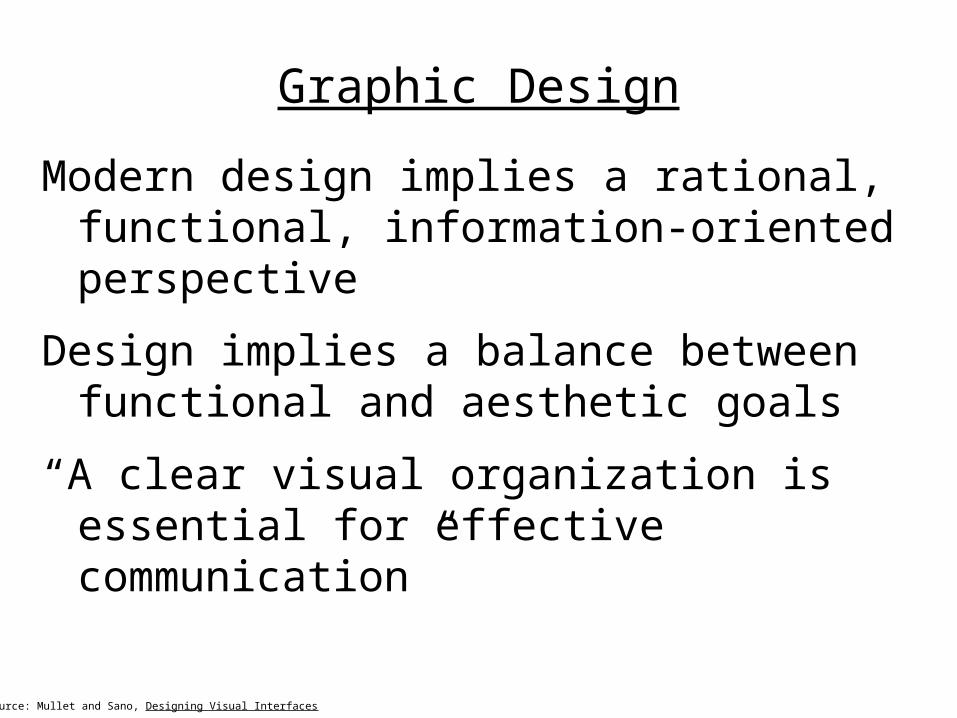
Graphic Design
Modern design implies a rational, functional, information-oriented perspective
Design implies a balance between functional and aesthetic goals
“A clear visual organization is essential for effective communication”
Source: Mullet and Sano, Designing Visual Interfaces

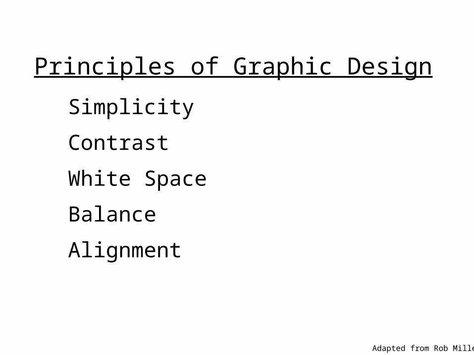
Principles of Graphic Design
Simplicity
Contrast
White Space
Balance
Alignment
Adapted from Rob Miller
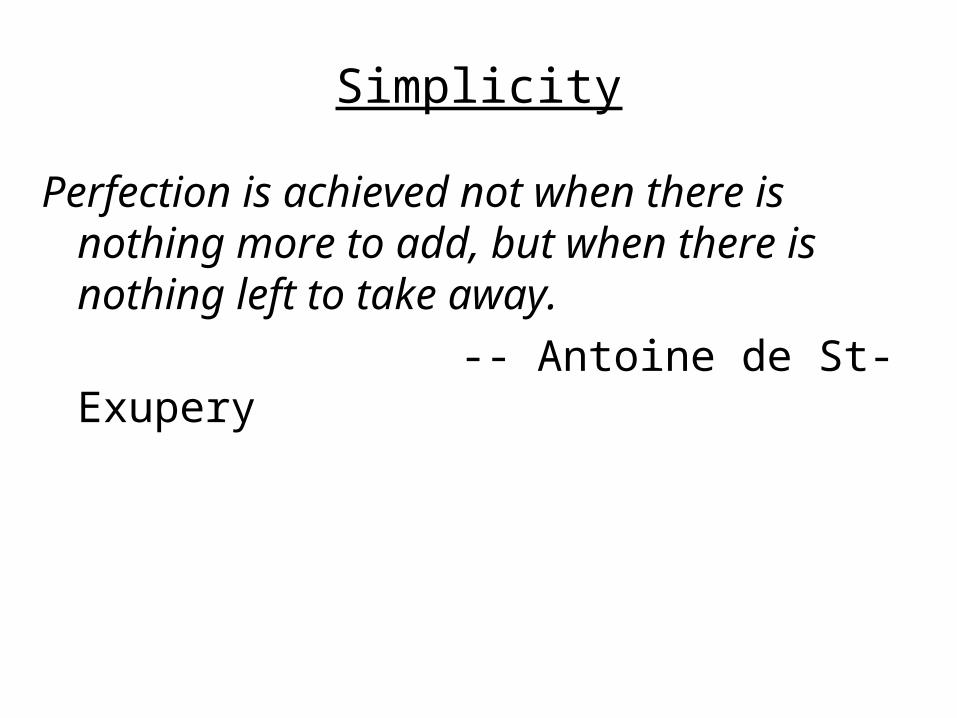
Simplicity
Perfection is achieved not when there is nothing more to add, but when there is nothing left to take away.
-- Antoine de St-Exupery
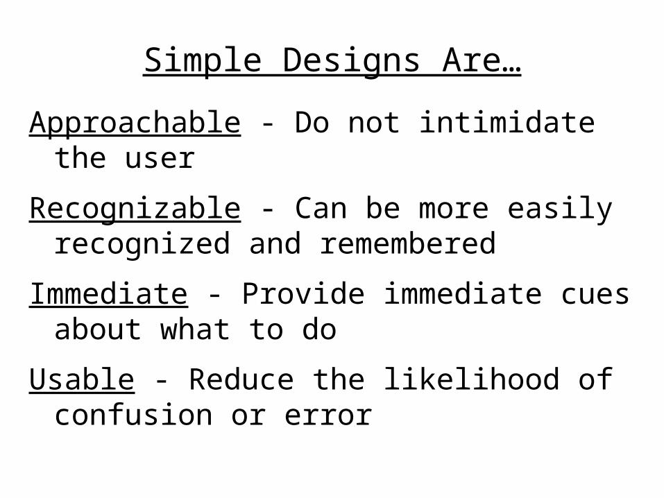
Simple Designs Are…
Approachable - Do not intimidate the user
Recognizable - Can be more easily recognized and remembered
Immediate - Provide immediate cues about what to do
Usable - Reduce the likelihood of confusion or error


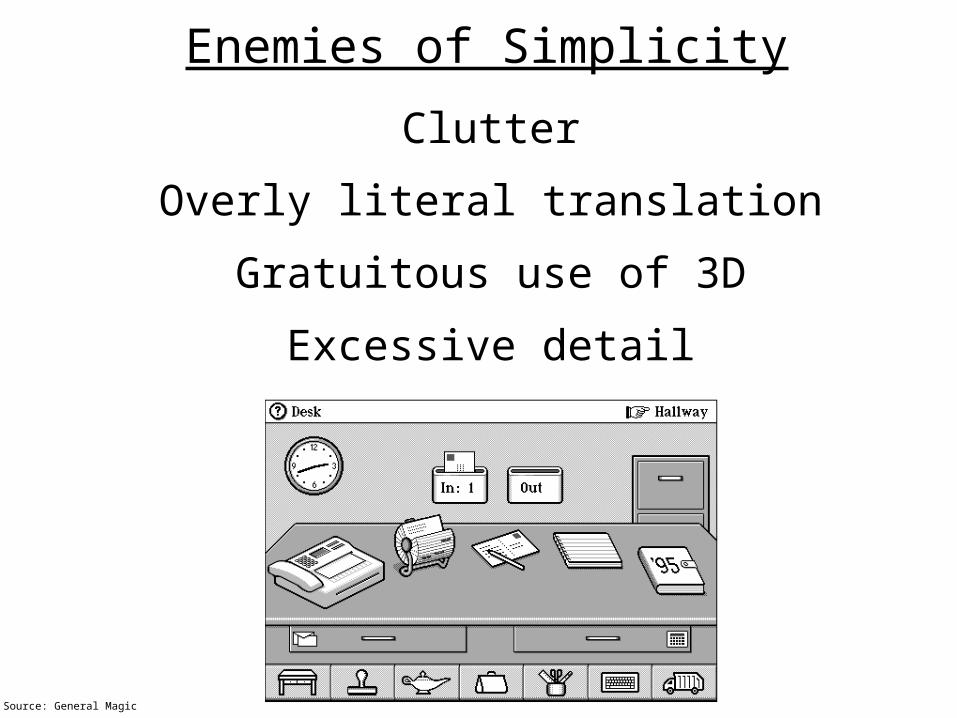
Enemies of Simplicity
Clutter
Overly literal translation
Gratuitous use of 3D
Excessive detail
Source: General Magic
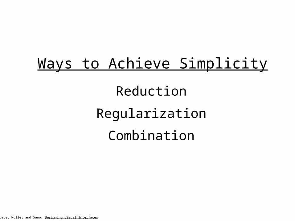
Ways to Achieve Simplicity
Reduction
Regularization
Combination
Source: Mullet and Sano, Designing Visual Interfaces
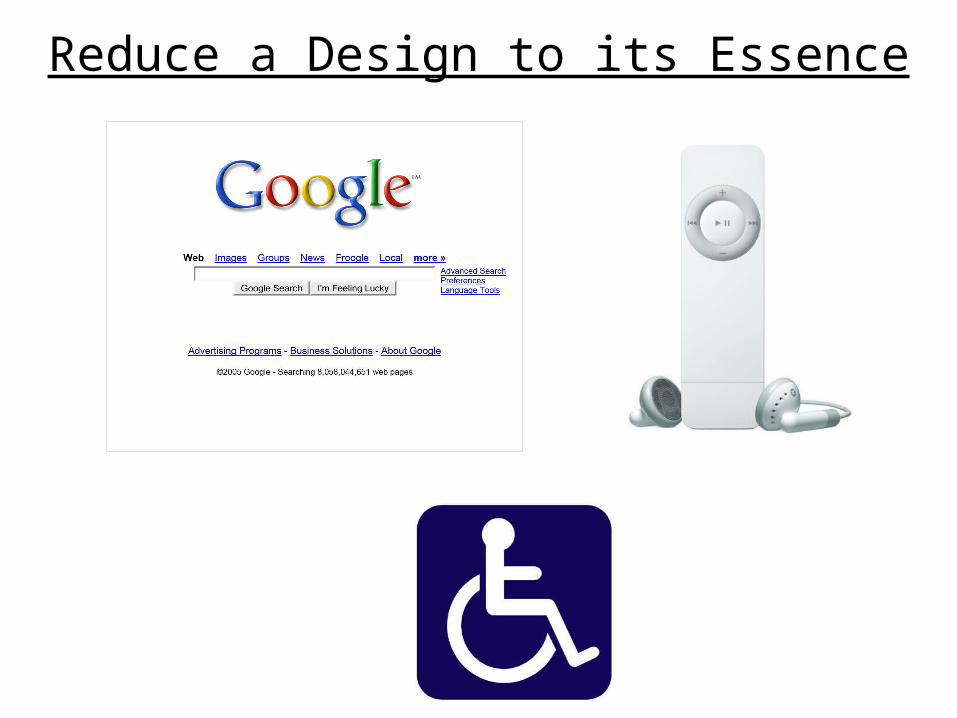
Reduce a Design to its Essence
Reducing a Design
Determine the essential elements
Examine each element, and ask yourself whether its needed
If it isn’t, then remove it
Even if it is, try to remove it, and see if the design remains coherent
Source: Mullet and Sano, Designing Visual Interfaces
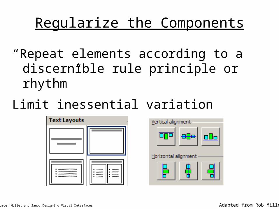
Regularize the Components
“Repeat elements according to a discernible rule principle or rhythm”
Limit inessential variation
Source: Mullet and Sano, Designing Visual Interfaces Adapted from Rob Miller
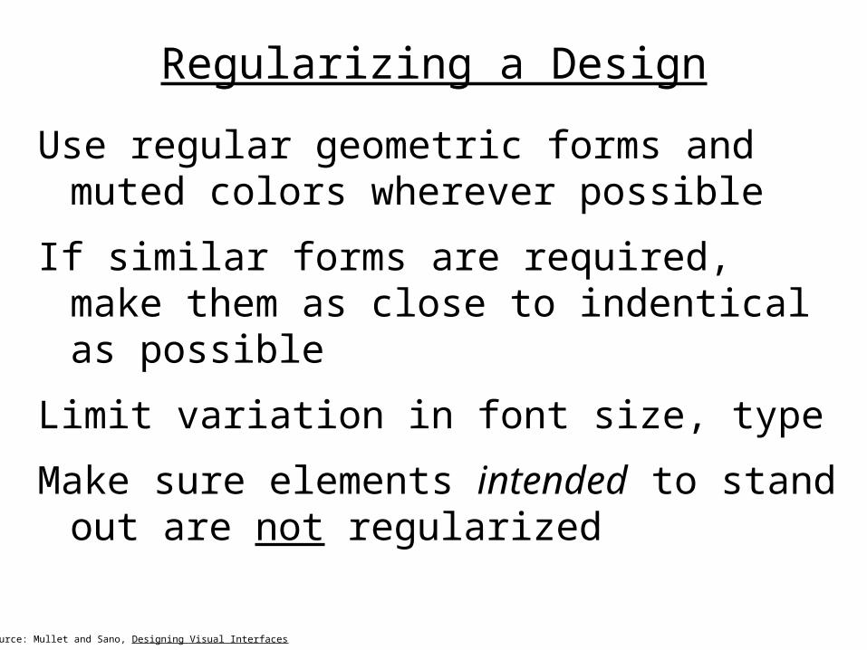
Regularizing a Design
Use regular geometric forms and muted colors wherever possible
If similar forms are required, make them as close to indentical as possible
Limit variation in font size, type
Make sure elements intended to stand out are not regularized
Source: Mullet and Sano, Designing Visual Interfaces
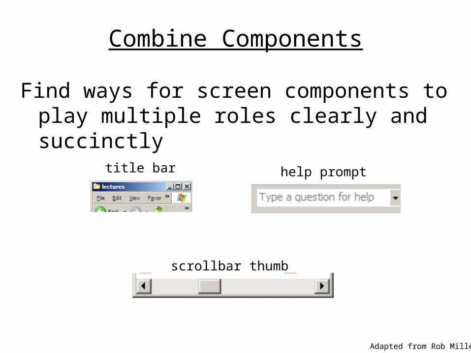
Combine Components
Find ways for screen components to play multiple roles clearly and succinctly
Adapted from Rob Miller
title bar
scrollbar thumb
help prompt
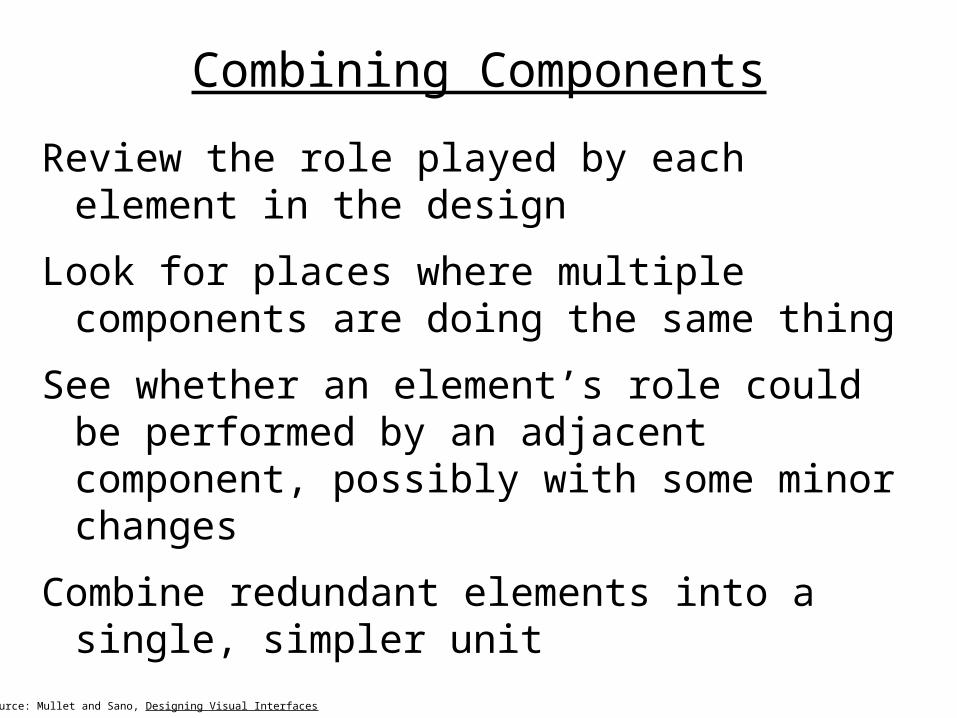
Combining Components
Review the role played by each element in the design
Look for places where multiple components are doing the same thing
See whether an element’s role could be performed by an adjacent component, possibly with some minor changes
Combine redundant elements into a single, simpler unit
Source: Mullet and Sano, Designing Visual Interfaces
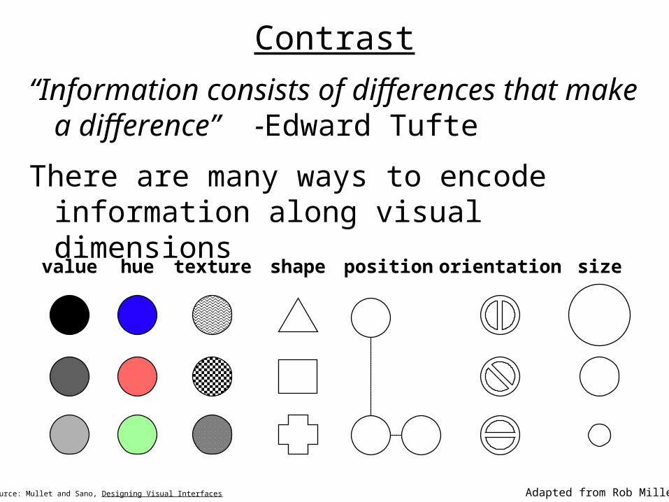
Contrast
“Information consists of differences that make a difference” -Edward Tufte
There are many ways to encode information along visual dimensions
Source: Mullet and Sano, Designing Visual Interfaces Adapted from Rob Miller
sizevalue hue orientationtexture shape position
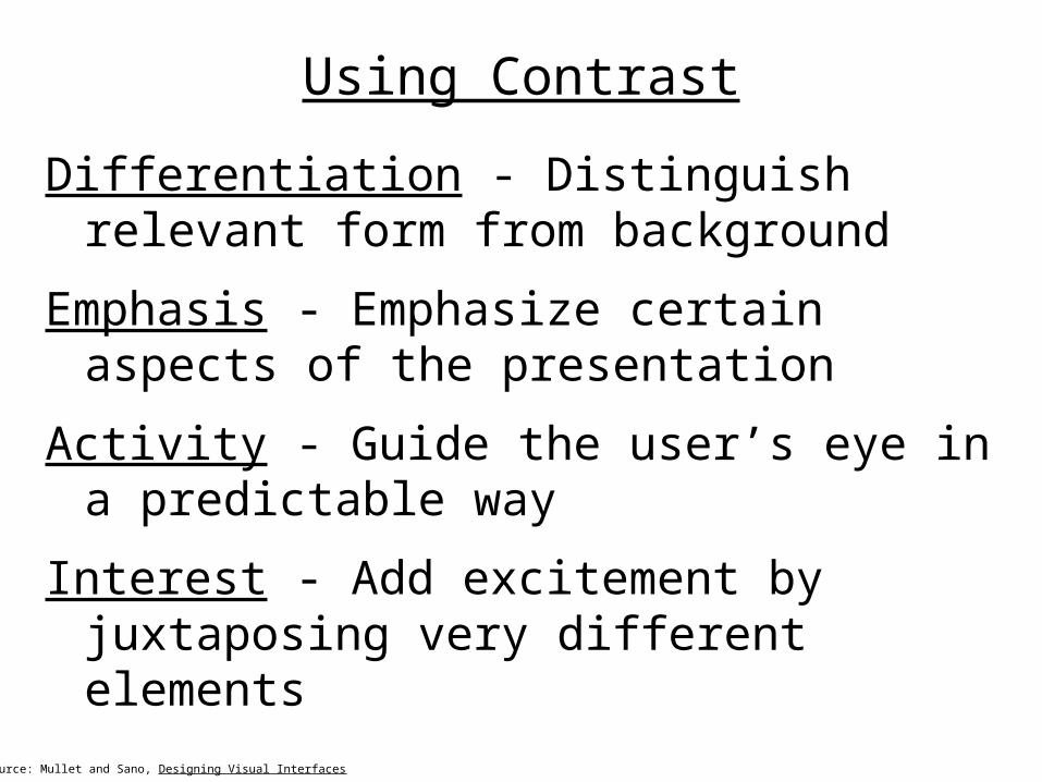
Using Contrast
Differentiation - Distinguish relevant form from background
Emphasis - Emphasize certain aspects of the presentation
Activity - Guide the user’s eye in a predictable way
Interest - Add excitement by juxtaposing very different elements
Source: Mullet and Sano, Designing Visual Interfaces

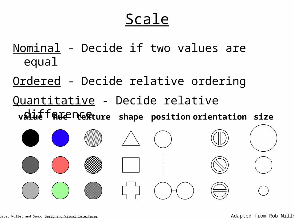
Scale
Comparisons that a visual dimension affords
Nominal - Decide if two values are equal
– All dimensions
Ordered - Decide relative ordering
– Position, size, value, texture granularity
– Not orientation, hue, shape
Quantitative - Decide relative difference
– Position, size
– Not value, texture, orientation, shape, hue
Source: Mullet and Sano, Designing Visual Interfaces Adapted from Rob Miller
Scale
Nominal - Decide if two values are equal
Ordered - Decide relative ordering
Quantitative - Decide relative difference
Source: Mullet and Sano, Designing Visual Interfaces
sizevalue hue orientationtexture shape position
Adapted from Rob Miller
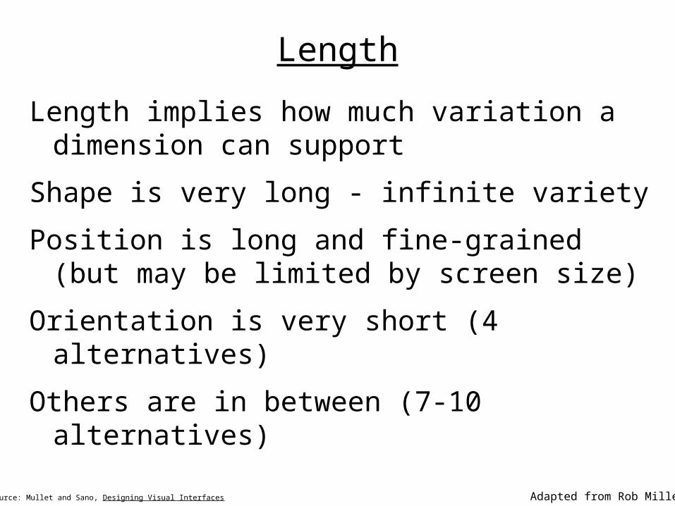
Length
Length implies how much variation a dimension can support
Shape is very long - infinite variety
Position is long and fine-grained (but may be limited by screen size)
Orientation is very short (4 alternatives)
Others are in between (7-10 alternatives)
Source: Mullet and Sano, Designing Visual Interfaces Adapted from Rob Miller
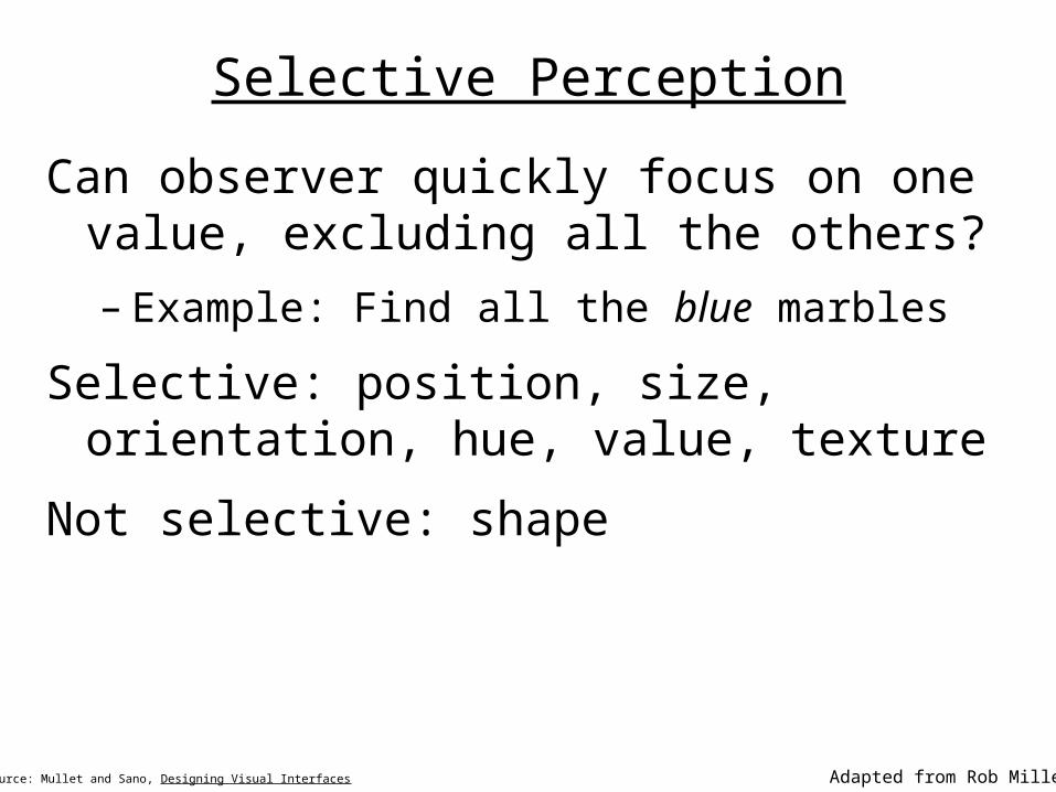
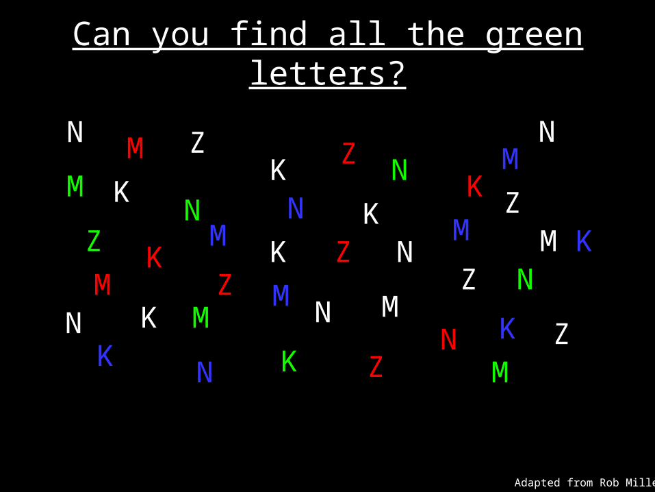
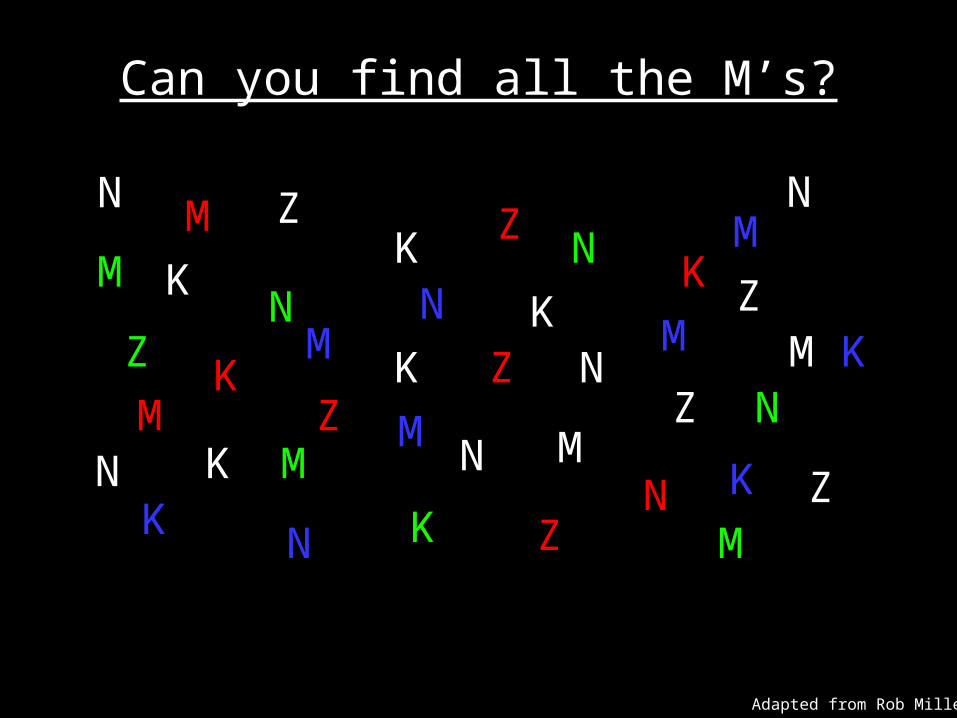
Selective Perception
Can observer quickly focus on one value, excluding all the others?
– Example: Find all the blue marbles
Selective: position, size, orientation, hue, value, texture
Not selective: shape
Source: Mullet and Sano, Designing Visual Interfaces Adapted from Rob Miller
N
N
N N
N
N
N
NN
N
NZ
Z
Z
Z
Z
Z
ZZ
ZK
KK
KK
K
K
K
KK
K
MM
M
M M
M
M
M
M
M
M
Can you find all the green letters?
Adapted from Rob Miller
N
N
N N
N
N
N
NN
N
NZ
Z
Z
Z
Z
Z
ZZ
ZK
KK
KK
K
K
K
KK
K
MM
M
M M
M
M
M
M
M
M
Can you find all the M’s?
Adapted from Rob Miller
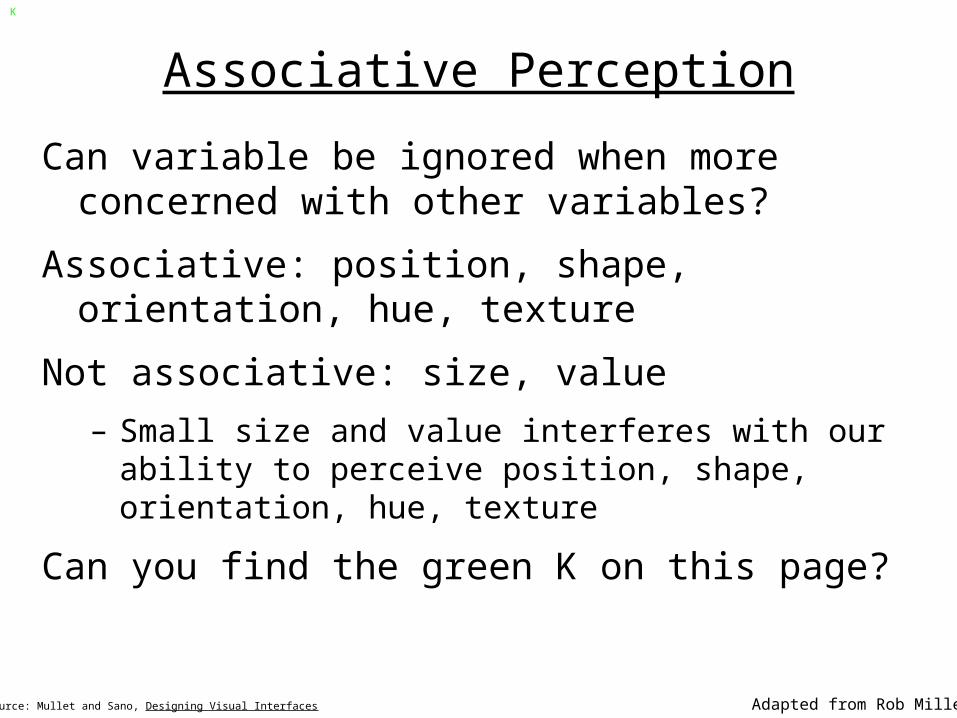
Associative Perception
Can variable be ignored when more concerned with other variables?
Associative: position, shape, orientation, hue, texture
Not associative: size, value
– Small size and value interferes with our ability to perceive position, shape, orientation, hue, texture
Can you find the green K on this page?
Source: Mullet and Sano, Designing Visual Interfaces Adapted from Rob Miller
K
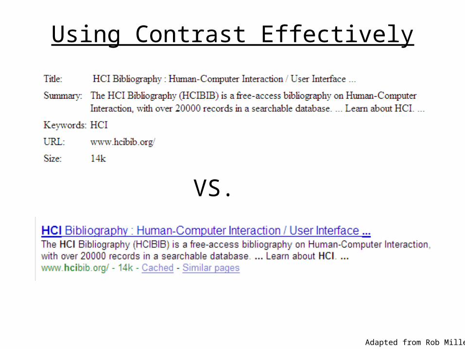
Using Contrast Effectively
Adapted from Rob Miller
VS.

The “Squint Test”
Close one eye, and squint with the other
What do you see? That is the structure that matters
Adapted from Rob Miller
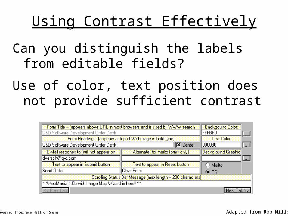
Using Contrast Effectively
Can you distinguish the labels from editable fields?
Use of color, text position does not provide sufficient contrast
Source: Interface Hall of Shame Adapted from Rob Miller
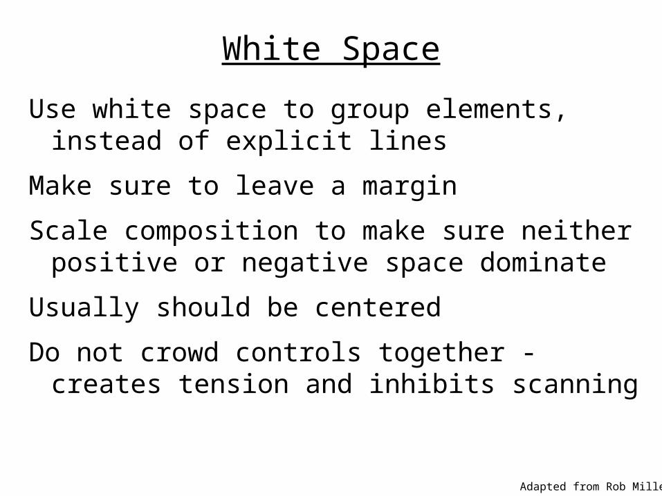
White Space
Use white space to group elements, instead of explicit lines
Make sure to leave a margin
Scale composition to make sure neither positive or negative space dominate
Usually should be centered
Do not crowd controls together - creates tension and inhibits scanning
Adapted from Rob Miller
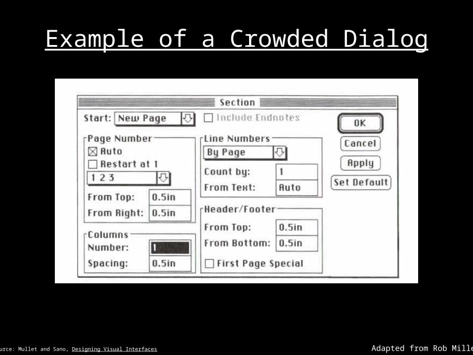
Example of a Crowded Dialog
Adapted from Rob MillerSource: Mullet and Sano, Designing Visual Interfaces
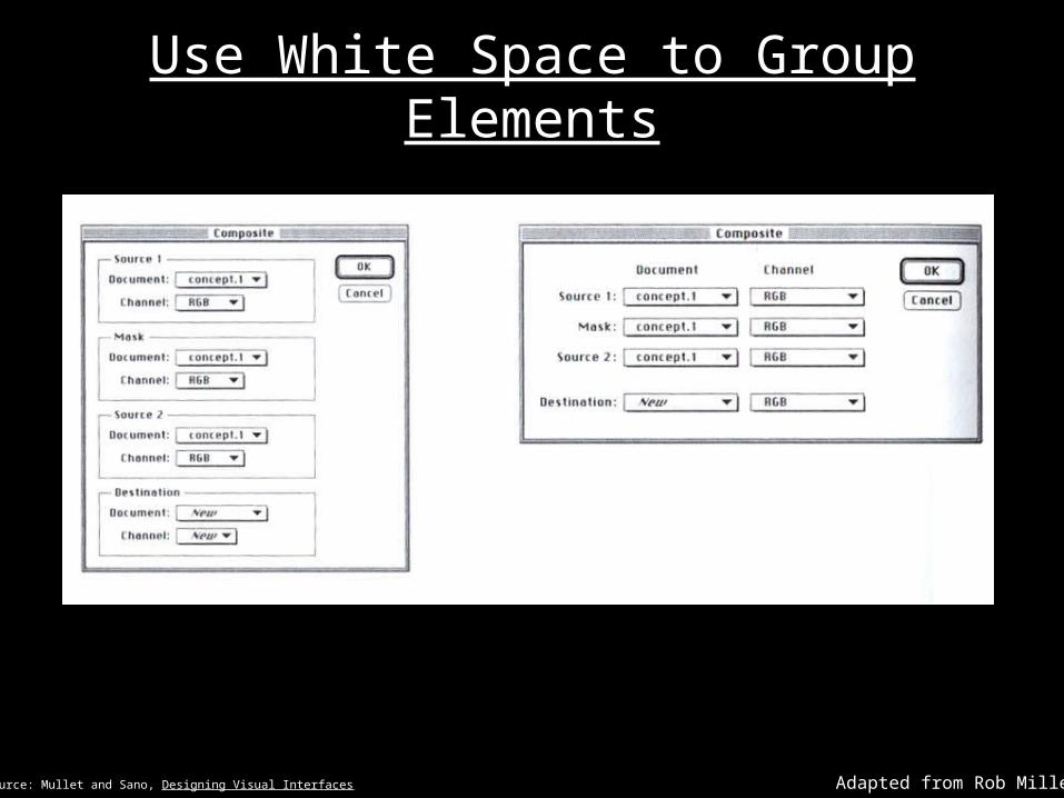
Use White Space to Group Elements
Adapted from Rob MillerSource: Mullet and Sano, Designing Visual Interfaces
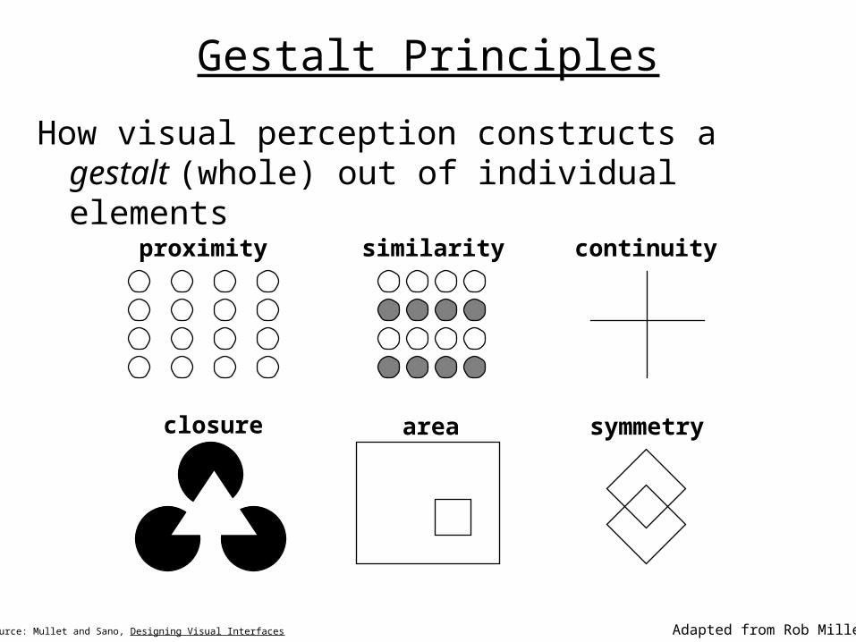
Gestalt Principles
How visual perception constructs a gestalt (whole) out of individual elements
Source: Mullet and Sano, Designing Visual Interfaces Adapted from Rob Miller
proximity similarity continuity
closure area symmetry
Balance
Choose an axis (usually vertical)
Make sure the visual weight of elements on each side are approximately equal
Symmetric layouts are implicitly balanced and aesthetically pleasing
Asymmetric layouts are harder to balance, but can increase tension and activity
Adapted from Rob Miller
Alignment
Either left- or right-justify your labels
Try to align your controls on the left and the right
Align controls and labels on the same baseline
Adapted from Rob Miller
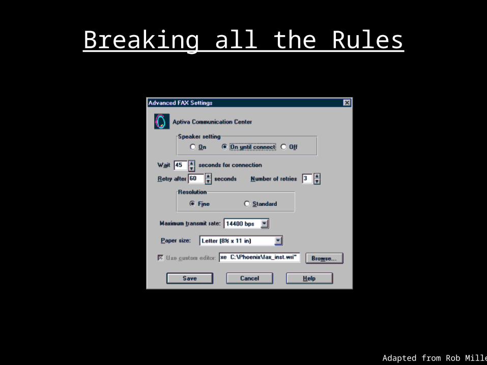
Breaking all the Rules
Adapted from Rob Miller
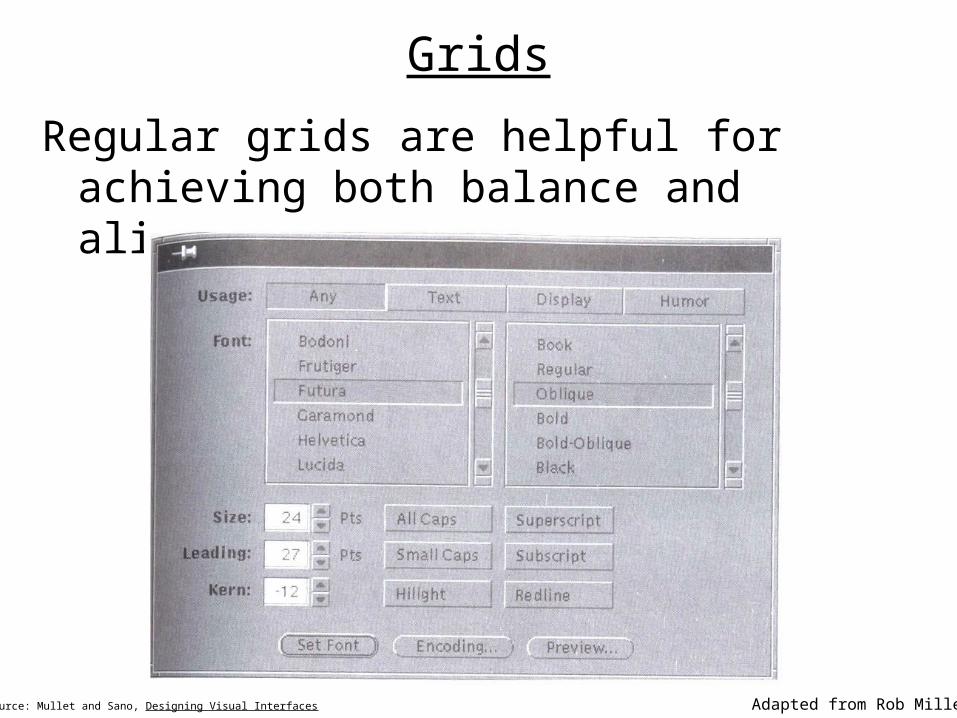
Grids
Regular grids are helpful for achieving both balance and alignment
Adapted from Rob MillerSource: Mullet and Sano, Designing Visual Interfaces
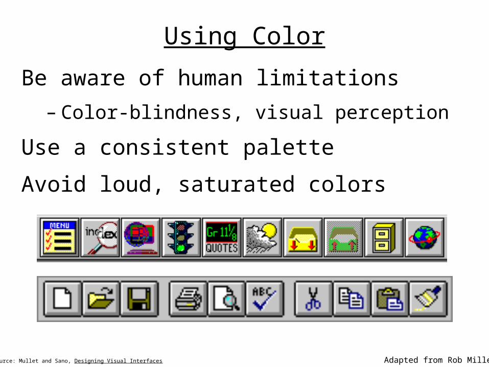
Using Color
Be aware of human limitations
– Color-blindness, visual perception
Use a consistent palette
Avoid loud, saturated colors
Adapted from Rob MillerSource: Mullet and Sano, Designing Visual Interfaces
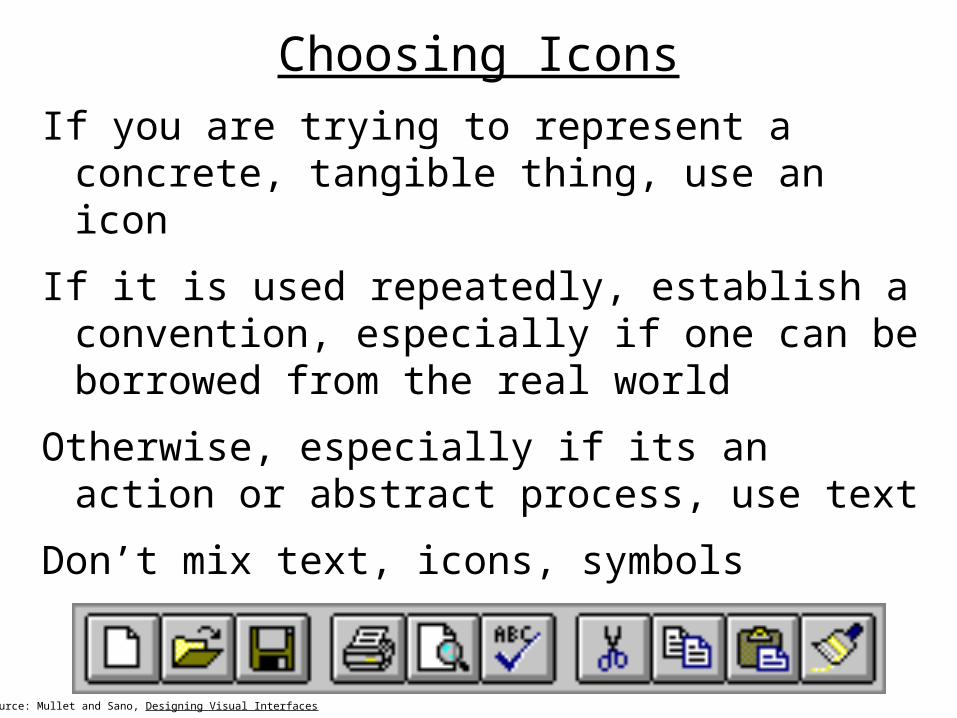
Choosing Icons
If you are trying to represent a concrete, tangible thing, use an icon
If it is used repeatedly, establish a convention, especially if one can be borrowed from the real world
Otherwise, especially if its an action or abstract process, use text
Don’t mix text, icons, symbols
Source: Mullet and Sano, Designing Visual Interfaces
Closing Thought
Problem-solving and communication, not personal expression, is the key to effective visual design for graphical user interfaces.
Source: Mullet and Sano, Designing Visual Interfaces
For Next Time
Lo-Fi Project Presentations!– Any questions?