graphing skills se
TRANSCRIPT
8/8/2019 Graphing Skills SE
http://slidepdf.com/reader/full/graphing-skills-se 1/7
.Name: ______________________________________ Date: ________________________
Student Exploration: Graphing Skills
Vocabulary: bar graph, line graph, negative relationship, pie chart, positive relationship, scale,scatter plot, variable
Prior Knowledge Questions (Do these BEFORE using the Gizmo.)
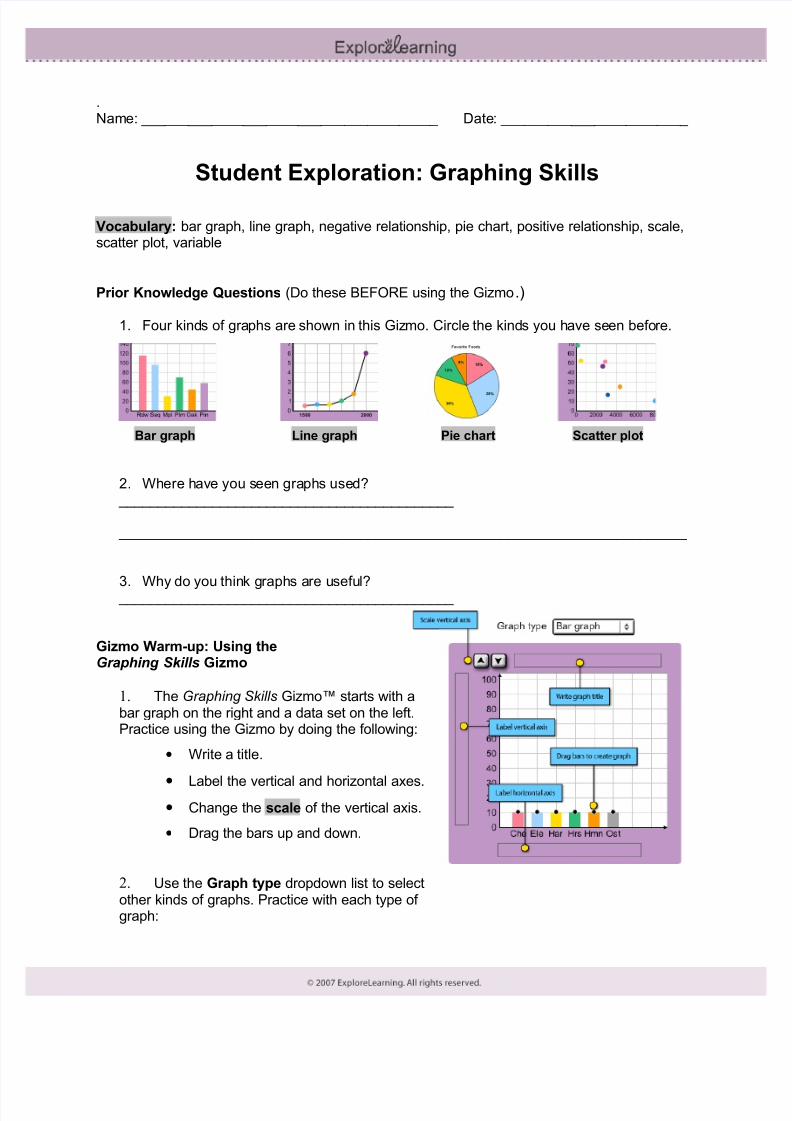
1. Four kinds of graphs are shown in this Gizmo. Circle the kinds you have seen before.
Bar graph Line graph Pie chart Scatter plot
2. Where have you seen graphs used? ___________________________________________
_________________________________________________________________________
3. Why do you think graphs are useful? ___________________________________________
Gizmo Warm-up: Using theGraphing Skills Gizmo
1. The Graphing Skills Gizmo™ starts with abar graph on the right and a data set on the left.Practice using the Gizmo by doing the following:
• Write a title.
•
Label the vertical and horizontal axes.• Change the scale of the vertical axis.
• Drag the bars up and down.
2. Use the Graph type dropdown list to selectother kinds of graphs. Practice with each type of graph:
8/8/2019 Graphing Skills SE
http://slidepdf.com/reader/full/graphing-skills-se 2/7
• On the Line graph drag the points up and down.
• On the Pie chart change the size of each slice by dragging the edges.
• On the Scatter plot drag points from the data table to the graph.
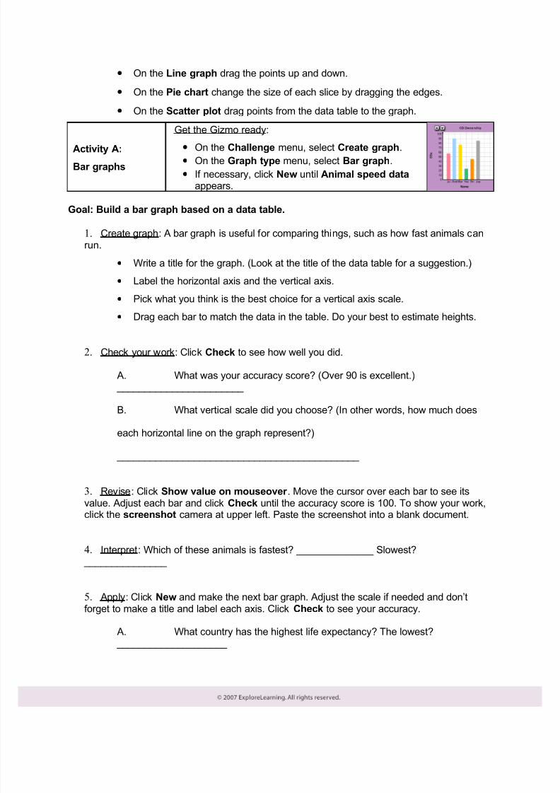
Activity A:
Bar graphs
Get the Gizmo ready:
• On the Challenge menu, select Create graph.
• On the Graph type menu, select Bar graph.
• If necessary, click New until Animal speed dataappears.
Goal: Build a bar graph based on a data table.
1. Create graph : A bar graph is useful for comparing things, such as how fast animals canrun.
• Write a title for the graph. (Look at the title of the data table for a suggestion.)
• Label the horizontal axis and the vertical axis.
• Pick what you think is the best choice for a vertical axis scale.
• Drag each bar to match the data in the table. Do your best to estimate heights.
2. Check your work : Click Check to see how well you did.
A. What was your accuracy score? (Over 90 is excellent.) _______________________
B. What vertical scale did you choose? (In other words, how much does
each horizontal line on the graph represent?)
____________________________________________
3. Revise : Click Show value on mouseover . Move the cursor over each bar to see itsvalue. Adjust each bar and click Check until the accuracy score is 100. To show your work,click the screenshot camera at upper left. Paste the screenshot into a blank document.
4. Interpret: Which of these animals is fastest? ______________ Slowest? _______________
5. Apply : Click New and make the next bar graph. Adjust the scale if needed and don’tforget to make a title and label each axis. Click Check to see your accuracy.
A. What country has the highest life expectancy? The lowest? ____________________

8/8/2019 Graphing Skills SE
http://slidepdf.com/reader/full/graphing-skills-se 3/7
___________________________________________________________________
B. Does anything about the graph surprise you? _______________________________
___________________________________________________________________
6. Challenge yourself : Hold a contest with your classmates. Turn off the Show value onmouseover checkbox and click New. Who can create the most accurate bar graph?
8/8/2019 Graphing Skills SE
http://slidepdf.com/reader/full/graphing-skills-se 4/7
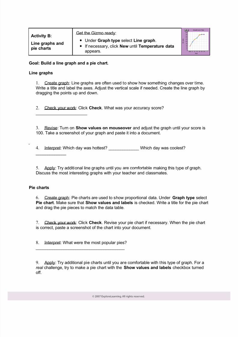
Activity B:
Line graphs andpie charts
Get the Gizmo ready:
• Under Graph type select Line graph.
• If necessary, click New until Temperature dataappears.
Goal: Build a line graph and a pie chart.
Line graphs
1. Create graph : Line graphs are often used to show how something changes over time.Write a title and label the axes. Adjust the vertical scale if needed. Create the line graph bydragging the points up and down.
2. Check your work : Click Check. What was your accuracy score? ______________________
3. Revise : Turn on Show values on mouseover and adjust the graph until your score is100. Take a screenshot of your graph and paste it into a document.
4. Interpret: Which day was hottest? _____________ Which day was coolest? _____________
5. Apply : Try additional line graphs until you are comfortable making this type of graph.Discuss the most interesting graphs with your teacher and classmates.
Pie charts
6. Create graph : Pie charts are used to show proportional data. Under Graph type selectPie chart. Make sure that Show values and labels is checked. Write a title for the pie chartand drag the pie pieces to match the data table.
7. Check your work : Click Check. Revise your pie chart if necessary. When the pie chartis correct, paste a screenshot of the chart into your document.
8. Interpret: What were the most popular pies? ______________________________________
9. Apply : Try additional pie charts until you are comfortable with this type of graph. For areal challenge, try to make a pie chart with the Show values and labels checkbox turnedoff.

8/8/2019 Graphing Skills SE
http://slidepdf.com/reader/full/graphing-skills-se 5/7
10. Extend your thinking : The Gizmo also allows you to create a data table from a graph.Under Challenge select Create table. Write a title for the table and then fill in each emptybox based on the graph. Click Check to check your accuracy.
8/8/2019 Graphing Skills SE
http://slidepdf.com/reader/full/graphing-skills-se 6/7
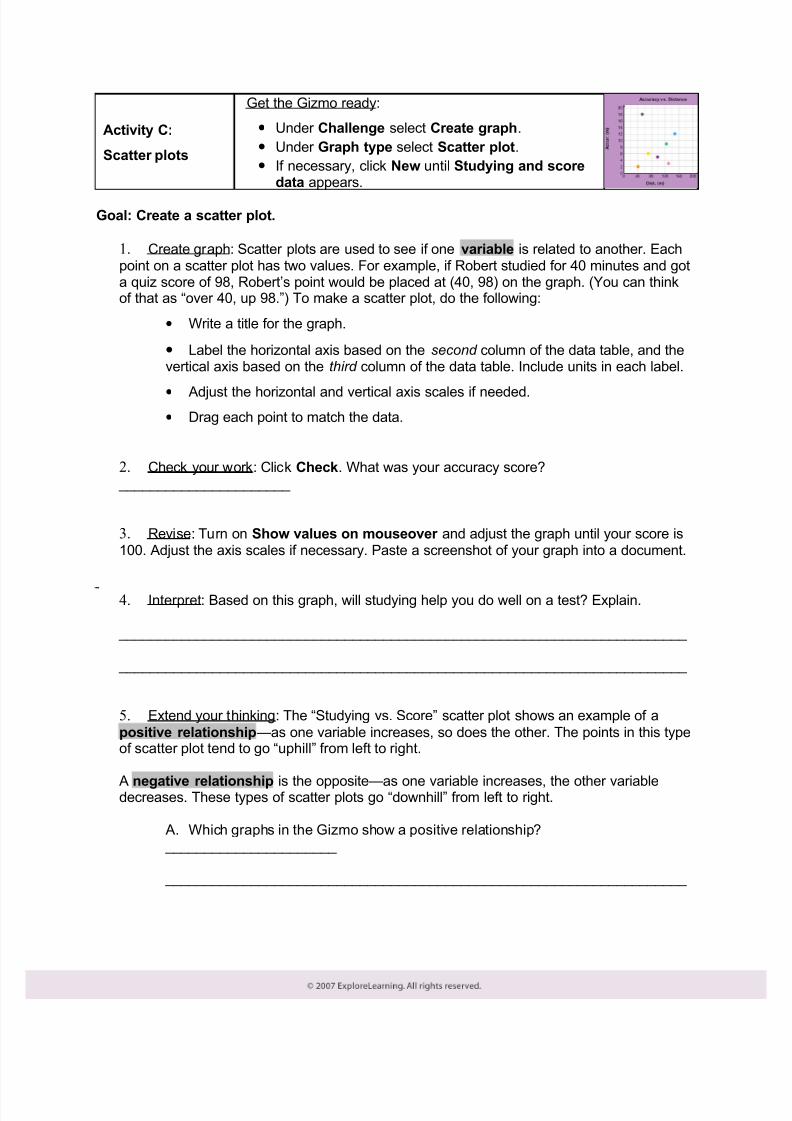
Activity C:
Scatter plots
Get the Gizmo ready:
• Under Challenge select Create graph.
• Under Graph type select Scatter plot.
• If necessary, click New until Studying and scoredata appears.
Goal: Create a scatter plot.
1. Create graph : Scatter plots are used to see if one variable is related to another. Eachpoint on a scatter plot has two values. For example, if Robert studied for 40 minutes and gota quiz score of 98, Robert’s point would be placed at (40, 98) on the graph. (You can thinkof that as “over 40, up 98.”) To make a scatter plot, do the following:
• Write a title for the graph.
• Label the horizontal axis based on the second column of the data table, and thevertical axis based on the third column of the data table. Include units in each label.
• Adjust the horizontal and vertical axis scales if needed.
• Drag each point to match the data.
2. Check your work : Click Check. What was your accuracy score? ______________________
3. Revise : Turn on Show values on mouseover and adjust the graph until your score is100. Adjust the axis scales if necessary. Paste a screenshot of your graph into a document.
4. Interpret: Based on this graph, will studying help you do well on a test? Explain.
_________________________________________________________________________
_________________________________________________________________________
5. Extend your thinking : The “Studying vs. Score” scatter plot shows an example of apositive relationship—as one variable increases, so does the other. The points in this typeof scatter plot tend to go “uphill” from left to right.
A negative relationship is the opposite—as one variable increases, the other variabledecreases. These types of scatter plots go “downhill” from left to right.
A. Which graphs in the Gizmo show a positive relationship? ______________________
___________________________________________________________________

8/8/2019 Graphing Skills SE
http://slidepdf.com/reader/full/graphing-skills-se 7/7
B. Which graphs in the Gizmo show a negative relationship? _____________________
___________________________________________________________________