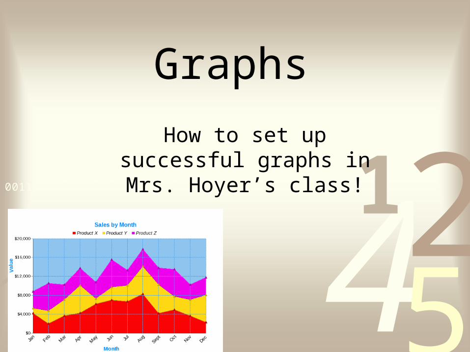
graphs how to set up successful graphs in mrs. hoyer’s class!
TRANSCRIPT
4251
0011 0010 1010 1101 0001 0100 1011
42510011 0010 1010 1101 0001 0100 1011
Graphs
How to set up successful graphs in Mrs. Hoyer’s class!
4251
0011 0010 1010 1101 0001 0100 1011
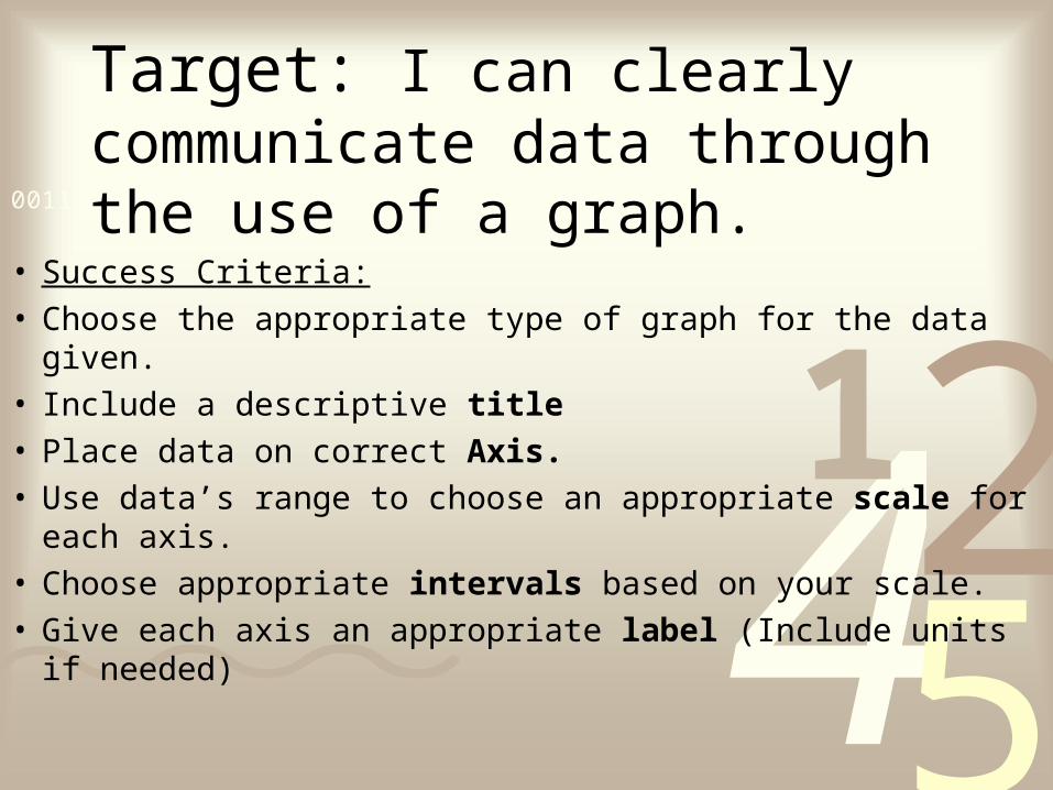
Target: I can clearly communicate data through the use of a graph.
• Success Criteria:• Choose the appropriate type of graph for the data given.• Include a descriptive title• Place data on correct Axis. • Use data’s range to choose an appropriate scale for each axis. • Choose appropriate intervals based on your scale.• Give each axis an appropriate label (Include units if needed)
4251
0011 0010 1010 1101 0001 0100 1011
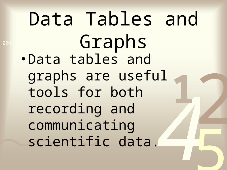
Data Tables and Graphs
• Data tables and graphs are useful tools for both recording and communicating scientific data.
4251
0011 0010 1010 1101 0001 0100 1011
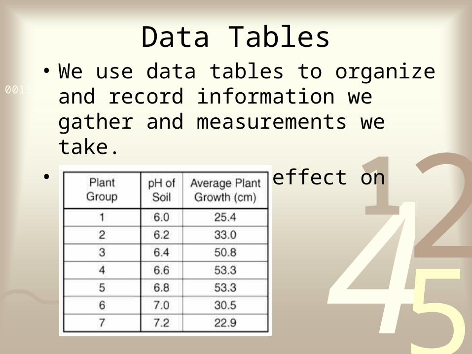
Data Tables• We use data tables to organize and record
information we gather and measurements we take.
• Soil pH and its effect on plant growth
4251
0011 0010 1010 1101 0001 0100 1011
Can you name a type of graph?

4251
0011 0010 1010 1101 0001 0100 1011
Types of Graphs
4251
0011 0010 1010 1101 0001 0100 1011
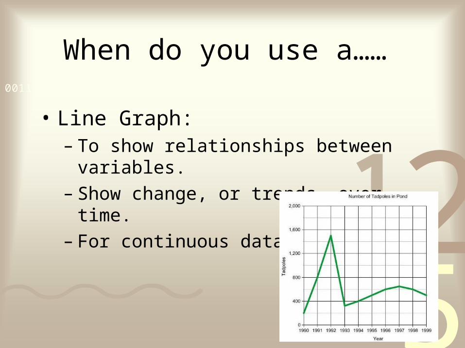
When do you use a……
• Line Graph: – To show relationships between variables. – Show change, or trends, over time.– For continuous data
4251
0011 0010 1010 1101 0001 0100 1011
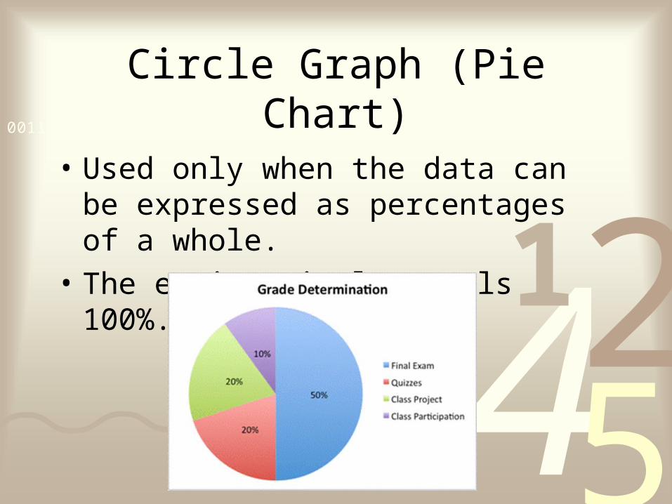
Circle Graph (Pie Chart)
• Used only when the data can be expressed as percentages of a whole.
• The entire circle equals 100%.
4251
0011 0010 1010 1101 0001 0100 1011
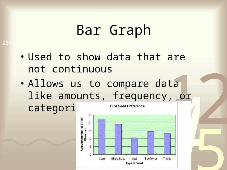
Bar Graph
• Used to show data that are not continuous
• Allows us to compare data like amounts, frequency, or categories.

4251
0011 0010 1010 1101 0001 0100 1011
Scatter Plot
A graph of plotted points that show the relationship between two sets of data.
4251
0011 0010 1010 1101 0001 0100 1011
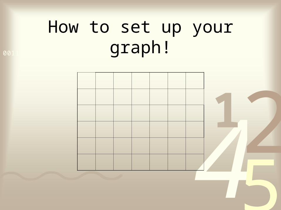
How to set up your graph!
4251
0011 0010 1010 1101 0001 0100 1011
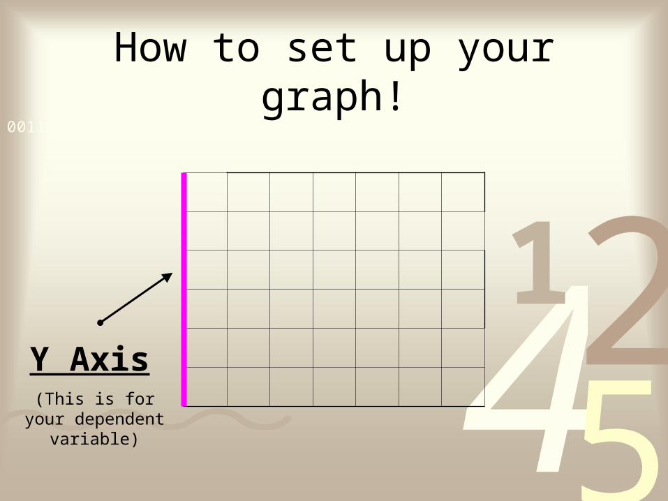
How to set up your graph!
Y Axis
(This is for your dependent variable)

4251
0011 0010 1010 1101 0001 0100 1011
How to set up your graph!
X Axis
(This is for your independent variable)
4251
0011 0010 1010 1101 0001 0100 1011What things should your graph
include?

4251
0011 0010 1010 1101 0001 0100 1011
TAILS
TT - Title
Teachers' Favorite Singer
4251
0011 0010 1010 1101 0001 0100 1011
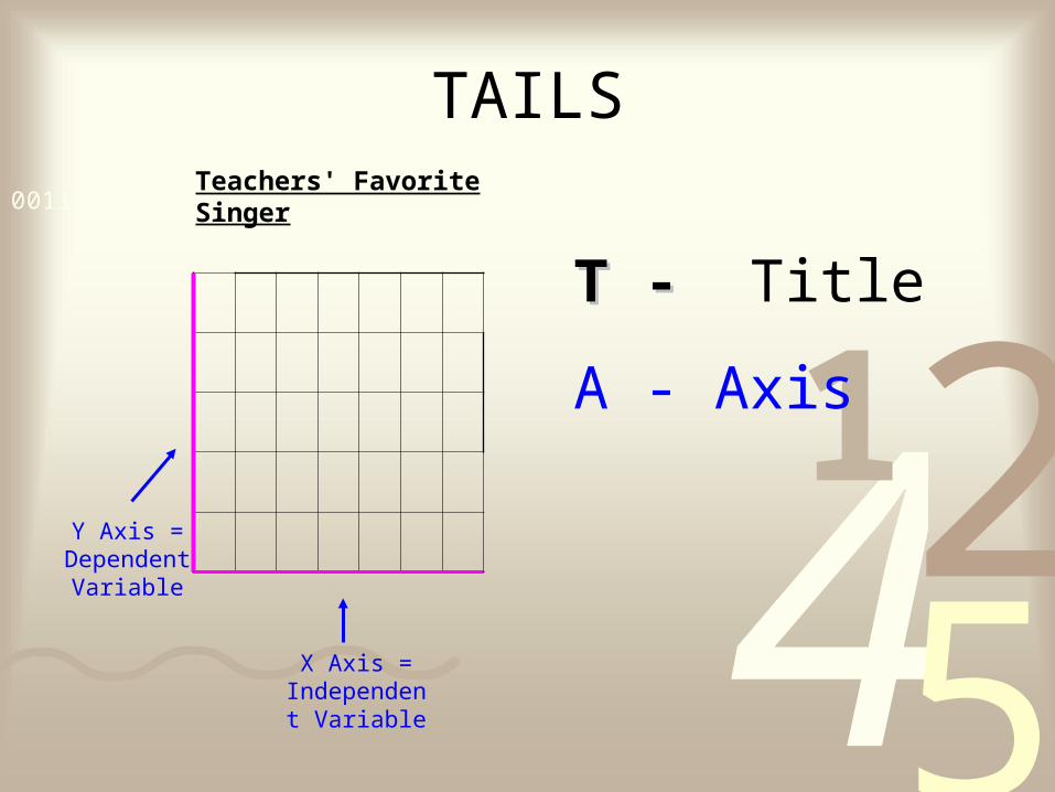
TAILS
T - T - Title
A - Axis
Teachers' Favorite Singer
Y Axis = Dependent Variable
X Axis = Independent
Variable
4251
0011 0010 1010 1101 0001 0100 1011
TAILS
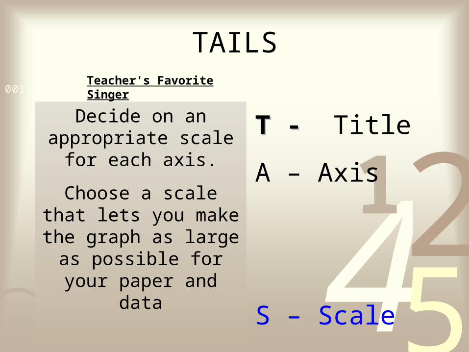
T - T - Title
A – Axis
S – Scale
Teacher's Favorite Singer
Decide on an appropriate scale for each axis.
Choose a scale that lets you make the graph as
large as possible for your paper and data
4251
0011 0010 1010 1101 0001 0100 1011
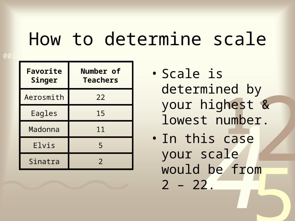
How to determine scale
• Scale is determined by your highest & lowest number.
• In this case your scale would be from 2 – 22.
Favorite Singer
Number of Teachers
Aerosmith 22
Eagles 15
Madonna 11
Elvis 5
Sinatra 2
4251
0011 0010 1010 1101 0001 0100 1011
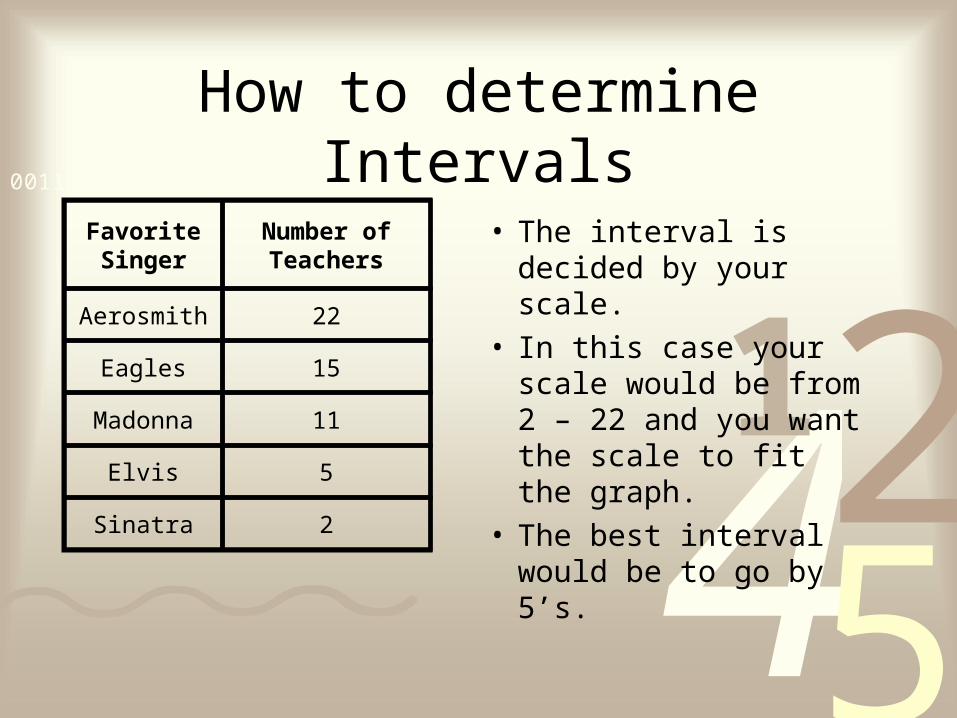
How to determine Intervals
• The interval is decided by your scale.
• In this case your scale would be from 2 – 22 and you want the scale to fit the graph.
• The best interval would be to go by 5’s.
Favorite Singer
Number of Teachers
Aerosmith 22
Eagles 15
Madonna 11
Elvis 5
Sinatra 2
4251
0011 0010 1010 1101 0001 0100 1011
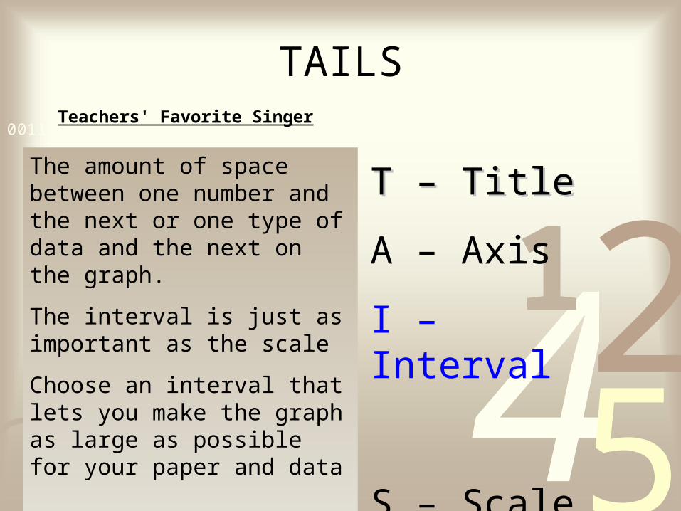
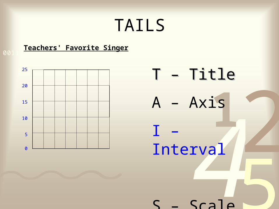
TAILS
T – TitleT – Title
A – Axis
I – Interval
S – Scale
Teachers' Favorite Singer
The amount of space between one number and the next or one type of data and the next on the graph.
The interval is just as important as the scale
Choose an interval that lets you make the graph as large as possible for your paper and data
4251
0011 0010 1010 1101 0001 0100 1011
TAILS
T – TitleT – Title
A – Axis
I – Interval
S – Scale
Teachers' Favorite Singer
0
5
10
15
20
25
4251
0011 0010 1010 1101 0001 0100 1011
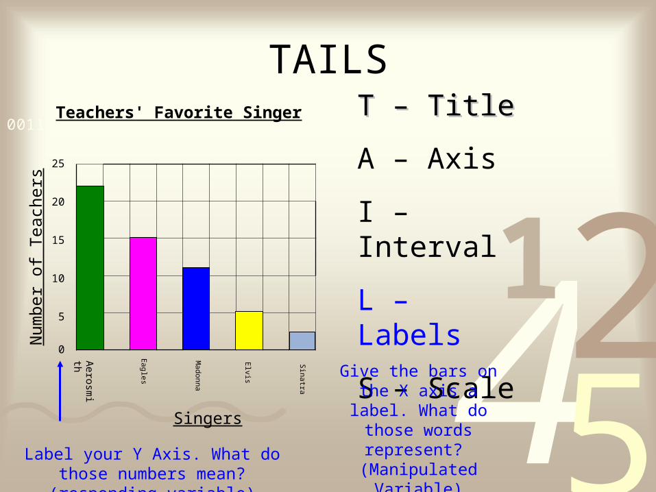
TAILST – TitleT – Title
A – Axis
I – Interval
L – Labels
S – Scale
Teachers' Favorite Singer
0
5
10
15
20
25
Aerosm
ith
Eagles
Madonna
Elvis
Sinatra
Singers
Give the bars on the X axis a label. What do
those words represent? (Manipulated Variable)
Num
ber
of T
each
ers
Label your Y Axis. What do those numbers mean? (responding variable)
4251
0011 0010 1010 1101 0001 0100 1011
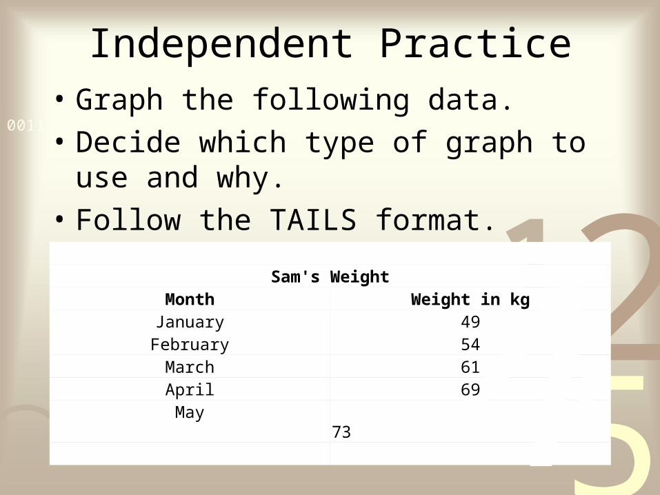
Independent Practice• Graph the following data.
• Decide which type of graph to use and why.
• Follow the TAILS format.
Sam's WeightMonth Weight in kgJanuary 49February 54
March 61April 69May 73

4251
0011 0010 1010 1101 0001 0100 1011
4251
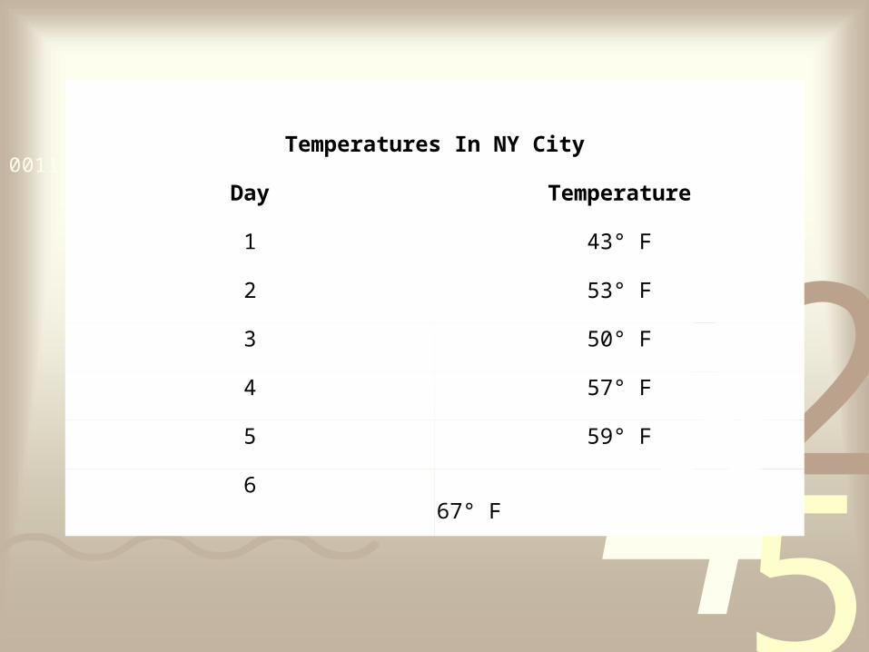
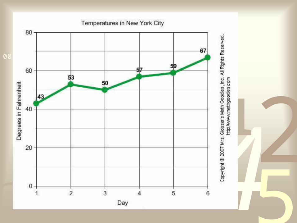
0011 0010 1010 1101 0001 0100 1011Temperatures In NY City
Day Temperature
1 43° F
2 53° F
3 50° F
4 57° F
5 59° F
6 67° F
4251
0011 0010 1010 1101 0001 0100 1011