growing unequal
TRANSCRIPT

8/20/2019 Growing Unequal
http://slidepdf.com/reader/full/growing-unequal 1/309
Growing Unequal?
INCOME DISTRIBUTION AND POVERTYIN OECD COUNTRIES
8/20/2019 Growing Unequal
http://slidepdf.com/reader/full/growing-unequal 2/309
ORGANISATION FOR ECONOMIC CO-OPERATION
AND DEVELOPMENT
The OECD is a unique forum where the governments of 30 democracies work together toaddress the economic, social and environmental challenges of globalisation. The OECD is also atthe forefront of efforts to understand and to help governments respond to new developments andconcerns, such as corporate governance, the information economy and the challenges of anageing population. The Organisation provides a setting where governments can compare policyexperiences, seek answers to common problems, identify good practice and work to co-ordinatedomestic and international policies.
The OECD member countries are: Australia, Austria, Belgium, Canada, the Czech Republic,Denmark, Finland, France, Germany, Greece, Hungary, Iceland, Ireland, Italy, Japan, Korea,Luxembourg, Mexico, the Netherlands, New Zealand, Norway, Poland, Portugal, the Slovak Republic,Spain, Sweden, Switzerland, Turkey, the United Kingdom and the United States. The Commission of the European Communities takes part in the work of the OECD.
OECD Publishing disseminates widely the results of the Organisation’s statistics gathering andresearch on economic, social and environmental issues, as well as the conventions, guidelines and
standards agreed by its members.
Also available in French under the title:
Croissance et inégalités
DISTRIBUTION DES REVENUS ET PAUVRETÉ DANS LES PAYS DE L’OCDE
Cover illustration:
© Inmagine ltd.
Corrigenda to OECD publications may be found on line at: www.oecd.org/publishing/corrigenda.
© OECD 2008
You can copy, download or print OECD content for your own use, and you can include excerpts from OECD publications, databases and multimedia
products in your own documents, presentations, blogs, websites and teaching materials, provided that suitable acknowledgment of OECD as sourceand copyright owner is given. All requests for public or commercial use and translation rights should be submitted [email protected]. Requests forpermission to photocopy portions of this material for public or commercial use shall be addressed directly to the Copyright Clearance Center (CCC)at [email protected] or the Centre français d'exploitation du droit de copie (CFC) [email protected].
This work is published on the responsibility of the Secretary-General of the OECD. The
opinions expressed and arguments employed herein do not necessarily reflect the official
views of the Organisation or of the governments of its member countries.

8/20/2019 Growing Unequal
http://slidepdf.com/reader/full/growing-unequal 3/309
FOREWORD
GROWING UNEQUAL? – ISBN 978-92-64-044180-0 – © OECD 2008 3
Foreword
Fears of rising income inequalities and poverty loom large in current discussions of how globalisation
is affecting OECD economies and societies. Such fears are probably the single most important concern
put forward by those who argue that we should resist the increased integration of our economies and
societies, and that the larger cross-border flows of goods, services and people are putting at risk the
living and working conditions of millions of people in developed and less-developed countries.I believe that these responses are wrong – but also that the anxieties from which they stem should
be taken seriously. Globalisation offers opportunities to live fuller and better lives – but making thebest of these requires correcting the asymmetries in the distribution of the benefits and costs of
globalisation.
Achieving this goal requires building up and maintaining an adequate statistical infrastructure
to monitor how income inequality and poverty are changing over time. This is a task that has
involved the OECD over many years, reaching back to the mid-1970s with the pioneering efforts of
Malcom Sawyer for the OECD Economic Outlook, and continuing in the mid-1990s with the report
prepared for the OECD on the subject by a team of leading scholars (Tony Atkinson, Lee Rainwater
and Tim Smeeding). Since those days, the OECD has regularly monitored changes in income
inequality and poverty through a set of standard tabulations drawn from national datasets and
based on common assumptions and definitions. These tabulations are provided to the OECD by anetwork of national consultants. While the responsibility for analysis and possible errors in the
report belongs to the authors alone, this work would not have been possible without the enduring
co-operation of this network of friends and colleagues.
While this report builds on a tradition of OECD work, it nevertheless represents a landmark for
the OECD. First, because – for the first time – it presents information on this subject covering all
30 OECD countries. Second, because it provides fairly up-to-date information (referring to the
mid-2000s), with a large reduction in the time-lag that characterised previous such OECD reports.
Lastly, because it brings together information on both household income in cash (the standard
concept used by the OECD to assess the distribution of resources) and other economic resources
(in-kind public services, household assets) that contribute to the well-being of individuals and
families.
This report reflects the contribution of several colleagues, in and outside the OECD. Michael
Förster and Marco Mira d’Ercole, from the OECD Social Policy Division, have co-ordinated the data
collection. Chapter 1 has been prepared by Michael Förster and Marco Mira d’Ercole; Chapters 2 and 3
by Marco Mira d’Ercole and Aderonke Osikonimu (currently at the University of Freiburg, Germany);
Chapter 4 by Peter Whiteford, senior economist at the OECD Social Policy Division at the time of
writing this chapter and currently professor at the Social Policy Research Centre at the University of
New South Wales, Australia; Chapter 5 by Michael Förster and Marco Mira d’Ercole; Chapter 6 by
Anna Cristina D’Addio, OECD Social Policy Division; Chapter 7 by Romina Boarini, OECD EconomicsDepartment, and Marco Mira d’Ercole; Chapter 8 by Anna Cristina D’Addio; Chapter 9 by François
Marical (INSEE), Marco Mira d’Ercole (OECD), Maria Vaalavuo (European University Institute,

8/20/2019 Growing Unequal
http://slidepdf.com/reader/full/growing-unequal 4/309
FOREWORD
GROWING UNEQUAL? – ISBN 978-92-64-044180-0 – © OECD 20084
Florence) and Gerlinde Verbist (University of Antwerp); Chapter 10 by Markus Jantti (Åbo Akademi
University), Eva Sierminska (CEPS), and Tim Smeeding (Syracuse University); and Chapter 11 by
Michael Förster and Marco Mira d’Ercole. Supporting material can be found on the OECD web pages
www.oecd.org/els/social/inequality. Patrick Hamm contributed to the editing of the report. Mark
Pearson, Head of the OECD Social Policy Division, supervised the preparation of this report and
provided useful comments on various versions.
Angel Gurria
OECD Secretary-General

8/20/2019 Growing Unequal
http://slidepdf.com/reader/full/growing-unequal 5/309

8/20/2019 Growing Unequal
http://slidepdf.com/reader/full/growing-unequal 6/309

8/20/2019 Growing Unequal
http://slidepdf.com/reader/full/growing-unequal 7/309
TABLE OF CONTENTS
GROWING UNEQUAL? – ISBN 978-92-64-044180-0 – © OECD 2008 7
Table of Contents
Introduction . . . . . . . . . . . . . . . . . . . . . . . . . . . . . . . . . . . . . . . . . . . . . . . . . . . . . . . . . . . . . . . . 15
Part IMAIN FEATURES OF INEQUALITY
Chapter 1. The Distribution of Household Income in OECD Countries:
What Are its Main Features? . . . . . . . . . . . . . . . . . . . . . . . . . . . . . . . . . . . . . . . . . . . . . 23Introduction . . . . . . . . . . . . . . . . . . . . . . . . . . . . . . . . . . . . . . . . . . . . . . . . . . . . . . . . . . . . 24How does the distribution of household income compare across countries? . . . . . 24Has the distribution of household income widened over time?. . . . . . . . . . . . . . . . . 26Moving beyond summary measures of income distribution: income levelsacross deciles . . . . . . . . . . . . . . . . . . . . . . . . . . . . . . . . . . . . . . . . . . . . . . . . . . . . . . . . . . . 34Conclusion . . . . . . . . . . . . . . . . . . . . . . . . . . . . . . . . . . . . . . . . . . . . . . . . . . . . . . . . . . . . . 38
Notes . . . . . . . . . . . . . . . . . . . . . . . . . . . . . . . . . . . . . . . . . . . . . . . . . . . . . . . . . . . . . . . . . . 38
References. . . . . . . . . . . . . . . . . . . . . . . . . . . . . . . . . . . . . . . . . . . . . . . . . . . . . . . . . . . . . . 40
Annex 1.A1. OECD Data on Income Distribution: Key Features . . . . . . . . . . . . . . . . . . 41
Annex 1.A2. Additional Tables and Figures. . . . . . . . . . . . . . . . . . . . . . . . . . . . . . . . . . . 49
Part IIMAIN DRIVERS OF INEQUALITY
Chapter 2. Changes in Demography and Living Arrangements: Are they Widening
the Distribution of Household Income? . . . . . . . . . . . . . . . . . . . . . . . . . . . . . . . . . . . . 57Introduction . . . . . . . . . . . . . . . . . . . . . . . . . . . . . . . . . . . . . . . . . . . . . . . . . . . . . . . . . . . . 58Cross-country differences in population structure. . . . . . . . . . . . . . . . . . . . . . . . . . . . 58Demographic differences across the income distribution. . . . . . . . . . . . . . . . . . . . . . 60
The influence of population structure on summary measures of incomeinequality . . . . . . . . . . . . . . . . . . . . . . . . . . . . . . . . . . . . . . . . . . . . . . . . . . . . . . . . . . . . . . 65Changes in the relative income of different groups . . . . . . . . . . . . . . . . . . . . . . . . . . . 67Conclusion . . . . . . . . . . . . . . . . . . . . . . . . . . . . . . . . . . . . . . . . . . . . . . . . . . . . . . . . . . . . . 70
Notes . . . . . . . . . . . . . . . . . . . . . . . . . . . . . . . . . . . . . . . . . . . . . . . . . . . . . . . . . . . . . . . . . . 70
References. . . . . . . . . . . . . . . . . . . . . . . . . . . . . . . . . . . . . . . . . . . . . . . . . . . . . . . . . . . . . . 71
Annex 2.A1. Structure of the Population in Selected OECD Countries . . . . . . . . . . . . 73
Chapter 3. Earnings and Income Inequality: Understanding the Links . . . . . . . . . . . . . . 77Introduction . . . . . . . . . . . . . . . . . . . . . . . . . . . . . . . . . . . . . . . . . . . . . . . . . . . . . . . . . . . . 78Main patterns in the distribution of personal earnings amongfull time-workers . . . . . . . . . . . . . . . . . . . . . . . . . . . . . . . . . . . . . . . . . . . . . . . . . . . . . . . . 79

8/20/2019 Growing Unequal
http://slidepdf.com/reader/full/growing-unequal 8/309
TABLE OF CONTENTS
GROWING UNEQUAL? – ISBN 978-92-64-044180-0 – © OECD 20088
Earnings distribution among all workers: the importance of non-standardemployment . . . . . . . . . . . . . . . . . . . . . . . . . . . . . . . . . . . . . . . . . . . . . . . . . . . . . . . . . . . . 82From personal to household earnings: which factors come into play?. . . . . . . . . . . 84From household earnings to market income. . . . . . . . . . . . . . . . . . . . . . . . . . . . . . . . . 90Conclusion . . . . . . . . . . . . . . . . . . . . . . . . . . . . . . . . . . . . . . . . . . . . . . . . . . . . . . . . . . . . . 92
Notes . . . . . . . . . . . . . . . . . . . . . . . . . . . . . . . . . . . . . . . . . . . . . . . . . . . . . . . . . . . . . . . . . . 92
References. . . . . . . . . . . . . . . . . . . . . . . . . . . . . . . . . . . . . . . . . . . . . . . . . . . . . . . . . . . . . . 94
Chapter 4. How Much Redistribution Do Governments Achieve? The Role of Cash
Transfers and Household Taxes . . . . . . . . . . . . . . . . . . . . . . . . . . . . . . . . . . . . . . . . . . 97Introduction . . . . . . . . . . . . . . . . . . . . . . . . . . . . . . . . . . . . . . . . . . . . . . . . . . . . . . . . . . . . 98An accounting framework for household income . . . . . . . . . . . . . . . . . . . . . . . . . . . . 98Targeting and progressivity: how do social programmes and taxes affect incomedistribution? . . . . . . . . . . . . . . . . . . . . . . . . . . . . . . . . . . . . . . . . . . . . . . . . . . . . . . . . . . . . 99Level and characteristics of public cash transfers and household taxes . . . . . . . . . 102How much redistribution is achieved through government cash benefitsand household taxes? . . . . . . . . . . . . . . . . . . . . . . . . . . . . . . . . . . . . . . . . . . . . . . . . . . . . 109Redistribution towards those at the bottom of the income ladder:the interplay of size and targeting . . . . . . . . . . . . . . . . . . . . . . . . . . . . . . . . . . . . . . . . . 115Improving measures of welfare state outcomes . . . . . . . . . . . . . . . . . . . . . . . . . . . . . . 117Conclusion . . . . . . . . . . . . . . . . . . . . . . . . . . . . . . . . . . . . . . . . . . . . . . . . . . . . . . . . . . . . . 118
Notes . . . . . . . . . . . . . . . . . . . . . . . . . . . . . . . . . . . . . . . . . . . . . . . . . . . . . . . . . . . . . . . . . . 119
References. . . . . . . . . . . . . . . . . . . . . . . . . . . . . . . . . . . . . . . . . . . . . . . . . . . . . . . . . . . . . . 120
Part IIICHARACTERISTICS OF POVERTY
Chapter 5. Poverty in OECD Countries: An Assessment Based on Static Income . . . . . 125Introduction . . . . . . . . . . . . . . . . . . . . . . . . . . . . . . . . . . . . . . . . . . . . . . . . . . . . . . . . . . . . 126Levels and trends in overall income poverty. . . . . . . . . . . . . . . . . . . . . . . . . . . . . . . . . 126Poverty risks for different population groups . . . . . . . . . . . . . . . . . . . . . . . . . . . . . . . . 130The role of household taxes and public cash transfers in reducingincome poverty. . . . . . . . . . . . . . . . . . . . . . . . . . . . . . . . . . . . . . . . . . . . . . . . . . . . . . . . . . 139Accounting for changes in poverty rates since the mid-1990s . . . . . . . . . . . . . . . . . . 144Conclusion . . . . . . . . . . . . . . . . . . . . . . . . . . . . . . . . . . . . . . . . . . . . . . . . . . . . . . . . . . . . . 147
Notes . . . . . . . . . . . . . . . . . . . . . . . . . . . . . . . . . . . . . . . . . . . . . . . . . . . . . . . . . . . . . . . . . . 148
References. . . . . . . . . . . . . . . . . . . . . . . . . . . . . . . . . . . . . . . . . . . . . . . . . . . . . . . . . . . . . . 150
Annex 5.A1. Low-income Thresholds Used in the Analysis . . . . . . . . . . . . . . . . . . . . . 151
Annex 5.A2. Alternative Estimates of Main Poverty Indicators . . . . . . . . . . . . . . . . . . 153
Chapter 6. Does Income Poverty Last Over Time? Evidence from Longitudinal Data . . 155Introduction . . . . . . . . . . . . . . . . . . . . . . . . . . . . . . . . . . . . . . . . . . . . . . . . . . . . . . . . . . . . 156Longitudinal data and dynamic poverty measures . . . . . . . . . . . . . . . . . . . . . . . . . . . 156Distinguishing between temporary and persistent spells of poverty . . . . . . . . . . . . 157
The composition of persistent poverty. . . . . . . . . . . . . . . . . . . . . . . . . . . . . . . . . . . . . . 158Poverty entries, exits and occurrences. . . . . . . . . . . . . . . . . . . . . . . . . . . . . . . . . . . . . . 161Events that trigger entry into poverty. . . . . . . . . . . . . . . . . . . . . . . . . . . . . . . . . . . . . . . 166

8/20/2019 Growing Unequal
http://slidepdf.com/reader/full/growing-unequal 9/309
TABLE OF CONTENTS
GROWING UNEQUAL? – ISBN 978-92-64-044180-0 – © OECD 2008 9
Income mobility and poverty persistence . . . . . . . . . . . . . . . . . . . . . . . . . . . . . . . . . . . 168
Conclusion . . . . . . . . . . . . . . . . . . . . . . . . . . . . . . . . . . . . . . . . . . . . . . . . . . . . . . . . . . . . . 170
Notes . . . . . . . . . . . . . . . . . . . . . . . . . . . . . . . . . . . . . . . . . . . . . . . . . . . . . . . . . . . . . . . . . . 172
References. . . . . . . . . . . . . . . . . . . . . . . . . . . . . . . . . . . . . . . . . . . . . . . . . . . . . . . . . . . . . . 173
Chapter 7. Non-income Poverty: What Can we Learn from Indicators of Material
Deprivation? . . . . . . . . . . . . . . . . . . . . . . . . . . . . . . . . . . . . . . . . . . . . . . . . . . . . . . . . . . . . 177
Introduction . . . . . . . . . . . . . . . . . . . . . . . . . . . . . . . . . . . . . . . . . . . . . . . . . . . . . . . . . . . . 178
Material deprivation as one approach to the measurement of poverty . . . . . . . . . . 178
Characteristics of material deprivation in a comparative perspective . . . . . . . . . . . 181
Conclusion . . . . . . . . . . . . . . . . . . . . . . . . . . . . . . . . . . . . . . . . . . . . . . . . . . . . . . . . . . . . . 193
Notes . . . . . . . . . . . . . . . . . . . . . . . . . . . . . . . . . . . . . . . . . . . . . . . . . . . . . . . . . . . . . . . . . . 194
References. . . . . . . . . . . . . . . . . . . . . . . . . . . . . . . . . . . . . . . . . . . . . . . . . . . . . . . . . . . . . . 195
Annex 7.A1. Prevalence of Non-income Poverty Based
on a Synthetic Measure of Multiple Deprivations. . . . . . . . . . . . . . . . . . . . . . . . . . . . . 197
Part IVADDITIONAL DIMENSIONS OF INEQUALITY
Chapter 8. Intergenerational Mobility: Does it Offset or Reinforce Income
Inequality? . . . . . . . . . . . . . . . . . . . . . . . . . . . . . . . . . . . . . . . . . . . . . . . . . . . . . . . . . . . . . 203
Introduction . . . . . . . . . . . . . . . . . . . . . . . . . . . . . . . . . . . . . . . . . . . . . . . . . . . . . . . . . . . . 204
Intergenerational transmission of disadvantages: an overview. . . . . . . . . . . . . . . . . 204
Intergenerational transmission of disadvantage: does it matter for policies? . . . . . 214
Conclusion . . . . . . . . . . . . . . . . . . . . . . . . . . . . . . . . . . . . . . . . . . . . . . . . . . . . . . . . . . . . . 216Notes . . . . . . . . . . . . . . . . . . . . . . . . . . . . . . . . . . . . . . . . . . . . . . . . . . . . . . . . . . . . . . . . . . 216
References. . . . . . . . . . . . . . . . . . . . . . . . . . . . . . . . . . . . . . . . . . . . . . . . . . . . . . . . . . . . . . 218
Chapter 9. Publicly-provided Services: How Do they Change the Distribution
of Households’ Economic Resources? . . . . . . . . . . . . . . . . . . . . . . . . . . . . . . . . . . . . . . 223
Introduction . . . . . . . . . . . . . . . . . . . . . . . . . . . . . . . . . . . . . . . . . . . . . . . . . . . . . . . . . . . . 224
Findings from previous research. . . . . . . . . . . . . . . . . . . . . . . . . . . . . . . . . . . . . . . . . . . 224
New empirical evidence . . . . . . . . . . . . . . . . . . . . . . . . . . . . . . . . . . . . . . . . . . . . . . . . . . 232
Conclusion . . . . . . . . . . . . . . . . . . . . . . . . . . . . . . . . . . . . . . . . . . . . . . . . . . . . . . . . . . . . . 245
Notes . . . . . . . . . . . . . . . . . . . . . . . . . . . . . . . . . . . . . . . . . . . . . . . . . . . . . . . . . . . . . . . . . . 246
References. . . . . . . . . . . . . . . . . . . . . . . . . . . . . . . . . . . . . . . . . . . . . . . . . . . . . . . . . . . . . . 249
Chapter 10. How is Household Wealth Distributed? Evidence from the Luxembourg
Wealth Study . . . . . . . . . . . . . . . . . . . . . . . . . . . . . . . . . . . . . . . . . . . . . . . . . . . . . . . . . . . 253
Introduction . . . . . . . . . . . . . . . . . . . . . . . . . . . . . . . . . . . . . . . . . . . . . . . . . . . . . . . . . . . . 254
Household wealth and social policies. . . . . . . . . . . . . . . . . . . . . . . . . . . . . . . . . . . . . . . 254
Basic LWS measures and methodology . . . . . . . . . . . . . . . . . . . . . . . . . . . . . . . . . . . . . 256
Basic patterns in the distribution of household wealth. . . . . . . . . . . . . . . . . . . . . . . . 258
Joint patterns of income and wealth inequality . . . . . . . . . . . . . . . . . . . . . . . . . . . . . . 263
Conclusion . . . . . . . . . . . . . . . . . . . . . . . . . . . . . . . . . . . . . . . . . . . . . . . . . . . . . . . . . . . . . 269
Notes . . . . . . . . . . . . . . . . . . . . . . . . . . . . . . . . . . . . . . . . . . . . . . . . . . . . . . . . . . . . . . . . . . 270

8/20/2019 Growing Unequal
http://slidepdf.com/reader/full/growing-unequal 10/309
TABLE OF CONTENTS
GROWING UNEQUAL? – ISBN 978-92-64-044180-0 – © OECD 200810
References. . . . . . . . . . . . . . . . . . . . . . . . . . . . . . . . . . . . . . . . . . . . . . . . . . . . . . . . . . . . . . 271
Annex 10.A1. Features of the Luxembourg Wealth Study. . . . . . . . . . . . . . . . . . . . . . . 274
Part V
CONCLUSIONSChapter 11. Inequality in the Distribution of Economic Resources:
How it has Changed and what Governments Can Do about it . . . . . . . . . . . . . . . . . 281Introduction . . . . . . . . . . . . . . . . . . . . . . . . . . . . . . . . . . . . . . . . . . . . . . . . . . . . . . . . . . . . 282What are the main features of the distribution of household incomein OECD countries? . . . . . . . . . . . . . . . . . . . . . . . . . . . . . . . . . . . . . . . . . . . . . . . . . . . . . . 282What factors have been driving changes in the distributionof household income? . . . . . . . . . . . . . . . . . . . . . . . . . . . . . . . . . . . . . . . . . . . . . . . . . . . . 288Can we assess economic inequalities just by looking at cash income?. . . . . . . . . . . 294What are the implications of these findings for policies aimed
at narrowing poverty and inequalities? . . . . . . . . . . . . . . . . . . . . . . . . . . . . . . . . . . . . . 301Conclusion . . . . . . . . . . . . . . . . . . . . . . . . . . . . . . . . . . . . . . . . . . . . . . . . . . . . . . . . . . . . . 306
Notes . . . . . . . . . . . . . . . . . . . . . . . . . . . . . . . . . . . . . . . . . . . . . . . . . . . . . . . . . . . . . . . . . . 307
References. . . . . . . . . . . . . . . . . . . . . . . . . . . . . . . . . . . . . . . . . . . . . . . . . . . . . . . . . . . . . . 307
Boxes
1.1. Changes at the top of the income distribution. . . . . . . . . . . . . . . . . . . . . . . . . . . . 321.2. Income inequality and wage shares: are they related?. . . . . . . . . . . . . . . . . . . . . 353.1. Conceptual features of OECD statistics on the distribution of personal
earnings . . . . . . . . . . . . . . . . . . . . . . . . . . . . . . . . . . . . . . . . . . . . . . . . . . . . . . . . . . . . 793.2. What accounts for the greater inequality of spouse earnings compared
to those of household heads? . . . . . . . . . . . . . . . . . . . . . . . . . . . . . . . . . . . . . . . . . . 875.1. Subjective attitudes to poverty . . . . . . . . . . . . . . . . . . . . . . . . . . . . . . . . . . . . . . . . . 1317.1. Main empirical results from previous research on material deprivation. . . . . . 1807.2. Description of deprivation items used in this section. . . . . . . . . . . . . . . . . . . . . . 1869.1. Conceptual and methodological issues . . . . . . . . . . . . . . . . . . . . . . . . . . . . . . . . . . 2259.2. Redistributive effects of health care based on actual use. . . . . . . . . . . . . . . . . . . 2369.3. Estimates of the implicit subsidy provided to renters in the public sector . . . . 240
11.1. Why do people care about income inequalities? . . . . . . . . . . . . . . . . . . . . . . . . . . 283
Tables
1.1. Trends in real household income by quintiles . . . . . . . . . . . . . . . . . . . . . . . . . . . . 291.2. Gains and losses of income shares by income quintiles. . . . . . . . . . . . . . . . . . . . 312.1. Number of children per woman by quintile of household income . . . . . . . . . . . 632.2. Changes in income inequality assuming a constant population structure . . . . 663.1. Non-employment rates and share of people living in jobless households . . . . 883.2. Size and concentration of different elements of capital income, mid-2000s. . . 914.1. The income accounting framework . . . . . . . . . . . . . . . . . . . . . . . . . . . . . . . . . . . . 99
4.2. Shares of cash benefits and household taxes in household disposableincome . . . . . . . . . . . . . . . . . . . . . . . . . . . . . . . . . . . . . . . . . . . . . . . . . . . . . . . . . . . . . 103
4.3. Progressivity of cash benefits and household taxes . . . . . . . . . . . . . . . . . . . . . . . 105

8/20/2019 Growing Unequal
http://slidepdf.com/reader/full/growing-unequal 11/309
TABLE OF CONTENTS
GROWING UNEQUAL? – ISBN 978-92-64-044180-0 – © OECD 2008 11
4.4. Progressivity of cash transfers by programme . . . . . . . . . . . . . . . . . . . . . . . . . . . . 1064.5. Alternative measures of progressivity of taxes in OECD countries, 2005 . . . . . . 1074.6. Effectiveness and efficiency of taxes and transfers in reducing inequality. . . . 1144.7. Redistribution through cash transfers and household taxes
towards people at the bottom of the income ladder, mid-2000s . . . . . . . . . . . . . 116
5.1. Poverty rates for people of working age and for households witha working-age head, by household characteristics . . . . . . . . . . . . . . . . . . . . . . . . 135
5.2. Poverty rates for children and people in households with childrenby household characteristics. . . . . . . . . . . . . . . . . . . . . . . . . . . . . . . . . . . . . . . . . . . 138
5.3. Poverty rates among the elderly and people living in householdswith a retirement-age head by household characteristics . . . . . . . . . . . . . . . . . . 140
5.4. Decomposition of the change in poverty rates among people livingin households with a working-age head by selected components . . . . . . . . . . . 145
5.5. Decomposition of the change in poverty rates among people livingin households with a retirement-age head by selected components . . . . . . . . . 146
6.1. Risks of falling into different types of poverty by age of the individualacross OECD countries . . . . . . . . . . . . . . . . . . . . . . . . . . . . . . . . . . . . . . . . . . . . . . . . 160
6.2. Risk of falling into different types of poverty by household type . . . . . . . . . . . . 1626.3. Risk of falling into different types of poverty for singles, by gender
and presence of children . . . . . . . . . . . . . . . . . . . . . . . . . . . . . . . . . . . . . . . . . . . . . . 1636.4. Prevalence of different sequences of poverty among the income-poor
in one and two of the years considered. . . . . . . . . . . . . . . . . . . . . . . . . . . . . . . . . . 1656.5. Transition matrix between income quintiles, OECD average. . . . . . . . . . . . . . . . 1696.6. Measures of income mobility and immobility over a three-year period . . . . . . 1706.7. Share of income poor in the initial year at different income levels
in the final year of observation . . . . . . . . . . . . . . . . . . . . . . . . . . . . . . . . . . . . . . . . . 1717.1. Share of households reporting different types of material deprivation,
around 2000 . . . . . . . . . . . . . . . . . . . . . . . . . . . . . . . . . . . . . . . . . . . . . . . . . . . . . . . . . 1827.2. Prevalence of different forms of material deprivation . . . . . . . . . . . . . . . . . . . . . 1887.3. Risk of experiencing two or more deprivations for people living
in households with a head of working age, by household characteristics. . . . . 1928.1. Intergenerational mobility across the earnings distribution . . . . . . . . . . . . . . . . 2068.2. What explains the correlation of incomes across generations? . . . . . . . . . . . . . 2088.3. Gaps in average achievement in mathematics scores among 15-year-olds
according to various background characteristics. . . . . . . . . . . . . . . . . . . . . . . . . . 211
8.4. Share of adults agreeing with different statements about distributive justice . . . . . . . . . . . . . . . . . . . . . . . . . . . . . . . . . . . . . . . . . . . . . . . . . . . . . . . . . . . . . . 213
9.1. Inter-quintile share ratio before and after inclusion of all types of publicservices to households . . . . . . . . . . . . . . . . . . . . . . . . . . . . . . . . . . . . . . . . . . . . . . . . 234
9.2. Inter-quintile share ratio before and after inclusion of pre-primaryeducation expenditures . . . . . . . . . . . . . . . . . . . . . . . . . . . . . . . . . . . . . . . . . . . . . . . 238
9.3. Inter-quintile share ratio before and after inclusion of public expenditureson primary, secondary and tertiary education. . . . . . . . . . . . . . . . . . . . . . . . . . . . 239
9.4. Inter-quintile share ratio before and after inclusion of expenditureon all public services . . . . . . . . . . . . . . . . . . . . . . . . . . . . . . . . . . . . . . . . . . . . . . . . . 243
10.1. Household asset participation. . . . . . . . . . . . . . . . . . . . . . . . . . . . . . . . . . . . . . . . . . 25810.2. Household portfolio composition . . . . . . . . . . . . . . . . . . . . . . . . . . . . . . . . . . . . . . . 259

8/20/2019 Growing Unequal
http://slidepdf.com/reader/full/growing-unequal 12/309
TABLE OF CONTENTS
GROWING UNEQUAL? – ISBN 978-92-64-044180-0 – © OECD 200812
10.3. Distribution of household net worth . . . . . . . . . . . . . . . . . . . . . . . . . . . . . . . . . . . . 26310.4. Proportion with positive net worth and mean wealth and debt holdings,
all people and income poor . . . . . . . . . . . . . . . . . . . . . . . . . . . . . . . . . . . . . . . . . . . . 26410.5. Values of assets and debt for people at different points of the distribution,
all persons and income poor . . . . . . . . . . . . . . . . . . . . . . . . . . . . . . . . . . . . . . . . . . . 265
10.6. Gini coefficient of household net worth, all persons and income poor . . . . . . . 26611.1. Summary of changes in income inequality and poverty . . . . . . . . . . . . . . . . . . . 28611.2. Impact of changes in population structure for income inequality . . . . . . . . . . . 28911.3. Summary of changes in earnings inequality among men working
full time . . . . . . . . . . . . . . . . . . . . . . . . . . . . . . . . . . . . . . . . . . . . . . . . . . . . . . . . . . . . 29011.4. Summary of changes in the concentration of different income components . . 29111.5. Summary of changes in government redistribution in reducing inequality
and poverty . . . . . . . . . . . . . . . . . . . . . . . . . . . . . . . . . . . . . . . . . . . . . . . . . . . . . . . . . 29211.6. Summary of various factors for changes in poverty rates for households
with a head of working age or of retirement age . . . . . . . . . . . . . . . . . . . . . . . . . . 293
Figures
1.1. Gini coefficients of income inequality in OECD countries, mid-2000s . . . . . . . . 251.2. Trends in income inequality . . . . . . . . . . . . . . . . . . . . . . . . . . . . . . . . . . . . . . . . . . . 271.3. Changes in the ratio of median to mean household disposable income . . . . . . 301.4. Inequality trends for market and disposable income . . . . . . . . . . . . . . . . . . . . . . 331.5. Trends in market and disposable income inequality, OECD average . . . . . . . . . 341.6. Income levels across the distribution, mid-2000s . . . . . . . . . . . . . . . . . . . . . . . . . 361.7. Income levels for people at different points in the distribution,mid-2000s. . . . 37
2.1. Average household size across OECD countries. . . . . . . . . . . . . . . . . . . . . . . . . . . 592.2. Population pyramids in mid-2000s, by gender, age and income quintiles. . . . . 612.3. Gini coefficients of income inequality by age of individuals, 2005 . . . . . . . . . . . 632.4. Relative income by age of individual and household type in selected
OECD countries . . . . . . . . . . . . . . . . . . . . . . . . . . . . . . . . . . . . . . . . . . . . . . . . . . . . . . 642.5. Shares of selected groups in the population and Gini coefficients of income
inequality . . . . . . . . . . . . . . . . . . . . . . . . . . . . . . . . . . . . . . . . . . . . . . . . . . . . . . . . . . . 652.6. Relative income of individuals by age . . . . . . . . . . . . . . . . . . . . . . . . . . . . . . . . . . . 672.7. Relative income of individuals by household type . . . . . . . . . . . . . . . . . . . . . . . . 693.1. Changes in the distribution of personal earnings and of household market
income . . . . . . . . . . . . . . . . . . . . . . . . . . . . . . . . . . . . . . . . . . . . . . . . . . . . . . . . . . . . . 783.2. Trends in earnings dispersion among men working full time. . . . . . . . . . . . . . . 803.3. Real earnings growth for men and women working full time by decile,
1980 to 2005 . . . . . . . . . . . . . . . . . . . . . . . . . . . . . . . . . . . . . . . . . . . . . . . . . . . . . . . . . 823.4. Inequality in the distribution of personal earnings when moving from
full-time workers to all workers . . . . . . . . . . . . . . . . . . . . . . . . . . . . . . . . . . . . . . . . 843.5. Concentration of household earnings by type of wage earner. . . . . . . . . . . . . . . 853.6. Changes in the share of the population living in households
with different numbers of workers and changes in earning inequality . . . . . . . 893.7. Inequality in the distribution of household earnings
when moving from households with positive earnings to all households. . . . . 893.8. Concentration of capital and self-employment income, mid-2000s . . . . . . . . . . 91

8/20/2019 Growing Unequal
http://slidepdf.com/reader/full/growing-unequal 13/309
TABLE OF CONTENTS
GROWING UNEQUAL? – ISBN 978-92-64-044180-0 – © OECD 2008 13
4.1. Contribution rates to public pensions, redistributive and actuarialcomponents, 1995 . . . . . . . . . . . . . . . . . . . . . . . . . . . . . . . . . . . . . . . . . . . . . . . . . . . . 101
4.2. Level and concentration of public cash transfers in OECD countries,mid-2000s. . . . . . . . . . . . . . . . . . . . . . . . . . . . . . . . . . . . . . . . . . . . . . . . . . . . . . . . . . . 107
4.3. Share of net public benefits in disposable income of each age group,
mid-2000s. . . . . . . . . . . . . . . . . . . . . . . . . . . . . . . . . . . . . . . . . . . . . . . . . . . . . . . . . . . 1084.4. Differences in inequality before and after taxes and transfers
in OECD countries . . . . . . . . . . . . . . . . . . . . . . . . . . . . . . . . . . . . . . . . . . . . . . . . . . . . 1104.5. Inequality-reducing effect of public cash transfers and household taxes
and relationship with income inequality, mid-2000s . . . . . . . . . . . . . . . . . . . . . . 1114.6. Reduction in inequality due to public cash transfers and household taxes . . . 1124.7. Changes in redistributive effects of public cash transfers and taxes over
time . . . . . . . . . . . . . . . . . . . . . . . . . . . . . . . . . . . . . . . . . . . . . . . . . . . . . . . . . . . . . . . . 1135.1. Relative poverty rates for different income thresholds, mid-2000s . . . . . . . . . . 1275.2. Poverty gap and composite measure of income poverty, mid-2000s . . . . . . . . . 128
5.3. Trends in poverty headcounts . . . . . . . . . . . . . . . . . . . . . . . . . . . . . . . . . . . . . . . . . 1295.4. Trends in “absolute” poverty. . . . . . . . . . . . . . . . . . . . . . . . . . . . . . . . . . . . . . . . . . . 1305.5. Risk of relative poverty by age of individuals, mid-1970s to mid-2000s,
OECD average. . . . . . . . . . . . . . . . . . . . . . . . . . . . . . . . . . . . . . . . . . . . . . . . . . . . . . . . 1325.6. Risk of relative poverty of men and women by age, OECD average,
mid-2000s. . . . . . . . . . . . . . . . . . . . . . . . . . . . . . . . . . . . . . . . . . . . . . . . . . . . . . . . . . . 1325.7. Poverty rates by household type, mid-2000s. . . . . . . . . . . . . . . . . . . . . . . . . . . . . . 1335.8. Poverty and employment rates, around mid-2000s. . . . . . . . . . . . . . . . . . . . . . . . 1365.9. Shares of poor people by number of workers in the household
where they live, mid-2000s . . . . . . . . . . . . . . . . . . . . . . . . . . . . . . . . . . . . . . . . . . . . 136
5.10. Poverty risk of jobless households relative to those with workers, mid-2000s . 1395.11. Effects of taxes and transfers in reducing poverty among the entire
population, mid-2000s and changes since mid-1980s . . . . . . . . . . . . . . . . . . . . . . 1415.12. The effect of net transfers in reducing poverty among different groups . . . . . . 1425.13. Poverty rates and social spending for people of working age and retirement
age, mid-2000s. . . . . . . . . . . . . . . . . . . . . . . . . . . . . . . . . . . . . . . . . . . . . . . . . . . . . . . 1436.1. Share of people experiencing temporary, recurrent and persistent poverty. . . 1586.2. Correlation between different indicators of poverty . . . . . . . . . . . . . . . . . . . . . . . 1596.3. Risks of falling into different types of poverty by age and household type,
OECD average. . . . . . . . . . . . . . . . . . . . . . . . . . . . . . . . . . . . . . . . . . . . . . . . . . . . . . . . 159
6.4. Entry and exit out of income poverty, early 2000s. . . . . . . . . . . . . . . . . . . . . . . . . 1646.5. Events that trigger the entry into poverty. . . . . . . . . . . . . . . . . . . . . . . . . . . . . . . . 1676.6. Events that trigger the entry into poverty for different groups of poor people,
OECD average. . . . . . . . . . . . . . . . . . . . . . . . . . . . . . . . . . . . . . . . . . . . . . . . . . . . . . . . 1687.1. Higher material deprivation in countries with higher relative income
poverty and lower GDP per capita . . . . . . . . . . . . . . . . . . . . . . . . . . . . . . . . . . . . . . 1857.2. Share of people lacking different numbers of deprivation items and mean
number of items lacked . . . . . . . . . . . . . . . . . . . . . . . . . . . . . . . . . . . . . . . . . . . . . . . 1897.3. Relative income of individuals with different numbers of deprivation items. . 1907.4. Risk of multiple deprivation by age of individuals. . . . . . . . . . . . . . . . . . . . . . . . . 1917.5. Share of people who are both deprived and income poor and either deprived
or income poor. . . . . . . . . . . . . . . . . . . . . . . . . . . . . . . . . . . . . . . . . . . . . . . . . . . . . . . 193

8/20/2019 Growing Unequal
http://slidepdf.com/reader/full/growing-unequal 14/309
TABLE OF CONTENTS
GROWING UNEQUAL? – ISBN 978-92-64-044180-0 – © OECD 200814
8.1. Estimates of the intergenerational earnings elasticityfor selectedOECD countries . . . . . . . . . . . . . . . . . . . . . . . . . . . . . . . . . . . . . . . . . . . . . . . . . . . . . . 205
8.2. Intergenerational mobility, static income inequality and private returnson education . . . . . . . . . . . . . . . . . . . . . . . . . . . . . . . . . . . . . . . . . . . . . . . . . . . . . . . . 213
9.1. Public health care expenditures per capita for each age group, as a proportion
of total per capita health expenditure . . . . . . . . . . . . . . . . . . . . . . . . . . . . . . . . . . . 2279.2. Distribution of public health care expenditure across income quintiles,
early 2000s . . . . . . . . . . . . . . . . . . . . . . . . . . . . . . . . . . . . . . . . . . . . . . . . . . . . . . . . . . 2289.3. School enrolment by age in selected OECD countries, 2003 . . . . . . . . . . . . . . . . . 2309.4. Public expenditure for in-kind services in OECD countries in 2000. . . . . . . . . . . 2339.5. Income inequality before and after inclusion of expenditures on public
services in OECD countries . . . . . . . . . . . . . . . . . . . . . . . . . . . . . . . . . . . . . . . . . . . . 2419.6. Importance of public services in household income across the distribution,
OECD average. . . . . . . . . . . . . . . . . . . . . . . . . . . . . . . . . . . . . . . . . . . . . . . . . . . . . . . . 2449.7. Redistributive impact of in-kind public services compared to that
of household taxes and cash benefits . . . . . . . . . . . . . . . . . . . . . . . . . . . . . . . . . . . 24410.1. Median wealth-holdings by age of the household head . . . . . . . . . . . . . . . . . . . . 26010.2. LWS country rankings by mean and median of net worth and income . . . . . . . 26210.3. Income-wealth quartile groups. . . . . . . . . . . . . . . . . . . . . . . . . . . . . . . . . . . . . . . . . 26710.4. Results from regressions describing the average amounts of household
disposable income and net worth . . . . . . . . . . . . . . . . . . . . . . . . . . . . . . . . . . . . . . 26911.1. Levels of income inequality and poverty in OECD countries, mid-2000s . . . . . . 28511.2. Influence of in-kind public services and consumption taxes on income
inequalities. . . . . . . . . . . . . . . . . . . . . . . . . . . . . . . . . . . . . . . . . . . . . . . . . . . . . . . . . . 29511.3. Static and dynamic measures of poverty and inequality . . . . . . . . . . . . . . . . . . . 296
11.4. Poverty reductions achieved through “redistribution” and “work” strategies,mid-2000s. . . . . . . . . . . . . . . . . . . . . . . . . . . . . . . . . . . . . . . . . . . . . . . . . . . . . . . . . . . 305
This book has...
StatLinks2 A service that delivers Excel® files
from the printed page!
Look for the StatLinks at the bottom right-hand corner of the tables or graphs in this book.
To download the matching Excel® spreadsheet, just type the link into your Internet browser,
starting with the http://dx.doi.org prefix.
If you’re reading the PDF e-book edition, and your PC is connected to the Internet, simply
click on the link. You’ll find StatLinks appearing in more OECD books.

8/20/2019 Growing Unequal
http://slidepdf.com/reader/full/growing-unequal 15/309
INTRODUCTION
GROWING UNEQUAL? – ISBN 978-92-64-044180-0 – © OECD 2008 15
Introduction
If you asked a typical person to list the major problems that the world faces today, thelikelihood is that “inequality and poverty” would be one of the first things they mentioned.There is a widespread concern that economic growth is not being shared fairly. A poll bythe BBC in February 2008 suggested that about two-third of the population in 34 countriesthought that “the economic developments of the last few years” have not been sharedfairly. In Korea, Portugal, Italy, Japan and Turkey, over 80% of respondents agreed with this
statement.* There are many other polls and studies which suggest the same thing.So are people right in thinking that “the rich got richer and the poor got poorer”? As is
often the case with simple questions, providing simple answers is much harder. Certainlythe richest countries have got richer and some of the poorest countries have done relativelybadly. On the other hand, the rapid growth in incomes in China and India has draggedmillions upon millions of people out of poverty. So whether you are optimistic orpessimistic about what is happening in the world to income inequality and povertydepends on whether you think a glass is half filled or half empty. Both are true.
Even if we could agree that the world was getting more unequal, it might not bebecause of globalisation alone. There are other plausible explanations – skill-biasedtechnological change (so people who know how to exploit the internet gain, for example,and those who don’t, lose) or changes in policy fashion (so unions are weaker and workersless protected than before) are other reasons why inequality might have been growing. Allthese theories have widely-respected academic champions. In all probability, all thesefactors play some role.
This report looks at the 30 developed countries of the OECD. It shows that there hasbeen an increase in income inequality that has gone on since at least the mid-1980s andprobably since the mid-1970s. The widening has affected most (but not all) countries, withbig increases recently in Canada and Germany, for example, but decreases in Mexico,
Greece and the United Kingdom.But the increase in inequality – though widespread and significant – has not been as
spectacular as most people probably think it has been. In fact, over the 20 years, theaverage increase has been around 2 Gini points (the Gini is the best measure of incomeinequality). This is the same as the current difference in inequality between Germany andCanada – a noticeable difference, but not one that would justify to talk about the breakdownof society. This difference between what the data shows and what people think no doubtpartly reflects the so-called “Hello magazine effect” – we read about the super rich, whohave been getting much richer and attracting enormous media attention as a result. Theincomes of the super rich are not considered in this report, as they cannot be measured
adequately through the usual data sources on income distribution. This does not mean
* See www.worldpublicopinion.org/pipa/pdf/feb08/BBCEcon_Feb08_rpt.pdf .

8/20/2019 Growing Unequal
http://slidepdf.com/reader/full/growing-unequal 16/309
INTRODUCTION
GROWING UNEQUAL? – ISBN 978-92-64-044180-0 – © OECD 200816
that the incomes of the super rich are unimportant – one of the main reasons why peoplecare about inequality is fairness, and many people consider the incomes of some to begrotesquely unfair.
The moderate increase in inequality recorded over the past two decades hides a largerunderlying trend. In developed countries, governments have been taxing more andspending more to offset the trend towards more inequality – they now spend more onsocial policies than at any time in history. Of course, they need to spend more because of the rapid ageing of population in developed countries – more health care and pensionsexpenditures are necessary. The redistributive effect of government expendituresdampened the rise in poverty in the decade from the mid-1980s to the mid-1990s, butamplified it in the decade that followed, as benefits became less targeted on the poor. If governments stop trying to offset the inequalities by either spending less on socialbenefits, or by making taxes and benefits less targeted to the poor, then the growth ininequality would be much more rapid.
The study shows that some groups in society have done better than others. Thosearound retirement age – 55-75 – have seen the biggest increases in incomes over the past20 years, and pensioner poverty has fallen very rapidly indeed in many countries, so that itis now less than the average for the OECD population as a whole. In contrast, child povertyhas increased, and is now above average for the population as a whole. This is despitemounting evidence that child wellbeing is a key determinant of how well someone will doas an adult – how much they will earn, how healthy they will be, and so on. The increase inchild poverty deserves more policy attention than it is currently receiving in manycountries. More attention is needed to issues of child development, to ensure that (as therecent American legislation puts it) no child is left behind.
Relying on taxing more and spending more as a response to inequality can only be atemporary measure. The only sustainable way to reduce inequality is to stop theunderlying widening of wages and income from capital. In particular, we have to make surethat people are capable of being in employment and earning wages that keep them andtheir families out of poverty. This means that developed countries have to do much betterin getting people into work, rather than relying on unemployment, disability and earlyretirement benefits, in keeping them in work and in offering good career prospects.
There are a number of objections that people might make in response to the previousparagraphs. They might, for example, point to the following considerations:
● What matters is not just income. Public services such as education and health can bepowerful instruments in reducing inequality.
● Some people who have low incomes nevertheless have lots of assets, so they should notbe considered poor.
● We should not care unduly about poverty at a point in time – only if people have lowincomes for a long period are they likely to be seriously deprived.
● A better way of looking at inequality is seeing if people are deprived of key goods andservices, such as having enough food to eat, or being able to afford a television or awashing machine.
● A society in which income was distributed perfectly equally would not be a desirableplace either. People who work harder, or are more talented than others, should havemore income. What matters, in fact, is equality of opportunity, not equality of outcomes.

8/20/2019 Growing Unequal
http://slidepdf.com/reader/full/growing-unequal 17/309
INTRODUCTION
GROWING UNEQUAL? – ISBN 978-92-64-044180-0 – © OECD 2008 17
This study addresses all these issues directly – or, to be more accurate, it considers theempirical evidence for each of the statements, not the normative issues of what is and whatis not a “good” society. In short, the comparative evidence in this report reveals a number of “stylised facts” pertaining to: i) the general features characterising the distribution of household income and its evolution; ii) the factors that have contributed to changes in
income inequality and poverty; and iii) what can be learned by looking at broader measuresof household resources.
Features characterising the distribution of household incomein OECD countries
● Some countries have much more unequal income distributions than others, regardlessof the way in which inequality is measured. Changes in the inequality measure usedgenerally have little effect on country rankings.
● Countries with a wider distribution of income also have higher relative income poverty,
with only a few exceptions. This holds regardless of whether relative poverty is definedas having income below 40, 50 or 60% of median income.
● Both income inequality and the poverty headcount (based on a 50% median incomethreshold) have risen over the past two decades. The increase is fairly widespread,affecting two-thirds of all countries. The rise is moderate but significant (averaging around 2 points for the Gini coefficient and 1.5 points for the poverty headcount). It is,however, much less dramatic than is often portrayed in the media.
● Income inequality has risen significantly since 2000 in Canada, Germany, Norway, theUnited States, Italy, and Finland, and declined in the United Kingdom, Mexico, Greeceand Australia.
● Inequality has generally risen because rich households have done particularly well incomparison with middle-class families and those at the bottom of the incomedistribution.
● Income poverty among the elderly has continued to fall, while poverty among young adults and families with children has increased.
● Poor people in countries with high mean income and a wide income distribution (e.g. theUnited States) can have a lower living standard than poor people in countries with lowermean income but more narrow distributions (Sweden). Conversely, rich people incountries with low mean incomes and wide distributions (Italy) can have a higher living
standard than rich people in countries where mean income is higher but the incomedistribution is narrower (Germany).
Factors that have driven changes in income inequality and poverty over time
● Changes in the structure of the population are one of the causes of higher inequality.However, this mainly reflects the rise in the number of single-adult households ratherthan population ageing per se.
● Earnings of full-time workers have become more unequal in most OECD countries. Thisis due to high earners becoming even more so. Globalisation, skill-biased technicalchange and labour market institutions and policies have all probably contributed to this
outcome.

8/20/2019 Growing Unequal
http://slidepdf.com/reader/full/growing-unequal 18/309
INTRODUCTION
GROWING UNEQUAL? – ISBN 978-92-64-044180-0 – © OECD 200818
● The effect of wider wage disparities on income inequality has been offset by higheremployment. However, employment rates among less-educated people have fallen andhousehold joblessness remains high.
● Capital income and self-employment income are very unequally distributed, and havebecome even more so over the past decade. These trends are a major cause of widerincome inequalities.
● Work is very effective at tackling poverty. Poverty rates among jobless families arealmost six times higher than those among working families.
● However, work is not sufficient to avoid poverty. More than half of all poor people belong to households with some earnings, due to a combination of low hours worked during theyear and/or low wages. Reducing in-work poverty often requires in-work benefits thatsupplement earnings.
Lessons learned by looking at broader measures of poverty and inequality
● Public services such as education and health are distributed more equally than income,so that including these under a wider concept of economic resources lowers inequality,though with few changes in the ranking of countries.
● Taking into account consumption taxes widens inequality, though not by as much as thenarrowing due to taking into account public services.
● Household wealth is distributed much more unequally than income, with somecountries with lower income inequality reporting higher wealth inequality. Thisconclusion depends, however, on the measure used, on survey design and the exclusionof some types of assets (whose importance varies across countries) to improvecomparability.
● Across individuals, income and net worth are highly correlated. Income-poor peoplehave fewer assets than the rest of the population, with a net worth generally about underhalf of that of the population as a whole.
● Material deprivation is higher in countries with high relative income poverty but also inthose with low mean income. This implies that income poverty underestimateshardship in the latter countries.
● Older people have higher net worth and less material deprivation than younger people.This implies that estimates of old-age poverty based on cash income alone exaggeratethe extent of hardship for this group.
● The number of people who are persistently poor over three consecutive years is quitesmall in most countries, but more people have low incomes at some point in that period.Countries with high poverty rates based on annual income fare worse on the basis of theshare of people who are persistently poor or poor at some point in time.
● Entries into poverty mainly reflect family- and job-related events. Family events (e.g.
divorce, child-birth, etc.) are very important for the temporarily poor, while a reductionin transfer income (e.g. due to changes in the conditions determining benefit eligibility)are more important for those who are poor in two consecutive years.
● Social mobility is generally higher in countries with lower income inequality, and vice versa .
This implies that, in practice, achieving greater equality of opportunity goes hand-in-handwith more equitable outcomes.

8/20/2019 Growing Unequal
http://slidepdf.com/reader/full/growing-unequal 19/309
INTRODUCTION
GROWING UNEQUAL? – ISBN 978-92-64-044180-0 – © OECD 2008 19
The report leaves many questions unanswered. It does not consider whether moreinequality is inevitable in the future. It does not answer questions on the relativeimportance of various causes of the rise in inequality. It does not even answer in any detailthe question as to what developed countries should do to tackle inequality. But it doesshow that some countries have had smaller rises – or even falls – in inequality than others.
It shows that the reason for differences across countries are, at least in part, due todifferent government policies, either through more effective redistribution, or betterinvestment in the capabilities of the population to support themselves. The key policymessage from this report is that – regardless of whether it is globalisation or some otherreason why inequality has been rising – there is no reason to feel helpless: goodgovernment policy can make a difference.
The volume is organised as follows:
Chapter 1, which constitutes the first part of this report, describes levels and trends inincome inequality among people based on a measure of household cash income adjusted
for differences in economic needs across households.The second part of the report looks in more detail at some of the main drivers of these
trends in income inequality, focusing on the role of population ageing and of changes inliving arrangements (Chapter 2); earnings inequality among workers, and the distributionof employment opportunities among households (Chapter 3); and governmentredistribution through the taxes that they collect from households and the cash transfersthat they provide to them (Chapter 4).
The third part of the report focuses on the conditions of people living in poverty, inparticular on the features of the lower tail of the distribution of cash income (Chapter 5); onthe extent to which spells of low income last over time (Chapter 6); and on measures of
poverty based on people’s access to the goods and amenities needed to enjoy an acceptablestandard of living (Chapter 7).
The fourth part of the report assesses how OECD countries compare when looking atadditional dimensions of economic inequality, namely, at how they are passed on fromparents to their offspring (Chapter 8); at the extent to which differences in cash income arereduced by publicly-provided in-kind services (Chapter 9); and at whether households withlow income also experience low levels of net worth (Chapter 10).
Chapter 11 provides an overview of some of the main conclusions drawn from theprevious chapters, and discusses their implications for policies aimed at narrowing income
inequality and poverty.The OECD will pursue its work on these themes in the years ahead. It will continue to
monitor trends in income inequality and poverty in member countries; it will work toimprove data comparability and to extend country coverage to both “accession countries”(Chile, Estonia, Israel, Russia and Slovenia) and to countries that have started a process of “enhanced engagement” with the Organisation (Brazil, China, India, Indonesia and SouthAfrica); it will deepen its understanding of the determinants of the observed trends ininequality; and, it will pursue its analysis to understand what policies can do to moderateinequality and promote greater equality of opportunity.

8/20/2019 Growing Unequal
http://slidepdf.com/reader/full/growing-unequal 20/309

8/20/2019 Growing Unequal
http://slidepdf.com/reader/full/growing-unequal 21/309
GROWING UNEQUAL? – ISBN 978-92-64-044180-0 – © OECD 2008
PART I
Main Features of Inequality

8/20/2019 Growing Unequal
http://slidepdf.com/reader/full/growing-unequal 22/309
8/20/2019 Growing Unequal
http://slidepdf.com/reader/full/growing-unequal 23/309
ISBN 978-92-64-044180-0Growing Unequal?© OECD 2008
23
PART I
Chapter 1
The Distribution of Household Incomein OECD Countries:
What Are its Main Features?*
Income inequality has increased moderately but significantly over the past twodecades, although with differences in the timing, intensity and even direction of these changes across countries. The wide cross-country differences in the overallshape of the income distribution at a point in time imply similarly largedifferences in income levels for people at similar points of the distribution – withsome of the OECD countries topping the OECD league at one end of thedistribution falling further behind when considering the other end.
* This chapter has been prepared by Michael Förster and Marco Mira d’Ercole, OECD Social PolicyDivision.

8/20/2019 Growing Unequal
http://slidepdf.com/reader/full/growing-unequal 24/309
I.1. THE DISTRIBUTION OF HOUSEHOLD INCOME IN OECD COUNTRIES: WHAT ARE ITS MAIN FEATURES?
GROWING UNEQUAL? – ISBN 978-92-64-044180-0 – © OECD 200824
Introduction
Policy debates in all OECD countries are increasingly marked by concerns aboutwidening economic disparities between those who are well placed to thrive in more openand knowledge-intensive economies and those who are not. A good perspective fromwhich to assess such concerns is provided by information on the distribution of householdincome. Income disparities are of course only a partial measure of economic inequalities,and only one element for the comparison of economic well-being within and acrosscountries. Further, income disparities may reflect differences in individual preferences,
and they are based on an imperfect measure of economic resources. Despite theselimitations, they can be compared more reliably across countries than other measures of economic resources and such comparisons highlight patterns that are of interest to thegeneral public and to policy makers.
This chapter provides an overview of income distribution in OECD countries over theperiod from the mid-1980s until the mid-2000s based on data collected through a networkof national consultants. These consultants periodically provide the OECD with detailedtabulations that are based on micro-data from nationally-representative sources andemploy a common methodology and assumptions. The basic income concept used inmuch of this report can be characterised as follows:
● it refers to the distribution of household disposable income net of household taxes incash (i.e. excluding items such as the imputed rents of home-owners);
● it refers to the distribution among people living in private households, where eachindividual is attributed the income of the household where they live; and
● household income is “adjusted” to reflect differences in household needs with acommon but arbitrary parameter.
The main features of the data used in this report are described in Annex 1.A1, withfurther details on the data sources used for each country provided in Table 1.A1.1.
This chapter first compares OECD countries in terms of the overall shape of their
income distribution at a point in time. It then describes changes in these distributions overtime, and finally it looks at how people at similar points in the income distribution withina country compare across nations.
How does the distribution of household income compare across countries?
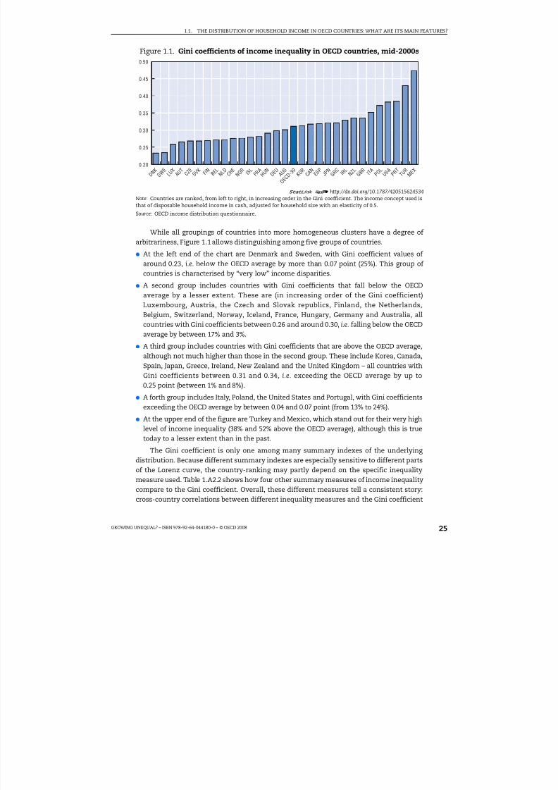
The overall shape of the distribution of household disposable income differssignificantly across OECD countries. Such differences may be highlighted through summaryindexes of the underlying distribution. Figure 1.1 shows levels of the best known of theseindexes (the Gini coefficient) in the mid-2000s, with countries ranked in increasing order of this coefficient (with increasing values denoting a wider distributions of disposableincome).1 Cross-country differences are large, with income inequality in the country at thetop of the league (Mexico) twice as large as in the country at the bottom (Denmark).
8/20/2019 Growing Unequal
http://slidepdf.com/reader/full/growing-unequal 25/309
I.1. THE DISTRIBUTION OF HOUSEHOLD INCOME IN OECD COUNTRIES: WHAT ARE ITS MAIN FEATURES?
GROWING UNEQUAL? – ISBN 978-92-64-044180-0 – © OECD 2008 25
While all groupings of countries into more homogeneous clusters have a degree of arbitrariness, Figure 1.1 allows distinguishing among five groups of countries.
● At the left end of the chart are Denmark and Sweden, with Gini coefficient values of around 0.23, i.e. below the OECD average by more than 0.07 point (25%). This group of countries is characterised by “very low” income disparities.
● A second group includes countries with Gini coefficients that fall below the OECD
average by a lesser extent. These are (in increasing order of the Gini coefficient)Luxembourg, Austria, the Czech and Slovak republics, Finland, the Netherlands,Belgium, Switzerland, Norway, Iceland, France, Hungary, Germany and Australia, allcountries with Gini coefficients between 0.26 and around 0.30, i.e. falling below the OECDaverage by between 17% and 3%.
● A third group includes countries with Gini coefficients that are above the OECD average,although not much higher than those in the second group. These include Korea, Canada,Spain, Japan, Greece, Ireland, New Zealand and the United Kingdom – all countries withGini coefficients between 0.31 and 0.34, i.e. exceeding the OECD average by up to0.25 point (between 1% and 8%).
● A forth group includes Italy, Poland, the United States and Portugal, with Gini coefficientsexceeding the OECD average by between 0.04 and 0.07 point (from 13% to 24%).
● At the upper end of the figure are Turkey and Mexico, which stand out for their very highlevel of income inequality (38% and 52% above the OECD average), although this is truetoday to a lesser extent than in the past.
The Gini coefficient is only one among many summary indexes of the underlying distribution. Because different summary indexes are especially sensitive to different partsof the Lorenz curve, the country-ranking may partly depend on the specific inequalitymeasure used. Table 1.A2.2 shows how four other summary measures of income inequality
compare to the Gini coefficient. Overall, these different measures tell a consistent story:cross-country correlations between different inequality measures and the Gini coefficient
Figure 1.1. Gini coefficients of income inequality in OECD countries, mid-2000s
1 2
http://dx.doi.org/10.1787/420515624534Note: Countries are ranked, from left to right, in increasing order in the Gini coefficient. The income concept used isthat of disposable household income in cash, adjusted for household size with an elasticity of 0.5.
Source: OECD income distribution questionnaire.
0.50
0.45
0.40
0.35
0.30
0.25
0.20
D N K
S W E
L U X
A U T
C Z E
S V K F
I N B E L
N L D
C H E
N O R I S
L F R A
H U N
D E U
A U S
O E C D
- 3 0
K O R
C A N
E S P J P
N G R C I R
L N Z L
G B R I T
A P O L
U S A
P R T
T U R
M E X
8/20/2019 Growing Unequal
http://slidepdf.com/reader/full/growing-unequal 26/309
I.1. THE DISTRIBUTION OF HOUSEHOLD INCOME IN OECD COUNTRIES: WHAT ARE ITS MAIN FEATURES?
GROWING UNEQUAL? – ISBN 978-92-64-044180-0 – © OECD 200826
are above 0.95 for the Mean Log Deviation and the P90/P10 inter-decile ratio, and around0.80 for the Square Coefficient of Variation and the P50/P10 inter-decile ratio.2 Depending on the measure used, some countries improve their ranking based on some summarymeasure while others worsen their own based on some other, but overall the differentmeasures tell a consistent story.
Beyond their sensitivity to the specific summary measure used, country rankings of levels of income inequality are potentially ambiguous for other reasons. The first is thatdifferent statistical sources for the same country may provide different pictures of theunderlying income distribution, even when they rely on identical assumptions andcomputation methods; in these circumstances, it is sometimes difficult to establish, basedon a priori arguments, which statistical source should be preferred.3 Table 1.A2.3 comparesGini coefficients of household income in OECD countries drawn from three different datasources. Differences are relatively small in most cases but larger for some countries –although not large enough to radically modify their ranking.4
The second reason to suggest caution when comparing summary inequality measuresacross countries is that income inequality may be higher in one country than in anotherover one portion of the entire distribution, while the reverse occurs over a differentportion.5 In practice, this occurs only in a few cases.6 While both factors – differencesbetween data sources for the same country and the possibility that the assessment of inequality will vary depending on which part of the distribution is considered – suggestthat cross-country comparisons of income distribution need to be taken with somecaution, neither of these factors seems important enough to obscure the conclusion thatthe large cross-country differences in income inequalities highlighted in this section are“real” and not the product of statistical “noise”.
Has the distribution of household income widened over time?
From a policy perspective, comparisons of changes in income distribution acrosscountries are often more significant than comparisons of levels. In this respect the OECDdata have significant advantages relative to other data sources, as they rely on series thatare temporarily consistent or that (in most cases) allow correcting for discontinuities whenthese occur.7 Figure 1.4, which shows point changes in the Gini coefficient for equivalisedhousehold disposable income over different time periods, highlights significant differencesin income distribution across both countries and periods.
● In the decade from the mid-1980s to the mid-1990s, the dominant pattern is that of a
widening of the distribution. This is especially evident in Mexico, New Zealand andTurkey but also in Italy, Portugal, the United Kingdom and the United States, as well asin the Czech Republic and Hungary (where data start in 1990). Income inequality fell inthis decade in only a few countries (Canada, Denmark, France, Ireland and Spain). Whenaveraged across the 24 OECD countries for which time-series data are available, incomedistribution widened by 0.018 point, i.e. by around 6%, and by slightly less (0.014 point,i.e. 5%) when excluding Mexico and Turkey.
● There is more diversity in patterns in the decade from the mid-1990s to the mid-2000s.Income distribution widened again in several countries – especially in Canada, Finland,Germany, Norway, Portugal, Sweden and the United States – but it narrowed in 10, withlarge declines in Mexico and Turkey and smaller ones in Australia, Greece, Ireland, theNetherlands and the United Kingdom. Statements about “average” changes of inequality

8/20/2019 Growing Unequal
http://slidepdf.com/reader/full/growing-unequal 27/309
I.1. THE DISTRIBUTION OF HOUSEHOLD INCOME IN OECD COUNTRIES: WHAT ARE ITS MAIN FEATURES?
GROWING UNEQUAL? – ISBN 978-92-64-044180-0 – © OECD 2008 27
in this period crucially depend on developments in Mexico and Turkey: when including them, the average increase in income inequality is only 0.002 point, while it is higher –but still below that recorded in the previous decade – when excluding them (0.07 point,i.e. 2%). Since 2000, income inequality increased strongly in Canada, Germany, Norwayand the United States (and, to a lesser degree, in Italy, and Finland), while it fell in the
United Kingdom, Mexico, Greece and Australia (and, to a smaller extent, in Sweden andthe Netherlands).
● Overall, over the entire period from the mid-1980s to the mid-2000s, the dominantpattern is one of a fairly widespread increase in inequality (in two-thirds of all countries),with declines in France, Greece, Ireland, Spain and Turkey (but the data are limited to2000 for Ireland and Spain). The rises are stronger in Finland, Norway and Sweden (froma low base), as well as in Germany, Italy, New Zealand and the United States (from ahigher base). Across the 24 OECD countries for which data are available, the cumulativeincrease is of around 0.02 point, i.e. around 7%, with most of the rise experienced in thefirst decade, with a similar change holding when excluding Mexico and Turkey from theOECD average.8
Figure 1.2. Trends in income inequalityPoint changes in the Gini coefficient over different time periods
1 2 http://dx.doi.org/10.1787/420558357243Note: In the first panel, data refer to changes from around 1990 to the mid-1990s for the Czech Republic, Hungary andPortugal and to the western Länder of Germany (no data are available for Australia, Poland and Switzerland). In thesecond panel, data refer to changes from the mid-1990s to around 2000 for Austria, the Czech Republic, Belgium,Ireland, Portugal and Spain (where 2005 data, based on EU-SILC, are not deemed to be comparable with those forearlier years). OECD-24 refers to the simple average of OECD countries with data spanning the entire period (allcountries shown above except Australia); OECD-22 refers to the same countries except Mexico and Turkey.
Source: Computations from OECD income distribution questionnaire.
-0.08 -0.04 0 0.04 0.08 -0.08 -0.04 0 0.04 0.08 -0.08 -0.04 0 0.04 0.08
Mid-1990s to Mid-2000s
Cumulative change(Mid-1980s to Mid-2000s)Mid-1980s to Mid-1990s
AUS
AUTBELCANCZEDNK
FINFRADEUGRCHUNIRLITA
JPNLUXMEXNLDNZLNORPRTESP
SWE
TURGBRUSA
OECD-24OECD-22

8/20/2019 Growing Unequal
http://slidepdf.com/reader/full/growing-unequal 28/309
I.1. THE DISTRIBUTION OF HOUSEHOLD INCOME IN OECD COUNTRIES: WHAT ARE ITS MAIN FEATURES?
GROWING UNEQUAL? – ISBN 978-92-64-044180-0 – © OECD 200828
How “large” is this observed increase in income inequality? It is difficult to provide asimple answer to this (simple) question.
● First, because qualitative assessments of this type depend on the a priori judgments of different people: a “small” increase in the Gini coefficient for people that do not caremuch about inequality will appear as much larger to someone committed to a strong egalitarian agenda.
● Second, because different inequality measures have different boundaries, they willdisplay changes of different size: for example, across the 22 OECD countries with dataspanning the two decades to the mid-2000s, the inter-decile (P90/P10) ratio recorded anaverage increase of 0.3 point, i.e. 7%, while the inter-quintile share ratio (S80/S20), theMLD and the SCV increased by 10%, 9% and 30% respectively – i.e. larger rises than for theGini coefficient (Table 1.A2.4).
● Third, because summary measures of income inequalities differ in their sensitivity todevelopments in various parts of the distribution.9
An intuitive metric for comparing changes in the Gini coefficient of income inequality isprovided by Blackburn (1989), who argues that the difference in the Gini coefficients for twodistributions is one-half the percentage value of a lump-sum transfer of average income fromeach individual below (above) the median to each individual above (below) the median income.On this basis, an increase in the Gini coefficient of 2 percentage points is equivalent to a(hypothetical) lump-sum transfer of 4% of average income from all those below the median toall those above it. Of course, people at the top half of the distribution have higher incomes thanthose at the bottom (about 2.5 times bigger, on average, in OECD countries). This means that tochange the Gini coefficient by 2 points is equivalent to each person below the mediantransferring 7% of their own income to those above the median, whose income rises by nearly
3%. Overall, these considerations suggest that the widening of the income distribution in OECDcountries recorded over the past 20 years is moderate but significant.
These aggregate changes in income distribution are themselves the result of differences in the pace of income growth for people at different points of the incomedistribution. Changes in real income by income grouping are significant for severalreasons. First, if economic growth is important for the well-being of individuals in differentcountries, “how” the economy grows (i.e. which income groups benefit the most) mattersfor income inequalities. Second, a widening of inequalities in a country experiencing higher
income growth throughout the distribution has different welfare implications from oneoccurring in a context of income declines for all. Table 1.1 shows average annual changesin real disposable income over the two decades (mid-1980s to mid-1990s and mid-1990s tomid-2000s), for people at different points in the income distribution. Patterns differ acrossthe two time periods. In general, differences in the pace of income growth across thedistribution are significant. The higher absolute pace of income growth over the pastdecade has generally benefitted people across the entire distribution, although withimportant differences across countries – i.e. the real income of people in the bottomquintile of the distribution fell in Belgium, Germany, Japan, Turkey and – to a lesser extent– in Mexico and the United States. On average, across all OECD countries considered,people in the top quintile recorded larger income gains than those in the bottom in bothdecades, but the differences were smaller in the second decade.10
These differences in the growth rates of equivalised income across income quintileshave impacted on income distribution in various ways. The main effect is that the “middle

8/20/2019 Growing Unequal
http://slidepdf.com/reader/full/growing-unequal 29/309
I.1. THE DISTRIBUTION OF HOUSEHOLD INCOME IN OECD COUNTRIES: WHAT ARE ITS MAIN FEATURES?
GROWING UNEQUAL? – ISBN 978-92-64-044180-0 – © OECD 2008 29
class” has lost ground relative to the economy-wide average in several countries. This“relative” decline may be described by looking at changes in the ratio of the “median”income (i.e. the income of the person standing exactly in the middle of the distribution) tothe “mean” income of each country Figure 1.3): the more this ratio falls below 1, the morethe income of the middle class falls relative to that of other people in society, in particularthose in the upper tail of the distribution. The ratio of median to mean income fell sincethe mid-1980s (or earlier) in most countries, with the main exceptions being theNetherlands and Greece (where it increased throughout the period) and Australia, NewZealand and Turkey (where it increased since the mid-1990s). The decline in the ratio of median-to-mean income was especially sharp in New Zealand in the decade from the mid-
1980s to the mid-1990s, as well as in Canada, Finland and the United States, with a declineof around 10% over the entire period.
Table 1.1. Trends in real household income by quintiles
Average annual change mid-1980s to mid-1990s Average annual change mid-1990s to mid-2000s
Bottomquintile
Middlethree
quintiles
Topquintile
Median MeanBottomquintile
Middlethree
quintiles
Topquintile
Median Mean
Australia . . . . . . . . . . 2.4 2.0 1.9 2.2 2.0
Austria1 2.5 2.7 2.8 2.8 2.7 –2.1 –0.5 –0.4 –0.6 –0.6
Belgium1 1.2 0.5 1.2 0.4 0.8 1.4 1.3 1.7 1.2 1.5
Canada 0.3 –0.2 –0.1 –0.2 –0.1 0.2 1.2 2.1 1.1 1.4
Czech Republic . . . . . . . . . . 0.4 0.6 0.7 0.5 0.6
Denmark 1.3 0.9 0.8 0.9 0.9 0.6 0.9 1.5 0.9 1.1
Finland 0.9 0.9 1.0 0.8 1.2 1.6 2.5 4.6 2.5 2.9
France 1.0 0.5 –0.1 0.5 0.3 0.9 0.7 1.0 0.8 0.8
Germany 0.4 1.4 1.6 1.2 1.4 –0.3 0.5 1.3 0.6 0.7
Greece 0.3 0.1 0.1 0.3 0.1 3.6 3.0 2.7 2.9 2.9
Hungary . . . . . . . . . . 0.9 1.2 1.0 1.1 1.1
Ireland1 4.0 3.0 2.9 3.2 3.1 5.2 7.7 5.4 8.2 6.6
Italy –1.3 0.5 1.5 0.6 0.8 2.2 1.0 1.6 1.0 1.3
Japan 0.8 1.8 2.1 1.8 1.9 –1.4 –1.0 –1.3 –1.0 –1.1
Luxembourg 2.3 2.5 3.0 2.4 2.7 1.5 1.5 1.7 1.5 1.6
Mexico 0.7 1.2 3.8 1.1 2.6 –0.1 –0.1 –0.6 –0.2 –0.4
Netherlands 1.1 2.7 3.9 2.8 3.0 1.8 2.0 1.4 2.0 1.8
New Zealand –1.1 –0.5 1.6 –0.6 0.3 1.1 2.2 1.6 2.3 1.9
Norway –0.3 0.3 1.0 0.4 0.5 4.4 3.9 5.1 3.8 4.3
Portugal1 5.7 6.5 8.7 6.2 7.3 5.0 4.1 4.4 4.2 4.3
Spain1 4.4 3.2 2.4 3.2 3.0 5.2 5.1 5.0 5.5 5.1
Sweden 0.5 0.9 1.2 0.9 0.9 1.4 2.2 2.8 2.2 2.3
Turkey –0.6 –0.7 1.4 –0.8 0.4 –1.1 –0.5 –3.2 –0.3 –1.9
United Kingdom 0.7 2.0 4.3 1.9 2.8 2.4 2.1 1.5 2.1 1.9
United States 1.2 1.0 1.9 1.0 1.4 –0.2 0.5 1.1 0.4 0.7OECD-222 1.2 1.4 2.1 1.4 1.7 1.5 1.8 1.9 1.9 1.8
OECD-203 1.3 1.5 2.1 1.5 1.7 1.7 2.0 2.2 2.1 2.1
1 2 http://dx.doi.org/10.1787/4207783645501. Changes over the period mid-1990s to around 2000 for Austria, the Czech Republic, Belgium, Ireland, Portugal and
Spain (where 2005 data, based on EU-SILC, are not deemed to be comparable with those for earlier years).2. OECD-22 refers to the simple average for all countries with data spanning the entire period (i.e. excluding
Australia, the Czech Republic and Hungary, as well as Iceland, Korea, Poland, the Slovak Republic andSwitzerland).
3. OECD-20 refers to all countries mentioned above except Mexico and Turkey.Source: Computations from OECD income distribution questionnaire.

8/20/2019 Growing Unequal
http://slidepdf.com/reader/full/growing-unequal 30/309
I.1. THE DISTRIBUTION OF HOUSEHOLD INCOME IN OECD COUNTRIES: WHAT ARE ITS MAIN FEATURES?
GROWING UNEQUAL? – ISBN 978-92-64-044180-0 – © OECD 200830
Differences in the pace of income growth across quintiles have changed the share of total income accruing to each. Over the past decade, the income share of people in thebottom quintile was broadly constant in a majority of countries, with moderate rises in Italyand Mexico and moderate declines in Austria, Canada, Finland, Germany, Ireland, Swedenand the United States (Table 1.2). There is more diversity across countries when looking atdevelopments in the middle and top of the income distribution. The income share of the
three middle quintiles increased strongly (i.e. by more than 2 points) in Ireland, Mexico andTurkey (countries where income disparities are wide but narrowing rapidly) and, to a lesserextent (i.e. between 0.5 and 2 points), in Japan, the Netherlands and New Zealand, while it fellstrongly in Norway and, to a lesser extent, Canada, Denmark, Finland, France, Germany, Italy,Sweden and the United States. Strong gains in the income share of the top quintile droverising disparities in Canada, Finland and Norway, as well as (to a lesser extent) in Austria,Denmark, Germany, Italy, Sweden and the United States; while, conversely, strong declinesin the income share of the very rich contributed to lower inequalities in Ireland, Mexico andTurkey. Income gains at the top of the distribution are likely to be under-reported in thegeneral population surveys used in this report (Box 1.1). This is indicated by the fact that
gains in the income share of the top 1% of the population, as available in the OECD incomedistribution questionnaire, fall short of the much larger gains (since the mid-1980s) reportedin the tax records for the United States, the United Kingdom and Canada.
While the changes in income distribution described above reflect the operation of different factors (described in more detail in later chapters), a key distinction is thatbetween inequality of disposable income (i.e. income after taxes and government transfers)and of market income (the sum of earnings, self-employment and capital income, allmeasured on a pre-tax basis). Changes in inequality for these two income concepts allowdistinguishing (to a first approximation) between the effect of market forces and that of government policies. This distinction is important, as governments can generally counter
a rise in the inequality of market income through the tax and benefit system, but not forlong: there are limits to the redistribution that government can achieve, especially when
Figure 1.3. Changes in the ratio of median to mean household disposable income
1 2 http://dx.doi.org/10.1787/420625088572
Source: Computations from OECD income distribution questionnaire.
1.00
0.95
0.90
0.85
0.80
0.75
1.00
0.95
0.90
0.85
0.80
0.75
FINNOR
CANUSA DEU
ITAJPN
NLDDNK
NZLGBR FRA
GRCSWE
Mid-1970s Mid-1980s Mid-1990s Mid-1970s Mid-1980s Mid-1990sMid-2000s Mid-2000s

8/20/2019 Growing Unequal
http://slidepdf.com/reader/full/growing-unequal 31/309
I.1. THE DISTRIBUTION OF HOUSEHOLD INCOME IN OECD COUNTRIES: WHAT ARE ITS MAIN FEATURES?
GROWING UNEQUAL? – ISBN 978-92-64-044180-0 – © OECD 2008 31
other pressures on public spending (e.g. those due to population ageing) are also rising.Figure 1.4 shows changes in the Gini coefficients for these two income concepts, with bothseries indexed to the first observation available for each country. In the decade from the mid-1980s to the mid-1990s, greater income inequality was mainly driven by the widening distribution of market income, which affected all countries except France. In this period,governments offset this widening through household taxes and public cash benefits eitherin full (e.g. Canada and Sweden) or in part (in all others, Figure 1.4). Cross-country differences
are much more significant since 1995. In this period, market income inequality fell markedlyin the Netherlands and, to a lesser extent, in Australia, New Zealand, the United Kingdomand Sweden, while it stabilised in Denmark, Finland and France, and increased in othercountries (rapidly in the case of Germany, Italy, Japan and Luxembourg). While the increaseof disposable-income inequality was generally lower than in the previous period, a largerpart of this rise reflected lower redistribution through the tax and transfers system,especially in Canada, the Netherlands, Sweden and, to a lesser extent, the United States.
Figure 1.5 plots the average trends in the dispersion of disposable and market incomeacross the 15 OECD countries with observation spanning the entire period from themid-1980s to the mid-2000s. The figure highlights, in a more parsimonious way than
Figure 1.4, some significant differences across periods. On average, across the 15 countrieshere considered (the same one shown in Figure 1.4 except Australia), the widening of income inequality observed in the decade from the mid-1980s to the mid-1990s mainlyreflected greater inequality in the distribution of market-income, which was partly offsetby public cash transfers and households taxes. Conversely, from the mid-1990s up toaround 2000, the growth of market-income inequality ebbed, and the increase in disposableincome inequality mainly reflected the effect of public transfers and household taxes. Thestabilisation in market-income inequality testified to the success of the welfare reformsintroduced by several OECD countries in “activating” former benefit recipients, and inmoving them into work (OECD, 2005). The most recent period, however, features a
reversion to the older pattern of wider market-income inequality partially offset byredistribution though taxes and transfers, although at a pace lower than in the past. This
Table 1.2. Gains and losses of income shares by income quintilesPoint changes, mid-1990s to mid-2000s
Bottom quintile Middle three quintiles Top quintile
Strong increase . . Ireland, Mexico,Turkey Canada, Finland, Norway
Moderate increase Italy, Mexico Japan, Netherlands, New Zealand,
United Kingdom
Austria, Denmark, Germany, Italy,
Sweden, United StatesStability Australia, Belgium, Czech Rep.,
Denmark, France, Greece, Hungary,Japan, Luxembourg, Netherlands,New Zealand, Norway, Portugal,Spain, Turkey, United Kingdom
Australia, Austria, BelgiumCzech Rep., Greece, HungaryLuxembourg, Portugal, Spain
Australia, Belgium, Czech Rep.,France, Hungary, Japan,Luxembourg, Portugal, Spain
Moderate decl ine Austria, Canada, Finland, Germany,Ireland, Sweden, United States
Canada, Denmark, France, Finland,Germany, Italy, Sweden,United States
Greece, Netherlands, New Zealand,United Kingdom
Strong decline . . Norway Ireland, Mexico, Turkey
Note: “Strong” increases and declines in income share are those above and below 2 percentage points, respectively;“moderate” increases and declines are those between ½ and 2 points; “stability” denotes changes in income sharesbetween +/–½ point. For Austria, Belgium, Czech Republic, Denmark, France, Ireland, Japan, Poland, Portugal andSpain data refer to changes over the period from the mid-1990s to around 2000.Source: OECD income distribution questionnaire.

8/20/2019 Growing Unequal
http://slidepdf.com/reader/full/growing-unequal 32/309
I.1. THE DISTRIBUTION OF HOUSEHOLD INCOME IN OECD COUNTRIES: WHAT ARE ITS MAIN FEATURES?
GROWING UNEQUAL? – ISBN 978-92-64-044180-0 – © OECD 200832
Box 1.1. Changes at the top of the income distribution
The survey measures of household income used in this report are not well-suited to measureincome at the top of the distribution. This is due to the narrow income definition used, toconfidentiality norms applied to top income and to the high non-response rates among people at the
top end of the distribution. With respect to the first element, the main feature is the exclusion fromthe (cash) income concept used in this report of those income sources (capital and withholding gains,non-wage components of the remuneration package of managers such as stock options, andimputed rents) that disproportionately accrue to the very rich. With regard to the second element,the main feature is whether survey data cap (“top code”) income or earnings beyond a giventhreshold. Top coding affects most analysis of income distribution in the United States, based on the“public use” data from the “Annual Social and Economic Supplement” to the Current Population Survey,
which are affected by changes in the confidentiality limits applied by the Census Bureau on to top-income (which will dampen the recorded rise in income inequality over time); the US data presentedin this report are less affected by this problem as they are based on the Census Bureau “internal” files.
An alternative to survey data for capturing changes at the top of the income distribution is providedby tax records (adjusted to take account of the income of the non-filers). Data on the share of pre-tax
income earned by people in the top 1% of the distribution show large increases (of 70% or more) sincethe mid-1970s in Australia, Canada, Ireland, the United Kingdom, the United States and Canada, andsmaller ones (between 10% and 25%) in Germany, Japan, New Zealand, Spain and Sweden), anddeclines (of around 10%) in France and the Netherlands (Leigh, 2007). With few exceptions, changes inthe income share of the richest 1% of the population account for most of the increase in the incomeshare of the top decile of the distribution. While these tax data are better at capturing what happens atthe top end of the distribution – while also providing a long-term context for assessing recent trends –they are affected by changes in provisions that alter tax payers’ incentives to report capital (and other)income in their tax declarations (Reynolds, 2007). In the case of the United Sates, however, the strong
rise in the income share of the top 1% is confirmed by other administrative sources (e.g. the tabulationsof the US Social Security Administration of personal earnings) and by studies that take into accountpayments of both personal and corporate taxes (Burtless, 2007).
Shares of pre-tax income of the richest 1% of population
1 2 http://dx.doi.org/10.1787/420757184562Source: Leigh (2007), dataset downloaded from http://econrsss.anu.edu.au/~aleigh /.
30 30
25 25
20 20
15 15
10 10
5 5
0 0
1 9 1
5
1 9 2
0
1 9 2
5
1 9 3
0
1 9 3
5
1 9 4
0
1 9 4
5
1 9 5
0
1 9 5
5
1 9 6
0
1 9 6
5
1 9 7
0
1 9 7
5
1 9 8
0
1 9 8
5
1 9 9
0
1 9 9
5
2 0 0
0 1 9 1
5
1 9 2
0
1 9 2
5
1 9 3
0
1 9 3
5
1 9 4
0
1 9 4
5
1 9 5
0
1 9 5
5
1 9 6
0
1 9 6
5
1 9 7
0
1 9 7
5
1 9 8
0
1 9 8
5
1 9 9
0
1 9 9
5
2 0 0
0
United KingdomSweden
AustraliaUnited States
Canada
FranceJapan
Ireland
New ZealandNetherlands
Spain
Germany

8/20/2019 Growing Unequal
http://slidepdf.com/reader/full/growing-unequal 33/309
I.1. THE DISTRIBUTION OF HOUSEHOLD INCOME IN OECD COUNTRIES: WHAT ARE ITS MAIN FEATURES?
GROWING UNEQUAL? – ISBN 978-92-64-044180-0 – © OECD 2008 33
Figure 1.4. Inequality trends for market and disposable incomeGini coefficients, indexed to the value in the first available year
1 2 http://dx.doi.org/10.1787/420678772078
Note: Dots in each country-panel refer to the available observations. Lines are obtained as linear interpolations
between these observations. Gini coefficients for market- and disposable-income are based on people ranked based
on each of the two income concepts.
Source: OECD income distribution questionnaire.
0.8
0.9
1.0
1.1
1.2
1.3
1.4
0.8
0.9
1.0
1.1
1.2
1.3
1.4
0.8
0.9
1.0
1.1
1.2
1.3
1.4
0.8
0.9
1.0
1.1
1.2
1.3
1.4
0.8
0.9
1.0
1.1
1.2
1.3
1.4
0.8
0.9
1.0
1.1
1.2
1.3
1.4
0.8
0.9
1.0
1.1
1.2
1.3
1.4
0.8
0.9
1.0
1.1
1.2
1.3
1.4
0.8
0.9
1.0
1.1
1.2
1.3
1.4
0.8
0.9
1.0
1.1
1.2
1.3
1.4
0.8
0.9
1.0
1.1
1.2
1.3
1.4
0.8
0.9
1.0
1.1
1.2
1.3
1.4
0.8
0.9
1.0
1.1
1.2
1.3
1.4
0.8
0.9
1.0
1.1
1.2
1.3
1.4
0.8
0.9
1.0
1.1
1.2
1.3
1.4
0.8
0.9
1.0
1.1
1.2
1.3
1.4
1975 1985 1990 1995 200020051975 1985 19901995 200020051975 1985199019952000 20051975 1985 1990199520002005
1975 1985 1990 1995 200020051975 1985 19901995 200020051975 1985199019952000 20051975 1985 1990199520002005
1975 1985 1990 1995 200020051975 1985 19901995 200020051975 1985199019952000 20051975 1985 1990199520002005
1975 1985 1990 1995 200020051975 1985 19901995 200020051975 1985199019952000 20051975 1985 1990199520002005
Disposable income Market income
Australia Canada Denmark
United States
Germany
Finland
New Zealand
Norway
Netherlands
United KingdomSweden
LuxembourgJapan
France Greece Italy

8/20/2019 Growing Unequal
http://slidepdf.com/reader/full/growing-unequal 34/309
I.1. THE DISTRIBUTION OF HOUSEHOLD INCOME IN OECD COUNTRIES: WHAT ARE ITS MAIN FEATURES?
GROWING UNEQUAL? – ISBN 978-92-64-044180-0 – © OECD 200834
development suggests that some of the earlier narrowing in market-income inequalitymay have been short-lived, and that stronger reforms will be required to assure a moreequal distribution of market income. While these changes in market-income inequality are
often related to shifts in factor shares, the relation between the two is complex, suggesting that other factors have also been at work (Box 1.2).
Moving beyond summary measures of income distribution: income levelsacross deciles
While income inequality is only one element involved in comparisons of social andeconomic conditions across OECD countries, the data presented in this report also shedlight on other aspects that are relevant to that assessment. One of these is the absolute level
of household disposable income of people at different points of the distribution. Figure 1.6plots the mean income (averaged across people belonging to different deciles of the
distribution) of various OECD countries, as well as the average income of people belonging to each decile of the income distribution.11 Mean disposable income per consumption unitis above USD 22 000 on average, with Luxembourg leading the league (at above USD 40 000)followed by the United States (USD 33 000) and Norway (USD 30 000). At the other extremeare Turkey and Mexico, with values of around USD 7 000. Values of mean disposableincome per consumption unit are lower than conventional measures of income per capita(NNI), but the two series are highly correlated with each other.12 The overall width of theincome distribution – as measured by the difference in average income of the top andbottom income deciles, in USD at PPP rates – is also significantly different across countries,with a gap in average income between top and bottom of less than USD 20 000 in the
Slovak Republic and more than USD 85 000 in the United States.The same set of data can also be presented in a format more suited to highlight
cross-country differences in the income levels of people at comparable points in the
Figure 1.5. Trends in market and disposable income inequality, OECD averageGini coefficients, mid-1980s = 1.0
1 2 http://dx.doi.org/10.1787/420718178732Note: OECD-15 is the average of countries for which information is available over the entire period from themid-1980s to the mid-2000s (Canada, Denmark, Finland, France, Germany, Greece, Italy, Japan, Luxembourg, theNetherlands, New Zealand, Norway, Sweden, the United Kingdom and the United States). Gini coefficients for marketand disposable income are based on people ranked based on each of the two income concepts.
Source: OECD income distribution questionnaire.
1985 1990 1995 2000 2005
1.2
1.1
1.0
0.9
OECD-15
Disposable incomeMarket income

8/20/2019 Growing Unequal
http://slidepdf.com/reader/full/growing-unequal 35/309
I.1. THE DISTRIBUTION OF HOUSEHOLD INCOME IN OECD COUNTRIES: WHAT ARE ITS MAIN FEATURES?
GROWING UNEQUAL? – ISBN 978-92-64-044180-0 – © OECD 2008 35
Box 1.2. Income inequality and wage shares: are they related?
The moderate but significant rise in income inequality recorded in most OECD countries since the mid-1980s has occurred alongside significant declines in the share of wages in value added. Across 15 OECDcountries with data spanning the entire period since 1976, this share has declined by around 10 points
(i.e. 15%), with larger declines (of 15 points or more) in Ireland, Italy and Japan, and smaller ones (5 pointsor less) in Denmark, Greece, the United Kingdom and the United States (see figure below).
The share of wages in value added
1 2 http://dx.doi.org/10.1787/420767282661Note: Total wages are measured as total compensation of employees and the self-employed (valued at the business sector
compensation rate). Total wages are expressed as a share of the Gross Domestic Product. OECD-15 is the average of the ten countriesshown plus Austria, Belgium, Finland, Greece and Ireland.
Source: OECD (2007).
While there are large differences in the level of the wage share across industries, this decline has affected– to different degrees – most industrial sectors, suggesting that this downward trend reflects more than justchanges in the structure of GDP (i.e. from industries with a higher wage share towards those with a lowerone).1 Empirical analysis of the determinants of the decline in the wage share at the industry levelhighlights the influence of higher capital-output ratios, higher real price of oil, stronger (non-labouraugmenting) technological progress, as well as (in a less clear-cut way) greater adjustment costs for labour(as measured by higher employment growth) and lower bargaining power of workers (as measured byindustrial conflicts, Bentolila and Saint-Paul, 2003). Other factors not explicitly included in these empirical
estimates may also have contributed to the observed decline in the wage share.As wages constitute a larger share of income for people at the bottom than at the top of the incomedistribution, a lower wage share is often taken to imply a decline in the share of household income going to people with lower income. In reality, there is no necessary connection between the share of value addedpaid as wages and the share of household disposable income going to low-income groups.2 However, asdescribed in later chapters, capital income is generally much more unequally distributed than wages: thisimplies that an increase in the share of capital income within households’ economic resources will widenincome inequality though a compositional effect.
1. De Serres et al. (2002) show that changes in the industrial composition of business sector output account for between 25% and10% of the decline in the aggregate wage share from the mid-1970s to the mid-1990s in Italy, France, Belgium and the UnitedStates, with a larger influence in Germany (where a wage share adjusted for changes in the industrial composition of outputrises) and a negligible one in the Netherlands.
2. Lam (1997) describes a simple model with two groups of people: low-paid workers, whose income includes only wages, and
higher-income workers, who receive both wages and capital income. In this model, when assuming an elasticity of substitutionbetween labour and capital equal to 1, an increase in the number of low-income workers will lead to an increase in their incomeshare and to a decline in that of higher-income workers (for an unchanged share of capital income).
80 80
75 75
70 70
65 65
60 60
55 55
50 501976 1981 1986 1991 1996 2001 2006 1976 1981 1986 1991 1996 2001 2006
Sweden
United States
GermanyUnited KingdomOECD-15
Japan
ItalySpain
DenmarkNetherlands
OECD-15
France

8/20/2019 Growing Unequal
http://slidepdf.com/reader/full/growing-unequal 36/309
I.1. THE DISTRIBUTION OF HOUSEHOLD INCOME IN OECD COUNTRIES: WHAT ARE ITS MAIN FEATURES?
GROWING UNEQUAL? – ISBN 978-92-64-044180-0 – © OECD 200836
income distribution in different countries. Figure 1.7 presents information for middle-classpeople (top panel), as well for people in the bottom decile (middle panel) and top decile(bottom panel), with countries ranked in each panel in increasing order of equivalisedhousehold disposable income. Figure 1.7 highlights several patterns:
● Median income per consumption unit is marginally less than USD 20 000 on average,ranging from USD 36 000 in Luxembourg to around USD 5 000 in Mexico and Turkey.Dispersion in median income across countries is 10% higher than for mean income.Changes in country ranking (relative to that based on mean income) are small, although
the Netherlands rises by two ranks (to the second-highest levels) and the UnitedKingdom falls by two.
Figure 1.6. Income levels across the distribution, mid-2000sUS dollars at PPP rates
1 2 http://dx.doi.org/10.1787/420721018310Note: The data refer to equivalised household disposable income of people at different points of the distribution. Foreach country, the bar starts at the average income of the first decile and ends at the average income of the 10th decile.The figure also shows the mean income over the entire population (shown as a diamond). Income data for eachcountry are adjusted for inflation (when they refer to a year different from 2005) and then converted into US dollarsbased on PPP rates for actual consumption in 2005. This exchange rate expresses the costs of a standard basket of consumer goods and services purchased on the market or provided for free (or at subsidised rates) by the publicsector in different countries. Countries are ranked, from left to right, in increasing order of mean equivalised income.
Source: OECD income distribution questionnaire and other OECD databases.
100 000
90 000
80 000
70 000
60 000
50 000
40 000
30 000
20 000
10 000
0
T U R
M E X S V
K P O
L H U
N C Z
E P R
T G R
C I T A E S P
K O R
S W E
N Z L
F I N F R A D N
K B E
L D E
U J P N
A U S
I S L
I R L
A U T C A
N N O
R G B
R C H
E N L
D U S
A L U
X
O E C D
- 3 0

8/20/2019 Growing Unequal
http://slidepdf.com/reader/full/growing-unequal 37/309
I.1. THE DISTRIBUTION OF HOUSEHOLD INCOME IN OECD COUNTRIES: WHAT ARE ITS MAIN FEATURES?
GROWING UNEQUAL? – ISBN 978-92-64-044180-0 – © OECD 2008 37
Figure 1.7. Income levels for people at different points in the distribution,mid-2000s
US dollars at PPP rates
1 2 http://dx.doi.org/10.1787/420757110442
Source: OECD income distribution questionnaire and other OECD databases.
M E X T U R P O L S V K H U N P R T C Z E I T A G R C E S P K O R N Z L
O E C
D - 3 0 F R A S W E F I N D E U B E L I R L I S L J P N D N K A U S G B R A U T C A N N O R U S A C H E N L D L U X
40 000
35 000
30 000
25 000
20 000
15 000
10 000
5 000
0
M E X
T U R
P O L
S V K
H U N
P R T
C Z E I T
A G R C
E S P
K O R
N Z L
O E
C D - 3 0
F R A
S W E
F I N
D E U
B E L
I R L
I S L
J P N
D N K
A U S
G B R
A U T
C A N
N O R
U S A
C H E
N L D
L U X
100 000
90 000
80 000
70 000
60 000
50 000
40 000
10 000
20 000
30 000
0
M E X
T U R
P O L
S V K
H U N
P R T
C Z E I T
A G R C
E S P
K O R
N Z L
O E C
D - 3 0
F R A
S W E
F I N
D E U
B E L
I R L
I S L
J P N
D N K
A U S
G B R
A U T
C A N
N O R
U S A
C H E
N L D
L U X
18 000
16 000
14 000
12 000
10 000
8 000
6 000
2 000
4 000
0
Median income
Average income of the top decile
Average income of the bottom decile
8/20/2019 Growing Unequal
http://slidepdf.com/reader/full/growing-unequal 38/309
I.1. THE DISTRIBUTION OF HOUSEHOLD INCOME IN OECD COUNTRIES: WHAT ARE ITS MAIN FEATURES?
GROWING UNEQUAL? – ISBN 978-92-64-044180-0 – © OECD 200838
● Cross-country differences are much larger for people at the bottom of the distribution.The average income of people in the first decile is a little less than USD 7 000, ranging from 15 000 in Luxembourg to less than 1 000 in Mexico. The country-ranking forhousehold income of those at the bottom of the distribution differs significantly fromthat based on mean income – e.g. the United States (with the second-highest mean
income) falls by 11 positions while Sweden (ranked 14 in terms of mean income) risesby eight.
● At the top of the distribution, average income across countries is USD 37 000, with theUnited States now topping the league (ahead of Luxembourg) at more than USD 93 000and Turkey closing it at USD 23 000. Differences across countries are larger in absoluteterms than in all previous cases, but lower when assessed relative to the average incomeof all people at the top of income distribution. Among the countries included in thefigure, Italy rises by eight positions (to the eighth-highest) while Sweden falls by four.
Conclusion
This chapter has highlighted four main patterns.
● First, the distribution of household income differs significantly across countries, andthese differences persist over time – even if their exact size depends on which statisticalsources are used for each country. Different measures provide a broadly consistentassessment of country differences in income inequality, as the Lorenz curves fordifferent countries “cross” each other only in a minority of cases.
● Second, income inequality widened in the two decades since the mid-1980s. Thiswidening is fairly widespread (affecting around two-thirds of all OECD countries), with amoderate but significant increase in most inequality measures. This widening was,
however, stronger in the first decade than in the second, and has differed across countries– with several countries experiencing lower inequality in the most recent period.
● Third, the widening of the income distribution has been mainly driven by greaterinequality in market income from the mid-1980s to the mid-1990s. Market-incomeinequality stopped rising from the mid-1990s to around 2000, followed by a renewedmoderate increase in later years.
● Lastly, there are large differences across countries in terms of how people at similar pointsof the income distribution in different countries compare – differences that are “hidden”when countries are compared in terms of their mean income. Percentage differences in
income levels across countries are larger at the bottom of the distribution than at themiddle, while the top of the distribution features differences in living standards acrosscountries that are wide in absolute terms, but smaller in percentage terms.
Notes
1. The Gini coefficient is defined as the area between the Lorenz curve (which plots cumulativeshares of the population, from the poorest to the richest, against the cumulative share of incomethat they receive) and the 45o line, taken as a ratio of the whole triangle. The values of the Ginicoefficient range between 0, in the case of “perfect equality” (i.e. each share of the population getsthe same share of income), and 1, in the case of “perfect inequality” (i.e. all income goes to theindividual with the highest income).
2. Relative to other indices, the Mean Log Deviation is more sensitive to changes at the bottom of thedistribution, and the Squared Coefficient of Variation is more sensitive to changes at the top, whilethe Gini coefficient is less sensitive to changes at the two extremes of the distribution.

8/20/2019 Growing Unequal
http://slidepdf.com/reader/full/growing-unequal 39/309
I.1. THE DISTRIBUTION OF HOUSEHOLD INCOME IN OECD COUNTRIES: WHAT ARE ITS MAIN FEATURES?
GROWING UNEQUAL? – ISBN 978-92-64-044180-0 – © OECD 2008 39
3. The choice of the statistical sources to use for the OECD income distribution questionnaire is madein consultation with national authorities and consultants. A key criterion for that choice is that of temporal consistency between years.
4. The OECD data show significantly higher inequality than either LIS or Eurostat in several countries(Iceland, Germany and Italy, when compared to Eurostat; Finland, Germany, Ireland, Italy, theNetherlands, Norway and Poland, when compared to LIS). Differences exist even when the three
data sources rely on the same underlying survey. While these differences may partly reflectdifferences in the years considered (i.e. OECD estimates are generally more up-to-date than theLIS) and in the equivalence scale used (in the case of Eurostat), other factors also matter. In thecase of Germany, Eurostat data are based on EU-SILC, which is affected by significant biases, whilethe OECD relies on the survey (the German Socio-Economic Panel) that is used by most officialnational reports on the subject (as well as by LIS). In the case of Italy, OECD results are based on amicro-simulation model run by the central statistical office (ISTAT), which provides estimates of household taxes for the micro-records of the Bank of Italy’s Survey of Household Income and Wealth,which is the same household survey used by LIS. While the LIS and OECD data provide a consistentpicture in terms of structural characteristics of the Italian population, the OECD data show a risein inequality since 2000, which contrasts with the broad stability of inequality in the Bank of Italydatafiles. In the case of Japan (not covered by LIS), different sources provide significantly differentestimates of inequality levels (but broadly consistent information about trends). The OECD data
rely on the Comprehensive Survey on Living Conditions – a survey characterised by a large sample sizeand high response rate, which collects information based on retrospective questions and allowstracking changes in income inequality and poverty over time. The Gini coefficient from this surveyis, however, significantly higher than the one computed (based on similar definitions) from theNational Survey of Family Income and Expenditure (0.28) – the basic source of information onhousehold spending. This second survey, which relies on diaries filled by respondents, has a largersample but it excludes some types of households; as a result, this survey allows monitoring trendsin income inequality and poverty only for a narrower population group.
5. Income inequality is unambiguously greater (lower) in one country than in another when itsLorenz curve lies strictly above (or below) that of the comparison country. Conversely, when theLorenz curves for two countries “cross” each other, assessments of inequality based on summarymeasures of the entire distribution are somewhat arbitrary.
6. Table 1.A2.1 in the annex compares Lorenz curves between pairs of countries, classifying results
with different colours (dark grey and dark blue in cases of “strict” dominance of the Lorenz curveof one country relative to that of another; light grey and light blue in cases where Lorenz curves of two countries cross each other at one of the two extremes; white in indeterminate cases). The tableshows that, in around three quarters of all cases, binary comparisons of income distributionbetween countries lead to unambiguous conclusions (i.e. the Lorenz curve of one country lieseither strictly above or strictly below than that of another). However, in 18% of all cases, Lorenzcurves cross each other (cells shaded in white) and in a further 8% of all countries the crossing occurs either at the top or bottom decile (cells shaded in light blue or light grey).
7. Discontinuities, due to either changes in the statistical source used (as in the cases of Canada in1995 and the United Kingdom in 2001) or to changes in survey design or weighting (as in the caseof the Netherlands in 2000 and Sweden in 1985) are addressed by collecting data for the same yearboth on a “new” and “old” basis, and then “splicing” the various indicators. Statistical breaks alsoaffect series for Belgium, Germany, Italy, Japan, Spain and Turkey (in 1995). For France, the source
used for describing trends in income distribution (Enquête Revenus Fiscaux) differs from the oneused to compare levels of the various indicators in the most recent year (EU-SILC).
8. Data spanning the period from the mid-1970s to the mid-1980s are available for seven OECDcountries. These data point to a sharp increase of income inequality in the United Kingdom and,to a lesser extent, in the Netherlands and the United States, and to declines in Canada, Finland,Greece, Portugal and Sweden.
9. For example, focusing on the lower part of the distribution, it has been estimated that, for theEU15 as a whole, removing all means-tested benefits would increase the Gini coefficient(computed for the entire EU15 population) from 0.300 to 0.327 (Immervoll et al., 2006, Table 5.3).
10. Data in Table 1.1 are shaped by the specific features of the data and definitions used. First, theincome concept used in household surveys differs in important respects from that embodied inthe national-accounts measures conventionally used in the analysis of living standards, and
changes in the “coverage” of the survey data may distort trends over time (Siminski et al., 2003).Second, changes in equivalised disposable income are affected by both the overall trends in

8/20/2019 Growing Unequal
http://slidepdf.com/reader/full/growing-unequal 40/309
I.1. THE DISTRIBUTION OF HOUSEHOLD INCOME IN OECD COUNTRIES: WHAT ARE ITS MAIN FEATURES?
GROWING UNEQUAL? – ISBN 978-92-64-044180-0 – © OECD 200840
household income and by changes in household size across different income deciles; as averagehousehold size fell in all OECD countries over this period, the gains in equivalised income shownin Table 1.2 are lower than those for per capita income based on national accounts aggregates.
11. For the purpose of this comparison, survey-based estimate of equivalised household disposableincome are first adjusted for price changes (because of differences in the years to which the datarefer) to a common 2005-base, and then converted into “purchasing power” equivalents through
exchange rates that express how many units of a standard basket of consumer goods residents of different countries can either purchase on the market or receive for free, or at subsidised rates,from governments (i.e. PPP rates for “actual” consumption).
12. The correlation coefficient between levels of NNI per capita and mean equivalised householddisposable income in cash is around 0.95, and slightly lower when looking at rank correlations.
References
Atkinson, A.B., L. Rainwater and T.M. Smeeding (1995), Income Distribution in OECD Countries, OECD,Paris.
Bentolila, S. and G. Saint-Paul (2003), “Explaining Movements in the Labor Share”, Contributions to
Macroeconomics, Vol. 3, No. 1, The Berkeley Electronic Press.Blackburn, M. (1989), “Interpreting the Magnitude of Changes in Measures of Income Inequality”,
Journal of Econometrics, No. 42.
Burniaux, J.M., T.-T. Dang, D. Fore, M.F. Förster, M. Mira d'Ercole and H. Oxley (1998), “IncomeDistribution and Poverty in Selected OECD Countries”, OECD Economics Department Working Paper, No. 189, March, OECD, Paris.
Burtless, G. (2007), “Has US Income Inequality Really Increased?”, mimeo, The Brookings Institution,Washington DC.
Expert Group on Household Income Statistics (2001), Final Report and Recommendations, The CanberraGroup, Ottawa.
Förster, M. and M. Mira d’Ercole (2005), “Income Distribution and Poverty in OECD Countries in the
Second Half of the 1990s”, OECD Social, Employment and Migration Working Paper, No. 22, OECD,Paris.
De Serres, A., S. Scarpetta and C. Maisonneuve (2002), “Sectoral Shifts in Europe and the United States:How Do They Affect Aggregate Labour Shares and the Properties of Wage Equations”, OECDEconomics Department Working Papers, No. 326, OECD, Paris.
Immervoll, H., H. Levy, C. Lietz, D. Mantovani, C. O’Donoghue, H. Sutherland and G. Verbist (2006),“Household Incomes and Redistribution in the European Union: Quantifying the Equalising Properties of Taxes and Benefits”, in D.B. Papadimitriou (ed.), The Distributional Effects of GovernmentSpending and Taxation, Palgrave Macmillan.
Lam, D. (1997), “Demographic Variables and Income Inequality”, in M.R. Rosenzweig and O. Stark(eds.), Handbook of Population and Family Economics, Elsevier Science.
Leigh, A. (2007), “How Closely Do Top Income Shares Track Other Measures of Inequality”, Economic Journal, No. 117, November.
OECD (2005), Extending Opportunities – How Active Social Policy Can Benefit Us All, OECD, Paris.
OECD (2007), “OECD workers in the global economy: increasingly vulnerable?”, OECD EmploymentOutlook, OECD, Paris.
Reynolds, A. (2007), “Has US Income Inequality Really Increased?”, Policy Analysis, CATO Institute,Washington DC.
Sawyer, M. (1976), “Income Distribution in OECD Countries”, OECD Economic Outlook, OECD, Paris.
Siminski, P., P. Saunders, S. Waseem and B. Bradbury (2003), “Reviewing the Intertemporal Consistencyof ABS Household Income Data with External Aggregates”, Australian Economic Review, Vol. 33,No. 3, September.
8/20/2019 Growing Unequal
http://slidepdf.com/reader/full/growing-unequal 41/309
I.1. THE DISTRIBUTION OF HOUSEHOLD INCOME IN OECD COUNTRIES: WHAT ARE ITS MAIN FEATURES?
GROWING UNEQUAL? – ISBN 978-92-64-044180-0 – © OECD 2008 41
ANNEX 1.A1
OECD Data on Income Distribution: Key Features
Comparable data on the distribution of household income provide both a point of reference for judging the performance of any country and an opportunity to assess the role
of common drivers as well as drivers that are country-specific. They also allowgovernments to draw on the experience of different countries in order to learn “what worksbest” in narrowing income disparities and poverty. But achieving comparability in this fieldis also difficult, as national practices differ widely in terms of concepts, measures, andstatistical sources.1 The OECD has a long association with research on the distribution of household income, which this report pursues based on a new set of data.2 The data arecollected through a network of national experts, who apply common conventions anddefinitions to unit record data from different national data sources and supply detailedcross-tabulations to the OECD (Table 1.A1.1 provides country details on the statisticalsources used). This method of data collection allows covering a broader range of OECD
countries (30, in the present volume), based on information that is both more up-to-daterelative to that available through other statistical sources and better suited for assessing changes in income distribution over time. Its disadvantage is that it does not allowaccessing the original micro-data, which constrains the analysis that can be performed.For this reason, data from the OECD income distribution questionnaire presented in thisreport are complemented, when needed, by results based on micro-records of theLuxembourg Income Study project (www.lisproject.org).
The data on income distribution presented in this volume have three key features:
● First, they refer to cash income – excluding imputed components such as homeproduction and imputed rents – regularly received over the year. Data refer to disposable(i.e. after tax) income and its components: earnings (broken down into those of thehousehold head, of the spouse and of other household members); self-employmentincome; capital income (rents, dividends and interest); public transfers; and householdtaxes. Information is presented for various breakdowns: by age of the individual, age of the household head (below and above 65), presence of children (persons aged below 18),presence of other adults, and work status of household members.
● Second, the analysis refers to the distribution among individuals, while keeping thehousehold as the unit within which income sources are pooled and equally shared. Thisimplies that the income of the household is attributed to each of its members,
irrespectively of who in the household receives that income. The income attributed toeach person is “adjusted” for household size based on a common but arbitraryequivalence elasticity (the square root of household size) that does not distinguish

8/20/2019 Growing Unequal
http://slidepdf.com/reader/full/growing-unequal 42/309
I.1. THE DISTRIBUTION OF HOUSEHOLD INCOME IN OECD COUNTRIES: WHAT ARE ITS MAIN FEATURES?
GROWING UNEQUAL? – ISBN 978-92-64-044180-0 – © OECD 200842
between adults and children and which implies that a household’s economic needsincrease less than proportionally with its size.3
● Third, data for most countries are drawn from household surveys, but in the case of several Nordic countries they come from comprehensive population registers integratedwith survey data. The use of household surveys implies that data are affected by varioussampling and non-sampling errors, whose importance can vary from country to country.It also implies that the data exclude some people at the bottom of the incomedistribution, such as those without a regular address (e.g. homeless), irregular residentsand people living in institutions. Survey results may also be affected by under-reporting,which may be especially significant at the top and bottom of the distribution.
The data used in this paper, however, differ in certain aspects that escape“standardisation”, and this may affect cross-country comparisons. Some of these featuresinclude the following:
● Differences in the definition of households. For most countries, a household refers to a group
of people living in the same dwelling, but, in some others, having a common provisionfor essential items is an additional requirement. Countries using more restrictivedefinitions of households will feature lower household size and equivalised income (andhigher poverty rates) relative to other countries. In Sweden until the mid-1990s, childrenabove a given age were considered as a separate household, even if living in theirparents’ home, and special adjustments (described below) have been used to account forthis change in the definition of households.
● Period over which income is assessed. Income refers to what is earned in the year preceding the interview, with most countries referring to the previous calendar year, while a fewrefer to the 12 months preceding the interview. In some countries, however, income or
some of its components are assessed over a shorter reference period and then convertedto an annual basis.4 Countries using shorter reference periods will generally displaygreater income volatility and are more likely to record periods of temporary incomeshortfalls.
● Availability of tax data. All income components are reported before deduction of direct andpayroll taxes (social security contributions) paid by households, but there are someexceptions.5 Even for countries where household taxes are separately identified, there maybe differences in the way these are computed, with some countries relying on self-reporteddata (e.g. Japan), others on tax records (e.g. Denmark and several other Nordic countries),and others on values “imputed” though microsimulation models applied to individualrecords (e.g. Italy, New Zealand, the United States). In the case of estimates based onmicro-simulation models, differences in the details and assumptions used (e.g. withrespect to tax evasion) may affect the comparability of results.
● Temporal consistency of the data. When statistical breaks occur – due to changes in surveymethods (Japan in 1995, the Netherlands in 2000), income or household definitions (Italyin 1995, Sweden in 1985), or adoption of different surveys (Belgium, Canada and Spain in1995; the United Kingdom in 2001) – data are collected on both the “old” and “new” basesso as to allow chain-linking various indicators. However, with the introduction of EU-SILC in 2004, several European countries (Austria, Belgium, the Czech Republic,
Ireland, Portugal, Poland and Spain) discontinued the surveys used in this paper forprevious years: for these countries, data for the mid-2000s are therefore not comparablewith those for earlier years.

8/20/2019 Growing Unequal
http://slidepdf.com/reader/full/growing-unequal 43/309

8/20/2019 Growing Unequal
http://slidepdf.com/reader/full/growing-unequal 44/309

8/20/2019 Growing Unequal
http://slidepdf.com/reader/full/growing-unequal 45/309

8/20/2019 Growing Unequal
http://slidepdf.com/reader/full/growing-unequal 46/309

8/20/2019 Growing Unequal
http://slidepdf.com/reader/full/growing-unequal 47/309
I.1. THE DISTRIBUTION OF HOUSEHOLD INCOME IN OECD COUNTRIES: WHAT ARE ITS MAIN FEATURES?
GROWING UNEQUAL? – ISBN 978-92-64-044180-0 – © OECD 2008 47
Notes
1. The most important differences are the income concept and unit of analysis used: most Europeanresearch has traditionally looked at the distribution of disposable income ( i.e. after taxes andtransfers) among individuals, while keeping the household (and more rarely the family) as the unitwithin which income is pooled and shared among its members; conversely, most analyses in theUnited States have focused on the distribution of pre-tax income among families (and, more rarely,
households). For a detailed description of methodological features affecting income distributionstatistics, see the report of the Expert Group on Household Income Statistics (2001).
2. The first milestone in OECD work on income distribution is represented by Sawyer (1976) who, inan article for OECD Economic Outlook, reviewed the performance of 12 OECD countries in the late1960s and early 1970s based on the measures that were most commonly used in each country. Asecond milestone is represented by Atkinson, Rainwater and Smeeding (1995), who presentedresults referring to 12 OECD countries in the second half of the 1980s based on unit-record datafrom the Luxembourg Income Study (LIS) database, a standardised data environment that allowsanalysts to apply common definitions to micro records from different national surveys. A thirdphase began with the regular data collection undertaken by the OECD (at around five-yearintervals) through a network of national consultants. The data in the present wave, covering a yearas close as possible to 2005, also include revisions (for some countries) relative to the data used byFörster and Mira d’Ercole (2005).
3. The “square root elasticity” implies that the needs of a household composed of four people aretwice as large as those of a single (1.4 and 1.7 times those of a single in the case of a childlesscouple and of a couple with one child). For further details, see www.oecd.org/dataoecd/61/52/ 35411111.pdf .
4. This is the case of Australia and the United Kingdom (where earnings data refer to the week),Austria (where data before the mid-2000s relate to monthly income) and Spain (where data untilmid-1995 relate to quarterly income).
5. Data on household taxes are not available for Austria, Luxembourg and Poland (except in themid-2000s), Greece, Hungary, Mexico, Poland, Spain and Turkey. In all these cases, data onindividual components of household income are recorded on a “net” (i.e. post-tax) basis.

8/20/2019 Growing Unequal
http://slidepdf.com/reader/full/growing-unequal 48/309

8/20/2019 Growing Unequal
http://slidepdf.com/reader/full/growing-unequal 49/309
I.1. THE DISTRIBUTION OF HOUSEHOLD INCOME IN OECD COUNTRIES: WHAT ARE ITS MAIN FEATURES?
GROWING UNEQUAL? – ISBN 978-92-64-044180-0 – © OECD 2008 49
ANNEX 1.A2
Additional Tables and Figures

8/20/2019 Growing Unequal
http://slidepdf.com/reader/full/growing-unequal 50/309
GR OWI N G UNE Q UAL ? –I S B N 9 7 8 - 9 2 - 6 4 - 0 4 4 1 8 0 - 0 – © OE C D2 0 0 8
5 0 Table 1.A2.1. Lorenz curves’ dominance across OECD countries
Mid-2000s
AUS AUT BEL CAN CZE DNK FIN FRA DEU GRC HUN ISL IRL ITA JPN KOR LUX MEX NLD NOR NZL POL P
AUS
AUT
BEL
CAN
CZE
DNK
FIN
FRA
DEU
GRC
HUN
ISL
IRL
ITA
JPN
KOR
LUX
MEX
NLD
NOR
NZL
POL
PRT
ESP
SVK
SWE
CHE
TUR
GBR
USA
1. Strictly greater inequality (in all deciles).2. Greater inequality (the sign is reversed either at the top or at the bottom of the distribution).
3. Multiple sign reversals (for more than 1 decile).4. Lower inequality (the sign is reversed at either the top or the bottom of the distribution).5. Strictly lower inequality (in all deciles).
Note: The table shows how the Lorenz curve of each OECD country (which plots the cumulative share of income received by people in each decile of
allows distinguishing among five cases: i) strictly greater inequality, when the entire curve of one country lies below that of another (denoted in dar
one country lies below that of another except at the top or bottom of the distribution denoted in light grey ); iii) indeterminate situations, when th
other in the middle of the distribution (denoted in white); iv) lower inequality, when the curve for one country is above that of another except at t
light blue) ; and v) strictly lower inequality, when the entire curve of one country lies above that of another (denoted in blue). For example, the last ro
in the United States is strictly wider than in all other OECD countries with the exceptions of Mexico (where it is strictly lower), Italy (where the
distribution), Turkey (where the two curves cross each other at the bottom), as well as Poland and Portugal (where the two curves cross each other i
Source: Computations from OECD income distribution questionnaire.

8/20/2019 Growing Unequal
http://slidepdf.com/reader/full/growing-unequal 51/309
I.1. THE DISTRIBUTION OF HOUSEHOLD INCOME IN OECD COUNTRIES: WHAT ARE ITS MAIN FEATURES?
GROWING UNEQUAL? – ISBN 978-92-64-044180-0 – © OECD 2008 51
Table 1.A2.2. Levels of income inequality based on different summary measuresin mid-2000s
Gini coefficient Mean log deviationStandard coefficient
of variationInterdecile ratio
P90/P10Interdecile ratio
P50/P10
Level Rank Level Rank Level Rank Level Rank Level Rank
Australia 0.30 16 0.17 15 0.39 9 3.95 15 2.09 18
Austria 0.27 4 0.13 8 0.33 3 3.27 10 1.82 7
Belgium 0.27 9 0.13 6 0.30 1 3.43 14 1.97 14
Canada 0.32 18 0.18 17 0.59 17 4.12 17 2.14 20
Czech Republic 0.27 5 0.12 4 0.38 8 3.20 5 1.74 2
Denmark 0.23 1 0.10 2 0.60 18 2.72 1 1.75 3
Finland 0.27 7 0.13 7 0.81 24 3.21 6 1.86 11
France 0.28 13 0.14 9 0.37 7 3.39 13 1.82 8
Germany 0.30 15 0.16 14 0.45 13 3.98 16 2.08 17
Greece 0.32 21 0.18 16 0.43 12 4.39 21 2.18 21
Hungary 0.29 14 0.14 10 0.48 15 3.36 12 1.78 6
Iceland 0.28 12 0.16 13 0.54 16 3.10 4 1.76 4
Ireland 0.33 22 0.19 18 0.79 22 4.41 22 2.29 22
Italy 0.35 25 0.24 23 1.10 25 4.31 20 2.11 19
Japan 0.32 20 0.20 20 0.41 11 4.77 25 2.43 26
Korea 0.31 17 0.20 22 0.35 5 4.73 24 2.50 27
Luxembourg 0.26 3 0.12 3 0.30 2 3.25 8 1.86 10
Mexico 0.47 30 0.41 28 2.70 28 8.53 30 2.86 30
Netherlands 0.27 8 . . . . . . . . 3.23 7 1.86 12
New Zealand 0.34 23 . . . . . . . . 4.27 19 2.06 16
Norway 0.28 11 0.16 12 0.46 14 2.83 3 1.77 5
Poland 0.37 26 0.26 24 0.71 20 5.63 26 2.42 25
Portugal 0.42 28 0.31 26 1.13 26 6.05 28 2.35 24
Slovak Republic 0.27 5 0.13 5 0.37 6 3.26 9 1.86 13
Spain 0.32 19 0.20 21 0.41 10 4.59 23 2.32 23Sweden 0.23 2 0.10 1 0.65 19 2.79 2 1.72 1
Switzerland 0.28 10 0.15 11 0.34 4 3.29 11 1.83 9
Turkey 0.43 29 0.32 27 1.45 27 6.49 29 2.67 28
United Kingdom 0.34 23 0.20 19 0.71 21 4.21 18 1.99 15
United States 0.38 27 0.29 25 0.81 23 5.91 27 2.69 29
Average OECD 0.31 . . 0.19 . . 0.66 . . 4.16 2.09 . .
Corr. with Gini coeff. . . . . 0.99 . . 0.80 . . 0.96 0.88 . .
1 2 http://dx.doi.org/10.1787/420888675468Note: The mean log deviation is the average value of the natural logarithm of the ratio of mean income to the income of eachdecile. The squared coefficient of variation is the variance of average income of each decile, divided by the square of the averageincome of the entire population. The P90/P10 inter-decile ratio is the ratio of the upper bound value of the ninth decile to that
of the first. The P50/P10 inter-decile ratio is the ratio of median income to the upper bound value of the first decile. All thesesummary indicators have different upper and lower bounds: the mean log deviation and inter-decile ratios have a lower valueof 1 and no upper bound, while the squared coefficient of variation has a lower bound of 0 and upper bound of infinity.Source: OECD income distribution questionnaire.

8/20/2019 Growing Unequal
http://slidepdf.com/reader/full/growing-unequal 52/309
I.1. THE DISTRIBUTION OF HOUSEHOLD INCOME IN OECD COUNTRIES: WHAT ARE ITS MAIN FEATURES?
GROWING UNEQUAL? – ISBN 978-92-64-044180-0 – © OECD 200852
Table 1.A2.3. Gini coefficients from different sourcesMost recent year
Reference years (incomes) Gini coefficientDifference in Gini coefficients
rel. to OECD questionnaire
OECD
questionnaireEurostat LIS
OECD
questionnaireEurostat LIS Eurostat LIS
Australia 2004 2004 2003 0.301 . . 0.312 . . –0.01
Austria 2004 2004 2000 0.265 0.260 0.257 0.01 0.01
Belgium 2004 2004 2000 0.271 0.280 0.279 –0.01 –0.01
Canada 2005 . . 2000 0.317 . . 0.315 . . 0.00
Czech Republic 2004 2004 . . 0.268 0.260 . . 0.01 . .
Denmark 2004 2004 2004 0.232 0.240 0.228 –0.01 0.00
Finland 2004 2004 2004 0.269 0.260 0.252 0.01 0.02
France 2004 2004 2000 0.281 0.280 0.278 0.00 0.00
Germany 2004 2004 2000 0.298 0.260 0.275 0.04 0.02
Greece 2004 2004 2000 0.321 0.330 0.333 –0.01 –0.01
Hungary 2005 2004 1999 0.291 0.280 0.295 0.01 0.00
Iceland 2004 2004 . . 0.280 0.250 . . 0.03 . .
Ireland 2004 2004 2000 0.328 0.320 0.313 0.01 0.02
Italy 2004 2004 2000 0.352 0.330 0.333 0.02 0.02
Japan 2003 . . . . 0.321 . . . . . . . .
Korea 2005 . . . . 0.312 . . . . . . . .
Luxembourg 2004 2004 2000 0.258 0.260 0.260 0.00 0.00
Mexico 2004 . . 2002 0.474 . . 0.471 . . 0.00
Netherlands 2004 2004 2000 0.271 0.270 0.231 0.00 0.04
New Zealand 2003 . . . . 0.335 . . . . . . . .
Norway 2004 2004 2000 0.276 0.280 0.251 0.00 0.03
Poland 2004 2004 1999 0.372 0.360 0.313 0.01 0.06
Portugal 2004 2004 . . 0.385 0.380 . . . . . .
Slovak Republic 2004 2004 . . 0.268 0.260 . . 0.01 . .Spain 2004 2004 2000 0.319 0.320 0.336 0.00 –0.02
Sweden 2004 2004 2000 0.234 0.230 0.252 0.00 –0.02
Switzerland 2004 . . 2002 0.276 . . 0.274 . . 0.00
Turkey 2004 2002 . . 0.430 0.450 . . –0.02 . .
United Kingdom 2005 2004 1999 0.335 0.340 0.343 –0.01 –0.01
United States 2005 . . 2004 0.381 . . 0.372 . . 0.01
1 2 http://dx.doi.org/10.1787/421057754822Note: Both the OECD and LIS refer to household disposable income equivalised with the square root elasticity; Eurostatestimates rely on the so-called “modified OECD scale”.Source: OECD income distribution questionnaire, Eurostat (as at 6 February 2008); LIS key figures (as of 31 December 2007).

8/20/2019 Growing Unequal
http://slidepdf.com/reader/full/growing-unequal 53/309

8/20/2019 Growing Unequal
http://slidepdf.com/reader/full/growing-unequal 54/309
8/20/2019 Growing Unequal
http://slidepdf.com/reader/full/growing-unequal 55/309
GROWING UNEQUAL? – ISBN 978-92-64-044180-0 – © OECD 2008
PART II
Main Drivers of Inequality

8/20/2019 Growing Unequal
http://slidepdf.com/reader/full/growing-unequal 56/309

8/20/2019 Growing Unequal
http://slidepdf.com/reader/full/growing-unequal 57/309
ISBN 978-92-64-044180-0Growing Unequal?© OECD 2008
57
PART II
Chapter 2
Changes in Demographyand Living Arrangements:
Are they Widening the Distributionof Household Income?*
Changes in demographic structures and lower household sizes have dampenedthe economic welfare of OECD populations. They have also contributed to widerincome inequalities because of the increased importance of people living aloneand of lone parents. These changes have been accompanied by significant shiftsin the relative income of various groups, with people in their later working lifegaining the most and those entering the labour market and lone parents losingground.
* This chapter has been prepared by Marco Mira d’Ercole, OECD Social Policy Division, and AderonkeOsikominu, currently at the University of Freiburg, Germany.

8/20/2019 Growing Unequal
http://slidepdf.com/reader/full/growing-unequal 58/309
II.2. CHANGES IN DEMOGRAPHY AND LIVING ARRANGEMENTS: ARE THEY WIDENING THE DISTRIBUTION OF HOUSEHOLD INCOME?
GROWING UNEQUAL? – ISBN 978-92-64-044180-0 – © OECD 200858
Introduction
All OECD countries have experienced radical changes in their demographic profilesand the living arrangements of their populations over the last few decades. These changeshave major implications not only for public budgets and other macro-economic aggregates,but also for income inequality and the distribution of economic risks between individuals.This is because these changes alter the size of different demographic groups and the waysincome is shared within households. Further, these demographic shifts have occurredalongside significant changes in the relative income of various groups. Both factors –
population structure and the relative income of various groups – have affected thedistribution of household income, although to different extents across countries.
This chapter first describes the size of the shifts both in the demographic make-up of the population of various OECD countries and in the different income groups. It thenanalyses how these changes have affected trends in summary measures of incomeinequality in each country. It finally looks at changes in the relative income of variousgroups and how these are related to demographic factors.
Cross-country differences in population structure
Differences in the population structure of OECD countries have implications for the
way income is shared within households and for the economic well-being of theirmembers. While the population structure can be described for a range of dimensions, themost important are the age of individuals and the household type to which people belong.
Changes in the age profile of OECD populations are well documented. In the 20 yearsto 2005, all OECD countries have experienced a fall in the population share of children andyouths (by around 4 and 2 points, respectively, on average, Panel A of Table 2.A1.1). Mostalso exhibit a roughly constant share of young adults and an increase of that of prime-agepeople, people in their later working life and in old age (up by around 2 points each).Population ageing has affected all OECD countries, but with different intensity. In Mexico,Turkey and Japan the population share of children fell by twice or more the average declinerecorded in the OECD area. Conversely, in Portugal, Norway and Sweden the share of peopleaged 65 or more declined marginally, while the sharpest rise occurred for people in theirlater working life (41 to 50 and, especially, 51 to 65).
Even sharper changes have occurred in the population structure by household type(Panel B of Table 2.A1.1).1 Some of these changes (the decline in the share of people living in households with children, and the increase in the share of households with a head of retirement age) simply mirror those characterising the population structure by age of individuals. Others – such as the increase in the share of people living alone and in lone-parent households – do not, and they stress the importance of additional factors bearing
on living arrangements. In general, these changes have implied a gradual movementaway from the “typical” family structure most prevalent in the past. Most individuals inOECD countries continue to live in households composed of couples and their children
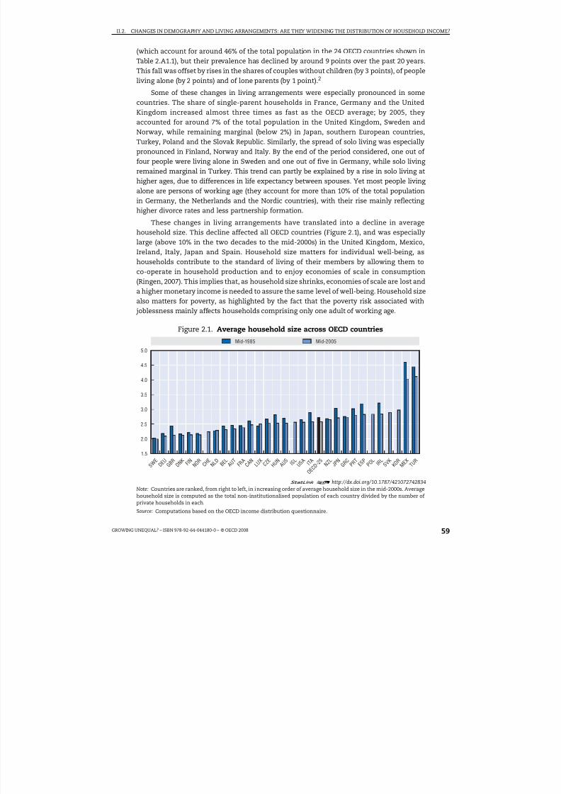
8/20/2019 Growing Unequal
http://slidepdf.com/reader/full/growing-unequal 59/309
II.2. CHANGES IN DEMOGRAPHY AND LIVING ARRANGEMENTS: ARE THEY WIDENING THE DISTRIBUTION OF HOUSEHOLD INCOME?
GROWING UNEQUAL? – ISBN 978-92-64-044180-0 – © OECD 2008 59
(which account for around 46% of the total population in the 24 OECD countries shown inTable 2.A1.1), but their prevalence has declined by around 9 points over the past 20 years.This fall was offset by rises in the shares of couples without children (by 3 points), of peopleliving alone (by 2 points) and of lone parents (by 1 point).2
Some of these changes in living arrangements were especially pronounced in somecountries. The share of single-parent households in France, Germany and the UnitedKingdom increased almost three times as fast as the OECD average; by 2005, theyaccounted for around 7% of the total population in the United Kingdom, Sweden andNorway, while remaining marginal (below 2%) in Japan, southern European countries,Turkey, Poland and the Slovak Republic. Similarly, the spread of solo living was especiallypronounced in Finland, Norway and Italy. By the end of the period considered, one out of four people were living alone in Sweden and one out of five in Germany, while solo living remained marginal in Turkey. This trend can partly be explained by a rise in solo living athigher ages, due to differences in life expectancy between spouses. Yet most people living alone are persons of working age (they account for more than 10% of the total populationin Germany, the Netherlands and the Nordic countries), with their rise mainly reflecting higher divorce rates and less partnership formation.
These changes in living arrangements have translated into a decline in averagehousehold size. This decline affected all OECD countries (Figure 2.1), and was especiallylarge (above 10% in the two decades to the mid-2000s) in the United Kingdom, Mexico,Ireland, Italy, Japan and Spain. Household size matters for individual well-being, ashouseholds contribute to the standard of living of their members by allowing them toco-operate in household production and to enjoy economies of scale in consumption(Ringen, 2007). This implies that, as household size shrinks, economies of scale are lost and
a higher monetary income is needed to assure the same level of well-being. Household sizealso matters for poverty, as highlighted by the fact that the poverty risk associated with joblessness mainly affects households comprising only one adult of working age.
Figure 2.1. Average household size across OECD countries
1 2 http://dx.doi.org/10.1787/421072742834
Note: Countries are ranked, from right to left, in increasing order of average household size in the mid-2000s. Averagehousehold size is computed as the total non-institutionalised population of each country divided by the number of private households in each.
Source: Computations based on the OECD income distribution questionnaire.
5.0
4.5
4.0
3.5
3.0
2.5
2.0
1.5
S W E
D E U
G B R
D N K
F I N N O R
C H E
N L D
B E L
A U T
F R A
C A N
L U X
C Z E
H U N
A U S
I S L
U S A I T A N Z
L J P N
G R C
P R T
E S P
P O L
I R L
S V K
K O R
M E X T U
R
O E C D
- 2 5
Mid-1985 Mid-2005

8/20/2019 Growing Unequal
http://slidepdf.com/reader/full/growing-unequal 60/309
II.2. CHANGES IN DEMOGRAPHY AND LIVING ARRANGEMENTS: ARE THEY WIDENING THE DISTRIBUTION OF HOUSEHOLD INCOME?
GROWING UNEQUAL? – ISBN 978-92-64-044180-0 – © OECD 200860
Demographic differences across the income distribution
Individuals with certain demographic characteristics are over-represented at certainpoints in the income distribution. This is especially evident when looking at age groups.Figure 2.2 plots, separately for men and women, the share of each age group in the bottom
two, middle six, and top two deciles of the income distribution. It suggests large differencesacross countries for two main dimensions.
● First is the size of the various cohorts (as shown by the total length of the horizontal bar).For example, the demographic structure of Mexico and Turkey, characterised by a broadbase (i.e. a large share of children) and a narrow top (i.e. a small share of elderly people),contrasts markedly with that of countries where the process of population ageing is moreadvanced (e.g. Japan and Italy), which translates into a more narrow base and fatter flanks.
● Second is the demographic composition of the different income quintiles. For example,children represent less than 20% of all those in the bottom income quintile in Denmark,Finland, Japan and Sweden, but up to 50% in Mexico and Turkey and more than 30% in
New Zealand and the United States. Prime-age people (aged 41 to 65) account for morethan half of those in the top income quintile in Denmark and Sweden, but only aroundone-fourth in Mexico.
Because of the assumption that people in a household share its total income equally,there are smaller differences between men and women (both are roughly equallyrepresented at different points in the distribution). The main exception is women aged 75and over, many of whom are living alone following the death of their spouse. They aredisproportionately clustered at the bottom of the income distribution, and account formore than 10% of those in the bottom income quintile in the Nordic countries and Japan,but for only 3% in the United States and a negligible proportion in Turkey.
Changes in living arrangements have also occurred to varying extents across the incomedistribution. In particular, fertility rates have evolved differently across the incomedistribution in several countries. On the one hand, highly skilled professional women areincreasingly opting to postpone childbearing and often end up having no or fewer childrenthan desired. On the other hand, less-skilled women may have children at a very early age,and be caught in a trap where the lack of affordable child care facilities precludes them fromcompleting their education or participating in the labour market (Dixon and Margo, 2006).Table 2.1 shows changes in fertility rates for women aged 30 to 39 who belong to householdswith different income levels. Taking all the countries included in Table 2.1, average fertilityrates have declined more at the bottom and middle of the distribution than at the top, butthese differences are small, suggesting that the impact of differential fertility on incomedistribution has been small. Across countries, however, fertility rates declined more stronglyamong low-income women than for their high-income counterparts in most countries (suchas the United States, Belgium, Germany, Denmark, Spain, France, Ireland, Luxembourg andNorway), with the exceptions of Hungary, Mexico, Poland and Sweden. For low-incomehouseholds, the decision to have fewer children may be part of a strategy to “spread” incomeover a fewer number of household members. This dampens the observed widening of theincome distribution, but at the “cost” of fewer children overall.
These differences across countries in the demographic make-up of income quintiles
reflect differences in both the distribution of income within each demographic group andin the average incomes of the groups. With respect to the first element, Figure 2.3 suggeststhat, in most OECD countries, the distribution of household income is narrower for the

8/20/2019 Growing Unequal
http://slidepdf.com/reader/full/growing-unequal 61/309
II.2. CHANGES IN DEMOGRAPHY AND LIVING ARRANGEMENTS: ARE THEY WIDENING THE DISTRIBUTION OF HOUSEHOLD INCOME?
GROWING UNEQUAL? – ISBN 978-92-64-044180-0 – © OECD 2008 61
Figure 2.2. Population pyramids in mid-2000s, by gender, age and income quintiles
0.200.20 0.150.15
> 75
66-75
41-50
51-65
26-40
18-25
0-17
> 75
66-75
41-50
51-65
26-40
18-25
0-17
> 75
66-75
41-50
51-65
26-40
18-25
0-17
> 75
66-75
41-50
51-65
26-40
18-25
0-17
> 75
66-75
41-50
51-65
26-4018-25
0-17
> 75
66-75
41-50
51-65
26-4018-25
0-17
> 75
66-75
41-50
51-65
26-4018-25
0-17
> 75
66-75
41-50
51-65
26-4018-25
0-17
> 75
66-75
41-50
51-65
26-40
18-25
0-17
> 75
66-75
41-50
51-65
26-40
18-25
0-17
> 75
66-75
41-50
51-65
26-40
18-25
0-17
> 75
66-75
41-50
51-65
26-40
18-25
0-17
> 75
66-75
41-50
51-65
26-40
18-25
0-17
> 75
66-75
41-50
51-65
26-40
18-25
0-17
> 75
66-75
41-50
51-65
26-40
18-25
0-17
> 75
66-75
41-50
51-65
26-40
18-25
0-17
> 7566-75
41-50
51-65
26-40
18-25
0-17
> 7566-75
41-50
51-65
26-40
18-25
0-17
> 7566-75
41-50
51-65
26-40
18-25
0-17
> 7566-75
41-50
51-65
26-40
18-25
0-17
> 75
66-75
41-50
51-65
26-40
18-25
0-17
> 75
66-75
41-50
51-65
26-40
18-25
0-17
> 75
66-75
41-50
51-65
26-40
18-25
0-17
> 75
66-75
41-50
51-65
26-40
18-25
0-17
> 75
66-75
41-50
51-65
26-40
18-25
0-17
> 75
66-75
41-50
51-65
26-40
18-25
0-17
> 75
66-75
41-50
51-65
26-40
18-25
0-17
> 75
66-75
41-50
51-65
26-40
18-25
0-17
0.100.10 0.050.05 00 0.200.20 0.150.15 0.100.10 0.050.05 00
0.200.20 0.150.15 0.100.10 0.050.05 00 0.200.20 0.150.15 0.100.10 0.050.05 00
0.200.20 0.150.15 0.100.10 0.050.05 00 0.200.20 0.150.15 0.100.10 0.050.05 00
0.200.20 0.150.15 0.100.10 0.050.05 00 0.200.20 0.150.15 0.100.10 0.050.05 00
0.200.20 0.150.15 0.100.10 0.050.05 00 0.200.20 0.150.15 0.100.10 0.050.05 00
0.200.20 0.150.15 0.100.10 0.050.05 00 0.200.20 0.150.15 0.100.10 0.050.05 00
0.200.20 0.150.15 0.100.10 0.050.05 00 0.200.20 0.150.15 0.100.10 0.050.05 00
Korea
Germany
Hungary Ireland
Italy Japan
France
Luxembourg
Greece
Australia Austria
Belgium Canada
Denmark
Bottom quintile Middle three quintiles Top quintiles
Women
Women
Women
Women
Women Women
Women
Women
Women
Women
Women Women
Women Women
Men
Men
Men
Men Men
Men
Men
Men
Men
Men
Men Men
Men
Men

8/20/2019 Growing Unequal
http://slidepdf.com/reader/full/growing-unequal 62/309
II.2. CHANGES IN DEMOGRAPHY AND LIVING ARRANGEMENTS: ARE THEY WIDENING THE DISTRIBUTION OF HOUSEHOLD INCOME?
GROWING UNEQUAL? – ISBN 978-92-64-044180-0 – © OECD 200862
Figure 2.2. Population pyramids in mid-2000s, by gender, age and income quintiles (cont.)
1 2 http://dx.doi.org/10.1787/421136300585Note: The figure shows, separately for men and women in each country, the share of people of a given age belonging to thebottom, top and middle-three quintiles of the distribution of equivalised household disposable income. The total length of eachbar represents the share of each age group in the total population; the different colours represent the age composition of eachincome group. OECD-30 is the average of all OECD countries: data for countries not included in the figure are available at theStatLink below.
Source: Computations based on the OECD income distribution questionnaire.
> 75
66-75
41-50
51-65
26-40
18-25
0-17
> 75
66-75
41-50
51-65
26-40
18-25
0-17
> 75
66-75
41-50
51-65
26-40
18-25
0-17
> 75
66-75
41-50
51-65
26-40
18-25
0-17
> 75
66-75
41-50
51-65
26-40
18-25
0-17
> 75
66-75
41-50
51-65
26-40
18-25
0-17
> 75
66-75
41-50
51-65
26-40
18-25
0-17
> 75
66-75
41-50
51-65
26-40
18-25
0-17
> 75
66-75
41-50
51-65
26-40
18-25
0-17
> 75
66-75
41-50
51-65
26-40
18-25
0-17
> 75
66-75
41-50
51-65
26-40
18-25
0-17
> 75
66-75
41-50
51-65
26-40
18-25
0-17
> 75
66-75
41-50
51-65
26-40
18-25
0-17
> 75
66-75
41-50
51-65
26-40
18-25
0-17
> 75
66-75
41-50
51-65
26-40
18-25
0-17
> 75
66-75
41-50
51-65
26-40
18-25
0-17
> 75
66-75
41-50
51-65
26-40
18-25
0-17
> 75
66-75
41-50
51-65
26-40
18-25
0-17
> 75
66-75
41-50
51-65
26-40
18-25
0-17
> 75
66-75
41-50
51-65
26-40
18-25
0-17
> 75
66-75
41-50
51-65
26-40
18-25
0-17
> 75
66-75
41-50
51-65
26-40
18-25
0-17
> 75
66-75
41-50
51-65
26-40
18-25
0-17
> 75
66-75
41-50
51-65
26-40
18-25
0-17
> 75
66-75
41-50
51-65
26-40
18-25
0-17
> 75
66-75
41-50
51-65
26-40
18-25
0-17
0.200.20 0.150.15 0.100.10 0.050.05 00
0.200.20 0.150.15 0.100.10 0.050.05 00 0.200.20 0.150.15 0.100.10 0.050.05 00
0.200.20 0.150.15 0.100.10 0.050.05 00 0.200.20 0.150.15 0.100.10 0.050.05 00
0.200.20 0.150.15 0.100.10 0.050.05 00 0.200.20 0.150.15 0.100.10 0.050.05 00
0.200.20 0.150.15 0.100.10 0.050.05 00 0.200.20 0.150.15 0.100.10 0.050.05 00
0.200.20 0.150.15 0.100.10 0.050.05 00 0.200.20 0.150.15 0.100.10 0.050.05 00
0.200.20 0.150.15 0.100.10 0.050.05 00 0.200.20 0.150.15 0.100.10 0.050.05 00
Slovak Republic
Sweden Turkey
United Kingdom United States
Portugal
OECD-30
Spain
Mexico Netherlands
New Zealand Norway
Poland
Women
Women
Women
Women
Women Women
Women
Women
Women
Women Women
Women Women
Men
Men
Men
Men
Men
Men
Men
Men
Men
Men Men
Men
Men
Bottom quintile Middle three quintiles Top quintile

8/20/2019 Growing Unequal
http://slidepdf.com/reader/full/growing-unequal 63/309
II.2. CHANGES IN DEMOGRAPHY AND LIVING ARRANGEMENTS: ARE THEY WIDENING THE DISTRIBUTION OF HOUSEHOLD INCOME?
GROWING UNEQUAL? – ISBN 978-92-64-044180-0 – © OECD 2008 63
elderly than for the non-elderly population. This mainly reflects the smaller dispersion inold-age pensions than in earnings. The exceptions are explained partly by the greaterprevalence of employment among the elderly (in the United States and Japan) and partly byless mature pension systems (in Mexico and Korea).3
Table 2.1. Number of children per woman by quintile of household income
Period
Bottom income quintile Middle three quintiles Top income quintile
Earlieryear
Lateryear
Pointchange
Earlieryear
Lateryear
Pointchange
Earlieryear
Lateryear
Pointchange
Australia 1985-2001 2.0 1.6 –0.4 2.0 1.7 –0.4 1.7 1.2 –0.5Austria 1994-2000 1.1 1.0 –0.1 1.6 1.5 –0.1 1.4 1.3 –0.1
Belgium 1985-2000 1.2 0.8 –0.3 1.6 1.8 0.2 1.9 1.9 0.0
Canada 1987-2000 1.6 1.4 –0.2 1.7 1.6 –0.2 1.6 1.5 –0.1
Germany 1984-2000 1.1 0.8 –0.3 1.5 1.4 –0.2 1.3 1.2 –0.1
Denmark 1987-2000 1.0 0.9 –0.1 1.7 1.7 0.0 1.6 1.8 0.2
Spain 1990-2000 2.1 1.3 –0.8 1.9 1.3 –0.6 1.7 1.0 –0.6
Finland 1987-2000 0.7 0.7 0.0 1.7 1.7 0.0 1.9 1.9 0.0
France 1984-2000 1.4 1.1 –0.3 1.8 1.8 0.0 1.7 1.8 0.1
Greece 1995-2000 1.6 1.5 –0.1 1.6 1.6 0.0 1.4 1.6 0.2
Hungary 1991-1999 1.4 1.4 0.0 1.8 1.7 –0.1 1.8 1.5 –0.3
Ireland 1994-2000 2.1 1.7 –0.3 2.1 2.2 0.1 1.6 1.6 0.0
Italy 1986-2000 1.8 1.6 –0.2 1.7 1.3 –0.4 1.3 1.2 –0.1
Luxembourg 1985-2000 1.4 1.2 –0.2 1.6 1.5 –0.1 1.4 1.3 –0.1
Mexico 1984-2000 4.3 3.2 –1.0 3.9 2.6 –1.3 3.5 2.3 –1.2
Netherlands 1987-1999 1.2 1.1 –0.1 1.8 1.6 –0.2 1.2 1.5 0.3
Norway 1986-2000 1.1 0.9 –0.2 2.0 1.8 –0.1 2.0 1.9 –0.1
Poland 1986-1999 2.1 2.3 0.2 2.0 2.1 0.1 2.0 1.8 –0.2
Sweden 1987-2000 0.6 0.6 0.0 1.7 1.8 0.1 2.0 1.8 –0.2
United Kingdom 1986-1999 1.8 1.6 –0.2 1.9 1.7 –0.2 1.6 1.3 –0.2
United States 1986-2000 1.8 1.5 –0.2 1.7 1.6 0.0 1.5 1.6 0.0
OECD-22 1.6 1.3 –0.2 1.9 1.7 –0.2 1.7 1.6 –0.1
1 2 http://dx.doi.org/10.1787/421222675372Note: Data refer to children aged less than 18 and to women who are classified as either head of household or as spouse andare aged 30 to 39. Quintiles based on non-equivalised household disposable income.Source: Calculations based on the Luxembourg Income Study database.
Figure 2.3. Gini coefficients of income inequality by age of individuals, 2005
1 2 http://dx.doi.org/10.1787/421143586160Note: Countries are ranked from left to right in increasing order of the Gini coefficient for the population of working age.
Source: OECD income distribution questionnaire.
D N K
S W E L U
X B E
L A U
T S V
K C Z
E C H
E N L
D F I N F R A
N O R I S
L D E
U H U
N K O
R A U
S E S
P G R
C J P N
I R L
C A N
N Z L G B
R I T A
U S A
P R T
P O L
T U R
M E X
O E C D
- 3 0
0.6
0.5
0.4
0.3
0.2
0.1
Working age (18 to 65) Retirement age (over 65)

8/20/2019 Growing Unequal
http://slidepdf.com/reader/full/growing-unequal 64/309
II.2. CHANGES IN DEMOGRAPHY AND LIVING ARRANGEMENTS: ARE THEY WIDENING THE DISTRIBUTION OF HOUSEHOLD INCOME?
GROWING UNEQUAL? – ISBN 978-92-64-044180-0 – © OECD 200864
With respect to the second element, average disposable income varies with the age of individuals and household types in similar ways across countries, with certaindemographic groups overrepresented at the tails of the income distribution (Figure 2.4). Inall countries, average income rises with age until the end of working life and then declines,although there are differences across countries in the age at which the highest level is
reached. Similarly, when grouping people living in different household types, averageincome rises when moving from single-parent households to singles without children andreaches its maximum for couples with no children; average income then declines for two-adult households with children (all with a head of working age), couples with a head of
Figure 2.4. Relative income by age of individual and household typein selected OECD countries
Equivalised household disposable income, mid-2000s
1 2 http://dx.doi.org/10.1787/421156621241
Note: WASACH = working-age head, single adult with children; WASANC = working-age head, single adult withoutchildren; WATACH = working-age head, two or more adults with children; WATANC = working-age head, two or moreadults without children; RATA = retirement age head, two or more adults; RASA = retirement age head, single adult.
Source: Computations based on the OECD income distribution questionnaire.
1.2
1.0
0.8
0.6
0.4
1.2
1.0
0.8
0.6
0.4
DEUITA
SWEUSA JPN
MEXCAN OECD-30
GBRFRA KOR
0 - 1 7
1 8 - 2 5
2 6 -
4 0
4 1 - 5 0
5 1 - 6 5
6 6 - 7 5
> 7 5
0 - 1 7
1 8 - 2 5
2 6 -
4 0
4 1 - 5 0
5 1 - 6 5
6 6 - 7 5
> 7 5
1.2
1.0
0.8
0.6
0.2
0.4
1.2
1.0
0.8
0.6
0.2
0.4
W A S
A C H
W A S
A N C
W A T
A C H
R A T
A
R A S
A
W A S
A C H
W A S
A N C
W A T
A C H
R A T
A
R A S
A
OECD-30
Age of individuals, age group 41-50 = 1
Household types, couple with no children = 1
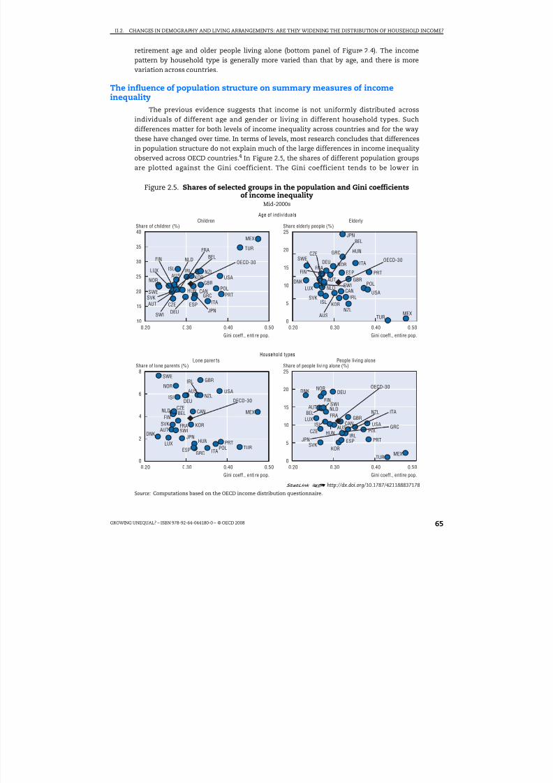
8/20/2019 Growing Unequal
http://slidepdf.com/reader/full/growing-unequal 65/309
II.2. CHANGES IN DEMOGRAPHY AND LIVING ARRANGEMENTS: ARE THEY WIDENING THE DISTRIBUTION OF HOUSEHOLD INCOME?
GROWING UNEQUAL? – ISBN 978-92-64-044180-0 – © OECD 2008 65
retirement age and older people living alone (bottom panel of Figure 2.4). The incomepattern by household type is generally more varied than that by age, and there is morevariation across countries.
The influence of population structure on summary measures of income
inequalityThe previous evidence suggests that income is not uniformly distributed across
individuals of different age and gender or living in different household types. Suchdifferences matter for both levels of income inequality across countries and for the waythese have changed over time. In terms of levels, most research concludes that differencesin population structure do not explain much of the large differences in income inequalityobserved across OECD countries.4 In Figure 2.5, the shares of different population groupsare plotted against the Gini coefficient. The Gini coefficient tends to be lower in
Figure 2.5. Shares of selected groups in the population and Gini coefficientsof income inequality
Mid-2000s
1 2 http://dx.doi.org/10.1787/421188837178
Source: Computations based on the OECD income distribution questionnaire.
25
20
15
10
5
00.20 0.30 0.40 0.50
40
35
30
25
20
15
100.20 0.30 0.40 0.50
25
20
15
10
5
00.20 0.30 0.40 0.50
8
6
4
2
00.20 0.30 0.40 0.50
AUS
AUT
BEL
CAN
CZE
FIN
FRA
DEU
GRCHUN
ISL IRL
ITA
JPN
KORLUX
MEX
NLD
NZL
NOR
POLPRTSVK
ESP
SWE
SWI
TUR
GBRUSA
AUS
AUT
BEL
CAN
CZE
FINFRA
DEU
GRC HUN
ISLIRL
ITA
JPN
KOR
LUX
DNK
MEX
NLD
NZL
NOR
POL
PRT
SVK
ESP
SWE
SWI
TUR
GBR
USA
AUS
AUT
BEL CANCZE
DNK
FIN
FRA
DEU
GRC
HUN
ISL
IRL
ITA
JPN
KOR
LUX
MEXNLD
NZLNOR
POLPRT
SVK
ESP
SWE
SWI
TUR
GBR
USA
AUS
AUTBEL
CAN
CZE
FIN
FRA
DEU
GRCHUN
ISL
IRL
ITA
JPN
KOR
LUX
MEX
NLDNZL
NORDNK
POL
PRTSVK
ESP
SWI
TUR
GBRUSA
Gini coeff., entire pop. Gini coeff., entire pop.
Age of individuals
Share of children (%) Share elderly people (%)Children Elderly
Gini coeff., entire pop. Gini coeff., entire pop.
Household types
Share of lone parents (%) Share of people living alone (%)Lone parents People living alone
OECD-30
OECD-30
OECD-30 OECD-30

8/20/2019 Growing Unequal
http://slidepdf.com/reader/full/growing-unequal 66/309
II.2. CHANGES IN DEMOGRAPHY AND LIVING ARRANGEMENTS: ARE THEY WIDENING THE DISTRIBUTION OF HOUSEHOLD INCOME?
GROWING UNEQUAL? – ISBN 978-92-64-044180-0 – © OECD 200866
OECD countries with a higher share of people living alone. There is, however, no clearpattern when considering the prevalence of children, elderly people and lone parents.
In terms of changes in income inequality over time, a simple approach for assessing the overall effect of demographic trends is to compute an inequality measure while “freezing”the population structure at the level prevailing in a given reference year. Results for severalOECD countries are shown in Table 2.2. Beyond the total change in the Gini coefficients of eachcountry (shown in the first column), the table shows the change that would have prevailedwith a constant population structure by age of individuals (third column), by householdcharacteristics (fifth column) and by both age and household type (seventh column),respectively. Though age of people and household type are not independent criteria (e.g. olderpeople are more likely to live alone), the results highlight two main patterns:
● First, changes in population structure due to the combined effect of age and householdtype contribute to higher income inequality in most countries, although there are someexceptions, such as Mexico, as well as (to a lesser extent) Austria, Denmark, Italy, and
Sweden. The effect of changes in the demographic make-up of the population on rising inequality is large (above 20%) in Australia, Canada, France, Germany, the Netherlandsand the United Kingdom.
Table 2.2. Changes in income inequality assuminga constant population structure
PeriodTotal change
in Ginicoefficient
Change in Gini coefficientat constant age structure
Change in Gini coefficientat constant household
structure
Change in Gini coefficientat constant age
and household structure
Share of totalchange (%)
Share of totalchange (%)
Share of totalchange (%)
Australia 1995-2004 –0.008 –0.011 –31.8 –0.012 –45.0 –0.013 –57.8
Austria1 1987-2000 0.028 0.029 –2.0 0.031 –8.0 0.032 –10.8
Belgium1 1985-2000 0.053 0.049 8.8 0.045 15.4 0.044 17.1
Canada 1985-2005 0.027 0.026 4.1 0.021 22.0 0.021 21.6
Denmark1 1987-2004 –0.024 –0.024 2.6 –0.025 –3.7 –0.022 9.9
Finland 1986-2004 0.062 0.058 7.1 0.054 13.7 0.052 16.1
France1 1984-2000 –0.008 –0.008 –2.9 –0.011 –34.6 –0.011 –36.8
Germany 1985-2005 0.044 0.045 –2.5 0.005 88.2 0.026 40.8
Italy 1984-2004 0.063 0.069 –10.3 0.071 –14.0 0.073 –16.0
Luxembourg 1986-2004 0.011 0.011 2.7 0.010 12.6 0.009 14.7
Mexico 1984-2004 0.021 0.021 0.6 0.026 –20.9 0.030 –39.9
Netherlands1 1985-1999 –0.003 –0.002 51.4 –0.007 –129.1 –0.007 –102.1
Norway 1986-2004 0.046 0.048 –5.1 0.040 12.5 0.039 15.6
Spain1 1980-2000 0.018 0.020 –8.9 0.015 16.7 0.016 9.2
Sweden 1983-2004 0.019 0.018 9.4 0.020 –1.1 0.023 –18.1
UnitedKingdom
1985-2005 0.051 0.049 3.3 0.041 19.6 0.041 20.4
United States1 1986-2000 0.037 0.035 3.3 0.036 2.4 0.035 5.4
Average 0.026 0.026 0.9 0.021 17.9 0.023 11.2
1 2 http://dx.doi.org/10.1787/421226186681Note: The approach used first computes the population structure (across seven age groups and six household types)in the beginning and final year, and then applies re-weighting factors (defined as the ratio of the population sharesin the two years) to the income records of the final year. The resulting estimate corresponds to the Gini coefficientthat would have prevailed in the final year had the population structure remained unchanged. For the Netherlands,
where no data on children are available in LIS, the data on household structure in the earlier year are drawn from theOECD questionnaire. Data for Germany refer to western länder only.1. Based on data from the Luxembourg Income Study.Source: Calculations based on the Luxembourg Income Study and the OECD income distribution questionnaire.

8/20/2019 Growing Unequal
http://slidepdf.com/reader/full/growing-unequal 67/309
II.2. CHANGES IN DEMOGRAPHY AND LIVING ARRANGEMENTS: ARE THEY WIDENING THE DISTRIBUTION OF HOUSEHOLD INCOME?
GROWING UNEQUAL? – ISBN 978-92-64-044180-0 – © OECD 2008 67
● Second, effects on income distribution are generally larger when controlling for changesby household type than for those by age of individual. This is not surprising, as changesin the latter are driven by both declines in the number of children (who have low averageincome in most countries) and by increases in the share of elderly (a group alsocharacterised by low reported income). Conversely, changes in the population structure
by household type tend to be dominated by the rise in the share of single adult families(both single parents with children, and elderly people living alone), i.e. groups with lowaverage income.5 Separating between age- and household type-effects is, however,difficult, as in many countries the growing importance of single households may reflectthe larger share of elderly people in the total population.6
Changes in the relative income of different groups
Changes in population structure contribute to shaping trends in income inequalitythrough a “compositional effect”. However, trends in income inequality also reflectchanges in income within and between demographic groups. Changes in average incomebetween groups have been significant in several OECD countries. Figure 2.6 plots the
Figure 2.6. Relative income of individuals by ageAverage household disposable income of each age group relative to that of people aged 41 to 50,
mid-1980s and mid-2000s
1 2 http://dx.doi.org/10.1787/421203370354
Note: The later year (on the horizontal axis) refers to the mid-2000s for all countries except Austria, Belgium, Ireland,Spain and Portugal, where it refers to around 2000. The earlier year (on the vertical axis) refers to the mid-1980s forall countries except Australia, Belgium, Poland, Portugal (1995) and Hungary (1990).
Source: OECD income distribution questionnaire.
1.0
0.9
0.8
0.7
0.6
1.1
1.0
0.9
0.8
0.7
1.2
1.1
1.0
0.9
0.80.6 0.7 0.8 0.9 1.0 0.7 0.8 0.9 1.0 1.1 0.8 0.9 1.0 1.1 1.2
1.2
1.1
1.0
0.9
0.8
1.1
1.0
0.9
0.8
0.5
0.7
0.6
1.0
0.9
0.8
0.7
0.5
0.6
0.8 0.9 1.0 1.1 1.2 0.70.60.5 0.8 0.9 1.0 1.1 0.5 0.6 0.7 0.8 0.9 1.0
AUS
AUT
BEL
CAN
DNK
FIN
FRA
DEU
GRC
HUN
IRLITA
JPNLUX
MEX
NLD
NZL
NOR
PRT
ESP
SWE
TUR
GBR
USA
AUS
AUT
BEL
CAN
DNKNOR
FIN
FRA
DEUGRC
HUN
ITA
JPNLUX
MEXNLD
NZLPRT
IRL
ESP
SWE
TUR
GBR
USA
AUS
AUT
BEL
CAN
DNK
FIN
FRA
DEUGRC
HUNIRL
ITA
JPN
LUX
MEX
NLD
NZL
NOR
PRT
ESP
SWE
TUR
GBR
USA
AUS
AUT
BEL
CAN
DNK
FIN
FRA
DEU
GRC
HUN
IRL ITAJPN
LUX
MEX NLD
NZL
NORPRT
ESP
SWETUR
GBR
USA
AUSAUT
BEL
CAN
DNK
FIN
FRADEU
GRCHUN
IRL
ITA
JPN
LUXMEX
NLDNZL
NOR
PRT
ESPSWE
TURGBR
USA
AUS
AUT
BEL
CAN
DNK
FINFRADEU
GRC HUN
IRLITAJPNLUX
MEX
NLD
NZL
NOR
PRT
ESP
SWETUR
GBR
USA
OECD-24
OECD-24
OECD-24
OECD-24
OECD-24
OECD-24
Less than 18 Between 18 and 25 Between 25 and 40Mid-1980s Mid-1980s Mid-1980s
Mid-2000sMid-2000sMid-2000s
Between 51 and 65 Between 66 and 75 Above 75Mid-1980s Mid-1980s Mid-1980s
Mid-2000sMid-2000sMid-2000s
8/20/2019 Growing Unequal
http://slidepdf.com/reader/full/growing-unequal 68/309
II.2. CHANGES IN DEMOGRAPHY AND LIVING ARRANGEMENTS: ARE THEY WIDENING THE DISTRIBUTION OF HOUSEHOLD INCOME?
GROWING UNEQUAL? – ISBN 978-92-64-044180-0 – © OECD 200868
income of various age groups of the population at two points in time (the most recent year,on the horizontal axis; and the mid-1990s, on the vertical one) relative to that of peopleaged 41 to 50; countries above the diagonal are those in which the relative income for thegroup considered has fallen. The most important changes highlighted by Figure 2.6 are thelarge improvements realised by people in their later working life (51 to 65) and the equally
important deterioration for youths (18 to 25). However, there is also much diversity incountries’ experiences.
● Children gain in most countries, especially in the United States and Canada (by 8 pointsor more) but also in Australia, France, New Zealand and Norway. They record largedeclines in Spain and Mexico, and smaller ones in Turkey and Japan.
● Youths aged 18 to 25 record a deterioration in relative income of around 4 points onaverage but much larger (of 10 points or more) in Denmark, Mexico, New Zealand,Norway, Sweden and Turkey. This age group improves its position only inseven countries, significantly so in Hungary, Canada and Portugal.
● There is much diversity for people aged 26 to 40, with gains in around half of thecountries and losses in the other half. Changes are small in most cases, but there arelarge gains (of 5 points or more) in Ireland, Hungary, Australia, Canada and Finland andlarge losses (of the same amount) in Mexico, Denmark, Spain and Portugal.
● People in their later working life (51 to 65) experienced the largest gains (by 7 points onaverage, but more than twice as large in Denmark, Finland, France, Hungary, andNorway). Over this period, most countries experienced a shift to the right of the ageincome profile, which has made this group the one with the highest income in morethan half of all countries. The position of this age group worsened in only four countries,with a large deterioration (by 5 points or more) only in Mexico.
● Changes are smaller for the elderly. For people aged 66 to 75, small improvements arerecorded in all but eight countries, with large gains (of 10 points or more) in Norway,Hungary, Austria, Germany and Luxembourg, and large losses in Mexico, Turkey, Spainand New Zealand. People above 75 experienced gains in a slight majority of countries(especially in Austria, Canada and Norway) but losses in eleven countries (especiallylarge in Japan, New Zealand, Spain and Turkey).
Changes in relative income are smaller across household types (when income isexpressed relative to that of couple households with children and a working-age head).Countries are, in general, evenly distributed on the two sides of the diagonal in Figure 2.7,
with an “average” gain (across the 18 countries considered) of around 4 points for elderlypeople living alone and a small loss (of around 1 point) for single parents.
Shifts in relative income may reflect demographic changes. This holds especially forage cohorts. For example, the entry of a large birth cohort into the labour market maydepress their wages and life-time income and have indirect effects on other cohorts(depending on the extent to which they substitute for each other).7 Similarly, demographicinfluences may lead to changes in social policies that alter the benefit income of differentage groups, as for example when benefits are reduced or social security contributionsincreased in response to population ageing (von Weizsäcker, 1996). But effects may also goin the opposite direction, as larger population groups gain weight in the political process,
thereby increasing their capacity to resist downward adjustments of their income and toimpose policies favouring them. In practice, there is little evidence of strong links betweenchanges in relative income and changes in population shares. First, as noted above, while

8/20/2019 Growing Unequal
http://slidepdf.com/reader/full/growing-unequal 69/309
II.2. CHANGES IN DEMOGRAPHY AND LIVING ARRANGEMENTS: ARE THEY WIDENING THE DISTRIBUTION OF HOUSEHOLD INCOME?
GROWING UNEQUAL? – ISBN 978-92-64-044180-0 – © OECD 2008 69
income losses of young adults have occurred alongside a rise in their population share, thegains experienced by people aged 51 to 65 occurred despite their larger cohort size. Second,
changes in relative income for some of the groups that have experienced the mostsignificant changes in relative income are not larger in the countries where demographicshifts are stronger. This suggests that shifts in the relative income of various groups havebeen driven more by changes in terms of access to jobs and support from the welfaresystem, rather than by demographic factors per se.
Figure 2.7. Relative income of individuals by household typeHousehold disposable income of each household type relative to couples with a working-age head
without children, mid-1980s and mid-2000s
1 2 http://dx.doi.org/10.1787/421211338058Note: The later year (on the horizontal axis) refers to the mid-2000s for all countries. The earlier year (on the verticalaxis) refers to the mid-1980s for all countries except Australia.
Source: OECD income distribution questionnaire.
0.7
0.6
0.5
0.4
0.3
1.1
1.0
0.9
0.8
0.6
0.7
1.0
0.9
0.8
0.6
0.7
0.50.3 0.4 0.5 0.6 0.7 0.6 0.7 0.8 0.9 1.0 1.1 0.5 0.6 0.7 0.8 0.9 1.0
0.9
0.8
0.5
0.7
0.6
0.8
0.7
0.6
0.5
0.3
0.4
0.70.60.5 0.8 0.9 0.3 0.4 0.5 0.6 0.7 0.8
AUS
AUT
CAN
DEN
FINFRA
GER GRC
ITA
JPN
LUX
MEX
NLDNZL
NOR
SWE
GBR
USA
AUS
AUT
CANDEN
FIN
FRAGER
GRC
ITA
JPN
LUX MEX
NLD
NZLSWE
GBR
USAAUS
AUT
CAN
DENFINFRA
GER
GRC
ITAJPN
LUXMEX
NLDNZL
NOR
SWE
GBR
USA
AUS
AUTCAN
DENFIN
FRA
GER
GRC
ITA
JPN
LUX
MEX
NLD
NZLNOR
SWE
GBR
USA
AUS
AUTCAN
DEN
FIN
FRA
GERGRC
ITA
JPN
LUX
MEX
NLD
NZLNOR SWE
GBR
USA
Working age head,single adult with children
Working age head,single adult without children
Working age head,two adults with children
Mid-1980s Mid-1980s Mid-1980s
Mid-2000sMid-2000sMid-2000s
Retirement age head, couple Retirement age head, single
Mid-1980s Mid-1980s
Mid-2000sMid-2000s
OECD-18
OECD-18
OECD-18
OECD-18
OECD-18

8/20/2019 Growing Unequal
http://slidepdf.com/reader/full/growing-unequal 70/309
II.2. CHANGES IN DEMOGRAPHY AND LIVING ARRANGEMENTS: ARE THEY WIDENING THE DISTRIBUTION OF HOUSEHOLD INCOME?
GROWING UNEQUAL? – ISBN 978-92-64-044180-0 – © OECD 200870
Conclusion
The demographic factors described in this chapter, in particular population ageing andchanges in living arrangements, have shifted the distribution of economic risks among thepopulation, with some groups losing ground relatively and others gaining. The chapter has
highlighted the following patterns:● Changes in the age structure and living arrangements of OECD populations – with more
people living alone, as lone parents or as couples without children – have reducedhousehold size and dampened the growth in equivalised income.
● These demographic shifts have widened the income distribution in most countries,more because of changes in living arrangements than in the age structure of thepopulation. In most countries these demographic factors account for only a part of theobserved change in income distribution.
● These shifts in the demographic composition of OECD countries have occurred alongsidechanges in the relative income of different groups. Youths and, to a lesser extent, lone
parents have lost ground in most countries, while people who are closer to the end of their working life, as well as elderly people living alone, have gained the most.
These changes call for a re-orientation of social policies. Policymakers havetraditionally been reluctant to implement policies with an explicit focus on demographicfactors. While this situation has been changing in recent years, most of the policiesintroduced have aimed either at reconciling the work and family responsibilities of parents, or at increasing fertility rates. These policies, however, also affect incomeinequalities. Hence they need to be combined with a better understanding of what drivesdifferences in the economic conditions of various groups, and be targeted to those familiesthat are on the “losing end” of the redistribution of economic fortunes.
Notes
1. The OECD questionnaire on income distribution classifies individuals according to thecharacteristics of the households where they live, using as main criteria the age of the householdhead (above 65 or not), the presence of children and the number of adults (singles and couples). Anadditional criterion, used in later chapters, is the number of workers in the household (zeroworkers, one worker, two or more workers).
2. The data in the OECD questionnaire may underestimate the rise in single parenthood as they referto people living in households with a single adult and children. A single parent living with an adultother than their partner (e.g. their own parent, other cohabitants) is therefore classified as a couple
family.3. With respect to changes in income inequality over time, from the mid-1990s to the mid-2000s the
Gini coefficient for the retirement age population has declined in more than half of all countries;in most other countries, it has increased by less than that for the population of working age.
4. See, for example, Brandolini and D’Alessio (2001). These authors use LIS data to compute the meanlog deviation of income that would have prevailed in 12 European countries if the demographicstructure prevailing in Italy were applied to them. After controlling for differences in householdsize and the age and gender of the household head, they conclude that the demographicdifferences between Italian households and those of the other 11 European countries do notexplain why inequality is higher in Italy than elsewhere ( i.e. other European countries exhibit alower income inequality based on the demographic profile of Italy).
5. Other approaches have aimed at disentangling the relative importance of various factors behind
these changes in inequality. For inequality measures that can be decomposed additively bypopulation subgroups (such as the MLD), the total change in inequality can be expressed as thesum of income differences “between” and “within” groups, and of a residual component representing the effect of demographic structure. While for this class of inequality measures it is possible to
8/20/2019 Growing Unequal
http://slidepdf.com/reader/full/growing-unequal 71/309
II.2. CHANGES IN DEMOGRAPHY AND LIVING ARRANGEMENTS: ARE THEY WIDENING THE DISTRIBUTION OF HOUSEHOLD INCOME?
GROWING UNEQUAL? – ISBN 978-92-64-044180-0 – © OECD 2008 71
derive analytically the conditions determining the overall sign of the various effects, no similarproperty holds for other inequality measures such as the Gini coefficient (von Weizsäcker, 1996).
6. Similar Gini-based approaches are used by Li (2005), for Australia, and Reed (2006) for the UnitedKingdom. The first study (which is based on a more refined methodology applied to data from themid-1990s to the early 2000s) finds that changes in the age structure account for around one-thirdof the total (but insignificant) increase in income inequality, while the second study (which
controls for a broader range of household characteristics over the period 1979 to 2003/04) finds thatdemographic change explained around 20% of the total increase in income inequality.
7. The notion of a relationship between the relative income of each cohort and its size was suggestedby Easterlin (1987) who argued that, when a large cohort enters the labour market, its entry wagefalls and that this fall may persist over their working career due to effects on delaying marriageand childbirth.
References
Brandolini, A. and G. D’Alessio (2001), “Household Structure and Income Inequality”, Luxembourg Income Study Working Paper, No. 254, Luxembourg.
D’Addio, A. and M. Mira d’Ercole (2005), “Trends and Determinants of Fertility Rates: The Role of Policies”, OECD Social, Employment and Migration Working Paper, No. 27, OECD, Paris.
Dang, T.-T., H. Immervoll, D. Mantovani, K. Orsini and H. Sutherland (2006), “An Age Perspective onEconomic Well-Being and Social Protection in Nine OECD Countries”, OECD Social, Employmentand Migration Working Paper, No. 34, OECD, Paris.
Dixon, M. and J. Margo (2006), Population Politics, Institute for Public Policy Research, London.
Easterlin, R.A. (1987), “Easterlin Hypothesis”, in J. Eatwell, M. Milgate and P. Newman (eds.), The NewPalgrave: A Dictionary of Economics, The Stockton Press, NewYork, pp. 1-4.
Li, Y. (2005), “Impact of Demographic and Economic Change on Measured Income Inequality”,Research Paper, Australian Bureau of Statistics, Canberra.
Reed, H. (2006), “Modelling Demographic Pressure on Poverty and Inequality”, in M. Dixon and J. Margo
(eds.), Population Politics, Institute for Public Policy Research, London.Ringen, S. (2007), “What Do Families Do?”, Chapter 5 in S. Ringen, What Democracy Is For?, Princeton
University Press.
von Weizsäcker, R.K. (1996), “Distributive Implications of An Ageing Society”, European Economic Review,Vol. 40.

8/20/2019 Growing Unequal
http://slidepdf.com/reader/full/growing-unequal 72/309

8/20/2019 Growing Unequal
http://slidepdf.com/reader/full/growing-unequal 73/309
II.2. CHANGES IN DEMOGRAPHY AND LIVING ARRANGEMENTS: ARE THEY WIDENING THE DISTRIBUTION OF HOUSEHOLD INCOME?
GROWING UNEQUAL? – ISBN 978-92-64-044180-0 – © OECD 2008 73
ANNEX 2.A1
Structure of the Population in Selected OECD Countries
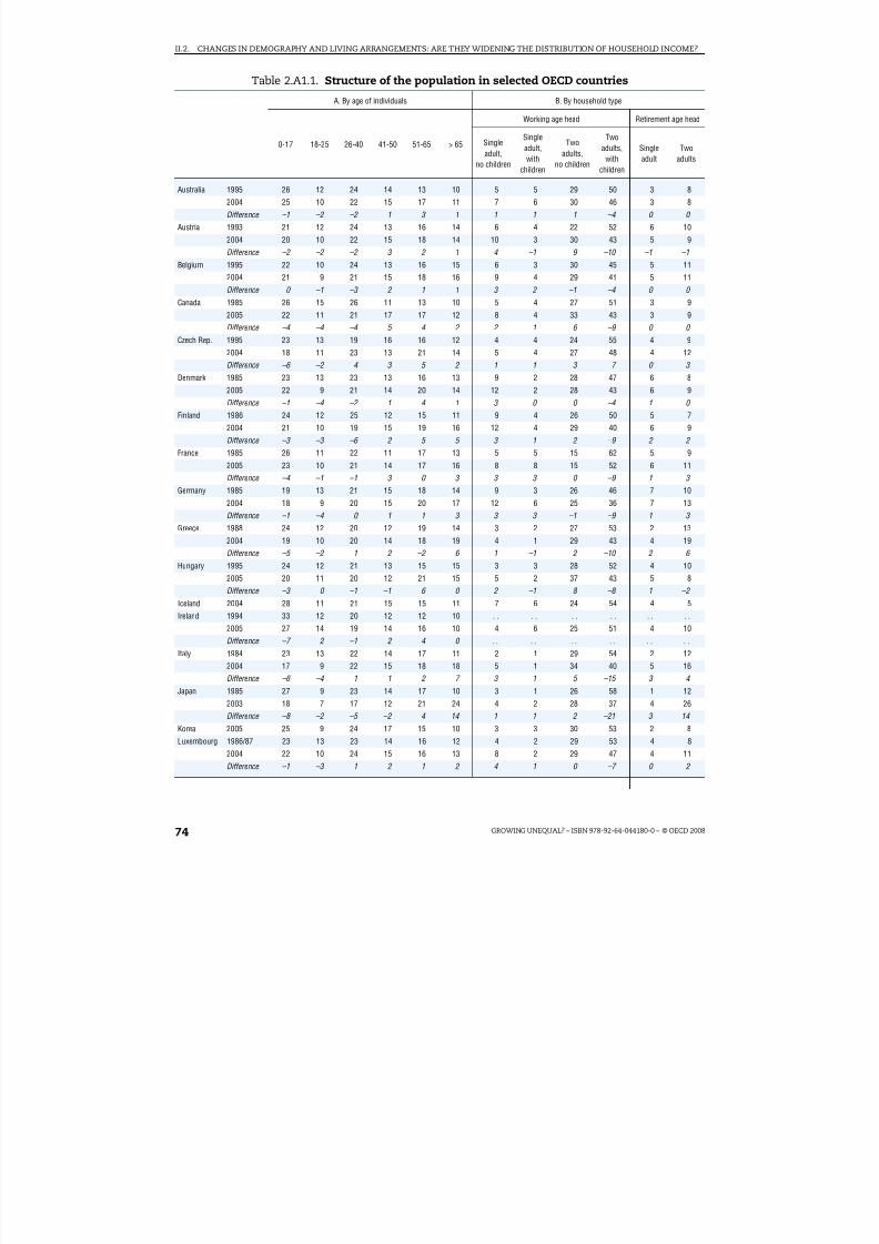
8/20/2019 Growing Unequal
http://slidepdf.com/reader/full/growing-unequal 74/309
II.2. CHANGES IN DEMOGRAPHY AND LIVING ARRANGEMENTS: ARE THEY WIDENING THE DISTRIBUTION OF HOUSEHOLD INCOME?
GROWING UNEQUAL? – ISBN 978-92-64-044180-0 – © OECD 200874
Table 2.A1.1. Structure of the population in selected OECD countries
A. By age of individuals B. By household type
0-17 18-25 26-40 41-50 51-65 > 65
Working age head Retirement age head
Single
adult,no children
Singleadult,with
children
Two
adults,no children
Twoadults,with
children
Singleadult
Twoadults
Australia 1995 26 12 24 14 13 10 5 5 29 50 3 8
2004 25 10 22 15 17 11 7 6 30 46 3 8
Difference –1 –2 –2 1 3 1 1 1 1 –4 0 0
Austria 1993 21 12 24 13 16 14 6 4 22 52 6 10
2004 20 10 22 15 18 14 10 3 30 43 5 9
Difference –2 –2 –2 3 2 1 4 –1 9 –10 –1 –1
Belgium 1995 22 10 24 13 16 15 6 3 30 45 5 11
2004 21 9 21 15 18 16 9 4 29 41 5 11
Difference 0 –1 –3 2 1 1 3 2 –1 –4 0 0
Canada 1985 26 15 26 11 13 10 5 4 27 51 3 92005 22 11 21 17 17 12 8 4 33 43 3 9
Difference –4 –4 –4 5 4 2 2 1 6 –9 0 0
Czech Rep. 1995 23 13 19 16 16 12 4 4 24 55 4 9
2004 18 11 23 13 21 14 5 4 27 48 4 12
Difference –6 –2 4 –3 5 2 1 1 3 –7 0 3
Denmark 1985 23 13 23 13 16 13 9 2 28 47 6 8
2005 22 9 21 14 20 14 12 2 28 43 6 9
Difference –1 –4 –2 1 4 1 3 0 0 –4 1 0
Finland 1986 24 12 25 12 15 11 9 4 26 50 5 7
2004 21 10 19 15 19 16 12 4 29 40 6 9
Difference –3 –3 –6 2 5 5 3 1 2 –9 2 2
France 1985 26 11 22 11 17 13 5 5 15 62 5 9
2005 23 10 21 14 17 16 8 8 15 52 6 11
Difference –4 –1 –1 3 0 3 3 3 0 –9 1 3
Germany 1985 19 13 21 15 18 14 9 3 26 46 7 10
2004 18 9 20 15 20 17 12 6 25 36 7 13
Difference –1 –4 0 1 1 3 3 3 –1 –9 1 3
Greece 1988 24 12 20 12 19 14 3 2 27 53 2 13
2004 19 10 20 14 18 19 4 1 29 43 4 19
Difference –5 –2 1 2 –2 6 1 –1 2 –10 2 6
Hungary 1995 24 12 21 13 15 15 3 3 28 52 4 10
2005 20 11 20 12 21 15 5 2 37 43 5 8
Difference –3 0 –1 –1 6 0 2 –1 8 –8 1 –2
Iceland 2004 28 11 21 15 15 11 7 6 24 54 4 5
Ireland 1994 33 12 20 12 12 10 . . . . . . . . . . . .2005 27 14 19 14 16 10 4 6 25 51 4 10
Difference –7 2 –1 2 4 0 . . . . . . . . . . . .
Italy 1984 23 13 22 14 17 11 2 1 29 54 2 12
2004 17 9 22 15 18 18 5 1 34 40 5 16
Difference –6 –4 1 1 2 7 3 1 5 –15 3 4
Japan 1985 27 9 23 14 17 10 3 1 26 58 1 12
2003 18 7 17 12 21 24 4 2 28 37 4 26
Difference –8 –2 –5 –2 4 14 1 1 2 –21 3 14
Korea 2005 25 9 24 17 15 10 3 3 30 53 2 8
Luxembourg 1986/87 23 13 23 14 16 12 4 2 29 53 4 8
2004 22 10 24 15 16 13 8 2 29 47 4 11
Difference –1 –3 1 2 1 2 4 1 0 –7 0 2

8/20/2019 Growing Unequal
http://slidepdf.com/reader/full/growing-unequal 75/309
II.2. CHANGES IN DEMOGRAPHY AND LIVING ARRANGEMENTS: ARE THEY WIDENING THE DISTRIBUTION OF HOUSEHOLD INCOME?
GROWING UNEQUAL? – ISBN 978-92-64-044180-0 – © OECD 2008 75
Mexico 1984 50 14 18 7 7 4 1 3 6 84 0 7
2004 38 14 22 11 10 6 1 4 13 71 1 10
Difference –12 0 5 3 3 2 1 2 7 –13 0 3
Netherlands 1985 24 14 24 12 14 12 6 2 26 51 4 10
2004 22 10 22 15 18 13 10 4 27 44 4 9
Difference –2 –4 –2 3 5 0 4 2 1 –7 0 0
New Zealand 1985 31 14 23 11 13 9 4 5 21 59 4 7
2003 26 11 21 14 15 12 5 6 26 50 4 9
Difference –4 –3 –1 4 1 3 1 1 5 –9 0 1
Norway 1986 25 13 23 11 15 14 8 5 24 49 6 92004 24 9 22 14 18 13 13 7 24 42 6 8
Difference –1 –3 –1 3 3 –1 5 2 0 –6 0 –1
Poland 2000 21 13 21 15 17 12 5 2 29 50 4 11
Portugal 1995 19 13 18 13 19 18 1 1 30 45 3 19
2004 19 11 23 14 17 16 2 2 33 47 4 12
Difference 0 –3 5 1 –2 –2 1 1 3 2 0 –7
Slovak Rep. 2004 20 15 20 16 18 11 3 2 32 49 5 8
Spain 1995 21 14 23 13 16 14 2 1 20 66 2 10
2004 18 11 25 15 16 16 3 1 37 42 3 14
Difference –3 –3 2 2 0 2 1 0 17 –24 2 4
Sweden 1983 23 10 22 12 15 18 19 7 16 41 9 10
2004 22 9 20 13 19 17 17 8 17 40 8 11
Difference –1 –1 –2 2 4 –1 –2 1 1 –1 –1 0
Switzerland 2000 21 9 23 16 18 14 10 3 31 42 5 9
Turkey 1984 42 14 20 9 11 4 0 1 13 79 0 6
2004 35 13 23 13 11 5 1 1 18 72 0 8
Difference –8 –1 3 3 1 1 0 0 5 –7 0 2
UnitedKingdom
1985 26 11 22 11 16 13 5 4 23 53 5 10
2005 22 10 21 14 18 14 7 7 32 39 5 10
Difference –4 –1 –1 3 2 2 3 3 9 –14 1 –1
United States 1984 27 12 25 11 14 11 5 6 25 50 4 10
2005 25 10 21 15 17 12 6 7 24 49 4 10
Difference –2 –2 –4 4 3 1 0 1 0 –1 0 0
Average 1985 26 12 22 12 15 12 5 3 24 54 4 102005 23 10 21 14 17 14 7 4 27 46 5 11
Difference –4 –2 –1 2 2 2 2 1 3 –9 1 2
1 2 http://dx.doi.org/10.1787/421247327266Note: Average of 25 OECD countries (excluding Iceland, Korea, Poland, the Slovak Republic and Switzerland) for population structure byage of individuals; average of 24 countries (also excluding Ireland) for population structure by household type.Source: OECD income distribution questionnaire.
Table 2.A1.1. Structure of the population in selected OECD countries (cont.)
A. By age of individuals B. By household type
0-17 18-25 26-40 41-50 51-65 > 65
Working age head Retirement age head
Single
adult,no children
Singleadult,with
children
Two
adults,no children
Twoadults,with
children
Singleadult
Twoadults

8/20/2019 Growing Unequal
http://slidepdf.com/reader/full/growing-unequal 76/309

8/20/2019 Growing Unequal
http://slidepdf.com/reader/full/growing-unequal 77/309
ISBN 978-92-64-044180-0Growing Unequal?© OECD 2008
77
PART II
Chapter 3
Earnings and Income Inequality:Understanding the Links*
Wage disparities among full-time workers have increased over the past two
decades. These disparities are much wider when looking at personal earnings of all workers, reflecting differences in the amount of work performed over the year.When looking at the distribution across the entire working-age population –whether working or not – the concentration of household earnings has remainedbroadly stable over the past decade, while that of capital and self-employmentincome has increased markedly.
* This chapter has been prepared by Marco Mira d’Ercole, OECD Social Policy Division, and AderonkeOsikonimu, currently at the University of Freiburg, Germany.

8/20/2019 Growing Unequal
http://slidepdf.com/reader/full/growing-unequal 78/309
II.3. EARNINGS AND INCOME INEQUALITY: UNDERSTANDING THE LINKS
GROWING UNEQUAL? – ISBN 978-92-64-044180-0 – © OECD 200878
Introduction
Much of the discussion on the drivers of income inequality has focused on thedistribution of earnings, and on the impact of technological development, trade with low-wage countries and institutional changes on earnings.1 This discussion is critical to anyassessment of what has happened to income inequality: earnings are the largestcomponent of household income and, as a result, they play a key role in shaping changesin income inequality. Yet the relation between earnings and income inequality is complex:many factors are at work that can either offset the impact of earnings inequality on the
distribution of household income or reinforce it.2 Because of the variety of factors involvedand differences in concepts, measures and statistical sources used to describe them,changes in the distribution of personal earnings among workers and changes in marketincome (the sum of earnings, self-employment and capital income) among people maysometimes move in different directions. While for most of the countries included inFigure 3.1, changes in the distribution of earnings and of market income over the pastdecade have moved in sympathy, there have been exceptions, and even when bothdistributions move consistently, there are differences in the strength of their association.3
This chapter focuses on the links between the distribution of personal earnings and thedistribution of market income to highlight the role of labour markets in driving changes in
income inequality among people of working age. Because of its focus, the chapter ignoresthe redistribution of income that is achieved through taxes and public transfers (theseissues are considered in Chapter 4) and abstracts from the qualitatively different factors
Figure 3.1. Changes in the distribution of personal earningsand of household market income
Mid-1990s to mid-2000s
1 2 http://dx.doi.org/10.1787/421248507235Note: Market income inequality among persons of working age and earnings inequality among full-time workers.Data refer to the mid-1990s and mid-2000s for all countries.
Source: OECD Earnings database and income distribution questionnaire.
0.28 0.30 0.32 0.34 0.36 0.38 0.40 0.42 0.44 0.46
5.0
4.5
4.0
3.5
3.0
2.5
2.0
1.5
1.0
AUS
CAN
DNKFIN
FRA DEUJPN
NLD
NZL
NORSWE
GBR
USA
P90/P10 for personal earnings
Gini coefficient of household market income
OECD-13

8/20/2019 Growing Unequal
http://slidepdf.com/reader/full/growing-unequal 79/309
II.3. EARNINGS AND INCOME INEQUALITY: UNDERSTANDING THE LINKS
GROWING UNEQUAL? – ISBN 978-92-64-044180-0 – © OECD 2008 79
that affect income distribution among the elderly. After describing some of the mainfeatures of OECD earnings statistics (Box 3.1), this chapter reviews trends in earningsinequality among full-time workers and then discusses how the growth of non-standard jobs has shaped earnings inequality among all workers. It then describes some of thefactors that come into play when moving from personal earnings to household earnings
and from household earnings to market income.
Main patterns in the distribution of personal earnings amongfull time-workers
Changes in labour-market conditions over the past few decades have significantlyaffected the distribution of personal earnings in all OECD countries. The large literaturethat has attempted to explain these patterns has typically focused on men working fulltime, as they account for the largest share of total employment (Gottschalk and Danziger,2005). Figure 3.2 highlights a sharp widening in the distribution of personal earnings – as
measured by inter-decile ratios – among men working full time in most OECD countries. Onaverage, across the 11 OECD countries for which information is available since 1985,earnings dispersion increased by around 10% since 1990, with most of this rise occurring
Box 3.1. Conceptual features of OECD statistics on the distributionof personal earnings
The comparative earnings statistics collected by the OECD in its Earnings database (seeTable 3.A1.1 available at http://dx.doi.org/10.1787/424402577838 ) are drawn from differentsources: surveys of individuals and firms, administrative registers and tax records. Thedata refer to individuals of working age holding a full-time job. While full-time jobsaccount for the largest share of total employment in all OECD countries, the definition of full-time work used by these sources may differ from that used in labour-force surveys.These earnings data are generally reported before taxes and refer to the whole economy,although there are exceptions (i.e. in some countries they may exclude some sectors of employment such as general government or agriculture). The data also refer to differentearnings concepts (hourly and weekly earnings in most cases, annual and monthlyearnings for some countries) and include different elements of the employeeremuneration packages. Because of these differences, earnings data such as thosecollected by the OECD are more suited for assessing changes in earnings distributions overtime than for comparing levels of earnings inequality across countries (Atkinson, 2007).*
Beyond these methodological features, the relation between earnings and incomedistribution is affected by deeper conceptual differences. The most important of these
relates to the unit of analysis used in each case (Saunders, 2005). Measures of earningsinequality refer to the distribution of personal earnings among workers. Conversely,measures of income inequality – even when using the individual as the unit of analysis –refer to the household as the basic unit within which income is pooled and shared by itsmembers. This implies considering all individuals, whatever their age and employmentstatus, and attributing to each of them the (equivalised) income of the household wherethey live. This difference has important implications for understanding the relationshipbetween earnings distribution and income distribution, as the latter will be affected byhow workers pool their earnings within households and by the distribution of employmentopportunities among households with different characteristics.
* While comparability problems also affect information on the distribution of household income, they are
less severe than in the case of earnings. For a description of these problems see Annex 1.A1 in Chapter 1.

8/20/2019 Growing Unequal
http://slidepdf.com/reader/full/growing-unequal 80/309
II.3. EARNINGS AND INCOME INEQUALITY: UNDERSTANDING THE LINKS
GROWING UNEQUAL? – ISBN 978-92-64-044180-0 – © OECD 200880
Figure 3.2. Trends in earnings dispersion among men working full timeIndex 1990 = 1.0
1 2 http://dx.doi.org/10.1787/421347778834Note: Three measures of earnings dispersion are shown: the top panel refers to the entire distribution (i.e. the ratiobetween the upper limit of the 9th decile and that of the 1st decile); the middle panel to the lower half of thedistribution (the ratio of median earnings to the upper limit of the 1st decile); and the bottom panel to the upper half (the ratio of the upper limit of the 9th decile to median earnings). Wages and salaries of full-time employees arereported gross of taxes and social security contributions in all countries except France, where they exclude socialsecurity contributions paid by workers. Data for some countries have been interpolated for missing observations.OECD-11 includes Canada, Finland, France, Germany, Japan, the Netherlands, New Zealand, Sweden, the UnitedKingdom and the United States, as well as Korea (not shown above).
Source: OECD Earnings database.
1.3
1.2
1.1
0.9
1.0
0.8
1.3
1.2
1.1
0.9
1.0
0.8
DEUSWE
JPNFIN FRA
GBRNLD
USANZL CAN
1985 1990 1995 2000 2005 1985 1990 1995 2000 2005
1.3
1.2
1.1
0.9
1.0
0.8
1.3
1.2
1.1
0.9
1.0
0.8 1985 1990 1995 2000 2005 1985 1990 1995 2000 2005
1.3
1.2
1.1
0.9
1.0
0.8
1.3
1.2
1.1
0.9
1.0
0.8 1985 1990 1995 2000 2005 1985 1990 1995 2000 2005
OECD-11
P90/P10 ratio
OECD-11
P50/P10 ratio
P90/P50 ratio
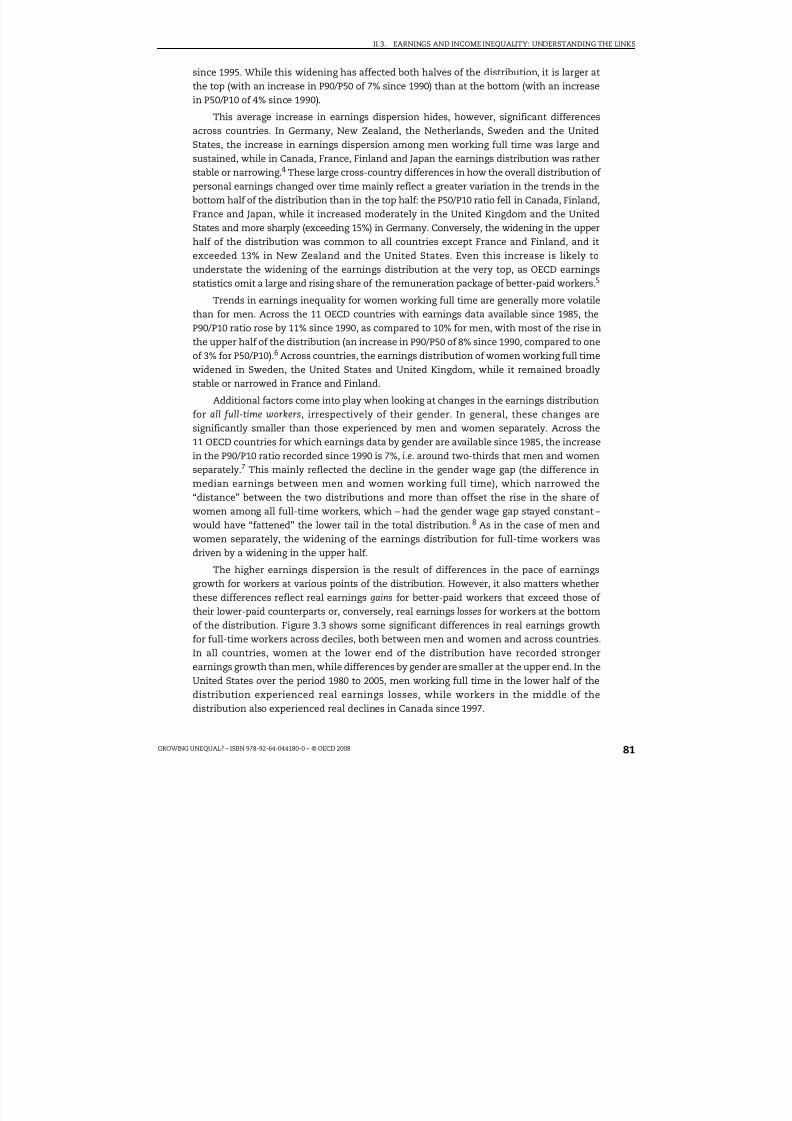
8/20/2019 Growing Unequal
http://slidepdf.com/reader/full/growing-unequal 81/309
II.3. EARNINGS AND INCOME INEQUALITY: UNDERSTANDING THE LINKS
GROWING UNEQUAL? – ISBN 978-92-64-044180-0 – © OECD 2008 81
since 1995. While this widening has affected both halves of the distribution, it is larger atthe top (with an increase in P90/P50 of 7% since 1990) than at the bottom (with an increasein P50/P10 of 4% since 1990).
This average increase in earnings dispersion hides, however, significant differencesacross countries. In Germany, New Zealand, the Netherlands, Sweden and the UnitedStates, the increase in earnings dispersion among men working full time was large andsustained, while in Canada, France, Finland and Japan the earnings distribution was ratherstable or narrowing.4 These large cross-country differences in how the overall distribution of personal earnings changed over time mainly reflect a greater variation in the trends in thebottom half of the distribution than in the top half: the P50/P10 ratio fell in Canada, Finland,France and Japan, while it increased moderately in the United Kingdom and the UnitedStates and more sharply (exceeding 15%) in Germany. Conversely, the widening in the upperhalf of the distribution was common to all countries except France and Finland, and itexceeded 13% in New Zealand and the United States. Even this increase is likely tounderstate the widening of the earnings distribution at the very top, as OECD earningsstatistics omit a large and rising share of the remuneration package of better-paid workers.5
Trends in earnings inequality for women working full time are generally more volatilethan for men. Across the 11 OECD countries with earnings data available since 1985, theP90/P10 ratio rose by 11% since 1990, as compared to 10% for men, with most of the rise inthe upper half of the distribution (an increase in P90/P50 of 8% since 1990, compared to oneof 3% for P50/P10).6 Across countries, the earnings distribution of women working full timewidened in Sweden, the United States and United Kingdom, while it remained broadlystable or narrowed in France and Finland.
Additional factors come into play when looking at changes in the earnings distribution
for all full-time workers, irrespectively of their gender. In general, these changes aresignificantly smaller than those experienced by men and women separately. Across the11 OECD countries for which earnings data by gender are available since 1985, the increasein the P90/P10 ratio recorded since 1990 is 7%, i.e. around two-thirds that men and womenseparately.7 This mainly reflected the decline in the gender wage gap (the difference inmedian earnings between men and women working full time), which narrowed the“distance” between the two distributions and more than offset the rise in the share of women among all full-time workers, which – had the gender wage gap stayed constant –would have “fattened” the lower tail in the total distribution.8 As in the case of men andwomen separately, the widening of the earnings distribution for full-time workers was
driven by a widening in the upper half.The higher earnings dispersion is the result of differences in the pace of earnings
growth for workers at various points of the distribution. However, it also matters whetherthese differences reflect real earnings gains for better-paid workers that exceed those of their lower-paid counterparts or, conversely, real earnings losses for workers at the bottomof the distribution. Figure 3.3 shows some significant differences in real earnings growthfor full-time workers across deciles, both between men and women and across countries.In all countries, women at the lower end of the distribution have recorded strongerearnings growth than men, while differences by gender are smaller at the upper end. In theUnited States over the period 1980 to 2005, men working full time in the lower half of the
distribution experienced real earnings losses, while workers in the middle of thedistribution also experienced real declines in Canada since 1997.

8/20/2019 Growing Unequal
http://slidepdf.com/reader/full/growing-unequal 82/309
II.3. EARNINGS AND INCOME INEQUALITY: UNDERSTANDING THE LINKS
GROWING UNEQUAL? – ISBN 978-92-64-044180-0 – © OECD 200882
Earnings distribution among all workers: the importance of non-standardemployment
Changes in the distribution of personal earnings among all employees reflect theinfluence of a range of additional factors beyond those affecting the distribution among full-time workers. These include differences in working hours and in wage rates of other
Figure 3.3. Real earnings growth for men and women working full time by decile,1980 to 2005
Average growth rate per year, in percentage
1 2 http://dx.doi.org/10.1787/421373283813Note: Annual growth rates over the period 1980 to 2005 for Australia, Japan and the United States; 1980 to 2004 forFinland, Germany and Sweden; 1980 to 2003 for the United Kingdom; 1985 to 2005 in the Netherlands; and 1997to 2005 for Canada. Nominal earnings data are deflated with the CPI.
Source: OECD Earnings database.
4
3
2
1
-1
0
4
3
2
0
1
-1
4
3
2
1
-1
0
P 1 0
P 2 0
P 3 0
P 4 0
P 5 0
P 6 0
P 7 0
P 8 0
P 9 0
P 1 0
P 2 0
P 3 0
P 4 0
P 5 0
P 6 0
P 7 0
P 8 0
P 9 0
P 1 0
P 2 0
P 3 0
P 4 0
P 5 0
P 6 0
P 7 0
P 8 0
P 9 0
4
3
2
1
-1
0
4
3
2
0
1
-1
4
3
2
1
-1
0
P 1 0 P 2 0 P 3 0 P 4 0 P 5 0 P 6 0 P 7 0 P 8 0 P 9 0 P 1 0 P 2 0 P 3 0 P 4 0 P 5 0 P 6 0 P 7 0 P 8 0 P 9
0 P 1 0 P 2 0 P 3 0 P 4 0 P 5 0 P 6 0 P 7 0 P 8 0 P 9 0
4
3
2
1
-1
0
4
3
2
0
1
-1
4
3
2
1
-1
0
P 1 0
P 2 0
P 3 0
P 4 0
P 5 0
P 6 0
P 7 0
P 8 0
P 9 0
P 1 0
P 2 0
P 3 0
P 4 0
P 5 0
P 6 0
P 7 0
P 8 0
P 9 0
P 1 0
P 2 0
P 3 0
P 4 0
P 5 0
P 6 0
P 7 0
P 8 0
P 9 0
Australia Canada Finland
Germany Netherlands Japan
Sweden United Kingdom United States
Men Women

8/20/2019 Growing Unequal
http://slidepdf.com/reader/full/growing-unequal 83/309
II.3. EARNINGS AND INCOME INEQUALITY: UNDERSTANDING THE LINKS
GROWING UNEQUAL? – ISBN 978-92-64-044180-0 – © OECD 2008 83
groups of workers, such as those working part time and in non-standard employment, thatare omitted from the OECD earnings data used above.
The importance of non-standard jobs has increased in recent years, although withdifferent intensity across countries. For example, the incidence of part-time work in totalemployment since the mid-1990s has been broadly stable (at 16% in 2006) for the OECDarea as a whole, but it increased sharply in Germany, Spain and Korea (OECD, 2007a).Similarly, the incidence of temporary workers (temporary help agency workers, on-callworkers, seasonal workers, workers on fixed-term contracts of one year or less) has risenonly marginally on average (from a little more than 10% in 1985 to around 12% in 2000)but by much more in Spain, Italy and Ireland (OECD, 2002).9 Beyond these two categoriesof workers, some workers holding non-standard jobs are likely to be classified asself-employed and hence excluded from earnings statistics.
Because part-time employees work fewer hours each week and many categories of temporary employees work fewer weeks each year, the inclusion of non-standard workers
significantly widens the distribution of annual earnings among all employees. Thissuggests that workers at the bottom of the distribution of annual earnings are typicallythose working a low number of hours per year, either because they work part time orbecause they work full time but only for part of the year (see also Burniaux, 1997).10 This isnot a cause of concern when part-time or intermittent work is “chosen”: non-regular jobsoften provide opportunities for people to work in flexible ways that better match theirdiverse lifestyles. However, surveys also suggest that many part-time workers would preferto work more hours if suitable jobs were available, and the share of these involuntary part-timers (at 16% of part-time employment in 2005 for the OECD area as a whole) is todayaround three times larger than in 1985 (OECD, 2007a).11
Beyond differences in hours worked, workers in non-standard jobs are also typicallypaid less per hour. In the mid-1990s, the hourly pay of part-time workers was around 25%less than for workers in full-time jobs (OECD, 1999), and the gap between temporary workersand permanent workers was similar in a sample of European countries in the late 1990s(OECD, 2002). While part of these wage differences reflect the different characteristics of theindividuals (e.g. age, tenure and qualification) and of the firms where they work (e.g. sizeand industrial sectors), controlling for these different characteristics does not eliminate thewage penalty associated with holding a temporary or part-time job (OECD, 1999 and 2002).12
Further, in some countries such as Japan and Korea, earnings statistics for full-time workersexclude all those holding irregular jobs, even when their working hours are comparable to
those of regular workers. In these two countries, workers holding irregular jobs are paidbetween 40 and 60% less per hour than regular workers, a gap that is too large to be explainedby productivity differences (OECD, 2006 and 2007b). Beyond differences in pay rates, a largeshare of these workers are also not entitled to additional benefits and guarantees, whichwould imply higher gaps in actual remuneration.
One way to illustrate the importance of non-standard jobs for the distribution of personal earnings is to see how a typical measure of inequality changes when the coverageof the earnings data is broadened from full-time workers to all employees. Figure 3.4 showsestimates of the Gini coefficient for personal earnings based on micro-data for 19 OECDcountries in around 2000 drawn from the Luxembourg Income Study project. The first panel
shows how inequality in personal earnings changes, for each country, when moving frommen working full time (on the horizontal axis) to all full-time workers, irrespectively of
8/20/2019 Growing Unequal
http://slidepdf.com/reader/full/growing-unequal 84/309
II.3. EARNINGS AND INCOME INEQUALITY: UNDERSTANDING THE LINKS
GROWING UNEQUAL? – ISBN 978-92-64-044180-0 – © OECD 200884
their gender (on the vertical axis); the second panel shows how inequality in personal
earnings changes when moving from all full-time workers (on the horizontal axis) to all
employees, whether working full or part time (on the vertical axis). Two main patterns
stand out from Figure 3.4:
●
First, there are large cross-country differences in the width of the distribution of personal earnings among men working full time, with Gini coefficients ranging from
around 0.45 in Mexico and the United States to values below 0.25 in Italy, Austria,
Germany, Finland, Belgium and Greece. Conversely, including women working full time
has only a small effect on the distribution of personal earnings among all full-time
employees, with a small widening in most countries and a small narrowing in Mexico,
Australia, Finland and the United States.13
● Second, the distribution of personal earnings widens significantly when including part-time
workers. On average, the Gini coefficient for personal earnings among all employees
exceeds that for full-timers by 0.06 point (i.e. a 20% increase), with larger rises in Finland,
Sweden, Germany and the Netherlands and negligible ones in Greece and Mexico. Also,across countries, the widening of the earnings distribution when including part-time
workers is larger in countries where the earnings distribution of full-time workers is
narrower, which suggests that the narrower distribution may have encouraged the
diffusion of part-time work in several countries.
From personal to household earnings: which factors come into play?
Moving from personal to household earnings requires broadening the analysis across
individuals, considering how they pool and share their earnings with other household
members, and how jobs are distributed among people. While both of these factors matter,
the assessment of their role depends on how households with no earnings are included inthe analysis and on how people are “ranked” (i.e. whether based on household gross
earnings or on their “final” disposable income).
Figure 3.4. Inequality in the distribution of personal earningswhen moving from full-time workers to all workers
Gini coefficients in around 2000
1 2 http://dx.doi.org/10.1787/421380354876
Note: Gini coefficients refer to individuals belonging to households with a head aged between 18 and 65. Data refer
to the year 2000, except for Australia (2001), Hungary, Netherlands and the United Kingdom (1999).
Source: Luxembourg Income Study.
0.50
0.45
0.40
0.35
0.30
0.25
0.20
0.20 0.25 0.30 0.35 0.40 0.45 0.50
0.50
0.45
0.40
0.35
0.30
0.25
0.20
0.20 0.30 0.350.25 0.40 0.45 0.50
AUS
AUTBELCAN
DEU
DNK
ESP
FIN
FRA
GRC
HUN
IRL
ITA
LUX
MEX
NLD
SWE
GBR
USA
AUS
BEL
CAN
AUT
DEU
DNK
ESP
FIN
FRA
GRC
HUN
IRL
ITA
LUX
MEX
NLD
SWE
GBR
USA
Men working full-time Men and women working full-time
Men and women working full-time Men and women working full- and par t-time
Inequalit y of personal earnings, full-time workers Inequalit y of personal earnings, all workers
OECD-19
OECD-19

8/20/2019 Growing Unequal
http://slidepdf.com/reader/full/growing-unequal 85/309

8/20/2019 Growing Unequal
http://slidepdf.com/reader/full/growing-unequal 86/309
II.3. EARNINGS AND INCOME INEQUALITY: UNDERSTANDING THE LINKS
GROWING UNEQUAL? – ISBN 978-92-64-044180-0 – © OECD 200886
Cross-country differences in the distribution of household earnings are also evidentwhen looking separately at the earnings of the household head, of spouses and of otherhousehold members (in Panels B, C and D of Figure 3.5). In the mid-2000s, earnings of spouses were significantly more concentrated than those of household heads (with aconcentration coefficient that was, on average, one-third higher), and the same pattern
applied, to a lesser extent, to the earnings of other household members (with inequalityaround higher). While the greater inequality of spouse earnings reflects a range of factorsdescribed in Box 3.2, cross-country differences in the size of these inequalities partlyreflect how prevalent two-earner households are in each country. This is highlighted by themuch larger gap between the Gini coefficient of spouse earnings and that of householdheads in those countries (such as Turkey and Greece) where the share of people in two-earner households is smaller. Cross-country differences are also significant when looking at changes in earnings inequality among these various types of earnings: in Germany, forexample, earnings of spouses became much more concentrated than those of heads, whilein the United Kingdom lower inequality in the earnings of spouses and other household
members was accompanied by a slight increase in that of household heads. As a result,there is only a weak correlation between changes in earnings inequality of householdheads, on one side, and of spouses and other household members, on the other.
What accounts for the broad stability in the distribution of household earnings among people in a context of greater inequality in personal earnings among workers? One factoris the change in employment and in its distribution among households. In the ten years tothe mid-2000s, non-employment rates fell on average and in most OECD countries,especially in Spain, Ireland and Finland, while they increased in several eastern Europeancountries and in Turkey (Table 3.1). The decline in the share of people not in paid work,however, mainly benefited people with intermediate education, while those with lowereducational attainment experienced a fall in their employment levels.15 Further, theaverage decline recorded in non-employment rates has not been matched by a similar fallin the share of people living in jobless households; countries that have recorded the largestfall in non-employment rates tend to experience larger inroads into household joblessness,but the association between the two variables is not strong, and there are severalexceptions.16 In the ten years to 2005, countries that have experienced a larger decline inhousehold joblessness have also recorded a lower concentration in household earnings(Figure 3.6, left-hand panel). Similarly, countries where the share of people living in two-earner households has increased the most have also experienced a sharper fall in theinequality of spouse-earnings. The large dispersion in countries’ experiences suggestshowever that other factors beyond access to jobs have been at work.17
One way to highlight the significance of the various factors shaping the distribution of household earnings is to look at how inequality changes as the coverage of earnings datais extended, step by step, from individual workers to all people, whether working or not.Figure 3.7 shows values of the Gini coefficient for household earnings (among people living in a household with a head of working age) with people ranked by their (equivalised)household earnings (rather than income). The first panel compares the inequality inpersonal earnings among workers to that in household earnings among the sameindividuals (i.e. after allowing for partnership formation between them), with household
earnings “equivalised” by the number of workers in each household. The second panelcompares the inequality in household earnings as defined previously with the inequalityobtained after including in the analysis non-working spouses and their children. The third

8/20/2019 Growing Unequal
http://slidepdf.com/reader/full/growing-unequal 87/309
II.3. EARNINGS AND INCOME INEQUALITY: UNDERSTANDING THE LINKS
GROWING UNEQUAL? – ISBN 978-92-64-044180-0 – © OECD 2008 87
Box 3.2. What accounts for the greater inequality of spouse earnings comparedto those of household heads?
Two factors that partly offset each other have contributed to shape the distribution of spouseearnings compared to that of household heads:
● The first reflects the characteristics of the marriage market, in particular the extent to which better-educated spouses (with a higher earnings potential) “match” with heads with similar characteristics(a phenomenon also called “assortative mating”). Much research has documented the importance of marital mating for the United States (e.g. Juhn and Murphy, 1997), where the growing tendency forbetter-educated individuals to marry each other is occurring alongside the increasing difficulty facedby less-educated women (particularly from ethnic minorities) to find suitable partners (Mare, 2000).The consequences of assortative mating are not limited to income distribution, and thisphenomenon is not unique to the United States: the left-hand panel of the figure below shows apositive correlation (of 50% on average) between the educational attainment of partners withincouples (with a head aged between 18 and 65), with higher values in the United States, Mexico andthe southern European countries (where income inequality is above-average) and lower ones in theNordic countries and continental Europe (with below-average income inequality).
● The second factor is the likelihood that spouses who are married to higher-earning heads (for agiven level of educational attainment) will enter the labour market. For couples with an employedhead, the right-hand panel of the figure below suggests that, in all countries except Denmark,spouses are more likely to enter the paid labour force when the earnings of the head are low ratherthan high. This result holds after controlling for the level of education of spouses as, ceteris paribus,
labour-force participation rises with educational attainment. This suggests that many householdswith lower “earnings potential” offset this by having both partners participating in the paid labourmarket.
While these factors work in opposite directions, the evidence presented above suggests that,
because of assortative mating and the higher educational levels of spouses, their earningscontribute to widening the distribution of household income.
1 2 http://dx.doi.org/10.1787/421541777254Note: Calculations based on individuals belonging to households with a head aged between 18 and 65. Data refer to theyear 2000, except for Hungary and the Netherlands (1999). Values shown in the right-hand panel are partial correlation
coefficients, i.e. computed after controlling for the educational attainment of both spouses.Source: Luxembourg Income Study.
0.7 -0.5
0.8 -0.6
0.6 -0.4
0.5 -0.3
0.4 -0.2
0.3 -0.1
0.2 0
D E U
D E U
S W E
S W E
F I N F I N D N K
D N K
A U T
A U T
N L D
N L D
I R L
I R L
B E L
B E L
F R A
F R A
U S A
U S A
L U X
L U X
E S P
E S P
M E X
M E X I T
A I T A
G R C
G R C
O E C D
- 1 5
O E C D
- 1 5
Correlation of educational attainment among partnersin couple families, around 2000
Correlation between the labour-force participationof spouses and the earnings of households heads

8/20/2019 Growing Unequal
http://slidepdf.com/reader/full/growing-unequal 88/309
II.3. EARNINGS AND INCOME INEQUALITY: UNDERSTANDING THE LINKS
GROWING UNEQUAL? – ISBN 978-92-64-044180-0 – © OECD 200888
panel compares the dispersion of household earnings among all people living inhouseholds with positive wage income (as defined above) with that among all households(i.e. including those with zero earnings).18 Inequality measures vary across countries, butto different extents:
● First, partnership formation among employees, and the economies of scale inconsumption that this allows, narrows the distribution of household earnings among all
workers relative to that for personal earnings. On average, inequality of household
Table 3.1. Non-employment rates and share of people living in jobless households
Non-employment rateShare of population
living in joblesshouseholds
Total Less educated Medium educated Highly educated
Level,around2005
Pointchangesince1995
Level,2005
Pointchangesince1995
Level,2005
Pointchangesince1997
Level,2005
Pointchangesince1997
Level,2005
Pointchangesince1997
Australia 28.4 –5.6 40.6 –3.2 21.6 –4.3 15.9 –0.9 14.2 –1.8
Austria 31.4 –0.4 52.8 1.8 26.6 1.0 15.8 0.9 11.0 –1.8
Belgium1 39.0 –5.2 59.6 –0.1 34.5 –2.3 17.2 –0.2 18.6 –2.2
Canada 27.5 –5.4 49.8 –3.5 25.9 –2.6 18.5 –1.0 6.2 –0.5
Czech Republic1 35.2 4.5 78.2 10.9 28.2 4.9 15.4 4.2 10.1 4.0
Denmark 24.5 –3.1 41.4 . . 21.4 . . 13.8 . . 9.2 –0.5
Finland 32.0 –8.0 54.2 0.1 28.0 –6.1 15.8 –2.6 7.3 0.3
France1 37.7 –3.9 52.6 –3.0 31.9 –0.7 23.4 0.1 11.6 –3.1
Germany 34.5 –1.0 57.7 –2.2 30.7 –1.3 17.3 –1.1 19.4 4.2
Greece 39.7 –6.2 49.5 –0.8 39.2 –6.9 18.9 –2.3 6.5 –3.1
Hungary 43.1 –3.4 72.0 1.0 35.1 0.8 17.5 –1.1 19.1 11.2
Iceland . . . . . . . . . . . . . . . . 2.1 2.1
Ireland1 32.9 –15.3 50.5 –7.0 26.9 –10.9 14.5 –6.8 11.7 . .
Italy 42.5 –5.9 54.1 . . 33.4 . . 21.5 . . 9.6 –2.3
Japan 30.7 0.0 . . . . 33.8 1.5 26.1 0.0 5.1 1.1
Korea 36.3 –0.9 49.9 4.8 36.2 1.7 23.6 3.2 5.5 . .
Luxembourg 36.4 –3.4 49.5 . . 37.0 . . 17.5 . . 7.1 –2.2
Mexico 40.4 –0.9 42.6 1.5 36.2 –0.4 29.2 2.4 3.8 0.4
Netherlands 28.9 –7.2 41.6 . . 22.6 . . 14.6 . . 9.1 –1.7
New Zealand 25.4 –6.6 40.0 –5.1 23.0 –1.2 16.2 –3.4 9.3 –3.5
Norway 24.8 –3.0 42.8 3.8 19.8 –2.0 12.9 –0.1 13.1 1.8Poland 47.0 5.3 76.9 12.4 43.1 10.0 18.7 5.2 14.0 . .
Portugal1 32.5 –3.4 34.3 . . 36.9 . . 14.4 . . 5.9 –1.0
Slovak Republic 42.3 2.1 86.7 12.0 33.6 5.0 16.7 5.5 10.6 . .
Spain1 35.7 –16.9 44.4 –10.0 34.2 –23.2 19.9 –12.2 5.8 –3.6
Sweden 26.1 –2.4 47.5 4.3 21.5 –3.6 14.0 –3.4 6.2 –0.8
Switzerland 22.8 –1.6 57.8 20.3 22.8 2.3 10.3 –0.8 5.9 . .
Turkey 54.1 6.5 55.4 7.9 50.1 –0.1 27.6 5.2 10.4 5.6
United Kingdom 27.4 –4.0 52.1 3.8 24.7 –1.0 12.8 –0.5 16.3 –1.1
United States 28.5 0.5 58.1 2.0 29.2 3.2 17.8 3.1 6.3 0.1
OECD 34.1 –3.3 53.3 2.3 30.6 –1.5 17.9 –0.3 9.7 0.1
1 2 http://dx.doi.org/10.1787/421582070853Note: Non-employment rates relative to the population of working age; share of total population living in jobless householdswith a head of working age.1. Changes in the share of people in jobless households refer to the period 1995 to 2000 in the case of Austria, Belgium, the
Czech Republic, Portugal and Spain; in the case of France, data on changes in household joblessness are based on a source(the Enquête Revenus Fiscaux) that differs from the one used to show levels of the same variable (EU-SILC).
Source: OECD Education database and income distribution questionnaire.

8/20/2019 Growing Unequal
http://slidepdf.com/reader/full/growing-unequal 89/309
II.3. EARNINGS AND INCOME INEQUALITY: UNDERSTANDING THE LINKS
GROWING UNEQUAL? – ISBN 978-92-64-044180-0 – © OECD 2008 89
earnings is around 0.04 point lower than for personal earnings (i.e. a 12% decline), withlarger declines in the Netherlands, the United States, Denmark and Finland, with theexception of only Canada.
● Second, including dependents (children, the elderly and non-working spouses) inhouseholds of workers widens the distribution of household earnings. When each
Figure 3.6. Changes in the share of the population living in householdswith different numbers of workers and changes in earning inequality
Mid-1990s to mid-2000s
1 2 http://dx.doi.org/10.1787/421463342772Note: The first panel plots changes in the share of people in jobless households against changes in the Ginicoefficient of household earnings; the second plots changes in the share of people living in two-earner householdsagainst changes in the Gini coefficient of spouse earnings.
Source: OECD income distribution questionnaire.
Figure 3.7. Inequality in the distribution of household earningswhen moving from households with positive earnings to all households
Around 2000
1 2 http://dx.doi.org/10.1787/421482623283Note: Gini coefficients calculated based on individuals belonging to households with a head aged between 18 and 65.Data refer to the year 2000, except for Australia (2001), Hungary, Netherlands and the United Kingdom (1999).
Source: Luxembourg Income Study.
0.16
0.08
0
-0.08
-0.16
-0.08 -0.04 0 0.04 0.08
0.08
0.04
0
-0.04
-0.08
-0.08 -0.04 0 0.04 0.08
AUS
CAN
DNK
FIN
DEU
GRC
HUN JPNLUXMEX
NLDNZL
NOR
SWE
TUR
GBRAUS
CAN
DNKFIN
DEU
GRC
ITA
JPNLUX
MEX
NLD
NZLNOR
SWE
TUR
GBR
USA
FRAFRA
ITA
Change in the share of people in jobless households
Change in concentration of spouse earningsChange in concentration of household earnings
Change in the share of people in two workers households
Share o f people l iv ing in households with no workers Share o f people l iv ing in two earners households
0.60
0.50
0.40
0.30
0.20
0.60
0.50
0.40
0.30
0.20
0.60
0.50
0.40
0.30
0.200.20 0.30 0.40 0.50 0.60 0.20 0.30 0.40 0.50 0.60 0.20 0.30 0.40 0.50 0.60
AUT
AUS
BEL
CAN
DEUDNK
ESP
FIN
FRAGRC
HUN
IRLITA
LUX
MEX
NLD
SWE
GBRUSA
AUT
AUS
BEL
CANDEU
DNK
ESP
FIN FRA
GRC HUN
IRLITA
LUX
MEX
NLD
SWE
GBR
USA
AUT
AUS
BEL
CANDEU
DNK
ESP
FINFRA
GRC
HUN
IRL
ITA LUX
MEX
NLD
SWEGBR
USA
All workers Households with positive earnings All households
Household earnings among all workers
Personal earnings among all workers Household earnings among all workers
Household earnings,workers and their dependents
Household earnings, incl. households
with no earnings
Household earnings,workers and their dependents
OECD-19
OECD-19
OECD-19

8/20/2019 Growing Unequal
http://slidepdf.com/reader/full/growing-unequal 90/309
II.3. EARNINGS AND INCOME INEQUALITY: UNDERSTANDING THE LINKS
GROWING UNEQUAL? – ISBN 978-92-64-044180-0 – © OECD 200890
member of these households is considered as benefiting from these earnings, thedistribution of household earnings among all people in working households widens on average,relative to the case when only workers are considered, by 0.05 point (i.e. a 15% increase),with only minor differences across countries.
● Third, including households with no wage income significantly widens the distributionof household earnings.19 The inequality in household earnings among people rises by0.10 point on average (i.e. a 30% increase) with large differences across countries – fromaround 0.2 point in Austria, Greece and Italy to less than 0.05 in the United States, wherethe share of people living in households with no earners is small.
As the importance of each of the factors involved in the distributions of householdearnings may change over time, it is difficult to say a priori how they will play out in theaggregate.
From household earnings to market income
Moving from household earnings to market income requires broadening the analysisto include self-employment and capital income. While measurement problems for thesetwo income sources are much larger than for earnings, both have played a significant rolein shaping recent trends in the distribution of market income.
The concentration of capital and self-employment income among individuals of working age, when people are ranked by their equivalised disposable income, is in generalsignificantly higher than that of household earnings. This reflects both greater inequalityin capital and self-employment income among the households reporting them, anddifferences in the share of people receiving them in each decile of the income distribution.On average, the Gini coefficient for capital income exceeds that for household earnings by
around one-fourth, and a similar gap is recorded for self-employment income.20 Thispattern of greater concentration holds in most countries, with the exceptions of Australia,Korea, Poland and Switzerland (where both self-employment and capital income are moreequally distributed than earnings) and a few other countries (for one of the two incomestreams).
There have been significant changes in the concentration of capital and self-employmentincome in the ten years since 1995 in several OECD countries, which have contributed togreater inequality in the distribution of market income. On average, across the countriesincluded in Figure 3.8, the concentration of capital income increased by 0.04 point, i.e.
around 9%, while that of self-employment income increased by around 4%. Inequality incapital income has risen sharply in the Nordic countries as well as in Italy and Hungary,while it declined in Turkey, the Czech Republic and (to a lesser extent) in a few othercountries. Concentration of self-employment income also increased sharply in Sweden(from a low base) as well as in Italy and Mexico. In Hungary and Norway, the increase inmarket-income inequality was further strengthened by the large increase in the weight of capital income within household disposable income.
There are also significant differences in the degree of concentration of the differentcomponents of capital income. While the quality of information is inevitably affected bythe small number of observations for individual categories, the estimates in Table 3.2
suggest that concentration is highest for other capital income (mainly interest and returnson financial assets) and private pensions, but significantly lower for occupational pensionsand private transfers.

8/20/2019 Growing Unequal
http://slidepdf.com/reader/full/growing-unequal 91/309
II.3. EARNINGS AND INCOME INEQUALITY: UNDERSTANDING THE LINKS
GROWING UNEQUAL? – ISBN 978-92-64-044180-0 – © OECD 2008 91
Figure 3.8. Concentration of capital and self-employment income, mid-2000sAmong people of working age
1 2 http://dx.doi.org/10.1787/421540540222Note: The concentration coefficient is computed in the same way as the Gini coefficient, with the only differencebeing that individuals are not ranked by the value of the earnings they receive but rather by their equivaliseddisposable incomes. Concentration coefficients are computed based on grouped data for average income streams ineach decile. Data refer to gross ( i.e. pre-tax) income in all countries except Greece, Hungary, Mexico, Poland andTurkey, where they are measured post-tax.
Source: OECD income distribution questionnaire.
0.8
0.6
0.4
0.2
00 0.2 0.4 0.6 0.8
0.8
0.6
0.4
0.2
00 0.2 0.4 0.6 0.8
AUSCAN
CZE
DNK
FIN
FRA
DEUGRC
HUN
ITA
JPN
LUXMEX
NLD
NZL
NORSWE
TUR
GBR
USA
AUSCAN
CZE
DNKFIN
FRA
DEU
GRC
HUN
ITA
JPN
LUX
MEX
NLDNZL
NOR
SWE
TUR
GBR
USA
Mid-2000s
Mid-1990sMid-1990s
Mid-2000s
Capital income Self-employment income
OECD-20
OECD-20
Table 3.2. Size and concentration of different elements of capital income, mid-2000sAmong people of working age
Private Pensions Occupational pensions Private transfers Other capital income Total capital income
Concentra-tion
coefficient
Share inhouseholddisp. income
(%)
Concentra-tion
coefficient
Share inhouseholddisp. income
(%)
Concentra-tion
coefficient
Share inhouseholddisp. income
(%)
Concentra-tion
coefficient
Share inhouseholddisp. income
(%)
Concentra-tion
coefficient
Share inhouseholddisp. income
(%)
Australia . . . . 0.15 2.1 0.00 1.2 0.50 4.8 0.33 8.1
Belgium 0.73 0.0 . . . . –0.12 0.7 0.54 4.1 0.44 4.8
Canada 0.32 5.5 . . . . 0.31 2.9 0.48 3.6 0.36 12.0
Finland 0.49 0.6 –0.02 8.6 –0.08 1.0 0.78 9.2 0.37 19.5
Germany 0.35 0.2 0.42 0.4 –0.23 0.6 0.61 5.4 0.48 6.8
Greece 0.38 0.0 . . . . –0.20 1.7 0.55 3.8 0.32 5.5
Hungary . . . . . . . . 0.54 1.2 0.80 6.3 0.76 7.7
Italy . . . . . . . . . . . . 0.64 4.1 0.64 4.1
New Zealand 0.51 0.8 . . . . 0.29 4.3 0.59 4.8 0.45 10.4Norway 0.23 0.1 0.18 2.6 –0.25 0.3 0.81 10.7 0.66 13.8
Slovakia 0.16 0.1 . . . . –0.45 0.1 . . . . –0.05 3.0
Sweden 0.46 0.8 0.48 2.9 . . . . 0.63 3.7 0.55 7.4
Turkey 0.59 0.1 . . . . 0.31 2.0 0.64 5.0 0.54 7.2
United Kingdom 0.30 0.5 0.24 4.5 0.20 2.9 0.51 2.3 0.30 10.2
United States 0.51 0.1 0.16 0.7 0.45 0.5 0.65 7.8 0.61 9.2
OECD-16 0.42 0.7 0.23 3.1 0.06 1.5 0.62 5.4 0.45 8.6
1 2 http://dx.doi.org/10.1787/421602824576
Note: The concentration coefficient is computed in the same way as the Gini coefficient, with the only difference being thatindividuals are not ranked by the value of the capital income they receive but rather by their equivalised disposable incomes.Concentration coefficients are computed based on grouped data expressing the value of capital income for people in each
income decile.Source: OECD income distribution questionnaire.

8/20/2019 Growing Unequal
http://slidepdf.com/reader/full/growing-unequal 92/309
II.3. EARNINGS AND INCOME INEQUALITY: UNDERSTANDING THE LINKS
GROWING UNEQUAL? – ISBN 978-92-64-044180-0 – © OECD 200892
Conclusion
Analyses of earnings and income distribution typically develop along parallel tracks,using different methodologies to address different questions. Research on earningsinequality typically looks at individual workers, paying little attention to household
dynamics and non-wage income sources, while research on income distribution focuses onhouseholds, but may miss the importance of labour-market developments. Betterintegrating these two perspectives is important for understanding how labour marketsaffect the distribution of household income. When the two perspectives are considered jointly, the following patterns emerge:
● The distribution of personal earnings among men working full time has widenedsignificantly in most OECD countries since 1990, mainly reflecting developments in theupper half of the distribution. The widening is smaller for all full-time workers, due tothe simultaneous narrowing in the wage gap between men and women working fulltime. The growing incidence of non-standard employment in some OECD countries has
further contributed to widening the distribution of personal earnings among allemployees.
● The distribution of household earnings among all people, whether working or not, hasbeen stable since the mid-1990s, both on average and in most countries, as the widening distribution of earnings was offset by higher employment rates. Changes in thedistribution of earnings of household heads, of spouses and of other household membershave evolved in different directions in various countries, due to a range of factors.
● Both capital income and self-employment income are more concentrated than householdearnings, and they have become increasingly so in the last ten years, widening thedistribution of market income in several OECD countries.
Overall, these patterns suggest that there are both consistencies and differences inhow earnings inequality among workers and market-income inequality among peopleevolve over time. While both distributions have widened in most OECD countries, there areexceptions and differences in both the direction and the strength of the associationbetween the two.21 These differences reflect the importance of income sharing withinhouseholds, the labour supply decision of spouses and the incidence of household joblessness and dual-earner households. These factors suggest that there is more than oneway of countering a wider distribution of market income. As governments can onlymarginally affect individual decisions about household formation and living arrangements, and as the scale of redistribution is limited by the amount of tax revenues,policies to narrow income inequalities need to consider how best to improve labour-marketconditions, reduce joblessness and ensure that earnings inequality does not become toolarge (Kenworthy, 2007).
Notes
1. Gottschalk and Smeeding (1997) and Katz and Autor (1999) discuss how trends in earningsdispersion in OECD countries are related to technological change, foreign trade and labour-marketinstitutions. Lemieux, MacLeod and Parent (2007) discuss the importance of additional factors,such as the influence of performance pay systems; Black and Spitz-Oener (2007) relate changes inthe gender wage gap to the effect of differential changes in the skill content of male and femalework.
2. Atkinson and Brandolini (2005) develop a simple model to illustrate the links between differentlabour-market conditions, personal earnings and income inequality. Checchi and García Peñalosa

8/20/2019 Growing Unequal
http://slidepdf.com/reader/full/growing-unequal 93/309
II.3. EARNINGS AND INCOME INEQUALITY: UNDERSTANDING THE LINKS
GROWING UNEQUAL? – ISBN 978-92-64-044180-0 – © OECD 2008 93
(2005) build a more complex model to explain how labour-market institutions affect thedistribution of household income.
3. In Japan and Finland, for example, a widening of the distribution of market income occurredalongside stable or declining earnings dispersion among full-time workers while, conversely, thedistribution of market income narrowed in the Netherlands despite a wider distribution of personal earnings.
4. The increase was also strong in Australia and Korea, where OECD earnings data are availablesince 1990.
5. For example, in France non-wage components of earnings (such as various incentive plans,including intéressement, participation, abondements par les entreprises aux versements des salaries aux
plan d'épargne entreprise) account for around 3% of the wage bill, with 60% of these received by the10% of employees with the highest earnings (CERC, 2006). Non-wage components of earnings areespecially important for managers, and they account for much of the sharp rise in theirremuneration. In the United States, the average remuneration of CEOs (excluding the value of “stock options”) increased from 85 times average earnings in 1990 to 525 times in 2000 beforedeclining to 410 in 2005 (www.faireconomy.org).
6. The P90/P10 ratio among full-time employees is generally smaller for women than for men in mostOECD countries, with the exceptions of Canada and Germany.
7. From 1990 onwards consistent data on earnings inequality are available for a larger sample of 19 OECD countries (i.e. the same countries included in Figure 3.1, as well as Australia, the CzechRepublic, Denmark, Hungary, Ireland and Poland). The cumulative increase in the interdeciles ratiosince 1990 recorded by this larger set of countries is significantly higher than that recorded by theOECD-11 over the same period (a rise in the P90/P10 ratio of 18% compared to 10%), reflecting amore rapid increase in earnings inequality in the upper part of the distribution (11% rather than7%) and, to a lesser extent, in the lower part (6% relative to 4%).
8. In 2005, the gender pay gap was highest in Japan (at 32%) and Korea (40%) and lowest in NewZealand (9%) and Poland (11%). Over the past two decades, the difference in median earningsbetween men and women working full time declined by between 7 and 17 points in most OECDcountries, but only marginally in Australia, Germany and Sweden.
9. The two groups of workers partially overlap, as a large proportion of temporary workers hold part-
time jobs (OECD, 2002).10. Differences in the number of hours worked during the year result in the much larger disparities in
annual earnings than in wage rates. In France, for example, the P90/P10 inter-decile ratio wasaround 3 in 2004 when looking at full-time equivalent earnings but of 13 when considering annualearnings. Employees in the first decile worked only 13 weeks during the year, as compared to51 weeks for those in the top decile; similarly, their weekly hours of work were around 22 hours, ascompared to 38 for those in the top decile (CERC, 2006).
11. Involuntary part-time employment is much higher in some countries and when using national(rather than OECD) definitions of full-time work.
12. A negative wage gap is systematically observed for women working part time even aftercontrolling for these different characteristics, but its magnitude differs among countries andstudies. In the case of men, O’Dorchai et al. (2007) conclude that different controls account for
between 50% and 100% of the wage gap between men working full time and part time observed inthe mid-1990s in European countries.
13. These earnings data, which are based on household surveys representative of the entirepopulation, match quite closely those from the OECD Earnings database, with a correlationcoefficient for P90/P10 from the two sources of over 0.9 across ten countries. The main exceptionsare Denmark and the United States, where the inter-decile ratios based on the LIS are much higherthan those in the OECD earnings database.
14. The concentration coefficient is computed in the same way as the Gini coefficient of householdincome, so that a value of zero would mean that all income groups receive an equal share of household earnings. The only difference relative to the Gini coefficient is that individuals are notranked by the value of the earnings they receive but rather by that of their equivalised householddisposable incomes.
15. Over this period, changes in employment rates have been in general more favourable for womenthan for men. Even in countries where total employment rates fell, those for women eitherincreased or fell by less than for men.
8/20/2019 Growing Unequal
http://slidepdf.com/reader/full/growing-unequal 94/309
II.3. EARNINGS AND INCOME INEQUALITY: UNDERSTANDING THE LINKS
GROWING UNEQUAL? – ISBN 978-92-64-044180-0 – © OECD 200894
16. In Germany, for example, higher employment rates have been associated with higher household joblessness; also, while employment rates increased strongly in both New Zealand and the UnitedKingdom, the decline in household joblessness was much stronger in the first than in the second.The correlation between changes in employment rates and changes in the share of people in
jobless households as shown in Table 3.2 is less than –0.60.
17. As in the previous cases, these measures are based on data on the distribution of each earnings
component among individuals ranked by their equivalised household disposable income; hencethey reflect differences across deciles in both the pay workers receive and in the numbersemployed.
18. Saunders (2005) conducts a similar analysis for Australia based on a somewhat different sequenceof distributions. As elsewhere in this chapter, the unit of analysis used in Figure 3.7 is theindividual, with household earnings equivalised by the square root elasticity to account foreconomies of scale in consumption.
19. Zero worker households are defined as households with zero earnings, i.e. they may include thosewith positive self-employment income. The inclusion of households with no earnings in measuresof household earnings inequality highlights the effect of employment (and the way it isdistributed) for cross-country differences in income inequality. However, this procedure effectivelyextends the analysis to households with no earnings while excluding their income sources other
than earnings.20. These comparisons refer to people of working age. For the population as a whole, the difference in
the Gini coefficients of self-employment and capital income are slightly less.
21. Daly and Valletta (2006) and Gottschalk and Danziger (2005) show that, while the dispersion of male wages and family income evolved similarly during the last 30 years in the United States,men’s earnings have not been the only driving factor in family income inequality.
References
Atkinson, A.B. (2007), “The Long Run Earnings Distribution in Five Countries: ‘Remarkable Stability’, U,V or W?”, Second Ruggles Lecture for the International Association for Research in Income andWealth, Review of Income and Wealth, Vol. 53, No. 1, March.
Atkinson, A.B. and A. Brandolini (2005), “From Earnings Dispersion to Income Inequality”, in F. Farinaand E. Savaglio (eds.), Inequality and Economic Integration, Routledge, London.
Black, S. and A. Spitz-Oener (2007), “Explaining Women’s Success: Technological Change and the SkillContent of Women’s Work”, NBER Working Paper, No. 13116, Cambridge, Massachusetts.
Burniaux, J.-M. (1997), “Inégalités et emplois : effet de redistribution lié à la structure familiale”,Économie Internationale, Vol. 71, No. 3.
Checchi, D. and C. García Peñalosa (2005), “Labour Market Institutions and the Personal Distribution of Income in the OECD”, IZA Discussion Paper, No. 1681, Bonn.
CERC (2006), La France en transition, 1993-2005, Conseil de l’emploi, des revenus et de la cohésionsociale, Rapport No. 7, La Documentation Française, Paris.
Daly, M.C. and R.G. Valletta (2006), “Inequality and Poverty in the United States: The Effects of Rising Dispersion of Men’s Earnings and Changing Family Behaviour”, Economica, Vol. 73, No. 289.
Gottschalk, P. and S. Danziger (2005), “Inequality of Wage Rates and Family Income in the UnitedStates, 1975-2002”, Review of Income and Wealth, Vol. 51, No. 2.
Gottschalk, P. and T.M. Smeeding (1997), “Cross National Comparisons of Earnings and IncomeInequality”, Journal of Economic Literature, Vol. 35, No. 2.
Juhn, C. and K.M. Murphy (1997), “Wage Inequality and Family Labor Supply”, Journal of Labor Economics,Vol. 15, No. 1.
Katz, L. and D. Autor (1999), “Changes in the Wage Structure and Earnings Inequality”, in O. Ashenfelterand D. Card (eds.), Handbook of Labor Economics, Vol. 3A, Amsterdam: North Holland.
Kenworthy, L. (2007), “Jobs with Equality”, unpublished manuscript, University of Arizona.
Lemieux, T., W.B. Macleod and D. Parent (2007), “Performance Pay and Wage Inequality”, IZADiscussion Paper, No. 2850, Bonn.

8/20/2019 Growing Unequal
http://slidepdf.com/reader/full/growing-unequal 95/309
II.3. EARNINGS AND INCOME INEQUALITY: UNDERSTANDING THE LINKS
GROWING UNEQUAL? – ISBN 978-92-64-044180-0 – © OECD 2008 95
Mare, R.D. (2000), “Assortative Mating, Intergenerational Mobility and Educational Inequality”,California Center for Population Research, CCPR-004-00, University of California.
O’Dorchai, S., R. Plasman and F. Rycx (2007), “The Part-time Wage Penalty in European Countries: HowLarge Is It for Men?”, IZA Discussion Paper, No. 2591, Bonn.
OECD (1999), “Recent Labour Market Developments and Prospects – Special Focus on the Quality of
Part-time Jobs”, OECD Employment Outlook, OECD, Paris.OECD (2002), “Taking the Measure of Temporary Employment”, OECD Employment Outlook, OECD, Paris.
OECD (2006), OECD Economic Survey: Japan, OECD, Paris.
OECD (2007a), OECD Employment Outlook, OECD, Paris.
OECD (2007b), OECD Economic Survey: Korea, OECD, Paris.
Saunders, P. (2005), “Reviewing Recent Trends in Wage Income Inequality in Australia”, DiscussionPaper, University of New South Wales, Australia.

8/20/2019 Growing Unequal
http://slidepdf.com/reader/full/growing-unequal 96/309

8/20/2019 Growing Unequal
http://slidepdf.com/reader/full/growing-unequal 97/309
ISBN 978-92-64-044180-0Growing Unequal?© OECD 2008
97
PART II
Chapter 4
How Much RedistributionDo Governments Achieve?The Role of Cash Transfers
and Household Taxes*
OECD countries differ significantly in how much income they redistributethrough government cash transfers and household taxes – and those countriesthat redistribute more achieve a more narrow distribution of final income. Theredistribution achieved by public cash transfers is generally larger than that of household taxes, and countries that have more targeted programmes tend tospend less than others.
* This chapter has been prepared by Peter Whiteford who, at the time of writing, was senioreconomist at the OECD Social Policy Division and is currently professor at the Social Policy ResearchCentre at the University of New South Wales, Australia. This chapter draws on a longer document,available as Whiteford (2008).

8/20/2019 Growing Unequal
http://slidepdf.com/reader/full/growing-unequal 98/309
II.4. HOW MUCH REDISTRIBUTION DO GOVERNMENTS ACHIEVE? THE ROLE OF CASH TRANSFERS AND HOUSEHOLD TAXES
GROWING UNEQUAL? – ISBN 978-92-64-044180-0 – © OECD 200898
Introduction
Government policies in all OECD countries affect the distribution of householdincome. They do so through a range of programmes but most directly through the cashtransfers paid to households and the direct taxes and social security contributionscollected from them. However, different welfare states may pursue a variety of socialobjectives, with the balance and priority given to each of them varying across bothcountries and between programmes. A critical issue that all OECD governments confront –particularly when considering policy reforms – is whether the redistributive and other
policy objectives of society could be more effectively or efficiently achieved through adifferent mix or design of policies.
This chapter provides a discussion of the varying levels of redistribution achieved bydifferent welfare states. The chapter first outlines the framework commonly used to assessthe impact of welfare state arrangements on household income and discusses briefly thedefinition of the targeting and progressivity of government programmes. It then comparesthe distributional profiles of different social programmes and tax systems beforedescribing the combined effects of government cash transfers and household taxes innarrowing income inequality, how this effect has changed over time, and the separatecontributions of taxes and public transfers to these results. The chapter then discusses
how the interplay of the level of cash transfers and taxes and their targeting contribute tothe economic well-being of those at the bottom of the income scale. The chapter concludeswith a discussion of ways of improving the measurement of welfare state outcomes on thedistribution of household income.
An accounting framework for household income
Underlying all comparisons of welfare state outcomes is a framework for analysing theprocess of income distribution and redistribution (Palme, 1990; Esping-Andersen, 1990).Following Ringen (1987), this will be called “the standard approach”. By definition, using acommon framework to analyse income distribution and redistribution across countries
implies that the framework is equally applicable in all countries and gives consistent results.
Table 4.1 sets out this standard approach. In this framework, income from wages andsalaries, self-employment and property sum to “factor income”; factor income plusoccupational and private pensions gives “market income”; market income plus public andprivate transfers, as well as other types of cash income, produces “gross income”; finally,gross income minus personal income taxes and workers’ social security contributionsgives “cash disposable income”. This last concept, when adjusted to reflect differences inhousehold needs through an equivalence scale, gives “equivalised disposable income” –the main measure of household well-being used in this report. The approach set out in
Table 4.1 is an accounting framework that allows different components of income to berelated to each other and suitable aggregates to be derived but, as discussed below, theframework is both linear and static.

8/20/2019 Growing Unequal
http://slidepdf.com/reader/full/growing-unequal 99/309
II.4. HOW MUCH REDISTRIBUTION DO GOVERNMENTS ACHIEVE? THE ROLE OF CASH TRANSFERS AND HOUSEHOLD TAXES
GROWING UNEQUAL? – ISBN 978-92-64-044180-0 – © OECD 2008 99
This framework can be used to construct a number of measures of the redistributiveimpact of social security and taxation policies. With micro-data, this framework can be appliedto each household’s income to produce the four income measures identified in Table 4.1.These unit records can then be aggregated and analysed to produce measures of distributionand redistribution across the population as a whole. In particular, the degree of redistributioneffected by taxes or social security transfers can be calculated by comparing income shares orother measures such as Gini coefficients at different stages in the process outlined in Table 4.1.For example, the impact of cash transfers can be evaluated by comparing the differencebetween measures of inequality or poverty on the basis of market income (Stage 2) and on thebasis of gross income (Stage 3), while the effects of taxes can be calculated by comparing measures of gross and disposable incomes (Stage 4). As noted by Ringen (1987, p. 172), thisstandard approach provides a simple but ingenious and flexible model. Yet despite itswidespread use, it has a number of important limitations, as discussed below.
Targeting and progressivity: how do social programmes and taxes affectincome distribution?
When considering the redistributive impact of alternative systems of social protectionit is important to note that their design features differ in important respects. Two of themost important features relate to the way benefits are funded – i.e. the different ways inwhich programmes are financed – and structured – i.e. the relationship between benefitsreceived and the past or current income of beneficiaries. Using these criteria, the social
welfare systems of OECD countries are often characterised as either “Bismarckian” or“Beveridgean” (Werding, 2003). In the first, social programmes are based on socialinsurance principles, with earnings-related benefits, entitlement based on contribution
Table 4.1. The income accounting framework
Income component Adjustment Equivalised income component
Wages and salaries+
Self-employment income
+Property income
=
1. Factor income
+Equivalence scales = Equivalent factor income
Occupational and private pensions=
2. Market income
+Equivalence scales = Equivalent market income
Social security cash benefits(universal, income-related, contributory)
+
Private transfers
+Other cash income
=
3. Gross income
–Equivalence scales = Equivalent gross income
Income tax (and employee social security contributions)=
4. Cash disposable income Equivalence scales = Equivalent cash disposable income
Source: Adapted from O'Higgins et al. (1990), pp. 30-31.

8/20/2019 Growing Unequal
http://slidepdf.com/reader/full/growing-unequal 100/309
II.4. HOW MUCH REDISTRIBUTION DO GOVERNMENTS ACHIEVE? THE ROLE OF CASH TRANSFERS AND HOUSEHOLD TAXES
GROWING UNEQUAL? – ISBN 978-92-64-044180-0 – © OECD 2008100
records and funding through employer and employee social security contributions. In thesecond, policies are generally characterised by universal provision, with entitlement basedon residence and in some cases need, and with benefits that are flat-rate and financedthrough general taxation.
The differing designs of social programmes influence the distribution of householdincomes in different ways. In assessing these impacts it is important to distinguishbetween targeting, progressivity, and redistribution.
● Targeting is a means for determining either eligibility for benefits or the level of entitlements for those eligible. In a sense, all benefit systems – apart from a universal“basic income” or “guaranteed minimum income” scheme – are targeted to specificcategories of people, such as the unemployed, people with disabilities or those overretirement age. Income and asset-testing is a further form of targeting that can beapplied once people satisfy categorical eligibility criteria.1
● Progressivity refers to the profile of benefits when compared to market or disposable
incomes – how large a share of benefits is received by different income groups – e.g. dothe poor receive more than the rich from the transfer system?
● Finally, redistribution refers to the outcomes of different tax and benefit systems – howmuch does the benefit system actually change the distribution of household income?
In this context, welfare states can have differing objectives and achieve different typesof redistribution. The main objective of social transfer systems in most OECD countries isto provide income maintenance or insurance in the face of adverse risks (unemployment,disability, sickness) or to redistribute across the lifecycle, either to periods whenindividuals have greater needs (for example, when there are children in the household) orwould otherwise have lower incomes (such as in retirement). Barr (2001) describes this asthe “piggy-bank objective”.2 The second main objective of the welfare state can bedescribed as taking from the rich to give to the poor (what Barr calls the “Robin Hood”motive). Targeting of benefits is usually justified as a means of achieving the “Robin Hood”objective. Bismarckian-type welfare states can be characterised as giving priority to the“piggy-bank” objective, while Beveridgean-type welfare states give priority to the “RobinHood” objective.
In practice, social protection systems in all OECD countries involve a mix of redistribution between rich and poor and risk insurance or lifecycle redistribution,although the mix of elements differs between countries. However, the precise nature of the
mix cannot be observed directly in annual data on incomes or social spending, sinceannual data cannot identify the extent to which households have already paid for theirbenefits, or the extent to which they will do so in the future.
As a result, various ways of modelling the lifetime distribution of benefits and taxesare required. In the United States, for example, many studies of social security evaluate theextent to which the system provides “value for money”, i.e. the extent to which individualswith different characteristics receive back in retirement more or less than they contributedduring their working lives (Leimer, 1995; Geanakoplos et al., 2000). In a comparative study,Falkingham and Harding (1996) estimated that in Australia, 38% of lifetime benefitsreceived by individuals, on average, were financed through taxes they paid at another stage
in their lifecycle, and the remaining 62% of lifetime benefits involved redistributionbetween rich and poor; in the United Kingdom these shares were reversed, with 38% of lifetime benefits involving redistribution between individuals and 62% involving

8/20/2019 Growing Unequal
http://slidepdf.com/reader/full/growing-unequal 101/309
II.4. HOW MUCH REDISTRIBUTION DO GOVERNMENTS ACHIEVE? THE ROLE OF CASH TRANSFERS AND HOUSEHOLD TAXES
GROWING UNEQUAL? – ISBN 978-92-64-044180-0 – © OECD 2008 101
redistribution over different phases of the lifecycle of the same individual. A recent surveyby Ståhlberg (2007) compares a wider range of countries and shows that the degree of redistribution across the lifecycle is negatively correlated with the level of targeting, that is,systems that target low-income households at a point in time are more redistributivebetween rich and poor, but achieve less lifecycle redistribution.3
Another measure of the balance between these two types of redistribution is shown inFigure 4.1, derived from Disney (2004). The figure shows the effective contribution rates topublic pensions as a percentage of earnings (with countries ranked by the level of contributions required) as well as the part that redistributes between individuals, on oneside, and across the individual’s lifetime, on the other.4 In an actuarially fair system,individual pension entitlements would exactly match individual earnings. In contrast, in aredistributive system there is little or no relationship between lifetime earnings andindividual entitlements, and rates of return on contributions differ significantly betweengenerations.
A number of points should be emphasised. First, on this measure the share of redistribution between rich and poor varies widely across countries. Second, in all
countries the larger part of pension contributions goes towards redistribution across thelifecycle. However, there is greater cross-country variability in the level of contributionsgoing towards lifecycle redistribution than towards redistribution between rich and poor.Lastly, there tends to be an inverse relationship between the degree of redistributionbetween rich and poor and the level of contributions – countries that spend the most tendto concentrate more on redistribution across the lifecycle, while those that focus more onredistribution between rich and poor spend less.
Redistribution across the lifecycle cannot reduce lifetime inequality betweenindividuals, since it is simply a way of smoothing consumption for the same person, whosetotal lifetime income remains unchanged; it can, however, reduce inequality at a point intime, and lower both lifetime poverty (for those whose average lifetime incomes are abovethe poverty line) and poverty at a point in time (Åberg, 1989). 5 Moreover, lifecycle
Figure 4.1. Contribution rates to public pensions, redistributiveand actuarial components, 1995
1 2 http://dx.doi.org/10.1787/421670886812
Source: Disney (2004).
60
50
40
30
20
10
0AUS IRL CAN NLD DNK CHE USA NZL DEU FIN JPN GBR FRA NOR SWE BEL PRT ITA LUX ESP GRC
Redistributive share Actuarial share Total effective contribution rate
8/20/2019 Growing Unequal
http://slidepdf.com/reader/full/growing-unequal 102/309
II.4. HOW MUCH REDISTRIBUTION DO GOVERNMENTS ACHIEVE? THE ROLE OF CASH TRANSFERS AND HOUSEHOLD TAXES
GROWING UNEQUAL? – ISBN 978-92-64-044180-0 – © OECD 2008102
redistribution can also occur – and in some countries may be most common – throughinstruments that fall outside the traditional boundaries of the welfare state. For example,home ownership is strongly redistributive across the lifecycle, as families usually facehigher expenses for home purchase while they are working and then benefit from lowerhousing costs when in retirement. Similarly, private health insurance, personal savings,
individual pension plans and endowment insurance involve either self-insurance orredistribution across an individual’s or family’s own lifecycle, while usually providing noredistribution between income groups. A crucial difference between private andgovernment redistribution across the lifecycle is that private redistribution does notnormally involve the pooling of risks (except in the case of insurance policies). When therisks confronting individuals (e.g. in terms of health or unemployment) are correlated withincome, such pooling may also be regarded as redistributing income between individuals.
The main prerequisites for (static) redistribution to occur are that the distribution of cash transfers and that of household taxation be more progressive than the distribution of market income. Overall, the degree of redistribution achieved by the tax-benefit system6
thus reflects both the progressivity of taxes and benefits and their size, i.e. the level of spending and of revenue collected (Barr, 1992).7 The progressivity of benefits is determinedby whether the system is means-tested (and how), flat-rate or earnings-related (and towhat degree). By definition, in a means-tested system, benefits provided to the poorest aregreater than the average benefits paid. Conversely, a universal, flat-rate system providesbenefits that are of equal value to all recipients, while under an earnings-related systemaverage benefits are greater than minimum benefits. It follows that, for a given amount of
spending, benefits paid to those with fewer economic resources will be greater under ameans-tested system than under a universal benefit system, which in turn will providemore generous payments to the poor than an earnings-related system. On the other hand,these characteristics of welfare systems may also impact on the overall size of spending, asthe middle class may be more supportive of welfare programmes when benefits areuniversally provided (Korpi and Palme, 1998). The critical question, therefore, relates to theimpact of different programme designs or distributional profiles when levels of spending and taxes differ across countries.
Level and characteristics of public cash transfers and household taxes
Table 4.2 shows the level of public cash transfers and of household taxes, expressed asa share of household disposable income, in various OECD countries based on the OECD
income distribution questionnaire; also shown is how these shares have changed since themid-1990s. Cash benefits are lowest in Korea and Mexico, at 4% and 6% of householddisposable income, respectively, while they account for around 9% of household income inthe United States. Cash benefits are between 13 and 20% of household disposable incomein Australia, Canada, Finland, Iceland, Ireland, Japan, the Netherlands, New Zealand,Switzerland, Turkey and the United Kingdom; between 20 and 30% in the Czech Republic,Denmark, Germany, Greece, Italy, Norway, Portugal, Spain and the Slovak Republic; andthey exceed 30% of household income in Austria, Belgium, France, Hungary, Luxembourg,Poland and Sweden. Since the mid-1990s, benefits have fallen as a share of householdincome in a majority of these countries, most strongly in Finland and Sweden, following
the recovery from the deep recession in the early 1990s, but also in Ireland, due to strong rates of economic growth. Cash benefits have grown in significance, particularly in Turkeyand Japan, as well as Germany.
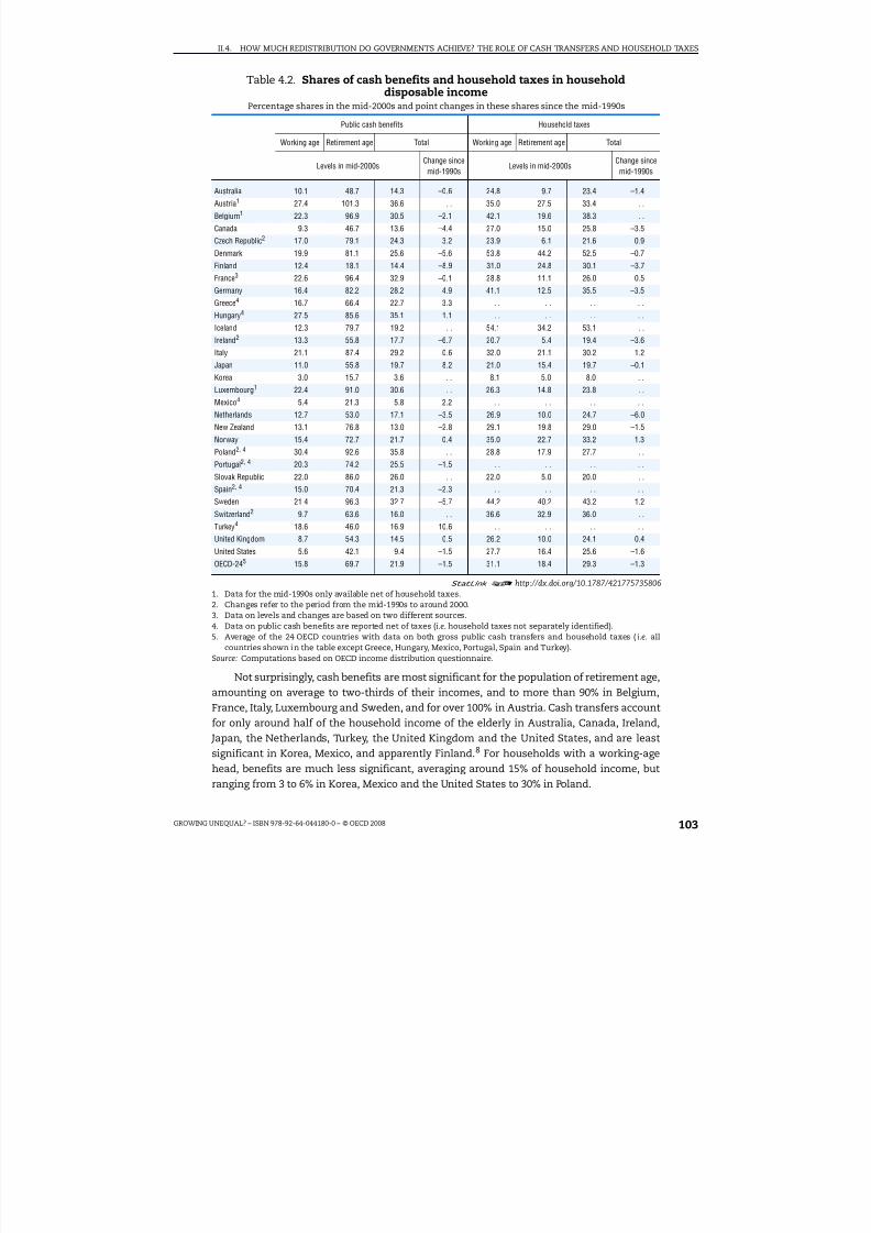
8/20/2019 Growing Unequal
http://slidepdf.com/reader/full/growing-unequal 103/309
II.4. HOW MUCH REDISTRIBUTION DO GOVERNMENTS ACHIEVE? THE ROLE OF CASH TRANSFERS AND HOUSEHOLD TAXES
GROWING UNEQUAL? – ISBN 978-92-64-044180-0 – © OECD 2008 103
Not surprisingly, cash benefits are most significant for the population of retirement age,amounting on average to two-thirds of their incomes, and to more than 90% in Belgium,France, Italy, Luxembourg and Sweden, and for over 100% in Austria. Cash transfers accountfor only around half of the household income of the elderly in Australia, Canada, Ireland, Japan, the Netherlands, Turkey, the United Kingdom and the United States, and are leastsignificant in Korea, Mexico, and apparently Finland.8 For households with a working-agehead, benefits are much less significant, averaging around 15% of household income, butranging from 3 to 6% in Korea, Mexico and the United States to 30% in Poland.
Table 4.2. Shares of cash benefits and household taxes in householddisposable income
Percentage shares in the mid-2000s and point changes in these shares since the mid-1990s
Public cash benefits Household taxes
Working age Retirement age Total Working age Retirement age Total
Levels in mid-2000sChange sincemid-1990s
Levels in mid-2000sChange sincemid-1990s
Australia 10.1 48.7 14.3 –0.6 24.8 9.7 23.4 –1.4
Austria1 27.4 101.3 36.6 . . 35.0 27.5 33.4 . .
Belgium1 22.3 96.9 30.5 –2.1 42.1 19.6 38.3 . .
Canada 9.3 46.7 13.6 –4.4 27.0 15.0 25.8 –3.5
Czech Republic2 17.0 79.1 24.3 3.2 23.9 6.1 21.6 0.9
Denmark 19.9 81.1 25.6 –5.6 53.8 44.2 52.5 –0.7
Finland 12.4 18.1 14.4 –8.9 31.0 24.8 30.1 –3.7
France3 22.6 96.4 32.9 –0.1 28.8 11.1 26.0 0.5
Germany 16.4 82.2 28.2 4.9 41.1 12.5 35.5 –3.5
Greece4 16.7 66.4 22.7 3.3 . . . . . . . .Hungary4 27.5 85.6 35.1 1.1 . . . . . . . .
Iceland 12.3 79.7 19.2 . . 54.1 34.2 53.1 . .
Ireland2 13.3 55.8 17.7 –6.7 20.7 5.4 19.4 –3.6
Italy 21.1 87.4 29.2 0.6 32.0 21.1 30.2 1.2
Japan 11.0 55.8 19.7 8.2 21.0 15.4 19.7 –0.1
Korea 3.0 15.7 3.6 . . 8.1 5.0 8.0 . .
Luxembourg1 22.4 91.0 30.6 . . 26.3 14.8 23.8 . .
Mexico4 5.4 21.3 5.8 2.2 . . . . . . . .
Netherlands 12.7 53.0 17.1 –3.5 26.9 10.0 24.7 –6.0
New Zealand 13.1 76.8 13.0 –2.8 29.1 19.8 29.0 –1.5
Norway 15.4 72.7 21.7 0.4 35.0 22.7 33.2 1.3
Poland
2,
4
30.4 92.6 35.8 . . 28.8 17.9 27.7 . .Portugal2, 4 20.3 74.2 25.5 –1.5 . . . . . . . .
Slovak Republic 22.0 86.0 26.0 . . 22.0 5.0 20.0 . .
Spain2, 4 15.0 70.4 21.3 –2.3 . . . . . . . .
Sweden 21.4 96.3 32.7 –5.7 44.2 40.2 43.2 1.2
Switzerland2 9.7 63.6 16.0 . . 36.6 32.9 36.0 . .
Turkey4 18.6 46.0 16.9 10.6 . . . . . . . .
United Kingdom 8.7 54.3 14.5 –0.5 26.2 10.0 24.1 0.4
United States 5.6 42.1 9.4 –1.5 27.7 16.4 25.6 –1.6
OECD-245 15.8 69.7 21.9 –1.5 31.1 18.4 29.3 –1.3
1 2 http://dx.doi.org/10.1787/4217757358061. Data for the mid-1990s only available net of household taxes.
2. Changes refer to the period from the mid-1990s to around 2000.3. Data on levels and changes are based on two different sources.4. Data on public cash benefits are reported net of taxes (i.e. household taxes not separately identified).5. Average of the 24 OECD countries with data on both gross public cash transfers and household taxes (i.e. all
countries shown in the table except Greece, Hungary, Mexico, Portugal, Spain and Turkey).Source: Computations based on OECD income distribution questionnaire.

8/20/2019 Growing Unequal
http://slidepdf.com/reader/full/growing-unequal 104/309
II.4. HOW MUCH REDISTRIBUTION DO GOVERNMENTS ACHIEVE? THE ROLE OF CASH TRANSFERS AND HOUSEHOLD TAXES
GROWING UNEQUAL? – ISBN 978-92-64-044180-0 – © OECD 2008104
Measured household taxes also vary widely. They are low in Korea but account formore than 40% of household disposable income in Sweden and more than 50% in Denmarkand Iceland.9 The level of household taxes – as measured in household surveys – hasdecreased on average by about 1 percentage point since the middle of the 1990s, matching the decline recorded on the transfer side, with larger declines in the Netherlands, Canada,
Germany, Ireland and Finland. It is clear, however, that the relationship between measuredtaxes and transfers differs across countries. For example, in the United States – based onthe household survey data used there – household taxes (at 26% of household income) arenearly three times higher than public cash transfers. At the other extreme, in the CzechRepublic, France, Luxembourg and the Slovak Republic, measured transfers account for alarger share of household disposable income than measured taxes. A major factor behindthese discrepancies is the fact that employer social security contributions – which financea large part of the welfare state in these and some other countries – are paid by employersdirectly to the government, and since they do not pass through the household sector theyare not recorded in household income surveys.
Table 4.3 compares OECD countries in terms of how public transfers and householdtaxes are distributed across income groups. The measure shown is the concentrationcoefficient as defined in Chapter 3 (note 14); as individuals are ranked according to theirdisposable income, rather than by the public transfers they receive, the concentrationcoefficient of transfers can be negative (in the case where poorer income groups receive ahigher share of transfers than their share of disposable income) – with lower and morenegative values implying greater progressivity. Cash benefits are more progressivelydistributed than market incomes in all countries, thus reducing inequality. Thedistribution of cash benefits for the entire population is most progressive, by a widemargin, in Australia, followed by New Zealand, Denmark, the United Kingdom, Finland andIreland, while it is least progressive in Mexico, Turkey, Portugal, and Poland. With theexceptions of Portugal and Turkey, transfers to people of working age are moreprogressively distributed than those to people of retirement age, although the differencesare small in Greece, Iceland, Poland and Portugal, as well as in Italy, Luxembourg and Spain.The ranking of countries is broadly similar for transfers to people of retirement age and of working age, although Finland has the most progressive distribution of transfers to peopleof retirement age, rather than Australia.
The second panel of Table 4.3 shows the distribution of household taxes (income taxesand employee social security contributions). Because taxes are deducted from household
incomes, higher values of the concentration coefficient imply a more progressivedistribution of household taxes. Taxation is most progressively distributed in the UnitedStates, probably reflecting the greater role played there by refundable tax credits, such asthe Earned Income Tax Credit and the Child Tax Credit. Overall, there is less variation in theprogressivity of taxes across countries than in the case of transfers. After the United States,the distribution of taxation tends to be most progressive in the English-speaking countries– Ireland, Australia, the United Kingdom, New Zealand and Canada – together with Italy,followed by the Netherlands, the Czech Republic and Germany. Taxes tend to be leastprogressive in the Nordic countries, France and Switzerland. In most but not all countriestaxes are more progressive for the retirement-age population than for the working-age
population, reflecting the existence of various tax concessions for low-income retiredpeople.
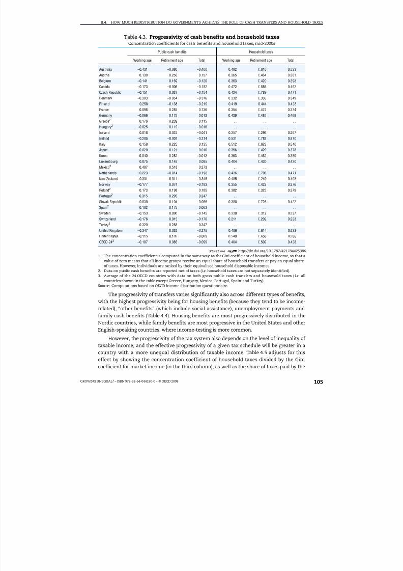
8/20/2019 Growing Unequal
http://slidepdf.com/reader/full/growing-unequal 105/309
II.4. HOW MUCH REDISTRIBUTION DO GOVERNMENTS ACHIEVE? THE ROLE OF CASH TRANSFERS AND HOUSEHOLD TAXES
GROWING UNEQUAL? – ISBN 978-92-64-044180-0 – © OECD 2008 105
The progressivity of transfers varies significantly also across different types of benefits,with the highest progressivity being for housing benefits (because they tend to be income-related), “other benefits” (which include social assistance), unemployment payments andfamily cash benefits (Table 4.4). Housing benefits are most progressively distributed in theNordic countries, while family benefits are most progressive in the United States and otherEnglish-speaking countries, where income-testing is more common.
However, the progressivity of the tax system also depends on the level of inequality of taxable income, and the effective progressivity of a given tax schedule will be greater in a
country with a more unequal distribution of taxable income. Table 4.5 adjusts for thiseffect by showing the concentration coefficient of household taxes divided by the Ginicoefficient for market income (in the third column), as well as the share of taxes paid by the
Table 4.3. Progressivity of cash benefits and household taxesConcentration coefficients for cash benefits and household taxes, mid-2000s
Public cash benefits Household taxes
Working age Retirement age Total Working age Retirement age Total
Australia –0.431 –0.080 –0.400 0.492 0.816 0.533Austria 0.130 0.256 0.157 0.365 0.464 0.381
Belgium –0.141 0.169 –0.120 0.363 0.420 0.398
Canada –0.173 –0.006 –0.152 0.472 0.586 0.492
Czech Republic –0.151 0.037 –0.154 0.424 0.789 0.471
Denmark –0.303 –0.054 –0.316 0.332 0.336 0.349
Finland –0.258 –0.138 –0.219 0.419 0.444 0.428
France 0.098 0.285 0.136 0.354 0.474 0.374
Germany –0.066 0.175 0.013 0.439 0.485 0.468
Greece2 0.176 0.202 0.115 . . . . . .
Hungary2 –0.025 0.119 –0.016 . . . . . .
Iceland 0.018 0.037 –0.041 0.257 0.296 0.267
Ireland –0.205 –0.001 –0.214 0.531 0.782 0.570
Italy 0.158 0.225 0.135 0.512 0.623 0.546
Japan 0.020 0.121 0.010 0.356 0.429 0.378
Korea 0.040 0.282 –0.012 0.363 0.462 0.380
Luxembourg 0.075 0.145 0.085 0.404 0.430 0.420
Mexico2 0.407 0.518 0.373 . . . . . .
Netherlands –0.223 –0.014 –0.198 0.436 0.705 0.471
New Zealand –0.331 –0.011 –0.345 0.485 0.249 0.498
Norway –0.177 0.074 –0.183 0.355 0.433 0.376
Poland2 0.173 0.198 0.185 0.382 0.325 0.379
Portugal2 0.315 0.295 0.247 . . . . . .
Slovak Republic –0.030 0.104 –0.056 0.388 0.726 0.422
Spain2 0.102 0.175 0.063 . . . . . .
Sweden –0.153 0.090 –0.145 0.330 0.312 0.337
Switzerland –0.176 0.015 –0.170 0.211 0.202 0.223
Turkey2 0.320 0.288 0.347 . . . . . .
United Kingdom –0.347 0.035 –0.275 0.486 0.614 0.533
United States –0.115 0.105 –0.089 0.549 0.658 0.586
OECD-243 –0.107 0.085 –0.099 0.404 0.502 0.428
1 2 http://dx.doi.org/10.1787/4217844253861. The concentration coefficient is computed in the same way as the Gini coefficient of household income, so that a
value of zero means that all income groups receive an equal share of household transfers or pay an equal shareof taxes. However, individuals are ranked by their equivalised household disposable incomes.
2. Data on public cash benefits are reported net of taxes (i.e. household taxes are not separately identified).3. Average of the 24 OECD countries with data on both gross public cash transfers and household taxes (i.e. all
countries shown in the table except Greece, Hungary, Mexico, Portugal, Spain and Turkey).Source: Computations based on OECD income distribution questionnaire.

8/20/2019 Growing Unequal
http://slidepdf.com/reader/full/growing-unequal 106/309
II.4. HOW MUCH REDISTRIBUTION DO GOVERNMENTS ACHIEVE? THE ROLE OF CASH TRANSFERS AND HOUSEHOLD TAXES
GROWING UNEQUAL? – ISBN 978-92-64-044180-0 – © OECD 2008106
richest 10% of the population compared to the share of market income they receive (sixth
column). Based on the concentration coefficient of household taxes, the United States has themost progressive tax system and collects the largest share of taxes from the richest 10% of thepopulation. However, the richest decile in the United States has one of the highest shares of market income of any OECD country. After standardising for this underlying inequality, Irelandhas the most progressive tax system as measured by the ratio of the concentration coefficientsof household taxes and market income, while Australia and the United States collect the mosttax from people in the top decile relative to the share of market income that they earn.
What is the relationship between the level of public spending on cash transfers and theprogressivity of spending programmes? In other words, do OECD countries with moreprogressive cash programmes spend more or less than others? Figure 4.2, which plots the
share of public cash transfers as a percentage of equivalised household disposable income asmeasured in surveys against their level of concentration in different OECD countries, providessome indication. The figure suggests the existence of a negative relationship between
Table 4.4. Progressivity of cash transfers by programmeConcentration coefficients for cash transfers, mid-2000s
Old agepensions
Disabilitybenefits
Compensationfor occupation
injury anddiseases
Survivorbenefits
Family cashbenefits
Unemploymentbenefits
Housingbenefits
Otherbenefits
Australia –0.47 –0.35 . . –0.30 –0.33 –0.44 . . –0.40
Austria 0.25 0.14 0.16 0.00 –0.09 –0.17 –0.48 –0.05
Belgium –0.09 –0.27 –0.13 –0.14 0.03 –0.22 –0.15 –0.50
Canada –0.11 . . . . . –0.46 –0.06 . . –0.22
Czech Republic –0.11 –0.06 . . 0.19 –0.26 –0.28 –0.66 –0.36
Denmark –0.49 –0.18 . . . . –0.04 –0.22 –0.58 –0.37
Finland –0.44 0.07 0.12 0.02 –0.07 –0.24 –0.61 –0.39
France 0.25 0.14 . . 0.05 –0.13 0.08 –0.55 –0.23
Germany 0.10 . . 0.07 –0.04 –0.04 –0.28 0.00 –0.24
Greece 0.15 0.06 0.25 0.02 –0.02 0.04 –0.17 –0.11
Hungary 0.01 . . . . . . –0.06 –0.25 . . –0.17
Ireland –0.32 –0.27 0.27 0.08 –0.21 –0.07 –0.46 0.02Italy 0.22 0.90 . . . . –0.52 –0.04 . . –0.05
Japan 0.02 . . . . . . . . –0.11 . . –0.33
Luxembourg 0.17 0.00 . . 0.13 –0.02 –0.09 –0.41 –0.52
Netherlands –0.16 –0.11 . . –0.14 –0.36 0.03 –0.65 –0.37
New Zealand –0.32 –0.35 –0.41 0.02 –0.43 –0.38 –0.37 –0.14
Norway –0.27 –0.06 . . –0.18 –0.06 –0.12 –0.65 –0.24
Poland 0.26 0.04 0.40 0.15 –0.22 0.13 –0.26 –0.13
Portugal 0.33 0.03 . . 0.03 . . 0.20 0.13 –0.77
Slovak Republic 0.00 –0.19 –0.01 0.24 –0.01 –0.07 0.84 –0.59
Spain 0.04 0.11 0.14 0.05 0.35 0.02 0.48 0.02
Sweden –0.19 0.25 0.25 . . –0.07 –0.10 –0.66 –0.16
Switzerland –0.19 . . . . . . –0.02 –0.15 . . –0.29
Turkey 0.37 0.07 . . 0.25 0.17 0.08 . . 0.52
United Kingdom –0.21 –0.20 . . . . . . . . . . –0.37
United States –0.04 . . . . . . –0.56 0.07 . . –0.10
OECD-27 –0.05 –0.01 0.10 0.02 –0.14 –0.10 –0.29 –0.24
1 2 http://dx.doi.org/10.1787/421827523148Note: Data refer to the mid-2000s for all countries. Data refer to “gross” public cash transfers (i.e. before taxes) for allcountries except Greece, Hungary, Ireland, Mexico, Poland, Portugal, Spain and Turkey (where survey data ontransfers are reported net of taxes). OECD-27 is the average across all countries with data available.Source: Computations based on OECD income distribution questionnaire.
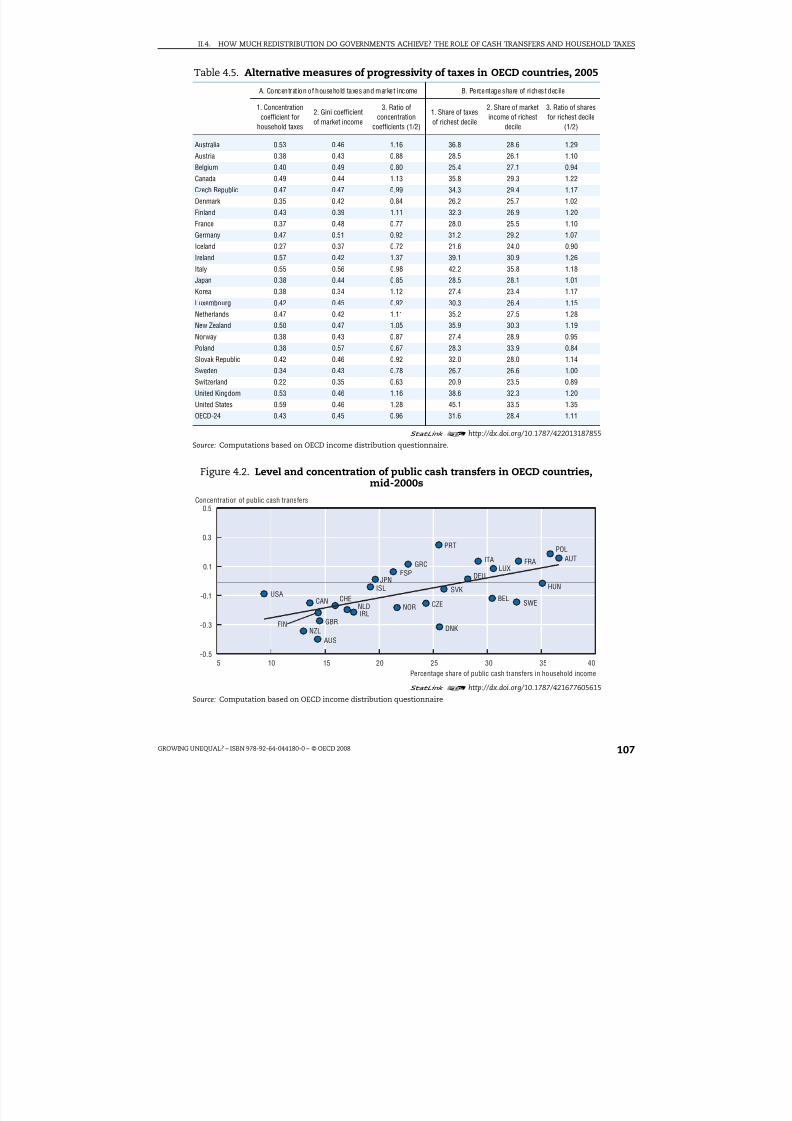
8/20/2019 Growing Unequal
http://slidepdf.com/reader/full/growing-unequal 107/309
II.4. HOW MUCH REDISTRIBUTION DO GOVERNMENTS ACHIEVE? THE ROLE OF CASH TRANSFERS AND HOUSEHOLD TAXES
GROWING UNEQUAL? – ISBN 978-92-64-044180-0 – © OECD 2008 107
Table 4.5. Alternative measures of progressivity of taxes in OECD countries, 2005
A. Concentration of household taxes and market income B. Percentage share of richest decile
1. Concentrationcoefficient for
household taxes
2. Gini coefficientof market income
3. Ratio ofconcentration
coefficients (1/2)
1. Share of taxesof richest decile
2. Share of marketincome of richest
decile
3. Ratio of sharesfor richest decile
(1/2)
Australia 0.53 0.46 1.16 36.8 28.6 1.29
Austria 0.38 0.43 0.88 28.5 26.1 1.10
Belgium 0.40 0.49 0.80 25.4 27.1 0.94
Canada 0.49 0.44 1.13 35.8 29.3 1.22
Czech Republic 0.47 0.47 0.99 34.3 29.4 1.17
Denmark 0.35 0.42 0.84 26.2 25.7 1.02
Finland 0.43 0.39 1.11 32.3 26.9 1.20
France 0.37 0.48 0.77 28.0 25.5 1.10
Germany 0.47 0.51 0.92 31.2 29.2 1.07
Iceland 0.27 0.37 0.72 21.6 24.0 0.90
Ireland 0.57 0.42 1.37 39.1 30.9 1.26
Italy 0.55 0.56 0.98 42.2 35.8 1.18
Japan 0.38 0.44 0.85 28.5 28.1 1.01
Korea 0.38 0.34 1.12 27.4 23.4 1.17
Luxembourg 0.42 0.45 0.92 30.3 26.4 1.15
Netherlands 0.47 0.42 1.11 35.2 27.5 1.28
New Zealand 0.50 0.47 1.05 35.9 30.3 1.19
Norway 0.38 0.43 0.87 27.4 28.9 0.95
Poland 0.38 0.57 0.67 28.3 33.9 0.84
Slovak Republic 0.42 0.46 0.92 32.0 28.0 1.14
Sweden 0.34 0.43 0.78 26.7 26.6 1.00
Switzerland 0.22 0.35 0.63 20.9 23.5 0.89
United Kingdom 0.53 0.46 1.16 38.6 32.3 1.20
United States 0.59 0.46 1.28 45.1 33.5 1.35
OECD-24 0.43 0.45 0.96 31.6 28.4 1.11
1 2 http://dx.doi.org/10.1787/422013187855
Source: Computations based on OECD income distribution questionnaire.
Figure 4.2. Level and concentration of public cash transfers in OECD countries,mid-2000s
1 2
http://dx.doi.org/10.1787/421677605615Source: Computation based on OECD income distribution questionnaire
0.5
0.3
0.1
-0.1
-0.3
-0.55 10 15 20 25 30 35 40
AUS
AUT
BELCAN CZE
DNKFIN
FRA
DEU
GRC
HUNISL
IRL
ITA
JPN
LUX
NLD
NZL
NOR
POL
PRT
SVK
ESP
SWECHE
GBR
USA
Concentration of public cash transfers
Percentage share of public cash transfers in household income

8/20/2019 Growing Unequal
http://slidepdf.com/reader/full/growing-unequal 108/309
II.4. HOW MUCH REDISTRIBUTION DO GOVERNMENTS ACHIEVE? THE ROLE OF CASH TRANSFERS AND HOUSEHOLD TAXES
GROWING UNEQUAL? – ISBN 978-92-64-044180-0 – © OECD 2008108
progressivity and spending levels, with higher levels of spending associated with lowerprogressivity (so, for example, the countries in the bottom left of the figure tend spend less buthave more progressive systems). However, lower-income OECD countries such as Mexico andTurkey (which, together with Korea, are excluded from the figure because of their lesscomprehensive welfare systems) combine both lower levels of spending and low progressivity.
The role of government transfers (and household taxes) also varies with individualcharacteristics such as age. One measure of this is provided in Figure 4.3, which shows the
Figure 4.3. Share of net public benefits in disposable income of each age group,mid-2000s
Percentage point differences relative to that of people aged 41-50
1 2 http://dx.doi.org/10.1787/421743352747
Source: Computations based on the OECD Income distribution questionnaire.
120
100
80
60
40
20
0
-20
120
100
80
60
40
20
0
-20
DEUOECD-18
ITAUSA JPN
NOROECD-18
GBRCAN FRA
1 8 - 2 5
2 6 - 4 0 4 1
- 5 0 4 1 - 5 0
5 1 - 6 5
6 6 - 7 5
1 8 - 2 5
2 6 - 4 0 5 1
- 6 5 6 6
- 7 5
120
100
80
60
40
20
0
-20
120
100
80
60
40
20
0
-20
SWEAUS
NLDIRL FIN
SVKNZLOECD-18 OECD-18
HUNCZE DNK
1 7 o r
l e s s
O v e r
7 5
1 7 o r
l e s s
O v e r
7 5
1 8 - 2 5
2 6 -
4 0 4 1 - 5 0
4 1 - 5 0
5 1 - 6 5
6 6 - 7 5
1 8 - 2 5
2 6 -
4 0 5 1
- 6 5
6 6 - 7 5
1 7 o r
l e s s
O v e r
7 5
1 7 o r
l e s s
O v e r
7 5

8/20/2019 Growing Unequal
http://slidepdf.com/reader/full/growing-unequal 109/309
II.4. HOW MUCH REDISTRIBUTION DO GOVERNMENTS ACHIEVE? THE ROLE OF CASH TRANSFERS AND HOUSEHOLD TAXES
GROWING UNEQUAL? – ISBN 978-92-64-044180-0 – © OECD 2008 109
share of net benefits (public cash benefits less household taxes) for different age groups,relative to that of people aged 41 to 50. Net benefit rates are typically positive forindividuals at retirement age and negative for younger groups. When compared to those of the reference group aged 41-50 (the group that pays the highest amount of taxes relative tothe benefits that they receive) children below 18 are only slightly better off. There are
however large differences across countries in these profiles, which rise much more steeplyin Germany, Italy and Sweden than in Australia, Canada and the United States. These age-income profiles are important not just for their influence on the current distribution of household income but also because they give an indication of how demographic changesmay translate into higher public spending in the future (Dang et al., 2006).
How much redistribution is achieved through government cash benefitsand household taxes?
The most direct way to illustrate the effect of public cash transfers and householdtaxes on the distribution of household disposable income is to compare the sameinequality measure computed over the various income concepts described in Table 4.1.While such comparisons will reflect differences in both size and structure of welfareprogrammes and tax systems across countries, they provide a convenient summarymeasure that is useful for comparing countries and assessing changes over time. Thissection presents evidence limited to those OECD countries with data covering both
household taxes and gross public transfers (24 countries in the most recent year, excluding Greece, Hungary, Iceland, Mexico, Poland, Portugal, Spain and Turkey for analysis of levels;19 countries, i.e. also excluding Austria, Belgium, Czech Republic, Korea and the SlovakRepublic, for analysis of changes since 1995).
Figure 4.4 shows two measures of the “effectiveness” of the tax and benefit systems inreducing income inequality: the percentage reduction in income inequality when moving from market income to disposable income (in the top panel), and the absolute pointdifference between these two measures (in the bottom panel). These measures arecalculated in two ways.
● In the first approach (shown as diamonds), inequality in the distribution of marketincome is computed by ranking people by their level of market income. On this measure,on average, across the 24 countries covered, the tax and transfer systems lower incomeinequality by around one-third (i.e. around 0.15 Gini point), with declines ranging fromaround 45% in Denmark, Sweden and Belgium to less than 8% in Korea.
● In the second approach (shown as bars) the Gini coefficient for market income is basedon people ranked by their disposable income, i.e. individuals are ranked by where theyend up “after” redistribution, rather than where they were placed “before” redistribution.On this second measure, the reduction of inequality achieved by taxes and transfers is alittle more than one-fourth (i.e. 0.11 point), with declines ranging from around 40% inSweden and Denmark to 5% in Korea.
The difference between the two measures of redistribution is a result of the re-ranking of some households as a consequence of welfare state programmes (Ankrom, 1993). Thisdifference is of interest, as one of the limitations of the standard approach to measuring redistribution relates to the counterfactual against which redistribution is measured.Layard (1977), for example, argues that the standard approach exaggerates theredistributive impact of the welfare state because it assumes that the different levels of

8/20/2019 Growing Unequal
http://slidepdf.com/reader/full/growing-unequal 110/309
II.4. HOW MUCH REDISTRIBUTION DO GOVERNMENTS ACHIEVE? THE ROLE OF CASH TRANSFERS AND HOUSEHOLD TAXES
GROWING UNEQUAL? – ISBN 978-92-64-044180-0 – © OECD 2008110
welfare state spending and taxation have no behavioural impact on the distribution of market incomes. In particular, in countries with generous public pensions, the standardapproach implies that middle-class individuals are plunged into market-income poverty onretirement simply because it is the government, rather than the market, that provides theirpensions: generous earnings-related public pensions are then measured as being very
effective at reducing inequality, in part because they restore middle-income retirees to theirpre-retirement ranking. A comparison between the two alternative measures suggests that,in some OECD countries, a very significant part of the redistribution measured by the
Figure 4.4. Differences in inequality before and after taxes and transfersin OECD countries
Difference in concentration coefficients around 2005
1 2 http://dx.doi.org/10.1787/421744352206Note: Countries are ranked, from left to right, in increasing order of the percentage point reduction in theconcentration coefficient achieved by household taxes and public cash transfers, based on people ranked by their
household disposable income. Bars are computed based on grouped data for average market and disposable income,by deciles of people ranked by their household disposable income. Diamonds are computed based on individual data,with people ranked by market income (for the Gini coefficient of market income) and ranked by disposable income(for the Gini coefficient of disposable income).
Source: OECD income distribution questionnaire
K O R
C H E
I S L
J P N
P O L
F R A
A U T
U S A
C A N
L U X
F I N N Z L
N O R I T A N L
D S V
K G B
R D E
U I R L
A U S
B E L
C Z E
S W E
D N K
0.6
0.5
0.4
0.3
0.2
0.1
0
K O R
C H E
I S L
J P N
P O L
F R A
A U T
U S A
C A N
L U X
F I N N Z L
N O R I T
A N L
D S V
K G B
R D E
U I R L
A U S
B E L
C Z E
S W E
D N K
0.3
0.2
0.1
0
People ranked by disposable income People ranked by market and disposable income
O E C
D - 2 4
O E C
D - 2 4
Percentage reduction
Point reduction

8/20/2019 Growing Unequal
http://slidepdf.com/reader/full/growing-unequal 111/309

8/20/2019 Growing Unequal
http://slidepdf.com/reader/full/growing-unequal 112/309
II.4. HOW MUCH REDISTRIBUTION DO GOVERNMENTS ACHIEVE? THE ROLE OF CASH TRANSFERS AND HOUSEHOLD TAXES
GROWING UNEQUAL? – ISBN 978-92-64-044180-0 – © OECD 2008112
discussed above is eliminated. Based on this approach, the redistribution achieved bypublic cash transfers on average is twice as large as that achieved through household taxes,although the United States stands out for achieving greater redistribution through the taxsystem than through cash transfers. Korea and Japan also stand out for the very lowredistribution achieved through the tax system.11
Based on the preferred measure of redistribution (bars in Figure 4.4), which abstracts
from the effect of “re-ranking”, the combined effect of transfers and taxes in reducing inequality is similar in Ireland and Australia to that achieved in Sweden and Denmark,while the redistribution in the United Kingdom and in New Zealand is similar to the levelsachieved in Germany and the Netherlands, for example. It follows that the higher levels of disposable-income inequality in these four English-speaking countries do not reflect lesseffective welfare states but higher market-income inequality, in particular of householdearnings, to start with.12
Has the extent of redistribution changed over time? This is shown in Figure 4.7.Countries falling above the diagonal achieve less redistribution today than in the 1990s,while those below the diagonal achieve more. Patterns are quite diverse across countries.When looking at the combined effect of public cash transfers and household taxes (toppanel), a number of countries, such as Italy, Germany and the Czech Republic now achieve
Figure 4.6. Reduction in inequality due to public cash transfersand household taxes
Point reduction in the concentration coefficient
1 2 http://dx.doi.org/10.1787/421752256406Note: The effect of public cash transfers in reducing income inequality is measured as the difference between theconcentration coefficient of market income and that of gross income after transfers, and the effect of household
taxes as the difference between the concentration coefficient of gross post-transfer income and that of disposableincome. Concentration coefficients are computed based on information on the income share of transfers and taxes,with individuals ranked by their level of equivalised household disposable income.
Source: OECD income distribution questionnaire.
0 0.05 0.10 0.15 0 0.05 0.10 0.15
Public transfers in cash Household taxes
KOR
USAJPN
AUT
CAN
FIN
LUX
ITA
NLD
NZL
OECD-21
GBR
DEU
NOR
SVKAUS
FRA
IRL
CZE
DNK
BEL
SWE
KOR
USAJPN
AUT
CAN
FIN
LUX
ITA
NLD
NZL
OECD-21
GBR
DEU
NOR
SVKAUS
FRA
IRL
CZE
DNK
BEL
SWE

8/20/2019 Growing Unequal
http://slidepdf.com/reader/full/growing-unequal 113/309
II.4. HOW MUCH REDISTRIBUTION DO GOVERNMENTS ACHIEVE? THE ROLE OF CASH TRANSFERS AND HOUSEHOLD TAXES
GROWING UNEQUAL? – ISBN 978-92-64-044180-0 – © OECD 2008 113
more redistribution than in the past (although this may partly reflect greater market incomeinequality), while others – Finland, Norway, Sweden, Ireland, Canada and the United States –are now less redistributive, and others show very little change.13 In some countries such asthe Netherlands, an unchanged level of redistribution has gone in hand with lowerinequality in the distribution of disposable income reflecting large declines in marketincome inequality (by close to 6 percentage points). When looking separately at changes inthe two levers of government redistribution (bottom panel), the redistributive impact of household taxes appears to have declined in Japan and Norway, and increased in Italy,Denmark, the Netherlands and the United Kingdom. The redistributive impact of public cashtransfers fell in Finland and Ireland, while the opposite occurred in Germany and Italy.
A further way of assessing the impact of differing welfare state arrangements is shownin Table 4.6, which provides measures of the efficiency and effectiveness of tax and
Figure 4.7. Changes in redistributive effects of public cash transfersand taxes over time
1 2 http://dx.doi.org/10.1787/421755213675Note: Government redistribution is measured by the change in concentration coefficient for market and disposableincome “without re-ranking”, as computed based on data for average (market and disposable) income by deciles of people ranked by their household disposable income.
Source: OECD income distribution questionnaire.
0.2
0.2
0.1
0.1
00 0.1 0.1 0.2 0.2
50
40
30
20
1010 20 30 40 50
0.14
0.12
0.10
0.08
0.06
0.04
0.02
00 0.060.040.02 0.100.08 0.12 0.14
0.06
0.05
0.04
0.02
0.01
0.03
00 0.01 0.02 0.03 0.04 0.05 0.06
AUS
CAN
CZE
DNK
FIN
FRADEU
IRL
ITA
JPN
NLD
NZL
NOR
SWE
GBR
USA
AUS
CAN
CZE
DNK
FIN
FRADEU
IRL
ITA
JPN
NLD
NZLNOR
SWE
GBR
USA
AUS
CANCZE
DNK
FIN
FRA
JPN
DEUIRL
ITANLD
NZL
NORSWE
GBR
USA
AUS
CAN
CZE
DNK
FIN FRA
DEU
IRL
ITA
JPN
NLDNZL
NOR
SWE
GBR
US
A
Mid-2000s
Mid-1990sMid-1990s
Mid-2000s
Percentage reduction Point difference
OECD-16
OECD-16
Mid-2000s
Mid-1990sMid-1990s
Mid-2000s
Household taxes Public cash transfers
OECD-16
OECD-16
Combined effect to household taxes and public cash transfers
Effects of household taxes and public cash transfers, point difference

8/20/2019 Growing Unequal
http://slidepdf.com/reader/full/growing-unequal 114/309
II.4. HOW MUCH REDISTRIBUTION DO GOVERNMENTS ACHIEVE? THE ROLE OF CASH TRANSFERS AND HOUSEHOLD TAXES
GROWING UNEQUAL? – ISBN 978-92-64-044180-0 – © OECD 2008114
transfer systems in reducing inequality. Following Beckerman (1979), effectiveness isdefined as the percentage point reduction in the concentration coefficient of incomeinequality associated with the household taxes and public cash transfers, respectively, ineach OECD country, as shown in Figure 4.6, while efficiency is the effectiveness measure(multiplied by 100) divided by the share in household disposable income of householdtaxes and public cash transfers, respectively. For example, in Australia for each1 percentage point of household taxes, the concentration coefficient for gross income is
reduced by 0.193 percentage point, while for each 1 percentage point of public cashtransfers, market-income inequality is reduced by 0.679 percentage point (Panel C). Thetable suggests that, based on the measure of “effectiveness” shown in Panel A, the tax
Table 4.6. Effectiveness and efficiency of taxes and transfersin reducing inequality
A. Effectiveness (inequalityreduction)
B. Size (share of householddisp. income)
C. Efficiency index A/(B/100) D. Concentration index
Household
taxes
Public cash
transfers
Household
taxes
Public cash
transfers
Household
taxes
Public cash
transfers
Household
taxes
Public cash
transfers
Australia 0.045 0.097 23.4 14.3 0.193 0.679 0.533 –0.400
Austria 0.029 0.052 33.4 36.6 0.086 0.142 0.381 0.157
Belgium 0.037 0.119 38.3 30.5 0.096 0.391 0.398 –0.120
Canada 0.037 0.060 25.8 13.6 0.145 0.444 0.492 –0.152
Czech Rep. 0.037 0.114 21.6 24.3 0.170 0.468 0.471 –0.154
Denmark 0.042 0.118 52.5 25.6 0.080 0.461 0.349 –0.316
Finland 0.038 0.065 30.1 14.4 0.127 0.449 0.428 –0.219
France 0.020 0.056 26.0 32.9 0.079 0.171 0.374 0.136
Germany 0.046 0.086 35.5 28.2 0.130 0.303 0.468 0.013
Ireland 0.041 0.100 19.4 17.7 0.210 0.565 0.570 –0.214
Italy 0.047 0.073 30.2 29.2 0.156 0.251 0.546 0.135
Japan 0.003 0.048 19.7 19.7 0.015 0.244 0.378 0.010
Korea 0.005 0.011 8.0 3.6 0.067 0.312 0.380 –0.012
Luxembourg 0.032 0.066 23.8 30.6 0.135 0.215 0.420 0.085
Netherlands 0.041 0.080 24.7 17.1 0.166 0.468 0.471 –0.198
New Zealand 0.038 0.080 29.0 13.0 0.132 0.615 0.498 –0.345
Norway 0.027 0.093 33.2 21.7 0.082 0.427 0.376 –0.183
Slovak Rep. 0.028 0.094 20.0 26.0 0.138 0.361 0.422 –0.056
Sweden 0.032 0.121 43.2 32.7 0.075 0.368 0.337 –0.145
Switzerland –0.012 0.057 36.0 16.0 –0.034 0.355 0.223 –0.170
United Kingdom 0.039 0.085 24.1 14.5 0.164 0.586 0.533 –0.275
United States 0.044 0.041 25.6 9.4 0.170 0.434 0.586 –0.089
OECD-22 0.032 0.078 28.3 21.4 0.117 0.396 0.438 –0.114
Memorandum items
Correlation
coeff.1 . . 0.496 0.211 0.423 0.839 0.430 0.906 –0.940
1 2 http://dx.doi.org/10.1787/4220512431361. Correlation between effectiveness of taxes and of cash transfers in the second column; between size and
effectiveness of taxes and transfers, respectively, in the third and fourth columns; between the efficiency indexand effectiveness of taxes and transfers, respectively, in the fifth and sixth columns; and between theconcentration index and the efficiency index of taxes and transfers, respectively, in the seventh and eighthcolumns.
Note: The effectiveness index is defined as the percentage point reduction in the Gini coefficient of income inequalitydue to household taxes (i.e. between gross and disposable income) and cash transfers (i.e. between market and grossincome) in each OECD country. The efficiency index is the effectiveness index of taxes and transfers divided by therespective share of taxes and transfers in each country. The concentration index of household taxes and public cash
transfer is calculated as in Table 4.2.Source: Computations based on OECD income distribution questionnaire.

8/20/2019 Growing Unequal
http://slidepdf.com/reader/full/growing-unequal 115/309
II.4. HOW MUCH REDISTRIBUTION DO GOVERNMENTS ACHIEVE? THE ROLE OF CASH TRANSFERS AND HOUSEHOLD TAXES
GROWING UNEQUAL? – ISBN 978-92-64-044180-0 – © OECD 2008 115
system achieves the largest reductions of income inequality in Italy, Germany, Australia,the United States, Denmark, Ireland and the Netherlands, and the lowest ones in Japan,Korea and Switzerland (second column). When looking at public cash transfers, the largestreductions of income inequalities are recorded by Sweden, Belgium, Denmark and theCzech Republic, and the lowest ones in Korea and the United States (third column).
Overall, the efficiency measure gives a slightly different picture than some earliermeasures. It remains the case that transfer systems are significantly more efficient thantax systems at reducing inequality, as well as more effective, but some countries changetheir ranking when the efficiency index is used rather than the concentration coefficients.For example, Australia has a slightly less progressive tax system than the United States(Panel D), but is slightly more efficient in terms of inequality reduction (Panel C).
The table also shows the correlation between various design features of OECD welfarestates. Not surprisingly, the highest correlations are between the concentration andefficiency of household taxes (Panel D), and also between the concentration and efficiency
of public cash transfers (in this case, the correlation is negative because the mostprogressive transfer systems have negative concentration coefficients, as discussedearlier). There are moderately high correlations between the other measures shown,although effectiveness and efficiency are more strongly correlated in the case of taxes thanfor transfers.
Redistribution towards those at the bottom of the income ladder:the interplay of size and targeting
When considering the redistributive effects of the tax and transfer systems it isimportant to note that the concentration coefficient gives greater weight to changes in the
middle of the distribution, whereas policy-makers may be more concerned about people atthe bottom of the income distribution. Beyond looking at changes in poverty rates (thesubject of Chapter 5), it is possible to address this concern by considering the effect of public cash transfers and household taxes on the lowest income groups. Table 4.7 providesa measure of the redistribution towards people at the lower end of the income distribution– in the lowest income quintile – separately for gross public transfers (left-hand panel) andhousehold taxes (right-hand panel).
The role of cash transfers in supporting the income of people in the bottom quintile iscomputed by first estimating the average ratio of cash transfers as a percentage of householddisposable income measured in income surveys (Column A);14 second, by calculating how
much of this share goes to the poorest 20% of the population (Column B); and finally, bymultiplying the size of spending by the progressivity of its distribution to calculate grossbenefits accruing to people at the lower end of the distribution (divided by 100, inColumn C). The same procedure is used to calculate how much tax is paid by people at thelower end of the distribution, while the difference between the two values (in Column G)represents the “net” cash transfers to the lowest income quintile.
Several patterns stand out from Table 4.7:
● First, public cash transfers are more targeted to the poorest 20% of the population inAustralia, Denmark, New Zealand, Finland, the Netherlands, Ireland and the United
Kingdom (where the lowest income quintile receive more than 30% of all transfers, andabove 40% in Australia, Column B), and least targeted in Poland (where the poorest 20%

8/20/2019 Growing Unequal
http://slidepdf.com/reader/full/growing-unequal 116/309
II.4. HOW MUCH REDISTRIBUTION DO GOVERNMENTS ACHIEVE? THE ROLE OF CASH TRANSFERS AND HOUSEHOLD TAXES
GROWING UNEQUAL? – ISBN 978-92-64-044180-0 – © OECD 2008116
receive less than 10% of all transfers); on this criterion, the level of targeting is roughly
similar in Canada, the United States and Sweden.● Second, there are large differences in the overall size of the redistribution towards low
income households achieved through the combined effect of public transfers andhousehold taxes; this ranges from values (as percentages of household disposable income)above 5.5 in Australia, Belgium, Denmark and Sweden, to values of around 2 in Japan,Poland and the United States, and to less than 0.5 in Switzerland and Korea (Column G).
● Third, there are large differences in the mix of cash transfers and household taxes usedto redistribute income towards people at the bottom of the income scale. For example,the value of the public transfers to people in the lowest quintile (Column C) is 30 timesthat of the household taxes they pay (Column F) in Australia and Ireland, and more thanten times in the United Kingdom, as compared to levels of only twice (or less) for Koreaand Poland. Nordic countries transfer large amounts of gross benefits to low-income
Table 4.7. Redistribution through cash transfers and household taxestowards people at the bottom of the income ladder, mid-2000s
Gross public transfers paid to householdsDirect taxes and social security contributions
paid by householdsG. Net transfers
to lowest quintile
(C-F)
A. Average ratio
of householddisposable
income
B. Share of publictransfers paid tolowest quintile
C. Transfers tolowest quintile
(A*B/100)
D. Average ratio
of householddisposable
income
E. Share of taxespaid by lowest
quintile
F. Taxes fromlowest quintile
(D*E/100)
Australia 14.3 41.5 5.9 23.4 0.8 0.2 5.8
Austria 36.6 13.9 5.1 33.4 5.4 1.8 3.3
Belgium 30.5 24.1 7.3 38.3 3.9 1.5 5.8
Canada 13.6 25.7 3.5 25.8 2.3 0.6 2.9
Czech Republic 24.3 23.0 5.6 21.6 3.5 0.8 4.8
Denmark 25.6 36.0 9.2 52.5 6.1 3.2 6.0
Finland 14.4 32.9 4.7 30.1 4.0 1.2 3.5
France 32.9 16.2 5.3 26.0 5.6 1.5 3.9
Germany 28.2 17.4 4.9 35.5 2.1 0.7 4.2
Ireland 17.7 30.8 5.4 19.4 0.9 0.2 5.3Italy 29.2 12.6 3.7 30.2 1.8 0.6 3.1
Japan 19.7 15.9 3.1 19.7 6.0 1.2 2.0
Korea 3.6 24.9 0.9 8.0 5.8 0.5 0.4
Luxembourg 30.6 13.9 4.3 23.8 5.9 1.4 2.8
Netherlands 17.1 31.5 5.4 24.7 3.4 0.8 4.5
New Zealand 13.0 34.0 4.4 29.0 1.8 0.5 3.9
Norway 21.7 27.7 6.0 33.2 4.6 1.5 4.5
Poland 35.8 9.0 3.2 27.7 6.0 1.7 1.6
Slovak Republic 26.0 19.0 4.9 20.0 5.0 1.0 3.9
Sweden 32.7 25.9 8.5 43.2 6.5 2.8 5.7
Switzerland 16.0 29.2 4.7 36.0 12.4 4.5 0.2
United Kingdom 14.5 31.4 4.6 24.1 1.7 0.4 4.1United States 9.4 24.8 2.3 25.6 1.6 0.4 1.9
OECD-23 22.0 24.4 5.4 28.3 4.2 1.2 4.2
1 2 http://dx.doi.org/10.1787/422058728151Note: Values in Columns A and D are the ratios of public transfers and household taxes, respectively, in thedisposable income of the entire population; Columns B and E show the shares of public transfers and householdtaxes received and paid, respectively, by people of the bottom quintile of the population. Data refer to the mid-2000sfor all countries. The table excludes countries where data on household taxes are not available (i.e. where availabledata on public transfers are expressed “net” of taxes).Source: OECD income distribution questionnaire.

8/20/2019 Growing Unequal
http://slidepdf.com/reader/full/growing-unequal 117/309
II.4. HOW MUCH REDISTRIBUTION DO GOVERNMENTS ACHIEVE? THE ROLE OF CASH TRANSFERS AND HOUSEHOLD TAXES
GROWING UNEQUAL? – ISBN 978-92-64-044180-0 – © OECD 2008 117
people but also levy a significant amount of household taxes on them; conversely, mostEnglish speaking countries pay less generous transfers but offset this partly by levying lower household taxes on them.
● Fourth, countries redistribute income towards people at the bottom of the income scalethrough different combinations of the size and progressivity of their taxes and transfers.For example, Australia and Norway pay comparable amounts of gross transfers to low-income people, with a spending effort in the former country of only two-thirds that of the latter – the difference being offset by a far greater targeting of the transfers paid(about 50% more, on the measure used here). Similarly, both Korea and the United Statescollect a similar amount of taxes from low-income households but achieve this througha low general tax level in the former country and through targeted tax credits in thelatter.
Improving measures of welfare state outcomes
While the standard approach used in this chapter – and most of the comparative socialpolicy literature – provides a simple but flexible model for analysing income redistribution,the framework has a number of significant limitations. These include:
● the counterfactual against which redistribution is assessed;
● the limitations in accounting for government redistributive activity; and
● the treatment of the relationship between public and private provision.
With reference to the first element, any assessment of the distributional impact of aset of policies involves comparing the observed distribution with a counterfactual – thehypothetical distribution that would exist in the absence of the policies being evaluated(Pederson, 1994). As set out in Table 4.1, the standard accounting framework is linear: itassumes that the distribution of factor and market incomes precedes the operation of thetax and transfer systems, and there are no interactions between them, apart from thedirect effect of government programmes in reducing final inequality. Moreover, whenapplied to a range of countries, this approach implicitly assumes that the wide differencesin the scope and form of different welfare states have no impact on the behaviour of peoplein different countries. Both assumptions – which underlie the estimates presented in thischapter – are unrealistic. Individuals make decisions about income-generating activitieswithin existing institutional frameworks, which vary widely across countries. Layard (1977)and Reynolds and Smolensky (1977) argue that, because of these assumptions, the
standard approach exaggerates both the inequality of market incomes and the amount of redistribution that is achieved by social policies. This chapter has attempted to deal withthis fundamental problem by providing estimates that include and then exclude there-ranking effects of the welfare state, showing that this effect is significant.
A second limitation of the standard approach is that the effects of government policiesare only partly considered. These gaps arise in several ways. First, most income surveysonly include information on cash benefits and direct taxes, while excluding in-kindbenefits (discussed in Chapter 9) and consumption taxes (Warren, 2008). Second, policiescan be implemented through regulations rather than direct provision, and the former areexcluded from the analysis. For example, an important way in which governments affect
labour-market outcomes is through the setting of minimum wages, but in the standardapproach the degree of wage dispersion in each country is treated as if it has beenproduced by market mechanisms alone. Third, the standard framework also excludes

8/20/2019 Growing Unequal
http://slidepdf.com/reader/full/growing-unequal 118/309
II.4. HOW MUCH REDISTRIBUTION DO GOVERNMENTS ACHIEVE? THE ROLE OF CASH TRANSFERS AND HOUSEHOLD TAXES
GROWING UNEQUAL? – ISBN 978-92-64-044180-0 – © OECD 2008118
employer social security contributions – which are insignificant in Australia, Denmark andNew Zealand but account for more than 25% of total tax revenue in France and the CzechRepublic (OECD, 2007b). Given that these contributions pay for a large part of social securityspending in many countries, an assessment of their distributional impact would bewarranted.15 The obvious question that arises is whether a different measure of household
well-being, broadened to include these factors, would change conclusions about the extentof redistribution in different countries. The answers will depend on the extent to whichthere is divergence between these income measures in different countries – e.g. on therelative weights of cash transfers and other public spending, and of direct taxes and otherforms of taxation.
A final limitation of the standard approach is that public cash transfers (as well astaxes and social security contributions) can substitute for a wide range of privatearrangements for individual protection, and vice versa.16 A case in point arises whenconsidering contributions to private and occupational pensions and their relation tocontributions to public pensions. The standard approach (and the SNA conventions) treatscontributions to government pensions as a tax that finances the retirement pensions paidout in the same year, while contributions to private pensions are effectively treated as aform of private consumption. This affects international comparisons of incomedistribution in several ways. For example, countries with earnings-related social securitysystems will look more equal because a higher proportion of the savings that well-off individuals make for retirement are made through taxes. Conversely, where flat-rate ormeans-tested benefits are provided, a higher proportion of savings for retirement are madethrough occupational and private pension contributions.17 In summary, different socialsecurity systems produce different distributions of public and private pension rights, andthe incomplete treatment of this redistributive activity may bias cross-countrycomparisons of income distribution. Overcoming this bias requires broadening theframework used to assess household well-being and distributive outcomes.
Conclusion
Two major objectives of the welfare state are to redistribute across the lifecycle and toredistribute between rich and poor. All OECD countries pursue both objectives, althoughthe emphasis given to each of them varies significantly between countries. Overall, severalconclusions stand out from this analysis.
● In general, countries with lower levels of transfer spending have a more progressive
structure of both benefits and taxes, although there are exceptions (Mexico, with low-spending also has very low progressivity) and other cross-country differences (e.g. Nordiccountries have higher-than-average spending and progressive benefit structures, butless progressive tax systems).
● Indicators of the redistributive activity of welfare states based on the “standardapproach” show that the tax and benefit systems in all OECD countries reduce incomeinequality, with the impact being greatest in the Nordic countries and lowest in theUnited States and Korea.
● However, in a number of countries, a significant part of this redistribution results fromthe “re-ranking” of people, where for example, middle-income households are treated asif they fall into deep poverty upon retirement, with their income gap then amelioratedby generous, earnings-related public pensions. When accounting for re-ranking, then

8/20/2019 Growing Unequal
http://slidepdf.com/reader/full/growing-unequal 119/309
II.4. HOW MUCH REDISTRIBUTION DO GOVERNMENTS ACHIEVE? THE ROLE OF CASH TRANSFERS AND HOUSEHOLD TAXES
GROWING UNEQUAL? – ISBN 978-92-64-044180-0 – © OECD 2008 119
Australia and Ireland prove to be nearly as effective in reducing inequality as the Nordiccountries, while the United Kingdom and New Zealand are about as effective asGermany, for example
● The redistributive effect of the welfare state is generally larger for public cash benefitsthan for household taxes – except in the United States, which achieves moreredistribution through the tax system than through the transfer system. Similarly, thedegree of redistribution to the lowest income quintile varies widely across countries, andis greatest in Australia and the Nordic countries.
While useful for highlighting a number of patterns, the “standard approach” also haslimits, and while some of them are addressed in later chapters, other are beyond the scopeof this volume. Further efforts are therefore required to develop more comprehensivemeasures of the impact of redistributive policies.
Notes
1. Other forms of targeting are possible, such as benefits directed to particular geographic areas;these are more common in low-income countries.
2. Other forms of redistribution can occur as well: for example, between generations, between menand women, or across geographical regions, but these are usually a by-product of the two mainobjectives rather than being primary goals in their own right.
3. The actual distribution of benefits across the lifecycle for individuals is likely to differ fromcalculations of this sort, since both money’s worth calculations and micro-simulations usuallylook at hypothetical lifetimes and calculate the extent of lifetime redistribution on the basis of thetax and benefit system at a specific point in time. In practice, taxation and benefit systems can bechanged many times during an individual’s lifetime. Some studies, therefore, attempt to estimateto what extent different generations are net beneficiaries or net contributors to social security
systems (see Thomson, 1989; Williamson et al., 1999).4. The effective contribution rate is the average rate of contributions required to finance current
spending on public pensions without budgetary transfers or accumulation or decumulation of pension funds.
5. While total lifetime income for an individual is unchanged by redistribution across the lifecycle,income smoothing can reduce the share of time that might otherwise be spent below the povertyline by those whose average incomes are above the poverty line. However, while people whoselifetime incomes are below the poverty line can theoretically have their incomes raised above thepoverty line at different points in time, this could only be achieved at the cost of more severepoverty (i.e. a larger poverty gap) in other periods.
6. A simple example (which disregards the impact of taxes) illustrates the impact of different welfarestate arrangements on the distribution of household income. Imagine two countries with the same
distribution of market incomes and a concentration coefficient of 0.40. In country A transfersaccount for 20% of household gross income and the concentration coefficient for transfers is 0.30(i.e. the system is earnings-related, but not as unequal as market income); in this country, marketincome provides 80% of gross household income and the Gini coefficient for income after transfersis 0.38 (0.40*0.8 plus 0.30*0.2). In country B transfers account for only 5% of gross income, but theconcentration coefficient for transfers is zero (i.e. benefits are flat-rate) so that the Gini coefficientfor income after transfers is also 0.38 (0.40*0.95 plus 0.00*0.05). In this example, the transfersystems of these two countries reduce income inequality by the same degree even though the levelof spending and the distribution of benefits were very different between the two.
7. There are other influences, as well, including the incidence of unemployment by income class anddifferences in life expectancy and disability by income; other important factors include the take-upof benefits (low take-up reduces effective progressivity) and the coverage of the social securitysystem – as shown below, Mexico and Turkey have the least redistributive social security systems
in the OECD, with the main explanation for this being their lower level of coverage of thepopulation.

8/20/2019 Growing Unequal
http://slidepdf.com/reader/full/growing-unequal 120/309
II.4. HOW MUCH REDISTRIBUTION DO GOVERNMENTS ACHIEVE? THE ROLE OF CASH TRANSFERS AND HOUSEHOLD TAXES
GROWING UNEQUAL? – ISBN 978-92-64-044180-0 – © OECD 2008120
8. The apparently low level of public cash benefits to the retirement age population in Finlandreflects the fact that, in the income questionnaire used by the OECD, mandatory occupationalpensions are counted as a private transfer (hence included in capital incomes) rather than asgovernment cash transfers. More generally, level of public cash benefits from income surveys differfrom those from administrative records available through the OECD Social Expenditure Database(OECD, 2007a).
9. Taxes paid by people of retirement age are by far the highest in Denmark, taking 44% of theirhousehold disposable income, followed by Sweden, Iceland and Switzerland.
10. These concentration coefficients are computed based on information on the average income bydecile – with people ranked by the level of their equivalised disposable income – rather than onmicro-data. In general, results based on approaches that “add in” one component after the otherdepend on the order in which income sources are considered. This is because the calculatedcontribution of each income source will depend on both its own distribution and the degree towhich it is correlated to other income sources. All approaches based on the “adding in” of variousincome sources – such as the one used in this section – attribute the effect on inequality due to thiscorrelation to the income source that is added last (in this case, household taxes).
11. For Korea, this partly reflects the measurement of self-employment income as withdrawals fromenterprise income which is recorded net of taxes paid by the enterprise.
12. Household earnings inequality is high in these four countries in part because of wider wagedispersion, but also because a higher share of the population of working age lives in joblesshouseholds, as discussed in Chapter 3.
13. In Figure 4.7, changes in government redistribution are measured by the difference in theconcentration of market and household disposable income, with individuals ranked by theirdisposable income. Changes in this measure of government redistribution are quite similar tothose based on the differences in the Gini coefficients for market and disposable income, withindividuals “re-ranked”: the correlation between the two sets of measures is around 0.80 for bothpoint and percentage changes.
14. It is possible to apply the progressivity of the formula to measures of social spending as apercentage of GDP; when this is done, very similar results are achieved. However, social spending in the national accounts includes items that do not accrue to private households ( e.g. benefits
received by people in hospitals and nursing homes).15. The incidence of employer contributions is controversial, but one straightforward approach is to
assume they are incident on wages. Inclusion of employer social security contributions in bothmarket income and household taxes would change both market-income inequality and measuresof the effectiveness of different tax-transfer systems (Mitchell, 1991).
16. As noted by Atkinson (1991), consideration of the effects of social insurance should take accountof the possibility of the equivalence of transactions: “Where for instance people are already saving forold age, the introduction of a compulsory government pension scheme on the same terms maysimply displace the private savings” (p. 11).
17. These biases can be addressed in several ways. For example, the United Kingdom Households below Average Income statistics subtract occupational pension contributions from disposable income, onthe basis that these contributions do not enhance current living standards.
References
Åberg, R. (1989), “Distributive Mechanisms of the Welfare State – A Formal Analysis and an EmpiricalApplication”, European Sociological Review, No. 5.
Ankrom, J. (1993), “An Analysis of Horizontal and Vertical Equity in Sweden, the US and the UK”, TheScandinavian Journal of Economics, Vol. 95, No. 1, March.
Atkinson, A.B. (1991), “Social Insurance, The Fifteenth Annual Lecture of the Geneva Association”, TheGENEVA Papers on Risk and Insurance – Theory, Vol. 16, No. 2, December.
Barr, N. (1992), “Economic Theory and the Welfare State: A Survey and Reinterpretation”, Journal of Economic Literature, Vol. 30, June.
Barr, N. (2001), The Welfare State as Piggy Bank: Information, Risk, Uncertainty, and the Role of the State,Oxford University Press, Oxford.

8/20/2019 Growing Unequal
http://slidepdf.com/reader/full/growing-unequal 121/309
II.4. HOW MUCH REDISTRIBUTION DO GOVERNMENTS ACHIEVE? THE ROLE OF CASH TRANSFERS AND HOUSEHOLD TAXES
GROWING UNEQUAL? – ISBN 978-92-64-044180-0 – © OECD 2008 121
Beckerman, W. (1979), “The Impact of Income Maintenance Payments on Poverty in Britain – 1975”,Economic Journal, June.
Dang, T.-T., H. Immervoll, D. Mantovani, K. Orsini and H. Sutherland (2006), “An Age Perspective onEconomic Well-Being and Social Protection in Nine OECD Countries”, OECD Social, Employmentand Migration Working Paper, No. 34, OECD, Paris.
Disney, R. (2004), “Are Contributions to Public Pension Programmes a Tax on Employment?”, EconomicPolicy, July.
Esping-Andersen, G. (1990), The Three Worlds of Welfare Capitalism, Polity Press, Cambridge.
Falkingham, J. and A. Harding (1996), “Poverty Alleviation versus Social Insurance: A Comparison of Lifetime Redistribution”, NATSEM Discussion Paper No. 12, NATSEM, University of Canberra.
Geanakplos, J., O.S. Mitchell and S.P. Zeldes (2000), “Social Security Money’s Worth”, NBER Working Paper, No. 6722, available at http://cowles.econ.yale.edu/P/cd/d11b/d1193.pdf.
Korpi, W. and J. Palme (1998), “The Paradox of Redistribution and the Strategy of Equality: Welfare StateInstitutions, Inequality and Poverty in the Western Countries”, American Sociological Review, Vol. 63,No. 5.
Layard, R. (1977), “On Measuring the Redistribution of Lifetime Income”, in M.S. Feldstein and
R.P. Inman (eds), The Economics of Public Services, Macmillan, London.Leimer, D.R. (1995), “A Guide to Social Security Money’s Worth Issues”, ORS Working Paper No. 67,
Social Security Administration, Washington D.C., available at www.ssa.gov/policy/docs/ workingpapers/wp67.pdf.
Lindert, P.H. (2004), Growing Public: Social Spending and Economic Growth Since the Eighteenth Century,Cambridge University Press, Cambridge.
Mitchell, D. (1991), Income Transfers in Ten Welfare States, Aldershot, Avebury.
OECD (2007a), OECD Social Expenditure Database 1980-2003, OECD, Paris.
OECD (2007b), Revenue Statistics, 1965-2006, OECD, Paris.
O’Higgins, M, G. Schmaus and G. Stephenson (1990), “Income Distribution and Redistribution: AMicrodata Analysis for Seven Countries”, in T. Smeeding, M. O’Higgins and L. Rainwater (eds.),
Poverty, Inequality, and Income Distribution in Comparative Perspective, Harvester Wheatsheaf, HemelHempstead.
Pederson, A.W. (1994), “The Welfare State: Still No Answer to the Big Questions?”, LIS Working Paper,CEPS/INSTEAD, Luxembourg.
Palme, J. (1990), Pension Rights in Welfare Capitalism: The Development of Old-Age Pensions in 18 OECDCountries 1930-1985, Swedish Institute for Social Research, Stockholm.
Reynolds, M. and Smolensky, E. (1977), Public Expenditures, Taxes and the Redistribution of Income: The USA,1950, 1961, 1970, Academic Press, New York.
Ringen, S. (1987), The Possibility of Politics, Clarendon Press, Oxford.
Siminski, P., P. Saunders, S. Waseem and B. Bradbury (2003), “Assessing the Quality and Inter-temporalComparability of ABS Household Income Distribution Survey Data”, SPRC Discussion Paper
No. 123, University of New South Wales, April.
Ståhlberg, A.-C. (2007), “Redistribution across the Life Course in Social Protection Systems”,Modernising Social Policy for the New Life Course, OECD, Paris.
Thomson, D. (1989), “The Welfare State and Generation Conflict: Winners and Losers”, in P. Johnson,C. Conrad and D. Thomson (eds.), Workers versus Pensioners: Intergenerational Justice in an AgeingWorld, Manchester University Press, Manchester, New York.
Warren, N. (2008), “A Review of Studies on the Distributional Impact of Consumption Taxes in OECDCountries”, OECD Social, Employment and Migration Working Paper, forthcoming, OECD, Paris.
Werding, M. (2003), “After Another Decade of Reform: Do Pension Systems in Europe Converge?”,CESifo Dice Report, Vol. 1/2003.
Whiteford, P. (2008), “Redistribution in OECD Welfare States”, OECD Social, Employment and Migration
Working Papers, forthcoming, OECD, Paris.
Williamson, J.B., D.M. Watts-Roy and E.R. Kingson (eds.) (1999), The Generational Equity Debate,New York, Columbia University Press.

8/20/2019 Growing Unequal
http://slidepdf.com/reader/full/growing-unequal 122/309

8/20/2019 Growing Unequal
http://slidepdf.com/reader/full/growing-unequal 123/309
GROWING UNEQUAL? – ISBN 978-92-64-04418-0 – © OECD 2008
PART III
Characteristics of Poverty

8/20/2019 Growing Unequal
http://slidepdf.com/reader/full/growing-unequal 124/309

8/20/2019 Growing Unequal
http://slidepdf.com/reader/full/growing-unequal 125/309
ISBN 978-92-64-04418-0Growing Unequal?© OECD 2008
125
PART III
Chapter 5
Poverty in OECD Countries:An Assessment Based on Static
Income*
Poverty rates have increased over the past decade, especially among children and people of working age. Most of this rise reflects the lower redistribution towards people at the bottom of the income scale. As a result of these changes, the risk of poverty has shifted from the elderly towards youths. Work is very effective toavoid the risk of poverty, nevertheless most poor people belong to householdswith some earnings.
* This chapter has been prepared by Michael Förster and Marco Mira d’Ercole, OECD Social PolicyDivision.

8/20/2019 Growing Unequal
http://slidepdf.com/reader/full/growing-unequal 126/309
III.5. POVERTY IN OECD COUNTRIES: AN ASSESSMENT BASED ON STATIC INCOME
GROWING UNEQUAL – ISBN 978-92-64-04418-0 – © OECD 2008126
Introduction
Concerns about income inequality have special salience when they relate to people atthe bottom of the income distribution. This reflects both the shared commitment of allOECD governments to fight poverty within their borders and the fact that, while a range of factors shape the well-being of individuals, household income is the most obvious way toassess whether individuals are at risk of falling below the minimum standard of living thatis considered acceptable in each country. While minimum standards will differ acrosscountries, and are shaped by national traditions and by the political process of each
country, benchmarking countries’ performance on common arbitrary thresholds allowsidentifying patterns that are common to all OECD countries and patterns that differentiatetheir experiences in the field of poverty.
This chapter presents evidence on poverty based on a measure of households' annualincome at a given point in time. Poverty is assessed relative to the income of a typicalmiddle-class family in each country but also based on measures that reflect the absoluteincome gains for people at the bottom of the distribution. After having described levels andtrends in different poverty measures for the entire population, this chapter looks at theexperience of people of working age, of children and of the elderly in order to assess howpoverty risks have shifted among them and to identify the factors that most contribute to
these risks. The chapter then looks at the role of public transfers and household taxes inreducing poverty in each country, and presents a simple decomposition of how differentfactors have affected changes in the poverty rates of households with a head of eitherworking age or retirement age. While a number of patterns, summarised in the concluding section, emerge from the analysis, their robustness is affected by measurement problemsthat are especially severe at the bottom end of the income scale. These data featuresexplain the significant differences in poverty estimates across various surveys for a fewcountries (see Table 5.A2.1 in the Annex); further, as large proportions of the population ineach country are clustered around the thresholds used here, very small changes in theirincome can sometimes lead to large swings in poverty measures.1
Levels and trends in overall income poverty
Relative income poverty
A natural starting point for assessing patterns of income poverty in various OECDcountries is represented by the level of different summary measures, based on thresholdsset at different proportions of median equivalised household disposable income. Figure 5.1displays one widely used indicator – the “headcount” ratio, i.e. the share of people in eachcountry with an income below 40%, 50% and 60% of median income2 – with countriesranked (in increasing order) by the level of this indicator for the 50% threshold. “Absolute”
values of these thresholds (in national currencies and in USD at PPP rates) are shown inTable 5.A1.1 in the Annex.

8/20/2019 Growing Unequal
http://slidepdf.com/reader/full/growing-unequal 127/309
III.5. POVERTY IN OECD COUNTRIES: AN ASSESSMENT BASED ON STATIC INCOME
GROWING UNEQUAL – ISBN 978-92-64-04418-0 – © OECD 2008 127
In the mid-2000s, around 6% of the population in the 30 OECD countries had anequivalised income of less than 40% of the median, a proportion that rises to 11% when the
income threshold is set at 50% of the median and to around 17% for a threshold of 60%. Thereare wide disparities across countries in this measure of relative income poverty – with cross-country differences ranging between 2 and 13% for the 40% threshold, between 5 and 18% forthe 50% threshold, and between 11 and 25% for the 60% threshold. These disparities remainsignificant even after excluding “outliers” at both ends of the distribution.3 Cross-countrydispersion (as measured by the standard deviation) rises with the threshold used.
Despite large absolute differences in headcount rates depending on the thresholdused, the ranking of countries is remarkably consistent across the three measures.4
Relative poverty rates are always lowest, whatever the threshold used, in the CzechRepublic, Denmark and Sweden, while they are always highest in the United States, Turkey
and Mexico. Poverty rates are below average in all Nordic and several Continental Europeancountries, and above average in Southern European countries as well as Ireland, Japan andKorea. In Austria, Denmark, Finland, New Zealand and Sweden, the share of people withincome between 50% and 60% of the median is at least as large as that below half themedian, while in Japan, Korea, Mexico, Poland, Turkey and the United States this share ismuch smaller (less than 30%). The use of the higher income threshold would thereforeincrease poverty headcounts by more in the first group of countries than in the latter.
The headcount ratio is one measure of the number of poor people in each country (i.e.
the frequency of poverty). Also important is the amount by which the mean income of thepoor falls below the poverty line, measured as a percentage of the poverty threshold (i.e. the“poverty gap”). This gap (shown as a diamond in Figure 5.2) was – on average, across theOECD – 29%, ranging from about 20% in the Belgium, Luxembourg, Finland and the
Figure 5.1. Relative poverty rates for different income thresholds, mid-2000sRelative poverty rates at 40, 50 and 60% of median income thresholds
1 2 http://dx.doi.org/10.1787/422066332325Note: Poverty rates are defined as the share of individuals with equivalised disposable income less than 40, 50 and60% of the median for the entire population. Countries are ranked, from left to right, in increasing order of incomepoverty rates at the 50% median threshold. The income concept used is that of household disposable incomeadjusted for household size.1. Poverty rates based on a 40% threshold are not available for New Zealand.
Source: Computations from OECD income distribution questionnaire.
30
25
20
15
10
5
0
%60%50%40%
O E C D - 3 0
D
N K
S W E
C Z
E
A
U T
N O R
F R A
I S L
H U N
F I N
N
L D
L
U X
S V K
G
B R
C
H E
B E
L
N Z L
1
D
E U
I T A
C A N
A
U S
G
R C
P
R T
E
S P
P
O L
I R L
J
P N
U
S A
T U R
M
E X
K O R

8/20/2019 Growing Unequal
http://slidepdf.com/reader/full/growing-unequal 128/309
III.5. POVERTY IN OECD COUNTRIES: AN ASSESSMENT BASED ON STATIC INCOME
GROWING UNEQUAL – ISBN 978-92-64-04418-0 – © OECD 2008128
Netherlands to almost 40% in Mexico, Switzerland and the United States.5 In general,countries with a lower incidence of poverty (headcount ratios) also record lower povertygaps, but the correlation is rather weak (0.60) and there are several exceptions: Norway,
Iceland and especially Switzerland, with below-average poverty rates, have above-averagepoverty gaps, while Australia, Canada, Greece and Ireland, with above-average povertyrates, have below-average poverty gaps. A composite measure of poverty – which takes intoaccount both how many poor there are in each country and the distance between theirincome and the poverty line (shown as bars in Figure 5.2) – was around 3%, on average, inthe mid-2000s, ranging between 1.3% in Denmark and 7% in Mexico.6
Changes in the poverty headcount based on the 50% median income threshold sincethe mid-1980s highlight several patterns.
● From the mid-1980s to the mid-1990s (Figure 5.3, left-hand panel), the unweighted
average of poverty rates across 24 OECD countries increased by 0.6 percentage point.Larger (2 to 4 points) rises were recorded in Germany, Italy, the Netherlands, NewZealand and the United Kingdom, while in Belgium and Spain poverty rates fell by asimilar amount.7
● In the decade from the mid-1990s to the mid-2000s (middle panel), poverty ratesincreased again in a majority of countries, with the average rate across 24 OECDcountries edging up by 0.6 point to almost 11% of the population. This rise extendedearlier trends for Austria, Germany, Ireland, Japan, Luxembourg, the Netherlands, NewZealand and Sweden, while it reversed earlier progress for Canada, Denmark, Finland,Spain and the United States. In this decade, only Greece, Italy, Mexico and the United
Kingdom experienced declines in the poverty headcount of around 1 point or more.
Figure 5.2. Poverty gap and composite measure of income poverty, mid-2000s
1 2 http://dx.doi.org/10.1787/422071611541Note: The poverty gap (shown on the right-hand axis) is calculated as the distance between the poverty thresholdand the mean income of the poor, expressed as a percentage of the poverty threshold. The composite measure(shown on the left-hand axis) is the product of the poverty rate and the poverty gap. Countries are ranked (from leftto right) in increasing order of the composite poverty measure. Data refer to the mid-2000s for all countries except forCanada (2000). The income concept used is that of household disposable income adjusted for household size.
Source: Computations from OECD income distribution questionnaire.
D N K
S W E
C Z E F
I N N L D
L U X
H U N
F R A
B E L
A U T
N O R
G B R
S V K I S
L A U S
C A N
D E U
C H E
G R C
N Z L
P R T I T
A I R L
E S P
J P N
P O L
K O R
T U R
U S A
M E X
8.0
7.0
6.0
5.0
4.0
3.0
2.0
1.0
0
%40
35
30
25
20
15
10
5
0
%Composite measure * 100 (left scale) Poverty gap (right scale)
O E
C D - 3 0

8/20/2019 Growing Unequal
http://slidepdf.com/reader/full/growing-unequal 129/309
III.5. POVERTY IN OECD COUNTRIES: AN ASSESSMENT BASED ON STATIC INCOME
GROWING UNEQUAL – ISBN 978-92-64-04418-0 – © OECD 2008 129
● Over the entire period from the mid-1980s to the mid-2000s, the poverty headcountincreased in two-thirds of the OECD countries (exceptions being Belgium, Denmark,France, Greece, Mexico, Portugal, Spain and the United States). The increase was largestin Austria, Finland, Germany, Luxembourg, the Netherlands, New Zealand, Sweden andthe United Kingdom (from a lower base) as well as in Ireland and Japan (from a higherbase). Across the 24 OECD countries for which data are available, the cumulativeincrease was around 1.2 points (i.e. 13%) with changes of similar magnitudes in each of the two decades.8, 9
Changes in a broader range of poverty measures for the same countries suggest thatwhile poverty headcounts for different thresholds typically moved in the same direction,changes in poverty rates and poverty gaps often offset each other (see Figure 5.A2.1available at http://dx.doi.org/10.1787/424402577838).
Changes in “absolute” poverty
The estimates shown above refer to “relative” income poverty, i.e. with a threshold set
as a percentage of the median income in each country in each of the years considered.Several OECD countries, however, have “official” measures of poverty that rely on“absolute” standards, typically in the form of the cost of a basket of goods and services
Figure 5.3. Trends in poverty headcountsPoint changes in income poverty rate at 50% median level over different time periods
1 2 http://dx.doi.org/10.1787/422076001267Note: Data in the first panel refer to changes in the poverty headcount from around 1990 to mid-1990s for CzechRepublic, Hungary and Portugal; no data are available for Australia and Switzerland. Data in the second panel referto changes from the mid-1990s to around 2000 for Austria, Belgium, Czech Republic, Ireland, Portugal and Spain(where 2005 data, based on EU-SILC, are not comparable with those for earlier years); and to changes from 2000to 2005 for Switzerland. OECD-24 refers to the simple average of OECD countries with data spanning the entire period(all countries shown above except Australia and Switzerland).
Source: Computations from OECD income distribution questionnaire.
-5 -4 4-3 3-2 2-1 10 -5 -4 4-3 3-2 2-1 10 -5 -4 4-3 3-2 2-1 105 5 5
AUS
AUT
BELCANCZEDNKFIN
FRADEUGRCHUNIRLITA
JPNLUXMEXNLDNZL
NORPRTESP
SWECHETURGBRUSA
Mid-1990s to mid-2000s
Cumulative change(mid-1980s to mid-2000s)Mid-1980s to mid-1990s
OECD-24

8/20/2019 Growing Unequal
http://slidepdf.com/reader/full/growing-unequal 130/309
III.5. POVERTY IN OECD COUNTRIES: AN ASSESSMENT BASED ON STATIC INCOME
GROWING UNEQUAL – ISBN 978-92-64-04418-0 – © OECD 2008130
required to assure minimum living conditions and indexed for price changes over time (e.g.
United States). While the use of “absolute” thresholds poses difficult methodological issuesfor cross-country comparisons (Förster, 1994), one way to illustrate how “absolute” povertyhas changed over time is to use a relative threshold in a base year which is kept unchangedin real terms in later years.10 One such measure, based on a threshold set at half of median
income in the mid-1990s, shows that – even when relative income poverty is rising – mostOECD countries achieved significant reductions in absolute poverty between the mid-1990sand mid-2000s (Figure 5.4). On average, across the 15 OECD countries for which thisinformation is available, absolute poverty rates fell by about 40% during the last decade,with larger reductions (of 60% or more) in those countries (such as Greece, Hungary) thatexperienced economic transformations and stronger economic growth over that periodand rises since around 2000 only in Germany.11 While there is continuing controversyabout the extent to which subjective attitudes towards poverty are influenced by the actualscale of poverty in society (as measured by either absolute or relative income povertyrates), it is also clear that, in any case, these attitudes matter for the people affected and
for the willingness of voters to fund programmes to alleviate poverty (Box 5.1).
Poverty risks for different population groups
Poverty risks within each country vary depending on individual and householdcharacteristics, and they have shifted significantly over time. The most significant of theseshifts has been away from the elderly and towards younger people. On average – across the23 OECD countries covered by the left-hand panel of Figure 5.5 – the poverty risk of peopleaged 75 and over has fallen from a level almost twice as high as that of the populationaverage in the mid-1980s to 1.5 times by the mid-2000s. For people aged 66 to 75 this risk is
now lower than for children and young adults.12 This improvement, which appeared tohave stopped in the early-2000s (Förster and Mira d’Ercole, 2005) has resumed in recentyears. The reduction in the poverty risk of elderly people is even larger when looking, in a
Figure 5.4. Trends in “absolute” povertyThreshold set at half of median income in the mid-1990s kept constant in real terms in later years,
mid-1990s = 1.0
1 2 http://dx.doi.org/10.1787/422162217110Note: Countries are ranked, from left to right, in decreasing order of the reduction in “absolute poverty” from itsmid-1990s level (e.g. in Hungary, “absolute” poverty in the mid-2000s was only 30% of the level it had reached in themid-1990s, while in Germany it was 13% above that level).
Source: Computations from OECD income distribution questionnaire.
1.6
1.4
1.2
1.0
0.8
0.6
0.4
0.2
0HUN GRC GBR NOR AUS FIN LUX FRA ITA SWE DNK MEX NZL USA DEU
2005 Mid-1990s
OECD-15

8/20/2019 Growing Unequal
http://slidepdf.com/reader/full/growing-unequal 131/309
III.5. POVERTY IN OECD COUNTRIES: AN ASSESSMENT BASED ON STATIC INCOME
GROWING UNEQUAL – ISBN 978-92-64-04418-0 – © OECD 2008 131
smaller number of OECD countries, at changes since the mid-1970s (right-hand panel). Ingeneral, poverty risks for all age groups above 50 have declined, while those for people
below that age have risen. By 2005, children and young adults had poverty rates about 25%above the population average, while they were close to and below that average,respectively, 20 years ago.13
Poverty rates also differ by gender, despite the assumption of equal sharing of resourceswithin households. Poverty rates of women are, on average, about 1 point higher than formen (with the only exceptions being Hungary, New Zealand and Poland, where they are lessthan that) but 2 points or more in Australia, Germany, Greece, Ireland, Italy, Japan, Korea andthe United States. These gender differences in poverty rates are closely related to the age of individuals (Figure 5.6). Women are more likely to be living alone following the death of theirspouses; and – as fewer women have gained pension rights during their working age – therisk of being poor for elderly women is one-third higher than that for men of the same age.As more women head single-parent families, the risk of poverty for prime-age women is also
Box 5.1. Subjective attitudes to poverty
The burden of poverty on individuals and families depends not just on its size but alsoon how others in society view its nature, in particular whether poverty is perceived as theresult of individual attitudes or of the way society is organised. The chart below shows the
share of respondents who believe that people are poor because of laziness or lack of will,on one side, or because society is unfair, on the other. In general, the share of respondentswho believe that poverty reflects laziness is greater in the Asian and Anglo-Saxoncountries than in the Nordic and Continental European countries. Beyond these cross-country differences in levels, attitudes towards poverty also change over time withinindividual countries. Paugman and Selz (2005) note that fewer people believe that povertyis based on laziness in times when unemployment rises, as more people are exposed torisks of job losses; they also note that “laziness” explanations of poverty have becomemore prevalent in most European countries in recent years.
Share of respondents attributing poverty to different factors
1 2 http://dx.doi.org/10.1787/422338105131
Source: World Values Survey referring to the mid-1990s.
DEU ESP SWE TUR FIN MEX POL NOR JPN AUS USA KOR
1.00
0.80
0.60
0.20
0.40
0
Laziness Unfair society Don’t know

8/20/2019 Growing Unequal
http://slidepdf.com/reader/full/growing-unequal 132/309
III.5. POVERTY IN OECD COUNTRIES: AN ASSESSMENT BASED ON STATIC INCOME
GROWING UNEQUAL – ISBN 978-92-64-04418-0 – © OECD 2008132
Figure 5.5. Risk of relative poverty by age of individuals, mid-1970s to mid-2000s,OECD average
Poverty rate of the entire population in each year = 100
1 2 http://dx.doi.org/10.1787/422163541278Note: Relative poverty risk is the age-specific poverty rate divided by the poverty rate for the entire populationtimes 100. The poverty threshold is set at 50% of median income of the entire population. OECD-23 is the averagepoverty rates across all OECD countries except Australia, Belgium, Iceland, Korea, Poland, the Slovak Republic andSwitzerland. OECD-7 is the average for Canada, Finland, Greece, the Netherlands, Sweden, the United Kingdom andthe United States. Data for mid-1980s refer to around 1990 for the Czech Republic, Hungary and Portugal; those formid-2000s refer to 2000 for Austria, Belgium, the Czech Republic, Ireland, Portugal and Spain (where 2005 data, basedon EU-SILC, are not comparable with those for earlier years). Data based on cash income (see note 12 for the
implications of this).Source: Computations from OECD income distribution questionnaire.
Figure 5.6. Risk of relative poverty of men and women by age, OECD average,mid-2000s
Poverty rate of the entire population = 100
1 2 http://dx.doi.org/10.1787/422171622463
Note: Relative poverty risk is the age-specific poverty rate of men and women divided by the poverty rate for theentire population times 100. The poverty threshold is set at 50% of the median income of the entire population.
Source: Computations from OECD income distribution questionnaire.
225
200
175
150
125
100
75
50
225
200
175
150
125
100
75
50
B e l o w
1 8 1 8
- 2 5
2 6 - 4 0
4 1 - 5 0
5 1 - 6 5
6 6 - 7 5
A b o v e 7 5
B e l o w
1 8 1 8
- 2 5
2 6 - 4 0
4 1 - 5 0
5 1 - 6 5
6 6 - 7 5
A b o v e 7 5
Mid-1980s
Mid-1990s Mid-2000s
Around 2000 Mid-1980s
Mid-1970s
Mid-1990s Mid-2000s
Around 2000
23 OECD countries 7 OECD countries
175
150
125
100
75
50
Men Women
Above 750-17 18-25 26-40 41-50 51-65 66-75
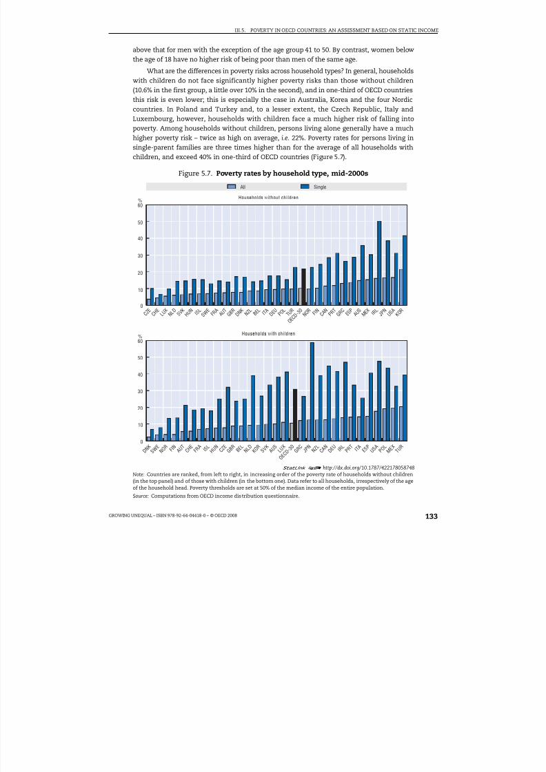
8/20/2019 Growing Unequal
http://slidepdf.com/reader/full/growing-unequal 133/309
III.5. POVERTY IN OECD COUNTRIES: AN ASSESSMENT BASED ON STATIC INCOME
GROWING UNEQUAL – ISBN 978-92-64-04418-0 – © OECD 2008 133
above that for men with the exception of the age group 41 to 50. By contrast, women belowthe age of 18 have no higher risk of being poor than men of the same age.
What are the differences in poverty risks across household types? In general, householdswith children do not face significantly higher poverty risks than those without children(10.6% in the first group, a little over 10% in the second), and in one-third of OECD countriesthis risk is even lower; this is especially the case in Australia, Korea and the four Nordiccountries. In Poland and Turkey and, to a lesser extent, the Czech Republic, Italy andLuxembourg, however, households with children face a much higher risk of falling intopoverty. Among households without children, persons living alone generally have a muchhigher poverty risk – twice as high on average, i.e. 22%. Poverty rates for persons living insingle-parent families are three times higher than for the average of all households withchildren, and exceed 40% in one-third of OECD countries (Figure 5.7).
Figure 5.7. Poverty rates by household type, mid-2000s
1 2 http://dx.doi.org/10.1787/422178058748
Note: Countries are ranked, from left to right, in increasing order of the poverty rate of households without children(in the top panel) and of those with children (in the bottom one). Data refer to all households, irrespectively of the ageof the household head. Poverty thresholds are set at 50% of the median income of the entire population.
Source: Computations from OECD income distribution questionnaire.
60
50
40
30
20
10
0
60
50
40
30
20
10
0
%
%
Households without children
Households with children
C Z E
C H E
L U X
N L D
S V K
H U N
I S L
S W E
F R A
A U T
G B R
D N K
N Z L
B E L
I T A D E U
P O L
T U R
O E C D
- 3 0
N O R
F I N C A N
P R T
G R C
E S P
A U S
M E X
I R L
J P N
U S A
K O R
D N K
S W E
N O R
F I N A U T
C H E
F R A
I S L
H U N
C Z E
G B R
B E L
N L D
K O R
S V K
A U S
L U X
O E C D
- 3 0
G R C
J P N
N Z L
C A N
D E U
I R L
P R T
I T A
E S P
U S A
P O L M E X T U
R
All Single
8/20/2019 Growing Unequal
http://slidepdf.com/reader/full/growing-unequal 134/309
III.5. POVERTY IN OECD COUNTRIES: AN ASSESSMENT BASED ON STATIC INCOME
GROWING UNEQUAL – ISBN 978-92-64-04418-0 – © OECD 2008134
Changes in poverty risks by household type over time have been small and mainlylimited to single persons. On average, and in most OECD countries, the poverty risk of couples without children is around half that of the total population, while that of coupleswith children is slightly below average. Conversely, lone parents have a probability of falling into poverty that is around three times higher than average, with little change in the
past decade. The situation for single persons without children (including both working-ageand retirement-age adults) improved over the past decade.
Poverty among people of working age: the role of paid work
Across the OECD area, around 9% of people of working age had a household disposableincome below the 50% threshold in the mid-2000s, a share that has increased by 0.6 pointin the past decade. Poverty rates have decreased recently only in seven OECD countries,and then only slightly. While poverty rates among people belonging to this group dependon a range of factors, the most important is whether household members have a paid job.Table 5.1 shows that among all those belonging to a household with a head of working age,
those living in households where no one works have a poverty rate of 36% on average, i.e.almost three times higher than in households with one worker, and 12 times higher thanhouseholds with two or more workers. The poverty rate of households with no workers isabove 50% in Australia, Canada, Ireland, Korea, and the United States but below 20% inDenmark, Hungary, Luxembourg, Switzerland and Turkey. Moreover, during the pastdecade the poverty rate among non-working households has increased considerably (bymore than 3 percentage points on OECD average), while it increased by much less (by1.6 points) for households with one worker, and remained almost at the same level forhouseholds with two or more workers.
Because households with workers have lower poverty rates than other households,countries with a higher employment rate for people of working age also tend to record alower poverty rate among the same group (Figure 5.8, left-hand panel), although with alarge variation across countries. Some countries such as Japan or the United Statescombine high employment rates with above-average poverty rates, while the inverse is thecase in Hungary.
The effect of paid work in reducing poverty among households with a head of working age is also evident when looking at the type of job held, i.e. whether working full or part
time. Among single adult households (with and without children), 46% of people in joblesshouseholds have, on average, income below the 50% threshold. This proportion declines to
28% when the single adult in these families works part time and to 8% when the personworks full time. Among people living in couple families, around 33% have income below the50% poverty line when no one in the household has a paid job. The poverty rate is thus lowerfor jobless couples than for singles, especially when they have children, reflecting the moregenerous out-of-work transfers available. The poverty rate falls to 19% when one householdmember is working part time and to around 4% when at least one is working full time.
Despite the importance of paid work for reducing poverty, many households withworkers have income below the 50% poverty line. On average, people living in householdswith workers account for around 60% of the income poor, with this share ranging fromaround 25% in Australia and Norway to 80% or more in Japan, Greece, Luxembourg, Turkey,
Iceland and Mexico (Figure 5.9). While most of these poor households have only oneworking member, those with two or more workers account for as much as 17% of all theincome poor on average, and for more than one-third in Japan, Turkey, Iceland and

8/20/2019 Growing Unequal
http://slidepdf.com/reader/full/growing-unequal 135/309
GR OWI N G UNE Q UAL –I S B N 9 7 8 - 9 2 - 6 4 - 0 4 4 1 8 - 0 – © OE C D2 0 0 8
1 3 5
Table 5.1. Poverty rates for people of working age and for households with a working-age head,
Poverty among peopleof working age
Poverty in households with a head of working age
AllNo
workersOne
workerTwo
workersAll
Noworkers
Oneworker
Twoworkers
Single
Mid-2000s
Pointchanges
since 1995Level, mid-2000s Point changes since mid-1990s Not
workingWorkinpart-tim
Australia 10 1.2 10 55 7 1 0.4 9.0 –0.5 0.2 72 12
Austria 7 2.2 6 22 6 3 3.6 1.3 1.7 6.1 31 17Belgium 7 0.5 8 25 8 2 0.0 6.7 0.7 –0.8 29 18Canada 10 0.9 13 66 21 4 2.5 6.2 6.1 1.2 79 50Czech Republic 5 0.7 6 38 7 0 0.9 2.9 –2.0 0.1 56 [. .]Denmark 5 1.2 5 18 8 1 1.0 4.8 1.5 0.3 22 28Finland 7 1.7 6 34 10 1 1.8 13.4 1.2 –0.2 47 13France 7 –0.6 7 22 10 2 0.1 7.6 0.1 –0.7 31 8Germany 8 0.8 12 40 7 1 3.4 4.7 1.9 –0.1 49 32Greece 9 –1.2 10 26 18 3 –0.5 4.7 3.6 –1.2 33 34Hungary 7 1.0 7 19 6 4 0.2 –4.9 –4.6 –0.7 39 [. .]Iceland 7 . . 7 28 19 4 . . . . . . . . 23 25Ireland 12 3.3 13 63 15 2 . . . . . . . . 75 36Italy 10 –2.8 11 36 16 1 –3.1 –2.2 –1.3 –3.1 40 50Japan 12 0.4 12 42 14 9 0.8 2.2 1.3 –0.3 57 . .
Korea 12 . . 11 58 13 4 . . . . . . . . 53 . .Luxembourg 8 2.8 9 19 15 3 3.3 7.3 7.3 1.6 28 35Mexico 15 –2.2 18 37 26 10 –2.9 –3.5 –0.2 –3.5 30 . .Netherlands 7 0.7 8 34 13 2 1.4 6.5 5.9 1.0 40 . .New Zealand 11 3.3 12 46 19 4 2.5 15.2 8.5 0.1 51 41Norway 7 1.0 6 38 4 0 0.9 1.0 0.0 0.2 47 [. .]Poland 14 . . 16 33 23 5 . . . . . . . . 40 . .Portugal 11 –0.4 11 37 24 3 0.0 –2.4 3.3 0.2 58 31Slovak Republic 8 . . 9 38 15 1 . . . . . . . . 35 21Spain 11 –0.4 11 49 18 4 –0.2 9.6 1.5 1.5 62 27Sweden 5 1.0 5 23 9 1 1.4 7.6 2.6 0.2 23 16Switzerland 7 0.5 6 19 4 5 0.5 4.2 3.7 –1.4 21 [. .]Turkey 14 0.4 17 19 17 18 1.8 –11.5 –0.1 4.2 33 [. .]United Kingdom 7 –0.3 8 33 7 1 –2.1 –2.7 –1.9 0.0 38 11
United States 15 1.0 16 71 25 5 0.0 –3.2 –0.8 –0.4 80 54OECD 9 0.6 10 36 14 3 0.7 3.4 1.6 0.2 46 28
1
Note: Poverty thresholds are set at 50% of the median income of the entire population. Data for changes refer to the period from the mid-1990s Republic, Ireland, Portugal and Spain (where 2005 data, based on EU-SILC, are not comparable with those for earlier years); and to changes frthat the sample size is too small.Source: Computations from OECD income distribution questionnaire.

8/20/2019 Growing Unequal
http://slidepdf.com/reader/full/growing-unequal 136/309
III.5. POVERTY IN OECD COUNTRIES: AN ASSESSMENT BASED ON STATIC INCOME
GROWING UNEQUAL – ISBN 978-92-64-04418-0 – © OECD 2008136
Switzerland. While such large cross-country differences may partly reflect differences inthe way different sources define “workers”, they also suggest that other factors beyondaccess to paid work – such as the number of hours worked each year and the hourly wagereceived – contribute to the risk of insufficient economic resources. Indeed, out of the18 OECD countries where wages are subject to statutory minima, only in 8 (Luxembourg,
the Czech Republic, Japan, New Zealand, Poland, Ireland and Australia) the net income of minimum wage earners with inactive spouses in the 2005 was high enough to keep afamily with two children out of poverty (OECD, 2007).14
Figure 5.8. Poverty and employment rates, around mid-2000s
1 2
http://dx.doi.org/10.1787/422187281362Note: Poverty thresholds are set at 50% of the median income of the entire population. Employment rates of personsof working age in 2003; employment rates of mothers in 2002.
Source: Computations from OECD income distribution questionnaire.
Figure 5.9. Shares of poor people by number of workers in the householdwhere they live, mid-2000s
Percentage of poor people living in households with a head of working age
1 2 http://dx.doi.org/10.1787/422210017310Note: Poverty thresholds are set at 50% of the median income of the entire population. Countries are ranked, from leftto right, in increasing order of the share of poor people living in households with no workers.
Source: Computations from OECD income distribution questionnaire.
25
20
15
10
5
040 50 60 70 80 90
16
14
12
10
8
6
4
2
040 60 7050 80
AUS
AUT
BEL
CAN
CZE DNK
FINFRA
DEUGRC
HUN
IRL
ITA
JPNKOR
MEX
NLD
NZLPRT
SVK
ESP
SWECHE
TUR
GBR
USA
NOR
POL
AUS
AUT
BEL
CAN
CZE
DNKFIN
FRA
DEU
GRC
HUN
IRLITA
JPNLUX
NLD
NZL
NOR
SVK
ESP
SWE
CHEGBR
USA
Employment rate, working-age population, % Employment rate of mothers, %
Poverty rate, working-age population, % Poverty rate of children, %
People of working age Children and mothers
H U N
N O R
A U S
G B R
D E U
C Z E
B E L
I R L
S V K
C A N F
I N A U T
F R A
D N K
N L D
N Z L I T
A C H E
K O R
P O L
U S A
S W E
E S P
P R T
L U X
J P N
G R C
T U R I S
L M E X
%100
80
60
40
20
0
O E C
D - 3 0
No workers One worker Two or more workers

8/20/2019 Growing Unequal
http://slidepdf.com/reader/full/growing-unequal 137/309
III.5. POVERTY IN OECD COUNTRIES: AN ASSESSMENT BASED ON STATIC INCOME
GROWING UNEQUAL – ISBN 978-92-64-04418-0 – © OECD 2008 137
Poverty among families with children: maternal employment and number of children
In the mid-2000s, one child out of eight (12.4%) lived in households with equivalisedincome below the 50% median threshold, with a slightly lower share for people inhouseholds with children (i.e. including adult members). Both shares increased in the pastdecade by more than for the population as a whole. Child poverty increased by 4 points ormore in Austria, Germany, Luxembourg and Turkey, while it declined slightly in Australia,Belgium, Hungary, and the United States and, more strongly, in Italy, Mexico and the UnitedKingdom.
Both the living arrangements and the employment status of parents shape the povertyrisks of children, as can be seen in Table 5.2. Children living with a single adult have ahigher probability of being in poverty than those living with two adults, and this holds forboth working and non-working parents, although there are some exceptions anddifferences are not always large. Conversely, children whose parents are employed havemuch lower poverty than those in jobless households. Among single-parent families, the
poverty rate of those in jobless households is 2.6 times higher than that of households withworkers (Figure 5.10, top panel); among couples with children, the poverty rate of joblesshouseholds is three times higher than for one-worker households, and 12 times higherthan for households with two or more workers (bottom panel). OECD countries with alarger share of mothers in paid work also record lower poverty rates among children(Figure 5.8, right-hand panel).
The risk of falling into poverty also depends on the number of children in thehousehold. Poverty rates generally increase monotonically with the number of childrenpresent, although there are exceptions (Table 5.2, final three columns). In general, povertyrates of families with two children are only slightly above those of families with only one
child. Poverty rates, however, increase more substantially when a third (or more) child ispresent in the family, especially in Ireland, Mexico, Poland, the United Kingdom and theUnited States. Conversely, in Australia, Austria and the Nordic countries, no significantincrease occurs. While the general pattern of poverty rates increasing with the number of children may to some extent reflect the arbitrary nature of the elasticity of householdneeds to household size used here (i.e. a greater increase in household needs for eachadditional member than is actually the case), it may also reflect genuine strains on thehousehold finances of larger families due to rising child costs.
Poverty among the elderly: the impact of earnings and living arrangements
Recent trends in poverty for elderly persons (those aged over 65) contrast with thosefor other age groups. On average, the poverty rate of elderly people fell slightly (by0.5 percentage point), with a similar fall for persons living in households with a head of retirement age. Country experiences were, however, diverse. In five countries (Austria, theCzech Republic, Greece, Norway and Turkey) the decrease in income poverty wasparticularly pronounced (at 5 points or more), while sizeable increases were recorded inAustralia, Finland, Sweden, Switzerland and particularly in Ireland.
In many OECD countries, the effective retirement age has risen recently. Nevertheless,at 27%, the share of elderly people who work (or live with persons who work) has remainedremarkably stable over the past ten years. Poverty rates among elderly households with
work are much lower than for those without (7% and 17%, respectively, Table 5.3),especially in Australia, France, Germany, Greece, Ireland, Italy, Norway, Portugal and the
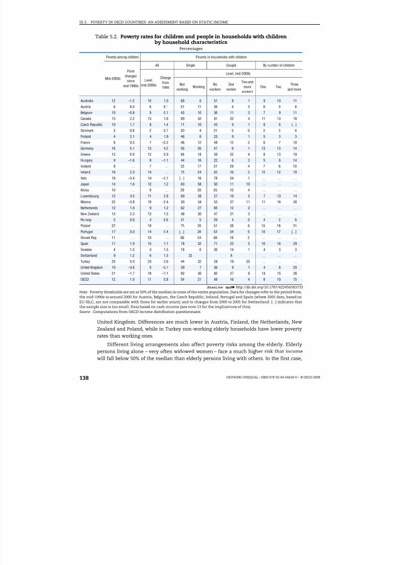
8/20/2019 Growing Unequal
http://slidepdf.com/reader/full/growing-unequal 138/309

8/20/2019 Growing Unequal
http://slidepdf.com/reader/full/growing-unequal 139/309
III.5. POVERTY IN OECD COUNTRIES: AN ASSESSMENT BASED ON STATIC INCOME
GROWING UNEQUAL – ISBN 978-92-64-04418-0 – © OECD 2008 139
poverty rates exceed 40% in Australia, Ireland, Japan, Korea, Mexico and the United States,countries with more limited public pension schemes. However, poverty rates have declinedmore significantly among the single elderly than among multiple-person households.
The role of household taxes and public cash transfers in reducingincome poverty
In all OECD countries, public cash benefits and household taxes significantly reducepoverty. One measure of this is the difference between poverty rates based on disposableincomes (the income concept used so far) and those based on market income.15 The left-
hand panel of Figure 5.11 highlights differences across countries in the role of governmenttaxes and cash benefits in reducing poverty. The point differences range from less than10 points in Korea, Switzerland and the United States to more than 23 points in Belgium
Figure 5.10. Poverty risk of jobless households relative to those with workers,mid-2000s
1 2 http://dx.doi.org/10.1787/422228452208Note: The poverty risk is defined as poverty rate of non-working households divided by poverty rate of working households.
Source: Computations from OECD income distribution questionnaire.
12
10
8
6
4
2
0
100
80
60
40
20
0
M E X
J P N
K O R I S
L T U R
N Z L
L U X
D E U
N L D
E S P
U S A
H U N
C A N
S V K
S W E
P O L I R
L F R A B
E L G R C
A U T
D N K
G B R
N O R C
Z E F I N
A U S
12
10
8
6
4
2
0
T U R
P R T
L U X
G R C I S
L P O L
M E X
N Z L
S W E
F I N
E S P
U S A I T
A H U N B
E L I R L
C A N
S V K
D N K
G B R
F R A
C Z E
J P N
N L D
A U S
K O R
N O R
A U T
D E U
Single parent households
Relative to couples with children and two workers (right scale)
Relative to couples with children with one worker (left scale)
O E C
D - 2 7
Couple with children
O E C
D - 2 9

8/20/2019 Growing Unequal
http://slidepdf.com/reader/full/growing-unequal 140/309
III.5. POVERTY IN OECD COUNTRIES: AN ASSESSMENT BASED ON STATIC INCOME
GROWING UNEQUAL – ISBN 978-92-64-04418-0 – © OECD 2008140
and France, while the percentage difference in poverty headcounts due to the combinedeffect of household taxes and public cash transfers ranges from 12% in Korea to 80% inDenmark and Sweden, and is a little over 60% on average. These large cross-countrydifferences in the poverty-reducing effects of public cash transfers and household taxes –
and the significant negative correlation between disposable income poverty and thepoverty-reduction effects of net public transfers – imply that countries with higher market-income poverty are not necessarily those with higher poverty based on final income.
Table 5.3. Poverty rates among the elderly and people living in householdswith a retirement-age head by household characteristics
Poverty among peopleof retirement age
Poverty in households with a head of retirement age
Mid-2000sPointchangessince
mid-1990s
All Working Not working Singles Couples
Mid-2000s
Pointchangesince
mid-1990s
Mid-2000s
Pointchangesince
mid-1990s
Mid-2000s
Pointchangesince
mid-1990s
Mid-2000s
Pointchangesince
mid-1990s
Mid-2000s
Pointchangesince
mid-1990s
Australia 27 4.6 27 5.6 4 3.2 32 5.4 50 –4.8 18 9.8
Austria 7 –5.7 8 –6.0 7 5.3 9 –7.6 16 –11.6 4 0.2
Belgium 13 –3.5 12 –2.3 4 –0.6 13 –3.7 17 –6.8 10 0.1
Canada 4 1.5 7 3.2 2 0.7 10 4.8 16 7.3 4 1.8
Czech Rep. 2 –6.5 3 –5.8 [. .] [. .] 3 –6.2 6 –19.1 2 0.5
Denmark 10 –2.1 10 –2.2 2 0.6 12 –2.3 17 –4.4 4 0.3
Finland 13 5.3 14 5.9 11 7.7 14 5.5 28 12.5 4 2.3
France 4 –0.2 9 –2.1 1 –5.9 9 –1.4 16 0.2 4 –2.4Germany 10 –0.6 8 –1.6 2 –4.7 9 –1.2 15 0.2 5 –1.8
Greece 23 –6.6 21 –7.0 7 –10.5 31 –3.1 34 –4.5 18 –7.1
Hungary 5 –2.5 5 –2.9 [. .] [. .] 5 –5.2 11 –6.9 1 –2.7
Iceland 5 . . 5 . . 3 . . 7 . . 10 . . 2 . .
Ireland 31 18.8 25 . . 5 . . 36 . . 65 . . 9 . .
Italy 13 –2.3 13 –2.1 3 0.4 17 –4.5 25 –7.5 9 –1.2
Japan 22 –1.0 21 –1.1 13 –1.8 30 –7.6 48 –7.9 17 –1.5
Korea 45 . . 49 . . 35 . . 69 . . 77 . . 41 . .
Luxembourg 3 –1.8 3 –1.6 [. .] [. .] 4 –5.4 4 –5.6 3 –6.4
Mexico 28 –4.6 23 –8.6 19 –9.1 39 –7.9 45 –5.9 21 –9.2
Netherlands 2 0.9 2 0.8 2 1.1 2 0.7 3 –0.1 2 1.3
New Zealand 2 0.2 4 2.5 1 –3.8 2 1.6 3 2.1 1 –0.1Norway 9 –6.8 9 –7.1 1 –1.1 10 –7.9 20 –13.8 1 –2.1
Poland 5 . . 6 . . 6 . . 6 . . 6 . . 6 . .
Portugal 17 –1.1 20 –2.2 5 –4.6 25 –1.0 35 –4.8 16 –2.0
Slovak Rep. 6 . . 4 . . [. .] [. .] 7 . . 10 . . 3 . .
Spain 17 –1.1 27 16.8 12 –4.3 32 23.3 39 32.7 24 12.6
Sweden 8 4.0 6 2.7 3 1.1 7 3.2 13 5.8 1 0.5
Switzerland 18 4.3 18 –1.8 [. .] [. .] [. .] [. .] 24 6.1 15 3.4
Turkey 15 –8.1 18 –4.1 20 0.6 16 –16.4 38 –6.2 17 –4.0
United Kingdom 10 –2.1 10 –0.8 1 0.1 12 –2.5 17 –0.9 7 –1.3
United States 24 2.9 24 3.2 9 1.4 34 5.0 41 3.0 17 3.2
OECD 13 –0.5 14 –0.7 7 –1.2 17 –1.4 25 –1.6 9 –0.4
1 2 http://dx.doi.org/10.1787/422457006467Note: Poverty thresholds are set at 50% of the median income of the entire population. Data for mid-2000s refer to around 2000 for Japan and Switzerland. Data for changes refer to the period from the mid-1990s to around 2000 for Austria, Belgium, Czech Republic,Denmark, France, Ireland, Portugal and Spain (where 2005 data, based on EU-SILC, are not comparable with those for earlier years).[. .] indicates that the sample size is too small. Data based on cash income (see note 13 for the implications of this).Source: Computations from OECD income distribution questionnaire.
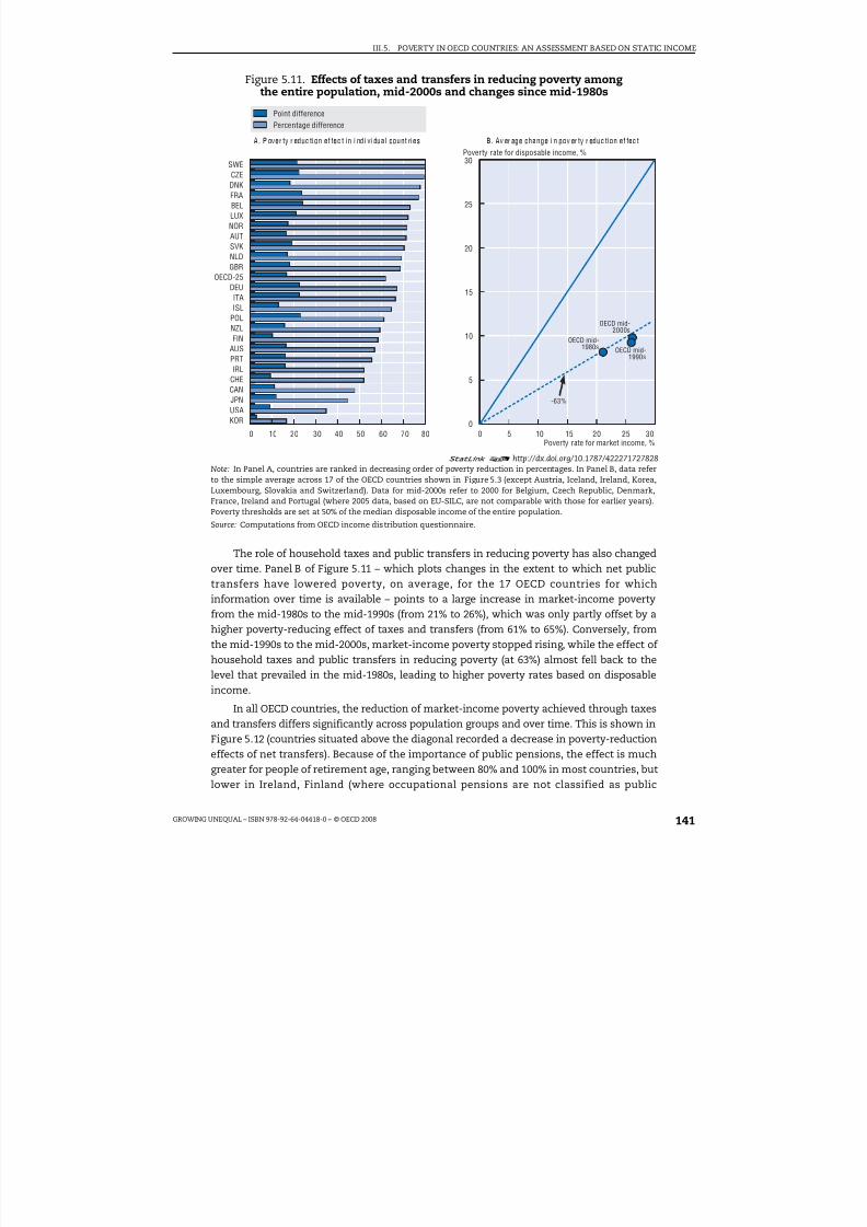
8/20/2019 Growing Unequal
http://slidepdf.com/reader/full/growing-unequal 141/309
III.5. POVERTY IN OECD COUNTRIES: AN ASSESSMENT BASED ON STATIC INCOME
GROWING UNEQUAL – ISBN 978-92-64-04418-0 – © OECD 2008 141
The role of household taxes and public transfers in reducing poverty has also changedover time. Panel B of Figure 5.11 – which plots changes in the extent to which net publictransfers have lowered poverty, on average, for the 17 OECD countries for which
information over time is available – points to a large increase in market-income povertyfrom the mid-1980s to the mid-1990s (from 21% to 26%), which was only partly offset by ahigher poverty-reducing effect of taxes and transfers (from 61% to 65%). Conversely, fromthe mid-1990s to the mid-2000s, market-income poverty stopped rising, while the effect of household taxes and public transfers in reducing poverty (at 63%) almost fell back to thelevel that prevailed in the mid-1980s, leading to higher poverty rates based on disposableincome.
In all OECD countries, the reduction of market-income poverty achieved through taxesand transfers differs significantly across population groups and over time. This is shown inFigure 5.12 (countries situated above the diagonal recorded a decrease in poverty-reduction
effects of net transfers). Because of the importance of public pensions, the effect is muchgreater for people of retirement age, ranging between 80% and 100% in most countries, butlower in Ireland, Finland (where occupational pensions are not classified as public
Figure 5.11. Effects of taxes and transfers in reducing poverty amongthe entire population, mid-2000s and changes since mid-1980s
1 2 http://dx.doi.org/10.1787/422271727828Note: In Panel A, countries are ranked in decreasing order of poverty reduction in percentages. In Panel B, data referto the simple average across 17 of the OECD countries shown in Figure 5.3 (except Austria, Iceland, Ireland, Korea,Luxembourg, Slovakia and Switzerland). Data for mid-2000s refer to 2000 for Belgium, Czech Republic, Denmark,France, Ireland and Portugal (where 2005 data, based on EU-SILC, are not comparable with those for earlier years).Poverty thresholds are set at 50% of the median disposable income of the entire population.
Source: Computations from OECD income distribution questionnaire.
30
25
20
15
10
5
00 10 20 30 40 50 60 70 80 0 10 155 20 25 30
A. Pover ty r educ tion ef fec t in individual count ries B. Average change in pover ty r educ tion ef fec t
Poverty rate for market income, %
Poverty rate for disposable income, %SWECZEDNKFRABELLUXNORAUTSVKNLDGBR
OECD-25DEUITAISL
POLNZLFIN
AUS
PRTIRL
CHECANJPNUSAKOR
Point difference
Percentage difference
-63%
OECD mid-1980s OECD mid-
1990s
OECD mid-2000s

8/20/2019 Growing Unequal
http://slidepdf.com/reader/full/growing-unequal 142/309
III.5. POVERTY IN OECD COUNTRIES: AN ASSESSMENT BASED ON STATIC INCOME
GROWING UNEQUAL – ISBN 978-92-64-04418-0 – © OECD 2008142
transfers), France, Portugal, Australia, Japan and the United States. Changes in the size of this effect over the past decade have been minor, with the exceptions of Ireland and
Finland.The poverty-reducing effect of taxes and transfers is much smaller for people of
working age (around two-thirds, on average, of that for elderly people) and, to an evenlarger extent, for children (around 57% of that of the elderly). For both age groups, theimpact of taxes and transfers on reducing poverty has declined over time in most OECDcountries, generally with a larger reduction for people of working age than for children.16
The decline among children was especially large in Ireland (where data are limited to 2000),as well as New Zealand, Finland and Sweden (though from very high levels in the latter twocountries), while it increased in Italy and the United Kingdom and, to a lesser extent,Australia and the United States.
Differences across countries are also significant when looking at the experience of other demographic groups, although patterns may be affected by small sample sizes for
Figure 5.12. The effect of net transfers in reducing poverty among different groupsPercentage reductions of poverty rates, mid-1990s and mid-2000s
1 2 http://dx.doi.org/10.1787/422303818851Note: The effect of household taxes and government cash transfers in reducing poverty is measured by thepercentage difference between poverty rates based on market-income and disposable income, for a threshold set at50% of median disposable income for the entire population. Data for mid-1990s refer to 2000 for Switzerland and theUnited Kingdom. Data for mid-2000s refer to 2000 for Belgium, Czech Republic, Ireland and Portugal (where 2005 data,based on EU-SILC, are not comparable with those for earlier years).
Source: Computations from OECD income distribution questionnaire.
100
80
60
20
40
0
100
80
60
40
20
0
100
80
60
40
20
00 20 40 8060 100 0 20 40 8060 100 0 20 40 8060 100
100
60
80
40
20
0
100
80
60
40
0
20
100
80
60
40
0
20
0 4020 60 80 100 40200 60 80 100 0 20 40 60 80 100
AUS BEL
CAN
CZE
DNKFIN
FRA
DEUIRL ITA
JPN
NZL
NOR
PRT
SWE
GBRUSA
CHE
AUS
BEL
CAN
CZE
DNKFIN
FRADEU
IRL
ITA
JPN
NLDNZL
NOR
PRT
SWE
GBR
USA
CHE
AUS
BEL
CAN
CZE
DNK
FIN
FRA
DEU
IRL
ITA
NLD
NZL
NOR
PRT
SWE
GBR
USACHE
AUS
BEL
CANCZE
DNKFIN
FRA
DEU
ITA
JPN
NLD
NZL
NOR
PRT
SWE
GBR
USA
CHEAUS
BEL
CANCZE
DNKFIN
FRA
DEUJPN
NLD
NZLNOR
SWE
GBR
USA
AUS
BEL
CAN
CZE
DNK
FIN
FRA
DEUITA
JPN
NLDNZL
NOR
PRT
SWE
GBR
USA
CHE
Children Working-age population Retirement-age populationMid-1990s, % Mid-1990s, % Mid-1990s, %
Mid-2000s, %Mid-2000s, %Mid-2000s, %
Single parents Single parents not working Jobless householdsMid-1990s, % Mid-1990s, % Mid-1990s, %
Mid-2000s, %Mid-2000s, %Mid-2000s, %
OECD-19
OECD-18
OECD-15
OECD-18
OECD-19
OECD-19

8/20/2019 Growing Unequal
http://slidepdf.com/reader/full/growing-unequal 143/309
III.5. POVERTY IN OECD COUNTRIES: AN ASSESSMENT BASED ON STATIC INCOME
GROWING UNEQUAL – ISBN 978-92-64-04418-0 – © OECD 2008 143
some countries. For single parents, the effect of net public transfers in reducing poverty ishighest in Nordic countries and lowest in Italy, Japan, Portugal and the United States – andit declined in most countries over the past decade, with the main exception of Germany.This large cross-country variation partly reflects differences in the share of lone parentswho are working, rather than relying on benefits. The effect of net transfers is reducing
poverty among single parents who do not work is in all countries higher than in the case of single parents as a whole, although the extent to which this is true has diminished in amajority of countries during the past decade. For persons in jobless households in general(single parents or others), the effect of net benefits in reducing poverty is lowest inAustralia, Canada, France, Japan and the United States, and larger reductions (above 70%)are limited to the Czech Republic, Denmark and Sweden.17
These cross-country differences in the poverty-reducing effects of net public transferspartly reflect their overall size, and, as people at the bottom of the income scale typicallypay few taxes, mainly the size of cash transfers to households. The poverty-reducing effectalso depends on the nature of these programmes and on the characteristics of theirrecipients. Figure 5.13 plots cash social transfers (both public and mandatory private ones)as a share of GDP, against the (disposable income) poverty rate, based on a threshold set athalf of the median, separately for people of working age and retirement age. The left-handpanel suggests a significant negative relation between the two variables, with countriesspending more on social transfers towards people of working age also achieving lowerpoverty rates, although with large differences in poverty outcomes among countries withhigher levels of social spending.18 No similar relation exists for elderly people. While thispattern reflects the earnings-related nature of old-age pensions in most OECD countries, it
Figure 5.13. Poverty rates and social spending for people of working ageand retirement age, mid-2000s
1 2 http://dx.doi.org/10.1787/422333665216Note: Poverty rates based on a threshold set at half of median household disposable income. Social spending includesboth public and mandatory private spending in cash (i.e. excluding in-kind services). Social spending for people of working age is defined as the sum of outlays for incapacity, family, unemployment, housing and other ( i.e. socialassistance) programmes; social spending for people of retirement age is the sum of outlays for old-age and survivorsbenefits. Social spending is expressed in percentage of GDP at factor costs. Data on poverty rates refer to themid-2000s for all countries; data for social spending refer to 2003 for all countries except Turkey (1999).
Source: Computations from OECD income distribution questionnaire and OECD Social Expenditure database (SOCX).
Social spending for working-age people, % of GDP Social spending for elderly people, % of GDP
Poverty rate, % Poverty rate, %
People of working age People of retirement age
32
28
24
20
16
12
8
4
00 2 4 6 8 10 12 14 16
16
14
12
10
8
6
4
2
00 2 31 5 6 7 84 9
AUS
AUT
BEL
CAN
CZE DNK
FINFRA
DEU
GRC
HUN ISL
IRL
ITA
JPN
KOR
LUX
MEX
NLD
NZL
NOR
POL
PRT
SVK
ESP
SWE
CHE
TUR
GBR
USA
OECD-30
AUS
AUT
BEL
CAN
CZE
DNKFIN
FRADEU
GRC
HUNISL
IRL
ITA
JPN
LUX
MEX
NLDNZL
NOR
POL
PRT
SVK
ESP
SWE
CHETUR
GBR
USA
OECD-30

8/20/2019 Growing Unequal
http://slidepdf.com/reader/full/growing-unequal 144/309
III.5. POVERTY IN OECD COUNTRIES: AN ASSESSMENT BASED ON STATIC INCOME
GROWING UNEQUAL – ISBN 978-92-64-04418-0 – © OECD 2008144
also suggests that larger inroads into reducing poverty could be achieved by redirecting spending from pension programmes towards programmes targeted to people of working age and their children at the bottom of the income scale.
Accounting for changes in poverty rates since the mid-1990s
Although both taxes and public transfers reduce poverty at a point in time, they alsodistort decisions of private agents in terms of employment and work efforts. Marginaleffective tax rates, which are one cause of these distortions, are typically high at the lowerend of the income distribution, and they may contribute both to poverty traps among people relying on benefits and to a reduced work effort by low-paid workers. Reformsimplemented by several OECD countries during the second half of the 1990s (generally inthe form of earnings top-up or working tax credits for low-paid workers, and of help topersons relying on benefits to move to employment) have aimed at reducing thesedistortions so as to improve work incentives for individuals with low income.
How have these reforms affected changes in poverty? Efforts to address this questionhave typically followed two tracks. The first uses individual records to assess what povertyrates would be today if the structure of wages, working hours and government benefits hadremained at some base-year level; while this approach does not account for behaviouralchanges following reforms, it allows tracking the same individual over time.19 A secondapproach, which is easier to implement when comparing a large number of countries,relies on aggregate data.20 This approach is used here to account for changes in relativepoverty rates (based on a 50% of median income threshold), separately for people living inhouseholds with a head of working age (65 or less) and of retirement age (66 or more). Asimple shift-share analysis allows decomposing changes in poverty rates of each
household type into three components:● the part due to changes in market-income poverty for each of several groups within the
two household types, while keeping constant both the structure of the population andthe effect of taxes and transfers in reducing poverty for each group;
● the part due to changes in the effect of taxes and transfers in reducing market-incomepoverty for each group, for a given population structure and market-rate poverty for eachgroup; and
● the part due to changes in the structure of the population by both household type andnumber of workers in each household, for a given market-income poverty rate and levelof effectiveness of tax and transfers in reducing poverty in that group.21
While decompositions of this type do not reflect the complex links between each pairof variables,22 they do provide a convenient summary of the role of various factors; at thesame time, because of the detailed breakdown used, results may be affected by the smallsample sizes of some surveys.
Table 5.4 shows results for changes in poverty rates for persons living in householdswith a head of working age in the period from the mid-1990s to the mid-2000s for selectedOECD countries. In addition to the total change in the poverty rate of all people living inhouseholds with a working-age head (shown in the third column), the table shows theresults from a decomposition based on all household categories (ten groups overall, in
Panel A), and then separately when controlling only for changes in the number of workersin each household (distinguishing between no worker, one and two workers, in Panel B)and in the living arrangement of each household (single and couples, with and without

8/20/2019 Growing Unequal
http://slidepdf.com/reader/full/growing-unequal 145/309
III.5. POVERTY IN OECD COUNTRIES: AN ASSESSMENT BASED ON STATIC INCOME
GROWING UNEQUAL – ISBN 978-92-64-04418-0 – © OECD 2008 145
children, in Panel C). In the case of Australia, for example, the poverty rate of persons living in households with a head of working age increased by 0.4 point from 1995 to 2004 (from10% to 10.4%) as a higher market-income poverty for each group and a lower poverty-reducing effect of taxes and transfers raised poverty (by 0.6 and 0.7 point each) while
changes in population structure (towards household groups with a lower poverty rate)lowered it (by 0.9 point).
On average, across the 14 countries included in Table 5.4, poverty rates of people living in a household with a head of working age increased by around 1 percentage point over thepast ten years, while the rates declined in the United Kingdom and, more significantly, inItaly. The largest part of the increase in poverty rates reflected lower net public transfers tohouseholds at the bottom of the income scale (in most countries except France, Italy and Japan).23 There are greater differences across countries in the extent to which changes inmarket-income poverty for each group contributed to developments in the povertyheadcount, with rises in market-income poverty both on average and in most countries
(especially in Italy, New Zealand, Australia and Canada) and declines in the Nordiccountries as well as the United Kingdom and the United States. Changes in the structure of
Table 5.4. Decomposition of the change in poverty rates among people livingin households with a working-age head by selected components
Point changes
Totalchange
in povertyrate
Controlling for changes by:
A. Work attachment
and household type B. Work attachment only C. Household type only
Due to changes in:
Market-incomepoverty
Taxes andpublic cashtransfers
Change inweights
Market-incomepoverty
Taxes andpublic cashtransfers
Change inweights
Market-incomepoverty
Taxes andpublic cashtransfers
Change inweights
Australia 1995-2004 0.4 0.6 0.7 –0.9 0.4 0.9 –0.9 –0.6 0.2 0.7
Canada 1995-2005 2.5 0.7 2.4 –0.7 0.3 2.6 –0.4 0.0 2.1 0.3
Denmark 1995-2005 1.0 –0.2 1.1 0.1 –0.2 1.3 0.0 –0.3 1.1 0.2
Finland 1995-2004 1.8 –1.0 2.2 0.5 –0.9 2.0 0.7 –0.7 2.2 0.3
France 1996-2005 0.0 0.5 –0.3 –0.2 1.0 –0.5 –0.4 0.2 –0.4 0.2
Germany 1995-2004 3.4 0.2 0.6 2.6 0.1 1.6 1.7 1.3 0.7 1.5
Italy 1995-2004 –3.1 2.1 –3.5 –1.7 1.5 –3.7 –0.9 0.1 –3.3 0.1Japan 1994-2003 0.8 0.2 –0.2 0.8 0.9 –0.4 0.3 0.7 –0.5 0.5
Netherlands 1995-2004 0.7 0.3 0.8 –0.4 0.6 1.0 –0.9 –0.9 1.1 0.6
New Zealand 1995-2003 2.5 1.9 2.4 –1.7 1.5 2.6 –1.6 0.0 2.9 –0.4
Norway 1995-2004 0.9 –0.6 0.6 0.8 –0.5 0.7 0.7 0.1 0.5 0.3
Sweden 1995-2004 1.4 –0.6 2.2 –0.1 –0.8 2.3 0.0 –0.9 2.2 0.1
United Kingdom 1995-2005 –1.6 –1.0 0.0 –0.6 –0.9 –0.2 –0.5 –1.6 –0.1 0.2
United States 1995-2005 0.0 –0.4 0.1 0.2 –0.7 0.0 0.6 0.1 0.0 –0.2
OECD-14 0.8 0.2 0.7 –0.1 0.2 0.7 –0.1 –0.2 0.6 0.3
1 2 http://dx.doi.org/10.1787/422458127850Note: Poverty rates are based on a threshold set at 50% of equivalised household disposable income. The data shown are basedon a shift-share analysis applied to the population living in households with a head of working age, broken down by both work
attachment and household types (ten groups, in Panel A) as well as by work attachment only (distinguishing betweenhouseholds with no workers, with one adult working, and with two or more adults working, in Panel B) and by household type(distinguishing between singles and couple families, with and without children, in Panel C). Within each panel, the sum of thethree components (changes in market-income poverty, changes in the poverty-reducing effect of net public transfers, andchanges in weights) is equal to the total change in poverty rate (shown in Column 3). The analysis is limited to countries forwhich the data allow distinguishing between market- and disposable-income poverty.Source: Computations from OECD income distribution questionnaire.
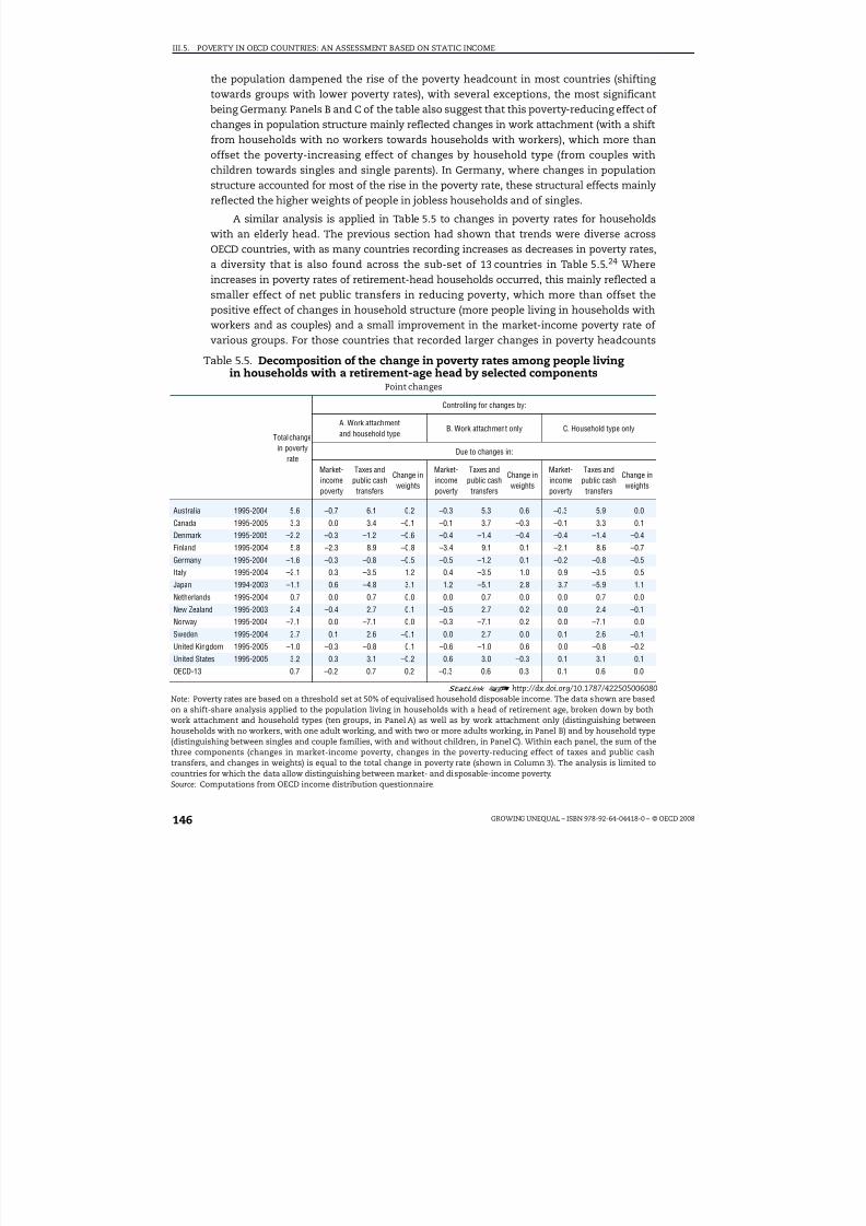
8/20/2019 Growing Unequal
http://slidepdf.com/reader/full/growing-unequal 146/309
III.5. POVERTY IN OECD COUNTRIES: AN ASSESSMENT BASED ON STATIC INCOME
GROWING UNEQUAL – ISBN 978-92-64-04418-0 – © OECD 2008146
the population dampened the rise of the poverty headcount in most countries (shifting towards groups with lower poverty rates), with several exceptions, the most significantbeing Germany. Panels B and C of the table also suggest that this poverty-reducing effect of changes in population structure mainly reflected changes in work attachment (with a shiftfrom households with no workers towards households with workers), which more than
offset the poverty-increasing effect of changes by household type (from couples withchildren towards singles and single parents). In Germany, where changes in populationstructure accounted for most of the rise in the poverty rate, these structural effects mainlyreflected the higher weights of people in jobless households and of singles.
A similar analysis is applied in Table 5.5 to changes in poverty rates for householdswith an elderly head. The previous section had shown that trends were diverse acrossOECD countries, with as many countries recording increases as decreases in poverty rates,a diversity that is also found across the sub-set of 13 countries in Table 5.5.24 Whereincreases in poverty rates of retirement-head households occurred, this mainly reflected asmaller effect of net public transfers in reducing poverty, which more than offset thepositive effect of changes in household structure (more people living in households withworkers and as couples) and a small improvement in the market-income poverty rate of various groups. For those countries that recorded larger changes in poverty headcounts
Table 5.5. Decomposition of the change in poverty rates among people livingin households with a retirement-age head by selected components
Point changes
Total changein poverty
rate
Controlling for changes by:
A. Work attachmentand household type
B. Work attachment only C. Household type only
Due to changes in:
Market-incomepoverty
Taxes andpublic cashtransfers
Change inweights
Market-incomepoverty
Taxes andpublic cashtransfers
Change inweights
Market-incomepoverty
Taxes andpublic cashtransfers
Change inweights
Australia 1995-2004 5.6 –0.7 6.1 0.2 –0.3 5.3 0.6 –0.3 5.9 0.0
Canada 1995-2005 3.3 0.0 3.4 –0.1 –0.1 3.7 –0.3 –0.1 3.3 0.1
Denmark 1995-2005 –2.2 –0.3 –1.2 –0.6 –0.4 –1.4 –0.4 –0.4 –1.4 –0.4
Finland 1995-2004 5.8 –2.3 8.9 –0.8 –3.4 9.1 0.1 –2.1 8.6 –0.7
Germany 1995-2004 –1.6 –0.3 –0.8 –0.5 –0.5 –1.2 0.1 –0.2 –0.8 –0.5
Italy 1995-2004 –2.1 0.3 –3.5 1.2 0.4 –3.5 1.0 0.9 –3.5 0.5
Japan 1994-2003 –1.1 0.6 –4.8 3.1 1.2 –5.1 2.8 3.7 –5.9 1.1
Netherlands 1995-2004 0.7 0.0 0.7 0.0 0.0 0.7 0.0 0.0 0.7 0.0
New Zealand 1995-2003 2.4 –0.4 2.7 0.1 –0.5 2.7 0.2 0.0 2.4 –0.1
Norway 1995-2004 –7.1 0.0 –7.1 0.0 –0.3 –7.1 0.2 0.0 –7.1 0.0
Sweden 1995-2004 2.7 0.1 2.6 –0.1 0.0 2.7 0.0 0.1 2.6 –0.1
United Kingdom 1995-2005 –1.0 –0.3 –0.8 0.1 –0.6 –1.0 0.6 0.0 –0.8 –0.2
United States 1995-2005 3.2 0.3 3.1 –0.2 0.6 3.0 –0.3 0.1 3.1 0.1
OECD-13 0.7 –0.2 0.7 0.2 –0.3 0.6 0.3 0.1 0.6 0.0
1 2 http://dx.doi.org/10.1787/422505006080Note: Poverty rates are based on a threshold set at 50% of equivalised household disposable income. The data shown are basedon a shift-share analysis applied to the population living in households with a head of retirement age, broken down by bothwork attachment and household types (ten groups, in Panel A) as well as by work attachment only (distinguishing betweenhouseholds with no workers, with one adult working, and with two or more adults working, in Panel B) and by household type(distinguishing between singles and couple families, with and without children, in Panel C). Within each panel, the sum of the
three components (changes in market-income poverty, changes in the poverty-reducing effect of taxes and public cashtransfers, and changes in weights) is equal to the total change in poverty rate (shown in Column 3). The analysis is limited tocountries for which the data allow distinguishing between market- and disposable-income poverty.Source: Computations from OECD income distribution questionnaire.

8/20/2019 Growing Unequal
http://slidepdf.com/reader/full/growing-unequal 147/309
III.5. POVERTY IN OECD COUNTRIES: AN ASSESSMENT BASED ON STATIC INCOME
GROWING UNEQUAL – ISBN 978-92-64-04418-0 – © OECD 2008 147
(rises in Australia, Canada, Finland, New Zealand, Sweden and the United States, and
declines in Denmark, Germany, Italy, Japan, Norway and the United Kingdom), changes in
the poverty-reducing effect of net public transfers played the most significant role.
Conclusion
Cash income in a given year is an imperfect yardstick to assess poverty. While
households with net income below a certain threshold may face a greater likelihood of
falling into poverty than others, they (or the community where they live) may not perceive
themselves as being “poor” in the way the term is commonly used. Further, the difficulties
in measuring income are much larger for those at the bottom of the income scale than for
people in the central part of the distribution. But, despite these limits, the measures of
household income used in this chapter highlight several patterns that are important for
assessing the conditions of the poor population and for improving the design of anti-
poverty programmes.
●
In the mid-2000s, the share of people at risk of poverty in OECD countries was 6%, for athreshold of 40% of median household income, 11% for a threshold of 50% and around
18% for a threshold of 60%. Differences across countries are large, with relative income
poverty rates always lowest – whatever the threshold used – in Denmark, Sweden and
the Czech Republic, and highest in the United States, Turkey and Mexico. The ranking of
countries does not change much based on a measure that combines both the incidence
and depth of poverty.
● Poverty rates (for a threshold of half of median income) increased on average by 0.6 point
in the decade from the mid-1980s to the mid-1990s, and by another 0.6 point from the
mid-1990s to the mid-2000s, with individual countries often experiencing contrasting
developments over these two periods. In the most recent decade, poverty rates increasedin a majority of OECD countries, while they declined only in Greece, Italy, Mexico and the
United Kingdom, by around 1 point or more. Poverty with a threshold “anchored” in time
fell, on average, by 40% since the mid-1990s, with larger declines in some countries and
rises since 2000 in Germany.
● The risk of poverty varies by individual and household characteristics. The U-shaped
relationship between age and poverty has shifted over the past two decades from people
above 50 years of age to people below that age. Women have higher poverty risks than
men, as more of them live alone in old age or head lone-parent families. The poverty risk
of single persons is twice as high as that of the population as a whole, and the risk for
single-parent families is three times as high.
● While both living arrangements and the employment status of household members
affect the poverty rate of various population groups, work is far more important.
Countries where the share of people of working age in paid employment is higher also
display lower poverty rates; and the same holds for the levels of employment of mothers
and child poverty.
● Work is, however, not the only factor shaping poverty. Across countries, there are large
differences in the poverty rates of jobless households and, on average, a majority of the
income poor in the OECD area belong to households with workers. In several countries,
even households where one member is working full time or households with more thanone person in work are not shielded from the risk of falling into poverty.

8/20/2019 Growing Unequal
http://slidepdf.com/reader/full/growing-unequal 148/309
III.5. POVERTY IN OECD COUNTRIES: AN ASSESSMENT BASED ON STATIC INCOME
GROWING UNEQUAL – ISBN 978-92-64-04418-0 – © OECD 2008148
● There are large differences across countries in the extent to which household taxes and
public cash transfers lower poverty rates. Changes in government redistribution dampened
the rise in poverty in the decade from the mid-1980s to the mid-1990s, but amplified it in the
following one. Countries with higher spending in social programmes targeted to people of
working age record lower poverty headcounts, while no such relation is evident for
programmes benefitting the elderly.
Notes
1. For example, while 4.6% of Australians have equivalised household disposable income of less than40% of the median in 2003-04, this proportion rises to 5.3% using a 41% cutoff and to 6.9% using a43% cutoff.
2. A threshold of 60% of median income is used as a benchmark for at-risk-of-poverty at the EU level,while the (absolute) poverty line used in the United States is closer to 40% of median income. As amid-point between these two levels, this chapter will mainly focus on a poverty threshold of 50%of median equivalised household disposable income.
3. For example, for a threshold of half of median income, the country with the 6th highest rate –Ireland – has a poverty rate more than twice as high as the country with the 6th lowest rate –France.
4. The cross-country correlation of poverty headcounts based on different thresholds is 0.96 forthresholds set at 50% and 60% of the median as well as those set at 40% and 50% of the median,and 0.90 for thresholds of 40% and 60%.
5. Figures presented refer to the average poverty gap. Estimates for the median poverty gap generallyresult in lower values – some 23% on average across OECD countries. The correlation coefficientbetween the two measures is 0.68.
6. This measure is sometimes taken to illustrate the size of the transfer of equivalised incomeneeded to raise all those living below the poverty line to that level. This interpretation neglects,however, behavioural changes due to, for instance, work disincentives.
7. Data for Belgium in 1983 and 1995 are based on fiscal data and are not strictly comparable withthose for later years. First, the unit of analysis is that of households filling a tax declaration.Second, the method used to integrate information on households who do not fill a questionnairediffers in the two years. Alternative estimates based on household surveys from the University of Antwerp suggest broad stability of the poverty headcount in the late 1980s and a slight increase inthe first half of the 1990s.
8. Changes in poverty headcounts based on a threshold set at 60% of median income (the one usedby EU countries) show a cumulative rise (across 24 OECD countries) of 1.7 points (i.e. above the risebased on a 50% threshold), with a stronger rise in the first decade than in the second one.
9. Data on poverty headcounts going back to the mid-1970s are available for seven OECD countries.These data show a decline in the 50% poverty headcount from the mid-1970s to the mid-1980s inCanada, Finland and Greece, stability in the Netherlands, Sweden and the United Kingdom, andsmall rises in the Unites States (see Figure 5.A2.1 available at http://dx.doi.org/10.1787/ 424402577838).
10. The EU set of social inclusion indicators includes a measure of the at-risk-of-poverty rate“anchored” in year t-3 and uprated by inflation over the following three years.
11. Real income growth will cause a greater reduction of “absolute” poverty rates in countries wherethe level of relative poverty was higher at the beginning of the period (Freeman, 2001). Estimates foradditional countries based on two different set of data and therefore not strictly comparablesuggest that “absolute” poverty has fallen by some 32-40% in Austria, Belgium and the CzechRepublic and by 60% or more in Ireland, Portugal and Spain.
12. The estimates of the elderly poverty rates shown in this report are very sensitive to methodologicalassumptions. First, the cash income definition used here exaggerates poverty rates of the elderlycompared to other groups: in Denmark, for example, the inclusion of imputed rents in the incomedefinition lowers the poverty headcount of the elderly from around 10% to around 4%, ascompared to a reduction from 5.3% to 4.7% for the entire population. Second, as old-age pensionsare often the main (or only) income source of the elderly, their cash income is typically clustered

8/20/2019 Growing Unequal
http://slidepdf.com/reader/full/growing-unequal 149/309
III.5. POVERTY IN OECD COUNTRIES: AN ASSESSMENT BASED ON STATIC INCOME
GROWING UNEQUAL – ISBN 978-92-64-04418-0 – © OECD 2008 149
around the prevailing pension rates, leading to high sensitivity of poverty estimates to smallchanges in the income threshold used: in Australia, for example, the income-poverty rate fallsfrom 26% for a threshold of 50% of median income, to 18% for a threshold of 47%. Third, estimatesare very sensitive to the equivalence scale used: in Australia, the elderly poverty rate at 50% of median income falls from 26% based on the 0.5 equivalence scale used in this report, to 17% basedon the “modified OECD equivalence scale” (where the first adult has a weight of 1.0, the second and
subsequent adults a weight of 0.5, and dependent children a weight of 0.3, which is closelyapproximated by an equivalence scale of 0.6) conventionally used by the Australian Bureau of Statistics.
13. In some countries, however, the opposite pattern prevails. In particular, the poverty rate of children and/or young adults fell during the most recent decade in Australia, Spain and the UnitedStates while that of elderly people increased (see Table 5.A2.2 available at http://dx.doi.org/10.1787/ 424402577838).
14. These estimates are based on a threshold of 50% of median income in the early 2000s, uprated forinflation to 2005.
15. OECD measures of market-income poverty refer to the share of people with market income belowa given threshold of household disposable income. Because of this definition, the differencebetween the poverty rates based on market and disposable income will reflect both the absolute
size of household taxes and public cash transfers, and the extent to which these are targeted to thepoor (see chapter 4).
16. Reforms implemented in this period in several OECD countries seem to have sheltered children(and their families) from the decline in the poverty-reducing effect of net benefits that affectedother families. This effect was felt fully in Australia, Germany, the Czech Republic and the UnitedStates and partially in most other countries. Conversely, there has been a trend for net transfers toreduce poverty less among children than for people of working age in Italy, Japan, Norway,Denmark and Sweden, as well as Belgium and Portugal (where time series data are limited to 2000).
17. In most OECD countries, benefits of last resorts paid to people of working age in 2005 were lowerthan the threshold of half of median income (as defined in endnote 14), although this varieddepending on whether additional housing benefits were available as well as on specific familyarrangements. In the case of a married couple with two children, the net income of socialassistance clients was above the threshold of half of median income only in Australia and Norway
under the assumption of no housing costs and benefits; when including additional benefitsconditional on rental expenditures, the list of OECD countries where the net income of socialassistance clients was above that threshold also included Austria, Denmark, Finland, Germany,Ireland, Sweden and the United Kingdom (OECD, 2007).
18. For example, the Czech Republic has the same poverty rate as Sweden with a level of socialspending that is 40% lower, while Poland’s poverty rate is twice as high as Hungary’s with the samespending level.
19. Based on this approach, Dickens and Ellwood (2001) argue that demographic conditions (e.g. agreater incidence of single-parent households), the earnings structure (e.g. wider earningsdistributions) and work efforts (i.e. the combined effect of changes in activity rates and hoursworked) account for comparable shares of the increase in relative poverty in the United Kingdomfrom 1979 to 1999, while greater generosity in government benefits contributed to reducing
poverty rates over the same period. In the United States, the increase in relative poverty over thesame period mainly reflected demographic changes and, to a lesser extent, changes in theearnings structure; greater work efforts contributed to reducing poverty, while changes ingovernment benefits did not exert a significant influence in either direction.
20. Most often, studies using aggregate data regress poverty rates against a range of possibledeterminants, and use results to compare situations at two points in time. However, results fromthis type of analysis have typically been found to be unstable and sensitive to the specificationused.
21. In this exercise, the aggregate poverty rate, at the level of disposable income, is defined as theweighted sum of group-specific poverty rates, with these rates expressed as the product of market-income poverty and of a coefficient indicating the effect of taxes and transfers in reducing market-income poverty.PRt = PRi
t * it = [PR(MI) it * (1 – ) it ] * i
t
where PR is the (disposable income) poverty rate of all people living in household with a head of working age at times t, PRi
t is the (disposable income) poverty rate of the different groups i withinall households with a head of working age; PR(MI)i
t is the poverty rate at times t at the level of
8/20/2019 Growing Unequal
http://slidepdf.com/reader/full/growing-unequal 150/309
III.5. POVERTY IN OECD COUNTRIES: AN ASSESSMENT BASED ON STATIC INCOME
GROWING UNEQUAL – ISBN 978-92-64-04418-0 – © OECD 2008150
market income, for each group; (1 – )it is the poverty-reducing effect of taxes and transfers foreach group; and i
t is the population share of each group. When analysing changes over time in thepoverty headcount, changes in one variable are multiplied by the average value (betweentwo points in time) of the other two variables (to avoid explicit consideration of the interactionbetween each pair of variables).
22. Changes in benefit level, for example, may encourage previously inactive individuals to take up
jobs, leading to positive effects (i.e. a reduction in poverty) for both household structure (decline inworkless households) and market-income poverty (higher earnings as former benefit recipientsenter employment).
23. It should be noted that a smaller poverty-reducing effect of net public transfers may reflect asmaller increase in real benefits than in median income, and/or lower benefit take-up, rather thanan absolute reduction in the real value of benefits.
24. France is excluded from the analysis because of the small number of observations in some of thehousehold categories considered here.
References
Dickens, R. and D. Ellwood (2001), “Whither Poverty in Great Britain and the United States? TheDeterminants of Changing Poverty and Whether Work Will Work”, NBER Working Paper,No. W8253, Cambridge, Massachusetts.
Förster, M.F. (1994), “Measurement of Low Incomes and Poverty in a Perspective of InternationalComparisons”, OECD Labour Market and Social Policy Occasional Paper, No. 14, OECD, Paris,available at www.oecd.org/dataoecd/45/58/1895548.pdf.
Förster, M.F. and M. Mira d’Ercole (2005), “Income Distribution and Poverty in OECD Countries in theSecond Half of the 1990s”, OECD Social, Employment and Migration Working Paper, No. 22, OECD,Paris, available at www.oecd.org/dataoecd/48/9/34483698.pdf.
Freeman, R.B. (2001), “The Rising Tide Lifts...?”, National Bureau of Economic Research Working Paper,No. 8155, March, Cambridge, Massachusetts.
OECD (2007), Benefits and Wages – OECD Indicators, OECD, Paris.
Paugman, S. and M. Selz (2005), “La perception de la pauvreté en Europe depuis le milieu desannées 1970”, Économie et Statistique, No. 383-385, Paris.

8/20/2019 Growing Unequal
http://slidepdf.com/reader/full/growing-unequal 151/309
III.5. POVERTY IN OECD COUNTRIES: AN ASSESSMENT BASED ON STATIC INCOME
GROWING UNEQUAL – ISBN 978-92-64-04418-0 – © OECD 2008 151
ANNEX 5.A1
Low-income Thresholds Used in the Analysis
Table 5.A1.1 shows the values of poverty thresholds used in this chapter. Thresholdsare expressed as levels of annual income for various family types, in both national
currencies (left-hand panel) and in US dollars – based on purchasing power parities for“actual” consumption (i.e. the costs of a common basket of consumer goods that are eitherpurchased on the market or provided for free or at subsidised prices by governments),right-hand panel. For example, a couple with two children will be considered as being atrisk of poverty, based on a threshold of half of median income, when their annual incomeis below USD 23 000 in Australia and below USD 27 000 in the United States. Theseestimates do not take into account the under-reporting of income at the bottom of theincome scale. Also, the PPP rates used may not be fully representative of the consumptionpatterns of the poor across countries. The table highlights large differences betweenincome benchmarks across countries. For a 40% threshold, a couple with two children in
the United States have an income that is six times higher than a similar couple in Mexico,but 25% lower than in Luxembourg, and similar to the Netherlands, Norway andSwitzerland. For a single person, the poverty threshold at 50% median income representsbetween 30% and 50% of the national average net wage (take-home pay) in most countries,but this share is significantly lower in Turkey and higher in the United States.
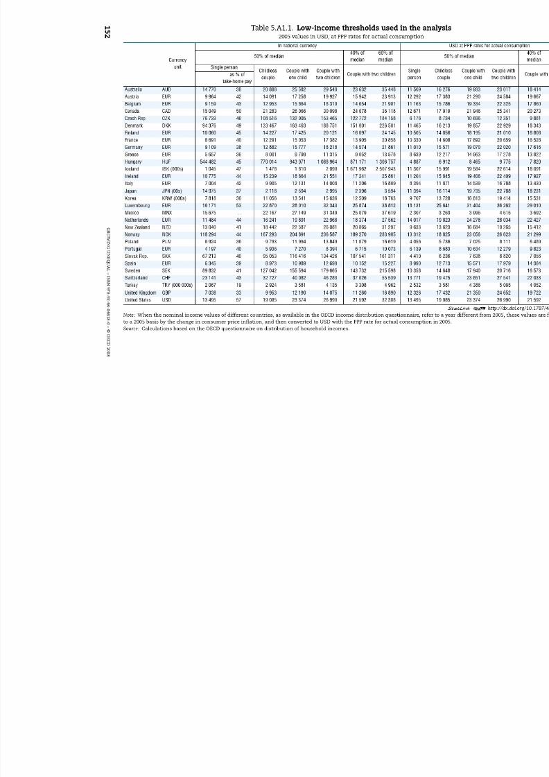
8/20/2019 Growing Unequal
http://slidepdf.com/reader/full/growing-unequal 152/309

8/20/2019 Growing Unequal
http://slidepdf.com/reader/full/growing-unequal 153/309
III.5. POVERTY IN OECD COUNTRIES: AN ASSESSMENT BASED ON STATIC INCOME
GROWING UNEQUAL – ISBN 978-92-64-04418-0 – © OECD 2008 153
ANNEX 5.A2
Alternative Estimates of Main Poverty Indicators
Table 5.A2.1 shows alternative estimates of main poverty indicators frominternational sources (Eurostat and Luxembourg Income Study): poverty rates for the entire
population at 50% and 60% of median income thresholds and child poverty rates at the 50%median income threshold, respectively. Differences in methodology are minor. Theconcept of disposable income is quasi-identical between the three data sources.* Theequivalence scale used by Eurostat differs only slightly from that used by the OECD and LIS,giving a somewhat higher weight to additional household members and distinguishing between adults and children. For most countries, differences in poverty rates between theOECD and the alternative sources do not exceed 1 percentage point. There are, however,two exceptions (Germany and the United Kingdom), especially for estimates of childpoverty.
* The Eurostat definition, for instance, defines inter-household transfers as transfers received minustransfers paid, while in the OECD questionnaire definition these are defined as transfers receivedonly. Nevertheless, this will have no impact on estimates of overall poverty.

8/20/2019 Growing Unequal
http://slidepdf.com/reader/full/growing-unequal 154/309
III.5. POVERTY IN OECD COUNTRIES: AN ASSESSMENT BASED ON STATIC INCOME
GROWING UNEQUAL – ISBN 978-92-64-04418-0 – © OECD 2008154
Table 5.A2.1. Comparisons of main estimates between the OECD questionnaireand alternative data sources, latest available year
Reference years (incomes) Poverty rate 50% median Poverty rates 60% median Child poverty rate 50% median
OECDquestion-
naire
Eurostat LISOECD
question-
naire
Eurostat LISOECD
question
naire
Eurostat LISOECD
question-
naire
Eurostat LIS
Australia 2004 . . 2003 12 . . 12 20 . . 20 12 . . 14
Austria 2004 2004 2000 7 6 8 13 12 13 6 6 8
Belgium 2004 2004 2000 9 8 8 16 15 16 10 9 7
Canada 2005 . . 2000 12 . . 12 19 . . 19 15 . . 16
Czech Republic 2004 2004 . . 6 5 . . 11 10 . . 10 9 . .
Denmark 2004 2004 2004 5 6 6 12 12 13 3 5 4
Finland 2004 2004 2004 7 5 7 15 12 14 4 3 4
France 2004 2004 2000 7 6 7 14 13 14 8 6 8
Germany 2004 2004 2000 11 7 8 17 12 13 16 6 9
Greece 2004 2004 2000 13 13 14 20 20 21 13 13 13
Hungary 2005 2004 1999 7 7 6 12 13 13 9 11 8
Iceland 2004 2004 . . 7 5 12 10 . . 8 6 . .
Ireland 2004 2004 2000 15 11 16 23 20 22 16 15 16
Italy 2004 2004 2000 11 12 13 20 19 20 16 16 17
Japan 2000 . . . . 15 . . . . 21 . . . . 14 . . . .
Korea 2005 . . . . 15 . . . . 21 . . . . 10 . . . .
Luxembourg 2004 2004 2000 8 7 6 13 13 12 12 10 9
Mexico 2004 . . 2002 18 . . 20 25 . . 27 22 . . 25
Netherlands 2004 2004 2000 8 6 5 14 11 11 12 9 6
New Zealand 2003 . . . . 11 . . . . 23 . . . . 15 . . . .
Norway 2004 2004 2000 7 7 6 12 11 12 5 5 3
Poland 2004 2004 1999 15 15 13 21 21 19 22 22 18
Portugal 2004 2004 . . 13 13 . . 21 19 . . 17 17 . .
Slovak Rep. 2004 2004 . . 8 8 . . 14 13 . . 11 12 . .Spain 2004 2004 2000 14 13 14 21 20 21 17 16 15
Sweden 2004 2004 2000 5 5 7 11 9 12 4 5 4
Switzerland 2001 . . 2002 7 . . 8 12 . . 14 8 . . 7
Turkey 2004 2002 . . 18 18 . . 24 26 . . 25 . . . .
United Kingdom 2005 2004 1999 8 12 12 16 19 21 10 13 17
United States 2005 . . 2005 17 . . 17 24 . . 24 21 . . 21
1 2 http://dx.doi.org/10.1787/422525733036Note: Equivalence scale used is the square root of household size for the OECD questionnaire and LIS and the modifiedOECD scale for Eurostat (which gives a weight of 1 to the first person, 0.5 for each additional adult and 0.3 for each additionalchild). Children are defined as persons below age 18 in all three data sources.Source: Calculations based on the OECD questionnaire on distribution of household incomes. Eurostat (as at 6 February 2008);LIS key figures (as of 31 December 2007).

8/20/2019 Growing Unequal
http://slidepdf.com/reader/full/growing-unequal 155/309
ISBN 978-92-64-04418-0Growing Unequal?© OECD 2008
155
PART III
Chapter 6
Does Income Poverty Last Over Time?Evidence from Longitudinal Data*
Less than one third of people with income of less than half of median income are
persistently in that condition over a three-year period, but only a small share of them move into higher strata of the distribution. Entries into poverty mainlyreflect family- and job-related events, but the share of unidentified events is alsoimportant. Countries with higher poverty headcounts based on static incomemeasures also record higher rates of persistent and recurrent poverty.
* This chapter has been prepared by Anna Cristina D’Addio, OECD Social Policy Division. The authorwishes to thank Atsuhiro Yamada and Kayoko Ishii for having provided estimates for Japan based on
a standard format. Also greatly appreciated was co-operation and feedback from Mary Gartley, atStatistics Canada; John Iceland and Chaowen Chan, at the University of Maryland; Dan Feenberg, atthe NBER; Dean Lillard, at Cornell University; and Mark Pearson and Marco Mira d’Ercole, at the OECDSocial Policy Division.

8/20/2019 Growing Unequal
http://slidepdf.com/reader/full/growing-unequal 156/309
III.6. DOES INCOME POVERTY LAST OVER TIME? EVIDENCE FROM LONGITUDINAL DATA
GROWING UNEQUAL – ISBN 978-92-64-04418-0 – © OECD 2008156
Introduction
Many people experience temporary spells of low income at some point in their lives –when they are students, when temporarily absent from work because of illness orchildbirth, or when moving from job to job. But these periods of low income do not lastlong. As a result, a significant share of people with low income at a given point in time willmove up the income distribution fairly quickly. Conversely, for a smaller group of people,the experience of poverty extends over prolonged periods, with more significantconsequences for the economic well-being of the people affected and their families.
This chapter presents new cross-country evidence about the persistence of lowincome based on micro-data from surveys that follow the same individuals andhouseholds over time. The chapter first describes the characteristics of the surveys and theconcepts used to compute the different measures of poverty dynamics. It then discussesthe size of temporary and persistent poverty, and the transition into and out of it. Finally, itpresents evidence about some of the reasons why people fall into poverty and aboutincome mobility and variability.
Longitudinal data and dynamic poverty measures
Surveys that follow the same individual and/or household over a number of periods (i.e.
panel data) are used in this chapter. This type of data allows examination of howindividuals’ income changes over time, the extent to which they experience temporary orpersistent spells of poverty, and how frequently they move up and down the incomedistribution.
Panel data, however, also have limits. While some of these limits apply to all samplesurveys (e.g. non-response, measurement errors), others are specific to panel data.1 Beyondthese survey features, the most important limits from the perspective of the analysisconducted here are the short number of years typically covered by these longitudinaldatasets, and the small number of countries included in previous comparative analysis onthe subject. As panel data extending over several years are available only for a fewcountries, the choice made in this chapter is to cover the largest possible number of OECDcountries, although at the price of limiting the analysis to a short number of spells. Thischapter relies on data spanning a period of three years – as compared to the longer periodsused in OECD (2001) and Burniaux et al. (2006) – as this shorter period allows the analysis tocover 17 OECD countries.2
As in Chapter 5, estimates of poverty are based on income thresholds that capture thestandard of living that is most typical in a given society at a particular time (Atkinson,1983). While this approach is conventionally used in most comparative studies, its limitsshould be kept in mind – for example, poverty rates based on relative income will fall even
when the incomes of the poor are declining, as long as the incomes of the non-poor arefalling faster. This chapter uses different thresholds – 40%, 50% and 60% of median income– to highlight the sensitivity of results with respect to the threshold used. As in the rest of

8/20/2019 Growing Unequal
http://slidepdf.com/reader/full/growing-unequal 157/309
III.6. DOES INCOME POVERTY LAST OVER TIME? EVIDENCE FROM LONGITUDINAL DATA
GROWING UNEQUAL – ISBN 978-92-64-04418-0 – © OECD 2008 157
this report, the income concept used is that of annual household disposable income, i.e. thecash income available to the household, including public transfers and after deducting income taxes and social security contributions paid by the households.3 To account fordifferences in family size, household income is “equivalised” by means of the squared rootequivalence scale. This equivalised income is attributed to each household member and is
used to determine the poverty status of each person in each year.
This approach allows one to distinguish between four (mutually exclusive) groups of people:
● those who are never poor over the three-year time period (“never poor”);
● those with an equivalised income below the poverty threshold in only one of the threeyears considered (“temporary poor”);
● those with an equivalised income below the poverty threshold in only two of the threeyears considered (“recurrent poor”); and
● those with an equivalised income below the poverty threshold over the entire periodconsidered (“persistent poor”).
These are the basic categories used in this chapter and in previous OECD reports onpoverty dynamics (OECD, 1998, 2001).4
Distinguishing between temporary and persistent spells of poverty
Poverty measures based on annual income provide only a partial perspective on theexperience of those at the bottom of the income scale, especially in a context characterisedby rapid changes in the labour market and high job turnover. To highlight the limits of static income data, Figure 6.1 shows the percentage of the population falling into different
categories of poverty, based on a threshold set at 50% of median income. Similar data basedon thresholds of 40 and 60% can be found in the annex.5
Figure 6.1 highlights a number of patterns:
● First, the “average” poverty headcounts based on these longitudinal dataset were fairlysimilar to those based on the cross-sectional data used in Chapter 5 of this report.6 For athreshold set at half of median income, the “average” poverty rate prevailing over thethree years was around 10% for the 17 countries included in Figure 6.1, ranging between6% or less in the Netherlands, Denmark and Germany and 14% or more in Australia,Ireland, the United States and Greece.7
● Second, across the 17 countries considered, around 17% had an income below thepoverty threshold in at least one of the three years, implying that 83% of the populationwas never poor in any of the three years considered. The share of people who were poorat least once over the three years ranged from around 10% in Luxemburg and theNetherlands to 25% in Australia.
● Third, 5% of the population was, on average, poor in all three years, and a further 4% inonly two of the three years considered. Rates of persistent poverty varied from 7% ormore in Australia, Greece, Ireland, Portugal and the United States, to less than 2% inDenmark and the Netherlands.
Setting higher income thresholds has two results: a higher proportion of all
respondents are counted as poor in each year, and a higher share of people are calculatedto experience recurrent and, especially, persistent poverty among all those who are poor atleast once (see Table 6.A1.1 available at http://dx.doi.org/10.1787/424402577838). On average,

8/20/2019 Growing Unequal
http://slidepdf.com/reader/full/growing-unequal 158/309
III.6. DOES INCOME POVERTY LAST OVER TIME? EVIDENCE FROM LONGITUDINAL DATA
GROWING UNEQUAL – ISBN 978-92-64-04418-0 – © OECD 2008158
the share of the persistent poor among all those who are poor at least once rises from 17%,for a threshold set at 40% of median income, to 28% for a threshold of 50%, and to 36% fora threshold of 60%. A similar but weaker pattern holds for the recurrent poor, whose sharerises from 23% for the lower threshold to 26% for the two higher poverty lines.
Overall, cross-country differences in the prevalence of persistent and recurrentpoverty are larger than those highlighted by the simple poverty headcount, although thedifferent measures provide a consistent picture. Indeed, Figure 6.1 highlights a positiverelation (statistically significant at the level of 0.01%) between the simple poverty
headcount (averaged over the three years), on one side, and the rates of persistent andrecurrent poverty, on the other.
The composition of persistent poverty
This section describes the composition of the poor by looking at the poverty risk, i.e.
the ratio between the poverty rate for a specific group and that for the entire population(OECD, 2001). Groups are defined in terms of characteristics at the beginning of the period.
While the age profile of those who are poor at least once (Panel A of Figure 6.3) –averaged across the 17 countries included in the analysis – mirrors that described inChapter 5, there are distinctive patterns for other definitions of poverty.8
● Individuals aged 65 and over experience not just a higher risk of being poor in each yearbut, especially, of persistent low income. Across the 17 countries considered, this risk
Figure 6.1. Share of people experiencing temporary, recurrentand persistent poverty
Threshold set at 50% of median income, experience over three consecutive years, in percentage
1 2 http://dx.doi.org/10.1787/422528522436Note: Countries are ranked from left to right in increasing order of the share of people who have been “poor at leastonce” over the three years considered. OECD-17 is the simple average of the countries shown except Japan, for whichestimates are based on an income definition (household income before taxes and after public transfers) that differfrom that used for other countries (household disposable income, i.e. after taxes and public transfers).
Source: Data refer to 1999-2001 for European countries, based on the European Community Household Panel (ECHP);to 2002-2004 for Canada, based on data from the Cross National Equivalent File of the Survey of Labour and IncomeDynamics (SLID); and to 2002-2004 for Australia, based on data from the Cross National Equivalent File of the surveyHousehold Income and Labour Dynamics in Australia (HILDA). For the United States, data refer to 2001-2003 based on
data from the Survey of Income and Program Participation (SIPP). For Japan, data refer to 2005-2007 and are based onthe Keio Household Panel Survey.
L U X
N L D
D E U
D N K F
I N B E L
A U T
F R A
C A N I T
A J P N
G B R
P R T I R
L G R C U S
A E S P
A U S
30
25
20
15
10
5
0
%
Poor in one year Poor in two years Poor in three years
Poor at least once Average poverty rate
O E C
D - 1 7

8/20/2019 Growing Unequal
http://slidepdf.com/reader/full/growing-unequal 159/309
III.6. DOES INCOME POVERTY LAST OVER TIME? EVIDENCE FROM LONGITUDINAL DATA
GROWING UNEQUAL – ISBN 978-92-64-04418-0 – © OECD 2008 159
rises from 1.2 for temporary poverty (i.e. 20% above the poverty rate for the entirepopulation) to 2.1 for persistent poverty – with much higher levels for the latter (above 3)in Australia, Austria and Denmark but a lower risk (at 1.0 or lower) in Canada, theNetherlands, Italy and Japan (Table 6.1, Panel E).
● At the other end of the age spectrum, children also experience a greater risk of povertycompared to the entire population, but this risk is evenly spread across the variouspoverty spells. In Denmark, virtually no child lives in persistent poverty over a three-year
Figure 6.2. Correlation between different indicators of povertyThreshold set at 50% of median income, experience over three consecutive years, in percentage
1 2 http://dx.doi.org/10.1787/422531127768Note: OECD-17 is the simple average of the countries shown except Japan (shown as a darker dot), for whichestimates are based on an income definition (household income before taxes and after public transfers) that differfrom that used for other countries (equivalised household disposable income).
Source: Detailed sources are provided in Figure 6.1.
Figure 6.3. Risks of falling into different types of poverty by ageand household type, OECD average
1 2 http://dx.doi.org/10.1787/422555054624Note: OECD-17 is the simple average of the countries shown in Figure 6.1 except Japan, for which estimates are basedon an income definition (household income before taxes and after public transfers) that differ from that used forother countries (household disposable income).
Source: Detailed sources are provided in Figure 6.1.
20
16
12
8
4
00 3 6 9
20
16
12
8
4
00 3 6 9
AUS
AUTBEL
CAN
DNK
FIN FRA
DEU
GRCIRL
ITA
LUXNLD
PRT ESP
GBR
USA
JPN
OCDE-17
AUS
AUTBEL
CAN
DNKFIN
FRA
DEU
GRC
IRL
ITA
LUXNLD
PRT
ESP
GBR
USA
JPNOCDE-17
Persistent poverty rate Recurrent poverty rate
Average poverty rate Average poverty rate
Average and persistent poverty rates Average and recurrent poverty rates
0 0 2.01.0 3.0 4.0 5.00.5 1.0 1.5 2.0 2.5
At least once Three years Two years One year
Over 65 Couples without children
Singles without children
Single with children
Working
Couples with children
Workless
51 to 65
25 to 50
13 to 24
Less than 13
A. By age of people B. By household types

8/20/2019 Growing Unequal
http://slidepdf.com/reader/full/growing-unequal 160/309

8/20/2019 Growing Unequal
http://slidepdf.com/reader/full/growing-unequal 161/309
III.6. DOES INCOME POVERTY LAST OVER TIME? EVIDENCE FROM LONGITUDINAL DATA
GROWING UNEQUAL – ISBN 978-92-64-04418-0 – © OECD 2008 161
period, while in Italy, Netherlands, the United Kingdom, the United States and Japanchildren face a high risk of persistent poverty (Table 6.1, Panel A).
● Youths aged 13 to 24 also have a higher probability of experiencing temporary orrecurrent poverty compared to the entire population, but a lower one when looking atpersistent poverty, with the exception of only Italy, the Netherlands and Japan.
● Adults aged 25 to 50 face a poverty risk below the population average for all povertycategories, and this risk falls when moving from temporary to persistent poverty.
● Older adults (aged 51 to 64) have generally lower probability of falling into poverty thanthe entire population, but there are exceptions – and their number rises when moving from temporary (Germany, Greece and Japan) to persistent poverty (Australia, Canada,Ireland and, especially, Finland and Germany).
The composition of the various poverty categories also varies with householdcharacteristics (Figure 6.3, Panel B):
● Single-adult households (with and without kids) are more exposed to poverty risks thanpeople living in couples, especially when considering the risk of having long periods withlow income. On average, single adults with children face a risk of persistent poverty thatis twice as high as for the whole population, particularly in Japan (where lone parents arerare), the Netherlands and Denmark (Table 6.2). The probability of persistent poverty forsingles without children is even higher, being on average three times larger than for theentire population, and much more in Denmark, Finland, Ireland and Portugal.
● Couples with children face a risk of persistent poverty that is generally well below thepopulation average with the singular exception of Italy. Patterns are more diverse forcouples without children, with a higher risk than for the population average in Australia,
Austria, Belgium, France, Greece, Portugal and Spain.● A large part of these differences in the risk of chronic poverty reflects the employment
status of household members. On average, people belonging to workless householdshave a risk of persistent poverty that is almost five times higher than that of the wholepopulation (Figure 6.3, Panel B) and even higher in Canada, Denmark and the Netherlands(right-hand panel of Table 6.2). These cross-country differences in the risk of persistentpoverty among jobless households reflect both differences in the economic conditions of these households and in the extent to which joblessness persists over time.
Finally, the risk of persistent poverty also varies by gender. Women always face ahigher probability of chronic poverty than men, with a disadvantage that is especially large
in Austria, Belgium, Denmark and Finland (Table 6.3). This higher risk of persistent povertymainly reflects the situation of single women, both with and without children. Womenliving alone (mainly elderly women) face a risk of persistent poverty that is 2.7 times thatfor the entire population, and much higher in Austria, Denmark, Finland and theNetherlands. Single mothers with children have a higher probability of being poor at leastonce than the entire population, and this disadvantage rises when moving from transitoryto recurrent and persistent poverty, especially in the Netherlands and Denmark.9
Poverty entries, exits and occurrences
One of the main advantages of using longitudinal data is that this allows analysis of
the transitions into and out of poverty and the extent of poverty turnover. Figure 6.4 showsentry and exit rates out of income poverty (based on a threshold set at half of median

8/20/2019 Growing Unequal
http://slidepdf.com/reader/full/growing-unequal 162/309
GR OWI N G UNE Q UAL –I S B
N 9 7 8 - 9 2 - 6 4 - 0 4 4 1 8 - 0 – © OE C D2 0 0 8
1 6 2
Table 6.2. Risk of falling into different types of poverty by household tyPoverty risk relative to the entire population, based on a threshold set at 50% of the media
By presence of children B
Without children With children
Singles Couples Singles Couples
Poor in: Poor in: Poor in: Poor in:
Oneyear
Twoyears
Threeyears
Atleastonce
Oneyear
Twoyears
Threeyears
Atleastonce
Oneyear
Twoyears
Threeyears
Atleastonce
Oneyear
Twoyears
Threeyears
Atleastonce
Oneyear
Twye
Australia 1.1 1.8 3.8 2.0 1.0 1.2 1.1 1.1 1.1 1.0 0.6 0.9 0.8 0.3 0.2 0.5 1.7 3
Austria 1.7 2.5 3.7 2.3 0.8 0.9 1.6 1.0 2.3 1.1 1.6 1.9 0.8 0.7 0.4 0.7 1.4 3
Belgium 1.2 2.0 3.2 1.8 1.3 1.7 1.4 1.4 1.8 1.4 1.9 1.7 0.7 0.5 0.4 0.6 2.0 3
Canada 1.2 1.7 2.5 1.8 0.8 0.7 0.4 0.6 1.1 1.2 1.3 1.2 0.8 0.7 0.6 0.7 1.1 3
Denmark 1.9 6.9 6.4 3.5 1.3 0.8 0.8 1.2 2.2 0.2 5.2 2.3 0.6 0.1 0.0 0.4 0.7 3
Finland 1.8 4.0 5.0 3.1 0.6 0.5 0.3 0.5 1.3 0.8 0.4 1.0 0.7 0.2 0.1 0.4 1.7 2
France 1.5 1.7 2.9 1.8 0.8 1.2 1.0 0.9 1.5 2.4 2.4 1.9 0.9 0.7 0.6 0.8 1.4 2
Germany 1.8 2.1 3.3 2.2 0.6 0.7 0.7 0.6 2.5 5.6 2.4 3.3 0.8 0.5 0.4 0.6 2.2 4
Greece 1.0 1.1 2.9 1.6 1.0 1.4 2.3 1.5 1.0 1.3 0.8 1.0 0.9 0.7 0.5 0.8 1.0 2
Ireland 1.3 1.7 5.5 2.9 1.5 1.5 0.8 1.2 1.4 1.0 0.7 1.0 0.9 1.0 0.6 0.8 1.4 2Italy 1.4 1.2 1.7 1.4 0.8 0.5 0.6 0.7 0.9 1.1 1.0 1.0 1.0 1.1 1.1 1.1 1.2 1
Luxembourg 0.8 0.9 0.9 0.9 0.4 0.4 0.9 0.5 2.3 1.4 2.2 2.0 1.0 1.3 0.8 1.0 1.1 4
Netherlands 1.7 1.0 2.0 1.5 0.7 0.3 0.0 0.5 1.5 4.8 7.4 3.3 0.9 0.8 0.3 0.8 2.1 4
Portugal 1.4 2.1 4.3 2.6 1.1 1.5 1.9 1.5 1.2 1.4 1.3 1.3 1.0 0.9 0.7 0.9 2.5 2
Spain 2.0 1.9 1.1 1.8 0.9 0.9 2.1 1.2 0.8 1.0 1.6 1.1 1.1 0.9 0.9 1.0 1.3 3
United Kingdom 1.4 1.7 2.0 1.7 0.6 0.7 0.5 0.6 1.5 2.5 2.8 2.1 0.9 0.6 0.7 0.8 1.4 3
United States 1.2 1.4 2.2 1.6 0.7 0.6 0.5 0.6 1.2 1.3 1.4 1.3 0.9 0.7 0.5 0.7 1.2 1
OECD-17 1.4 2.1 3.1 2.0 0.9 0.9 1.0 0.9 1.5 1.7 2.1 1.7 0.9 0.7 0.5 0.7 1.5 3
Memorandum item:
Japan 1.9 1.5 2.0 1.8 0.8 0.6 0.4 0.6 1.9 3.8 8.4 4.3 0.8 0.5 0.7 0.7 1.4 1
United States (PSID) 1.2 1.2 1.3 1.2 0.7 0.3 0.3 0.5 1.1 1.5 1.6 1.3 0.8 0.8 0.6 0.8 1.2 2
1
Note: Estimates for the United States are based on SIPP (those based on PSID are shown for information only).Source: Detailed sources are provided in Figure 6.1.

8/20/2019 Growing Unequal
http://slidepdf.com/reader/full/growing-unequal 163/309
GR OWI N G UNE Q UAL –I S B N 9 7 8 - 9 2 - 6 4 - 0 4 4 1 8 - 0 – © OE C D2 0 0 8
1 6 3
Table 6.3. Risk of falling into different types of poverty for singles, by gender and prePoverty risk relative to the entire population, based on a threshold set at 50% of median inco
Men Women Single women with and without children
Poor in: Poor in: Poor in:
Oneyear
Twoyears
Threeyears
At leastonce
Oneyear
Twoyears
Threeyears
At leastonce
Oneyear
Twoyears
Threeyears
At leonc
Australia 0.9 0.9 0.8 0.9 1.1 1.1 1.2 1.1 1.3 1.4 1.6 1.4
Austria 0.9 0.7 0.6 0.8 1.1 1.3 1.4 1.2 2.4 2.5 3.8 2.7
Belgium 0.9 0.9 0.7 0.9 1.1 1.1 1.3 1.1 1.8 2.0 2.9 2.
Canada 1.0 1.0 0.9 0.9 1.0 1.0 1.1 1.1 1.3 1.4 1.7 1.5
Denmark 0.9 0.6 0.7 0.8 1.1 1.4 1.3 1.2 2.7 5.7 6.1 3.8
Finland 1.0 0.9 0.7 0.9 1.0 1.1 1.3 1.1 2.0 3.0 4.5 2.9
France 1.0 0.9 0.9 0.9 1.0 1.1 1.1 1.1 1.9 2.3 2.7 2.
Germany 0.9 0.8 1.0 0.9 1.1 1.2 1.0 1.1 2.2 2.9 2.6 2.5
Greece 1.0 1.0 0.9 1.0 1.0 1.0 1.1 1.0 1.1 1.2 2.3 1.5
Ireland 0.9 1.1 0.9 0.9 1.1 0.9 1.1 1.1 1.6 1.2 2.9 2.0
Italy 1.0 1.0 0.9 1.0 1.0 1.0 1.1 1.0 1.4 1.2 1.6 1.4
Luxembourg 1.0 1.1 0.9 1.0 1.0 0.9 1.1 1.0 1.8 1.4 1.7 1.6
Netherlands 0.9 1.1 0.9 1.0 1.1 0.9 1.1 1.0 1.9 1.9 3.3 2.
Portugal 1.0 0.9 0.9 0.9 1.0 1.1 1.1 1.1 1.5 1.8 2.5 1.9Spain 0.9 0.9 0.9 0.9 1.1 1.1 1.1 1.1 1.7 1.6 1.4 1.6
United Kingdom 0.9 0.9 0.8 0.9 1.1 1.1 1.1 1.1 1.8 2.2 2.4 2.
United States 1.0 0.9 0.8 0.9 1.0 1.1 1.2 1.1 1.2 1.5 1.7 1.5
OECD-17 0.9 0.9 0.8 0.9 1.1 1.1 1.2 1.1 1.7 2.1 2.7 2.
Memorandum items:
Japan 1.0 0.9 0.9 1.0 1.0 1.1 1.1 1.0 1.7 3.1 4.1 2.8
United States (PSID) 1.0 0.9 0.9 0.9 1.0 1.1 1.1 1.1 1.2 1.5 1.6 1.4
1
Note: Estimates for the United States are based on SIPP (those based on PSID are shown for information only).Source: Detailed sources are provided in Figure 6.1.

8/20/2019 Growing Unequal
http://slidepdf.com/reader/full/growing-unequal 164/309
III.6. DOES INCOME POVERTY LAST OVER TIME? EVIDENCE FROM LONGITUDINAL DATA
GROWING UNEQUAL – ISBN 978-92-64-04418-0 – © OECD 2008164
income) during the three-year period considered in this chapter, with entry rates expressedrelative to the entire population and exit rates calculated over the number of people whoare poor in the preceding period.10 On average, across all OECD countries studied, about 5%of all people who were not poor in a given year have low income in the year that follows,with values ranging from above 6% in Australia, Spain and Greece to 3% or less inLuxembourg, Germany and Austria.11 Exit rates, expressed as the share of all people whoare counted as poor in any given year but who are no longer poor in the following one, are
around 40% on average, ranging from more than 50% in Denmark and the Netherlandsdown to 30% or less in Ireland, Canada and the United States.12 These data suggest that,overall, poverty turnover is high, but with large differences across countries (OECD, 2001).
Figure 6.4. Entry and exit out of income poverty, early 2000sPoverty based on a threshold set at 50% of the median
1 2 http://dx.doi.org/10.1787/422580110083Note: Entry into poverty is measured by the share of individuals who were not poor at time t-1 and are poor at time t.The exit rate is the share of individuals that were poor at time t-1 and are no longer poor at time t. The two measuresare averaged over the three years. Data for the United States are based on SIPP. Countries are ranked, from left toright, in increasing order of exit and entry rates. OECD-17 is the simple average of the countries shown except Japan,for which estimates are based on an income definition (household income before taxes and after public transfers)
that differs from that used for other countries (household disposable income).Source: Detailed sources are provided in Figure 6.1.
I R L
U S A
C A N
P R T I T
A G R C F
I N J P N
G B R
A U S
L U X
D E U
E S P
B E L
A U T
F R A
D N K
N L D
60
50
40
30
20
10
0
L U X
D E U
A U T N L
D F I N
B E L
D N K
F R A
C A N
J P N
P R T I T
A G B R
U S A I R
L G R C
E S P A U
S
10
8
6
4
2
0
A. Exit rates (percentage of those in poverty who exit it)
B. Entry rates (percentage of the entire population who enter poverty)
O E C D
- 1 7
O E C
D - 1 7

8/20/2019 Growing Unequal
http://slidepdf.com/reader/full/growing-unequal 165/309
III.6. DOES INCOME POVERTY LAST OVER TIME? EVIDENCE FROM LONGITUDINAL DATA
GROWING UNEQUAL – ISBN 978-92-64-04418-0 – © OECD 2008 165
Several empirical studies have shown that the probability of exiting poverty fallsrapidly after having been poor for two or more years (Bane and Ellwood, 1986; Stevens,1994, 1999). In theory, measures of poverty duration should allow a better understanding of the risks confronted by people at the bottom of the income distribution. In practice, suchestimates are affected by biases that are especially important with the data (spanning only
a few years) used in this chapter.13 A different perspective on the characteristics of povertyis provided by looking at the extent to which poverty is recurrent. The number of povertyspells (occurrences) matters as, for a given number of years spent in poverty, anuninterrupted experience implies a more rapid reduction in accumulated savings andlarger falls in living standards for people affected, as well as a greater concentration of poverty on a small number of persons for the country as a whole.14
Table 6.4 shows the share of the population as a whole who experience differentsequences of poverty and non-poverty among those counted as income poor in either one(left-hand panel) or two (right-hand panel) of the years considered, with values of 1 or 0denoting whether the individual is poor or not in each calendar year. For example, asequence “101” indicates that an individual is poor in the first year, climbs out of it in the
Table 6.4. Prevalence of different sequences of poverty among the income-poorin one and two of the years considered
Poverty based on a threshold set at 50% of the median
Poor in one year Poor in two years
100 010 001 110 101 011
Australia 4.2 3.9 4.0 2.3 1.3 2.3
Austria 3.0 1.5 2.2 1.0 0.7 1.1
Belgium 2.2 2.4 2.7 0.6 0.4 1.3
Canada 2.8 1.8 2.8 1.7 0.8 2.1
Denmark 2.2 1.8 3.3 0.8 0.7 0.6
Finland 1.7 1.2 3.0 1.0 0.3 1.2
France 2.4 2.5 2.8 1.2 0.8 1.6
Germany 1.9 1.3 2.2 1.3 0.5 1.1
Greece 3.6 2.6 3.3 2.6 1.1 2.6
Ireland 2.5 2.2 3.1 1.8 1.4 3.0
Italy 2.5 2.0 3.3 2.0 1.4 2.1
Luxembourg 1.8 1.5 1.1 1.0 1.2 0.9
Netherlands 2.3 1.2 2.2 1.1 1.0 1.0
Portugal 2.9 2.0 3.3 1.6 0.8 2.5
Spain 4.5 2.6 4.1 2.8 1.4 2.7
United Kingdom 4.0 2.1 3.1 2.1 0.8 2.2United States 3.7 1.8 3.7 2.1 1.6 2.1
OECD-17 2.8 2.0 2.9 1.6 1.0 1.8
Memorandum items:
Japan 3.0 2.6 2.3 1.6 1.0 1.8
United States (PSID) 5.6 3.4 4.1 3.1 2.1 2.6
1 2 http://dx.doi.org/10.1787/422641132604Note: Each column illustrates the share of individuals experiencing a specific poverty path over the three-year timeperiod, where “0” stands for non-poor and “1” stands for poor. For example “110” means “poor in the first year, poorin the second year and non-poor in the third year”. Estimates for the United States are based on SIPP (those based onPSID are shown for information only).Source: Detailed sources are provided in Figure 6.1.

8/20/2019 Growing Unequal
http://slidepdf.com/reader/full/growing-unequal 166/309
III.6. DOES INCOME POVERTY LAST OVER TIME? EVIDENCE FROM LONGITUDINAL DATA
GROWING UNEQUAL – ISBN 978-92-64-04418-0 – © OECD 2008166
second, and re-enters it in the third year, thus experiencing two poverty occurrences overthe observation period. Two main patterns stand out:
● Among those who are poor in two of the three years considered, sequences of the type“101” are generally less frequent (1% on average) than those where people remain poorfor two consecutive years either at the beginning (1.6%) or at the end of the period (1.8%).Differences across countries (as measured by the standard deviation) are also larger foruninterrupted sequences (110 and 011) than for interrupted ones (101). Countries with ahigher share of people experiencing uninterrupted spells of poverty over two years alsorecord higher rates of persistent poverty over the three years, suggesting that similarfactors account for the different forms of chronic poverty.
● There are also differences in the frequency of the various sequences among people whoare poor in only one of the three years considered. The share of people entering povertyin the second year and exiting it in the third (010) is 2% on average, ranging from 1.2% (inFinland, Germany and the Netherlands) to above 3% (in Australia). The sequences where
either entry or exit from poverty cannot be observed (100 and 001) occur more frequently(at around 3%, on average, in both cases), and people belonging to these two categories(which include people who were already poor before entering the three-year periodconsidered here, and others whose poverty spell will continue beyond these three years)will generally experience longer poverty spells than others.
Events that trigger entry into poverty
The high turnover observed among the poor prompts questions about the nature of the events underlying the dynamics of poverty. What type of events lead households to fallinto poverty? Are these events different in the case of temporary and persistent poverty?
To answer these questions, this section presents evidence on the relationship between arange of events and poverty transitions. The decline in the equivalised income of eachperson that triggers entry into poverty will reflect changes in both household income andin household composition, and empirical studies have documented the importance of bothtypes of event for the likelihood of entering and exiting poverty (Jenkins, 2000; OECD, 2001; Jenkins et al., 2001; Jenkins and Schluter, 2003; McKernan and Ratcliff, 2005; Valletta, 2006).
In general, this research suggests that finding a job or getting married increases theprobability of moving out of poverty, while becoming unemployed or incurring separationincreases the likelihood of entering it (Duncan et al., 1993; Muffels et al., 1999; Oxley et al.,
2000; Finnie, 2000; Dubois and Jeandidier, 2000; Jeandidier et al., 2002; Fouarge and Layte,
2003, 2005). Other empirical studies suggest that some events, like divorce, have a strongerimpact on women than on men (Bartfeld, 1998; Di Prete and McManus, 2000; Jarvis and Jenkins, 1999; Bianchi Lekha and Khan, 1999).
This section presents evidence on the events associated with entry into poverty. Theapproach is similar to that used in OECD (2001), but the analysis presented heredistinguishes between different sequences of poverty spells during the three-year periodand refers to all household members rather than being limited to the household head. Asin OECD (2001), the analysis tries to account for the fact that several events concur intriggering the entry into poverty (e.g. changes in family structure may influence the supplyof labour of individuals by lowering their hours worked and wages) by focusing on specificsub-samples for each event.15

8/20/2019 Growing Unequal
http://slidepdf.com/reader/full/growing-unequal 167/309
III.6. DOES INCOME POVERTY LAST OVER TIME? EVIDENCE FROM LONGITUDINAL DATA
GROWING UNEQUAL – ISBN 978-92-64-04418-0 – © OECD 2008 167
Figure 6.5 examines the effect of a range of events on the probability of entering intopoverty. The events considered are: i) a change in family structure (due to either the birthof a child, divorce, separation, widowhood or similar factors); ii) a reduction in the numberof workers in the household; iii) the income component (among earnings, transfers, capitaland other incomes) that records the largest absolute reduction when entering poverty;16
and iv) other events not identified. When looking at the importance of various events forall entries into poverty combined, a number of patterns emerge:
● Changes in family structure are generally an important trigger of entry into poverty.They account on average, for around 30% of all entries, and above 40% in Austria,Denmark, Portugal and the United Kingdom.
● Falls in the number of workers in the household – unrelated to a change in familystructure – account for only 5% of all entries into poverty, and for 7% or more in Canada,Germany, Greece, the Netherlands and the United States.17
● The combined effect of declines in income streams accounts for around 30% of all
poverty entries, with similar shares for earnings and transfers, and a smaller one forcapital income. Large falls in public transfers matter more for entry into poverty thanthose in capital income in all countries except the United States, while declines inearnings are more important than those in transfers in a slight majority of countries (butnot in Austria, Belgium, Denmark, France, Germany, Luxembourg, the Netherlands andthe United Kingdom).
Figure 6.5. Events that trigger the entry into povertyShare of people experiencing a given event when entering poverty
1 2 http://dx.doi.org/10.1787/422607373715Note: Countries are ranked from left to right in increasing order of the share of people experiencing a change infamily structure when entering poverty. Estimates for “fewer workers” are based on the sub-sample of peopleexperiencing no change in family structure. Estimates referring to the income component (among earnings, publictransfers and capital income) that records the largest absolute reduction when entering into poverty are based on thesub-sample of people experiencing no change in family structure and number of workers. Estimates for the UnitedStates are those based on SIPP.
Source: Detailed sources are provided in Figure 6.1.
100
80
60
40
20
0
%
A U S
A U T
B E L
C A N
D N K F I N F
R A D E U
G R C I R
L I T A
L U X N
L D P R T
E S P
G B R U S
A
Unidentified
Earnings
Capital and other incomes
Fewer workers
Public transfers
Family structure
O E C
D - 1 7

8/20/2019 Growing Unequal
http://slidepdf.com/reader/full/growing-unequal 168/309
III.6. DOES INCOME POVERTY LAST OVER TIME? EVIDENCE FROM LONGITUDINAL DATA
GROWING UNEQUAL – ISBN 978-92-64-04418-0 – © OECD 2008168
● A large share (30% on average) of all entries into poverty is not accounted for by any of the events considered, with an even higher share in Australia, Greece, Luxembourg andthe United States.
The role of various events in poverty entry differs across groups of poor people.Figure 6.6 shows – for the average of the 17 OECD countries considered – the share of entries into poverty for people who remain poor in only one year (left bar), for those whoremain poor in the last two of the three years (middle), and for those who are poor in twonon-consecutive years. Family events are, in general, very important for those who aretemporarily poor (one year), but less so for people who are poor in two consecutive years,for whom a reduction in transfer income accounts for a larger share of poverty entries.Further, for people who are poor in two non-consecutive years (bar on the right), family andlabour-market events are less important in triggering entry into poverty than among people who remain poor in only one year, while unidentified causes are more important.These patterns suggest that the duration (i.e. the number of years of low income) and thenumber of spells (interrupted and uninterrupted ones) matter for understanding thedynamics of poverty.
Income mobility and poverty persistence
The observed patterns of transition into and out of poverty and the number of povertyrecurrences matter for income mobility. This is an important policy concern because thesize and characteristics of poverty in society are closely linked to the extent of incomemobility.18 Higher immobility at the bottom of the income distribution implies a higher riskof chronic poverty while, conversely, persistent poverty has a bearing on lifetime incomeinequality and can be a “marker” of unequal opportunities. In this respect, higher income
mobility may lead to a more equal distribution of lifetime incomes and also affectindividual expectations about moving up the socio-economic ladder. To investigate these
Figure 6.6. Events that trigger the entry into poverty for different groupsof poor people, OECD average
Share of people experiencing a given event when entering poverty
1 2 http://dx.doi.org/10.1787/422608180210
Source: Detailed sources are provided in Figure 6.1.
1.00
8.0
6.0
4.0
2.0
0“010” “011” “101”
UnidentifiedEarnings
Capital and other incomes
Fewer workers
Public transfers
Family structure

8/20/2019 Growing Unequal
http://slidepdf.com/reader/full/growing-unequal 169/309
III.6. DOES INCOME POVERTY LAST OVER TIME? EVIDENCE FROM LONGITUDINAL DATA
GROWING UNEQUAL – ISBN 978-92-64-04418-0 – © OECD 2008 169
issues, this section looks at how people move across income quintiles between the initialand final year of the three-year period considered.
The relation between income mobility and poverty dynamics between two years – t1
and t2 – can be illustrated through a simple example. If incomes are unchanged in the twoyears, the distribution of income and the poverty rate will also be the same. However, someindividuals who were poor in t1 may have moved out of poverty in t2, and have beenreplaced by an equal number of individuals who have become poor in t2.19 This impliesthat income mobility may occur even when static income measures of poverty andinequality are unchanged. Higher income mobility lowers the risk of being poor in twoconsecutive years and implies a more equal distribution of lifetime income and lifetimepoverty. In other terms, higher income mobility gives poverty a more transitory characterrather than a persistent one.
Table 6.5 illustrates the extent of mobility across the quintiles of the distribution of equivalised (household) income between the initial year and the final year of the three-
year period, averaged across the 17 OECD countries considered.20
Over this short period,the size of income mobility is fairly high, with only around 40% of the sample remaining inthe same quintile during the three years. Income mobility is, however, significantly lowerfor people in the bottom and top quintiles; almost 70% of the people in these two quintilesremain in the same income groupings over the whole period, and most of those who movedo so by one or two quintiles at most (for country specific information on transitionmatrices, see Table 6.A1.2 available at http://dx.doi.org/10.1787/424402577838).
Table 6.6 presents additional information on mobility patterns in individual countries.The left-hand panel highlights the size of income “immobility” over the three-year periodconsidered, i.e. the share of individuals remaining in the same income quintile in the baseand final year for each country. There is evidence of “tail rigidity” in all countries, with theshares of people staying in the lowest and in the highest quintile well above thosecharacterising other quintiles. For example, the share of people who are still in the bottomquintile after three years is above 70% in Finland and Luxembourg but below 60% in Spain,with the United States exhibiting a level of mobility around the average for other countries.The right-hand panel of Table 6.6 shows another component of mobility, i.e. mobility intoadjacent quintiles as a percentage of those in each specific quintile in the initial year. On
average, around 21% of those in a specific quintile move into the next one, a pattern thatreplicates that exhibited over longer time-periods (Yaqub, 2000).
Table 6.5. Transition matrix between income quintiles, OECD average
Final year
Q1 Q2 Q3 Q4 Q5
Initial year
Q1 0.66 0.22 0.07 0.04 0.02
Q2 0.21 0.48 0.21 0.07 0.03
Q3 0.07 0.21 0.45 0.22 0.06
Q4 0.04 0.07 0.21 0.47 0.21
Q5 0.02 0.03 0.06 0.20 0.69
1 2 http://dx.doi.org/10.1787/422667887673
Source: Detailed sources are provided in Figure 6.1.

8/20/2019 Growing Unequal
http://slidepdf.com/reader/full/growing-unequal 170/309
III.6. DOES INCOME POVERTY LAST OVER TIME? EVIDENCE FROM LONGITUDINAL DATA
GROWING UNEQUAL – ISBN 978-92-64-04418-0 – © OECD 2008170
Table 6.6 above describes the extent of income mobility for the entire sample availablewithout looking specifically at mobility for those who are income poor in the initial year.Patterns of income mobility for the poor are illustrated in Table 6.7, which looks at peoplewith income below the 50% threshold in the initial year who in the final year are either:i) still below the 50% threshold; ii) between 50% and 75% of median income; iii) between
75% of the median and the median itself; or iv) above the median. The table suggests that,on average, around 55% of the income poor in the initial year have incomes still below half of the median in the final year, with higher shares (at 60% or more) in Ireland, Italy,Portugal and the United States. On average, only 8% of those with income less than 50% of the median in the initial year have income above the median in the final year, but thisshare exceeds 10% in Austria, Belgium, the Netherlands and the United Kingdom. Morethan half of those who move above the 50% threshold have income between 50 and 75% of the median by the end of the period, with this share exceeding 30% in Denmark, Germany,France, Luxembourg and the Netherlands.
Conclusion
Longitudinal income data enrich our assessment of income poverty. In particular, theevidence presented in this chapter suggests a number of patterns.
● First, for a large share of people poverty is a temporary experience, with only about 5% of people persistently poor over a three-year period. Despite this, the share of individuals
Table 6.6. Measures of income mobility and immobility over a three-year periodShares of people in each quintile in the initial year
Share of people staying in the same quintile Share of people moving across adjacent quintiles
Q1 Q2 Q3 Q4 Q5From Q1
to Q2From Q2
to Q3From Q3
to Q4From Q4
to Q5
Australia 62.5 46.7 40.0 43.5 61.1 21.5 23.5 23.8 24.8
Austria 67.2 52.4 49.6 50.1 70.9 21.8 16.1 20.2 17.8
Belgium 65.5 43.1 46.4 43.0 60.3 21.7 23.3 21.4 23.4
Canada 69.5 52.2 47.3 50.9 71.8 20.2 21.7 22.8 19.4
Denmark 60.5 43.2 38.8 37.7 62.4 24.8 24.5 27.5 24.1
Finland 71.9 58.1 51.3 49.3 71.0 16.8 13.7 20.8 20.6France 67.6 50.5 45.7 50.9 73.7 21.7 20.8 23.5 18.9
Germany 67.6 47.9 46.3 55.0 73.6 20.8 26.7 19.2 16.3
Greece 64.9 43.4 40.4 47.6 69.1 22.6 23.6 21.1 21.2
Ireland 66.5 41.1 39.9 36.8 62.7 24.7 20.6 25.7 30.4
Italy 66.9 52.4 45.6 49.7 70.2 17.6 15.9 20.6 18.6
Luxembourg 72.4 54.2 52.5 50.7 71.6 19.2 18.7 20.4 22.5
Netherlands 62.6 48.4 46.4 50.6 72.6 22.9 21.0 22.6 19.5
Portugal 68.2 48.6 47.8 55.2 75.8 22.9 23.7 16.3 16.2
Spain 59.6 41.7 38.4 40.3 70.0 23.9 16.8 23.7 17.1
United Kingdom 62.5 44.9 40.9 45.0 65.9 22.4 21.2 23.2 20.4
United States 66.6 43.1 41.0 44.5 66.5 23.1 24.0 24.2 23.1
OECD-17 66.0 47.8 44.6 47.1 68.8 21.7 20.9 22.2 20.8
Memorandum item:
United States (PSID) 58.2 38.8 35.7 39.9 61.9 24.7 26.4 26.8 24.1
1 2 http://dx.doi.org/10.1787/422672221848Note: The table shows the percentage of individuals that, between the base year and the final year over a three-yeartime period, move from one quintile to the adjacent quintile only. Estimates for the United States are based on SIPP(those based on PSID are shown for information only).Source: Detailed sources are provided in Figure 6.1.
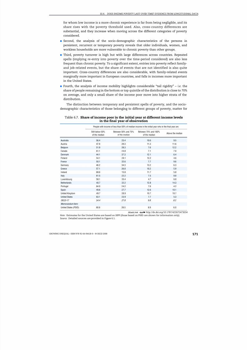
8/20/2019 Growing Unequal
http://slidepdf.com/reader/full/growing-unequal 171/309
III.6. DOES INCOME POVERTY LAST OVER TIME? EVIDENCE FROM LONGITUDINAL DATA
GROWING UNEQUAL – ISBN 978-92-64-04418-0 – © OECD 2008 171
for whom low income is a more chronic experience is far from being negligible, and itsshare rises with the poverty threshold used. Also, cross-country differences aresubstantial, and they increase when moving across the different categories of povertyconsidered.
● Second, the analysis of the socio-demographic characteristics of the persons inpersistent, recurrent or temporary poverty reveals that older individuals, women, andworkless households are more vulnerable to chronic poverty than other groups.
● Third, poverty turnover is high but with large differences across countries. Repeatedspells (implying re-entry into poverty over the time-period considered) are also lessfrequent than chronic poverty. To a significant extent, entries into poverty reflect family-and job-related events, but the share of events that are not identified is also quiteimportant. Cross-country differences are also considerable, with family-related eventsmarginally more important in European countries, and falls in incomes more importantin the United States.
● Fourth, the analysis of income mobility highlights considerable “tail rigidity” – i.e. theshare of people remaining in the bottom or top quintile of the distribution is close to 70%on average, and only a small share of the income poor move into higher strata of thedistribution.
The distinction between temporary and persistent spells of poverty, and the socio-demographic characteristics of those belonging to different groups of poverty, matter for
Table 6.7. Share of income poor in the initial year at different income levelsin the final year of observation
People with income of less than 50% of median income in the initial year who in the final year are:
Still below 50%of the median
Between 50% and 75%of the median
Between 75% and 100%of the median
Above the median
Australia 56.4 23.4 10.6 9.5
Austria 47.8 29.3 11.3 11.6
Belgium 51.9 28.3 7.6 12.2
Canada 61.1 24.8 7.1 7.0
Denmark 44.1 37.3 12.1 6.4
Finland 54.1 29.1 12.2 4.6
France 50.1 32.6 7.7 9.6
Germany 46.2 34.3 13.2 6.3
Greece 57.1 26.8 10.2 5.9
Ireland 68.6 13.8 11.7 5.8Italy 61.5 22.2 7.5 8.8
Luxembourg 58.1 30.4 4.7 6.8
Netherlands 40.7 32.2 12.8 14.3
Portugal 64.0 24.2 7.6 4.2
Spain 49.6 27.7 12.6 10.1
United Kingdom 49.7 28.9 10.7 10.7
United States 63.1 23.9 7.7 5.3
OECD-17 54.4 27.8 9.8 8.2
Memorandum item:
United States (PSID) 60.6 26.5 6.9 6.0
1 2 http://dx.doi.org/10.1787/422672473034
Note: Estimates for the United States are based on SIPP (those based on PSID are shown for information only).Source: Detailed sources are provided in Figure 6.1.
8/20/2019 Growing Unequal
http://slidepdf.com/reader/full/growing-unequal 172/309
III.6. DOES INCOME POVERTY LAST OVER TIME? EVIDENCE FROM LONGITUDINAL DATA
GROWING UNEQUAL – ISBN 978-92-64-04418-0 – © OECD 2008172
policy. Many recent reforms have aimed at eliminating the “poverty traps” embedded insocial assistance programmes, and their success typically requires initiatives targetedtowards specific groups of people. Better identifying the characteristics of these clientsrequires better surveys following people over time. However, and as important, the analysisin this chapter also reveals that the experience of low income affects a large part of the
population.
Notes
1. The most important of these problems are attrition and censoring. Attrition occurs when somepeople are not present at all survey dates: as attrition is typically non-random, it implies that,without an appropriate treatment, sample estimates are biased. Censoring may occur either whenthe beginning of the poverty spell is not observed (left-censoring), or because the spell was stillrunning at the end of the survey period (right-censoring). These two problems are particularlyimportant when estimating the duration or transition models based on individual data (especiallywhen computing the average duration of poverty spells). While the analysis in this chapter ignoresthe potential biases due to these selection processes, findings from national studies typicallyconclude that simple models provide estimates that differ little from those obtained from morecomplicated models (Cappellari and Jenkins, 2004).
2. Data refer to 1999-2001 for European countries, based on the European Community HouseholdPanel (ECHP); to 2002-2004 for Canada, based on data from the Survey of Labour and IncomeDynamics (SLID); and to 2002-2004 for Australia, based on data from the survey Household Incomeand Labour Dynamics in Australia (HILDA). For the United States, data come from two differentsources: the Survey of Income and Program Participation (SIPP) for the years 2001-2003, and thePanel Survey of Income Dynamics (PSID) for 1999, 2001 and 2003; estimates based on the PSID (thesource used in previous OECD analysis) are shown for information only, as the panel interviewspeople at two-year intervals. For Japan, data are based on the Keio Household Panel Survey for theyears 2005 to 2007. Poverty estimates for Japan are based on household income before taxes andafter public transfers; because of this difference in the income definition, estimates for Japan areshown as “memorandum items” in the figures and tables of this chapter. For Canada, Australia andthe United Sates (PSID), the data for poverty estimates are those available through the CrossNational Equivalent File (CNEF), see Burkhauser et al. (1995, 2001).
3. Household income data in the US SIPP survey are provided “before taxes and transfers”. Values of income “after taxes and transfers” are obtained by applying version 8 of the internet TAXSIMmodel of the National Bureau of Economic Research to the gross income records for this survey(see www.nber.org/~taxsim/taxsim-calc8/index.html; and Feenberg and Coutts, 1993).
4. Several studies have analysed poverty dynamics in specific countries using econometric models.Examples of multi-state multiple spells transition models with unobserved heterogeneity areStevens, (1999); Jenkins and Rigg (2001); Devicienti (2001a; 2001b); Hansen and Wahlberg (2004);Biewen (2006); Fertig and Tamm (2007). Studies based on a single spell of exit and re-entry includeOxley et al. (2000) and Fouarge and Layte (2005). See also Iceland (1997) and Jenkins (2007), as wellas Duncan et al. (1984; 1993), Bane and Ellwood (1986), Stevens (1994; 1995; and 1999) and Burgess
and Propper (1996; 1999).5. Only individuals present in all three years of the sample are included.
6. The correlation of poverty headcounts from the two data sources is around 0.9 for thresholds setat both 60% and 50% of median income. The average poverty rates shown in Figure 6.1 are also veryclose to those computed on the full (“unbalanced”) sample.
7. For a threshold set at 40% of the median, the OECD-average poverty rate falls to 5%, while itexceeds 16% when using a threshold of 60%. On this measure, country rankings are little affectedby the specific threshold used, i.e. those countries that top the poverty league based on onethreshold also record high values based on the others.
8. The age groups used in this chapter differ slightly from those used in Chapters 2 and 5.
9. While all data shown in this chapter are based on sample sizes of at least 50 observations, those
referring to countries where the poverty headcount is low (e.g. Denmark) may reflect the presenceof extreme values.

8/20/2019 Growing Unequal
http://slidepdf.com/reader/full/growing-unequal 173/309
III.6. DOES INCOME POVERTY LAST OVER TIME? EVIDENCE FROM LONGITUDINAL DATA
GROWING UNEQUAL – ISBN 978-92-64-04418-0 – © OECD 2008 173
10. Entry into poverty is measured by the share of individuals in the population as a whole who werenot poor at time t-1 and are poor at time t. The exit rate is the share of individuals who were poorat time t-1 and are no longer poor at time t.
11. The correlation between the rate of entry into poverty and the poverty headcount is positive andstatistically significant (with a correlation coefficient of 0.89), i.e. the risk of entering poverty ishigher in those countries where the poverty rate is also higher.
12. In this case the correlation between the rate of exit out of poverty and the poverty rate is negativeand statistically significant (with a correlation coefficient equal to –0.74). Thus the probability of exiting poverty is lower where the poverty headcount is higher.
13. This is because entries into poverty are not observed for those who are classified as poor in theinitial year and exits are not observed for people who are still in poverty at the end of the period.More generally, biases in the estimation of poverty duration may arise due to inadequatetreatment of the right and left-censoring of the data.
14. However, as noted by Fouarge and Layte (2005), “Whether or not long spells of poverty are worsethan recurrent short spells depends, to a large extent, on the degree of one’s aversion towardsuncertainty”.
15. For example, the impact of job-related events for entry into poverty is measured by first identifying
all households experiencing a change in family structure and then calculating the role of job-hrelated events only for the sub-sample of households with a stable family structure.
16. This variable was used in OECD (2001) to capture the effect of income losses due to a move to alower-paying job or a reduction in benefits or in capital income.
17. This, however, may simply reflect the specific order in which events are considered (i.e. when a fallin the number of workers is associated with family breakdown, the approach used here attributesthis effect to changes in family structure; the same will apply when a reduction in public benefitsis triggered by a change in family status). As noted in OECD (2001), this procedure reduces theimportance of changes in the number of workers relative to family events, and of income declinesrelative to changes in the number of workers.
18. Although income mobility may exist even when only small changes over two points in time areobserved in the overall income distribution, stability at the macro level does not necessarily imply
stability at the individual level.19. The correlation coefficient between the incomes at the times t1 and t2 will be equal to one only
when each individual’s income has not varied over the two time periods. By contrast, when somepeople’s incomes have increased enough to allow them to escape poverty and they are replaced byexactly the same number of individuals who see their income decline so that they enter poverty,the correlation coefficient will be lower than one. See Glewwe (2005 and 2007).
20. Mobility matrices for all the countries are in the annex.
References
Atkinson, T. (1983), The Economics of Inequality, 2nd edition, Clarendon Press, Oxford.
Bane, M.J. and D. Ellwood (1986), “Slipping Into and Out of Poverty: The Dynamics of Spells”, Journal of Human Resources, Vol. 21, No. 1.
Bartfeld, J. (1998), “Child Support and the Postdivorce Economic Well-being of Mothers, Fathers, andChildren”, Institute for Research on Poverty Discussion Paper, No. 1182-98, University of Wisconsin.
Bianchi Lekha, S.L. and J.R. Kahn (1999), “The Gender Gap in the Economic Well-Being of Non-residential Fathers and Custodial Mothers”, Demography, Vol. 36, No. 2.
Biewen, M. (2006), “Who Are the Chronic Poor? An Econometric Analysis of Chronic Poverty inGermany”, Research on Economic Inequality, Vol. 13.
Burgess, S. and C. Propper (1996), “Poverty Dynamics among Young Americans”, Centre for EconomicPolicy Research, Discussion Paper No. 1362, London.
Burgess, S. and C. Propper (1999), “An Economic Model of Household Income Dynamics, With anApplication to Poverty Dynamics Among American Women”, University of Bristol, Centre forEconomic Policy Research, Discussion Paper No. 1830, London.

8/20/2019 Growing Unequal
http://slidepdf.com/reader/full/growing-unequal 174/309
III.6. DOES INCOME POVERTY LAST OVER TIME? EVIDENCE FROM LONGITUDINAL DATA
GROWING UNEQUAL – ISBN 978-92-64-04418-0 – © OECD 2008174
Burkhauser, R.V., B.A. Butrica and M.C. Daly (1995), “The Syracuse University PSID, GSOEP EquivalentData File: A Product of Cross-National Research”, All-University Gerontology Center, MaxwellSchool of Citizenship and Public Affairs, Syracuse University, United States.
Burkhauser, R.V., B.A. Butrica, M.C. Daly and D.R. Lillard (2001), “The Cross-National Equivalent File: AProduct of Cross-National Research”, in I. Becker, N. Ott, and G. Rolf (eds.), Soziale Sicherung in EinerDynamischen Gesellschaf ( Social Insurance in a Dynamic Society), Campus Verlag, Frankfurt.
Burniaux, J.M., F. Pedrini and N. Brandt (2006), “Labour Market Performance, Income Inequality andPoverty in OECD Countries”, OECD Economic Department Working Paper, No. 500, OECD, Paris.
Cappellari, L and S.P. Jenkins (2004), “Modelling Low Pay Transition Probabilities: Accounting for PanelAttrition, Non-Response and Initial Conditions”, Institute for Social and Economic Research, ISERWorking Paper No. 2004-08, University of Essex.
Devicienti, F. (2001a), “Poverty Persistence In Britain: A Multivariate Analysis Using The BHPS, 1991-1997”,in P. Moyes, C. Seidl and A.F. Shorrocks (eds.), “Inequalities: Theory, Measurement andApplications”, Journal of Economics, Suppl. No. 9.
Devicienti, F. (2001b), “Estimating Poverty Persistence in Britain”, LABORatorio R. Revelli, Working Paper Series, No. 1, Torino.
Di Prete, T.A. and A. McManus (2000), “Family Change, Employment Transitions, and the Welfare State:
Household Income Dynamics in the United States and Germany”, American Sociological Review,Vol. 65.
Dubois, C. and B. Jeandidier (2000), “Dans quelle mesure les événements d’emploi et les événementsfamiliaux peuvent-ils expliquer les transitions individuelles de pauvreté ?”, in Bertrand et al. (eds.),Trajectoires d’emploi et conditions d’existence des individus, Céreq, Séminaires, No. 148, Marseille.
Duncan, G.J., R.D. Coe and M.S. Hill (1984), “The Dynamics of Poverty”, in G.J. Duncan, R.D. Coe,M.E. Corcoran, M.S. Hill, S.D. Hoffman and J.N. Morgan (eds.), Years of Poverty, Years of Plenty: TheChanging Economic Fortunes of American Workers and Families, Institute for Social Research, Universityof Michigan, Ann Arbor, United States.
Duncan, G., B. Gustafsson, R. Hauser, G. Schmauss, H. Messinger, R. Muffels, B. Nolan and J.-C. Ray,(1993), “Poverty Dynamics in Eight Countries”, Journal of Population Economics, Vol. 6.
Dynan, K.E., D.W. Elmendorf, D.E. Sichel (2007), “The Evolution of Household Income Volatility”,Federal Reserve Board and Brookings Institution, Draft, June.
Feenberg, D.R. and E. Coutts (1993), “An Introduction to the TAXSIM Model”, Journal of Policy Analysis andManagement, Vol. 12, No. 1.
Fertig, M. and M. Tamm (2007), “Always Poor or Never Poor and Nothing in Between? Duration of ChildPoverty in Germany”, Working Paper No. 59, ECINEQ, Society for the Study of Economic Inequality,Spain.
Finnie, R. (2000), “Low Income (Poverty) Dynamics in Canada: Entry, Exit, Spell Durations, and TotalTime”, Applied Research Branch Strategic Policy Human Resources Development Canada Working Paper, No. W-00-7E.
Fouarge, D. and R. Layte (2003), “Duration of Poverty Spells in Europe”, EPAG Working Paper, No. 2003-47,University of Essex, Colchester, United Kingdom.
Fouarge, D. and R. Layte (2005), “Welfare Regimes and Poverty Dynamics: The Duration and Recurrenceof Poverty Spells in Europe”, Journal of Social Policy, Vol. 34, No. 3.
Glewwe, P. (2005), “How Much of Observed Economic Mobility Is Measurement Error? A Method toRemove Measurement Error, with an Application to Vietnam”, Unpublished paper, Department of Applied Economics, University of Minnesota, United States.
Glewwe, P. (2007), “Measurement Error Bias in Estimates of Income and Income Growth among thePoor: Analytical Results and a Correction Formula”, Economic Development and Cultural Change,Vol. 56.
Hansen, J. and R. Wahlberg (2004), “Poverty Persistence in Sweden”, IZA Discussion Paper, No. 1209,Institute for the Study of Labor (IZA), Bonn.
Iceland, J. (1997), “The Dynamics of Poverty Spells and Issues of Left-Censoring”, Research Report
No. 97-378, Population Studies Center, University of Michigan, Ann Arbor.
Jarvis, S. and S.P. Jenkins (1999), “Marital Splits and Income Changes: Evidence from the BritishHousehold Panel Survey”, Population Studies, Vol. 53.

8/20/2019 Growing Unequal
http://slidepdf.com/reader/full/growing-unequal 175/309
III.6. DOES INCOME POVERTY LAST OVER TIME? EVIDENCE FROM LONGITUDINAL DATA
GROWING UNEQUAL – ISBN 978-92-64-04418-0 – © OECD 2008 175
Jeandidier, B., C. Bourreau-Dubois and F. Berger ( 2002), “Poverty Dynamics in Europe: An Approach inTerms of Work and/or Family-Related Events”, Working Paper du réseau européen COST A15Reforming Social Protection Systems in Europe, Urbino.
Jenkins, S.P. (2000), “Modelling Household Income Dynamics”, Journal of Population Economics, Vol. 13,No. 4, Springer.
Jenkins, S.P. (2007), “Approach to Modelling Poverty Dynamics”, Paper presented at the workshop“Dynamic Analysis using Panel Data: Applications to Poverty and Social Exclusion”, Torino, June 25.
Jenkins, S.P. and C. Schluter (2003), “Why Are Child Poverty Rates Higher in Britain than in Germany?A Longitudinal Perspective”, Journal of Human Resources, Vol. 38, No. 2.
Jenkins, S.P., J. Rigg and F. Devicienti (2001), “The Dynamics of Poverty in Britain”, Department for Workand Pensions, Research Report No. 157, London.
McKernan, S.-M. and C. Ratcliffe (2005), “Events that Trigger Poverty Entries and Exits”, Social ScienceQuarterly, Vol. 86, No. 5.
Muffels, R., D. Fouarge and R. Dekker (1999), “Longitudinal Poverty and Income Inequality. AComparative Panel Study for the Netherlands, Germany and the UK”, EPAG-Working Paper Series,No. 1, University of Essex.
OECD (1998), “Low-income Dynamics in Four OECD Countries”, OECD Economic Outlook, Chapter VI,OECD, Paris.
OECD (2001), “When Money is Tight: Poverty Dynamics in OECD Countries”, Chapter 2 in EmploymentOutlook, OECD, Paris.
OECD (2006), Society at a Glance – OECD Social Indicators, OECD, Paris.
Oxley, H., P. Antolín and T.-T. Dang (2000), “Poverty Dynamics in Six OECD Countries”, OECD EconomicStudies, No. 30, OECD, Paris.
Stevens, A. Huff (1994), “The Dynamics of Poverty Spells: Updating Bane and Ellwood”, AmericanEconomic Review, American Economic Association, Vol. 84, No. 2.
Stevens, A. Huff (1995), “Climbing Out of Poverty, Falling Back In: Measuring the Persistence of Poverty
over Multiple Spells”, NBER Working Paper No 5390, National Bureau of Economic Research, Inc.,Cambridge, Massachusetts.
Stevens, A. Huff (1999), “Climbing out of Poverty, Falling Back In: Measuring the Persistence of Povertyover Multiple Spells”, Journal of Human Resources, Vol. 34, No. 3.
Valletta, R.G. (2006), “The Ins and Outs of Poverty in Advanced Economics: Government Policies andPoverty Dynamics in Canada, Germany, Great Britain and the United States”, Review of Income andWealth, Vol. 52, No. 2.
Yaqub, S. (2000), “Intertemporal Welfare Dynamics”, Background paper prepared for the HumanDevelopment Report 2001 (UNDP), Brighton.

8/20/2019 Growing Unequal
http://slidepdf.com/reader/full/growing-unequal 176/309

8/20/2019 Growing Unequal
http://slidepdf.com/reader/full/growing-unequal 177/309
ISBN 978-92-64-04418-0Growing Unequal?© OECD 2008
177
PART III
Chapter 7
Non-income Poverty:What Can we Learn from Indicators
of Material Deprivation?*
Based on a measure that aggregates data on the prevalence of different types of deprivation, non-income poverty is higher in countries with lower per capitaincome and higher relative income poverty headcounts. The experience of deprivation declines monotonically with people’s income and age. In a given year,a large share of the income poor are not materially deprived while, conversely, alarge share of the population experience either low income or deprivation.
* This chapter has been prepared by Romina Boarini, OECD Economics Department, and Marco Mira
d‘Ercole, OECD Social Policy Division. The authors wish to thank Marton Medgyesi, TARKI, Hungary;Aya Abe, National Institute of Population and Social Security Research, Tokyo; Aderonke Osikominu.University of Freiburg, Germany; and Mark Pearson, OECD, for providing tabulations based onindividual data for, respectively, EU countries, Japan, the United States and Australia.

8/20/2019 Growing Unequal
http://slidepdf.com/reader/full/growing-unequal 178/309
III.7. NON-INCOME POVERTY: WHAT CAN WE LEARN FROM INDICATORS OF MATERIAL DEPRIVATION?
GROWING UNEQUAL – ISBN 978-92-64-04418-0 – © OECD 2008178
Introduction
Income is only a partial measure of the economic resources of people and of the extentto which these resources allow them to meet their basic needs. Some people with lowincome may benefit from in-kind support from public agencies and relatives, or fromaccumulated savings and borrowing that allow them to enjoy a decent standard of living.Conversely, even income above conventional thresholds may leave some people withinsufficient resources when they have special needs due to sickness and disability, or whenthey incur high work-related expenses, such as child care. Because conventional income
measures cannot identify such needs, a long tradition of research on poverty has lookedinstead at direct measures of the extent to which individuals and households have accessto the goods and amenities that are deemed to be needed for an acceptable standard of living in any given society.
This chapter takes stock of what can be learned from measures of material deprivationin a comparative perspective. After having described the conceptual foundations of material deprivation, the next section provides evidence of the size and features of material deprivation using two different approaches. The first is based on measures of theaverage prevalence of a broad range of deprivation items across OECD countries, withsummary measures derived as a simple average across these items: this approach allows
covering a broad range of items and countries, but relies on survey questions that are notstrictly comparable across countries (and are missing for some). The second approach isbased on measures of the extent to which each individual or household experiences a morelimited number of deprivation items, with summary measures derived by considering howmany people cumulate several deprivations at the same time. The final sectionsummarises the key patterns and draws some policy implications.
Material deprivation as one approach to the measurement of poverty
Poverty is a complex phenomenon, and different measures give different perspectivesas to its size and evolution.1 While a variety of alternative measures have been developed,
all approaches to the measurement of poverty rely on the specification of: i) a thresholdseparating the poor and the non-poor; and ii) an index that expresses how far from thethreshold the poor are. Different poverty measures can however be distinguished along two main dimensions:
● First, whether the metric used is “monetary” or “non-monetary”.
● Second, whether these measures refer either to “inputs” (i.e. indirect measures of poverty) or to “outcomes” (i.e. direct measures).
Most poverty measures, including those presented earlier in this report, are“monetary” and “input”-based, where the inputs are the resources required to achieve
well-being; income measures fall in this category, and they can be distinguished based onwhether they rely on either “absolute” or “relative” thresholds. 2 A complementaryapproach is that of measuring poverty “outcomes”, which concentrates on the final

8/20/2019 Growing Unequal
http://slidepdf.com/reader/full/growing-unequal 179/309
III.7. NON-INCOME POVERTY: WHAT CAN WE LEARN FROM INDICATORS OF MATERIAL DEPRIVATION?
GROWING UNEQUAL – ISBN 978-92-64-04418-0 – © OECD 2008 179
conditions of people rather than on the means required to achieve those conditions.Outcomes are generally conceived in terms of well-being or living standards, andmeasured based on metrics that are either monetary – as in the case of the measures thatconsider whether actual household expenditures fall short of some minimum level – ornon-monetary. Measures of material deprivation fall in this latter category – i.e. they are
“non-monetary” and “outcome”-based measures of poverty.
Much of the interest in measuring material deprivation (or “hardship”, in the USliterature) stems from the work of Townsend (1979), who related the concept of deprivationto the broader notion of “inability of living a decent life”. Following Townsend, otherscholars have emphasised the notions of “shame” and “inability to live a decent life withdignity” (Sen, 1983). Today, most authors define material deprivation as “exclusion fromthe minimum acceptable way of life in one’s own society because of inadequate resources”(Callan et al., 1993; Nolan and Whelan, 1996; Kangas and Ritakallio, 1998; Layte et al., 2001;Whelan et al., 2002; Perry, 2002) or as “lack of socially perceived necessities” (Bradshaw andFinch, 2003; Nolan and Whelan, 1996). In all these definitions, the line separating what isacceptable or decent and what is not differs across countries and over time. As a result, atleast in theory, measures of material deprivation imply a reference to a “relative” threshold.In practice, once a set of deprivation items is identified, change in material deprivationover time will reflect changes in the absolute living conditions of people. Conversely, as inthe case of income-based measures, all these definitions retain the household as thefundamental unit within which resources are shared and needs satisfied.
These definitions of material deprivation are consistent with a range of measurementapproaches, and much of the later research has aimed to refine empirical measures of deprivation. This research has focused on a number of questions:
● How to distinguish between preferences and constraints? One objection to using materialdeprivation concerns the failure to distinguish between the lack of a good (or of anactivity) due to voluntary choice from that due to financial constraints (Piachaud, 1981).For example, lack of a TV set might be due to not having enough money to buy one, or itmight reflect disgust with the quality of programmes. Today, the wording of most surveyquestions on material deprivation tries to distinguish between preferences andaffordability, although other aspects about the nature of deprivation (e.g. those related tothe quality of the items owned) are not adequately addressed.
● Which deprivation items to select? A second issue relates to the arbitrary list of items usedin the early research on material deprivation. This typically relied on experts’ views of
the items that allow a decent life – or, most often, of whatever information happened tobe available. However, people may disagree with what is and what is not included in thelist. A more structured approach pioneered by Mack and Lansley (1985) for the UnitedKingdom aims to reduce the arbitrariness in the choice of deprivation items by asking arepresentative sample of people to evaluate which specific items they perceived as“social necessities”.
● How to weight different items? A further argument stressed the importance of accounting for the seriousness of different forms of deprivation (Gordon et al., 2000). Indeed, mostempirical studies relied on simple binary scores to characterise whether a personexperienced each deprivation item; this approach implicitly assigns each type of deprivation an equal weight. This might not be reasonable – we might consider nothaving enough food to eat as more important that access to a TV. Desai and Shah (1988)
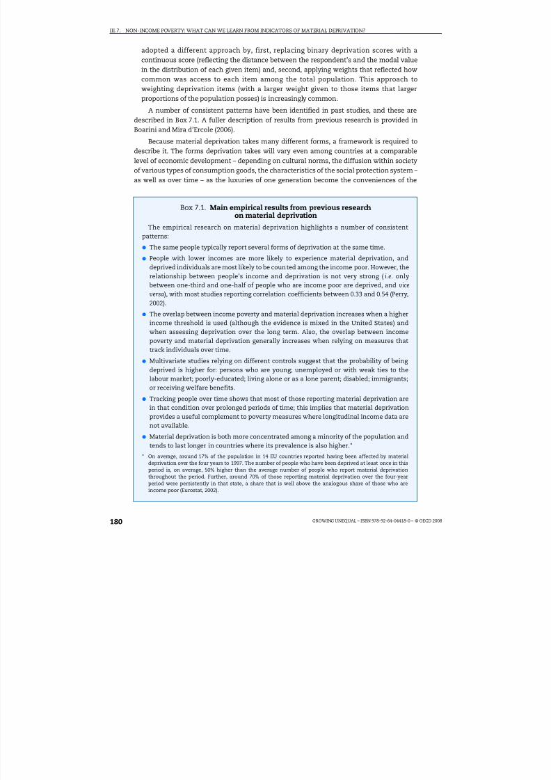
8/20/2019 Growing Unequal
http://slidepdf.com/reader/full/growing-unequal 180/309
III.7. NON-INCOME POVERTY: WHAT CAN WE LEARN FROM INDICATORS OF MATERIAL DEPRIVATION?
GROWING UNEQUAL – ISBN 978-92-64-04418-0 – © OECD 2008180
adopted a different approach by, first, replacing binary deprivation scores with acontinuous score (reflecting the distance between the respondent’s and the modal valuein the distribution of each given item) and, second, applying weights that reflected howcommon was access to each item among the total population. This approach toweighting deprivation items (with a larger weight given to those items that larger
proportions of the population posses) is increasingly common.
A number of consistent patterns have been identified in past studies, and these aredescribed in Box 7.1. A fuller description of results from previous research is provided inBoarini and Mira d’Ercole (2006).
Because material deprivation takes many different forms, a framework is required todescribe it. The forms deprivation takes will vary even among countries at a comparablelevel of economic development – depending on cultural norms, the diffusion within societyof various types of consumption goods, the characteristics of the social protection system –as well as over time – as the luxuries of one generation become the conveniences of the
Box 7.1. Main empirical results from previous researchon material deprivation
The empirical research on material deprivation highlights a number of consistentpatterns:
● The same people typically report several forms of deprivation at the same time.
● People with lower incomes are more likely to experience material deprivation, anddeprived individuals are most likely to be counted among the income poor. However, therelationship between people’s income and deprivation is not very strong ( i.e. only
between one-third and one-half of people who are income poor are deprived, and viceversa), with most studies reporting correlation coefficients between 0.33 and 0.54 (Perry,2002).
● The overlap between income poverty and material deprivation increases when a higherincome threshold is used (although the evidence is mixed in the United States) andwhen assessing deprivation over the long term. Also, the overlap between incomepoverty and material deprivation generally increases when relying on measures thattrack individuals over time.
● Multivariate studies relying on different controls suggest that the probability of being deprived is higher for: persons who are young; unemployed or with weak ties to thelabour market; poorly-educated; living alone or as a lone parent; disabled; immigrants;
or receiving welfare benefits.
● Tracking people over time shows that most of those reporting material deprivation arein that condition over prolonged periods of time; this implies that material deprivationprovides a useful complement to poverty measures where longitudinal income data arenot available.
● Material deprivation is both more concentrated among a minority of the population andtends to last longer in countries where its prevalence is also higher.*
* On average, around 17% of the population in 14 EU countries reported having been affected by materialdeprivation over the four years to 1997. The number of people who have been deprived at least once in thisperiod is, on average, 50% higher than the average number of people who report material deprivationthroughout the period. Further, around 70% of those reporting material deprivation over the four-yearperiod were persistently in that state, a share that is well above the analogous share of those who areincome poor (Eurostat, 2002).

8/20/2019 Growing Unequal
http://slidepdf.com/reader/full/growing-unequal 181/309
III.7. NON-INCOME POVERTY: WHAT CAN WE LEARN FROM INDICATORS OF MATERIAL DEPRIVATION?
GROWING UNEQUAL – ISBN 978-92-64-04418-0 – © OECD 2008 181
next and the necessities of the one that follows. A simple typology of material deprivationdistinguishes between the following types.
● Satisfaction of basic needs, which refers to items that are essential for physical survival (e.g.
food, clothes, ability to keep the home warm during winter, etc.).
●
Capacity to afford basic leisure and social activities, which refers to items that, while notessential for physical survival, are critical for enjoying a decent quality of life (e.g. having a week of holiday away from home at least once per year, or occasionally inviting friendsand relatives home for drinks or meals).
● Availability of consumer durables, which refers to items that are essential to perform every-day life activities (e.g. having a telephone) or that significantly ease housework and otherdomestic tasks (e.g. having a microwave oven).
● Housing conditions, which relates to both the physical characteristics of the dwelling (e.g. availability of electricity, water supply, or indoor flushing toilet, or whether parts of the dwelling are deteriorated or damaged) and of the areas where these are located ( e.g.
exposure to noise, indoor pollution, etc.).
● Appreciation of own personal conditions, in terms of their financial stress and ability tomake ends meet, as well as subjective perception of whether they consider themselvesas poor.
● Characteristics of the social environment where individuals live, which describe features of the neighbourhood (e.g. exposure to specific hazards, fear of crime, and availability of public services such as schools and hospitals) and of the social networks of individuals(e.g. ability to rely on support from others in case of need).3
This typology provides a grid that is used in the next section to summarise the
available evidence on material derivation across OECD countries. However, not all of theitems listed are equally relevant and few measures exist for some. As a result, thedescription below excludes indicators of the extent to which individuals feel poor andindicators of neighbourhood characteristics.
Characteristics of material deprivation in a comparative perspective
The most important problem in making international comparisons is data availability:no survey currently exists that includes a common set of questions on material deprivationand covers a significant number of OECD countries – although a common survey (the EU
Survey on Income and Living Conditions) now exists for EU countries. It follows that any
attempt to shed some light on how material deprivation compares across OECD countrieswill need to identify items for which comparisons are less arbitrary. This section uses twodifferent approaches to make international comparisons. The first describes theprevalence of material deprivation in each country for a large number of items, and derivessummary measures of deprivation for the country as a whole by averaging across theseitems. The second approach restricts attention to a more narrow set of items andcountries, and reverses the order of aggregation, i.e. a composite measure of materialdeprivation is derived by looking at, first, the extent to which each person lacks variousitems and, second, at how many people are in these conditions.
Prevalence of material deprivation based on aggregate data
Table 7.1 presents information on the prevalence of various types of deprivation acrosshouseholds within each of the six main categories described above. The information

8/20/2019 Growing Unequal
http://slidepdf.com/reader/full/growing-unequal 182/309
GR OWI N G UNE Q UAL –I S B
N 9 7 8 - 9 2 - 6 4 - 0 4 4 1 8 - 0 – © OE C D2 0 0 8
1 8 2
Table 7.1. Share of households reporting different types of material deprivation,Based on aggregate data
Househoulds deprived in terms of
Basic needs Basic leisure Consumer durables Housing
Inability toadequately
heat home
Inabilityto have a
healthy diet
Restrictedaccess to
heath care
Having oneweek holidayaway from
home per year
Televison TelephonePersonalcomputer
Needingrepair
Lackingindoor toilet
Expoto pol
Austria 1 6 5 21 0 1 9 4 3 4
Belgium 4 3 8 20 0 1 5 6 2 10
Canada . . 8 . . 0 . . 4 . . 8 . . .
Czech Republic 8 19 3 34 . . . . 18 9 5 20
Denmark 2 1 1 11 0 0 5 5 0 4
Finland 7 4 3 26 1 0 8 2 1 14
France 4 3 4 24 0 1 11 9 2 17
Germany 3 2 3 21 0 1 18 7 1 5
Greece 31 26 21 51 2 2 16 9 6 15
Hungary 11 34 8 63 . . . . 23 19 9 22
Ireland 4 1 10 24 1 2 15 5 1 7Italy 17 5 26 36 1 1 15 6 1 15
Japan 1 . . 2 26 . . 2 12 17 1 .
Luxembourg 6 2 5 8 0 0 2 6 . . 16
Netherlands 3 2 3 13 0 0 4 8 0 11
New Zealand 4 11 8 21 0 2 . . 14 0 7
Poland 30 17 19 68 . . . . 40 25 11 22
Portugal 56 3 17 59 2 5 26 23 7 19
Slovak Republic 17 33 21 64 . . . . 28 26 7 18
Spain 42 3 4 37 0 2 21 9 0 10
Sweden 1 2 3 15 0 . . 4 4 1 5
Turkey 45 53 33 66 . . . . 61 20 12 29
United Kingdom 2 8 3 24 0 0 10 6 1 7
United States 7 11 8 . . 1 5 33 5 . . 3
OECD-24 13 11 9 32 1 2 18 10 3 13
1
. .: Data not available.Source: OECD (2006), based on a selection of the indicators included in Tables 3 to 8 in Boarini et al. (2006).
8/20/2019 Growing Unequal
http://slidepdf.com/reader/full/growing-unequal 183/309
III.7. NON-INCOME POVERTY: WHAT CAN WE LEARN FROM INDICATORS OF MATERIAL DEPRIVATION?
GROWING UNEQUAL – ISBN 978-92-64-04418-0 – © OECD 2008 183
presented is limited to a few items within each category, with information on a broaderrange of items (not always available for all countries) presented in Boarini et al. (2006).Some broad patterns emerge:
● Basic needs. In the early 2000s, across the OECD countries included in Table 7.1, around10% of OECD households failed to satisfy basic needs such as adequately heating theirhome, having a healthy diet or having unrestricted access to health care. These sharesare, in general, larger in most Southern and Eastern European countries (especially forheating and clothing). A high level of deprivation in one of these items generally meansa high level in other indicators too.4 The simple OECD-average of the share of households deprived in basic needs is 11% (and 10% when items that only a small shareof the population lack are given a larger weight, Table 3 in Boarini et al., 2006) with valuesranging from 5% or less in France, Ireland, Luxembourg, Netherlands, Sweden and theUnited Kingdom up to 20% or more in Greece, Hungary, Poland, Portugal, the SlovakRepublic and Turkey.
●
Basic leisure. On average, across all OECD countries, around one-third of all householdscould not afford to take one week of holiday away from home over the past 12 months,with this share exceeding 50% in Greece, Hungary, Poland, Portugal, the Slovak Republicand Turkey. Also, according to Table 4 in Boarini et al., 2006, 14% of all households reportnot having invited friends and relatives over the past month. The correlation betweenthese two types of basic leisure activities is high (84%), and cross-country variability in thetwo items small. The average share of OECD households unable to afford basic leisureactivities is 24% based on unweighted data, and 21% when the items that only a smallshare of the population lack are given a larger weight (Boarini et al., 2006). Lack of basicleisure activities appears to affect a larger share of people than does lack of basic needs.
● Consumer durables. On average, few OECD households lacked a television or a telephone,but close to one-fifth did not have a personal computer at home. Differences acrossOECD countries in the share of households possessing different consumer durables arelarge, with the shares lacking basic consumer durables generally higher in Australia,Canada and the United States than in most European countries (although this mayreflect differences in the wording of survey questions, i.e. lack of a distinction betweenfinancial constraints and voluntary choices in most non-European surveys). Cross-country differences in the possession of consumer durables are generally higher than inthe case of basic needs and leisure activities, in particular when looking at possession of cars and microwaves (Table 5 in Boarini et al., 2006). Lack of one type of durable is very
much correlated with lack of another type. On average, 11% of OECD households reportlacking some basic consumer durables (9% when considering the weighted average),with this share exceeding 25% in Hungary, Poland, the Slovak Republic and Turkey(Boarini et al., 2006).
● Housing conditions. If most households in OECD countries report having an indoor toilet,one in ten reported that their house was in need of repairs, and 13% that it was exposedto pollution. When looking at other characteristics of dwellings, very few householdsreported lacking an indoor shower or bath (2%) or hot running water (7%), while asignificantly higher proportion (14% on average) reported overcrowding (based on anindicator referring, for most countries, to dissatisfaction with respect to housing space,
Table 6 in Boarini et al., 2006). A larger share of households declared being exposed tonoise and crime (21% and 19%), with little variation across countries. Overall, the items

8/20/2019 Growing Unequal
http://slidepdf.com/reader/full/growing-unequal 184/309
III.7. NON-INCOME POVERTY: WHAT CAN WE LEARN FROM INDICATORS OF MATERIAL DEPRIVATION?
GROWING UNEQUAL – ISBN 978-92-64-04418-0 – © OECD 2008184
describing housing conditions are not very correlated with each other, with the averageshare of OECD households experiencing poor housing conditions around 12% (and 8%based on weighted data, Boarini et al., 2006).
● Financial stress. Less than 10% of OECD households reported having incurred paymentarrears during the past year, but the share was 20% for those declaring that in the pastyear they could make ends meet only with great difficulty, or that occasionally theycould not meet essential expenses (with much higher values in several East Europeancountries). On average 9% of households declared having been unable to pay utility billsin the past year (a share that is much higher in East European countries, Turkey andAustralia, Table 7 in Boarini et al., 2006), with a lower proportion reporting arrears inpaying rents or mortgages (5%) and other types of loans (3%). 5 Different forms of financial stress are highly correlated with each other, with the main exception being theindicator referring to the inability to repay loans. The simple OECD average of households suffering from financial strain is 10%, while the weighted average is 8%(Boarini et al., 2006).
● Support from others. On average, around 13% of all households report that they regularlyrelied on help from persons living outside the household in the year preceding thesurvey.6 A similar proportion of households declared that, in case of financial need, theywould not have anyone on whom to rely (Table 8 in Boarini et al., 2006). Across countries,the correlation between the two indicators (at 36%) is smaller than for other deprivationdimensions. The OECD average for the two indicators is 14%, based on unweighted data(and marginally lower when using weighted data or excluding countries where only oneindicator is available, Boarini et al., 2006).
Across countries, data on the prevalence of the six main components of deprivation
are highly correlated with each other, particularly for deprivation in basic needs, socialactivities and consumer durables (with average correlations, across these dimensions, of 64%, 77% and 65%, respectively) and, to a lesser extent, for help from social networks andfinancial stress (with average correlations of 40% and 46% respectively). The highcorrelations between the different types of deprivation suggest that they measure thesame underlying phenomenon and that they provide a reasonably consistent picture of theextent of poverty and hardship across OECD countries.
A summary measure of the overall prevalence of material deprivation can becomputed by averaging first across the deprivation items within each of the six maincategories, and then across the categories. Figure 7.1 plots the relation between this
summary measure of material deprivation, on one side, and the relative income povertyheadcount and per capita income, on the other. This summary measure of materialdeprivation is only weakly correlated with income poverty (at around 40% when using athreshold set at half of the median), while the correlation is stronger (over 80%) withrespect to GDP per capita. This suggests that this simple measure of material deprivationprovides information about the absolute living standard of the poor, which in turn dependson the economic development of each country. However, when limiting the comparisons toOECD countries with similar levels of income (i.e. those with a GDP per capita aboveUSD 20 000), the correlation with relative income poverty rises (to around 0.60) while thatwith per capita GDP disappears. While it is not possible to interpret this relation in terms
of causality, the figure suggests that monetary and non-monetary measures of povertyconvey a broadly consistent picture.

8/20/2019 Growing Unequal
http://slidepdf.com/reader/full/growing-unequal 185/309
III.7. NON-INCOME POVERTY: WHAT CAN WE LEARN FROM INDICATORS OF MATERIAL DEPRIVATION?
GROWING UNEQUAL – ISBN 978-92-64-04418-0 – © OECD 2008 185
Size and characteristics of material deprivation based on individual data
Despite the high correlation between the different measures of material deprivationshown above, it could be that they are not suffered by the same people. This is because the
measures of material deprivation presented above do not distinguish between situationswhere the same person experiences different types of deprivation and those where theseexperiences are widely shared among the population at large. Distinguishing betweenthese two situations requires data referring to specific individuals and households. Thissection presents results for 25 OECD (22 European and three non-European countries)based on household surveys referring to the mid-2000s.
The analysis refers to a small set of deprivation items that are common across surveys:
● Inadequate heating.
● Constrained food choices.
● Overcrowding.● Poor environmental conditions.
● Arrears in utility bills.
● Arrears in rents/mortgages.
● Inability to make ends meet.
These items include both specific contingencies (such as payment arrears) and moregeneral assessments of the respondents’ own conditions (e.g. ability to make ends meet). Itshould also be noted that the wording of the survey questions differ (Box 7.2), and thesedifferences may affect cross-country comparisons of the overall prevalence of material
deprivation in each country.7 The analysis in this section makes abstraction of thesedifferences, trying instead to make the best possible use of the information that iscurrently available. The evidence below refers to the share of people affected by different
Figure 7.1. Higher material deprivation in countries with higher relative incomepoverty and lower GDP per capita
Based on aggregate data
1 2 http://dx.doi.org/10.1787/422677656865Note: Material deprivation refers to the share of households reporting different forms of deprivation among the sixmain categories shown in Table 7.1 averaged across them. Relative income poverty is based on a threshold set at half of median disposable income. OECD countries with per capita GDP below USD 20 000 are denoted with a diamond.The grey dashed line in each panel is the trend line between the two variables obtained when limiting the analysisto countries with per capita GDP above USD 20 000.
Source: Boarini and Mira d’Ercole (2006).
60 000
50 000
40 000
30 000
10 000
20 000
00 10 20 30 40
20
16
12
8
4
00 10 20 30 40
AUT
CAN
CZEDNK
FINFRADEU
GRC
HUN
IRL
ITA
JPN
LUXNLD
NZLPOL
PRT
ESP
SWE
TUR
GBR
USA
AUTCAN
CZE
DNK
FIN
FRA
DEUGRC
HUN
IRL ITA
JPN
LUX
NLD
NZL POL
PRTESP
SWE
TUR
GBR
USA
Material deprivation Materiel deprivation
Relative income poverty GDP per capita
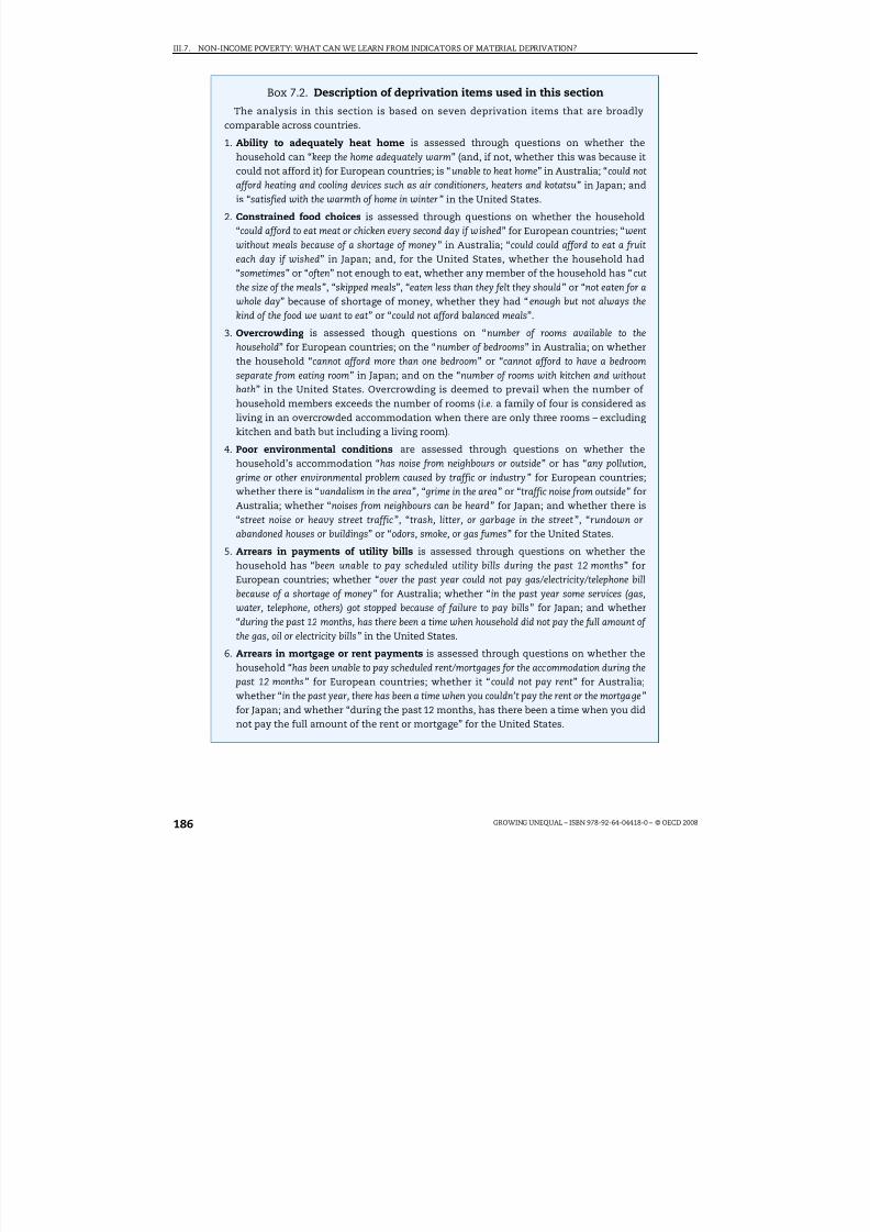
8/20/2019 Growing Unequal
http://slidepdf.com/reader/full/growing-unequal 186/309
III.7. NON-INCOME POVERTY: WHAT CAN WE LEARN FROM INDICATORS OF MATERIAL DEPRIVATION?
GROWING UNEQUAL – ISBN 978-92-64-04418-0 – © OECD 2008186
Box 7.2. Description of deprivation items used in this section
The analysis in this section is based on seven deprivation items that are broadlycomparable across countries.
1. Ability to adequately heat home is assessed through questions on whether the
household can “keep the home adequately warm” (and, if not, whether this was because itcould not afford it) for European countries; is “unable to heat home” in Australia; “could notafford heating and cooling devices such as air conditioners, heaters and kotatsu” in Japan; andis “satisfied with the warmth of home in winter” in the United States.
2. Constrained food choices is assessed through questions on whether the household“could afford to eat meat or chicken every second day if wished” for European countries; “went
without meals because of a shortage of money” in Australia; “could could afford to eat a fruit
each day if wished” in Japan; and, for the United States, whether the household had“sometimes” or “often” not enough to eat, whether any member of the household has “cut
the size of the meals”, “skipped meals”, “eaten less than they felt they should” or “not eaten for a
whole day” because of shortage of money, whether they had “enough but not always thekind of the food we want to eat” or “could not afford balanced meals”.
3. Overcrowding is assessed though questions on “number of rooms available to thehousehold” for European countries; on the “number of bedrooms” in Australia; on whetherthe household “cannot afford more than one bedroom” or “cannot afford to have a bedroom
separate from eating room” in Japan; and on the “number of rooms with kitchen and withoutbath” in the United States. Overcrowding is deemed to prevail when the number of household members exceeds the number of rooms (i.e. a family of four is considered asliving in an overcrowded accommodation when there are only three rooms – excluding kitchen and bath but including a living room).
4. Poor environmental conditions are assessed through questions on whether thehousehold’s accommodation “has noise from neighbours or outside” or has “any pollution,
grime or other environmental problem caused by traffic or industry” for European countries;whether there is “vandalism in the area”, “grime in the area” or “traffic noise from outside” forAustralia; whether “noises from neighbours can be heard” for Japan; and whether there is“street noise or heavy street traffic”, “trash, litter, or garbage in the street”, “rundown orabandoned houses or buildings” or “odors, smoke, or gas fumes” for the United States.
5. Arrears in payments of utility bills is assessed through questions on whether thehousehold has “been unable to pay scheduled utility bills during the past 12 months” forEuropean countries; whether “over the past year could not pay gas/electricity/telephone bill
because of a shortage of money” for Australia; whether “in the past year some services (gas,
water, telephone, others) got stopped because of failure to pay bills” for Japan; and whether“during the past 12 months, has there been a time when household did not pay the full amount of
the gas, oil or electricity bills” in the United States.
6. Arrears in mortgage or rent payments is assessed through questions on whether thehousehold “has been unable to pay scheduled rent/mortgages for the accommodation during the
past 12 months” for European countries; whether it “could not pay rent” for Australia;whether “in the past year, there has been a time when you couldn’t pay the rent or the mortgage”for Japan; and whether “during the past 12 months, has there been a time when you didnot pay the full amount of the rent or mortgage” for the United States.

8/20/2019 Growing Unequal
http://slidepdf.com/reader/full/growing-unequal 187/309
III.7. NON-INCOME POVERTY: WHAT CAN WE LEARN FROM INDICATORS OF MATERIAL DEPRIVATION?
GROWING UNEQUAL – ISBN 978-92-64-04418-0 – © OECD 2008 187
types of deprivation based on responses from the household head or reference person,ignoring possible differences in assessments of their own conditions provided by various
members of the same household.8
Prevalence of different deprivation items
The natural starting point for a comparative assessment of material deprivation isprovided by prevalence rates for each of the seven items described above. Two mainpatterns stand out from Table 7.2:
● First, patterns differ across items. On average, across the countries considered, 20% of respondents declared being unable to make ends meet, while smaller shares of respondents report living in overcrowded housing or in areas with poor environmentalconditions (18% and 16% respectively). The frequency of other deprivation items
(inadequate heating and food consumption, payment arrears for utilities and rents) is,on average, below 10%.9
● Second, differences across countries are significant. In general, Nordic countries (exceptIceland) record the lowest prevalence rates for all the items considered, Southern andEastern European countries have some of the highest shares in almost all dimensions,while Australia, Japan and the United States are somewhere in the middle.10
Another perspective on the prevalence of material deprivation is provided byinformation on the number of items that people lacked on average. Figure 7.2 shows largedifferences in the share of people lacking two or more items, ranging from 10% in all Nordic
countries (except Iceland), Luxembourg, Austria and the Netherlands, to 20% or more inItaly, Switzerland, the Czech Republic, Australia, the United States and Japan, and to 40% ormore in Greece, Hungary, the Slovak Republic and Poland. The share of people lacking three
Box 7.2. Description of deprivation items used in this section (cont.)
7. Ability to make ends meet is assessed through questions on whether, “Thinking of your
household’s total monthly income, is your household able to make ends meet with great/some
difficulty/fairly easily” for European countries; those indicating “very poor situation” in
response to questions about the household’s “ prosperity, given current needs and financialresponsibilities” for Australia; whether “the family runs into red every month” for Japan;whether “during the past 12 months, has there been a time when you did not meet all of your
essential expenses” for the United States.
Data on these items are available for 22 European countries based on the Survey onIncome and Living Conditions (EU-SILC) conducted in 2005; for Australia, based on thesurvey Household Income and Labour Dynamics in Australia (HILDA) conducted in 2005;for Japan, based on the Shakai Seikatsu Chousa (Survey of Living Conditions) conducted in2003; and for the United States, based on the Survey of Income and Program Participation,SIPP, conducted in 2003. While these are large, official surveys for most countries, the
survey used for Japan is an unofficial and experimental survey designed by the NationalInstitute of Population and Social Security Research, with a (nationally representative)sample limited to around 2 000 households and around 6 000 persons aged 20 years andabove, with data on household income provided through categorical answers. For theUnited States, where SIPP data refer to gross ( i.e. pre-tax) income, income values “aftertaxes” have been obtained by applying the TAXSIM model of the National Bureau of Economic Research to the SIPP data.

8/20/2019 Growing Unequal
http://slidepdf.com/reader/full/growing-unequal 188/309

8/20/2019 Growing Unequal
http://slidepdf.com/reader/full/growing-unequal 189/309
III.7. NON-INCOME POVERTY: WHAT CAN WE LEARN FROM INDICATORS OF MATERIAL DEPRIVATION?
GROWING UNEQUAL – ISBN 978-92-64-04418-0 – © OECD 2008 189
of deprivation items, although with differences in this profile – which is (marginally) steeperin the United Kingdom and Switzerland and flatter in Australia and Sweden.12
A second dimension that is important is the age of each person experiencing
deprivation. Figure 7.4 shows the share of each age group reporting two or moredeprivation items (top panel) and three or more items (bottom panel), relative to thecorresponding share for the entire population. These profiles decline monotonically withthe age of each person, a pattern that contrasts with the U-shaped profile for the income-poverty headcount described in Chapter 5. This suggests that household disposableincome over-estimates the risk of inadequate consumption among the elderly. There are,however, differences in these age-deprivation profiles across countries – with high risks of deprivation for young adults in Denmark and the very elderly in Greece and Portugal, andmuch flatter profiles (i.e. small declines in the frequency of material deprivation withpeople’s age) in Austria, Hungary, Poland, Portugal, the Slovak Republic and the United
States.13
The risk of material deprivation also differs with the characteristics of the householdwhere individuals live. Among households with a head of working age (Table 7.3), theexperience of multiple deprivations is higher among singles than couples; among households with children than those without; and among households where no one isworking than those where someone is. There are, however, exceptions and largedifferences in the deprivation-risk of different household types across countries. Forexample, couples with children have a below-average risk of deprivation (at 0.9, across the25 OECD countries considered) when both parents work (although this is not true in eightcountries) but an above-average one when only one person is working (1.8) and especiallywhen no one works (3.1) – with a deprivation risk for jobless couples of 5 in Austria, Polandand Sweden. Among lone parents, the risk of deprivation is, on average, around 3 when the
Figure 7.2. Share of people lacking different numbers of deprivation itemsand mean number of items lacked
Based on individual data
1 2 http://dx.doi.org/10.1787/422725806623Note: European and non-European countries are ranked separately, from left to right, in increasing order of the shareof people reporting deprivation in two or more items.
Source: OECD Secretariat calculation based on different household surveys.
D N K
S W E
F I N N O R
L U X
A U T
N L D
G B R
I R L
D E U I S
L B E
L E S
P F R
A I T A
C H E
C Z E
P R T
G R C
H U N
S V K
P O L A U
S U S
A J P N
80
60
40
20
0
2.4
1.8
1.2
0.6
0
Two or more (left scale) Mean number of deprivation items (right scale)Four or more (left scale) Three or more (left scale)
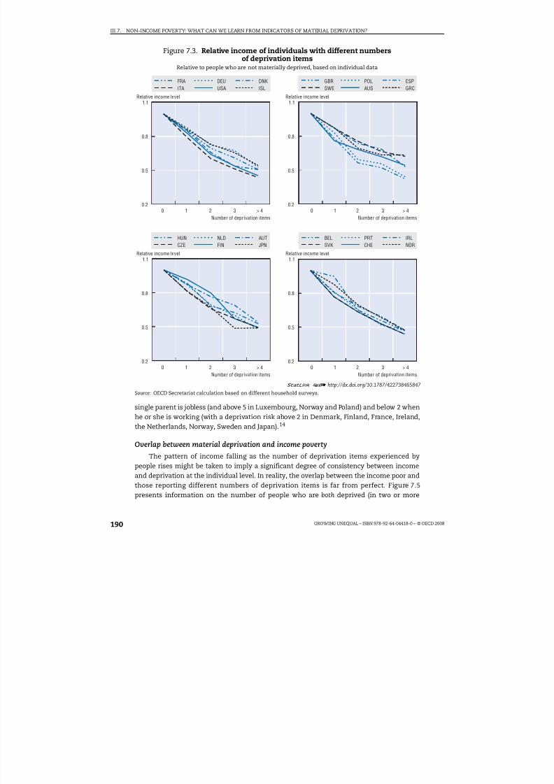
8/20/2019 Growing Unequal
http://slidepdf.com/reader/full/growing-unequal 190/309
III.7. NON-INCOME POVERTY: WHAT CAN WE LEARN FROM INDICATORS OF MATERIAL DEPRIVATION?
GROWING UNEQUAL – ISBN 978-92-64-04418-0 – © OECD 2008190
single parent is jobless (and above 5 in Luxembourg, Norway and Poland) and below 2 whenhe or she is working (with a deprivation risk above 2 in Denmark, Finland, France, Ireland,the Netherlands, Norway, Sweden and Japan).14
Overlap between material deprivation and income poverty
The pattern of income falling as the number of deprivation items experienced bypeople rises might be taken to imply a significant degree of consistency between incomeand deprivation at the individual level. In reality, the overlap between the income poor and
those reporting different numbers of deprivation items is far from perfect. Figure 7.5presents information on the number of people who are both deprived (in two or more
Figure 7.3. Relative income of individuals with different numbersof deprivation items
Relative to people who are not materially deprived, based on individual data
1 2 http://dx.doi.org/10.1787/422738465847Source: OECD Secretariat calculation based on different household surveys.
1.1
0.8
0.5
0.2
1.1
0.8
0.5
0.2
FRAITA USA
DEUISLDNK GBR
SWE AUS
POLGRCESP
HUNCZE FIN
NLDJPNAUT BEL
SVK CHEPRT
NORIRL
0 21 3 > 40 21 3 > 4
1.1
0.8
0.5
0.2
1.1
0.8
0.5
0.20 21 3 > 40 21 3 > 4
Number of deprivation itemsNumber of deprivation items
Relative income level Relative income level
Number of deprivation itemsNumber of deprivation items
Relative income level Relative income level

8/20/2019 Growing Unequal
http://slidepdf.com/reader/full/growing-unequal 191/309
III.7. NON-INCOME POVERTY: WHAT CAN WE LEARN FROM INDICATORS OF MATERIAL DEPRIVATION?
GROWING UNEQUAL – ISBN 978-92-64-04418-0 – © OECD 2008 191
items) and income poor (based on a threshold set at half of median income) and thenumber in either of these conditions, as well as the share of all people who are materiallydeprived and have income of less than half of the median. Several patterns stand out:
● The overlap is in general only partial, i.e. only a small proportion of people reporting material deprivation are also income poor, and vice versa . On average, only 20% of peopledeprived in two or more items have income below the 50% threshold, with this shareranging from around 30% in the United States and Luxembourg, down to 10% in theNetherlands and the Slovak Republic (see Table 7.A2.1 available at http://dx.doi.org/
10.1787/424402577838).
● Relatively few people experience both income poverty and material deprivation. Onaverage, around 4% of all people have both income below the 50% threshold andexperience two or more deprivations. Across countries, this share varies from less than
Figure 7.4. Risk of multiple deprivation by age of individualsBased on individual data
1 2 http://dx.doi.org/10.1787/422745863337Note: No data on deprivation by age of individuals are available for Japan.
Source: OECD Secretariat calculation based on different household surveys.
2.0
1.6
1.2
0.4
0.8
0
2.0
1.6
1.2
0.4
0.8
0
DNKAUS
ESPAUT BEL
SWEUSA
GBRFRA ITA
0 - 1 7 1 8 - 2 5
2 6 - 4 0
4 1 - 5 0
5 1 - 6 5
6 6 - 7 5 > 7 5 0 - 1 7 1
8 - 2 5 2 6 - 4 0
4 1 - 5 0
5 1 - 6 5
6 6 - 7 5 > 7 5
0 - 1 7
1 8 - 2 5
2 6 -
4 0
4 1 - 5 0
5 1 - 6 5
6 6 - 7 5
> 7 5
0 - 1 7
1 8 - 2 5
2 6 -
4 0
4 1 - 5 0
5 1 - 6 5
6 6 - 7 5
> 7 5
2.0
1.6
1.2
0.4
0.8
0
2.0
1.6
1.2
0.4
0.8
0
DEU POL
A. Share of each age group experiencing two or more deprivation items, rat io relative to population average
B. Share of each age group experiencing three or more deprivation items, ratio relat ive to population average

8/20/2019 Growing Unequal
http://slidepdf.com/reader/full/growing-unequal 192/309
III.7. NON-INCOME POVERTY: WHAT CAN WE LEARN FROM INDICATORS OF MATERIAL DEPRIVATION?
GROWING UNEQUAL – ISBN 978-92-64-04418-0 – © OECD 2008192
2% in Sweden, Denmark, Norway, Finland and Austria, up to 6% or more in Japan, Italy,the United States, Portugal, Greece and Poland.
● While people who are both income poor and materially deprived may be considered asbeing in severe conditions, the number of those who are either income poor or deprivedprovides an upper bound estimate of those facing a risk of poverty. People in this groupmay be reducing their consumption patterns, despite having an income that is above theconventional poverty line, or they may afford typical consumption patterns, despitetheir low income, through additional resources. The share of people in either of these
Table 7.3. Risk of experiencing two or more deprivations for people livingin households with a head of working age, by household characteristics
Relative to the population average, based on individual data
Household with a head of working age
Single adults Couples
Without children With children Without children With children
WorkingNot
workingWorking
Notworking
Two ormore
workers
Oneworker
No workerTwo ormore
workers
Oneworker
No worker
European countries
Austria 0.7 2.2 1.9 4.2 0.7 0.6 0.7 1.0 1.6 5.1
Belgium 0.9 2.4 1.5 3.7 0.4 0.8 1.1 0.5 1.9 3.7
Czech Rep. 0.6 1.3 1.6 1.9 0.7 0.8 0.9 1.0 1.6 2.7
Denmark 1.4 2.9 2.5 4.7 0.4 0.5 0.5 0.8 2.8 4.7
Finland 1.2 2.5 2.7 3.9 0.5 0.7 1.3 1.0 2.2 3.1
France 1.0 2.0 2.2 3.9 0.6 0.8 0.8 0.8 1.9 3.6
Germany 1.1 2.7 1.8 3.6 0.6 0.9 0.8 0.8 1.4 3.6Greece 0.8 0.8 1.4 0.9 1.0 0.9 1.0 0.9 1.2 1.6
Hungary 0.7 1.1 1.1 1.8 0.8 1.0 1.0 1.1 1.4 1.9
Iceland 0.9 3.0 1.8 2.0 0.6 0.7 0.8 1.1 2.6 3.0
Ireland 0.7 1.9 2.3 4.6 0.2 0.7 0.9 0.6 1.5 4.4
Italy 0.7 1.2 1.1 1.4 0.8 0.8 0.9 1.1 1.7 2.3
Luxembourg 0.5 2.4 1.8 6.0 0.4 0.6 0.6 1.4 1.6 2.2
Netherlands 1.1 2.9 2.5 5.9 0.5 0.7 1.2 0.8 1.7 4.2
Norway 1.3 2.8 2.3 5.7 0.4 0.8 1.0 0.8 2.6 6.4
Poland 0.7 1.1 1.0 1.4 0.8 0.9 1.1 0.9 1.2 1.4
Portugal 0.8 1.2 1.2 1.6 0.8 0.9 1.1 1.1 1.3 1.6
Slovak Rep. 0.6 0.9 1.0 1.7 0.9 0.9 1.0 1.1 1.2 1.5
Spain 0.9 1.9 1.5 2.0 0.8 0.9 1.1 1.1 1.2 2.2Sweden 1.1 2.9 2.1 6.7 0.4 0.9 1.2 0.9 2.5 6.4
Switzerland 0.6 1.5 1.0 0.8 0.9 0.9 0.8 1.1 1.7 2.5
United Kingdom 0.9 2.1 1.6 3.1 0.5 0.6 1.0 0.7 1.8 2.5
Non-European countries
Australia 1.1 1.8 1.5 3.2 0.5 0.9 0.7 0.9 1.5 2.4
Japan 2.1 1.2 3.0 2.2 0.9 1.1 0.5 1.1 1.5 2.1
United States 0.8 1.6 1.7 2.5 0.5 0.8 0.9 1.0 2.5 1.5
Averages
EU-22 0.9 2.0 1.7 3.3 0.6 0.8 0.9 0.9 1.8 3.2
Non-EU-3 1.4 1.5 2.1 2.6 0.6 0.9 0.7 1.0 1.8 2.0
OECD-25 0.9 1.9 1.8 3.2 0.6 0.8 0.9 0.9 1.8 3.1
1 2 http://dx.doi.org/10.1787/423113020872Note: The risk of deprivation is measured as the share of people in each household type experiencing two or moredeprivation items divided by the share for the entire population.Source: OECD Secretariat calculation based on different household surveys.
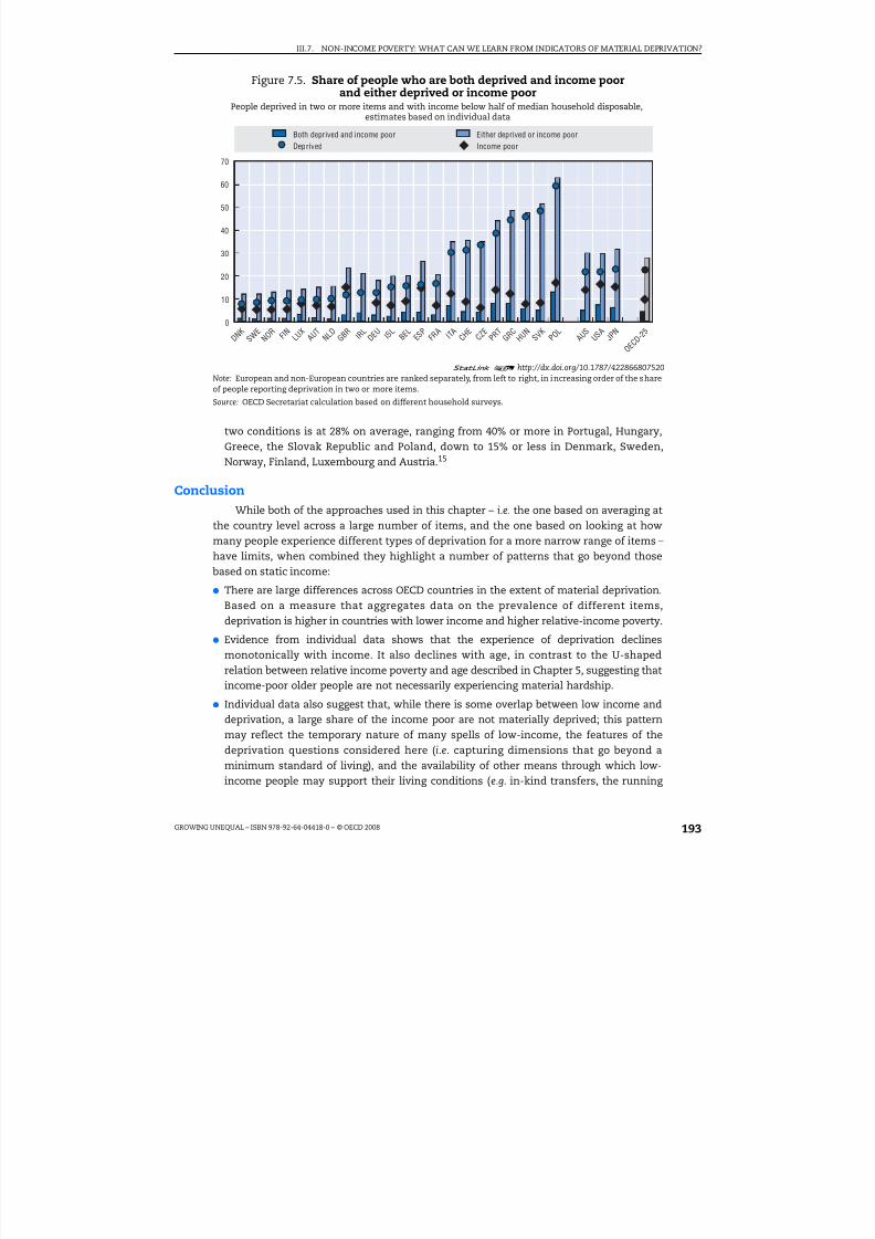
8/20/2019 Growing Unequal
http://slidepdf.com/reader/full/growing-unequal 193/309
III.7. NON-INCOME POVERTY: WHAT CAN WE LEARN FROM INDICATORS OF MATERIAL DEPRIVATION?
GROWING UNEQUAL – ISBN 978-92-64-04418-0 – © OECD 2008 193
two conditions is at 28% on average, ranging from 40% or more in Portugal, Hungary,Greece, the Slovak Republic and Poland, down to 15% or less in Denmark, Sweden,
Norway, Finland, Luxembourg and Austria.15
Conclusion
While both of the approaches used in this chapter – i.e. the one based on averaging atthe country level across a large number of items, and the one based on looking at howmany people experience different types of deprivation for a more narrow range of items –have limits, when combined they highlight a number of patterns that go beyond thosebased on static income:
● There are large differences across OECD countries in the extent of material deprivation.
Based on a measure that aggregates data on the prevalence of different items,deprivation is higher in countries with lower income and higher relative-income poverty.
● Evidence from individual data shows that the experience of deprivation declinesmonotonically with income. It also declines with age, in contrast to the U-shapedrelation between relative income poverty and age described in Chapter 5, suggesting thatincome-poor older people are not necessarily experiencing material hardship.
● Individual data also suggest that, while there is some overlap between low income anddeprivation, a large share of the income poor are not materially deprived; this patternmay reflect the temporary nature of many spells of low-income, the features of thedeprivation questions considered here (i.e. capturing dimensions that go beyond a
minimum standard of living), and the availability of other means through which low-income people may support their living conditions (e.g. in-kind transfers, the running
Figure 7.5. Share of people who are both deprived and income poorand either deprived or income poor
People deprived in two or more items and with income below half of median household disposable,estimates based on individual data
1 2 http://dx.doi.org/10.1787/422866807520Note: European and non-European countries are ranked separately, from left to right, in increasing order of the shareof people reporting deprivation in two or more items.
Source: OECD Secretariat calculation based on different household surveys.
70
60
50
40
30
20
10
0
D N K
S W E
N O R F
I N L U X
A U T
N L D
G B R I R
L D E U I S
L B E L
E S P
F R A I T
A C H E
C Z E
P R T
G R C
H U N
S V K P O
L A U
S
U S A
J P N
Both deprived and income poor Either deprived or income poor
Deprived Income poor
O E C
D - 2 5

8/20/2019 Growing Unequal
http://slidepdf.com/reader/full/growing-unequal 194/309
III.7. NON-INCOME POVERTY: WHAT CAN WE LEARN FROM INDICATORS OF MATERIAL DEPRIVATION?
GROWING UNEQUAL – ISBN 978-92-64-04418-0 – © OECD 2008194
down of assets or the accumulation of debt). Conversely, a large share of the populationas a whole experience either low income or deprivation.
This chapter is only an attempt to use the information currently available on materialdeprivation in a comparative setting. Better comparative measures can be achieved onlythrough greater ex ante standardisation of surveys, so as to include a larger set of items thatare comparable across countries. Achieving such standardisation in statistical sources is aninvestment worth doing in the light of the importance for social policy of measuring material deprivation accurately. Standardised measures are important not only forbenchmarking countries’ performance, but also in order to improve the targeting of individual programmes. This is especially important in countries where income is a poorproxy of economic needs. Indirectly, measures of material deprivation also point to theimportance of looking at factors that go beyond the income and earnings capacity of people, to other constituents of an acceptable standard of living.
Notes
1. For example, Callan et al. (1996) shows that a much smaller minority of households in Ireland failto satisfy their basic needs compared to those counted as income poor, and that their incidencehas declined over time even when income poverty was rising.
2. Absolute thresholds define poverty on the basis of a normative judgment of, for example, whatqualifies as basic needs or what is the proportion of food expenses in the household’s budget.While most of these measures are not purely “absolute” – i.e. the threshold is both time- andspace-specific – their common characteristic is that they build on a priori assumptions of whatbasic needs should be satisfied. Conversely, relative-income measures such as those used inChapters 5 and 6 of this report fix an arbitrary threshold relative to the most “typical” standard of living in society (e.g. median income).
3. Van den Bosch (2001) provides a comprehensive discussion of the subjective dimensions of deprivation and a detailed description of methods used for the subjective assessment of poverty.Gallie and Paugam (2002) provide useful discussions of issues related to the social environment.
4. Across countries, there is in general a positive correlation between the deprivation items includedin Table 3 in Boarini et al., 2006 (the average of these correlation coefficients is 66%). Inability toclothe properly is the item most highly correlated with others, and inability to adequately heat thehome the least (with these two items recording the highest and lowest cross-country variability).
5. Data are available, however, for only a few OECD countries. These data also raise specific problemsof interpretation: first, because most households reporting material deprivation are also likely toface constraints in financial markets, hence limited indebtedness; second, because the availabilityof consumer loans depends on the characteristics of credit markets, which differ among OECDcountries.
6. This share is higher in the United States (24%), where, however, this question is only asked to thosehouseholds that experienced problems in meeting essential expenses (rather than all households).Also, the questions in the US survey refer to help received in specific contingencies (rather than ingeneral) and to persons who did not expect to receive any help in a broader range of (non-financial)contingencies. Because of these differences in survey questions, data for the United States are notincluded in Table 8 in Boarini et al. (2006).
7. For example, overcrowding is defined more strictly in the case of Japan than for other countrieswhile, conversely, questions about constrained food choices and poor environmental conditionsencompass a larger menu of contingencies for the United States than elsewhere.
8. In the case of Australia, questions on material deprivation are answered separately by eachhousehold member. While the deprivation data for Australia used in this section are thoseprovided by the household head, Breunig et al. (2005) highlight significant differences in thereporting of material deprivation among partners of the same household, especially for
households with intermediate levels of income, with other household members often reporting various forms of deprivation even when the household head does not. This implies that surveywhich rely upon a representative individual to report about financial difficulty are missing

8/20/2019 Growing Unequal
http://slidepdf.com/reader/full/growing-unequal 195/309
III.7. NON-INCOME POVERTY: WHAT CAN WE LEARN FROM INDICATORS OF MATERIAL DEPRIVATION?
GROWING UNEQUAL – ISBN 978-92-64-04418-0 – © OECD 2008 195
important information about material hardship, and suggests that, in the presence of a significantdisagreement between partners on their experience of financial difficulties, many household willbe misclassified.
9. The larger share of people reporting “inability to make ends meet” relative to other items partlyreflects the more general and subjective nature of this type of question.
10. The share of people unable to make ends meet ranged from less than 10% in the Nordic countries(except Iceland), Luxembourg, Austria and Greece to 25% or more in the Czech Republic, Hungary,Ireland, Italy, Poland, Portugal, Switzerland and the Slovak Republic, as well as Japan and Australia.The share of people reporting inadequate heating is above 10% in Belgium, Greece, Hungary, Italy,Poland, Portugal and the Slovak Republic, and the same occurs for constrained food choices in theCzech Republic, Germany, Hungary, Poland, the Slovak Republic, as well as Japan and the UnitedStates. More than 10% of people report arrears in paying utility bills in Greece, Hungary, Italy,Poland, Switzerland, Australia and the United States, and the same share reports arrears in paying mortgages or rents in Greece and Iceland.
11. Some of the approaches that might be used to derive a measure of the prevalence of non-incomepoverty based on a synthetic measure of multiple deprivations are described in Annex 7.A1.
12. An alternative approach to describing the relation between income and material deprivation isused by Saunders and Adelman (2006), who plot the share of people in the various income
groupings (in decreasing order of income) that are also materially deprived: their results show thatthis gradient is steeper and more monotonic in Australia than in the United Kingdom.
13. Across the 24 OECD countries with available data, people aged 66 to 75 and over 75 have,respectively, a risk of deprivation that is 62 and 60% lower that of the population average in thecase of two or more items, but only 47 and 43% lower in the case of three or more items.
14. Among households with an elderly head, patterns mirror those by age of individuals. Householdswith a head of retirement age have a deprivation risk always below that of the entire population,even when the elderly person is living alone and not working. Only in Austria, Greece, Poland andPortugal is the share of elderly people living alone reporting two or more deprivations (marginally)above that for the entire population.
15. A number of other patterns stand out from Table 7.A2.1 (available at http://dx.doi.org/10.1787/ 424402577838). First, for a given number of deprivation items, the extent of overlap rises when a
higher income threshold is used. For example, among people reporting deprivation in two or moreitems in OECD countries, 30% have income below 60% of the median, as compared to only 10%when considering those with income below 40% of the median. When considering people deprivedin three of more items, the corresponding shares are 37% and 13% respectively. Second, for a givenincome threshold, the overlap rises when a higher number of items is considered (e.g., in the caseof people with income below 60% of the median, from 30% in the case of deprivation in two ormore items to 37% in the case of deprivation in three or more items).
References
Boarini, R. and M. Mira d’Ercole (2006), “Measures of Material Deprivation in OECD Countries”, OECDSocial, Employment and Migration Working Paper No. 37, OECD, Paris.
Bradshaw, J. and N. Finch (2003), “Overlaps in Dimensions of Poverty”, Journal of Social Policy, Vol. 32,No. 4.
Breunig, R., D. Cobb-Clark, X. Gong and D. Venn (2005), “Disagreement in Partner Reports of FinancialDifficulty”, IZA Discussion Paper No. 1624, Bonn, May.
Callan, T., B. Nolan and C.T. Whelan (1993), “Resources, Deprivation and the Measurement of Poverty”, Journal of Social Policy, Vol. 22, No. 2.
Callan, T., B. Nolan, B.J. Whelan, C.J. Whelan and J. Williams (1996), Poverty in the 1990s: Evidence fromthe 1994 Living in Ireland Survey, Oak Tree Press, Dublin.
Desai, M. and A. Shah (1988), “An Econometric Approach to the Measurement of Poverty”, OxfordEconomic Papers, Vol. 40, No. 3.
Eurostat (2002), Deuxième rapport sur le revenu, la pauvreté et l’exclusion sociale , Statistiques socialeseuropéennes, Luxembourg.
Gallie, D. and S. Paugam (2002), Social Precarity and Social Integration, Rapport pour la Direction généralede l’emploi de la Commission européenne.

8/20/2019 Growing Unequal
http://slidepdf.com/reader/full/growing-unequal 196/309
III.7. NON-INCOME POVERTY: WHAT CAN WE LEARN FROM INDICATORS OF MATERIAL DEPRIVATION?
GROWING UNEQUAL – ISBN 978-92-64-04418-0 – © OECD 2008196
Gordon, D., R. Levitas, C. Pantazis, D. Patsios, S. Payne and P. Townsend (2000), Poverty and SocialExclusion in Britain, Joseph Rowntree Foundation, York.
Jensen, J., M. Spittal, S. Crichton, S. Sathiyandra and V. Krishnan (2002), “Direct Measures of Living Standards: the New Zealand ELSI Scale”, Ministry of Social Development, Wellington.
Kangas, O. and V.-M. Ritakallio (1998), “Different Methods – Different Results? Approaches to
Multidimensional Poverty”, in H.-J. Andress (ed.), Empirical Poverty Research in a ComparativePerspective, Aldershot, Ashgate.
Layte, R., B. Maître, B. Nolan and C. T. Whelan (2001), “Persistent and Consistent Poverty in the 1994and 1995 waves of the European Community Household Panel”, Review of Income and Wealth,Vol. 47, No. 4.
Mack, J. and S. Lansley (1985), Poor Britain, Allen and Unwin, London.
Nolan, B. and C. Whelan (1996), “Measuring Poverty using Income and Deprivation Indicators:Alternative Approaches”, Journal of European Social Policy, Vol. 6, No. 3.
OECD (2006), Society at a Glance – OECD Social Indicators, OECD, Paris.
Perry, B. (2002), “The Mismatch Between Income Measures and Direct Outcome Measures of Poverty”,Social Policy Journal of New Zealand, Vol. 19.
Piachaud, D. (1981), “Peter Townsend and the Holy Grail”, New Society, Vol. 57.Saunders, P. and L. Adelman (2006), “Deprivation and Exclusion: A Comparative Study of Australia and
Britain”, Journal of Social Policy, Vol. 35, No. 4.
Sen, A.K. (1983), “Poor, Relatively Speaking”, Oxford Economic Paper, No. 35.
Townsend, P. (1979), Poverty in the United Kingdom, Harmondsworth, Penguin.
Van den Bosch, K. (2001), Identifying the Poor: Using Subjective and Consensual Measures, Ashgate,Aldershot.
Whelan, C.T., R. Layte and B. Maître (2002), “Persistent Deprivation in European Union”, Schmollers Jahrbuch: Journal of Applied Social Sciences, Vol. 122, pp. 1-24.

8/20/2019 Growing Unequal
http://slidepdf.com/reader/full/growing-unequal 197/309

8/20/2019 Growing Unequal
http://slidepdf.com/reader/full/growing-unequal 198/309
III.7. NON-INCOME POVERTY: WHAT CAN WE LEARN FROM INDICATORS OF MATERIAL DEPRIVATION?
GROWING UNEQUAL – ISBN 978-92-64-04418-0 – © OECD 2008198
the headcount in Hungary and the Slovak Republic (Figure 7.A1.1, left-hand panel). Thecorrelation with the income-poverty headcount, while positive, is low.
Another way of computing a summary measure of multiple deprivations is by“weighting” each item according to its general prevalence. Weighting has the advantage of converting the discrete “1 to 7” deprivation scale into a continuous scale ranging between
0 (for people not deprived of any of the items considered) to 1 (for those deprived of allitems); its disadvantage is that weights are sensitive to outliers.4 Annex Table 7.A1.1 showssummary measures of “weighted” deprivation based on three thresholds: 20% and 30% of
Table 7.A1.1. Summary measure of material deprivation and income poverty based on different thresholds
Based on individual data
Summary measure of material deprivationIncome-poverty rate
Unweighted Weighted
Threshold set at: Threshold set at:
Twice the mean 20% 30% Twice the mean 60% median 50% median 40% median
European countries
Austria 9.4 5.3 2.8 4.8 13.4 7.1 3.4
Belgium 15.2 10.8 6.6 8.5 15.6 9.0 3.7
Czech Republic 15.8 29.4 16.4 12.7 11.5 5.8 3.0
Denmark 7.6 8.2 3.3 4.4 11.1 5.5 2.7
Finland 8.9 10.4 4.1 6.5 12.3 5.7 2.3
France 16.4 16.4 8.9 11.0 14.0 7.0 2.8
Germany 12.6 11.0 5.2 7.0 14.2 8.2 3.9
Greece 22.8 32.8 20.6 13.6 19.4 12.2 7.0
Hungary 25.5 35.4 22.9 15.0 13.9 7.8 3.8
Iceland 15.2 16.2 6.9 10.5 12.1 7.0 4.2
Ireland 12.4 11.5 6.7 7.9 21.2 12.5 5.4
Italy 13.7 19.6 12.8 12.8 19.2 12.2 6.9
Luxembourg 9.2 4.8 3.4 4.4 13.1 8.0 3.0
Netherlands 9.8 8.1 4.1 6.4 10.6 6.6 4.2
Norway 8.8 9.2 4.3 5.3 10.1 5.3 3.0
Poland 21.7 43.1 25.5 17.3 22.4 16.9 11.9
Portugal 16.1 18.3 8.5 8.5 21.6 13.9 8.3
Slovak Republic 24.4 35.7 19.0 12.6 13.8 8.2 4.5
Spain 15.7 9.5 4.7 7.1 21.4 14.6 8.8
Sweden 8.1 8.6 3.8 6.0 9.4 5.0 2.8
Switzerland 12.7 16.7 7.9 8.5 13.6 8.6 4.0Non-European countries
Australia 9.9 12.7 6.4 10.5 20.6 13.6 6.0
Japan 10.6 10.5 4.3 6.8 20.1 15.0 8.7
United States 12.1 22.8 13.9 13.9 23.7 16.5 10.5
Averages
EU-21 14.4 16.5 9.0 8.7 15.2 9.2 5.0
Non-EU-3 10.9 15.3 8.2 10.4 21.4 15.0 8.4
OECD-24 14.0 16.6 9.1 9.0 15.8 9.7 5.3
1 2 http://dx.doi.org/10.1787/423114348677Note: The deprivation rates shown in the first column are based on a threshold set at twice the mean number of items lacked by the population as a whole i.e. twice the difference between the number of items considered (7) and
the average number of items held, as shown in Figure 7.2. In practice this threshold is equal to 2 for Austria, Belgium,Germany, Denmark, Spain, Finland, France, Ireland, Iceland, Luxembourg, the Netherlands, Norway, Sweden, theUnited Kingdom, as well as Japan; to 3 in the Czech Republic, Greece, Hungary, Italy, Portugal, Switzerland and theSlovak Republic, as well as Australia and the United States; and to 4 for Poland.Source: OECD Secretariat calculation based on different household surveys.

8/20/2019 Growing Unequal
http://slidepdf.com/reader/full/growing-unequal 199/309
III.7. NON-INCOME POVERTY: WHAT CAN WE LEARN FROM INDICATORS OF MATERIAL DEPRIVATION?
GROWING UNEQUAL – ISBN 978-92-64-04418-0 – © OECD 2008 199
all items (i.e. a threshold common across countries) and a relative threshold (differing across countries) set at twice the average number of deprivation items experienced by theentire population. On average (across the 22 OECD countries included), the weighteddeprivation rate based on a relative threshold is 9%, ranging between values of 12% andover in the Czech Republic, Greece, Hungary, Poland, the Slovak Republic and the UnitedStates, and below 5% in Austria, Denmark, and Luxembourg. On average, this summary
measure of multiple deprivations is close to the poverty headcount based on a threshold of 50% of median income, but again with large differences across countries. This summarymeasure of multiple deprivations is well below the poverty headcount in Japan,Luxembourg and Spain, but well above it in the Czech and Slovak Republics, France, Icelandand Hungary (Figure 7.A1.1, left-hand panel). While the correlation between this measureof multiple deprivation and the income-poverty headcount is higher than for the“unweighted” measure, cross-country dispersion remains large.
Notes
1. Townsend (1979) considered individuals with a score equal to or greater than 5 as living indeprivation, and then derived an income threshold corresponding to the level below which“deprivation scores escalated disproportionately”. Most studies of material deprivation use anabsolute standard, usually defined by specifying a minimum number of items, and counting people as “poor” when they report deprivation in (at least) these items. Other approaches rely on“relative” thresholds, whereby poverty is defined by the lack of a certain number of items, the levelof which is set such that the number of people lacking them is the same as the number of incomepoor (Layte et al. , 2001). This procedure is, however, less useful if the goal is to derive anindependent measure of non-income poverty that could be used alongside the income-povertyheadcount.
2. The income-poverty headcounts shown in Table 7.A1.1 are very close to these based on the OECDincome distribution questionnaire shown in Chapter 5, with a correlation coefficient of 0.88 for athreshold of 50% of median income, and of 91% for one at 60%.
3. This is analogous to using half of median income as the threshold for income poverty. The mean,rather than median, is used here, as the median number of items that people lack is typically zero.This approach implies that if, on average, people have six of the seven items considered (i.e. on
Figure 7.A1.1. The relation between a summary measure of material deprivationand income poverty headcounts
Based on individual data
1 2 http://dx.doi.org/10.1787/423021363648
Source: OECD Secretariat calculation based on different household surveys.
20
15
10
5
00 5 10 15 20
30
20
10
00 10 20 30
R2 = 0.0652 R2 = 0.1991
AUT BEL
CZE
DEU
DNK
ESP
FINFRA
GRC
HUN
IRL
ISL
ITA
LUX
NLDNOR
POLPRT
SWE
CHESVK
GBRAUS
JPN
USA
AUT
BEL
CZE
DEU
DNK
ESP
FIN
FRA
GRC
HUN
IRL
ISL
ITA
LUXNLD
NOR
POL
PRT
SWE
CHE SVK
AUS
JPNUSA
Unweighted deprivation rate Weighted deprivation rate
Income-poverty headcount 60% Income-poverty headcount 50%
OECD-23
OECD-24

8/20/2019 Growing Unequal
http://slidepdf.com/reader/full/growing-unequal 200/309
III.7. NON-INCOME POVERTY: WHAT CAN WE LEARN FROM INDICATORS OF MATERIAL DEPRIVATION?
GROWING UNEQUAL – ISBN 978-92-64-04418-0 – © OECD 2008200
average they lack only one item) the threshold is set at two. The number of items “lacked” isconventionally rounded to the greater integer (e.g. if they lack 1.5 items, this is rounded to two).
4. When the share of people in the entire population experiencing deprivation of items is very low,the weight given to other types of deprivation becomes very small (tending to zero). For thisreason, “weighted” deprivation rates for the United Kingdom are not shown in Table 7.A1.1.

8/20/2019 Growing Unequal
http://slidepdf.com/reader/full/growing-unequal 201/309

8/20/2019 Growing Unequal
http://slidepdf.com/reader/full/growing-unequal 202/309
8/20/2019 Growing Unequal
http://slidepdf.com/reader/full/growing-unequal 203/309
ISBN 978-92-64-04418-0Growing Unequal?© OECD 2008
203
PART IV
Chapter 8
Intergenerational Mobility: Does itOffset or Reinforce Income Inequality?*
Income, education, occupation and personality traits all tend to be transmitted
from parents to their offspring, especially at the top and bottom of thedistribution. Countries with lower intergenerational mobility tend to featurewider income inequalities at a point in time and higher returns to education –suggesting that the education systems and the strategies used by parents for theeducation of their children are very important for the transmission of disadvantages from generation to generation.
* This chapter has been prepared by Anna Cristina D’Addio, OECD Social Policy Division, drawing onD’Addio (2007). Special thanks to Mark Pearson and Marco Mira d’Ercole for useful comments, and toPatrick Hamm for editorial assistance.

8/20/2019 Growing Unequal
http://slidepdf.com/reader/full/growing-unequal 204/309
IV.8. INTERGENERATIONAL MOBILITY: DOES IT OFFSET OR REINFORCE INCOME INEQUALITY?
GROWING UNEQUAL? – ISBN 978-92-64-04418-0 – © OECD 2008204
Introduction
Many OECD countries are rightly concerned about intergenerational mobility – the extentof transmission of advantages or disadvantages across generations. When children “inherit” asubstantial degree of their economic status or other important social characteristics from theirparents, this generates widespread perceptions of unfairness and lack of opportunity.Societies characterised by a high transmission of social and economic status fromgeneration to generation are not only more likely to be perceived as “unfair”, they may alsobe less productive than those where all individuals have a more equal chance to succeed,
as they waste the talents and skills of youths from disadvantaged backgrounds. 1
Drawing on a more extensive review of intergenerational mobility by D’Addio (2007),this chapter summarises the main empirical evidence about the extent to whichdifferences in income are transmitted from one generation to the next. The first sectionoverviews the available evidence on the transmission of income and education acrossgenerations, while also identifying the most important factors that contribute to it. Thechapter then discusses some of the key policy implications of the intergenerationaltransmission of disadvantage, with a focus on the policies available to reduce thoseinequalities at birth that undermine chances of achievement and success in later life.Children’s outcomes are analysed here from a lifecycle perspective; from this viewpoint,
the extent to which the life chances of children are either positively or adversely affectedby the circumstances and behaviours of their parents is an integral component of developing policies to give children “the best possible start to their lives”.
Intergenerational transmission of disadvantages: an overview
Income, education, occupation and personality traits persist between generations inall OECD countries. However, the size of this persistence may vary across domains. It ispossible, for example, to have a great deal of mobility in education, occupation or evenpersonality traits without seeing similar mobility in income (e.g. because incomes may varywidely within the same occupation).2 The consequences of intergenerational transmission
will also vary depending on people’s characteristics. For example, low-income persistencehas different effects than high-income persistence, and growing up in a low-incomeenvironment may cumulate with other forms of disadvantage.
While this review mainly focuses on the transmission across generations of individuals’ traits, it should be stressed that several factors shape the magnitude of thistransmission. One of these factors is the macro-economic context of each country. Forexample, many children have enjoyed better economic and social conditions than theirparents, mainly reflecting the strong economic growth recorded over the past 50 years,which has resulted in increased opportunities to move into higher-skilled, better-paid jobs.
However, the overall pace of economic growth is only one factor: the more unequal asociety is, the more difficult it is to move up the social ladder, simply because children havea greater gap to make up.

8/20/2019 Growing Unequal
http://slidepdf.com/reader/full/growing-unequal 205/309
IV.8. INTERGENERATIONAL MOBILITY: DOES IT OFFSET OR REINFORCE INCOME INEQUALITY?
GROWING UNEQUAL? – ISBN 978-92-64-04418-0 – © OECD 2008 205
Intergenerational transmission of income
What do we know about the intergenerational transmission of income?
Intergenerational income mobility is commonly measured by the fraction of relativeincome differences between all adults at a point in time that is transmitted to their offspring:
the higher this fraction (or elasticity), the lower is intergenerational income mobility. Moststudies have focused on the earnings of fathers and sons, as family income is harder to measureand more complex to interpret. Fewer studies have considered transmission of earningsdifferences between fathers and daughters, despite the increasing educational attainmentand participation in the labour market of recent cohorts of women.3
In general, the available evidence suggests that income from work – but also fromassets and welfare – persists across generations. It also suggests that disadvantage tendsto persist in vulnerable households. A disadvantaged family background – for example, interms of low education, poor health, lone parenthood or non-employment – tends to boostthe persistence of poverty. Similarly, growing up in areas characterised by a high
concentration of poverty might also contribute to intergenerational poverty, long-termwelfare dependency, crime victimisation, and family breakdowns.4
Intergenerational earnings mobility varies significantly across OECD countries: forexample, less than 20% of the differences in parental earnings are passed on to thechildren in some of the Nordic countries, as well as in Australia and Canada, as comparedto between 40 and 50% in some other countries, including Italy, the United Kingdom andthe United States (Figure 8.1). In these latter countries, parents determine the success orfailure of their offspring to a greater extent than in others, either directly (throughintergenerational transfers of money, or extra investment in the success of their children)or indirectly (through living in a good neighbourhood or having a particular ethnic origin).
Keeping things very simple, an elasticity value of 0.50 – as in Italy or the United Kingdom –implies that 50% of the relative difference in parental earnings is transmitted, on average,to their children. An elasticity of 0.15 (as in Denmark) implies that only 15% of the
Figure 8.1. Estimates of the intergenerational earnings elasticityfor selected OECD countries
1 2 http://dx.doi.org/10.1787/423132685118Note: The height of each bar represents the best point estimate of the intergenerational earnings elasticity resulting from the meta-analysis carried out by Corak (2006), integrated with estimates from national studies for a few
countries. Higher parameters indicate a higher persistence of earnings across generations ( i.e. lowerintergenerational mobility).
Source: D’Addio (2007) based on Corak (2006) for all countries except Italy, Spain and Australia. For these lattercountries, estimates are from Leigh (2006) for Australia; Hugalde Sanchèz (2004) for Spain; and Piraino (2006) for Italy.
0.60
0.50
0.40
0.30
0.20
0.10
0DNK AUS NOR FIN CAN SWE DEU ESP FRA USA ITA GBR

8/20/2019 Growing Unequal
http://slidepdf.com/reader/full/growing-unequal 206/309
IV.8. INTERGENERATIONAL MOBILITY: DOES IT OFFSET OR REINFORCE INCOME INEQUALITY?
GROWING UNEQUAL? – ISBN 978-92-64-04418-0 – © OECD 2008206
difference in parental earnings is transmitted to the children. The “absolute” effect of agiven elasticity will, of course, be greater in more unequal societies.5
Evidence of lower mobility at the bottom of the earnings distribution is reported inmany studies of individual countries.6 Jäntti et al. (2006), comparing six countries (i.e.
Denmark, Finland, Norway, Sweden, United Kingdom and the United States), report lowermobility in the tails of the distributions and argue that this might explain the pattern of male intergenerational mobility across countries. Table 8.1, which is drawn from this study,shows that the probability that a son is in the same earnings quintile as his father is alwaysgreater in the lowest and highest quintiles, with the probability in the United States being particularly high in the lowest earnings quintile.
A number of studies report evidence that low mobility at the bottom of the distributionincreases the inheritance of poverty across generations.7 When mobility at the bottom of the income distribution is very low, growing up in a family on welfare increases thelikelihood of becoming a welfare recipient as an adult. While available research does notallow comparing the extent to which intergenerational transmission of welfare recipiencycompares across countries, it does confirm that in many OECD countries welfaredependency is transmitted across generations.8 This transmission proceeds from differentmechanisms, some causal and some non-causal, which include the way that social policyis structured and delivered. For example, the structure of eligibility rules and the emphasison active versus passive payments may lead to different intergenerational patterns in thetransmission of welfare-dependent status across generations – i.e. passive programmes aremore likely than active programmes to lead to higher transmission across generations(Corak et al., 2004). Thus, for example, the strong intergenerational correlation of welfarestatus observed in the United States might be related to the design of the programme (as itwas before 1996) and how it was targeted.
The inheritance of poverty and, more generally, of inequality threatens equality of opportunity and produces economic inefficiencies. The identification of the factors thatcontribute most to the transmission of income differences across generations willtherefore lead to a better understanding of the policies needed to make poverty lesspersistent. Indeed, actions directed at improving education, health, employment systems,residential mobility and urban revitalisation could contribute to break the poverty cyclethrough their influence on intergenerational income mobility.
Table 8.1. Intergenerational mobility across the earnings distributionProbability for the son of being in the same earnings quintile as his father
Denmark Finland Norway Sweden United Kingdom United States
1st Quintile 0.25 0.28 0.28 0.26 0.30 0.422nd Quintile 0.25 0.22 0.24 0.23 0.23 0.28
3rd Quintile 0.22 0.22 0.22 0.22 0.19 0.26
4th Quintile 0.22 0.23 0.22 0.22 0.25 0.25
5th Quintile 0.36 0.35 0.35 0.37 0.35 0.36
1 2 http://dx.doi.org/10.1787/423230758402
Source: Based on the diagonal of the transition matrices estimated by Jäntti et al. (2006).

8/20/2019 Growing Unequal
http://slidepdf.com/reader/full/growing-unequal 207/309
IV.8. INTERGENERATIONAL MOBILITY: DOES IT OFFSET OR REINFORCE INCOME INEQUALITY?
GROWING UNEQUAL? – ISBN 978-92-64-04418-0 – © OECD 2008 207
What determines the extent of intergenerational income transmission?
Table 8.2 summarises the evidence, as available through several empirical studies, of how different factors contribute to the transmission of income between generations.While most of these studies suggest that the influence of schooling and household wealthis, in general, quite large, they also point to the importance of other factors.
● Wealth passed from parents to children affects the incomes of children in various ways:directly, in the form of gifts and bequests that increase the asset holdings of childrenfrom different backgrounds; and indirectly, when parental wealth contributes to theearnings of people in their adult life by improving nutrition, health, education, access togood housing and neighbourhood conditions, as well as providing start-up capital that iscritical for many activities (e.g. Blanchflower and Oswald, 1998). Perhaps the mostimportant intergenerational impact of wealth is that it reduces the importance of capitalmarket failures. In an ideal world, when people seek loans on capital markets to financeinvestments in human capital, parental background would have no impact on whether
the loan were granted. In practice, borrowing against future earnings is difficult, andliquidity constraints affect investment in human capital (Becker and Tomes, 1979). Inthese conditions, low-income parents will under-invest in their children’s humancapital, making the poverty circle harder to break. Wealth transfers may also indirectlyaffect intergenerational income mobility when they influence those traits that areimportant for economic success, such as saving and schooling propensities, the workethic and risk-related behaviours.9
● Genetic factors also matter, although the mechanisms underlying their contribution tothe inheritance of income are largely unexplained. Evidence suggests that inheritance of IQ makes very little contribution to the intergenerational income correlation. Other
inherited traits, like personality traits (and behaviours – though not entirely geneticallydetermined), appear to be important channels of transmission. The ethnic origin of theindividual also contributes to the transmission of income across generations. This mayhappen because ethnicity acts as an externality in the human capital accumulationprocess (Borjas, 1992). This “spill-over effect” operates mainly through geographicconcentrations of peers, and differs from that related to the neighbourhood in whichfamilies live: even within the same neighbourhood, children are more likely to interactwith other individuals from the same ethnic group, in which case the impact of peers of the same ethnicity will outweigh that of other neighbours.
● While there is a great deal of ambiguity concerning the long-run causal effects of
neighbourhoods, some studies suggest that local conditions are important inexplaining intergenerational transmission of income. For example, growing up in a“good” neighbourhood, with low unemployment, is associated with higher earningswhen the child reaches adulthood. The employment of parents also exerts an impact onthe eventual earnings of children, independently of the income associated with work.There is evidence, in other words, that providing children with a positive role model of aworking parent affects their own attitudes towards work.
● Another factor in intergenerational income transmission is the structure of thehousehold. For example, the correlation to parental earnings is higher for first-bornchildren than for later-born siblings. If there is “assortative mating” (i.e. people marry orhave children with partners with similar education and earnings potential), theirchildren are more likely to have incomes similar to their parents.

8/20/2019 Growing Unequal
http://slidepdf.com/reader/full/growing-unequal 208/309

8/20/2019 Growing Unequal
http://slidepdf.com/reader/full/growing-unequal 209/309

8/20/2019 Growing Unequal
http://slidepdf.com/reader/full/growing-unequal 210/309
IV.8. INTERGENERATIONAL MOBILITY: DOES IT OFFSET OR REINFORCE INCOME INEQUALITY?
GROWING UNEQUAL? – ISBN 978-92-64-04418-0 – © OECD 2008210
● Finally, educational policies may affect the extent of intergenerational income mobility.For example, public provision or funding of education may increase mobility, as itreduces the cost of education. This implicitly affects parental borrowing constraints andprovides a substitute for family inputs in the education process. Of course, the relativequality of public education is also an important influence on outcomes.
Overall, the literature suggests that a large portion of the income differencestransmitted from one generation to the next relates to factors that are largely beyond thecontrol of the child (e.g. neighbourhood quality, family structure, and birth order) or of theparents (e.g. ethnic origin). Other factors, such as investment in human capital, are partlyunder the control of parents, but the presence of constraints (e.g. financial or societal), lackof information or insufficient foresight may drive parents to make sub-optimal choices. Inturn, this can lead to an inefficient allocation of talents within society and to thepersistence of inequalities across generations. By creating private and social benefits,education – broadly defined – is a central component of social stratification and, at thesame time, a correlate of both opportunity and inequality within and across generations.The next section looks therefore at the extent to which educational inequalities are passedon from parents to their children.
Transmission of education across generations
Educational attainment and qualifications are significantly correlated acrossgenerations. The most important question that researchers have been trying to answer isto what extent this is because of genetic inheritance and to what extent it results fromdifferent behaviours (e.g. are more educated parents on average more effective parents?). Ingeneral, this research suggests that both inherited abilities and family background
contribute to the intergenerational transmission of educational outcomes (D’Addio, 2007)but also that the way in which schooling is organised matters a lot.10 These conclusions arehighlighted by Table 8.3, which compares differences in the mathematics scores of students aged 15 in relation to various background characteristics, based on the OECDProgramme for International Students Assessment (PISA) of 2003.
● Among the various background characteristics, parental education is by far the mostimportant. Students whose fathers have low educational attainment record, on average,mathematics scores that are 62 points lower than those of students with highly educated
parents, a gap in competencies that is equivalent to around 1½ years less of schooling (and more than two years of education in Hungary and the Czech and Slovak Republics).
● Students’ scores are also correlated with parental occupational status. On average,children whose parents have higher occupational status perform better. The average gap(–77 points on a 500-point standardised scale) corresponds to around two years (grades).Gaps are highest in Luxembourg, Germany, Hungary and Belgium, where studentswhose parents have the highest-status jobs score, on average, about as well as theaverage student in Finland – the best performing country in PISA (2003) acrossmathematics, reading and science. In contrast, in the same countries, students whoseparents have the lowest-status jobs score only a little higher than the average studentsin the lowest-performing countries (Greece, Italy, Mexico and Turkey).11
● Students from single-parent households also show lower performance (varying from more
than one grade year in Belgium and the United States, to almost no difference in Austria,the Czech and Slovak Republics). Lower performance is also reported by non-native

8/20/2019 Growing Unequal
http://slidepdf.com/reader/full/growing-unequal 211/309
IV.8. INTERGENERATIONAL MOBILITY: DOES IT OFFSET OR REINFORCE INCOME INEQUALITY?
GROWING UNEQUAL? – ISBN 978-92-64-04418-0 – © OECD 2008 211
students (i.e. students born in a different country from the one where they are attending school), by first-generation students (with a gap equivalent to more than one grade year, onaverage, relative to natives), and by students whose parents speak a different language at
home than the language used in school classes (particularly in Belgium and Germany,while this gap is narrowest in Canada, Australia and New Zealand).
These various background characteristics are obviously correlated with one another.The PISA index of social, economic and cultural status (shown in the right-hand column of
Table 8.3) summarises all elements of parental background.12 The achievement gap of students whose parents belong to the bottom quarter of the index is 2½ grade years lower
Table 8.3. Gaps in average achievement in mathematics scores among 15-year-oldsaccording to various background characteristics
Point differences in students’ achievement on a 500-point standardised scale
Father’s education Mother’s education Family type Country of originLanguagespoken at
home
Economicsocial and
cultural index
Loweducationrel. to higheducation
Mediumeducationrel. to higheducation
Loweducationrel. to higheducation
Mediumeducationrel. to higheducation
Singleparentsrel. to
couples
Firstgeneration
rel. tonatives
Non-nativesrel. to
natives
Differentlanguage
rel. to samelanguage
Bottomquarter rel.
to top quarter
Australia –47 –35 –39 –29 –27 –5 –2 –12 –93
Austria –46 –7 –53 –12 –3 –56 –63 –57 –94
Belgium –62 –28 –67 –32 –42 –92 –109 –95 –133
Canada –41 –23 –45 –21 –20 6 –7 –13 –74
Czech Republic –111 –62 –103 –54 –5 . . . . . . –107
Denmark –63 –41 –61 –25 –26 –70 –65 –43 –101
Finland –34 –21 –36 –17 –9 . . . . . . –71
France –50 –19 –55 –17 –18 –48 –72 –66 –105Germany –96 –30 –88 –21 –10 –93 –71 –90 –120
Greece –48 –16 –58 –21 –19 . . –47 –48 –96
Hungary –120 –64 –115 –58 –16 . . . . . . –127
Iceland –38 –20 –38 –22 –8 . . . . . . –61
Ireland –49 –24 –49 –19 –33 . . . . . . –86
Italy –39 3 –44 –1 –15 . . . . . . –90
Japan –66 –34 –57 –28 . . . . . . . . –88
Korea –66 –31 –60 –20 –9 . . . . . . –90
Luxembourg –61 –24 –53 –25 –19 –31 –45 –42 –102
Mexico –48 11 –40 20 –10 . . . . . . –91
Netherlands –46 –29 –40 –33 –31 –59 –79 –81 –99
New Zealand –67 –32 –61 –13 –22 –32 –5 –16 –105Norway –40 –23 –53 –27 –22 . . –61 –45 –89
Poland –86 –55 –95 –54 –13 . . . . . . –95
Portugal –31 11 –41 –2 –10 –30 . . . . –95
Slovak Republic –127 –62 –125 –49 –4 . . . . . . –116
Spain –47 –27 –43 –25 –12 . . . . . . –85
Sweden –31 –2 –48 –3 –29 –34 –92 –65 –91
Switzerland –60 –9 –56 2 –16 –59 –89 –79 –103
Turkey –98 –50 –108 –35 –5 . . . . . . –116
United States –74 –35 –76 –29 –43 –22 –36 –46 –109
OECD-29 –62 –27 –62 –23 –18 –45 –56 –53 –98
1 2 http://dx.doi.org/10.1787/423264430207
Note: Each column shows the difference in average scores in mathematics between students from disadvantaged backgroundsand those from advantaged ones. The last row shows the unweighted OECD average.Source: OECD Secretariat computations based on data extracted from PISA (2003) as in D’Addio (2007).

8/20/2019 Growing Unequal
http://slidepdf.com/reader/full/growing-unequal 212/309
IV.8. INTERGENERATIONAL MOBILITY: DOES IT OFFSET OR REINFORCE INCOME INEQUALITY?
GROWING UNEQUAL? – ISBN 978-92-64-04418-0 – © OECD 2008212
than those in the top quarter of the index (with the gap ranging from three years or morein Hungary and Belgium to less than two years in Iceland, Finland and Canada). Overall, thechanges in mathematics scores associated with a one-unit change in the index of economic, social and cultural status are lowest in Iceland, Portugal and Mexico(corresponding to 0.70 of a grade), and highest in the Czech Republic, the Slovak Republic
and Belgium (corresponding to around 1.25 grades).
Besides family background, policies and institutions also affect educational mobilityacross generations. Early streaming of children according to ability reduces educationalmobility across generations, while public provision of education (which reduces the costsof human capital borne by parents) increases it. Schütz et al. (2005) report an invertedU-shaped relationship between the family background effect (FBE)13 and pre-schoolenrolment – which suggests that early education may reduce the extent to which familybackground shapes youths life-chances. They also note that the size of the FBE increaseswith private expenditure and decreases with private enrolment, and argue that thesefeatures of the education system can jointly account for 40% of the cross-country variationin their estimated FBEs.
Finally, how education is rewarded in the labour market is also important. Educationsystems that are too egalitarian may, for example, affect the extent of educational mobilitythrough their effects on returns to education (Checchi et al., 1999; Checchi and Flabbi, 2005;and Chevalier et al., 2005). For example, when the educational system compresses thedistribution of education, the distribution of income is also likely to be narrower andreturns on education to be low; and, with low returns, low-income parents may have notenough incentive to invest in their children’s human capital.
In sum, the overwhelming evidence is that educational attainment persists across
generations. This persistence is generated by the combined effect of education and othercharacteristics of the parents (such as occupation and culture) interacting with differentinstitutions (such as the education systems and the labour market). Based on PISA,mathematics scores are least affected by family background in Iceland, Portugal andMexico, while they are most affected by it in the Czech Republic, the Slovak Republic andBelgium – though the United States, Switzerland, Germany and Japan do not fare muchbetter. Austria (close to France and New Zealand) occupies the median position.
Intergenerational mobility and income inequality at a point in time:what are the links?
The extent to which conventional measures of income inequality at a point in timereflect people’s opportunities to move up the income ladder during their lifetime is likelyto matter a lot for how income inequalities are perceived by individuals and policy makers.In fact, survey data suggest that – despite differences across countries – most people areready to accept inequalities of income and wealth so long as these are associated with“equal opportunities” (Table 8.4). Measures of intergenerational mobility provide oneyardstick against which statements about equal opportunities may be assessed.
There is, in general, no necessary association between income mobility acrossgeneration and income inequalities at a point in time. Beyond the differences in theincome concept used (individual earnings, in one case, and household income, in the
other), the two measures refer to different time horizons, and these differences imply thata priori the association may be either positive or negative. Because of this uncertainty, it

8/20/2019 Growing Unequal
http://slidepdf.com/reader/full/growing-unequal 213/309
IV.8. INTERGENERATIONAL MOBILITY: DOES IT OFFSET OR REINFORCE INCOME INEQUALITY?
GROWING UNEQUAL? – ISBN 978-92-64-04418-0 – © OECD 2008 213
is important to look at the empirical evidence. Figure 8.2 (left-hand panel) suggests apositive relation in a cross-section of twelve OECD countries between the extent of intergenerational earnings mobility and conventional measures of income inequality at apoint in time around 2000. In general, the countries with the most equal distributions of income at a given point in time exhibit the highest income mobility across generations.The exceptions include Australia and Canada, which combine high mobility withmoderately high inequality, and France which has lower mobility than would be expectedfrom its level of inequality.14
Table 8.4. Share of adults agreeing with different statementsabout distributive justice
Percentage share agreeing minus percentage share not agreeing
Japan West Germany Great Britain United States
It’s fair if people have more money and wealth, but only
if there are equal opportunities 40 72 71 74The fairest way of distributing wealth and income wouldbe to give everyone equal shares –39 –37 –32 –51
It is just luck if some people are more intelligent or moreskillful than others, so they don’t deserve to earn moremoney –37 –27 –56 –66
People who work hard deserve more money than thosewho do not 86 89 93 89
People are entitled to keep what they have earned evenif this means some people will be wealthier than others 56 83 72 88
1 2 http://dx.doi.org/10.1787/423305525101
Source: International Social Justice Project, as reported in Marshall et al. (1997).
Figure 8.2. Intergenerational mobility, static income inequalityand private returns on education
1 2 http://dx.doi.org/10.1787/423218022861Note: Intergenerational mobility is measured by the earnings elasticity between fathers and sons. Income inequalityis measured by the Gini coefficient of equivalised household disposable income. The private internal rate of returnon education is estimated on the basis of the addition to after-tax earnings that result from a higher level of educational attainment, net of the additional private costs (tuition and foregone earnings) that attaining this higherlevel of education requires; the estimates shown refer to an individual who has invested in obtaining tertiaryeducation after having completed upper secondary education.
Source: Data on intergenerational earnings elasticity are those reported in Figure 8.1. Data on private returns on
education are from OECD, Education at a Glance, various years; those on the Gini coefficient on income inequality arefrom previous issues of OECD, Society at Glance. See D’Addio (2007).
0.6
0.5
0.4
0.3
0.2
0.1
02 6 10 14 18
0.6
0.5
0.1
0.2
0.3
0.4
0-20 25 3530 40
AUS
CAN
DEU
DNK
ESP
FIN
FRA
GBR ITA
NOR
SWE
USA
AUS
CAN
DEU
DNK
ESP
FIN
FRA
GBRITA
NOR
SWE
USA
Gini coefficient of income inequality Private returns to education
Intergenerational earnings elasticity Intergenerational earnings elasticity

8/20/2019 Growing Unequal
http://slidepdf.com/reader/full/growing-unequal 214/309
IV.8. INTERGENERATIONAL MOBILITY: DOES IT OFFSET OR REINFORCE INCOME INEQUALITY?
GROWING UNEQUAL? – ISBN 978-92-64-04418-0 – © OECD 2008214
There are a number of possible explanations for this relation. One explanation centreson the role of private returns on education, as they affect earnings inequality. Countrieswith a wide distribution of earnings are also likely to be those where the private returns toeducation are highest – because education gives access to jobs that are even more highlypaid (relative to other jobs) than is the case in countries with a narrower distribution of
earnings. However, if parental income affects access to education – because of capitalmarket constraints, or because rich parents can choose to live in neighbourhoods withgood schools – then ability to take advantage of the high returns on education will belimited to children of richer households. As shown in the right-hand panel of Figure 8.2,there is indeed evidence of a (weak) positive relationship between intergenerationalearnings elasticity and private returns on education. Hence, income inequality at a point intime and a strong correlation of earnings across generations can reinforce each otherthrough the effect of the former on access to higher education.
However, there are other possible explanations of the correlation betweenintergenerational mobility and static income inequality. Returns on education and incomeinequality reflect institutional characteristics, so these relations are complex. For example,a more compressed earnings distribution, higher minimum wages and broader bargaining coverage all contribute to lower returns on education (and plausibly to lower incomeinequality at a point in time). A better understanding of these phenomena might provideuseful insights for the study of earnings mobility across generations (Solon, 2004; Corak,2006).
Intergenerational transmission of disadvantage: does it matter for policies?
The inequalities that arise from the transmission of low-income status have
important policy implications. Educational policy, early childhood investment, access tohealth care and immigration policy all affect the extent to which the social and economicposition of individuals in society is determined by their skills and ambitions rather than byinherited characteristics. International comparisons of intergenerational mobility areuseful in helping to identify the different institutions, social settings and labour-marketstructures that potentially connect one generation’s socio-economic status to the next.
Social policy plays an essential role in this area through interventions aimed atreducing inequality of opportunities over the entire life course of individuals. For example,family policies may help by addressing those barriers to mobility that start in earlychildhood, as events experienced during that age crucially shape later opportunities in life.
These interventions offer an opportunity to break the cycle of disadvantage, and thus tocontribute to child development and to the fight against poverty.
Social policy makers need to understand how advantages and disadvantages arepassed from one generation to the next. If the degree of intergenerational transmission of disadvantage can be reduced, the aptitudes and abilities of everyone in society are morelikely to be used efficiently, thus promoting both growth and equity. However, whilereducing the negative effects of parental background on child outcomes is something thatmost policy makers would wish to promote, a society in which the circumstances andbehaviours of parents had no effect on outcomes for their children would not be desirableeither. The vast majority of parents strive to do the best that they can for their children,
investing time, emotional commitment and money in them. While it is both desirable andacceptable for parents to influence the development of their children, public programmes

8/20/2019 Growing Unequal
http://slidepdf.com/reader/full/growing-unequal 215/309
IV.8. INTERGENERATIONAL MOBILITY: DOES IT OFFSET OR REINFORCE INCOME INEQUALITY?
GROWING UNEQUAL? – ISBN 978-92-64-04418-0 – © OECD 2008 215
are needed to ensure that no child is left behind because of factors for which they are notresponsible.
If countries want to promote equality of opportunity, there are a number of steps theycould take. The most important seems to be the reduction of different forms of inequality,including those in current income and educational results. The evidence presented earlier,while not conclusive, is suggestive of a consistent cross-country pattern of lowintergenerational mobility and high income inequality. This makes intuitive sense: if theextent of mobility varies according to parental background, it is also likely that inequalitylinked to family characteristics and resources perpetuates over time. Unfortunately, thatmeans that inequality in one generation is passed on to subsequent generations. Thisassociation is, however, not universal and there are some interesting anomalies. Forexample, when looking at the distribution of household income at a point in time,Australia and Canada are more unequal than a number of European countries, but they areamong the most mobile across generations. This may be due to immigration – there isevidence that immigration increases both current inequality and income mobility – butalso to public interventions in early education and care and on behalf of disadvantagedindividuals as well.
The analysis of the factors shaping intergenerational mobility suggests a range of domains where policies may make a difference:
● Household wealth and parental education are two crucial determinants of children’sfuture life-chances. Because of this, a greater public intervention in the accumulation of human capital might increase intergenerational mobility. Moreover, parents that arecapital-constrained – i.e. facing tighter liquidity constraints – cannot invest as much ineducation as rich parents do. The effects of such liquidity constraints are also likely to
vary considerably according to the ability of the child, being greater for low-incomeparents of high-ability children. Both factors suggest that it is important for educationaland social policies to target low-income families and children with greater abilities.
● Growing up in low-income households affects children's future life-chances heavily. Infact, parental poverty is related to lower levels of good health, nutrition and housing, allof which affect child development and future incomes. High parental income is alsocorrelated with a better quality of education (because good schools are generally in goodneighbourhoods), greater transmission of verbal ability and non-cognitive skills(including self-discipline) and access to social networks that may become useful in laterlife (Heckman and Carneiro, 2003). Because of these effects, reducing childhood poverty
may contribute to reducing intergenerational inequality.
● Family structure also matters for intergenerational mobility, perhaps for reasons that gobeyond income. The home environment is where beliefs, attitudes and values areshaped, and where parents provide role models for their children. Family structure mayalso matter for intergenerational mobility because of the different allocation of time andmoney between family members. Children from lone-parent households do less wellthan they “should”, given the income of their parents (but most evidence relates to sons),even if these negative effects may be related to selection rather than being a directconsequence of family structures (e.g. Piketty, 2003).
●
Finally, there is still a good deal of ambiguity as to the long-run causal impact of theneighbourhood on child adult outcomes. The best that can be said is that they matter in

8/20/2019 Growing Unequal
http://slidepdf.com/reader/full/growing-unequal 216/309
IV.8. INTERGENERATIONAL MOBILITY: DOES IT OFFSET OR REINFORCE INCOME INEQUALITY?
GROWING UNEQUAL? – ISBN 978-92-64-04418-0 – © OECD 2008216
the here and now for the well-being of children, and this is enough to justify policyintervention.
For policy makers, the implications of these observations reinforce the lessons of thechild development literature. Childhood poverty is a route through which disadvantage istransmitted between generations, so tackling it needs to be a priority. Doing so by helping parents work can be more effective than by giving them cash transfers, as this maycontribute to changing attitudes or behaviours. Targeting intensive health, nutrition andcare support on particularly deprived households or areas, as well as getting good qualitycare in early childhood, pre-school and school years are essential tools for promoting intergenerational mobility (e.g. Heckman, 2006).
Conclusion
Parents transmit a broad range of resources to their children. While there is somedisagreement about the mechanisms that underpin this transmission, a large part of the
differences observed are related to different levels of schooling, of household wealth and of a broader set of cognitive and non-cognitive abilities. This chapter has shown the following patterns:
● While income, education, occupation and personality traits tend to be transmittedacross generations in all OECD countries, there are cross-country differences:intergenerational earnings mobility, in particular, is higher in the Nordic countries,Australia and Canada, and lower in Italy, the United States and Great Britain.
● Intergenerational mobility tends to be higher in the top and bottom quintiles of theincome distribution, but low-income persistence is particularly damaging, as it tends tocumulate with other forms of disadvantage.
● While many factors are involved in intergenerational income transmission – including wealth, genetics, social environment, household structure and others – parentaleducation is by far the most important background characteristic. Educational attainmentpersists across generations, particularly in societies with a higher return on educationalinvestment.
One of the main objectives of social policy is to break the cycle of disadvantage acrossgenerations and prevent the development of a self-replicating underclass. The evidencereviewed in this chapter suggests that interventions targeted at improving childhoodoutcomes are desirable. Such interventions have become a much more important feature
of social policies in most OECD countries in recent years. Reducing the stress and anxietyof children, from whatever source, and providing them with greater educationalopportunities will have a pay-off in the incomes they subsequently command and thelonger-term contribution that they make to society as adults. Tapping their full potential iskey to promoting both economic growth and equality.
Notes
1. The Communiqué from the 2005 meeting of OECD Social Policy Ministers stated: “Social and familypolicies must help give children and young people the best possible start to their lives and helpthem to develop and achieve through their childhood into adulthood”.
2. Various types of research on intergenerational mobility face different data constraints and usedifferent methodological tools. For example, several studies focus on intergenerational mobility in

8/20/2019 Growing Unequal
http://slidepdf.com/reader/full/growing-unequal 217/309
IV.8. INTERGENERATIONAL MOBILITY: DOES IT OFFSET OR REINFORCE INCOME INEQUALITY?
GROWING UNEQUAL? – ISBN 978-92-64-04418-0 – © OECD 2008 217
education rather than income, as recall errors are lower in the first case than in the second. Thecriteria used to rank occupations may also differ across studies.
3. There are a number of specific issues to deal with when estimating intergenerational elasticity of income, such as the number of periods over which income (or earnings) is averaged and the age atwhich these incomes or earnings are observed. See Solon (1992), Zimmerman (1992), and Box 7 inD’Addio (2007).
4. The inheritance of poverty related to family structure might imply a widening socioeconomic gapbetween single-parent and two-parent families. However, Musick and Mare (2004) find very littleevidence of such a divergence in the United States. This result may reflect growing incomedifferences among single-parent families themselves. See also Blanden and Gibbons (2006) onpoverty inheritance related to growing up in social housing.
5. There are no clear trends in the extent of intergenerational income mobility over time. In somecountries, this is reported to have increased (e.g. Norway; see Bratberg et al., 2005), while in othersit is reported to have decreased or remained stable (e.g. United Kingdom; see Blanden et al., 2005).
6. These include Hertz (2005), Atkinson et al. (1983), Dearden et al. (1997), and Blanden (2005a), forBritain; Piraino (2006), for Italy; and Bratberg et al. (2005), for Norway.
7. See D’Addio (2007) for full references to studies for individual countries.
8. For example, see Page (2004) for the United States; Corak et al. (2004) for Canada and Sweden;Maloney et al. (2003) for New Zealand; and Pech and McCoull (2000) for Australia. See D'Addio (2007)for a more extensive survey of the literature on this issue.
9. The literature suggests that personality traits, attitudes and beliefs also significantly persist acrossgenerations. The extent to which parents transmit these characteristics is important for a numberof reasons. First, while evidence about how preferences or beliefs are formed is sparse, they canshape parenting styles, health and family outcomes (as in the case of the odds of experiencing divorce, Diekmann and Schmidheiny, 2006). Second, these characteristics may diverge in the long-run across different groups, leading to cleavages in societies that adversely affect social andeconomic outcomes. Finally, the transmission of beliefs and attitudes may matter for social policyto the extent that they lead to a “culture of dependence”, which increases the likelihood of povertyfor future generations (see Mulligan, 1997; Jencks, 1979; Bowles et al., 2002 and 2005).
10. For example, Belzil and Hansen (2003) suggest that household background variables (especiallyparents’ education) account for 68% of the explained cross-sectional variations in schooling attainment, while ability correlated with background variables accounts for 17% and pureindividual-specific ability accounts for 15%.
11. This result is important as occupations also persist across generations. Breen (2004) and Breen and Jonsson (2005) suggest that while absolute mobility has been substantial in all industrialisedcountries – as economic growth and industrialisation have fuelled the opportunities for childrenrelative to their parents – relative mobility is rather stable and differs across countries: on thismeasure, the United States holds an intermediate position between the more fluid countries(Sweden, Canada, and Norway) and the most rigid nations (such as Germany, Ireland, Italy andFrance).
12. The index of economic, social and cultural status – ESCS – covers the highest International Socio-Economic Index of Occupational Status (ISEI) of the parents or guardians, the highest level of
education of the parents (converted into years of education), an index of the educational resourcesin the home, and the number of books at home.
13. The family background effect (i.e. the estimated parameter) shows by how much moves from onecategory to the next in the number of books at home change the test scores in each country. Thisfamily background effect is interpreted by the authors as a measure of inequality of opportunity.See Schütz et al. (2005).
14. Assessing more thoroughly the relation between static income inequality and intergenerationalearnings elasticity would require surveys containing data on the earnings of fathers and sons aswell as on the income of the entire population. While no such surveys currently exist, Andrew andLeigh (2007) provide evidence of a significant positive relation across ten countries (excluding former communist countries) based on a variable of “predicted parental earnings” (based oninformation on fathers’ occupation and current earnings by occupation).

8/20/2019 Growing Unequal
http://slidepdf.com/reader/full/growing-unequal 218/309
IV.8. INTERGENERATIONAL MOBILITY: DOES IT OFFSET OR REINFORCE INCOME INEQUALITY?
GROWING UNEQUAL? – ISBN 978-92-64-04418-0 – © OECD 2008218
References
Anderson, G.J. and T.W. Leo (2006), “Intergenerational Educational Attainment Mobility and FamilyStructure”, Paper prepared for the 29th General Conference of the International Association forResearch in Income and Wealth.
Andrews, D. and A. Leigh (2007), “More Inequality, Less Social Mobility”, mimeo, Research School of
Social Sciences (RSSS), Australian National University.Askew, D., J. Brewington and A. Touhey (2001), “An Examination of Intergenerational Income Mobility
Using the Panel Study of Income Dynamics”, Puget Sound eJournal of Economics, first edition.
Atkinson, A.B., A.K. Maynard and C.G. Trinder (1983), Parents and Children: Incomes in Two Generations,Heinemann, London.
Aydemir, A., W.-H. Chen and M. Corak (2006), “Intergenerational Earnings Mobility among the Childrenof Canadian Immigrants”, No. 2085, IZA Discussion Papers, Bonn.
Bauer, P. (2006), “The Intergenerational Transmission of Income in Switzerland: A Comparisonbetween Natives and Immigrants”, WWZ Discussion Paper 06/ 01, University of Basel.
Belzil, C. and J. Hansen (2003), “Structural Estimates of the Intergenerational Education Correlation”, Journal of Applied Econometrics, Vol. 18, No. 6.
Björklund, A., T. Eriksson, M. Jäntti, O. Rauum and E. Österbacka (2004a), “Family Structure and LabourMarket Success: The Influence of Siblings and Birth Order on the Earnings of Young Adults inNorway, Finland and Sweden”, Chapter 9 in M. Corak (ed.), Generational Income Mobility in North
America and Europe, Cambridge University Press.
Blanchflower, D.G. and A.J. Oswald (1998), “What Makes an Entrepreneur?”, Journal of Labor Economics,Vol. 16.
Blanden, J. (2005a), “Essays on Intergenerational Mobility and Its Variation over Time, Place and FamilyStructure”, PhD Thesis, University of London.
Blanden, J. (2005b), “Intergenerational Mobility and Assortative Mating in the UK”, mimeo, Centre forEconomic Performance, London School of Economics.
Blanden, J. (2005c), “Love and Money: Intergenerational Mobility and Marital Matching”, Analytical
Studies Branch Research Paper Series, Family and Labour Studies Division, Ottawa.Blanden, J. and S. Gibbons (2006), “The Persistence of Poverty across Generations: A View from Two
British Cohorts”, Report, Joseph Rowntree Foundation, North Yorkshire, United Kingdom.
Blanden, J., P. Gregg and S. Machin (2005), “Intergenerational Mobility in Europe and North America. AReport supported by the Sutton Trust”, Centre for Economic Performance, London School of Economics.
Blanden, J., P. Gregg and L. Macmillan (2006), “Explaining Intergenerational Income Persistence: Non-cognitive Skills, Ability and Education”, Working Paper No. 06/146, Centre for Market and PublicOrganisation, University of Bristol.
Boehm, T. and A.M. Schlottmann (1999), “Does Home Ownership by Parents Have an Economic Impacton Their Children?”, Journal of Housing Economics, Vol. 8.
Boehm, T. and A.M. Schlottmann (2002), “Housing and Wealth Accumulation: IntergenerationalImpacts”, in N.P. Retsinas and E.S. Belsky (eds.), Low-income Homeownership: Examining theUnexamined Goal, The Brookings Institution, Washington, DC.
Borjas, G.J. (1992), “Ethnic Capital and Intergenerational Mobility”, Quarterly Journal of Economics,Vol. 107, No. 1.
Borjas, G.J. (2004), “Increasing the Supply of Labor Through Immigration Measuring the Impact onNative-born Workers”, Backgrounder, Centre for Immigration Studies, Washington, DC, May.
Bowles, S. and H. Gintis (2002a), “The Inheritance of Inequality”, Journal of Economic Perspectives, Vol. 16,No. 3.
Bowles, S. and H. Gintis (2002b), “Schooling in Capitalist America Revisited”, Sociology of Education,Vol. 75, No. 1.
Bowles, S., H. Gintis and M. Osborne (2002), “The Determinants of Individual Earnings: Skills,Preferences, and Schooling”, Journal of Economic Literature.

8/20/2019 Growing Unequal
http://slidepdf.com/reader/full/growing-unequal 219/309
IV.8. INTERGENERATIONAL MOBILITY: DOES IT OFFSET OR REINFORCE INCOME INEQUALITY?
GROWING UNEQUAL? – ISBN 978-92-64-04418-0 – © OECD 2008 219
Bowles, S., H. Gintis and M. Osborne Groves (2005), “Introduction”, in S. Bowles, H. Gintis, andM. Osborne Groves (eds.), Unequal Chances: Family Background and Economic Success, Russell Sage,New York.
Bratberg, E., Ø.A. Nilsen and K. Vaage (2005), “Intergenerational Earnings Mobility in Norway: Levelsand Trends”, The Scandinavian Journal of Economics, Vol. 107, No. 3.
Breen, R. (2004), Social Mobility in Europe, Oxford University Press.Breen, R. and J.O. Jonsson (2005), “Inequality of Opportunity in Comparative Perspective: Recent
Research on Educational Attainment and Social Mobility”, Annual Review of Sociology, Vol. 31.
Card, D. (2005), “Is the New Immigration Really So Bad?”, NBER Working Paper, No. 11547, NationalBureau of Economic Research, Cambridge, MA.
Case, A. and C. Paxson (2006), “Children’s Health and Social Mobility”, The Future of Children, Vol. 16,No. 2.
Case, A., A. Fertig and C. Paxson (2004), “The Lasting Impact of Childhood Health and Circumstances”,Centre for Health and Wellbeing Discussion Paper, Princeton.
Chadwick, L. and G. Solon (2002), “Intergenerational Income Mobility among Daughters”, AmericanEconomic Review, Vol. 92, No. 1.
Checchi, D., A. Ichino and A. Rustichini (1999), "More equal but less mobile? Education financing andintergenerational mobility in Italy and in the US", Journal of Public Economics, Vol. 74.
Checchi, D. and L. Flabbi (2005), “Intergenerational mobility and schooling decisions”, mimeo.
Chevalier, A., K. Denny and D. McMahon (2005), “A Multi-country Study of Inter-generationalEducational Mobility”, mimeo.
Corak, M. (2006), “Do Poor Children Become Poor Adults? Lessons from a Cross Country Comparison of Generational Earnings Mobility”, IZA Discussion Paper, No. 1993, Bonn.
Corak, M., B. Gustafsson and T. Österberg (2004), “Intergenerational Influences on the Receipt of Unemployment Insurance in Canada and Sweden”, Chapter 11 in M. Corak (ed.), GenerationalIncome Mobility in North America and Europe, Cambridge University Press.
D'Addio, A.C. (2007), “Intergenerational Transmission of Disadvantage: Mobility or Immobility across
Generations? A Review for OECD countries”, OECD Social, Employment and Migration Working Paper, No. 52, OECD, Paris.
Dearden, L., S. Machin and H. Reed (1997), “Intergenerational Mobility in Britain”, Economic Journal,Vol. 107.
Diekmann, A. and K. Schmidheiny (2006), “The Intergenerational Transmission of Divorce. Resultsfrom a Fifteen-Country Study with the Fertility and Family Survey”, mimeo.
Eriksson, T., B. Bratsberg and O. Raaum (2005), “Earnings Persistence across Generations: Transmissionthrough Health?”, Memorandum No. 35/2005, Department of Economics, University of Oslo.
Ermisch, J., M. Francesconi and T. Siedler (2006), “Intergenerational Economic Mobility and AssortativeMating”, Economic Journal, Vol. 116, July.
Grawe, N.D. (2004), “Intergenerational Mobility for Whom? The Experience of High- and Low-earning
Sons in International Perspective”, Chapter 4 in M. Corak (ed.), Generational Income Mobility in North America and Europe, Cambridge University Press, Cambridge.
Grawe, N.D. (2005), “Family Size and Child Achievement”, Carleton College Department of EconomicsWorking Paper, No. 2005-06, Carleton College Department of Economics, Northfield, MN.
Hanushek, E.A. and L. Woessmann (2005), Does Educational Tracking Affect Performance andInequality? Differences-in-Differences Evidence across Countries", NBER Working Paper,No. 11124, National Bureau of Economic Research, Cambridge, MA.
Harding, D.J., C. Jencks, L.M. Lopoo and S.E. Mayer (2005), “The Changing Effect of Family Backgroundon the Incomes of American Adults”, Chapter 3 in S. Bowles, H. Gintis, and M. Osborne Groves,Unequal Chances: Family Background and Economic Success.
Heckman, J.J. (2006), “The Economics of Investing in Early Childhood”, Presentation given at the Niftey
Conference, University of New South Wales, Sydney, February.Heckman, J. and P. Carneiro (2003), “Human Capital Policy”, in J.J. Heckman and A.B. Krueger (eds.),
Inequality in America: What Role for Human Capital Policies?, MIT Press, Cambridge, MA.

8/20/2019 Growing Unequal
http://slidepdf.com/reader/full/growing-unequal 220/309
IV.8. INTERGENERATIONAL MOBILITY: DOES IT OFFSET OR REINFORCE INCOME INEQUALITY?
GROWING UNEQUAL? – ISBN 978-92-64-04418-0 – © OECD 2008220
Hendricks, L. (1999), “Do Redistributive Policies Promote Intergenerational Mobility?”, Working PaperNo. 99/06, W.P. Carey School of Business, Arizona State University.
Hertz, T. (2006), “Understanding Mobility in America”, Report, Centre for American Progress,Washington, DC.
Hirvonen, L. (2006), “Intergenerational Earnings Mobility Among Daughters and Sons: Evidence from
Sweden and a Comparison with the United States”, mimeo, Institute for Social Research,Stockholm University.
Holmlund, H. (2006), “Intergenerational Mobility and Assortative Mating Effects of an EducationalReform”, Swedish Institute for Social Research Working Paper, No. 4/2006, Stockholm University.
Hugalde Sánchez, A. (2004), “Movilidad intergeneracional de ingresos y educativa en España (1980-90)”,Working Paper No. 2004/1, Institut d'Economia de Barcelona, Centre de Recerca en FederalismoFiscal i Economia Regional.
Jäntti, M., B. Bratsberg, K. Roed, O. Raaum, R. Naylor, E. Österbacka, A. Björklund and T. Eriksson (2006),“American Exceptionalism in a New Light: A Comparison of Intergenerational Earnings Mobility inthe Nordic Countries, the United Kingdom and the United States”, IZA Discussion Paper, No. 1938,IZA-Bonn.
Jencks, C. (1979), Who Gets Ahead?, Basic Books, New York.
Lam, D. and R.F. Schoeni (1993), “Effects of Family Background on Earnings and Returns to Schooling:Evidence from Brazil”, Journal of Political Economy, Vol. 101, No. 4.
Leigh, A. (2006), “Intergenerational Mobility in Australia”, manuscript, Social Policy Evaluation,Analysis and Research Centre, Research School of Social Sciences, Australian National University.
Lindahl, L. (2002), “Do Birth Order and Family Size Matter for Intergenerational Income Mobility?Evidence from Sweden”, Working Paper No. 5/2002, Swedish Institute for Social Research,Stockholm University.
Marshall G., A. Swift and S. Roberts (1997), Against the Odds? Social Class and Social Justice in IndustrialSocieties, Oxford University Press, Oxford.
Mazumder, B. (2001), “Earnings Mobility in the US: A New Look at Intergenerational Inequality”,Working Paper No. 2001-18, Federal Reserve Bank of Chicago.
Mazumder, B. (2002), “Analyzing Income Mobility over Generations”, Chicago Fed Letter, Vol. 181,September.
Mazumder, B. (2005), “Fortunate Sons: New Estimates of Intergenerational Mobility in the US Using Social Security Earnings Data”, Review of Economics and Statistics, Vol. 87, No. 2.
Mulligan, C.B. (1997), Parental Priorities, University of Chicago Press, Chicago.
Musick, K. and R.D. Mare (2004), “Family Structure, Intergenerational Mobility, and the Reproduction of Poverty: Evidence for Increasing Polarization?”, Demography, Vol. 41, No. 4.
Osborne Groves, M.A. (2005), “Personality and the Intergenerational Transmission of Earnings fromFathers to Sons”, in S. Bowles, H. Gintis and M. Osborne Groves (eds.), Unequal Chances: FamilyBackground and Economic Success, Russell Sage and Princeton University Press.
Palmer, S. (2002), “Neighbourhood Effects and their Role in Intergenerational Mobility for the UK”,Faculty of Social Sciences, Department of Economics, University of Southampton.
Pekkarinen, T., R. Uusitalo and S. Pekkala (2006), “Education Policy and Intergenerational IncomeMobility: Evidence from the Finnish Comprehensive School Reform”, IZA Discussion PaperNo. 2204, Bonn.
Piketty, T. (2003), “The Impact of Divorce on School Performance: Evidence from France, 1968-2002”,Centre for Economic Policy Research (CEPR), Discussion Paper No. 4146, London.
Piraino, P. (2006), “Comparable Estimates of Intergenerational Income Mobility in Italy”, Working PaperNo. 471, Department of Economics, University of Siena.
Rumberger, R.W. (2006), “Education and the Reproduction of Economic Inequality in the United States:An Empirical Investigation”, Draft paper, University of California.
Schütz, G., H.W. Ursprung and L. Woessmann (2005), “Education Policy and Equality of Opportunity”,IZA Discussion Paper, No. 1906, Bonn.

8/20/2019 Growing Unequal
http://slidepdf.com/reader/full/growing-unequal 221/309
IV.8. INTERGENERATIONAL MOBILITY: DOES IT OFFSET OR REINFORCE INCOME INEQUALITY?
GROWING UNEQUAL? – ISBN 978-92-64-04418-0 – © OECD 2008 221
Seshadri, A. and K. Yuki (2004), “Equity and Efficiency Effects of Redistributive Policies”, Journal of Monetary Economics, Vol. 51.
Solon, G. (1992), “Intergenerational Income Mobility in the United States”, American Economic ReviewVol. 82, No. 3.
Solon, G. (2004), “A Model of Intergenerational Mobility Variation over Time and Place”, Chapter 2 in
M. Corak, Generational Income Mobility in North America and Europe, Cambridge University Press.Zimmerman, D. (1992), “Regression toward Mediocrity in Economic Stature”, American Economic Review,
Vol. 82, No. 3.

8/20/2019 Growing Unequal
http://slidepdf.com/reader/full/growing-unequal 222/309

8/20/2019 Growing Unequal
http://slidepdf.com/reader/full/growing-unequal 223/309
ISBN 978-92-64-04418-0Growing Unequal?© OECD 2008
223
PART IV
Chapter 9
Publicly-provided Services: How Dothey Change the Distribution
of Households’ Economic Resources?*
Public services to households significantly narrow inequality, although thisreduction is typically lower than that achieved by the combined effect of household taxes and public cash transfers. This inequality-reducing effect resultsmainly from a relatively uniform distribution of these services across the
population, which implies that they account for a larger share of the resources of people at the bottom of the distribution than at the top.
* This chapter draws on a longer paper prepared by François Marical (INSEE), Marco Mira d’Ercole(OECD), Maria Vaalavuo (European University Institute, Florence) and Gerlinde Verbist (University of Antwerp). See Marical et al. (2006). It is also published, whith minor differences, in OECD EconomicStudies.

8/20/2019 Growing Unequal
http://slidepdf.com/reader/full/growing-unequal 224/309
IV.9. PUBLICLY-PROVIDED SERVICES: HOW DO THEY CHANGE THE DISTRIBUTION OF HOUSEHOLDS’ ECONOMIC RESOURCES?
GROWING UNEQUAL? – ISBN 978-92-64-04418-0 – © OECD 2008224
Introduction
Many factors other than income contribute to individuals’ well-being. By leaving thesefactors out of the analysis, conventional income measures bias the assessment of both theaverage level of well-being in each country and of how this is distributed across people.This chapter focuses on one of these factors, i.e. public services to households that confera personal benefit to users. The case of including these services in distributive analysis isstraightforward. First, households pay taxes to finance these public services: these taxes(or at least, part of them) are deducted from their gross income to arrive at a measure of
households’ disposable, or net, income (Table 4.1) but the public services provided in returnare not considered as affecting households’ consumption possibilities.1 Secondly, thebudgetary outlays for these services are, in all OECD countries, large enough to have asignificant impact on households’ well-being. However, important statistical andconceptual issues stand in the way of a systematic integration of these services intomeasures of households’ resources (Box 9.1), and no consensus currently exists on the bestway of addressing these problems.
This chapter looks at the impact of these public services on summary measures of income inequality, building on the results highlighted by a long tradition of research onthis issue.2 The chapter also presents quantitative estimates of the distributive effects of
these services based on two different approaches. The first relies on the micro records fromhousehold surveys for 18 OECD countries and considers the distributive impact of publichealth care, education and social housing. The second approach is based on groupedincome data by deciles from the OECD questionnaire on income distribution and providesestimates for 26 OECD countries and for all spending categories included in the OECDSocial Expenditure Database. The chapter ignores other important effects of public services– such as those on labour supply and poverty – and it does not consider those publicservices (such as transport infrastructure, police and defence) that cannot be attributed toindividual users.
Findings from previous researchSeveral studies have looked at the distributive implications of publicly provided
services. This section summarises some of the main findings from this research in thefields of health care, education and social housing. Findings are, however, difficult tocompare directly across studies, because of differences in the programmes covered and inthe methodology used.
Health care
Research on the distributive effects of health care services has pursued two mainapproaches: the first considers the monetary value of public health care services as adding
to household income; the second focuses on how individuals’ out-of-pocket health carecosts lower their economic resources.

8/20/2019 Growing Unequal
http://slidepdf.com/reader/full/growing-unequal 225/309
IV.9. PUBLICLY-PROVIDED SERVICES: HOW DO THEY CHANGE THE DISTRIBUTION OF HOUSEHOLDS’ ECONOMIC RESOURCES?
GROWING UNEQUAL? – ISBN 978-92-64-04418-0 – © OECD 2008 225
Box 9.1. Conceptual and methodological issues
Considering the influence of government services on the distribution of economic resourcesavailable to households requires broadening the definition of resources, from the more narrowconcept of disposable income – i.e. the sum of market income (earnings, rents, dividends, etc.) and
cash transfers (from both public and private sources) that households receive, less the direct taxesand social security contributions they pay – to one that includes additional non-market elements,such as government-provided services, that are usually omitted from conventional statistics.Shifting from household income towards a broader concept of economic resources raises a rangeof questions: some are conceptual, and mainly relate to the valuation of these services and to theirdistribution across individual beneficiaries; others are methodological – and probably lesscontroversial – but can crucially affect numerical results.
● What services should be included? The boundaries of what can be included under the heading of “public services” to households are ill defined. Major items of public expenditure such aseducation and health are certainly included, but a priori any public expenditure – either directlyor indirectly – benefits households, from spending on military equipment to operating costs of institutions. One can, however, categorise these different types of expenditure. Some servicesprovided by government benefit households individually, as in the case of health, education andsocial housing. Others, conversely, benefit the whole population more or less indivisibly, forexample infrastructure or security. A few studies have sought to allocate all public expenditureto households, from agricultural subsidies to construction of motorways (e.g. Ruggles andO’Higgins, 1981). Others have relied on a more precise classification of public services according to their impact on households (e.g. Wolff and Zacharias, 2004).1 In practice, most studies havefocussed on more limited sectors of activity – notably education, health and certain other itemsof social expenditure – where services provided confer a personal benefit upon users.
● How to value government services to households? Public services are typically provided outside
market settings. Because of the lack of market prices, these services are generally valued, in thenational accounts system, at their production cost – which, in most cases, is further limited tolabour costs, i.e. excluding costs for the use of capital equipment. This is a controversial choicewhen the objective is to value the well-being of individuals and households. An alternative toproduction costs would be to value these services by what an individual would have spent if similar services had been bought on the market or on the willingness of individuals to pay forthem, but the information requirements of these approaches are demanding – and governmentservices may have characteristics that differ from those purchased on the market. Despite theseproblems, the valuation of government output has a critical importance for all analyses of itsdistributive impact – underlining the importance of the ongoing discussion within the nationalaccounts community of how best to measure government output (Atkinson, 2005). Most studies
on the distributive impacts of government services value these at their production costs (e.g.Aaberge and Langørgen, 2006; Ruggles and O’Higgins, 1981; Smeeding et al., 1993), thusneglecting differences across countries in the efficiency of service provision.2
● How to distribute the aggregate value of government services among individuals? The household surveysthat are typically used to assess income distribution often provide only limited information on theactual use of different government services by each individual and household. This implies thatmost attempts to “individualise” these benefits rely on imputation techniques, and are thereforeexposed to errors.3 While for some services this individualisation is relatively straightforward (e.g.use of public education is limited to those households with a child of the relevant school age), forother types it requires more detailed information (e.g. on the number of medical and hospital visitsin the case of public health). Most studies of the distributive impact of public health care services
base the distribution of their aggregate value across individuals not on their actual use, but rather oncharacteristics of individuals (e.g. age, gender, education or income) and households (e.g. presence of children, work status of other adults in the family) – i.e. on the assumption that the probability that

8/20/2019 Growing Unequal
http://slidepdf.com/reader/full/growing-unequal 226/309
IV.9. PUBLICLY-PROVIDED SERVICES: HOW DO THEY CHANGE THE DISTRIBUTION OF HOUSEHOLDS’ ECONOMIC RESOURCES?
GROWING UNEQUAL? – ISBN 978-92-64-04418-0 – © OECD 2008226
Box 9.1. Conceptual and methodological issues (cont.)
a person will access these services is the same as that prevailing for other individuals with the samecharacteristics.4
● Should the value of government services be attributed to individuals or to the household in which they live?
This methodological question is important for interpreting the results of different studies. Moststudies of income distribution use the household (or, more rarely, the family) as the unit withinwhich resources are pooled and (equally) shared by individuals (i.e. individuals are attributed theincome of the household where they live, after an adjustment for different needs acrosshouseholds of different size, Canberra Group 2001). This approach raises, however, specificproblems in the case of government services, i.e. whether their benefits accrue to the individualuser (for example, those who are attending university education) or extend to other householdmembers (i.e. parents who may bear the costs of their children’s university studies).5 While thissecond approach is the one used by most studies, its application raises specific problems in thecase of students in tertiary education, many of whom may be counted as being part of anindependent household with low reported income. While some studies try to overcome this
problem by attaching students to their family of origin, this is not always feasible.● Redistribution over what period? The benefits of government services to individual users may not be
limited to the moment in which they are consumed but extend to the long term ( e.g. educationservices enhance the future earnings of students). Accounting for these long-term benefits, however,requires life-cycle models whose assumptions (in terms of preferences and risk aversion) are oftenad hoc. Because of these difficulties, most studies in this field take a more limited, but also lessarbitrary, static view of these benefits.
Answers to many of the questions above are inevitably controversial. Some observers will questionthe possibility of assessing households’ well-being by “adding” cash components that can be used byrecipients to meet all their needs of daily living – and whose value is known with certainty – to othercomponents that can only be used to meet some of these needs – and whose valuation is inevitablycontroversial. Even when accepting the usefulness of a broader concept than household income, thepartial nature of this extension (e.g. including in-kind public services but excluding other componentssuch as imputed rents or capital gains) can improve the ranking of some individuals (e.g. families withchildren) while an extension to all components could have the opposite effect (Verger, 2005). In otherwords, each additional item has the potential to affect the overall assessment of well-being andinequality.6 These considerations have obvious implications for the interpretation of results in thisreport.
1. Wolff and Zacharias (2004) use a classification for the United States based on the national accounts nomenclature, whichincludes all services that directly benefit households but excludes general administration, national defence, justice andprisons.
2. Smeeding (1977), however, values government services based on how much households would have spent for a private
service with similar characteristics, i.e. their cash-equivalent value. Because of differences in the characteristics of households who purchase public and private services, Smeeding relies on econometric methods (applied to householdsbuying private services on the market) to estimate the price that households who use public services would have beenready to pay.
3. In addition, the benefits from these services may not be limited to the individual user but extend to society as a whole (i.e.each person may benefit from living in a community where the levels of education and heath are high). However,accounting for these externalities is difficult: as a result, they are generally ignored by most empirical analysis.
4. This assumption effectively implies that all individuals derive a benefit from knowing that, in case of need, theywould have access to these services.
5. In one approach, the equivalised income of the beneficiary is increased by the non-equivalised value of governmentservices; while in the second, the non-equivalised income of the household is first raised by the amount of government services and then equivalised.
6. Both the size and the distributive effects of various income components will depend on the valuation used. For example,Mattila-Wiro (2004) estimates that household production (i.e. the production by household members of goods and services
for their own use that could have been delegated to individuals outside the household), when valued at the earnings of anon-skilled worker, would lower the Gini coefficient of income inequality in Finland by around 30% and the headcountpoverty rate by close to 60% in 1999-2000.

8/20/2019 Growing Unequal
http://slidepdf.com/reader/full/growing-unequal 227/309
IV.9. PUBLICLY-PROVIDED SERVICES: HOW DO THEY CHANGE THE DISTRIBUTION OF HOUSEHOLDS’ ECONOMIC RESOURCES?
GROWING UNEQUAL? – ISBN 978-92-64-04418-0 – © OECD 2008 227
Approaches based on adding public outlays to household income
Studies on the impact of public health care expenditure on overall householdresources have relied on two main approaches in attributing to individuals the benefitsfrom these services. The first is based on the notion that each individual has the sameprobability of benefiting from these programmes as other people with similarcharacteristics (insurance value); the second is based on the actual use of these services. Thefirst approach is by far the most dominant, and is the one that will be used for theempirical analysis presented in the next section. The dominance of this approach partlyreflects the high concentration of health spending on the elderly. Indeed, the profile of public health expenditure by age is remarkably similar across OECD countries: following aslight fall after an early age, use of health care services remains broadly flat until the age of 40-44 before increasing exponentially in old age, and then declining marginally after age 85(Figure 9.1).
Research that bases the imputation of public health care expenditure on people’s age(extended, more rarely, to other characteristics) reports a significant effect in reducing inequality in the distribution of economic resources. This effect reflects two elements.
● The first is the heavy concentration of health spending on the elderly mentioned above,combined with the fact that most elderly, having withdrawn from the labour market,have low money income – which implies a strong redistributive effect in terms of theannual accounting period used here. Indeed, according to Gardiner et al. (1995), thegreater concentration of health care spending in the lower quintiles mainly reflects thelow income of most elderly people.
● The second is the amplification of this age-related redistributive impact by an additional
equalising impact from the distribution of public health care spending within agegroups.3 This reflects both the greater importance of health care services for those at thebottom of the income distribution, even when the absolute amount provided is the same
Figure 9.1. Public health care expenditures per capita for each age group,as a proportion of total per capita health expenditure
1 2 http://dx.doi.org/10.1787/423317305521Note: Values above 1 indicate that the per capita spending of a given age group is above the one for the population asa whole (e.g. health care spending going to people aged 80 and over is around three times higher than the average).
Source: Calculations based on OECD (2006).
4
3
2
1
0
4
3
2
1
0
ITACAN
USAAUT DNK
JPNGBR
NZLDEU FRA
5 5 - 5 9
6 0 - 6 4
6 5 - 6 9
7 0 - 7 4
7 5 - 7 9
8 0 - 8 4 8 5
+ 0 - 4
5 - 9
1 0 - 1 4
1 5 - 1 9
2 0 - 2 4
2 5 - 2 9
3 0 - 3 4
3 5 - 3 9
4 0 -
4 4
4 5 -
4 9
5 0 - 5 4
5 5 - 5 9
6 0 - 6 4
6 5 - 6 9
7 0 - 7 4
7 5 - 7 9
8 0 - 8 4 8 5
+ 0 - 4
5 - 9
1 0 - 1 4
1 5 - 1 9
2 0 - 2 4
2 5 - 2 9
3 0 - 3 4
3 5 - 3 9
4 0 -
4 4
4 5 -
4 9
5 0 - 5 4

8/20/2019 Growing Unequal
http://slidepdf.com/reader/full/growing-unequal 228/309
IV.9. PUBLICLY-PROVIDED SERVICES: HOW DO THEY CHANGE THE DISTRIBUTION OF HOUSEHOLDS’ ECONOMIC RESOURCES?
GROWING UNEQUAL? – ISBN 978-92-64-04418-0 – © OECD 2008228
for all individuals, and – in some countries – the higher value of the health care servicesprovided to people in the lower quintiles of the income distribution.
These patterns hold both in countries with a universal health care system (e.g. theUnited Kingdom), and, to an even greater extent, in those where access to some publichealth care services is limited to elderly people or to those with fewer resources (e.g. theUnited States). Estimates from national studies of the distribution of public health careexpenditure across income quintiles show that the decline is both steeper and moreprogressive in the United States, while in both the United Kingdom and Australia those inthe second quintile receive the largest share (Figure 9.2). Indeed, according to Lakin (2004),the distribution of public health care spending in the United Kingdom is relatively uniformfor non-retired households, while it favours those in the lower part of the distributionwhen the analysis is extended to all households.
Other studies have relied on actual consumption to assess the distributive effects of public health care. For example, both Evandrou et al. (1993) and Sefton (2002), who rely ondetailed data on the effective use of health care services by individuals in the UnitedKingdom, conclude that public health care expenditure lowers inequality – with an evenlarger share of public health care spending accruing to people in the second quintile and asteeper fall in its distribution, relative to studies based on insurance values. Estimates basedon actual health care use, however, are not immune to criticism. In effect, this approachimplies that, for a given money income, sick people are better off than others simply becausethey receive more health-related services (Aaberge and Langørgen., 2006). In addition, manyhealth care interventions are both very costly and concentrated over a limited period of time:
as a consequence, re-ranking individuals on the basis of “final” income (i.e. after allowing forthe effect of the public health-care benefits received) may push those people who benefit
Figure 9.2. Distribution of public health care expenditure across income quintiles,early 2000s
1 2 http://dx.doi.org/10.1787/423342631545Note: Estimates for the United States assume that outlays for public health and hospitals are available to allindividuals (i.e. they are distributed on a per capita basis) while those for Medicare and Medicaid are only available tospecific segments of the population. For each country, the five bars in the chart sum to unity.
Source: Harding et al. (2004) for Australia, Lakin (2004) for the United Kingdom, and Wolff and Zacharias (2004) for theUnited States.
0.30
0.25
0.20
0.15
0.10
0.05
0
United Kingdom Australia United States
Q1 Q2 Q3 Q4 Q5
8/20/2019 Growing Unequal
http://slidepdf.com/reader/full/growing-unequal 229/309

8/20/2019 Growing Unequal
http://slidepdf.com/reader/full/growing-unequal 230/309
IV.9. PUBLICLY-PROVIDED SERVICES: HOW DO THEY CHANGE THE DISTRIBUTION OF HOUSEHOLDS’ ECONOMIC RESOURCES?
GROWING UNEQUAL? – ISBN 978-92-64-04418-0 – © OECD 2008230
also important. The role of these factors depends considerably on the category of education concerned. In this regard, the fundamental distinction is between compulsoryeducation and non-compulsory education.
Compulsory education
Compulsory education, which includes primary and lower secondary education,accounts for between 30% and 60% of public education expenditure, depending on the
country. In principle, all individuals of school age benefit from this, although somehouseholds choose private education.9 While a small minority of children (most of themfrom poor backgrounds) do not attend school at this age, 10 the allocation of publicexpenditure for compulsory education based solely on age seems a priori justifiable.
Studies adopting this approach to compulsory education have generally foundevidence of significant reductions in inequalities in the distribution of economic resources.For example, in Greece primary and secondary education mainly benefit the three lowestquintiles of the distribution, the inclusion of each of these two categories of publicspending leading to a one point reduction in the Gini coefficient (Antoninis andTsakloglou, 2001). Greater equality generally results from the combined effect of a highervalue of universal services as a proportion of income for households at the bottom of theincome scale, and from the concentration of children in lower income families (in somecountries). In some countries, households in the bottom deciles of the income distributionalso appear to receive a higher absolute amount (e.g. public spending for primary andsecondary education in Norway, Steckmest, 1996).
Non-compulsory education
Social background is much more significant for attendance at other levels of education. This is the case of pre-primary education, where the probability of access is
higher for children from households where both parents are in paid employment and who,as a consequence, are more likely to be in the highest deciles of the distribution (CERC,2003; Hugounenq, 1998). This phenomenon is even more apparent at post-compulsory
Figure 9.3. School enrolment by age in selected OECD countries, 2003
1 2 http://dx.doi.org/10.1787/423410322555Note: Participation in public and private education both on a full- and part-time basis. In some countries, the rate of participation is higher than 100% because the estimates of the number of students and the number of people in eachage group are based on different data sources.
Source: OECD (2005).
120
100
80
60
40
20
0
120
100
80
60
40
20
0
TUR SWEAUS USA
MEX KORFRA GBR
2 5 3 5 7 9 1
1 1 3 1 5 1
7 1 9
2 1 2 3 2
9 2 7 2 5 3 5 7 9 1
1 1 3 1 5 1
7 1 9
2 1 2 3 2
9 2 7

8/20/2019 Growing Unequal
http://slidepdf.com/reader/full/growing-unequal 231/309
IV.9. PUBLICLY-PROVIDED SERVICES: HOW DO THEY CHANGE THE DISTRIBUTION OF HOUSEHOLDS’ ECONOMIC RESOURCES?
GROWING UNEQUAL? – ISBN 978-92-64-04418-0 – © OECD 2008 231
education levels (upper secondary school and university) which, in addition, account for amuch higher share of public expenditure on education.11
In all the OECD countries, attendance of tertiary education is associated with a moreunequal distribution of resources, not least because it depends on parents’ socio-economiccharacteristics.12 Various factors combine to cause this.
● One factor relates to the parents’ age. Parents of children aged 18 to 25 are generally atthe time of their life where their salaries are highest, which helps to place them mostoften in the highest quintiles of the income distribution (Sefton, 2002). By contrast, olderpeople, whose incomes are generally lower than the population average, benefit lessfrom this expenditure because fewer of them have children of that age.13
● A second factor relates to family incomes. Evaluating this factor, however, raises specificproblems. A large proportion of students in tertiary education live away from theirfamily of origin and could, based on conventional definitions of household income, beconsidered as having low income. To take account of this factor, individuals must be
grouped in their households of origin. While only a few studies appear to have used suchan approach, they do highlight clear inequalities in attendance. Thus, in France,individuals aged between 18 and 24 from households in the highest quintile of theincome distribution have a probability of access to university which is three times higherthan that of the lowest quintile (Albouy et al., 2002). These inequalities are also evidentin the United Kingdom (Evandrou et al., 1993; Sefton, 2002) and, to a lesser extent, in theUnited States (i.e. they are greater in those countries where the enrolment rate in highereducation is lower).14
Both of these elements make public expenditure for tertiary education regressive, i.e.
most of their benefits accrue to individuals coming from richer families.
Social housing
Housing costs are the largest item in the household budget, especially for householdsat the bottom of the income distribution (Ditch et al., 2001). The institutional arrangementswhereby governments help the poorest to meet housing expenditure vary from onecountry to another (Gardiner et al., 1995). While housing aid in cash is generally included inhousehold money income, this is not the case for social housing, even if householdsbenefiting from this often pay a rent that is below market rates.15 The scale of social
housing varies considerably from country to country. Thus, the proportion of householdsin social housing ranges from 6% or less in Australia, Canada, New Zealand and Sweden,
up to around 20% or more in France (18%), the United Kingdom (22%) and the Netherlands(36%, Ditch et al., 2001).
The impacts of social housing on income inequality depend on the characteristics of renters and on the size of the “implicit subsidy” provided. With respect to the first element,conditions of access to social housing vary considerably from one country to another. InGreat Britain, the Netherlands, New Zealand and Sweden, access to social housing is notexplicitly linked to individuals’ resources, while such means-testing does exist in the othersix countries considered by Ditch et al. (2001). In France, social housing primarily benefitsfamilies on low or modest incomes, even if the majority of them are not poor.16
While comparative evidence of the impacts of social housing on income inequality israre, more evidence is available from national studies.17 Both Sefton (2002) and Lakin (2004)argue that people in the two bottom quintiles of the income distribution in the United
8/20/2019 Growing Unequal
http://slidepdf.com/reader/full/growing-unequal 232/309
IV.9. PUBLICLY-PROVIDED SERVICES: HOW DO THEY CHANGE THE DISTRIBUTION OF HOUSEHOLDS’ ECONOMIC RESOURCES?
GROWING UNEQUAL? – ISBN 978-92-64-04418-0 – © OECD 2008232
Kingdom benefit most (receiving 36% and 34%, respectively, of the total benefits associatedwith social housing). Other studies, which “augment” household income for both theimplicit subsidy provided by social housing and for the imputed rent of owner occupation,show that the effects of these two factors on income inequality offset each other. Forexample, Saunders and Siminski (2005) conclude that the overall effect of rental income
(for all types of tenure) is a small decline of income inequality in Australia;18 whileGardiner et al. (1995) report that allowing for housing subsidies and imputed rents slightlyreduces income inequality and poverty in the United Kingdom and France. Overall, thesestudies suggest that social housing is probably the category of government services thatbenefits the poor most. However, its overall impact on income inequality is smaller thanfor health care and education because of the lower amounts of spending.
New empirical evidence
This section first describes the size of public spending on services to households, andthen presents estimates of its impact on the static distribution of household income. Theseestimates are based on two different approaches, which use different methodologies toimpute these expenditures to individual beneficiaries. The first approach – which is limitedto a more narrow range of countries and social programmes – is based on individualrecords from household surveys: in this approach, household income is increased by thevalue of the public services received by individual beneficiaries, and inequality measuresallow for possible moves of individuals in the distribution (i.e. for “re-ranking” of individuals).The second approach – which is applied to 26 OECD countries and covers all publicexpenditures for the provision of social services to households – is based on income datagrouped by deciles, as available from the OECD questionnaires on income distributions. Inthis approach, the average income of each decile is increased by the average value of services received by people in that decile, without “re-ranking” of individuals. Both sets of estimates rely on the concept of “equivalised” household disposable income based on anarbitrary (but commonly used) assumption of how household needs change withhousehold size (the square root elasticity).19 The description of results presented in thissection is mainly based on the inter-quintile share ratio (Q5/Q1) and refers to a single pointin time, typically around 2000.
Size and composition of public services to households
Public expenditure for the provision of services that can be attributed to individualhouseholds is considerable (Figure 9.4).20 At a minimum, these publicly provided servicesinclude health care and education, as well as spending for the provision of what arelabelled as “other social services” in the OECD Social Expenditure Database.21 On average,this expenditure represents 21% of household disposable income (according to nationalaccounts data), with large disparities from one country to another (from less than 10% of household income in Mexico to over 40% in the Nordic countries). Health care is the biggestitem (on average, 45% of total public expenditure on individualised services), closelyfollowed by education (41%), while other social services account for 14% of the total. Withinthe latter category, the biggest item is services to families (34% of all “other social services”)followed by services to the elderly and disabled persons (28 and 21%, respectively). Even
these amounts under-estimate the size of public services to households; in particular,public spending for housing services only includes quasi-cash rental-assistance

8/20/2019 Growing Unequal
http://slidepdf.com/reader/full/growing-unequal 233/309
IV.9. PUBLICLY-PROVIDED SERVICES: HOW DO THEY CHANGE THE DISTRIBUTION OF HOUSEHOLDS’ ECONOMIC RESOURCES?
GROWING UNEQUAL? – ISBN 978-92-64-04418-0 – © OECD 2008 233
programmes, while excluding both the investment for the building of social housing and
the “implicit subsidies” to households renting social housing at a below-market rate.22
On average, publicly-provided services to individual households represent an amountcomparable to public cash transfers (which are included in household disposable income)and a larger amount in 11 OECD countries. In general, however, countries that spend alarger absolute amount on cash transfers also spend a larger amount on in-kind services tohouseholds (e.g. the Nordic countries).
Estimates based on individual records
Estimates based on individual records from household surveys cover several Europeancountries (based on the 2001 wave of the European Community Household Panel, ECHP) as well
as the United States, Canada and Australia (based on national surveys).23 All these surveysprovide data on the income of private households as well as information on their socio-economic characteristics that can be used to impute public services to individuals. Theanalysis covers health and education services, using data on public expenditures from theOECD Social Expenditure database (SOCX) and from the UNESCO-OECD-Eurostat datacollection on education statistics. In addition, this section provides estimates of thedistributive impact of social housing, relying on simple multivariate estimates of theimplicit subsidy that is associated with the provision of social housing at below-marketrents. For education and social housing, the imputation of public services to individuals isbased on actual use and relies on either direct information from surveys or on
“imputations” that attribute public spending to individuals based on those characteristicsthat most influence their use (e.g. age); for health care, it is based on the average costsof the services provided to individuals according to their age. For all categories of
Figure 9.4. Public expenditure for in-kind services in OECD countries in 2000Percentage of household disposable income
1 2 http://dx.doi.org/10.1787/423415168781Note: The category “other social expenditure” includes services to the elderly, survivors, disabled persons, familiesand unemployed, as well as those related to housing, social assistance, and active labour-market policies.
Source: Data are taken from the OECD database on social expenditure for the “health” and “other social expenditure”categories, and from the UNESCO-OECD-Eurostat database for education expenditure. For Turkey, data refer to 1999.Household disposable income is taken from the national accounts for all the countries considered except Ireland andLuxembourg (where no national accounts data for the household sector exist), where data are drawn from the OECDquestionnaire on income distribution.
50
40
30
20
10
0
T U
R
K
O R
M
E X
P O
L
G
R C
U S
A
S V
K I T A
E S
P
J P N
G
B R
H
U N
P R
T
A U
T
A U
S
L U
X
C H
E
B E
L
C Z
E
D E
U
N L
D
I R L
N Z
L
F R
A
C A
N F I N
N
O R
S W E
D
N K
Other Health Education
O E C D
- 2 9
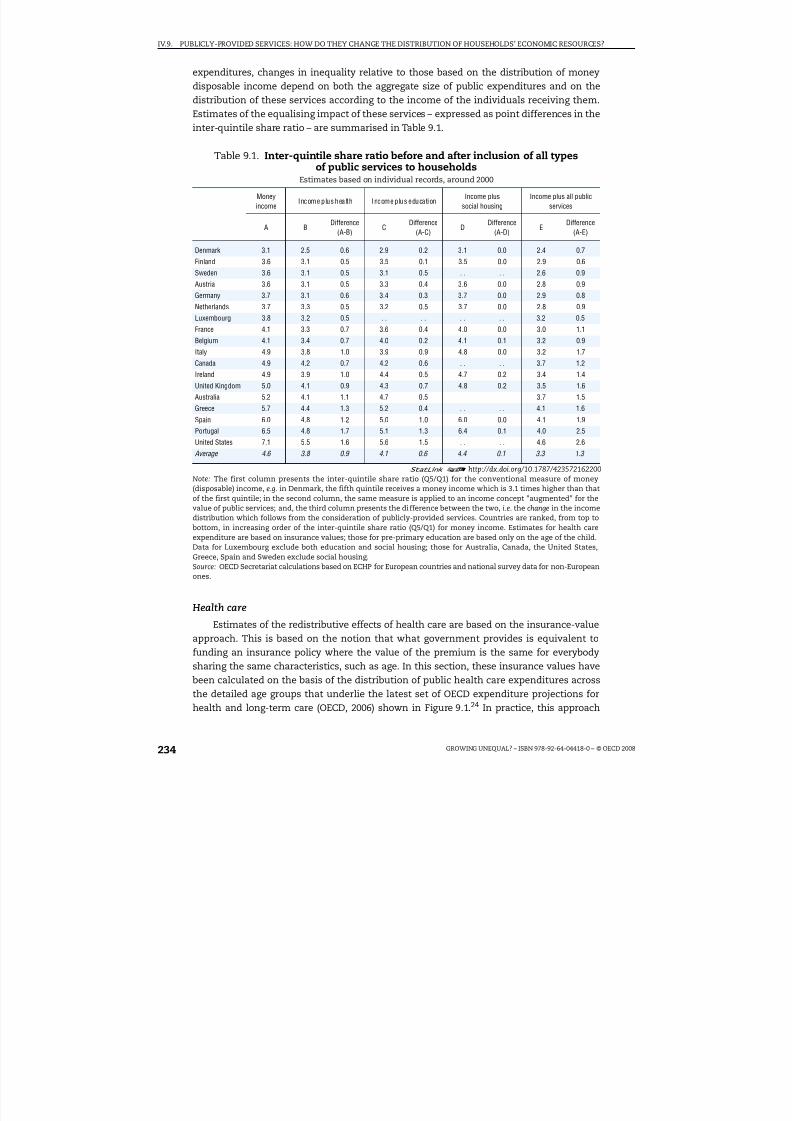
8/20/2019 Growing Unequal
http://slidepdf.com/reader/full/growing-unequal 234/309
IV.9. PUBLICLY-PROVIDED SERVICES: HOW DO THEY CHANGE THE DISTRIBUTION OF HOUSEHOLDS’ ECONOMIC RESOURCES?
GROWING UNEQUAL? – ISBN 978-92-64-04418-0 – © OECD 2008234
expenditures, changes in inequality relative to those based on the distribution of moneydisposable income depend on both the aggregate size of public expenditures and on thedistribution of these services according to the income of the individuals receiving them.Estimates of the equalising impact of these services – expressed as point differences in theinter-quintile share ratio – are summarised in Table 9.1.
Health care
Estimates of the redistributive effects of health care are based on the insurance-valueapproach. This is based on the notion that what government provides is equivalent tofunding an insurance policy where the value of the premium is the same for everybodysharing the same characteristics, such as age. In this section, these insurance values havebeen calculated on the basis of the distribution of public health care expenditures across
the detailed age groups that underlie the latest set of OECD expenditure projections forhealth and long-term care (OECD, 2006) shown in Figure 9.1.24 In practice, this approach
Table 9.1. Inter-quintile share ratio before and after inclusion of all typesof public services to households
Estimates based on individual records, around 2000
Moneyincome
Income plus health Income plus educationIncome plus
social housingIncome plus all public
services
A BDifference
(A-B)C
Difference(A-C)
DDifference
(A-D)E
Difference(A-E)
Denmark 3.1 2.5 0.6 2.9 0.2 3.1 0.0 2.4 0.7
Finland 3.6 3.1 0.5 3.5 0.1 3.5 0.0 2.9 0.6
Sweden 3.6 3.1 0.5 3.1 0.5 . . . . 2.6 0.9Austria 3.6 3.1 0.5 3.3 0.4 3.6 0.0 2.8 0.9
Germany 3.7 3.1 0.6 3.4 0.3 3.7 0.0 2.9 0.8
Netherlands 3.7 3.3 0.5 3.2 0.5 3.7 0.0 2.8 0.9
Luxembourg 3.8 3.2 0.5 . . . . . . . . 3.2 0.5
France 4.1 3.3 0.7 3.6 0.4 4.0 0.0 3.0 1.1
Belgium 4.1 3.4 0.7 4.0 0.2 4.1 0.1 3.2 0.9
Italy 4.9 3.8 1.0 3.9 0.9 4.8 0.0 3.2 1.7
Canada 4.9 4.2 0.7 4.2 0.6 . . . . 3.7 1.2
Ireland 4.9 3.9 1.0 4.4 0.5 4.7 0.2 3.4 1.4
United Kingdom 5.0 4.1 0.9 4.3 0.7 4.8 0.2 3.5 1.6
Australia 5.2 4.1 1.1 4.7 0.5 3.7 1.5
Greece 5.7 4.4 1.3 5.2 0.4 . . . . 4.1 1.6
Spain 6.0 4.8 1.2 5.0 1.0 6.0 0.0 4.1 1.9
Portugal 6.5 4.8 1.7 5.1 1.3 6.4 0.1 4.0 2.5
United States 7.1 5.5 1.6 5.6 1.5 . . . . 4.6 2.6
Average 4.6 3.8 0.9 4.1 0.6 4.4 0.1 3.3 1.3
1 2 http://dx.doi.org/10.1787/423572162200Note: The first column presents the inter-quintile share ratio (Q5/Q1) for the conventional measure of money(disposable) income, e.g. in Denmark, the fifth quintile receives a money income which is 3.1 times higher than thatof the first quintile; in the second column, the same measure is applied to an income concept "augmented" for thevalue of public services; and, the third column presents the difference between the two, i.e. the change in the incomedistribution which follows from the consideration of publicly-provided services. Countries are ranked, from top tobottom, in increasing order of the inter-quintile share ratio (Q5/Q1) for money income. Estimates for health careexpenditure are based on insurance values; those for pre-primary education are based only on the age of the child.Data for Luxembourg exclude both education and social housing; those for Australia, Canada, the United States,Greece, Spain and Sweden exclude social housing.Source: OECD Secretariat calculations based on ECHP for European countries and national survey data for non-Europeanones.

8/20/2019 Growing Unequal
http://slidepdf.com/reader/full/growing-unequal 235/309
IV.9. PUBLICLY-PROVIDED SERVICES: HOW DO THEY CHANGE THE DISTRIBUTION OF HOUSEHOLDS’ ECONOMIC RESOURCES?
GROWING UNEQUAL? – ISBN 978-92-64-04418-0 – © OECD 2008 235
implies attributing to each individual of a given age the average per capita spending amount accruing to the corresponding age group. These per capita amounts are “added” tothe household disposable income of the household to which the individual belongs, andthen equivalised.25
Based on this approach, the inter-quintile share ratio declines, on average, by 0.9 point(from 4.6 for money disposable income to 3.8 after allowing for public health services,Table 9.1, second set of columns). The reduction affects all countries and ranges betweenover 1 point in southern European countries, Australia and the United States to around0.5 point in Sweden, Finland and the Netherlands.26 In general, public health care servicesare distributed rather uniformly across quintiles (i.e. each quintile gets around 20% of public health care services), with marginally higher shares going to people in the lowestquintiles in Denmark, Greece and Belgium.27 Estimates based on actual use – as availablefor a smaller number of countries – point to a more limited distributive impact of publichealth care spending (Box 9.2).
Education
Imputation of public educational expenditures to individuals based on actual userequires, first, determining whether or not an individual is participating in different levelsof the education system; and second, increasing the income of the households where theylive by the average public spending per student at the relevant educational level.28 Themethodology followed for determining participation applies two different approaches forindividuals aged below 16 and those aged 16 and over.
● For children aged 16 and over, the survey data provide information on educationparticipation for each individual filling out the questionnaire, although without
distinguishing between public and private institutions.29
● For children younger than 16, the surveys provide no information on education attended.For this age group, the probability of participating in a specific education level relies ondata on net enrolment rates30 by single year of age (i.e. the probability of attending school is assumed to be the same for each individual of that age in the survey,irrespectively of their household income).
Public educational expenditure refers to total direct government expenditures foreducational institutions per education level, converted to a “per student” basis through
data on the number of students in each level.31 Overall, the combined effect of publicspending on all categories of education is a reduction in the inter-quintile share ratio of
0.6 point on average (Table 9.1, third set of columns). The reduction is stronger (1 point ormore) in Spain, Portugal and the United States, while it is weaker (less than 0.2 point) inFinland, Denmark and Belgium.
The impact of public services in education on income inequality depends crucially onthe level considered.
● Pre-primary education generally narrows inequalities. The effect is small because of themodest amount of expenditures for pre-primary education (in all countries below 2% of household disposable income). Different assumptions for imputing participation rateshave only small effects. When the imputation is based only on the age of the child
(Table 9.2, left-hand panel), the average reduction in the quintile-share ratio is 0.1 point(but twice as high in Portugal and the United States); when the imputation is based onboth the age of the child and the employment status of the parents (i.e. allowing for the

8/20/2019 Growing Unequal
http://slidepdf.com/reader/full/growing-unequal 236/309
IV.9. PUBLICLY-PROVIDED SERVICES: HOW DO THEY CHANGE THE DISTRIBUTION OF HOUSEHOLDS’ ECONOMIC RESOURCES?
GROWING UNEQUAL? – ISBN 978-92-64-04418-0 – © OECD 2008236
possibility that households where both parents work make more use of pre-primaryeducation) the fall in inequality is marginally smaller.
● For primary and secondary education, public expenditures have a stronger effect inreducing inequalities, with an average decline of around 0.5 point (Table 9.3, middlepanel).32 The decline of the inter-quintile share ratio is largest in the countries with themost unequal distribution of money income (Spain, Portugal and the United States)while it is negligible in Denmark and Finland. The first outcome mainly reflects the sizeof public expenditures for this level of education: in most countries, primary andsecondary education make up about 10% of household disposable income. On average,the distribution of this category of public expenditure is uniform across quintiles, with amarginally lower share for people in the upper part of the distribution. The share of public expenditure for primary and secondary education going to people in the bottomquintile is low in Finland and Denmark, reflecting the greater concentration of childrenin the middle of the income distribution in these countries.33
●
For tertiary education, patterns are radically different – on average, the decline in the inter-quintile share ratio is negligible. In around un tiers of the countries included in Table 9.3
Box 9.2. Redistributive effects of health care based on actual use
The approach based on actual use of health care services can only be applied to a limitednumber of European countries. Several questions in ECHP relate to the use of health careservices by individuals aged 15 or more (without distinguishing, however, between use of public and private facilities): questions relate to visits to a general practitioner, to aspecialist and to a dentist in the year preceding the questionnaire, as well as to the numberof nights spent in hospital. These data – available for eight European countries (France wasexcluded because of a low response rate) – have been combined with data on public healthcare expenditures grouped in two broad categories: hospital care, and consultations andmedical examinations outside hospitals.1
Based on this approach, the distributive effect of health care expenditures is, on average,significantly lower than for the insurance-value approach (an average reduction of 0.2 point, as compared to one of 0.8 based on insurance value for the same countries).Results vary considerably among countries. In Denmark, inequality rises, and the sameoccurs, to a smaller extent, in Italy, Finland and the Netherlands. Conversely, public healthcare reduces inequality in Spain, the United Kingdom, Austria and Ireland. In thosecountries where inequality rises, this reflects the effect of health care services provided
inside a hospital (in five of the eight countries these services widen inequalities), whilehealth care services outside hospitals have an equalising effect in all countries.
These opposite effects reflect the large differences in how inside and outside hospitalcare expenditures are distributed among individuals in different income quintiles. While bothinside and outside hospital expenditures tend to benefit more the lowest quintiles (based onmoney income), the profile is especially steep for hospital care. For example, in Denmark, 35%of hospital care expenditures go to the lowest quintile. While this may seem surprising – in thelight of evidence in the table below – the result that in-hospital expenditures increase
inequality in several countries reflects the effect of “re-ranking” individuals: as in-hospitalexpenditures are concentrated among a small number of individuals2 they lead moreeasily to re-ranking individual beneficiaries, which dampens (or even reverses) theequalising effects of these health services. These results underline the limits (describedearlier) of this approach.

8/20/2019 Growing Unequal
http://slidepdf.com/reader/full/growing-unequal 237/309
IV.9. PUBLICLY-PROVIDED SERVICES: HOW DO THEY CHANGE THE DISTRIBUTION OF HOUSEHOLDS’ ECONOMIC RESOURCES?
GROWING UNEQUAL? – ISBN 978-92-64-04418-0 – © OECD 2008 237
(right panel), this ratio increases slightly, a pattern suggesting that students in highereducation predominantly live in better-off households. Even for countries where tertiaryeducation lowers inequalities, such as Denmark and Sweden, this effect maypredominantly reflect the large proportion of tertiary students living away from theparental home, who are classified by surveys as separate households with low reportedincome. Because of the earnings premium of higher education, many of theseindividuals will be high-income earners in the future. The share of public expenditure intertiary education accruing to people in the top quintile of the distribution is close to 30%
on average, and above 40% in Belgium, Spain and Portugal (Marical et al., 2006).
Box 9.2. Redistributive effects of health care based on actual use (cont.)
1. This breakdown of health care expenditures does not correspond exactly to the one used in ECHP (e.g. OECDdata provide information on public health care expenditures for medical visits, without distinguishing – for
most countries – between general practitioners and specialists). Imputations of in-hospital care expendituresto an individual j (DSHj) are based on the number of nights spent in hospital (nj):
where N indicates the population (i.e. those older than 15) in the sample. For expenditures outside hospital(DSOH
j) the criterion used is based on the number of visits to a general practitioner (v j), i.e.:
2. In the survey data used here, around 5% of the population accounted for more than 90% of the nights spentin hospital; conversely, more than 50% of the population accounted for 90% of all medical visits.
Inter-quintile share ratio before and after inclusionof public health expenditures based on actual use
Estimates based on individual data, around 2000
Total expenditure In-hospital expenditures Out-of-hospital expenditures
A. Moneyincome
B. Income plushealth care
(consumption)
C. Difference(A-B)
B1. Income plusin-hospitalhealth care
C1. Difference(A-B1)
B2. Income plusout-of-hospital
health care
C2. Difference(A-B2)
Denmark 3.10 3.25 –0.16 3.39 –0.29 2.90 0.19
Finland 3.56 3.60 –0.04 3.77 –0.21 3.36 0.20
Austria 3.65 3.39 0.26 3.56 0.09 3.39 0.26
Netherlands 3.73 3.76 –0.02 3.99 –0.26 3.48 0.26
Italy 4.85 4.86 –0.01 5.41 –0.56 4.30 0.55
Ireland 4.88 4.69 0.20 5.01 –0.12 4.47 0.41
United Kingdom 5.02 4.37 0.66 4.97 0.06 4.35 0.67
Spain 5.99 5.24 0.75 5.90 0.09 5.23 0.76
Average 4.35 4.14 0.20 4.50 –0.15 3.93 0.41
Memorandum item:
Average for the same
countries based on
insurance approach 4.31 3.52 0.79 . . . . . . . .
1 2 http://dx.doi.org/10.1787/423752820478Note: Countries are ranked, from top to bottom, in increasing order of the inter-quintile share ratio for moneyincome.Source: Secretariat calculations based on ECHP for European countries.
∑∈
××=
N i
j
H
j j H
n N
DS n DS
∑∈
×
−×=
N i
j
H
j jOH
v N
DS DS v DS
)(

8/20/2019 Growing Unequal
http://slidepdf.com/reader/full/growing-unequal 238/309
IV.9. PUBLICLY-PROVIDED SERVICES: HOW DO THEY CHANGE THE DISTRIBUTION OF HOUSEHOLDS’ ECONOMIC RESOURCES?
GROWING UNEQUAL? – ISBN 978-92-64-04418-0 – © OECD 2008238
Social housing
Estimating the distributive effect of social housing is more difficult than for other
social services, as it requires quantifying the aggregate size of the implicit benefitsprovided. This section presents estimates for some European countries based oninformation on housing tenure (i.e. whether different households own or rent theirresidence, and whether they rent from the public or private sector)34 and on their actualrents.
OECD countries differ not only with respect to the relative importance of various typesof housing, but also in how their prevalence varies with household income. The share of individuals who are renting their main residence is close to 40% in the lowest quintile andonly 13% in the top one (Marical et al., 2006), with the exceptions of only Greece andAustria, where the share of renters is rather uniform across quintiles. The importance of
public sector rentals also declines when moving up the income distribution.35
Overall, theshare of renters living in social housing is low in Greece and Spain (less than 10%) but moreimportant in Ireland, the Netherlands and the United Kingdom.
Table 9.2. Inter-quintile share ratio before and after inclusion of pre-primaryeducation expenditures
Estimates based on individual data, around 2000
Imputation based on the age of the childImputation based on the age of the childand the employment status of parents
A. Money income B1. Income pluspre-primary education
Difference (A-B1) B2. Income pluspre-primary education
Difference (A-B2)
Denmark 3.1 3.1 0.0 3.1 0.0
Finland 3.6 3.5 0.0 3.5 0.0
Sweden 3.6 3.5 0.1 3.5 0.1
Austria 3.6 3.5 0.1 3.6 0.1
Germany 3.7 3.7 0.0 3.7 0.0
Netherlands 3.7 3.7 0.1 3.7 0.1
France 4.1 4.0 0.1 . . . .
Belgium 4.1 4.1 0.1 . . . .
Italy 4.9 4.7 0.2 . . . .
United Kingdom 5.0 4.9 0.1 4.9 0.1
Australia 5.2 5.2 0.0 . . . .
Greece 5.7 5.6 0.0 5.6 0.0
Spain 6.0 5.9 0.1 . . . .
Portugal 6.5 6.2 0.2 6.1 0.3
United States 7.1 6.9 0.2 . . . .
Average 4.7 4.6 0.1 . . . .
Average across the countries
included in right-hand panel 4.3 4.2 0.1 4.2 0.1
1 2 http://dx.doi.org/10.1787/423582010573Note: Countries are ranked, from top to bottom, in increasing order of the Q5/Q1 ratio for money income. Ireland isexcluded because of the very small number of children aged 3 to 6 in pre-primary education in the survey. Estimates inthe left-hand panel assume that the probability of attending pre-primary education is the same for each child, and
independent of household income. Estimates on the right-hand panel assume, for countries where the participationrate of children in this age group is below the share of children in households where both parents work, that all childrenbelonging to this household type have the same probability of attending and that all other children are not attending;and, for countries where the participation rate is above the share of children in households where both parents work,that all children in this household type are in pre-primary and that all other children have the same probability of attending. Estimates on the right-hand panel have been limited to countries where participation in pre-primaryeducation is 80% or less in the age groups under consideration.Source: OECD Secretariat calculations based on ECHP for European countries and national survey data for non-Europeanones.

8/20/2019 Growing Unequal
http://slidepdf.com/reader/full/growing-unequal 239/309
IV.9. PUBLICLY-PROVIDED SERVICES: HOW DO THEY CHANGE THE DISTRIBUTION OF HOUSEHOLDS’ ECONOMIC RESOURCES?
GROWING UNEQUAL? – ISBN 978-92-64-04418-0 – © OECD 2008 239
To evaluate the implicit subsidy associated with the provision of social housing atbelow-market rents, each beneficiary is attributed an amount equal to the differencebetween the rent effectively paid and the one they would have paid on the market for adwelling with similar characteristics (Box 9.3). The distributive effects of social housing arein general quite limited (Table 9.1, fourth set of columns). This small equalising effectreflects the small size of the aggregate subsidy implicit in the provision of social housing (0.6% of household disposable income, on average), even though – when compared tohealth and education – it mainly benefits individuals in the lowest quintiles of thedistribution.
Summing up
When considering the combined effect of the three categories of public servicesdiscussed above, the inter-quintile share ratio falls, on average, by around 1.3 points (i.e.
from 4.6 for money disposable income to 3.3), with a reduction that is largest in the UnitedStates and Portugal (almost twice the average) and smallest in Finland and Denmark(Table 9.1, rightmost columns).36 In general, patterns are little affected by the specificinequality measure used. Figure 9.5, which presents estimates of the effects of governmentservices for both the inter-quintile share ratio and the Gini coefficient, suggests that:
● Both the Gini coefficient and the inter-quintile share ratio decline significantly when the
income concept is broadened to include all public services considered here.● With both measures, the ranking of countries does not change significantly when
moving from money (disposable) income to a measure that includes public services (the
Table 9.3. Inter-quintile share ratio before and after inclusionof public expenditures on primary, secondary and tertiary education
Estimates based on individual data, around 2000
Primary and secondary education Tertiary education
A. Money income
B1. Income plus
primary andsecondary education
Difference(A-B1) B2. Income plustertiary education Difference(A-B2)
Denmark 3.1 3.1 0.0 2.9 0.2
Finland 3.6 3.6 –0.1 3.5 0.1
Sweden 3.6 3.4 0.2 3.4 0.2
Austria 3.6 3.4 0.3 3.7 0.0
Germany 3.7 3.5 0.2 3.7 0.0
Netherlands 3.7 3.3 0.4 3.7 0.0
France 4.1 3.8 0.3 4.0 0.1
Belgium 4.1 4.0 0.2 4.2 –0.1
Italy 4.9 4.1 0.7 4.8 0.1
Canada 4.9 4.3 0.6 4.8 0.1
Ireland 4.9 4.2 0.7 5.1 –0.2
United Kingdom 5.0 4.4 0.6 5.0 0.1
Australia 5.2 4.8 0.4 5.1 0.1
Greece 5.7 5.3 0.4 5.6 0.0
Spain 6.0 5.0 1.0 6.1 –0.1
Portugal 6.5 5.2 1.3 6.5 –0.1
United States 7.1 5.8 1.3 7.0 0.1
Average 4.7 4.2 0.5 4.7 0.0
1 2 http://dx.doi.org/10.1787/423583401157Note: Countries are ranked, from top to bottom, in increasing order of the Q5/Q1 ratio for money income.Source: OECD Secretariat calculations based on ECHP for European countries and national survey data for non-Europeanones.
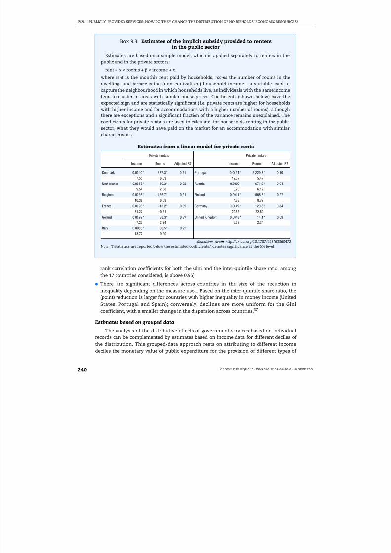
8/20/2019 Growing Unequal
http://slidepdf.com/reader/full/growing-unequal 240/309
IV.9. PUBLICLY-PROVIDED SERVICES: HOW DO THEY CHANGE THE DISTRIBUTION OF HOUSEHOLDS’ ECONOMIC RESOURCES?
GROWING UNEQUAL? – ISBN 978-92-64-04418-0 – © OECD 2008240
rank correlation coefficients for both the Gini and the inter-quintile share ratio, among the 17 countries considered, is above 0.95).
● There are significant differences across countries in the size of the reduction ininequality depending on the measure used. Based on the inter-quintile share ratio, the(point) reduction is larger for countries with higher inequality in money income (UnitedStates, Portugal and Spain); conversely, declines are more uniform for the Ginicoefficient, with a smaller change in the dispersion across countries.37
Estimates based on grouped data
The analysis of the distributive effects of government services based on individualrecords can be complemented by estimates based on income data for different deciles of the distribution. This grouped-data approach rests on attributing to different incomedeciles the monetary value of public expenditure for the provision of different types of
Box 9.3. Estimates of the implicit subsidy provided to rentersin the public sector
Estimates are based on a simple model, which is applied separately to renters in thepublic and in the private sectors:
rent = α × rooms + β × income + c.
where rent is the monthly rent paid by households, rooms the number of rooms in thedwelling, and income is the (non-equivalised) household income – a variable used tocapture the neighbourhood in which households live, as individuals with the same incometend to cluster in areas with similar house prices. Coefficients (shown below) have theexpected sign and are statistically significant (i.e. private rents are higher for householdswith higher income and for accommodations with a higher number of rooms), althoughthere are exceptions and a significant fraction of the variance remains unexplained. Thecoefficients for private rentals are used to calculate, for households renting in the publicsector, what they would have paid on the market for an accommodation with similar
characteristics.
Estimates from a linear model for private rents
Private rentals Private rentals
Income Rooms Adjusted R7 Income Rooms Adjusted R7
Denmark 0.0040* 337.3* 0.21 Portugal 0.0024* 2 229.8* 0.10
7.55 6.53 12.37 5.47
Netherlands 0.0058* 19.3* 0.22 Austria 0.0002 671.2* 0.04
9.54 2.08 0.28 6.12
Belgium 0.0036* 1 136.7* 0.21 Finland 0.0041* 565.5* 0.27
10.38 6.68 4.33 8.79
France 0.0093* –13.2* 0.39 Germany 0.0049* 120.8* 0.3431.27 –0.51 22.56 22.82
Ireland 0.0099* 38.3* 0.32 United Kingdom 0.0048* 14.1* 0.09
7.27 2.34 6.62 2.34
Italy 0.0055* 66.5* 0.22
18.77 9.20
1 2 http://dx.doi.org/10.1787/423763360472Note: T statistics are reported below the estimated coefficients.* denotes significance at the 5% level.

8/20/2019 Growing Unequal
http://slidepdf.com/reader/full/growing-unequal 241/309
IV.9. PUBLICLY-PROVIDED SERVICES: HOW DO THEY CHANGE THE DISTRIBUTION OF HOUSEHOLDS’ ECONOMIC RESOURCES?
GROWING UNEQUAL? – ISBN 978-92-64-04418-0 – © OECD 2008 241
social services, and on comparing various inequality measures before and after thisimputation (i.e. with no re-ranking of individuals).38 This approach is less accurate thanthat based on individual records, but allows the analysis to be extended to a broader rangeof OECD countries and public services.
The imputation of the value of the different public services to each decile of the
income distribution relies on information about the average equivalised disposable incomeof each decile and the distribution of (nine) age groups across them.39 The imputation of government expenditures for these services to different income deciles relies on differentrules according to the type of service considered:
● Health care. The imputation is based on the age of individuals and on the distribution of different age groups across income deciles. Information on the latter is drawn from OECDquestionnaires on income distribution. The data on the distribution of public healthexpenditures by age of recipients are those shown in Figure 9.1. For most countries, theseage-expenditure profiles are based on national data; for countries where no national dataare available,40 the imputation relies on the “average” profile prevailing in other OECD
countries.
● Education. The imputation of education expenditure is based on individuals’ age and thedistribution of different age groups across income deciles. The procedure involves threesteps. The first requires determining the enrolment rates of individuals of a given age(from three to 29 years) in different levels of education and grouping them into the threeage groups available in the OECD income distribution questionnaire (0-17, 18-25 and26-40);41 the second step involves calculating total education expenditure by age group;and the last step computes education spending in each decile based on the educationalexpenditure for each age group and the distribution of each age group across deciles.Expenditure data refer to the direct educational outlays of the general government, i.e.
excluding cash transfers to private entities such as student grants and loans.42
Figure 9.5. Income inequality before and after inclusion of expenditureson public services in OECD countriesEstimates based on individual data, around 2000
1 2 http://dx.doi.org/10.1787/423465828250
Source: OECD Secretariat calculations based on ECHP for European countries and national survey data for non-Europeanones.
0.40
0.35
0.30
0.25
0.20
0.15
0.100.10 0.15 0.20 0.25 0.30 0.35 0.40
8
7
3
4
5
6
22 3 54 76 8
AUS
AUTBEL
CAN
DNK
FIN FRADEU
GRC
IRL
ITA
LUX
NLD
PRTESP
SWE
GBR
USA
Average
AUS
AUT
BEL
CAN
DNK
FINFRA
DEU
GRC
IRLITA
LUX
NLD
PRT
ESP
SWE
GBR
USA
Average
Money income Money income
Income plus services Income plus services
Gini coefficientInter-quintile ratio

8/20/2019 Growing Unequal
http://slidepdf.com/reader/full/growing-unequal 242/309
IV.9. PUBLICLY-PROVIDED SERVICES: HOW DO THEY CHANGE THE DISTRIBUTION OF HOUSEHOLDS’ ECONOMIC RESOURCES?
GROWING UNEQUAL? – ISBN 978-92-64-04418-0 – © OECD 2008242
● Other social services. This category of spending includes (in the SOCX classification) aheterogeneous set of programmes. Because of their diversity, the individualisation of public spending is based on the assumption that these services are distributed acrossincome deciles in the same way as the corresponding cash transfers (based oninformation included in the OECD questionnaire on income distribution). This
assumption reflects the notion that, for each type of programme, services and cashtransfers typically complement each other.
While less accurate than the estimates based on individual records described above, thisapproach can be applied to 26 countries included in the OECD database on income distributionand to the full range of public services to households included in OECD data on socialexpenditure. These results can be considered as providing a “first-order” approximation of thedistributive effects of public services for countries where micro records are not available.
Distributive effects, based on this approach, vary with the category of services considered:
● Health care. Health expenditure reduces inequalities in all the 26 OECD countries
considered (by 1.1 points, on average, Table 9.4, second set of columns). Changes incountry rankings are, however, small: the Nordic countries and the Czech Republic arethe most egalitarian countries both before and after taking health services into account.The greatest changes in the inter-quintile ratio affect countries such as Portugal, theUnited States and Mexico, where the distribution of disposable income is the mostunequal. Hence, overall there is a convergence of income inequalities among countries(as measured by the range of variation).43
● Education. The redistributive impact of public expenditure on education is onlymarginally smaller than that for health (the average inter-quintile ratio falls from 5.2, formoney disposable income, to 4.2 after taking education services into account, Table 9.4,
third set of columns). In general, education expenditure especially benefits the threelowest quintiles of the income distribution, even if the differences between countries areconsiderable. Sensitivity analysis shows that inequalities in attendance in educationacross income deciles have a fairly marginal impact on the results and are limited to the18-25 age group (Marical et al., 2007).44
● Other social services. While often significant, the effects of these services in narrowing income inequality (a decline of the inter-quintile share ratio of 0.3 point, on average,Table 9.4, fourth set of columns) are significantly lower than those associated withhealth and education, as the effect of their more targeted nature is offset by the loweramount of expenditure.
Overall, the effects of all public services on income inequalities are considerable in mostcountries. Thus the inter-quintile ratio falls on average from 5.2, on a cash basis, to 3.4 aftertaking public services into account – a fall of 1.8 points (Table 9.4, rightmost columns). Thedifferences between countries in the size of this fall are marked, with a largest (point) fall incountries where the inequalities in the distribution of disposable income are greatest.45 Thereduction in the disparities between countries narrows without fundamentally altering theirranking, even though some countries improve their position (e.g. France and Australia), whilethat of others worsens (especially the Netherlands, Austria and Greece).
Not surprisingly, the approach based on grouped data leads, in general, to different
numerical estimates of the reduction in inequality due to public services than those basedon individual records. A comparison of these estimates – across the countries andprogrammes (education and health) that are covered by both approaches – shows the fall

8/20/2019 Growing Unequal
http://slidepdf.com/reader/full/growing-unequal 243/309
IV.9. PUBLICLY-PROVIDED SERVICES: HOW DO THEY CHANGE THE DISTRIBUTION OF HOUSEHOLDS’ ECONOMIC RESOURCES?
GROWING UNEQUAL? – ISBN 978-92-64-04418-0 – © OECD 2008 243
in inequality based on grouped data exceeds that based on individual records (as the firstapproach does not allow for individuals’ re-ranking), although the difference is much lower
for the Gini coefficient that for the inter-decile ratio; further the reduction in inequalitybased on the two approaches are highly correlated with each other (above 0.90) acrosscountries, and this for both inequality measures.
This analysis also suggests that public services are distributed quite uniformly among the different quintiles and, in consequence, in a less inegalitarian way than moneyincomes. Figure 9.6 shows this result for the average of OECD countries. For all publicservices to households, the lowest quintile receives a share of 23% and the highest quintile17% (left-hand panel). Similar values are recorded for health services and education, whilethe share of the lowest quintile is the highest for “other” public services. However, due tothe different levels of cash income in the different quintiles, public services represent a
much larger share of the income of those at the bottom of the distribution (around 70% of disposable income on average) than for those at the top of the distribution (11%, right-handpanel).46 These patterns mirror closely those obtained based on individual records.
Table 9.4. Inter-quintile share ratio before and after inclusion of expenditureon all public services
Estimates based on grouped data, around 2000
Moneyincome
Income plus health Income plus educationIncome plus other social
servicesIncome plus all public
services
A B Difference(A-B)
C Difference(A-C)
D Difference(A-D)
E Difference(A-E)
Denmark 3.1 2.5 0.6 2.7 0.4 2.5 0.7 1.9 1.2
Sweden 3.4 2.7 0.8 2.9 0.5 2.7 0.8 2.0 1.4
Netherlands 3.6 3.1 0.5 3.1 0.5 3.4 0.2 2.6 0.9
Czech Republic 3.6 2.9 0.7 3.0 0.6 3.3 0.3 2.4 1.2
Luxembourg 3.7 3.1 0.5 3.1 0.6 3.4 0.3 2.6 1.1
Finland 3.7 3.1 0.7 3.2 0.6 3.2 0.5 2.5 1.2
Norway 3.7 2.9 0.9 3.2 0.5 3.0 0.8 2.2 1.5
Austria 3.9 3.3 0.6 3.1 0.8 3.8 0.1 2.7 1.2
Switzerland 3.9 3.2 0.7 3.4 0.6 3.7 0.2 2.8 1.1
France 4.0 3.2 0.9 3.3 0.8 3.7 0.4 2.6 1.4
Germany 4.3 3.3 1.0 3.6 0.6 3.9 0.3 2.8 1.4
Hungary 4.4 3.5 0.9 3.7 0.7 4.1 0.3 2.9 1.5
Canada 4.8 3.9 0.9 3.9 0.9 4.4 0.4 3.2 1.6
Australia 4.9 3.5 1.4 4.1 0.7 4.1 0.7 2.8 2.0
Ireland 5.0 3.7 1.3 4.3 0.7 4.7 0.4 3.2 1.8
United Kingdom 5.2 4.1 1.0 4.3 0.8 4.8 0.4 3.4 1.7
New Zealand 5.4 4.2 1.2 4.1 1.3 5.1 0.2 3.3 2.0
Spain 5.6 4.3 1.3 4.4 1.2 5.4 0.2 3.6 2.0
Japan 5.7 4.3 1.4 4.8 0.9 5.4 0.3 3.7 2.0
Greece 6.0 4.8 1.2 5.3 0.7 5.7 0.3 4.2 1.8
Poland 6.1 5.2 0.9 4.7 1.3 5.8 0.3 4.1 2.0
Italy 6.2 4.5 1.7 4.8 1.4 6.0 0.1 3.7 2.4
Portugal 6.2 4.4 1.8 4.9 1.3 6.0 0.2 3.7 2.5United States 6.9 5.1 1.7 5.1 1.8 6.4 0.5 4.0 2.9
Turkey 9.3 7.8 1.5 7.4 1.9 9.3 0.0 6.5 2.8
Mexico 12.6 10.9 1.7 9.9 2.7 12.3 0.3 8.8 3.8
Average 5.2 4.1 1.1 4.2 1.0 4.8 0.3 3.4 1.8
1 2 http://dx.doi.org/10.1787/423724888582Note: Countries are ranked, from top to bottom, in increasing order of the Q5/Q1 ratio for money income.Source: OECD Secretariat calculation based on OECD data.

8/20/2019 Growing Unequal
http://slidepdf.com/reader/full/growing-unequal 244/309
IV.9. PUBLICLY-PROVIDED SERVICES: HOW DO THEY CHANGE THE DISTRIBUTION OF HOUSEHOLDS’ ECONOMIC RESOURCES?
GROWING UNEQUAL? – ISBN 978-92-64-04418-0 – © OECD 2008244
A further issue is how the redistributive effect of in-kind government servicescompares with that of household taxes and public cash transfers. Figure 9.7 shows thepoint reduction of both the inter-quintile share ratio and the Gini coefficient achieved byin-kind government services (on the vertical axis) and by household taxes and public cashbenefit (on the horizontal axis).47 Three patterns stand out.
● First, the equalising impact of public in-kind services is, on average, around ¼ of thatachieved by household taxes and cash transfers when looking at the inter-quintile share
Figure 9.6. Importance of public services in household incomeacross the distribution, OECD average
Estimates based on grouped data, around 2000
1 2 http://dx.doi.org/10.1787/423523203382
Source: OECD Secretariat computation based on different OECD databases.
Figure 9.7. Redistributive impact of in-kind public services comparedto that of household taxes and cash benefits
Point differences in the inter-quintile ratio and Gini coefficient, estimates based on grouped data,around 2000
1 2 http://dx.doi.org/10.1787/423528286422Note: The reduction in inequality due to in-kind public transfers (on the vertical axis) is measured as the absolutedifference between the inequality measures (the inter-quintile share ratio, in the left-hand panel; the Gini coefficientin the right-hand panel) for disposable household income and that for income plus in-kind public services. The
reduction in inequality due to household taxes and public cash transfers is the absolute difference between theinequality measures for market income and for disposable income. Points below the line denote countries where thereduction in inequality due to household taxes and public cash benefits exceeds that due to in-kind public services.
Source: OECD Secretariat computation based on different OECD databases.
0.30
0.25
0.20
0.15
0.10
0.05
0
0.8
0.6
0.4
0.2
0
Q1 Q2 Q3 Q4 Q5 Q1 Q2 Q3 Q4 Q5
Dist ribut ion o f public services ac ross quint iles Rat io between public services and money income
All public services Health Education Other
0.15
0.10
0.05
00 0.05 0.10 0.15 0.20 0.25
4
3
1
2
00 4 128 2016
AUS
CAN
DNKFINFRA DEU
IRL
ITA
JPN
NLD
NZLNOR
PRT
SWECHE
GBR
USAAUS
CAN
DKN
FIN FRADEUIRL ITA
JPN
NLD
NZLNOR
PRT SWE
CHEGBR
USA
Taxes and cash transfers Taxes and cash transfers
In-kind public services In-kind public services
Gini coefficientInter-quintile share ratio
AverageAverage

8/20/2019 Growing Unequal
http://slidepdf.com/reader/full/growing-unequal 245/309
IV.9. PUBLICLY-PROVIDED SERVICES: HOW DO THEY CHANGE THE DISTRIBUTION OF HOUSEHOLDS’ ECONOMIC RESOURCES?
GROWING UNEQUAL? – ISBN 978-92-64-04418-0 – © OECD 2008 245
ratio, and around ½ in the case of the Gini coefficient – although, for some countries, thereduction in inequality achieved through the two set of policies is broadly similar.48
● Second, the redistributive effect of household taxes and government cash transfersvaries much more across countries than that of public services in-kind – around 50%more when looking at the coefficient of variation, for both inequality measures used.
● Finally, countries with a lower inequality of money disposable income also record alower inequality after including in-kind public services (with a correlation above 95% forboth inequality measures); there is conversely no correlation across countries whenconsidering the (absolute) redistribution achieved by the two policy levers.
Conclusion
Overall, both the approach based on individual records and that based on groupeddata highlight some consistent patterns that mirror, with few exceptions, those identifiedby previous research on the subject.
● Public expenditure for the provision of social services to households significantlynarrows inequality, although for some countries – when the imputation is based onindividual data – this effect is negligible for non-compulsory education. The overalleffect of public services in narrowing inequalities in the distribution of households’economic resources results mainly from a relatively uniform distribution of theseservices across income quintiles, which translates into a larger increase in the incomeshare at the bottom of the distribution than at the top.
● Changes in inequality measures prompted by the consideration of public services do notlead to major changes in country rankings. The dispersion of inequality across countriesnarrows considerably for the inter-quintile share ratio but by much less for the Gini
coefficient.
● The inequality reduction due to government in-kind services is, on average, lower thanthat achieved by the combined effect of household taxes and public cash transfers,although this is not true in all countries.
The way various government services are distributed among the population has someimportant policy implications. First, because of the significant effect of the publicly-provided services considered in this chapter on the distribution of economic resourcesamong households and individuals, it is important to take account of this redistributiveimpact when making policy choices about these programmes. Second, and despite
economists’ presumption in favour of cash transfers, provision of public services may be justified on a variety of reasons (e.g. when the consumption choices of parents do not takeinto full account the utility of their children, to improve the targeting of programmes, toincrease investment is people’s health and skills – and hence productivity in the long-run,Currie and Gahvari, 2007); this raises the question of how best to mix cash transfers and in-kind public services to meet any particular redistributive goal. Finally, public services mayalso affect the labour-supply decisions of beneficiaries, in particular for those at thebottom of the distribution; it follows that reform should consider how provision of in-kindservices (e.g. childcare) might augment the labour supply and thus ease the trade-off between equity and efficiency goals. These considerations underscore the importance of
accounting more systematically for the contribution of government services to householdwell-being and its distribution.

8/20/2019 Growing Unequal
http://slidepdf.com/reader/full/growing-unequal 246/309
IV.9. PUBLICLY-PROVIDED SERVICES: HOW DO THEY CHANGE THE DISTRIBUTION OF HOUSEHOLDS’ ECONOMIC RESOURCES?
GROWING UNEQUAL? – ISBN 978-92-64-04418-0 – © OECD 2008246
Notes
1. For example, households with children in state schools benefit from a tax-financed service thatimproves their well-being compared with those who have to buy the same services in the market.It should be noted, in this respect, that the OECD national accounts combine information on boththe goods and services bought by households on the market, and those provided by governmentsfree of charge or at subsidised prices within the concept of the “actual” consumption of households.
2. For example, every year the UK national statistical office publishes a report on the distribution of household income which also considers the effect of public spending in health and education (e.g.
Jones, 2006); and similar reports exist for Australia (ABS, 2001). While most studies have a nationalfocus, a few provide information extending to several countries – and their number has increasedfollowing the availability of the Luxembourg Income Study, a database providing access (within auniform data environment) to the micro-records of household income surveys for several OECDcountries (e.g. Brady, 2004; Garfinkel et al., 2004; Smeeding, 2002; Smeeding and Rainwater, 2002;Steckmest, 1996).
3. Differences in the use of health care services according to individuals’ income and socio-economicstatus are reported even in countries with universal health care systems (e.g. Goddard et al., 2001,for the United Kingdom).
4. Exceptions include the United States, Portugal and Finland, in the case of consultations withdoctors; and Mexico in the case of hospital nights.
5. Both approaches will lead to the same quantitative results when considering two countries withidentical (pre-tax) money income and health care needs, and where these needs are met, in onecountry, through tax-financed public health care and, in the other, through private out-of-pockethealth expenditures.
6. The Committee on National Statistics of the US National Academy of Sciences recommended that,for the purpose of measuring poverty, “family resources” should exclude both out-of-pocketmedical care expenditures and health insurance premiums (Citro and Michael, 1995). Weinberg (2006) underscores the importance of employer-provided health insurance for a better measure of household income.
7. According to Xu et al. (2003), the share of households with out-of-pocket payments exceeding 40%of their income is almost nil in France but close to 3% in Portugal. This proportion tends to behigher in low- and middle-income countries, as well as in economies in transition.
8. Private out-of-pocket costs are only one among the different sources of health care financing.Some studies have focused on the distributive implications of all types of health care financing, i.e.taxes, contributions and out-of-pocket costs. In general, these effects will depend on the relativeimportance of each source, on their “progressivity” ( i.e. the extent to which they weigh moreheavily on higher income groups), and on various factors that shape horizontal equity (e.g.differences in contribution rates across insurance funds or in health-related tax rates acrossmunicipalities, Wagstaff et al., 1999). De Graeve and Van Ourti (2003), who examine the impact of different financing sources on income distribution in 23 European countries, find that direct taxesare progressive in all countries and indirect taxes and out-of-pocket payments regressive, whilethere are more differences in results for contributions to social security and private insurance.Similar results are reported by van Doorslaer et al. (1999) for 12 OECD countries including theUnited States. Klavus and Häkkinen (1998), who apply a similar methodology for Finland, arguethat reforms to health care financing introduced following the recession of the early 1990s havemoderately reduced the progressivity of the overall system without compromising its equityfeatures, mainly because of the continuous importance of direct income taxes.
9. Private expenditure on education in OECD countries accounts on average for 18% of totalexpenditure at the pre-primary stage and 22% in tertiary education, but only 7% in primary andsecondary education (OECD, 2005).
10. The proportion of young people aged 20 to 24 years who, in 2001, had not completed lowersecondary school was less than 5% in 14 OECD countries, but highest in New Zealand (16%),Portugal (29%), Mexico (33%) and Turkey (47%).
11. Public expenditure on higher education accounts, on average, for almost half of educationalspending (48%) while the share of pre-primary education is only 7%.
12. For example, the probability of access to tertiary education is three times higher for young peoplewhose parents have a university degree than for those from less well-educated households(Machin, 2006). Differences in access to university education are also evident with regard to ethnicbackground. Thus, in the United States, the percentage of white students who, upon finishing high

8/20/2019 Growing Unequal
http://slidepdf.com/reader/full/growing-unequal 247/309
IV.9. PUBLICLY-PROVIDED SERVICES: HOW DO THEY CHANGE THE DISTRIBUTION OF HOUSEHOLDS’ ECONOMIC RESOURCES?
GROWING UNEQUAL? – ISBN 978-92-64-04418-0 – © OECD 2008 247
school, enrol in university is 10 points higher than for young people of Hispanic origin and20 points higher than for young blacks, even though these differences have declined since 1994.
13. This phenomenon is well documented by Evandrou (1993) for the United Kingdom. This studyshows that the distribution of public expenditure on tertiary education is more unequal whenpensioners’ households are included, as compared to results obtained when limiting the analysisto households of non-pensioners.
14. Inequalities in the distribution of expenditure on tertiary education reflect not only differences inaccess but also differences in costs per student depending on the subject chosen. Thus, in France,students from the wealthiest families choose more expensive course (Albouy and Wanecq, 2003).
15. Governments also intervene through rent controls applied to private housing: these measures arenot covered in this article.
16. Access to social housing generally means less expenditure on housing for the householdsconcerned. In France, tenants in private accommodation pay 22% of their income on housing,compared with 18% for tenants of public housing. These differences may under-estimate thebenefit, if people who live in social housing can afford a bigger or more comfortable home than if they rented in the private sector; but they may also over-estimate them, if social housing units aremainly located in disadvantaged neighbourhoods.
17. The approach used in the majority of the studies that focused on the distributive effects of socialhousing is to “gross up” the households’ cash income by an amount equal to the differencebetween the market rent for a home with the same characteristic as the one occupied and the rentactually paid for it.
18. The same pattern is reported by Harding et al. (2004), who argue that social housing accounts for13% of the disposable income of people in the first quintile of the income distribution in Australia,as compared to 3% for those in the second.
19. The “square root elasticity” implies that the needs of a household composed of four people aretwice as large as those of a single (1.4 and 1.7 times those of a single in the case of a childlesscouple and of a couple with one child).
20. These data – as well as the estimates presented later – refer to public expenditures in 2001 (despiteavailability of more recent data), as the latest information on the distribution of household
disposable income available at the time of writing referred to the early 2000s.21. The category “other social expenditure” (in the SOCX nomenclature) includes services to the
elderly, survivors, disabled persons, families and unemployed, as well as those related to housing,social assistance, and active labour-market policies.
22. As some of these quasi-cash housing benefits may be included in household income as measuredin surveys, the estimates based on “grouped” income data in this article may imply some doublecounting.
23. The 2001 wave of ECHP provides information on income earned in 2000. Data for non-Europeancountries are based on the Household Income and Labour Dynamics for Australia (HILDA); the Surveyof Income and Labour Dynamics (SLID) for Canada; and the Annual Social and Economic Supplement(ASEC) to the Current Population Survey for the United States. For Canada and the United States, dataare drawn from the Luxembourg Income Study database and refer to income earned in 2000. Data
for Australia refer to 2004: computations were provided courtesy of Mark Pearson.24. These projections refer to per-capita amounts of public heath care services for five-year age groups
in 2003. This age profile has been applied to public expenditure data referring to 2001.
25. In most countries, public health care services make up a considerable share of disposablehousehold income (around 13% on average), ranging between 11% (in Finland, the United Kingdomand the United States) and 16% (in Germany and Italy).
26. The larger absolute fall in the inter-quintile share ratio in countries with a wider distribution of money income implies much smaller cross-country differences in terms of percentage reduction(e.g. from 19% in Denmark to 23% in the United States).
27. In theory, the approach used here, which accounts only for differences in use by age, mayunderestimate the equalising effect of public health care services in countries where these aretargeted to low-income households (e.g. Medicaid in the United States). In practice, estimates of
the equalising impact of Medicaid and Medicare from the US Census Bureau point to a reductionof the inter-quintile share ratio and of the Gini coefficient (for non-equivalised household income)

8/20/2019 Growing Unequal
http://slidepdf.com/reader/full/growing-unequal 248/309
IV.9. PUBLICLY-PROVIDED SERVICES: HOW DO THEY CHANGE THE DISTRIBUTION OF HOUSEHOLDS’ ECONOMIC RESOURCES?
GROWING UNEQUAL? – ISBN 978-92-64-04418-0 – © OECD 2008248
of, respectively, 0.75 and 0.15 point (Cleveland, 2005), as compared to a decline of 1.63 and0.37 point, respectively, reported by Marical et al. (2006).
28. The expenditures on education attributed to individual j attending education level c (DEcj) aredetermined on the basis of whether or not they are attending these institution (tc
j =1 if anindividual follows education in category c, otherwise it is zero) based on the following identity:formule where Nc denotes the number of students enrolled in that education category and DEc the
public expenditures on education for that education level.29. Enrolment in private schools will affect results if these students are mainly from better-off families
and if public subsidies to private schools are lower than the costs of public schools; in theseconditions, the approach used here will underestimate the distributive effect of public educationservices. As the survey data for European countries distinguish among four levels of education(tertiary, upper secondary, lower secondary, and less than lower secondary), data for othercountries have been re-coded to these four levels. The survey data used for various countries differin the information they provide on school attendance for individuals of different ages (e.g. for theUnited States and Canada, this information refers to all individuals aged 15 or older; for Europeancountries, this refers to people aged 17 or older).
30. Data on net enrolment by single year of age, from OECD (2005), refer to 2003 and to individualsaged 3 to 29. For Canada; where data on enrolment by age are not available, all individuals aged
between 6 and 15 are assumed to be in school (in line with the enrolment rates prevailing in otherOECD countries); children aged 3 to 5 are assumed not to attend education (as no data on publicexpenditure on pre-primary education are available for Canada).
31. Because of lack of data, Luxembourg is not included in the analysis.
32. Primary and lower secondary education are grouped together as, for all countries considered here,they correspond to “compulsory education”; upper secondary education is also combined withthese two categories as, in several countries, compulsory education, or at least part of it, extendsto this level.
33. These results overestimate the equalising effect of primary and secondary education, as they donot allow for the possibility that most school drop-outs are concentrated in the lower end of theincome distribution; this may affect cross-country comparisons, when drop-out rates differ acrosscountries.
34. The definition of social housing used in the ECHP includes all accommodations provided by centraland local public administrations, as well as those provided by voluntary and non-profit agencies.
35. There are, however, some exceptions. In half of the countries, the proportion of renters in thepublic sector is higher for the second quintile than in the first; while in Austria and theNetherlands the share of renters from the public sector is relatively uniform across quintiles.
36. The lowest reduction is recorded by Luxembourg, but for this country results only refer to healthcare.
37. The larger reduction in the inter-quintile share ratio (an inequality measure that is more sensitiveto what happens at the two extremes of the distribution than for the Gini coefficient – a measurethat is more sensitive to changes around its middle) suggests that accounting for public services islikely to have major impacts on estimates of relative income poverty.
38. The consequences of this assumption are especially important for services whose unit costs arelarge and actual use is concentrated over a short time-span (e.g. health care). In thesecircumstances, not allowing individuals to change their rank position will increase the equalizing effect of government services relative to approaches that allow for such re-ranking (Atkinson,1980; Plotnick, 1981).
39. The values of equivalised income by deciles are converted into a non-equivalised equivalent basedon estimates of the average household size for the entire population.
40. These countries are the Czech Republic, Hungary, Iceland, Japan, Korea, Mexico, New Zealand,Norway, Poland, the Slovak Republic, Switzerland and Turkey.
41. Data on school enrolment by single year of age were not available for some types of educationalinstitutions in the case of Canada, Japan and Luxembourg. For these countries, the distribution of students aged above 17 between the aged groups 18-25 and 26-29 is based on the share of the two
age groups prevailing in the United States.42. To test the sensitivity of the results to the assumption of equal access to education, an alternative
scenario (presented in Marical et al., 2006) assumes that enrolment rates for poorer people are

8/20/2019 Growing Unequal
http://slidepdf.com/reader/full/growing-unequal 249/309
IV.9. PUBLICLY-PROVIDED SERVICES: HOW DO THEY CHANGE THE DISTRIBUTION OF HOUSEHOLDS’ ECONOMIC RESOURCES?
GROWING UNEQUAL? – ISBN 978-92-64-04418-0 – © OECD 2008 249
lower than those for better-off people, based on an arbitrary inequality coefficient that is commonacross countries.
43. For example, the gap in the inter-quintile share ratio between Denmark and the United States fallsfrom 3.8, based on money income, to 2.6 after taking health services into account.
44. Marical et al. (2006) show estimates of the equalising impact of education based on estimates of
enrolment rates by income deciles; these are based on country-specific enrolment rates by age andcommon coefficients for inequality in attendance (implying that disparities in attendance byhousehold income will be higher the lower the average enrolment for educational level).
45. Thus the inter-quintile ratio falls from 6.9 to 4.0 in the United States, from 12.6 to 8.8 in Mexico andfrom 9.3 to 6.5 in Turkey, while it falls from 3.1 to 2.0 in Denmark.
46. A comparison of results for the inter-quintile ratio and the Gini coefficient highlights patterns thatmirror quite closely those described in Figure 9.5, based on individual data, for a smaller numberof OECD countries and social programmes. Both inequality measures decline after considering public spending for social services; the decline in the inter-quintile share ratio is larger forcountries with a more unequal distribution of disposable income but broadly similar acrosscountries for the Gini coefficient.
47. The comparison is made with the combined effect of the taxes paid by households and the cash
public transfers they receive, as the information available on Gini coefficients does not allowseparating the effects of the two components of disposable income.
48. The larger equalising effect of household taxes and public cash transfers, relative to that achievedby public in-kind services, reflects both differences in their distributive profile and in their size (thethree items accounting for 29%, 20% and 27%, respectively, of household disposable income among the countries included in Figure 9.7).
References
Aaberge, R. and A. Langørgen (2006), “Measuring the Benefits from Public Services: The Effects of LocalGovernment Spending on the Distribution of Income in Norway”, Review of Income and Wealth,Vol. 52, No. 1, March.
Albouy, V., F. Bouton and N. Roth (2002 ), “Les effets redistributifs de l’éducation: les enseignementsd’une approche monétaire statique”, Communication préparée pour le séminaire organisé par leCERC, la DPD et l’INSEE, Paris.
Albouy, V. and T. Wanecq (2003), “Les inégalités sociales d’accès aux grandes écoles”, Économie etStatistique. No. 361.
Antoninis, M. and P. Tsakloglou (2001), “Who Benefits from Public Education in Greece? Evidence andPolicy Implications”, Education Economics, Vol. 9, No. 2.
Atkinson, A.B. (1980), “Horizontal Inequity and the Distribution of the Tax Burden”, in H. Aaron andM. Boskin (eds.), The Economics of Taxation, Studies of Government Finances, The BrookingsInstitutions, University of Columbia Press.
Atkinson, A.B. (2005), “Measurement of Government Output and Productivity for the National
Accounts”, Atkinson Review: Final Report, Palgrave-MacMillan.ABS – Australian Bureau of Statistics (2001), Government Benefits, Taxes and Household Income, Australia,
1998-99, Catalogue No. 6537.0, Canberra.
Brady, D. (2004), “The Welfare State and Relative Poverty in Rich Western Democracies, 1967-1997”, LISWorking Paper, No. 390, Luxembourg.
Canberra Group (2001), Expert Goup on Household Income Statistics: Final Report and Recommendations,Ottawa.
Caussat, L., S. Le Minez and D. Raynaud (2005), “L’assurance-maladie contribue-t-elle à redistribuer lesrevenus”, Drees, Dossiers solidarité et santé, Études sur les dépenses de santé, La DocumentationFrancaise, Paris.
Citro, C.F. and R.T. Michael (eds.) (1995), Measuring Poverty – A New Approach, National Accademy Press,
Washington DC.Cleveland, R.W. (2005), “Alternative Income Estimates in the United States: 2003”, Current Population
Reports, US Census Bureau, June.

8/20/2019 Growing Unequal
http://slidepdf.com/reader/full/growing-unequal 250/309
IV.9. PUBLICLY-PROVIDED SERVICES: HOW DO THEY CHANGE THE DISTRIBUTION OF HOUSEHOLDS’ ECONOMIC RESOURCES?
GROWING UNEQUAL? – ISBN 978-92-64-04418-0 – © OECD 2008250
CERC – Conseil de l’Emploi, des Revenus et de la Cohésion sociale (2003), “Éducation et Redistribution”,Rapport No. 3, Paris.
Currie, J. and F. Gahvari (2007), “Transfers in Cash and In Kind: Theory Meets the data”, NBER Working Paper, No. 13557, National Bureau of Economic Analysis.
De Navas-Walt, C., B.D. Proctor and C. Hill Lee (2006), “Income Poverty, and Health Insurance Coverage
in the United States: 2005”, Consumer Population Report, US Census Bureau, August.Ditch, J., A. Lewis and S. Wilcox (2001), “Social Housing, Tenure and Housing Allowance: An International
Review”, In-house Report No. 83, Department for Work and Pensions, University of York.
Evandrou, M., J. Falkingham, J. Hills and J. Le Grand (1993), “Welfare Benefits in Kind and IncomeDistribution”, Fiscal Studies, Vol. 14, No. 1.
Gardiner, K., J. Hills, V. Lechene and H. Sutherland (1995), “The Effects of Differences in Housing andHealth Care Systems on International Comparisons of Income Distribution”, No. WSP/110,STICERD/CASE Publications.
Garfinkel, I., L. Rainwater and T. Smeeding (2004), “Welfare State Expenditures and the Redistributionof Well-being: Children, Elders, and Others in Comparative Perspective”, Paper prepared for theAPPAM (Association for Public Policy Analysis and Management) conference, 29 October, Atlanta.
Goddard, M. and P. Smith (2001), “Equity of Access to Health Care Services: Theory and Evidence fromthe UK”, Social Science and Medicine, Vol. 53, No. 9, November.
De Graeve, D. and T. Van Ourti (2003), “The Distributional Impact of Health Financing in Europe: AReview”, The World Economy, Vol. 26, No. 10, November.
Harding, A., R. Lloyd and N. Warren (2004), “The Distribution of Taxes and Government Benefits inAustralia”, Paper presented at the conference on the distributional effects of government spending and taxation, The Levy Economics Institute, October.
Hernández-Quevado, C., A.M. Jones, A. López-Nicolás and N. Rice (2006), “Socio-economic Inequalitiesin Health: A Comparative Longitudinal Analysis Using the European Community HouseholdPanel”, Social Science and Medecine, Vol. 63, No. 5, September.
Hugounenq, R. (1998), “Les consommations publiques et la redistribution : le cas de l’éducation”,Document de travail, Conseil de l’emploi, des revenus et de la cohésion sociale (CERC), Paris.
Humphries, K.H. and E. van Doorslaer (2000), “Income-related Health Inequality in Canada”, SocialScience and Medicine, Vol. 50, No. 5, March.
Jones, F. (2006), “The effect of taxes and benefits on household income, 2004-2005”, Office of NationalStatistics, London.
Klavus, J. and U. Häkkinen (1998), “Micro-level Analysis of Distributional Changes in Health CareFinancing in Finland”, Journal of Health Services Research and Policy, Vol. 3, No. 1, January.
Lakin, C. (2004), “The Effects of Taxes and Benefits on Household Income, 2002-2003”, Economic Trends,Vol. 607, June.
Machin, S. (2006), “Social Disadvanatage and Educational Experiences”, OECD Social, Employment andMigration Working Paper, No. 32, OECD, Paris.
Marical, F., M. Mira d’Ercole, M. Vaalavuo and G. Verbist (2006), “Publicly-provided Services and theDistribution of Resources”, OECD Social, Employment and Migration Working Paper, DELSA/ELSA/WD/SEM(2006)14, OECD, Paris.
Mattila-Wiro, P. (2004), “Changes in the Inequality of Income and the Value of Housework Time inFinland in 1979-2000”, Paper prepared for the 28th conference of the IARIW (InternationalAssociation for Research in Income and Wealth), August 2004, Cork.
Merlis, M. (2002), Family Out-of-pocket Spending for Health Services: A Continuing Source of FinancialInsecurity, CMWF (The Commonwealth Fund), New York.
OECD (2005), Education at a Glance – OECD Indicators, OECD, Paris.
OECD (2006), “Projecting OECD Health and Long-term Care Expenditures: What are the Main Drivers?”,OECD Economic Department Working Paper, No. 477, OECD, Paris.
Plotnick, R. (1981), “A Measure of Horizontal Inequity”, Review of Economics and Statistics, Vol. 63.Ruggles, P. and M. O’Higgins (1981), “The Distribution of Public Expenditures and Taxes among
Households in the United States”, Review of Income and Wealth, Vol. 27, No. 3, September.

8/20/2019 Growing Unequal
http://slidepdf.com/reader/full/growing-unequal 251/309
IV.9. PUBLICLY-PROVIDED SERVICES: HOW DO THEY CHANGE THE DISTRIBUTION OF HOUSEHOLDS’ ECONOMIC RESOURCES?
GROWING UNEQUAL? – ISBN 978-92-64-04418-0 – © OECD 2008 251
Saunders, P. and P. Siminski (2005), “Home Ownership and Inequality: Imputed Rent and IncomeDistribution in Australia”, SPRC Discussion Paper, No. 144, September, University of New SouthWales.
Sefton, T. (2002), “Recent Changes in the Distribution of the Social Wage”, CASE Paper No. 62, LondonSchool of Economics, London.
Smeeding, T. (1977), “The Antipoverty Effectiveness of In-kind Transfers” , The Journal of HumanResources, Vol. 12, No. 3, Summer.
Smeeding, T. (2002), “Real Standards of Leaving and Public Support for Children: A Cross NationalComparison”, LIS Working Paper, No. 345, Luxembourg.
Smeeding, T. and L. Rainwater (2002), “Comparing Living Standards across Nations: Real Incomes atthe Top, the Bottom, and the Middle”, SPRC Discussion Paper, No. 120, December.
Smeeding, T., S. Saunders, J. Coder, S. Jenkins, J. Fritzell, A. Hagenaars, R. Hauser and M. Wolfson (1993),“Poverty, Inequality, and Family Living Standards Impact across Seven Nations: The Effect of Noncash Subsidies for Health, Education and Housing”, Review of Income and Wealth, Vol. 39, No. 3,September.
Steckmest, E. (1996), “Noncash Benefits and Income Distribution”, LIS Working Paper, No. 100,Luxembourg .
Van Doorslaer, E., A. Wagstaff, H. Van Der Burgh, T. Christiansen, G. Citoni, R. Di Biase, U. Gerdtham,M. Gerfin, L. Gross, U. Häkkinen, J. John, P. Johnson, J. Klavus, C. Lachaud, J. Lauritsen, R. Leu,B. Nolan, J. Pereira, C. Propper, F. Puffer, L. Rochaix, M. Schellhorn, G. Sundberg and O. Winkelhake(1999), “The Distributive Effect of Health Care Finance in Twelve OECD Countries”, Journal of HealthEconomics, Vol. 18.
Van Doorslaer, E. and C. Masseria (2004), “Income-related Inequality in the Use of Medical Care in21 OECD Countries”, Towards High Performing Health Systems: Policy Studies, OECD, Paris.
Verger, D. (2005), “Bas revenus, consommation restreinte ou faible bien-être : les approches statistiquesde la pauvreté à l’épreuve des comparaisons internationales”, Économie et Statistiques, Paris.
Wagstaff, A., E. Van Doorslaer, H. Van Der Burgh, S. Calonge, T. Christiansen, G. Citoni, U. Gerdtham,M. Gerfin., L. Gross, U. Häkkinen, P. Johnson, J. John, J. Klavus, C. Lachaud, J. Lauritsen, R. Leu,
B. Nolan, E. Perán, J. Pereira, C. Propper, F. Puffer, L. Rochaix, M. Rodríguez, M. Schellhorn,G. Sundberg and O. Winkelhake (1999), “Equity in the Finance of Health Care: Some FurtherInternational Comparisons”, Journal of Health Economics, Vol. 18, No. 3, June.
Weinberg, D.H. (2006), “Measuring Poverty in the United States”, Paper prepared for the Statistics Canada-University of Toronto workshop on “Low Income, Poverty and Deprivation”, Ottawa, 5-6 June.
Wolff, E. and A. Zacharias (2004), “An Overall Assessment of the Distributional Consequences of Government Spending and Taxation in the US, 1989 and 2000”, Preliminary version.
Xu, K., D.B. Evans, K. Kawabata, R. Zeramdini, J. Klavus and C.J.L. Murray (2003), “Understanding Household Catastrophic Health Expenditures: A Multi-country Analysis”, in C.J.L. Murray andD.B. Evans (eds.), Health Systems Performance Assessment, World Health Organisation, Geneva.

8/20/2019 Growing Unequal
http://slidepdf.com/reader/full/growing-unequal 252/309

8/20/2019 Growing Unequal
http://slidepdf.com/reader/full/growing-unequal 253/309
ISBN 978-92-64-04418-0Growing Unequal?© OECD 2008
253
PART IV
Chapter 10
How is Household Wealth Distributed?Evidence from the Luxembourg
Wealth Study*
There are significant cross-country differences in both levels and distribution of household wealth compared that of income, which partly depend on the definitionof wealth and on the measures used to summarise its distribution. Many of thosewho are classified as income poor do have some assets, although the “median”
poor has negligible financial assets in all countries covered. Disposable incomeand net worth are positively correlated across individuals, and this associationholds even after controlling for personal characteristics such as age andeducation.
* This chapter is a shorter, edited version of a longer paper prepared for the OECD by Markus Jantti(Åbo Akademi University), Eva Sierminska (CEPS), and Tim Smeeding (Syracuse University). See
Jantti et al. (2008).

8/20/2019 Growing Unequal
http://slidepdf.com/reader/full/growing-unequal 254/309
IV.10. HOW IS HOUSEHOLD WEALTH DISTRIBUTED? EVIDENCE FROM THE LUXEMBOURG WEALTH STUDY
GROWING UNEQUAL? – ISBN 978-92-64-04418-0 – © OECD 2008254
Introduction
Wealth is a key dimension of household economic resources, and the study of the sizeand distribution and household wealth is today a flourishing research field. Empiricalanalysis must, however, cope with considerable weaknesses in available data. Householdsurveys of assets and debts typically suffer from large sampling errors due to the highskewness of the wealth distribution as well as from serious non-sampling errors. Incomparative analysis these problems are compounded by differences in the methods anddefinitions used in various countries.1 Because of these methodological features – and in
contrast with the quality information now available on household income – knowledgeabout the country-ordering in terms of wealth inequality is far more uncertain than in thecase of cash income. Analyses of the joint distribution of income and assets (i.e. whetherpeople at the bottom of the income scale also report low levels of household wealth)confront similar challenges.2
These and similar questions have led researchers and institutions from a number of countries to join forces to launch the Luxembourg Wealth Study (LWS) – an internationalproject to assemble existing micro-data on household wealth into a coherent database.Building on the experience with the Luxembourg Income Study (LIS), the hope is that theavailability of such a database could spur comparative research on household net worth,
portfolio composition, and wealth distributions, and stimulate a process of harmonisationof definitions and methodologies.3
This chapter describes asset-holdings and their distribution for the entire population,as well as the composition of household assets, in terms of both diffusions and amounts.After having outlined some of the reasons why information on household wealth mattersfor social policies, the chapter presents measures of asset holding and inequality based ona range of wealth definitions. It then focuses on the “joint distribution” of net worth andincome, so as to provide a measure of people’s economic situation that goes beyond thatprovided by the use of income alone. Developing a more all-sided picture like this,including of that part of the population that is income-poor but asset-rich, is important fordeveloping policies that can more accurately target the neediest sections of society andhave an impact on the actual sources of poverty and inequality.
Household wealth and social policies
The joint distribution of wealth and income is affected by a large number of publicpolicies. Because of the multiple nature of these links, any attempt to summarise thepolicies that affect the wealth-holding of households is inevitably partial and idiosyncratic.After all, it does not take a great effort of either imagination or evidence to make linksbetween the human capital in a household, its income, and its holdings of other forms of
capital, and between macroeconomic variables and the rate of return on financial assets.Through these two routes, virtually any aspect of government economic and social policy(broadly defined) can be said to influence asset-holding. Three main areas of policy are,

8/20/2019 Growing Unequal
http://slidepdf.com/reader/full/growing-unequal 255/309
IV.10. HOW IS HOUSEHOLD WEALTH DISTRIBUTED? EVIDENCE FROM THE LUXEMBOURG WEALTH STUDY
GROWING UNEQUAL? – ISBN 978-92-64-04418-0 – © OECD 2008 255
however, worth mentioning as examples of the importance for social policies of betterinformation about household assets:
● Assets and means-tests in welfare programmes. Although means-tests referring to both
income and assets define eligibility for several social programmes in many OECDcountries, most comparative studies of welfare programmes are based on income dataalone. Consideration of the joint distribution of income and assets would allowdetermining whether income and assets tests are “biting”, whether the two measurescomplement one another and, if so, to what extent. In general, all household decisionsto accumulate assets include elements of both precautionary saving “against a rainyday” and life-cycle redistribution. The social protection system provides an alternativemeans for people to cope with both objectives by providing insurance particularlyagainst unemployment and disability and through public pension savings. Wheneligibility for welfare benefits or the amount granted are based on the amount of liquidassets that a family holds, households are encouraged to liquidate or hide these assets.Policies that penalise or tax such assets as a condition for receiving benefits thusdiscourage the accumulation of private assets for possible self-protection. The system of targeted benefits in the United States, for instance (such as SSI and Food Stamps), whichconditions eligibility on having liquid assets of under USD 2 000 or the value of automobiles of under USD 4 500, discourages both precautionary savings andmaintaining a vehicle that could be vital for transportation to a job. Even in cases wherethe liquid asset limit is rather high (e.g., about AUD 60 000 for the Australian means-tested old-age flat pension), potential beneficiaries are encouraged to invest in untaxedassets (such as own homes) rather than in “taxed” financial assets. Indeed, the height of policy irony is reached where “matched savings” polices are aimed at encouraging low-income persons to accumulate assets, while at the same time means-testing punishes the income poor for holding such assets.
● Assets and means-tests in long-term care. Social programmes and asset distribution alsointeract in the financing of long-term care for the frail elderly. Approximately 10-15% of those reaching retirement, especially older women, eventually need help with activitiesof daily living. Much attention focuses on whether healthy life expectancy is increasing at the same rate as life expectancy itself. The jury is still out on that: the best that cancurrently be said is that “it is possible” (compare Cutler, 2001 with Wolf, 2001), and manystudies of disability at older ages do not measure trends in various types of dementia.Clearly, when provision of long-term care is provided collectively through insurance (as
it is in Germany and Japan, for example), there is less need to accumulate assets to pay forit than in countries where the individual or family is expected to pay. In many countries,public support for long-term care is provided through the welfare system and is subjectto means-tests. A great deal of institutional information is available on the structure of support for long-term care, though it is hard to see what form the best explanatoryindicator might take. There are few good studies of the effects of means-tested long-term care benefits on asset transfers.
● Assets and pensions. Another area where there is little information available is theaccumulation of individual assets in employer-provided pensions. Generally, the bestinformation available in all-purpose wealth surveys consists of the proportion of the
current working population who are covered. A survey of occupational pension-schemeproviders and large employers is currently being carried out by the OECD, jointly with the

8/20/2019 Growing Unequal
http://slidepdf.com/reader/full/growing-unequal 256/309
IV.10. HOW IS HOUSEHOLD WEALTH DISTRIBUTED? EVIDENCE FROM THE LUXEMBOURG WEALTH STUDY
GROWING UNEQUAL? – ISBN 978-92-64-04418-0 – © OECD 2008256
European Union, and may shed more light on what sort of pension entitlements arebeing accumulated outside of social retirement systems.
It is not possible to examine these issues in detail here. Moreover, information onpension fund accumulation is not available in comparative form at this time. However, it isuseful to bear in mind these potential policy links when looking at descriptive results.
Basic LWS measures and methodology
The surveys in the LWS differ by purpose and sampling frame (see Sierminska, 2005,for details). Certain surveys have been designed for the specific purpose of collecting wealth data (i.e. Canada, Italy, and the Survey of Consumer Finances in the United States,US-SCF); others cover different areas and have been supplemented with special wealthmodules (i.e. Germany and the Panel Survey on Income Dynamics in the United States,US-PSID). Some surveys over-sample the wealthy and provide better coverage of the uppertail of the distribution (Canada, Germany and the SCF in the United States) but at the cost
of higher non-response rates; further, not all over-sample evenly, as only the US-SCF usesa list sample of tax authority records and a large sample of high-wealth persons. Somesurveys ask detailed questions about various types of assets, while others ask only a smallnumber of broad wealth questions, but achieve good response rates (e.g., US-PSID).4 Finally,Germany (alone among the countries included in the LWS) applies a special case of bottom-coding (financial assets, durables and collectibles, and non-housing debt are only recordedwhen their respective values exceed EUR 2 500). To improve comparability, most of the datain this chapter impose the same bottom-coding on the records of other countries.
Definitions also differ across surveys:
● In general, the unit of analysis is the household, but it is the individual in Germany, and
the nuclear family (i.e. a single adult or a couple plus dependent children) in Canada. Ahousehold is defined as including all persons living together in the same dwelling, butsharing expenses is an additional requirement in Italy, Sweden and the United States.Demographic differences in asset-holdings hence reflect both differences in the unit of analysis and “true” differences in the population structure.
● The household head is the main income earner in most surveys, but is the person mostknowledgeable and responsible for household finances in Germany and Italy. The UnitedStates is the only country where the head is taken to be the male in mixed-sex couples.
The number and definition of recorded wealth variables also vary considerably across
surveys, ranging from seven for the United Kingdom to 30 or more for Italy and theUS-SCF.5 These differences, and the different detail of the questions asked in varioussurveys, make the construction of comparable wealth aggregates a daunting task. The LWShas approached this problem by defining an ideal set of variables to be included in thedatabase. This starts with a general classification of wealth components, from which totalsand subtotals are obtained by aggregation. This set is then integrated with demographiccharacteristics (including health status) and income and consumption aggregates, plus agroup of variables particularly relevant in the study of household wealth: realised lump-sumincomes (e.g., capital gains, inheritances and inter-vivo transfers) and “behavioural”variables such as motives for savings, perceptions about future events (e.g., bequest
motivation), attitude towards risk, and so forth.This ideal list was then pared down so that it could be crossed with the information
actually available in the LWS surveys. This gives rise to the matrix shown in Table 10.A1.2

8/20/2019 Growing Unequal
http://slidepdf.com/reader/full/growing-unequal 257/309
IV.10. HOW IS HOUSEHOLD WEALTH DISTRIBUTED? EVIDENCE FROM THE LUXEMBOURG WEALTH STUDY
GROWING UNEQUAL? – ISBN 978-92-64-04418-0 – © OECD 2008 257
in the annex. This matrix illustrates the difficulty of transforming the original sources intoa harmonised database: the coverage and aggregation of wealth items vary widely acrosssurveys. An acceptable degree of comparability can be obtained for only four maincategories of financial assets: i) deposit accounts; ii) bonds; iii) stocks; and iv) mutual funds(with the partial exception of Germany, which does not record information on checking
deposits). The remaining financial components are available only for some countries. Fornon-financial assets the greatest comparability is obtained for both principal residenceand investment real estate, while for business equity data are available only for a subset of countries. Liabilities are present in all surveys, though with a varying degree of detail.Applying the minimum common denominator criterion to this matrix, the following fourLWS aggregates are then defined:
● Financial assets, which include transaction and savings accounts; certificate of deposits;total bonds; stocks; mutual and investment funds; life insurance; pension assets; andother financial assets.
●
Non-financial assets, which include the principal residence; investment in real estate;business equity; vehicles; durables and collectibles; and other non-financial assets.
● Liabilities, including home-secured debt – i.e. the sum of principal residence mortgage,other property mortgage, and other home-secured debt (including lines of credit);vehicle loans; instalment debt (including credit card balance); educational loans; otherloans from financial institutions; and informal debt.
● Net worth, i.e. the sum of financial and non-financial assets less liabilities.
These LWS aggregates still fall far short of perfect comparability, since underlying definitions and methods vary across surveys. Moreover, these aggregates fail to captureimportant wealth components, such as pension assets. As the importance of thesecomponents differs across countries, cross-national comparisons are bound to reflectthese omissions. Some indication of the size of these omissions is provided by comparing LWS definitions of household net worth with the national accounts definitions. The LWSdatabase includes variables that are part of the national accounts concept but are excludedfrom the LWS definition. This allows users to reconcile the different definitions, as shownfor five countries in Table 10.A1.3 in the Annex. The first message of Table 10.A1.3 isreassuring: once the missing items are included back in net worth, the LWS figures closelyapproximate those released in the national accounts. On the other hand, the weight of these omissions is significant and varies considerably across countries, ranging from abouta half in the two North-American nations to less than a fourth in the three Europeannations. This is a salutary warning of the current high cost of cross-country comparability:until a greater standardisation of wealth surveys is achieved ex ante, comparability comesat the price of an incomplete picture of national wealth. The section of this chapterdescribing the joint distribution of assets and income will use a “broad” definition of networth that includes business equity, but this reduces the number of countries analysed.The next section, which describes basic patterns in asset distribution, sticks to a definitionthat is less inclusive but that is available for more countries.
Comparability is also affected by other methodological differences besides thedefinitional issues described above. First, some differences relate to the way assets and
liabilities are recorded (i.e. as point values, by brackets, or both) and to their accounting period (Table 10.A1.1 in the Annex). Second, the criteria used to value assets and liabilitiesmay differ across surveys (Atkinson and Harrison, 1978). Lastly, surveys differ in terms of

8/20/2019 Growing Unequal
http://slidepdf.com/reader/full/growing-unequal 258/309
IV.10. HOW IS HOUSEHOLD WEALTH DISTRIBUTED? EVIDENCE FROM THE LUXEMBOURG WEALTH STUDY
GROWING UNEQUAL? – ISBN 978-92-64-04418-0 – © OECD 2008258
patterns of non-response and imputation procedures.6 Table 10.A1.4 in the annex providesa synthetic assessment of the information contained in the LWS database by comparisonwith their aggregate counterparts in the national balance sheets of the household sector.This evidence suggests that, despite the considerable effort put into standardising wealthvariables, there remain important differences in definitions, valuation criteria and survey
quality that cannot be adjusted for. Moreover, the degree to which LWS-based estimatesmatch aggregate figures varies across surveys. These observations have to be borne inmind in reading the results discussed in the next section.7
Basic patterns in the distribution of household wealth8
This section presents some descriptive evidence on asset-holding and participation forall OECD countries included in the LWS. It describes asset and debt participation, portfoliocomposition, and the distribution of net worth for the whole LWS dataset, in particular withrespect to age of the household head, and presents some inter-country comparisons of wealth concentration. The definition of assets used here (“net worth 1”, in the LWSnomenclature) excludes business equity; this allows covering eight OECD countries based onnine datasets. Additional information on survey features is provided in Annex 10.A1.
Asset and debt participation and portfolio composition
Table 10.1 shows that, in almost all LWS countries, over 80% of households own sometype of financial assets. In most countries this is a deposit account. Stocks are particularlywidespread in Finland and Sweden, while Sweden and Norway have the highest diffusionof mutual funds. In the United States, according to the SCF, holders of stocks, bonds and
Table 10.1. Household asset participation
In percentage
Wealth variable
Canada Finland Germany1 Italy Norway SwedenUnited
KingdomUnitedStates
UnitedStates
SFS 1 999 HWS 1 998 SOEP 2 002 SHIW 2002 IDS 2 002 HINK 2002 BHPS 2 000 PSID 2001 SCF 2001
All assets as recorded
Non-financial assets 64 68 43 72 72 57 70 65 70
Principal residence 60 64 40 69 64 53 69 64 68
Investment real estate 16 27 12 22 30 14 8 – 17
Financial assets 90 92 49 81 99 79 80 83 91
Deposit accounts 88 91 – 81 99 59 76 82 91
Bonds 14 3 – 14 – 16 – – 19
Stocks 11 33 – 10 22 36 – 30 21
Mutual funds 14 3 – 13 38 58 – – 18
Debt
of which: 68 52 32 22 80 70 59 68 75
Home-secured debt 41 28 – 10 – – 39 – 46
Assets and liabilities recorded only when exceeding 2 500 euros
Non-financial assets 64 68 43 72 72 – 70 65 70
Financial assets 48 53 49 70 70 – 58 56 60
Total debt 58 45 32 17 74 – 49 59 65
1 2 http://dx.doi.org/10.1787/423818502548Note: Tabulations based on a definition of household wealth that excludes business equity. Data based on householdweights.1. Most financial assets and non-housing debt are recorded only for values exceeding EUR 2 500.Source: LWS database.
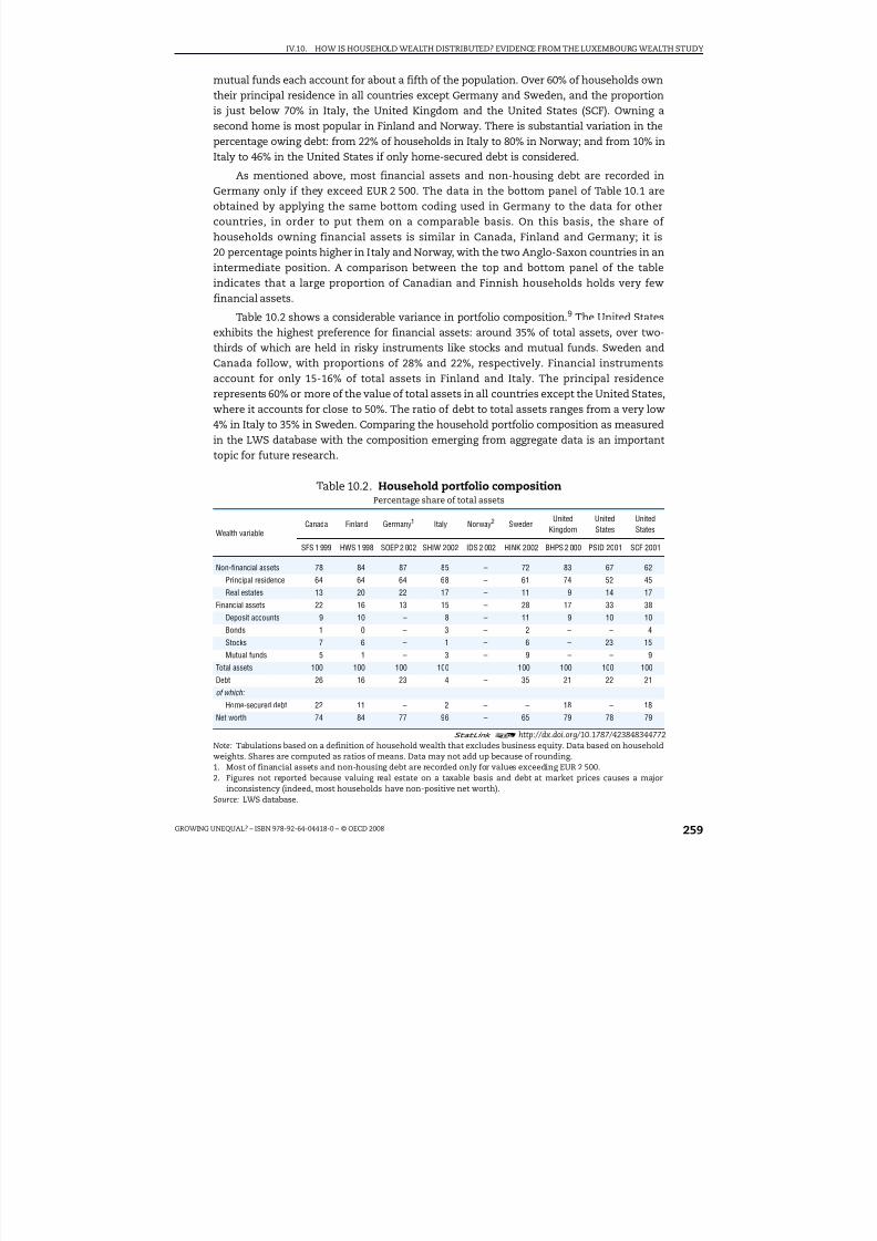
8/20/2019 Growing Unequal
http://slidepdf.com/reader/full/growing-unequal 259/309
IV.10. HOW IS HOUSEHOLD WEALTH DISTRIBUTED? EVIDENCE FROM THE LUXEMBOURG WEALTH STUDY
GROWING UNEQUAL? – ISBN 978-92-64-04418-0 – © OECD 2008 259
mutual funds each account for about a fifth of the population. Over 60% of households owntheir principal residence in all countries except Germany and Sweden, and the proportionis just below 70% in Italy, the United Kingdom and the United States (SCF). Owning asecond home is most popular in Finland and Norway. There is substantial variation in thepercentage owing debt: from 22% of households in Italy to 80% in Norway; and from 10% in
Italy to 46% in the United States if only home-secured debt is considered.
As mentioned above, most financial assets and non-housing debt are recorded inGermany only if they exceed EUR 2 500. The data in the bottom panel of Table 10.1 areobtained by applying the same bottom coding used in Germany to the data for othercountries, in order to put them on a comparable basis. On this basis, the share of households owning financial assets is similar in Canada, Finland and Germany; it is20 percentage points higher in Italy and Norway, with the two Anglo-Saxon countries in anintermediate position. A comparison between the top and bottom panel of the tableindicates that a large proportion of Canadian and Finnish households holds very fewfinancial assets.
Table 10.2 shows a considerable variance in portfolio composition.9 The United Statesexhibits the highest preference for financial assets: around 35% of total assets, over two-thirds of which are held in risky instruments like stocks and mutual funds. Sweden andCanada follow, with proportions of 28% and 22%, respectively. Financial instrumentsaccount for only 15-16% of total assets in Finland and Italy. The principal residencerepresents 60% or more of the value of total assets in all countries except the United States,where it accounts for close to 50%. The ratio of debt to total assets ranges from a very low4% in Italy to 35% in Sweden. Comparing the household portfolio composition as measuredin the LWS database with the composition emerging from aggregate data is an important
topic for future research.
Table 10.2. Household portfolio compositionPercentage share of total assets
Wealth variableCanada Finland Germany1 Italy Norway2 Sweden
UnitedKingdom
UnitedStates
UnitedStates
SFS 1 999 HWS 1 998 SOEP 2 002 SHIW 2002 IDS 2 002 HINK 2002 BHPS 2 000 PSID 2001 SCF 2001
Non-financial assets 78 84 87 85 – 72 83 67 62
Principal residence 64 64 64 68 – 61 74 52 45
Real estates 13 20 22 17 – 11 9 14 17
Financial assets 22 16 13 15 – 28 17 33 38
Deposit accounts 9 10 – 8 – 11 9 10 10
Bonds 1 0 – 3 – 2 – – 4
Stocks 7 6 – 1 – 6 – 23 15
Mutual funds 5 1 – 3 – 9 – – 9
Total assets 100 100 100 100 – 100 100 100 100
Debt 26 16 23 4 – 35 21 22 21
of which:
Home-secured debt 22 11 – 2 – – 18 – 18
Net worth 74 84 77 96 – 65 79 78 79
1 2 http://dx.doi.org/10.1787/423848344772Note: Tabulations based on a definition of household wealth that excludes business equity. Data based on householdweights. Shares are computed as ratios of means. Data may not add up because of rounding.
1. Most of financial assets and non-housing debt are recorded only for values exceeding EUR 2 500.2. Figures not reported because valuing real estate on a taxable basis and debt at market prices causes a major
inconsistency (indeed, most households have non-positive net worth).Source: LWS database.
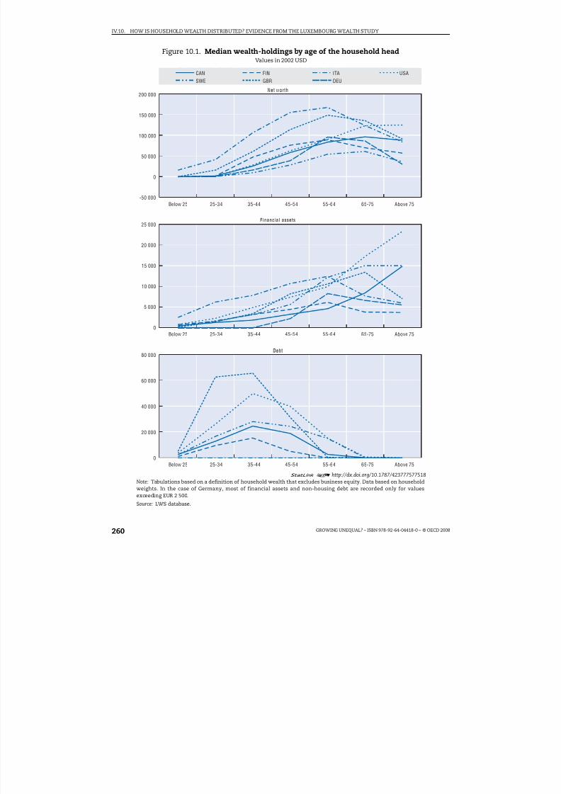
8/20/2019 Growing Unequal
http://slidepdf.com/reader/full/growing-unequal 260/309
IV.10. HOW IS HOUSEHOLD WEALTH DISTRIBUTED? EVIDENCE FROM THE LUXEMBOURG WEALTH STUDY
GROWING UNEQUAL? – ISBN 978-92-64-04418-0 – © OECD 2008260
Figure 10.1. Median wealth-holdings by age of the household headValues in 2002 USD
1 2 http://dx.doi.org/10.1787/423777577518Note: Tabulations based on a definition of household wealth that excludes business equity. Data based on household
weights. In the case of Germany, most of financial assets and non-housing debt are recorded only for valuesexceeding EUR 2 500.
Source: LWS database.
200 000
150 000
100 000
50 000
0
-50 000
CAN FIN ITA USA
SWE GBR DEU
25 000
20 000
15 000
10 000
5 000
0
80 000
60 000
40 000
20 000
0
Net worth
Below 25 Above 75
Financial assets
Below 25 Above 75
Debt
Below 25 Above 75
25-34 35-44 45-54 55-64 65-75
25-34 35-44 45-54 55-64 65-75
25-34 35-44 45-54 55-64 65-75

8/20/2019 Growing Unequal
http://slidepdf.com/reader/full/growing-unequal 261/309
IV.10. HOW IS HOUSEHOLD WEALTH DISTRIBUTED? EVIDENCE FROM THE LUXEMBOURG WEALTH STUDY
GROWING UNEQUAL? – ISBN 978-92-64-04418-0 – © OECD 2008 261
Asset distribution by age of the household head
The profiles for median wealth holdings of financial assets, principal residence, debtand positive net worth by age of the household head are shown in Figure 10.1.10 Theseprofiles exhibit a hump-shaped pattern, although at different levels of net worth, in mostcountries. The young have less, the middle-aged have the most, and the older have lessthan the middle-aged but more than the young. The richest young are found in Italy, buttheir share in the population is small, suggesting that only those with enough wealth leavetheir parents’ house. In the United States, Canada, the United Kingdom and Italy,households with older heads are also quite well-off. The patterns for financial assets arequite varied for those aged 50 and over. In all countries, the young have little debt, whilethose aged 35-44 are the most indebted. Unsurprisingly, indebtedness is low among theolder age classes: indeed, in all countries over half of the elderly have no debt. In Germanyand Italy, over half of the households have no debt at all ages. 11
Country ranking by levels of net worth and wealth inequality
Figure 10.2 is based on the most comprehensive version of LWS wealth, with valuesexpressed in international 2002 US dollars based on purchasing power parities andconsumer price indices estimated by the OECD. Estimates indicate that the countryranking differs between net worth and household disposable income, and also that itmatters which central value of the wealth distribution (i.e. mean or median) is chosen.Based on both with mean and median household disposable income, the United States isthe richest country, followed by Canada and the United Kingdom, then Germany andSweden, and lastly Finland and Italy. The country-ranking is very different based onhousehold net worth. The United States and Italy are the richest nations in terms of mean
net worth, and Sweden and Finland are the poorest ones. When switching to median networth, the United States falls towards the middle and is surpassed by Finland and theUnited Kingdom. Italy and the United Kingdom show by far the highest median net worth,almost twice the corresponding values for the other countries.
The LWS database also sheds new light on international differences in wealthconcentration. There are very few international comparisons of wealth distribution basedon micro-data reclassified to account for differences in definitions. While Kessler andWolff (1991), Klevmarken et al. (2003), and Faiella and Neri (2004) are among the fewexamples of bilateral comparisons, the LWS project is the first attempt to extend suchcomparisons to more than two countries. Table 10.3 shows statistics on the distribution of
net worth in seven countries. The caveats mentioned above must be borne in mind: inparticular, the bottom-coding implemented in the German survey is likely to overstatemeasured inequality. Several patterns stand out:
● Sweden records the highest Gini index for household net worth. The United States,Germany and Canada follow in that order. Finland, the United Kingdom and Italy exhibita more equal distribution of net worth.
● In accounting terms, part of the explanation of the very high asset inequality in Swedenrests on the very high proportion of Swedish households with nil or negative net worth(32% against 23%, at most, in other countries excluding Germany, whose figure isoverstated by bottom-coding).
● When the share of net worth held by top population percentiles is considered, the UnitedStates regains the lead: the richest 1% of US households control 33% of total wealth,

8/20/2019 Growing Unequal
http://slidepdf.com/reader/full/growing-unequal 262/309
IV.10. HOW IS HOUSEHOLD WEALTH DISTRIBUTED? EVIDENCE FROM THE LUXEMBOURG WEALTH STUDY
GROWING UNEQUAL? – ISBN 978-92-64-04418-0 – © OECD 2008262
according to the SCF, or 25%, according to the PSID, and the next 4% cent control another25%.12 These proportions are far higher than in all other countries, Sweden included.
Understanding the extent to which these results are affected by the differentmeasurement methods or the different comprehensiveness of the wealth definition is animportant question for future LWS research. For instance, counting pension rights as an
asset might matter more for Sweden, which should result in much greater equality thanfound in Table 10.3.13
Figure 10.2. LWS country rankings by mean and median of net worthand income
Values in 2002 USD
1 2 http://dx.doi.org/10.1787/423813102862
Note: Countries are ranked, from left to right, in increasing order of mean household disposable income. Tabulationsbased on a definition of household wealth that excludes business equity. Data based on household weights. Valuesare expressed in 2002 USD based on purchasing power parities and consumer price indexes.
Source: LWS database.
FIN ITA SWE DEU CAN GBR USA-SCF USA-PSID
250 000
200 000
150 000
100 000
50 000
0
40 000
30 000
20 000
10 000
0
FIN ITA SWE DEU CAN GBR USA-SCF USA-PSID
250 000
200 000
150 000
100 000
50 000
0
40 000
30 000
20 000
10 000
0
Mean household net worth and disposable income
Mean household disposable income (right scale)Mean household net worth (left scale)
Median household net worth and disposable income
Median household disposable income (right scale)Median household net worth (left scale)

8/20/2019 Growing Unequal
http://slidepdf.com/reader/full/growing-unequal 263/309
IV.10. HOW IS HOUSEHOLD WEALTH DISTRIBUTED? EVIDENCE FROM THE LUXEMBOURG WEALTH STUDY
GROWING UNEQUAL? – ISBN 978-92-64-04418-0 – © OECD 2008 263
Joint patterns of income and wealth inequality14
The joint distribution of income and wealth is of interest for a number of reasons.First, both income and wealth allow persons and households to finance their consumption.Second, in many policy circumstances, for instance support for the elderly, some peoplemight have low incomes but also hold wealth that could be drawn upon to financeconsumption. Third, assessing the effects of means-testing on benefit eligibility and take-upwill often require looking at both income and asset holdings of potential beneficiaries.More generally, the higher the correlation between income and wealth, the higher is thedegree of “permanent” inequality in potential consumption due to either income orwealth.
Exploring the joint distribution of income and wealth with some accuracy calls for
special selections of datasets and editing procedures. This section concentrates on fivenations and six datasets (two for the United States because of the SCF oversample). Thedefinitions of income and wealth for the five countries analysed here are as follows.
● Income refers to household disposable income adjusted by the square root of householdsize (e = 0.5) equivalence scale. The income definition in the LWS is very similar to thatused in LIS, but of a more aggregated variety. People are considered as income-poorwhen their income is less than half of the median, using the same equivalence scale.
● The wealth definition includes business equity within other non-financial assets (“networth 2”, in the LWS nomenclature). The same equivalence scale (e = 0.5) is used for bothincome and wealth. In practice, the choice of the equivalence scale makes little
difference to the outcome (Sierminska et al., 2006b).
Table 10.3. Distribution of household net worth1
Percentage
StatisticsCanada Finland Germany2 Italy Norway3 Sweden
UnitedKingdom
UnitedStates
UnitedStates
SFS 1 999 HWS 1 998 SOEP 2 002 SHIW 2 002 IDS 2 002 HINK 2 002 BHPS 2000 PSID 2001 SCF 2001
Shares of individuals (%)
Positive net worth 77 83 63 89 – 68 82 77 77
Nil net worth 3 2 29 7 – 5 6 8 4
Negative net worth 20 15 9 3 – 27 11 16 19
Shares of total wealth (%)
Top 10% 53 45 55 42 – 58 45 64 71
Top 5% 37 31 38 29 – 41 30 49 58
Top 1% 15 13 16 11 – 18 10 25 33
Wealth inequality
Gini index 0.75 0.68 0.8 0.61 – 0.89 0.66 0.81 0.84
1 2 http://dx.doi.org/10.1787/423884073432Note: Tabulations based on a definition of household wealth that excludes business equity. Data based on householdweights.1. Figures not reported because over 60% of values for net worth are missing.2. Most financial assets and non-housing debt are recorded only for values exceeding EUR 2 500.3. Figures not reported because valuing real estate on a taxable basis and debt at market prices causes a major
inconsistency (indeed, the majority of households have negative net worth).Source: LWS database.

8/20/2019 Growing Unequal
http://slidepdf.com/reader/full/growing-unequal 264/309
IV.10. HOW IS HOUSEHOLD WEALTH DISTRIBUTED? EVIDENCE FROM THE LUXEMBOURG WEALTH STUDY
GROWING UNEQUAL? – ISBN 978-92-64-04418-0 – © OECD 2008264
This definition of net worth means that the number of countries used here is smallerthan if excluding business assets (i.e. five countries and six datasets, Table 10.A1.2 in theAnnex).15 National data are converted into US dollars using the PPPs for personalconsumption in 2002 published by the OECD; national price deflators for personalconsumption have been used to express national currencies in 2002 prices.
Wealth holding of all persons and of the income-poor
Table 10.4 shows the share of people reporting positive wealth of various types (leftpanel) and the values for various asset aggregates (net worth, financial assets, non-financial assets and debts, right panel) for all persons and for the income poor.16 Thisshows that the majority of families, including poor families, have some positive net worth.The average net worth of the income poor is positive but obviously well below as that of theentire population. The income poor have low financial assets, averaging under USD 8 812except for the US SCF where the value is USD 26 678 (owing to a small number of outliers,see below). Between 30 and 60% of the income poor hold non-financial assets (homes or
businesses) but the values are on average USD 25-50 000. The average debt of the poorexceeds their financial assets in three countries (Canada, Germany and Sweden) and isunder USD 2 000 in Italy. Debt is also substantial for the poor in both of the United Statesdatasets.
Table 10.5 indicates the dispersion of net worth, assets and debt within both the entirepopulation and within those classified as income poor; a measure of this dispersion isprovided by comparing the values of various wealth aggregates for those at the top end of thedistribution (90th percentile) and at the median person is each of the two groups. Skewness
Table 10.4. Proportion with positive net worth and mean wealth
and debt holdings, all people and income poorIn 2002 US PPP adjusted dollars
Networth
Financialassets
Non-financialassets
DebtNet
worthFinancialassets
Non-financialassets
Debt
A. Proportion with positive amounts B. Average amount
Canada Canada
All persons 80.1 89.9 75.1 75.1 All persons 59 557 13 574 63 716 17 733
Income poor 58.8 76.2 40.1 61.1 Income poor 23 737 4 610 26 585 7 458
Germany Germany
All persons 67.2 49.7 52.7 41.1 All persons 83 063 10 870 92 206 20 013
Income poor 38.5 19.3 29.5 19.4 Income poor 31 174 2 229 35 203 6 257Italy Italy
All persons 90.7 82.4 77.0 23.0 All persons 112 506 14 666 100 719 2 879
Income poor 70.3 45.0 62.0 17.6 Income poor 51 947 1 972 51 634 1 659
Sweden Sweden
All persons 70.5 83.1 66.6 79.4 All persons 43 000 15 808 48 761 21 569
Income poor 48.6 62.4 33.1 66.9 Income poor 20 863 8 801 25 383 13 321
United States (PSID) US (PSID)
All persons 78.0 83.1 71.5 73.0 All persons 104 075 36 249 94 027 26 200
Income poor 52.4 52.2 41.8 48.8 Income poor 21 784 8 238 20 956 7 410
United States (SCF) US (SCF)
All persons 77.0 91.3 73.3 81.5 All persons 120 553 42 058 109 180 30 685
Income poor 54.9 70.0 43.2 63.4 Income poor 75 452 26 678 59 359 10 585
1 2 http://dx.doi.org/10.1787/424003453262Note: Tabulations based on a definition of household wealth that includes business equity.Source: Luxembourg Wealth Study.
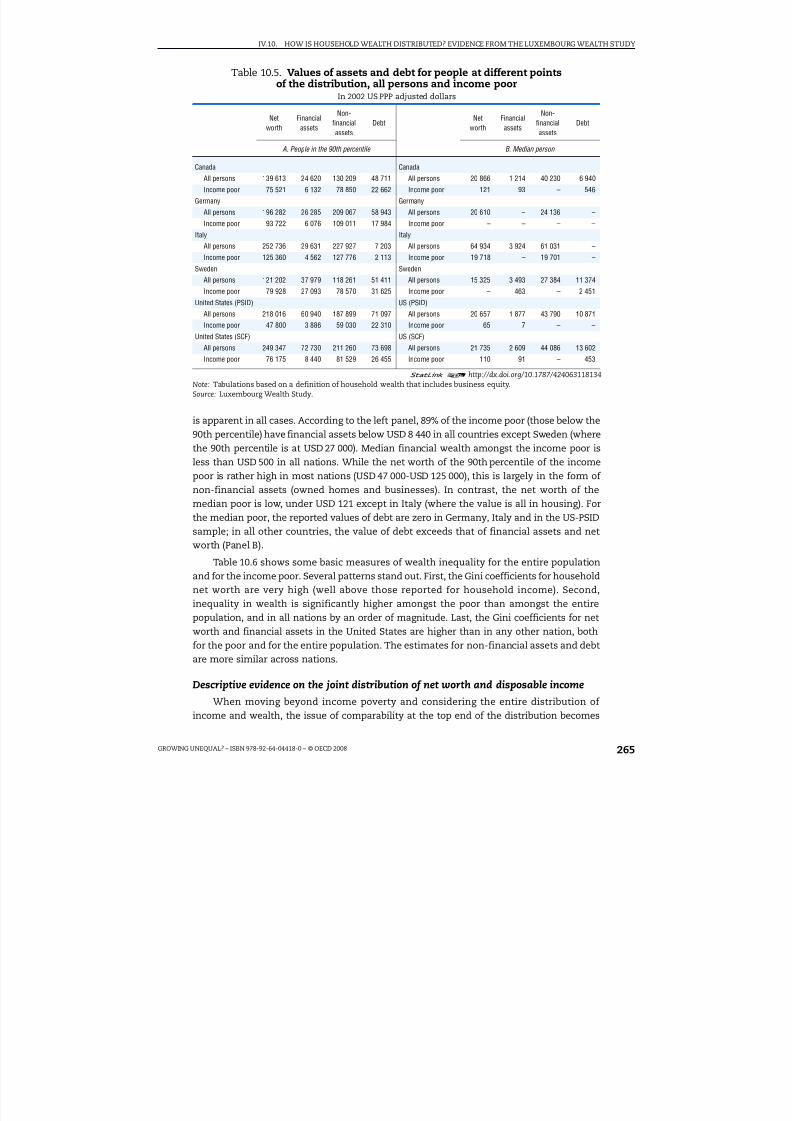
8/20/2019 Growing Unequal
http://slidepdf.com/reader/full/growing-unequal 265/309
IV.10. HOW IS HOUSEHOLD WEALTH DISTRIBUTED? EVIDENCE FROM THE LUXEMBOURG WEALTH STUDY
GROWING UNEQUAL? – ISBN 978-92-64-04418-0 – © OECD 2008 265
is apparent in all cases. According to the left panel, 89% of the income poor (those below the90th percentile) have financial assets below USD 8 440 in all countries except Sweden (wherethe 90th percentile is at USD 27 000). Median financial wealth amongst the income poor isless than USD 500 in all nations. While the net worth of the 90th percentile of the incomepoor is rather high in most nations (USD 47 000-USD 125 000), this is largely in the form of non-financial assets (owned homes and businesses). In contrast, the net worth of themedian poor is low, under USD 121 except in Italy (where the value is all in housing). Forthe median poor, the reported values of debt are zero in Germany, Italy and in the US-PSIDsample; in all other countries, the value of debt exceeds that of financial assets and networth (Panel B).
Table 10.6 shows some basic measures of wealth inequality for the entire populationand for the income poor. Several patterns stand out. First, the Gini coefficients for householdnet worth are very high (well above those reported for household income). Second,inequality in wealth is significantly higher amongst the poor than amongst the entirepopulation, and in all nations by an order of magnitude. Last, the Gini coefficients for networth and financial assets in the United States are higher than in any other nation, bothfor the poor and for the entire population. The estimates for non-financial assets and debtare more similar across nations.
Descriptive evidence on the joint distribution of net worth and disposable incomeWhen moving beyond income poverty and considering the entire distribution of
income and wealth, the issue of comparability at the top end of the distribution becomes
Table 10.5. Values of assets and debt for people at different pointsof the distribution, all persons and income poor
In 2002 US PPP adjusted dollars
Networth
Financialassets
Non-financialassets
DebtNet
worthFinancialassets
Non-financialassets
Debt
A. People in the 90th percentile B. Median person
Canada Canada
All persons 139 613 24 620 130 209 48 711 All persons 20 866 1 214 40 230 6 940
Income poor 75 521 6 132 78 850 22 662 Income poor 121 93 – 546
Germany Germany
All persons 196 282 26 285 209 067 58 943 All persons 20 610 – 24 136 –
Income poor 93 722 6 076 109 011 17 984 Income poor – – – –
Italy Italy
All persons 252 736 29 631 227 927 7 203 All persons 64 934 3 924 61 031 –
Income poor 125 360 4 562 127 776 2 113 Income poor 19 718 – 19 701 –
Sweden Sweden
All persons 121 202 37 979 118 261 51 411 All persons 15 325 3 493 27 384 11 374
Income poor 79 928 27 093 78 570 31 625 Income poor – 463 – 2 451
United States (PSID) US (PSID)
All persons 218 016 60 940 187 899 71 097 All persons 20 657 1 877 43 790 10 871
Income poor 47 800 3 886 59 030 22 310 Income poor 65 7 – –
United States (SCF) US (SCF)
All persons 249 347 72 730 211 260 73 698 All persons 21 735 2 609 44 086 13 602
Income poor 76 175 8 440 81 529 26 455 Income poor 110 91 – 453
1 2 http://dx.doi.org/10.1787/424063118134Note: Tabulations based on a definition of household wealth that includes business equity.Source: Luxembourg Wealth Study.

8/20/2019 Growing Unequal
http://slidepdf.com/reader/full/growing-unequal 266/309
IV.10. HOW IS HOUSEHOLD WEALTH DISTRIBUTED? EVIDENCE FROM THE LUXEMBOURG WEALTH STUDY
GROWING UNEQUAL? – ISBN 978-92-64-04418-0 – © OECD 2008266
crucial. As already noted, the US-SCF is the dataset that captures more assets in the UnitedStates, and is reputed to be the best wealth survey in the world. In order to adjust for “toogood” a survey, this section relies on trimming data for the top 1% of the US SCF records butnot from other datasets.17
The basic patterns of income and wealth (net worth) holdings are shown inFigure 10.3. Data refer to quartile groupings (QG) of both income and wealth, matched intoa four-by-four picture. The dots show the relevant fraction of people in a given income- andwealth-quartile cell. Take for instance the lowest quartile group of both income and wealth(the top left-hand corner of Figure 10.3) and contrast this with the top quartile group inboth distributions (the bottom right-hand corner). The United States stands out, comparedto other countries, for the highest fraction of low income people that also belong to thelowest wealth quartile and, similarly, for the highest fraction of high-income people in thetop wealth quartile.
A number of other patterns stand out from Figure 10.3:● First, the concentration of people with the highest-income people in the top wealth cells
is highest in the United States (nearly 15% in both datasets) and lowest in Canada (about11%).
● Second, the distribution of people belonging to the third and the second wealth quartilesacross income groups is remarkably similar in all nations (with the exception of Germany for Wealth QG2).
● Third, among people belonging to the top two wealth quartiles, their share increasesuniformly as we move up the income scale (from Income QG1 to Income QG3, for peoplebelonging to WealthQG3; and from Income QG1 to Income QG4, for those belonging toWealth QG4).This suggests that income and wealth positions are positively correlated.
Table 10.6. Gini coefficient of household net worth, all persons and income poor
Gini coefficient Net worth Fin. assets Non-fin. assets Debt
Canada
All people 0.67 0.87 0.63 0.66
Income Poor 0.78 0.92 0.82 0.81
Germany
All people 0.73 0.82 0.75 0.84
Income Poor 0.84 0.92 0.84 0.92
Italy
All people 0.60 0.77 0.61 0.91
Income Poor 0.70 0.84 0.72 0.95
Sweden
All people 0.62 0.78 0.66 0.65
Income Poor 0.69 0.82 0.86 0.78
United States (PSID)
All people 0.77 0.89 0.70 0.67
Income Poor 0.86 0.97 0.82 0.83
United States (SCF)All people 0.77 0.89 0.73 0.66
Income Poor 0.92 0.98 0.90 0.86
1 2 http://dx.doi.org/10.1787/424105231277Note: Tabulations based on a definition of household wealth that includes business equity.Source: Luxembourg Wealth Study.

8/20/2019 Growing Unequal
http://slidepdf.com/reader/full/growing-unequal 267/309
IV.10. HOW IS HOUSEHOLD WEALTH DISTRIBUTED? EVIDENCE FROM THE LUXEMBOURG WEALTH STUDY
GROWING UNEQUAL? – ISBN 978-92-64-04418-0 – © OECD 2008 267
● Fourth, few low-income people have high wealth; the share of people in the bottomincome quartile (Income QG1) who also belong to the top wealth quartile (Wealth QG4) ishighest in Sweden but, even here, it is well below 5%.
● Last, at the other end of the spectrum, high-income people rarely have low wealth;Sweden, again, stands out for the highest share of people in Income QG4 who are also inWealth QG1.
The simple conclusion is that, in most nations, income and wealth are correlated, butnot perfectly. The highest correlations appear to be at the top of the income and wealth
Figure 10.3. Income-wealth quartile groupsShare of people in each income quartile belonging to various quartiles of the wealth distribution
1 2 http://dx.doi.org/10.1787/423815213564
Note: Tabulations based on a definition of household wealth that includes business equity. For each income quartile,the sum of values across wealth quartiles equals 25%.
Source: Luxembourg Wealth Study.
0 5 10 15 20%
0 5 10 15 20%
0 5 10 15 20%
0 5 10 15 20%
0 5 10 15 20
%
0 5 10 15 20
%
0 5 10 15 20
%
0 5 10 15 20
%
0 5 10 15 20%
0 5 10 15 20%
0 5 10 15 20%
0 5 10 15 20%
0 5 10 15 20%
0 5 10 15 20%
0 5 10 15 20%
0 5 10 15 20%
USA (SCF)
USA (PSID)
SWE
ITA
DEU
CAN
USA (SCF)
USA (PSID)
SWE
ITA
DEU
CAN
USA (SCF)
USA (PSID)
SWE
ITA
DEUCAN
USA (SCF)
US
A (PS
ID)SWE
ITA
DEU
CAN
Income QG: 4
Income QG: 2
Income QG: 3
Income QG: 1
Wealth QG: 1 Wealth QG: 2 Wealth QG: 3 Wealth QG: 4
Wealth QG: 1 Wealth QG: 2 Wealth QG: 3 Wealth QG: 4
Wealth QG: 1 Wealth QG: 2 Wealth QG: 3 Wealth QG: 4
Wealth QG: 1 Wealth QG: 2 Wealth QG: 3 Wealth QG: 4

8/20/2019 Growing Unequal
http://slidepdf.com/reader/full/growing-unequal 268/309
IV.10. HOW IS HOUSEHOLD WEALTH DISTRIBUTED? EVIDENCE FROM THE LUXEMBOURG WEALTH STUDY
GROWING UNEQUAL? – ISBN 978-92-64-04418-0 – © OECD 2008268
scale (Income QG4 and Wealth QG4, bottom-right corner), but even here the extent of overlap is less than full.
Determinants of household disposable income and net worth
While an examination of the joint distribution of income and wealth using the
proportions of persons in different parts of the (marginal) distributions is informative, theobserved association between income and wealth is in part accounted for by the fact thatthe characteristics associated with having high income – having a high education, forinstance – are also associated with having high wealth. Differences in the degree of association between countries are likely driven by both differences in the characteristics of those who hold wealth and by differences in how these characteristics are associated withwealth and income.
To examine this in more depth, this section considers patterns of disposable incomeand net worth while controlling for different characteristics. This is done by estimating simple bivariate regressions of household disposable income and net worth, using ascovariates the age of the household head (four groups; age less than 30 omitted), theeducation level of the head (three levels; lowest level omitted) and the household type
(five types; childless couples omitted). This permits a look both at how average wealth isrelated to household characteristics, and at how the joint distribution (as conditioned byage, education and household type) compares across countries. Figure 10.4 showregression results for income and wealth patterns: models are estimated in levels,measured in PPP US dollars, so the coefficients can be interpreted in absolute terms. Theresults are not an attempt to provide a causal model for disposable income and net worth– indeed, a causal model for these would at the very least require longitudinal data. But
they do show certain patterns in the extent of the variance of disposable income and networth that is captured by the different characteristics (for more evidence of theseregression analysis, see Jantti et al., 2008).
Some of the key patterns emerging from this analysis include the following:
● The calculations for household disposable income show that single parents do less well,and education positively adds to incomes, especially for the United States in the SCFsample. Incomes peak for household heads in the 50-70 age range, being lower inages 30-50 and 70 and over. The results also suggest that a given characteristic is
associated with a larger difference in income in the United States than elsewhere. Forinstance, having a high education is associated with a USD 30 433 disposable income
advantage in the United States, but at most about USD 13 000 in the other countries.● The net worth regressions tend to show few demographic effects but strong effects for
age (older people have higher wealth) and education (higher education and net worth arepositively correlated), with the strongest effects again in the United States.
● The share of variance accounted for by the age, education and family characteristics isnot very large for either income or wealth. Close to 40% of the variance of disposableincome is captured in Sweden, which has the most equal distribution of these nations(Atkinson, Rainwater and Smeeding, 1995; Brandolini and Smeeding, 2005), while inother countries the variance in incomes explained by these three determinants isbetween 20 and 25%.
● In the wealth regressions, education, age and family structure explain between 10 and20% of the variance. The fact that the share of variance explained by the various

8/20/2019 Growing Unequal
http://slidepdf.com/reader/full/growing-unequal 269/309
IV.10. HOW IS HOUSEHOLD WEALTH DISTRIBUTED? EVIDENCE FROM THE LUXEMBOURG WEALTH STUDY
GROWING UNEQUAL? – ISBN 978-92-64-04418-0 – © OECD 2008 269
characteristics is less for wealth than for income reflects that we know less about whatis involved in the generation of wealth, although there are reasons to believe thatintergenerational transfers are a significant factor (see Chapter 8).
● Even after controlling for these factors, a sizeable correlation between wealth and
income at the individual level remains. This correlation is particularly high in the UnitedStates in the SCF sample, where it exceeds 0.50, while it varies between 0.27-0.36 in theother datasets, including the PSID sample for the United States.
Conclusion
The Luxembourg Wealth Study allows for comparisons of net worth and itscomponents across countries. Although comparability is not as great as might be hopedfor, two main patterns stand out:
● First, there are both similarities and differences in patterns of wealth-holding across
countries. Housing accounts for a large part of net worth in all countries. The share of financial assets is also important, although there is considerable variation acrosscountries. Italy stands out for having very low levels of debt and few households with
Figure 10.4. Results from regressions describing the average amountsof household disposable income and net worth
Coefficient estimates and confidence intervals
1 2 http://dx.doi.org/10.1787/423816145285Note: Tabulations based on a definition of household wealth that includes business equity.
Source: Luxembourg Wealth Study.
-50 50-25 250 -50 50-25 250 -50 50-25 250 -50 50-25 250 -50 50-25 250 -50 50-25 250
-0.2 0.40.20-0.2 0.40.20-0.2 0.40.20-0.2 0.40.20-0.2 0.40.20-0.2 0.40.20
Household disposable income, in thousands
Canada Germany Italy SwedenUnited States
(PSID)United States
(SCF)
InterceptAge 30-50
Age 50-70
Age 70 and over
Education medium
Education high
Fam: couple with children
Fam: other
Fam: single no children
Fam: single parent
Intercept
Age 30-50
Age 50-70
Age 70 and over
Education medium
Education high
Fam: couple with children
Fam: other
Fam: single no children
Fam: single parent
Household net worth, in millions
Canada Germany Italy SwedenUnited States
(PSID)United States
(SCF)

8/20/2019 Growing Unequal
http://slidepdf.com/reader/full/growing-unequal 270/309
IV.10. HOW IS HOUSEHOLD WEALTH DISTRIBUTED? EVIDENCE FROM THE LUXEMBOURG WEALTH STUDY
GROWING UNEQUAL? – ISBN 978-92-64-04418-0 – © OECD 2008270
negative net worth. There are some differences in US results depending on whetheranalysis is based on the SCF or the PSID. This suggests that survey design matters a lot.It is not possible, at this point, to say whether observed country differences are due tosuch technical differences.
● Second, net worth and disposable income are highly, but not perfectly, correlated. Manyof those who are classified as income poor do have some assets, although the prevalenceof holding and the amounts held are clearly well below those of the general population,while the “median” poor has negligible financial assets in all countries covered. Part of the positive association of disposable income and net worth is related to characteristicsof the household such as age and education, but a positive correlation persists even aftercontrolling for these factors.
These results indicate that while income continues to be a crucial factor shaping living conditions and social policies, it is not the only factor that matters in determining theresources available to households. Correlation between wealth and income is high but far
from perfect. In particular, the fact that assets are more concentrated than income,including among the income poor, has implications for welfare systems that rely on means-testing. All this underscores yet again the need for a common framework for the collectionof data on household wealth: increased comparability can only be achieved throughgreater ex ante standardisation of measurement tools.
Notes
1. Indeed, in introducing a collection of essays on household portfolios in five countries, Guiso et al.(2002) mention “definitions” as the “initial problem” and warn the reader that “the special featuresand problems of each survey … should be kept in mind when trying to compare data across
countries”. Likewise, Davies and Shorrocks (2000) conclude their extensive survey on thedistribution of wealth by remarking that: “Adoption of a common framework in different countries,along the lines that have been developed for income distributions, would improve the scope forcomparative studies”. Both considerations should be kept in mind here.
2. A recent compilation of data on wealth inequality for nine nations around the beginning of thisdecade shows that Sweden, not the United States, leads the ranking (Brandolini, 2006). Thisevidence not only runs counter to that based on income, but also to earlier evidence. According tothe figures assembled by Davies and Shorrocks (2000) for 11 nations, in the mid-1980s wealthinequality was among the lowest in Sweden and greatest in the United States. Does this differentranking reflect true changes during the 1990s, or some statistical artefact? The results of Klevmarkenet al. (2003), which show a much higher level of wealth inequality in the United States than inSweden in the 1980s and 1990s, point towards the latter explanation. Klevmarken (2006) alsoreports that, in 2003, the inequality of net worth in Sweden was somewhat below the average, and
lower than in France, Germany and Italy, according to the evidence of the Survey of Health, Ageingand Retirement in Europe (SHARE) – an international project for the collection of data standardisedfrom the outset on the living conditions and health status of households with at least one memberaged 50 or more. These findings are a clear warning that, before making cross-countrycomparisons and investigating the causes of different patterns, we must carefully understand theextent to which data are comparable.
3. The first LWS working papers described the main features of the LWS and some preliminaryresults (e.g. Sieminska et al., 2006a and 2006b, www.lisproject.org/publications/lwswpapers.htm ). Otherrecent papers on the same website look at the characteristics of individuals (median net worth) byage, gender and education. Some of these papers provide a special focus on the economicconditions of the elderly in terms of both income and assets, looking at how the combination of resources in retirement varies with the characteristics of the social protection system (Gornicket al., 2006).
4. The US-SCF is by far the most detailed survey of those included in the LWS database: checking accounts, for instance, are first separated into primary and secondary accounts, and thendistinguished according to the type of bank where they are held.

8/20/2019 Growing Unequal
http://slidepdf.com/reader/full/growing-unequal 271/309
IV.10. HOW IS HOUSEHOLD WEALTH DISTRIBUTED? EVIDENCE FROM THE LUXEMBOURG WEALTH STUDY
GROWING UNEQUAL? – ISBN 978-92-64-04418-0 – © OECD 2008 271
5. Full documentation of each survey’s features is an important constituent of the LWS archive. TheLWS documentation also reports which of these differences in the original surveys were correctedfor in the harmonisation process, and which were not. See www.lisproject.org/lwstechdoc.htm formore on these idiosyncrasies.
6. For more on these differences and the efforts being made to resolve them, see Jantti et al. (2008).
7. Conversely, the LWS income data are almost identical to the income measures available on theLIS income surveys (Niskanen, 2007). This should come as no surprise as – for Germany, Italy andSweden – the data are from the same surveys. While LWS income data are more aggregated thanthe LIS data, the former still makes it possible to separate market and disposable incomeuniformly across all LWS surveys.
8. The data used in this section (as well as in Annex 10.A1) are drawn from the preliminary (β) versionof the LWS database.
9. Figures are not reported for Norway because of the inconsistency stemming from valuing realestate on a taxable basis and debt at market prices; also, the German data are biased by the factthat small holdings of some financial assets and debt are not recorded.
10. As wealth accumulation patterns vary over the life-cycle, it is also useful to portray thedemographic structure in each country (Table 10.A1.5). The average household size ranges from
1.96 persons in Sweden to 2.65 in Italy. Italy also stands out as the country with the mostpronounced ageing process, followed by the United Kingdom, Germany and Sweden, while Canadahas the youngest average household head.
11. Profiles of the share of people in different age groups holding different types of assets andliabilities (not shown here) also differ across countries. Italy, again, stands out as an outlier. On theone hand, intergenerational differences appear to be dissimilar, since the hump-shape of debt-holding and home-ownership is much flatter than in the other countries. On the other hand, thelow propensity to borrow and the parallel high proportion of positive net worth holders, alreadynoted for the average, are common across all age classes. Norway and Finland show a remarkablediffusion of financial wealth in all cohorts, including the young. In Germany and Sweden the shareof home-owners tends to be lower than in other countries, and it is markedly so among the elderly.
12. The over-sampling of the wealthy in the US-SCF but not in the US-PSID is a plausible reason for thedifference in the estimated shares of the richest households.
13. On measuring pension wealth see Brugiavini et al. (2005).
14. This section relies on the α-version (i.e., publicly available) of the LWS database.
15. In examining the joint distribution of income and wealth, the focus is on net worth and householddisposable income. The analysis refers to both the full datasets and “shaved” datasets, where thetop 1% and bottom 1% of each dataset for income and wealth are “trimmed down” to enhancecomparability. For more on the methodological issues involved, such as shaved datasets, samplesize, special sampling, imputations for item non-response and the handling of differences incollection methods, see Jantii et al. (2008).
16. Because of the omission of values for the units with financial assets below EUR 2 500, the Germanfigures are biased downwards.
17. For more on the effect of trimming data on the comparability of the data, in particular with regard
to Germany (with the omission of financial assets under EUR 2 500), Sweden (where high net debtseems to be due to tax laws that encourage debt holding) and Italy (where low net debt seems toreflect the high concentration on housing assets), see Jantii et al. (2008).
References
Aizcorbe, A., A. Kennickell and K. Moore (2003), “Recent Changes in the US Family Finances: Evidencefrom the 1998 and 2001 Survey of Consumer Finances”, Federal Reserve Bulletin, January.
Antoniewicz, R., R. Bonci, A. Generale, G. Marchese, A. Neri, K. Maser and P. O’Hagan (2005),“Household Wealth: Comparing Micro and Macro Data in Cyprus, Canada, Italy and United States”,Paper prepared for LWS Workshop “Construction and Usage of Comparable Microdata on Wealth:the LWS”, Banca d’Italia, Perugia, Italy, 27-29 January.
Atkinson, A.B. and A.J. Harrison (1978), Distribution of Personal Wealth in Britain, Cambridge UniversityPress, Cambridge.

8/20/2019 Growing Unequal
http://slidepdf.com/reader/full/growing-unequal 272/309
IV.10. HOW IS HOUSEHOLD WEALTH DISTRIBUTED? EVIDENCE FROM THE LUXEMBOURG WEALTH STUDY
GROWING UNEQUAL? – ISBN 978-92-64-04418-0 – © OECD 2008272
Atkinson, A.B., L. Rainwater and T.M. Smeeding (1995), Income Distribution in OECD Countries, OECD,Paris.
Banks, J., Z. Smith and M. Wakefield (2002), “The Distribution of Financial Wealth in the UK: Evidencefrom 2000 BHPS Data”, Institute for Fiscal Studies, Working Paper No. 02/21, November.
Bičáková, A. and E. Sierminska (2007), “Homeownership Inequality and the Access to Credit Markets.
Can Credit Availability Explain Cross-country Differences in the Inequality of Homeownershipacross Income of Young Households?”, Luxembourg Wealth Study Working Paper No. 5, December.
Board of Governors of the Federal Reserve System (2006), Flow of Funds Accounts of the United States.Flows and Outstandings. First Quarter 2006. Washington, DC, available at www.federalreserve.gov/ releases/z1/current/default.htm.
Brandolini, A. (2006), “The Distribution of Wealth in Germany and Sweden: Discussion of the Papers byStein and Klevmarken”, in G. Chaloupek and T. Zotter (eds.), Steigende wirtschaftliche Ungleichheit beisteigendem Reichtum?, Tagung der Kammer für Arbeiter und Angestellte für Wien, LexisNexis Verlag ARD Orac., Vienna.
Brandolini, A. and T.M. Smeeding (2005), “Inequality Patterns in Western Democracies: Cross-CountryDifferences and Time Changes”, Paper presented at the conference “Democracy, Inequality andRepresentation: Europe in Comparative Perspective”, Maxwell School, Syracuse University,
Syracuse, 6-7 May.Brandolini, A., L. Cannari, G. D’Alessio and I. Faiella (2006), “Household Wealth Distribution in Italy in
the 1990s”, forthcoming in E.N. Wolff (ed.), International Perspectives on Household Wealth.Cheltenham: Edward Elgar, also available in Banca d’Italia, Temi di discussione, No. 530,December 2004.
Brugiavini, A., K. Maser and A. Sundén (2005), “Measuring Pension Wealth”, Paper prepared for LWSWorkshop “Construction and Usage of Comparable Microdata on Wealth: the LWS”, Banca d’Italia,Perugia, Italy, 27-29 January.
Campbell, J.Y (2006), “Household Finance”, National Bureau of Economic Research, Working Paper,No. 12149, March.
Davies, J.B. and A.F. Shorrocks (2000), “The Distribution of Wealth”, in A.B. Atkinson and F. Bourguignon(eds.), Handbook of Income Distribution, Vol. 1, Amsterdam: North-Holland.
Expert Group on Household Income Statistics – The Canberra Group (2001), Final Report andRecommendations, The Canberra Group, Ottawa.
Eurostat (2006), Financial Accounts, available at http://epp.eurostat.ec.europa.eu/portal/page?_pageid=0,1136173,0_45570701&_dad=portal&_schema=PORTAL&screen=ExpandTree&open=/economy/
f ina/ fina_st&pr odu ct =EU_e con omy _finan ce&no deid= 36 59 8&vi nd ex=5&leve l=3& po rtletid=39994106_QUEENPORTLET_92281242&scrollto=0 .
Faiella, I. and A. Neri (2004), “La ricchezza delle famiglie italiane e americane”, Banca d’Italia, Temi didiscussione, No. 501, June.
Gornick, J.C., T. Munzi, E. Sierminska and T.M. Smeeding (2006), “Older Women’s Income and WealthPackages: The Five-Legged Stool in Cross-National Perspective”, Luxembourg Wealth StudyWorking Paper No. 3, November.
Guiso, L., M. Haliassos and T. Jappelli (2002), “Introduction”, in L. Guiso, M. Haliassos and T. Jappelli(eds.), Household Portfolios, MIT Press, Cambridge, Mass.
Harding, T., H.O. Aa. Solheim and A. Benedictow (2004), “House Ownership and Taxes”, StatisticsNorway, Research Department, Discussion Papers No. 395, November.
Jantti, M., E. Sierminska and T. Smeeding (2008), “The Joint Distribution of Household Income andWealth: Evidence from the Luxembourg Wealth Study”, OECD Social, Employment and MigrationWorking Paper, No. 65, OECD, Paris.
Kennickell, A.B. (2000), “Wealth Measurement in the Survey of Consumer Finances: Methodology andDirections for Future Research”, Board of Governors of the Federal Reserve Board, SCF Working Paper, May.
Kessler, D. and E.N. Wolff (1991), “A Comparative Analysis of Household Wealth Patterns in France and
the Unites States”, Review of Income and Wealth, Vol. 37.

8/20/2019 Growing Unequal
http://slidepdf.com/reader/full/growing-unequal 273/309
IV.10. HOW IS HOUSEHOLD WEALTH DISTRIBUTED? EVIDENCE FROM THE LUXEMBOURG WEALTH STUDY
GROWING UNEQUAL? – ISBN 978-92-64-04418-0 – © OECD 2008 273
Klevmarken, A. (2006), “The Distribution of Wealth in Sweden: Trends and Driving Factors”, inG. Chaloupek and T. Zotter (eds.), Steigende wirtschaftliche Ungleichheit bei steigendem Reichtum?,Tagung der Kammer für Arbeiter und Angestellte für Wien, LexisNexis Verlag ARD Orac., Vienna.
Klevmarken, A., J. Lupton and F. Stafford (2003), “Wealth Dynamics in the 1980s and 1990s. Sweden andthe United States”, Journal of Human Resources, Vol. 38.
Niskanen E. (2007), “The Luxembourg Wealth Study: Technical Report on LWS Income Variables”,mimeo, www.lisproject.org/lws/incomevariablereport.pdf .
Office for National Statistics (2006), United Kingdom National Accounts. The Blue Book 2006, edited by J. Dye and J. Sosimi, Palgrave Macmillan, Basingstoke.
Sierminska, E. (2005), “The Luxembourg Wealth Study: A Progress Report”, Paper prepared for LWSWorkshop “Construction and Usage of Comparable Microdata on Wealth: the LWS”, Banca d’Italia,Perugia, Italy, 27-29 January.
Sierminska, E., A. Brandolini and T.M. Smeeding (2006a), “Cross National Comparison of Income andWealth Status in Retirement: First Results from the Luxembourg Wealth Study (LWS)”, Luxembourg Wealth Study Working Paper No. 2, August.
Sierminska, E., A. Brandolini and T.M. Smeeding (2006b), “Comparing Wealth Distribution across RichCountries: First Results from the Luxembourg Wealth Study”, Luxembourg Wealth Study Working
Paper No. 1, August.Sierminska, E. and Y. Takhtamanova (2006), “Wealth Effects Out of Financial and Housing Wealth:
Cross Country and Age Group Comparisons”, Luxembourg Wealth Study Working Paper No. 4,November.
Smeeding, T.M. (2004), “Twenty Years of Research on Income Inequality, Poverty, and Redistribution inthe Developed World: Introduction and Overview”, Socio-Economic Review, No. 2.
Statistics Canada (2006a), Assets and Debts by Family Units, Including Employer-sponsored Registered PensionPlans, by Province, available at www40.statcan.ca/l01/cst01/famil99k.htm?sdi=assets%20debts.
Statistics Canada (2006b), National Balance Sheet Accounts, Market Value, by Sectors, at Quarter End,Quarterly (dollars x 1,000,000), available at http://cansim2.statcan.ca/cgi-win/cnsmcgi.exe?Lang=E&Accessible=1&ArrayId=V1074&ResultTemplate=CII\SNA___&RootDir=CII/
&Interactive=1&OutFmt=HTML2D&Array_Retr=1&Dim=-#HERE.Statistics Sweden (2004). Förmögenhetsstatistik 2002.

8/20/2019 Growing Unequal
http://slidepdf.com/reader/full/growing-unequal 274/309
IV.10. HOW IS HOUSEHOLD WEALTH DISTRIBUTED? EVIDENCE FROM THE LUXEMBOURG WEALTH STUDY
GROWING UNEQUAL? – ISBN 978-92-64-04418-0 – © OECD 2008274
ANNEX 10.A1
Features of the Luxembourg Wealth Study
This annex presents background information on some of the main features of thestatistical sources used by LWS, as well as details on the definitions used. It also presents
summary statistics on the distribution of household wealth in all OECD countriesparticipating in the LWS.
A synthetic assessment of the information contained in the LWS database is providedby the comparison of LWS-based estimates with their aggregate counterparts in thenational balance sheets of the household sector (which include non-profit institutionsserving households and small unincorporated enterprises). This comparison is presentedin Table 10.A1.4, where all variables are transformed into euros at current prices by using the average market exchange rate in the relevant year, and are expressed in per capitaterms to adjust for differences in household size. Note that Table 10.A1.3 discussed aboveasks how well LWS covers the national accounts concept of net worth. Here, we focus on
another question, namely how well the concept of net worth used in the LWS correspondsto the similarly defined concept of net worth based on national accounts. Aggregateaccounts provide a natural benchmark for assessing the quality of the LWS database, but aproper comparison would require painstaking work to reconcile the two sources, asdiscussed at length by Antoniewicz et al. (2005). The aim of Table 10.A1.4 is more modestlyto offer a summary view of how the picture drawn on the basis of the LWS data relates tothe one that could be derived from the national balance sheets or the financial accounts.LWS estimates seem to represent non-financial assets and, to a lesser extent, liabilitiesbetter than financial assets. In all countries where the aggregate information is available,the LWS wealth data account for between 40 and 60% of the aggregate wealth. Note that not
all of these discrepancies should be attributed to the deficiency of the LWS data, since theyreflect not only under-reporting in the original micro sources, but also the dropping of some items in the LWS definitions to enhance cross-country comparability as well as thedifferent definitions used in micro and macro sources.

8/20/2019 Growing Unequal
http://slidepdf.com/reader/full/growing-unequal 275/309
IV.10. HOW IS HOUSEHOLD WEALTH DISTRIBUTED? EVIDENCE FROM THE LUXEMBOURG WEALTH STUDY
GROWING UNEQUAL? – ISBN 978-92-64-04418-0 – © OECD 2008 275
Table 10.A1.1. LWS household wealth surveys
Name AgencyWealthyear1
Incomeyear
Type of sourceOver-
sampling ofthe wealthy
Sample sizeNo. of non-missing net
worth
No. ofwealth items
Austria Survey of
HouseholdFinancial Wealth(SHFW)
Österreichische
Nationalbank
2004 2004 Sample survey No 10
Canada Survey ofFinancialSecurity (SFS)
StatisticsCanada
1999 1998 Sample survey Yes 15 933 15 933 17
Finland HouseholdWealth Survey(HWS)
Statistics Finland End of1998
1998 Sample survey No 3 893 3 893 23
Germany Socio-EconomicPanel (SOEP)
DeutschesInstitut FürWirtschaftsforschung (DIW)Berlin
2002 2001 Sample panelsurvey
Yes 12 692 12 129 9
Italy Survey ofHouseholdIncome andWealth (SHIW)
Bank of Italy End of2002
2002 Sample survey(panel section)
No 8 011 8 010 34
Norway IncomeDistributionSurvey (IDS)
StatisticsNorway
End of2002
2002 Sample surveyplusadministrativerecords
No 22 870 22 870 35
Sweden Wealth Survey(HINK)
StatisticsSweden
End of2002
2002 Sample surveyplusadministrativerecords
No 17 954 17 954 26
United
Kingdom
British
Household PanelSurvey (BHPS)
ESRC 2000 2000 Sample panel
survey
No 4,8672 4 185 7
UnitedStates
Panel Studyof IncomeDynamics(PSID)
Survey ResearchCenter of theUniversity ofMichigan
2001 2000 Sample panelsurvey
No 7 406 7 071 14
Survey ofConsumerFinances (SCF)
Federal ReserveBoard andUS Departmentof Treasury
2001 2000 Sample survey Yes 4 4423 4 4423 30
1. Values refer to the time of the interview unless otherwise indicated.2. Original survey sample. Sample size can rise to 8 761 when weights are not used.3. Data are stored as five successive replicates of each record that should not be used separately; thus, actual sample size for
users is 22 210. The special sample of the wealthy includes 1 532 households.Source: LWS database.

8/20/2019 Growing Unequal
http://slidepdf.com/reader/full/growing-unequal 276/309
GR OWI N G UNE Q UAL ? –I S B
N 9 7 8 - 9 2 - 6 4 - 0 4 4 1 8 - 0 – © OE C D2 0 0 8
2 7 6
Table 10.A1.2. Wealth classification matrix in the LWS
LWS acronymCanada Finland Germany Italy Norway Sweden
SFS 1999 HWS 1998 SOEP 2002 SHIW 2002 IDS 2002 HINK 200
Financial assets
Total TFA Σ Σ Σ Σ Σ Σ
Deposit accounts: transaction, savings and CDs DA Y Y Y Y Y
Total bonds: savings and other bonds TB Y Y Y Y Y
Stocks ST Y Y Y1 Y YMutual funds and other investment funds TM Y Y Y Y Y
Life insurance LI – Y – Y –
Other financial assets (exc. pension) OFA Y Y Y3 Y Y Y5
Pension assets PA Y Y – Y –
Non-financial assets
Total TNF Σ Σ Σ Σ Σ Σ
Principal residence PR Y Y Y Y Y Y
Investment real estate IR Y Y Y Y Y Y
Business equity BE Y – Y6 Y Y6 Y6
Vehicles VH Y Y Y8 Y Y –
Durables and collectibles DRCL Y Y Y Y Y –Other non-financial assets ONF – – – – Y5
Liabilities
Total TD Σ Σ Σ Σ Y Y
Home-secured debt HSD Σ Y Σ Y – Y10
Principal residence mortgage MG Y Y Y11 –
Other property mortgage OMG Y Y –
Other home-secured debt (incl. line of credit) OHSD Y – Y –
Vehicle loans VL Y Y Y Y Y11 Y10
Installment debt (incl. credit card balance) IL Y Y
Educational loans EL Y Y – Y Y
Other loans from financial institutions OL Y Y – Y Y
Note: “Y” denotes a recorded item; “–” denotes a not recorded item; “Σ” indicates that the variable is obtained by aggregation of its compone1. Excludes checking deposits. 2. DA and LI recorded together. 3. Includes only some pension assets. 4. Includes collectibles and some mutrecorded together. 6. Business assets only. 7. IR recorded net of OMG. 8. As recorded in the 2003 wave. 9. VH recorded net of VL. 10. HSD, Vand IL recorded together. 12. Includes also VL, which implies a double-counting.Source: LWS database.

8/20/2019 Growing Unequal
http://slidepdf.com/reader/full/growing-unequal 277/309
IV.10. HOW IS HOUSEHOLD WEALTH DISTRIBUTED? EVIDENCE FROM THE LUXEMBOURG WEALTH STUDY
GROWING UNEQUAL? – ISBN 978-92-64-04418-0 – © OECD 2008 277
Table 10.A1.3. Reconciling the LWS and national net worth concept Averages in thousands (national currencies)
Canada Finland Italy Sweden1 United States
SFS 1999 HWS 1998 SHIW 2002 HINK 2002 SCF 2001
LWS net worth 103 69 154 538 213+ pension assets 83 1 – – 74
+ other financial assets 3 2 0 25 3
+ business equity 27 – 24 80 75
+ other non-financial assets 29 7 24 18 21
LWS adjusted net worth 244 80 201 660 396
National source net worth 249 80 204 660 396
1 2 http://dx.doi.org/10.1787/424146383431Note: Based on household weights.1. LWS adjusted net worth does not include other debts.Source: LWS database, and country sources (Statistics Canada, 2006a; Finnish data provided by Markku Säylä;Brandolini et al., 2004; Statistics Sweden, 2004; Aizcorbe, Kennickell and Moore, 2003).
Table 10.A1.4. Per capita household wealth in the LWS databaseand national balance sheets
Values in euros and percentages
Canada Finland Germany Italy Norway SwedenUnited
KingdomUnitedStates
UnitedStates
SFS 1 999 HWS 1 998 SOEP 2 002 SHIW 2 002 IDS 2 002 HINK 2 002 BHPS 2000 PSID 2001 SCF 2001
LWS database
Non-financial assets 28 237 31 920 53 507 50 965 14 605 33 132 61 436 63 170 77 686
Financial assets 8 018 6 181 7 971 8 913 22 066 12 943 11 036 31 332 47 059
Debt 9 577 6 032 11 202 2 590 29 561 16 159 13 572 20 857 26 707
Net worth 26 678 32 069 50 276 57 288 7 110 29 916 58 901 73 646 98 037
National balance sheet (NBS)
Non-financial assets 32 492 – 69 234 78 417 – – 67 728 66 679
Financial assets 51 157 20 317 44 731 48 780 42 268 40 927 87 199 123 768
Debt 13 813 7 147 18 750 7 089 33 629 16 577 20 471 31 003
Net worth 69 836 – 95 215 120 108 – – 134 457 159 444
Ratio of LWS to NBS
Non-financial assets 87 – 77 65 – – 91 95 117
Financial assets 16 30 18 18 52 32 13 25 38
Debt 69 84 60 37 88 97 66 67 86
Net worth 38 – 53 48 – – 44 46 611 2 http://dx.doi.org/10.1787/424161176817
Note: LWS figures are given by the ratios between wealth totals and number of persons in each survey; householdweights are used. National balance sheets (NBS) figures are obtained by dividing total values for the sector“Households and non-profit institutions serving households” by total population. All values are expressed in euros atcurrent prices by using the average market exchange rate in the relevant year.Source: LWS database and country sources (Eurostat, 2006 for financial assets and debt of European countries; personalcommunication by Ulf von Kalckreuth, Brandolini et al. 2004, and Office for National Statistics, 2006 for non-financialwealth in Germany, Italy and the United Kingdom, respectively; Statistics Canada,2006b; Board of Governors of theFederal Reserve System, 2006).

8/20/2019 Growing Unequal
http://slidepdf.com/reader/full/growing-unequal 278/309
IV.10. HOW IS HOUSEHOLD WEALTH DISTRIBUTED? EVIDENCE FROM THE LUXEMBOURG WEALTH STUDY
GROWING UNEQUAL? – ISBN 978-92-64-04418-0 – © OECD 2008278
Table 10.A1.5. Demographic structure based on LWS data
Householdcharacteristic
Canada Finland Germany Italy Norway SwedenUnited
KingdomUnitedStates
UnitedStates
SFS 1 999 HWS 1 998 SOEP 2 002 SHIW 2 002 IDS 2 002 HINK 2 002 BHPS 2000 PSID 2001 SCF 2001
Mean household size 2.4 2.2 2.1 2.7 2.1 2.0 2.4 2.4 2.4Mean age of thehousehold’s head 47 49 52 55 49 51 53 48 49
Age composition ofhousehold’s head (%)
24 or less 5.9 7.3 3.7 0.7 7.2 6.6 3.8 5.3 5.6
25-34 19.6 16.7 15.2 9.4 19.3 16.9 14.3 18.6 17.1
35-44 24.7 20 20.6 21.5 19.4 17.7 19.3 22.2 22.3
45-54 19.6 21 17.5 18.8 18 17.5 17.4 22.4 20.6
55-64 11.9 13.8 16.5 16.9 14.1 16.6 14.9 12.5 13.3
65-74 10.4 11.7 14.9 18.2 9.8 10.9 14 10.9 10.7
75 and over 7.9 9.5 11.6 14.5 12.2 13.8 16.3 8.1 10.4
Total 100 100 100 100 100 100 100 100 100
1 2 http://dx.doi.org/10.1787/424260847544Note: Based on household weights.Source: LWS database.

8/20/2019 Growing Unequal
http://slidepdf.com/reader/full/growing-unequal 279/309
GROWING UNEQUAL? – ISBN 978-92-64-04418-0 – © OECD 2008
PART V
Conclusions

8/20/2019 Growing Unequal
http://slidepdf.com/reader/full/growing-unequal 280/309

8/20/2019 Growing Unequal
http://slidepdf.com/reader/full/growing-unequal 281/309
ISBN 978-92-64-04418-0Growing Unequal?© OECD 2008
281
PART V
Chapter 11
Inequality in the Distributionof Economic Resources:
How it has Changed and whatGovernments Can Do about it*
Better information on how cash income and other types of resources aredistributed within society is critical to address rising concerns about poverty andinequality. This information has implications for policies, as it highlights theimportance of national circumstances for the success of different programmesand strategies. By providing information on more homogeneous groups withinsociety, these data are also essential to bridge the gap between official statisticsbased on macro aggregates for economy-wide income and individuals’
perceptions of their own conditions.
* This chapter has been prepared by Michael Förster and Marco Mira d’Ercole, OECD Social PolicyDivision.

8/20/2019 Growing Unequal
http://slidepdf.com/reader/full/growing-unequal 282/309
V.11. INEQUALITY IN THE DISTRIBUTION OF ECONOMIC RESOURCES: HOW IT HAS CHANGED...
GROWING UNEQUAL? – ISBN 978-92-64-04418-0 – © OECD 2008282
Introduction
Discussions about the distribution of household income are often perceived as value-loaded and ideological, grounded more in the a priori prejudices of different people than onhard data and analysis. The evidence in this report is intended to help dispel thisperception. While value judgments on the desirability of varying levels of incomedistribution will always differ across people and national cultures, all societies do careabout the issue. How these inequalities evolve over time is one of the criteria against whichall public policies are assessed.
This chapter takes stock of what can be learned from findings in previous chapters inthis report. After having spelled out some of the reasons why people pay attention to incomeinequalities in their country (Box 11.1), the chapter draws on the evidence presented inprevious chapters to summarise the main patterns characterising the distribution of household income in OECD countries, and to review the role of demographic factors, labourmarkets and government redistribution in shaping them. The following section discusseswhether looking at current income alone is adequate if what we are really interested in is thedistribution of economic resources in each country. It outlines some of the key patterns thatemerge when considering items other than cash income, such as governments’ provision of in-kind services and their collection of consumption taxes; household wealth and
consumption patterns; and dynamic measures of how the income of the same personchanges over time and compares to that of their parents. The last section highlights some of the implications of the evidence presented in this report for designing more effective policiesto deal with these equity concerns by providing evidence on the potential effect of differentstrategies aimed at lowering poverty in different OECD countries.
What are the main features of the distribution of household incomein OECD countries?
This section summarises some of the main features characterising the distribution of (equivalised) household disposable income in OECD countries. The focus is both on the
overall shape of this distribution and on developments at the bottom end of thedistribution, where people are at greater risk of poverty.
Levels of income inequality and poverty among the entire population
Differences in the overall shape of the distribution of household income across OECDcounties are both large and persistent. The Gini coefficient of income inequality is twice ashigh in Mexico as in Denmark, and differences remain large when excluding from theanalysis countries at both ends of the league table of OECD countries (Figure 11.1).Significant cross-country differences in inequality are found regardless of the measureused, with the ranking of countries little affected by which one is used. There are of courseuncertainties about the precise level of inequality in any country, because of small samplesizes, under-reporting of certain types of income, and over-representation of some

8/20/2019 Growing Unequal
http://slidepdf.com/reader/full/growing-unequal 283/309
V.11. INEQUALITY IN THE DISTRIBUTION OF ECONOMIC RESOURCES: HOW IT HAS CHANGED...
GROWING UNEQUAL? – ISBN 978-92-64-04418-0 – © OECD 2008 283
Box 11.1. Why do people care about income inequalities?
Complete equality in the distribution of economic resources is neither attainable nor desirable. Someincome disparities simply reflect differences in life-styles and preferences and are the counterpart of better incentives to work and save which, in turn, are basic requirements for strong economic growth.
Because of these links, several empirical studies have investigated in recent years the effect of widerincome inequalities on economic growth. Unfortunately, the results from the empirical research onthis trade-off are inconclusive. For example, an OECD analysis of this issue concluded that, whileevidence leaned towards suggesting that a wider income distribution is good for economic growth, theestimates as a whole explained so little of the differences in GDP growth rates across OECD countriesand over time that very little, in fact, could be safely concluded (Arjona et al., 2001).
There are, however, other reasons why income inequalities matter:
● First, no society is indifferent to the distributive outcomes of a market economy, and differences inhousehold income are the most visible manifestation of these outcomes. Of course, voters andpolicy makers will have different views on the importance that should be paid to the conditions of
people at different points in the distribution: for example, whether special attention should begiven to the “median” person, or whether the income gains realised by the very rich and the verypoor in society should be given equal weight. But, whatever these views, data on the income of individuals and families across the entire distribution are needed for spelling out the implicationsof different policies and structural factors. An additional reason for looking at income across theentire distribution is that both psychological and economic analyses have documented thatincome differences have real significance: people assess their own conditions throughcomparisons with others (Boarini et al., 2006). This implies that information on relative incomematters for the assessment of the living conditions of people, independently of judgements onwhat is “fair” in society.
● Second, most people in OECD countries do care about income inequalities and are capable of articulating
judgements on the shape of the income distribution. When asked about whether incomeinequalities in their country are “too high” or “too low”, a majority of respondents in all OECDcountries indicated the first option, even if with large differences across countries in the size of this group.1 Similarly, when asked to choose among different shapes of income distributions, mostpeople expressed a preference for more equal distributions relative to more unequal ones and,among the former, for those that are more equal both at the bottom and at the top of thedistribution (Kenworthy, 2007). Household surveys also highlight that one of the key determinantsof different attitudes towards income inequality and poverty are people’ views about thedeterminants of economic success, i.e. whether such success is thought to mainly reflect factorsthat are outside the control of individuals as compared to individual attitudes to work and risk-taking (see Box 5.1). While perceptions on inequality can sometimes be ill founded, people seemto care about income inequalities especially when these raise the risk of falling into poverty. InEuropean countries, around 60% of individuals interviewed in late 2006 shared the view thateveryone was at risk of falling into poverty at some point in their life, and more than 20% felt theyfaced such a risk personally (see figure below). Even in the United States, where (until recently) asignificantly lower proportion of respondents perceived income inequality as “too large” relative toother countries, nearly three-quarters agree with the statement “today it’s really true that the richget richer while the poor get poorer”, with a rise in the share of those agreeing of eight pointssince 2002, to the highest level since the early 1990s.2
● Last, even when communities downplay inequalities compared to other societal goals, reducing
income disparities may be instrumental for achieving other goals. The effects of higher income
inequality are many, including greater political influence of the wealthy, wider differences inhealth and educational outcomes, less capacity to undertake collective action to respond to

8/20/2019 Growing Unequal
http://slidepdf.com/reader/full/growing-unequal 284/309
V.11. INEQUALITY IN THE DISTRIBUTION OF ECONOMIC RESOURCES: HOW IT HAS CHANGED...
GROWING UNEQUAL? – ISBN 978-92-64-04418-0 – © OECD 2008284
Box 11.1. Why do people care about income inequalities? (cont.)
common threats. But one that has attracted much attention recently is the risk that these
inequalities may lead to the adoption of policies that are inimical to economic performance. This
risk is especially important given the strong focus in current discussions on the role of “globalisation” as a driver of greater inequalities. While it has proved difficult to quantify precisely
the impact of trade, outsourcing and foreign investment in low-wage countries on earnings and
income inequality in OECD countries, changes in income distribution are occurring in a context
where the benefits of globalisation are widely shared while its costs (in terms of job displacement,
earnings losses, income insecurity) are not. This asymmetry, if not addressed in an effective way,
risks leading to policies (such as barriers to trade, investment and immigration) that will hurt
economic growth much more than well-conceived measures to mitigate these economic
inequalities.
An important limit of focusing on inequalities in the distribution of annual income is that these
snapshots refer to a particular year, and do not capture differences in life-time conditions. This is an
important limit, but also one that is not easily overcome – given the lack of data covering complete
lifetimes of individuals and the ad hoc assumptions used in dynamic microsimulation models to
generate hypothetical lifetime income profiles (Stånberg, 2007). Moreover, when the focus is on the
immediate plight of citizens, the focus of policy discussions will be on income distribution “here and
now” and on how this is changing over time. These reasons underscore the importance of closely
monitoring how income inequalities change over time, and of taking corrective action when these
trends are perceived as exceeding shared norms of what is “fair” in society.
1. Surveys undertaken in 1999 under the aegis of the International Social Science Programme show that the share of
respondents who agreed or strongly agreed with the view that “differences in income are too large” ranged between
around 65% in the United States, Canada and Japan, to between 70 and 75% in Australia, New Zealand, West Germany
and Norway, to between 80 and 90% in the United Kingdom, Austria, the Czech Republic, France, Poland and Spain,
and above 90% in east Germany, Hungary, the Slovak Republic and Portugal (Förster and Mira d’Ercole, 2005).2. “Trends in Political Values and Core Attitudes: 1987-2007”, Pew Research Center for People and the Press, Washington
DC., 2007.
Perceptions about poverty in EU countries, mid-2000sShare of respondents agreeing with each statement
1 2 http://dx.doi.org/10.1787/424370547515
Note: Countries are ranked, from left to right, in decreasing order of the share agreeing that “anyone is at risk
of poverty at some point in their life”.
Source: Eurobarometer (2007), European Social Reality, Special Report No. 273, Brussels.
1.0
0.8
0.6
0.4
0.2
0
F R A H U
N L U X
P R T
B E L
G B R
D E U
D N K
E S P I R
L I T A
S V K
P O L
A U T
G R C
N L D F
I N C Z E
S W E
Anyone is at risk of poverty at some point in their lifeI feel there is a risk I could fall into poverty
EU19

8/20/2019 Growing Unequal
http://slidepdf.com/reader/full/growing-unequal 285/309
V.11. INEQUALITY IN THE DISTRIBUTION OF ECONOMIC RESOURCES: HOW IT HAS CHANGED...
GROWING UNEQUAL? – ISBN 978-92-64-04418-0 – © OECD 2008 285
demographic groups, and because different statistical sources may sometime provide adifferent picture of how household income is distributed. But these uncertainties are notso large as to give serious grounds for doubting the broad sweep of the findings in terms of
cross-country differences in inequality.Large cross-country differences are also evident when looking at income poverty. While
Figure 11.1 shows only one measure of relative income poverty (the poverty headcount, basedon a threshold set at 50% of median income, shown as a diamond), cross-country patterns arefairly robust with respect to the choice of different thresholds. Relative poverty rates are alwaysamong the lowest, whatever the threshold used, in Sweden, Denmark and the Czech Republic,and always among the highest in the United States, Turkey and Mexico; they are below-averagein all Nordic and several Continental European countries, and above-average in SouthernEuropean countries as well as Ireland, Poland, Japan and Korea. A composite measure of poverty – constructed by combining information on both the number of poor people in each
country and how much their income falls below the poverty line – ranged in the mid-2000sfrom around 1% of household income in Sweden to around 7% in Mexico.
Changes in income inequality and poverty among the entire population
The past 20 years have experienced a widening of the income distribution in mostOECD countries. On average, the Gini coefficient of income inequality increased by around0.02 point, i.e. 7%. Other summary measures such as the standard coefficient of variationpoint to larger increases – by almost 30% since the mid-1980s – but these are more affectedby developments at the extremes of the distribution. In all cases, these increases – whilesignificant1 – fall short of the sharp rises sometimes advanced in public discussion on the
subject. Further, this increase has not affected all countries – as witnessed by smalldeclines in France, as well as Ireland and Spain (where consistent time-series are limitedup to the year 2000) and broad stability in another 14 countries (Table 11.1, Panel A). The
Figure 11.1. Levels of income inequality and poverty in OECD countries,mid-2000s
1 2 http://dx.doi.org/10.1787/424316682284Note: Countries are ranked in increasing order of the Gini coefficient of income inequality. Data refer to thedistribution of household disposable income in cash across people, with each person being attributed the income of the household where they live adjusted for household size.
Source: Computations based on OECD income distribution questionnaire.
D N K
S W E
L U X
A
U T
C
Z E
S V K
F I N
B
E L
N
L D
C
H E
N O R
I S L
F R A
H U N
D
E U
A U S
K O R
C A N
E
S P
J P N
G R C
I R L
G B R
N
Z L
I T A
P
O L
U
S A
P
R T
T U R
M
E X
0.50
0.45
0.40
0.35
0.30
0.25
0.20
22
19
16
13
10
7
4
%Gini coefficient (left-hand scale) Poverty rate, 50% median income (right-hand scale)
O E C D
- 3 0
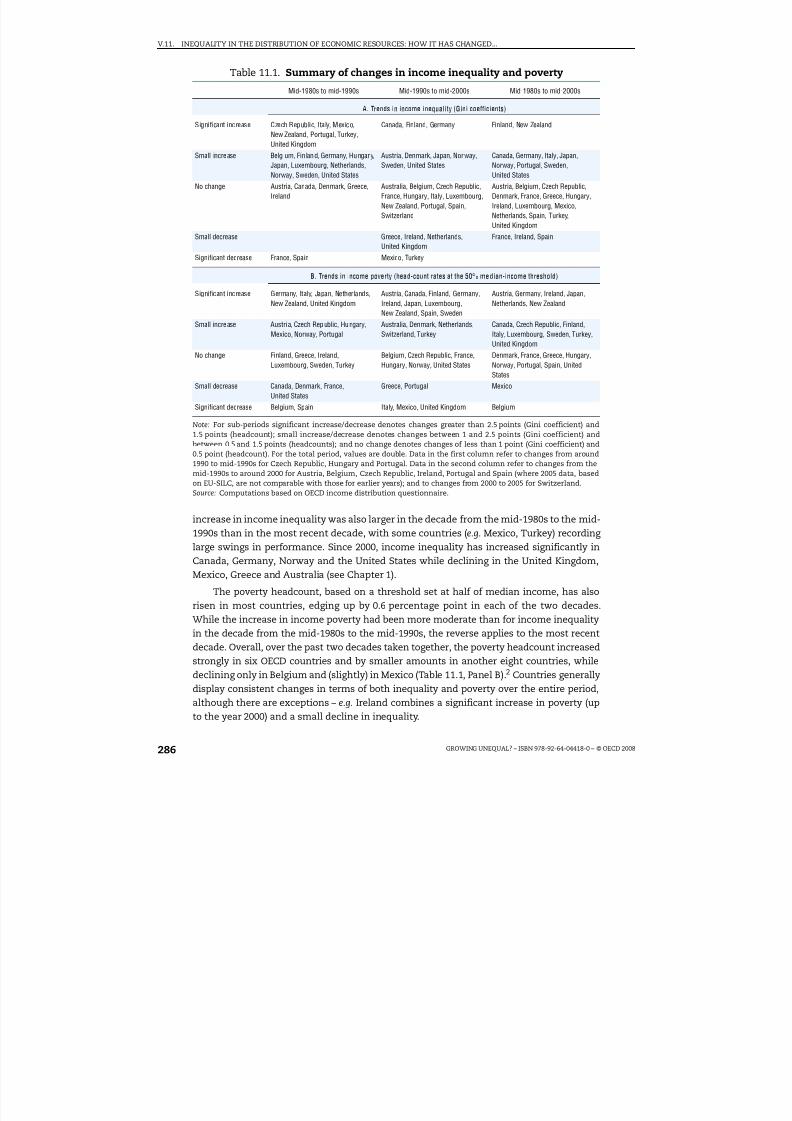
8/20/2019 Growing Unequal
http://slidepdf.com/reader/full/growing-unequal 286/309
V.11. INEQUALITY IN THE DISTRIBUTION OF ECONOMIC RESOURCES: HOW IT HAS CHANGED...
GROWING UNEQUAL? – ISBN 978-92-64-04418-0 – © OECD 2008286
increase in income inequality was also larger in the decade from the mid-1980s to the mid-1990s than in the most recent decade, with some countries (e.g. Mexico, Turkey) recording
large swings in performance. Since 2000, income inequality has increased significantly inCanada, Germany, Norway and the United States while declining in the United Kingdom,Mexico, Greece and Australia (see Chapter 1).
The poverty headcount, based on a threshold set at half of median income, has alsorisen in most countries, edging up by 0.6 percentage point in each of the two decades.While the increase in income poverty had been more moderate than for income inequalityin the decade from the mid-1980s to the mid-1990s, the reverse applies to the most recentdecade. Overall, over the past two decades taken together, the poverty headcount increasedstrongly in six OECD countries and by smaller amounts in another eight countries, whiledeclining only in Belgium and (slightly) in Mexico (Table 11.1, Panel B).2 Countries generally
display consistent changes in terms of both inequality and poverty over the entire period,although there are exceptions – e.g. Ireland combines a significant increase in poverty (upto the year 2000) and a small decline in inequality.
Table 11.1. Summary of changes in income inequality and poverty
Mid-1980s to mid-1990s Mid-1990s to mid-2000s Mid-1980s to mid-2000s
A. Trends in income inequality (Gini coefficients)
Significant increase Czech Republic, Italy, Mexico,
New Zealand, Portugal, Turkey,United Kingdom
Canada, Finland, Germany Finland, New Zealand
Small increase Belg ium, Fin land, Germany, Hungary,Japan, Luxembourg, Netherlands,Norway, Sweden, United States
Austria, Denmark, Japan, Norway,Sweden, United States
Canada, Germany, Italy, Japan,Norway, Portugal, Sweden,United States
No change Austria, Canada, Denmark, Greece,Ireland
Australia, Belgium, Czech Republic,France, Hungary, Italy, Luxembourg,New Zealand, Portugal, Spain,Switzerland
Austria, Belgium, Czech Republic,Denmark, France, Greece, Hungary,Ireland, Luxembourg, Mexico,Netherlands, Spain, Turkey,United Kingdom
Small decrease Greece, Ireland, Netherlands,United Kingdom
France, Ireland, Spain
Significant decrease France, Spain Mexico, Turkey
B. Trends in income poverty (head-count rates at the 50% median-income threshold)
Significant increase Germany, Italy, Japan, Netherlands,New Zealand, United Kingdom
Austria, Canada, Finland, Germany,Ireland, Japan, Luxembourg,New Zealand, Spain, Sweden
Austria, Germany, Ireland, Japan,Netherlands, New Zealand
Small increase Austria, Czech Republic, Hungary,Mexico, Norway, Portugal
Australia, Denmark, Netherlands,Switzerland, Turkey
Canada, Czech Republic, Finland,Italy, Luxembourg, Sweden, Turkey,United Kingdom
No change Finland, Greece, Ireland,Luxembourg, Sweden, Turkey
Belgium, Czech Republic, France,Hungary, Norway, United States
Denmark, France, Greece, Hungary,Norway, Portugal, Spain, UnitedStates
Small decrease Canada, Denmark, France,United States
Greece, Portugal Mexico
Significant decrease Belgium, Spain Italy, Mexico, United Kingdom Belgium
Note: For sub-periods significant increase/decrease denotes changes greater than 2.5 points (Gini coefficient) and1.5 points (headcount); small increase/decrease denotes changes between 1 and 2.5 points (Gini coefficient) andbetween 0.5 and 1.5 points (headcounts); and no change denotes changes of less than 1 point (Gini coefficient) and0.5 point (headcount). For the total period, values are double. Data in the first column refer to changes from around1990 to mid-1990s for Czech Republic, Hungary and Portugal. Data in the second column refer to changes from themid-1990s to around 2000 for Austria, Belgium, Czech Republic, Ireland, Portugal and Spain (where 2005 data, basedon EU-SILC, are not comparable with those for earlier years); and to changes from 2000 to 2005 for Switzerland.Source: Computations based on OECD income distribution questionnaire.

8/20/2019 Growing Unequal
http://slidepdf.com/reader/full/growing-unequal 287/309
V.11. INEQUALITY IN THE DISTRIBUTION OF ECONOMIC RESOURCES: HOW IT HAS CHANGED...
GROWING UNEQUAL? – ISBN 978-92-64-04418-0 – © OECD 2008 287
These changes in income inequality and poverty have however occurred in a contextof stronger income growth over the past decade. This increase in the absolute pace of income growth has generally benefitted people across the entire distribution, althoughwith important differences across countries. Over the decade from the mid-1990s to themid-2000s, the real income of people in the bottom 20% of the distribution fell in Austria,
Germany, Japan, Turkey and – to a lesser extent – in Mexico and the United States. Realincome growth in the middle of the distribution lagged behind the average in Canada,Finland, Italy, Norway and the United States.
Cross-country comparisons of income levels for people at similar pointsin the distribution
Data on the income of people and families at different points of the distribution are alsoimportant for cross-country comparisons of economic welfare. While these comparisonsgenerally rest on estimates for “representative” agents – built by summing income flowsacross unattached individuals, i.e. all people resident in a country, irrespectively of the
household where they live – the assumptions underlying these estimates are difficult to justify.Data on the distribution of household income allow moving beyond these comparisons of “representative agents”, to look at the experiences of people at similar points in thedistribution and at the pooling and sharing of resources that occur within each household.Across countries, measures of mean equivalised household disposable income are highlycorrelated with conventional SNA aggregates (such as Net National Income). There are,however, wide differences across countries in terms of:
● The income gap (in USD at PPP rates) between people at the top and bottom of thedistribution (this gap ranges from USD 20 000 in the Slovak Republic to more thanUSD 85 000 in the United States, Figure 1.6).
● How people at similar points in a country’s income distribution compare acrosscountries – with the United States, for example, topping the league by a wide margin interms of the average income of the top decile, while coming fourth (after Luxembourg,the Netherlands and Switzerland) when looking at median income, and 12th in terms of average income of the bottom decile (Figure 1.7).
Shifts in income distribution and poverty among various groups
Aggregate trends in income distribution have affected people at various points of thedistribution in different ways. In Ireland, Mexico and Turkey, the decline of income
inequality experienced over the past decade has mainly reflected falls in the income shareaccruing to people in the top quintile of the distribution and gains for people in the middlethree. Conversely, in most of the countries where income inequality increased over thedecade, this mainly reflected gains at the top of the distribution.
One consequence of these large gains at the top of the distribution has been thatmiddle-class families have often lost ground relative to the economy-wide average – theso-called phenomenon of the “hollowing out of the middle-class”. This is especiallyevident in New Zealand and the United Kingdom (in the decade from the mid-1980s to themid-1990s), as well as Canada, Finland and the United States (where the median to meanratio fell by around 10% over the entire period, Figure 1.3). Conversely, the relative income
of middle-class families has been stable in Denmark, France and Sweden, and improved inthe Netherlands and Greece throughout the period and in more countries since themid-1990s.

8/20/2019 Growing Unequal
http://slidepdf.com/reader/full/growing-unequal 288/309
V.11. INEQUALITY IN THE DISTRIBUTION OF ECONOMIC RESOURCES: HOW IT HAS CHANGED...
GROWING UNEQUAL? – ISBN 978-92-64-04418-0 – © OECD 2008288
These changes in economic conditions have also shifted poverty risks among variousdemographic groups. The most significant of these shifts has been away from the elderlyand towards young adults and children (Figure 5.5). While the very old (people aged 75 andover) continue to be exposed to a greater risk of (relative-income) poverty than other agegroups in the mid-2000s, this risk has fallen from a level almost twice as high as that of the
population average in the mid-1980s to 50% higher by the mid-2000s. For people aged 66to 75, this risk is now lower than for children and young adults. Conversely, children andyoung adults experienced poverty rates that are today around 25% higher than thepopulation average, while they were close to and below that average, respectively, 20 yearsago. Changes have been smaller when looking at poverty risks across household types,with lone parents as the group exposed to the highest risk – three times higher thanaverage – a disadvantage that increased further over the past decade.
What factors have been driving changes in the distributionof household income?
Cross-country differences in income inequality and poverty reflect the interplay of many factors. Three, in particular, have figured prominently in discussions on the subject.These are changes in demography and living arrangements; labour-market trends; andgovernment tax and transfer policies. While it is not always easy to distinguish among these factors, this report highlights several patterns.
Demographic factors
Demographic factors have played an important role in shaping households’ living conditions. The most direct way in which this has occurred is by reducing averagehousehold size, implying that economies of scale in consumption are lost and that a highermoney income is needed to assure the same level of household well-being.3 There are,however, additional channels through which demographic factors and changes in living arrangements affect income inequalities in each country. The most important is byincreasing the share in the total population of groups with below-average income (e.g. theelderly or lone parents) or with higher within-group inequality. One way of assessing therole of these demographic factors in accounting for the observed trend in incomeinequality is to compare the actual change in income distribution to what would haveoccurred had the population structure (by both age of individuals and household type)remained “frozen” at the level prevailing in some initial year. The results of such anexercise, described in Chapter 2 and summarised in Table 11.2, suggest that thesestructural factors have increased income inequality in a majority of countries, andsignificantly so (i.e. exceeding 20% of the total change in the Gini coefficient of incomeinequality) in Australia, Canada, France, Germany, the Netherlands and the UnitedKingdom. However, more important than population ageing per se have been the changesin living arrangements, which have implied that more people are living alone and inlone-parent households.
These shifts in the composition of OECD populations have occurred alongside changesin the relative income of different groups – with youths and, to a lesser extent, lone parentslosing ground relative to others in most countries, and people closer to the end of their
working life, as well as elderly people living alone, gaining the most. To some extent, theseshifts in the relative income of various groups may reflect changes in their size – as in thecase, for example, of lower wages following the entry of a large cohort into the labour
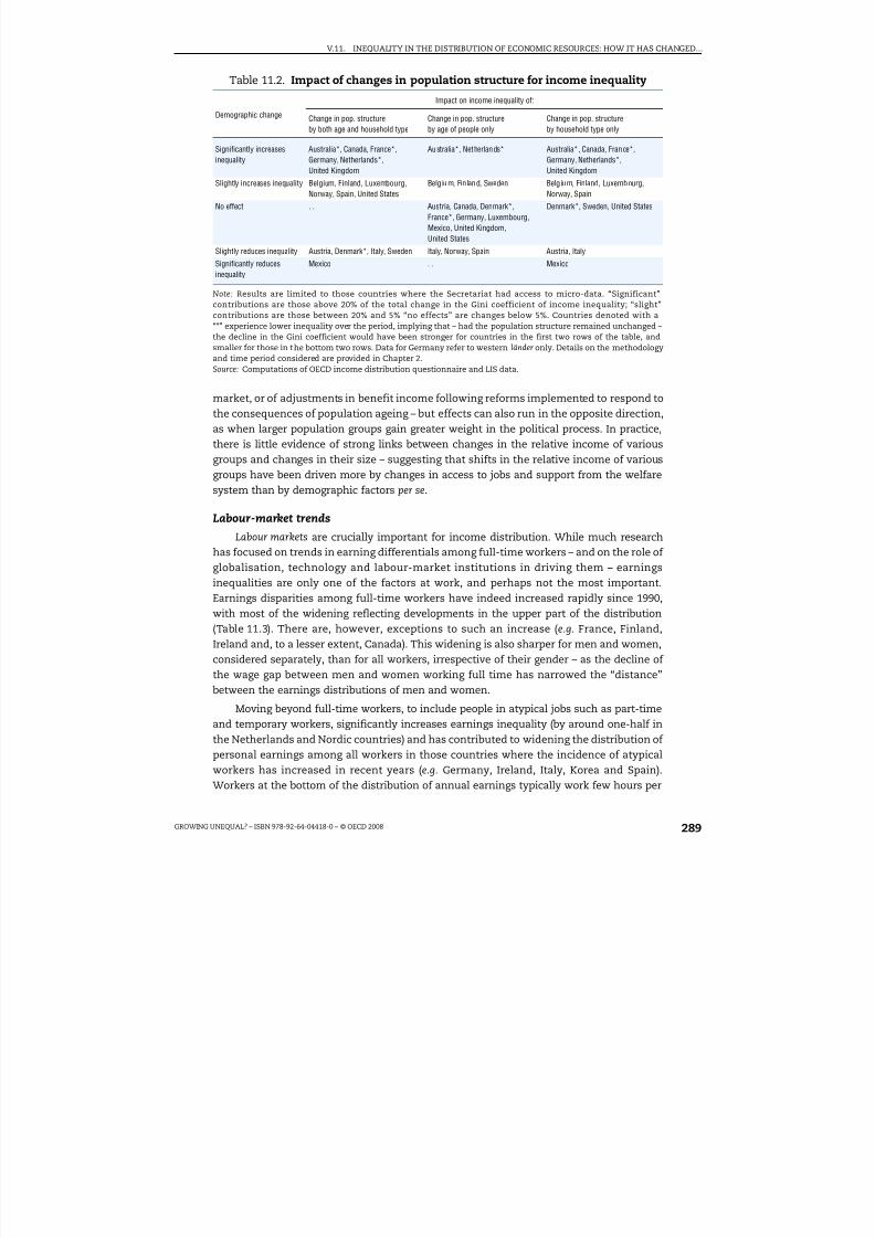
8/20/2019 Growing Unequal
http://slidepdf.com/reader/full/growing-unequal 289/309
V.11. INEQUALITY IN THE DISTRIBUTION OF ECONOMIC RESOURCES: HOW IT HAS CHANGED...
GROWING UNEQUAL? – ISBN 978-92-64-04418-0 – © OECD 2008 289
market, or of adjustments in benefit income following reforms implemented to respond tothe consequences of population ageing – but effects can also run in the opposite direction,as when larger population groups gain greater weight in the political process. In practice,there is little evidence of strong links between changes in the relative income of various
groups and changes in their size – suggesting that shifts in the relative income of variousgroups have been driven more by changes in access to jobs and support from the welfaresystem than by demographic factors per se.
Labour-market trends
Labour markets are crucially important for income distribution. While much researchhas focused on trends in earning differentials among full-time workers – and on the role of globalisation, technology and labour-market institutions in driving them – earningsinequalities are only one of the factors at work, and perhaps not the most important.Earnings disparities among full-time workers have indeed increased rapidly since 1990,
with most of the widening reflecting developments in the upper part of the distribution(Table 11.3). There are, however, exceptions to such an increase (e.g. France, Finland,Ireland and, to a lesser extent, Canada). This widening is also sharper for men and women,considered separately, than for all workers, irrespective of their gender – as the decline of the wage gap between men and women working full time has narrowed the “distance”between the earnings distributions of men and women.
Moving beyond full-time workers, to include people in atypical jobs such as part-timeand temporary workers, significantly increases earnings inequality (by around one-half inthe Netherlands and Nordic countries) and has contributed to widening the distribution of personal earnings among all workers in those countries where the incidence of atypicalworkers has increased in recent years (e.g. Germany, Ireland, Italy, Korea and Spain).Workers at the bottom of the distribution of annual earnings typically work few hours per
Table 11.2. Impact of changes in population structure for income inequality
Demographic change
Impact on income inequality of:
Change in pop. structureby both age and household type
Change in pop. structureby age of people only
Change in pop. structureby household type only
Significantly increasesinequality Australia*, Canada, France*,Germany, Netherlands*,United Kingdom
Australia*, Netherlands* Australia*, Canada, France*,Germany, Netherlands*,United Kingdom
Slightly increases inequality Belgium, Finland, Luxembourg,Norway, Spain, United States
Belg ium, Fin land, Sweden Belg ium, Finland, Luxembourg,Norway, Spain
No effect . . Austria, Canada, Denmark*,France*, Germany, Luxembourg,Mexico, United Kingdom,United States
Denmark*, Sweden, United States
Slightly reduces inequality Austria, Denmark*, Italy, Sweden Italy, Norway, Spain Austria, Italy
Significantly reducesinequality
Mexico . . Mexico
Note: Results are limited to those countries where the Secretariat had access to micro-data. “Significant”
contributions are those above 20% of the total change in the Gini coefficient of income inequality; “slight”contributions are those between 20% and 5% “no effects” are changes below 5%. Countries denoted with a“*” experience lower inequality over the period, implying that – had the population structure remained unchanged –the decline in the Gini coefficient would have been stronger for countries in the first two rows of the table, andsmaller for those in the bottom two rows. Data for Germany refer to western länder only. Details on the methodologyand time period considered are provided in Chapter 2.Source: Computations of OECD income distribution questionnaire and LIS data.

8/20/2019 Growing Unequal
http://slidepdf.com/reader/full/growing-unequal 290/309
V.11. INEQUALITY IN THE DISTRIBUTION OF ECONOMIC RESOURCES: HOW IT HAS CHANGED...
GROWING UNEQUAL? – ISBN 978-92-64-04418-0 – © OECD 2008290
year, as they work either part time or full time for only part of the year. While this mayreflect the voluntary choices of workers, this is only part of the story, as highlighted by thesignificant rise in the share of workers declaring that they would work longer hours if suitable jobs were available, as has been observed in several OECD countries.
Disparities in personal earnings among workers, however, do not necessarily translateinto a wider distribution of household earnings among all people, whether working or not.This is because higher employment (especially of second earners) spread earnings among a larger number of households. However, the employment gains experienced throughout
the OECD area since the second half of the 1990s have not led to significant declines in theshare of people living in jobless households, with this share rising further in Turkey,Germany, the Czech Republic and Hungary and falling significantly in France, Greece andNew Zealand and, to a less extent, in Australia, Italy, the Netherlands and the UnitedKingdom. The persistence of high household joblessness despite higher employment haspartly reflected the concentration of employment gains among people with intermediateeducation, and the decline of employment rates among less educated people. As a result of these contrasting employment developments, changes in the concentration of householdearnings have been small in most OECD countries in the period from the mid-1990s tomid-2000s, with significant rises only in Canada, the Czech Republic, Germany and Japan,
and significant falls in Greece, Hungary, Ireland, Mexico and Spain (Table 11.4). Conversely,capital income and, to a lesser extent, self-employment income have become significantlymore concentrated in a much larger number of OECD countries. This suggests thatnon-wage income sources – whose measurement is subject to larger uncertainties than inthe case of earnings – account for a significant part of the observed widening in thedistribution of household disposable income.
If changes in the concentration of household earnings account for only a part of thewidening in income inequality, access to paid work remains the main factor shaping therisk of poverty. As shown in Chapter 5, among single adult households, 46% of people in jobless households have income below the 50% threshold, a proportion which falls to 28%
when the household head works part time and to 8% when he or she works full time.Among people living in couple families, 33% have income below the 50% poverty line whenno one in the household has a paid job, but only 19% do when one person works part time
Table 11.3. Summary of changes in earnings inequality among men workingfull time1990 to 2005
Over the entire distribution(P90/P10)
Over the bottom halfof the distribution (P50/P10)
Over top half of the distribution(P90/P50)
Significant Increase Australia, Czech Rep., Germany,Hungary, Ireland, Korea, Poland,Switzerland
Hungary, Korea, Poland Australia, Poland, Switzerland
Moderate increase Netherlands, New Zealand, Sweden,United Kingdom, United States
Australia, Czech Rep., Denmark,Germany, Ireland, Netherlands,New Zealand, Sweden, UnitedKingdom, United States
Canada, Czech Rep., Denmark,Germany, Hungary, Ireland, Korea,Netherlands, New Zealand, Sweden,United Kingdom, United States
No change Japan Japan, Switzerland Finland, Japan
Decline Canada, Finland, France Canada, Finland, France France
Note: “Strong increase” corresponds to a rise by 20% or more in the different inter-decile ratios; “moderate increase”to a rise between 2.5% and 20%; “no change” to a change of plus or minus 2.5%; and “decline” to a fall of 2.5% or morein the different inter-decile ratios.Source: Data from the OECD Earnings database as presented in Figure 3.1.

8/20/2019 Growing Unequal
http://slidepdf.com/reader/full/growing-unequal 291/309
V.11. INEQUALITY IN THE DISTRIBUTION OF ECONOMIC RESOURCES: HOW IT HAS CHANGED...
GROWING UNEQUAL? – ISBN 978-92-64-04418-0 – © OECD 2008 291
and only 4% when at least one works full time. Across countries, those with higheremployment rates also record lower poverty headcounts – with countries with higheremployment rates for all people as well as for mothers also recording lower poverty ratesamong persons of working age and among children, respectively.
Work is, however, not the only factor that matters for avoiding poverty. In the mid-2000s,for the OECD area as a whole, people living in households with workers accounted for around60% of all the income poor (based on a threshold set at half of median income, Figure 5.10).The poverty rate among one-worker households was around 14%, and it was 3.5% for thosewith two workers. Even a full-time job does not always protect from the risk of poverty.
Government redistribution
Cross-country differences in the shape of the income distribution partly reflectdifferences in how governments redistribute income across individuals through the cashbenefits they provide and the household taxes they collect. The effect of government
redistribution in lowering income inequality is largest in the Nordic countries and lowestin Korea and the United States. The country-ranking is similar when looking at the effectsof taxes and transfers in reducing poverty. Countries that redistribute more towards peoplewith lower income also achieve a more narrow distribution of household income and lowerpoverty rates (Figure 4.6). Also, most of this redistribution towards people at the bottom of the income scale is generally achieved through public cash benefits – with the mainexception of the Unites States, where a large part of the support provided to low-incomefamilies is administered through the income tax system.
These cross-country differences in the scale of redistribution among people withdifferent incomes partly reflect differences in the size and structure of social spending –
with spending towards people of working age achieving a larger reduction in poverty thansocial spending towards the elderly. Differences in spending levels and structure are,however, only part of the story. OECD countries redistribute in a variety of ways – some
Table 11.4. Summary of changes in the concentration of different incomecomponents
Entire population, period from the mid-1990s to mid-2000s
Household earnings Capital income Self-employment income
Increased inequality Canada, Czech Rep., Germany,
Japan
Australia, Denmark, Finland, France,
Hungary, Italy, Netherlands, NewZealand, Norway, Spain, Sweden
Belgium, Denmark, France, Germany,
Greece, Hungary, Ireland, Italy,Luxembourg, Mexico, Spain, Sweden,United Kingdom, United States
Stability Australia, Belgium, Denmark, Finland,France, Italy, Luxembourg,Netherlands, New Zealand, Norway,Portugal, Sweden, Turkey,United Kingdom, United States
Belgium, Canada, Germany, Ireland,Japan, Portugal
Canada, Finland, Japan
Reduced inequality Greece, Hungary, Ireland, Mexico,Spain
Czech. Rep., Greece, Luxembourg,Mexico, Turkey, United Kingdom,United States
Australia, Czech Rep., Netherlands,New Zealand, Norway, Portugal,Turkey
Note: Concentration is measured by the concentration coefficient of each income component, with individualsranked in increasing order of their equivalised household disposable income, and is computed based on data on the
average value of each component for each income decile. “Stability” denotes changes in the concentration coefficientof each component between +/–0.02 point. Changes over the period from the mid-1990s to around 2000 for Austria,Belgium, the Czech Republic, Ireland, Portugal and Spain (where EU-SILC data for the mid-2000s are not comparablewith those for earlier years). Income components are measured on a pre-tax basis in all countries except Belgium,Greece, Hungary, Luxembourg, Mexico, Spain and Turkey.Source: Computations based on OECD income distribution questionnaire.

8/20/2019 Growing Unequal
http://slidepdf.com/reader/full/growing-unequal 292/309
V.11. INEQUALITY IN THE DISTRIBUTION OF ECONOMIC RESOURCES: HOW IT HAS CHANGED...
GROWING UNEQUAL? – ISBN 978-92-64-04418-0 – © OECD 2008292
through universal benefits, others with more targeted programmes, some mainly relying on transfers, others mainly granting tax rebates to low-income families. Also,redistribution across individuals with different income levels always coexists withredistribution across the life-course of the same person, with some evidence that countriesthat redistribute more across the lifecycle spend more, in the aggregate, than those that
focus more on redistribution between rich and poor.
When looking at changes over the past decade in the size of the redistribution fromrich to poor, such changes differ significantly across countries and are small on average.The reduction of income inequality achieved by the combined effect of household taxesand public cash transfers declined over the past decade in around half of the countries,although it increased in the Czech Republic, France, Germany and Italy (Table 11.5). Thesedevelopments were mainly driven by changes in the redistribution achieved by public cashtransfers (which declined in most countries), which was partly offset by strongerredistribution through household taxes (in particular in Denmark, Germany, Italy, theNetherlands and the United Kingdom). Changes are more significant when looking atredistribution towards people at the lower tail of the income distribution, with net publictransfers having weaker effects in reducing poverty than in the past in most Nordiccountries (excluding Norway) as well as Canada and New Zealand, but larger poverty-reducing effect in the Czech Republic (up to 2000), Germany, Italy and Japan. These changesin redistribution may however reflect changes in market-income inequality, which tends toincrease the redistributive effects for a given structure of tax and benefit systems.
Summing-up
The importance of each of these drivers of income inequality – changes in demographyand living arrangements, labour-market trends, and government redistribution – has variedacross OECD countries, and no single “story” holds for all. The factors involved are many and,
Table 11.5. Summary of changes in government redistributionin reducing inequality and poverty
Entire population, period from the mid-1990s to mid-2000s
Reduction of inequality
Reduction of povertyDue to both taxes and publiccash transfers
Due to public cashtransfers alone
Due to household taxesalone
Increase Czech Republic, France,Germany, Italy
Czech Republic, France,Germany, Italy, Japan
Denmark, Germany, Italy,Netherlands, United Kingdom
Czech Rep., Germany, Italy,Japan, Portugal
Stability Australia, Canada, Japan,United Kingdom
Australia, Norway Australia, Canada, CzechRepublic, Finland, France,Ireland, New Zealand
Australia, Belgium, France,Netherlands, Norway, UnitedKingdom, United States
Decline Denmark, Finland, Ireland,Netherlands, New Zealand,Norway, Sweden, UnitedStates
Canada, Denmark, Finland,Ireland, Netherlands, NewZealand, Sweden, UnitedKingdom, United States
Japan, Norway, Sweden,United States
Canada, Denmark, Finland,New Zealand, Sweden
Note: The inequality reducing effect of household taxes and public cash transfers is measured as the point differencebetween the concentration measures of market and disposable income, with people ranked by disposable income.The poverty reducing effect of household taxes and public cash transfers is measured as the point differencebetween the poverty headcount based on market income and that based on disposable income. In the case of inequality, “increase/decrease” denotes changes greater than 0.3 point in the effect of net transfers in reducing theconcentration measure. In the case of poverty, “increase/decrease” denotes changes greater than 2 points in theeffect of net transfers in lowering the poverty headcount rate at 50% median income. Changes refer to the periodfrom the mid-1990s to around 2000 for Belgium, the Czech Republic, Denmark and Ireland (where EU-SILC data forthe mid-2000s are not deemed to be comparable with those for earlier years).Source: Computations based on OECD income distribution questionnaire.

8/20/2019 Growing Unequal
http://slidepdf.com/reader/full/growing-unequal 293/309
V.11. INEQUALITY IN THE DISTRIBUTION OF ECONOMIC RESOURCES: HOW IT HAS CHANGED...
GROWING UNEQUAL? – ISBN 978-92-64-04418-0 – © OECD 2008 293
because of their interdependencies, disentangling their importance is difficult. One measureof their role is provided in Table 11.6, which shows results of a simple shift-sharedecomposition applied to changes in the poverty headcount for households with a head of working age (left-hand panel) or of retirement age (right-hand panel) over the past decade.Available data allowed applying this decomposition to 14 countries.
For both household types, the rise in the poverty headcount over the past decade
mainly reflected a small fall in the redistributive effects of taxes and transfers, withnegligible effects for changes in market-income poverty and population structure. Countryexperiences, however, differ significantly, especially for working-age households.Demographic factors have been important in Germany, where they contributed toincreasing the poverty headcount of working-age households, as well as in Italy and NewZealand, where they had the opposite effect. Conversely, a greater concentration of marketincome has increased poverty in Italy and New Zealand and, to a lesser extent, in Australia,Canada and France. Finally, the reduction in the size of interpersonal redistributionachieved by the tax and benefit system has been significant in Canada, Finland, NewZealand and Sweden, and – to a lesser extent – in Australia, Denmark, Germany, the
Netherlands and Norway. In the case of households headed by a person of retirement age,all countries where the poverty headcount increased significantly over the past decade(Australia, Canada, Finland, New Zealand, Sweden and the United States) also experienced
Table 11.6. Summary of various factors for changes in poverty ratesfor households with a head of working age or of retirement age
Entire population, period from the mid-1990s to mid-2000s
Persons living in households with working-age head Persons living in households with retirement-age head
Total changein poverty
rate
Due to changes in:Total change
in povertyrate
Due to changes in:
Market-incomepoverty
Taxes andpublic cashtransfers
Householdstructure
Market-incomepoverty
Taxes andpublic cashtransfers
Householdstructure
Australia = + + – +++ – +++ =
Canada +++ + +++ – +++ = +++ =Denmark + = + = —- = – –
Finland +++ – +++ + +++ – +++ –
France = + = = . . . . . . . .
Germany +++ = + +++ – = – –
Italy – +++ – – – = – +
Japan + = = + – + – +++
Netherlands + = + = + = + =
New Zealand +++ +++ +++ – +++ = +++ =
Norway + – + + —- = —- =
Sweden + – +++ = +++ = +++ =
United
Kingdom
– – = – – = – =
United States = = = = +++ = +++ =
Average + = + = + = + =
Note: The table is based on a decomposition analysis described in Chapter 5. Household structure refers to ten groupsdistinguishing work attachment (households with no workers, with one adult working, and with two or more adultsworking) and household types (singles and couple families, with and without children). The analysis is limited tocountries for which the data allow distinguishing between market- and disposable-income poverty. “+++”/“–” denoteschanges greater than +/–1.5 points, “+”/“–” denotes changes between +/–0.5 and +/–1.5 points and “=” denoteschanges of less than 0.5 point. See Chapter 5 for a more detailed description of methodology.Source: Computations based on OECD income distribution questionnaire.

8/20/2019 Growing Unequal
http://slidepdf.com/reader/full/growing-unequal 294/309
V.11. INEQUALITY IN THE DISTRIBUTION OF ECONOMIC RESOURCES: HOW IT HAS CHANGED...
GROWING UNEQUAL? – ISBN 978-92-64-04418-0 – © OECD 2008294
a fall in the effect of the tax and transfer system in reducing poverty. Better identifying therole of the various factors at work – a task that is best undertaken through country-specificanalysis – is important for designing appropriate policy responses.
Can we assess economic inequalities just by looking at cash income?
The short answer to this question is “no”. There are three reasons why cash income isa limited measure of the economic resources of households. First, people can have quitehigh living standards even if they have low incomes – because they have built up theirsavings, because government services such as health and education may be provided freeof charge, or because they can produce much of what they need through home production.Second, income is only an indirect measure of people’s consumption opportunities, andbetter proxies – such as household wealth and actual consumption – are sometimesavailable. Third, the calendar year underlying the concept of annual income is anaccounting concept with no intrinsic economic significance, and the situation that prevailsat a point in time may be a poor guide to people's conditions over their life-course. Cashincome is easily measured, and this helps cross-country comparisons, but any seriousattempt to assess developments in economic inequality has to consider whether theseother factors validate or invalidate conclusions based on static income measures alone.
Non-cash income sources
Household cash disposable income excludes a range of flows that affect a household'sconsumption possibilities. These include services provided by firms (which are importantin some countries) as well as other resources (such as time and home production) thatcontribute to households’ living standards and to their ability to attend to their needs.Among the factors omitted from the “standard” accounting framework are governmentactivities that impact on household well-being through the in-kind services they provideand the consumption taxes they collect.
The case for including in-kind public services in a broader measure of the economic well-being of households is straightforward. Households pay taxes to finance these publicservices. However, while these taxes are deducted from their disposable income whenmaking studies of the distribution of income, the services provided in return are not included.
While, in theory, all public services confer benefits to households (from education todefence), the case for their inclusion in a broader measure of household economicresources is most compelling for those that confer a personal benefit to users. The value of
these public services (for education, health and other social services) varies significantlyacross countries (from less than 10% of household disposable income in Turkey to morethan 40% in Denmark and Sweden), as well as over time (mainly reflecting the expansionof publicly provided education and health services). This suggests that including them in amore comprehensive measure of households’ economic resources will significantly affectany assessment of cross-country comparisons of levels of inequality and of changes inindividual countries.
There is no unique way to include household services in income distribution analysis,and sometimes conclusions differ according to the different techniques that can be used.Nevertheless, some patterns (described in Chapter 9) are consistent across studies:
● Public in-kind services tend to be distributed rather uniformly across people belonging to various income groupings, implying that they account for a larger share of household

8/20/2019 Growing Unequal
http://slidepdf.com/reader/full/growing-unequal 295/309
V.11. INEQUALITY IN THE DISTRIBUTION OF ECONOMIC RESOURCES: HOW IT HAS CHANGED...
GROWING UNEQUAL? – ISBN 978-92-64-04418-0 – © OECD 2008 295
income at the bottom of the distribution than at the top. As a result, inclusion of thesein-kind services narrows the Gini coefficient of income inequality at a point in time, byaround 0.07 point on average, and by larger amounts in Sweden, Norway, Australia,Denmark, New Zealand, Portugal, France, Italy and the United States (Figure 11.2).
● This equalising effect, however, differs among programmes – with large reductions dueto compulsory education, non-specialist health care and public housing, and negligibleones for non-compulsory education. Indeed, non-compulsory education is moreunequally distributed than income in one in three countries.
● The effect of government services in narrowing the Gini coefficient of income inequalityis quite large. It is equivalent to about half the equalising impact of household taxes andcash benefits. In the United States, public services have the same impact in reducing inequality as do taxes and transfers.
Consumption taxes also fall outside the standard accounting framework generally usedto assess income inequality. Considering how consumption taxes affect the distribution of household resources is however much more difficult than for in-kind services for bothconceptual and empirical reasons. Despite these difficulties, a long tradition of researchhas considered the distributive impact of consumption taxes in individual countries. Thisresearch highlights two consistent patterns.
● First, consumption taxes are heavily concentrated on people with lower income.
● Second, this is more the case for taxes levied on specific goods and services (alcohol andgasoline) than for those on general consumption.
Figure 11.2. Influence of in-kind public services and consumption taxes
on income inequalities
1 2 http://dx.doi.org/10.1787/424330428204Note: Countries are ranked from left to right in increasing order of the Gini coefficient of income inequality. Estimatesof the effect of public in-kind services in narrowing income inequality are those based on grouped data described inChapter 9. Estimates of the effect of consumption taxes in increasing income inequality are illustrative only: they arebased on applying the distributive profile of general consumption taxes and of excises in one country (Australia) to
income values by deciles in other countries (as described in Warren, 2008).Source: Computation based on OECD income distribution questionnaire and other data.
D N K
S W E
N L D
A U T
N O R C
Z E F I N
L U X
C H E
F R A
D E U
H U N
C A N I R
L A U S
J P N
G B R
N Z L
G R C I T
A U S A
P R T
T U R
M E X
0.50
0.40
0.30
0.20
0.10
0
Gini disposable income Gini after considering in-kind services
Gini after considering consumption taxes
O E C
D - 2 4

8/20/2019 Growing Unequal
http://slidepdf.com/reader/full/growing-unequal 296/309
V.11. INEQUALITY IN THE DISTRIBUTION OF ECONOMIC RESOURCES: HOW IT HAS CHANGED...
GROWING UNEQUAL? – ISBN 978-92-64-04418-0 – © OECD 2008296
There are few comparative studies of the distributional impact of consumption taxes,but those that have been done highlight large differences in the burden of consumptiontaxes as a share of income for people in different deciles (with more regressive impacts inNordic countries than in Belgium, the Netherlands and Ireland). Unfortunately, thesestudies do not yet allow assessing whether these cross-country differences reflect the
specific features of the tax systems of various countries or other factors.4 Even so, the factthat consumption taxes are now often relatively high (VAT rates often exceed 20%, andexcise taxes are often a considerably higher proportion of final prices) imply that they dohave a significant effect on the distribution of resources. One way to illustrate the scale of this effect is though a simple “what if” scenario, which applies the distributive profile of taxes on general consumption and specific goods prevailing in one country (Australia) –based on the “preferred” methodology described by Warren (2008) – to the incomedistribution of others. This simple scenario adjusts for differences in the overall level of consumption taxes and in their composition (between general consumption and excises)across countries, but not for differences across countries in the detailed characteristics of
national tax systems and in consumption-to-income ratios across income groupings.Results (shown as diamonds in Figure 11.3) suggest that consumption taxes could raise theGini coefficient of income inequality by around 0.02 point, i.e. around 5%, with largereffects in Denmark, Hungary, Finland, Norway and Sweden. This effect of consumptiontaxes in raising income inequality offsets a large part of the combined effect of incometaxes and workers social security contributions in lowering it – even if it is considerablylower than that (in the opposite direction) of in-kind public services.5
Does the exclusion of these non-cash income sources matter for policies? It obviouslydoes for countries that have undergone significant changes in the mix of support theyprovide to households (for example, by switching from in-kind services to cash transfers as
Figure 11.3. Static and dynamic measures of poverty and inequality
1 2 http://dx.doi.org/10.1787/424352834355Note: Panel A: Dynamic measures of income-poverty rates based on a threshold set at half of median equivalisedhousehold disposable income. OECD-17 is the simple average of the countries shown except Japan, for whichestimates are based on an income definition (household income before taxes and after public transfers) that differfrom the disposable income definition used for other countries. The “always poor” poverty rate is the share of peoplewith income below the poverty threshold in each of three consecutive years; data refer to the early 2000s. Panel B:The intergenerational earnings elasticity is a measure of the extent to which the earnings of sons are correlated tothose of their fathers at a similar point in their life-cycle, meaning that high elasticity levels reflect low mobility. Forfurther details on both sets of data, see Chapters 6 and 8.
Source: Detailed sources are provided in Chapters 6 and 8.
0.40
0.30
0.35
0.25
0.200.1 0.2 0.3 0.4 0.5 0.6
20
16
4
8
12
00 2 64 108
AUS CAN
DEU
DNK
ESP
FIN
FRA
GBR
ITA
NORSWE
USA
AUS
AUTBEL
CAN
DNK FIN
FRA
DEU
GRC IRL
ITA
LUX
NLD
PRTESP
GBR
USA
JPN
Recurrent poverty rate Intergenerational earnings elasticity
Average poverty rate Gini coefficient of income inequality
B. Intergenerational mobilityA. Poverty persistance
OECD-17

8/20/2019 Growing Unequal
http://slidepdf.com/reader/full/growing-unequal 297/309
V.11. INEQUALITY IN THE DISTRIBUTION OF ECONOMIC RESOURCES: HOW IT HAS CHANGED...
GROWING UNEQUAL? – ISBN 978-92-64-04418-0 – © OECD 2008 297
in the reforms implemented in several transition countries, or by moving from provision of public housing at subsidised rates to rent allowances targeted to low-income households)or that have implemented reforms that change the tax mix in the direction of greaterreliance on taxes on general consumption. In these cases, governments need to assess theconsequences of these reforms for the well-being of beneficiaries, and may want to mitigate
some of the adverse distributive effects of these reforms through specific measures. But theconsideration of these non-cash income sources also raises a more general question thatmatters for policy design, namely, how best to mix cash transfers and in-kind services tomeet any particular redistributive goal: while people may value cash transfers more thanservices tied to a specific use, such services can often be better targeted to those in need andmay contribute more to improving their living conditions in the longer term.6
Non-income measures
The rationale for relying on income as the yardstick for assessing the living standardsof individuals and households is that income effectively constrains their consumption
possibilities. Income is, however, only a partial measure of these possibilities and othermeasures are important in their own right.
One of these measures is household wealth. Surveys measuring household assets andliabilities exist in several OECD countries, but differences in survey design in this field aremuch larger than in the case of income. This makes their use for cross-countrycomparisons much more problematic. Comparative information on household wealth is,however, becoming more easily available with the “public use” version of the Luxembourg
Wealth Study – a collaborative project that aims to do for household wealth what the LIS hasachieved for income.
Despite the difficulties in making international comparisons, the first results that areemerging from the LWS (as described in Chapter 10 of this report) shed new light on theassessment of living conditions and how these vary among the population.
● One result, which is now well established in country-specific research, is that thedistribution of wealth is much more unequal than that of income: this reflectsdifferences in saving patterns across the income distribution (with small savings among those at the bottom of the income scale, and much larger ones for people at the top), andthe importance of bequests for the transmission of market wealth across generations.
● Less well established is how wealth inequality compares across countries. In theearly 2000s, the Gini index for the distribution of household net worth (based on a
definition that included business equity) was highest in Sweden (one of the countrieswith a more narrow distribution of household income), closely followed by the UnitedStates and, further behind, by Germany and Canada, with Finland, the United Kingdomand Italy having the most equal distributions of wealth. However, other measures of wealth inequality (such as the share of total wealth held by people in the top decile) andother definitions of household wealth (i.e. excluding business equity) lead to a countryranking that is more similar to that based on household income. More generally,comparisons of wealth inequality across countries partly reflect the exclusion from theLWS of some wealth components (such as pension assets) for which information iscurrently limited to only some countries.
Country rankings also differ significantly when comparing the absolute level of household assets and income, with Italy having the highest median net worth (followed by

8/20/2019 Growing Unequal
http://slidepdf.com/reader/full/growing-unequal 298/309
V.11. INEQUALITY IN THE DISTRIBUTION OF ECONOMIC RESOURCES: HOW IT HAS CHANGED...
GROWING UNEQUAL? – ISBN 978-92-64-04418-0 – © OECD 2008298
the United Kingdom) despite having the lowest equivalised household income among theOECD countries included in the LWS. Sweden has the lowest median net worth, despite anincome value that is above that of many other OECD countries. This suggests thatdifferences in average income across countries might exaggerate comparative differencesin household access to resources – although it may also reflect the partial coverage of the
wealth data currently available.
Other patterns emerge when looking at the wealth holdings of people with differentcharacteristics. Median net wealth varies with the age of the household head, generallyrising until the end of working life and then declining during retirement. This inverted-Uprofile is, however, less steep than for income, with only small declines taking place inCanada and a continued increase by age of the household head in the United States.
The data used in Chapter 10 also allow looking at the joint distribution of income andwealth for a subset of the countries covered by the LWS. Across individuals, income and networth are highly correlated, but this is not perfect. In general, income-poor people have
fewer assets than the rest of the population, with a net worth generally about under half of that of the population as a whole.
The second non-income measure of households’ “command over resources” is providedby direct measures of household consumption. Household consumption is, in theory, lessaffected by temporary disturbances in income, and so is better suited to making assessments of inequalities across different people. Students, for example, may beincome-poor but not consumption-poor, as they are able to borrow against expected futureearnings and are often supported by their family. Similarly, people who suffer a temporary
setback in income might not feel the need to reduce their consumption immediately,relying on savings from previous years or hoping that things will get better in the future.
In recent years, several studies have looked at trends in consumption expenditureinequalities. The results show that consumption inequality has risen more slowly thanhousehold income inequality in the United States, the United Kingdom and Australia (seeTable 11.A.1 available at http://dx.doi.org/10.1787/424402577838), which suggests thatannual incomes have become more volatile, but the volatility of lifetime income has notchanged by as much. This is a case of data confirming what has long been the popularperception of change in these countries. However, this is not a general pattern across allcountries – consumption inequality has increased by as much as income inequality in Japan and has risen more rapidly than income inequality in Poland and Turkey.
One area where consumption data hold special promise is for developing directmeasures of poverty. “Material deprivation” refers to the extent to which people in eachcountry can afford those items and activities that are typical in their society. This approachhas a long tradition in individual countries but can also be implemented in a comparativesetting in two different ways, both of which are used in Chapter 7 of this report.
● The first looks at the average prevalence of different deprivation items (for example, theinability to pay for a holiday or to socialise with friends) in each country, and thenderives a summary measure by averaging across these items. This approach, whenapplied across a broad range of items, highlights large differences in the extent of material deprivation across OECD countries. This measure of material deprivation is
higher in countries with high income poverty – suggesting that, at least at the aggregatelevel, relative income poverty is indeed identifying difficult living conditions. However,the prevalence of material deprivation is also higher in countries characterised by lower

8/20/2019 Growing Unequal
http://slidepdf.com/reader/full/growing-unequal 299/309
V.11. INEQUALITY IN THE DISTRIBUTION OF ECONOMIC RESOURCES: HOW IT HAS CHANGED...
GROWING UNEQUAL? – ISBN 978-92-64-04418-0 – © OECD 2008 299
national income – suggesting that relative income poverty rates may be a poor proxy forhardship in countries with a relatively low, but equally distributed, standard of living.
● The second approach reverses the order of aggregation: a composite measure of materialdeprivation is derived by looking first at the extent to which each person lacks variousitems, and then by looking at how many people are in these conditions. Results based onthis second approach show that, across individuals, the experience of deprivationdeclines monotonically as income rises. It also declines with age, in contrast to theU-shaped relation between relative-income poverty and age found in most countries,suggesting that income-poor older people are not necessarily experiencing materialhardship. Results also suggest that, while there is some overlap between low income anddeprivation, a large share of income-poor people are not materially deprived and that,conversely, a large share of those materially deprived are not income-poor.
Information on these non-income measures of economic well-being is important forsocial policies. This is most evident when considering ways of improving the targeting of
social programmes to reach those with greater needs. Income may be a poor proxy of economic needs, and equity concerns may relate to a range of inequalities (e.g. in educationand health) that have not been addressed in this report.7 Indirectly, the non-incomemeasures considered in this report also point to the importance of looking at factors thatgo beyond the income and earnings capacity of people, to other constituents of anacceptable standard of living. More comprehensive information on asset holdings wouldalso allow assessing the effects of the assets tests embodied in the social programmes of several countries on the behaviour of social-assistance clients, and the effect of the variousasset-based welfare programmes recently introduced in several OECD countries.
Dynamic measuresMeasures of economic resources that look at income – or even wealth, or material
deprivation – at a single point in time are to a lesser or greater degree “static”. Something could happen shortly after the sample period that could change the standard of living of households. This is important, as what matters most for policies are not the blips of fortune that can lead anyone to experience a period of low income at some point in theirlife, but the persistence over time of these unfavourable conditions. The importance of dynamic measures of economic inequality is illustrated by longitudinal data that track the
income of the same person over time and by studies that compare the income of anindividual with that of their parents.
The value-added of longitudinal data that track the income of the same person overtime is best illustrated by focusing on income poverty. Longitudinal data enable adistinction to be made between three groups of people: i) those who are temporarily poor;ii) those who are continuously poor; and iii) those who cycle in and out of income povertyover a given number of years. While such data are generally available for only a minority of countries, the evidence discussed in Chapter 6 for 17 OECD countries, based oninformation on income over three consecutive years, shows that:
● Around 45% of people counted as poor based on static income will move above the (50%)poverty threshold over the next three years; however, less than 10% of them have incomeabove the median in the final year.
● On average, about 5% of the population were poor in all three years, and a further 4% intwo of the three years considered.
8/20/2019 Growing Unequal
http://slidepdf.com/reader/full/growing-unequal 300/309
V.11. INEQUALITY IN THE DISTRIBUTION OF ECONOMIC RESOURCES: HOW IT HAS CHANGED...
GROWING UNEQUAL? – ISBN 978-92-64-04418-0 – © OECD 2008300
● A higher proportion of the population (17%) experiences a drop in their income below thepoverty threshold at some point in any three-year period.
Across countries, however, those characterised by a higher poverty headcount basedon static income also record higher persistent poverty (Figure 11.3, left-hand panel), andindeed higher proportions of the population who experience low income at some point inthe three-year period. There is a strong correlation between measures of income povertycalculated on an annual basis and both the narrower and wider measures of poverty thatcan be calculated using longitudinal data. Further, when looking at the importance of various events, entries into poverty are mainly associated with family- and job-relatedevents, although their importance varies between various types of income-poor ( i.e.
temporary and recurrent).
The second way to move beyond static income data is to look at income mobility across
generations. Surveys in all OECD countries show that a majority of people declare thatincome inequalities are acceptable when they are matched by greater equality of
opportunities. Indeed, striving to achieve equality of opportunity better corresponds tomost people’s notions of equity and fairness than looking at final income inequalities.Unfortunately, equality of opportunity is hard to define, even harder to measure, andexceptionally difficult to achieve – not least because the endowments of each individualpartly reflect factors and decisions taken by their parents.
One way, however, to give practical content to the notion of equal opportunity isthrough measures of the extent to which children of low-income households move up theincome ladder when they reach adulthood. While information suitable for this type of study exists only for a few countries and domains, the measures presented in Chapter 8suggest that parental background remains a very strong determinant of success, be it
assessed in terms of students’ achievement in secondary education or in terms of theposition on the earnings ladder of sons relative to fathers. Cross-country differences in thedegree of this inter-generational elasticity are large. There is evidence that theintergenerational transmission of advantage and disadvantage is particularly high in theUnited Kingdom, the United States and Italy, and is much lower in most Nordic countries.This suggests that countries with lower income inequality based on static income (in thelower corner of the right-hand panel of Figure 11.3) also have greater social mobility,although there are exceptions – e.g. Australia and Canada, which combine high mobilitywith moderately high inequality, and France which has lower mobility than would beexpected from its level of inequality.
As Chapter 8 makes clear, one of the conclusions to be drawn from this way of looking at inequality is that those people who claim that they are indifferent to the distribution of resources at any one point in time, as long as everyone has an equal opportunity to achievesuccess, are effectively deluding themselves. Equality of opportunity often requires anequal starting point. While this suggests that a more equal distribution of resources is anecessary precondition for providing fair opportunities, these resources and parentalendowments go well beyond current income. This calls for attention on ensuring that nochildren are left behind in the education system, and that opportunities are provided foraccess to further education by all.

8/20/2019 Growing Unequal
http://slidepdf.com/reader/full/growing-unequal 301/309
V.11. INEQUALITY IN THE DISTRIBUTION OF ECONOMIC RESOURCES: HOW IT HAS CHANGED...
GROWING UNEQUAL? – ISBN 978-92-64-04418-0 – © OECD 2008 301
Summing-up
Because conventional measures of inequality based on the annual cash incomes of households are so limited, information on additional dimensions of household well-being has much to offer. There are drawbacks to all the measures considered in this section, so itseems unlikely that we can put aside annual income-based estimates of inequality orpoverty yet. But we can tentatively conclude that:
● Measures of inequality based on annual cash incomes overstate the overall inequality of resources available to households relative to measures that consider publicly-providedservices. This conclusion needs to be modified to the extent that consumption taxeswiden the distribution of resources, but the evidence is that this effect is smaller thanthe equalising effect of these other factors. Other factors that are not considered in thisreport (such as employer provided benefits, and imputed capital income flows) may,however, have the effect of widening inequalities relative to measures based on cashincome alone.
● Poverty measures based on annual income are moderately good indicators of the extentof hardship across countries. They are strongly correlated with measures that look atlonger periods of time, as well as with measures of material deprivation. But they aremuch poorer indicators of the extent of poverty the more that average living standardsdiffer across countries. And while they are good indicators of poverty in differentcountries, income-based measures are poor measures at the individual level. Changing the time period taken into account has an enormous effect on who is and who is notconsidered poor. The overlap between income poverty and material deprivation is farfrom perfect. Such conclusions point to the importance for policies of considering arange of factors beyond current income when assessing the need for social support.
● There is substantial evidence that the living standards of older people are higher than isindicated by annual cash-income measures. The older people are, the less likely they areto be deprived materially and the more likely they are to hold greater assets. Incomedistribution results show that families with children are now on average more likely tobe poor than people aged 65-75; the true gap in living standards is probably even largerthan this statistic suggests.
What are the implications of these findings for policies aimedat narrowing poverty and inequalities?
This report has mainly focused on the “facts” characterising inequalities and poverty
in OECD countries. But many of these facts have implications for designing more effectivepolicies to deal with these problems. This section provides an illustration of theseimplications based on conventional measures of cash income. In discussing suchimplications, it is useful to distinguish policies along two dimensions:
● The first relates to the precise nature of the equity goal pursued by governments. Whilemuch of this report has discussed income inequalities over the entire distribution, formany OECD countries the most immediate concern is poverty rather than inequalities per se. Because of this consideration, this section looks at the effect of different strategiesin reducing relative income-poverty among people of working age. The exact nature of
the equity goal pursued by governments is important as the effects of different policieswill depend on the characteristics of the people who are supposed to benefit from them.

8/20/2019 Growing Unequal
http://slidepdf.com/reader/full/growing-unequal 302/309
V.11. INEQUALITY IN THE DISTRIBUTION OF ECONOMIC RESOURCES: HOW IT HAS CHANGED...
GROWING UNEQUAL? – ISBN 978-92-64-04418-0 – © OECD 2008302
● The second distinction is between two different strategies to narrow poverty. The firstaims at remedying inequalities after they have occurred in the market place, and theprimary tools used to achieve this goal are public cash transfers and household taxes(the “redistribution strategy”). The second approach aims at making the distribution of market income less unequal, and the main instrument through which this goal is
pursued is that of increasing the level of employment and spreading work opportunitiesacross a larger number of households (the “work strategy”).
This section first describes some of the features of these two strategies to lowerpoverty, and then presents evidence on their potential effect in lowering poverty indifferent OECD countries.
The redistribution strategy
While redistribution from rich to poor is only one of the objectives of governmentpolicies, the size and channels of its effects will come under increased scrutiny ascommunities become more concerned about a widening divide in economic conditionsand opportunities. Two set of considerations are relevant to the design of redistributivepolicies.
● A first relates to the relative role of cash transfers and household taxes. Several factorsbear on establishing the most appropriate balance between these two elements. On oneside, cash transfers may be regarded as effectively equivalent to negative taxes,suggesting that only the “net” should matter for the individual. However, a large amounton “churning” of benefits and taxes (where the same person pays and receives a largeamount of both) may be expected to lower the well-being of people – either because of differences in the timing of various measures, or because taxes lower the discretionary
control of people on how to allocate their resources. In practice, people at the bottom of the income distribution are likely to pay few taxes, so that supporting them will typicallydepend on cash transfers. These benefits may be administered in different ways ( i.e.
either through a specific benefit administration or through the tax system) and tied todifferent conditions, with implications for the well-being of people receiving them.
● A second consideration relates to the balance between the overall size of public transfersand the amount of redistribution achieved per dollar spent. As argued in Chapter 4, agiven redistributive goal can be pursued through different combinations of level and
targeting of social spending. The evidence there presented suggested that countries thatredistribute more per dollar spent have lower outlays on social expenditures than others.
This trade-off implies that more redistribution could be achieved, for a given amount of taxes, by targeting social programmes more tightly to people in greater need or,conversely, that the same redistribution could be achieved with a lower tax pressure.While different considerations will bear on the “optimal” amount of targeting, onesimple option for shifting public efforts towards those in greater needs is to re-directspending away from earnings-related programmes (such as old-age pensions) andtowards programmes that are subject to some conditions on resources. However, forprogrammes directed at people of working age, greater targeting may come at the costsof larger disincentives for participation and work effort in the income range wherebenefits are withdrawn. Targeting may also alienate support from higher income groups,
pushing them to “opt out” of public programmes towards private alternatives and to voteagainst political parties supporting higher spending.

8/20/2019 Growing Unequal
http://slidepdf.com/reader/full/growing-unequal 303/309
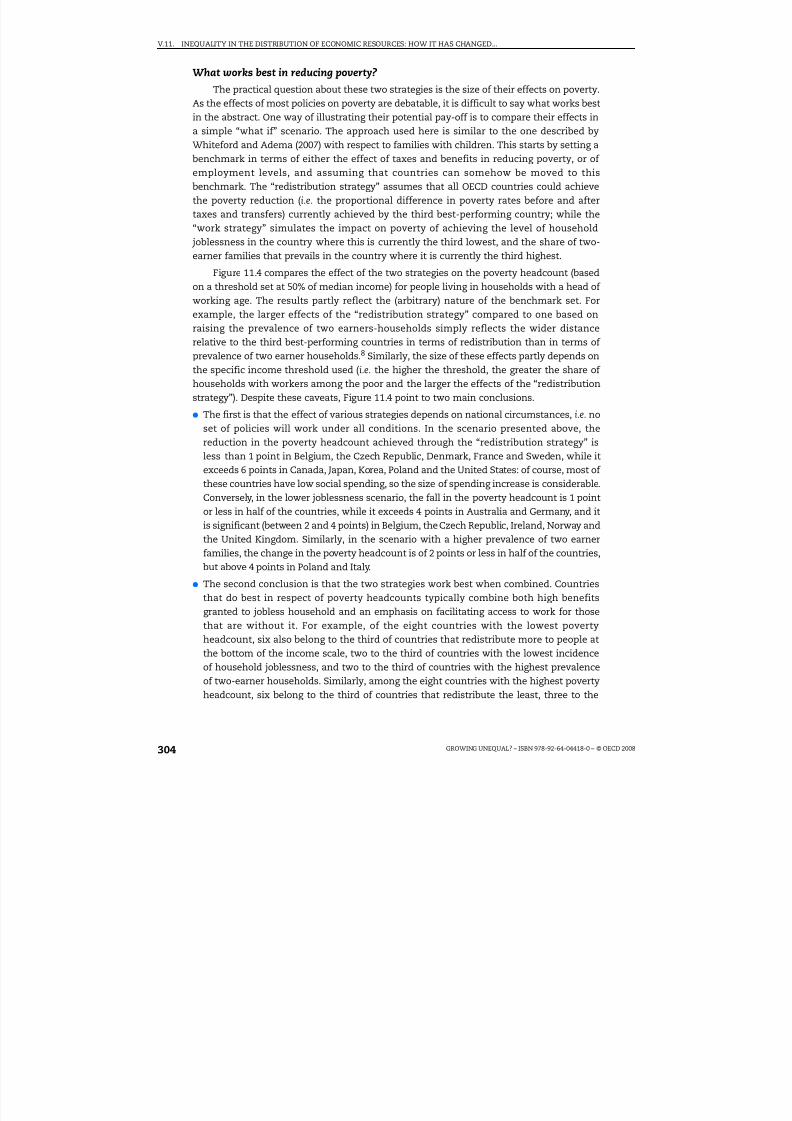
8/20/2019 Growing Unequal
http://slidepdf.com/reader/full/growing-unequal 304/309
V.11. INEQUALITY IN THE DISTRIBUTION OF ECONOMIC RESOURCES: HOW IT HAS CHANGED...
GROWING UNEQUAL? – ISBN 978-92-64-04418-0 – © OECD 2008304
What works best in reducing poverty?
The practical question about these two strategies is the size of their effects on poverty.As the effects of most policies on poverty are debatable, it is difficult to say what works bestin the abstract. One way of illustrating their potential pay-off is to compare their effects ina simple “what if” scenario. The approach used here is similar to the one described byWhiteford and Adema (2007) with respect to families with children. This starts by setting abenchmark in terms of either the effect of taxes and benefits in reducing poverty, or of employment levels, and assuming that countries can somehow be moved to thisbenchmark. The “redistribution strategy” assumes that all OECD countries could achievethe poverty reduction (i.e. the proportional difference in poverty rates before and aftertaxes and transfers) currently achieved by the third best-performing country; while the“work strategy” simulates the impact on poverty of achieving the level of household joblessness in the country where this is currently the third lowest, and the share of two-earner families that prevails in the country where it is currently the third highest.
Figure 11.4 compares the effect of the two strategies on the poverty headcount (basedon a threshold set at 50% of median income) for people living in households with a head of working age. The results partly reflect the (arbitrary) nature of the benchmark set. Forexample, the larger effects of the “redistribution strategy” compared to one based onraising the prevalence of two earners-households simply reflects the wider distancerelative to the third best-performing countries in terms of redistribution than in terms of prevalence of two earner households.8 Similarly, the size of these effects partly depends onthe specific income threshold used (i.e. the higher the threshold, the greater the share of households with workers among the poor and the larger the effects of the “redistributionstrategy”). Despite these caveats, Figure 11.4 point to two main conclusions.
● The first is that the effect of various strategies depends on national circumstances, i.e. noset of policies will work under all conditions. In the scenario presented above, thereduction in the poverty headcount achieved through the “redistribution strategy” isless than 1 point in Belgium, the Czech Republic, Denmark, France and Sweden, while itexceeds 6 points in Canada, Japan, Korea, Poland and the United States: of course, most of these countries have low social spending, so the size of spending increase is considerable.Conversely, in the lower joblessness scenario, the fall in the poverty headcount is 1 pointor less in half of the countries, while it exceeds 4 points in Australia and Germany, and itis significant (between 2 and 4 points) in Belgium, the Czech Republic, Ireland, Norway andthe United Kingdom. Similarly, in the scenario with a higher prevalence of two earner
families, the change in the poverty headcount is of 2 points or less in half of the countries,but above 4 points in Poland and Italy.
● The second conclusion is that the two strategies work best when combined. Countriesthat do best in respect of poverty headcounts typically combine both high benefitsgranted to jobless household and an emphasis on facilitating access to work for thosethat are without it. For example, of the eight countries with the lowest povertyheadcount, six also belong to the third of countries that redistribute more to people atthe bottom of the income scale, two to the third of countries with the lowest incidenceof household joblessness, and two to the third of countries with the highest prevalenceof two-earner households. Similarly, among the eight countries with the highest poverty
headcount, six belong to the third of countries that redistribute the least, three to the

8/20/2019 Growing Unequal
http://slidepdf.com/reader/full/growing-unequal 305/309
V.11. INEQUALITY IN THE DISTRIBUTION OF ECONOMIC RESOURCES: HOW IT HAS CHANGED...
GROWING UNEQUAL? – ISBN 978-92-64-04418-0 – © OECD 2008 305
Figure 11.4. Poverty reductions achieved through “redistribution”and “work” strategies, mid-2000s
Poverty rates among people living in households with a head of working age,based on a threshold set at half of median equivalised disposable income
1 2 http://dx.doi.org/10.1787/424354624210Note: Countries are ranked, from left to right, in increasing order of the actual poverty rate. The “redistributionstrategy” assumes that countries achieve the same percentage reduction in market-income poverty that is currentlyachieved by the country with the third highest reduction. The “work strategy” embodies two different variants: in thefirst, countries achieve the same prevalence of household joblessness (as measured by the share of people living inhouseholds where no one works) that is currently realised in the country with the third lowest level; in the second,countries achieve the same prevalence of two-earners families as in the country with the third highest level.Countries that perform better than the benchmark are assumed to be unchanged. Benchmarks for the “redistributionstrategy” refer to the aggregate poverty reduction. Benchmarks for the “work strategy” are specific to four householdtypes (single and two-or-more-adult households, with and without children). The scenario is limited to thosecountries where information is available on market-income poverty.
Source: Calculations based on the OECD income distribution questionnaire.
F R A
D N K
S W E
F I N
A U T
C Z E
N O R
L U X C H
E I S L
G B R
B E L
N L D
S V K
K O R A U
S I T A
D E U
N Z L
J P N
C A N
I R L
U S A
20
16
12
8
4
0
%
20
16
12
8
4
0
%
P O L
F R A
D N K
S W E
F I N
A U T
C Z E
N O R
L U X C H
E I S L
G B R
B E L
N L D
S V K
K O R A U
S I T A
D E U
N Z L
J P N
C A N
I R L
U S A
P O L
Redistribution strategy
More redistribution Actual poverty rate
Work strategy
Higher share of two-earners couples
Lower joblessnessActual poverty rate
O E C
D - 2 4
O E C
D - 2 4

8/20/2019 Growing Unequal
http://slidepdf.com/reader/full/growing-unequal 306/309
V.11. INEQUALITY IN THE DISTRIBUTION OF ECONOMIC RESOURCES: HOW IT HAS CHANGED...
GROWING UNEQUAL? – ISBN 978-92-64-04418-0 – © OECD 2008306
third of countries with the highest prevalence of joblessness and three to the third of countries with the lowest prevalence of two-earner households. This suggests that both
access to work and redistribution are important to reduce poverty.
A final consideration is that the two strategies described here are not two polesopposing each other but part of a continuum of options. Disincentive effects of the“redistribution strategy” are especially large when it takes the form of paying subsidies topeople who are not working. But as the risk of poverty shifts to households with someearnings, successful inroads into poverty can increasingly rely on programmes that top-upthe earnings of low paid workers. Such schemes are important as it is not enough to movepeople from the welfare rolls into poorly-paid jobs that do not provide them or theirfamilies with a viable route out of poverty. To achieve lasting reductions in poverty, policiesneed to insure that the people concerned keep these jobs (many currently do not), that theearnings paid are high enough to escape poverty (which does not always happen) and thatthese workers progress towards better jobs (which typically requires training and humancapital accumulation). To this end, measures to promote “welfare-in-work” could includeemployment-conditional benefits granted to low-paid workers according to their familycharacteristics, wage subsidies to employers for hiring or retaining low-paid workers,portable retraining and health care, measures to enable and promote up-skilling, as well asservices that allow parents to reconcile work and care – though flexible working patterns,access to quality and affordable child care, and changes in the organisation of schools to fitthe needs of working families.
These considerations suggest that addressing concerns about economic inequalitiesrequires both a shift in emphasis in social programmes and a balanced set of interventions.Making “work” the centrepiece of efforts to reduce poverty and inequality recognises that
a narrower distribution of economic resources is better achieved through subsidies tolow-paid workers than through payments for not working, and that transfers to those withno jobs are more effective when supported by services aimed at moving them frombenefits to work. The need for balance stems from the recognition that some people facemore deep-seated obstacles to participating in the labour markets than others, that many jobs do not pay wages adequate to escape poverty, and that, anyway, children cannot beheld responsible for the sins of their parents (Ringen, 2007).
Conclusion
Whatever the mix of intervention chosen, society's goal of reducing economic
inequalities – at least when these are perceived as conflicting with shared norms of whatis fair in society – should be clearly formulated and given the place they deserve within therange of goals that governments pursue. While the specific formulation of these objectiveswill differ across countries – ranging from poverty goals for children (as in the UnitedKingdom) or for the population at large (as in Ireland), to goals referring to the growth in asuitable measure of household income (e.g. the median)9 – what matters is that these areset clearly, that policies in all fields (e.g. fiscal, health and education) are assessed for theircontribution to their attainment, and that governments are accountable for their successor failures in achieving them. Monitoring the achievement of these goals requires anadequate statistical infrastructure and suitable indicators in each country, as well as
comparative data to assess the influence of common and country-specific factors on theirevolution. For all these reasons, the information presented in this report is critical fordesigning better policies to promote growth that is more equitable.

8/20/2019 Growing Unequal
http://slidepdf.com/reader/full/growing-unequal 307/309
V.11. INEQUALITY IN THE DISTRIBUTION OF ECONOMIC RESOURCES: HOW IT HAS CHANGED...
GROWING UNEQUAL? – ISBN 978-92-64-04418-0 – © OECD 2008 307
Notes
1. The average change of the Gini coefficient over the past two decades is equivalent to around 15%of the gap in income inequality that separates Denmark from the United States; in the case of theinter-decile ratio (P90/P10), the average change over this period is equivalent to less than 10% of thegap between the same two countries.
2. Data for Belgium for 1983 and 1995 are based on fiscal data and are not strictly comparable withthose for later years (see note 7, page 148). In particular, estimates of changes in poverty are likelyto be downward biased compared to other national surveys.
3. Childbearing decisions are an important determinant of household size and – when fertility ratesevolve differently across the income distribution – they will also affect income inequalities. Onaverage, fertility rates have declined slightly more at the bottom and middle of the incomedistribution than at the top, especially in the United States and most European countries, with theopposite pattern occurring in Mexico, Poland and Sweden. A stronger decline in fertility rates atthe bottom of the income distribution allows these household to spread the available resourcesover a smaller number of people; this will dampen the increase in income inequality relative towhat it would otherwise have been.
4. Among the features that most immediately impact on these distributive impacts are the zeroVAT-rate on food in Australia and the United Kingdom. Other mechanisms – which may becaptured through income surveys – are VAT-credits targeted to low-income households (as inCanada) or cash transfers used to compensate low-income groups following the introduction of VAT (as in New Zealand).
5. Ideally, a comprehensive assessment of all government activities on the distribution of householdincomes would consider all these flows simultaneously. In practice, this is difficult, as the datarequirements are daunting. Based on a variant of the “what if” scenario presented above, thecombined effect of public in-kind services and consumption taxes may narrow the incomedistribution by 0.05 point on average, but by much more in Australia, Sweden, the United States,Italy, New Zealand and Portugal and by much less in the Netherlands, Luxembourg, Turkey, Finlandand Greece (Warren, 2008).
6. Public in-kind services may also be especially important to reduce income poverty. In Japan, forexample, including the value of childcare services in household income would lower child poverty
by more than 2 points (from around 14% to 12%).7. The most obvious dimensions of equity in education are ensuring a basic minimum standard of
educational competencies to all students; and ensuring that personal and family circumstances donot become an obstacle to achieving their educational potential. Cross-country differences inthese respects are large (OECD, 2007a). Differences are also important when looking at healthinequalities, whether these are measured by the dispersion in the age of death or in terms of mortality differentials between groups of people with different education or social class withincountries (OECD, 2007b).
8. For example, the median country achieves less redistribution than the third best performing oneby around 13 points, while its level of household joblessness is around 4 points higher than thethird best performing country, and the prevalence of two-earners households is around eightpoints lower.
9. Atkinson (2007) recommends that “when reporting the change in living standards the OECD andnational governments should measure the change in median income … This simple change shouldnot … be controversial; its implications are however far-reaching. It means that the macroeconomicdiscourse would have to consider the distributional implications of policy. It would require theacquisition of distributional information alongside the national accounts”.
References
Arjona, R., M. Ladaique and M. Pearson (2001), “Growth, Inequality and Social Protection”, OECDLabour Market and Social Policy Occasional Paper, No. 51, OECD, Paris.
Atkinson, T. (2007), “EU Social Policy, the Lisbon Agenda and Re-Imagining Social Policy”, HendersonOration, Centre for Public Policy Conference, 21-22 February, Melbourne.
Boarini, R., A. Johansson and M. Mira d’Ercole (2006), “Alternative Measures of Well-being”, OECDEconomics Department Working Paper, No. 476 and OECD Social, Employment and MigrationWorking Paper, No. 33, OECD, Paris.

8/20/2019 Growing Unequal
http://slidepdf.com/reader/full/growing-unequal 308/309
V.11. INEQUALITY IN THE DISTRIBUTION OF ECONOMIC RESOURCES: HOW IT HAS CHANGED...
GROWING UNEQUAL? – ISBN 978-92-64-04418-0 – © OECD 2008308
Förster, M. and M. Mira d’Ercole (2005), “Income Distribution and Poverty in OECD Countries in theSecond Half of the 1990s”, OECD Social, Employment and Migration Working Paper No. 22, OECD,Paris.
Kenworthy, L. (2007), “Jobs with Equality”, mimeo.
OECD (2005), Extending Opportunities for All – How Active Social Policy Can Benefit Us All, OECD, Paris.
OECD (2007a), No More Failures: Ten Steps to Equity in Education, OECD, Paris.OECD (2007b), Society at a Glance – OECD Social Indicators 2006, OECD, Paris.
Whiteford P. and W. Adema (2007),What Works Best in Reducing Child Poverty: A Benefit or WorkStrategy?, OECD Social, Employment and Migration Working Paper, No. 52, OECD, Paris.
Ringen, S. (2007), “What Do Families Do?”, Chapter 5 in What Democracy Is For?, Princeton University Press.
Ståhlberg A.-C. (2007), “Redistribution across the Life Course in Social Protection Systems: AnOverview”, Modernising Social Policy for the New Life Course, OECD, Paris.
Warren, N. (2008), “A Review of Studies on the Distributional Impact of Consumption Taxes in OECDCountries”, OECD Social, Employment and Migration Working Paper, No. 64, OECD, Paris.

8/20/2019 Growing Unequal
http://slidepdf.com/reader/full/growing-unequal 309/309