hierarchy branding promotional - international … of sale.pdf · colour the first thing you...
TRANSCRIPT


BRANDING PROMOTIONAL
SIGNAGE HIERARCHY
INFORMATION
PERMANENT CONSISTENT
SEMI – PERMANENT SHOULD LINK TO
BRANDING
DISPOSABLE CHANGES FOR
EACH PROMOTION

Branding helps you stand out from your
competitors, add value to your offer and engage
with your customers

The term ‘brand’ originates from the days when
farmers used to brand their cattle to register ownership
of their herd. Before long the brand began to
represent not just the owner but their values and
quality of their product; it became a mark of security
and trust.

If Coca-Cola were to lose all of its production-related assets in a disaster, the company would survive. By contrast, if all consumers were to have a sudden lapse of memory and forget everything related to Coca-Cola, the company would go out of business.
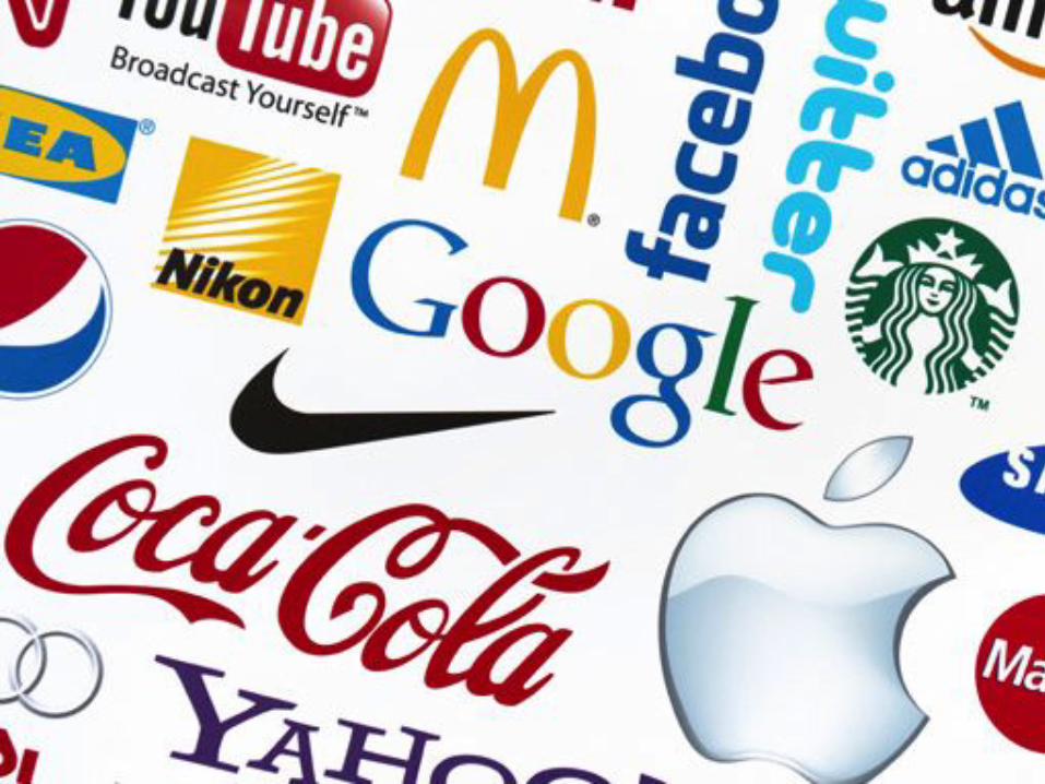
A BRAND IS MORE THAN A NAME

Colour The first thing you remember about a brand may well be its colour. Think Cadbury's Dairy Milk purple, Coca-Cola's red or Guinness's black and cream. Colour makes your product recognisable and its important that any packaging designer's response to a brief conveys understanding on what the colours they use will convey, and whether they are going to sit with or challenge convention. Sometimes the most-effective packs are the most simple. Multiple colours on a pack can be both distracting to the customer and costly to produce, which is why colour rationalisation is becoming increasingly popular.

Story Building a story into the packaging of a product is becoming increasingly popular way to convey provenance and brand essence. Doing so allows consumers to connect with the product on an emotional level.

Illustrustrations
Selecting an illustration or image can strentghen your branding image. In fact the illustration can become the brand icon and be as strong on its on!

The Same is True of Shops/Restaurants

BRANDING DOESN’T STOP AT THE FRONT DOOR

TOP TIPS FOR BRANDING Include your Mission, values and vision It should mark you distinctively It could carry on beyond one shop There is a brand colour palette There is a brand story Ensure your supporting illustrations are memorable and distinctive alone Once you have your branding design use it to strongly identify your store exterior Carry this brand image throughout the store and on all your marketing materials

Point&of&Sale&Marke/ng&Materials&&Point&of&Sale&(POS)&materials&are&used&for&execu6ng&adver6sing&campaigns,&exhibi6ons&and&presenta6ons.&As&an&effec6ve&marke6ng&tool,&well&thought&out&and&properly&presented&POS&materials&aCract&consumer&aCen6on&and&promote&the&brand.&Due&to&their&appealing&and&informa6ve&nature,&POS&materials&are&capable&of&s6mula6ng&purchases&directly&at&the&point&of&sale.&&The&crea6on&of&POS&materials&is&a&comprehensive&process&and&involves&the&following:&&Idea&development/Design&Produc6on&(prin6ng&and&product&development)&Posi6oning&inIstore&&&

SIGNAGE DESIGN
PERMANENT SIGNS SHOULD MATCH TO
BRAND DESIGN
ALL SIGNS SHOULD HAVE A
SPECIFIC PURPOSE
COMPLEMENT YOUR VISION/
MISSION COMMUNICATE
CLEARLY
ACHIEVE THE DESIRED RESULT
PROMOTIONAL SIGNS SHOULD SUIT THE
EVENT AND RELATE TO BRAND
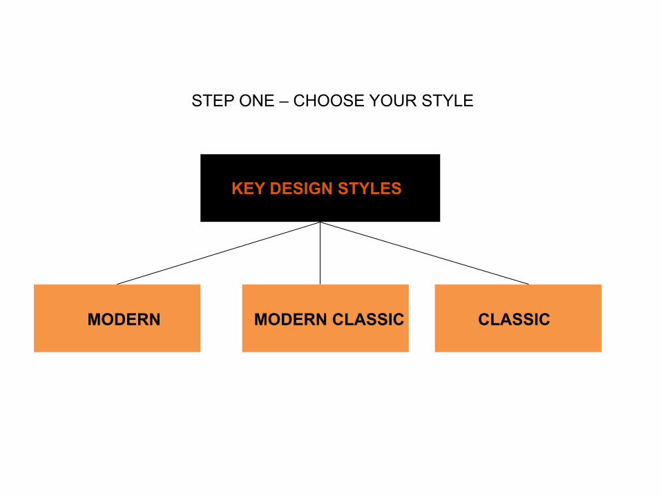
3 KEY DESIGN STYLES
MODERN MODERN CLASSIC CLASSIC
STEP ONE – CHOOSE YOUR STYLE

MODERN
CLEAN MINIMAL SIMPLE

MODERN CLASSIC
STYLISH HOMELY NOT RISKY MODERN YET NOT COLD

CLASSIC
RICH WARM DETAILED TRADITIONAL
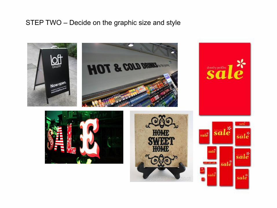
STEP TWO – Decide on the graphic size and style

STEP THREE – Create the design brief If you can afford to, get a professional designer to artwork your graphics and use your design brief to explain the purpose, size, quantity and quality you require Or create them yourself using Powerpoint or Word and buy inexpensive images or illustrations from istock to create your desired look Convert to [save as] a PDF file which any printer can then use to print from Keep to simple formats Print using the best paper for the type of event. Short events /thinner paper. Longer or reusable events use thicker card.

STEP FOUR – Use the right holder

STEP FOUR – Use the right holder

STEP FOUR – Use the right holder

ALTERNATIVES TO PRINT – sign writing

ALTERNATIVES TO PRINT – sign writing

ALTERNATIVES TO PRINT – A Boards

ALTERNATIVES TO PRINT – vinyl decals

ALTERNATIVES TO PRINT – vinyl decals
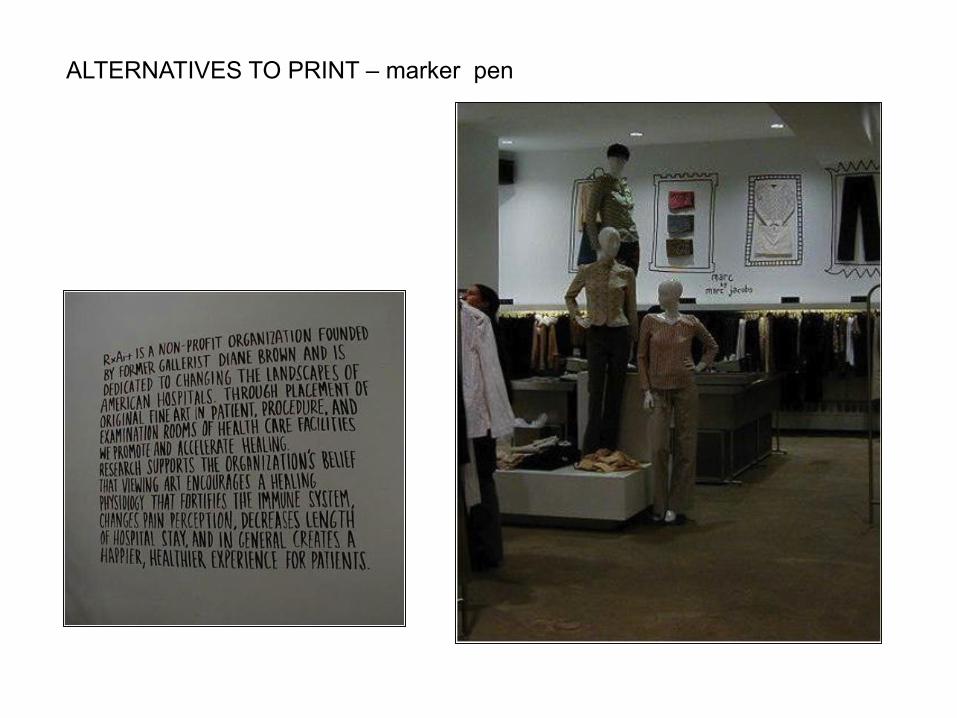
ALTERNATIVES TO PRINT – marker pen

ALTERNATIVES TO PRINT - stencilling

ALTERNATIVES TO PRINT – paint/marker pen

ALTERNATIVES TO PRINT – plates/mugs

ALTERNATIVES TO PRINT - chalkboards

ALTERNATIVES TO PRINT – blackboard paint

ALTERNATIVES TO PRINT – scrabble tiles

ALTERNATIVES TO PRINT – letters

ALTERNATIVES TO PRINT – 3d letters
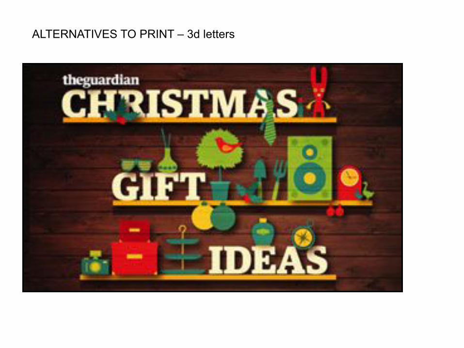
ALTERNATIVES TO PRINT – 3d letters

ALTERNATIVES TO PRINT

ALTERNATIVES TO PRINT

ALTERNATIVES TO PRINT

ALTERNATIVES TO PRINT
