hmi style guide and toolkit - static.iter.org 1/12-hmi_style_guide_and... · process that included...
TRANSCRIPT

PDF generated on 15 Jul 2015DISCLAIMER : UNCONTROLLED WHEN PRINTED – PLEASE CHECK THE STATUS OF THE DOCUMENT IN IDM
Report
HMI Style Guide and Toolkit
This guide provides simple and practical guidance to plant system Instrumentation and Control (I&C) responsible officers and designers on how to design, develop, procure, operate and maintain an effective plant system operator user interface.
Approval Process Name Action AffiliationAuthor Utzel N. 13 Jul 2015:signed IO/DG/COO/SCOD/CSD/CDCCo-AuthorsReviewers Park M.
Piccolo F. 13 Jul 2015:recommended15 Jul 2015:recommended
IO/DG/COO/SCOD/CSD/CDCIO/DG/COO/SCOD/OMA
Approver Wallander A. 15 Jul 2015:approved IO/DG/COO/SCOD/CSDDocument Security: Internal Use
RO: Yonekawa IzuruRead Access LG: CODAC team, AD: ITER, AD: External Collaborators, AD: IO_Director-General, AD: EMAB, AD:
OBS - CODAC Section (CDC), AD: Auditors, AD: ITER Management Assessor, project administrator, RO, AD: OBS - Control System Division (CSD) - EXT, AD: OBS - CODAC Section (CDC) - EXT, LG: Cryogenic Section lin...
IDM UID
3XLESZVERSION CREATED ON / VERSION / STATUS
13 Jul 2015 / 3.3 / Approved
EXTERNAL REFERENCE / VERSION

PDF generated on 15 Jul 2015DISCLAIMER : UNCONTROLLED WHEN PRINTED – PLEASE CHECK THE STATUS OF THE DOCUMENT IN IDM
Change Log
HMI Style Guide and Toolkit (3XLESZ)
Version Latest Status Issue Date Description of Change
v1.0 Approved 09 Dec 2010
v1.1 Signed 05 Jan 2011 Internal review comments integrated.
v1.2 Signed 01 Feb 2011 Footer error fixed
v2.0 Approved 10 Feb 2011 Reference to ITER Process for Human Machine Interface (HMI) Development (ITER D 3T9UK2)
v2.1 Approved 01 Feb 2013 PCDH V7 schema
v3.0 Signed 30 Jan 2015 This document sets out the designs for human-machine interfaces (HMI) that ITER personnel will use to monitor and control the ITER systems during phases of commissioning, operation, and maintenance. The ITER Human Factors Integration Plan (IHFIP) identified the need for a HMI Development Process that included this HMI design guide to achieve high user reliability, efficiency, and effectiveness by enforcing high standards for human-system interface design consistently across ITER.
v3.1 Disapproved 04 Feb 2015 Implemented the comment from Nadine on missing Pop-up boxes images.
v3.2 Approved 18 Feb 2015 Support of ITER Human Factor requirements for HMI development (QEDG6L)
v3.3 Approved 13 Jul 2015 Added requirements for area dimensions, font sizes and trace colours.
New navigation pane.
User input validation and feedback.
OPI validation tool.

ITER HMI Style Guide and Toolkit Page 1 of 31
Table of Contents
1 Introduction .........................................................................................................................21.1 PCDH Context.............................................................................................................21.2 Document Scope ..........................................................................................................21.3 Related documents ......................................................................................................21.4 Definitions....................................................................................................................31.5 HMI Style Guide .........................................................................................................31.6 HMI Toolkit.................................................................................................................3
2 Operator User Interface Layout ........................................................................................42.1 Size................................................................................................................................52.2 Status Bar ....................................................................................................................62.3 Main Display Area - Mimic........................................................................................7
2.3.1 Auxiliaries Status ..................................................................................................72.3.2 Mimic ....................................................................................................................8
2.4 Alarm Pane ..................................................................................................................92.4.1 Alarm Page .........................................................................................................10
2.5 Control Area / Faceplate Pane.................................................................................112.6 Navigation Pane ........................................................................................................14
3 Operator User Interface Detailed Design........................................................................183.1 Fonts ...........................................................................................................................183.2 Colours .......................................................................................................................183.3 Symbols ......................................................................................................................193.4 Measurement Units and Precision...........................................................................203.5 Labelling ....................................................................................................................213.6 Mimics........................................................................................................................213.7 Appearance................................................................................................................253.8 User Input ..................................................................................................................263.9 Feedback ....................................................................................................................27
4 Operator User Interface Validation.................................................................................29

ITER HMI Style Guide and Toolkit Page 2 of 31
1 Introduction
1.1 PCDH Context
The Plant Control Design Handbook (PCDH) [RD1] defines methodology, standards, specifications and interfaces applicable to ITER plant systems Instrumentation & Control (I&C) system life cycle. I&C standards are essential for ITER to:
Integrate all plant systems into one integrated control system. Maintain all plant systems after delivery acceptance. Contain cost by economy of scale.
PCDH comprises a core document which presents the plant system I&C life cycle and recaps the main rules to be applied to the plant system I&Cs for conventional controls, interlocks and safety controls. Some I&C topics will be explained in greater detail in dedicated documents associated with PCDH as presented in Figure 1-1. This document is one of them.
Core PCDH (27LH2V)Plant system control philosophyPlant system control Life CyclePlant system control specificationsCODAC interface specificationsInterlock I&C specificationSafety I&C specification
PCDH core and satellite documents: v7PS CONTROL DESIGN
Plant system I&C architecture (32GEBH)
Methodology for PS I&C specifications (353AZY)
CODAC Core System Overview (34SDZ5) INTERLOCK CONTROLS
Guidelines for PIS design (3PZ2D2)
Guidelines for PIS integration & config. (7LELG4)
Management of local interlock functions (75ZVTY)
PIS Operation and Maintenance (7L9QXR)
I&C CONVENTIONSI&C Signal and variable naming (2UT8SH)
ITER CODAC Glossary (34QECT)
ITER CODAC Acronym list (2LT73V)
PS SELF DESCRIPTION DATASelf description schema documentation (34QXCP)
CATALOGUES for PS CONTROLSlow controllers products (333J63)
Fast controller products (345X28)
Cubicle products (35LXVZ)
Integration kit for PS I&C (C8X9AE)
PS CONTROL INTEGRATIONThe CODAC -PS Interface (34V362)
PS I&C integration plan (3VVU9W) ITER alarm system management (3WCD7T)
ITER operator user interface (3XLESZ)
Guidelines for PON archiving (B7N2B7)
PS Operating State management (AC2P4J)
Guidelines for Diagnostic data structure (354SJ3)PS CONTROL DEVELOPMENT
I&C signal interface (3299VT)
PLC software engineering handbook (3QPL4H)
Guidelines for fast controllers (333K4C)
Software engineering and QA for CODAC (2NRS2K)
Guidelines for I&C cubicle configurations (4H5DW6)
CWS case study specifications (35W299)
NUCLEAR PCDH (2YNEFU)
OCCUPATIONAL SAFETY CONTROLSGuidelines for PSS design (C99J7G)
Available and approved
Legend
This document
(XXXXXX) IDM ref.
ITER operator user interface (3XLESZ)
Figure 1-1 Schema of PCDH documents
1.2 Document Scope
This guide provides simple and practical guidance to plant system Instrumentation and Control (I&C) responsible officers and designers on how to design, develop, procure, operate and maintain an effective plant system operator user interface.
1.3 Related documents
[RD1] Plant Control Design Handbook (PCDH). (27LH2V)[RD2] ITER Process for Human Machine Interface (HMI) Development (3T9UK2)[RD3] ITER Human Factor requirements for HMI development (QEDG6L)[RD4] CODAC Core System User Manual (43PSH9)

ITER HMI Style Guide and Toolkit Page 3 of 31
1.4 Definitions
Definitions as represented on Figure 1-2 include:- VDU workstation or “station” is composed of at least 3 VDUs- VDU or “monitor” 16/9 has a resolution of 3840 x 2160- Full screen display canvas within CS-Studio environment has a resolution of 3830 x 2080- A mimic resolution within the display canvas is limited to 3236 x 1760- A faceplate resolution within the display canvas is limited to 575 x 943
Figure 1-2 HMI Basic Definitions
1.5 HMI Style Guide
HMI Style Guide includes general design principles for the displays derived from [RD3]. It describes the displays layout and organisation.
1.6 HMI Toolkit
An HMI toolkit1 is delivered with CODAC Core System to edit and run displays used to control and monitor systems on the ITER site during and throughout commissioning, operation and maintenance phases. The toolkit is based on CS-Studio (CSS) set of tools that include an operator interface (BOY), an alarm system (BEAST) and an archive system (BEAUTY).
The HMI toolkit provides standardised colours and fonts, a collection of graphical objects – widgets – that the user can drag and drop from the palette to the display canvas, trend widgets, an industrial symbol library (electrical breaker, valve, pump…) and many templates.
1 This document refers to the HMI toolkit 4K/Quad HD version. Please consult [RD4] to learn how to switch from Full HD to 4K definition

ITER HMI Style Guide and Toolkit Page 4 of 31
2 Operator User Interface LayoutThe entire screen area visible to the user is the ‘display canvas’ and has the following specific zones:
Status Bar Main Display Area - mimic Alarm Pane Control Area / Faceplate Pane Navigation Pane
Figure 2-1, shows the display canvas layout running on one-terminal using CS-Studio BOY.
Figure 2-1 Display canvas layout
The root element of the screen is the ‘Display’ widget with some predefined properties, such as the position and the size2 as illustrated on Figure 2-2.
Figure 2-2 Display widget – Position properties
A macro ${TITLE} defines the mimic title as shown on Figure 2-3 and is used as widget name.
Figure 2-3 Title macro specification during edition
2 The HMI toolkit provides an automatic scaling tool to adapt Full HD screens to 4K resolution. Consult [RD4] for more information

ITER HMI Style Guide and Toolkit Page 5 of 31
At runtime, the display tab reflects the widget name as illustrated on Figure 2-4.
Figure 2-4 Title macro instantiated at runtime for the tab name
2.1 Size
The size of each specific zone of the display canvas is fixed and not adjustable by the user. The following table gives the dimensions in percentage of the available screen size:Area Title Subarea Title Width[%] Height[%]Status Bar 100 5
Global Statuses 30 5Mimic Title 55 5UTC Time 15 5
Mimic Area 85 85Navigation Area 85 10
General Navigation 20 10Mimic Navigation 65 10
Alarm Pane 15 50Faceplate Area 15 45
With the HMI toolkit provided by CODAC Core System, some extra space is required for the window, view and border management. The user available space for each container is presented on Figure 2-5.
Figure 2-5 Display canvas zones sizing

ITER HMI Style Guide and Toolkit Page 6 of 31
2.2 Status Bar
The primary purpose of the Status Bar is to provide the user with a high-level overview of ITER’s overall status and to “set the context” for the station. The status bar includes:
Global Statuses (CODAC, Central Safety System, Central Interlock System…) Mimic Title Coordinated Universal Time (UTC) 24-hour time with seconds ITER logo
Figure 2-6, shows an implementation of the status bar.
Figure 2-6 Status Bar
Global statuses and UTC time are provided in standard by CODAC as standalone screens to be linked to the user screen as illustrated on Figure 2-7.
Figure 2-7 Status Bar hierarchy of widgets
To integrate them, a linked folder <project_name>/src/main/boy/templates is provided that points to /opt/codac/opi/boy/resources/templates.
Finally, the title of the mimic is displayed in the middle of the status bar, using a Label widget which Text property refers to the title macro defined in the root Display widget as shown on Figure 2-8.
Figure 2-8 Label widget – Text property to display the title using “IO Title” font style
Global Statuses
Title UTC Time

ITER HMI Style Guide and Toolkit Page 7 of 31
2.3 Main Display Area - Mimic
Mimics present representations of the ITER plant systems, sub-systems and any other data and information necessary for user tasks. Mimics provide some control functions that allow users to interact with the plant systems.
2.3.1 Auxiliaries StatusOn the top left of the mimic, space is allocated to represent the status of auxiliaries. Figure 2-9, shows an implementation of the plant system auxiliaries status.
Figure 2-9 Auxiliaries Status
A status includes usually a LED widget that shows the Boolean status of the auxiliary:
healthy
not healthy minor
not healthy major
And a Label widget that provides the auxiliary text information using “IO Label” font3. It is recommended to group the LED and Label widgets in a container as illustrated on Figure 2-10.
3 The fonts “IO Label” and “IO Normal” are equivalent. “IO Label” is the default one and “IO Normal” is maintained for compatibility reason
Auxiliaries Statuses

ITER HMI Style Guide and Toolkit Page 8 of 31
Figure 2-10 Auxiliaries Grouping Containers organisation
2.3.2 MimicIn order to display independently a mimic on a wall panel, it is recommended to provide it as a standalone OPI screen to be linked into the canvas as illustrated on Figure 2-11.
Figure 2-11 Mimic Linked OPI
The size of the mimic is 3236 x 1760.
The mimic itself can be organised using container widgets in different layers as illustrated on Figure 2-12.
Figure 2-12 Mimic Layers
Information layerDynamic data shall be presented in the information layer and shall be easily distinguishable from the background and static data layers. This layer shall have a show/hide function for information that is not always needed for operator tasks e.g. component labels and to de-clutter mimics. Take the templates/Empty.opi as an example on how to define the show/hide tick box and the rule defined on the Information Layer container as illustrated on Figure 2-13.

ITER HMI Style Guide and Toolkit Page 9 of 31
Figure 2-13 Rule to show/hide the information layer
Priority layerAlarm information shall be presented in a priority layer where any changes are immediately brought to the operator's attention. This layer may also be used for other more urgent or higher-priority information e.g. plant equipment is out for maintenance.
Static data layer:The static data shall enable the operator to interpret the meaning of the displayed information (e.g. showing the geography and/or structure of a process).
2.4 Alarm Pane
The alarm pane reflects the alarm status of the controlled system displayed on the mimic – it is specific to each mimic. A first implementation using LED widgets is represented on Figure 2-14.
Figure 2-14 Alarm Pane
Rules and script have been defined to set the background colour according to the severity of the alarm and to display the alarm time.
Figure 2-15 shows the hierarchy of widgets organised in containers setup for maximum 20 alarm buttons.

ITER HMI Style Guide and Toolkit Page 10 of 31
Figure 2-15 Alarm Pane Widgets Hierarchy
This version of the alarm pane is subject to change as it is required to list only the active alarms as illustrated on Figure 2-16.
Figure 2-16 Future Alarm Pane
2.4.1 Alarm PageThe function of the Alarm Pane is to attract immediate attention of the user to the specific alarm. Clicking on the alarm will open a dedicated screen for alarm handling and investigation.
Figure 2-17 presents an alarm page with the alarm description and procedure, including all relevant data for analysis displayed using trend widgets.
This first implementation does not allow to directly acknowledge the alarm – the control area is disabled. The alarm dedicated display (BEAST) has to be used instead on a second VDU.

ITER HMI Style Guide and Toolkit Page 11 of 31
Figure 2-17 Alarm Page
Trend widgets
Alarm response procedure with user inputs
Control Area
Alarm Description

ITER HMI Style Guide and Toolkit Page 12 of 31
2.5 Control Area / Faceplate Pane
Each controllable component on a mimic shall have a ‘faceplate’ to provide information about the component and options to control it.
Figure 2-18, shows an implementation of a faceplate displayed when the user clicks on a valve symbol.
Figure 2-18 Faceplate
The faceplate is displayed within a linking container provided by CODAC as shown on Figure 2-19, which reacts to user click on the controllable component to load the specified faceplate and to instantiate the component macro.
Figure 2-19 Faceplate Linking Container
An action shall be defined on each controllable component to load its faceplate as illustrated on Figure 2-20. This action writes in a predefined variable loc://$(DID)_FACEPLATE("") the relative path to the faceplate OPI and specify the component name using the macro ${COMPONENT}. In the following example, writing the value faceplates/AnalogComponent.opi COMPONENT=VG-1100 into the PV name loc://$(DID)_FACEPLATE("") will ask the CODAC linking container ControlPane.opi to load faceplates/AnalogComponent.opi and instantiate the macro ${COMPONENT} with the name of the component VG-1100. In addition, the widget named VG-1100 will be highlighted.
Controllable component
selected
Faceplate

ITER HMI Style Guide and Toolkit Page 13 of 31
Figure 2-20 Action to load a faceplate on user click
It is recommended to setup a dedicated folder for the faceplates within the I&C project under src/main/boy as shown on Figure 2-21.
Figure 2-21 faceplates folder within the I&C project under src/main/boy
In this case the relative path to the faceplate from the templates folder looks like../faceplates/Diris.opi COMPONENT=UTIL-S15-BG07:MUT1.
This src/main/boy/faceplates folder can be organised with sub-folders such as pictures and scripts.
Faceplates are designed with tabs:
Status: read-only fields providing information on the status of the component Trends: trend widgets displaying historic and live data Controls: input fields controlling the component Help: containing information about the specific component. Links to datasheet, documentation
and information about the physical location of the component are available from this tab.
Some faceplates have been made available under the templates folder, as reported on Figure 2-22. Scripts are also provided to illustrate user input validation and submission to the process – cf. Error! Reference source not found..

ITER HMI Style Guide and Toolkit Page 14 of 31
Figure 2-22 Faceplate AnalogComponent.opi Tab Container – Status, Trends, Controls, Help
Fonts to be used within the faceplate are:
Subarea Font FamilyName of the component IO LabelTitle of the Tab IO SubtitleTitle of Container (Grouping Container) IO TitleValues and Label IO LabelInput Box IO LabelText in Buttons IO LabelTrend Title IO SubTitleAxis values in Trends IO Scale 3Axis Title in Trends IO Label 3
Table 1: Font style used in faceplates

ITER HMI Style Guide and Toolkit Page 15 of 31
2.6 Navigation Pane
The mimics for plant system users are arranged in a hierarchical structure to allow the user to navigate through the plant system to specific mimics based on the Control Breakdown Structure (CBS), and this in 5 clicks maximum. The navigation pane is divided into two areas:
General Navigation area with the current location of the mimic and up buttons Mimic Navigation which contains the link to other relevant displays.
The following screenshots report an example of the navigation principles4.
Figure 2-23 ITER machine overview (CBS0)
Figure 2-24 UTIL overview (CBS1)
4 Some navigation buttons are greyed out because they are currently not available. The mimics shown in the pictures are for illustrative purposes only.
Current position = Home
CBS1 buttons
Home up buttonCurrent CBS1
CBS2 buttons

ITER HMI Style Guide and Toolkit Page 16 of 31
Figure 2-25 UTIL overview (CBS2)
An automatic CBS map is made available via a right-click on any navigation button and using the option Actions -> Display OPIs Map. The map as shown on Figure 2-26 lists the breakdown of the user interface and by clicking on any line, it is possible to open directly the related screen.
Figure 2-26 OPIs Map
Home and CBS1 up buttonsCurrent CBS2 CBS3 buttons

ITER HMI Style Guide and Toolkit Page 17 of 31
The navigation pane is displayed within a linking container provided by CODAC as shown on Figure 2-27, which parses a navigation XML file describing the breakdown.
Figure 2-27 Navigation Pane linking container
SDD generates automatically under a dedicated navigation folder the XML configuration file for an I&C project based on the declared CBS and functions. Canvas screens are also generated automatically as illustrated on Figure 2-28.
ITER.opi Home screen for CBS0 ITER[-{CBS1}].opi CBS1
canvas screen to be completed ITER[-{CBS1}][-{CBS2}].opi CBS2
canvas screen to be completed ITER[-{CBS1}][-{CBS2}]}][-{CBS3}].opi
CBS3 canvas screen to be completed
Figure 2-28 Navigation XML configuration file and canvas screens generated by SDD
It is possible to customise the navigation from CBS3. You can take the demo example from CSS -> opi -> resources -> Demo -> navigation (linked folder to /opt/codac/opi/boy/resources/Demo/navigation) to check how this can be acheived.
ITER HMI Style Guide and Toolkit Page 18 of 31
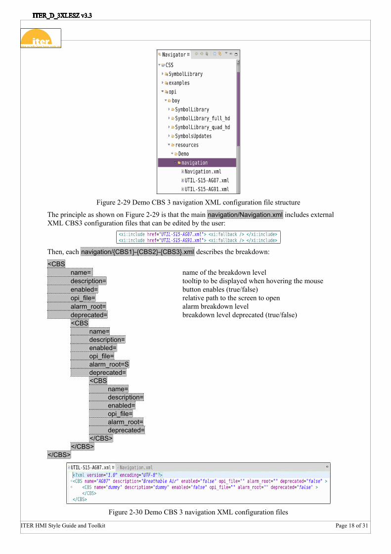
Figure 2-29 Demo CBS 3 navigation XML configuration file structure
The principle as shown on Figure 2-29 is that the main navigation/Navigation.xml includes external XML CBS3 configuration files that can be edited by the user:
Then, each navigation/{CBS1}-{CBS2}-{CBS3}.xml describes the breakdown:
<CBS name= name of the breakdown leveldescription= tooltip to be displayed when hovering the mouseenabled= button enables (true/false)opi_file= relative path to the screen to openalarm_root= alarm breakdown leveldeprecated= breakdown level deprecated (true/false)<CBS
name=description=enabled=opi_file=alarm_root=Sdeprecated=<CBS
name=description=enabled=opi_file=alarm_root=deprecated=
</CBS></CBS>
</CBS>
Figure 2-30 Demo CBS 3 navigation XML configuration files

ITER HMI Style Guide and Toolkit Page 19 of 31
3 Operator User Interface Detailed DesignThe HMI toolkit includes fonts and colours definition, templates and examples of all necessary graphic widgets and elements to implement an operator user interface that meets the style guide requirements. During the detailed design, the developer will drag and drop widgets from the palette to the canvas, adjust few properties such as the process variable name and keep the standardised settings in order to achieve a consistent look and feel of the interface.
3.1 FontsStyles are predefined and cannot be adjusted by the user. Most of the widgets come with the font already configured. Styles that are permitted for the different types of information to be presented to the user are the following and are illustrated on Figure 3-1:
IO Title and IO Subtitle for headers and critical operational information, IO Label for operational information (e.g. labels, numerical data) presented in mimics and
faceplates. This the default font for most of the widgets, IO Scale for graph axis.
Figure 3-1 Fonts
3.2 ColoursColours are predefined and cannot be adjusted by the user. Most of the widgets come with the background and foreground colours already configured. As illustrated on Figure 3-2, the main colours are the following:
IO Background colour for the mimics5
IO Foreground colour for the text and line IO Invalid Level Alarm, IO High Level Alarm and IO Medium Level Alarm colours used in
conjunction with the ‘background alarm sensitive = yes’ property IO PV OFF and IO PV ON colours for symbol in 0, 1 or more than 1 position
5 The Menu bar, alarm pane, control area and navigation pane use a different background colour to enlighten them. This “IO Area Background” colour shall not be used for another purpose

ITER HMI Style Guide and Toolkit Page 20 of 31
Figure 3-2 Colours
3.3 SymbolsSymbols are predefined and cannot be redesigned. Browse the installed library to select the required component when inserting a Boolean or multistate symbol on the canvas.
Screens describing the library are provided in the HMI toolkit as illustrated on Figure 3-3 as well as electrical and PID diagram examples - Figure 3-4 and Figure 3-5.
Figure 3-3 Valve Fluid Symbols

ITER HMI Style Guide and Toolkit Page 21 of 31
Figure 3-4 Medium Voltage Switchgear Example
Figure 3-5 PID Water Cooling Example
3.4 Measurement Units and PrecisionMeasurement units are standardised. Widgets used to displayed process variable value, retrieve and show the unit as well as the precision from the EPICS PV. No measurement unit and no precision should be hardcoded in the HMI.
ITER HMI Style Guide and Toolkit Page 22 of 31
Figure 3-6 Measurement Unit Example
3.5 LabellingLabel widgets are predefined to be left-justified.
Figure 3-7 Labelling Example
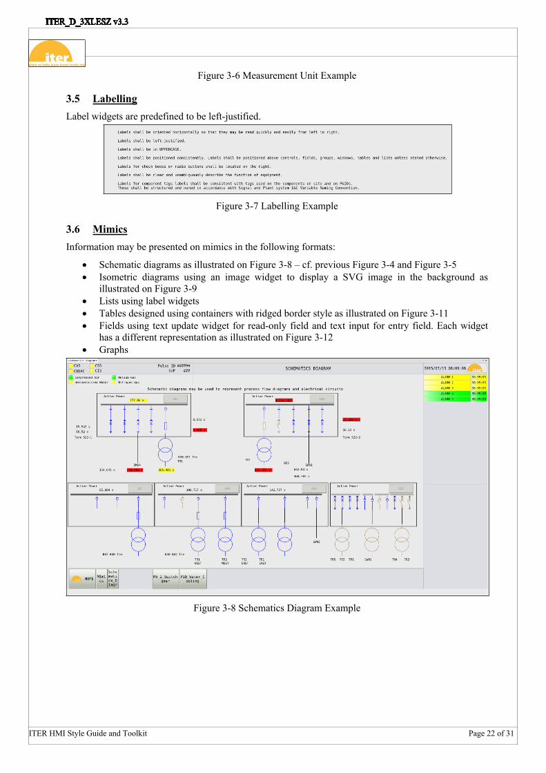
3.6 MimicsInformation may be presented on mimics in the following formats:
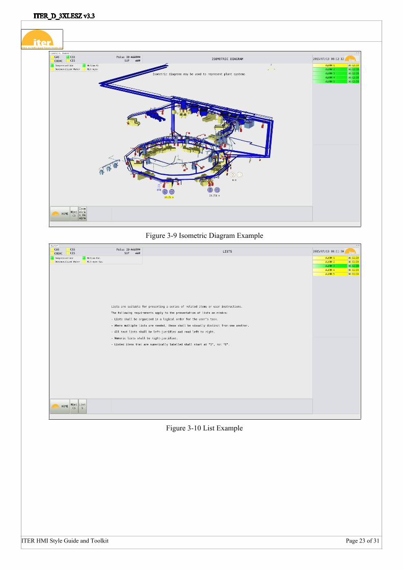
Schematic diagrams as illustrated on Figure 3-8 – cf. previous Figure 3-4 and Figure 3-5 Isometric diagrams using an image widget to display a SVG image in the background as
illustrated on Figure 3-9 Lists using label widgets Tables designed using containers with ridged border style as illustrated on Figure 3-11 Fields using text update widget for read-only field and text input for entry field. Each widget
has a different representation as illustrated on Figure 3-12 Graphs
Figure 3-8 Schematics Diagram Example
ITER HMI Style Guide and Toolkit Page 23 of 31
Figure 3-9 Isometric Diagram Example
Figure 3-10 List Example

ITER HMI Style Guide and Toolkit Page 24 of 31
Figure 3-11 Table Example
Figure 3-12 Fields Example

ITER HMI Style Guide and Toolkit Page 25 of 31
Figure 3-13 Graphs Example up to 8 traces
Trace colour shall use one of the eight predefined trace colours – IO Trace 1 to IO Trace 8, as illustrated on Figure 3-14.
Figure 3-14 Traces Coding
By default, an XY Graph has a title and shows the legend as represented on Figure 3-15.

ITER HMI Style Guide and Toolkit Page 26 of 31
Figure 3-15 XY Graph Widget Standard Layout
Fonts to be used within the XY Graph are:
Subarea Font FamilyTitle IO SubtitleAxis values in Trends IO ScaleAxis Title in Trends IO Label
Table 2: Font style used in faceplates
Figure 3-16 provides the look and feel of all the available widgets in the HMI toolkit, including:
Graphics: label, image, ellipse, rectangle, polyline… Monitors: text update, LED, progress bar, tank… Controls: text input, action button, Boolean button, choice button, combo box and check box… Symbols: Boolean symbol and multistate symbol
Figure 3-16 Widgets library
3.7 AppearanceAll mimics shall have a consistent appearance.
- Mimic size shall be fixed and not adjustable by the user (3236 x 1760)- Displayed information shall be presented from left to right and begin at the top- Information and controls used in emergency conditions shall be grouped separately to those
used for normal operations- All necessary information required for handling the worst case scenario shall be presented on a
single page- The density of information on each page shall not appear overly cluttered to the user. The
density of information on pages used for critical task sequences shall be lower than on other information pages
- The use of scrolling on mimics is not permitted- Corresponding information on diagrams shall be placed in the same relative position in all
similar instances- Information and controls shall be grouped in relation to the user’s task and their objectives, and

ITER HMI Style Guide and Toolkit Page 27 of 31
relate to operating procedures- Options shall be grouped in conventional or natural grouping according to the user’s task.

ITER HMI Style Guide and Toolkit Page 28 of 31
For example:
- Information and controls shall be presented in the sequence of how they will be used. - Information and controls used most frequently shall be positioned at the top of the display. - Highest priority information and controls shall be placed in the most accessible position within
groups and on pages
For rapid and accurate searching, groups of controls and/or information shall not exceed 6 lines in vertical length top to bottom and 12 characters in width
Controls shall be placed below indications. Where this is not practicable, the control shall be placed on the right of the indication.
3.8 User InputLists, tables and graphs shall present read-only information.
The system shall automatically input data that is already available or provide defaults by reading feedback from the process for example.
Users shall be able to change process variables or component state in schematic diagrams, isometric diagrams and entry fields. Users shall be able to click on the relevant component to open the component’s faceplate and control the component.
Users shall be able to modify or cancel an input prior to executing an action.
If it is possible without damage to the system or to data, users shall be provided with a means to suspend and cancel operations in progress.
The system shall automatically validate user input data before the action is processed and an indication of the potential problem shall be provided before the failure occurs. Figure 3-17, Figure 3-18 and Figure 3-19 illustrate user input validation where the user enters a manual position in an input field.
Figure 3-17 User Input Error
Figure 3-18 User Input Warning

ITER HMI Style Guide and Toolkit Page 29 of 31
Figure 3-19 User Input Validated OK
The validation JavaScript validate_<pv_name>.js shall be placed under a scripts subfolder as illustrated on Figure 3-20. The script is executed when the user press enter after entering the new input.
Figure 3-20 User Input Validated OK
The user can modify the input (Input) and validate it again by pressing enter, compare it to the current status from the process (InputSt) and only after pressing the button Submit, the action will be executed.
System self-correcting features that detect and automatically correct user errors are not permitted for control actions.
Where possible, users shall not be responsible for control actions that result in destructive consequences.
3.9 FeedbackThe system shall have sufficient response time to provide feedback about the outcome of mimic control operations during or immediately following those operations.
Following a control action, the mimic shall provide the user with the following feedback:
- That the system has received the variable change command, has processed it and accepted the command.
- The variable is in the process of changing. The form of feedback needs to indicate what is changing, e.g. if the valve is closing or opening. The status of valves, open, closed or travelling needs to be visible.
- Confirmation that the change is complete and the system state is as requested.

ITER HMI Style Guide and Toolkit Page 30 of 31
Figure 3-21 illustrates the submission to the process of a new Input position 110 which requires a confirmation from the user.
Figure 3-21 User Input Submission
After confirmation, Figure 3-22 shows that the process accepted the input (InputSt = Input) and the current measured variable Position is changing – flashing in yellow. While the action is ongoing, it is no more possible to modify the input and submit the change. A demonstration of cancelling the ongoing action will be provided in the next release.
Figure 3-22 User Input Feedback
When the action is finished, Input, InputSt and Position are all equal.
Figure 3-23 User Input Feedback

ITER HMI Style Guide and Toolkit Page 31 of 31
4 Operator User Interface ValidationOPI Validation tool built on the Eclipse's validation framework provides means to validate and quickly fix existing OPI files with regards to ITER OPI schema. Validation can be invoked manually on an OPI file or group of OPI files by invoking the Validate contextual menu item via a right-click. Manually invoking validation will run validation in the background.
When validation is completed, a validation results dialog is displayed, and any problems found will be shown in the Problems view as illustrated on Figure 4-1.
To open the Problems view, select Problems from the menu bar Window -> Show View -> Other... -> General -> Problems.
Double-clicking on an error/warning/info message in this view opens the respective editor (OPI Editor or OPI Runtime) and highlights the failing widget.
Finally, from the Problems view, fixes can be applied on one or many error/warning messages by invoking the Quick fix contextual menu item. A confirmation is asked for making a backup before applying the fix.
After the quick fix is completed, the modified OPI files are revalidated.
Figure 4-1 Operator User Interface Validation Results