how do hospitals respond to managed care? evidence …al3045/ajin-lee-jmp.pdf · how do hospitals...
TRANSCRIPT

How Do Hospitals Respond to Managed Care?
Evidence from At-Risk Newborns∗
Ajin Lee†
Job Market Paper
This version: November 2016For the most recent version, please go to: http://bit.ly/2eTWWB7
Abstract
Medicaid, the largest public health insurance program in the US, has transitioned from a fee-for-servicesystem (FFS) primarily administered by the government to a managed care system (MMC) administeredby private insurers over the last few decades. I examine how hospitals’ responses to financial incentivesunder these two systems affect hospital costs and newborn health outcomes. I analyze the universe ofinpatient discharge records across New York State from 1995-2013, totaling 4.5 million births. First,I exploit an arbitrary determinant of MMC enrollment: infants weighing less than 1,200 grams wereexcluded from MMC and were instead served through FFS. Using a regression discontinuity design, Ifind that newborns enrolled in MMC stayed fewer days in hospitals and thus had less expensive visitsrelative to newborns enrolled in FFS. The cost difference is driven by birth hospitals retaining morenewborns enrolled in FFS while transferring away those enrolled in MMC. I find that MMC had limitedimpacts on newborn health, measured by in-hospital mortality and hospital readmission. Hospitalstended to transfer out MMC newborns only when a high-quality hospital was nearby, which resulted inthese infants receiving uncompromised care. Second, I exploit county-level rollout of the MMC mandateto examine impacts on the full population of infants using a difference-in-difference design. I find thathospitals achieved a similar rate of cost savings as for infants over the 1,200-gram threshold, while lengthof stay, the probability of transfer, and mortality did not change following the mandate. This findingsuggests that there are alternative, successful methods by which hospitals reduce costs under MMC,including for high-risk deliveries.
∗I am grateful to Douglas Almond, Kate Ho, Wojciech Kopczuk, and Amy Ellen Schwartz for their invaluable support andhelpful suggestions. I also thank Hyuncheol Bryant Kim, Yogita Shamdasani, Boris Vabson, and the applied microeconomicscolloquium participants at Columbia University. I use the State Inpatient Databases from the Healthcare Cost and Utiliza-tion Project (HCUP), Agency for Healthcare Research and Quality, provided by the Maryland Health Services Cost ReviewCommission, the New Jersey Department of Health, and the New York State Department of Health. I also use the AmericanHospital Association (AHA) Annual Survey Database. I thank Jean Roth at the National Bureau of Economic Research forassistance with the data.†Columbia University: [email protected]
1

1 Introduction
Health care spending in the US is notoriously high. In 2014, the US government spent $1.1 trillion on
public health insurance programs. 40% of US children are covered by Medicaid, the means-tested health
insurance program funded by states and the federal government. To reduce costs, Medicaid has transitioned
from the traditional fee-for-service (FFS) system administered by the government to the Medicaid Managed
Care (MMC) system administered by private insurers – up from 10% of Medicaid enrollees in the early 1990s
to 74% by 2013 [Duggan and Hayford 2013; CMS 2015a]. This transition is expected to continue as several
states expand their MMC programs. Despite this systematic change, the existing literature finds mixed
impacts of MMC on both cost and health outcomes, providing little support for the transition to MMC.
This paper examines whether MMC can incentivize hospitals to reduce costs without compromising
patient health. I exploit variation in the probability of MMC enrollment at a birth weight cutoff: infants
weighing less than 1,200 grams (2 pounds, 10 ounces) were excluded from mandatory enrollment in MMC
in New York State and were instead served through the traditional FFS system [NYSDOH, 2000, 2001]. I
compare infants whose birth weight falls just below the threshold and thus enroll in FFS with infants whose
birth weight falls just above the threshold and thus enroll in MMC in a regression discontinuity (RD) design.
While local, my estimates are important because they focus on the most expensive newborn deliveries.
Infants that weigh below 1,200 grams account for one percent of the total newborn population but incur
approximately one-third of total newborn hospital costs. This suggests that potential cost savings relative to
FFS are large. Moreover, infants around the cutoff are at-risk newborns whose health outcomes are highly
dependent on the quality of care. The mortality rate of infants near the threshold is ten times higher than
the overall rate. If MMC compromises the quality of care, cost savings might be traded off against health
outcomes.
Under the traditional FFS system, Medicaid reimburses hospitals directly for each service that they
provide. The fact that costs were not seen by hospitals may have encouraged over-provision of care with
dubious health benefits [Hackbarth et al. 2008; Arrow et al. 2009]. Under MMC, Medicaid pays a fixed
fee per month per enrollee to intermediary health plans that reimburse hospitals. This fixed fee structure
under MMC incentivizes health plans to: (1) cut down unnecessary care in order to minimize cost; and (2)
keep their enrollees healthy so as to avoid incurring future costs. A priori, MMC’s incentive structure might
restrain the excesses of FFS. In practice, MMC may fail to achieve its intended goals for several reasons.
First, MMC may lead to under-provision of care. “Churning,” the phenomenon of beneficiaries cycling in and
out of Medicaid, reduces the incentive of health plans to promote the long-term health of their enrollees. The
2

reduced incentive to manage the quality of care can result in adverse health outcomes. Second, the success of
MMC is contingent on hospitals’ financial incentives. Since MMC does not govern contracts between health
plans and hospitals, it is unclear how the actual providers of care would respond to the incentives of MMC.
Focusing on hospital discharge records from New York City, I find that infants above the 1,200-gram
threshold are 23 percentage points more likely to participate in MMC compared to infants below the thresh-
old. I also find that they have discontinuously shorter lengths of stay and thereby have less expensive visits
compared to infants below the threshold. The cost difference is driven by birth hospitals transferring more
infants above the threshold to other short-term hospitals while holding onto lucrative infants below the
threshold. Tracking infants across hospitals, I find that the cumulative length of stay and hospital costs
are still lower above the threshold. These differences suggest that hospitals internalize financial incentives
to reduce costs for MMC infants. I provide additional evidence that financial incentives do indeed drive
these hospital responses. Consistent with a profit maximization problem of hospitals, effects are stronger
when hospitals’ spatial constraints bind (i.e., when they have few Neonatal Intensive Care Unit (NICU) beds
available) and when potential receiving hospitals have spare capacity. In addition, the effects are stronger
for infants with high expected costs of treatment.
Although costs and care change, I find limited evidence that the reduced amount of care provided to
infants above the threshold results in worse health outcomes, as measured by individual-level mortality
during hospitalization and the incidence of hospital readmission following the birth episode. I show that
receiving hospitals are on average bigger and better-equipped than birth hospitals. Consequently, infants
enrolled in MMC are likely to be transferred away; however, these transfers occur to higher-quality hospitals,
resulting in minimum harm to health. These results suggest that MMC reallocates at-risk newborns from a
lower-quality hospital to a higher-quality hospital.
I propose a mechanism through which hospitals might engage in such behavior in response to MMC:
efficient coordination of care between local hospitals. In contrast to the above findings in New York City,
I show that there are no differences between MMC and FFS in counties outside of New York City. This
suggests that the structure of local health care markets may impact how hospitals respond to MMC. In
particular, I consider distance from a birth hospital to a high-quality hospital with a NICU as a possible
factor driving the differences between New York City and upstate counties. I find that hospitals are in fact
more responsive to MMC when they have a high-quality hospital nearby, even within New York City. This
suggests that even if MMC motivates hospitals to selectively transfer infants to maximize their profits, the
cost of timely transfers may outweigh the financial benefit for some hospitals due to the lack of an efficient
coordination system.
As is well known, RD estimates apply to those with a high probability of being near the threshold [Lee
3

and Lemieux, 2010] and may not apply to other subpopulations. To address this, I exploit the rollout of the
MMC mandate across counties in New York State in a difference-in-difference (DD) framework. I find that
the DD estimates are comparable to my RD estimates for low birth weight infants. For infants with higher
birth weight, I also find that hospitals achieve a similar level of cost reductions without affecting mortality.
However, length of stay and the probability of transfer do not change for this group following the MMC
mandate, suggesting that hospitals adjust the amount of care conditional on retaining these infants.
I also consider the average characteristics of “compliers” for both RD and DD models. Compliers for the
RD model are infants who are induced to enroll in MMC due to exceeding the birth weight threshold at
1,200 grams. Compliers for the DD model are infants who are induced to enroll in MMC due to living in a
county at the time of the MMC mandate rollout. I find that two groups of compliers are quite different. For
example, compliers in the RD model stay in hospitals that have more beds, staff, and equipment compared
to compliers in the DD model, who also have much higher birth weight. This suggests that treatment
effects for these two models could differ since hospitals with varying observable characteristics may respond
differently to incentives associated with MMC. Indeed, the means by which cost reductions are achieved
differ. Nevertheless, the overarching finding of lower cost but similar health outcomes under MMC persists.
The remainder of the paper is organized as follows. Section 2 discusses my contributions to the related
literature. Section 3 provides relevant institutional details. Section 4 describes my data and presents de-
scriptive statistics. Section 5 describes the main empirical strategy, while Section 6 presents the main RD
estimates and discusses the mechanism. To further understand hospitals’ financial incentives, Section 7 ex-
plores three sources of heterogeneity: capacity at birth hospitals, capacity at potential receiving hospitals,
and expected costs of treatment. Section 8 discusses several specification and robustness checks of the main
results. Section 9 presents the DD estimates and compares complier characteristics between the DD and RD
estimates. Section 10 discusses cost implications and Section 11 concludes.
2 Contributions to the Relevant Literature
This section summarizes the relevant literature and discusses my contributions. The current literature on
MMC has three limitations. First, there is no consensus on the effects of MMC as the findings in the literature
are mixed. Second, few papers focus directly on provider-level responses, thus limiting our understanding of
the mechanisms. Third, most papers focus on relatively healthier subpopulations who might have little room
for cost reductions and health improvements. This paper attempts to address each of these three points.
First, I utilize a type of variation that has not been previously explored to identify the effects of MMC.
I exploit a discontinuous exclusion from MMC enrollment based on birth weight in an RD framework. To
4

complement my RD strategy, I also estimate a DD model using county-level rollout of the MMC mandate
in New York State. Moreover, I compute mean characteristics of compliers for both RD and DD models to
further understand the differences between these two models.
Several papers use local MMC mandates as an exogenous source of variation in a DD framework, but
the findings are mixed. For instance, Duggan [2004] focuses on the impact on Medicaid expenditures using a
local MMC mandate in California as a source of variation. He finds that an MMC mandate in California led
to an increase in government spending with no health improvement, suggesting that MMC in fact decreased
the program efficiency. His findings, however, do not always apply to a similar study in other states. For
example, Harman et al. [2014] show that the MMC mandate in Florida led to a reduction in Medicaid
expenditures. On the other hand, using datasets that represent a national sample, Herring and Adams
[2011] and Duggan and Hayford [2013] find no overall effects on expenditures.
Similarly, the findings on the effects of MMC on health outcomes are also inconclusive. Several papers
focus on pregnant women and infants as they account for a large share of Medicaid beneficiaries. Aizer
et al. [2007] examine prenatal care and birth outcomes in California and find that MMC actually decreased
the quality of prenatal care and increased the incidence of low birth weight, pre-term births, and neonatal
mortality.1 Their findings suggest that providers can respond to MMC by limiting care for certain sub-
populations, resulting in adverse effects on health.2 On the contrary, some of the earlier findings suggest
improvements in prenatal care [Krieger et al. 1992; Levinson and Ullman 1998; Howell et al. 2004].
Second, I focus on hospital responses to MMC and propose a hospital-level mechanism through which
MMC can achieve its goals. Few papers in the literature directly discuss mechanisms and most focus on health
plans’ incentives. Duggan and Hayford [2013] show that states with high baseline Medicaid reimbursement
rates achieved savings, suggesting the government’s ability to negotiate lower prices with health plans as
a mechanism for reducing health care expenditures under MMC.3 In addition, Van Parys [2015] examines
Florida’s 2006 Medicaid reform and discusses that the types of competing health plans in regional health
care markets affect how health plans reduce costs. Although it is useful to understand plan-level incentives,
the lack of attention on provider-level incentives limits our understanding of how MMC can influence actual
provider practice.4
1Conover et al. [2001] also find that MMC led to poor prenatal care and negative birth outcomes (lower Apgar scores,but no effect on infant mortality). In addition, Kaestner et al. [2005] document similar findings—poor prenatal care and birthoutcomes—but show that their estimates are unlikely to be causal.
2Kuziemko et al. [2013] provide evidence on risk-selection under MMC. They find that the transition from FFS to MMCwidened black-Hispanic (i.e., high- and low-cost infants) disparities in birth outcomes, suggesting that health plans shift theirresources towards low-cost enrollees.
3Their findings are consistent with the literature on managed care in the private insurance market. For example, Cutleret al. [2000] examine the effects of managed care on price and quantity of health care for the privately insured, focusing onpatients with heart disease. They show that unit prices (i.e., reimbursement payments) are lower under managed care than thetraditional indemnity insurance, while they find relative modest differences in quantity (i.e., treatment patterns) and healthoutcomes.
4Marton et al. [2014] discusses how plans reimburse providers greatly affects the reduction in utilization and spending,
5

Third, I focus on a high-cost subpopulation - low birth weight infants. Newborns are one of the costliest
populations treated in US hospitals. In 2011, aggregate hospital costs on newborns were ranked on top
among those billed to Medicaid and private insurance [HCUP, 2013]. In particular, as Figure 1 shows, only
around 1% of infants weighed less than 1,200 grams at birth, but they accounted for 22.3% of total costs
between 1995 and 2013 in New York State. The literature focuses on relatively healthier subpopulations
because most of the local MMC mandates exclude disabled subpopulations and high-cost procedures are
often carved out of benefit packages.5 As a number of states have begun to expand MMC to those with
critical conditions [Iglehart 2011; Libersky et al. 2013; KFF 2015], however, it is timely and policy-relevant
to understand whether MMC can successfully deliver medical care to these populations.
This paper is also related to the literature on hospital responses to a change in prices.6 Dafny [2005]
shows that hospitals “upcode” patients to take advantage of large price increases for certain diagnoses.7
Acemoglu and Finkelstein [2008] find a large increase in capital-labor ratios following a reform that decreased
reimbursement for labor input. Shigeoka and Fushimi [2014] find an increase in NICU utilization following
a reform that made it more profitable in Japan. I contribute to this literature by examining how hospitals
respond to a change in reimbursement rates for severely ill patients.
Moreover, this paper is related to the literature on returns to early life medical care. Almond et al.
[2010] estimate marginal returns to medical care in early life using the very low birth weight classification
at 1,500 grams and find that the higher level of medical care below the threshold results in lower mortality.
Bharadwaj et al. [2013] use the same identification strategy and find that more medical care in early life
leads to higher test scores in the long-term. I focus on a different cutoff at 1,200 grams to examine how
different reimbursement methods affect hospitals and early life health care.
3 Background
In this section, I provide institutional details on MMC in New York State focusing on newborns. Section
3.1 describes mandatory enrollment in MMC in New York State and discusses imperfect compliance with
the mandate. Section 3.2 describes the exclusion of newborns from mandatory enrollment in MMC based on
birth weight. Section 3.3 discusses hospital payments under FFS versus MMC in treating low birth weight
infants.
suggesting that provider-level incentives play a key role in the success of MMC.5One exception is the Florida’s Medicaid reform that Van Parys [2015] studies. Florida required disabled beneficiaries
who received Medicaid through Supplemental Security Income (SSI) to enroll in MMC. However, Van Parys [2015] does notseparately focus on examining the effects of MMC on this disabled subpopulation.
6Some papers focus on physicians’ financial incentives. For example, see Clemens and Gottlieb [2014].7See also Sacarny [2014] & Geruso and Layton [2015].
6

3.1 Mandatory MMC Enrollment in New York State
Medicaid beneficiaries in New York State are generally required to enroll in a managed care plan. The
mandatory enrollment in MMC was phased in starting October 1997 in Albany and four other upstate
counties. In New York City, the MMC mandate was introduced in August 1999 and was fully implemented
in September 2002. As of November 2012, MMC was mandated in all 62 counties. However, the actual share
of Medicaid recipients enrolled in MMC falls short of 100%. In July 2015, two and a half years after the full
implementation, only 78% of the New York State Medicaid population were enrolled in MMC while the rest
were still enrolled in FFS.8
Figure 2 shows the trends in the share of infants covered by Medicaid in New York State using inpatient
discharge records. Medicaid coverage has increased over time, and around half of all births were financed
through Medicaid in 2013. The composition of Medicaid coverage has changed dramatically over the study
period. In 1995, only about 5% of total Medicaid infants were covered by Health Maintenance Organizations
(HMOs), a type of managed care organizations (MCOs), while the rest 95% were covered by non-HMO. By
2013, 83% of total Medicaid infants were enrolled in HMOs, and the rest 17% were served through non-HMO.
I use Medicaid HMO and MMC interchangeably in the remainder of the paper based on the comparison
between the managed care penetration published by Centers for Medicare & Medicaid Services (CMS) and
the share of Medicaid infants enrolled in HMO in my sample.9
The share covered by HMO is not 100% even after the statewide implementation of the mandate due
to three reasons. First and foremost, there are a few infants who are still covered by Medicaid FFS due to
exclusions and exemptions from the MMC enrollment. I exploit one of the exclusions for my identification
strategy, which I describe further in the following section. Second, some infants who are newly enrolled in
Medicaid might show up as having the FFS coverage in the discharge records at birth, in case their parents
fail to enroll their child in a managed care plan in a timely manner.10 Third, even for infants who are subject
to mandatory enrollment, the implementation might not be perfect or immediate due to some administrative
shortcomings.
8http://kff.org/medicaid/state-indicator/share-of-medicaid-population-covered-under-different-delivery-systems/
9According to CMS [2015], the Medicaid managed care penetration rate in New York State increased from 61.5% in 2005to 76.7% in 2011. In my sample of infants in New York State, the share of Medicaid infants enrolled in HMO increased from62.1% in 2005 to 76.2% in 2011. This suggests that Medicaid HMO is a good measure of the total MMC participation in NewYork State.
10Newly enrolled Medicaid beneficiaries are given 90 days to choose a health plan.
7

3.2 Exclusion Below the 1,200 Grams Birth Weight Threshold
Infants born to pregnant women who are receiving Medicaid on the date of delivery are automatically
eligible for Medicaid for one year. If the mother is enrolled in a health plan that provides an MMC option,
the child is automatically enrolled in the mother’s plan in most cases. When the infant weighs less than
1,200 grams, however, the system receives an alert with an indicator from the hospital noting that the infant
should not be enrolled with an MCO for the first six months of their lives. They are instead served through
the FFS system. This creates a discontinuous exclusion from MMC based on birth weight, which I exploit
in an RD framework to estimate the causal effects of MMC in comparison to FFS.
These infants with very low birth weight were excluded from MMC enrollment along with other subpop-
ulations that are medically complicated and expensive to treat. For example, nursing home residents and
people residing in state psychiatric facilities were also excluded from MMC enrollment during the study pe-
riod [Sparer, 2008]. Given the high costs of treatment and clinical complications, these groups were excluded
initially due to several concerns raised by both health plans and beneficiaries. Health plans had little expe-
rience with severely ill subpopulations and lacked the coordinated delivery system for them. Beneficiaries
were also concerned about inadequate provider networks under MMC.
However, the state has been gradually phasing in mandatory enrollment into MMC for these subpopu-
lations, mainly for greater cost savings. As part of the Medicaid Redesign Team (MRT) initiatives, infants
weighing less than 1,200 grams at birth have been no longer excluded from MMC enrollment since April
2012.11 Therefore, this paper has direct policy implications on whether MMC can achieve cost reductions
without harming health outcomes of critically ill newborns.
3.3 Hospital Payments Under FFS Versus MMC
Under FFS, hospitals are directly reimbursed by Medicaid in a uniform manner. In New York State, the
Medicaid program uses a Diagnosis Related Group (DRG) to reimburse health care providers for inpatient
services they provide to FFS enrollees. Each inpatient visit is classified into a DRG based on patient
conditions, and Medicaid pays a fixed rate to hospitals according to the DRG assigned to the patient [Quinn,
2008].
Under MMC, Medicaid pays health plans a flat fee per month per enrollee (i.e., capitation) and health
plans are responsible for reimbursing hospitals for inpatient services. Therefore, hospital payments under
MMC vary depending on contractual details between health plans and hospitals. Health plans choose a wide
range of methods in reimbursing providers, from a fee-for-service method to capitation. For inpatient services
11http://www.health.ny.gov/health_care/medicaid/program/update/2012/2012-02.htm#infants
8

associated with newborn medical care, however, most health plans in New York State use a fee-for-service
method using DRGs.
Since health plans have an incentive to reduce costs given the fixed revenue structure, the fee-for-service
payments to hospitals under MMC are likely lower than the hospital payments under FFS. According to
the New York State Department of Health (NYSDOH), the actual hospital payments under FFS are in fact
higher than the suggested hospital payments under MMC.12 This suggests that hospitals may face clear
incentives to reduce the amount of care for infants enrolled in MMC who would bring in smaller profits
compared to infants enrolled in FFS. Refer to Appendix Section A for further details on hospital payments.
4 Data
For my main analysis, I use inpatient discharge records from State Inpatient Databases (SID) of Health-
care Cost and Utilization Project (HCUP) for New York State from 1995-2013.13 This dataset contains the
universe of inpatient discharge records, thus almost all births. This dataset contains critical information
for my identification strategy such as birth weight in grams and primary expected payer. I examine the
effects of MMC on various measures of inpatient care including total charges, length of stay (LOS), transfer,
and mortality during hospitalization. Starting 2003, New York State Inpatient Databases include encrypted
person identifiers that enable researchers to identify multiple hospital visits of the same patient over time.
This allows me to distinguish births, transfers, and subsequent visits.
In addition, I use American Hospital Association (AHA) Annual Survey of Hospitals from 1995-2013.14
This dataset contains detailed information on hospitals such as hospital names, location, staff, and facilities.
I use these various hospital characteristics to understand the mechanism through which MMC affects hospital
practice.
Table 1 provides summary statistics of my main analysis sample, infants in New York State from 2003-
2011. I focus on periods between 2003 and 2011 to exploit encrypted person identifiers to track patients over
time and to exclude the periods when the exclusion was no longer valid. Among the full sample of newborns
in the first column, 43% of the total 2 million discharge records are financed by Medicaid. Within Medicaid,
62% of infants are covered by HMO.
Total charges are list prices for all services provided at the facility to each discharge record. The list price
for a given service is the same for all patients regardless of their insurance status. Discounts are applied to
12The suggested hospital payments are intended to be used as base rates where adjustments can be made based onthe contracts between health plans and hospitals (http://www.health.ny.gov/facilities/hospital/reimbursement/apr-drg/rates/ffs/index.htm).
13Data access to HCUP was provided by the National Bureau of Economic Research (NBER).14Access to AHA was also granted by NBER.
9

list prices for actual payments based on contractual details between each insurer and hospital. Although
total charges are not the exact payments made by insurers, they are a good proxy for the amount of services
provided to a given patient. Total costs are total charges multiplied by hospital-year-specific cost-to-charge
ratios. This measure is considered to better reflect how much hospital services actually cost. Total costs are
considerably lower than total charges, $3,500 compared to $9,609 on average.15 In the full sample, infants
stay on average four days in the hospital. Death is a rare event, around 0.3%. Around 1% of the total
newborns experience transfers, and 10% stay in a NICU facility.
The last two columns show means for the sample near the 1,200-gram threshold. Below the threshold,
95% of Medicaid beneficiaries are enrolled in a non-HMO category, which indicates that the exclusion is
implemented fairly well. Hospital visits are highly expensive for these very low birth weight infants. Total
charges are over $200,000 below and $145,000 above the threshold. Total costs are also high, $75,758 below
and $52,670 above the threshold. These infants stay hospitalized for more than a month on average. Mortality
is also greater than the full sample, which is around 5% below the threshold and 2% above the threshold.
Transfers occur for more than 10% of these infants, and the majority of them utilize NICU (74-75%).
5 Empirical Strategy
To examine the effects of MMC in comparison to FFS, I exploit the 1,200-gram threshold in a regression
discontinuity design. That is, I compare infants whose birth weight falls just below the 1,200-gram threshold
and thus are served through Medicaid FFS to infants whose birth weight falls just above the threshold and
thus are enrolled in MMC. I estimate the following regression to examine the first stage effect of exceeding the
threshold on MMC participation. Then, I proceed to examine the reduced-form effects on several discharge
outcomes Yi:
Yi = α+ βDi + f(Xi) + φy + φm + ψc + ui (1)
where i denotes a discharge record. Di is a binary variable that takes one if the birth weight of a record i
is greater than or equal to 1,200 grams. Xi indicates a running variable, which is birth weight centered at
1,200 grams. I control for a trend in birth weight with a linear spline, f(Xi) = Xi + DiXi. Additionally,
to increase precision, I control for admission year fixed effects (φy), admission month fixed effects (φm), and
hospital county fixed effects (ψc). Excluding these additional controls has little impact on the results.
For bandwidth selection, I employ a bandwidth selection method proposed by Calonico et al. [2014] for
each outcome. This method suggests a bandwidth ranging from 100 to 200 grams for my main outcome
15All monetary values are in 2011 dollars adjusted by CPI-U.
10

variables. I estimate these models with Ordinary Least Squares (i.e., local linear regressions with a uniform
kernel). In the tables, I specify the bandwidth used for each estimation and report the RD estimate β with
robust standard errors.16 As a robustness check, I additionally examine whether the estimates are sensitive
to a range of bandwidth choices and functional forms of f(Xi).
The main identifying assumption of my RD design is that control over birth weight is imprecise [Lee
and Lemieux, 2010]. Figure 3 shows the frequency of discharge records by birth weight. Panel (a) plots the
histogram using one-gram bins. There are large heaps at multiples of 10 and smaller heaps at multiples of
5, most likely due to rounding in reporting. Other than that, however, there is little evidence of irregular
heaps around 1,200 grams. Panel (b) plots the same information using 20-gram bins along with local linear
regression fitted lines. For figures, I estimate local linear regressions using the triangular kernel and a
bandwidth of 150, separately for below and above the threshold. Again, it shows that the mean frequency
is smooth across the threshold. McCrary [2008] test also indicates that the discontinuity estimate is not
statistically significant at the 5% level.
In addition, I test whether birth weight is manipulated for infants with high expected costs. Specifically,
I compute predicted list prices from regressing total charges on principal diagnosis and principal procedure
fixed effects. I then divide the sample by quartiles of the predicted list prices. I find no evidence of heaping
across the distribution, even for infants in the top quartile of expected costs (Appendix figure C.1). Taken
together, I find no evidence of manipulation around the 1,200-gram threshold.
Additionally, I repeat the estimations dropping infants at 1,200 grams (“donut RD”) to test whether the
tendency to round to 1,200 grams is correlated with other characteristics that are also correlated with my
outcomes [Barreca et al., 2011]. I find that my results are robust to this restriction, suggesting that the
observed heaps are likely random and thus do not interfere with identification.17
To further test the validity of the RD design, I examine whether observed predetermined characteristics
are similar around the threshold. Since it is difficult to accurately predict birth weight prior to delivery,
predetermined characteristics of patients and birth hospitals are unlikely to change discontinuously across
the threshold. Table 2 summarizes the RD estimates for these baseline characteristics. As expected, none of
the estimates are statistically significant, indicating that the exclusion in fact created random variation in
enrollment into MMC.
16Clustering standard errors at the birth weight level does not affect the results [Card and Lee, 2008].17My results are also robust to excluding other large heaps and to restricting the estimations to large heaps only.
11

6 Main Results
In this section, I present main results separately for New York City in Section 6.1 and for counties outside
of New York City in Section 6.2. Section 6.3 considers proximity to a high-quality hospital as a potential
mechanism behind the main findings.
6.1 New York City
6.1.1 Provider Practice Outcomes
Since treatment at birth can change the course of subsequent hospital care, I distinguish visits at birth
from subsequent visits. Panel A of Table 3 shows the RD estimates at birth hospitals and Figure 4 presents
the corresponding figures. Consistent with the policy, panel (a) of Figure 4 shows that the MMC participation
rate discontinuously increases above the threshold. This corresponds to an increase of 23 percentage points,
which constructs a fuzzy RD design.18 The MMC participation rate below the threshold is close to zero,
which indicates that the exclusion from MMC enrollment based on birth weight is strictly implemented.
I show that the higher MMC rate is associated with shorter length of stay, lower charges and costs,
consistent with hospitals’ incentives to reduce the amount of care for infants enrolled in MMC. Column 2 of
Table 3 shows that length of stay drops by 12% above the threshold.19 The large reduction in length of stay
results in lower charges and lower costs by similar magnitudes.
The reduction in length of stay could be driven by (1) faster routine discharges from a birth hospital or
(2) transfers from a birth hospital to another facility for additional care. I first examine the transfer decision.
An inter-hospital transfer is an option for infants who require specialized or intensive care if they are born
in inadequately-equipped facilities. For infants below the threshold, hospitals have an incentive to retain
them to extract higher payments. However, since the risk of treating the infants at relatively inadequate
facilities may be too great further below the threshold, hospitals would keep the healthiest among the infants
enrolled in FFS, those right below the threshold. For infants above the threshold, this incentive essentially
disappears, and hospitals would rather have an incentive to transfer them. I find that the probability of
transfer to another short-term hospital in fact increases by 2.4 percentage points above the threshold. In
addition, panel (e) of Figure 4 shows that the effect is driven by the lower likelihood of transfer right below
18The composition of Medicaid beneficiaries might be affected due to differential selection into Medicaid following the MMCmandate. The managed care mandate can make Medicaid participation more appealing for infants above the threshold, while itdoes not affect those below the threshold as they are excluded from the mandate. For instance, assuming the quality of care ishigher under managed care, some families who otherwise would not participate in Medicaid might decide to enroll in Medicaid[Currie and Fahr, 2005]. To minimize selection, I do not restrict my estimation to Medicaid participants.
19To be specific, I use log(length of stay+1) as the outcome. Using the inverse hyperbolic sine transformation to avoid addingan arbitrary number one yields the same result.
12

the threshold.20
I examine whether the shorter length of stay is driven by faster routine discharges by focusing on infants
who are routinely discharged from birth hospitals. I find no effects on length of stay or cost measures for
this group of infants (e.g., RD estimate for log(length of stay): -0.017; standard error: 0.026). Note that
infants who are routinely discharged below the threshold are not comparable to those above the threshold
due to the differential probability of transfer across the threshold. Nevertheless, a smooth linear fit around
the threshold (Appendix Figures C.2) suggests that transfers are likely the main driver of the reduction in
length of stay at birth hospitals.
The majority of transfers occur soon after birth. In my sample, 70% of transfers occur within the first
three days after birth (Figure 6). Additionally, health plans have limited control over hospitals’ decisions
on neonatal transfers. Due to the emergency of neonatal transfers, prior authorization by insurers is not
required [NYSDOH, 2016]. This suggests that transfer decisions are essentially made by hospitals. Moreover,
hospitals that receive transferred infants in my sample are “higher-quality” hospitals. Figure 7 compares mean
characteristics of birth hospitals and receiving hospitals. Receiving hospitals on average have more beds,
physicians, and nurses. They are more likely to be teaching hospitals and more likely to have a NICU facility.
These hospital characteristics suggest that infants in my sample are generally transferred to higher-quality
hospitals that are bigger and better-equipped.
Exploiting the encrypted person identifiers, I further examine how MMC affects subsequent care provided
to infants around the birth weight threshold. Panel B of Table 3 shows the effects on individual-level
outcomes that aggregate outcomes at birth hospitals with outcomes at subsequent visits including transfers
(if transferred). The corresponding figures are shown in Figure 5.
I find that the magnitudes of the shorter length of stay, lower charges, and costs are smaller when
aggregating the amount of care provided at subsequent visits. However, length of stay is still shorter above
the threshold by 9% and the estimate is marginally significant at the 10% level. When including hospital
fixed effects (panel C of Table 3), the point estimates barely change but precision increases. This suggests
that the effects in fact come from within-hospital differences in treatment depending on the infant’s insurance
status. With hospital fixed effects, the 9% reduction in total costs becomes marginally significant.
6.1.2 Health Outcomes
In this section, I test whether the reduced amount of care provided to infants above the threshold
results in worse health outcomes. First, I examine mortality at birth hospitals. If FFS infants receive more
20I examine other dispositions such as transfer to other facilities (e.g., skilled nursing facility, intermediate care facility) andhome health care, but I find no effects on these measures.
13

resources than MMC infants even among those who remain at birth hospitals, there may be negative health
consequences for infants enrolled in MMC at birth hospitals. I find that the point estimate is positive but
insignificant (RD estimate: 0.019; robust standard error: 0.016). However, since the probability of transfer
changes at the threshold, there may be selection into who remains at birth hospitals, which can differentially
affect the probability of death across the threshold.
Subsequently, I track the infants over time and estimate the probability of hospital readmission and
individual-level mortality during hospitalization (columns 5 and 6 of Table 3 panel B). If the reduced amount
of care provided to infants above the threshold at birth was inadequate, the probability of hospital readmission
might be higher above the threshold. I find no evidence of that: the point estimate on hospital readmission
is zero and statistically insignificant (RD estimate: -0.000; robust standard error: 0.021). This suggests that
the reduction in total length of stay at birth may have improved efficiency by cutting down unnecessarily
long stays.
The point estimate on individual-level mortality, however, is positive and large although statistically
insignificant (RD estimate: 0.015; robust standard error: 0.016). In addition, it is only slightly lower than
the estimate at birth hospitals, suggesting that the difference in mortality at birth hospitals are unlikely
driven by selection. This is not surprising since more than half of all deaths I observe occur within the first
three days following birth. This result suggests a potential shift in resources at birth hospitals from infants
above the threshold towards infants below the threshold. Nevertheless, given limited precision, it is hard to
conclude that MMC had significant impacts on health outcomes.21
Additionally, I examine various outcomes associated with the quality of care and patient health, including
hospital readmission due to preventable conditions,22 level IV NICU stays, utilization of occupational therapy,
physical therapy, respiratory therapy, and speech therapy services (Appendix Table D.1). I do not detect any
statistically significant effect on these measures except for one outcome. For utilization of physical therapy
services, I find an increase of 4 percentage points above the threshold, suggesting that if anything MMC may
be associated the higher quality of care.
6.2 Rest of the State
In this section, I repeat the estimations for counties outside of New York City. Table 4 summarizes the
effects on discharge outcomes at birth hospitals (panel A) and aggregated outcomes at the individual level
(panel B). Appendix Figures C.3 and C.4 show the corresponding figures.
In counties outside of New York City, I find few differences between MMC and FFS. The probability
21Adding various controls (e.g., diagnosis fixed effects) does not reduce standard errors of my mortality outcomes.22I follow the definition of avoidable hospitalizations in Parker and Schoendorf [2000] and Dafny and Gruber [2005].
14

of MMC participation increases discontinuously at the threshold by 15 percentage points, which is slightly
lower than the New York City estimate. Panel (a) of Appendix Figure C.3 shows that the Medicaid HMO
participation is close to zero below the threshold, while it jumps discontinuously to around 20% above the
threshold. Unlike New York City, however, I find no effects on all other discharge outcomes in this sample.
The estimates are positive and imprecise. Figures also show little evidence of discontinuous changes in
outcomes across the threshold.
The lack of effects on discharge outcomes outside of New York City suggests that local health care markets
may play a role in hospital responses to MMC. Since New York City is unique in many aspects compared to
the rest of the state, there could be numerous channels through which MMC affects hospitals. For instance,
the number of plans is much larger in New York City compared to the rest of the state, which could affect
the level of competition in local health care markets and thus the strength of incentives to reduce costs and
improve quality.23 The density of local health care markets can also have an impact on hospital practice style
by allowing hospitals to coordinate the provision of care to local patients. In Section 6.3, I pay particular
attention to the role of proximity between hospitals in understanding this geographical heterogeneity.
6.3 Potential Mechanism
In this section, I consider proximity to a potential receiving hospital as a potential mechanism that drives
the differences between New York City and the rest of the state. The idea is that costs of transfer may be
lower in New York City due to shorter distances between hospitals. The costs may include transportation
costs, transaction costs between originating and receiving hospitals, and potential harm to infants’ health.
There are risks associated neonatal transfers,24 and the literature documents that the longer duration of
transport is associated with increased neonatal mortality [Mori et al., 2007] and poor physiologic status of
newborns [Arora et al., 2014].
In particular, I focus on the distance from a birth hospital to a hospital with a NICU as a potential
receiving hospital. Focusing on hospitals with a NICU is a natural choice since the majority of infants near
the threshold utilize NICU. To illustrate the geographical difference between New York City and the rest of
the state, I first measure straight-line distances. Specifically, I geocode the center point of each hospital zip
code and compute the distance from a birth hospital to the nearest hospital that provides a NICU facility.
The distance between hospitals is much shorter in New York City compared to other counties outside of New
York City (Appendix Figure C.5). The median distance is 1.3 miles in New York City and 18 miles outside23Unfortunately, simple comparisons by the number of plans are fraught with the endogeneity of plan entry and exit, and I
do not have a valid instrument for the number of plans to further investigate this mechanism in the current project.24For instance, Arad et al. [1999], Mohamed and Aly [2010], Nasr and Langer [2011] & Nasr and Langer [2012] document
neonatal transfers are associated with higher mortality and more complications. However, since transfers are not randomlyassigned, the resulting outcomes are confounded by selection into transfers.
15

of New York City.
To examine whether proximity predicts hospitals’ practice style, I compare hospitals that have a hospital
with a NICU close by with hospitals that have a hospital with a NICU far away relative to the median driving
time within New York City. Driving time between hospitals is the relevant measure of proximity since the
main mode of neonatal transport is ground ambulance [Ohning, 2015]. Specifically, I compute driving time
using Google Map APIs from each birth hospital to the nearest hospital with a NICU.
Table 5 shows that even within New York City, the reduction in length of stay and the increase in the
probability of transfer are driven by hospitals with shorter driving time to the nearest hospital with a NICU.
This suggests that proximity to a potential destination hospital plays an important role in birth hospitals’
decision-making process. Given the longer driving distance between hospitals outside of New York City,
transfer decisions might depend less on financial incentives but more on medical needs, which are unlikely
to change discontinuously at the threshold.
This finding suggests that hospitals engage in profit-seeking behavior in response to financial incentives
associated with MMC, but only when they can minimize the potential harm and costs through expedient
transfer to a high-quality hospital. This finding is consistent with the growing literature that documents
that health care providers respond to financial incentives but they are not willing to sacrifice the health of
their patients in doing so [Ho and Pakes, 2014].
7 Heterogeneity in New York City
To further understand how hospitals respond to MMC in New York City, I conduct three heterogeneity
analyses. In Section 7.1, I examine the role of capacity at birth hospitals. Section 7.2 examines the role
of capacity at potential receiving hospitals. In Section 7.3, I examine predicted list prices of newborns to
evaluate whether hospitals are especially responsive to infants who are costly to treat.
7.1 Capacity at Birth Hospitals
Here, I further explore hospitals’ incentives to transfer away infants with less generous payments. Suppose
that the number of NICU beds is fixed, and the hospital decides whether to retain a low birth weight infant
at its own NICU facility or to transfer the infant to another hospital following birth. Although entering
the NICU market has a large fixed cost, marginal costs of providing neonatal intensive care is relatively
low. Therefore, the hospital has an incentive to utilize empty beds.25 That is, as long as the reimbursement
payments are higher than the relatively moderate marginal costs, the hospital can increase its profits by
25Freedman [2016] tests this hypothesis and finds that empty beds increase NICU utilization.
16

retaining infants enrolled in both MMC and FFS. When the hospital is spatially constrained, however, the
hospital can benefit more from holding onto infants enrolled in FFS than those enrolled in MMC. Therefore,
incentives to transfer infants enrolled in MMC are likely pronounced when the hospital has few NICU beds
available.
To test this hypothesis, I exploit variation in monthly NICU utilization. Specifically, I define the NICU
occupancy in a given month as the number of infants admitted last month and stayed in a NICU facility
for at least 10 days.26 I use the number of infants admitted last month to avoid counting the endogenous
number of NICU stays in the contemporaneous month as a measure of how crowded NICU is. To ensure
that infants who leave the hospital soon after birth are not included in the occupancy measure, I restrict
length of stay to be at least 10 days. Given that the mean length of stay for very low birth weight infants is
longer than a month, 10 days is unlikely to be a binding restriction.
I compare months when the NICU occupancy is below the median with months when the NICU occupancy
is above the median at a given hospital in a given year. Within hospital-year comparisons ensure that the
comparison is made at fixed capacity since the number of NICU beds is unlikely to change dramatically for
a given hospital in a given year. The results are shown in panels A and B of Table 6. When the NICU
occupancy is above the median, the reduction in length of stay, total charges, and total costs are large and
significant around 20%; and the probability of transfer also increases by 4 percentage points. When the
NICU occupancy is below the median (i.e., hospitals have enough number of beds), I find little impact of
MMC on all outcomes, consistent with the spatial constraint playing an important role.
Since the NICU occupancy at the month level27 cannot directly be compared to the number of NICU beds,
high NICU occupancy may not indicate that the hospital is close to capacity. To address this issue, I create
a crowdedness measure that is relative to hospital capacity. The mean length of stay for infants who stayed
in a NICU facility for at least 10 days is 34 days. Thus, dividing the NICU occupancy, which is computed at
the month level, by the number of beds yields a crude measure of the daily NICU occupancy rate. I compare
below- and above-median months using this measure and find similar results (Appendix Table D.2). This
supports the above finding that hospitals’ incentives become stronger when they are spatially constrained.
7.2 Capacity at Potential Receiving Hospitals
Since hospitals have a financial incentive to utilize empty beds, I examine the role of crowdedness at
potential destination hospitals. I consider two types of potential destination hospitals: (1) the nearest
26Appendix Figure C.6 plots this NICU occupancy measure for each month for an example hospital in a given year. It showsthat there is large variation in NICU utilization across months.
27I observe the admission month and the discharge month but do not observe the exact date of admission or discharge. Dueto this data limitation, I am unable to identify exactly how many of NICU beds are occupied on a given day.
17

hospital with a NICU facility following Section 6.3; and (2) a “typical destination” hospital, which I define
as the receiving hospital of the majority of (any) neonatal transfers from a given hospital.28
As in Section 7.1, I use the NICU occupancy to measure how crowded the potential destination hospital
is. Table 7 shows that the effects are stronger in months when the nearest hospital with a NICU is relatively
less crowded. Similarly, I find that the birth hospital is more likely to differentially treat infants across the
threshold when its typical destination is relatively less crowded (Appendix Table D.3). This suggests that
MMC may have induced hospitals to engage in reallocation of at-risk infants from a crowded hospital to a
less crowded hospital via transfers.
In addition to the incentive to utilize empty beds, receiving hospitals with high-quality may have another
incentive to accept the transferred infants. When health plans and hospitals negotiate over hospital payments
for Medicaid patients, hospital quality plays a crucial role in determining the bargaining power of hospitals.
That is, higher-quality hospitals likely have more bargaining power and thus command higher prices [Gaynor
et al., 2015]. In my sample, receiving hospitals are generally bigger and better-equipped, suggesting that
they may face relatively modest incentives to differentially treat infants enrolled in FFS versus MMC.
7.3 Expected Costs of Treatment
In this section, I examine which group of infants is most affected by hospitals’ financial incentives. Unless
the reimbursement payments are perfectly adjusted for severity, infants with high predicted costs of treatment
are especially costly to hospitals. Therefore, profit-maximizing hospitals are more likely to respond to infants
whose marginal costs are high. To test this hypothesis, I create a measure of predicted costs of treatment.
Specifically, I compute predicted list prices by regressing total charges on principal diagnosis fixed effects
and principal procedure fixed effects. This measure thus estimates the expected total charges solely based
on the severity of patients’ conditions.
Consistent with the hypothesis, I find that hospital responses are stronger for infants with higher predicted
list prices (Table 8). For infants with below-median predicted list prices, MMC reimbursement payments may
still exceed the marginal costs and hospitals are unlikely to treat infants differentially across the threshold
on the extensive margin (i.e., the retention versus transfer margin). For infants with above-median predicted
list prices, the lower reimbursement payments under MMC may not cover the expected costs of treatment for
these infants and thus birth hospitals are more likely transfer out infants above the threshold. Consequently,
infants with severe conditions may be transferred to higher-quality hospitals, which suggests a potential
improvement in the match between the patient and hospital.
28In my sample, around 32% of total transfers occur to the nearest hospital with a NICU; and around 51% of total transfersend up at typical destination hospitals.
18

For infants with above-median predicted list prices, however, I find that mortality during hospitalization
at birth hospitals increases above the threshold and the estimate is marginally significant at the 10% level.
This suggests that hospitals may shift resources towards infants under FFS with higher reimbursement
payments, resulting in harming health among the most high-risk subpopulations under MMC. When I follow
the patients over time, the individual-level mortality during hospitalization for this subgroup is still large,
although insignificant (RD estimate for individual-level mortality: 0.032; robust standard error: 0.023).
Albeit with limited precision, this suggests that MMC may adversely affect health for infants with the most
severe conditions.
8 Specification and Robustness Checks
As a specification check, I test whether the estimates are robust to the choice of bandwidth and the
degree of polynomials. I repeat the estimations varying bandwidths from 100 grams to 500 grams in 50-gram
increments for each outcome. I use quadratic and cubic polynomials in addition to the linear polynomial to
control for trends in birth weight. Appendix Figure C.7 shows the RD estimates by bandwidth for different
degrees of polynomials. Overall, all panels show that the RD estimates are not sensitive to the choice
of bandwidth and the degree of polynomials. In particular, the estimates for log(length of stay) and the
probability of transfer are stable across different choices of bandwidths and polynomials, supporting my main
specification.
One issue associated with identification using the birth weight threshold at 1,200 grams is that it coincides
with one of the conditions that qualify children for the Supplemental Security Income (SSI) program, which
provides monthly cash payments and Medicaid to beneficiaries. However, I argue that SSI participation is
likely to have a limited impact on medical care of newborns. First, monthly cash payments are unlikely to
affect families’ health care utilization conditional on Medicaid participation. When the child is in a medical
facility, monthly cash payments are limited to $30. Since the amount of cash payments is fairly small and
services provided to newborns enrolled in Medicaid are exempt from copayment, SSI payments are unlikely
to alter families’ incentives to utilize health care conditional on Medicaid participation. Additionally, the
average monthly benefit for children was $633 in December 2014 [Duggan et al., 2015]. Given the substantial
amount of income transfer low-income families can expect outside of a medical facility, there may be an
incentive for families to leave the facility early. However, this would go against finding a reduction in length
of stay above the threshold.
If SSI participation based on the birth weight qualification induces people to participate in Medicaid
who otherwise would not, it can affect both families and health care providers by substantially changing
19

the cost of health care services. I examine whether the probability of receiving Medicaid discontinuously
increases below the threshold. I find that the probability of Medicaid participation is in fact higher above the
threshold and the estimate is not statistically significant (RD estimate: 0.024; robust standard error: 0.023).
Little impact on Medicaid participation is likely due to a high baseline insured rate among very low birth
weight infants, independent of SSI participation. Given the high costs of treatment, hospitals have a strong
incentive to enroll all infants who qualify for a public health insurance program, if they do not already have
one through the mother. This finding suggests that SSI has limited impacts on medical care of newborns
around the 1,200-gram threshold.
Nevertheless, I conduct two exercises to test whether my results are robust to SSI participation. First,
I repeat the estimations for two other states (New Jersey and Maryland) over the same period where the
federal SSI rule applies but the exclusion from MMC does not, and I find no effects on discharge outcomes
for this sample (panel A of Table 9).29 This suggests that SSI has little impact on my findings. Second, I
use the inclusion of infants weighing less than 1,200 grams into mandatory MMC enrollment in April 2012
to test the robustness of my results. I repeat my estimations using the discharge records of infants born
after April 2012 in New York City and I find no effects on discharge outcomes during this period (panel B
of Table 9),30 suggesting that my results are not driven by something other than the exclusion from MMC.
9 Difference-in-Difference Estimation
In this section, I employ a difference-in-difference approach using the MMC mandate rollout across
counties in New York State. The mandate was phased in starting October 1997 and was fully implemented
in November 2012. To compare DD estimates with my RD estimates, I restrict the estimation up to 2011 since
the exclusion of low birth weight infants was lifted in April 2012. Thus, the sample consists of inpatient visits
of all newborns born between 1995-2011. In a DD framework, I estimate the effects of the MMC mandate on
MMC participation and various discharge outcomes. I report the coefficient of interest δ from the following
regression:
Yict = λc + γt + δDct + θct+ εict (2)
where i denotes a discharge record, c denotes county, and t denotes year. I consider various outcomes Yict
such as the probability of having Medicaid HMO as the primary expected payer, log(length of stay), log(total
charges), log(total costs), the probability of transfer, and mortality during hospitalization. I include county
29Additionally, I restrict the estimation to large urban areas in these two states and still find no differences below and abovethe threshold.
30I also use the periods before the mandate was introduced in New York City (prior to 1999) and find no differences at thethreshold.
20

fixed effects (λc) and year fixed effects (γt). Dct indicates the years after the mandate for each county. I
include county-specific time trends (θct) in some specifications as a specification check. Standard errors are
clustered at the county level.
Panel A of Table 10 shows the estimates from the baseline DD model excluding the county-specific time
trends. The probability of participating in Medicaid HMO increases by 11 percentage points among infants
following the mandate. This is smaller than the RD estimate which is around 23 percentage points, mainly
due to heterogeneous compliance across counties. Column 2 shows that the DD estimate on length of stay
is negative, but the magnitude is much smaller than my RD estimate. The DD estimates for total charges
and total costs are negative and fairly close to my RD estimates. There is no change in the probability of
transfer and mortality during hospitalization following the mandate in the whole sample of newborns.
As a check on the DD identification strategy, I estimate the model including the county-specific time
trends. Panel B shows that including the time trends has little impact on the estimates, supporting the
parallel trends assumption. Moreover, I employ an event study approach to examine pre-trends. Appendix
Figure C.8 shows that there is little evidence of pre-trends in the probability of Medicaid HMO participation.
These results suggest that differential time trends across counties are unlikely to drive my findings.
The comparison between the two sets of estimates emphasizes how hospital responses can vary across
different subpopulations, suggesting that my RD estimates may have little external validity. To further
understand the differences between the two models, I take two approaches. First, I repeat the DD estimations
by birth weight groups in Section 9.1. Second, I compute and compare complier characteristics in Section
9.2.
9.1 Difference-in-Difference Estimation by Birth Weight Groups
To compare the DD estimates with my RD estimates for very low birth weight infants, I repeat the DD
estimations (equation (2)) by birth weight groups. Given the small number of infants, I aggregate all infants
weighing between 600 and 1,200 grams for the DD estimation below the threshold. Above the threshold,
I repeat the estimation for each birth weight group in 150-gram increments. In addition, I repeat the RD
estimations using 150 grams as the bandwidth for all outcomes and compare them with the DD estimates
for infants whose birth weight is between 1,200 grams and 1,350 grams. In Figure 8, I plot the DD estimates
for each birth weight group along with 95% confidence intervals. I plot the RD estimates along with 95%
confidence intervals from New York City in 2003-2011 in red bars for the 1,200-1,350 gram bin.
Panel (a) of Figure 8 shows that the probability of being enrolled in Medicaid HMO is not affected
by the mandate for infants with birth weight below 1,200 grams, which confirms that the exclusion from
21

the mandate is implemented well. The increase in the probability of having Medicaid HMO is around 7
percentage points for all birth weight groups above the threshold.
Panels (b)-(f) show that for infants with birth weight between 1,200 and 1,350 grams the DD estimates
are similar to the RD estimates. The DD estimates are imprecise for these low birth weight infants, but
the RD estimates for the 1,200-1,350 gram group are generally within the confidence intervals of the DD
estimates. Since both DD and RD models identify the effects using infants with the same range of birth
weight, the similarity between these estimates supports my main RD estimates.
The DD estimates for infants with higher birth weight suggest that hospitals do engage in some cost-
reduction measures in response to the MMC mandate for infants across the whole range of birth weight,
but potentially using different methods. Both total charges and total costs decline, while length of stay and
the probability of transfer barely change following the mandate among heavier infants. This suggests that
hospitals may achieve cost reductions for these infants by adjusting the amount of care on the intensive
margin (i.e., conditional on retaining at birth hospitals).
9.2 Complier Characteristics
To further gain insights on the differences between the RD and DD estimates, I examine hospital and
patient characteristics for “compliers” who comply with each of the two instruments and compare them
to the overall characteristics. Compliers in my RD context refer to those who are induced to enroll in
MMC due to exceeding the 1,200-gram threshold. Compliers under the DD specification are those who are
induced to enroll in MMC due to county-level rollout of the MMC mandate. It is impossible to identify
compliers since counterfactual outcomes are not observable, but it is possible to describe the distribution of
their characteristics [Abadie, 2003]. I compute mean characteristics of the compliers following Angrist and
Pischke [2009] and Almond and Doyle [2011].31 Refer to Appendix Section B for details.
Table 11 presents the mean complier characteristics for both RD and DD samples. Panel A summarizes
hospital characteristics and panel B compares patient characteristics. Column 1 shows the complier mean
for the RD framework in the estimation window using the bandwidth of 150 grams, while column 2 shows
the overall mean characteristics within the estimation window. Column 3 shows the complier mean for the
DD specification, and column 4 shows the full sample mean of all infants.
Comparing columns 1 and 2 in panel A, compliers and the overall sample within the RD estimation
window are relatively similar regarding the number of beds, staff, and admissions. A few notable differences,
however, include the number of lives covered in capitated services arrangement and the share of infants
covered by Medicaid. I use the 1995 values (before the mandate was in place) for the capitated lives covered31See also Kim and Lee [2016].
22

since compliers by definition have more patients covered in a capitated payment structure contemporaneously.
The number of lives covered in capitated services arrangement is lower for compliers than for the overall
sample within the estimation window. This suggests that hospitals who previously served fewer patients
covered in capitation were more compliant to the birth weight exclusion, which is as expected since more
patients in these hospitals were induced to enroll in MMC following the mandate compared to patients in
hospitals with high baseline participation in some capitated services.
In addition, compliers tend to stay in hospitals that serve more infants covered by Medicaid. This could
be the case if hospitals with a high volume of Medicaid infants are more aware of the policy and thus more
compliant to it. Moreover, assuming there is a cost associated with treating Medicaid managed care patients
differently from traditional Medicaid patients (e.g., hiring a managed care manager), hospitals might do
so only when there are enough number of patients affected by the adoption of MMC. Panel B shows that
compliers are likely less advantaged subgroups. They are more likely to be racial minorities, and they tend
to live in zip codes in the bottom quartile of the median income distribution. Consistent with this finding,
Appendix Table D.4 shows that the effects are driven by counties with the lowest median household income
where the share of Medicaid participation is likely high.
Similar to the compliers in the RD framework, column 3 shows that hospitals that comply with the
MMC mandate have fewer lives covered in capitated services arrangement and more infants covered by
Medicaid compared to the full sample. The DD compliers are also more likely to be racial minorities and
poor compared to the full sample. However, compliers in the DD framework are different in many dimensions
from compliers in the RD framework. They have much higher birth weight and stay in hospitals that are
less likely to have a NICU facility or to be a teaching hospital. They also tend to have fewer beds, staff, and
patients compared to the RD compliers. This suggests that compliers in the DD framework stay in hospitals
that may employ alternative methods in achieving cost savings. Consequently, the treatment effects likely
vary across these two instruments, consistent with the differences between the RD and DD estimates.
10 Cost Implications
In the New York City sample, I find that the overall costs aggregated at the individual level drop by 9%
according to my preferred specification with hospital fixed effects (panel C of Table 3). This amounts to an
average reduction of $8,764 (=0.093×$94,237) for an infant right below the threshold in 2011 values. Note,
however, that total costs are not actual payments made by insurers. With the caveat that the reduction in
total costs may not translate into actual savings in health care spending, this suggests that hospitals indeed
provide the less amount of care to infants enrolled in MMC.
23

The effect on individual-level mortality is positive but imprecisely estimated with the 95% confidence
interval [-0.014, 0.048]. Given the wide confidence interval, it is hard to draw a conclusion on the value of
a statistical life. When evaluated at the mean effect, the implied cost of saving a statistical life is $515,529
(=$8,764/0.017), which is fairly close to the estimate of $550,000 (in 2006 dollars) for newborns with birth
weight near 1,500 grams from Almond et al. [2010]. Limited precision on health measures, however, suggests
that the reduction in costs due to MMC may be efficient as it is achieved without harming health.
However, the current study has a few limitations in conducting a complete cost-benefit analysis. The
health measures I examine are limited and imperfect as I only observe extreme measures such as death during
hospitalization. I do not observe death or other health care utilization outside of the inpatient setting (e.g.,
outpatient visits).32 In addition, there may be other forms of “costs” besides health consequences such as
non-medical costs to hospitals (e.g., lawsuits) and parental disutility from separation/transfer, which I do
not observe. For example, neonatal transfers can cause enormous stress and anxiety to parents [Hawthorne
and Killen, 2006].
11 Conclusion
Recognizing limitations of the FFS system, the US health care market has increasingly adopted new
payment systems that promote more efficient delivery of health care. These new systems are generally
designed to reward improvement in the quality of care without unnecessarily increasing costs [Hackbarth
et al. 2008; Arrow et al. 2009]. Notably, the Affordable Care Act introduced accountable care organizations
(ACOs) for Medicare populations that share similar incentives and goals as managed care organizations
under Medicaid. This paper provides important implications for hospital responses to these incentives.
My findings suggest that hospitals respond to financial incentives stemming from different reimbursement
models by adjusting their practice style. Hospitals reduce costs by transferring infants under MMC to other
hospitals while holding onto infants enrolled in FFS. Hospital responses are particularly large when they
are spatially constrained and for infants with high predicted list prices. However, I find no impact on
hospital readmission and do not detect statistically significant impacts on mortality during hospitalization.
In addition, I find that the effects are driven by birth hospitals that have a hospital with a NICU nearby.
This suggests that hospitals do not compromise the quality of care or patient health, by engaging in profit-
seeking behavior only when they can minimize the potential harm through expedient coordination with a
high-quality hospital.
The overarching finding that MMC achieves cost reductions in ways that do not appear to compromise
32In future projects, I plan to examine the impact of MMC on outpatient and emergency department visits.
24

the quality of care is robust across the RD and DD models. This is surprising given the large differences
in the complier mean between these two models, as shown in Table 11. There are two implications of this
finding. First, my estimates are fairly representative and generalizable to the overall newborn population, as
supported by the similarity between the DD complier mean and the overall sample mean. Second, even for
the highest-risk infants, the RD results suggest a similar conclusion that costs go down while health does not
seem to deteriorate. My finding of no adverse (postnatal) health effects, however, is in contrast to negative
effects on prenatal care and worse birth outcomes found in Aizer et al. [2007]. Whether there are differences
between the response of prenatal versus postnatal care to MMC, both of which affect neonatal health but
through distinct clinical channels, is an area for future research.
25

References
Abadie, A. (2003). Semiparametric instrumental variable estimation of treatment response models. Journal
of econometrics, 113(2):231–263.
Acemoglu, D. and Finkelstein, A. (2008). Input and technology choices in regulated industries: Evidence
from the health care sector. Journal of Political Economy, 116(5):837–880.
Aizer, A., Currie, J., and Moretti, E. (2007). Does managed care hurt health? Evidence from Medicaid
mothers. The Review of Economics and Statistics, 89(3):385–399.
Almond, D. and Doyle, J. J. (2011). After midnight: A regression discontinuity design in length of postpartum
hospital stays. American Economic Journal: Economic Policy, 3(3):1–34.
Almond, D., Doyle, J. J., Kowalski, A. E., and Williams, H. (2010). Estimating marginal returns to medical
care: Evidence from at-risk newborns. The Quarterly Journal of Economics, 125(2):591–634.
Angrist, J. D. and Pischke, J.-S. (2009). Mostly Harmless Econometrics: An Empiricist’s Companion.
Princeton University Press.
Arad, I., Gofin, R., Baras, M., Bar-Oz, B., Peleg, O., and Epstein, L. (1999). Neonatal outcome of inborn and
transported very-low-birth-weight infants: Relevance of perinatal factors. European Journal of Obstetrics,
Gynecology, and Reproductive Biology, 83(2):151–157.
Arora, P., Bajaj, M., Natarajan, G., Arora, N. P., Kalra, V. K., Zidan, M., and Shankaran, S. (2014). Impact
of interhospital transport on the physiologic status of very low-birth-weight infants. American journal of
perinatology, 31(03):237–244.
Arrow, K., Auerbach, A., Bertko, J., Brownlee, S., Casalino, L. P., Cooper, J., Crosson, F. J., Enthoven, A.,
Falcone, E., Feldman, R. C., et al. (2009). Toward a 21st-century health care system: Recommendations
for health care reform. Annals of Internal Medicine, 150(7):493–495.
Barreca, A. I., Guldi, M., Lindo, J. M., and Waddell, G. R. (2011). Saving babies? Revisiting the effect of
very low birth weight classification. The Quarterly Journal of Economics, 126:2117–2123.
Bharadwaj, P., Løken, K. V., and Neilson, C. (2013). Early life health interventions and academic achieve-
ment. American Economic Review, 103(5):1862–1891.
26

Brown, J., Duggan, M., Kuziemko, I., and Woolston, W. (2014). How does risk-selection respond to
risk-adjustment? New evidence from the Medicare Advantage Program. American Economic Review,
104(10):3335–3364.
Calonico, S., Cattaneo, M. D., and Titiunik, R. (2014). Robust nonparametric confidence intervals for
regression-discontinuity designs. Econometrica, 82(6):2295–2326.
Card, D. and Lee, D. S. (2008). Regression discontinuity inference with specification error. Journal of
Econometrics, 142(2):655–674.
Centers for Medicare & Medicaid Services (CMS) (2015). Medicaid managed care trends and snapshots,
2000-2013.
Clemens, J. and Gottlieb, J. D. (2014). Do physicians’ financial incentives affect medical treatment and
patient health? American Economic Review, 104(4):1320–1349.
Conover, C. J., Rankin, P. J., and Sloan, F. A. (2001). Effects of tennessee Medicaid managed care on
obstetrical care and birth outcomes. Journal of health politics, policy and law, 26(6):1291–1324.
Currie, J. and Fahr, J. (2005). Medicaid managed care: Effects on children’s Medicaid coverage and utiliza-
tion. Journal of Public Economics, 89(1):85–108.
Cutler, D. M., McClellan, M., and Newhouse, J. P. (2000). How does managed care do it? The RAND
Journal of Economics, 31(3):526–548.
Dafny, L. (2005). How do hospitals respond to price changes? American Economic Review, 95(5):1525–1547.
Dafny, L. and Gruber, J. (2005). Public insurance and child hospitalizations: Access and efficiency effects.
Journal of public Economics, 89(1):109–129.
Duggan, M. (2004). Does contracting out increase the efficiency of government programs? Evidence from
Medicaid HMOs. Journal of Public Economics, 88(12):2549–2572.
Duggan, M. and Hayford, T. (2013). Has the shift to managed care reduced Medicaid expenditures? Evidence
from state and local-level mandates. Journal of Policy Analysis and Management, 32(3):505–535.
Duggan, M., Kearney, M. S., and Rennane, S. (2015). The Supplemental Security Income (SSI) Program.
NBER Working Paper 21209.
Freedman, S. (2016). Capacity and utilization in health care: The effect of empty beds on neonatal intensive
care admission. American Economic Journal : Economic Policy, 8(2):154–185.
27

Gaynor, M., Town, R. J., and Ho, K. (2015). The industrial organization of health care markets. Journal of
Economic Literature, 53(2):235–284.
Geruso, M. and Layton, T. (2015). Upcoding: Evidence from Medicare on squishy risk adjustment. NBER
Working Paper 21222.
Hackbarth, G., Reischauer, R., and Mutti, A. (2008). Collective accountability for medical care—toward
bundled Medicare payments. New England Journal of Medicine, 359(1):3–5.
Harman, J. S., Hall, A. G., Lemak, C. H., and Duncan, R. P. (2014). Do provider service networks result
in lower expenditures compared with HMOs or primary care case management in Florida’s Medicaid
program? Health Services Research, 49(3):858–877.
Hawthorne, J. and Killen, M. (2006). Transferring babies between units: Issues for parents. Infant, 2(2):44–
46.
Healthcare Cost and Utilization Project (HCUP) (2013). Hospital stays for newborns, 2011.
Herring, B. and Adams, E. K. (2011). Using HMOs to serve the Medicaid population: What are the effects
on utilization and does the type of HMO matter? Health Economics, 20(4):446–460.
Ho, K. and Pakes, A. (2014). Hospital choices, hospital prices, and financial incentives to physicians.
American Economic Review, 104(12):3841–3884.
Holahan, J. and Schirmer, M. (1999). Medicaid managed care payment methods and capitation rates: results
of a national survey. Technical report, Urban Institute.
Howell, E. M., Dubay, L., Kenney, G., and Sommers, A. S. (2004). The impact of Medicaid managed care
on pregnant women in Ohio: a cohort analysis. Health services research, 39(4p1):825–846.
Iglehart, J. K. (2011). Desperately seeking savings: States shift more Medicaid enrollees to managed care.
Health Affairs, 30(9):1627–1629.
Kaestner, R., Dubay, L., and Kenney, G. (2005). Managed care and infant health: An evaluation of Medicaid
in the US. Social science & medicine, 60(8):1815–1833.
Kaiser Family Foundation (KFF) (2015). Medicaid reforms to expand coverage, control costs and improve
care: Results from a 50-state Medicaid budget survey for state fiscal years 2015 and 2016.
Kim, H. B. and Lee, S.-m. (2016). When public health intervention fails: Cost sharing, crowd-out, and
selection in Korea’s national cancer screening program.
28

Krieger, J. W., Connell, F. A., and LoGerfo, J. P. (1992). Medicaid prenatal care: A comparison of use and
outcomes in fee-for-service and managed care. American Journal of Public Health, 82(2):185–190.
Kuziemko, I., Meckel, K., and Rossin-Slater, M. (2013). Do insurers risk-select against each other? Evidence
from Medicaid and implications for health reform. NBER Working Paper 19198.
Lee, D. S. and Lemieux, T. (2010). Regression discontinuity designs in economics. Journal of Economic
Literature, 48(2):281–355.
Levinson, A. and Ullman, F. (1998). Medicaid managed care and infant health. Journal of Health Economics,
17(3):351–368.
Libersky, J., Dodd, A. H., and Verghese, S. (2013). National and state trends in enrollment and spending
for dual eligibles under age 65 in Medicaid managed care. Disability and Health Journal, 6:87–94.
Marton, J., Yelowitz, A., and Talbert, J. C. (2014). A tale of two cities? The heterogeneous impact of
Medicaid managed care. Journal of health economics, 36:47–68.
McCrary, J. (2008). Manipulation of the running variable in the regression discontinuity design: A density
test. Journal of Econometrics, 142(2):698–714.
Mohamed, M. A. and Aly, H. (2010). Transport of premature infants is associated with increased risk for
intraventricular haemorrhage. Archives of Disease in Childhood-Fetal and Neonatal Edition, 95(6):F403–
F407.
Mori, R., Fujimura, M., Shiraishi, J., Evans, B., Corkett, M., Negishi, H., and Doyle, P. (2007). Duration of
inter-facility neonatal transport and neonatal mortality: Systematic review and cohort study. Pediatrics
International, 49(4):452–458.
Nasr, A. and Langer, J. C. (2011). Influence of location of delivery on outcome in neonates with congenital
diaphragmatic hernia. Journal of pediatric surgery, 46(5):814–816.
Nasr, A. and Langer, J. C. (2012). Influence of location of delivery on outcome in neonates with gastroschisis.
Journal of pediatric surgery, 47(11):2022–2025.
New York State Department of Health (NYSDOH) (2000). Medicaid coverage for newborns.
New York State Department of Health (NYSDOH) (2001). Automatic Medicaid enrollment for newborns
(chapter 412 of the laws of 1999).
29

New York State Department of Health (NYSDOH) (2016). New York State Medicaid program transportation
manual policy guidelines.
New York State Office of the State Comptroller (NYS Comptroller) (2014). Overpayments to managed care
organizations and hospitals for low birth weight newborns.
Ohning, B. L. (2015). Transport of the critically ill newborn. Medscape.
Parker, J. D. and Schoendorf, K. C. (2000). Variation in hospital discharges for ambulatory care-sensitive
conditions among children. Pediatrics, 106(Supplement 3):942–948.
Quinn, K. (2008). New directions in Medicaid payment for hospital care. Health Affairs, 27(1):269–280.
Sacarny, A. (2014). Technological diffusion across hospitals: The case of a revenue-generating practice. Job
market paper, Massachusetts Institute of Technology.
Shigeoka, H. and Fushimi, K. (2014). Supplier-induced demand for newborn treatment: Evidence from
Japan. Journal of health economics, 35:162–178.
Sparer, M. (2008). Medicaid Managed Care Reexamined. United Hospital Fund.
United Hospital Funds (UHF) (2000). Provider networks in Medicaid managed care plans. Currents, 5(4).
Van Parys, J. (2015). How do managed care plans reduce healthcare costs? Job market paper, Columbia
University.
30
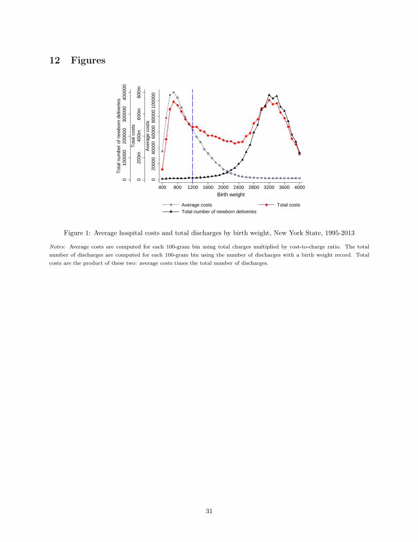
12 Figures
010
0000
2000
0030
0000
4000
00T
otal
num
ber
of n
ewbo
rn d
eliv
erie
s
020
0m40
0m60
0m80
0mT
otal
cos
ts
020
000
4000
060
000
8000
010
0000
Ave
rage
cos
ts
400 800 1200 1600 2000 2400 2800 3200 3600 4000
Average costs Total costsTotal number of newborn deliveries
Birth weight
Figure 1: Average hospital costs and total discharges by birth weight, New York State, 1995-2013
Notes: Average costs are computed for each 100-gram bin using total charges multiplied by cost-to-charge ratio. The totalnumber of discharges are computed for each 100-gram bin using the number of discharges with a birth weight record. Totalcosts are the product of these two: average costs times the total number of discharges.
31

0.1
.2.3
.4.5
1995 2000 2005 2010Calendar year
Medicaid, total Medicaid, HMO Medicaid, not HMO
Figure 2: Share of infants covered by Medicaid, New York State, 1995-2013
Notes: HMO stands for Health Maintenance Organization, a type of managed care organizations (MCOs).
050
100
150
200
900 1000 1100 1200 1300 1400 1500
Birth weight (grams)
(a) Frequency for each gram
400
500
600
700
−300 −200 −100 0 100 200 300
(Birth weight − 1200) grams
(b) Mean frequency for each 20-gram bin
Figure 3: Frequency of the running variable
Notes: Panel (a) plots the frequency of birth weight at each gram. Panel (b) plots mean frequency for each 20-gram bin (dots)along with a local linear regression fitted lines (solid lines) and 95% confidence intervals below and above the threshold. I usethe triangular kernel and a bandwidth of 150 grams for local linear regressions.
32

0.1
.2.3
.4
−300 −200 −100 0 100 200 300
(Birth weight − 1200) grams
(a) Medicaid HMO
3.2
3.4
3.6
3.8
4
−300 −200 −100 0 100 200 300
(Birth weight − 1200) grams
(b) Log(length of stay)
11.4
11.6
11.8
1212
.212
.4
−300 −200 −100 0 100 200 300
(Birth weight − 1200) grams
(c) Log(total charges)
10.5
1111
.5
−300 −200 −100 0 100 200 300
(Birth weight − 1200) grams
(d) Log(total costs)
.02
.04
.06
.08
.1.1
2
−300 −200 −100 0 100 200 300
(Birth weight − 1200) grams
(e) Transfer
0.0
2.0
4.0
6.0
8.1
−300 −200 −100 0 100 200 300
(Birth weight − 1200) grams
(f) Mortality during hospitalization
Figure 4: Effects of birth weight≥1,200 grams on discharge outcomes at birth, New York City
Notes: Panels (a)-(d) plot mean values of each outcome variable for each 20-gram bin (dots) along with a local linear regressionfitted lines (solid lines) and 95% confidence intervals below and above the threshold. Each 20-gram bin contains roughly 250discharge records. For panels (e) and (f) I use a bigger 30-gram bin for better visibility since transfer and death are both rareevents and thus noisy. Each 30-gram bin contains around 420 discharge records. I test whether using wider bins over-smoothsthe data following Lee and Lemieux [2010] but find no evidence of it. I use the triangular kernel and a bandwidth of 150 gramsfor local linear regressions.
33

0.1
.2.3
.4
−300 −200 −100 0 100 200 300
(Birth weight − 1200) grams
(a) Medicaid HMO
3.2
3.4
3.6
3.8
44.
2
−300 −200 −100 0 100 200 300
(Birth weight − 1200) grams
(b) Log(length of stay)
11.5
1212
.5
−300 −200 −100 0 100 200 300
(Birth weight − 1200) grams
(c) Log(total charges)
10.6
10.8
1111
.211
.411
.6
−300 −200 −100 0 100 200 300
(Birth weight − 1200) grams
(d) Log(total costs)
.06
.08
.1.1
2.1
4.1
6
−300 −200 −100 0 100 200 300
(Birth weight − 1200) grams
(e) Readmission
0.0
2.0
4.0
6.0
8.1
−300 −200 −100 0 100 200 300
(Birth weight − 1200) grams
(f) 1 year mortality during hospitalization
Figure 5: Effects of birth weight≥1,200 grams on cumulative discharge outcomes, New York City
Notes: Each outcome aggregates the value at the individual level including the value at transferred hospitals (if transferred).Panels (a)-(d) plot mean values of each outcome variable for each 20-gram bin (dots) along with a local linear regression fittedlines (solid lines) and 95% confidence intervals below and above the threshold. Each 20-gram bin contains roughly 250 dischargerecords. For panels (e) and (f) I use a bigger 30-gram bin for better visibility since readmission and death are both rare eventsand thus noisy. Each 30-gram bin contains around 420 discharge records. I test whether using wider bins over-smooths thedata following Lee and Lemieux [2010] but find no evidence of it. I use the triangular kernel and a bandwidth of 150 grams forlocal linear regressions.
34
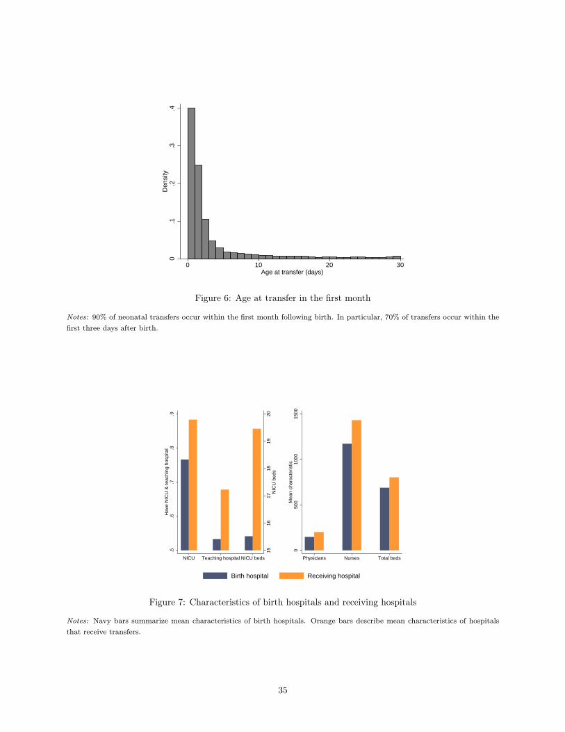
0.1
.2.3
.4D
ensi
ty
0 10 20 30Age at transfer (days)
Figure 6: Age at transfer in the first month
Notes: 90% of neonatal transfers occur within the first month following birth. In particular, 70% of transfers occur within thefirst three days after birth.
1516
1718
1920
NIC
U b
eds
.5.6
.7.8
.9H
ave
NIC
U &
teac
hing
hos
pita
l
NICU Teaching hospital NICU beds
050
010
0015
00M
ean
char
acte
ristic
Physicians Nurses Total beds
Birth hospital Receiving hospital
Figure 7: Characteristics of birth hospitals and receiving hospitals
Notes: Navy bars summarize mean characteristics of birth hospitals. Orange bars describe mean characteristics of hospitalsthat receive transfers.
35

−.0
50
.05
.1.1
5.2
.25
600 1200 1800 2400 3000 3600 4200 4800Birth weight (grams)
RD estimate for New York City (2003−2011)DD estimate for infants below the thresholdDD estimate for infants above the threshold
(a) Medicaid HMO
−.4
−.2
0.2
.4
600 1200 1800 2400 3000 3600 4200 4800Birth weight (grams)
RD estimate for New York City (2003−2011)DD estimate for infants below the thresholdDD estimate for infants above the threshold
(b) Log(length of stay)
−.4
−.2
0.2
.4
600 1200 1800 2400 3000 3600 4200 4800Birth weight (grams)
RD estimate for New York City (2003−2011)DD estimate for infants below the thresholdDD estimate for infants above the threshold
(c) Log(total charges)
−.4
−.2
0.2
.4
600 1200 1800 2400 3000 3600 4200 4800Birth weight (grams)
RD estimate for New York City (2003−2011)DD estimate for infants below the thresholdDD estimate for infants above the threshold
(d) Log(total costs)
−.0
50
.05
.1
600 1200 1800 2400 3000 3600 4200 4800Birth weight (grams)
RD estimate for New York City (2003−2011)DD estimate for infants below the thresholdDD estimate for infants above the threshold
(e) Transfer
−.0
20
.02
.04
600 1200 1800 2400 3000 3600 4200 4800Birth weight (grams)
RD estimate for New York City (2003−2011)DD estimate for infants below the thresholdDD estimate for infants above the threshold
(f) Mortality during hospitalization
Figure 8: Difference-in-difference estimates by birth weight
Notes: I estimate a difference-in-difference model by birth weight groups. Below the 1,200-gram threshold, I aggregate infantsbetween 600 and 1,200 grams for precision and plot the difference-in-difference estimate in a navy bar. Above the 1,200-gramthreshold, I plot the difference-in-difference estimates by birth weight groups in 150-gram increments (black). The estimates(solid lines) are plotted with 95% confidence intervals (dotted lines). The corresponding RD estimate for the New York Citysample is shown in red (x) along with its 95% confidence intervals.
36

13 Tables
Table 1: Summary statistics, infants in New York State from 2003-2011
(1) (2) (3)Near the 1,200-gram threshold
Full sample Birth weight∈[900,1,200) Birth weight∈[1,200,1,500]
Birth weight (grams) 3,273 1,050 1,357Medicaid 0.427 0.544 0.508
Non-HMO 0.380 0.945 0.519HMO 0.620 0.055 0.481
Total charges (USD) $9,609 $204,796 $145,434Total costs (USD) $3,500 $75,758 $52,670Length of stay (days) 3.710 46.370 33.016Died during hospitalization 0.003 0.049 0.024Subsequent visits 0.039 0.167 0.129Transfers 0.010 0.127 0.107NICU utilization 0.100 0.741 0.746
Observations 2001577 9076 11021
Notes: Total charges are list prices. Total costs are total charges multiplied by hospital-year-specific cost-to-charge ratios. Totalcharges and total costs are in 2011 values adjusted by CPI-U.
Table 2: Balance of covariates
(1) (2) (3) (4) (5) (6) (7) (8)
Female White Black Hispanic Asian Median income Scheduled Weekend
Panel A. Patient characteristics
Birth weight≥1,200 g -0.013 -0.023 0.026 0.015 -0.012 0.032 0.034 -0.007(0.018) (0.021) (0.018) (0.016) (0.009) (0.059) (0.028) (0.018)
Observations 12701 7177 9636 7177 9636 4617 3357 10061Mean below cutoff 0.497 0.355 0.316 0.145 0.054 2.353 0.713 0.261Mean above cutoff 0.493 0.374 0.309 0.135 0.047 2.420 0.731 0.260Bandwidth (grams) 250 150 200 150 200 150 150 200
NICU Teaching hospital NICU beds Physicians Nurses Total admissions Total beds Births
Panel B. Hospital characteristics
Birth weight≥1,200 g -0.002 0.009 -0.438 -7.346 -14.516 -560.159 -11.567 -97.628(0.009) (0.014) (0.586) (11.330) (35.162) (814.747) (18.180) (98.570)
Observations 6278 10057 4184 7477 7477 7477 7477 7477Mean below cutoff 0.955 0.715 20.7 180.1 1287.3 35357.2 753.1 4044.2Mean above cutoff 0.945 0.698 20.4 187.4 1279.3 34946.2 732.3 3994.7Bandwidth (grams) 150 200 100 150 150 150 150 150
Notes: Panel A shows the RD estimates for patient characteristics. Panel B shows the RD estimates for hospital characteristics.In addition to the indicator for birth weight≥1,200 g, each regression includes a linear spline of birth weight, admission yearfixed effects, admission month fixed effects, and hospital county fixed effects. Robust standard errors are reported.∗ Significant at 10%, ∗∗ significant at 5%, ∗∗∗ significant at 1%.
37
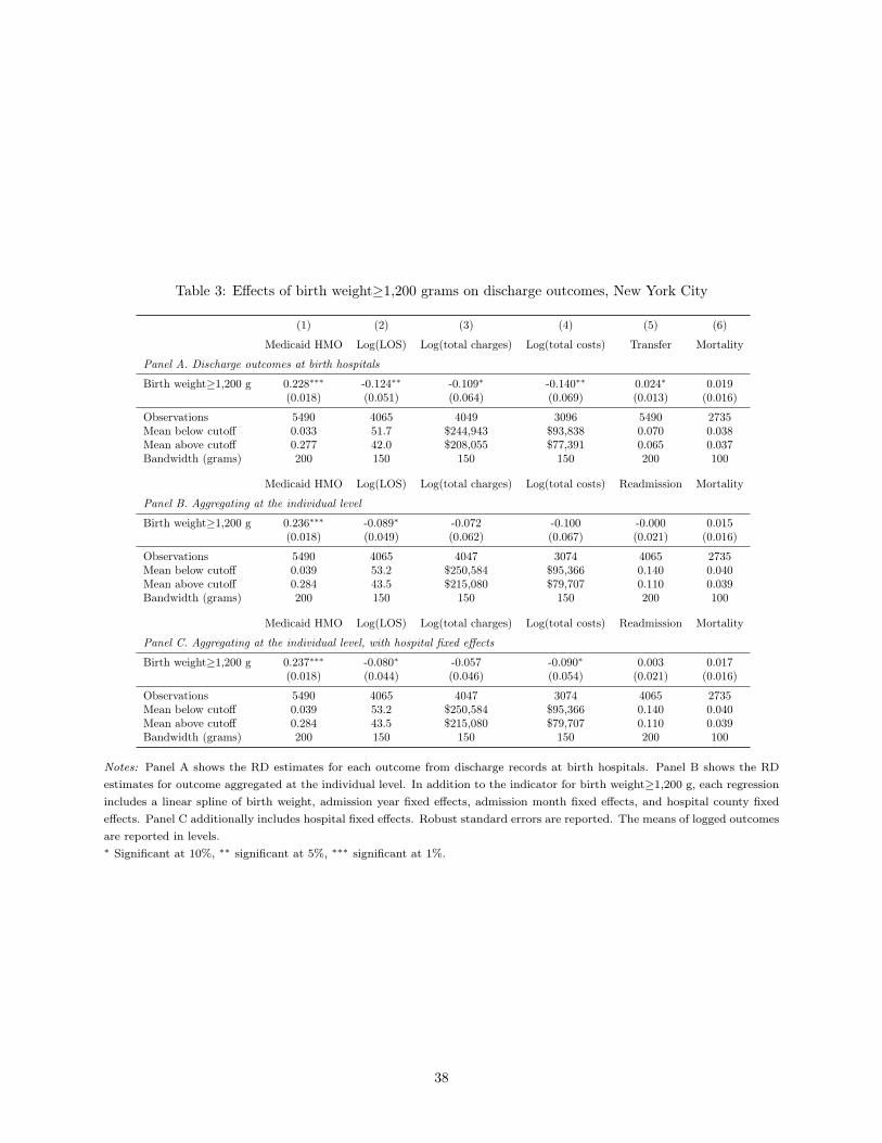
Table 3: Effects of birth weight≥1,200 grams on discharge outcomes, New York City
(1) (2) (3) (4) (5) (6)
Medicaid HMO Log(LOS) Log(total charges) Log(total costs) Transfer Mortality
Panel A. Discharge outcomes at birth hospitals
Birth weight≥1,200 g 0.228∗∗∗ -0.124∗∗ -0.109∗ -0.140∗∗ 0.024∗ 0.019(0.018) (0.051) (0.064) (0.069) (0.013) (0.016)
Observations 5490 4065 4049 3096 5490 2735Mean below cutoff 0.033 51.7 $244,943 $93,838 0.070 0.038Mean above cutoff 0.277 42.0 $208,055 $77,391 0.065 0.037Bandwidth (grams) 200 150 150 150 200 100
Medicaid HMO Log(LOS) Log(total charges) Log(total costs) Readmission Mortality
Panel B. Aggregating at the individual level
Birth weight≥1,200 g 0.236∗∗∗ -0.089∗ -0.072 -0.100 -0.000 0.015(0.018) (0.049) (0.062) (0.067) (0.021) (0.016)
Observations 5490 4065 4047 3074 4065 2735Mean below cutoff 0.039 53.2 $250,584 $95,366 0.140 0.040Mean above cutoff 0.284 43.5 $215,080 $79,707 0.110 0.039Bandwidth (grams) 200 150 150 150 200 100
Medicaid HMO Log(LOS) Log(total charges) Log(total costs) Readmission Mortality
Panel C. Aggregating at the individual level, with hospital fixed effects
Birth weight≥1,200 g 0.237∗∗∗ -0.080∗ -0.057 -0.090∗ 0.003 0.017(0.018) (0.044) (0.046) (0.054) (0.021) (0.016)
Observations 5490 4065 4047 3074 4065 2735Mean below cutoff 0.039 53.2 $250,584 $95,366 0.140 0.040Mean above cutoff 0.284 43.5 $215,080 $79,707 0.110 0.039Bandwidth (grams) 200 150 150 150 200 100
Notes: Panel A shows the RD estimates for each outcome from discharge records at birth hospitals. Panel B shows the RDestimates for outcome aggregated at the individual level. In addition to the indicator for birth weight≥1,200 g, each regressionincludes a linear spline of birth weight, admission year fixed effects, admission month fixed effects, and hospital county fixedeffects. Panel C additionally includes hospital fixed effects. Robust standard errors are reported. The means of logged outcomesare reported in levels.∗ Significant at 10%, ∗∗ significant at 5%, ∗∗∗ significant at 1%.
38

Table 4: Effects of birth weight≥1,200 grams on discharge outcomes, rest of the state
(1) (2) (3) (4) (5) (6)
Medicaid HMO Log(LOS) Log(total charges) Log(total costs) Transfer Mortality
Panel A. Discharge outcomes at birth hospitals
Birth weight≥1,200 g 0.147∗∗∗ 0.021 0.039 0.051 0.011 0.021(0.018) (0.065) (0.073) (0.074) (0.019) (0.014)
Observations 4571 3414 3407 3191 4571 2263Mean below cutoff 0.032 49.1 $204,180 $75,151 0.149 0.030Mean above cutoff 0.194 40.5 $167,210 $60,307 0.140 0.029Bandwidth (grams) 200 150 150 150 200 100
Medicaid HMO Log(LOS) Log(total charges) Log(total costs) Readmission Mortality
Panel B. Aggregating at the individual level
Birth weight≥1,200 g 0.151∗∗∗ 0.041 0.057 0.072 -0.002 0.018(0.018) (0.062) (0.070) (0.071) (0.021) (0.015)
Observations 4571 3414 3407 3174 3415 2263Mean below cutoff 0.036 51.6 $212,942 $78,495 0.113 0.034Mean above cutoff 0.204 42.4 $173,966 $63,014 0.093 0.030Bandwidth (grams) 200 150 150 150 200 100
Notes: Panel A shows the RD estimates for each outcome from discharge records at birth hospitals. Panel B shows the RDestimates for outcome aggregated at the individual level. In addition to the indicator for birth weight≥1,200 g, each regressionincludes a linear spline of birth weight, admission year fixed effects, admission month fixed effects, and hospital county fixedeffects. Robust standard errors are reported. The means of logged outcomes are reported in levels.∗ Significant at 10%, ∗∗ significant at 5%, ∗∗∗ significant at 1%.
Table 5: Heterogeneity by driving time to the nearest hospital with a NICU, New York City
(1) (2) (3) (4) (5) (6)
Medicaid HMO Log(LOS) Log(total charges) Log(total costs) Transfer Mortality
Panel A. Below the median driving time
Birth weight≥1,200 g 0.272∗∗∗ -0.136∗ -0.141 -0.109 0.041∗∗ 0.023(0.030) (0.079) (0.108) (0.119) (0.020) (0.020)
Observations 2321 1713 1700 1230 2321 1158Mean below cutoff 0.043 53.4 $287,628 $107,557 0.069 0.031Mean above cutoff 0.324 43.3 $246,442 $87,755 0.079 0.028Bandwidth (grams) 200 150 150 150 200 100
Panel B. Above the median driving time
Birth weight≥1,200 g 0.218∗∗∗ -0.083 -0.077 -0.128 0.019 0.023(0.025) (0.072) (0.080) (0.087) (0.018) (0.024)
Observations 2648 1962 1959 1486 2648 1312Mean below cutoff 0.026 51.1 $200,293 $84,847 0.066 0.044Mean above cutoff 0.258 41.5 $167,791 $70,934 0.055 0.040Bandwidth (grams) 200 150 150 150 200 100
Notes: Panel A shows the RD estimates for hospitals whose driving time to the nearest hospital with a NICU is below themedian, while panel B shows the RD estimates whose driving time is above the median. In addition to the indicator for birthweight≥1,200 g, each regression includes a linear spline of birth weight, admission year fixed effects, admission month fixedeffects, and hospital county fixed effects. Robust standard errors are reported. The means of logged outcomes are reported inlevels.∗ Significant at 10%, ∗∗ significant at 5%, ∗∗∗ significant at 1%.
39

Table 6: Heterogeneity by NICU crowdedness, New York City
(1) (2) (3) (4) (5) (6)
Medicaid HMO Log(LOS) Log(total charges) Log(total costs) Transfer Mortality
Panel A. Below the median NICU occupancy
Birth weight≥1,200 g 0.246∗∗∗ -0.055 -0.043 -0.029 0.007 0.030(0.033) (0.081) (0.100) (0.103) (0.025) (0.029)
Observations 1442 1063 1058 808 1442 724Mean below cutoff 0.019 52.3 $268,717 $104,320 0.063 0.035Mean above cutoff 0.255 43.4 $244,479 $89,590 0.052 0.032Bandwidth (grams) 200 150 150 150 200 100
Panel B. Above the median NICU occupancy
Birth weight≥1,200 g 0.236∗∗∗ -0.191∗∗ -0.226∗∗ -0.234∗∗ 0.037∗∗ 0.028(0.028) (0.075) (0.092) (0.099) (0.018) (0.028)
Observations 2040 1513 1509 1121 2040 1010Mean below cutoff 0.019 52.8 $275,354 $103,933 0.050 0.046Mean above cutoff 0.285 42.5 $223,628 $84,551 0.053 0.038Bandwidth (grams) 200 150 150 150 200 100
Notes: Panel A shows the RD estimates for months when the NICU occupancy is below the median for a given hospital ina given year. Panel B shows the RD estimates for relatively more crowded months when the NICU occupancy is above themedian for a given hospital-year. In addition to the indicator for birth weight≥1,200 g, each regression includes a linear splineof birth weight, admission year fixed effects, admission month fixed effects, and hospital county fixed effects. Robust standarderrors are reported. The means of logged outcomes are reported in levels.∗ Significant at 10%, ∗∗ significant at 5%, ∗∗∗ significant at 1%.
Table 7: Heterogeneity by crowdedness at the nearest hospital with a NICU, New York City
(1) (2) (3) (4) (5) (6)
Medicaid HMO Log(LOS) Log(total charges) Log(total costs) Transfer Mortality
Panel A. Below the median NICU occupancy at the nearest hospital
Birth weight≥1,200 g 0.232∗∗∗ -0.180∗∗ -0.227∗∗ -0.300∗∗ 0.044∗∗ 0.029(0.030) (0.084) (0.104) (0.119) (0.021) (0.027)
Observations 1846 1379 1373 995 1846 938Mean below cutoff 0.023 52.0 $275,300 $111,706 0.062 0.046Mean above cutoff 0.271 43.3 $237,916 $90,772 0.062 0.032Bandwidth (grams) 200 150 150 150 200 100
Panel B. Above the median NICU occupancy at the nearest hospital
Birth weight≥1,200 g 0.286∗∗∗ -0.151∗ -0.099 -0.074 -0.019 0.022(0.038) (0.079) (0.107) (0.114) (0.024) (0.037)
Observations 1284 932 928 668 1284 624Mean below cutoff 0.024 54.0 $280,850 $108,544 0.074 0.034Mean above cutoff 0.295 41.9 $225,560 $87,478 0.054 0.049Bandwidth (grams) 200 150 150 150 200 100
Notes: Panel A shows the RD estimates for months when the NICU occupancy at the nearest hospital with a NICU is belowthe median, while panel B shows the RD estimates for months when the NICU occupancy at the nearest hospital with a NICUis above the median. In addition to the indicator for birth weight≥1,200 g, each regression includes a linear spline of birthweight, admission year fixed effects, admission month fixed effects, and hospital county fixed effects. Robust standard errorsare reported. The means of logged outcomes are reported in levels.∗ Significant at 10%, ∗∗ significant at 5%, ∗∗∗ significant at 1%.
40

Table 8: Heterogeneity by predicted list prices, New York City
(1) (2) (3) (4) (5) (6)
Medicaid HMO Log(LOS) Log(total charges) Log(total costs) Transfer Mortality
Panel A. Below the median predicted list prices
Birth weight≥1,200 g 0.231∗∗∗ -0.025 0.050 -0.095 0.016 -0.002(0.029) (0.063) (0.085) (0.084) (0.017) (0.017)
Observations 2226 1619 1619 1233 2226 1078Mean below cutoff 0.034 47.9 $218,768 $86,188 0.054 0.019Mean above cutoff 0.274 37.9 $174,036 $67,170 0.050 0.010Bandwidth (grams) 200 150 150 150 200 100
Panel B. Above the median predicted list prices
Birth weight≥1,200 g 0.227∗∗∗ -0.167∗∗ -0.174∗∗ -0.111 0.035∗ 0.038∗(0.023) (0.070) (0.086) (0.092) (0.019) (0.022)
Observations 3202 2409 2393 1831 3202 1632Mean below cutoff 0.031 54.1 $261,268 $98,819 0.076 0.048Mean above cutoff 0.282 45.8 $237,610 $86,562 0.071 0.050Bandwidth (grams) 200 150 150 150 200 100
Notes: Panel A shows the RD estimates for infants whose predicted list charges are below the median, while panel B shows theRD estimates for infants whose predicted list charges are above the median. In addition to the indicator for birth weight≥1,200g, each regression includes a linear spline of birth weight, admission year fixed effects, admission month fixed effects, andhospital county fixed effects. Robust standard errors are reported. The means of logged outcomes are reported in levels.∗ Significant at 10%, ∗∗ significant at 5%, ∗∗∗ significant at 1%.
Table 9: Effects of birth weight≥1,200 grams on discharge outcomes, robustness checks
(1) (2) (3) (4) (5) (6)
Medicaid HMO Log(LOS) Log(total charges) Log(total costs) Transfer Mortality
Panel A. Hospitals in New Jersey and Maryland
Birth weight≥1,200 g 0.030 0.018 0.032 0.071 0.001 0.008(0.023) (0.081) (0.088) (0.095) (0.021) (0.015)
Observations 4755 3548 3542 3144 4755 2372Mean below cutoff 0.206 43.0 $215,660 $58,100 0.151 0.031Mean above cutoff 0.197 35.8 $177,229 $45,062 0.124 0.023Bandwidth (grams) 200 150 150 150 200 100
Panel B. Infants born after April 2012
Birth weight≥1,200 g 0.109 0.022 0.018 0.209 -0.029 0.026(0.069) (0.180) (0.214) (0.230) (0.042) (0.048)
Observations 900 669 669 554 900 438Mean below cutoff 0.437 53.5 $427,550 $134,895 0.101 0.056Mean above cutoff 0.503 42.3 $330,527 $109,927 0.055 0.042Bandwidth (grams) 200 150 150 150 200 100
Notes: Panel A shows the RD estimates for each outcome at birth hospitals in New Jersey and Maryland from 2003-2011. Inaddition to the indicator for birth weight≥1,200 g, each regression includes a linear spline of birth weight, admission year fixedeffects, admission month fixed effects, and state dummy for New Jersey. Panel B shows the RD estimates for each outcome atbirth hospitals for infants admitted after April 2012. Robust standard errors are reported. The means of logged outcomes arereported in levels.∗ Significant at 10%, ∗∗ significant at 5%, ∗∗∗ significant at 1%.
41

Table 10: Difference-in-difference estimates
(1) (2) (3) (4) (5) (6)
Medicaid HMO Log(LOS) Log(total charges) Log(total costs) Transfer Mortality
Panel A. Without county-specific time trends
MMC mandate 0.111∗∗∗ -0.009∗∗ -0.075∗∗ -0.095∗∗∗ -0.000 -0.000(0.022) (0.004) (0.037) (0.022) (0.001) (0.000)
Observations 4173544 4169319 4168406 2311157 3448242 4173535Mean 0.170 3.8 $7,132 $3,446 0.011 0.004
Panel B. With county-specific time trends
MMC mandate 0.065∗∗∗ -0.000 -0.106∗∗∗ -0.062∗∗ -0.001 0.000(0.015) (0.003) (0.031) (0.025) (0.001) (0.000)
Observations 4173544 4169319 4168406 2311157 3448242 4173535Mean 0.170 3.8 $7,132 $3,446 0.011 0.004
Notes: Panel A presents a difference-in-difference estimate for each outcome without including the county-specific trends. PanelB shows the estimates including the county-specific trends. The means of logged outcomes are reported in levels.∗ Significant at 10%, ∗∗ significant at 5%, ∗∗∗ significant at 1%.
42

Table 11: Mean complier characteristics
(1) (2) (3) (4)
RD estimation window [1050 g,1350 g] DD Full sample
Complier mean Overall mean Complier mean Overall meanPanel A. Hospital characteristics
Total beds 756.8 750.4 634.7 581.5NICU beds 20.5 20.3 14.4 13.5Number of physicians 188.7 184.6 148.5 127.9Number of nurses 1286.7 1295.9 1093.0 845.0Total admissions 35181.4 35480.7 31757.9 25590.2Total births 3872.6 4028.5 3716.6 3145.5NICU 0.92 0.94 0.81 0.72Teaching hospital 0.70 0.70 0.55 0.49Indigent care 0.72 0.71 0.77 0.63Lives covered, capitated (1995 values) 7008.3 7177.0 5782.7 7413.5Share covered by Medicaid, infants 0.57 0.47 0.59 0.40Share covered by Medicaid, all patients 0.37 0.31 0.35 0.26Share covered by HMO, infants 0.18 0.21 0.17 0.24Share covered by HMO, all patients 0.21 0.22 0.21 0.20
Panel B. Patient characteristics
Birth weight (grams) 1305.5 1204.5 3263.3 3287.4Fraction low birth weight (<2,500 grams) 1.00 1.00 0.07 0.08Female 0.50 0.48 0.48 0.48White 0.21 0.36 0.26 0.51Black 0.37 0.31 0.20 0.17Hispanic 0.22 0.15 0.29 0.15Asian 0.07 0.05 0.11 0.06Median income for patient zip code, quartile 1 0.56 0.36 0.53 0.30Median income for patient zip code, quartile 2 0.18 0.20 0.20 0.22Median income for patient zip code, quartile 3 0.17 0.19 0.12 0.21Median income for patient zip code, quartile 4 0.09 0.25 0.15 0.28Admission scheduled 0.61 0.64 0.86 0.78Admission on the weekend 0.24 0.25 0.23 0.22
Observations 8848 4173544
Notes: Column 1 presents mean characteristics of compliers within the RD estimation window. Column 2 shows the overallmean characteristics within the RD estimation window. Column 3 describes the complier mean for the DD specification.Column 4 shows the full sample mean. I follow Angrist and Pischke [2009] and Almond and Doyle [2011] to compute compliercharacteristics. Refer to Appendix Section B for further details.
43

Appendix A. Hospital Payments Under MMC
A.1 State Payments to Health Plans
The state negotiates with each health plan to determine monthly capitation payments in New York State.Health plans submit data on enrollees and previous expenditures and propose new rates based on expectedcosts for each region they participate. The state reviews the data and offers a new set of rates that vary byage, sex, and region. These rates are applicable for a one-year period. The plans can receive a bonus upto 3 percent of the rate based on their performance on quality measures. In 2008, the state introduced anew payment system that accounts for health conditions of the enrollees by adjusting the capitation ratesby Clinical Risk Groups. This new payment system was fully implemented in 2011 [Sparer, 2008].33
The New York State Medicaid program paid a monthly capitation rate of $138 on average for newbornsyounger than six months old in 1998 [Holahan and Schirmer, 1999], which is roughly $190 in 2011 values.For newborn services, however, plans receive lump-sum payments for costs related to newborn medicalcare in addition to monthly capitation payments. These lump-sum payments range from $2,277 to $6,651per newborn weighing 1,200 grams or more [NYS Comptroller, 2014]. Effective April 2012 following theexpansion of the MMC mandate to infants with birth weight below 1,200 grams, plans receive lump-sumpayments ranging from $68,355 to $105,108 per newborn for these low birth weight enrollees.
In return, health plans are responsible for providing health care services to their enrollees. Health plansoffer a network of health care providers to their enrollees and reimburse the providers for their services.Health plans employ a number of payment methods to reimburse providers. I focus on reimbursement forinpatient services in this paper.
A.2 Plan Payments to Hospitals
For patients enrolled in MMC, hospitals are paid in several ways depending on contractual details betweenhealth plans and hospitals. However, plan-to-provider payment rates for MMC in New York State areclassified as confidential and proprietary and thus not available. Although the exact payment methods andrates are unknown, most health plans in New York State reimburse providers through primary care capitationmodels [UHF, 2000]. Inpatient payments associated with newborn medical care are often excluded in monthlycapitation payments for primary care capitation models and are reimbursed on a fee-for-service basis usinga Diagnosis-Related Group (DRG) method.34 That is, each inpatient stay is classified into a DRG, andMedicaid pays a fixed rate to hospitals based on the DRG assigned to the patient [Quinn, 2008].
The New York State Department of Health (NYSDOH) provides inpatient payments base rates forenrollees in both the FFS system and the MMC system along with weights for each DRG.35 The stateMedicaid program uses the FFS rates for inpatient payments for patients enrolled in FFS. The MMC ratesare intended to be used by health plans as base rates in negotiation with hospitals. As expected, theseMMC rates are generally lower than the FFS rates that the state uses to pay hospitals directly. In 2009, forinstance, the base discharge rate for FFS was $6,471.31 on average, while the base contract discharge ratefor MMC was $5,284 on average.
33It is unclear whether risk-adjusted payments can in fact reduce adverse selection and thus reduce government spending[Brown et al., 2014].
34New York State implemented a severity-based methodology, All Patient Refined Diagnosis Related Groups (APR-DRGs)effective December 1, 2009. Prior to that, New York State utilized All Patient Diagnosis Related Groups (AP-DRG) for hospitalpayments.
35http://www.health.ny.gov/facilities/hospital/reimbursement/apr-drg/rates/ffs/index.htm
44

Appendix B. Computing Complier Characteristics
I follow the estimation proposed by Almond and Doyle [2011] to compute complier characteristics:
E(X|compliers) = pC + pApC
[E(X|D = 1, Z = 1)− pA
pC + pAE(X|D = 1, Z = 0)
]where X indicates hospital/patient characteristics, D denotes the treatment, which is MMC participation inmy context. Z denotes the instrument, which is exceeding the 1,200-gram threshold under the RD frameworkand the county-specific MMC mandate under the DD framework. pA is the proportion of always takers, andpN is the proportion of never takers. Assuming monotonicity (i.e., no defiers), I compute the proportion ofcompliers using the estimates, pC = 1− pA − pN .36
Given the independence of Z, I use the sample proportion of those enrolled in MMC even though theirbirth weight is below the threshold to estimate pA in the RD framework. Similarly, for the DD framework,I use the sample proportion of those enrolled in MMC even though the MMC mandate is not implementedin their county. To estimate pN for the RD framework, I use the sample proportion of those who are notenrolled in MMC even though their birth weight is above the threshold. For the DD framework, I use thesample proportion of those who are not enrolled in MMC even though the MMC mandate is implementedin their county.
I use sample means for those who are affected by the instrument and participate in Medicaid HMOto estimate E(X|D = 1, Z = 1) and sample means for those who are not affected by the instrument butparticipate in Medicaid HMO to estimate E(X|D = 1, Z = 0). Tables below present each parameter fortwo instruments and show the estimates of E(X|D = 1, Z = 1) and E(X|D = 1, Z = 0) used in computingcomplier means in Table 11.
RD DD
Z Birth weight≥1,200 g Years following the MMC mandatepA 0.04 0.05pN 0.74 0.73pC = 1− pA − pN 0.22 0.22
36The size of compliers can also be estimated from a simple regression of D on a binary Z.
45

RD DD
E(X|D = 1, Z = 1) E(X|D = 1, Z = 0) E(X|D = 1, Z = 1) E(X|D = 1, Z = 0)Panel A. Hospital characteristics
Total beds 745.0 675.7 641.1 670.5NICU beds 20.2 18.2 14.1 12.8Number of physicians 177.1 108.7 148.8 150.2Number of nurses 1256.5 1078.0 1039.1 790.5Total admissions 34684.6 31752.9 30693.1 25785.4Total births 3819.4 3505.5 3626.9 3213.5NICU 0.92 0.88 0.80 0.76Teaching hospital 0.68 0.59 0.56 0.57Indigent care 0.71 0.65 0.69 0.31Lives covered, capitated (1995 values) 6488.8 3423.4 5613.2 4831.9Share covered by Medicaid, infants 0.57 0.54 0.59 0.57Share covered by Medicaid, all patients 0.36 0.34 0.36 0.39Share covered by HMO, infants 0.18 0.19 0.17 0.20Share covered by HMO, all patients 0.21 0.21 0.20 0.17
Panel B. Patient characteristics
Birth weight (grams) 1278.7 1120.6 3265.8 3277.2Fraction low birth weight (<2,500 grams) 1.00 1.00 0.07 0.08Female 0.49 0.43 0.48 0.49White 0.21 0.22 0.27 0.28Black 0.37 0.33 0.22 0.31Hispanic 0.22 0.22 0.27 0.22Asian 0.06 0.04 0.10 0.04Median income for patient zip code, quartile 1 0.53 0.38 0.47 0.17Median income for patient zip code, quartile 2 0.20 0.32 0.22 0.33Median income for patient zip code, quartile 3 0.16 0.13 0.18 0.47Median income for patient zip code, quartile 4 0.11 0.18 0.13 0.04Admission scheduled 0.61 0.59 0.83 0.69Admission on the weekend 0.25 0.33 0.23 0.25
Observations 8848 8848 4173544 4173544
46

Appendix C. Figures
5010
015
020
025
0
−300 −200 −100 0 100 200 300
(Birth weight − 1200) grams
(a) Bottom quartile
050
100
150
−300 −200 −100 0 100 200 300
(Birth weight − 1200) grams
(b) Q2
100
120
140
160
180
200
−300 −200 −100 0 100 200 300
(Birth weight − 1200) grams
(c) Q3
5010
015
020
025
0
−300 −200 −100 0 100 200 300
(Birth weight − 1200) grams
(d) Top quartile
Figure C.1: Mean frequency of the running variable by each 20-gram bin, by predicted list prices
Notes: Predicted list prices are computed from regressions of total charges on principal diagnosis and principal procedure fixedeffects. I divide the sample by quartiles using the predicted list prices. Each panel plots mean frequency for each 20-gram bin(dots) along with a local linear regression fitted lines (solid lines) and 95% confidence intervals below and above the thresholdfor each quartile of predicted list prices. I use the triangular kernel and a bandwidth of 150 grams for local linear regressions.
47

3.4
3.6
3.8
44.
24.
4
−300 −200 −100 0 100 200 300
(Birth weight − 1200) grams
Figure C.2: Log(length of stay) for infants routinely discharged
Notes: The figure plots mean values of log(length of stay) for each 20-gram bin (dots) along with a local linear regressionfitted lines (solid lines) and 95% confidence intervals below and above the threshold. The sample is restricted to those who areroutinely discharged from birth hospitals. Each 20-gram bin contains roughly 250 discharge records. I use the triangular kerneland a bandwidth of 150 grams for local linear regressions.
48

0.0
5.1
.15
.2.2
5
−300 −200 −100 0 100 200 300
(Birth weight − 1200) grams
(a) Medicaid HMO
33.
23.
43.
63.
8
−300 −200 −100 0 100 200 300
(Birth weight − 1200) grams
(b) Log(length of stay)
1111
.512
−300 −200 −100 0 100 200 300
(Birth weight − 1200) grams
(c) Log(total charges)
1010
.511
11.5
−300 −200 −100 0 100 200 300
(Birth weight − 1200) grams
(d) Log(total costs)
.05
.1.1
5.2
.25
−300 −200 −100 0 100 200 300
(Birth weight − 1200) grams
(e) Transfer
0.0
2.0
4.0
6.0
8
−300 −200 −100 0 100 200 300
(Birth weight − 1200) grams
(f) Mortality during hospitalization
Figure C.3: Effects of birth weight≥1,200 grams on discharge outcomes at birth, rest of the state
Notes: Panels (a)-(d) plot mean values of each outcome variable for each 20-gram bin (dots) along with a local linear regressionfitted lines (solid lines) and 95% confidence intervals below and above the threshold. Each 20-gram bin contains roughly 250discharge records. For panels (e) and (f) I use a bigger 30-gram bin for better visibility since transfer and death are both rareevents and thus noisy. Each 30-gram bin contains around 420 discharge records. I test whether using wider bins over-smoothsthe data following Lee and Lemieux [2010] but find no evidence of it. I use the triangular kernel and a bandwidth of 150 gramsfor local linear regressions.
49

0.1
.2.3
−300 −200 −100 0 100 200 300
(Birth weight − 1200) grams
(a) Medicaid HMO
33.
23.
43.
63.
84
−300 −200 −100 0 100 200 300
(Birth weight − 1200) grams
(b) Log(length of stay)
11.2
11.4
11.6
11.8
1212
.2
−300 −200 −100 0 100 200 300
(Birth weight − 1200) grams
(c) Log(total charges)
10.2
10.4
10.6
10.8
1111
.2
−300 −200 −100 0 100 200 300
(Birth weight − 1200) grams
(d) Log(total costs)
.05
.1.1
5
−300 −200 −100 0 100 200 300
(Birth weight − 1200) grams
(e) Readmission
0.0
2.0
4.0
6.0
8
−300 −200 −100 0 100 200 300
(Birth weight − 1200) grams
(f) Mortality during hospitalization
Figure C.4: Effects of birth weight≥1,200 grams on aggregated discharge outcomes, rest of the state
Notes: Each outcome aggregates the value at the individual level including the value at transferred hospitals (if transferred).Panels (a)-(d) plot mean values of each outcome variable for each 20-gram bin (dots) along with a local linear regression fittedlines (solid lines) and 95% confidence intervals below and above the threshold. Each 20-gram bin contains roughly 250 dischargerecords. For panels (e) and (f) I use a bigger 30-gram bin for better visibility since transfer and death are both rare events andthus noisy. Each 30-gram bin contains around 420 discharge records. I test whether using wider bins over-smooths the datafollowing Lee and Lemieux [2010] but find no evidence of it. I use the triangular kernel and a bandwidth of 150 grams for locallinear regressions.
50

0.2
.4.6
.8
0 50 100 150Distance to the nearest hospital with NICU (miles)
New York City Rest of the state
Figure C.5: Proximity to the nearest hospital with a NICU facility
Notes: Navy bars show the density of New York City hospitals by the distance to the nearest hospital with a NICU. Orangebars show the density of hospitals outside of New York City.
1520
2530
35
2 3 4 5 6 7 8 9 10 11 12I:Admission month
Below median Above median
Figure C.6: An example hospital, 2005
Notes: This figures illustrates the monthly NICU occupancy for an example hospital in the year 2005. For instance,around 22 infants were admitted to NICU in January 2005 and stayed for at least 10 days. I use this value as anindication of the NICU occupancy for infants born in February. The figure shows that there is a large variation inthe NICU occupancy across months.
51

−.1
0.1
.2.3
100 150 200 250 300 350 400 450 500Bandwidth (grams)
(a) Medicaid HMO, linear−
.10
.1.2
.3
100 150 200 250 300 350 400 450 500Bandwidth (grams)
(b) Medicaid HMO, quadratic
−.1
0.1
.2.3
100 150 200 250 300 350 400 450 500Bandwidth (grams)
(c) Medicaid HMO, cubic
−.8
−.6
−.4
−.2
0.2
.4.6
100 150 200 250 300 350 400 450 500Bandwidth (grams)
(d) Log(length of stay), linear
−.8
−.6
−.4
−.2
0.2
.4.6
100 150 200 250 300 350 400 450 500Bandwidth (grams)
(e) Log(length of stay), quadratic
−.8
−.6
−.4
−.2
0.2
.4.6
100 150 200 250 300 350 400 450 500Bandwidth (grams)
(f) Log(length of stay), cubic
−.8
−.6
−.4
−.2
0.2
.4.6
100 150 200 250 300 350 400 450 500Bandwidth (grams)
(g) Log(total charges), linear
−.8
−.6
−.4
−.2
0.2
.4.6
100 150 200 250 300 350 400 450 500Bandwidth (grams)
(h) Log(total charges), quadratic
−.8
−.6
−.4
−.2
0.2
.4.6
100 150 200 250 300 350 400 450 500Bandwidth (grams)
(i) Log(total charges), cubic
−.8
−.6
−.4
−.2
0.2
.4.6
100 150 200 250 300 350 400 450 500Bandwidth (grams)
(j) Log(total costs), linear
−.8
−.6
−.4
−.2
0.2
.4.6
100 150 200 250 300 350 400 450 500Bandwidth (grams)
(k) Log(total costs), quadratic
−.8
−.6
−.4
−.2
0.2
.4.6
100 150 200 250 300 350 400 450 500Bandwidth (grams)
(l) Log(total costs), cubic
Figure C.7: Sensitivity to bandwidth and polynomial, New York City
Notes: I repeat the estimation for each outcome for a different choice of bandwidth and polynomial. I use a range of bandwidthsfrom 100 grams to 500 grams varying the degree of polynomials from degree 1 (linear), degree 2 (quadratic), to degree 3 (cubic).
52

−.1
−.0
50
.05
.1.1
5.2
.25
100 150 200 250 300 350 400 450 500Bandwidth (grams)
(m) Transfer, linear
−.1
−.0
50
.05
.1.1
5.2
.25
100 150 200 250 300 350 400 450 500Bandwidth (grams)
(n) Transfer, quadratic
−.1
−.0
50
.05
.1.1
5.2
.25
100 150 200 250 300 350 400 450 500Bandwidth (grams)
(o) Transfer, cubic
−.1
−.0
50
.05
.1.1
5.2
.25
100 150 200 250 300 350 400 450 500Bandwidth (grams)
(p) Mortality, linear
−.1
−.0
50
.05
.1.1
5.2
.25
100 150 200 250 300 350 400 450 500Bandwidth (grams)
(q) Mortality, quadratic
−.1
−.0
50
.05
.1.1
5.2
.25
100 150 200 250 300 350 400 450 500Bandwidth (grams)
(r) Mortality, cubic
Figure C.7: Sensitivity to bandwidth and polynomial, New York City (continued)
Notes: I repeat the estimation for each outcome for a different choice of bandwidth and polynomial. I use a range of bandwidthsfrom 100 grams to 500 grams varying the degree of polynomials from degree 1 (linear), degree 2 (quadratic), to degree 3 (cubic).
0.2
.4.6
−14 −12 −10 −8 −6 −4 −2 0 2 4 6 8 10 12 14Years from the mandate
Figure C.8: Medicaid HMO participation by years from the MMC mandate
Notes: The above figure plots estimates from a regression of an indicator for Medicaid HMO participation on a set of dummiesthat indicate years from the MMC mandate for each county. County fixed effects, year fixed effects, and county-specific timetrends are also included in the regression. The dashed lines plot 95% confidence intervals computed based on standard errorsclustered at the county level.
53

Appendix D. Tables
Table D.1: Effects of birth weight≥1,200 grams on other health/quality outcomes, New York City
(1) (2) (3) (4) (5) (6)
Avoidable Level IV Occupational Physical Respiratory Speechreadmission NICU stay therapy therapy therapy therapy
Birth weight≥1,200 g 0.002 -0.002 0.015 0.041∗∗ -0.007 0.006(0.013) (0.019) (0.019) (0.019) (0.020) (0.019)
Observations 4065 4315 4315 4315 3221 3221Mean below cutoff 0.052 0.873 0.137 0.127 0.947 0.091Mean above cutoff 0.043 0.869 0.105 0.118 0.893 0.080Bandwidth (grams) 150 200 200 200 150 150
Notes: Column 1 shows the RD estimate for hospital readmission due to preventable conditions. Columns 2-6 show the RDestimates for utilization of various inpatient services at the individual level. In addition to the indicator for birth weight≥1,200g, each regression includes a linear spline of birth weight, admission year fixed effects, admission month fixed effects, andhospital county fixed effects. Robust standard errors are reported.∗ Significant at 10%, ∗∗ significant at 5%, ∗∗∗ significant at 1%.
Table D.2: Heterogeneity by NICU crowdedness, relative to the number of beds, New York City
(1) (2) (3) (4) (5) (6)
Medicaid HMO Log(LOS) Log(total charges) Log(total costs) Transfer Mortality
Panel A. Below the median NICU occupancy relative to the number of beds
Birth weight≥1,200 g 0.205∗∗∗ -0.043 -0.048 0.024 0.018 0.020(0.035) (0.078) (0.101) (0.098) (0.026) (0.030)
Observations 1266 947 942 732 1266 645Mean below cutoff 0.017 53.0 $284,947 $107,507 0.058 0.036Mean above cutoff 0.242 43.8 $253,561 $92,292 0.046 0.030Bandwidth (grams) 200 150 150 150 200 100
Panel B. Above the median NICU occupancy relative to the number of beds
Birth weight≥1,200 g 0.244∗∗∗ -0.222∗∗∗ -0.249∗∗∗ -0.221∗∗ 0.033∗ 0.028(0.030) (0.076) (0.092) (0.098) (0.019) (0.029)
Observations 1744 1302 1298 982 1744 859Mean below cutoff 0.016 53.1 $287,583 $106,648 0.040 0.040Mean above cutoff 0.261 42.3 $230,545 $86,728 0.051 0.039Bandwidth (grams) 200 150 150 150 200 100
Notes: I divide the monthly NICU occupancy measure by the number of NICU beds. Since the mean length of stay for infantswho stay in NICU for at least 10 days is around one month, this measure roughly captures the daily occupancy rate in a givenmonth. Panel A shows the RD estimates for months when this relative NICU occupancy rate is below the median for a givenhospital in a given year. Panel B shows the RD estimates for months when the relative NICU occupancy rate is above themedian for a given hospital-year. In addition to the indicator for birth weight≥1,200 g, each regression includes a linear splineof birth weight, admission year fixed effects, admission month fixed effects, and hospital county fixed effects. Robust standarderrors are reported. The means of logged outcomes are reported in levels.∗ Significant at 10%, ∗∗ significant at 5%, ∗∗∗ significant at 1%.
54

Table D.3: Heterogeneity by crowdedness at the typical destination, New York City
(1) (2) (3) (4) (5) (6)
Medicaid HMO Log(LOS) Log(total charges) Log(total costs) Transfer Mortality
Panel A. Below the median NICU occupancy at the typical destination
Birth weight≥1,200 g 0.228∗∗∗ -0.194∗∗ -0.236∗∗ -0.219∗∗ 0.038 0.022(0.028) (0.077) (0.099) (0.106) (0.023) (0.027)
Observations 1826 1349 1343 1015 1826 904Mean below cutoff 0.019 52.4 $276,442 $106,429 0.067 0.027Mean above cutoff 0.262 42.1 $228,440 $84,086 0.064 0.033Bandwidth (grams) 200 150 150 150 200 100
Panel B. Above the median NICU occupancy at the typical destination
Birth weight≥1,200 g 0.261∗∗∗ -0.133 -0.134 -0.279∗∗ 0.008 0.018(0.038) (0.102) (0.119) (0.133) (0.023) (0.037)
Observations 1256 939 936 692 1256 647Mean below cutoff 0.031 52.3 $264,805 $104,435 0.064 0.051Mean above cutoff 0.320 43.6 $234,905 $90,673 0.062 0.039Bandwidth (grams) 200 150 150 150 200 100
Notes: I define a typical destination hospital as the receiving hospital of the majority of any neonatal transfers from a givenhospital. Panel A shows the RD estimates for months when the NICU occupancy at the typical destination hospital with a NICUis below the median, while panel B shows the RD estimates for months when the NICU occupancy at the typical destinationhospital is above the median in a given hospital-year. In addition to the indicator for birth weight≥1,200 g, each regressionincludes a linear spline of birth weight, admission year fixed effects, admission month fixed effects, and hospital county fixedeffects. Robust standard errors are reported. The means of logged outcomes are reported in levels.∗ Significant at 10%, ∗∗ significant at 5%, ∗∗∗ significant at 1%.
55
Table D.4: Heterogeneity by county-level median household income
(1) (2) (3) (4) (5) (6)
Medicaid HMO Log(LOS) Log(total charges) Log(total costs) Transfer Mortality
Panel A. Quartile 1
Birth weight≥1,200 g 0.301∗∗∗ -0.349∗∗∗ -0.250∗∗ -0.339∗∗∗ 0.078∗∗∗ 0.043(0.039) (0.091) (0.123) (0.121) (0.028) (0.028)
Observations 1290 976 973 734 1290 688Mean below cutoff 0.040 52.3 $252,267 $103,430 0.083 0.028Mean above cutoff 0.324 42.6 $219,470 $81,610 0.099 0.032Bandwidth (grams) 200 150 150 150 200 100
Panel B. Quartile 2
Birth weight≥1,200 g 0.247∗∗∗ -0.029 -0.010 -0.026 0.004 0.013(0.023) (0.075) (0.089) (0.096) (0.020) (0.021)
Observations 3492 2599 2595 2107 3492 1721Mean below cutoff 0.032 49.6 $194,713 $77,260 0.120 0.042Mean above cutoff 0.296 40.1 $157,699 $62,790 0.114 0.036Bandwidth (grams) 200 150 150 150 200 100
Panel C. Quartile 3
Birth weight≥1,200 g 0.158∗∗∗ 0.014 -0.079 0.023 0.011 -0.006(0.030) (0.091) (0.099) (0.108) (0.023) (0.025)
Observations 1497 1107 1101 939 1497 741Mean below cutoff 0.019 53.9 $268,293 $98,228 0.064 0.026Mean above cutoff 0.190 44.9 $214,479 $77,044 0.055 0.033Bandwidth (grams) 200 150 150 150 200 100
Panel D. Quartile 4
Birth weight≥1,200 g 0.118∗∗∗ 0.001 0.050 0.049 0.019 0.027∗(0.019) (0.071) (0.081) (0.083) (0.020) (0.016)
Observations 3782 2797 2787 2507 3782 1848Mean below cutoff 0.037 49.5 $232,172 $79,622 0.115 0.033Mean above cutoff 0.178 40.5 $196,712 $66,658 0.105 0.031Bandwidth (grams) 200 150 150 150 200 100
Notes: Each panel shows the RD estimates for counties classified into each quartile of a county-level median income measure. Itake an average of median household income levels across zip codes in each county to construct the county-level income measure.Here, I use county as a service area for a hospital since hospitals typically serve an area larger than a zip code. In additionto the indicator for birth weight≥1,200 g, each regression includes a linear spline of birth weight, admission year fixed effects,admission month fixed effects, and hospital county fixed effects. Robust standard errors are reported. The means of loggedoutcomes are reported in levels.∗ Significant at 10%, ∗∗ significant at 5%, ∗∗∗ significant at 1%.
56