how does your media product represent particular social groups
TRANSCRIPT

How does your media product represent
particular social groups?

My magazine is aimed at people aged between 16 and 28 years old.
It is aimed at people who enjoy up and coming bands and artists (mainly rap but also a focus on indie artists)
My target audience prefers informative articles about the artists rather than informal ‘gossip’
My main competitor is ‘Vibe” magazine and ‘Q’ magazine
My target audience

My front cover- representation of target audience
The target audience is represented through many key elements of the feature article photograph. The artists facial expression evokes a sense of excitement and anticipation. This relates to the target audience who are at the age when they enjoy partying and the sense of excitement towards music will be relatable as it is likely that music will be an everyday occurrence in their life.The black shirt worn by the artist evokes a sense of simplicity and formality as well as hinting at a dark side to the artist.The age of the artist is also important as it shows the culture of the genre as being an accepting group who respect the artist and music regardless of age.
How the layout and colour scheme represent the target audience
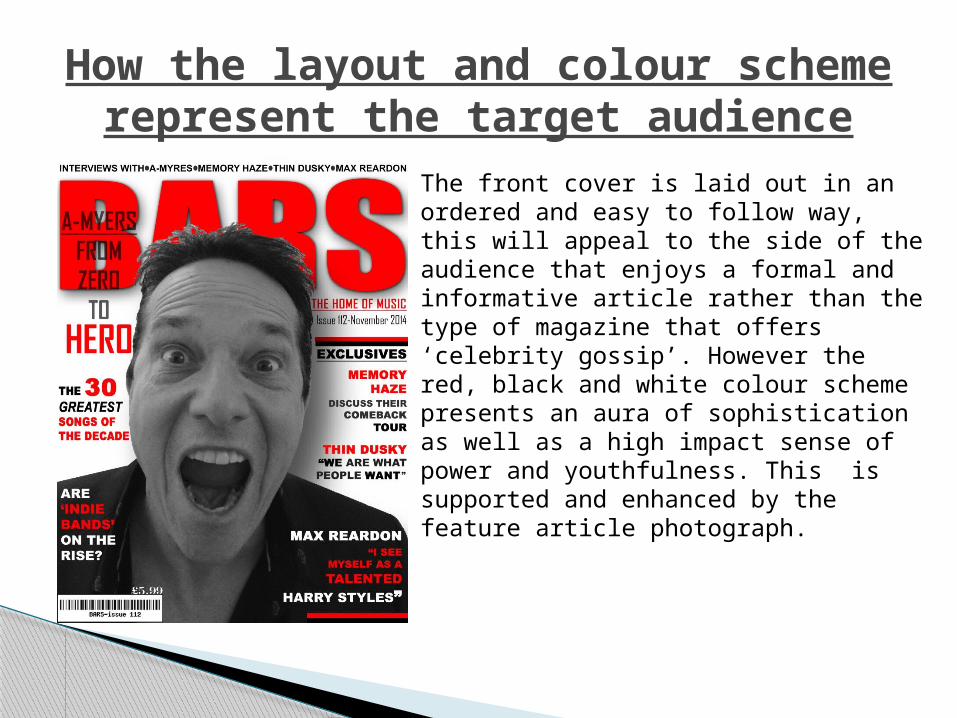
The front cover is laid out in an ordered and easy to follow way, this will appeal to the side of the audience that enjoys a formal and informative article rather than the type of magazine that offers ‘celebrity gossip’. However the red, black and white colour scheme presents an aura of sophistication as well as a high impact sense of power and youthfulness. This is supported and enhanced by the feature article photograph.
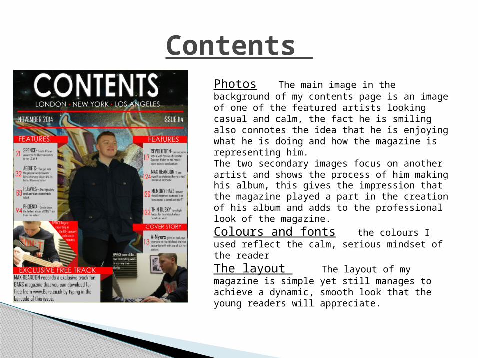
Contents Photos The main image in the background of my contents page is an image of one of the featured artists looking casual and calm, the fact he is smiling also connotes the idea that he is enjoying what he is doing and how the magazine is representing him.The two secondary images focus on another artist and shows the process of him making his album, this gives the impression that the magazine played a part in the creation of his album and adds to the professional look of the magazine.
Colours and fonts the colours I used reflect the calm, serious mindset of the reader
The layout The layout of my magazine is simple yet still manages to achieve a dynamic, smooth look that the young readers will appreciate.

Double page spread
The colour scheme and layout of my double page spread is well laid out and in a professional looking way, this appeals to the target audience who are looking for a sophisticated, slick, fluid looking articleIt Is written in an informative professional, formal way that avoids the article looking too chatty, this will appeal to the target audience who enjoy reading an informative article.