how effective is the combination of your main
TRANSCRIPT
HOW EFFECTIVE IS THE COMBINATION OF YOUR
MAIN PRODUCT AND ANCILLARY TEXT?

The combination of my main product which is the trailer ‘Decimation’ and my ancillary text which is a film poster and film magazine cover is very effective through the close synergy between the fonts, characters and colours/settings.
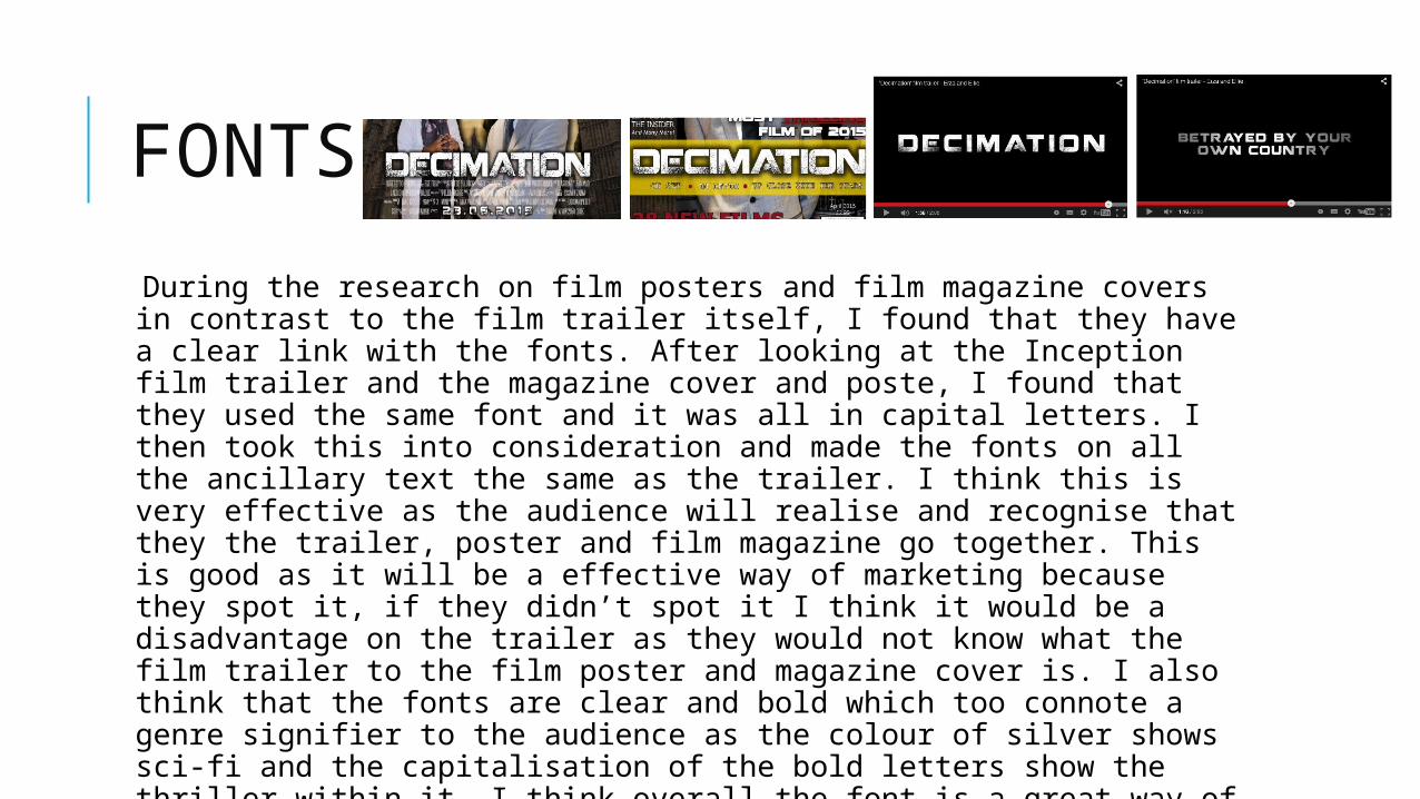
FONTS
During the research on film posters and film magazine covers in contrast to the film trailer itself, I found that they have a clear link with the fonts. After looking at the Inception film trailer and the magazine cover and poste, I found that they used the same font and it was all in capital letters. I then took this into consideration and made the fonts on all the ancillary text the same as the trailer. I think this is very effective as the audience will realise and recognise that they the trailer, poster and film magazine go together. This is good as it will be a effective way of marketing because they spot it, if they didn’t spot it I think it would be a disadvantage on the trailer as they would not know what the film trailer to the film poster and magazine cover is. I also think that the fonts are clear and bold which too connote a genre signifier to the audience as the colour of silver shows sci-fi and the capitalisation of the bold letters show the thriller within it. I think overall the font is a great way of attracting audience attention and allowing them to connect with the ancillary texts and the trailer itself.
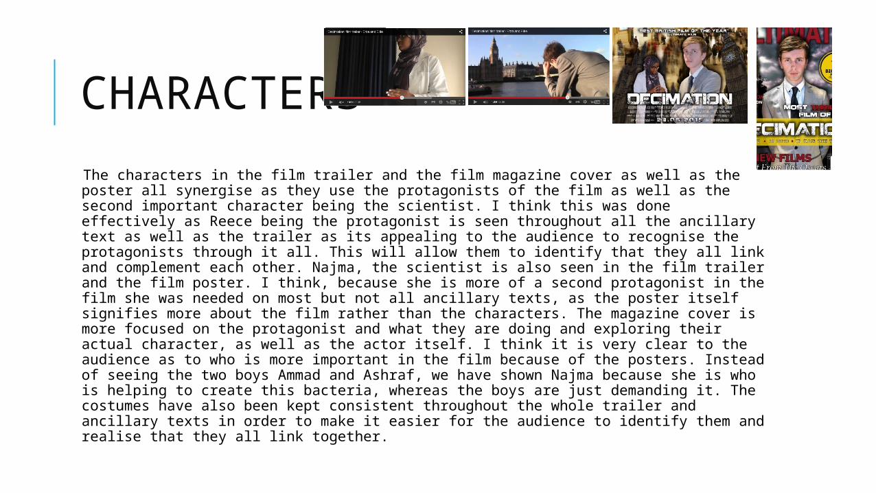
CHARACTERS
The characters in the film trailer and the film magazine cover as well as the poster all synergise as they use the protagonists of the film as well as the second important character being the scientist. I think this was done effectively as Reece being the protagonist is seen throughout all the ancillary text as well as the trailer as its appealing to the audience to recognise the protagonists through it all. This will allow them to identify that they all link and complement each other. Najma, the scientist is also seen in the film trailer and the film poster. I think, because she is more of a second protagonist in the film she was needed on most but not all ancillary texts, as the poster itself signifies more about the film rather than the characters. The magazine cover is more focused on the protagonist and what they are doing and exploring their actual character, as well as the actor itself. I think it is very clear to the audience as to who is more important in the film because of the posters. Instead of seeing the two boys Ammad and Ashraf, we have shown Najma because she is who is helping to create this bacteria, whereas the boys are just demanding it. The costumes have also been kept consistent throughout the whole trailer and ancillary texts in order to make it easier for the audience to identify them and realise that they all link together.
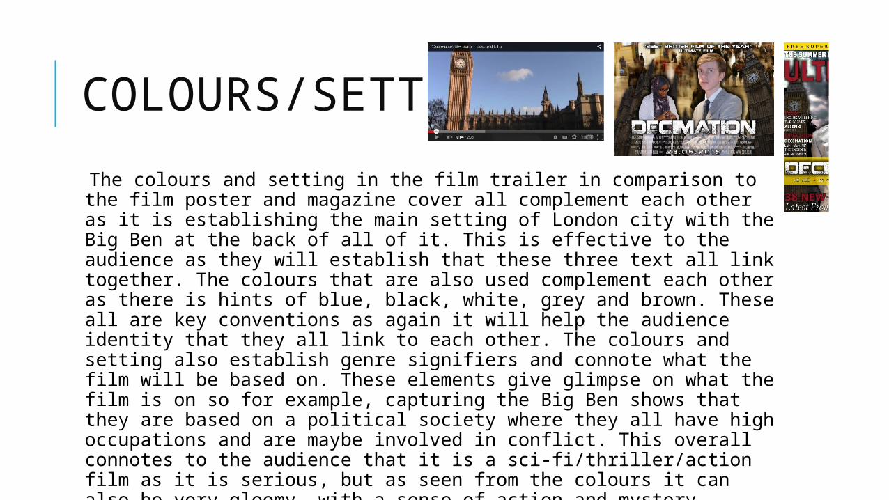
COLOURS/SETTING
The colours and setting in the film trailer in comparison to the film poster and magazine cover all complement each other as it is establishing the main setting of London city with the Big Ben at the back of all of it. This is effective to the audience as they will establish that these three text all link together. The colours that are also used complement each other as there is hints of blue, black, white, grey and brown. These all are key conventions as again it will help the audience identity that they all link to each other. The colours and setting also establish genre signifiers and connote what the film will be based on. These elements give glimpse on what the film is on so for example, capturing the Big Ben shows that they are based on a political society where they all have high occupations and are maybe involved in conflict. This overall connotes to the audience that it is a sci-fi/thriller/action film as it is serious, but as seen from the colours it can also be very gloomy with a sense of action and mystery.
CONCLUSION
Overall I believe that the combination of the film trailer, film poster and the film magazine cover all are very effective as it highlights the main conventions of a film such as the settings, the colours used, the characters and the fonts of the titles and intertitles. The help of researching different film trailers and posters like ‘In Time’ and ‘Inception’ too allowed us to focus on the minor details in order to make it all perfect and complement each other, which is what we achieved. I think that me and Ellie managed to apply is all clearly to the audience as its suitable for what they are seeing and reading in all three media texts.