human-computer interaction john kelleher it sligo
Post on 21-Dec-2015
222 views
TRANSCRIPT
Human-Computer Interaction
John KelleherIT Sligo
2
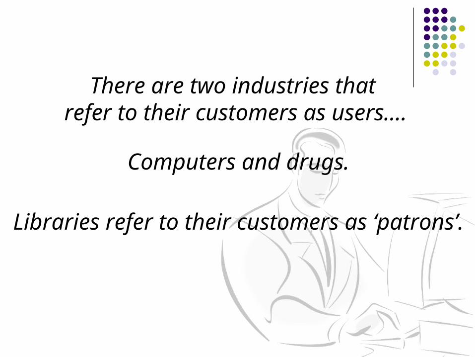
There are two industries that refer to their customers as users….
Computers and drugs.
Libraries refer to their customers as ‘patrons’.
3
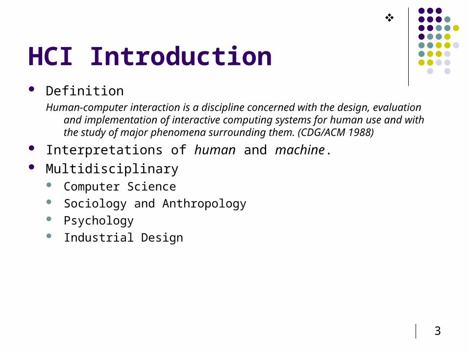
HCI Introduction Definition
Human-computer interaction is a discipline concerned with the design, evaluation and implementation of interactive computing systems for human use and with the study of major phenomena surrounding them. (CDG/ACM 1988)
Interpretations of human and machine. Multidisciplinary
Computer Science Sociology and Anthropology Psychology Industrial Design
4
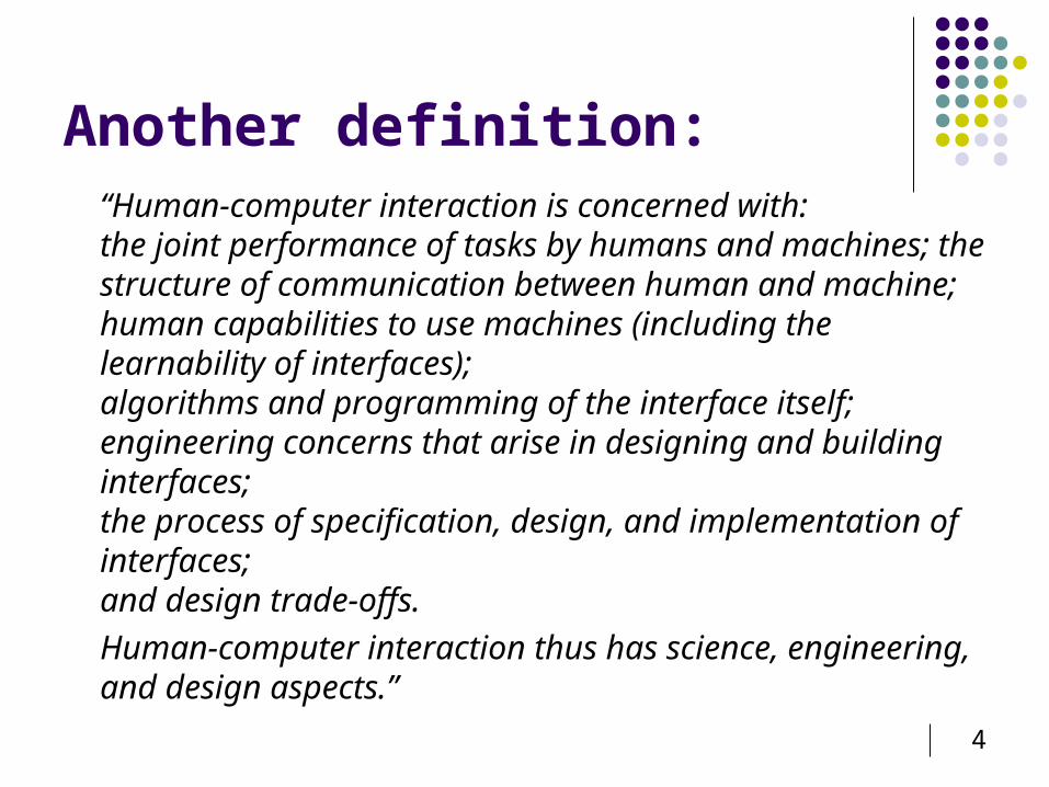
Another definition:“Human-computer interaction is concerned with:the joint performance of tasks by humans and machines; the structure of communication between human and machine; human capabilities to use machines (including the learnability of interfaces); algorithms and programming of the interface itself; engineering concerns that arise in designing and building interfaces; the process of specification, design, and implementation of interfaces; and design trade-offs.
Human-computer interaction thus has science, engineering, and design aspects.”
5
Exercise Create a new Powerpoint slide show Number slides from 1 excluding the Title slide
6
Why study HCI? Interface is major aspect of software development
50%-60% of overall effort, up to 90% Software is programmed once; but endured by users for lifetime
Cost savings1
Marketing Bad interfaces cost money and lives.
Therac-25 Phobos I USS Vincennes (story) London Ambulance Service, 1993 Others (incl. Cali Crash)
User interfaces are difficult! Hard theory elusive People are varied, unpredictable and moving targets2
1 www.useit.com/papers/guerrilla_hci.html2 Read Landauer, T.K. (1991). Let’s Get Real: A Position Paper on the Role of Cognitive Psychology in the Design of Humanly Useful and Usable Systems. In J.M. Carroll (Ed.), Designing Interaction, Cambridge University Press, pp. 60-73
7
Serious Life-Threatening Errors
Analysis of transcript of 911 call announcing bomb in Centennial Park at Atlanta Olympics indicated that 20 minutes were needed to call dispatchers Dispatch system required an address for Centennial Park Dispatch operators could not find anyone who knew address Bomb was set to go off 30 minutes after call
Airline crashed in 1996 into a mountainside in Colombia killing all aboard Pilot typed in “R” rather than full name of airport Guidance system took first airport in the list beginning with “R” which
was the wrong airport Plane ran into mountain
Draken drop-tanks
8
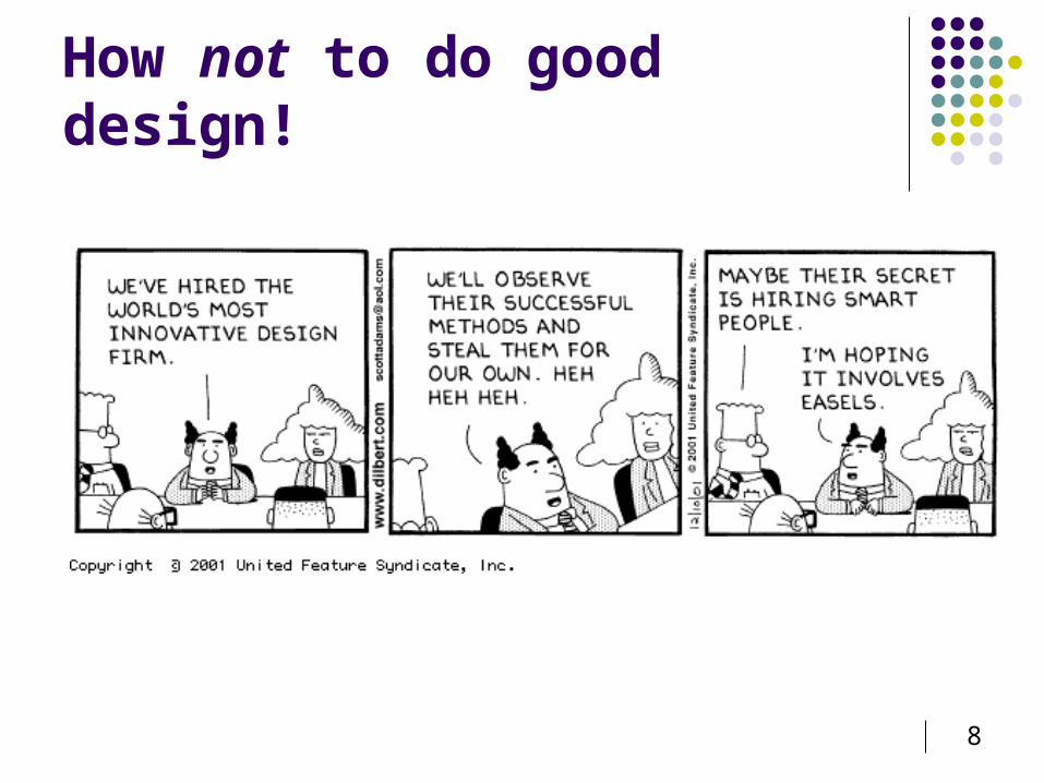
How not to do good design!
9
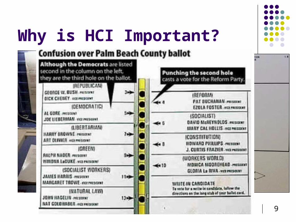
Why is HCI Important?
10
Ballot Problems The instructions are misleading
Use of the phrase “vote for group” is misleading Should say “vote for one”
Instructions only on lefthand side Implies righthand side is different
The interleaving of holes is misleading Only the President page has this layout Other offices are one per page (with appropriate
instructions) The sample ballot looks different
No holes – the source of the problem Did not lead to complaints
11
Other Ballot Issues No user testing No training for ‘chad’ removal People vote infrequently
Have to re-learn the system each time Rushed, uncomfortable circumstances Palm Beach Demographics: Elderly
12
An Informal Usability StudyBarbara Jacobowitz, CHI-WEB, Nov 10, 2000
“I was able to print 10 different sample ballots from various sources. Last night, I ran them all by my mother (81) and a group of her friends (70-something to 80's). All are bright, literate, and none are legally blind.
They did reasonably well on 9 of the ballots. On one, 6 marked it incorrectly and didn't realize it, 2 did it correctly, but very slowly, and 2 had to ask me what to do. Guess which ballot it was?.”
Summary of a more formal study of punch-card voting: http://www.osu.edu/units/research/archive/votedes.htm
13
Josephine Scott, CHI-Web, Nov 10, 2000
“I spent fifteen years making the voting process accessible and usable for all. I have some very strong feelings as well as considerable experience. …
Usability standards must be higher for voting than any other function for the most obvious reasons. Users--in this case, voters, share the need for the clearest of design and instruction to cast a vote properly. Many do not speak English well, or see well, or are able to decipher difficult design cognitively, but they may be able to make as informed a choice for president as our snobbish "experts" who don't see a problem. …
Bad design like this exacerbates the problem. The glib notion that "there is no problem because you can see the arrow" or that voters who made this mistake must be stupid shows a lack of compassion. Let me suggest that it is simple compassion for the user that informs usability expertise. …”
14
More evidence that the ballot is misleading (New York Times, Nov 9, 2000)
Percent of ballots thrown out in Palm Beach County for the error of "overvoting" on Presidential candidates: 4.1% (19,120)
Percent of ballots thrown out in Palm Beach County for the error of "overvoting" on Senatorial candidates: 0.8% (3,783)
Percent of ballots thrown out in Sacramento County (CA) for the error of "overvoting" on Presidential candidates: 0.29% (1,147)
Percentage of (unofficial) re-count votes in Gore's favor: 70% (2,520) Percentage of (unofficial) re-count votes in Bush's favor: 30% (1,063) Story
15
Blaming the User A huge step backwards:
Cokie Roberts (appearing on David Letterman) “stupidity is not an excuse”
Well-designed user interfaces do not present situations in which it is easy to make mistakes
Alan Cooper’s mantra: software should not humiliate the user
In this class we assume: if the user does something “wrong,” it is the fault of the system designer
16
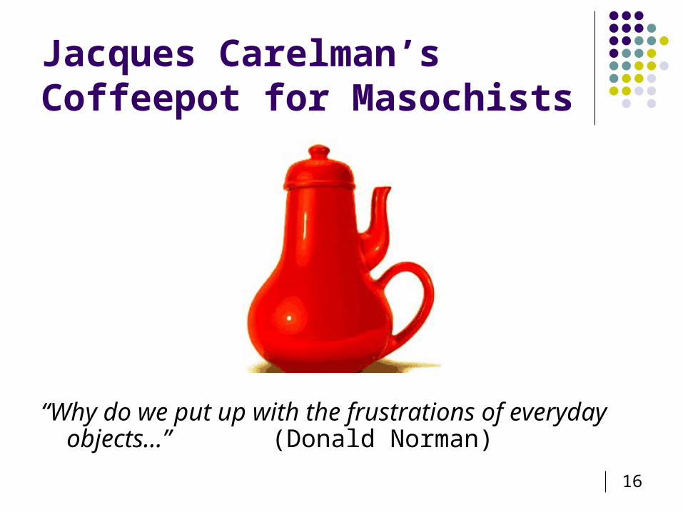
Jacques Carelman’sCoffeepot for Masochists
“Why do we put up with the frustrations of everyday objects…” (Donald Norman)
17
POET (1988) – Donald Norman
“The human mind is exquisitely tailored to make sense of the world. Give it the slightest clue and off it goes, providing explanation, rationalization, understanding.
Consider the objects - books, radios, kitchen appliances, office machines, and light switches - that make up our everyday lives. Well-designed objects are easy to interpret and understand. They provide visual clues to their operation.
Poorly designed objects can be difficult and frustrating to use. They provide no clues - or sometimes false clues. They trap the use and thwart the normal process of interpretation and understanding. Alas, poor design predominates. The result is a world filled with frustration, with objects that cannot be understood, with devices that lead to error.”
18
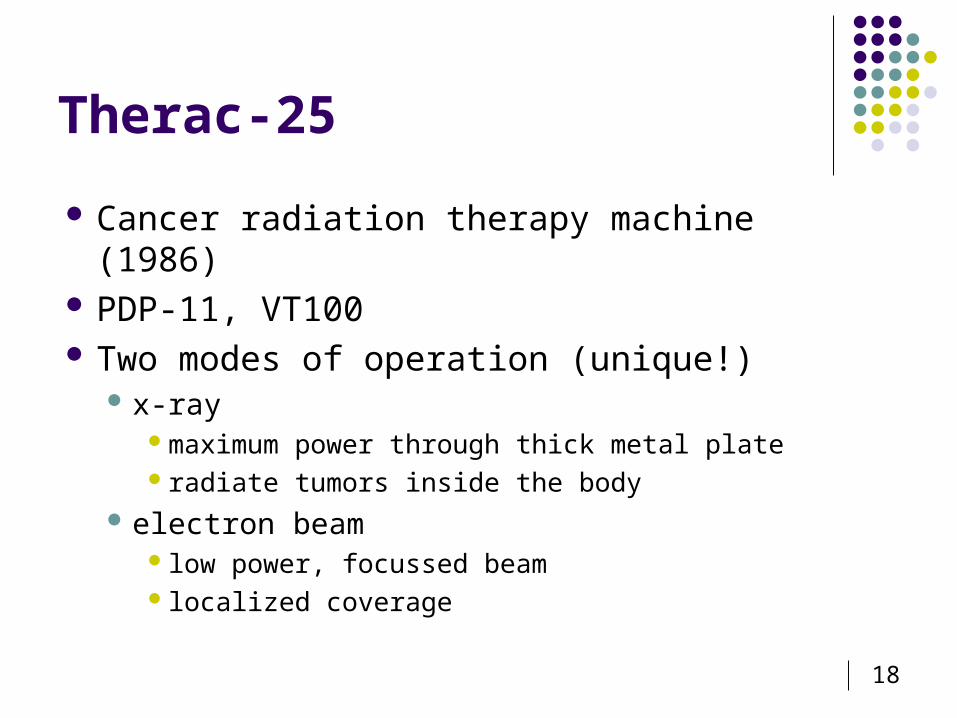
Therac-25
Cancer radiation therapy machine (1986) PDP-11, VT100 Two modes of operation (unique!)
x-raymaximum power through thick metal plateradiate tumors inside the body
electron beam low power, focussed beam localized coverage
19
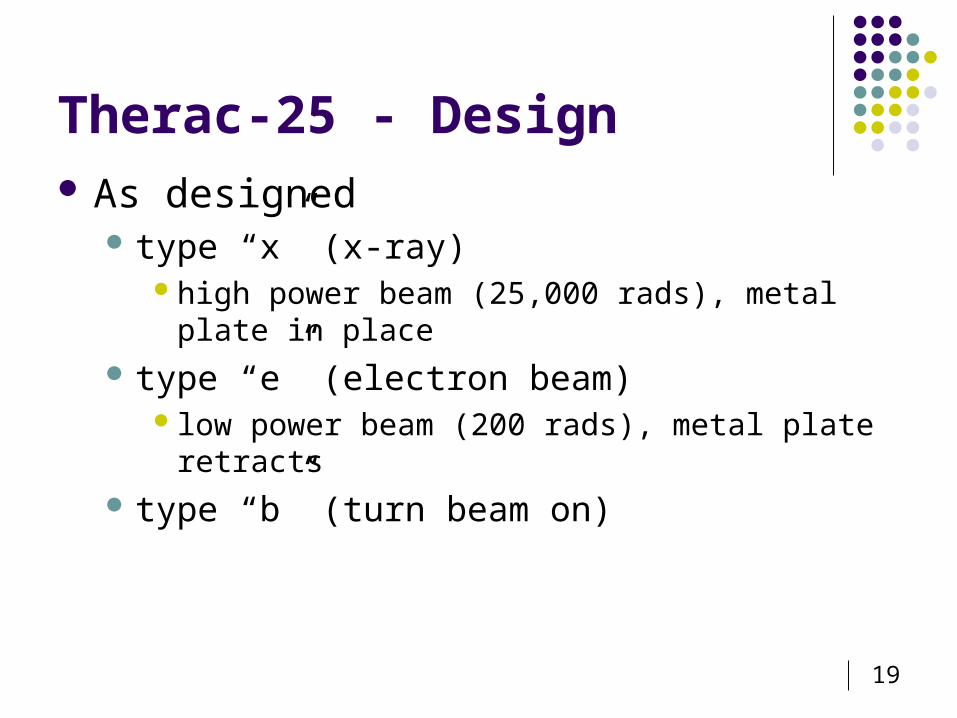
Therac-25 - Design As designed
type “x” (x-ray)high power beam (25,000 rads), metal plate in place
type “e” (electron beam) low power beam (200 rads), metal plate retracts
type “b” (turn beam on)
20
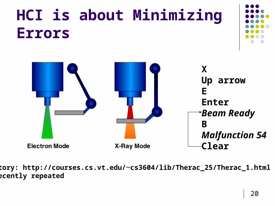
HCI is about Minimizing Errors
Story: http://courses.cs.vt.edu/~cs3604/lib/Therac_25/Therac_1.htmlRecently repeated
XUp arrowEEnterBeam ReadyBMalfunction 54Clear
21
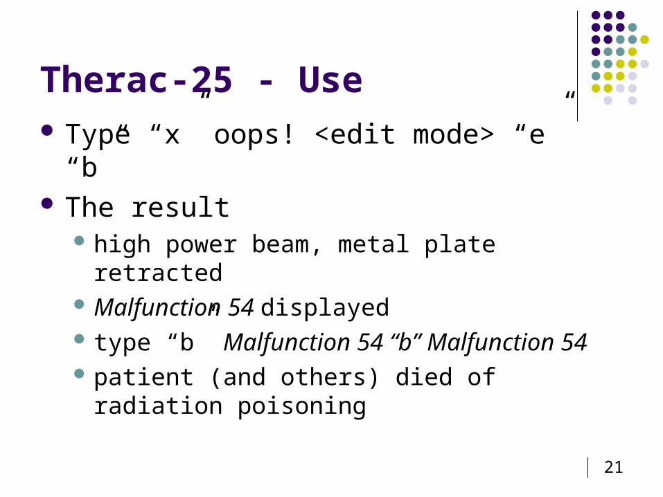
Therac-25 - Use Type “x” oops! <edit mode> “e” “b” The result
high power beam, metal plate retracted Malfunction 54 displayed type “b” Malfunction 54 “b” Malfunction 54 patient (and others) died of radiation poisoning
22
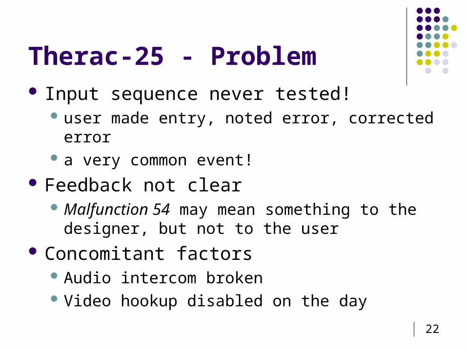
Therac-25 - Problem Input sequence never tested!
user made entry, noted error, corrected error a very common event!
Feedback not clear Malfunction 54 may mean something to the
designer, but not to the user Concomitant factors
Audio intercom broken Video hookup disabled on the day
23
HCI is about Minimizing Errors 60% of aircraft accidents are due to “human
error” 60% of undesirable manufacturing outcomes are
due to “human error” Think about the examples we just covered These aren’t “human error” They are DESIGN ERRORS! The goal of HCI is to minimize errors by
minimizing design errors
24
Interaction design in business Increasing number of ID consultancies, examples of well known
ones include: Nielsen Norman Group: “help companies enter the age of
the consumer, designing human-centered products and services”
Swim: “provides a wide range of design services, in each case targeted to address the product development needs at hand”
IDEO: “creates products, services and environments for companies pioneering new ways to provide value to their customers”
25
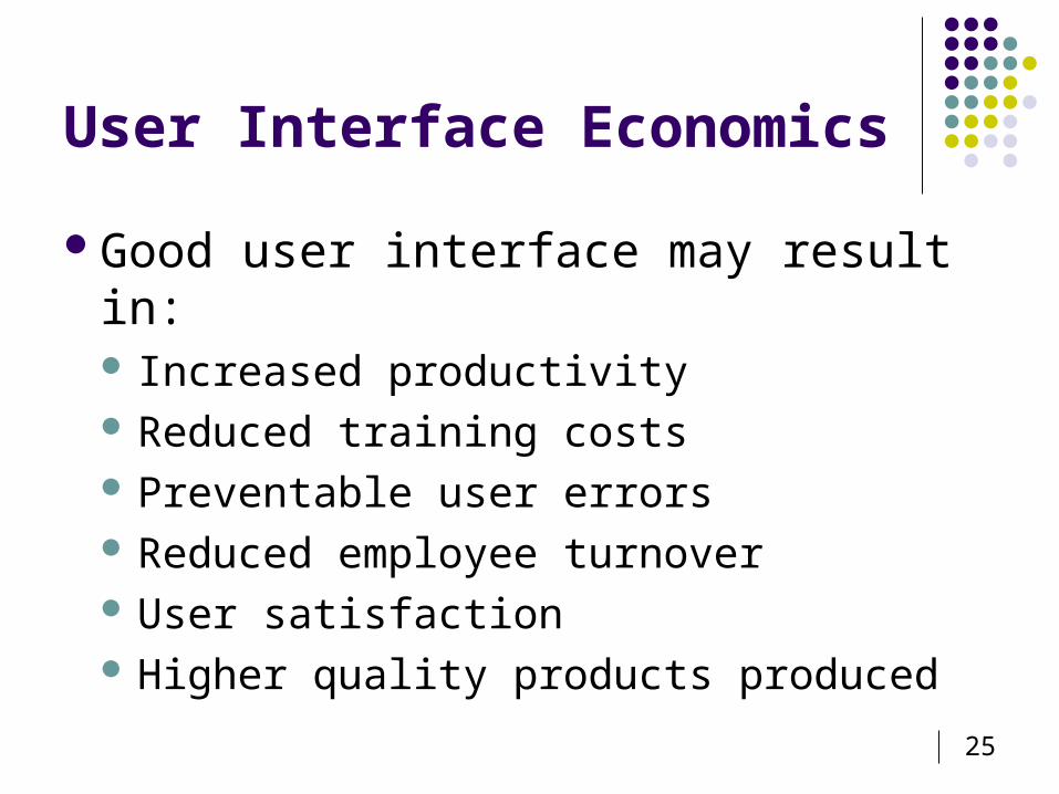
User Interface Economics
Good user interface may result in: Increased productivity Reduced training costs Preventable user errors Reduced employee turnover User satisfaction Higher quality products produced
26
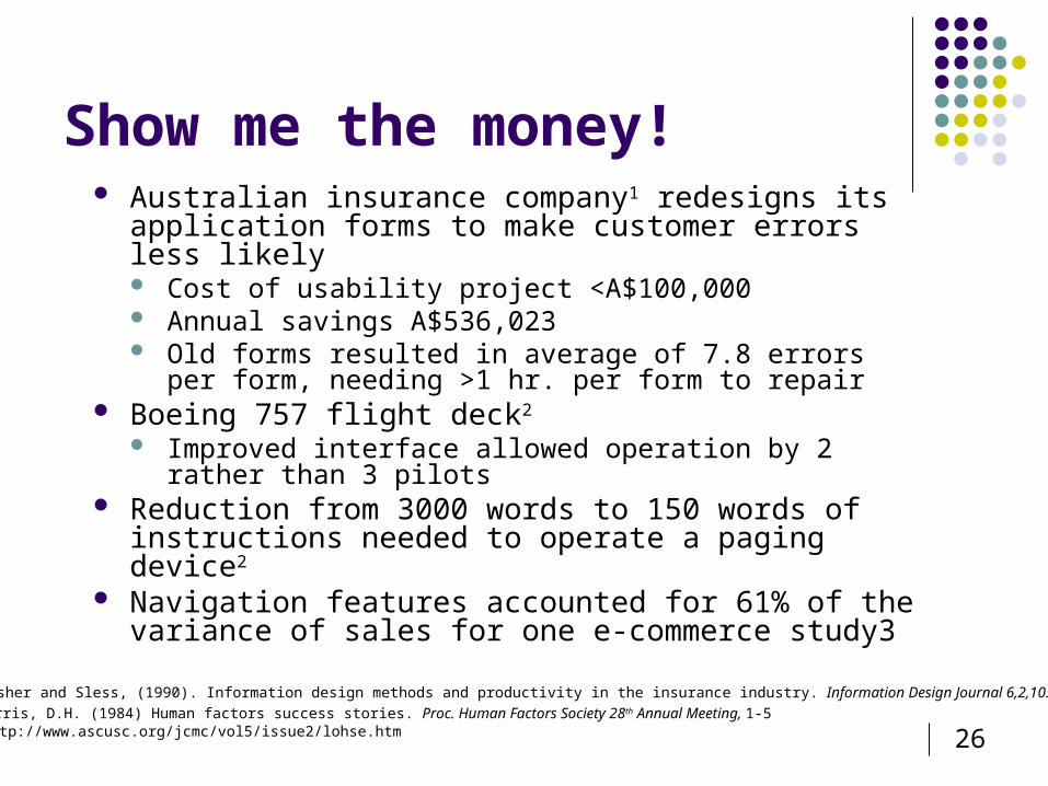
Show me the money! Australian insurance company1 redesigns its
application forms to make customer errors less likely Cost of usability project <A$100,000 Annual savings A$536,023 Old forms resulted in average of 7.8 errors per form,
needing >1 hr. per form to repair Boeing 757 flight deck2
Improved interface allowed operation by 2 rather than 3 pilots
Reduction from 3000 words to 150 words of instructions needed to operate a paging device2
Navigation features accounted for 61% of the variance of sales for one e-commerce study3
1 Fisher and Sless, (1990). Information design methods and productivity in the insurance industry. Information Design Journal 6,2,103-1292 Harris, D.H. (1984) Human factors success stories. Proc. Human Factors Society 28th Annual Meeting, 1-53 http://www.ascusc.org/jcmc/vol5/issue2/lohse.htm
27
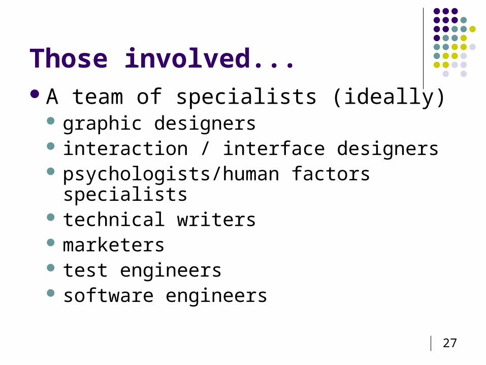
Those involved...A team of specialists (ideally)
graphic designers interaction / interface designers psychologists/human factors specialists technical writers marketers test engineers software engineers
28
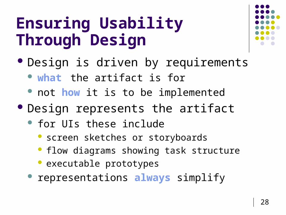
Ensuring Usability Through Design Design is driven by requirements
what the artifact is for not how it is to be implemented
Design represents the artifact for UIs these include
screen sketches or storyboards flow diagrams showing task structure executable prototypes
representations always simplify
29
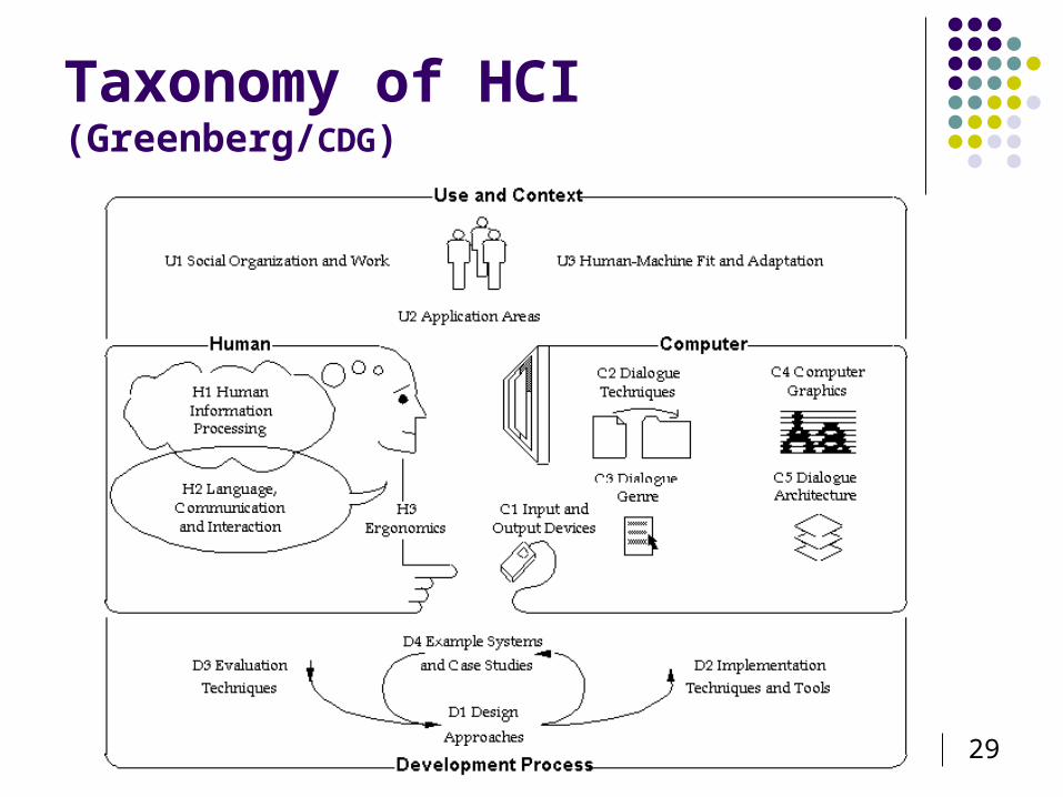
Taxonomy of HCI (Greenberg/CDG)
30
Higher Quality Products User spends less time on interface and
more on solving problem, e.g., one command compiles and executes program
Interface matches the way user thinks about problem, e.g., spreadsheet looks like accounting sheets
Interface adds value to problem solution, e.g., multiple ways to view data
31
User Interface Economics Good user interfaces sell systems!
Windows is a copy of the Mac interface The Mac interface is a copy of Bravo - developed
at Xerox PARC User interface capabilities and awareness
help get contracts Poor user interfaces can cripple a system
that is outstanding in all other respects
32
Ubiquity of Computers
Computer driven interfaces placed in most mechanical products we know
Classic problem of users not being able to set the clock on their VCR / microwave / car
Users can often not use a duplicating machine, a fax machine, a cash register, a candy machine, a bank machine or even a telephone
Cars will eventually be computer driven
33
Why Are User Interfaces Poor?
Inadequate training of people developing interfaces Diversity of knowledge required to design good
interfaces hard to find good people huge market for people with user interface design skills
Rapid technological advances Reluctance of companies to commit resources
not that true anymore Poor management - programmers do not talk to
user design team and vice versa
34
Lack of Real Engineering of The User Interface
User Interface specialists rarely involved The "bricklayers" (programmers) are left
to do the user interface architecture by default
“Ignorance by software engineers of usability and how to measure it is roughly equivalent to an electronics engineer not knowing what volts and watts are and how to measure them."
35
Current Design Practice Prevailing practice and theory in HCI Design models
1. Early focus on users and tasks Involve uses as much as possible Readings Norman (UCSD) Integrate knowledge from different disciplines
2. Empirical Measurement Simulate, observe, measure
3. Highly iterative Use to check key design decisions Analogous with programming Recognition that first time will not succeed
Heed findings of Gould & Lewis re: system designers (1985) 16% of developers identified all 3 techniques 26% mentioned none!
More recent study found… 21% Danish developers never heard of thinking-aloud method and
only 6% used it.