human development research paper 2010/39 graphical
TRANSCRIPT
Human DevelopmentResearch Paper
2010/39Graphical Statistical Methodsfor the Representation of the
Human DevelopmentIndex and its Components
César A. Hidalgo
United Nations Development ProgrammeHuman Development ReportsResearch Paper
September 2010
Human DevelopmentResearch Paper
2010/39Graphical Statistical Methodsfor the Representation of the
Human Development Indexand its Components
César A. Hidalgo
United Nations Development Programme Human Development Reports
Research Paper 2010/39 September 2010
Graphical Statistical Methods for the Representation of the Human Development
Index and its Components
César A. Hidalgo César A. Hidalgo is Assistant Professor at the Massachusetts Institute of Technology Media Laboratory and head of the Macro Connections Research Group. He is also Faculty Associate at Harvard's Centre for International Development. E-mail: [email protected]. Comments should be addressed by email to the author.
Abstract In this p aper w e in troduce f ive g raphical s tatistical me thods to c ompare c ountries le vel o f development relative to other countries and across time. For this, we use seven panels of data on the Human D evelopment Index and i ts components, containing information on m ore t han 100 countries for more than 35 years. We create visual comparisons of the level of development of countries relative to each other, and across time, through five different visualization techniques: (i) Rankings (ii) Values (iii) Distributions (iv) visual metaphors (The Development Tree), and (v) networks, b y i ntroducing t he concepts of P artial O rdering N etworks ( PON) a nd Development Reference Groups (DRG).
The g raphical ex ploration of bot h, va lues a nd di stributions, s how a saturation of bot h t he education a nd l ife di mensions of t he H DI, s uggesting a n eed t o e xtend the de finitions of t his components to include either more subcomponents, or completely new measures that could help differentiate between countries facing different development challenges. The Development Tree and the Partial Ordering Network, on t he other hand, are used to create graphical narratives of countries a nd regions. The s implicity of t he D evelopment T ree makes i t an i deal graphical metaphor f or br anding t he H DI in a m ultilingual s etting, whereas P artial O rdering N etworks provide a m ore or ganic way t o group c ountries according t o t heir l evels of d evelopment and connect countries to th ose w ith s imilar d evelopment ch allenges. W e conclude b y a rguing t hat graphical s tatistical m ethods c ould be us ed t o help c ommunicate c omplex da ta a nd c oncepts through universal cognitive channels that are heretofore underused in the development literature.
Keywords: Human Development Index, Visualization, The Development Tree, Partial Ordering JEL classification: B4, C82, O11 The H uman D evelopment R esearch P aper ( HDRP) S eries i s a m edium f or s haring recent research c ommissioned t o i nform t he g lobal H uman D evelopment R eport, w hich i s publ ished annually, and further research in the field of human development. The HDRP Series is a quick-disseminating, informal publication whose titles could subsequently be revised for publication as articles in professional journals or chapters in books. The authors include leading academics and practitioners from around the world, as well as UNDP researchers. The findings, interpretations and conclusions a re s trictly t hose of t he authors and do not necessarily represent t he vi ews of UNDP or U nited N ations M ember S tates. M oreover, t he da ta m ay not be c onsistent w ith t hat presented in Human Development Reports.

1
INTRODUCTION
THE ORIGINS OF GRAPHICAL STATISTICAL METHODS (Even charts had to be invented)
Joseph Priestley was an English theologian, clergyman and natural philosopher that lived
a prosperous academic life in the 18th century. Among Priestley’s most noteworthy contributions
was t he i solation of ox ygen i n i ts gaseous s tate, a honor t hat he s hared together w ith C arl
Wilhelm Scheele a nd Antoine Lavoisier. T he i nterests of P riestley, however, extended f ar
beyond chemistry and the Natural Sciences. Indeed, Joseph Priestley was an avid historian and
educator who w rote several books on world history, p olitics and its d efining c haracters,
including his “lectures on history and general policy”, in which he summarized many of his ideas
in forms of government, finance, taxation, and colonies, among other topics. Some of the most
outstanding contributions of this polymath, however, came not in the form of writing, but rather
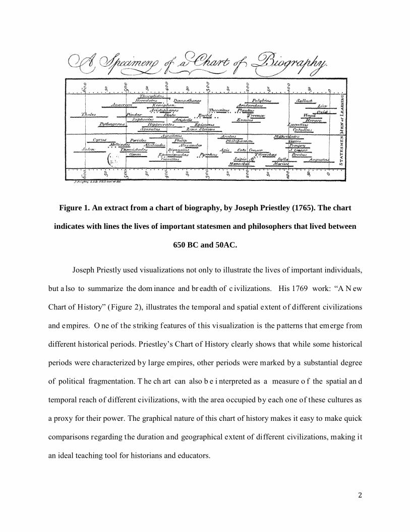
as illustrations. In 1765, Joseph P riestley created “ A C hart of B iography”, a por tion of w hich
appears in Figure 1. This chart is believed to be one of the earliest timelines and was created by
Priestley to illu strate the contemporaneity of ancient phi losophers a nd s tatesman. Priestley
believed t hat charts, s uch as t his one c ould h elp s ummarize a nd clarify i mportant a spects of
history making them a useful teaching and analytical resource and devoted an important part of
his life to the creation of charts of this sort.
2
Figure 1. An extract from a chart of biography, by Joseph Priestley (1765). The chart
indicates with lines the lives of important statesmen and philosophers that lived between
650 BC and 50AC.
Joseph Priestly used visualizations not only to illustrate the lives of important individuals,
but a lso to summarize the dom inance and br eadth of c ivilizations. His 1769 work: “A N ew
Chart of History” (Figure 2), illustrates the temporal and spatial extent of different civilizations
and empires. O ne of the striking features of this visualization is the patterns that emerge from
different historical periods. Priestley’s Chart of History clearly shows that while some historical
periods were characterized by large empires, other periods were marked by a substantial degree
of political fragmentation. T he ch art can also b e i nterpreted as a measure o f the spatial an d
temporal reach of different civilizations, with the area occupied by each one of these cultures as
a proxy for their power. The graphical nature of this chart of history makes it easy to make quick
comparisons regarding the duration and geographical extent of different civilizations, making it
an ideal teaching tool for historians and educators.

3
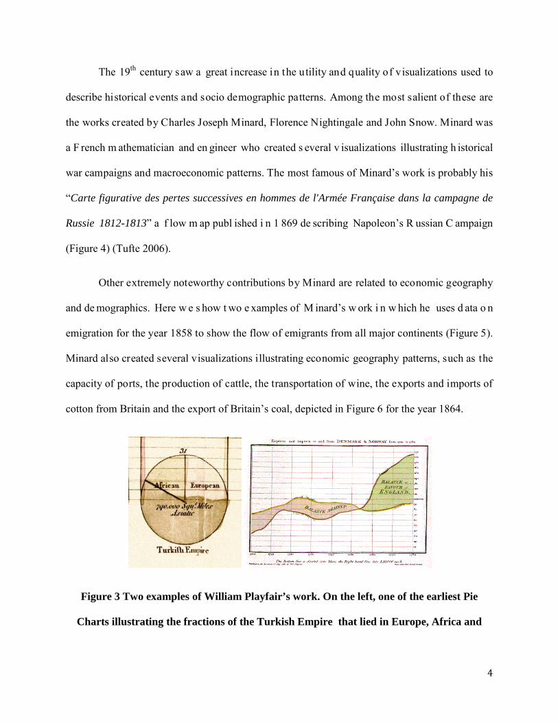
A y ounger, and mo re statistically o riented contemporary of J oseph P riestley, was
William Playfair. P layfair w as a S cottish en gineer that some considered to be the f ather o f
graphical statistical methods, such as the bar chart and the pie chart. Playfair, who once worked
as an assistant to hi s famous fellow Scotsman James Watts, believed that images were able to
explain concepts and ideas better than words. This is well exemplified in some of its most well
known images. Figure 3 s hows t wo of Playfair’s f igures, one s howing a P ie C hart used t o
compare the fractions of the Turkish Empire that lay in Asia, Africa and Europe, and the other
showing the temporal evolution of England’s trade balance with Norway and Denmark, which is
represented by the shaded area between the curves. While both of these figures seem extremely
simple from a modern perspective, they were ground breaking for their time and helped cement
the path to a more widespread use of graphical statistical methods in the following centuries.
Figure 2. A new chart of History by Joseph Priestley (1769). The chart illustrates, and
compare, the duration and geographical extent of mayor historical civilizations.
4
The 19th century saw a great increase in the utility and quality of visualizations used to
describe historical events and socio demographic patterns. Among the most salient of these are
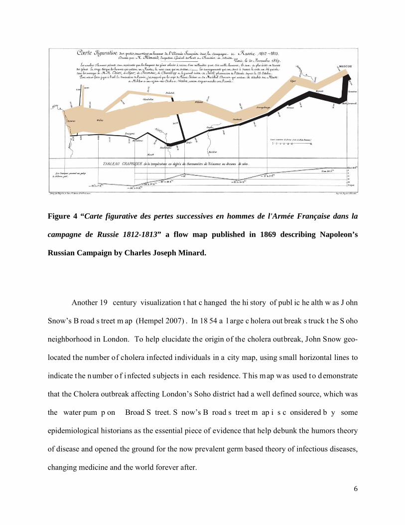
the works created by Charles Joseph Minard, Florence Nightingale and John Snow. Minard was
a F rench m athematician and en gineer who created s everal v isualizations illustrating h istorical
war campaigns and macroeconomic patterns. The most famous of Minard’s work is probably his
“Carte figurative des pertes successives en hommes de l'Armée Française dans la campagne de
Russie 1812-1813” a f low m ap publ ished i n 1 869 de scribing Napoleon’s R ussian C ampaign
(Figure 4) (Tufte 2006).
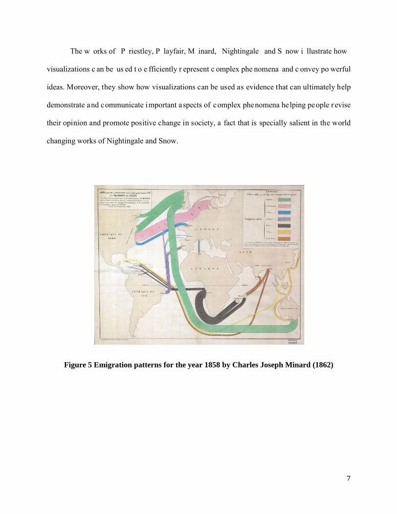
Other extremely noteworthy contributions by Minard are related to economic geography
and de mographics. Here w e s how t wo e xamples of M inard’s w ork i n w hich he uses d ata o n
emigration for the year 1858 to show the flow of emigrants from all major continents (Figure 5).
Minard also created several visualizations illustrating economic geography patterns, such as the
capacity of ports, the production of cattle, the transportation of wine, the exports and imports of
cotton from Britain and the export of Britain’s coal, depicted in Figure 6 for the year 1864.
Figure 3 Two examples of William Playfair’s work. On the left, one of the earliest Pie
Charts illustrating the fractions of the Turkish Empire that lied in Europe, Africa and

5
Asia in 1789 (created in 1801). And on the right an illustration of the trade balance between
England, Denmark and Norway (1786)
While the works of Minard are aesthetically impressive and clearly ahead of his time, the
more modest visualization works done by Florence Nightingale and John Snow had the power to
change public health for years to come.
Soon a fter t he C rimean w ar Florence N ightingale was as ked b y t he q ueen t o w rite a
report on t he poor s anitary conditions faced b y th e British A rmy and to make some
recommendations f or possible health reforms. A fter t he government di d not follow up on he r
report Nightingale decided t o w rite a nd s ubmit an a nnex where s he included her now f amous
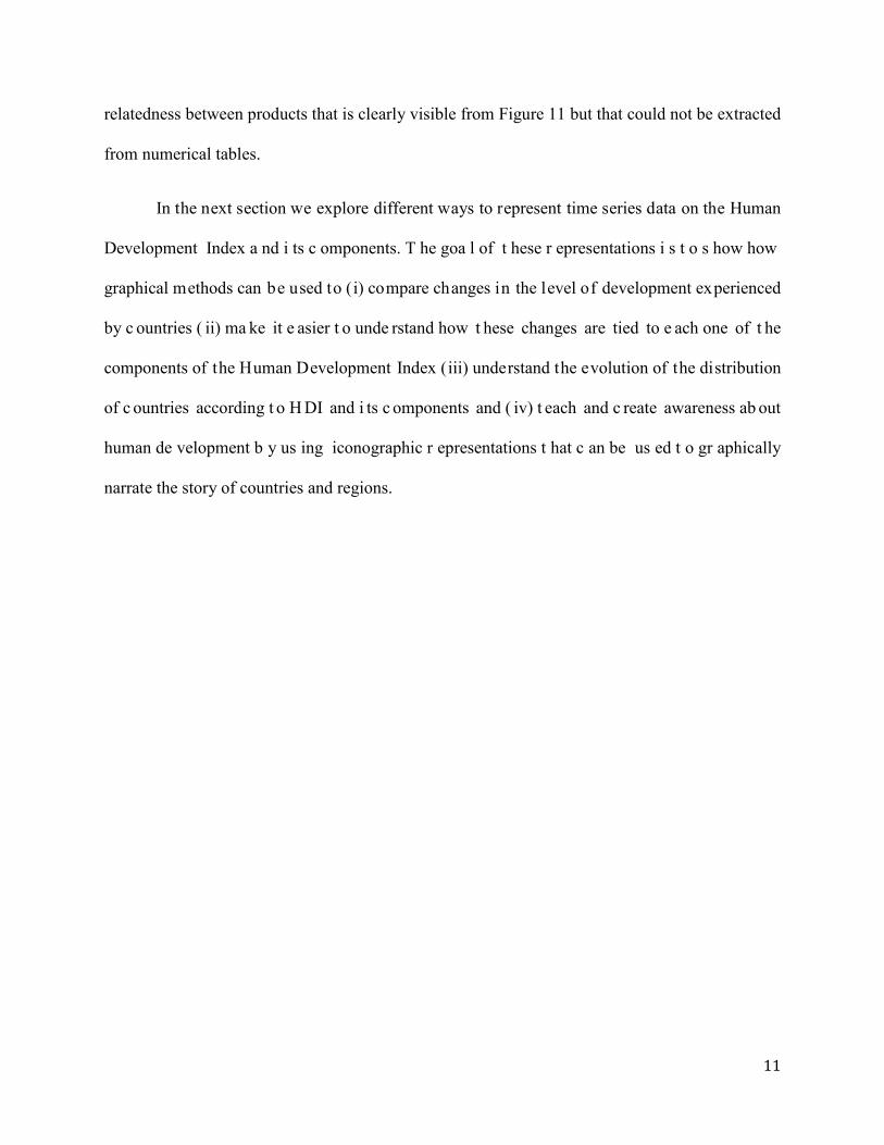
Nightingale’s rose (Figure 7). Nightingale’s Rose is a visualization that the famous nurse used to
show that most individuals that died during the Crimean war did so from preventable, rather than
catastrophic causes (preventable causes are represented by the light blue area of Figure 7). It is
believed that Nightingale thought that the queen will probably not r ead her report but that her
attention c ould b e m ore eas ily caught b y a p icture, r ather t han a p aragraph. S ome h istorian
believe that Nightingale’s rose ultimately help persuade the government to institute some of the
reforms she suggested (Brasseur 2005).
6
Figure 4 “Carte figurative des pertes successives en hommes de l'Armée Française dans la
campagne de Russie 1812-1813” a flow map published in 1869 describing Napoleon’s
Russian Campaign by Charles Joseph Minard.
Another 19 century visualization t hat c hanged the hi story of publ ic he alth w as J ohn
Snow’s B road s treet m ap (Hempel 2007) . In 18 54 a l arge c holera out break s truck t he S oho
neighborhood in London. To help elucidate the origin of the cholera outbreak, John Snow geo-
located the number of cholera infected individuals in a city map, using small horizontal lines to
indicate the number o f i nfected subjects in each residence. This map was used to demonstrate
that the Cholera outbreak affecting London’s Soho district had a well defined source, which was
the water pum p on Broad S treet. S now’s B road s treet m ap i s c onsidered b y some
epidemiological historians as the essential piece of evidence that help debunk the humors theory
of disease and opened the ground for the now prevalent germ based theory of infectious diseases,
changing medicine and the world forever after.
7
The w orks of P riestley, P layfair, M inard, Nightingale and S now i llustrate how
visualizations c an be us ed t o e fficiently r epresent c omplex phe nomena and c onvey po werful
ideas. Moreover, they show how visualizations can be used as evidence that can ultimately help
demonstrate and communicate important aspects of complex phenomena helping people r evise
their opinion and promote positive change in society, a fact that is specially salient in the world
changing works of Nightingale and Snow.
Figure 5 Emigration patterns for the year 1858 by Charles Joseph Minard (1862)
8
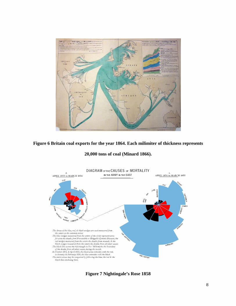
Figure 6 Britain coal exports for the year 1864. Each milimiter of thickness represents
20,000 tons of coal (Minard 1866).
Figure 7 Nightingale’s Rose 1858

9
Figure 8 John Snow’s Broad Street Map.
MODERN USES OF GRAPHICAL STATISTICAL METHODS
During the l ast de cades i mprovements i n i nformation t echnology h ave come t ogether
with an i ncrease i n t he num ber of g raphical s tatistical m ethods us ed b y analysts t o e xplore
complex s ocial, ph ysical, bi ological and economic phenomena. N etwork vi sualizations a re
among the most useful of these methods, since they allow analysts to work with data in addition
to demographic and geographic layers of information.
A good example of a new graphical statistical method, as well as an analytical concept,
that is now used to study the level of industrial development of countries and its evolution is the

10
Product Space. Figure 9 shows a vi sualization of the Product Space in which the relationships
between m ore t han 700 product categories is illu strated. In th is v isualization goods are
represented b y nodes and l inks connect goods t hat t end to be exported by the same countries.
Here, the co-exporting o f goods b y countries i s t aken as a proxy for the likelihood that goods
require a s imilar s et o f non-tradable i nputs or c apabilities (Hidalgo et a l. 2007) . H ence, T he
Product Space represents a “map” of industrial development that can be used to see the position
in the industrial space of a country together with its set of possible industrial options.
Figure 10 uses black squares to visualize the evolution of the export baskets of Malaysia,
China and Mexico, illustrating that countries tend to move towards products that are close by to
the ones they already produce in the Product Space. The visualization shows that that industrial
development i s a pr ocess c onstrained b y t he s tructure of t his ne twork, a f act t hat i s r elatively
easy to understand graphically, but is complex to illustrate otherwise.
While Figure 9 and Figure 10 show instances of the Product Space using that in which
products a re di saggregated i nto 775 c ategories, Figure 11 shows a m ore di saggregate
visualization of t he P roduct S pace c ontaining more t han 5,000 di fferent c ategories. If w e
approximate t he i nformation i n Figure 11 as t he t otal num ber o f node s, l inks a nd c ategories
illustrated there, we would conclude that Figure 11 is showing us a representation composed of
more t han 30,000 va lues, an amount of da ta which i s equivalent t o more t han 34 H DR annex
pages1 Figure 11. Yet, such an interpretation of the volume of information represented in would
not be considering the patterns described by these large set of data, an aspect of the pattern of
1 Considering the annex of the 2009 edition of the Human Development Report.
11
relatedness between products that is clearly visible from Figure 11 but that could not be extracted
from numerical tables.
In the next section we explore different ways to represent time series data on the Human
Development Index a nd i ts c omponents. T he goa l of t hese r epresentations i s t o s how how
graphical methods can be used to (i) compare changes in the level of development experienced
by c ountries ( ii) ma ke it e asier t o unde rstand how t hese changes are tied to e ach one of t he
components of the Human Development Index (iii) understand the evolution of the distribution
of c ountries according t o H DI and i ts c omponents and ( iv) t each and c reate awareness ab out
human de velopment b y us ing iconographic r epresentations t hat c an be us ed t o gr aphically
narrate the story of countries and regions.

12
Figure 9 The Product Space for the 1998-2000 period.(Hidalgo et al 2007)

13
Figure 10 Changes in patterns of comparative advantage for Malaysia, China and Mexico
between 1985 and 2000. Products for which these countries have revealed comparative
advantage (meaning they are being exported in sufficiently large amounts) are indicated in
black squares. (Hidalgo et al 2007)

14
Figure 11 Visualization of the Product Space for the year 2005 (Data from Gaulier et Zignano 2009, Analysis and Visualization
from Author's own calculations)

15
VISUALIZING HUMAN DEVELOPMENT
DATA
We u se the H DI data c ompiled b y G ray a nd P urser (2009) summarizing H DI and its
components between 1970 and 2005 i n five year intervals. When visualizing the time series for
HDI and its components we limit ourselves to data only for countries for which data is available
for all periods. As a result of this the number of countries included in visualizations for different
indicators varies according to the availability of data. For the Partial Ordering Network we use
data for 2007-2009, also compiled by Gray and Purser (2009).
THE HUMAN DEVELOPMENT INDEX
The Human Development Index (HDI) is a statistic used to describe countries well being
that gives equal weight t o ( i) an education indicator, ( ii) a life o r health indicator, and ( iii) an
income indicator. Formally the HDI of country c at time t is defined as:
(1)
Where EDc(t), LIFEc(t) a nd GDPc(t) r epresent, r espectively, a n education i ndicator,
which combines (2/3) of an adult literacy indicator and (1/3) of a primary enrollment indicator, a
life i ndicator t hat i s p roportional t o l ife e xpectancy a nd a n i ncome i ndicator w hich i s
proportional to the country’s per capita Gross Domestic Product (GDP). All of these indicators
are normalized such that their values lie between 0 and 1.

16
Starting i n 2010 t he H DI will be m odified to i nclude (i) School l ife ex pectancy o f
children of school entrance age and (ii) mean years of schooling of adults as its new educational
indicator. The figures we present below, however, use the traditional definition of HDI described
in equation (1) and use the data compiled by Gray and Purser referenced in the data section of
this document.
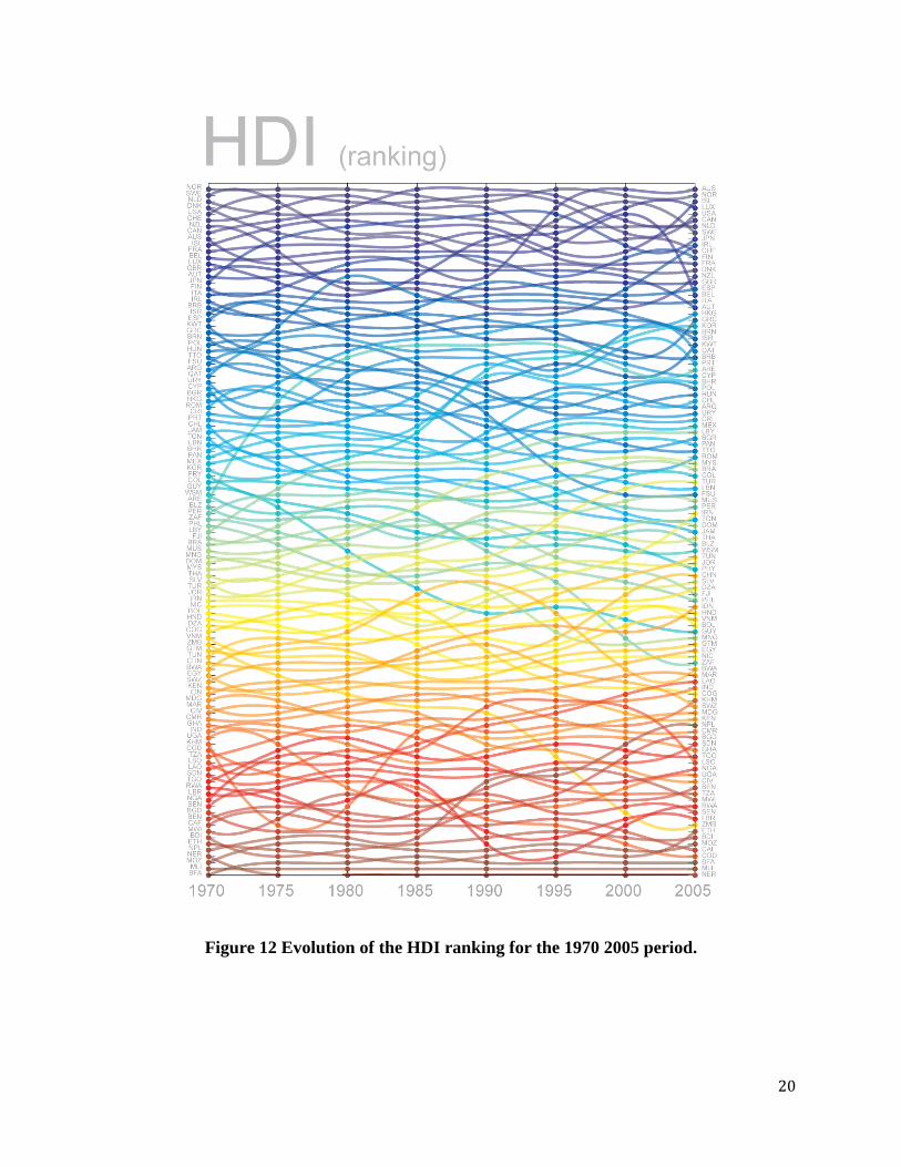
(I)-(III) RANKINGS, TRENDS AND DISTRIBUTIONS
(i) Rankings
We begin exploring the evolution of nations’ r elative l evels of human d evelopment b y
looking at the ranking of HDI and its components across time. Figure 8 to Figure 14 show the
evolution of the ranking of countries according to HDI between 1970 and 2005. The figures were
created b y assigning c olors t o e ach country i n 1 970 a ccording t o a pe rfect gradient t hat goes
from da rk bl ue, f or t he highest ranked c ountries, to c rimson for t he l owest ranked one s. T his
coloring technique helps to quickly identify countries that have experienced substantial changes
in t heir H DI r anking du ring t his pe riod. The s mooth c oloring of Figure 12 is ev idence t hat,
despite the substantial changes in the levels human development that took place during the last
30 years, the positions in the HDI ranking remain relatively stable. More notorious changes are
observed i n t he r ankings of i ndividual i ndicators. F or i nstance Figure 13 shows t hat Greece
(GRC), Korea ( KOR), Lybia ( LBY), Indonesia ( IDN) a nd Al geria ( DZA), a mong ot her
countries, moved s ubstantially up t he education i ndicator r anking, whereas B elize ( BLZ),
Vietnam ( VNM) a nd T rinidad a nd T obago ( TTO) pop out a s c ountries t hat fell dow n several
spots in the education ranking.
17
Figure 14 shows the Life indicator ranking revealing that in this dimension the countries
that m oved up t he ranking t he m ost dur ing t his pe riod w ere K orea ( KOR), O man (OMN),
Vietnam ( VNM), Indonesia ( IDN) an d N epal ( NPL) among ot hers. For t he i ncome i ndicator,
however, t he c ountries t hat m oved up t he r anking t he m ost w ere E quatorial G uinea ( GNQ),
Botswana (BWA), T hailand ( THA) a nd C hina ( CHN) ( Figure 15). M ovements i n r anking,
however, are not e quivalent t o m ovements i n v alues. T his i s i llustrated i n Figure 16, w hich
highlight the 15 countries that experienced the largest increase in HDI during this period, with
numerical values shown in parenthesis. Figure 16 shows two things, the first one is that most of
the c ountries t hat m ade s ubstantial a dvances i n H uman D evelopment dur ing t he obs ervation
period were all located in s imilar positions of the ranking. As a result, the ranking s tructure is
such t hat s ome c ountries t hat m ade s ubstantial pr ogress dur ing t he pe riod, s uch as B otswana
(BWA) moved down the ranking. Moreover, the top performer of the period, Indonesia ( IDN)
moved up only a few positions, since a ll countries that were close to Indonesia in the ranking
moved up substantially as well. The second thing that is clear from Figure 16 is that most of the
countries that had largest increases in HDI are located either in East Asia or in North Africa and
the M iddle E ast. T his g eographic c oncentration of H DI i ncrease i s s hown g eographically i n
Figure 17.
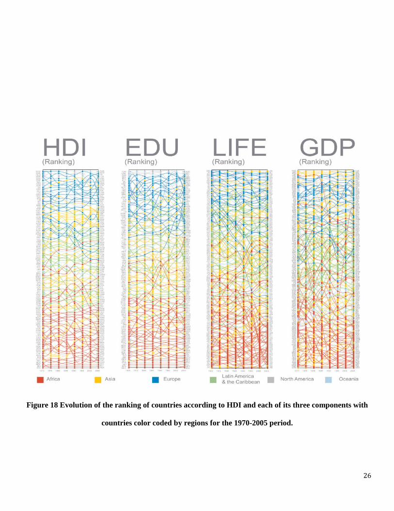
Rankings s uch a s t he o nes pr esented i n Figure 12 to Figure 16 can a lso be us ed t o
visualize the relative position o f regions as well as countries. Figure 18 to Figure 23 shows a
visual exploration of the ranking of countries and the relative position of the regions they belong
to by coloring each country according to its respective regions. Figure 18 shows the HDI ranking
together with that of each of the three components of HDI highlighting the clear separation in the
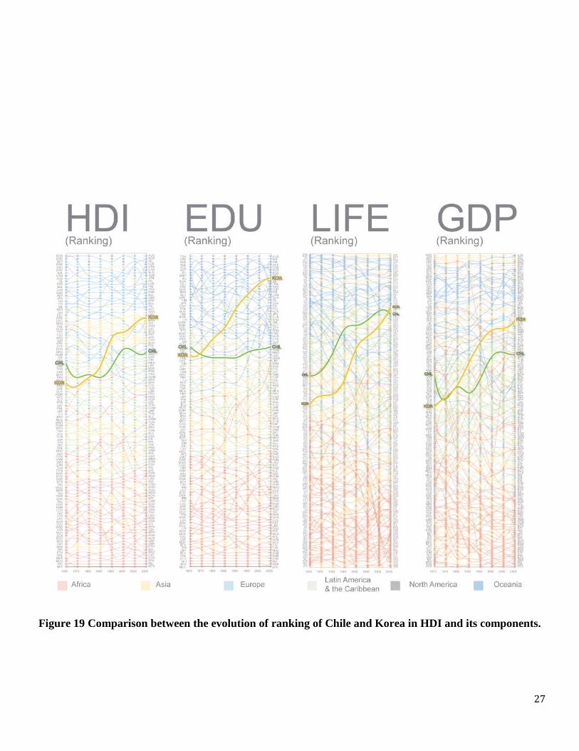
HDI rankings that exist between these different geographical regions. Figure 19 uses this figure

18
to compare the evolution in HDI and its components experienced by Chile and Korea. The figure
shows how K orea ha s surpassed C hile not on ly i n t he H DI ranking, but i n e ach o f t he
components as well, the largest difference in ranking between the two countries now being the
difference i n t he education i ndex and t he s mallest be ing t hat i n t he l ife c omponent of t he
indicator.
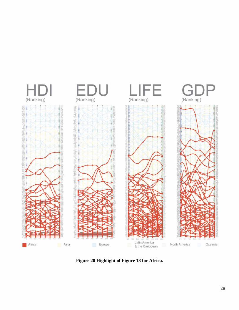
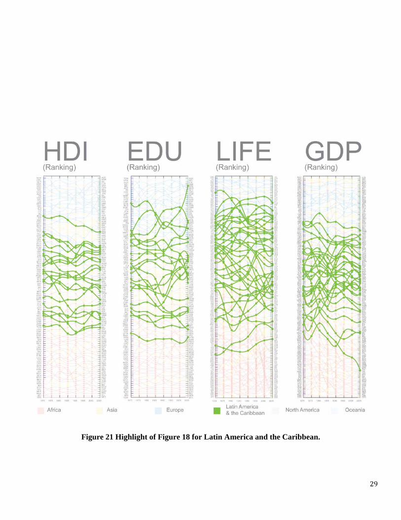
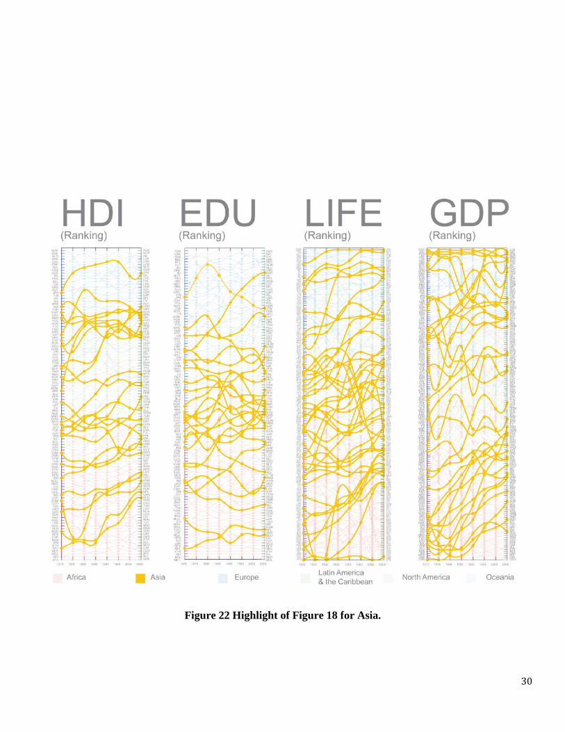
Figure 20 to Figure 23 highlight t he pos ition i n t he H DI r anking a nd t hat of i ts
components of countries located in Africa, Latin America and the Caribbean, Asia and Europe
together with North America and Oceania. The patterns defined by each one of these regions are
very distinct. Most African nations are consistently located in the bot tom spots of the ranking,
except for a f ew na tions w hose i ncome de pends on t he e xtraction of o il s uch a s E quatorial
Guinea (GNQ), Lybia (LBY), Gabon (GAB); a ex ception being the Seychelles (SYC), a s mall
archipelago in the Indian Ocean that has become a prosperous tourist destination.
The patterns defined by Latin America and Asia are, on the other hand, characterized by
a high degree of heterogeneity. Countries from Latin America and the Caribbean occupy a wide
range of the HDI ranking, with regional leaders in relatively high positions of the ranking, such
as Barbados (BRB), Argentina (ARG), Chile (CHL) and Mexico (MEX) sharing the region with
other countries like Haiti (HTI), Guatemala (GTM) and Nicaragua (NIC), who occupy some of
the la st positions in t he r anking. T his he terogeneity a ppears t o be m ore pr onounced i n A sia,
especially when i t comes to the l ife and income indicators where some Asian countries can be
found at the top of the ranking while others occupy the very bottom of it.
Figure 23 highlights Europe, North America and Oceania. While it is trivial to see from
these figure the fact that these countries are concentrated in the top spots of the HDI ranking and
19
that of i ts c omponents i t i s s urprising t o s ee t he r elatively s tep de cay on t he L ife r anking of
countries such as t hose of t he Former Soviet U nion (FSU), Romania ( ROM), Bulgaria ( BGR)
and H ungary ( HUN). T he de cays i n t he r anking of t hese c ountries ap pear t o h ave o ccurred
between 1970 and 1995, after which these countries stop losing positions in the ranking or begun
to recover a few spots in it.
Rankings l ike t he one s presented i n Figure 12 to Figure 23 are us eful f or doi ng s ome
comparisons but a re non -informative a bout H DI va lues. M oreover, r ankings di stort a xis b y
stretching them around values where there is a large concentration of countries and compressing
them ar ound v alues w here t oo f ew co untries a re l ocated. T his can cr eate ar tificially l arge
separations i n t he r anking between co untries with similar HDI values while a t th e s ame time
creating artificially small gaps between countries with extremely different values when no other
countries are located between them.
In t he ne xt s ection w e pr esent a vi sual e xploration of H DI va lues a nd also an alyze
changes in their distributions.
20
Figure 12 Evolution of the HDI ranking for the 1970 2005 period.

21
Figure 13 Evolution of the education ranking for the 1970-2005 period.

22
Figure 14 Evolution of the life ranking for the 1970 2005 period.

23
Figure 15 Evolution of the GDP ranking for the 1970 2005 period.

24
Figure 16 Ranking highlighting the 15 countries which largest increases in HDI during the
period between 1970 and 2005.

25
Figure 17 Figure illustrating countries with the largest changes in HDI between 1970 and 2005
Change in HDI Between1970 and 2005
26
Figure 18 Evolution of the ranking of countries according to HDI and each of its three components with
countries color coded by regions for the 1970-2005 period.
27
Figure 19 Comparison between the evolution of ranking of Chile and Korea in HDI and its components.
28
Figure 20 Highlight of Figure 18 for Africa.
29
Figure 21 Highlight of Figure 18 for Latin America and the Caribbean.
30
Figure 22 Highlight of Figure 18 for Asia.

31
Figure 23 Highlight of Figure 18 for Europe, North America and Oceania.
32
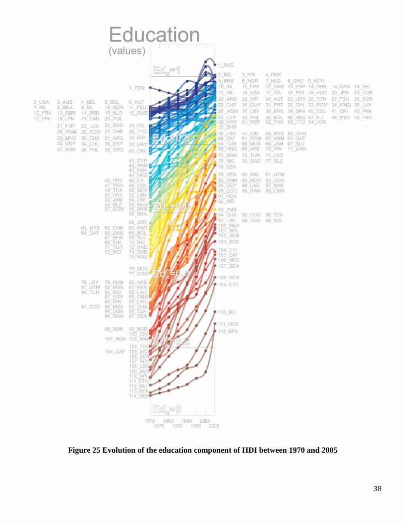
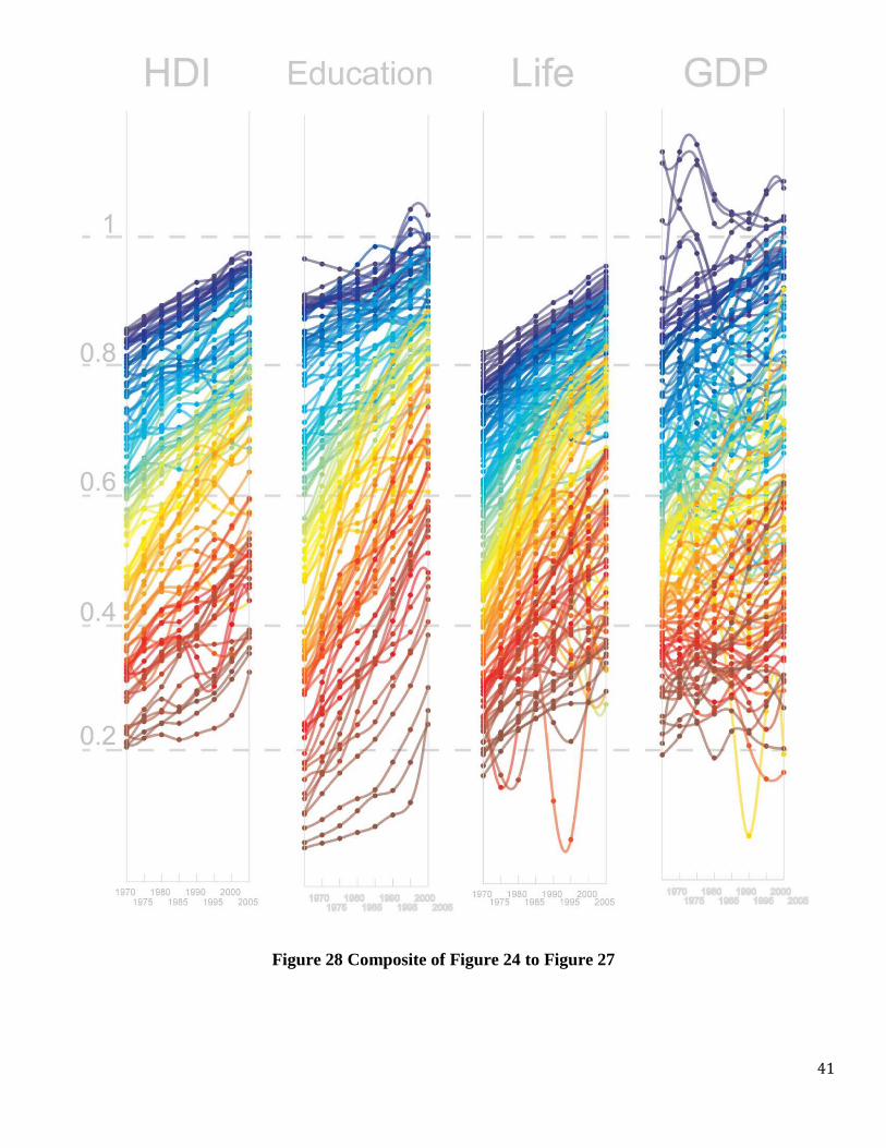
(ii)-(iii) Values and Distributions
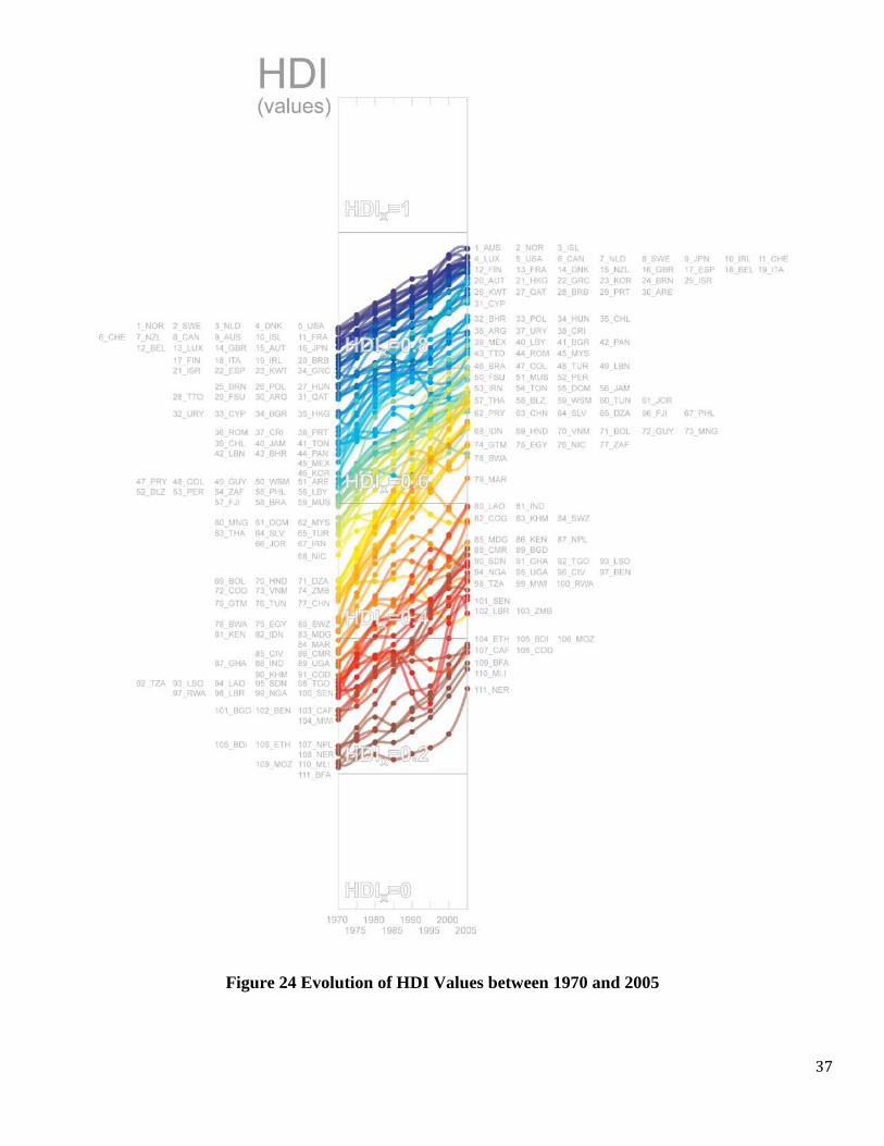
Figure 24 to Figure 28 show the evolution of HDI values for all countries for which we
have data available between 1970 and 2005. The upward slopping curves of these figures signal
a s ubstantial pr ogress i n hum an de velopment, a s c aptured b y H DI d ata, a nd i ts c omponents,
during these 25 years.
These f igures ( Figure 24 - Figure 27) also s how t he r ankings of c ountries i n t he a xis,
evidencing a hi gh concentration of n ations a t hi gh HDI values. This i s especially t rue f or t he
education and life indicators, suggesting a need to promote these measurements or complement
them w ith a dditional o nes if they a re t o c ontinue he lping us distinguish b etween t he l evel o f
development of c ountries and helping i dentify specific p roblems af fecting co untries t hat h ave
“outgrown” the current Human Development Index.
The relative concentration of countries at some HDI values can be appreciated better by
looking at figures showing the bivariate probability of finding a country with a certain HDI value
for a g iven year. Figure 29 shows t he e volution of t he di stribution o f H DI v alues, a nd i ts
components, be tween 19 70 and 2005, f or a ll countries. This f igure i llustrates some interesting
stylized f acts r egarding th e d istribution of H DI va lues. First, t hey show r elatively hi gh
concentration of countries for values c lose to maximum, especially for HDI and the education
indicator, for which more than half of the countries are concentrated at values of the indicator of
0.8 or higher.
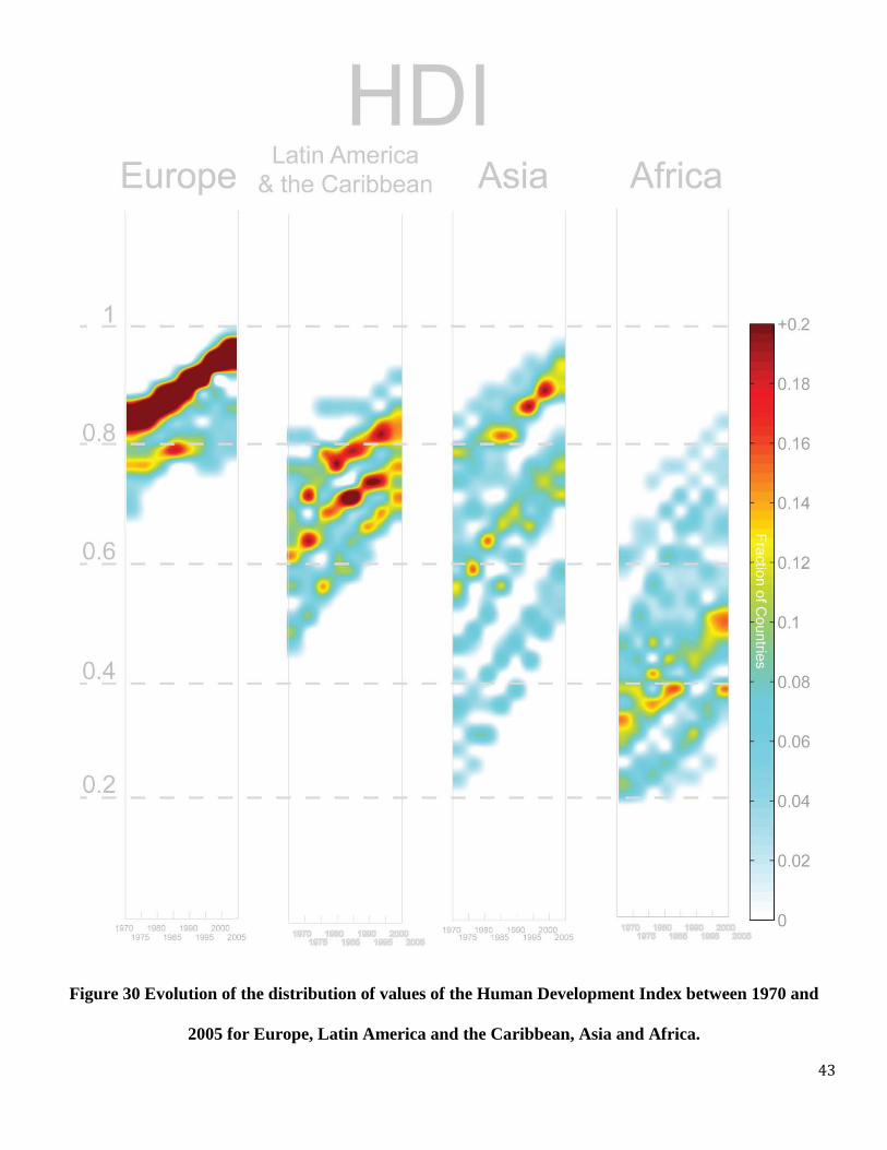
We can also get a deeper look at each region by recreating these distributions using data
for c ountries i n a s ingle r egion. Figure 29 doe s this e xercise f or t he H DI density di stribution

33
highlighting the different patterns characterizing Europe, Latin America and the Caribbean, Asia
and A frica. O nce a gain this f igure illu strates the large r egional d ifferences i n H DI v alues
characterizing countries of di fferent regions. Fig 29 s hows, for instance, that HDI almost does
not cap ture any d ifferences b etween E uropean co untries, al l o f w hich ar e concentrated at
extremely h igh H DI v alue ( above 0 .9), w hile a t t he s ame t ime i t r eveals a l arge d egree o f
heterogeneity in HDI among Asian states.
All in all, the visual exploration of HDI values and their distribution shows that (i) there
was a substantial increase in development as captured by HDI between 1970 and 2005 (ii) this
increase h as resulted i n the s aturation of s ome dimensions, w ith m any countries l ocated i n a
narrow r ange o f v alues cl ose t o t he m aximum. T his i s s pecially t he case f or H DI an d t he
Education indicator, but there is also a large concentration of values in the life dimension as well.
These suggest a n eed to extend or complement these indicators with other measures, a step that
has b een t aken regarding t he ed ucation i ndicator. Additional me asures for e xtending th e lif e
dimension could include the prevalence of diseases that have reached epidemic proportions, such
as A IDS a nd obe sity, a s w ell a s i ndicators of s anitary c onditions, s uch a s t he a vailability o f
drinking water, for instance. The extension of the indicators would increase the ability of HDI
and its components to differentiate between countries and point to more specific problems. (iii)
There a re important di fferences i n t he va riations of l evel of development, and the s tructure of
this variation, for countries in the same region. Europe, for instance, appears in the distribution
of HDI values as a coherent mass of countries that has progressed steadily during the observation
period t owards t he hi ghest va lues of t he ranking. A sia and Latin A merica, on t he ot her ha nd,
exhibit a wide range of variation which is characterized by bands of countries. Asia in particular
shows three well defined bands in Figure 30 that indicate that the Asian continent is composed

34
by a set of developed countries, including Japan (JPN), Korea (KOR), Israel (ISR) and Kuwait
(KWT), which have made a comparable progress to that of Europe and North America, followed
by a second s et o f co untries t hat h ave ad equate l evels i n H DI and i ts c omponents, s uch a s
Thailand ( THA), M alaysia ( MYS), C hina ( CHN) a nd T urkey ( TUR). Finally there is a th ird
group of countries that has grown a t a s imilar r ate b ut still la gs c onsiderably b ehind th e r est,
including examples such as India (IND) and Laos (LAO).
Here we conclude our use of traditional graphical statistical methods. In the next sections
we explore the use of a symbolic and network representation for the Human Development Index.
In t he ne xt s ection w e us e a t ree as a v isual metaphor to illu strate HDI to gether w ith its
components. In the section after that we introduce the concept of a partial ordering network to
graphically illustrate t he p atterns d efined b y connecting co untries at co mparable l evels o f
development.
BOX 1:
GRADUATION FROM HDI?
The remarkable progress in HDI and i ts components exhibited by several countries dur ing the
last couple of decades has translated into a large concentration of countries in a narrow range of
relatively high HDI values. This concentration limits the ability of HDI to point into particular
problems and limits the ability of the indicator to distinguish between countries.
As progress in human development is made it is natural to think that countries will “graduate”
from t he i ndicator. For i nstance, i t i s ha rd to b elieve t hat m easures o f l ife ex pectancy, s chool
enrollment or adult literacy could help identify or signal any problems for many of the countries
in t he da taset. T he need f or “g raduating” m any n ations from the e ducation i ndicator i s w ell

35
exemplified, for i nstance, by t he fact t hat i n 2005 t he e ducation i ndicator w as t he l argest
contributor t o H DI f or 75 (67.6%) out of t he 111 c ountries f or w hich f ull H DI da ta w as
available. In ot her w ords, t he e ducation i ndicator, c omposed of A dult L iteracy a nd P rimary
Enrollment, is a dimension in which it is relatively easy for all countries to obtain a large score
and does not help discriminate between different nations.
It c an be us eful t o t hink of HDI using a n analogy i n w hich H DI is a t est and co untries ar e
students. Currently, the test consist of three questions, from which the education question is one
that most students get right and therefore does not contribute much to the discriminatory power
of the test. This suggests a need for the subcomponents of the education question to be upgraded,
to “make the question more challenging” in order to separate the best s tudents, f rom the good
ones and the good ones from the more mediocre ones.
The graduation and extension of the Life indicator also seems appropriate at this point, albeit for
a difference set of reasons. While most countries are not concentrated in extremely large values
of the Life indicator, most countries are still concentrated in a narrow range of the Life indicator
values. Indeed, in 2005 the s tandard deviation o f t he Life i ndicator for was 0.182, onl y slight
larger than the standard deviation of the education indicator, which was equal to 0.177 for that
same year. For comparison, the income indicator has a standard deviation of 0.224. The narrow
range of values taken by countries in the life indicator suggests a need to extend or improve this
dimension t o i nclude s anitary and he alth r elated i ssues t hat a re not captured b y t he c urrent
incarnation of the Health Indicator.
The graduation and extension of the Human Development Index does not need to be traumatic.
Au contraire, it can b e d one g radually an d r especting H DI’s current tripartite s tructure ( i.e.

36
conserving t he b ranches o f ed ucation, l ife and i ncome). This w ould keep H DI s imple for
explanatory purposes, at an aggregate level, as i t would conserve i ts s tructure as an average of
education, life and income indicators, and would move the sophistication of new dimensions into
higher levels of the indicator, where the definitions are already more complex (as they include
the rescaling procedures).
The inclusion of more dimensions into each of the three branches of the HDI is an exercise that
should be performed carefully by a panel of experts that would consider data availability, as well
as cultural differences and other considerations. Yet, suggestion for more modern incarnations of
the education i ndicators c ould i nclude, f or i nstance, higher f orms of e ducation, such as high
school gr aduation and u niversity enrollment a s well a s a vailability and access to in formation
technologies, including the number of individuals with access to internet and mobile phone, for
instance. The life indicator could be improved using, public health dimensions such as access to
clean water, or the state of epidemics such as that of AIDS, malaria and obesity.
All in all, a strategy for gradually extending an improving the components of HDI is necessary.
As it is the indicator is not adaptable and runs the danger of becoming obsolete. A famous quote
of Lewis Carrol, which evolutionary biologist love to mention is that “..it takes all the running
you can do, to keep in the same place”. The current statistics of the Human Development Index
suggest that it may well be time to listen to the “red queen’s” advice.
37
Figure 24 Evolution of HDI Values between 1970 and 2005
38
Figure 25 Evolution of the education component of HDI between 1970 and 2005

39
Figure 26 Evolution of the life component of HDI between 1970 and 2005

40
Figure 27 Evolution of the GDP component of HDI between 1970 and 2005
41
Figure 28 Composite of Figure 24 to Figure 27
42
Figure 29 Evolution of the distribution of values of the Human Development Index and its components
between 1970 and 2005
43
Figure 30 Evolution of the distribution of values of the Human Development Index between 1970 and
2005 for Europe, Latin America and the Caribbean, Asia and Africa.

44
(IV) THE DEVELOPMENT TREE
In this s ection we present a s ymbolic r epresentation of t he Human Development Index
which we call The Development Tree.
From its definition, the Human Development Index is a “n ested” indicator. This means
that the value of HDI is the average of three other values, one if which is a weighted average of
two other values. Because of this structure we can represent the formula used to determine HDI
values using the diagram presented in Figure 31.
Figure 31 Graphical representation of the formula used to estimate HDI.
The diagram presented in Figure 31 makes it clear that HDI can be represented as a t ree
with (i) a trunk given by the Human Development Index value (ii) three branches, given by each
of the three HDI components, and (iii) two secondary branches representing adult l iteracy and
primary enrollment.
HUMAN DEVELOPMENT INDEX =
(1/3) EDUCATION INDICATOR
(1/3) LIFE INDICATOR
(1/3) INCOME INDICATOR
(1/3) EDUCATION INDICATOR
(2/3) ADULT LITERACY INDICATOR
(1/3) PRIMARY ENROLLMENT INDICATOR

45
Figure 32 shows the first of these two designs, which we call the Spline Design. The
Spline Design was constructed according to the following design rules:
Development Tree Rules (Spline Design)
1. The height of the trunk is linearly proportional to the HDI value
2. The or der i n w hich t he br anches c ome out f rom t he t ree i ndicates t he r elative
contribution of e ach component t o H DI. T he bottom br anch b eing t he s mallest
relative c ontribution a nd t he t op b ranch be ing t he hi ghest. For in stance, in th is
example th e lif e in dicator is th e o ne th at ma kes th e s mallest c ontribution to th e
overall HDI while the GDP indicator is the one that contributes the most.
3. The poi nt a t w hich t he br anches b egin ( change of color) i s pr oportional t o i ts
contribution to the total HDI.
4. The l ength of t he br anch ( after t he c urve) i s pr opotional t o t he a ctual va lue of t he
component indicator.
5. The color of the trunk is a weighted average of the color of the HDI components.

46
Figure 32 The Development Tree (Spline Design)
Figure 33 The Development Tree (Diamond Design)

47
Figure 33 shows our second design of the Development Tree, which we call the Diamond
Design. The Diamond Design was constructed according to the following set of rules:
Development Tree Rules (Diamond Design)
1. The height of the trunk is linearly proportional to the HDI value
2. The order in which the branches (boxes) come out from the tree indicates the relative
contribution of e ach component t o H DI. The leftmost b ranch being th e s mallest
relative contribution t o t he va lue o f H DI a nd t he r ightmost box r epresenting th e
highest relative contribution.
3. The side of the box is proportional to the actual value of the component indicator.
4. The color of the trunk is a weighted average of the color of the HDI components.
Unlike t he figures s hown i n previous sections t he development t ree allows th e
visualization of HDI together with its components in a single image, providing a picture of the
HDI value that can be immediately tied to the contribution to the total HDI value of each of the
indicator’s components.
It is also a plausible hypothesis that the iconographic character of the development tree
will create a s tronger emotional response in those experiencing the data than numerical or l ine
graph r epresentations. T his makes the de velopment t ree a m ore s uitable t ool f or t eaching a nd
illustrating the values of human development in public places and to non-technical audiences.
48
THE DEVELOPMENT TREE AS A NARRATIVE TOOL
Because of bot h, i ts hi gh i nformation c ontent a nd i ts pot ential a bility t o c ause m ore
emotional responses, the development tree can be used as an effective tool to create (i) graphical
narratives of countries histories and (ii) comparative graphics for sets of countries.
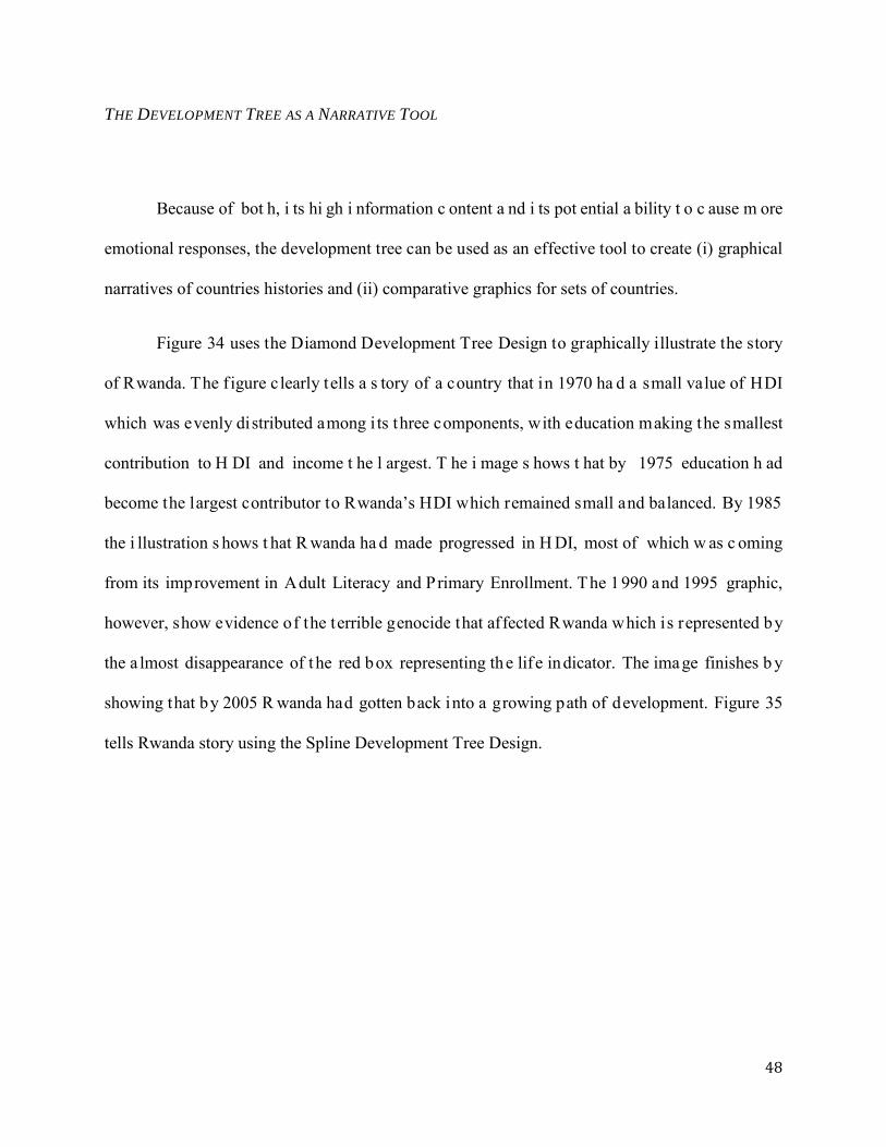
Figure 34 uses the Diamond Development Tree Design to graphically illustrate the story
of Rwanda. The figure clearly tells a s tory of a country that in 1970 ha d a small value of HDI
which was evenly distributed among i ts three components, with education making the smallest
contribution to H DI and income t he l argest. T he i mage s hows t hat by 1975 education h ad
become the largest contributor to Rwanda’s HDI which remained small and balanced. By 1985
the i llustration s hows t hat R wanda ha d made progressed in H DI, most of which w as c oming
from its improvement in Adult Literacy and Primary Enrollment. The 1990 and 1995 graphic,
however, show evidence of the terrible genocide that affected Rwanda which is represented by
the a lmost disappearance of t he red box representing the lif e indicator. The image finishes b y
showing that by 2005 R wanda had gotten back into a growing path of development. Figure 35
tells Rwanda story using the Spline Development Tree Design.
49
Figure 34 The evolution of the Human Development index and its components for Rwanda between 1970 and 2005 represented using the
Diamond Development Tree Design
Figure 35 The evolution of the Human Development index and its components for Rwanda between 1970 and 2005 represented using the
Spline Development Tree Design
RWANDA
1970 1975 1980 1985 1990 1995 2000 2005
50
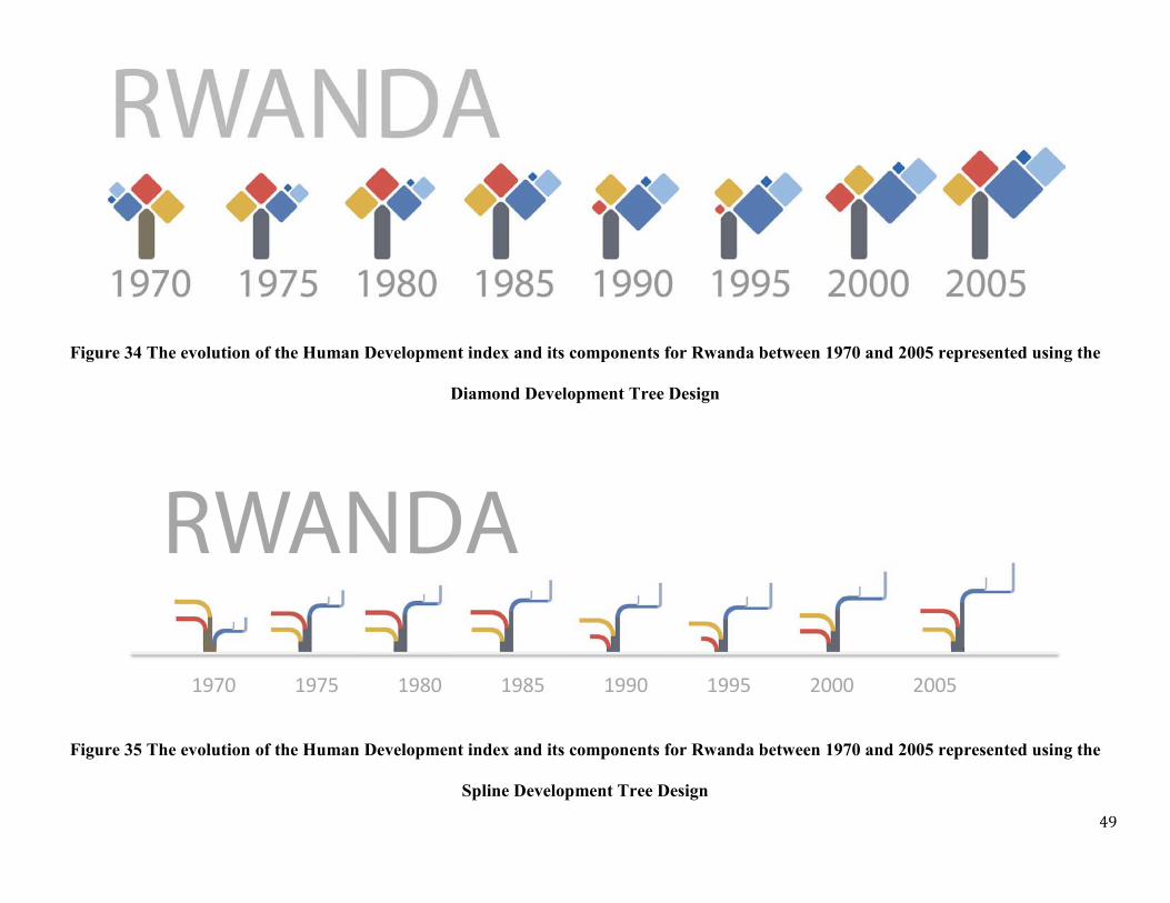
The development tree can also be used to create graphical narratives for entire regions, or
collections of countries. Figure 36 shows a po ster comparing t he Development T rees of 35
African countries, between 1970 a nd 2005. T hese visualization is excellent to quickly f ind out
the countries that made more progress dur ing this period, a set that includes Libya, Botswana,
Egypt and Tunisia, among others. It also allows to quickly spot imbalances in HDI components,
such as that exhibited by Botswana, evidencing the AIDS epidemic affecting that country, or the
proportionally low income of the Democratic Republic of the Congo. Figure 37 shows the same
as Figure 36 but us ing the Spline Development Tree Design. From this comparison, it is c lear
that the Diamond Tree is a better way to convey this large amount of information. We note that
both of this images graphically summarize 432 different numbers, a quantity that is equivalent to
a full page table. Yet, they help present this information in a way that makes it mo re amenable
for comparisons and a wide audience.
Inequalities in the Human Development Index and its components can also be visualized
using t he D evelopment tree. Figure 38 shows t hree e xamples of how o pacity can b e us ed t o
encode inequality in the total value of HDI or differentially in each one of its components. The
use of opacity to encode inequality is based on the metaphor that more equalitarian distributions
of HDI and its components are more “solid” than less equalitarian distributions.
COMBINING RANKING, VALUES AND SYMBOLIC REPRESENTATIONS
Finally, we present two visual explorations that combine information on H DI Ranking,
HDI values and the Development Tree. The first of these representations, shown in Figure 39,
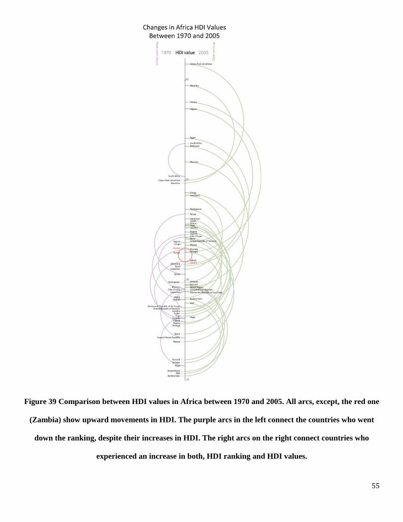
compare the HDI values representing African countries in 1970 and 2005. The figure shows that
most c ountries, e xcept Z ambia, ha ve gone u p i n va lues, t he va lue of t his i nformation
visualization design, however, is the fact that it also shows the relative ranking of countries and

51
uses arcs as a visual metaphor for the magnitude of the changes in HDI values. Green arcs show
countries that went up i n HDI value and ranking, whereas purple arcs show countries that went
up in HDI value but lost positions in the ranking. As all arcs have an identical circular curvature
the l ength of t he a rc i s directly proportional t o the c hange i n H DI v alue e xperienced b y t hat
country. H ence, Figure 39 illustrates s imultaneously, H DI v alues, H Di rankings, C hanges in
Values and Movement in Rankings.
Figure 40, on the other hand, shows changes in HDI rankings, together with HDI values
and i ts components, for 3 5 African countries between 1970 and 2005. H ere, the D evelopment
Tree makes i t eas y t o c ompare changes i n H DI and i ts c omponents w hile arcs help c onnect
countries that went up the ranking (green) or down the ranking (red). The use of the development
tree in this figure creates a strong visual statement by providing a solid area comparison for the
level of de velopment o f c ountries a t di fferent time p eriods. T he s ubstantially la rger tr ees,
representing the level of development of African countries in 2005 (right column), highlight an
across t he boa rd i ncrease i n t he l evel of H uman D evelopment for the entire r egion. A s econd
feature that comes clearly out of Figure 40, albeit with more of a keen eye, is that in 2005 t he
largest contribution to HDI for most countries came from the education indicator. Indeed, it is
relatively easy to notice that the largest contribution to HDI, shown by the rightmost box of the
2005 development trees, is given by the education indicator, which are represented by the blue
boxes. Indeed, from the 35 countries in the sample, education was the largest contributor to HDI
for 22 of them, whereas the Life indicator was the largest contributor to HDI for 12 of them with
Botswana and M ali be ing t he onl y c ountries in t he s ample f or which GDP w as t he l argest
contributor to HDI.
52
Figure 36 Comparison between the level of development, as measured by HDI and its components, using the Diamond Tree Design for 35
African Countries between 1970 and 2005.

53
Figure 37 Comparison between the level of development, as measured by HDI and its components, using the Spline Tree Design for 35
African Countries between 1970 and 2005.
54
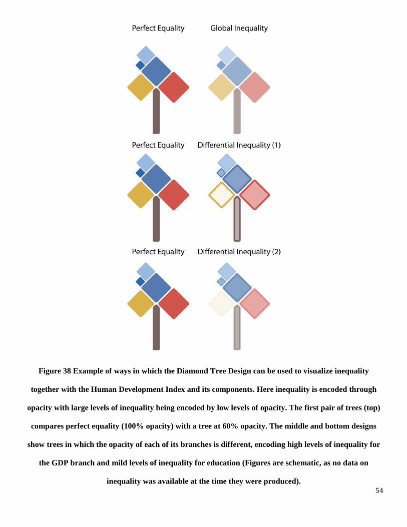
Figure 38 Example of ways in which the Diamond Tree Design can be used to visualize inequality
together with the Human Development Index and its components. Here inequality is encoded through
opacity with large levels of inequality being encoded by low levels of opacity. The first pair of trees (top)
compares perfect equality (100% opacity) with a tree at 60% opacity. The middle and bottom designs
show trees in which the opacity of each of its branches is different, encoding high levels of inequality for
the GDP branch and mild levels of inequality for education (Figures are schematic, as no data on
inequality was available at the time they were produced).
55
Figure 39 Comparison between HDI values in Africa between 1970 and 2005. All arcs, except, the red one
(Zambia) show upward movements in HDI. The purple arcs in the left connect the countries who went
down the ranking, despite their increases in HDI. The right arcs on the right connect countries who
experienced an increase in both, HDI ranking and HDI values.

56
Figure 40 Comparison between the ranking of African countries in 1970 and 2005. Red arcs on the left
connect countries that went down on the HDI ranking, whereas the green arcs on the right connect
countries that moved up the HDI ranking. The values of HDI are represented by the tree and are also
written numerically. The value of the components of HDI can be seen in the design of the trees.

57
(V) PARTIAL ORDERING NETWORKS AND THE DEVELOPMENT REFERENCE GROUPS
While i t i s pos sible t o s ort a nd r ank countries b y their H DI values, it is imp ortant to
understand t hat t hese r anking de pends on t he w ay i n w hich t he t hree c omponents o f H DI are
aggregated. An a lternative to the use of aggregation i s to rank countries using partial ordering
techniques that can be used to compare countries in absence of assumptions of the weights that
should be assigned to each one of the three HDI components.
Here we introduce the idea of a Partial Ordering Network (PON) as a method that can be
used to v isualize and c ompare the r elative l evel o f d evelopment experienced b y d ifferent
countries. To understand how we define the PON consider the following examples, dealing with
three countries, Argentina, Chile and Mexico.
COUNTRY COUNTRY CODE
EDUCATIONx LIFEx GDPx
Argentina ARG 0.95 0.83 0.78 Chile CHL 0.92 0.89 0.80 Mexico MEX 0.87 0.84 0.81
When we look at the value of the three indicators for these three different countries we
find t hat t he or dering t hat comes out o f each one of t hem i s di fferent. If w e c onsider t he
education indicator, for instance, we find that sorting countries from top to bottom results in the
ordering ARG, C HL, M EX, wh ereas wh en we rank t hem a ccording t o GDP we obtain MEX,
CHL, A RG. M oreover, or dering b y th e lif e in dicator r esults in C HL, M EX, A RG. In th is
particular example there is no unique ordering that can be used between the level of development
58
of these different countries and we could well say that ARG, CHL and MEX are at a comparable
level of development.
If w e w ould compare ARG, C HL a nd M EX, how ever, w ith A ustralia ( EDx=1.04,
LIFEx=0.93 a nd G DPx=0.96) w e w ould f ind that no m atter w hat di mension w e c hoose,
Australia w ill b e lo cated in th e to p o f th e r anking, and w e could s ay t hat, no m atter what
dimension w e c onsider m ore r elevant, A ustralia i s a t a hi gher l evel of de velopment t han
Argentina, Chile and Mexico. On the other hand, if we would repeat this exercise by comparing
ARG, C HL a nd M EX with Ivory C oast (EDx=0.48, L IFEx=0.52 a nd G DPx=0.46) we would
find that ARG, CHL and MEX score higher t han Ivory Coast i n a ll measures, suggesting that
these three Latin American countries are at a higher level of development than Ivory Coast.
Since these relationships are not always transitive we define the Partial Ordering Network
as a network connecting countries at a comparable level of development. Following the example
presented a bove, C hile a nd M exico are at a co mparable l evel o f d evelopment t han A rgentina,
since C hile a nd M exico s core hi gher t han A rgentina i n G DP, but l ower t han A rgentina i n
education. In s uch cases w e s ay t hat C hile a nd M exico ar e i n A rgentina’s D evelopment
Reference Group. Going forward we define a country’s Development Reference Group (DRG)
as the set of countries that score both, higher and lower in some of the HDI components than the
country in question.
59
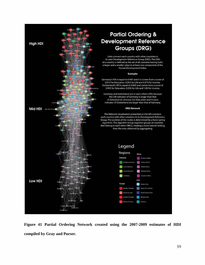
Figure 41 Partial Ordering Network created using the 2007-2009 estimates of HDI
compiled by Gray and Purser.

60
Figure 41 shows a visualization of the Partial Ordering Network created using Gray and
Purser’s da ta f or t he 2 007-2009 pe riod. E ach node r epresents a c ountry a nd i t i s c olored
according t he UN w orld m acro r egions and c omponents that c an be f ound at
http://www.un.org/depts/dhl/maplib/worldregions.htm. N ode s izes ar e proportional t o H DI.
Links connect countries in the same Development Reference Group, as explained above and in
the figure. The network layout was determined using a force-spring algorithm which helps group
countries with others in their same Development Reference Group.
The s tructure of t he ne twork s hows t he e xistence of t hree c learly di stinct c lusters of
countries, a f act t hat i s not c learly vi sible us ing ot her vi sualization t echniques. N ote th at th is
natural groups are not the same as the Very High, High, Medium and Low groups that have been
used in the report. At the top of the network we find countries from Europe, North America and a
few from Asia and Oceania, such as Korea, Japan and Australia. The second cluster, which can
be clearly ap preciated f urther dow n t he page, gathers m ost o f t he A mericas, A sia, E astern
Europe and Northern Africa. Finally, after a considerable gap, we find most of Africa and parts
of S outh E astern A sia. The P artial O rdering N etwork pr ovides a view of t he l evel of
development of di fferent countries which i s not constrained b y the l imitations of rankings and
the clutter from single values, allowing us to better understand a country’s level of development
in the context of other countries in the world.
The P artial O rdering N etwork c an be s een a s a m ap t hat groups c ountries w ith i ts
“development n eighbors”, r ather t han their geographic n eighbors. For i nstance, Y emen, Papua
New G uinea an d Tanzania ar e co untries at s imilar l evel o f d evelopment an d ar e t herefore
neighbors (connected by links) in the Partial Ordering Network.
61
It is also possible to illustrate the Partial Ordering Network that emerges from the three
main HDI components by using a Geographic, rather than a relational layout (Figure 42). Figure
43 to Figure 46 show examples of such a visualization in which we have highlighted Chile and
Haiti’s Development Reference Group. This layout is very useful to understand the development
context of a country and can be a useful t echnique to show how a na tion compares to others,
especially w hen t hese comparisons s eem not t o be ve ry i ntuitive. F or i nstance, i n C hile’s
Development Reference Group we find Equatorial Guinea, a country that most Chileans (such as
myself) would not identify, from the top of our heads, as a country with a high GDP per capita.
Yet, t he f igure he lps hi ghlight t his f act a nd he lps, w ith a dditional r eferences, i nform of t he
relatively abundant oil exports coming out of the small East African nation. Examples like this
one show how these visualization techniques can present relevant country specific information in
ways which are accessible, visually attractive and informative for a wide audience. Making them
ideal for museum exhibits and public campaigns.

62
Figure 42 Partial Ordering Network using Geographical Layout
63
Figure 43 Chile’s Development Reference Group. The position of a group of countries is determined by their geographical regions.

64
Figure 44 Chile’s Development Reference Group using a Layout in which only countries in Chile’s DRG are shown.
65
Figure 45 Haiti’s Development Reference Group. The position of a group of countries is determined by their geographical regions.

66
Figure 46 Haiti’s Development Reference Group using a Layout in which only countries in Haiti’s DRG are shown.
67
DISCUSSION
Here we ha ve pr esented a vi sual e xploration of H DI a nd i ts c omponents across time
through a m yriad of r epresentation t echniques that a llowed us t o i llustrate how H DI a nd i ts
components have changed dur ing a 35 year pe riod. From a hi storical pe rspective, we saw that
while th e u se o f v isualizations is n ot e xtremely p revalent i n m odern S ocial S ciences, i t w as
developed in the past in the frontier between the Natural and the Social Sciences, by polymaths
such a s J oseph P riestly, William P layfair, Charles J oseph M inard, J ohn S now and F lorence
Nightingale.
Visualizations a llow not onl y t o r epresent and communicate i nformation t hat c an be
expressed i n na rrative a nd num erical f orm, but a lso t o hi ghlight r elationships t hat c annot be
expressed using narrative and numerical techniques. An important aspect of visualizations is that
they speak t o a different pa rt of our br ains t hat written num erical a nd narrative de scriptions,
making t hem a m ore u niversal f orm of c ommunication. Indeed, t here i s scientific evidence
supporting the fact that graphical representations are more intuitive than more structured forms
of l anguage, lik e w ritten a nd n umerical la nguage which r equire s ubstantial le arning. This is
supported, for instance, by work done by Jan Deregowski during the 60’s and 70’s. Deregowski
showed t hat A fricans i ndividuals w ith litt le o r no e xposure t o g raphical a rt w ere able t o
recognize obj ects from photographs a nd pi ctures (Dergowski 1972 ). This universal a bility of
interpreting graphical representations was also studied by Robert Serpell, who showed that urban
American and rural Zambian children showed similar improvements in their progression on t he
ability to d iscriminate ima ges, a lbeit w ith a 2 -3 year la g in th e d evelopmental time (Serpell

68
1971). This su ggests a universal ph ysiological progression i n t he w ay in which w e p rocess
graphical representations that appears to be independent of cultural constraints.
The e xistence o f o ptical illu sions a lso is e vidence of t he uni versality of graphical
perception. Since optical illusions persist despite knowledge of the illusion itself, they show that
there ar e purely bi ological aspects affecting our pe rception of graphical r epresentations that
cannot be changed b y experience. Several e xamples of good opt ical i llusions are nowadays
widely a vailable t hrough t he w eb. H ere, for i llustrations pur poses only, we s how a n opt ical
illusion c reated b y E wald H ering. E wald H ering w as an 18 cen tury German physiologist th at
help developed the theory of color opponency, which is the basis used to explain and detect color
blindness. Hering’s illusion, shown in Figure 47, shows a couple of parallel red lines that do not
seem parallel, but rather bowed outwards, when they are put in front of a particular array of lines
that converge in the center of the image. The bottom panel shows the same two parallel lines in
absence of the background lines that cause the illusion. The bottom panel of Figure 47 explains
the illusion, yet it is not able to make it disappear.

69
Figure 47 Herring illusion, after Ewald Hering (1861)
The visual exploration of Human Development performed in this study was limited by a
relatively s mall d ataset o f H uman Development a nd i ts c omponents. W ithin t hese c onstraints
several alternative for the visualization of the Human Development Index and its changes in time
were explored. F rom t hese vi sualizations, t he r ichest one s a re t hose t hat i nclude t he
Development T ree, which a llows t he s imultaneous r epresentation of t he Human D evelopment
Index a nd i ts c omponents, a nd t he P artial O rdering N etwork, w hich a llowed c onnecting
countries to those at a comparable level of development. These designs can help in the creation
of c omparative c harts which ha ve not onl y a numerical, but a lso a s ymbolic a nd emotional
content. We strongly suggest the use of the Development Tree as a potential graphical branding
of the Human Development Index and for use in educational and outreach campaigns.
70
ACKNOWLEDGEMENTS
I would like to acknowledge the enormous help provided by Isabel Meirellis, Alex Simoes, Dave
Landry and Geoff House in the design of the Development Tree. They deserve most of the credit
for t his. I would a lso l ike t o acknowledge the support of F rancisco Rodriguez, J eni Klugman,
Jean-Yves Hamel, Isabel Pereira, José Pineda and all the members of the Human Development
Report of fice a t U NDP f or us eful di scussions and c omments t hroughout t he c reation of t his
manuscript.
REFERENCES:
L. Brasseur, Florence N ightingale’s V isual R hetoric i n t he R ose D iagrams. Technical Communication Quarterly 14(2) 161-182 (2005)
JB D ergowski, E S M uldrow, W F M uldrom, P ictorial r ecognition i n a r emote E thiopian population, Perception 1(4) 417-425 (1972)
Gaulier et Zignago "BACI: International Trade Database at the Product-level The 1994-2007 Version" Cepii Working Paper (2009) S. Hempel, The Strange Case of the Broad Street Pump: John Snow and the Mystery of Cholera. University of California Press, Berkeley, CA (2007)
C.A. H idalgo, B. Klinger, A .-L. Barabási , R . Hausmann, T he P roduct S pace C onditions the Development of Nation, Science 317:482-487 (2007)
George Gray Molina, Mark Purser, Human Development Trends since 1970: A Macro Story of Micro Changes, HDRO Working Paper Paper 01/2010, New York: UNDP (2009) R Serpell, Discrimination of orientation in Zambian children. Journal of Comparative and Physiological Psychology 75(2) 312-316 (1971) ER Tufte, Beautiful Evidence, Graphics Press, Cheshire, CT (2006)