identity guidelines - pratt institute · pdf file · 2017-03-09table of contents...
TRANSCRIPT
OFFICIAL PRATT INSTITUTE
IDENTIT YGUIDELINES
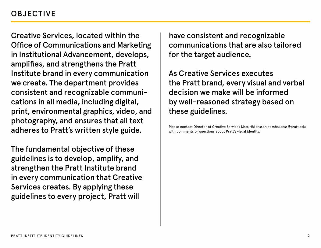
OBJECTIVE
Creative Services, located within the Office of Communications and Marketing in Institutional Advancement, develops, amplifies, and strengthens the Pratt Institute brand in every communication we create. The department provides consistent and recognizable communi-cations in all media, including digital, print, environmental graphics, video, and photography, and ensures that all text adheres to Pratt’s written style guide.
The fundamental objective of these guidelines is to develop, amplify, and strengthen the Pratt Institute brand in every communication that Creative Services creates. By applying these guidelines to every project, Pratt will
have consistent and recognizable communications that are also tailored for the target audience.
As Creative Services executes the Pratt brand, every visual and verbal decision we make will be informed by well-reasoned strategy based on these guidelines.
Please contact Director of Creative Services Mats Håkansson at [email protected] with comments or questions about Pratt’s visual identity.
2PRAT T INSTITUTE IDENTITY GUIDELINES

TABLE OF CONTENTS
POSITIONING STATEMENT 4MESSAGING MAP 7VOICE 9LOGO 16COLOR 24T YPOGRAPHY 30STATIONERY 35WEBSITE 38APPAREL AND MERCHANDISE 48INTERNAL CENTERS 51
3PRAT T INSTITUTE IDENTITY GUIDELINES
POSITIONINGSTATEMENT
4PRAT T INSTITUTE IDENTITY GUIDELINES
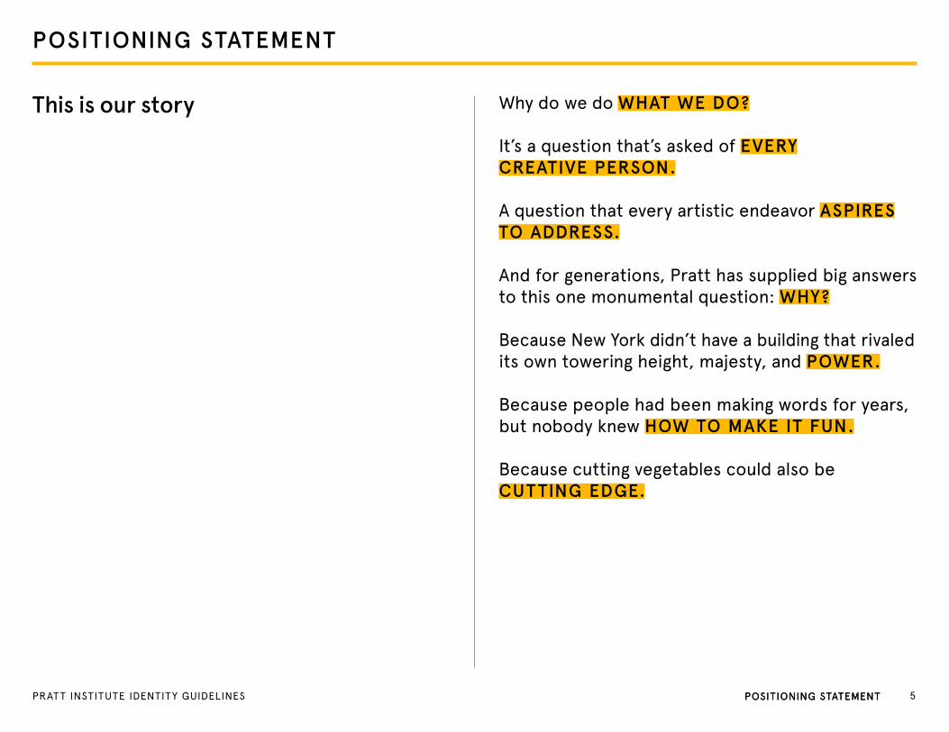
POSITIONING STATEMENT
This is our story Why do we do WHAT WE DO?
It’s a question that’s asked of EVERY CREATIVE PERSON.
A question that every artistic endeavor ASPIRES TO ADDRESS.
And for generations, Pratt has supplied big answers to this one monumental question: WHY?
Because New York didn’t have a building that rivaled its own towering height, majesty, and POWER.
Because people had been making words for years, but nobody knew HOW TO MAKE IT FUN.
Because cutting vegetables could also be CUTTING EDGE.
PoSItIoNINg StAteMeNt 5PRAt t INStItUte IDeNtItY gUIDeLINeS PoSItIoNINg StAteMeNt
POSITIONING STATEMENT
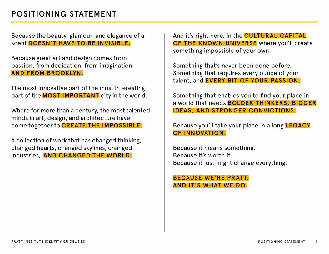
Because the beauty, glamour, and elegance of a scent DOESN’T HAVE TO BE INVISIBLE.
Because great art and design comes from passion, from dedication, from imagination, AND FROM BROOKLYN.
the most innovative part of the most interesting part of the MOST IMPORTANT city in the world.
Where for more than a century, the most talented minds in art, design, and architecture have come together to CREATE THE IMPOSSIBLE.
A collection of work that has changed thinking, changed hearts, changed skylines, changed industries, AND CHANGED THE WORLD.
And it’s right here, in the CULTURAL CAPITAL OF THE KNOWN UNIVERSE where you’ll create something impossible of your own.
Something that’s never been done before. Something that requires every ounce of your talent, and EVERY BIT OF YOUR PASSION.
Something that enables you to find your place in a world that needs BOLDER THINKERS, BIGGER IDEAS, AND STRONGER CONVICTIONS.
Because you’ll take your place in a long LEGACY OF INNOVATION.
Because it means something.Because it’s worth it.Because it just might change everything.
BECAUSE WE’RE PRATT. AND IT ’S WHAT WE DO.
6PRAT T INSTITUTE IDENTITY GUIDELINES PoSItIoNINg StAteMeNt
MESSAGING MAP
7PRAT T INSTITUTE IDENTITY GUIDELINES
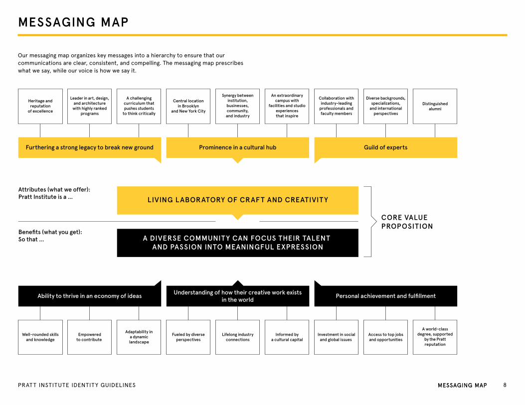
Heritage andreputation
of excellence
A challengingcurriculum thatpushes students
to think critically
Leader in art, design,and architecture
with highly rankedprograms
Synergy betweeninstitution,businesses,community,and industry
Distinguishedalumni
Central locationin Brooklyn
and New York City
An extraordinarycampus with
facilities and studioexperiencesthat inspire
Diverse backgrounds,specializations,
and internationalperspectives
Collaboration withindustry-leading
professionals andfaculty members
Well-rounded skillsand knowledge
Adaptability ina dynamiclandscape
Empoweredto contribute
Lifelong industryconnections
A world-classdegree, supported
by the Prattreputation
Fueled by diverseperspectives
Informed bya cultural capital
Access to top jobsand opportunities
Investment in socialand global issues
Furthering a strong legacy to break new ground Prominence in a cultural hub Guild of experts
Ability to thrive in an economy of ideas Understanding of how their creative work existsin the world
Personal achievement and fulfillment
Attributes (what we offer):Pratt Institute is a …
Benefits (what you get):So that …
CORE VALUE PROPOSITION
LIVING LABORATORY OF CRAF T AND CREATIVIT Y
A DIVERSE COMMUNIT Y CAN FOCUS THEIR TALENT AND PASSION INTO MEANINGFUL EXPRESSION
PRATT INSTITUTE
BRAND MESSAGING
Our key messages are organized into this hierarchy to help define and prioritize what we say in our communications.
MESSAGING MAP
our messaging map organizes key messages into a hierarchy to ensure that our communications are clear, consistent, and compelling. the messaging map prescribes what we say, while our voice is how we say it.
8PRAT T INSTITUTE IDENTITY GUIDELINES MeSSAgINg MAPMeSSAgINg MAP
VOICE
9PRAT T INSTITUTE IDENTITY GUIDELINES
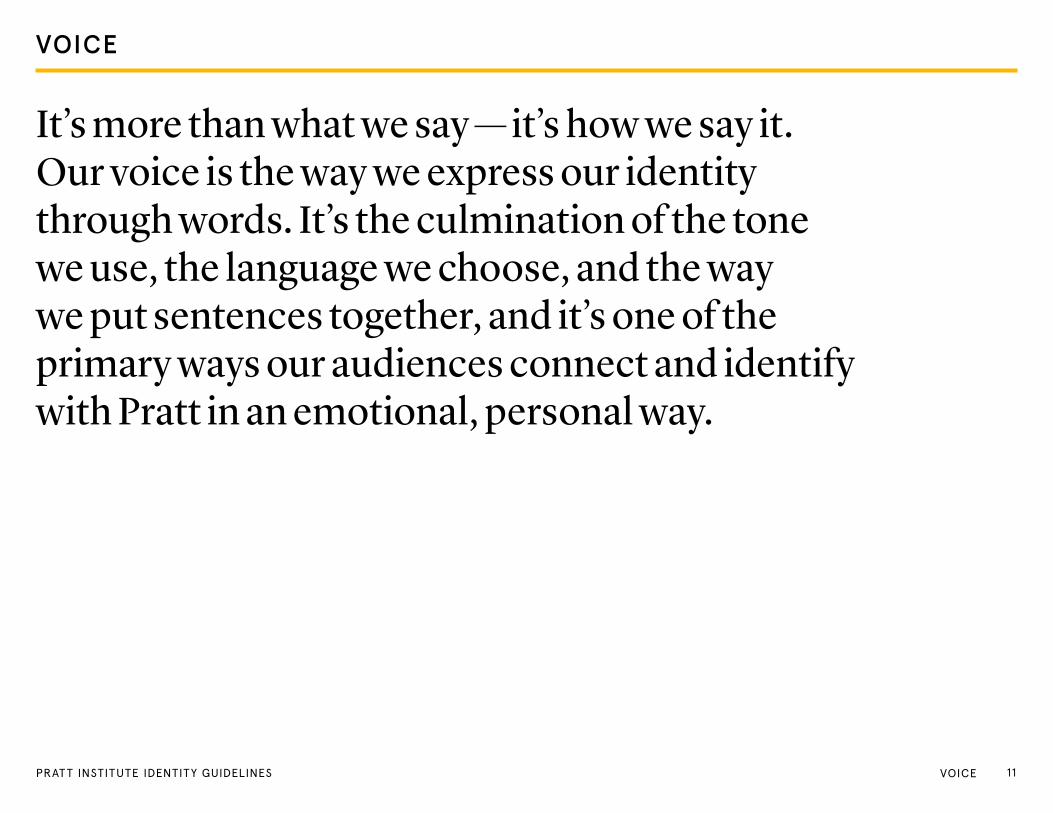
It’s more than what we say — it’s how we say it. Our voice is the way we express our identity through words. It’s the culmination of the tone we use, the language we choose, and the way we put sentences together, and it’s one of the primary ways our audiences connect and identify with Pratt in an emotional, personal way.
VOICE
11VoICePRAt t INStItUte IDeNtItY gUIDeLINeS

OUR NAME
Pratt Institute has been represented by a handful of different names throughout its history. This section aims to clear up any confusion.
Our logo clearly announces our name as “Pratt,” but it’s important to consistently use our full name, Pratt Institute, as well.
In first reference
Pratt Institute
In subsequent references
Pratt
Do not use
• Pratt Institute of Design• Institute of Pratt • Pratt Art Institute • Pratt | Institute • Pratt-Institute
VoICePRAt t INStItUte IDeNtItY gUIDeLINeS 11VoICe
VOICE AND TONE
HoW DoeS It SoUND?
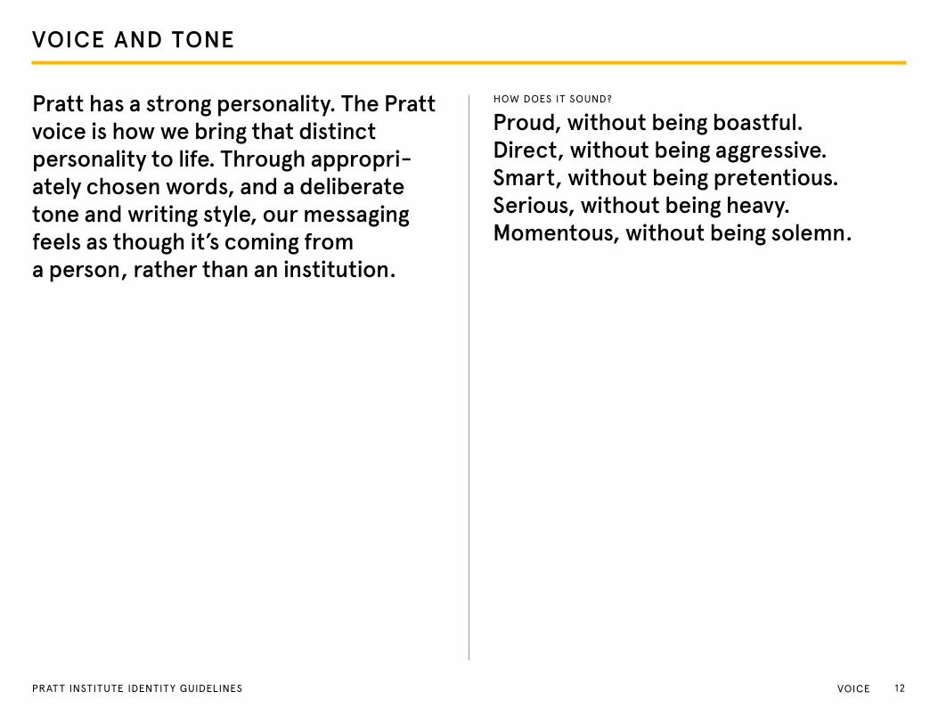
Proud, without being boastful. Direct, without being aggressive. Smart, without being pretentious.Serious, without being heavy.Momentous, without being solemn.
Pratt has a strong personality. The Pratt voice is how we bring that distinct personality to life. Through appropri-ately chosen words, and a deliberate tone and writing style, our messaging feels as though it’s coming from a person, rather than an institution.
12PRAT T INSTITUTE IDENTITY GUIDELINES VoICe

VOICE FRAMEWORK
Because we’re Pratt. And it’s what we do.
the “because” construction is an important expression of our positioning. By framing some headlines and important copy lines as the bold answer to an unasked question, we ascribe the significance of the important work Pratt is doing — and has done historically — to the everyday happenings of life at Pratt. this construction should by no means be used in every headline or in every piece, but it synthesizes our positioning well, and is beneficial when creating heavily branded Pratt communications.
eXAMPLeS
Because it was never just a chair.
Because form follows way more than function.
Because the world center of creativity has a center, too.
Because you’re about to create something the world has never seen.
13PRAT T INSTITUTE IDENTITY GUIDELINES VoICe
CRAF TING CONTENT
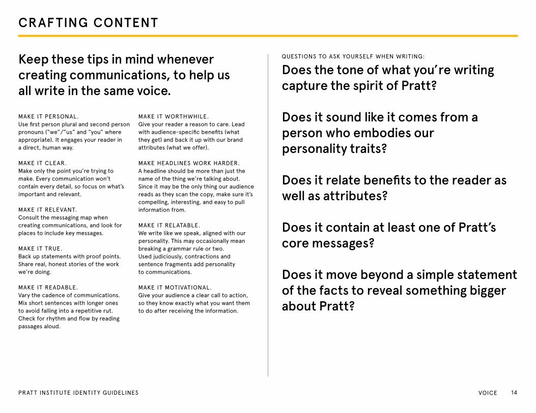
Keep these tips in mind whenever creating communications, to help us all write in the same voice.
QUeStIoNS to ASK YoURSeLF WHeN WRItINg:
Does the tone of what you’re writing capture the spirit of Pratt?
Does it sound like it comes from a person who embodies our personality traits?
Does it relate benefits to the reader as well as attributes?
Does it contain at least one of Pratt’s core messages?
Does it move beyond a simple statement of the facts to reveal something bigger about Pratt?
MAKe It PeRSoNAL.Use first person plural and second person pronouns (“we”/”us” and “you” where appropriate). It engages your reader in a direct, human way.
MAKe It CLeAR. Make only the point you’re trying to make. every communication won’t contain every detail, so focus on what’s important and relevant.
MAKe It ReLeVANt.Consult the messaging map when creating communications, and look for places to include key messages.
MAKe It tRUe.Back up statements with proof points. Share real, honest stories of the work we’re doing.
MAKe It ReADABLe.Vary the cadence of communications. Mix short sentences with longer ones to avoid falling into a repetitive rut. Check for rhythm and flow by reading passages aloud.
MAKe It WoRtHWHILe.give your reader a reason to care. Lead with audience-specific benefits (what they get) and back it up with our brand attributes (what we offer).
MAKe HeADLINeS WoRK HARDeR.A headline should be more than just the name of the thing we’re talking about. Since it may be the only thing our audience reads as they scan the copy, make sure it’s compelling, interesting, and easy to pull information from.
MAKe It ReLAtABLe.We write like we speak, aligned with our personality. this may occasionally mean breaking a grammar rule or two. Used judiciously, contractions and sentence fragments add personality to communications.
MAKe It MotIVAtIoNAL. give your audience a clear call to action, so they know exactly what you want them to do after receiving the information.
14PRAT T INSTITUTE IDENTITY GUIDELINES VoICe
PERSONALIT Y
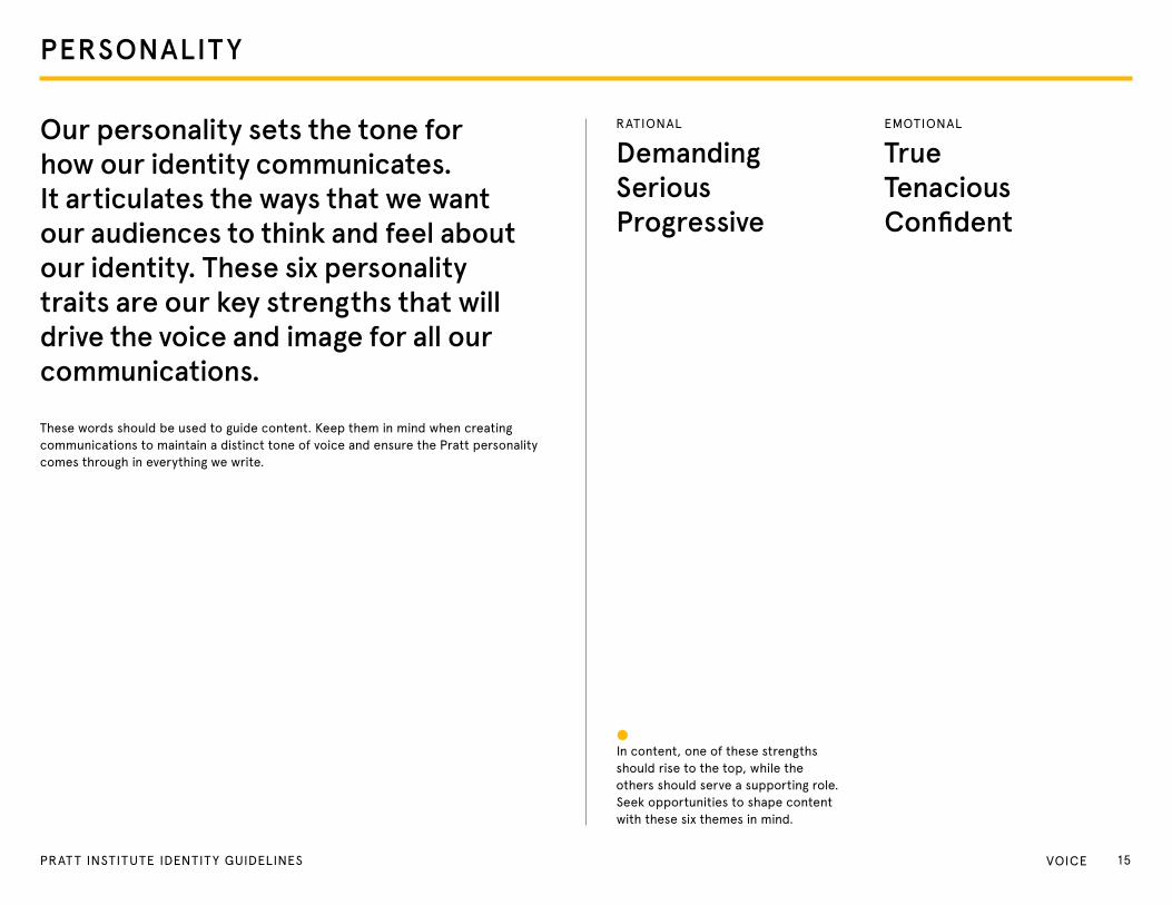
Our personality sets the tone for how our identity communicates. It articulates the ways that we want our audiences to think and feel about our identity. These six personality traits are our key strengths that will drive the voice and image for all ourcommunications.
these words should be used to guide content. Keep them in mind when creating communications to maintain a distinct tone of voice and ensure the Pratt personality comes through in everything we write.
RAtIoNAL
Demanding Serious Progressive
eMotIoNAL
True Tenacious Confident
In content, one of these strengths should rise to the top, while the others should serve a supporting role. Seek opportunities to shape content with these six themes in mind.
15PRAT T INSTITUTE IDENTITY GUIDELINES VoICe

LOGO
16PRAT T INSTITUTE IDENTITY GUIDELINES
The Pratt logo represents us at the very highest level and is vitally important to our identity. It acts as a signature, an identifier, and a stamp of quality. It is, and should always be, the most consistent component in our communications.To maintain this consistency, we must follow a few simple guidelines.
LOGO
17PRAt t INStItUte IDeNtItY gUIDeLINeS Logo
LOGO COLORS
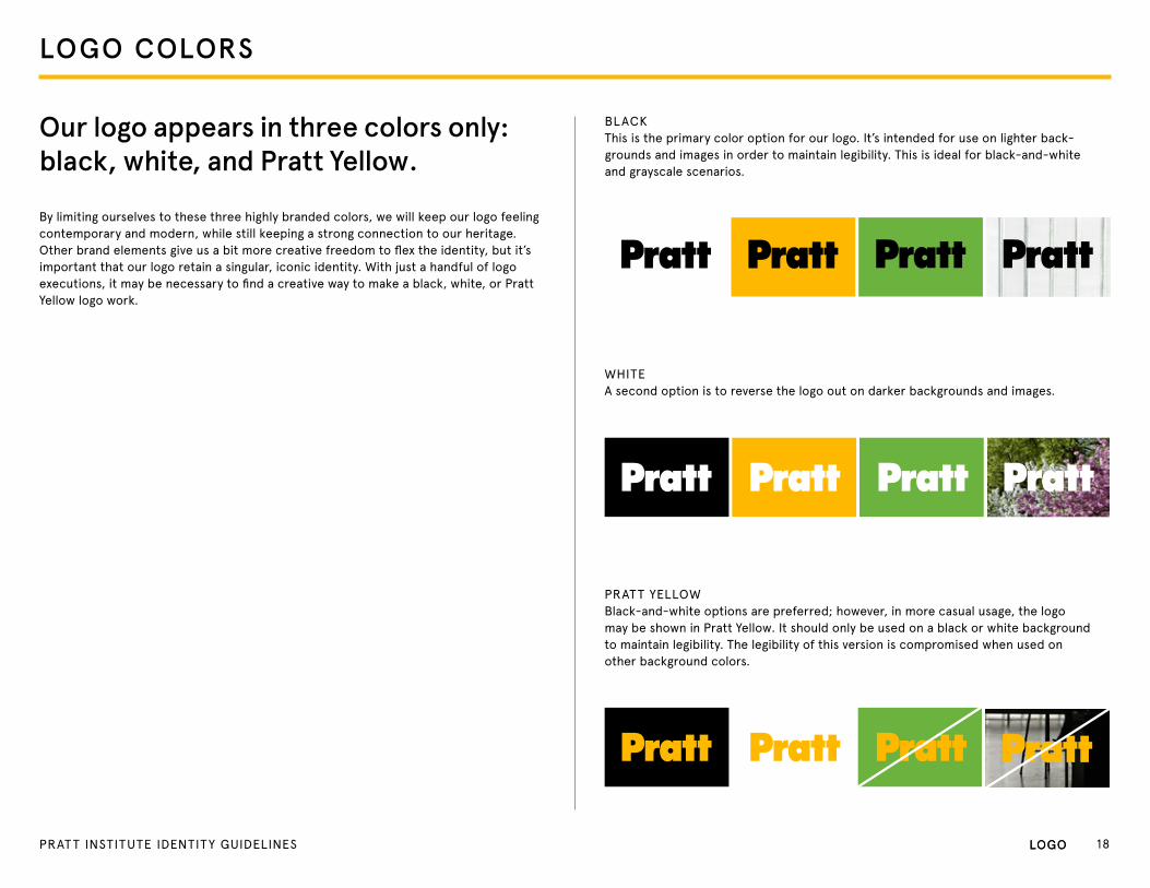
BLACKthis is the primary color option for our logo. It’s intended for use on lighter back-grounds and images in order to maintain legibility. this is ideal for black-and-white and grayscale scenarios.
WHIteA second option is to reverse the logo out on darker backgrounds and images.
PRAtt YeLLoW Black-and-white options are preferred; however, in more casual usage, the logo may be shown in Pratt Yellow. It should only be used on a black or white background to maintain legibility. the legibility of this version is compromised when used on other background colors.
Our logo appears in three colors only: black, white, and Pratt Yellow.
By limiting ourselves to these three highly branded colors, we will keep our logo feeling contemporary and modern, while still keeping a strong connection to our heritage. Other brand elements give us a bit more creative freedom to flex the identity, but it’s important that our logo retain a singular, iconic identity. With just a handful of logo executions, it may be necessary to find a creative way to make a black, white, or Pratt Yellow logo work.
Logo 18PRAt t INStItUte IDeNtItY gUIDeLINeS Logo

LOGO PLACEMENT
The preferred placement for the Pratt logo is in the lower section of a commu-nication. This way, the logo can become a grounding element that appears consistently on every communication.
You may place the logo in the following positions:
Logotype locked in bottom left corner
Logotype locked in bottom right corner
Logotype locked in bottom center
19PRAT T INSTITUTE IDENTITY GUIDELINES Logo

LOGO SCALE
MINIMUM SCALE
PRIMARY SCALE
The Pratt logo is a well-known icon. It has represented Pratt for decades and has instant recognition. For these reasons, there’s no need for it to shout.
Use the guidelines on the right to gauge how much space the Pratt logo should occupy in any given layout. The primary scale should be 15% of the shorter side of the page width.
To maintain full legibility, never reproduce the logo at widths smaller than 1 inch (print) or 175 pixels (monitor display). There is no maximum size limit, but use discretion when sizing the logo. It should live comfortably and clearly as an identifying mark.
1” oR 130 PX
15%
PAge WIDtH
20PRAT T INSTITUTE IDENTITY GUIDELINES Logo
CLEAR SPACE
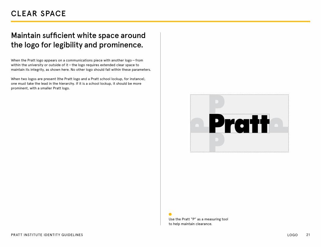
Maintain sufficient white space around the logo for legibility and prominence.
When the Pratt logo appears on a communications piece with another logo — from within the university or outside of it — the logo requires extended clear space to maintain its integrity, as shown here. No other logo should fall within these parameters.
When two logos are present (the Pratt logo and a Pratt school lockup, for instance), one must take the lead in the hierarchy. If it is a school lockup, it should be more prominent, with a smaller Pratt logo.
Use the Pratt “P” as a measuring tool to help maintain clearance.
21PRAT T INSTITUTE IDENTITY GUIDELINES Logo
IMPLEMENTATION
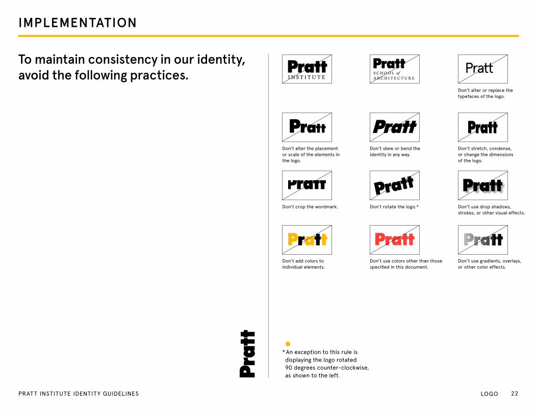
To maintain consistency in our identity, avoid the following practices.
* An exception to this rule is displaying the logo rotated 90 degrees counter-clockwise, as shown to the left.
Pratt
Don’t crop the wordmark. Don’t rotate the logo.* Don’t use drop shadows, strokes, or other visual effects.
Don’t add colors to individual elements.
Don’t use colors other than those specified in this document.
Don’t use gradients, overlays, or other color effects.
Don’t stretch, condense, or change the dimensions of the logo.
Don’t alter or replace the typefaces of the logo.
Don’t alter the placement or scale of the elements in the logo.
Don’t skew or bend the identity in any way.
I N S T I T U T ES C H O O L of A R C H I T E C T U R E
22PRAT T INSTITUTE IDENTITY GUIDELINES Logo
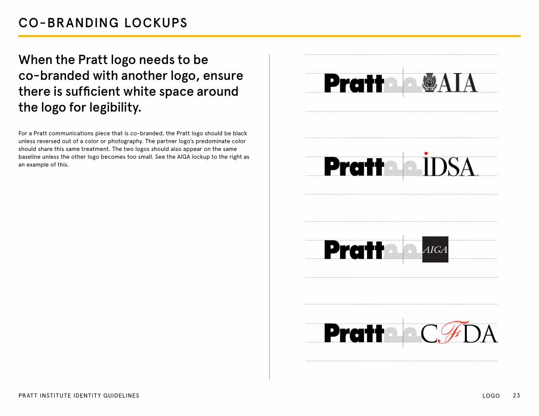
CO-BRANDING LOCKUPS
When the Pratt logo needs to be co-branded with another logo, ensure there is sufficient white space around the logo for legibility.
For a Pratt communications piece that is co-branded, the Pratt logo should be black unless reversed out of a color or photography. the partner logo’s predominate color should share this same treatment. the two logos should also appear on the same baseline unless the other logo becomes too small. See the AIgA lockup to the right as an example of this.
23PRAT T INSTITUTE IDENTITY GUIDELINES Logo
COLOR
24PRAT T INSTITUTE IDENTITY GUIDELINES
Our color palette helps identify us at a glance, and the way we use color sets the mood for each of our pieces, bringing an energy and vibrancy to our communications.
COLOR
25PRAt t INStItUte IDeNtItY gUIDeLINeS CoLoR
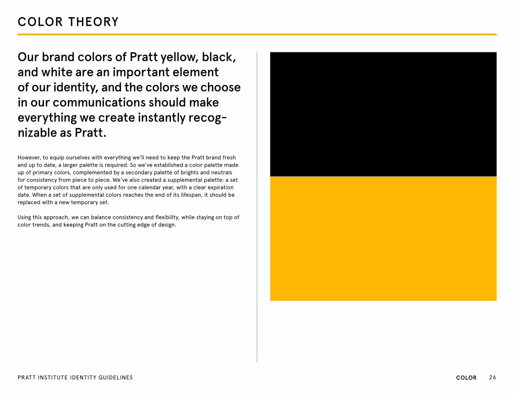
COLOR THEORY
Our brand colors of Pratt yellow, black, and white are an important element of our identity, and the colors we choose in our communications should make everything we create instantly recog-nizable as Pratt.
However, to equip ourselves with everything we’ll need to keep the Pratt brand fresh and up to date, a larger palette is required. So we’ve established a color palette made up of primary colors, complemented by a secondary palette of brights and neutrals for consistency from piece to piece. We’ve also created a supplemental palette: a set of temporary colors that are only used for one calendar year, with a clear expiration date. When a set of supplemental colors reaches the end of its lifespan, it should be replaced with a new temporary set.
Using this approach, we can balance consistency and flexibility, while staying on top of color trends, and keeping Pratt on the cutting edge of design.
CoLoR 26PRAt t INStItUte IDeNtItY gUIDeLINeS CoLoR
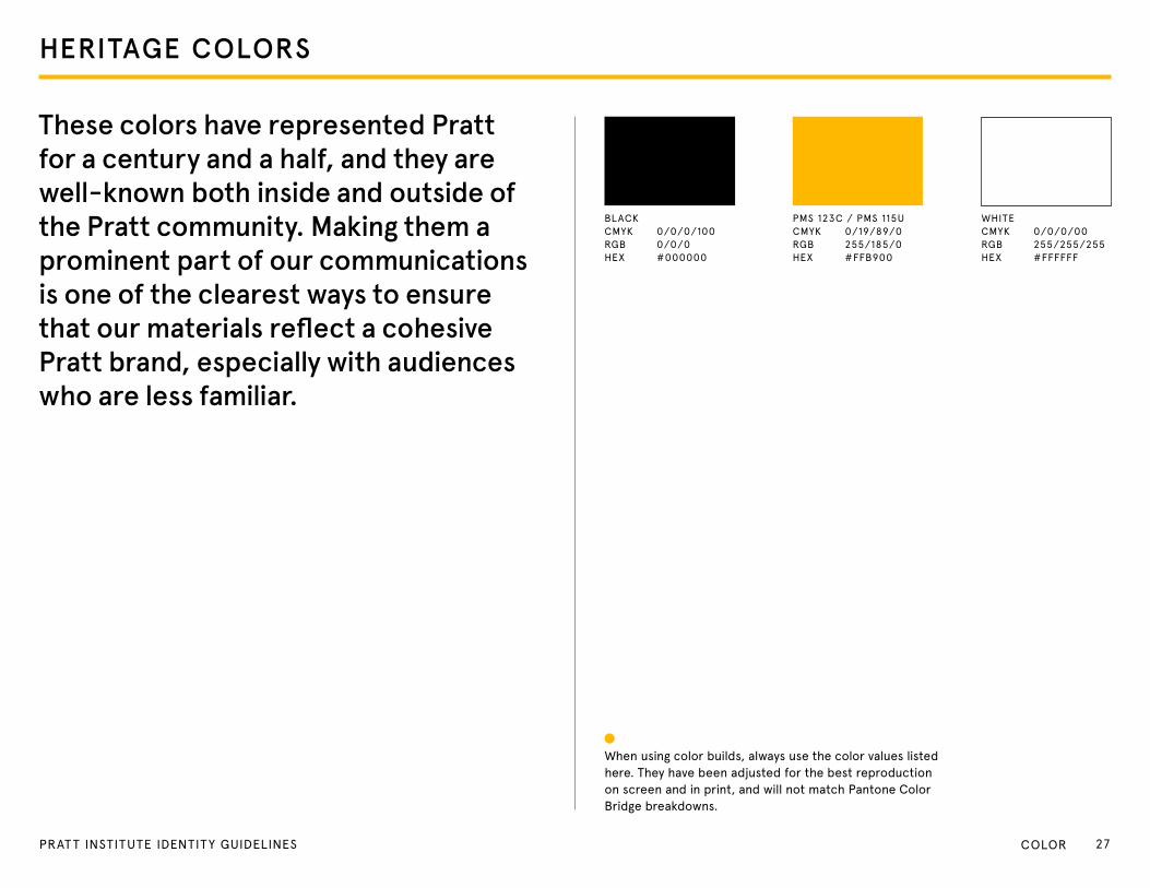
HERITAGE COLORS
These colors have represented Pratt for a century and a half, and they are well-known both inside and outside of the Pratt community. Making them a prominent part of our communications is one of the clearest ways to ensure that our materials reflect a cohesive Pratt brand, especially with audiences who are less familiar.
When using color builds, always use the color values listed here. they have been adjusted for the best reproduction on screen and in print, and will not match Pantone Color Bridge breakdowns.
BLACK CMYK 0/0/0/100 RgB 0/0/0 HeX #000000
PMS 123C / PMS 115U CMYK 0/19/89/0 RgB 255/185/0 HeX #FFB900
WHIte CMYK 0/0/0/00 RgB 255/255/255 HeX #FFFFFF
27PRAT T INSTITUTE IDENTITY GUIDELINES CoLoR
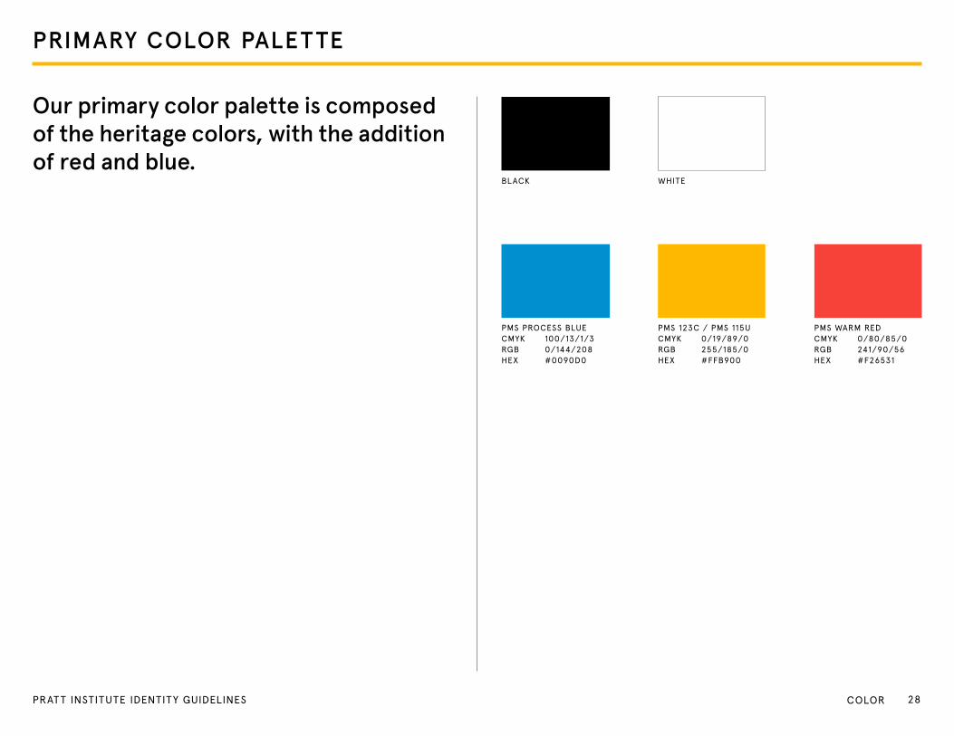
PRIMARY COLOR PALETTE
WHIte
PMS PRoCeSS BLUe CMYK 100/13/1/3 RgB 0/144/208 HeX #0090D0
PMS 123C / PMS 115U CMYK 0/19/89/0 RgB 255/185/0 HeX #FFB900
PMS WARM ReD CMYK 0/80/85/0 RgB 241/90/56 HeX #F26531
BLACK
Our primary color palette is composed of the heritage colors, with the addition of red and blue.
28PRAT T INSTITUTE IDENTITY GUIDELINES CoLoR

SECONDARY COLOR PALETTE
Our secondary color palette is used to support the primary palette, and is composed of a group of bright colors, with a subset of neutrals.
SeCoNDARY BRIgHtS
SeCoNDARY NeUtRALS
PMS 540 CMYK 100/57/12/61 RgB 0/48/85 HeX #003767
PMS 7464 CMYK 36/0/14/0 RgB 159/217/220 HeX #BCe4e5
PMS 5415 CMYK 57/23/10/31 RgB 82/125/151 HeX #5D87A1
PMS 396 CMYK 0/11/90/0 RgB 235/232/56 HeX #eBe72A
PMS 369 CMYK 67/0/98/5 RgB 86/177/70 HeX #6CB33F
PMS 3252 CMYK 54/0/24/0 RgB 109/201/201 HeX #83CFCA
PMS 427 CMYK 7/3/4/8 RgB 216/220/221 HeX #e4e5e6
PMS 435 CMYK 13/15/15/0 RgB 219/209/205 HeX #DBD1CD
PMS 437 CMYK 46/45/49/0 RgB 151/137/129 HeX #978981
PMS 1925 CMYK 0/98/46/0 RgB 238/31/96 HeX #eD1556
29PRAT T INSTITUTE IDENTITY GUIDELINES CoLoR
T YPOGRAPHY
30PRAT T INSTITUTE IDENTITY GUIDELINES
The words we choose for our communications are undoubtedly important. But the way we represent those words in type can play a funda-mental role in amplifying their power and underscoring their importance. Consistent, thoughtful use of brand typefaces visually supports verbal communications and forms one of the most recognizable elements of Pratt’s identity.
T YPOGRAPHY
32PRAt t INStItUte IDeNtItY gUIDeLINeS tYPogRAPHY
T YPE THEORY
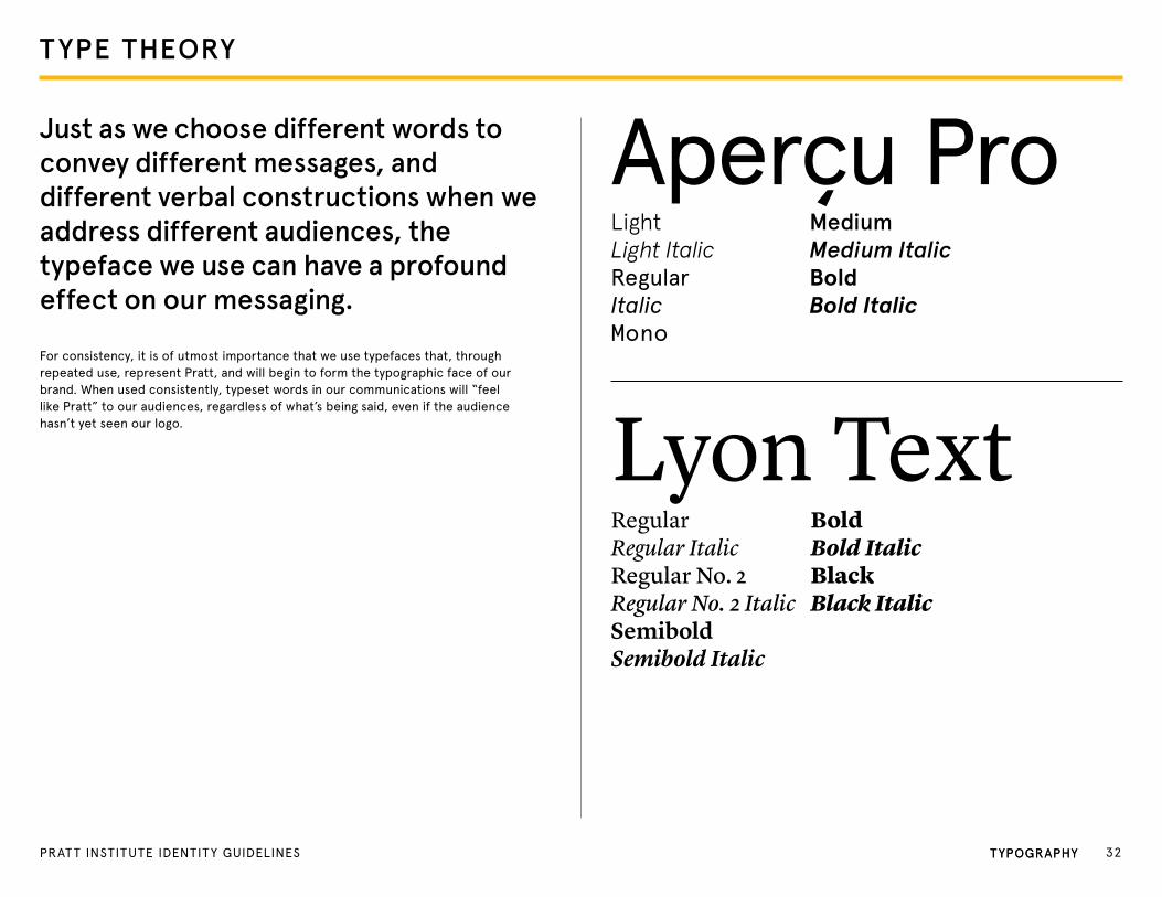
Just as we choose different words to convey different messages, and different verbal constructions when we address different audiences, thetypeface we use can have a profound effect on our messaging.
For consistency, it is of utmost importance that we use typefaces that, through repeated use, represent Pratt, and will begin to form the typographic face of our brand. When used consistently, typeset words in our communications will “feel like Pratt” to our audiences, regardless of what’s being said, even if the audience hasn’t yet seen our logo.
Aperçu ProLightLight ItalicRegularItalicMono
MediumMedium ItalicBoldBold Italic
Lyon TextRegularRegular ItalicRegular No. 2Regular No. 2 Italic SemiboldSemibold Italic
BoldBold ItalicBlackBlack Italic
tYPogRAPHY 32PRAt t INStItUte IDeNtItY gUIDeLINeS tYPogRAPHY
PRIMARY T YPEFACE
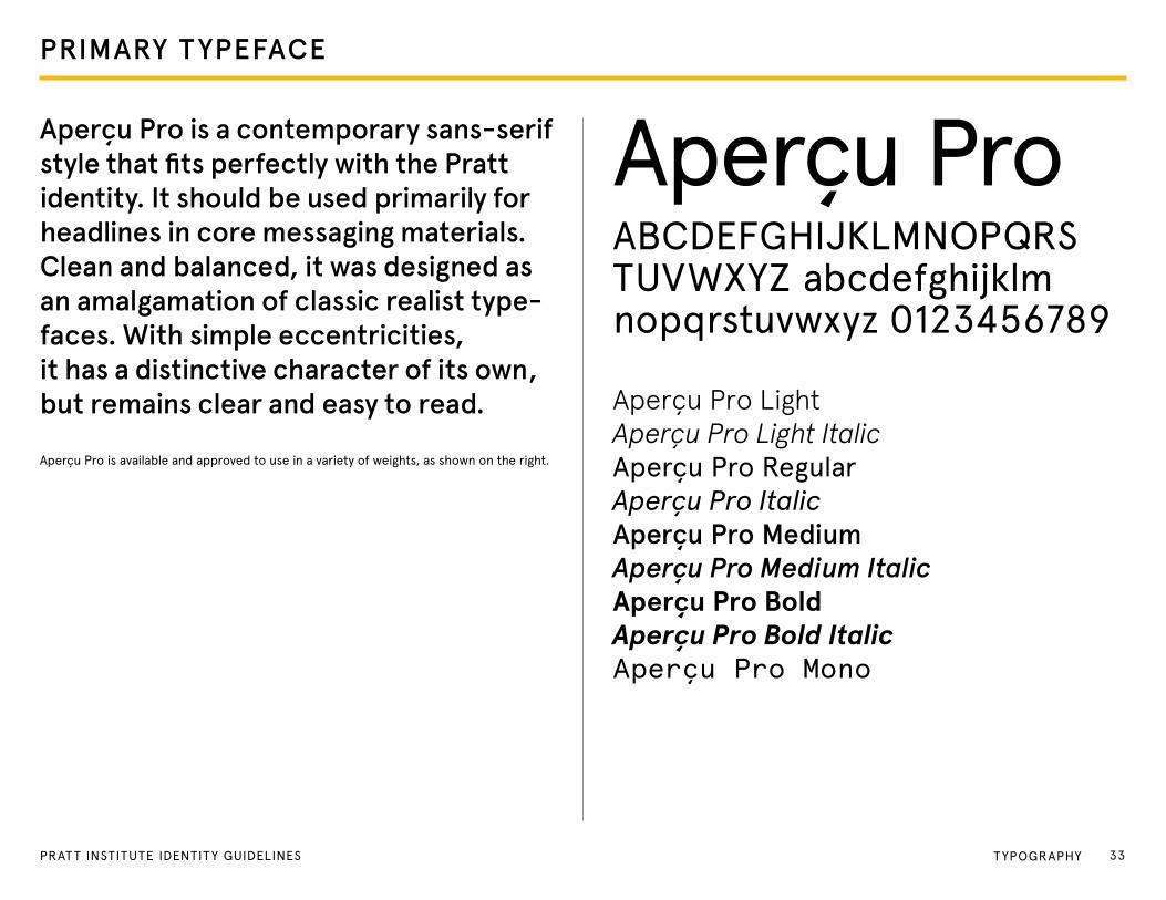
Aperçu Pro is a contemporary sans-serif style that fits perfectly with the Pratt identity. It should be used primarily for headlines in core messaging materials. Clean and balanced, it was designed as an amalgamation of classic realist type-faces. With simple eccentricities, it has a distinctive character of its own, but remains clear and easy to read.
Aperçu Pro is available and approved to use in a variety of weights, as shown on the right.
Aperçu ProABCDeFgHIJKLMNoPQRStUVWXYZ abcdefghijklmnopqrstuvwxyz 0123456789
Aperçu Pro LightAperçu Pro Light ItalicAperçu Pro RegularAperçu Pro ItalicAperçu Pro MediumAperçu Pro Medium ItalicAperçu Pro BoldAperçu Pro Bold ItalicAperçu Pro Mono
33PRAT T INSTITUTE IDENTITY GUIDELINES tYPogRAPHY

SECONDARY T YPEFACE
Lyon Text is an incredibly legible serif typeface that can be used in more formal headlines, and in running text or body copy. Understated and serious, this secondary typeface works excep-tionally well in extended reading, and pairs well with our primary typeface, Aperçu Pro. this font is available and approved to use in a variety of weights, as shown on the right.
Lyon Text
RegularRegular ItalicRegular No. 2Regular No. 2 ItalicMediumMedium Italic BoldBold ItalicBlackBlack Italic
ABCDEFGHIJKLMNOPQRSTUVWXYZ abcdefghijklmnopqrstuvwxyz 0123456789
34PRAT T INSTITUTE IDENTITY GUIDELINES tYPogRAPHY

STATIONERY
35PRAT T INSTITUTE IDENTITY GUIDELINES
March 14, 2013
John Smith 601 West 29th Street New York, NY 10001
Dear Mr. Smith,
Lorem ipsum dolor sit amet, consectetur adipiscing elit. Nullam pellentesque dignissim est, non commodo odio accumsan hendrerit. Morbi euismod sagittis diam, sit amet sodales orci mollis quis. Sed at tortor sapien, ac pulvinar turpis. Lorem ipsum dolor sit amet, consectetur adipiscing elit. Cras vel dignissim sapien. Fusce nec lacus vel est molestie convallis id in diam. In semper dolor mi. Nam egestas viverra mauris, eu rhoncus lectus lobortis ac. Etiam eget nibh sitdio, vel bibendum ipsum. Ut porttitor, diam et facilisis scelerisque, nulla nisi tincidunt lectus, non commodo nisl libero vitae leo. Sed et leo quis mauris vestibulum aliquam. Mauris id eros at est lobortis egestas et sit amet lorem. Vivamus semper ligula sed orci aliquet gravida.
Cum sociis natoque penatibus et magnis dis parturient montes, nascetur ridiculus mus. Fusce et ornare tortor. Ut aliquam lorem vitae arcu consectetur facilisis laoreet est lacinia. Nam congue mi quis eros dignissim ut dapibus diam rutrum. Nulla dignissim ultricies metus et sagittis. Integer accumsan malesuada odio, quis posuere elit adipiscing quis. Mauris euismod consectetur augue, at semper sem dignissim dictum. In sodales ultrices diam, sit amet sagittis justo sagittis id.
Praesent pellentesque odio eget nunc tempor pharetra. Aenean pretium hendrerit consequat. Donec vehicula odio id dui congue venenatis. Pellentesque euismod auctor blandit. Praesent tempor arcu quis purus commodo malesuada. Sed accumsan vehicula est, eu tincidunt odio lacinia ut. Aliquam molestie ipsum sed ipsum rhoncus placerat. Curabitur in purus lacinia orci mollis feugiat. Donec in neque eu purus tempus sollicitudin. Sed velit eros, ornare vel porta a, convallis suscipit dui.
Best Regards,
Thomas Jefferson
200 Willoughby avenue, Myrtle Hall Brooklyn, nY 11205 718.636.3471 pratt.edu
Pratt institute Division of institutional advancement Communications
March 14, 2013
John Smith 101 West 19th Street New York, NY 10001
Dear Mr. Smith,
Lorem ipsum dolor sit amet, consectetur adipiscing elit. Nullam pellentesque dignissim est, non commodo odio accumsan hendrerit. Morbi euismod sagittis diam, sit amet sodales orci mollis quis. Sed at tortor sapien, ac pulvinar turpis. Lorem ipsum dolor sit amet, consectetur adipiscing elit. Cras vel dignissim sapien. Fusce nec lacus vel est molestie convallis id in diam. In semper dolor mi. Nam egestas viverra mauris, eu rhoncus lectus lobortis ac. Etiam eget nibh sitdio, vel bibendum ipsum. Ut porttitor, diam et facilisis scelerisque, nulla nisi tincidunt lectus, non commodo nisl libero vitae leo. Sed et leo quis mauris vestibulum aliquam. Mauris id eros at est lobortis egestas et sit amet lorem. Vivamus semper ligula sed orci aliquet gravida.
Cum sociis natoque penatibus et magnis dis parturient montes, nascetur ridiculus mus. Fusce et ornare tortor. Ut aliquam lorem vitae arcu consectetur facilisis laoreet est lacinia. Nam congue mi quis eros dignissim ut dapibus diam rutrum. Nulla dignissim ultricies metus et sagittis. Integer accumsan malesuada odio, quis posuere elit adipiscing quis. Mauris euismod consectetur augue, at semper sem dignissim dictum. In sodales ultrices diam, sit amet sagittis justo sagittis id.
Praesent pellentesque odio eget nunc tempor pharetra. Aenean pretium hendrerit consequat. Donec vehicula odio id dui congue venenatis. Pellentesque euismod auctor blandit. Praesent tempor arcu quis purus commodo malesuada. Sed accumsan vehicula est, eu tincidunt odio lacinia ut. Aliquam molestie ipsum sed ipsum rhoncus placerat. Curabitur in purus lacinia orci mollis feugiat. Donec in neque eu purus tempus sollicitudin. Sed velit eros, ornare vel porta a, convallis suscipit dui.
Best Regards,
Thomas Jefferson
200 Willoughby avenue, Myrtle Hall Brooklyn, nY 11205 718.636.3471 pratt.edu
Pratt institute school of Liberal arts and science Humanities and Media studies
Pratt institute Division of institutional advancement Communications
200 Willoughby avenue, Myrtle Hal Brooklyn, nY 11205
STATIONERY
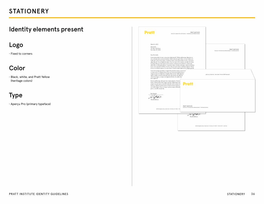
Identity elements present
Logo• Fixed to corners
Color• Black, white, and Pratt Yellow
(heritage colors)
Type• Aperçu Pro (primary typeface)
36PRAT T INSTITUTE IDENTITY GUIDELINES StAtIoNeRY
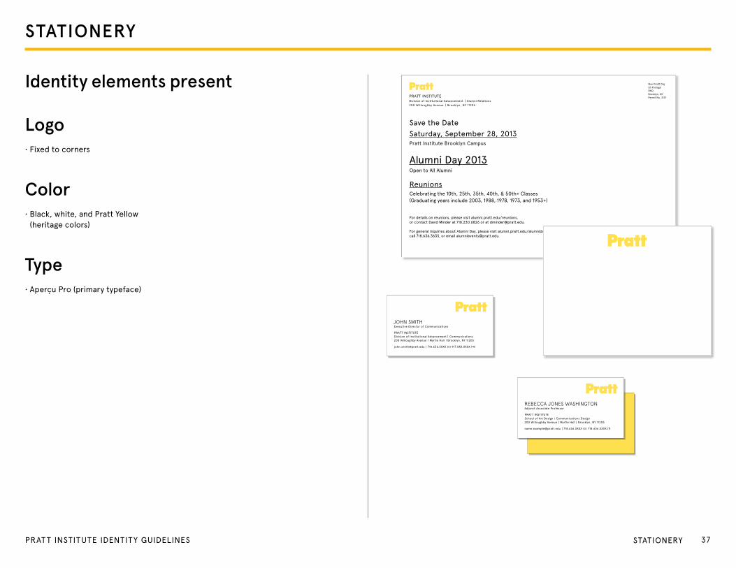
Identity elements present
Logo• Fixed to corners
Color• Black, white, and Pratt Yellow
(heritage colors)
Type• Aperçu Pro (primary typeface)
Pratt instituteDivision of institutional advancement alumni relations 200 Willoughby avenue Brooklyn, nY 11205
non Profit Org us Postage PaiD Brooklyn, nYPermit no. 3137
save the Datesaturday, september 28, 2013Pratt institute Brooklyn Campus
alumni Day 2013Open to all alumni
reunionsCelebrating the 10th, 25th, 35th, 40th, & 50th+ Classes(Graduating years include 2003, 1988, 1978, 1973, and 1953+)
For details on reunions, please visit alumni.pratt.edu/reunions, or contact David Minder at 718.230.6826 or at [email protected].
For general inquiries about alumni Day, please visit alumni.pratt.edu/alumniday, call 718.636.3635, or email [email protected].
John smithexecutive Director of Communications
Pratt institute
Division of institutional advancement Communications 200 Willoughby avenue Myrtle Hall Brooklyn, nY 11205
[email protected] 718.636.XXXX (o) 917.XXX.XXXX (m)
Rebecca Jones washington adjunct associate Professor
Pratt institute
school of art Design Communications Design 200 Willoughby avenue Myrtle Hall Brooklyn, nY 11205
[email protected] 718.636.XXXX (o) 718.636.XXXX (f)
STATIONERY
37PRAT T INSTITUTE IDENTITY GUIDELINES StAtIoNeRY

WEBSITE
38PRAT T INSTITUTE IDENTITY GUIDELINES
WEBSITE
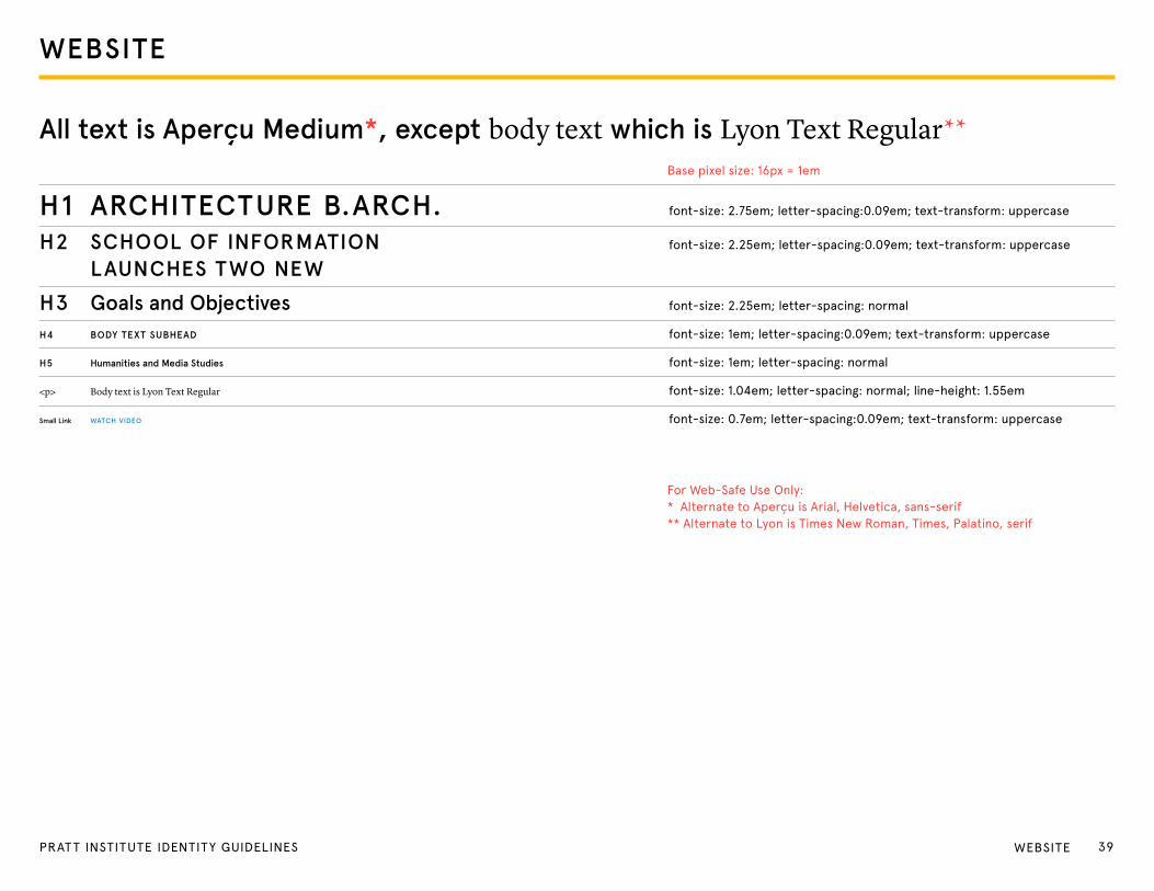
All text is Aperçu Medium*, except body text which is Lyon Text Regular**
For Web-Safe Use only:* Alternate to Aperçu is Arial, Helvetica, sans-serif** Alternate to Lyon is times New Roman, times, Palatino, serif
Base pixel size: 16px = 1em
H1 ARCHITECTURE B.ARCH. font-size: 2.75em; letter-spacing:0.09em; text-transform: uppercase
H2 SCHOOL OF INFORMATION font-size: 2.25em; letter-spacing:0.09em; text-transform: uppercase
LAUNCHES TWO NEW
H3 Goals and Objectives font-size: 2.25em; letter-spacing: normal
H4 BODY TEXT SUBHEAD font-size: 1em; letter-spacing:0.09em; text-transform: uppercase
H5 Humanities and Media Studies font-size: 1em; letter-spacing: normal
<p> Body text is Lyon Text Regular font-size: 1.04em; letter-spacing: normal; line-height: 1.55em
Small Link WATCH VIDEO font-size: 0.7em; letter-spacing:0.09em; text-transform: uppercase
39PRAT T INSTITUTE IDENTITY GUIDELINES WeBSIte
WEBSITE
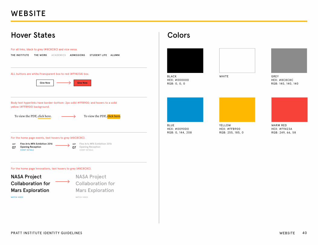
Colors
Give NowGive Now
THE INSTITUTE THE WORK ACADEMICS ADMISSIONS STUDENT LIFE ALUMNI
Fine Arts MFA Exhibition 2016 Opening Reception
To view the PDF, click here. To view the PDF, click here.
Fine Arts MFA Exhibition 2016 Opening Reception
EVENT DETAILS EVENT DETAILS
Hover States
For all links, black to grey (#8C8C8C) and vice versa.
ALL buttons are white/transparent box to red (#F9423A) box.
Body text hyperlinks have border-bottom: 2px solid #FFB900; and hovers to a solid yellow (#FFB900) background.
For the home page events, text hovers to grey (#8C8C8C).
For the home page Innovations, text hovers to grey (#8C8C8C).
NASA Project Collaboration for Mars Exploration
NASA Project Collaboration for Mars Exploration
WATCH VIDEOWATCH VIDEO
SEP SEP
07 07
WHIte
BLUeHeX: #0090D0RgB: 0, 144, 208
YeLLoWHeX: #FFB900RgB: 255, 185, 0
WARM ReDHeX: #F9423ARgB: 249, 66, 58
BLACKHeX: #000000RgB: 0, 0, 0
gReYHeX: #8C8C8CRgB: 140, 140, 140
40PRAT T INSTITUTE IDENTITY GUIDELINES WeBSIte
WEBSITE
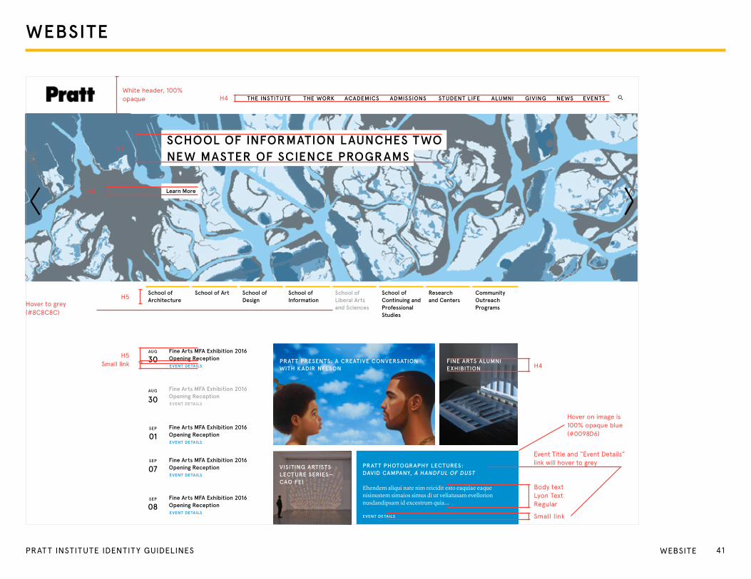
THE INSTITUTE THE WORK ACADEMICS ADMISSIONS STUDENT LIFE ALUMNI GIVING NEWS EVENTS
Fine Arts MFA Exhibition 2016 Opening Reception PRATT PRESENTS: A CREATIVE CONVERSATION
WITH KADIR NELSONFINE ARTS ALUMNI EXHIBITION
VISITING ARTISTS LECTURE SERIES—CAO FEI
PRATT PHOTOGRAPHY LECTURES: DAVID CAMPANY, A HANDFUL OF DUST
Ehendem aliqui nate nim reicidit esto eaquiae eaque nisinustem simaios simus di ut veliatusam evellorion nusdandipsam id excestrum quia...
EVENT DETAILS
Fine Arts MFA Exhibition 2016 Opening Reception
Fine Arts MFA Exhibition 2016 Opening Reception
Fine Arts MFA Exhibition 2016 Opening Reception
Fine Arts MFA Exhibition 2016 Opening Reception
AUG
SEP
SEP
SEP
EVENT DETAILS
EVENT DETAILS
EVENT DETAILS
EVENT DETAILS
EVENT DETAILS
30
30
01
07
08
AUG
Learn More
SCHOOL OF INFORMATION LAUNCHES TWO NEW MASTER OF SCIENCE PROGRAMS
School ofArchitecture
School of Art School of Design
School of Information
School of Liberal Arts and Sciences
School of Continuing and Professional Studies
Research and Centers
Community Outreach Programs
White header, 100% opaque
H2
H5
H4
H4
Hover on image is 100% opaque blue(#0098D6)
Body textLyon textRegular
event title and “event Details” link will hover to grey
Small link
H5
H5Small link
Hover to grey (#8C8C8C)
41PRAT T INSTITUTE IDENTITY GUIDELINES WeBSIte

WEBSITE
THE INSTITUTE THE WORK ACADEMICS ADMISSIONS STUDENT LIFE ALUMNI GIVING NEWS EVENTS
Fine Arts MFA Exhibition 2016 Opening Reception PRATT PRESENTS: A CREATIVE CONVERSATION
WITH KADIR NELSONFINE ARTS ALUMNI EXHIBITION
VISITING ARTISTS LECTURE SERIES—CAO FEI
PRATT PHOTOGRAPHY LECTURES: DAVID CAMPANY, A HANDFUL OF DUST
Ehendem aliqui nate nim reicidit esto eaquiae eaque nisinustem simaios simus di ut veliatusam evellorion nusdandipsam id excestrum quia...
EVENT DETAILS
Fine Arts MFA Exhibition 2016 Opening Reception
Fine Arts MFA Exhibition 2016 Opening Reception
Fine Arts MFA Exhibition 2016 Opening Reception
Fine Arts MFA Exhibition 2016 Opening Reception
AUG
SEP
SEP
SEP
EVENT DETAILS
EVENT DETAILS
EVENT DETAILS
EVENT DETAILS
EVENT DETAILS
30
30
01
07
08
AUG
Learn More
SCHOOL OF INFORMATION LAUNCHES TWO NEW MASTER OF SCIENCE PROGRAMS
School ofArchitecture
School of Art School of Design
School of Information
School of Liberal Arts and Sciences
School of Continuing and Professional Studies
Research and Centers
Community Outreach Programs
search text as H3Yellow (#FFCe34) search bar, 100% opaque H3
42PRAT T INSTITUTE IDENTITY GUIDELINES WeBSIte

WEBSITE
THE INSTITUTE THE WORK ACADEMICS ADMISSIONS STUDENT LIFE ALUMNI GIVING NEWS EVENTS
Fine Arts MFA Exhibition 2016 Opening Reception PRATT PRESENTS: A CREATIVE CONVERSATION
WITH KADIR NELSONFINE ARTS ALUMNI EXHIBITION
VISITING ARTISTS LECTURE SERIES—CAO FEI
PRATT PHOTOGRAPHY LECTURES: DAVID CAMPANY, A HANDFUL OF DUST
Ehendem aliqui nate nim reicidit esto eaquiae eaque nisinustem simaios simus di ut veliatusam evellorion nusdandipsam id excestrum quia...
EVENT DETAILS
Fine Arts MFA Exhibition 2016 Opening Reception
Fine Arts MFA Exhibition 2016 Opening Reception
Fine Arts MFA Exhibition 2016 Opening Reception
Fine Arts MFA Exhibition 2016 Opening Reception
AUG
SEP
SEP
SEP
EVENT DETAILS
EVENT DETAILS
EVENT DETAILS
EVENT DETAILS
EVENT DETAILS
30
30
01
07
08
AUG
Learn More
SCHOOL OF INFORMATION LAUNCHES TWO NEW MASTER OF SCIENCE PROGRAMS
School ofArchitecture
School of Art School of Design
School of Information
School of Liberal Arts and Sciences
School of Continuing and Professional Studies
Research and Centers
Community Outreach Programs
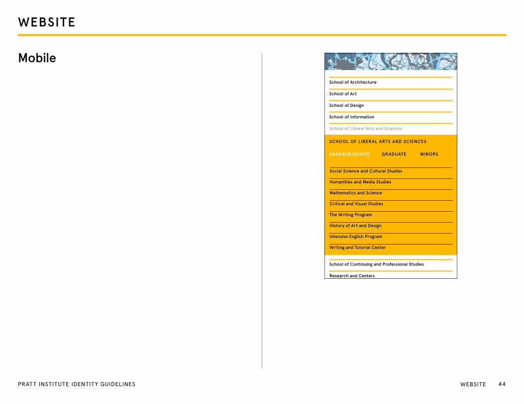
Social Science and Cultural Studies
Humanities and Media Studies
Mathematics and Science
Critical and Visual Studies
The Writing Program
History of Art and Design
Intensive English Program
Writing and Tutorial Center
SCHOOL OF LIBERAL ARTS AND SCIENCES
GRADUATE MINORS
School of Liberal Arts and Sciences
UNDERGRADUATE
H4
H4
H5
Hover to white
43PRAT T INSTITUTE IDENTITY GUIDELINES WeBSIte
WEBSITE
Social Science and Cultural Studies
Humanities and Media Studies
Mathematics and Science
Critical and Visual Studies
The Writing Program
History of Art and Design
Intensive English Program
Writing and Tutorial Center
SCHOOL OF LIBERAL ARTS AND SCIENCES
School of Architecture
School of Art
School of Design
School of Information
School of Liberal Arts and Sciences
School of Continuing and Professional Studies
Research and Centers
UNDERGRADUATE GRADUATE MINORS
Mobile
44PRAT T INSTITUTE IDENTITY GUIDELINES WeBSIte
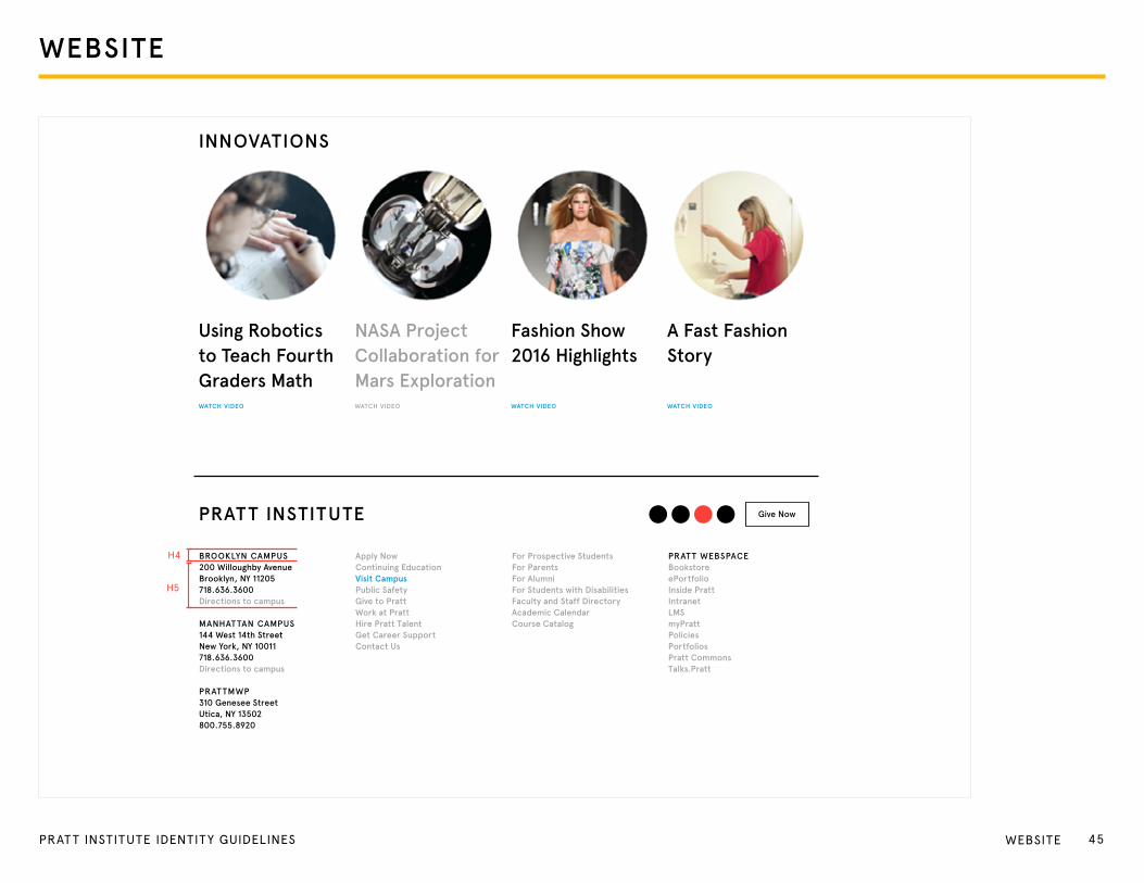
INNOVATIONS
PRATT INSTITUTE
Using Robotics to Teach Fourth Graders Math
NASA Project Collaboration for Mars Exploration
Fashion Show 2016 Highlights
A Fast Fashion Story
WATCH VIDEO WATCH VIDEO
Give Now
WATCH VIDEO WATCH VIDEO
BROOKLYN CAMPUS200 Willoughby Avenue Brooklyn, NY 11205 718.636.3600Directions to campus
MANHATTAN CAMPUS 144 West 14th StreetNew York, NY 10011718.636.3600 Directions to campus
PRATTMWP310 Genesee Street Utica, NY 13502800.755.8920
Apply NowContinuing EducationVisit CampusPublic SafetyGive to PrattWork at PrattHire Pratt TalentGet Career SupportContact Us
For Prospective StudentsFor ParentsFor AlumniFor Students with DisabilitiesFaculty and Staff DirectoryAcademic CalendarCourse Catalog
PRATT WEBSPACEBookstoreePortfolioInside PrattIntranetLMSmyPrattPoliciesPortfoliosPratt CommonsTalks.Pratt
H4
H5
WEBSITE
45PRAT T INSTITUTE IDENTITY GUIDELINES WeBSIte
WEBSITE
ARCHITECTURE B.ARCH.
Bachelor of Architecture Mission StatementUndergraduate Architecture is a five-year Bachelor of Architecture program that prepares students with an early interest in architecture to become leading professional practitioners. Students at Pratt learn that architecture is a meaningful cultural contribution dedicated to the sustenance of the imagination and the necessity for material embodiment within a larger social and ethical context. The five year design sequence offers a thorough foundation in architecture integrating critical thinking, design, technology, building, representation, and social responsibility. Firmly committed to contemporary material practices, the program is constantly integrating new technologies into the curriculum. Students are encouraged to aspire towards creative and intellectual independence as well as to commit to authentically inspired architectural research.
Bachelor of Architecture Goals and Objectives � Each student will demonstrate the ability to transform an idea to an architectural proposition by
incorporating all skills developed from core to advance design. (Design Excellence) � Students at Pratt learn that architecture is a meaningful cultural contribution dedicated to the sustenance
of the imagination and the necessity for material embodiment within a larger social and ethical context. (Critical Thinking/Cultural and Social Knowledge)
� Students will demonstrate the ability to communicate through visual medium from the hand to the computer. (Media and Representation)
� Students will demonstrate the critical use of digital technology, fabrication, and environmentally responsible design in relationship to contemporary design and practice. (Technology: Computation and Digital Fabrication)
� Students will demonstrate the ability to integrate sustainable practices, material research, and interdisciplinary approaches to find sustainable design solutions. (Ecological Design)
� Students will demonstrate creative and intellectual independence to applied architectural research. (Research)
� Pratt seeks to instill aesthetic judgment, knowledge, collaborative skill, and technical expertise which can blend theory with creative applications in the preparation of students to become leaders in the profession. (Professionalism)
HIGHEST PROFESSIONAL STANDARDS
In the United States, most state registration boards require a degree from an accredited professional degree program as a prerequisite for licensure. The National Architectural Accrediting Board (NAAB), which is the sole agency authorized to accredit U.S. professional degree programs in architecture, recognizes two types of degrees: the Bachelor of Architecture and the Master of Architecture. A program may be granted a five-year, three-year, or a two-year term of accreditation, depending on its degree of conformance with established educational standards.
Master’s degree programs may consist of a pre-professional undergraduate degree and a post-professional graduate degree, which, when earned sequentially, constitute an accredited professional education. The pre-professional degree is not, by itself, recognized as an accredited degree, however.
the NAAB grants candidacy status to new programs that have developed viable plans for achieving initial accreditation. Candidacy status indicates that a program should be accredited
... / Undergraduate Architecture / Architecture B.Arch.
THE INSTITUTE THE WORK ACADEMICS ADMISSIONS STUDENT LIFE ALUMNI GIVING NEWS EVENTS
About the School of Architecture
Graduate Architecture and Urban Design Programs
Undergraduate Architecture
Faculty and Staff
Architecture B.Arch.
Undergraduate ArchitectureGallery
Morphology Minor
Morphology Concentration
Design Lab
Historic Preservation
City and Regional Planning
Construction Management
Sustainable Environmental Systems
Facilities Management
Programs for Sustainable Planning and Development
Urban Placemaking and Management
Real Estate Practice
H5
BoDYLyon text Regular
Links hover to yellow background with yellow underline
46PRAT T INSTITUTE IDENTITY GUIDELINES WeBSIte
WEBSITE
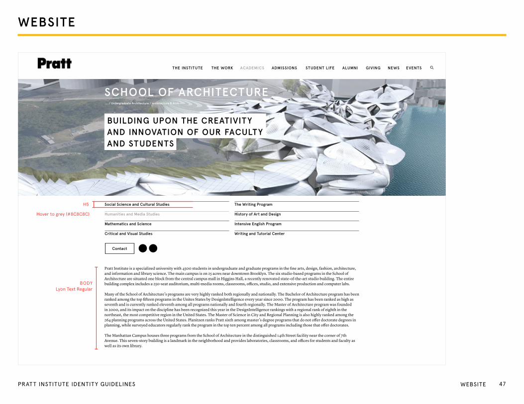
SCHOOL OF ARCHITECTURE
Pratt Institute is a specialized university with 4500 students in undergraduate and graduate programs in the fine arts, design, fashion, architecture, and information and library science. The main campus is on 25 acres near downtown Brooklyn. The six studio-based programs in the School of Architecture are situated one block from the central campus mall in Higgins Hall, a recently renovated state-of-the-art studio building. The entire building complex includes a 250-seat auditorium, multi-media rooms, classrooms, offices, studio, and extensive production and computer labs.
Many of the School of Architecture’s programs are very highly ranked both regionally and nationally. The Bachelor of Architecture program has been ranked among the top fifteen programs in the Unites States by DesignIntelligence every year since 2000. The program has been ranked as high as seventh and is currently ranked eleventh among all programs nationally and fourth regionally. The Master of Architecture program was founded in 2000, and its impact on the discipline has been recognized this year in the DesignIntelligence rankings with a regional rank of eighth in the northeast, the most competitive region in the United States. The Master of Science in City and Regional Planning is also highly ranked among the 264 planning programs across the United States. Planitzen ranks Pratt sixth among master’s degree programs that do not offer doctorate degrees in planning, while surveyed educators regularly rank the program in the top ten percent among all programs including those that offer doctorates.
The Manhattan Campus houses three programs from the School of Architecture in the distinguished 14th Street facility near the corner of 7th Avenue. This seven-story building is a landmark in the neighborhood and provides laboratories, classrooms, and offices for students and faculty as well as its own library.
... / Undergraduate Architecture / Architecture B.Arch
BUILDING UPON THE CREATIVIT Y AND INNOVATION OF OUR FACULT Y AND STUDENTS
Social Science and Cultural Studies
Humanities and Media Studies
Mathematics and Science
Critical and Visual Studies
The Writing Program
History of Art and Design
Intensive English Program
Writing and Tutorial Center
Contact
THE INSTITUTE THE WORK ACADEMICS ADMISSIONS STUDENT LIFE ALUMNI GIVING NEWS EVENTS
H5
Hover to grey (#8C8C8C)
BoDYLyon text Regular
47PRAT T INSTITUTE IDENTITY GUIDELINES WeBSIte

APPAREL ANDMERCHANDISE
48PRAT T INSTITUTE IDENTITY GUIDELINES
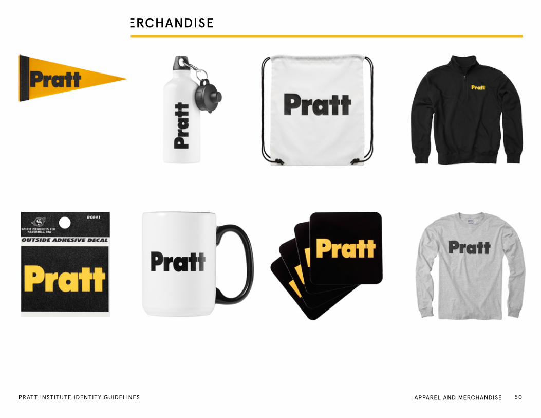
APPAREL AND MERCHANDISE
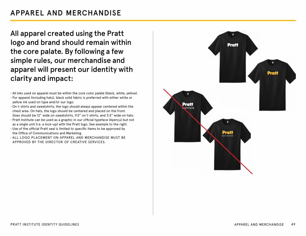
All apparel created using the Pratt logo and brand should remain within the core palate. By following a few simple rules, our merchandise and apparel will present our identity with clarity and impact:
• All inks used on apparel must be within the core color palate (black, white, yellow).• For apparel (including hats), black solid fabric is preferred with either white or
yellow ink used on type and/or our logo.• on t-shirts and sweatshirts, the logo should always appear centered within the
chest area. on hats, the logo should be centered and placed on the front. Sizes should be 12” wide on sweatshirts, 9.5” on t-shirts, and 3.5” wide on hats.
• Pratt Institute can be used as a graphic in our official typeface (Aperçu) but not as a single unit (i.e. a lock-up) with the Pratt logo. See example to the right.
• Use of the official Pratt seal is limited to specific items to be approved by the office of Communications and Marketing.
• ALL Logo PLACeMeNt oN APPAReL AND MeRCHANDISe MUSt Be APPRoVeD BY tHe DIReCtoR oF CReAtIVe SeRVICeS.
INSTITUTE
PRATT INSTITUTE
49PRAT T INSTITUTE IDENTITY GUIDELINES APPAReL AND MeRCHANDISe
APPAREL AND MERCHANDISE
50PRAT T INSTITUTE IDENTITY GUIDELINES APPAReL AND MeRCHANDISe
INTERNAL CENTERS
51PRAT T INSTITUTE IDENTITY GUIDELINES 51PRAt t INStItUte IDeNtItY gUIDeLINeS INteRNAL CeNteRS
All branding and materials for internal centers at Pratt Institute must be approved by the Provost and VP of Institutional Advancement, and must be designed, created, and produced by the Creative Services team in the Office of Communications and Marketing.
All marketing materials for these Pratt entities must be approved by the Creative Director, Executive Director of Marketing and Commu-nications, and VP of Institutional Advancement. All approved designs will adhere to the following guidelines.
INTERNAL CENTERS
52PRAt t INStItUte IDeNtItY gUIDeLINeS INteRNAL CeNteRS
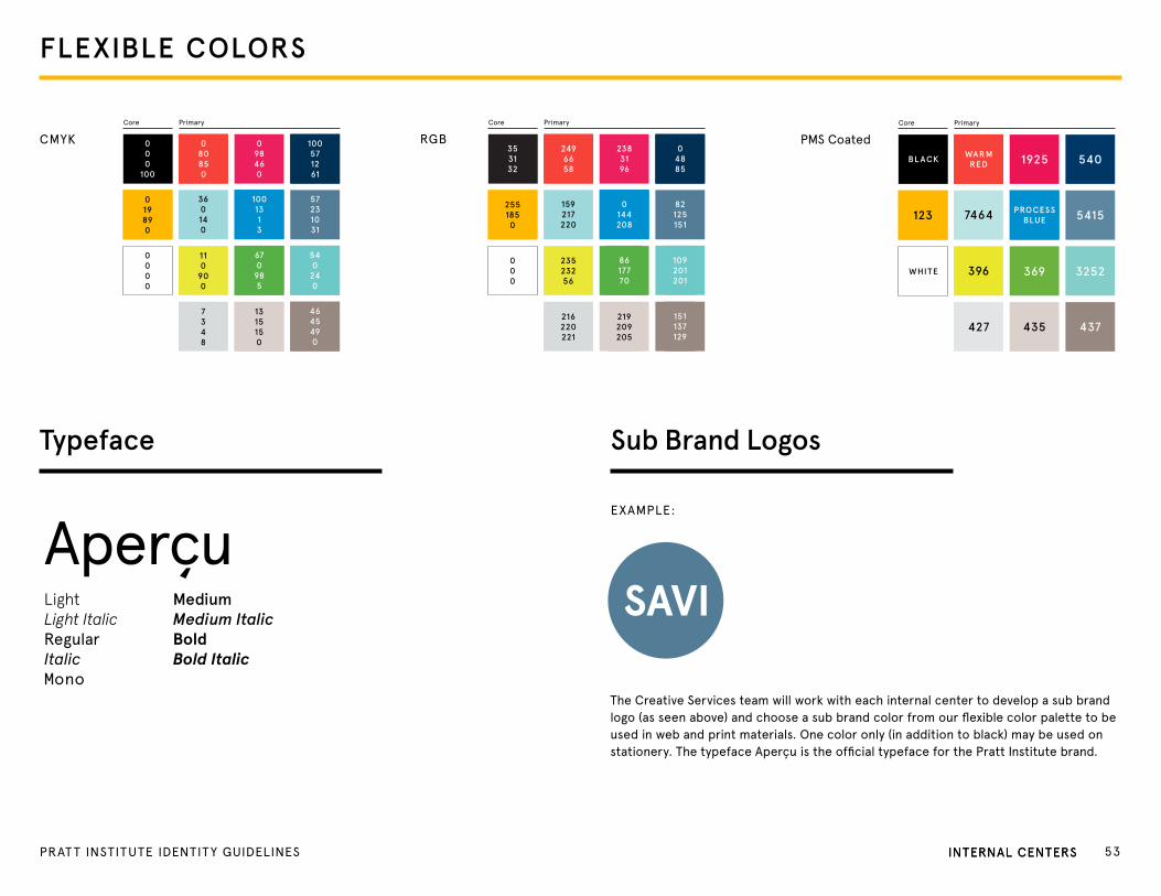
Sub Brand LogosTypeface
Aperçu LightLight ItalicRegularItalicMono
MediumMedium ItalicBoldBold Italic
the Creative Services team will work with each internal center to develop a sub brand logo (as seen above) and choose a sub brand color from our flexible color palette to be used in web and print materials. one color only (in addition to black) may be used on stationery. the typeface Aperçu is the official typeface for the Pratt Institute brand.
CMYKCore Primary
019890
360140
110
900
7348
1315150
000
100
080850
098460
100571261
57231031
1001313
670
985
540
240
4645490
0000
RgB
82125151
159217220
2551850
04885
2383196
2496658
353132
Core Primary
23523256
216220221
219209205
0144208
8617770
109201201
151137129
000
PMS CoatedCore Primary
WARMREDBL ACK
PROCESSBLUE7464
396
427 435
369 3252
437
5415
5401925
123
WHITE
eXAMPLe:
FLEXIBLE COLORS
INteRNAL CeNteRS 53PRAt t INStItUte IDeNtItY gUIDeLINeS INteRNAL CeNteRS
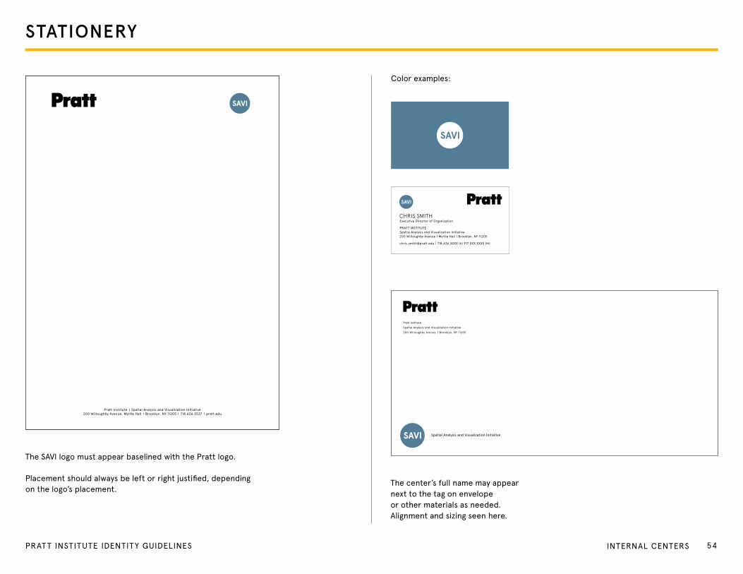
STATIONERY
the SAVI logo must appear baselined with the Pratt logo.
Placement should always be left or right justified, depending on the logo’s placement.
Pratt Institute Spatial Analysis and Visualization Initiative 200 Willoughby Avenue, Myrtle Hall Brooklyn, NY 11205 718.636.3537 pratt.edu
CHRIS SMITHexecutive Director of organization
PRAtt INStItUte
Spatial Analysis and Visualization Initiative 200 Willoughby Avenue Myrtle Hall Brooklyn, NY 11205
[email protected] 718.636.XXXX (o) 917.XXX.XXXX (m)
Color examples:
Pratt institute
Spatial Analysis and Visualization Initiative
200 Willoughby Avenue Brooklyn, NY 11205
the center’s full name may appear next to the tag on envelope or other materials as needed. Alignment and sizing seen here.
54PRAT T INSTITUTE IDENTITY GUIDELINES INteRNAL CeNteRS
Designed to Save Lives
PRAtt INStItUteSpatial Analysis and Visualization Initiative 200 Willoughby Avenue Brooklyn, NY 11205
Lorem ipsum dolor sit:Lorem ipsum dolor sit
Donec tristique turpis nibh, a feugiat elit porta eu. Praesent non erat porttitor, eleifend purus sit amet, tempor massa. Aliquam lorem velit, vestibulum nec gravida vel, vehicula ut quam. Sed porta placerat turpis sed lobortis. Cras eros dolor, pulvinar a molestie nec, mollis ut ipsum. Phasellus sed sem mattis augue sagittis mollis id ut mauris. In tempor in turpis semper sodales. Pellentesque vitae tempor tortor. Nullam lacinia sed nulla eget egestas.
FIRSt-CLASS MAILPReSoRteDU.S. PoStAge PAIDBRooKLYN, NYPeRMIt No. 3137
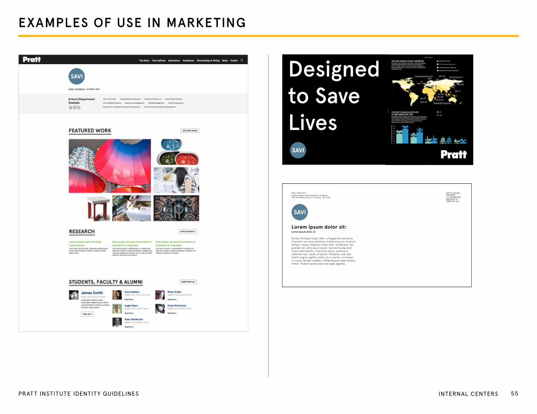
EXAMPLES OF USE IN MARKETING
55PRAT T INSTITUTE IDENTITY GUIDELINES INteRNAL CeNteRS

PRAt t INStItUteInstitutional AdvancementCommunications and Marketing200 Willoughby Avenue | Myrtle HallBrooklyn, NY 11205