ifta journal. issue 3 (2004)
TRANSCRIPT

IFTA Journal EditorLarry V. Lovrencic, ASIA
First Pacific SecuritiesP.O. Box 731
Rozelle NSW 2039 AustraliaTel: + 61 2 95555287
Email: [email protected]
IFTA ChairpersonBill Sharp
Valern Investment Management, Inc.140 Trafalgar Road
Oakville, Ontario L6J 3G5 CanadaTel: (1) 905 338 7540, Fax: (1) 905 845 2121
Email: [email protected]
IFTA Business OfficeIlse A. Mozga, Business Manager
157 Adelaide Street West, Suite 314Toronto, Ontario M5H 4E7 Canada
Tel: (1) 416 739 7437Email: [email protected]
Website: www.ifta.org
IFTAJOURNALJournal for the Colleagues of the International Federation of Technical Analysts
A Not-For-Profit Professional Organization
Incorporated in 1986
INTERNATIONAL FEDERATION OFTECHNICAL ANALYSTS, INC.
2004 Edition
From the Editor 2
Momentum Strategies Applied To Sector Indices 3
Mensur Pocinci
Market Internal Analysis In Asia 11
Ted Yi-Hua Chen
Using Japanese Candlestick Reversal Patterns in theArab and Mediterranean Developing Markets 21
Ayman Ahmed Waked
Derivation of Buying and Selling Signals Based on theAnalyses of Trend Changes and Future Price Ranges 27
Shiro Yamada
Wyckoff Laws: A Market Test (Part A) 34
Henry Pruden, Ph.D. and Benard Belletante, Ph.D.
Twelve Chart Patterns Within A Cobweb 37
Claude Mattern, DipITA
2004-2005 IFTA Board of Directors 43

2
IFTAJOURNAL 2004 Edition
www.ifta.org
Most of us have heard the phrase “to push the envelope.”
It’s origins are in the world of aviation and was popularized by TomWolfe in 1979 in his book The Right Stuff. Test pilots, such as ChuckYeager and John Glenn were often asked to push a plane past safe perfor-mance limits – the envelope. This enabled aeronautical designers tocompare calculated performance with actual performance which ulti-mately lead to safer, more efficient and faster planes.
You may ask why I mention this. Well, to me, the Chuck Yeagers –those with the ‘right stuff’ – of the technical analysis world are those who‘push the envelope’ by considering a ‘new’ or ‘different’ way of applyingtechnical analysis techniques. Not all who attempt to push the technicalanalysis envelope will be successful but every so often someone comes upwith a gem. One that comes to mind was the application of statistics totechnical analysis which lead to the commonly used Bollinger Bands.The result of successfully pushing the limits is an increase in our technicalanalysis body of knowledge.
In this Journal we feature articles from five IFTA colleagues who havethe ‘right stuff’ - five who submitted original research papers for DITALevel III to complete their Diploma in International Technical Analysis.Mensur Pocinci, Ted Yi-Hua Chen, Ayman Ahmed Waked , Shiro Yamadaand Claude Mattern put pen to paper to test their ideas.
The Diploma in International Technical Analysis (DITA) is a three-stage process. Levels I and II must be completed by coursework and exami-nation. Level III must be fulfilled by submission of a research paper that
a) must be original,
b) must deal with at least two different international markets,
c) must develop a reasoned and logical argument and lead to a soundconclusion supported by the tests, studies and analysis contained inthe paper,
d) should be of practical application, and
e) should add to the body of knowledge in the discipline of internationaltechnical analysis.
Mensur Pocinci’s article examines whether momentum strategies canbe successfully applied to sector analysis. The strategies were applied inthe weekly and monthly time frames and compared to a buy and hold ofthe benchmark indices. The popularity of Exchange Traded Funds (ETFs)based on financial market sectors makes Mensur’s article particularlyinteresting.
The N-day Diffusion Index and the N-day Diffusion Volatility Index,both market internal indicators, are examined in Ted Chen’s article with
From the Editorthe aim of deriving meaningful conclusions and practical applicationsfor stock market analysis.
In the next article Ayman Waked examines the accuracy and impor-tance of one of the oldest technical analysis methods, Japanese Candle-sticks, in some of the world’s oldest markets – the Arab and Mediterra-nean markets.
In his article, Shiro Yamada shows how to enhance the reliability ofsignals indicating trend changes by regulating future price ranges basedon probability theory.
Claude Mattern’s article explores the classification of chart patterns.He proposes an adaptive strategy for traders or advisers called BET (Build-Up, Exit, Target) when assessing patterns.
The final article is not a DITA III research paper but a collaborativeeffort by Professor Henry Pruden, Visiting Professor/Visiting Scholar,and Professor Benard Belletante, Dean and Professor of Finance,EuroMed-Marseille Ecole de Management, Marseille, France. They ex-amine the methods of Richard D Wyckoff, an innovator in his time anda man who had great market insight. In this article they subject theWyckoff Method to a ‘real-time-test under the natural laboratory condi-tions of the current U.S. stock market.’
I thank the authors for their contribution. I’m sure that readers of thisjournal will find interest in all of the articles. I’m also sure that the articleswill inspire IFTA colleagues to ‘push the envelope’ and to put their ideasinto action by submitting them as a DITA III research paper.
There are three persons, other than the authors who should be ac-knowledged for their efforts in producing the IFTA Journal. The first isBarbara Gomperts of Financial & Investment Graphic Design in Boston,MA, USA. Ms Gomperts, for quite a few years now, has been responsiblefor putting the polish on the IFTA Journal. Once again she has done amagnificent job, sometimes under trying circumstances, and has alwaysacted in a thoroughly professional and friendly manner.
The second and third persons to be acknowledged are my fellow IFTABoard members and Journal Committee members John Schofield (TASHK)and Larry Berman (CSTA). They spent many hours assessing the suitabil-ity of articles for publication and proofreading. Their sharp eyes andability to work as part of a team made the task of publishing this Journala pleasure. I am grateful for their contribution.
Once again this Journal may truly be called international as it is theresult of a collaboration of IFTA colleagues in many, varied geographicallocations – Europe, the Middle East, South East Asia, North Americaand Australia.
Larry V Lovrencic, DipTA (ATAA)
Editor
3
2004 Edition IFTAJOURNAL
www.ifta.org
INTRODUCTION
Working as a Technical Analyst for a one of the biggest banks in theworld implies having customers from different backgrounds and prefer-ences. An increasing number of clients, internal and external, are nowlooking for sector information. If one client doesn’t like, say the ItalianTelecoms in the European Telecom sector, they could be looking forother stocks in the same sector if they knew that the Telecom sector wasrated bullish. Sector analysis can thus offer clients more choice in build-ing their portfolios. Sector investing has also become popular in Europethanks to the introduction of the Euro. Portfolio management andfunds management have changed dramatically in the past few years inEurope. Before European monetary union, analysts, portfolio managersand fund mangers focused, mostly, on local markets. Recently a largeU.S. broker concluded from a survey that up to 90% of European port-folio and fund managers used a sector approach instead of a countryapproach to allocate their moneys.
I decided to set myself a task for my Diploma in International Tech-nical Analysis (DITA III) research paper to find out if price-momentumstrategies work in the short- and medium-term time frame on sectors.Price momentum strategies are simple strategies and most people shouldintuitively understand the logic behind buying past winners and sellingpast losers.
Thanks to this shift in investment approach, several exchanges haveintroduced ETFs (Exchange Traded Funds) based on S&P Sectors or DJEuro Stoxx Sectors.
In this article I will initially examine the weekly and monthly strategyon the Stoxx sectors and then continue within the appropriate timeframe on the S&P 500 groups. Finally, I will build a portfolio that iseither long the Stoxx or S&P 500 strategy to examine if additional valueor a decrease in risk can be achieved.
I will attempt to answer the following questions:
■ Which time frame to use?
■ What portfolio size?
■ What is the risk of the strategy?
PREVIOUS RESEARCH ON PRICE MOMENTUM STRATEGIES
Price momentum has been tested extensively on individual stocks. Forexample, DeBondt and Thaler (1985,1987) reported that long-term pastlosers outperform long-term past winners over the subsequent three tofive years. Jagadeesh (1990) and Lehmann (1990) found short-term re-turn reversals. Jagadeesh and Titman added a new twist to this literatureby documenting that over an intermediate horizon of three to twelvemonths, past winners on average continued to outperform past losers.
INVESTMENT UNIVERSE
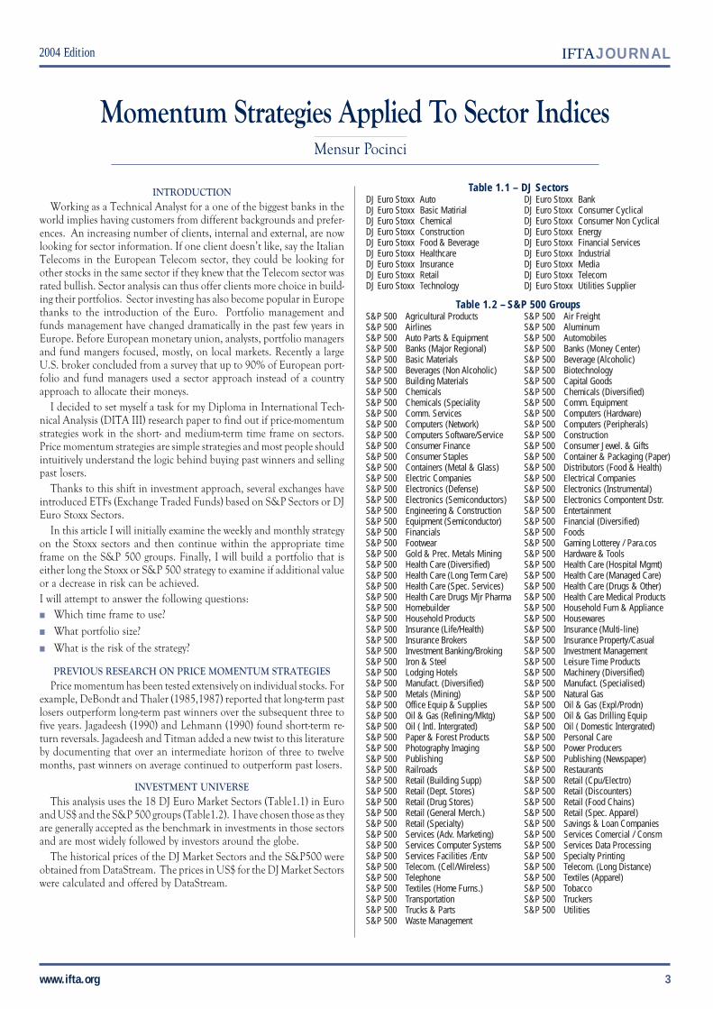
This analysis uses the 18 DJ Euro Market Sectors (Table1.1) in Euroand US$ and the S&P 500 groups (Table1.2). I have chosen those as theyare generally accepted as the benchmark in investments in those sectorsand are most widely followed by investors around the globe.
The historical prices of the DJ Market Sectors and the S&P500 wereobtained from DataStream. The prices in US$ for the DJ Market Sectorswere calculated and offered by DataStream.
Momentum Strategies Applied To Sector IndicesMensur Pocinci
Table 1.1 – DJ SectorsDJ Euro Stoxx Auto DJ Euro Stoxx BankDJ Euro Stoxx Basic Matirial DJ Euro Stoxx Consumer CyclicalDJ Euro Stoxx Chemical DJ Euro Stoxx Consumer Non CyclicalDJ Euro Stoxx Construction DJ Euro Stoxx EnergyDJ Euro Stoxx Food & Beverage DJ Euro Stoxx Financial ServicesDJ Euro Stoxx Healthcare DJ Euro Stoxx IndustrialDJ Euro Stoxx Insurance DJ Euro Stoxx MediaDJ Euro Stoxx Retail DJ Euro Stoxx TelecomDJ Euro Stoxx Technology DJ Euro Stoxx Utilities Supplier
Table 1.2 – S&P 500 GroupsS&P 500 Agricultural Products S&P 500 Air FreightS&P 500 Airlines S&P 500 AluminumS&P 500 Auto Parts & Equipment S&P 500 AutomobilesS&P 500 Banks (Major Regional) S&P 500 Banks (Money Center)S&P 500 Basic Materials S&P 500 Beverage (Alcoholic)S&P 500 Beverages (Non Alcoholic) S&P 500 BiotechnologyS&P 500 Building Materials S&P 500 Capital GoodsS&P 500 Chemicals S&P 500 Chemicals (Diversified)S&P 500 Chemicals (Speciality S&P 500 Comm. EquipmentS&P 500 Comm. Services S&P 500 Computers (Hardware)S&P 500 Computers (Network) S&P 500 Computers (Peripherals)S&P 500 Computers Software/Service S&P 500 ConstructionS&P 500 Consumer Finance S&P 500 Consumer Jewel. & GiftsS&P 500 Consumer Staples S&P 500 Container & Packaging (Paper)S&P 500 Containers (Metal & Glass) S&P 500 Distributors (Food & Health)S&P 500 Electric Companies S&P 500 Electrical CompaniesS&P 500 Electronics (Defense) S&P 500 Electronics (Instrumental)S&P 500 Electronics (Semiconductors) S&P 500 Electronics Compontent Dstr.S&P 500 Engineering & Construction S&P 500 EntertainmentS&P 500 Equipment (Semiconductor) S&P 500 Financial (Diversified)S&P 500 Financials S&P 500 FoodsS&P 500 Footwear S&P 500 Gaming Lotterey / Para.cosS&P 500 Gold & Prec. Metals Mining S&P 500 Hardware & ToolsS&P 500 Health Care (Diversified) S&P 500 Health Care (Hospital Mgmt)S&P 500 Health Care (Long Term Care) S&P 500 Health Care (Managed Care)S&P 500 Health Care (Spec. Services) S&P 500 Health Care (Drugs & Other)S&P 500 Health Care Drugs Mjr Pharma S&P 500 Health Care Medical ProductsS&P 500 Homebuilder S&P 500 Household Furn & ApplianceS&P 500 Household Products S&P 500 HousewaresS&P 500 Insurance (Life/Health) S&P 500 Insurance (Multi-line)S&P 500 Insurance Brokers S&P 500 Insurance Property/CasualS&P 500 Investment Banking/Broking S&P 500 Investment ManagementS&P 500 Iron & Steel S&P 500 Leisure Time ProductsS&P 500 Lodging Hotels S&P 500 Machinery (Diversified)S&P 500 Manufact. (Diversified) S&P 500 Manufact. (Specialised)S&P 500 Metals (Mining) S&P 500 Natural GasS&P 500 Office Equip & Supplies S&P 500 Oil & Gas (Expl/Prodn)S&P 500 Oil & Gas (Refining/Mktg) S&P 500 Oil & Gas Drilling EquipS&P 500 Oil ( Intl. Intergrated) S&P 500 Oil ( Domestic Intergrated)S&P 500 Paper & Forest Products S&P 500 Personal CareS&P 500 Photography Imaging S&P 500 Power ProducersS&P 500 Publishing S&P 500 Publishing (Newspaper)S&P 500 Railroads S&P 500 RestaurantsS&P 500 Retail (Building Supp) S&P 500 Retail (Cpu/Electro)S&P 500 Retail (Dept. Stores) S&P 500 Retail (Discounters)S&P 500 Retail (Drug Stores) S&P 500 Retail (Food Chains)S&P 500 Retail (General Merch.) S&P 500 Retail (Spec. Apparel)S&P 500 Retail (Specialty) S&P 500 Savings & Loan CompaniesS&P 500 Services (Adv. Marketing) S&P 500 Services Comercial / ConsmS&P 500 Services Computer Systems S&P 500 Services Data ProcessingS&P 500 Services Facilities /Entv S&P 500 Specialty PrintingS&P 500 Telecom. (Cell/Wireless) S&P 500 Telecom. (Long Distance)S&P 500 Telephone S&P 500 Textiles (Apparel)S&P 500 Textiles (Home Furns.) S&P 500 TobaccoS&P 500 Transportation S&P 500 TruckersS&P 500 Trucks & Parts S&P 500 UtilitiesS&P 500 Waste Management

4
IFTAJOURNAL 2004 Edition
www.ifta.org
ROC (RATE OF CHANGE)
At the end of each period the different ROCs (see table 2 and graph3 for calculation) were calculated for both weekly and monthly returns.The weekly returns were calculated on closing price of Friday or if Fridaywas a holiday the day before it. The same for the monthly ROCs, whichwere calculated on the last trading day of the ending month.
Table 2 - Relative Strength
Graph 3
Mathematically, the Relative Strength indicator is simply the ratio ofone data series divided by another. Generally, a stock price or industrygroup index is divided by a broad general market index to demonstratethe trend of performance of the stock relative of the market as a whole.
Ranking
The sectors were ranked by their ROC at the end of their time frame.
Performance Measurement
The different sectors were equally weighted in the performance mea-surement. That is, an average performance was calculated. For example,if a top 3 portfolio had one sector up 3%, one flat and the last up 1% theperformance for that time period the average performance for the port-folio would be 1.3%. The buying and selling took place on the last dayof calculations on the closing price. If a sector were to fall out of theportfolio, it would fall out on Fridays close and the new one added withthe closing price of the same Friday.
Portfolio Construction
The portfolio was constructed by buying the x-top ranked sector (port-folio size) and selling those that fell below the portfolio size. For examplein the monthly screen with a 3-month ROC on a 3-sector portfolio thetop 3 ranked sectors by their 3 monthly ROC were bought and thepreviously held sector, if no longer among the top 3 ranked, were sold.
Portfolio Change
The construction of the portfolio only changed if the rankings changed.For example, if, say, the DJ Euro Telecom sector fell from 1st place in the3-month ROC ranking to 5th place it would be replaced by the topranked sector in a 1-sector portfolio.
Risk / Reward
It is important to not only calculate and compare total return data butalso put them into perspective with the risk generated by those strategies.Risk was measured by drawdown (graph 5 table 4). The Risk / Rewardwas calculated by dividing total return with the maximal drawdown to see
how much return one percent drawdown generates. Perry Kaufman wrotein his book, Trading System and Methods, "Downside equity movementsare often more important than profit patterns. It is clear that if you haveto evaluate and test new strategies and ideas you should know the priceof risk that you pay". That’s why I also analysed risk / reward to find thebest solution.
Graph 5
Table 4
SUMMARY STATISTICS
■ Average Return: The average returns in the tables for the rollingperiods were calculated as geometric returns.
■ Average Weekly / Monthly Trades: This represents the average weekly/monthly trades for the tested strategy.
■ Maximal Drawdown: Calculates the maximal loss from the highestlevel in performance / equity.
■ Maximal Drawdown / Total Return: Calculates how much return isgenerated by one percent drawdown.
■ % Outperforming x W/M: This figure shows the percentage of peri-ods where the strategy outperformed the Buy and Hold strategy for theS&P 500 index or DJ Stoxx index.
Equity
Top Mark

5
2004 Edition IFTAJOURNAL
www.ifta.org
Number of Sectors HeldS&P 500 EuroStoxx
5 110 220 330 6
Portfolio Return Data
The return data for the different portfolios was calculated without anyuse of commission.
Average past performances were used, not only on different time frames,but also on the success rate in outperforming the benchmark in time.
Maximum Drawdown
As written in the introduction I examined maximum drawdown.Maximum drawdown is the percentage drop in performance or equitycurve from the previous highest value (see table 4 and graph 5 for calcu-lations). I used the maximum Drawdown to calculate the Risk/Returnvalues.
Results DJ Europe Sectors Weekly
The weekly portfolios were calculated on the following different pa-rameters:
ROC:
- 1-week % price change
- 5-week % price change
- 13-week % price change
- 21-week % price change
- 34-week % price change
Portfolio size:
- 1-Sector
- 2-Sectors
- 3-Sectors
- 6-SectorsThe data used was from 01.09.1987 - 31.08.2001 and was obtained
from DataStream.
1-SECTOR
Starting at the max draw down (Table 2.1) all strategies show highermaximum drawdown than the DJ Stoxx index, with the 1-week ROCleading with 63%, which is almost double the Stoxx with 33%. This riskis justified, as seen in Table (2.1), only in the 13 w roc and 21 w rocstrategies as only those manage to beat the Stoxx in draw down / totalreturn. The evidence on the 1-Sector portfolio doesn’t leave any room fordoubts as 13 week Roc convinces with highest return and highest maxi-mal drawdown/total return ratio. The %outperfoming periods are alsoencouraging with the highest % outperforming of the buy & hold in 83%of the time. As seen on graph (5.1) both total return and drawdown/totalreturn ratio peak at the 13-week Roc. The only negative is the hightrading frequency with 0.7 trades a week.
DJ Stoxx Weekly 1-Sector - Table 2.1
AVG % RETURN STOXX 1 W ROC 5 W ROC 13 W ROC 21 W ROC 34 W ROC
1W 0.15 0.06 0.19 0.26 0.24 0.17
3W 0.47 0.20 0.59 0.81 0.73 0.52
6W 0.96 0.45 1.20 1.64 1.47 1.07
12W 2.19 1.31 2.79 3.59 3.22 2.53
24W 5.08 3.47 6.42 8.25 7.12 5.84
36W 8.07 5.79 10.47 13.26 11.26 9.18
1 W ROC 5 W ROC 13 W ROC 21 W ROC 34 W ROC
%OUTP 1W 64 67 66 67 67
%OUTP 3W 60 66 68 67 65
%OUTP 6W 61 67 71 67 67
%OUTP 12W 74 78 81 78 78
%OUTP 24W 78 81 85 79 83
%OUTP 36W 65 74 83 70 75
1W ROC 5W ROC 13W ROC 21W ROC 34W ROC
# AVG TRADES PER WEEK 1.88 1.11 0.69 0.51 0.45
# TRADES TOTAL 1375 811 507 377 333
STOXX 1W ROC 5W ROC 13W ROC 21W ROC 34W ROC
MAX DRAWDOWN -33 -63 -61 -57 -46 -46
STOXX 1W ROC 5W ROC 13W ROC 21W ROC 34W ROC
TOTAL RETURN 205 54 307 596 486 250
RETURN / DD 6.27 0.86 4.99 10.40 10.53 5.42
Graph 5.1 - Total Return & Return/Max Drawdown
2-SECTORS
Starting at the max draw down (Table 2.1) all strategies show highermaximum drawdown than the DJ Stoxx index, with the 1-week ROCleading with 63%, which is almost double the Stoxx with 33%. This riskis justified, as seen in Table (2.1), only in the 13-week ROC and 21 w rocstrategies as only those manage to beat the Stoxx in drawdown/totalreturn. The evidence on the 1-sector portfolio doesn't leave any room fordoubts as 13-week ROC convinces with highest return and highest maxi-mal drawdown/total return ratio. The % outperfoming periods are alsoencouraging with the highest % outperforming of the buy & hold in 83%of the time. As seen on graph (5.1) both total return and drawdown/totalreturn ratio peak at the 13-week ROC. The only negative is the hightrading frequency with 0.7 trades a week.
DJ Stoxx Weekly 2-Sectors - Table 2.2
AVG % RETURN STOXX 1 W ROC 5 W ROC 13 W ROC 21 W ROC 34 W ROC
Total Return
Total Return/Max Drawdown

6
IFTAJOURNAL 2004 Edition
www.ifta.org
1W 0.15 0.13 0.27 0.30 0.23 0.18
3W 0.47 0.41 0.85 0.92 0.68 0.55
6W 0.96 0.86 1.73 1.87 1.37 1.12
12W 2.19 0.20 3.82 4.06 3.07 2.58
24W 5.08 4.65 8.43 8.92 6.86 5.89
36W 8.07 7.30 13.37 14.03 10.87 9.49
1 W ROC 5 W ROC 13 W ROC 21 W ROC 34 W ROC
%OUTP 1W 64 65 68 66 65
%OUTP 3W 65 69 69 67 65
%OUTP 6W 65 74 71 67 66
%OUTP 12W 79 85 87 81 75
%OUTP 24W 80 87 91 81 80
%OUTP 36W 66 91 93 76 69
1 W ROC 5 W ROC 13 W ROC 21 W ROC 34 W ROC
# AVG TRADES PER WEEK 3.51 1.74 1.07 0.90 0.73
# TRADES TOTAL 2570 1276 786 662 538
STOXX 1 W ROC 5 W ROC 13 W ROC 21 W ROC 34 W ROC
MAX DRAWDOWN -33 -43 -46 -36 -34 -45
STOXX 1 W ROC 5 W ROC 13 W ROC 21 W ROC 34 W ROC
TOTAL RETURN 205 159 649 811 420 274
RETURN / DD 6.27 3.71 14.13 22.31 12.52 6.09
3-SECTORS
The trend of lower drawdowns and higher outperforming percentagescontinues on the 3-Sector portfolio. Total return and risk-adjusted re-turns increase except for the 13-w-ROC when compared to the 2-Sectorstrategy. The 1-w-ROC still doesn’t manage to outperform buy & hold(see table 2.3). Trades continue to rise to 1.34 per week for the best riskadjusted performance still being held by the 13-w-ROC.
DJ Stoxx Weekly 3 Sectors - Table 2.3
AVERAGE % RETURN STOXX 1 W ROC 5 W ROC 13 W ROC 21 W ROC 34 W ROC
1W 0.15 0.13 0.28 0.29 0.24 0.20
3W 0.47 0.43 0.88 0.90 0.74 0.61
6W 0.96 0.89 1.80 1.18 1.49 1.12
12W 2.19 2.08 3.97 3.98 3.29 2.79
24W 5.08 4.80 8.73 8.75 7.18 6.30
36W 8.07 7.56 13.90 13.78 11.31 10.89
1 W ROC 5 W ROC 13 W ROC 21 W ROC 34 W ROC
%OUTP 1W 66 66 66 68 66
%OUTP 3W 63 70 70 67 66
%OUTP 6W 65 75 71 69 66
%OUTP 12W 81 85 89 86 77
%OUTP 24W 82 87 91 85 83
%OUTP 36W 71 93 96 84 74
1 W ROC 5 W ROC 13 W ROC 21 W ROC 34 W ROC
# AVG TRADES PER WEEK 4.90 2.28 1.34 1.21 0.93
# TRADES TOTAL 3591 1669 983 885 683
STOXX 1 W ROC 5 W ROC 13 W ROC 21 W ROC 34 W ROC
MAX DRAWDOWN -33 -38 -41 -35 -37 -43
STOXX 1 W ROC 5 W ROC 13 W ROC 21 W ROC 34 W ROC
TOTAL RETURN 205 171 705 738 491 333
RETURN / DD 6.27 4.54 17.13 21.26 13.31 7.78
6-SECTORS
The trend of lower max drawdown continues in the 6-sectors portfolio
as well and more important now 3 strategies (see graph 3.4 and table 2.4)have lower drawdowns than the Stoxx index. The total return figuresdecline compared to the 3-sectors portfolio in all strategies expect the 1-w-ROC and 34-w-ROC, which see slight improvement. The risk-adjustedreturns (total return / drawdown) are lower than in the 3-sector portfolioin the 5 and 13-w-ROC.
DJ Stoxx Weekly 6 Sectors - Table 2.4
AVERAGE % RETURN STOXX 1 W ROC 5 W ROC 13 W ROC 21 W ROC 34 W ROC
1W 0.15 0.14 0.24 0.26 0.22 0.20
3W 0.47 4.72 0.76 0.80 0.70 0.62
6W 0.96 0.96 1.55 1.63 1.42 1.27
12W 2.19 2.23 3.43 3.59 3.16 2.85
24W 5.08 5.06 7.56 7.86 6.95 6.32
36W 8.07 7.94 11.92 12.32 10.89 9.92
1 W ROC 5 W ROC 13 W ROC 21 W ROC 34 W ROC
%OUTP 1W 66 67 67 66 65
%OUTP 3W 64 70 71 68 68
%OUTP 6W 66 74 75 72 70
%OUTP 12W 82 87 89 87 82
%OUTP 24W 83 89 91 90 85
%OUTP 36W 71 95 100 87 78
1 W ROC 5 W ROC 13 W ROC 21 W ROC 34 W ROC
# AVG TRADES PER WEEK 7.87 3.42 1.94 1.59 1.26
# TRADES TOTAL 5772 2508 1423 1162 924
STOXX 1 W ROC 5 W ROC 13 W ROC 21 W ROC 34 W ROC
MAX DRAWDOWN -33 -32 -36 -30 -31 -33
STOXX 1 W ROC 5 W ROC 13 W ROC 21 W ROC 34 W ROC
TOTAL RETURN 205 199 500 570 431 347
RETURN / DD 6.27 6.20 13.93 18.80 13.68 10.66
Graph 3.4Results DJ Europe Sectors Monthly
The monthly portfolios were calculated on the following different

7
2004 Edition IFTAJOURNAL
www.ifta.org
parameters:
ROC:
- 1-month % price change
- 2-months % price change
- 3-months % price change
- 6-months % price change
- 9-months % price change
- 12-months % price changePortfolio size:
- 1-Sector
- 2-Sectors
- 3-Sectors
- 6-SectorsThe data used was from 30.09.1987 - 31.08.2001 and has been ob-
tained from DataStream.
1-SECTOR
The main difference to the weekly strategy here is the low turn over.The highest average monthly trade is 1.79 and the bottom at 0.65 tradesper month. All look-back periods outperform the STOXX index in totalreturn and risk adjusted return (see table 2.5) except for the 6-m ROC,which has lower returns as well as the second highest max drawdown. Theonly strategy having lower max drawdown than the Stoxx index was the3-m ROC with -30%, which puts it second in risk adjusted returns afterthe 12-ROC. On the total return the 1 m ROC is second with 1045% butdrops to third place in risk adjusted return as it has the highest drawdownwith 55%. The pattern of turnover decreasing with increasing look backperiod continues and the highest risk-adjusted and total return strategyhas the lowest turnover with only 0.65 trades a month.
DJ Stoxx 1-Sector Monthly - Table 2.5
AVG. % RETURN STOXX 1M ROC 2M ROC 3M ROC 6M ROC 9M ROC 12MROC
1M 0.71 16.89 13.93 15.10 8.21 11.38 15.08
3M 2.42 54.96 45.47 46.87 25.58 36.60 47.51
6M 5.59 118.86 98.16 97.78 52.80 78.02 98.04
12M 12.68 268.31 224.66 209.63 107.53 167.45 210.10
24M 28.12 647.82 488.83 454.96 210.27 372.45 503.40
36M 42.65 1081.75 734.78 715.54 288.67 598.33 853.79
1M ROC 2M ROC 3M ROC 6M ROC 9M ROC 12MROC
%OUTP 1M 52 54 53 49 52 55
%OUTP 3M 61 55 56 47 56 55
%OUTP 6M 66 58 59 48 54 56
%OUTP 12M 79 65 69 44 63 63
%OUTP 24M 89 70 76 35 67 68
%OUTP 36M 94 76 84 27 70 72
1M ROC 2M ROC 3M ROC 6M ROC 9M ROC 12MROC
# AVG TRADES PER MONTH 1.80 1.46 1.20 0.99 0.85 0.65
# TRADES TOTAL 302 245 201 167 143 108
STOXX 1M ROC 2M ROC 3M ROC 6M ROC 9M ROC 12MROC
MAX DRAWDOWN -32 -55 -42 -30 -43 -38 -35
STOXX 1M ROC 2M ROC 3M ROC 6M ROC 9M ROC 12MROC
TOTAL RETURN 223 1045 605 773 166 352 1078
RETURN / DD 6.78 18.89 14.33 25.70 3.89 9.37 30.71
2-SECTORS
The returns on the 2-sectors strategy were about 30-40% lower than for
the 1-sector strategy and the total return / drawdown ratio worsened. Thehighest total return was achieved in the 1-month strategy whereas the 3-month strategy received the highest risk return data.
DJ Stoxx 2-Sector Monthly - Table 2.6
AVG. % RETURN STOXX 1M ROC 2M ROC 3M ROC 6M ROC 9M ROC 12MROC
1M 0.71 16.89 13.93 15.10 8.21 11.38 15.08
3M 2.42 54.96 45.47 46.87 25.58 36.60 47.51
6M 5.59 118.86 98.16 97.78 52.80 78.02 98.04
12M 12.68 268.31 224.66 209.63 107.53 167.45 210.10
24M 28.12 647.82 488.83 454.96 210.27 372.45 503.40
36M 42.65 1081.75 734.78 715.54 288.67 598.33 853.79
1M ROC 2M ROC 3M ROC 6M ROC 9M ROC 12MROC
%OUTP 1M 56 54 53 49 52 55
%OUTP 3M 53 55 56 54 56 55
%OUTP 6M 62 58 59 56 54 56
%OUTP 12M 84 65 69 59 63 63
%OUTP 24M 97 70 76 60 67 68
%OUTP 36M 97 76 84 65 70 72
1M ROC 2M ROC 3M ROC 6M ROC 9M ROC 12MROC
# AVG TRADES PER MONTH 3.90 3.70 3.50 2.75 2.10 1.90
# TRADES TOTAL 647 614 581 456 348 315
STOXX 1M ROC 2M ROC 3M ROC 6M ROC 9M ROC 12MROC
MAX DRAWDOWN -32 -55 -42 -30 -43 -38 -35
AVG. % RETURN STOXX 1M ROC 2M ROC 3M ROC 6M ROC 9M ROC 12MROC
TOTAL RETURN 223 1045 605 773 166 352 1078
RETURN / DD 6.78 18.89 14.33 25.70 3.89 9.37 30.71
3-SECTORS
The average monthly trades continued to rise. Return and risk returnonly improved in the 3-month and 6-month look-back periods. Com-pared to the 1-sector portfolio, only the 6-m-ROC has a higher totalreturn risk adjusted return.
DJ Stoxx 3-Sectors Monthly - Table 2.7
AVG. % RETURN STOXX 1M ROC 2M ROC 3M ROC 6M ROC 9M ROC 12MROC
1M 0.71 13.99 12.84 13.85 12.11 10.87 11.92
3M 2.42 45.43 40.67 43.48 37.37 35.63 38.58
6M 5.59 97.71 87.15 91.11 78.34 75.33 80.56
12M 12.68 217.16 195.05 195.70 167.62 160.25 172.81
24M 28.12 506.05 427.63 425.63 365.90 359.76 409.99
36M 42.65 804.66 651.67 666.02 567.20 576.96 675.86
1M ROC 2M ROC 3M ROC 6M ROC 9M ROC 12MROC
%OUTP 1M 52 51 54 51 53 54
%OUTP 3M 55 57 55 53 53 52
%OUTP 6M 58 57 59 54 56 57
%OUTP 12M 82 65 67 62 60 58
%OUTP 24M 97 74 79 64 68 63
%OUTP 36M 96 77 83 77 76 66
1M ROC 2M ROC 3M ROC 6M ROC 9M ROC 12MROC
# AVG TRADES PER MONTH 6.20 5.90 5.41 4.34 3.63 2.51
# TRADES TOTAL 647 605 457 367 307 208
STOXX 1M ROC 2M ROC 3M ROC 6M ROC 9M ROC 12MROC
MAX DRAWDOWN -32 -45 -38 -29 -34 -48 -51

8
IFTAJOURNAL 2004 Edition
www.ifta.org
STOXX 1M ROC 2M ROC 3M ROC 6M ROC 9M ROC 12MROC
TOTAL RETURN 223 587 440 591 385 302 640
RETURN / DD 6.78 13.01 11.60 20.19 11.35 6.27 12.45
6-SECTORS
The total returns continued to fall on look-back periods but the riskreturns improved slightly in all of the look-back periods as the draw-downs came down. Once again the 6-m-ROC was the only strategy toperform better in the 6-sector portfolio than in the 1-sector portfolio.
DJ Stoxx 6-Sectors Monthly - Table 2.8
AVG. % RETURN STOXX 1M ROC 2M ROC 3M ROC 6M ROC 9M ROC 12MROC
1M 0.71 13.05 12.31 13.18 11.80 10.42 10.63
3M 2.42 41.42 39.06 41.00 36.73 33.07 34.29
6M 5.59 87.55 83.14 85.34 77.06 69.01 71.46
12M 12.68 189.54 182.56 180.86 164.28 145.81 151.96
24M 28.12 422.03 401.29 389.35 358.72 317.08 341.43
36M 42.65 671.16 636.92 611.81 568.12 506.01 549.14
1M ROC 2M ROC 3M ROC 6M ROC 9M ROC 12MROC
%OUTP 1M 51 51 50 52 56 53
%OUTP 3M 53 53 55 54 53 52
%OUTP 6M 60 59 58 58 57 55
%OUTP 12M 85 70 68 65 54 55
%OUTP 24M 99 85 74 71 60 51
%OUTP 36M 85 92 79 79 67 52
1M ROC 2M ROC 3M ROC 6M ROC 9M ROC 12MROC
# AVG TRADES PER MONTH 10.15 7.91 5.61 4.90 4.05
# TRADES TOTAL 858 668 474 414 336
STOXX 1M ROC 2M ROC 3M ROC 6M ROC 9M ROC 12MROC
MAX DRAWDOWN -32 -31 -34 -23 -27 -34 39
STOXX 1M ROC 2M ROC 3M ROC 6M ROC 9M ROC 12MROC
TOTAL RETURN 223 499 412 485 358 274 503
RETURN / DD 6.78 16.08 12.19 21.37 13.48 8.03 12.85
S&P 500 MONTHLY RESULTS
As we have seen there was no additional value in using the weeklysystem showing lower returns and higher drawdowns. I decided to onlyanalyse the monthly system for the S&P 500 groups. The tests on theS&P 500 groups were the same as on the DJ Stoxx with the only differ-ence being that the available data went back to 01.08.1982. Thus, I testedfrom 01.08.1982 to 31.08.2001, which represented a 19-year period.
The monthly portfolios were calculated on the following differentparameters:
ROC:
- 1-month % price change
- 2-months % price change
- 3-months % price change
- 6-months % price change
- 9-months % price change
- 12-months % price changePortfolio size:
- 5-Sectors
- 10-Sectors
- 20-Sectors
- 30-Sectors
5. SECTORS
The 5-sector strategy shows that all look-back periods manage to out-
pace the S&P 500 index buy & hold in total return. For the risk adjustedreturn the 12-m-ROC beat the S&P 500 index. Looking at the maxdrawdown, the longer look-back periods from 6-m-ROC on only pro-duced higher drawdowns than the S&P 500. The risk adjusted returntopped at the 2-m-ROC with a figure of 82.55 Return / Drawdown andcontinued to decline in the following periods.
Graph 3.9 - Max Drawdown
10-SECTORS
Also, here, all look-back periods managed to achieve higher total re-turns than the S&P 500 index and on a risk-adjusted basis only the 9-m-ROC outpaced the S&P 500 index. The drawdowns up to the 3-m-ROCremained the same as the 5-sector portfolio but had higher drawdownsfor the 9-m-ROC and lower ones for the 12-m-ROC. The total returnpeaked at the 12-m-ROC but because of the high drawdown, the risk-adjusted return was lead by the 2-m-ROC with 78.30. The other differ-ence to the 5-sector portfolio was the increased number of trades, about50-100% higher.
S&P 500 Monthly 10-Groups - Table 2.10
AVG. % RETURN S&P 500 1M ROC 2M ROC 3M ROC 6M ROC 9M ROC 12MROC
1M 0.99 1.82 1.46 1.38 1.26 1.14 1.33
3M 3.19 3.25 4.36 4.19 3.72 3.38 3.97
6M 6.71 6.74 9.04 8.60 7.59 7.05 8.34
12M 14.31 13.33 18.61 17.78 15.34 14.59 17.40
24M 30.43 27.76 41.33 38.75 31.30 31.54 38.49
36M 49.6 44.91 70.12 63.87 48.11 50.03 62.87
1M ROC 2M ROC 3M ROC 6M ROC 9M ROC 12MROC
%OUTP 1M 53 50 50 54 53 52
%OUTP 3M 50 52 54 52 53 54
%OUTP 6M 48 54 54 51 52 54
%OUTP 12M 47 62 55 52 51 58
%OUTP 24M 49 76 68 60 51 64
%OUTP 36M 48 79 69 56 58 68
1M ROC 2M ROC 3M ROC 6M ROC 9M ROC 12MROC
# AVG TRADES PER MONTH 13.30 11.35 9.89 7.44 6.13 5.08
# TRADES TOTAL 3058 2611 2275 1711 1411 1169
S&P 500 1M ROC 2M ROC 3M ROC 6M ROC 9M ROC 12MROC
MAX DRAWDOWN -30.17 -29.93 -21.99 -28.06 -40.27 -52.94 -49.68
S&P 500 1M ROC 2M ROC 3M ROC 6M ROC 9M ROC 12MROC
TOTAL RETURN 847 1298 1722 2006 2035 1291 2237
RETURN / DD 28.08 43.39 78.30 71.50 50.54 24.40 45.04
S&P500
1 MROC
2 MROC
3 MROC
6 MROC
9 MROC
12 MROC

9
2004 Edition IFTAJOURNAL
www.ifta.org
20-SECTORS
The major difference to the 5-sector strategy was the increased averagetrades per month with an average of 3-4 fold. The major improvementwas on the drawdown side with the 1-m-ROC now half the buy & holddrawdown and the 2-m-ROC and 3-m-ROC with lower drawdowns thanthe S&P 500. The highest total return was achieved by the 1-m-ROC aswell as the risk-adjusted return - both continued to decline until the 6-m-ROC before climbing again. The 1-m-ROC had the highest risk-adjustedreturn so far but when compared to the 5-sector strategy it made 4 timesmore trades a month and generated 3 times more risk-adjusted return.
S&P 500 Monthly 20-Groups - Table 2.11
AVG. % RETURN S&P 500 1M ROC 2M ROC 3M ROC 6M ROC 9M ROC 12MROC
1M 0.99 1.33 1.36 1.10 0.97 1.11 1.27
3M 3.19 3.93 4.01 3.25 2.83 3.32 3.79
6M 6.71 8.19 8.27 6.75 5.83 6.90 7.93
12M 14.31 17.12 16.98 13.60 11.56 14.30 16.81
24M 30.43 38.33 37.43 28.29 22.60 30.55 37.35
36M 49.60 65.04 62.46 45.35 33.56 48.10 60.29
1M ROC 2M ROC 3M ROC 6M ROC 9M ROC 12MROC
%OUTP 1M 52 53 52 51 53 52
%OUTP 3M 69 71 68 64 68 64
%OUTP 6M 52 52 49 47 52 53
%OUTP 12M 57 56 53 42 54 60
%OUTP 24M 69 73 45 40 59 63
%OUTP 36M 73 76 41 37 56 67
1M ROC 2M ROC 3M ROC 6M ROC 9M ROC 12MROC
# AVG TRADES PER MONTH 29.07 20.40 21.24 12.27 10.05 8.65
# TRADES TOTAL 6685 4691 4886 2822 2312 1990
S&P 500 1M ROC 2M ROC 3M ROC 6M ROC 9M ROC 12MROC
MAX DRAWDOWN -30.17 -14.73 -20.19 -26.88 -33.56 -38.63 30.08
S&P 500 1M ROC 2M ROC 3M ROC 6M ROC 9M ROC 12MROC
TOTAL RETURN 847 2051 1807 929 553 1050 1677
RETURN / DD 28.08 139.27 89.51 34.56 16.48 27.18 55.75
30-SECTORS
The 30-sector portfolio had higher drawdowns for the 6-m-ROC to 12-m-ROC. The total return peaked at 1-m-ROC and continued to declineuntil the 6-m-ROC where it turned upward again. The highest risk-ad-justed return was also achieved by the 1-m-ROC; only the 6-m-ROC and9-m-ROC had a lower risk-adjusted return than the S&P 500 index. Thebiggest disadvantage was the high trading turnover. Compared to the 5-sectors 1-m-ROC, the 30-sectors 1-m-ROC had more than 5 times thetrading turnover and a risk-adjusted return that was more than doublethan the 5-sector.
S&P 500 Monthly 30-Groups - Table 2.12
VG. % RETURN S&P 500 1M ROC 2M ROC 3M ROC 6M ROC 9M ROC 12MROC
1M 0.99 1.26 1.29 1.10 0.94 1.05 1.18
3M 3.19 3.75 3.81 3.25 2.76 3.12 3.54
6M 6.71 7.80 7.89 6.75 5.69 6.48 7.37
12M 14.31 16.25 16.21 13.60 11.34 13.22 15.51
24M 30.43 36.25 35.48 28.29 22.43 27.68 34.00
36M 49.60 61.19 59.31 45.35 34.19 43.68 54.81
1M ROC 2M ROC 3M ROC 6M ROC 9M ROC 12MROC
%OUTP 1M 53 52 52 51 53 51
%OUTP 3M 54 51 47 47 50 61
%OUTP 6M 53 52 49 43 49 53
%OUTP 12M 56 54 53 41 53 54
%OUTP 24M 65 65 45 36 53 50
%OUTP 36M 69 69 41 30 51 54
1M ROC 2M ROC 3M ROC 6M ROC 9M ROC 12MROC
# AVG TRADES PER MONTH 38.23 25.57 21.24 15.02 12.09 10.94
# TRADES TOTAL 8830 5906 4907 3469 2792 2527
S&P 500 1M ROC 2M ROC 3M ROC 6M ROC 9M ROC 12MROC
MAX DRAWDOWN -30.17 -16.50 -19.71 -26.88 -31.55 -38.47 -33.36
S&P 500 1M ROC 2M ROC 3M ROC 6M ROC 9M ROC 12MROC
TOTAL RETURN 847 1741 1615 929 553 855 1333
RETURN / DD 28.08 105.49 81.96 34.56 17.53 22.22 39.96
GLOBAL PORTFOLIO
The idea behind the global portfolio was to switch between the US andthe European strategy, to see if performance and risk/return could beimproved. To do so, I first had to choose two strategies from both sidesof the Atlantic. In Europe I chose the 3-m-ROC with one sector as itprovided one of the best total returns and risk-adjusted returns with lessdrawdown than the Stoxx index. In the US I choose the 3-m-ROC withfive sectors. The data was taken from previous tests and started on30.09.1987. To do a currency adjusted and more realistic test I had toretest the European portfolios with prices of the sectors in USD. The nextstep was to determine when to be invested in which strategy. For that Iused relative strength with a moving average to trigger the signal. I useda 6-month moving average, that is, the average relative strength for thelast six months. I examined on the basis that the European strategy wouldbe bought if the relative strength of the European versus the US strategycrossed its moving average from below and sold if the moving average wascrossed from above. As can be seen on Table 20 the total return and risk-adjusted return was only higher versus the S&P 500 portfolio and lowerthan the Stoxx portfolio. The main problem lies in turnover as the globalportfolio rose to 1,241 total trades, which is 50% more than the USstrategy and more than six fold of the European strategy. Thus, the outperformance would be lost in trading costs. I also examined whether itmade sense to switch between similar strategies as those strategies havea correlation of 0.94. Looking at Table 20 and having in mind that thecorrelation of these two strategies is at 0.94 it doesn’t make sense to tradesuch a portfolio because diversification wasn’t provided.
Table 20 - Global Portfolio
S&P 500 1M 5 Groups Stoxx 1M 1 Sector Global Portfolio
MAX DRAWDOWN -28 -30 -32.3
TOTAL RETURN 398 773 536
RETURN/DRAWDOWN 14.2 25.7 16.67
TOTAL TRADES 802 201 1292

10
IFTAJOURNAL 2004 Edition
www.ifta.org
CONCLUSION
The results have shown on both the weekly and monthly strategies inEurope and the monthly in US that buying past top performers andselling them when they drop below a rank makes money and outperformsthe buy & hold of the benchmark indices. The best results were achievedin the monthly strategies, as they were able to pick major trends butavoided trading too much. Increasing portfolio size didn’t mean thatdiversification or profitability could be improved as we can see whencomparing the DJ Stoxx 6-Sectors Monthly with the DJ Stoxx 1-SectorMonthly (table 2.8 and table 2.5).
FURTHER DEVELOPMENTS
This article offers a good foundation; nevertheless these strategiesoffer a lot more possibilities. Recent developments in the financial mar-kets have been encouraging, as new ETFs have, more frequently, beenoffered by exchanges on both sides of the Atlantic. This helps to tremen-dously reduce trading costs as one can easily trade a whole sector orgroup. In Europe the development has been more innovative with fu-tures contracts on the sector indices being offered. Trading costs forfutures versus trading ETFs should be significantly lower. It also enablesthe ability to go short, thus opening the door for price momentum strat-egies to be used to reduce market risk.
REFERENCES
■ Chan, Louis K. C., Narasimhan Jegadeesh, and Josef Lokonishok,1996, “Momentum Strategies,” Journal of Finanace v51n5, 1681-1713.
■ De Bondt, W. F. M., and R. H. Thaler, 1985, “Does The Stock MarketOverreact?,” Journal of Finance v40, 793-805.
■ Jegadeesh, Narasimhan, and Sheridan Titman, 1993, “Returns toBuying Winners and Selling Losers: Implications for Stock MarketEfficiency,” Journal of Finance v48n1, 65-91.
■ Jegadeesh, Narasimhan, 1990, “Evidence of Predictable Behavior ofSecurity Returns,” Journal of Finance v45n3, 881-898.
■ Kaufman, Perry J., 1998, Trading Systems and Methods, John Wiley& Sons, New York.

11
2004 Edition IFTAJOURNAL
www.ifta.org
IT’S A MARKET OF STOCKS
Wall Street proverbs are full of truisms. This one goes, “The stockmarket is a market of stocks.”
At a time when many technical analysts focus on the analysis of stockmarket indices by developing and applying far too many techniques andindicators, they are overlooking simple technical indicators that reflectthe notion that the stock market is a market of stocks.
If a technician spends most of the day looking at the stock marketindex, trying hard to fine-tune or optimize the oscillators, or drawing theperfect trend line, he may be missing the point. After all, we have a marketof stocks, not a stock market. Worrying about “the market” is at best aninteresting intellectual exercise and at worst a total distraction from themain pursuit of investing, which is to find companies or groups with thegreatest potential for capital appreciation within a given time horizon.Worrying what the stock market index will do tomorrow adds little valueto the main task at hand, which is to look for what opportunities are outthere. This requires a deeper look into the stock market - a market ofstocks - to arrive at a comprehensive view of the market. In my view,market internal indicators are the perfect tools to serve such purpose.
MARKET INTERNAL INDICATOR
Unlike many other technical indicators, which derive from stock pricesand market indices, market internal indicators are technical indicators,which reveal a different but important dimension of the stock marketmovements - the level of participation. Why is market internal impor-tant? Let’s start with a basic definition. A bull market - a generic term buthard to define with precision. What is a bull market? The followingdefinitions are quite common from the experts:
■ A broad upward movement, normally averaging at least 18 months, which is
interrupted by secondary reactions.
- Martin Pring, Technical Analysis Explained
■ A prolonged rise in the prices of stocks, bonds, or commodities, usually last atleast a few months and are characterized by high trading volume.
- Barron’s, Dictionary of Finance and Investment Terms
■ A long-term (months to years) upward price movement characterized by a seriesof higher intermediate (weeks to months) highs interrupted by a series of higherintermediate lows.
- Victor Sperandeo, Trader Vic II- Principles of Professional Speculation
■ A prolonged period of rising prices, usually by 20% or more.
- Investorwords.com
It’s clear that most definitions agree that a bull market requires notonly the market index to rise substantially, but also that the price ad-vances need to be broadly based. But, when it comes to the quantitativemeasures of a bull market, most definitions are rather ambiguous, oreven absent, particularly with regard to the level of participation. Thereare three quantifiable measures for a bull market - the extent of the rise,the duration of the rise and the participation of the rise in the stockmarket. Although it’s not viable to come up with a distinct measure of abull market, for the first two factors (extent and duration of the rise), it’sacceptable that a bull market should see minimum 20% rise in the stockmarket index for a prolonged period (months to years). The hard part isto gauge the level of participation of the rises in the stock market inrelation to bull and bear market. I believe that studies of market internalsprovide great insights into the dynamics of stock market movements.
This article explores the viability of a particular type of market internal
indicator - the N-day Diffusion Index, denoting the percentage of stocksabove their own N-day moving average - and its related indicators, hopingto derive at some meaningful conclusions and practical applications instock market analysis. Three markets have been selected for discussionwith over 12 years’ history. They have been chosen to cover three typesof general trends over that period - a rising trend (Hong Kong), a cyclicalsideways trend (Korea) and a declining trend (Thailand) (Chart 1).
Chart 1 - Performance of Three Asian Markets Since 1990(Jan. 1990 = 100)
Source: Thomson Datastream
N-DAY DIFFUSION INDEX, A LEADING INDICATOR
The N-day Diffusion Index (N-day DI) is based on the percentage ofstocks in a market or a sector that are above their N-day moving average.For example, among the top 100 stocks in the Korean Stock Exchange,38 of those stocks are above their 50-day moving average and 62 are belowtheir 50-day moving average, then the 50-day Diffusion Index (50-day DI)for the Top 100 Korean stocks is at 38%. In the same way, we can workout the 200-day DI for the Top 100 Korea stocks (34% as of August 21st,2002). The formula of %N-day Index should be:
N-day DI = x 100%
Chart 2 shows the recent history of 50-day DI and 200-day DI for thetop 100 stocks traded on the Korean Stock Exchange.
Chart 2 - Recent History of %50-Day DI and %200-Day DI forthe Top 100 Korean Stocks
Source: Thomson Datastream
Market Internal Analysis In AsiaTed Yi-Hua Chen
Number of stocks above their own N – day moving average
total number of stock in the group under study

12
IFTAJOURNAL 2004 Edition
www.ifta.org
As the formula suggests, the N-day DI is an oscillator fluctuating be-tween 0% and 100%. It’s not a smooth oscillator and can be quite volatiledepending on the parameter N (number of days used for moving averageof the stock price), thus another N-day moving average is applied to theN-day DI to smooth out the noise. Furthermore, when comparing themoving average of the N-day DI to the moving average of stock price (ormarket index), there are some important differences between the twowhich can help technicians gain better insights into the stock marketmovements.
My research in many Asian markets has found that, if the same num-ber of days is applied for the moving average smoothing, the movingaverage of the N-day DI is significantly different from the moving averageof the stock market index in two aspects:
1. The moving average of the N-day DI generally has more turns than themoving average of the stock market index;
2. The turns in the moving average of the N-day DI generally lead theturns in the moving average of the stock market index.
The next three charts (Chart 3 to 5) show the recent history of the 50-day moving average of the stock market index and of the 50-day DI inHong Kong, Korea and Thailand respectively. Turning points in the 50-day moving average of 50-day DI are plotted as red dots while turningpoints in the 50-day moving average of the stock market index are plottedas blue dots.
Chart 3 - Hong Kong: Hang Seng Index, 50-Day DI (top 100) andTheir 50-Day Moving Average
Source: Thomson Datastream
Note: as the 50-day moving average could produce whipsaws especially during
non-directional market condition, I applied a 20-day swing high (or low) to definea peak (or trough) in the moving average to filter out noise. In other words, aqualified peak should be the peak for at least the last 20 days and a qualified
trough should be the low for at least the last 20 days.
Chart 4 - Korea: KOSPI, 50-Day DI (top 100) and Their 50-dayMoving Average
Source: Thomson Datastream
Chart 5 - Thailand: SET Index, 50-Day DI (Top 100) and Their50-day Moving Average
Source: Thomson Datastream
The following three tables (Table 1 to 3) list all the turns in the movingaverage of DI and the moving average of stock market index in HongKong, Korea and Thailand from 1991 to 2002.

13
2004 Edition IFTAJOURNAL
www.ifta.org
Table 1 - Comparison of Turning Points: Hong Kong (1991 - 2002)

14
IFTAJOURNAL 2004 Edition
www.ifta.org
Table 2 - Comparison of Turning Points: Korea (1991 - 2002)

15
2004 Edition IFTAJOURNAL
www.ifta.org
Table 3 - Comparison of Turning Points: Thailand (1991 - 2002)

16
IFTAJOURNAL 2004 Edition
www.ifta.org
Table 4 - The Summary of the Statistics from Three Markets(1991 - 2002)
The evidence from three Asian markets clearly supports the argumentthat the Diffusion Index is a leading indicator of stock market indices.
I liken the ‘leading’ aspect of the Diffusion Index (DI) over the stockmarket index to the relationship between the gas pedal and the speed ofthe car. The fastest speed always happens after a powerful press of the gaspedal, as fuel injection to the engine is mainly responsible for the accel-eration of a car. By knowing how hard the pedal is pressed, we will havea pretty good idea of how fast the car will travel in the moment thatfollows. In the case of the stock market, an increase in liquidity, which,to a great extent, can be reflected by sustained rise in the N-day DiffusionIndex, is mainly responsible for the stock market advance. By knowinghow many stocks are participating the rally, we will have a pretty goodidea of how powerful and sustainable the market rally will likely to be.
Caveat: occasionally, a rise in the N-day DI is not followed by a subsequentrise in the stock market index or a fall in the N-day DI is not followed by asubsequent fall in the stock market index. This often occurs when the long-term
trend of the stock market is strongly upward (or firmly downward), which reflectsa situation where the market moves towards an equilibrium level from a massivelyundervalued (or overvalued) level. Such anomaly is similar to the situation when
a car is so overburdened that it cannot accelerate no matter how hard the gas pedalis pressed.
THE PROBLEM WITH A MOVING AVERAGE SYSTEM
Trading systems based on two moving averages of different time spanshave been well known to technical traders for years. But there are prob-lems with trading systems of this nature. Generally speaking, a movingaverage of price is reliable in identifying trends, especially the long-termtrend. However, due to its lagging effect, signals are often too late, espe-cially for the short to intermediate-term trend. Most dual moving averagetrading systems lack the flexibility to strike a balance between trade reli-ability (strategy) and trade efficiency (tactic). In other words, these sys-tems use the moving average as the tool for identifying trend as well as fortiming the trade.
The ‘leading’ function of the Diffusion Index over the stock marketindex has profound implication for improving trading system based ondual moving averages. Table 5 lays out the key characteristics of a movingaverage of both stock market index and the Diffusion Index. Although,the moving average of the Diffusion Index, as a non-price derived indica-tor, can give premature signals for long-term market trend change, theyare most effective in timing the short to intermediate-term trend reversals.
Table 5 - Key Characteristics of Price Moving Averageand DI Moving Average
Moving Average of Stock Market Index Moving Average of Diffusion Index
Type of indicator Price trend following indicator Oscillator between 0% and 100%
Frequency of turns Fewer turning points More turning points
Time lead/lag Lagging Leading
Pros • reliable signals • preemptive warning signals• follow price closely• more effective in identifying • more effective tool in catching
long-term trend intermediate-term trend reversals
Cons • late signals • Premanture signals, especially for• less effective catching long term trends intermediate-term trend • a non-price derived indicator, thus reversals hard to use for stop-loss purpose
Perhaps, incorporating the Diffusion Index into a moving average trad-ing system could greatly improve the trade efficiency.
DIMA TRADING SYSTEM
I have designed a trading system to take advantage of the best fromboth the price moving average and the DI moving average. In a nutshell,the system defines the trading strategy (buy only or sell only) by thedirection of a long-term moving average of the stock market index (say200-day moving average). It then times the entry/exit by the turns in themoving average of an intermediate-term Diffusion Index (say the movingaverage of the 50-day DI). A 20-day swing high (or swing low) is appliedto filter out necessary noises. In other words, the system will wait 20 daysafter a peak (or a trough) to confirm a turning point in the movingaverage. Due to the fact that the moving average of DI generally leads themoving average of the stock market index, the filtering process does notintroduce signal lag, which is a common problem with the price movingaverage. I have named the system DIMA (Diffusion Index with MovingAverage). Here are the trading rules:
■ Buy: when the 200-day moving average of the stock market index risesand the 50-day moving average of the 50-day DI makes a trough (apply-ing a 20-day swing low as the filter);
■ Exit long position: when the 50-day moving average of the 50-day DImakes a peak (applying a 20-day swing high as the filter);
■ Sell: when the 200-day moving average of the stock market indexdeclines and the 50-day moving average of the 50-day DI makes a peak(applying a 20-day swing high as the filter);
■ Exit short position: when the 50-day moving average of the 50-day DImakes a trough (applying a 20-day swing low as the filter).
Chart 6 - Illustrating the DIMA Trading System
Source: Thomson Datastream
Statistics Hong Kong Korea Thailand
Number of peaks in the 50-day moving average of 50-day DI 24 28 32
Number of peaks in the 50-day moving average of stock market index 20 21 17
Number of times when peak in DI leads peak in stock market index 17 15 11
Average number of days led by moving average of DI at peaks 33 29 43
Number of troughs in the 50-day moving average of 50-day DI 23 27 31
Number of troughs in the 50-day moving average of stock market index 21 22 16
Number of times when trough in DI leads trough in stock market index 11 18 10
Average number of days led by moving average of DI at troughs 19 17 24

17
2004 Edition IFTAJOURNAL
www.ifta.org
Table 7 - Comparison of Two Trading Systems’ Results(DIMA vs. MA only*)
1992 to 2002 Hong Kong Korea Thailand
Trading Instrument Hang Seng Index KOSPI SETI
Trading system (DIMA or MA) DIMA MA DIMA MA DIMA MA
Number of trades (1) 23 21 22 13 23 17
% of winning trades (2) 56.5% 47.6% 45.5% 61.5% 60.9% 47.1%
Average win/loss ratio (3) 3.25 1.66 2.36 2.21 3.42 3.64Total winning expectation(1) x (2) x (3) 42.2 16.6 23.6 17.7 47.9 29.1
* MA only system - A trading system that substitutes the 50-day DI with 50-day movingaverage of the stock market index in DIMA system.
The purpose of showing the results of the DIMA trading system is toillustrate the added value of N-day DI to stock market analysis rather thanto attempt spread around an ultimate trading system. There are otherareas in stock market analysis where market internal indicators can be ofgreat help. Here, I will discuss using market internal gauge as a contrarianindicator.
DIFFUSION VOLATILITY INDEX,
A CONTRARIAN INDICATOR
The theory of contrary opinion relates to the innate herd instinct thatafflicts investors. A basic tenet of this theory is that people feel mostcomfortable when they are in the mainstream. For this reason, investorsform a consensus opinion. They reinforce each other’s belief and blockout evidence that would support other conclusions. In the stock market,this behavior leads to excessive optimism just before a stock market peak,and general pessimism at a stock market trough. Contrarian investing isessentially to find out what the consensus opinion is, and then act in justthe opposite manner when the extent of one-sided opinion reaches theextreme.
The pressing issue with contrarian investing is how to measure theconsensus. Most technicians look at the sentiment indicators such asput/call ratio, volatility index, bullish and bearish sentiment figurescompiled by services from Investors Intelligence, Market Vane and thelike. After years of research, I have found market internal indicators tobe extremely effective in gauging the long-term crowds’ psychology in astock market.
Three distinctive natures of the market internals make it possible forindicators such as the N-day DI to be an effective contrarian indicator:
1. The market internal gauge leads the stock market index;
2. The market internal gauge is objectively measurable; and
3. Unlike most stock market indices, which are heavily influenced by afew large cap stocks, the market internal gauge is derived from a greaternumber of stocks with equal weighting, enabling itself as a better gaugeof overall market sentiment.
The 200-day Diffusion Index is a good indicator that reflects investors’sentiment. When the 200-day DI rises consistently, investors feel mostcomfortable as most of their stock holdings are showing improving per-formance. This eventually leads to excessive optimism. When the 200-day DI declines consistently, investors feel uneasy as most of their stockholdings are showing deteriorating performance. This eventually leads toexcessive pessimism.
To further enhance market internals as a sentiment indicator, I de-signed the N-day Diffusion Volatility Index (N-day DVI), which consistsof two separate indicators, DVI+ and DVI-.
The N-day DVI+ is, of all the stocks that are above their N-day movingaverage, the average distance to their N-day moving average (expressed asa percentage of their N-day average).
Chart 7 - Applying DIMA System in Hong Kong (1992 - 2002)
Source: Thomson Datastream
Chart 8 - Applying DIMA System in Korea (1992 -2002)
Source: Thomson Datastream
Chart 9 - Applying DIMA System in Thailand (1992 -2002)
Source: Thomson Datastream
The DIMA system testing results (Table 7) from three Asian marketsclearly demonstrates the added efficiency by incorporating market inter-nal gauge into a traditional trading system. In the Appendix, I list testingresults for another eight Asian markets, which are in line with the con-clusions drawn here.

18
IFTAJOURNAL 2004 Edition
www.ifta.org
The N-day DVI- is, of all the stocks that are below their N-day movingaverage, the average distance to their N-day moving average (expressed asa percentage of their N-day average).
With the invention of the N-day DVI, we are able to find out not onlythe proportion of stocks in a stock market that are above their N-daymoving average, but also the magnitude of the stocks that are above (andbelow) their N-day moving average. A significant market peak often oc-curs after a buying frenzy, which results in a very high reading in theDVI+. A significant market trough often occurs after a selling panic,which results in a very high reading in the DVI-.
The following three charts (Chart 10 - 12) display both the 200-day DIand the 200-day DVI (along with the stock market index) from threeAsian markets.
Chart 10 - Gauging Investors’ Sentiment in Hong Kong(1992 - 2002)
Source: Thomson Datastream
Chart 10 illustrates how DI and DVI are applied to identify stockmarket peaks and troughs.
1. The 200-day moving average of the 200-day DI generally leads the 200-day moving average of the stock market index. A turn in the 200-daymoving average of the 200-day DI should give a forewarning of a pend-ing cyclical trend reversal.
2. A peak in the 200-day DVI+ at a historically overbought region signalsthe end of a buying frenzy, providing good timing for profit taking andforewarning of a pending bear market.
3. A peak in the 200-day DVI- at a historically oversold region signals theend of a selling panic, providing good timing for short covering andforewarning of a pending bull market.
Chart 11 - Gauging Investors’ Sentiment in Korea (1992 - 2002)
Source: Thomson Datastream
Chart 11 shows a recent buying frenzy in Korea in the late first quarterof 2002. Subsequently, the 200-day moving average of the 200-day DIbegan falling after rising for most of the last two years. Such bearish setupwas accompanied by very bullish sentiment among fund managers evenafter a 20% decline in the second quarter of 2002.
This is a classic picture of a cyclical peak in the making.
Chart 12 - Gauging Investors’ Sentiment in Thailand (1992 -2002)
Source: Thomson Datastream
Chart 12 shows a selling panic in mid 2000 when stocks are, on aver-age, trading at a level 20% below their 200-day moving average. This isfollowed by an upturn in the 200-day moving average of the 200-day DIin the fourth quarter of 2000. Such bullish setup eventually led to a two-year bull market in Thailand.
A REAL-LIFE EXAMPLE
To see how effective the N-day DV and N-day DVI can be used as along-term trend reversal indicator, let’s take a look at a recent presenta-tion I made to a Technical Analysts’ Society of Hong Kong (TASHK)meeting held in January 2002. Among all of the stock markets around theworld, I chose Pakistan’s as the most interesting. It seemed rather contro-versial at the time as Pakistan was experiencing some political difficulties.Despite all of the bad news, the market internal indicators were actuallyshowing a very constructive picture:
Chart 13 - Gauging Investors’ Sentiment in Pakistan (1992 -2002)
Source: Thomson Datastream
1. The 200-day moving average of the 200-day DI (from the top 100stocks) began rising after falling for over a year;
2. The bullish turn in the DI had led the bullish turn in the 200-daymoving average of the KSE All-share index - a sign of confirmation.
3. The bullish turn came after a high reading in the 200-day DVI-, usuallya sign that the market has just passed a selling panic.

19
2004 Edition IFTAJOURNAL
www.ifta.org
At year-end, 2002, the top performer among all world equity marketswas Pakistan. This was an excellent example of applying market internalas a contrarian indicator.
TWO ISSUES ABOUT THE RESEARCH METHOD
Two issues need to be addressed with regard to the method I used toconduct this research -the statistic error and the survivorship bias.
Issue 1: Statistic Error
Statistic errors are incurred when only the top 100 stocks are includedto calculate market internal gauge instead of including all stocks from themarket (which could easily reach the range between 800 and 1500). Inother words, only a small sample is taken for study, which will certainlyintroduce statistic error. But, how significant is that statistic error?
Assuming the sample stocks are randomly selected (which will be theissue number 2 for later discussion), the standard error of a proportionshould be , where p is the sample proportion (in this article, it’sthe percentage of stocks above their N-day moving average among the top100 stocks), where n is the sample size (in this article, it’s the number ofstocks included in the top 100 stocks).
Based on the data from the three Asian markets, the result shows thatthe standard error of N-day DI incurred when using top 100 stocks as thesample instead of all stocks in the market is in the range of 2% to 7%.That is to say, the range outside the DI value (using only top 100 stocks)should contain 70% of the possible values using all stocks. Moreover,since all market internal gauge in this article will apply further smoothingby a N-day moving average, such smoothing process should further re-duce the statistic error significantly. Hence calculating the market in-ternal gauge using the sample from top 100 stocks should not intro-duce statistic error of any significance.
Issue 2: Survivorship Bias
In this article, stocks included in calculating the market internal gaugeare all currently traded issues. Due to limited resources, dead issues(stocks that have been de-listed due to bankruptcy, privatization, mergerand acquisition, etc.) are not included as they should have been in athorough investigation. This has introduced statistical bias towards theexisting issues, all of which are survivors. How does this survivorship biasaffect the research result in this article, and how significant is the effect?
Let’s review the formula of N-day DI,
Let P be the number of stocks above their own N-day moving average,
T be the number of stocks in the sample, the formula can be re-written
as this: N-day DI = x 100%.
If dead stocks were included in the calculation, the true N-day DI
would be x 100%, where D is the number of dead issues with market
cap large enough to be included in the top 100 stocks at that time in
history, and D’ is the number of dead issues above their own N-day
moving average among D. Statistically, the ratio itself is subject to
the value defined by at that time with a small standard error (discussed
in Issue 1: statistic error). Thus, the true N-day DI, which is x 100%,
should not be significantly different from the DI derived by x 100%.
However, during a bear market trough the true DI, which includes dead
stocks in calculation, could be slightly lower than the DI, which only
includes survivors in calculation. This is because most of the de-listed
stocks perform much weaker than the survivors in a bear market, espe-
cially during a bear market trough. Hence, the survivorship bias does
result in a value of DI slightly higher than the true DI at the time. How-
ever, when they are smoothed by a moving average, the effect from such
bias will be further reduced from an already low level. Thus, survivorship
bias does not affect the testing result in this article of any significance.
CONCLUSION
With sufficient evidence, logical reasoning and statistically significanttesting results, this article has demonstrated that market internal indica-tors, such as the N-day DI and N-day DVI, are effective tools for stockmarket analysis, both in timing the short- to intermediate-term trendreversals as well as in gauging long-term investment sentiment.
BIBLIOGRAPHY
■ Le Bon, Gustave. (1982, second edition). The Crowd: A Study of thePopular Mind. Atlanta, GA: Cherokee.
■ Pring, J. Martin. (1991, third edition). Technical Analysis Explained.McGraw-Hill, Inc.
■ Neill, B. Humphrey. (1992, fifth and enlarged edition). The Art ofContrary Thinking. Caldwell: The Caxton Printers, Ltd.
■ Plummer, Tony. (1993, revised edition). The Psychology of TechnicalAnalysis. Cambridge: Probus Publishing Company
■ Sperandeo, Victor. (1994). Trader Vic II - Principles of ProfessionalSpeculation. New York: Wiley Finance Edition, John Wiley & Sons,Inc.
■ Shefrin, Hersh. (2000). Beyond Greed and Fear. Boston: HarvardBusiness School Press
■ Chen, Ted. (2001). Market Internal Analysis for Asian Markets.[Compiled from speakers’ notes, IFTA 2001 Tokyo Conference]
D'
DP
TP+D'
T+DP
T
N-day DI = x 100%Number of stocks above their own N – day moving average
total number of stock in the group under study
P
T
P+D'
T+D
(See over)

20
IFTAJOURNAL 2004 Edition
www.ifta.org
APPENDIX
DIMA SYSTEM RESULTS FROM 8 ASIAN MARKETS
Market Trading instrument System # of trades (1) % of winning trades (2) Average win/loss ratio (3) Total win expectation
1992 - 2002 (1)x(2)x(3)
Japan TOPIX DIMA 29 41.2% 1.42 16.97
MA 15 46.7% 1.88 13.17
Singapore ST Index DIMA 24 54.2% 2.79 36.29
MA 18 50.0% 1.52 13.68
Taiwan TWSE Weighted DIMA 28 42.8% 1.43 17.14
MA 16 50.0% 1.54 12.32
Malaysia KLSE Composite DIMA 26 65.4% 1.99 33.84
MA 15 53.3% 2.72 21.75
Indonesia JKSE All-share DIMA 25 48.0% 0.83 9.96
MA 22 36.4% 0.96 7.69
Philippines PSE Composite DIMA 23 73.9% 2.18 37.05
MA 14 64.3% 0.8 7.20
India BSE 30 DIMA 21 57.1% 1.57 18.83
MA 10 40.0% 1.53 6.12
Pakistan KSE All-share DIMA 21 47.6% 2.63 26.29
MA 21 42.9% 1.65 14.86
Average N.A. DIMA 24.6 53.8% 1.86 24.55
MA 16.4 48.0% 1.58 12.10

21
2004 Edition IFTAJOURNAL
www.ifta.org
The Japanese candlestick is considered the oldest among all technicalanalysis methods. The technique may be divided into two parts: reversalpatterns and continuation patterns. This article is concerned with theaccuracy and importance of candlesticks reversal patterns in the Araband Mediterranean developing markets and whether these patterns, whichhave been used in the primary western markets for many years, have atleast as much relevance in those markets.
This article covers the Japanese candlestick reversal patterns in threedifferent ways:
● The number of appearances each has recorded during a specified timeperiod;
● Patterns that prove to be of high statistical significance; and
● The average move which follows each pattern, taking into consider-ation the average time duration for this move.
Examples will be given for the Turkish, Egyptian, Israeli, Jordanianand Cypriot markets as either an individual share or a market index.However, the statistical analysis will only be made on market indices forTurkey, Egypt and Israel.
The three indices, which have been analysed, are:
● The ISE National-100, which is a composite of the Turkish nationalmarket companies. The ISE National-100 contains the ISE National-50 and 30 companies and the Hermes Financial Index which is abroad-based index covering the most actively traded stocks on theCairo and Alexandria stock exchanges;
● The Hermes Financial Index, which is the benchmark for the Egyp-tian market and is used to monitor the overall market performance;
● The Tel Aviv 100 Index, a capitalization-weighted index, which com-prises the largest 100 Tel Aviv stock exchange listed shares.
The statistical analysis goes back to early 1997 from July 2002. It isimportant to mention that the primary trend has shifted in these marketsduring the period under study and that all of the analysis is based on thedaily chart.
The candlestick reversal patterns consist of a single candle or a com-bination of more than one candle. These patterns alert that the trendmay change. The study begins by examining single candle reversal pat-terns represented by the Hanging Man, Shooting Star, Hammer, In-verted Hammer and Bullish and Bearish Belt Hold Lines. We then exam-ine the duel candle reversal patterns represented by the Bullish EngulfingPattern, Bearish Engulfing Pattern, Dark Cloud Cover and PiercingPattern.
Single Reversal Patterns
Chart 1: The Hanging Man Chart 2: The Shooting Star
As shown in Chart 1 the Hanging Man is a top reversal pattern witha long lower Shadow and a small Real Body at the upper range of the day,while the Shooting Star in Chart 2 has a long upper Shadow and a smallReal Body at the lower end of the day. It is a top reversal pattern. Thecolour of the real body is not of major importance in both patterns.
Chart 3: Eastern Tobacco (EAST.CA)
Chart 3 Eastern Tobacco (EAST.CA) clearly shows how the trendsharply reversed after the appearance of the Shooting Star pattern inJanuary 2000.
Chart 4 Tel Aviv 100 (TA100)
Chart 4 Tel Aviv 100 (TA100) is a good example of how the ShootingStar is very significant in the Israeli market as the index sharply declinedafter the occurrence of the pattern.
Using Japanese Candlestick Reversal Patterns in theArab and Mediterranean Developing Markets
Ayman Ahmed Waked

22
IFTAJOURNAL 2004 Edition
www.ifta.org
Chart 5 ISE National-IOO
Chart 5 ISE National-I00 shows how the Hanging Man in January2002 ended the strong rally and suggested a peak in the Turkish market.
Chart 6: Hammer and the Inverted Hammer
The Hammer and the Inverted Hammer illustrated in Chart 6 are theopposite of the Shooting Star and Hanging Man. They are bottom rever-sal patterns that take place at the end of a downtrend. Both patternssuggest that demand is gaining control of the market and the trend isabout to change direction. The Hammer is made-up of a long lowerShadow with a small Real Body at the upper range of the day, while theInverted Hammer is built of a long upper Shadow with a small Real Bodyat the lower end of the day. Like the Hanging Man and Shooting Star thecolour of the real body is not really important in analyzing both patterns.
Chart 7: ISE National-100 (.XU100)
Chart 7 shows another good example of how candlestick reversal pat-terns are quite effective in changing trends in the Arab and Mediterra-nean developing markets. It is clear how Hammer 1, in September 2001,changed the trend from negative to neutral before the bull trend wasconfirmed weeks later. Hammer 2 in the same example shows how thebulls were able to regain control after a short correction to continue thepositive trend started by Hammer 1.
Chart 8: Cyprus SE Hotel/tourism IDX (.CHTR)
Chart 8 shows how the sell off in Cyprus SE Hotels/Tourism IDX,which began in June 2001, was reversed during September by the appear-ance of the Hammer. The importance of the Hammer’s lower shadowwas reflected eight months after the emergence of the pattern as the bearsfailed to maintain new lows in the index.
Chart 9: Arab Contractors (AICR.CA)
The daily chart for Arab Contractors, in Chart 9, is a good example ofhow the Inverted Hammer in October 2001 suggested a bottom in thestock and the beginning of a sharp advance that was also terminated bythe occurrence of the Hanging Man in late November. This patternappears in limited numbers in these markets.
Chart 10: Bullish and Bearish Belt Hold Lines
The Bullish Belt Hold Line has a long white candle that opens near thelows of the day and then the market reverses to close near the highs, thispattern is also called the Shaven Bottom. The Bearish Belt Hold Line hasa long black Real Body that opens at the high and closes near the low ofthe day. This pattern is also called Shaven Head.

23
2004 Edition IFTAJOURNAL
www.ifta.org
Chart 11: Tel Aviv 100
Chart 11 Tel Aviv 100 clearly shows how the appearance of the bullishbelt hold line signalled the beginning of the bull trend that remained forseveral weeks before it was ended by the shooting star.
Chart 12: Egyptian Company Mobile Services (EMOB.CA)
Chart 12 is a good example of how the Bearish Belt Hold Line sig-nalled a top in the most active stock in Egyptian market.
STATISTICAL ANALYSIS OF SINGLE REVERSAL PATTERNS
Hermes Financial Index (Egypt)
The statistical analysis covers the Hammer, Shooting Star, HangingMan and Bullish and Bearish Belt Hold Lines. The Inverted Hammer hasbeen excluded due to the very limited number of appearances. The fivepatterns appeared 85 times in the Hermes Financial Index during theperiod from May 1997 until July 2002.
Chart 13: The Number of Appearances of Each Pattern in theHermes Financial Index
Individually, the Hammer appeared 17 times. In 65% of the cases thepattern was successful in reversing the trend and the index rose in thefollowing days. On average the index was 8.60% higher after this patternin an average time of 9 days. The Hammer proved to be of high statisticalsignificance.
The Shooting Star occurred 18 times during the period under study.In 72% of the cases the pattern was significant as it indicated the changein direction correctly and the index fell in the following days. On averagethe index lost around 4.55% after this pattern in an average time of8
days. The Shooting Star proved to be of very high statistical significance.
The Hanging Man had the lowest number of appearances of all singlereversal patterns in the Hermes Index, as it appeared only 9 times. In only4 cases (44%) the index fell in the following days, while in 56% of thecases it continued to move higher. The Hanging Man proved to be of verylow statistical significance for the Hermes Index. On average the indexdropped 1.70% in an average time of 5 days.
The Hermes Financial Index exhibited the Bullish Belt Hold Line 21times during the period under examination. In 71% of the cases theindex increased in the following days. On average the index gained 7.50%after this pattern, in an average time of 7 days. This pattern also provedto be of high statistical significance.
The Bearish Belt Hold Line appeared 20 times; in 85% of the cases itcorrectly indicated the market direction and the index fell in the follow-ing days. On average the index lost 7% after this pattern in an averagetime of 10 days. The Bearish Belt Hold Line proved to be of high statis-tical significance (see Charts 13 and 14).
Chart 14: Percentage of Success for Each Pattern in Hermes Index
ISE National-100 (Turkey)
The statistical analysis made on the ISE National-100 covered fivesingle reversal patterns: the Hammer, Shooting Star, Hanging Man, Bull-ish and Bearish Belt Hold Lines. The Inverted Hammer was not includeddue to the very limited number of appearances. During the period fromJanuary 1997 to July 2002 the five patterns appeared 100 times in the ISENational-100 daily chart.
Chart 15: The Number of Appearance of Each Pattern inISE National-100
Looking at each of these patterns individually, the Hammer appeared27 times during the period under inspection. In 74% of the cases the ISENational-100 was higher in the following days. On average the index was17% higher after this pattern in an average time of 8 days. This patternhad a very high statistical significance.
The Shooting Star appeared 20 times. On average the index lost 12%after this pattern in an average time of 7 days. In 60% of the cases theindex fell in the following days. The Hanging Man occurred 15 times. Inonly 40% of the cases did it indicate the direction correctly. On averagethe index dropped by 9% in an average time of 5 days. This patternproved to be of very low statistical significance.
The Bullish Belt Hold Line proved to be of very high statistical signifi-
17 18
9
21 20
Hammer ShootingStar
HangingMan
BullishBelt Hold
Line
BearishBelt Hold
Line
65% 72%
44%
71%85%
Hammer ShootingStar
HangingMan
BullishBelt Hold
Line
BearishBelt Hold
Line
27
2015
27
11
Hammer ShootingStar
HangingMan
BullishBelt Hold
Line
BearishBelt Hold
Line

24
IFTAJOURNAL 2004 Edition
www.ifta.org
cance with a hit ratio of 81 %. On average the index was 13% higher inan average time of 6 days, while the Bearish Belt Hold Line appeared 11times. In 73% of the cases the pattern indicated the market directioncorrectly and the index dropped the following days. On average the indexlost 10% after this pattern in an average 4 days time (Charts 15 and 16).
Chart 16: Percentage of Success for Each Pattern inISE National-100
Tel Aviv 100 (Israel)
Chart 17: The Number of Appearance of Each Pattern inTel Aviv 100
The analysis on the Tel Aviv 100 covered five single reversal patterns:Hammer, Shooting Star, Hanging Man, Bullish and Bearish Belt HoldLines. Once again, the Inverted Hammer was not included due to thelimited number of appearances. During the period from January 1997 toJuly 2002 these patterns appeared 94 times in the Tel Aviv 100.
The Hammer appeared 21 times during the period under inspection.In around 72% of the cases the index rose in the following days. Onaverage the index rose 4.50% after this pattern in an average time of 6days. The Hammer proved to be of very high statistical significance in theTel Aviv 100.
The Shooting Star appeared 22 times during the period under study.In 73% of the cases the index declined in the following days and indi-cated the direction correctly. On average the index lost 4% following thispattern in an average time of 5 days. This pattern also proved to be of veryhigh statistical significance in the Israeli market.
The Hanging Man had the lowest number of appearances of all singlereversal patterns covered by the analysis, as it only appeared 13 times. In54% of the cases the pattern was successful in reversing the trend and theindex was lower in the following sessions. On average the index lost4.75% after the appearance of the Hanging Man in an average time of 4days.
The Bullish Belt Hold Line appeared 21 times. This single reversalpattern proved to be of very high statistical significance - similar to theHammer and the Shooting Star. In 71% of the cases the Tel Aviv 100 rosein the following days. On average the index rose 5.25% after this patternin an average time of 11 days.
The Tel Aviv 100 exhibited the Bearish Belt Hold Line 17 times duringthe period under examination. In 64% of the cases the index was lowerin the following days. On average the index was 3.85% lower after the
occurrence of this pattern in an average time of 6 days. This pattern isconsidered of high statistical significance (Charts 17 and 18).
Chart 18: Percentage of Success for Each Pattern in Tel Aviv 100
DUEL REVERSING PATTERNS
Chart 19: Bullish and Bearish Engulfing Patterns
The second types of reversal patterns covered are the dual reversalpatterns, which are represented by the Bullish Engulfing Pattern, BearishEngulfing Pattern, Dark Cloud Cover and the Piercing Pattern.
The Engulfing patterns are considered major reversal patterns. TheBullish Engulfing pattern is a bottom reversal pattern that consists of twocandles - a relatively small Real Body that is followed by a long whitecandle. The candle opens below the first days close and closes above itsopen. The opposite occurs with the Bearish Engulfing Pattern. It is con-sidered a top reversal pattern. It is made-up of a relatively small whitecandle that is followed by a long black candle. The second day shouldopen above the first day close and close below its open. The upper andlower shadows are not taken into account while analyzing both patterns(Chart 19).
Chart 20: Piercing Pattern and Dark Cloud Cover
The Dark Cloud Cover is a top reversal pattern that consists of twocandles. The first day is a long white candle while the second day opensabove the pervious close and closes within its real body, the more thepenetration into the first day’s real body, the stronger the signal. Theopposite is true for the piercing pattern. It is a bottom reversal pattern.The first day is a long black candle followed by a white candle, which alsocloses within the first candle real body. Both patterns suggest a shiftingin the trend direction (Chart 20).
72% 73%
54%
71%64%
Hammer ShootingStar
HangingMan
BullishBelt Hold
Line
BearishBelt Hold
Line
21 22
13
2117
Hammer ShootingStar
HangingMan
BullishBelt Hold
Line
BearishBelt Hold
Line
74%60%
40%
81%73%
Hammer ShootingStar
HangingMan
BullishBelt Hold
Line
BearishBelt Hold
Line

25
2004 Edition IFTAJOURNAL
www.ifta.org
Chart 21: Arab Polivara Spinning and Weaving (APSW.CA)
Chart 22 Amman General Index (.AMMAN)
Chart 22 shows that the major buy signal in Amman General Indexwas from the bullish engulfing pattern.
Chart 23: Hermes Financial Index (.HRMS)
Chart 23 shows how Hermes Financial Index declined after the ap-pearance of the Bearish Engulfing Pattern during October 1999.
Chart 24: Finansbank (FINBN.IS)
Chart 24 clearly shows how the appearance of the dark cloud coverended the two rallies in the Turkish FINANSBANK.
Chart 25: Commercial International Bank (COMLCA)
Chart 25 illustrates how the Commercial International Bank sharplyrallied after the appearance of the weekly piercing pattern.
Statistical Analysis of the Dual Reversal Patterns in theHermes Financial Index
The statistical analysis of reversal patterns with two candles coveredthe Bullish Engulfing Pattern, Bearish Engulfing Pattern, Piercing Pat-tern and Dark Cloud Cover. The analysis focused on the Hermes Finan-cial Index during the period from May 1997 till July 2002. The fourpatterns appeared 39 times.
Chart 26: The Number of Appearance of Each Pattern inHermes Financial Index
Individually, the Bearish Engulfing Pattern appeared 12 times. In 84%of the cases the Hermes Financial Index fell in the following days. Onaverage, the index lost 5.60% after the appearance of the Bearish Engulf-ing Pattern, in an average time of 9 days. The Bearish Engulfing Patternproved to be of very high statistical significance.
The Bullish Engulfing Pattern appeared 11 times. On average theindex increased 2.83% in an average time of 4 days. In 64% of the casesthe pattern indicated the correct market direction and the index washigher the following days.
The Piercing Pattern appeared 11 times during the period under study.In 55% of the cases the pattern correctly indicated the direction and theindex was higher in the following days. On average the index rose 7%after this pattern in an average time of 6 days.
The Dark Cloud Cover appeared 5 times during the same period. Onaverage the index rose 1.43% after the pattern in an average time of 4days. In 80% of the cases the index was lower the following days (Charts26 and 27).
11 12 11
5
PiercingPattern
DarkCloudCover
BullishEngulfingPattern
BearishEngulfingPattern

26
IFTAJOURNAL 2004 Edition
www.ifta.org
Chart 27: Percentage of Success for Each Pattern in Hermes Index
CONCLUSION
The statistical analysis in this article has shown that: the candlestickreversal patterns appear regularly and proved to be very effective, reliableand of crucial importance in predicting trend reversals in the Arab andMediterranean developing markets.
The Inverted Hammer had a very limited number of appearances inthe three markets, it occurred as a sideways pattern in most of the cases.
The statistical significance of the Hanging Man was very low in threemarkets, with an average hit ratio 46% of the three markets.
The statistical significance of the bearish reversal patterns was higherthan the bullish patterns in the Egyptian market, while the oppositeoccurred in the Turkish and Israeli Markets.
64%84%
55%
80%
PiercingPattern
DarkCloudCover
BullishEngulfingPattern
BearishEngulfingPattern
BIBLIOGRAPHY
● Nison, Steve, Japanese Candlestick Charting Techniques
● Nison Steve, Beyond Candlesticks
● NTAA, Analysis of Stock Prices in Japan

27
2004 Edition IFTAJOURNAL
www.ifta.org
INTRODUCTION
Moving averages and other technical analysis indicators have beenused for evaluating trend changes in prices. The most popular indicator,the moving average line, has been developed into a variety of appliedtechniques, including the computation of spread ratios, the utilization ofgolden and dead crosses, etc.
Since the moving average lines indicate averages of past prices, theytend to lag daily price fluctuations. If their computational period is set toa long term, they are useful as a guide for support or resistance, but timingfor recognizing trend changes tends to be much later than the actual pricemovements. If the period is set to a short one, they become more sensitiveto trend changes, but the use for trading signals increases the frequencyof occurrences of so-ca1led “misleading signals.”
Efforts have been made, in many ways, to avoid such “misleadingsignals”. For example, one may combine the use of momentum-typetechnical indicators with moving averages. In this article I intend to showhow to enhance the reliability of signals indicating trend changes byregulating future price ranges based on probability theory. In other words,I will show some techniques to remove such “misleading signals” at anearly stage.
To attain this goal, I will define trading signals with specific rules andverify their effects by applying actual trades.
ESTIMATION OF FUTURE PRICE RANGES
In the field of market risk management, there have been some tech-niques that measure volatility out of the distribution of price fluctuationsin the nearest cycle and estimate future price ranges (or degrees of risk).One of them is the VaR (Value at Risk) analysis, which is known as a pricefluctuation risk-measuring technique.
The estimation of price ranges by using such data usually comes fromnumerals that are found by means of probability and are independent ofprice trends. Therefore, if the probability distribution and the estimationperiod are appropriately selected, it is highly probable that future priceswill fall within the estimated price range. (Normally, however, this willnot clarify whether the estimated future prices are ranked above or belowthose prevailing at the time of such estimation.)
Such being the case, this article is based on the fact that the reliabilityof signals which indicate trend changes will be, possibly, improved if wepay due attention to future price ranges that are estimated by probability.
Generally speaking, assuming that the price W at the time t is changedinto W + ∆W at a future time T and that the changed price ∆ W followsthe function of probability density f (∆W), then the value X
1 that satisfies
is defined as VAR (maximum estimated loss) for a long position at thelevel of 100 (1 -α)%. (Namely, ∆W falls within the VAR at the probabilityof 100 (1 -α)%).
A price that is lower by VAR (= X1) than the present price W is regarded
as the lower limit of an estimated price range in the future time T.
In the same manner, the price VAR for a short position is the value Xh
that satisfies
A price that is higher by VAR (=Xh) than the present price W is
regarded as the upper limit of an estimated price range in the future timeT.
Assuming that the rate of return of a subject asset conforms to normaldistribution N (µ, σ2) in the calculation of X
1 and Xη as generally done
in many cases, VAR is easily found as follows:
VAR=W(1–e µ–z (α)σ)where, µ: average of the rate of return;
σ: standard deviation of the rate of return;
z (α): percentile in standard normal distribution.
By applying the results thus found, the following can be computed.
Estimated lower limit value = W – X1
Estimated upper limit value = W + Xh
The widths of estimated price ranges vary in accordance with the selec-tion of estimation period (T – t) and α (namely, assuming that the saidVAR is based on daily data, the width of the range is √ y times if theestimation period is y days). It is expected that, if these values are appro-priately selected, price fluctuations will fall within an estimated range ata considerably high probability.
As stated above, however, this is equal to mere computation of anestimated range above and below the current price in ordinary cases anddoes not indicate any directions of the price fluctuations.
The objective of this computation is to help in using an indicator thatsuggests trend changes. (In other words, the estimation of the range is notthe final objective).
The application of this estimation of future price ranges and concretepresumptions for computing values will be discussed in subsequent sec-tions together with simulations using actual market data.
TRADING SIMULATIONS
In this section, I will attempt to apply the future price range estimationdescribed in the previous section by combining it with indicators fortrend changes.
First of all, let’s simulate a trading system in which selling and buyingsignals come from the golden cross and dead cross based on a couple ofmoving average lines, long and short.
Since this is not a simulation in which the application of the movingaverage lines is focused, we adopt a buying signal simply when a short-term line moves above a long-term one and a selling one when the formermoves below the latter. Other factors are defined as follows:
■ Assume the two combinations (short-term: 5 days, long-term: 25 days)and (short-term 25 days, long-term75 days);
■ Measure profits and losses to be generated for the period from thebeginning of 1989 to the end of July 2002;
■ Always hold positions (Even up a position held whenever a sign isproduced and open interest on an opposite side);
■ Subject assets: 2 types, namely, Japanese stocks (Nikkei Stock Averageof 225 selected issues) and US stocks (Dow-Jones Industrial Average);
■ Unit of opening interest: Stock price index concerned x 1.
The simulation results are given in the upper portions of Tables 1 to 4.
Derivation of Buying and Selling Signals Based on theAnalyses of Trend Changes and Future Price Ranges
Shiro Yamada

28
IFTAJOURNAL 2004 Edition
www.ifta.org
Table 1

29
2004 Edition IFTAJOURNAL
www.ifta.org
Table 2

30
IFTAJOURNAL 2004 Edition
www.ifta.org
Table 3

31
2004 Edition IFTAJOURNAL
www.ifta.org
Table 4

32
IFTAJOURNAL 2004 Edition
www.ifta.org
I begin the simulation by adding new rules to include the estimationof future price ranges in the above assumptions. When selling and buyingsignals are generated, like the case with the first simulation above, I evenup the trade immediately after the price moves adversely beyond anestimated range (in other words, when the price goes below the lowerlimit of the estimated range in the case of the long position or when itgoes above the upper one in the case of short one.) In such a case, thereis no position until either a golden cross or a dead cross generates a newselling or buying sign again. Other factors are defined as follows:
■ α = 0.05 for determining the upper and lower limits of the estimatedrange (VAR of a 95% level);
■ An estimation period (for the future): 5 days (for all of the simula-tions);
■ Past data for estimation (computation of volatility): data of nearest 5days.
The results of the additional simulation made under these conditionsare indicated in the lower portions of Tables 1 to 4 so that they can becompared easily with the previous ones.
Figures 1-6, 2-6, 3-6 and 4-6 indicate changes of profits and lossesaccumulated for the whole periods.
Figure 1-6Trading System Under Identification of Trend Changes and Analysis
of Future Price Ranges (Nikkei 225)
Figure 2-6Trading System Under Identification of Trend Changes and Analysis
of Future Price Ranges (Nikkei 225)
Figure 3-6Trading System Under Identification of Trend Changes and Analysis
of Future Price Ranges (DJI)
Figure 4-6Trading System Under Identification of Trend Changes and Analysis
of Future Price Ranges (DJI)
VERIFICATION OF THE SIMULATION RESULTS
In the case of the Japanese stocks I increased profits since I adopted theselling/buying system in which future estimation ranges are considered,together with trial computations using signals obtained from the 5 to 25-day moving average lines and 25 to 75 moving average lines.
When reviewing the results year by year, most of the years producedhigher profits than those based only on simple trend changes. Whenchecking maximum losses in each year, I found that the profit and lossfor the above-mentioned techniques made them more stable. The use ofsignals, in particular, for the 25 to 75-day moving average lines indicatedapparent differences.
When checking profits and losses in each year more closely, it is foundthat the profits were not so much increased, but that the successfulavoidance of losses made great contribution to the good results. This willdemonstrate that the trading system adopted has devotedly met the ob-jective to avoid “misleading signals.”
It can be clearly stated that net profits have been more stably increasedif the estimation of future price range is added as discussed in this articlewhen compared with the trading backed merely by the simple identifica-tion of trend changes.

33
2004 Edition IFTAJOURNAL
www.ifta.org
In the case of US stocks, on the other hand, profits accumulated by theselling/buying system based on the identification of trend changes through-out the same period were found negative, and it seems that this systemdid not functioned well.
When reviewing the pattern to which future price range analysis isadded, the trial computation using signals under the 25 to 75-day movingaverage lines contributed to the reduction of losses, but this contributionwas limited when compared with the same to the Japanese stocks. Thetrial computation using signals under the 5 to 25-day moving averagelines resulted in negative effects, though an absolute value was small.
Particularly when reviewing the trial computations by year using thepattern of 5 to 25-day moving average lines, the negative functions of itseffects attract special attention in the period from the middle to the latterhalf of 1990s in which stock prices hiked in the US, being rather charac-teristic when compared with other periods when its effects were foundpositive.
Qualitative analysis has suggested that the techniques for avoiding“misleading signals” gave reverse effects in upward markets (and often“overheated” ones) over a long term because such “misleading signals”rarely occur if viewed from a middle-to-long term perspective.
As seen in the contents of profits and losses in such cases, the fact isthat the introduction of the technique under review has not increasedlosses (or more accurately, the amount of the losses have been ratherreduced) and that earlier evening up has resulted in losing profits.
CONCLUSION AND FUTURE TASKS
As found in the verification in the preceding section, I have demon-strated the possibilities of increasing net profits by applying a techniqueto estimate future price range by means of a stochastic approach ratherthan by using a trading system simply backed by a traditional techniqueof trend analysis.
Hence, the main point of the article, namely, an ‘earlier get -out from‘misleading factors’’ has been considerably satisfied.
As the above verification has demonstrated, there appears a new taskto cope with possible losses of chances to secure profits because the even-up procedure is taken earlier when a long-term trend occurs.
It is possible that the simulated system may have given influences inthis respect because the process to identify trend changes was excessivelysimple. Since I emphasized the comparison with the case to which futureprice ranges are added, there may have been some room for displayingfurther ingenuity in devising a trading system in which moving averagelines should be combined with positional relations with current prices,spread ratios, etc.
In the computation of future price ranges that forms the main themeof the present study, set values for estimation periods and data-obtainingones as computation bases and other definitions may not cover all thephases of the price estimation. It is ideal that the technique suggestedhere should be further improved by adopting, for example, a simulationbacked by short and long-term values.
More concretely, I proceeded with the present analysis using an ortho-dox assumption that the rate of return of a subject asset conforms tonormal distribution simply because it is widely adopted thanks to ease incomputation. I am now interested in assuming other complicated distri-butions depending on the types of assets and applying data-mining tech-nique or Monte Carlo simulation to technical analysis.
An important point made in the article is that signals for starting risk-avoiding actions can be expressed by using quantitative indicators.
It is not rare that an investor may turn in losses due to erroneousreading of even-up timing, even after securing a lot of profits in a shortperiod thanks to the utilization of a temporary trend.
In my opinion conventional mathematical market analyses (for ex-ample, quantitative analysis) and technical analyses will be more andmore fused with each other in the present day when the developed com-puter technologies have enabled us to process huge amounts of data ina PC without any difficulty.
In the modern world of asset operation, moreover, the importance of‘risk management’ has been repeatedly emphasized, and techniques in-volving financial engineering approaches backed exclusively by stochas-tic theories have been essential there.
I feel that such mathematical and logical analyses are consistent withtechnical analysis, and both are compatible with each other in terms ofthe requirement of enormous data processing stated above.
I feel that the analytical techniques employed here in this article arequite primitive when seen from such a viewpoint, but I intend to positionthem as an entrance leading to further development of approaches thatwill improve analytical techniques for contributing to better utilizationof technical analysis.

34
IFTAJOURNAL 2004 Edition
www.ifta.org
Wyckoff is a name gaining celebrity status in the world of TechnicalAnalysis and Trading. Richard D. Wyckoff, the man, worked in NewYork City during a “golden age” for technical analysis that existed duringthe early decades of the 20th Century. Wyckoff was a contemporary ofEdwin Lefevré who wrote The Reminiscences of A Stock Operator. LikeLefevré, Wyckoff was a keen observer and reporter who codified the bestpractices of the celebrated stock and commodity operators of that era.The results of Richard Wyckoff’s effort became known as the WyckoffMethod of Technical Analysis and Stock Speculation.
Wyckoff is a practical, straight forward bar chart and point-and-figurechart pattern recognition method that, since the founding of the Wyckoffand Associates educational enterprise in the early 1930s, has stood thetest of time.
Around 1990, after ten years of trial-and-error with a variety of tech-nical analysis systems and approaches, the Wyckoff Method became themainstay of The Graduate Certificate in Technical Market Analysis atGolden Gate University in San Francisco, California, U.S.A. During thepast decade dozens of Golden Gate graduates have gone to successfullyapply the Wyckoff Method to futures, equities, fixed income and foreignexchange markets using a range of time frames. Then in 2002 Mr. DavidPenn, in a Technical Analysis of Stocks and Commodities magazine articlenamed Richard D. Wyckoff one of the five “Titans of Technical Analy-sis.” Finally, Wyckoff is prominent on the agenda of the InternationalFederation of Technical Analysts (IFTA) for inclusion in the forthcom-ing Body of Knowledge if Technical Analysis.
The Wyckoff Method has withstood the test of time. Nonetheless, thisarticle proposes to subject the Wyckoff Method to the further challengeof real-time-test under the natural laboratory conditions of the currentU.S. Stock market. To set up this “test,” three fundamental laws of theWyckoff Method will be defined and applied.
THREE WYCKOFF LAWS
The Wyckoff Method is a school of thought in technical Market analy-sis that necessitates judgment. Although the Wyckoff Method is not amechanical system per se, nevertheless high reward/low risk opportuni-ties can be routinely and systematically based on what Wyckoff identifiedas three fundamental laws (see Table #1):
Table 11. The Law of Supply and Demand – states that when demand is greater
than supply, prices will rise; and when supply is greater thandemand,prices will fall. Here the analyst studies the relationship be-tween supply vs demand using price and volume over time as found ona barchart.
2. The Law of Effort vs Result – Divergencies and disharmonies betweenvolume and price often presage a change in the direction of the pricetrend. The Wyckoff “Optimism vs Pessimism” Index is an on-bal-anced-volume type of indicator that is helpful for indentifying accu-mulation vs distributiion and guaging effort.
3. The Law of Cause and Effect – postulates that in order to have aneffect you must first have a cause, and that effect will be in proportionto the cause. The law’s operation can be seen working as the force of
accumulation or distribution builds up within a trading range andworks itself out in the subsequent move out of the trading range. Pointand Figure chart counts can be used to measure this cause and projectthe extent of its effect.
PRESENT POSITION OF THE U.S. STOCK MARKET IN 2003:
BULLISH
Charts #1 and #2 show the application of the Three Wyckoff Laws toU.S. Stocks during 2002-2003. Chart #1, a bar chart, shows the declinein price during 2001-02, an inverse head-and-shoulders base formed during2002-2003 and the start of a new bull market during March-June 2003.The upward trend reversal defined by the Law of Supply vs. Demand,exhibited in the lower part of the chart, was presaged by the positivedivergencies signaled by the Optimism Pessimism (on-balanced-volume)Index. These expressions of positive divergence in late 2002 and early2003 showed the Law of Effort (volume) versus Result (price) in action.Those divergences reveal an exhaustion in supply and the rising domi-nance of demand or accumulation.
Wyckoff Laws: A Market Test (Part A)Henry Pruden, Ph.D., Visiting Professor/Visiting Scholar, and Benard Belletante, Ph.D., Dean and
Professor of Finance, EuroMed-Marseille Ecole de Management, Marseille, France
The Wyckoff Method has withstood the test of time. Nonetheless, this article proposes to subject the WyckoffMethod to the further challenge of real-time-test under the natural laboratory conditions of the current U.S.
Stock market. To set up this “test,” three fundamental laws of the Wyckoff Method will be defined and applied.
Wyckoff LawsLaws of Effort vs. Result
Laws of Supply and Demand
On-balanced Volume Type Indicator
Optimism-Pessimism Index
Positive Divergence
a surogate of the Dow IndustrialsWeekly Wyckoff Wave
Inverse Head-and-Shoulders

35
2004 Edition IFTAJOURNAL
www.ifta.org
The bullish price trend during 2003 was confirmed by the steeplyrising OBV index; accumulation during the trading range this continuedupward as the price rose in 2003. Together the Laws of Supply andDemand and Effort vs. Result revealed a powerful bull market underway.
FUTURE: A MARKET TEST IN 2004
The authors as academics are intrigued by the natural laboratory con-ditions of the stock market. A prediction study is the sine quo non of agood laboratory experiment. The Wyckoff Law of Cause and Effectseemed to us to provide an unusually fine instrument of conducting suchan experiment, a “forward test.” Parenthetically, it has been our feeling,shared by academics in general, that technicians have focused too heavilyupon “backtesting” and not sufficiently upon real experimentation. Thetime series and metric nature of the market data allow for “forwardtesting.” Forward testing necessitates prediction, then followed by theempirical test of the prediction with market data that tell what actuallyhappened.
How far will this bull market rise? Wyckoff used the Law of Cause andEffect and the Point-and-figure chart to answer the question of “how far.”Using the Inverse Head-and-Shoulders formation as the base of accumu-lation from which to take a measurement, of the “cause” built during theaccumulation phase, the point-and-figure chart (Chart #2) indicates 72boxes between the right inverse-shoulder and the left inverse-shoulder.Each box has a value of 100 Dow points. Hence, the point-and-figurechart reveals a base of accumulation for a potential rise of 7,200 points.When added to the low of 7,200 the price projects upward to 14,400.Hence, the expectation is for the Dow Industrials to continue to rise to14,400 before the onset of distribution and the commencement of thenext bear market. If the Dow during 2004-2005 comes within + or - 10%of the projected 7,200 points we will accept the prediction as having beenpositive.
CONCLUSIONS
In summary, U.S. equities are in a bull market with a potential to riseto Dow Jones 14,400. The anticipation is for the continuance of thispowerful bull market in the Dow Industrial Average of the U.S.A. through2004. This market forecast is the “test” to which the Wyckoff Methodof Technical Analysis is being subjected.
Part (B) of “Wyckoff Laws: A Market Test” will be a report in year 2005about “What Actually Happened.” As with classical laboratory experi-ments, the results will be recorded, interpreted and appraised. This sequelwill invite a critical appraisal of the Wyckoff Laws and in particular acritical appraisal of the Wyckoff Law of Effort vs. Result. The quality ofthe author’s application of the Wyckoff Laws will also undergo a critique.From these investigations and appraisals, we shall strive to extract lessonsfor the improvement of technical market analyses. Irrespective of theoutcomes of this market test, we are confident that the appreciation of theWyckoff Method of Technical Market Analysis will advance and that thestature of Mr. Richard D. Wyckoff will not diminish.
REFERENCES
■ Forte, Jim, CMT, “Anatomy of a Trading Range,” Market TechniciansAssociation Journal,” Summer-Fall 1994.
■ Lefervé, Edwin, Reminiscences Of A Stock Operator, Wiley Press(original, Doran & Co, 1923).
■ Penn, David, “The Titans of Technical Analysis,” Technical AnalysisOf Stock & Commodities, October 2002.
■ Pruden, Henry (Hank) O., “Wyckoff Tests: Nine Classic Tests ForAccumulation; Nine New Tests for Re-accumulation,” MarketTechnicians Association Journal, Spring-Summer 2001.

36
IFTAJOURNAL 2004 Edition
www.ifta.org
■ Pruden, Henry, ‘A Test of Wyckoff’, The Technical Analyst, February2004.
■ Charts, courtesy of Wyckoff/Stock Market Institute, 13601 N. 19thAvenue #1, Phoenix, Arizona, U.S.A. 85029-1672.
ABOUT THE AUTHORS
Henry (Hank) O. Pruden, Ph.D. is Visiting Professor/VisitingScholar at EUROMED-MARSEILLE Ecole De Management,Marseille, France during 2004-2005.
Dr. Henry Pruden is a Professor of Business and Executive Direc-tor of the Institute for Technical Market Analysis at Golden GateUniversity, San Francisco, California, U.S.A. He holds a Ph.D.degree (with honors) from the University of Oregon. Dr. Prudenhas over 40 refereed journal articles and presentations and over 100other papers. Dr. Pruden served as President of the Technical Secu-rities Analysts Association of San Francisco, Vice-Chair of TheAmericas for the International Federation of Technical Analystsand for eleven years he was the Editor of The Market Technicians
Association Journal. For twenty years Hank traded his own accounton a full-time basis.
Dr. Bernard Belletante is a Professor of Finance and Dean of theEuromed-Marseille Ecole de Management. He holds Ph.D. degreefrom Universite Lumiere, Lyon II, France. Dr Belletante has pub-lished 17 books and over 90 papers. He has served as director ofmany private and public organizations. Dr Belletante served asChairman of the Financial Observatory of Medium-Sized Compa-nies (OFEM) in partnership with the French Stock Exchange andthe Credit Agricole Bank.”

37
2004 Edition IFTAJOURNAL
www.ifta.org
“The (stock) market goes right on repeating the same old move-
ments in much the same old routine” –Robert D. Edwards
INTRODUCTION
One of the most common and useful tools in technicalanalysis is a price pattern at the top or bottom of a trend orduring a consolidation period. Twelve major chart forma-tions may be observed in the market.
Tradition has led to a well-accepted classification amongtechnical analysts. However, you will see in this article thatthe distribution of chart formations between these catego-ries is not so clear. John Murphy (1986; p.136) wrote, “Thetrick is to distinguish between the two types of patterns asearly as possible during the formation of the pattern.” Mar-tin Pring (1985; p.44) wrote, “During the period of forma-tion, there is no way of knowing in advance which way theprice will ultimately break.” The main purpose of this ar-ticle is to analyse those propositions and to provide a newclassification.
After a review of the ‘state of the art’, I will characterisethe behaviour of the market “behind the curve” to find outits structure. We will then see that the dynamic process ofexchange has a dimension in time that will lead to certainbehaviours of the price. Two main behaviours may be ob-served:
1. Price will either oscillate around an equilibrium price,during formation, or
2. Its move will be induced by a shift of the equilibriumprice, during the exit phase of the period.
A new classification of the chart pattern will then be proposed. Thisarticle will end with some thoughts about how to use those patterns, inlight of the properties of this new classification.
Chart patterns
I suspect that pattern recognition has been accumulated right from thestart since traders have been following price movements on charts. Recur-rent patterns were quickly recognised. I shall review the “academic” clas-sification of the chart patterns, which shows that there is not a wideconsensus.
Classification
As pointed out by Murphy, there are two types of patterns:
1. Reversal Patterns – where the price move has changed the trend (ac-cording to the definition of a trend) and
2. Continuation Patterns – where there are suggestions that the price ispausing, and maintaining its previous trend.
A Reversal Pattern needs, according to Murphy, a prior trend, a breakof an important trend line, a large base or large volume on the break.
A Continuation Pattern is a “pause in the prevailing trend” (Murphy;p.136). Pring suggested that, as it is difficult to know in advance how pricewill exit, “the prevailing trend is in existence until it is proved to havebeen reversed.” Schabaker (1932; p.179) took an opposite view, whichends to be the same: “ the most logical explanation of continuationformation goes back to a basic possibility that it might turn out to be areversal.”
Among the twelve patterns2, there is a clear consensus on the classifi-cation of five patterns as Reversal formations (Double; Triple; Head-and-
Shoulders; Rounding and Spike) and on two patterns as Continuationformations (Flag and Pennant). But contradictions appear on five pat-terns.
PATTERNS REVIEW
The Triangles:
This was the third most important reversal formation for Schabacker(p.74), which was partly supported by Pring, quoting it as the most com-mon pattern.
But Schabacker, while analysing Triangles as a Reversal Pattern quicklywrote, “Triangle is by no means always indicative of a reversal in technicalposition” (p.75). The main problem, also highlighted by Edwards andMagee, is that “...there is no sure way of telling during its formationwhether a Triangle will be intermediate or a reversal.” That is why Pringadded that, unfortunately, this is also the least reliable pattern (p.63).
Schabacker recognised that it “denotes continuation more often thanreversal...” Edwards and Magee estimated that in three cases of four,triangles are continuation patterns, even if they include it in an “Impor-tant Reversal Patterns” chapter (p.106). Hence, Murphy included theTriangle in the Continuation Pattern, but he also points out that theAscending Triangle may appear as a bottom, while the Descending Tri-angle is seen as a top.
Pring, finally, stated that “triangles may be consolidation or reversalformations,” which actually stops controversy.
Triangles are one of the most important patterns used in chart analy-sis. But, unfortunately, it is hard to qualify it as continuation or reversal.A frequency analysis of the exit would give some probabilities. But, withinits formation, there are no clues for forecasting the issue.
Twelve Chart Patterns Within A Cobweb1
Claude Mattern, DipITA
Table 1Name Pattern Qualification by Summary Duration Number of
oscillationsSchabacker
Stylised fact Edward & MageeMurphyPring
Triangle Reversal (3)/ Continuation(13) indeterminate major 3+Reversal (3) - (4)Continuation (6)reversal/consolidation
Broadening Reversal (8)/ Continuation indeterminate major 3+Formation Reversal (8)
Reversal / Continuation (7)reversal
Diamond Reversal (10) indeterminate minor 3+Reversal (9)Continuation (8)
Wedge Reversal (4) indeterminate major/ 3+Reversal (10) minorContinuation (11)continuation
Rectangle Reversal (11)/ Continuation (15) indeterminate minor 3+ReversalReversalcontinuation

38
IFTAJOURNAL 2004 Edition
www.ifta.org
This contradiction also appears for the patterns of roughly the sameshape: i.e. Broadening Formations or Rectangles.
The Diamond
Edwards and Magee signalled that the Diamond pattern was a reversalpattern that may look like a Head-and-Shoulders with a V neckline. JohnMurphy wrote about Diamonds in the Continuation Patterns chapter. Butlater on, he wrote that this pattern was “often seen at market tops.” Adiamond was also defined as an incomplete Broadening Formation, fol-lowed by a Symmetrical Triangle. As the qualification of those two pat-terns was undetermined, the Diamond is, by association, undetermined.
The Wedge
This is another confusing pattern, whether it appears in a correctionphase or at the end of a trend. For Schabacker, an Ascending Wedge wasa bearish reversal pattern (falling wedge is bullish), as this pattern appearsat the end of a bullish trend. Edwards and Magee wrote about a RisingWedge. Ralph N Elliott also noticed this configuration. But Schabackerwrote that a Wedge was a Reversal Pattern “because it forecasts a reversalof the trend ... but it is not so easy to explain why it should act the wayit does.” The puzzle in that classification came from Murphy who indi-cated that a “falling wedge is considered bullish and a rising wedge isbearish” when they move against the trend, as a continuation pattern, butthey “can appear at tops or bottoms,” which is “much less common.”Pring also supported this consolidation classification.
Under the name of a wedge, we do have an opposite view.
DISCUSSION
The distinction between Reversal Patterns and Continuation Patternsis finally of no use, as the classification of nearly half of the patterns areindeterminate, while the purpose of a classification should actually avoidsuch a problem. I notice, however, that there is unanimity on one point:the exit will tell, in the end, the whole story. We have to rely on that fact,and only on it.
Proposition 1: Only the exit will qualify the pattern and will forecastthe direction of the next trend
If classification cannot be found from observation of the price pat-terns, then we examine if the review of the definition of the patterns mayhighlight their structure. To do so, I have defined the pattern, accordingto the different authors, with a common language. The Table 2 summarisesthis survey.
From those definitions, two categories of patterns emerge:
1. Those that are defined by their peaks (or troughs) and a line break and
2. Those that are featured by a range and two border lines.
There is definitely an opposition between those two definitions.
But this opposition is only apparent, as patterns defined like a seriesof oscillations, suggesting a sideways pattern, do not argue in favour ofa continuation configuration. The definition is mainly linked to theformation of the pattern, but it does not imply the direction of the issue.
We might conjecture, at this stage, that the basis of a chart pattern isa series of oscillations, while a pattern defined by its peaks only suggestthat it is incomplete (a double-top might be a failed triangle).
Proposition 2: a chart pattern is a series of oscillations.
I shall now prove those two propositions that will be a “theorem”:
Theorem: only the exit of a chart pattern, that is define by a seriesof oscillations, will inform about the direction of the market
To demonstrate this theorem, I shall analyse the formation of a pat-tern, in terms of demand and supply. I shall at first present the conceptsof demand and supply, which have been well documented by economists.This would allow us to present a stylised dynamic process of price.
DEMAND AND SUPPLY
The law of demand and supply states that after a transaction, all buyerswho wished to buy at a certain price or above have met sellers whointended to sell at this price or below. However, the most important factis that buyers who wished to buy at a lower price and sellers, who wishedto sell at a higher price, remain in the market. The new information –price and volume – will modify their plans, which were apparently wrongin their quotation. The new price, revealed to the market, will also inducenew buyers and new sellers.
The slope of the demand (volume of the demand for price at or abovea certain level) is negative, as the demand will increase when the price islower. The angle of the slope depends on the behaviour of the traderswho wish to buy. The slope can be high, approaching the vertical. Thatmeans that a slight variation of volume will imply a big change in theprice. This is a very risky market, with high volatility, due to a lightmarket.
A nearly flat demand curve, on the other hand, means that only a largeorder would move the price a little. The price is rather inelastic to thedemand. The risk is low.
The supply curve is just the opposite, the slope being positive. Notethat on very specific occasions, the demand (the supply) might have apositive slope (negative): this means that there are more buyers when theprice increases (i.e. due to stop loss orders or gamma negative manage-
Table 2Double-Top Two peaks, with the second slightly lower than the first. The break of the baseline,
determined by the intermediate trough, will validate the pattern.
Head-and-Shoulders Three peaks, with the middle one higher than the first and the third. The break ofthe line joining the two intermediate troughs will validate the pattern.
Triple-Top Three peaks at roughly the same level. The break of the line joining the twointermediate troughs will validate the pattern.
Rounding tops A gradual and slow motion that is contained by a curve.
Spike One peak, signalling an abrupt reversal
Triangle A series of price oscillations, with the range narrowing. The down-slant resistanceline and the up-slant support line are converging towards the apex.
Broadening A series of price oscillations, with the range enlarging. The down-slant support lineand the up-slant resistance line are diverging from the apex.
Diamond A series of price oscillations contained within an “inverted triangle” at first followedby a “symmetrical triangle”.
Wedge: A series of price oscillations, with the range narrowing. The resistance and thesupport lines, that are converging towards the apex, are oriented in the samedirection
Rectangle A series of price oscillations, within a stable range. The border lines are horizontal.
Pennant A series of small oscillations between two converging border lines
Flag A series of small oscillations between two upward or downward parallel lines.
Chart 1

39
2004 Edition IFTAJOURNAL
www.ifta.org
ment). This is exceptional and does not hold for a long time, but couldbe devastating (like the USDJPY currency fall in October ’98).
Now we have a stable situation, where, at the equilibrium, the exchangeprice allows transaction between traders, at a price that equals demand tosupply. As they have no information about what the others are doing, thenew price and the volume is new information for all of them. This isinternal information for the traders. They will also revise their plan accord-ing to external information that may change their expectation.
New transaction price and new information will shift the demand andsupply curves, inducing a trend movement. Those curves are howeververy unstable in the short term, while rather stable in the long term.
Now, if the market price is lower than the equilibrium one3, there willbe a surplus on the demand side (the demand will be higher than thesupply). Exchange is impossible in that case. It will lead to a dynamicprocess towards the equilibrium price.
DYNAMIC AND CYCLE
How do the dynamics work? We assume that the buyer makes hischoice according to the price seen yesterday. The seller, however, take hisdecision according to the price seen today. This assumption could bedifferent (opposite or more complicated). That will not change the model,but only the dynamic and the interpretation.
The chart below reflects the dynamic process, which looks like a cob-web4, as the price oscillates around the equilibrium price. From a lowmarket price, the buying pressure is stronger than the selling (i.e. demandis above supply). The market has found a good support. Price is rebound-ing, until it met supply, that is enough to wash all the demand. But at thisnew higher price, demand has vanished, leaving the market under thepaw of the sellers. The market price fell, until it met new buying pressure.
Such adjustment takes time. If we assume that it takes one period foreach price move, then, by cancelling the volume axis, and replacing it withtime, we notice that the price move is an oscillation that reflects a pattern.I will review if such a model can explain chart patterns, by modifying theslope of the curves of demand and supply or shifting those curves.
Chart 2: this translates the dynamic process implied by the cobweb theoryinto the price oscillation. Assuming that the cobweb theory correctly explainsthe way the market works, then we see price evolving around a fixed level.
But that does not mean if we see such a move in the real world that it provesthat the market behaves like the cobweb theory says.
From that study, we conclude that two complementary effects influ-ence the price move:
1. A market adjustment where the price oscillates around the equilib-rium level. In that configuration the demand and supply curves arenot shifting. This is mainly position adjustment, called distributionor accumulation periods by technical analysts.
2. A change of the equilibrium level, due to a shift of the demand and/or supply curves. In that configuration, the external conditions, mainlyfundamentals, have modified the beliefs and the opinions of thetraders.
When analysing the price motion, technical analysts must bear inmind the two processes:
1. An adjustment process that reflects an oscillation around an equilib-rium price, but does not include the direction of the next move
2. A change of the equilibrium level, which explains a major breakout.
Such a dynamic in the market (i.e. oscillations or cycle) is widely jus-tified by two factors. First, the product traded is not directly consumed,but is stocked. Secondly, the decisions of the buyers or the sellers aretaken on the basis of the expected prices rather than the current price,and thus are subject to mistakes.
FOR A NEW CLASSIFICATION
We have seen that there are two types of patterns: those that are de-fined by their peaks (and troughs) and a line break and those that arefeatured by a range and two border lines, which roughly characterise thereversal patterns and the sideways patterns. We have seen that accordingto the cobweb theory, there are also mainly two types of price behaviouraccording to the supply and demand curves. The market may be engagedinto an adjustment process. It may also have been on a process of a shiftof the equilibrium price.
I will then define a pattern as an adjustment around an equilibriumprice with, in some particular cases a slight shift in demand or supply. Theabsolute rule states that demand and supply curves are stable. The priceis only oscillating around the equilibrium price.
An exit of the pattern will imply, on the other hand, a major shift indemand and/or supply that will move the equilibrium price away fromthe prevailing one, leading to a breakout of the former behaviour.
So, the first major feature of a price pattern is the number of peaks/troughs, before a modification of the equilibrium price.
The benchmarks of price adjustment around an equilibrium price areTriangles (symmetrical or inverted), Rectangles and Broadening Forma-tions. Some variations of those three canonical patterns would directlyinduce the Wedge; the Diamond; the Flag and the Pennant.
Those patterns are assumed to last until the demand and the supplycurves shift the equilibrium price away.
The Spike, the Double-Top, the Triple-Top and the Head and Shoul-ders are patterns that are truncated Triangles or Rectangles, due to anearlier change of the equilibrium price. So, I suggest the classificationbelow, based on oscillations.
One-oscillation pattern Spike
Two-oscillation pattern Double-bottom and Double-top
Three-oscillation pattern Head and Shoulders; Triple Top and Triple Bottom
Four-oscillation pattern Triangle; Broadening; Diamond; Rectangle; Wedge; Pennant; Flag
Non-clear oscillation pattern Rounded Bottom and Rounded Top
I will review some of those patterns, within the new light of the dy-namic process implied by the demand and supply curves. We will see thatthe classification by the number of oscillations is a “natural” one.
Triangles
Definition: A series of price oscillations, with the range narrowing. The
down-slant border line and the up-slant border line are converging towardsthe apex. The base is the vertical at the first peak.
Chart 2

40
IFTAJOURNAL 2004 Edition
www.ifta.org
Chart 3: USDJPY has oscillated around 145.00 during eight months,
before rising towards the target of the triangle, at 160.00.
Chart 4: this is one of the three canonical pattern, where the curves do notshift until the exit. The price oscillation is converging towards the equilib-
rium price, due to the lower slope of the supply, relative to the slope of thedemand (in absolute value). This is the opposite of the inverted triangle.
Broadening Triangles
Definition: A series of price oscillations, with the range enlarging. The down-slant border line and the up-slant border line are diverging from the apex.
The base is the vertical at the last peak, before the breakout.
Chart 5: The Dow Jones Industrial Average formed a Broadening Forma-tion in 1996 (such has not been found on the currency pairs on a daily basis).
Such a configuration qualifies as rare by most observers.
Chart 6: this is the first canonical pattern, in the sense that the demand and
the supply curves do not change during the oscillations. The exit however,like all the other patterns, needs a shift. The Broadening Formation is adiverging oscillation of the price from the equilibrium price. The relative
slopes of the demand and supply curves imply this move. The slope of thesupply is higher than the slope of demand, in absolute value terms.
Double-Tops
Definition: a double top (bottom) consists of two peaks (troughs) around avalley (reaction).
Chart 7 : USD/CHF has completed a double top during April/June 1989,with the exit in June 23rd, ’89. After a rebound above the baseline duringthree days, the currency pair has validated a double top, reaching the target
within the next four days.
Chart 8
Chart 7
Chart 6
Chart 5
Chart 4
Chart 3

41
2004 Edition IFTAJOURNAL
www.ifta.org
Chart 8 : The stylised double-top is reflected by two oscillations before a shiftof the supply (in that case), which has increased (the curve have shifted onthe right, meaning that for a same level of price, the volume prepared to be
sold is much higher). As the double top is only validated with the break ofthe previous trough, we note that this can only be done by a rise of the supply(or a fall of the demand).
The analysis of the chart pattern has revealed that until the build-upof the formation is complete, it is impossible to anticipate the directionof the market that shall be revealed by a shift of demand and /or supplythat has not happened yet.. It is thus clear that within the pattern, it ishighly speculative to forecast the type of pattern that will appear, but ithas nothing to do with technical analysis. We have seen that after threereversals, the configuration remains open, even if the market has alreadydone a lot of “consolidation distance.” We have also seen that the exit isthe most important information of a chart pattern, as it will tell us:
1. Whether the formation or the oscillations have finished and
2. The direction of the next move.
The exit is the result of a major shift of the demand and the supplycurves. Traders must intervene in the market with that idea in mind. Wewill see in the next part the implication for trading and anticipating.
TRADING AND ANTICIPATION
The progressive development of a price pattern requires an adaptivestrategy for the trader or the advisor. This strategy could be named theBET process, which implies a three-step progression with a strict order:
The Build-up period (B); The Exit of the pattern (E); The Target (T).
Each phase must be complete, before managing the following step.That means that it is impossible to project a target during the building ofthe pattern.
Build-up phase:
During this phase, no long-term positions should be committed, butprevious positions should be kept.
Otherwise, range trading can be implemented, according to differentscenarios. The trader would anticipate the next move according to thecurrent one with the chart patterns in prospective. The trader or theadvisor might use other technical tools (trend lines, retracements, wavescounts, etc.), except “potential” chart pattern.
Exit
The exit of a pattern requires a shift of the demand and/or the supplycurves, which reflects a fundamental change of the opinion of the opera-tors. This phase of the pattern is the most important one, as this is whenone’s position is managed. Four different exits can be surveyed:
Those exits are closely related to the way the market is trading a changeof trend – either a reversal or a resumption of the previous trend, aftera consolidation. Position adjustments are thus adding pressure to thefundamental shift of the demand and the supply.
Target
Some patterns have explicit targets, after the exit. They are only guide-lines. From the Cobweb theory, the shift of the demand and supplycurves that has broken the previous adjustment pattern does not depend,at first sight, on the length and the height of the pattern. But, in an afterthought, the trend that happens after the exit of a pattern does implyposition adjustments that were opened during the previous period. So,each move in the market does depend, in a certain way, on the motionsseen in the past5. If the price exits from a triangle on the downside, itimplies that, at a certain time or at a certain price level, buying pressurewill appear, induced by the short position opened during the build-up ofthe triangle. On the opposite side, selling pressure will appear after thedownside break, on closing long positions, stopping the losses. So theamount of new open interest built during the pattern will induce theextension of the downside. But this influence is only partial. Other be-liefs might also influence the strength of the downward trend, ratherthan the strict technical point of view. That is probably why the target ofa pattern should only be qualified as potential.
The behaviour of the price after an exit of a pattern will largely dependon the type of product that is traded (equities, bonds, commodities orcurrency pairs). This can only be set by an ad hoc study of the pattern,according to the market.
CONCLUSION
In this article, I have put forward simple criteria with the number ofpeaks/troughs, to separate the different patterns that are sufficientlystrong to hold in whatever environment. But then, the pattern, duringits build-up cannot tell us where the price will go later. The technicalanalyst and/or the trader must wait for the exit of the pattern, as it is onlyfrom that event that we have the information that the behaviour of theprice has changed. During the build-up of the pattern, we have no infor-mation about this change. We can only trade within the pattern, but notbeyond, as only the market will tell how it will exit.
This article opens a door to analyse price behaviour as a reflection ofthe conflict of interest between rational traders with heterogeneous timeframes, which leads to a dynamic process where a trend for a certain classof trader may be interpreted as a correction or an adjustment for anotherclass.
This can then be expended to a multiple-cycle pattern, where chartpatterns are only a specific area. Additional studies should be done foreach pattern, analysing the different features and their varieties. Thoseanalyses should be supported by observation of those patterns on differ-ent products, to measure their reliability and their behaviour within theBuild-up-Exit-Target paradigm. A first set of studies could be the analysisof a pattern with different types of financial products, to measure theirreliabilities. Another study could be an investigation of how a certainfinancial product behaves according to those patterns (e.g. EUR/GBPcurrency develops more triangles than double-tops or bottoms; EUR/JPY currency draws more wedges or Rounding formations; EUR/USDcurrency has more double-tops or bottoms). Chart patterns have been inthe toolbox of technical analysts for a long time but there is still a lot tosay and to study in the future.
We also leave on the table the BET system, which appears here only asa consequence of the Pattern/Cobweb theory. A trading system built onthis paradigm still has to be written. The main purpose of this system is,however, to give some rules to the trader or the analyst, showing the risktaken by them when they buy or sell the pattern before the end of itsformation.
Chart 9
Straight exit Pullback exit
Confirmation (exit) Failure (exit)

42
IFTAJOURNAL 2004 Edition
www.ifta.org
REFERENCES
Books
■ Edwards, Robert D. and Magee, John, 1992, Technical Analysis ofStock Trends, New York Institute of Finance
■ Henderson, J.M. and Quandt, R.E. 1971, Microeconomic Theory,McGraw-Hill Book Company
■ Murphy, John J. 1986 Technical Analysis of the Futures Markets, NewYork Institute of Finance
■ Pring, Martin J., 1985, Technical Analysis Explained, McGraw-HillBook Company
■ Samuelson, Paul A., 1947, Foundations of Economic Analysis,Harvard University Press
■ Schabacker, Richard W., 1932, Technical Analysis and Stock MarketProfits
Articles
■ Ezekiel, Mordecai, 1938, “The Cobweb Theorem,” Quarterly Journalof Economics, February 1938
■ Nerlove, Marc, 1958, “Adaptive Expectations and Cobweb Phenoma,”Quarterly Journal of Economics, May 1958, p. 227-240
■ Laedermann, Serge, 2000, “Head-and-Shoulders Accuracy and Howto Trade Them,” IFTA Journal, 2000 Edition, p.14-21.
■ Lo, Andrew W, Mamaysky, Harry, and Wang, Jiang, 2000,“Foundations of Technical Analysis: Computational Algorithms,Statistical Inference, and Empirical Implementation,” The Journal ofFinance, August 2000, p. 1705-1765.
■ Muth, John F., 1961, “Rational Expectations and the Theory of PriceMovements,” Econometrica, July 1961, p. 315-335.
■ Osler, C.L., “Identifying Noise Trader: The Head-and-ShouldersPattern in U.S. Equities.” Federal Reserve Bank of New York, February1998
■ Osler, C.L. and Kevin Chang P.H., “Head and Shoulders : Not Just aFlaky Pattern,” Staff Report n°4, Federal Reserve Bank of New York,August 1995
FOOTNOTES
1 Part of this analysis has been presented at the IFTA Conference in Dublinin 1992 and in Washington in 2003 by the author. This article is a reduced
version (cut half) of a Research Paper done for the DITA III, presented inNovember 2001 and passed in May 2002.
2 Different authors have noticed other patterns, but they remain mostly an-
ecdotal. I deliberately left them out, while I suspect that they might providegood information from time to time. Those patterns are Drooping Bottom;Horn; Half Moon; Scallops or Dormant. Inverted Triangle has been in-
cluded as the Broadening Formation.
3 Three prices can be defined: the market price, where there is real transac-tion; the expected price, which is the trader anticipated price based on
fundamentals (financial analysis) or past prices (quantitative and technicalanalysis) and the equilibrium price, which is based by the economics (unob-servable).
4 Mordecai Ezekiel, who did a lot of work for the Department of Agriculturein the US (USDA) during the 1920s and 1930s, built a dynamical modelof price adjustment called the cobweb process.
5 This proposition is in contradiction with the random walk, that states thatprice variations are independent. We will not discuss the latter hypothesis.The only observation that we are making is that, as long as a trader opens
a position at risk in the market, this position has to be closed in the future.This means that some portion of today's variation of the price will implytomorrow's variation, if variations of a price do reflect the buying and the
selling pressures.
BIOGRAPHY
Claude Mattern, Dip.ITA, is FX Technical Analyst at BNP Paribas inParis.

43
2004 Edition IFTAJOURNAL
www.ifta.org
2004-2005 IFTA Board of Directors
Chairperson
Bill Sharp (CSTA)Tel: (1) 905 338 7540 Fax: (1) 905 845 2121Email: [email protected]
Vice-Chairperson - the Americas
Henry Pruden, Ph.D. (MTA & TSAASF)Tel: (1) 415 442 6583 Fax: (1) 415 442 6579E-mail: [email protected]
Vice-Chairperson - Europe & Africa
Elaine Knuth (SAMT)E-mail: [email protected]
Vice-Chairperson - Pacific Region
Minoru Eda, Dip.ITA (NTAA)Tel: (81) 3 6213 4815 Fax: (81) 3 6213 4697Email: [email protected]
Treasurer
Peter Pontikis (ATAA)Tel: (61) 041 1722 148Email: [email protected]
Secretary
Bruno Estier, Dip.ITA (SAMT)Tel: (41) 22 346 9104 Fax: (41) 22 346 1499E-mail: [email protected]
Immediate Past Chairperson
Hirosho Okamoto, Dip.ITA (NTAA)Tel (Home): (81) 3 3249 6766Tel (NTAA): (81) 3 5542 2257Fax: (81) 3 5542 2258E-mail: [email protected]
Business Manager/Office
Ilse A. MozgaInternational Federation of Technical Analysts157 Adelaide Street West, Suite 314Toronto, Ontario, M5H 4E7 CanadaTel: (1) 416 739 7437Email: [email protected]
Core Business CommitteesExecutive Committee
Academic Interface Committee Chair
Ralph Acampora, CMT (MTA)Tel: (1) 212 778 2273 Fax: (1) 212 778 1208E-mail: [email protected]
Accreditation Committee Chair
Claude Mattern, Dip.ITA (AFATE)Tel: +33 1 43 16 98 39 Fax: noneE-mail: [email protected]
Body of Knowledge Committee Chair
John Brooks, CMT (STA)Tel: (1) 561 842 3514 Fax: (1) 561 842 1523E-mail: [email protected]
Data Committee Chair
Larry Berman, CTA, CFA, CMT (CSTA)E-mail: [email protected]
Education Committee Chair
John Schofield, MSTA, Dip.ITA (TASHK)Tel: (852) 8201 3566 Mobile: (852) 9188 4358Email: [email protected]
Ethics Committee Chair
Patricia Berry (AMAT)E-mail: [email protected]
Journal Committee Chair
Larry Lovrencic (ATAA)Tel: +61 2 95555287E-mail: [email protected]
IFTA Legal and Banking Services
Shelley Lebeckc/o Market Technicians Association74 Main Street, 3rd Fl.,Woodbridge, NJ 07095Tel: (1) 732 596 9399 Fax: (1) 732 596 9392E-mail: [email protected]
Communications Committee Chair
Len Smith, CMT (MTA)Tel: (1) 360 834 3021, ext. 3590 Fax: (1) 253423 7489E-mail: [email protected]
Conference Advisory Committee Chair
Frank Vlug, CEFA, CMT (VTA)Tel: +31(0)6-27078562 Fax: +31(0)162-457020E-mail: [email protected]
IFTA Conference 2004 Committee Chair
Marc Michiels (AEAT)Tel: +34 91357 08 25 Fax: +34 91 357 18 84E-mail: [email protected]
Finance Committee Chair
Simon Warren, MSTA (STA)E-mail [email protected]
Long-Range Planning Committee Chair
Bruce Kamich, CMT (MTA)Tel: (1) 908 782 1535 Fax: (1) 908 782 2873E-mail: [email protected]
Marketing Committee Chair
Larry Berman, CTA, CFA, CMT (CSTA)E-mail: [email protected]
Membership & New DevelopmentCommittee Chair
Carl-Gustav Gyllenram (STAF)Tel: (46) 31 62 18 48 Fax: (46) 31 62 18 50E-mail: [email protected]
Nominations Committee Chair
Bruno Estier, Dip.ITA (SAMT)Tel: (41) 22 346 9104 Fax: 41 22 346 90 73E-mail: [email protected]
Public Relations Committee Chair
Jerry Butrimovitz, Ph.D. (TSAASF)Tel: (1) 415 566 0400 Fax: (1) 415 566 6984E-mail: [email protected]
Administrative Committees
Gregor Bauer (VTAD)E-mail: [email protected]
Timothy Bradley (MTA)E-mail: [email protected]
Ted Chen, Dip.ITA (TASHK)E-mail: [email protected]
Alex Douglas (TASS)E-mail: [email protected]
Julius de Kempenaer (VTA)E-mail: [email protected]
Directors at Large
Taichi Ohtaki (NTAA)E-mail: [email protected]
Antonella Sabatini (SIAT)E-mail: [email protected]
Hans-Joerg Schreiweis (VTAD)E-mail: [email protected]
Adam Sorab (STA)E-mail: [email protected]
Adalberto Tronfi (SIAT)E-mail: [email protected]

A Not-For-Profit Professional Organization
Incorporated in 1986
INTERNATIONAL FEDERATION OFTECHNICAL ANALYSTS, INC.