image plotted against saturation and a 3rd...
TRANSCRIPT

Display Tools: Program hlsplot
Attribute-Assisted Seismic Processing and Interpretation – 28 March 2016 Page 1
MODULATING A POLYCHROMATIC IMAGE BY A 2ND IMAGE PLOTTED AGAINST SATURATION AND A 3RD IMAGE PLOTTED AGAINST LIGHTNESS: PROGRAM hlsplot
Plotting dip vs. azimuth vs. coherence – Program hlsplot
Earlier, we showed how we can plot dip magnitude against saturation and dip azimuth against
hue to obtain a multiattribute image whereby one attribute modulated another. We can carry this
construct one step further and plot coherence against lightness. To do so, return to the aaspi_util
GUI and select Display Tools and select hlsplot as shown below:
The following GUI will appear:
Display Tools: Program hlsplot
Attribute-Assisted Seismic Processing and Interpretation – 28 March 2016 Page 2
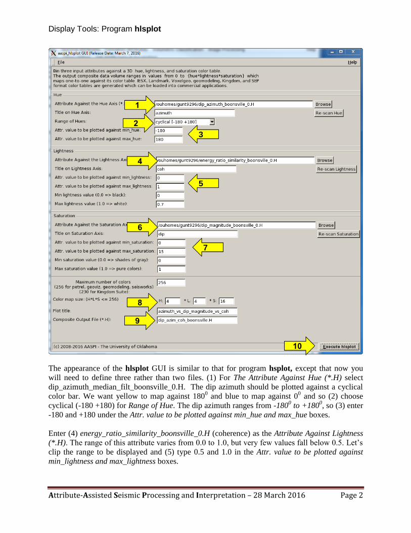
The appearance of the hlsplot GUI is similar to that for program hsplot, except that now you
will need to define three rather than two files. (1) For The Attribute Against Hue (*.H) select
dip_azimuth_median_filt_boonsville_0.H. The dip azimuth should be plotted against a cyclical
color bar. We want yellow to map against 1800 and blue to map against 0
0 and so (2) choose
cyclical (-180 +180) for Range of Hue. The dip azimuth ranges from -1800 to +180
0, so (3) enter
-180 and +180 under the Attr. value to be plotted against min_hue and max_hue boxes.
Enter (4) energy_ratio_similarity_boonsville_0.H (coherence) as the Attribute Against Lightness
(*.H). The range of this attribute varies from 0.0 to 1.0, but very few values fall below 0.5. Let’s
clip the range to be displayed and (5) type 0.5 and 1.0 in the Attr. value to be plotted against
min_lightness and max_lightness boxes.
10
9
1
2
3
4
6
8
5
7

Display Tools: Program hlsplot
Attribute-Assisted Seismic Processing and Interpretation – 28 March 2016 Page 3
Enter (6) dip_magnitude_filt_boonsville_0.H as the Attribute Against Saturation (*.H). The
range of this attribute varies from 0.0 to 15, but as with our hsplot earlier, (7) type 0.0 and 5.0 in
the Attr. value to be plotted against min_saturation and max_saturation boxes.
As of September 2009, most interpretation workstations only allow importation of 256 colors
(several allow more internally). Therefore under Color map size: (H*L*S <=256) leave the
defaults (8) of 4, 4, and 15. The last parameter to enter is (9) the Composite Output File (*.H)
where you will enter dip_azim_coh_boonsville.H. With all the parameters selected, (10) click
Execute. The following four images will appear when the job completes:
An hlsplot color legend appears. On the right of the 3D color bar is the 2D color bar that you
will load into your interpretation workstation. Not that it has been multiplexed (or wrapped)
horizontally. Note that an azimuth of 00
(North) appears blue, while azimuths of both -1800 and
+1800 (South) appear as yellow. A color wheel should also appear:

Display Tools: Program hlsplot
Attribute-Assisted Seismic Processing and Interpretation – 28 March 2016 Page 4

Display Tools: Program hlsplot
Attribute-Assisted Seismic Processing and Interpretation – 28 March 2016 Page 5
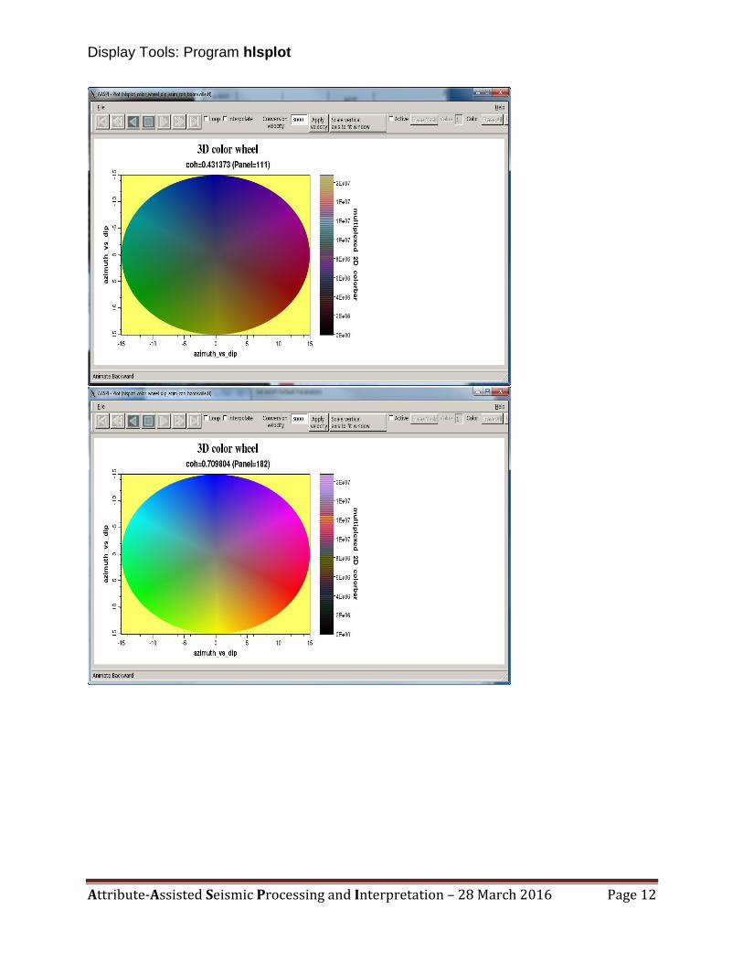
The color wheel is plotted using the aaspi_plot utility that is designed to display the seismic
amplitude and attribute data. Each color wheel corresponds to a range of dip at increasing levels
of coherence. There will also be an image of the data histogram:
Because we are plotting cyclical data, the software will also display the histogram as a wheel,
shown with the following suite of slices:

Display Tools: Program hlsplot
Attribute-Assisted Seismic Processing and Interpretation – 28 March 2016 Page 6

Display Tools: Program hlsplot
Attribute-Assisted Seismic Processing and Interpretation – 28 March 2016 Page 7
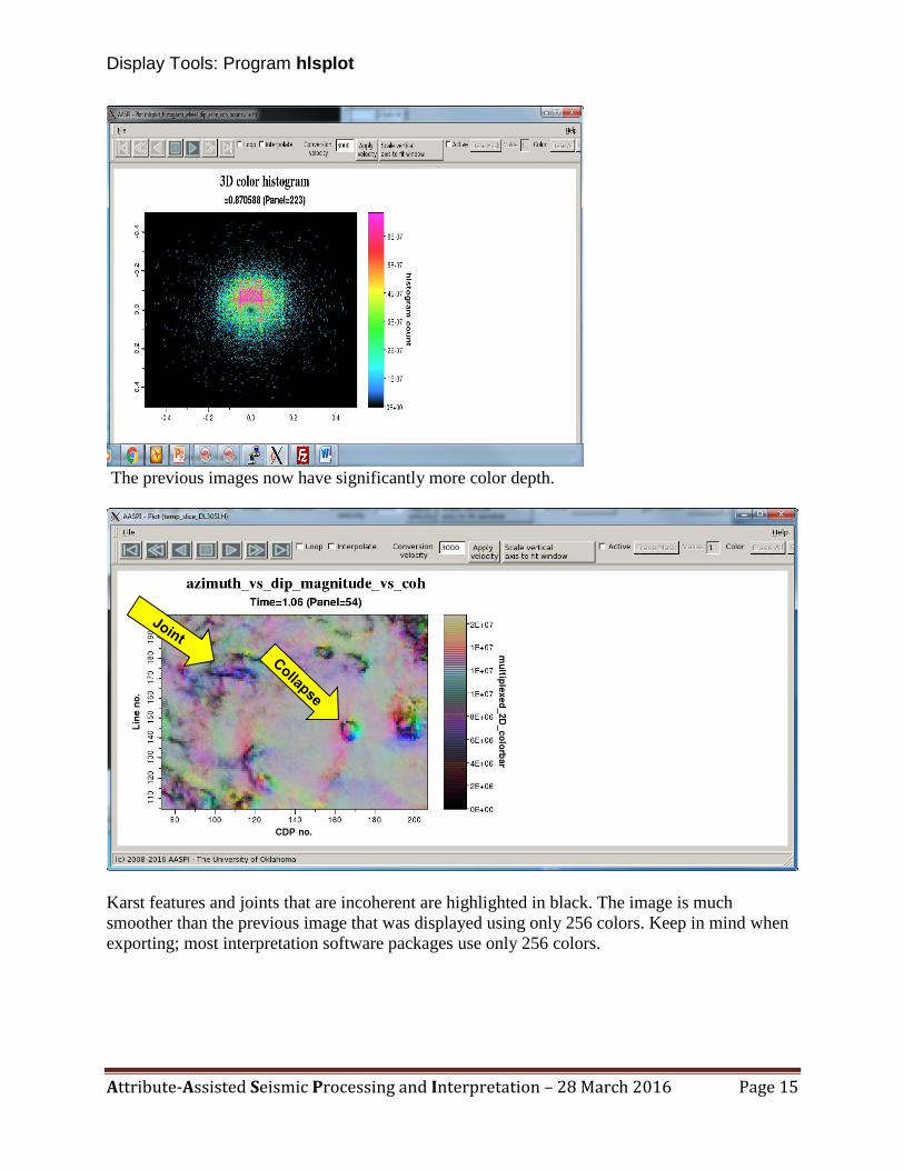
Finally, a window will appear that animates through time slices of the output data mapped to the
3D color bar. Incoherent areas are displayed in black while coherent areas are displayed in pure
colors.
The resulting image is overall less pastel than the image generated using program hsplot. The
less-coherent areas become darker, with the least coherent areas being black. Several collapse
features can easily be identified. The areas marked ‘joints’ are less clear. However, subsequent

Display Tools: Program hlsplot
Attribute-Assisted Seismic Processing and Interpretation – 28 March 2016 Page 8
curvature calculations will sharpen the areas where there is a lateral change in dip magnitude and
dip azimuth.
The 3D volume has integer values ranging from 0-255 stored as floating point numbers. When
loaded into commercial workstation software, these data should be loaded with a user-defined
range between 0 and 255. The corresponding color table (ending in *.alut, *.iesx, *.geoprobe,
etc.) should be loaded and mapped one-to-one against the data volume. Stretching and squeezing
the color bar will destroy the one-to-one mapping and should not be done.
Display Tools: Program hlsplot
Attribute-Assisted Seismic Processing and Interpretation – 28 March 2016 Page 9
Using more than 256 colors
While most commercial software packages are limited to 256 color bars, the AASPI software
(and simple things like you digital camera software) is not. Dao and Marfurt (2011) show the
sensitivity to the number of colors using paintings and faces to which the human mind is closely
Theory Most interpretation software packages use 256 colors, which are sufficient for displaying one
attribute however, for more than one attribute 256 colors, is not sufficient. The HLS color model
is a technique used for multiattribute display whose components can be described by hue,
lightness, and saturation (HLS) that can be represented by a color sphere. Where hue represents
the dominant light frequency, lightness represents the intensity or brightness of the color, and
saturation represents the proportion of the dominant frequency of light above its average
spectrum (Dao et al, 2011). Unlike RGB (red, green, and blue) that is used to display attributes
of similar type this technique provides a way to correlate attributes, calculated from a 3D data
volume, that are mathematically independent. It is designed to approximate the way humans
perceive and interpret color by manipulating colors. The HLS model provides a mean of
modulation from one attribute by another attribute. This technique transforms the multi-
attributes domain into a single attribute domain so each attribute can be thought as being plotted
against one axis of HLS.
The HLS color model has two useful properties. One, because the hue plane ranges from
0-360 degrees (cyclical color bar) it is an excellent representation of cyclical seismic attributes.
Secondly, colors differing by 180 degrees of hue are complementary with strong visual contrast.
Because the hue axis is cyclical, therefore 0 and 360 degrees are the same color. Typically,
lightness varies between 0 and 1.00 where 0 is represented by the color black and 1.00 is
represented by the color white. The saturation axis is radial with 0 is represented by grey colors
and 1.00 is represented by pure colors (Guo et al., 2008).
Hue is the color mapping of choice to display phase, azimuth, and strike attributes with
a cyclical color bar. Peak frequency, peak phase, and impedance to name a few attributes are
best plotted against hue. Energy ratio similarity and variance are good attribute of choice to be
plotted against the lightness axis. Dip magnitude is a good attribute of choice to be displayed
against the saturation axis.
With the addition of transparency, it can be used to display geometric shapes to aid in
mapping bowls, ridges, saddles, antiforms, and domes. Transparency is useful in highlighting a
distinct set of features within your data. Multi-attribute displays that do not fit such a color
model may present displays that are “pretty” to look at but do not display any useful geological
information.
In conclusion, with the correct attributes to be plotted against the correct axis the HLS
color model can be used to scan large data volumes in a quick manner to highlight geologic
features of interest. HLS is a mathematical color model that is used to display attributes
associated with azimuth, phase, dip, and/or intensity. With the addition of transparency, it can be
used to highlight or deemphasize features within the data volume (Guo et al., 2008).

Display Tools: Program hlsplot
Attribute-Assisted Seismic Processing and Interpretation – 28 March 2016 Page 10
attuned. Marfurt (2015) shows how to emulate higher dimensional colors through a non-intuitive
use of blending a monochrome gray color bar for saturation, and a monochrome black color bar
for lightness.
Let’s return the GUI and use 256 colors for hue, lightness, and saturation, giving a total of
2563=16,777,216 colors which is shown below:
The following four images appear:
10
9
1
2 3
4
6
8
5
7

Display Tools: Program hlsplot
Attribute-Assisted Seismic Processing and Interpretation – 28 March 2016 Page 11
An HLS color legend appears. As you can see from the previous color legend this color bar is
much more smooth and continuous. Next 3D color wheel will appear:
Display Tools: Program hlsplot
Attribute-Assisted Seismic Processing and Interpretation – 28 March 2016 Page 12

Display Tools: Program hlsplot
Attribute-Assisted Seismic Processing and Interpretation – 28 March 2016 Page 13
Followed by a 3D color histogram with different slices displayed below:

Display Tools: Program hlsplot
Attribute-Assisted Seismic Processing and Interpretation – 28 March 2016 Page 14
Display Tools: Program hlsplot
Attribute-Assisted Seismic Processing and Interpretation – 28 March 2016 Page 15
The previous images now have significantly more color depth.
Karst features and joints that are incoherent are highlighted in black. The image is much
smoother than the previous image that was displayed using only 256 colors. Keep in mind when
exporting; most interpretation software packages use only 256 colors.

Display Tools: Program hlsplot
Attribute-Assisted Seismic Processing and Interpretation – 28 March 2016 Page 16
References
Dao, T., and K. J. Marfurt, The value of visualization with more than 256 colors: 81st Annual
International Meeting of the SEG, Expanded Abstracts, 941-945.
Guo, H., S. Lewis, and K. J. Marfurt, 2008, Mapping multiple attributes to three- and four-
component color models — A tutorial, Geophysics, 73, W7-W19. doi:
10.1190/1.2903819
Marfurt, K. J., 2015, Techniques and best practices in multiattribute display: Interpretation, 3, 1-
24.