images to use for the magazine
TRANSCRIPT

Photos to use for my Magazine

Before After

Evaluate
Personally I like the photo above because it simple
but mysterious. I feel it looks better in black and white
as it adds more drama to the image.
By cropping it, it helped to highlight the features on
her face. I highlighted her features such as her eyes
to make them stand out more against the darkness of
the photo.
The photo could also help me to name the interview
which is going into the magazine, or could be used on
the contents page, however, I don’t think I will use it
as the cover.

Before After

Evaluate
Personally I am not to keep on the image above,
because I don’t think it is crisp enough and it
doesn’t give the edge I want it to. I probably
won’t use this image on my actual spread. I
might use it on the contents page, but that’s
about it.

Before after

Evaluate
I like the image above, because it looks like
something you would find in a magazine. The
clothes she is wearing also match the colour of
theme of the rest of the photos.
I brightened the background, and also got rid of
the black floor. I did this because I feel that it
looks better, and more like a studio, and
professional.

Before After

Evaluate
This is one of my favorite images I took. I like it
because it looks natural but professional. I didn’t
do a great deal of editing to this photo. I enhance
the colours of her. I did this so that she looked
more radiant and healthy. I then brightened the
background and got rid of the lines on the wall.
Again I did this made the image as a whole look
more professional.
I may consider using this as my cover photo. If I
don’t it will defiantly be in the magazine.

Before
After

Evaluate
This is my favorite image I have taken and
photographed. This is because I feel that it is a
really natural looking photo and it is edited really
well. Personally I think this will be my cover
image. As it is simple, but effective. The colour
contrast between the black and white also works
well.

Before
After
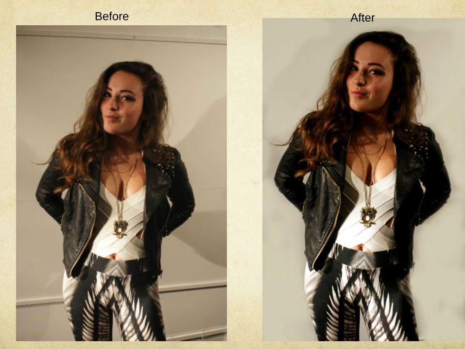
Evaluate
Personally, I am not keen on the image above
because it isn’t edited very well. However it
would fit a music magazine really well, because
she is clearly singing and obviously this is what a
music magazine is about.
If I were to use this image, I would only use it
small on the contents page, but I doubt I will use
it.

After
Before

Evaluate
I like this image above because it looks different,
and even though the background is busy, I feel
that the photo is simple looking. It also fits in to a
music magazine, because the background is
made up of all different access all area passes
for concerts and music tours.
I will use this photo in my magazine, but I don’t
feel that I will use it on the cover because the
background is too busy and I feel the cover will
look over crowded.

After
Before

Evaluation
I didn’t do a great deal of editing on this image,
because I feel that it was a good image as an
original. I only enhanced the colours to make the
image as a whole look brighter.
I think I will use this image in my magazine, more
than likely on the interview page. This is because
the girl looks like she is deep in thought like she
would be answering a question.

Before
After

Evaluation
Again there is little editing on this photo.
However I am not sure if I will use it or not. This
is because I feel that the expression on the face
is to weak and blank. I don’t think it is energetic
enough to be in a magazine.
I only enhanced the colours on the image, and
slightly retouched the face to make it more
floorless, and something it would look like in a
magazine.

After
Before

Evaluate
Again I really like this image, this is because I
feel that it is quirky and different. I also really like
the background, and I think it stands out more by
the colour of her hair.
I will more than likely use this image in my
magazine, because I feel that it is an effective
image and I think it will fit my magazine. I might
use it on the interview page or the contents page.
Like I stated earlier, I won’t use it on my cover,
because it will be to over powering.

After
Before

Evaluation
I like the image of the girl on the drum kit,
however I don’t feel that it is a good photo
because it looks really amateur. I will probably
use it in my magazine though maybe on my
contents page. I don’t feel that it is a good
enough image to be on the interview page.
Before After

Evaluation
This image will defiantly be in my magazine, this
is again because I feel that it looks professional,
and something that you would find in a
magazine.
I just brightened the back ground, and enhanced
the colours, I don’t think I will use this image on
the cover of the magazine, but I do think that I
will use it on the interview page.