info 213: final project report pippop · 2020-06-04 · info 213: final project report pippop...
TRANSCRIPT

Info 213: Final Project Report PIPPOP
Phone-in-pocket & phone-out-pocket contact exchange interactions in Social and Professional Settings
Max Curran, Ganesh Iyer, Parv Sondhi and Surendran Subbiah
PROJECT SUMMARY
Our project attempts to address the problem of exchanging contact information in social and professional settings. We established the prevalence and current needs around this problem through contextual inquiries of potential users in professional settings like career fairs as well as in informal social settings. After drawing from the insights by those in these settings, and discussing their current methods of exchanging contact information, we executed low fidelity paper-based prototypes leveraging two distinct methods of exchange:
● ‘ P hone- O ut-of- P ocket’ (POP) that would allow users to use their phones to exchange information in person with another individual they are currently speaking with, and
● the new ‘ P hone- In-Pocket’ (PIP) that would afford users the opportunity to exchange information after an interaction had occurred by collecting data from others around them into a list users could later use.
By conducting Think Aloud sessions with these initial prototypes, we gained valuable
feedback from users which we incorporated into interactive prototypes designed using Adobe Illustrator , JustinMind , and Marvel to address a selection of tasks we hope users would be able to accomplish including the in-person “POP” interaction, the post-interaction “PIP” contact request, and creating and customizing what personal information the user would share and gather from others. Heuristic Evaluations of these interactive prototypes were carried out providing us with feedback in specific heuristic domains some of which were easy fixes and others that required rebuilding from the project’s conceptual level to address. Finally, we produced a high-fidelity final prototype using Adobe Illustrator and Framer Studio which was used in experiments with individuals representative of our target user group who had initially provided us with insights in our contextual inquiries. The results of the experiments show that this prototype holds promise compared with control conditions designed around methods individuals currently use to accomplish the same tasks. The qualitative results and feedback from these experiments will also guide further tweaks and adjustments to our prototype in attempting to realize the solution we envision to the problem established in our initial inquiries.
INTRODUCTION AND PROBLEM STATEMENT
While newer technologies have permeated various aspects of our lives over the last 20
years, our methods of exchanging contact information have strangely remained arcane. Despite the possibility of text processing in smartphones where you can copy a phone number, for example, from a Facebook Messenger app to any other app including your contacts app, we believe that this method is not as rich in experience as it could possibly have been. The experience of exchanging contact information in person has also been relatively untouched with regards to technological intervention. Our pitch had a foundation in the prevalence of business cards and our contextual inquiries rendered them pretty much wasteful and unrequited. Why do people still use them? We thus frame our problem statement:
Make interpersonal exchange of information more seamless. It is not as if there have not been technological interventions in this area before.
Applications like Bump (no longer operational), CardFlick and Jiffy have designed creative solutions to enhance the experience of exchanging contact information but there could be two reasons why these solutions have not become ubiquitous. One could be that the status quo overhaul could take a long time and these solutions have not been in the market for long enough. After all, we are still using the same method, in principle, as we did over 20 years ago. The other reason could be the possible absence of a user-centered design process that led to these solutions because of which the integration into daily life became difficult. Even if we may be incorrect in assuming the absence of such a process in these other applications, it was important to us to understand why and how decisions emerge from such a process in this context.
DESIGN PROCESS
Following a user-centered design process was key to some of the project’s important findings and subsequently, had an impact on our design decisions as this report will further entail. While the product aimed to overhaul a firmly-rooted status quo, the technological nature of our intervention brings in new possibilities in terms of richer media and connection to existing social accounts but also new issues in terms of user privacy and safety. Therefore, it was extremely important that the user-centered design process was followed meticulously and iteratively in order for the product to stand any chance of assimilation into the norm.
Each step of the user-centered design process served as a distinct lens with which to
look at our problem statement. These steps have been described in detail below:
1. Contextual Inquiries and Summary Following an initial pitch to the class that the normative method of exchanging
contacts could be made much richer in terms of experience and impact, we investigated this
in great detail through our contextual inquiries. Our contextual inquiries were broad in nature as we observed and interviewed people in the following settings:
a. The I-School Alumni Potluck (September 19th, Precita Park, San Francisco) b. Cal Career Fair (September 18th, MLK Student Union, UC Berkeley) c. Deloitte Info-session (September 18th, South Hall, UC Berkeley)
The noteworthy challenges of the contextual inquiries include a general unwillingness
of students in the career fair to speak to the investigators for even more than a minute, granting permission to the investigators to follow and observe their interactions and the overall noisy environment of the career fair. This was partially countered by the use of a probe - a sticky note that was handed to the participants wherein they were asked to point out one difficult aspect during their interaction with the recruiters and which was returned to the investigators after their interaction. The contextual inquiries also comprised interviews with recruiters and their specific methods and quirks to exchange information with prospective recruits.
The notes, quotes and probes (in pink notes) from the contextual inquiries were
transferred as observations onto sticky notes for the purpose of affinity diagramming to detect patterns. We decided to be more exploratory with this approach and plotted cluster diagrams (shown below) based on type (various issues within interactions), location (where the observation happened) and the time (the position on the interaction timeline where this observation happened).
The type-based clustering mainly uncovered that people often ran out of business
cards and this also created problems in one-to-many and many-to-many interactions. We also discovered that users would often forget to acquire the contact of the other person despite speaking to them at length. The location-based one often dictated the mode of exchange - for example, the alumni potluck had fewer resume exchanges despite being a partly career-oriented event. Of the three however, the time-based clustering (fig. 1) provided us with the most interesting insight - that users attempted to exchange contacts long after their interaction with someone.
In addition to affinity diagramming, we used personas (1 professional persona, 1
personal and 2 with variations of the first two), scenario modeling (three present-day scenarios and one future scenario to view the problem from a technology-agnostic perspective), and work models (based on timeline of interactions, flow of information, physical environment and existing artifacts that users use) to get a more concrete understanding of the problem and to help guide our ideation for the low-fidelity prototypes.
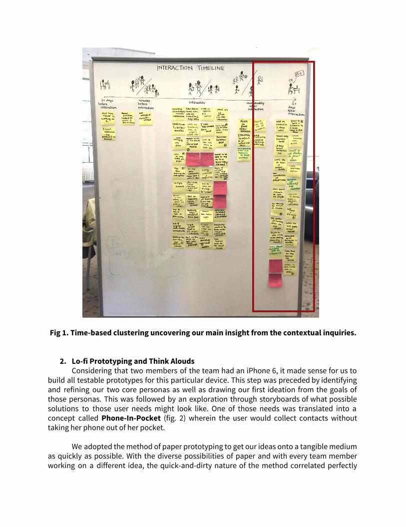
Fig 1. Time-based clustering uncovering our main insight from the contextual inquiries.
2. Lo-fi Prototyping and Think Alouds Considering that two members of the team had an iPhone 6, it made sense for us to
build all testable prototypes for this particular device. This step was preceded by identifying and refining our two core personas as well as drawing our first ideation from the goals of those personas. This was followed by an exploration through storyboards of what possible solutions to those user needs might look like. One of those needs was translated into a concept called Phone-In-Pocket (fig. 2) wherein the user would collect contacts without taking her phone out of her pocket.
We adopted the method of paper prototyping to get our ideas onto a tangible medium
as quickly as possible. With the diverse possibilities of paper and with every team member working on a different idea, the quick-and-dirty nature of the method correlated perfectly

with our divergent approach to generate interaction ideas. Following are some of our concepts by this method:
Fig. 2: Exploration of various contacts collected during the day - Phone-in-Pocket.
The Think Aloud on these prototypes resulted in some interesting feedback from the users. Some thought it would be nice to have a filter that only collected contacts based on the amount of time spent with them. The most important feedback was the uncertainty about the kind of information that is visible and being shared with someone as well as the confusion over what some of the conceptual metaphors (phone-in-pocket meant). Why the paper prototype was extremely crucial to our process was because despite the similarity in tangibility to business cards, the simulation of a tricky technological feature through these quick prototypes was enough to provoke security and ethical concerns.
3. Interactive Prototyping and Heuristic Evaluation
In this step, we converged onto some of the security and conceptual issues that were unearthed in the Think Aloud sessions and set new divergent paths of ideas from these points. The interactive prototypes were built in the form of task flows - viewing contacts collected over a period of time (which also included a map view), viewing nearby contacts, and understanding what kind of information is visible to these users and is shared with them. Keeping in line with our exploratory approach, each team member decided to use a software (Marvel, JustInMind, Pixate etc.) of his choosing to get their ideas ready for testing. The prototype for profile customization and setting limits on information being shared (built using Adobe Illustrator and Marvel) can be found here: https://marvelapp.com/99d5h3.
On conducting the Think Aloud experiments as well as Heuristic Evaluation on these prototypes, we unearthed that the users had trouble grasping the conceptual as well as the security aspects of both the Phone-in-Pocket and Phone-out of-Pocket method despite the moderators providing a brief description of what the app does. This resulted in multiple
violations of the ‘Match between System and Real World’ which we had fully expected ahead of the evaluation. There were also predictable reactions to something new, spanning from delight to embarrassment and awkwardness. We also looked at the application interface itself to ease the transition from one strongly rooted interaction to potentially another because some of the terms we used were also new.
There were also issues around the diverse nature of the prototypes because of which it was often that a heuristic issue in one prototype was solved by another prototype evaluated with another pair of users from class. This was countered by the use of a consolidated final prototype the design decisions for which were guided by the Heuristic Evaluation. The main advantage of the Heuristic Evaluation was that it is through such iterative tests that an application looking to do something new has the solid backing of user tests.
4. Description and Discussion of Tools used Through our journey to the final prototype, the team used a wide array of design
software and tools which bore a strong resemblance to the type of task at hand. For the quick-and-dirty paper prototypes, using extremely pliant tools like paper, pencil, markers, scissors, paper-cutter, sticky notes, glue and cellotape reflected our main focus to translate our ideas into a tangible form quicker. At this stage we were also looking to explore various interactions and the creative possibilities that paper offered were extremely helpful.
Moving on to the interactive prototype, the team explored various software like Adobe
Illustrator, Marvel, Pixate, JustInMind. There were some concerns on the learning curves for some of these. However, the team was able to work within the shortcomings and generate a wide array of solutions for the issues found in the Think Alouds and we ended up with alternative concepts of task flows for more than one component of the application. Our final prototype however, was programmed on an extremely popular prototyping tool in the industry - Framer Studio while the components were drawn on Adobe Illustrator.
FINAL PROTOTYPE Given the feedback we had received during the heuristic evaluation of our interactive
prototypes, we decided to focus on certain key elements and converge towards creating a more unified experience through our final prototype. We studied the iOS UI design guidelines during this phase to understand industry level practices in design and human computer interaction. At this step, we decided on a consistent and cohesive design to bring together the different flows of the prototype, which were earlier separated into different interactive prototypes. As part of the creation of this consistent design, the team focussed to work on creating a unique color palette and a framework template (fig. 3) to be used across the entire prototype. This framework was kept as the base for all our screens to ensure a much more coherent experience for users and help navigate our further interaction design decisions.
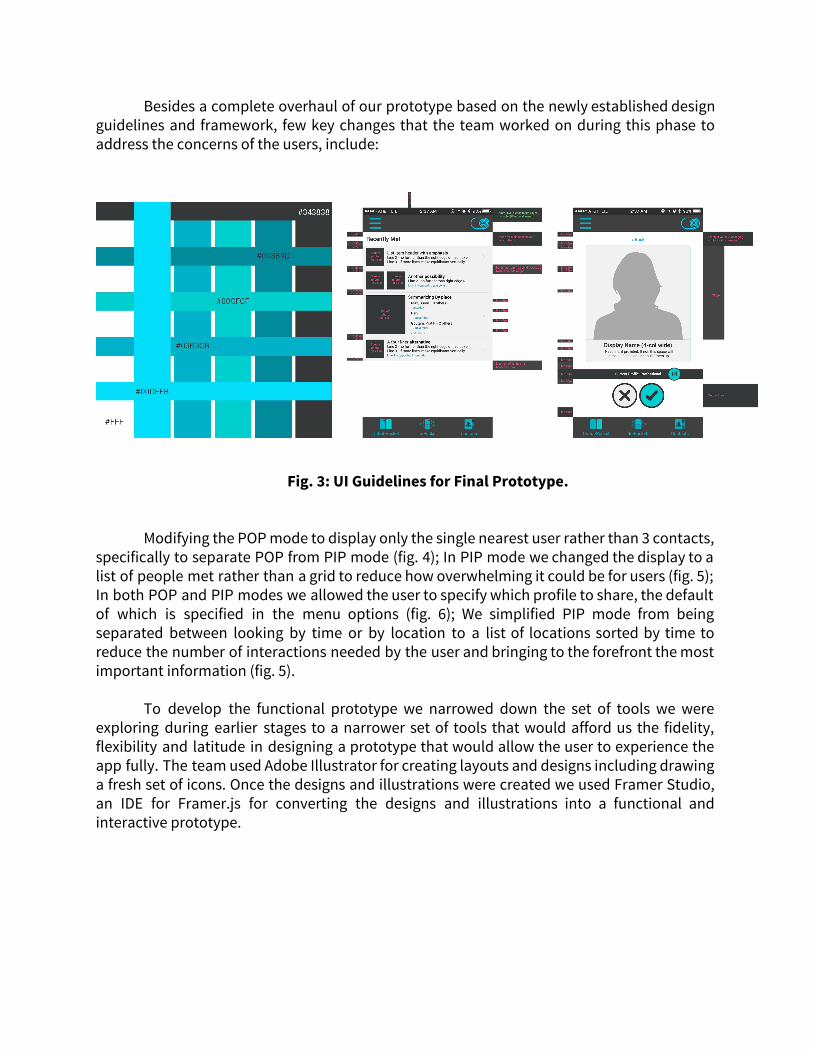
Besides a complete overhaul of our prototype based on the newly established design guidelines and framework, few key changes that the team worked on during this phase to address the concerns of the users, include:
Fig. 3: UI Guidelines for Final Prototype.
Modifying the POP mode to display only the single nearest user rather than 3 contacts,
specifically to separate POP from PIP mode (fig. 4); In PIP mode we changed the display to a list of people met rather than a grid to reduce how overwhelming it could be for users (fig. 5); In both POP and PIP modes we allowed the user to specify which profile to share, the default of which is specified in the menu options (fig. 6); We simplified PIP mode from being separated between looking by time or by location to a list of locations sorted by time to reduce the number of interactions needed by the user and bringing to the forefront the most important information (fig. 5).
To develop the functional prototype we narrowed down the set of tools we were exploring during earlier stages to a narrower set of tools that would afford us the fidelity, flexibility and latitude in designing a prototype that would allow the user to experience the app fully. The team used Adobe Illustrator for creating layouts and designs including drawing a fresh set of icons. Once the designs and illustrations were created we used Framer Studio, an IDE for Framer.js for converting the designs and illustrations into a functional and interactive prototype.
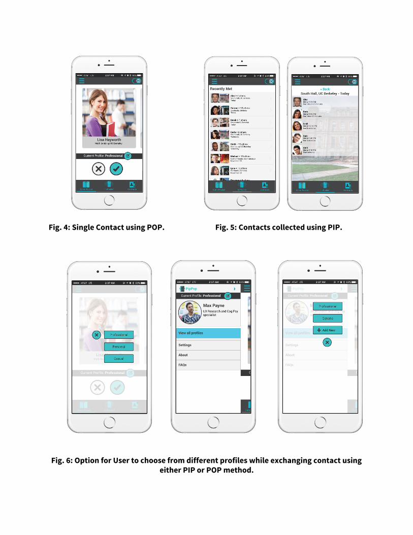
Fig. 4: Single Contact using POP. Fig. 5: Contacts collected using PIP.
Fig. 6: Option for User to choose from different profiles while exchanging contact using either PIP or POP method.

Though we tried to incorporate all the additional features that we had earlier planned
as part of the final prototype. Given the scope of the application, we still have a few features which we would implement at a later stage. These features include the locate the user’s PIP contacts on a map view. This would allow the application to display a visual representation of where the user interacted with others while there phone was in PIP mode. We also plan to include a feature which would allows users to attach specific additional documents with his card. These documents might include his portfolio, or his resume for easy access to the recruiters during a networking event or career fair. The ability to annotate certain cards by adding tags/categories is also included in the next step of our iteration, giving the user to group similar contacts together.
Given the additional features that we might add in future prototypes, we feel were successful in achieving what we set out to do in terms of the intended design and the feature set of the application.
EXPERIMENT DESIGN AND RESULTS
In our experiment design we initially proposed five tasks to have our participants try to complete using our final prototype. These tasks were: (1) exchanging contact information one on one (POP), (2) locating a person and requesting their contact information some time after an interaction (PIP), (3) testing a variety of options for navigation icons for their meaning to users, (4) creating a profile to share with others, and finally (5) comparing two ways to decide which profile to share. In carrying out our experiment we cut tasks 4 and 5 as we felt they were the least important to explore given some of our latest changes and improvements in our prototype and we didn’t want to take too much of our participants’ time. Tasks 1 through 3 were completed by each experiment participant, for tasks 1 and 2 (POP and PIP) participants were randomized to either a control group or experiment group which we discuss below in detailing each task. Additionally, the order of the POP and PIP tasks was randomized with the intent of reducing learning and familiarity effects that may be present as both tasks used our same final prototype. We completed the experiment with a total of 10 participants in our experiments, half of which were in the control group and the other half in the experimental group. All participants read and signed a statement of informed consent before beginning any study procedures. Task 1: Exchanging contact information one on one Outcome Measures: Time to successfully exchange contact information, post-task questionnaire likert scales and open responses. Experimental group: Participants in the experimental group were told to pretend that they were meeting someone (Ganesh as our actor) for the first time and they were having a short introductory conversation that should end with exchanging contact information using our prototype. To better simulate reality, a fake iPhone “home” screen was added to the prototype so that participants would start the interaction by tapping the app’s icon labeled “PipPop” and then try to execute the exchange of contact information using the prototype.
Timing started as soon as the user lifted up the test phone, to when the prototype confirmed that information was exchanged. Participants filled out a questionnaire immediately after the task was completed that asked about efficiency, speed, level of difficulty, and overall satisfaction. Control group: Participants in the control group were also told to pretend they were meeting our actor for the first time and that they should exchange contact information but they were to use whatever method they felt they would normally use in this situation to do so. Timing started when the user started using their phone (all participants used their cell phones) and ended when the participant and the actor had each other’s contact information. Participants filled out a questionnaire immediately after the task was completed that asked about efficiency, speed, level of difficulty, and overall satisfaction. Results: On average, the experimental group completed the task in 12.446 seconds and the control group in 55.4 seconds. Given our very small sample size, we used a Wilcox Rank-Sum test as a nonparametric alternative to a t-test. The experimental group performed significantly better with a p-value < 0.01, and achieved very high practical significance with a cohen’s d effect size of 2.18.
In our questionnaire the experimental group averaged responses were (out of 5): 5.0 for efficiency, 5.0 for speed, 3.2 for ease, and 3.2 for overall satisfaction. By comparison the control group averages were: 3.8 for efficiency, 4.0 for speed, 2.8 for ease, and 4.4 for overall satisfaction. The experimental group scored higher in all categories except “overall” interestingly, this may be due to a variety of reasons: (1) we may not have measured a factor that affected their overall experience, (2) compared to their usual method this prototype was new and unfamiliar, or (3) as we heard in open feedback responses, even if some users felt it did well in these categories they would not use the app in reality due to privacy concerns. Task 2: Locating and requesting contact info from someone met earlier in the day Outcome Measures: Time to successfully locate and request contact information, post-task questionnaire likert scales and open responses Experimental Group: Participants in the experimental group were presented with a fictitious narrative about a man named Alex describing that they met earlier in the day including details about where they met and for about how long in addition to his name, photograph, and the place he was employed. After about a minute of looking over the information, it was taken away and participants were asked to locate Alex using the PIPPOP app prototype and request his contact information. Timing began when participants started using the testing phone and ended when they successfully requested Alex’s information. Participants filled out a questionnaire immediately after the task was completed that asked about efficiency, speed, level of difficulty, and overall satisfaction. Control Group: Participants in the control group were presented with the same fictitious narrative about Alex and were asked to look over it for about a minute before it was taken away and they were to use LinkedIn on a laptop to locate Alex and request to connect with him. We created a fake profile for Alex on LinkedIn with all of the information from the narrative so that participants could succeed in the task. Timing began when participants started using the laptop and ended when they either successfully requested to connect with Alex or gave up searching unable to find him. Participants filled out a questionnaire
immediately after the task was completed that asked about efficiency, speed, level of difficulty, and overall satisfaction. Results: On average, the experimental group completed the task in 84.14 seconds and the control group in 141.0 seconds. Notably, two participants had to be excluded from the control group times because they were not able to accomplish the task of locating the LinkedIn profile using the information about the person provided. There was neither statistical nor practical significance when comparing experiment and control groups, possibly due to the small(er) and mismatched group sizes.
In our questionnaire the experimental group averaged responses were (out of 5): 4.0 for efficiency, 3.8 for speed, 3.2 for ease, and 3.2 for overall satisfaction. By comparison the control group averages were: 2.0 for efficiency, 2.4 for speed, 2.2 for ease, and 1.8 for overall satisfaction. Here, the experimental group scored higher in all categories. These questionnaire scores include even those participants who were unable to complete the task which likely (and we think relevantly) affected their ratings.
Task 3: Testing icon options In this task there were no control and experiment conditions, but it was executed in two parts. Only those participants who had been in the experimental group for tasks 1 and 2 above completed the second part of this task. The first part, completed by all participants, took place before any other experimental task when 21 icons were held up individually in a random order on flash cards and participants were asked to say a few words about what the icon meant to them. This was done before exposure to our prototype to avoid prompting the user with icons already in use in the prototype. The second part of the task was completed only by those that were in the experimental group for tasks 1 and 2 because they had been exposed to our prototype and knew its basic functions. In this task we asked five questions about the selection of 21 icons and which they would think represent the intended functions of the app most closely. If applicable, this second part was completed at the end of the entire experiment session. Results: We can gather from our results that a few icons had a high rate of flat out “Don’t Know” responses. Icons with more than 3 of these responses (30% of our sample) we will likely not consider using in any part of the app. Other icons showed particular promise as many users agreed on a meaning that we also intend to evoke in our app like “making connections” and “broadcasting”. It was also noteworthy that some users thought visual cues from two or more icons better explained what the task prompt had asked for. There was some feedback on the ‘direction’ of the icons as well, particularly in the case of the PIP indicator where the same icon that indicated visibility to others nearby did not strongly signify that their information is also visible to you.
REFLECTIONS, CONCLUSIONS AND FUTURE PLANS
The experiment gave the team a concrete way to validate certain hypothesis and at the same time draw new insights into the design and usability of an app designed to seamlessly exchange contact information both in social as well as professional settings. According to our experiment results it’s clear that overall our prototype performed very well
compared with methods that our participants typically use to accomplish the same kinds of tasks. The POP interaction was very fast and users rated it highly in qualitative measures except overall satisfaction. While the results were likely skewed by a very privacy-conscious individual, we are not disappointed with this result as privacy has come up repeatedly in our process as an important issue to some users and we must be cognizant and considerate of those users. The PIP interaction similarly performed fast and received high qualitative ratings. These experiments were admittedly very limited in execution and measurement and could be improved upon for more compelling results. For example, not all users may use LinkedIn to find someone they met earlier in the day but we wanted a better controlled and consistent experiment, and our questionnaires were quite short and likely did not capture all aspects of the user’s experience. Finally, the icons experiment provided us with a lot of feedback that will be very useful in any future iterations of our design to improve its visual appeal and clear understanding of its functions.
This entire experience of conceptualising an idea and seeing it through design and
uptill now has been an unique experience to us. Getting critiqued in a safe environment let us take bold design decisions and helped us diverge and converge at a design to create a functioning prototype. Through this process we were exposed to not only design ideas , but various steps involved in developing and designing a great user experience. Besides learnings through interaction with users, as a team we learnt from each other through extensive and detailed discussions.
Immediate plans for PipPop include further refinement by moving from a design
prototype to technically sound functioning prototypes. Until this point in time we had focused on design elements and interactions and now we would like to move towards the technical implementation of such a service and to that end the team plans to continue working and creating a functional prototype that can be tested and refined further. In the long run we would like to launch a Minimum Viable Product through the app marketplace and into the real world and strive to enrich the experience of exchanging contacts in any form of interactions from a user-informed perspective.