information visualization course
DESCRIPTION
Information Visualization Course. Web Design. Prof. Anselm Spoerri [email protected]. Lecture 6 – Overview. Recap – Competitive Site Analysis CSS Recap: DIVs & Linear “Natural Flow” and Box Model & Floating DIVs AP Elements more flexible page layouts - PowerPoint PPT PresentationTRANSCRIPT


© Anselm Spoerri
Lecture 6 – Overview
Recap – Competitive Site Analysis
CSS– Recap: DIVs & Linear “Natural Flow” and Box Model & Floating DIVs
– AP Elements more flexible page layouts
– Positioning Demo: absolute vs. relative
– “Clean Slate” CSS
Web Page / CSS Templates– Advantages and Challenges of using Templates
– Fixed or Liquid Three Columns Layout
Create 1st Website Using Dreamweaver CS6– Flexible Layout
– Mobile Layout
Dreamweaver: AP Elements Demo
© Anselm Spoerri
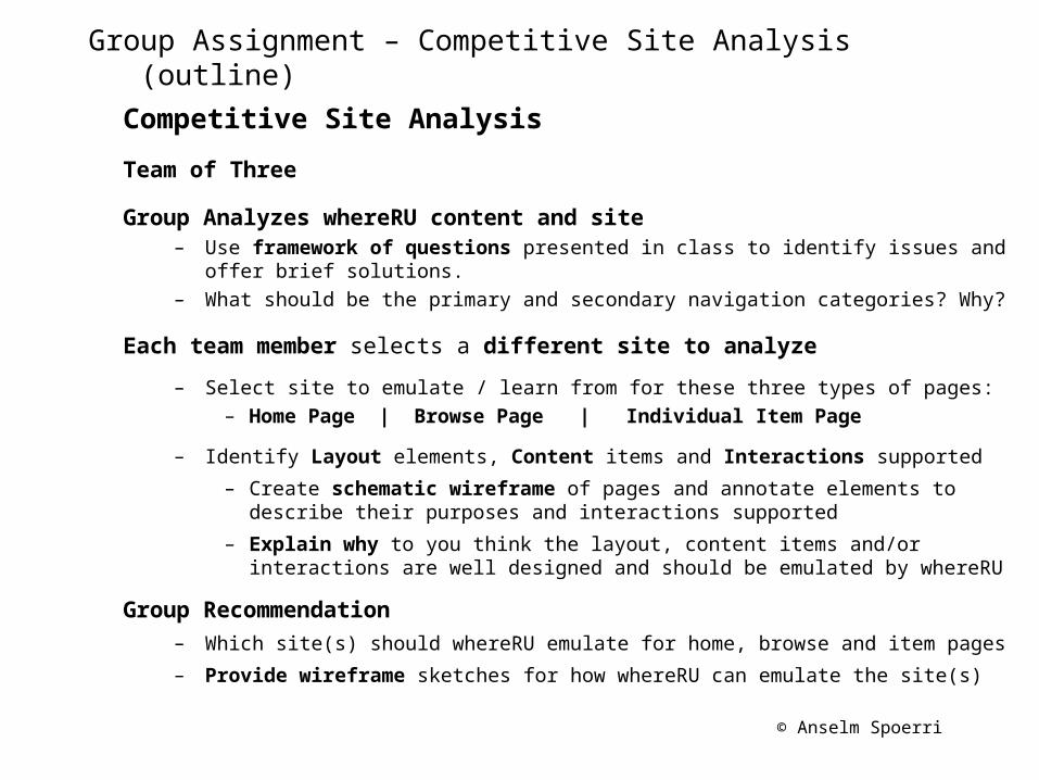
Group Assignment – Competitive Site Analysis (outline)
Competitive Site Analysis
Team of Three
Group Analyzes whereRU content and site– Use framework of questions presented in class to identify issues and offer
brief solutions.– What should be the primary and secondary navigation categories? Why?
Each team member selects a different site to analyze
– Select site to emulate / learn from for these three types of pages:– Home Page | Browse Page | Individual Item Page
– Identify Layout elements, Content items and Interactions supported
– Create schematic wireframe of pages and annotate elements to describe their purposes and interactions supported
– Explain why to you think the layout, content items and/or interactions are well designed and should be emulated by whereRU
Group Recommendation– Which site(s) should whereRU emulate for home, browse and item pages
– Provide wireframe sketches for how whereRU can emulate the site(s)

© Anselm Spoerri
whereRU
http://whereru.rutgers.edu
Target audience?– Prospective Student– Rutgers Community : bring it together– Alumni
What do you want the site to accomplish?– Rich Visual Experience – Experience Rutgers Virtually – Put Rutgers on the Map
Break Site into Categories – Location: University | Camden | Newark | New Brunswick– Media Types: Gigapan | Photosynth | Video | Virtual Tours– Display Types: Showcase | Map | Browse | Individual Item– Categories: Architecture & History | Arts & Culture | Athletics |
Events | Libraries | Research | Student Life
Sites to Emulate? Learn from?
© Anselm Spoerri
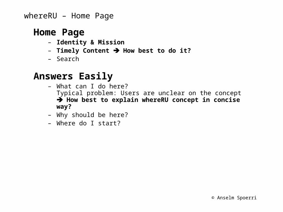
whereRU – Home Page
Home Page– Identity & Mission– Timely Content How best to do it?– Search
Answers Easily– What can I do here?
Typical problem: Users are unclear on the concept How best to explain whereRU concept in concise way?
– Why should be here?– Where do I start?

© Anselm Spoerri
Recap – 1. Conceptualization and Research
Large design firms: more time spent on research and identifying clients' needs than other stages of production. For large sites, includes case studies, interviews, market research.
Strategy
Why are you creating this web site? What do you expect to accomplish?
What are you offering your audience?
What do you want users to do on your web site? After they've left?
What brings your visitors back?
General Site DescriptionWhat kind of site is it?
(Promotional? Info-gathering? Publication? Point of sale?)
What features will it have?
What are your most important messages?
Who are your competitors? What are they doing right?
What could be improved upon?
© Anselm Spoerri
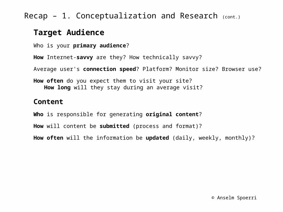
Recap – 1. Conceptualization and Research (cont.)
Target Audience
Who is your primary audience?
How Internet-savvy are they? How technically savvy?
Average user's connection speed? Platform? Monitor size? Browser use?
How often do you expect them to visit your site? How long will they stay during an average visit?
Content
Who is responsible for generating original content?
How will content be submitted (process and format)?
How often will the information be updated (daily, weekly, monthly)?

© Anselm Spoerri
Recap – CSS: DIVs and Linear “Natural Flow”
DIV and SPAN
Block Element of content (<div> always new line)
Inline Element displayed in current line (<span>)
Parents and Children = Hierarchy of Tags• elements contain other elements;
• each element must be properly nested and have closing tags.
Structure Your Pages
Divide logical sections of document into div elements
Linear sequence of divs
Use header elements (h1, h2 …)
Use comments /* comments help */
Linear “Natural Flow” by default Elements displayed as (X)HTML flows from top to bottom
with line breaks at beginning and end of each block-level element.

© Anselm Spoerri
Recap – CSS: Box Model
Box Model = every element is enclosed in Invisible Box
Width and Height can be specified
Border : can specify all four borders separately also specify border-style: type; border-width: n; border-color: color;
Padding = space surrounding content inside of box (all four sides can be specified separately)
Margin = invisible space around border of box (-top, -bottom,-left, -right, auto)
Overflow : elements are not always contained in their boxes; can be: visible; hidden, scroll; auto (scroll appears when needed).
If width, margin, border and padding don’t equal size of containing block something’s got to give :)

© Anselm Spoerri
Recap – CSS: Floating Elements
Making Elements Float so that they float in a sea of text
float: left / right element is on left / right text flows on right / left.
clear: left / right / both / none to keep elements from floating on left / right / both sides and none lets elements float on either side.
• clear property stops affected element from displaying until designated side is free.
• Add clear property to elements whose sides you want to be clear of floating elements.
float:left
clear: left
<div id=“yellow”><div id=“green”>
float:left
http://comminfo.rutgers.edu/~aspoerri/Teaching/WebDesign/Lectures/Lec5/Steps/float_and_clear.html
© Anselm Spoerri
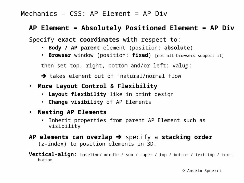
Mechanics – CSS: AP Element = AP Div
AP Element = Absolutely Positioned Element = AP Div
Specify exact coordinates with respect to:• Body / AP parent element (position: absolute)• Browser window (position: fixed) [not all browsers support it]
then set top, right, bottom and/or left: value;
takes element out of “natural/normal flow”
• More Layout Control & Flexibility• Layout flexibility like in print design• Change visibility of AP Elements
• Nesting AP Elements• Inherit properties from parent AP Element such as visibility
AP elements can overlap specify a stacking order (z-index) to position elements in 3D.
Vertical-align: baseline/ middle / sub / super / top / bottom / text-top / text-bottom
© Anselm Spoerri
Mechanics – CSS: AP Element = AP Div (cont.)
position: relative If desired, add position: relative to ancestor element to which you want
your absolutely positioned element to be offset; otherwise element will be offset with respect to body or AP parent.
relative positioning refers to element’s original position, not the surrounding elements
relative AP element will not show up in AP Panel in DW
Renaming AP ElementsChange ID name in Property Inspector or AP Elements Panel

© Anselm Spoerri
AP Elements Panel
AP Elements Panel
Window > AP Elementsin Standard Mode + Layout View
Visibility– open eye = visible; closed eye = hidden; no eye = inherits
Stacking Order– The greater the z-index, the higher up in the stack
Rename ID name
Nesting AP Elements
Prevent overlaps checkbox

© Anselm Spoerri
Create AP Element
– Standard Mode + Layout View– Insert > Layout Object > AP Div
or
Click “Draw AP Div” button in “Insert” panel, then drag to draw
Manipulate AP Elements – Must select AP Element before you can move, resize, or align it
– Resize and move AP Element via its Handles
– Align AP Element
– Select AP Elements, then Modify > Align > Alignment option
– Create Nested AP Elements
– Place insertion point inside existing AP Element
and choose Insert > Layout > Draw AP Div
– Drag Draw AP Element button from Insert panel and drop inside AP Element
– Hold Control key and drag AP Element to target AP Element in AP Elements Panel
Create & Manipulate AP Elements

© Anselm Spoerri
AP Div Properties
CSS-P Element = ID name (can change here and CSS code gets updated)
Position - L and T (left and top) – Relative to top left corner of page or parent AP Element (if nested)
Size - W and H specify the width and height of AP Element– Overridden if the content of the AP Element exceeds the specified size
Possible Dimensions – px, pt, in, mm, cm, %– Abbreviations must follow the value without a space
Z-Index - determines stacking order of the AP Element– Higher-numbered AP Elements appear above lower-numbered AP Elements
Visibility - visible, hidden, inherit– Use a scripting language, such as JavaScript, to control the visibility
Overflow – what to do if contents of AP Element exceed its set size– Visible (increases AP Element size) Hidden (clips content) Scroll (adds
scroll bars) Auto (scroll bars only if excess).

© Anselm Spoerri
CSS – Positioning and “Clean Slate”
Learn CSS Positioning in 10 Stepshttp://www.barelyfitz.com/screencast/html-training/css/positioning/
–position: absolute;
–position: relative;
CSS: Creating “Clean Slate”html, body, h1, h2, h3, h4, h5, h6, p, ol, ul, li, pre, code, address, variable, form, fieldset, blockquote {
padding: 0;
margin: 0;
font-size: 100%;
font-weight: normal;
}
© Anselm Spoerri
Web Design Templates
Lots of HTML+CSS templates available for free.
Open relevant HTML and CSS files in Code Editor and customize.
First work out design (page structure and CSS), then add content.
Skeletal DesignsSolve common problem: How to create the basic layout of site.
Commonly has header / banner area, content area, sidebar, navigation structure, and footer area.
Complete DesignsSkeletal layout plus a pre-fab look and feel -- colors, graphics, font choices, borders, accent graphics, starter banners, list styles.
Plus: if you can find one close to the look you're going for, you'll have much less work to do.
Minus: can be hard to find one that feels "just right," and it can be harder to customize some aspects of these sites than working up from a lower level.
© Anselm Spoerri
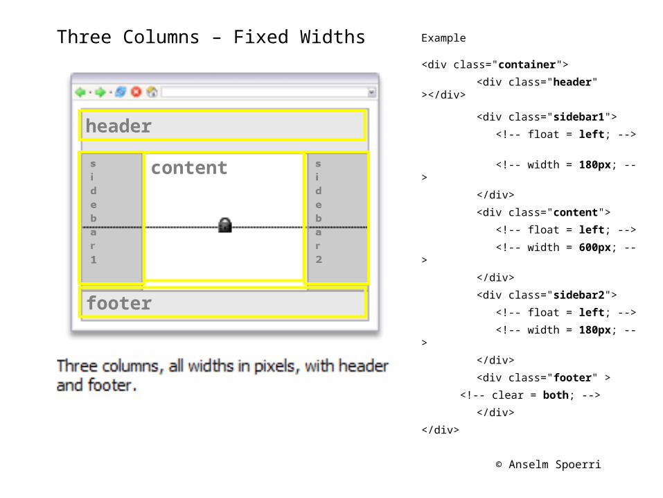
Three Columns – Fixed Widths Example
<div class="container">
<div class="header" ></div>
<div class="sidebar1">
<!-- float = left; -->
<!-- width = 180px; -->
</div>
<div class="content">
<!-- float = left; -->
<!-- width = 600px; -->
</div>
<div class="sidebar2">
<!-- float = left; -->
<!-- width = 180px; -->
</div>
<div class="footer" >
<!-- clear = both; -->
</div>
</div>
header
footer
content

© Anselm Spoerri
Three Columns – Liquid Widths Example
<div class="container">
<div class="header" ></div>
<div class="sidebar1">
<!-- float = left; -->
<!-- width = 20%; -->
</div>
<div class="content">
<!-- float = left; -->
<!-- width = 60%; -->
</div>
<div class="sidebar2">
<!-- float = left; -->
<!-- width = 20%; -->
</div>
<div class="footer" >
<!-- clear = both; -->
</div>
</div>
header
footer
content
© Anselm Spoerri
Mechanics – LyndaCampus: 1st Site using DW CS6
Flexible Layout Sakai > Resources > Lec6: index_begin04.html
– AP elements: convert Left, Width from px to %
– section element: float to the right and set right marigin as %
– Need to set position: relative; so that it moves with page
– Background Image to scale and cover– Create new CSS rule for body tag: background-size: cover;

© Anselm Spoerri
Mechanics – LyndaCampus: 1st Site using DW CS6
Mobile Layout Sakai > Resources > Lec6: index_begin04_3.html
– Select Live View to preview page in DW in predefined sizes(remember to unselect if you want to edit page)
– Modify > Media Queries …
– Select Checkbox = Force devices to report actual width
– Add query: Mobile and Max Width = 800px
– Create new file: mobile.css
– <link href="CSS/mobile.css" rel="stylesheet" type="text/css" media="only screen and (max-width:800px)">
– Create relevant CSS rules in mobile.css– Copy & paste section and header CSS rules to mobile.css
– section: width: 90%, left, right: 5%, no float and no transparency
– header: width: 480px; Need to change top for section.
– background-size: auto;
– Keep only what is different for mobile layout
– File > Save All
© Anselm Spoerri
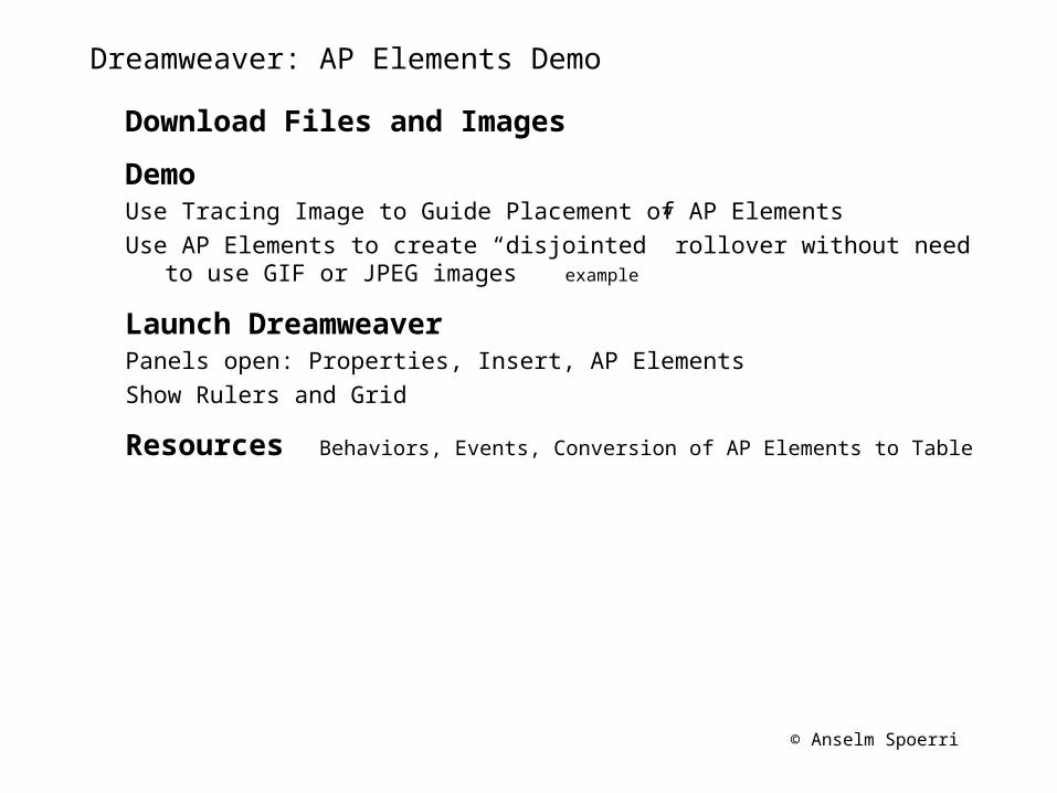
Dreamweaver: AP Elements Demo
Download Files and Images
DemoUse Tracing Image to Guide Placement of AP ElementsUse AP Elements to create “disjointed” rollover without need to use GIF
or JPEG images example
Launch DreamweaverPanels open: Properties, Insert, AP ElementsShow Rulers and Grid
Resources Behaviors, Events, Conversion of AP Elements to Table

© Anselm Spoerri
Step 1 – Tracing Image
Tracing Image Example
– File > New: HTML and <blank> Layout and Transitional
– Modify > Page Properties : select sans serif typeface
– Modify > Page Properties : select “Tracing Image” category
– Browse for tracing image = “i-R_Opening_Page”
and set transparency = 50%
– Standard Mode:
– Create main AP Element that will hold other elements
L = 0px; T = 0px; W = 600px; H = 600px view in Split View
– Create four AP Elements (along earth contour) nested in main AP Element
– Enter text : experiment with size / bolding to create “visual flow”
– Experiment with visibility setting of main and/or “children” AP Elements
Step-by-Step files: tracingimage1, tracingimage2, tracingimage3
© Anselm Spoerri
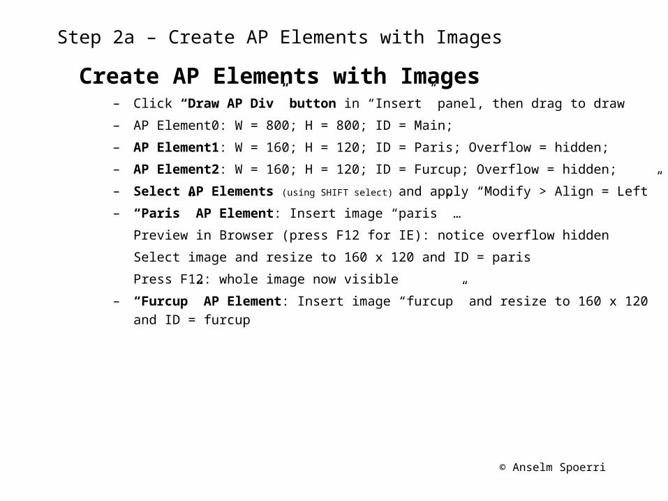
Step 2a – Create AP Elements with Images
Create AP Elements with Images– Click “Draw AP Div” button in “Insert” panel, then drag to draw
– AP Element0: W = 800; H = 800; ID = Main;
– AP Element1: W = 160; H = 120; ID = Paris; Overflow = hidden;
– AP Element2: W = 160; H = 120; ID = Furcup; Overflow = hidden;
– Select AP Elements (using SHIFT select) and apply “Modify > Align = Left”
– “Paris” AP Element: Insert image “paris” …
Preview in Browser (press F12 for IE): notice overflow hidden
Select image and resize to 160 x 120 and ID = paris
Press F12: whole image now visible
– “Furcup” AP Element: Insert image “furcup” and resize to 160 x 120 and ID = furcup

© Anselm Spoerri
Step 2b – Create Text AP Elements and Manage Visibility
Open file “layers1”
Create AP Elements with Text– Click “Draw AP Div” (AP Element) button in “Layout” toolbar, then drag to draw
– AP Element3: W = 250, H = 150, ID = IntroText, Visibility = Hidden
– AP Element4: select and copy “IntroText” AP Element,
deselect and paste; rename it “ParisText” in AP Elements Panel
(notice: new AP element is in exact same position as “IntroText” as we want it;but it is not nested inside “Main” AP Element)
hold Control key as you drag “ParisText” below “Main”
– AP Element5: copy & paste “IntroText” and rename “FurcupText”
Perform same steps as for “ParisText”
Enter text into AP Elements– Select AP Element in “AP Element” Panel and enter text
AP Elements / AP Element Visibility Management– “AP Elements” Window: click in “eye” column to make “IntoText” = visible
and drag “IntroText” to top of stack
– Make “ParisText” and “FurcupText” = invisible

© Anselm Spoerri
Step 2c – Use AP Elements to create “disjointed” rollover
Open file “layers2”
Attach “Show-Hide Elements” Behavior– Select “paris” image (can also select AP div that contains image)
– “Behavior” Window: click “+” and select “Show-Hide Elements”
– “Show Hide Elements” Dialog: select “IntroText” and “hide”– “ParisText” = show and “”FurcupText” = hide
– “Behavior” Window: select event associated with “paris” imageand click on pull-down menu to select “(onMouseOver)”
– Attach behavior for “(onMouseOut)” to image “paris”(can also select AP div that contains image)
where now “IntroText” = show and “ParisText” & “FurcupText” = hide

© Anselm Spoerri
Resources: Behaviors - General
How to Attach Behavior to Text– Can not attach a behavior to plain text. – Easiest way is to add a null link (#) to the text,
then attach a behavior to the null link.
Behaviors Window– Window > Behaviors– Press (+) to attach action.
Press (-) to remove selected action.– Actions for a given event are executed in specified order.
Use (up) and (down) arrow buttons move the selected action. – Order of execution of actions can be changed only for a
particular event, e.g. onLoad or onClick event.– Different events appear depending on the object selected.
Make sure the correct page element or tag is selected. – To select a specific tag, use the tag selector at the bottom left of
the Document window.– “Show Events For” specifies the browsers in which the current
behavior should work.
© Anselm Spoerri
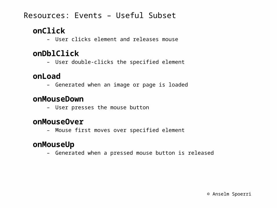
Resources: Events – Useful Subset
onClick – User clicks element and releases mouse
onDblClick – User double-clicks the specified element
onLoad – Generated when an image or page is loaded
onMouseDown – User presses the mouse button
onMouseOver – Mouse first moves over specified element
onMouseUp – Generated when a pressed mouse button is released