inside this issue: the 1999 genesis of good flag, bad flag
TRANSCRIPT
Portland Flag Association 1
Portland Flag Association “Free, and Worth Every Penny!” Issue 76 June 2019
Genesis of Good Flag, Bad Flag 1
May 2019 Flutterings 2
A “Gray Pride” Flag 4
The Pro-Abortion Gadsden Flag 6
Farewell, Michael Faul & Chumley 8
Pirate Flags in the Caribbean 9
The Red Flag 10
The Flag Quiz 11
Portland Flag Miscellany 12
Next Meeting 12
Roundup 5
Flaggy Map | Flags in School 7
INSIDE THIS ISSUE:
www.portlandflag.org
ISSN 2474-1787
The 1999 Genesis of Good Flag, Bad Flag By Ted Kaye
20 years ago the concept of a general-interest flag-design guide- book arose during ICV 18, the 18th International Congress of Vexillology, held in Victoria, BC.
Several PFA members attended that meeting—also NAVA 33— as one of our own, Mason Kaye, delivered a Driver-Award-winning presentation (its proximity to Port-land boosted PFA attendance!).
A panel discussion exploring “Vexillography—Guides for Flag Design” (featuring flag merchants Doreen Braverman, Jim Ferrigan, and Peter Orenski) deplored the sad state of flag design, evidenced by the poor quality of the flags proposed by their customers.
As the panel wrapped up, I rose to assert that we flag experts had no business criticizing the public’s vexillographic attempts until we successfully shared the basic prin-ciples of flag design with them. I then impulsively volunteered to draft such a guidebook, promising it for the next ICV, to be held in York, England, in two years’ time.
If you wish to compliment the editor, or to contribute in the future, contact Ted Kaye at 503-223-4660 or [email protected]. If you wish to complain, call your mother.
I compiled the text by consulting the writings of about 20 vexillo-graphic thinkers—in the U.S. and Canada and around the world. Finding that they seemed to agree on five basic principles, I made those the core of the guidebook.
At ICV 19 I shared a draft of a 16-page booklet titled Good Flag, Bad Flag (a catchy if sometimes unfortunate moniker). It met with wide enthusiasm from attendees.
After sharing it with members and receiving feedback, NAVA leader-ship of accepted the text and pub-lished it electronically on nava.org.
In 2006, NAVA published GFBF in printed form and since then has given it to each new member and made it available on Amazon.com.
GFBF has been translated into Spanish, French, German, Italian, Portuguese, and Slovenian, through the generous work of fellow vexil-lologists. All are available for download on the NAVA website.
The majority of flag-design efforts in the U.S. now quote GFBF—a success 20 years after its origin.
The flag should fill this primary condition: ... it must ... be a flag. And it must be a simple design, recognizable at a distance, a bright, clear note in the sky. A balanced and harmonious composition which will carry its meaning unfolding or fluttering in the wind. — Guy Viau, Province of Québec Arts Council, 1963
The Vexilloid Tabloid 2
June 2019
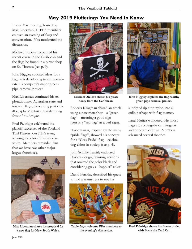
In our May meeting, hosted by Max Liberman, 11 PFA members enjoyed an evening of flags and conversation. Max moderated the discussion.
Michael Orelove recounted his recent cruise in the Caribbean and the flags he found in a pirate shop on St. Thomas (see p. 9).
John Niggley solicited ideas for a flag he is developing to commemo-rate his company’s major green-pipe-removal project.
Max Liberman continued his ex-ploration into Australian state and territory flags, recounting past vex-illographers’ efforts then debuting four of his designs.
Fred Paltridge celebrated the playoff successes of the Portland Trail Blazers, our NBA team, wearing its colors of red-black-white. Members reminded him that we have two other major-league franchises.
May 2019 Flutterings You Need to Know
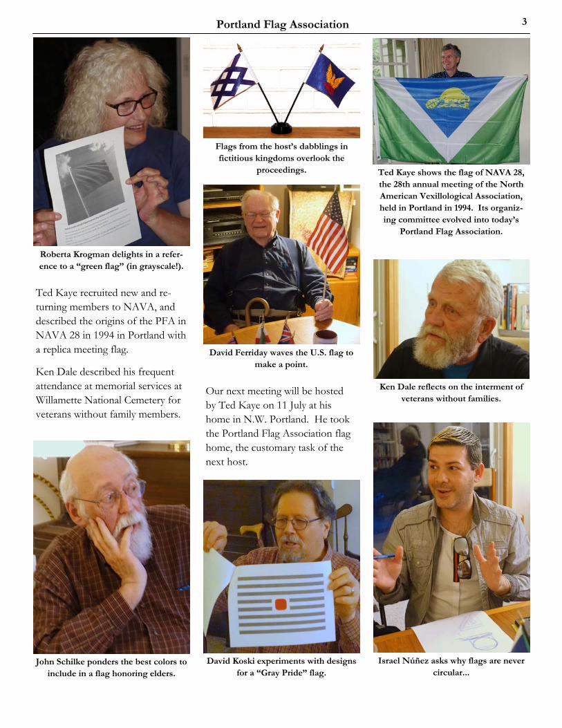
Roberta Krogman shared an article using a new metaphor—a “green flag”—meaning a good sign (versus a “red flag” as a bad sign).
David Koski, inspired by the many “pride flags”, showed his concept for a “Gray Pride” flag—celebra-ting elders in society (see p. 4).
John Schilke heartily endorsed David’s design, favoring versions that omitted the color black and considering gray a “happier” color.
David Ferriday described his quest to find a seamstress to sew his
supply of rip-stop nylon into a quilt, perhaps with flag themes.
Israel Nuñez wondered why most flags are rectangular or triangular and none are circular. Members advanced several theories.
Fred Paltridge shows his Blazer pride, with Blaze the Trail Cat.
Max Liberman shares his proposal for a new flag for New South Wales.
Michael Orelove shares his pirate booty from the Caribbean.
Table flags welcome PFA members to the evening’s discussion.
John Niggley explains the flag-worthy green pipe removal project.
Portland Flag Association 3
Ted Kaye recruited new and re-turning members to NAVA, and described the origins of the PFA in NAVA 28 in 1994 in Portland with a replica meeting flag.
Ken Dale described his frequent attendance at memorial services at Willamette National Cemetery for veterans without family members.
Our next meeting will be hosted by Ted Kaye on 11 July at his home in N.W. Portland. He took the Portland Flag Association flag home, the customary task of the next host.
Israel Núñez asks why flags are never circular...
Roberta Krogman delights in a refer-ence to a “green flag” (in grayscale!).
David Koski experiments with designs for a “Gray Pride” flag.
John Schilke ponders the best colors to include in a flag honoring elders.
Ken Dale reflects on the interment of veterans without families.
David Ferriday waves the U.S. flag to make a point.
Ted Kaye shows the flag of NAVA 28, the 28th annual meeting of the North American Vexillological Association, held in Portland in 1994. Its organiz-ing committee evolved into today’s
Portland Flag Association.
Flags from the host’s dabblings in fictitious kingdoms overlook the
proceedings.

The Vexilloid Tabloid 4
June 2019
By David Koski
On a number of occasions my stepson has sent me images of flags that he has seen while riding his bicycle through Portland’s neighborhoods. Knowing that I am a flag guy, he asks if I can identify them. In some cases I have been able to do so easily, but sometimes I’ve had to do a bit of research.
The last couple of flags turned out to be of the “queer pride” variety, most of which are unfamiliar to me. The research shows that they usually reflect some kind of gender identity or preference and have a scheme of horizontal stripes. There has been quite a prolifera-tion of different varieties since the original gay pride flag in 1978— the number of stripes vary, often with unusual colors. Seeing all these cool flags made me wonder what kind of pride flag I might fly to represent me. Out of the blue, it occurred to me that I had recently attained “senior citizen” status. While still working, I now also get a Social Security check each month. Was there a flag for old people? I did a web search and did not find any exam- ples, so I decided that I would design a flag for elders and see if it would fly. From the start I identified a number of features and elements to guide me. The flag should be simple, but with something distinc-tive and memorable to distinguish it from otherwise similar designs. I wanted to use horizontal stripes. It should be symmetrical both horizontally and vertically. And I wanted it to evoke the idea of
A “Gray Pride” Flag Honoring Elders
advanced age. Such constraints often help keep the design process on track. I started with five stripes, using gray and white to represent advancing age as well as wisdom and a bit of foolishness. I included some black stripes at first, mainly to emphasize that the gray was gray, but soon discarded them as unnecessary and suggestive of death. I decided to include a spot of red in the middle to represent vitality.
I started with a square the height of a stripe, but thought it a bit harsh because I wanted a softer effect. After considering a circle (too Japanese) and a cardioid/heart shape (too cute), I settled on a squircle, which is a shape some-where between a square and a circle.
With the basic scheme in place, I tried different numbers of stripes. I liked the variant with fifteen (eight gray, seven white) and a squircle three stripes tall. It seemed like a good candidate for a flag to be flown by elders, or by those showing solidarity with or support for elders, or by those simply “old at heart”. I presented my process with examples of the variants I’d tried at the March PFA meeting of the Portland Flag Association, and some members had suggestions to test. One thought it might be stronger with fewer stripes and a larger core. I went back to the drawing board and made a few more variants. Perhaps readers would like to comment on those shown here:
Proposals for a “Gray Pride” flag honoring elders, with a red squircle
amid varying numbers of gray stripes.
They comprise the original fifteen-striped flag with a squircle three units tall (3/15), along with one 7/15, one 5/13, and one 3/11.
Readers, which do you think would work best flying as a flag?
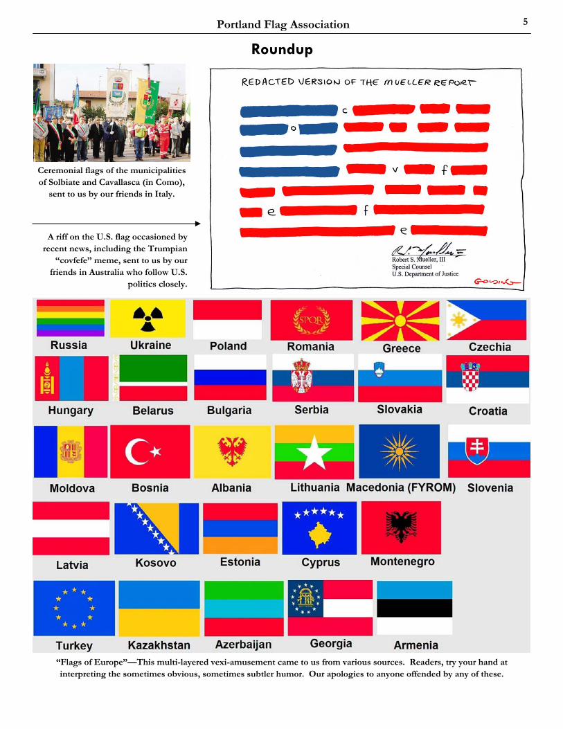
Portland Flag Association 5
Ceremonial flags of the municipalities of Solbiate and Cavallasca (in Como),
sent to us by our friends in Italy.
“Flags of Europe”—This multi-layered vexi-amusement came to us from various sources. Readers, try your hand at interpreting the sometimes obvious, sometimes subtler humor. Our apologies to anyone offended by any of these.
A riff on the U.S. flag occasioned by recent news, including the Trumpian
“covfefe” meme, sent to us by our friends in Australia who follow U.S.
politics closely.
Roundup
The Vexilloid Tabloid 6
June 2019
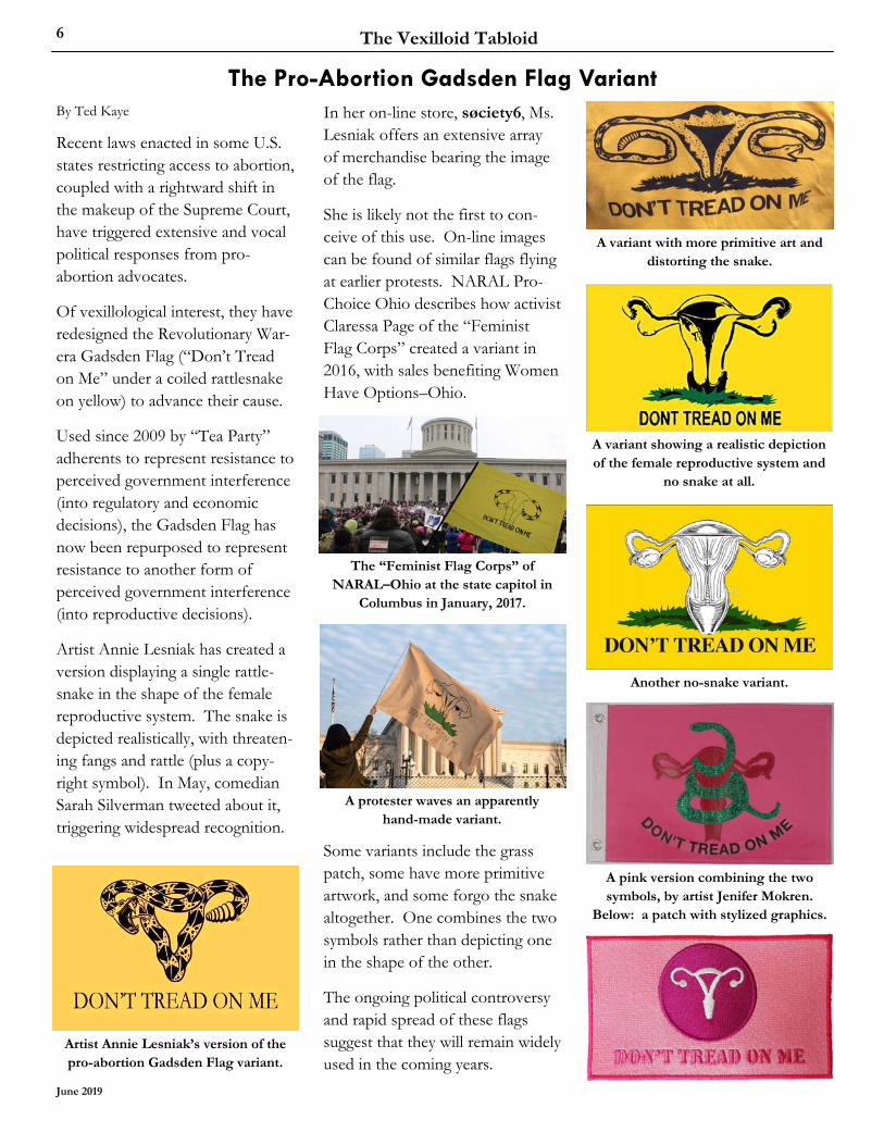
The Pro-Abortion Gadsden Flag Variant By Ted Kaye
Recent laws enacted in some U.S. states restricting access to abortion, coupled with a rightward shift in the makeup of the Supreme Court, have triggered extensive and vocal political responses from pro-abortion advocates.
Of vexillological interest, they have redesigned the Revolutionary War-era Gadsden Flag (“Don’t Tread on Me” under a coiled rattlesnake on yellow) to advance their cause.
Used since 2009 by “Tea Party” adherents to represent resistance to perceived government interference (into regulatory and economic decisions), the Gadsden Flag has now been repurposed to represent resistance to another form of perceived government interference (into reproductive decisions).
Artist Annie Lesniak has created a version displaying a single rattle-snake in the shape of the female reproductive system. The snake is depicted realistically, with threaten-ing fangs and rattle (plus a copy-right symbol). In May, comedian Sarah Silverman tweeted about it, triggering widespread recognition.
In her on-line store, søciety6, Ms. Lesniak offers an extensive array of merchandise bearing the image of the flag.
She is likely not the first to con-ceive of this use. On-line images can be found of similar flags flying at earlier protests. NARAL Pro-Choice Ohio describes how activist Claressa Page of the “Feminist Flag Corps” created a variant in 2016, with sales benefiting Women Have Options–Ohio.
Some variants include the grass patch, some have more primitive artwork, and some forgo the snake altogether. One combines the two symbols rather than depicting one in the shape of the other.
The ongoing political controversy and rapid spread of these flags suggest that they will remain widely used in the coming years.
A variant showing a realistic depiction of the female reproductive system and
no snake at all.
Artist Annie Lesniak’s version of the pro-abortion Gadsden Flag variant.
The “Feminist Flag Corps” of NARAL–Ohio at the state capitol in
Columbus in January, 2017.
A protester waves an apparently hand-made variant.
A pink version combining the two symbols, by artist Jenifer Mokren.
Below: a patch with stylized graphics.
Another no-snake variant.
A variant with more primitive art and distorting the snake.
Portland Flag Association 7
Collins Flags shows this image of the United States with the flags of each state in that state’s outline. This serves as an indirect argument for simple designs. https://www.collinsflags.com/blog/archives/state-flag-adoption-dates
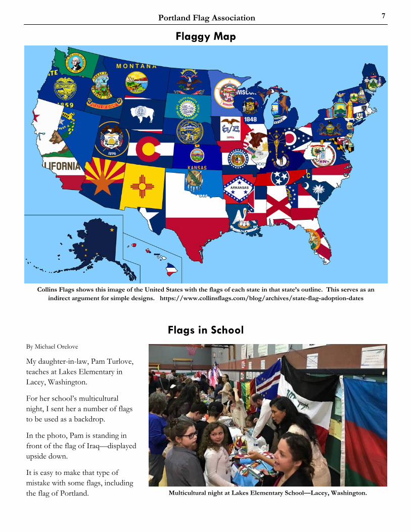
Multicultural night at Lakes Elementary School—Lacey, Washington.
By Michael Orelove
My daughter-in-law, Pam Turlove, teaches at Lakes Elementary in Lacey, Washington.
For her school’s multicultural night, I sent her a number of flags to be used as a backdrop.
In the photo, Pam is standing in front of the flag of Iraq—displayed upside down.
It is easy to make that type of mistake with some flags, including the flag of Portland.
Flaggy Map
Flags in School
The Vexilloid Tabloid 8
June 2019
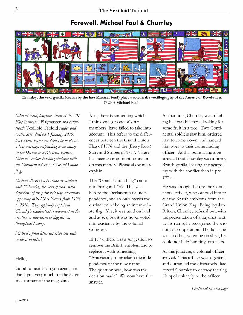
Chumley, the vexi-gorilla (drawn by the late Michael Faul) plays a role in the vexillography of the American Revolution. © 2006 Michael Faul.
Farewell, Michael Faul & Chumley
Michael Faul, longtime editor of the UK Flag Institute’s Flagmaster and enthu-siastic Vexilloid Tabloid reader and contributor, died on 1 January 2019. Five weeks before his death, he wrote us a long message, responding to an image in the December 2018 issue showing Michael Orelove teaching students with the Continental Colors (“Grand Union” flag).
Michael illustrated his close association with “Chumley, the vexi-gorilla” with depictions of the primate’s flag adventures appearing in NAVA News from 1999 to 2010. They typically explained Chumley’s inadvertent involvement in the creation or alteration of flag designs throughout history.
Michael’s final letter describes one such incident in detail:
Hello,
Good to hear from you again, and thank you very much for the exten-sive content of the magazine.
Continued on next page
Alas, there is something which I think you (or one of your members) have failed to take into account. This refers to the differ-ences between the Grand Union Flag of 1776 and the (Betsy Ross) Stars and Stripes of 1777. There has been an important omission on this matter. Please allow me to explain.
The “Grand Union Flag” came into being in 1776. This was before the Declaration of Inde-pendence, and so only merits the distinction of being an intermedi-ate flag. Yes, it was used on land and at sea, but it was never voted into existence by the colonial Congress.
In 1777, there was a suggestion to remove the British emblem and to replace it with something “American”, to proclaim the inde-pendence of the new nation. The question was, how was the decision made? We now have the answer.
At that time, Chumley was mind-ing his own business, looking for some fruit in a tree. Two Conti-nental soldiers saw him, ordered him to come down, and handed him over to their commanding officer. At this point it must be stressed that Chumley was a firmly British gorilla, lacking any sympa-thy with the conflict then in pro-gress.
He was brought before the Conti-nental officer, who ordered him to cut the British emblems from the Grand Union Flag. Being loyal to Britain, Chumley refused but, with the presentation of a bayonet next to his rump, he recognised the wis-dom of cooperation. He did as he was told but, when he finished, he could not help bursting into tears.
At this juncture, a colonial officer arrived. This officer was a general and outranked the officer who had forced Chumley to destroy the flag. He spoke sharply to the officer
Portland Flag Association 9
Pirate Flags in the Caribbean
who had made Chumley obey him, saying that: “It was disgraceful to force a fellow to do such a thing!” Chumley always remembered this officer with affection. His name was Benedict Arnold.
At this point, representatives from the rebel colonies arrived. They each brought emblems which they wanted included on the flag. No two were the same. North Caroli-na even brought a bucket of tar! South Carolina wanted peaches on the flag. New York wanted an owl. Every colony wanted something different, except for two, which both wanted a pine-tree, New Hampshire and Massachusetts.
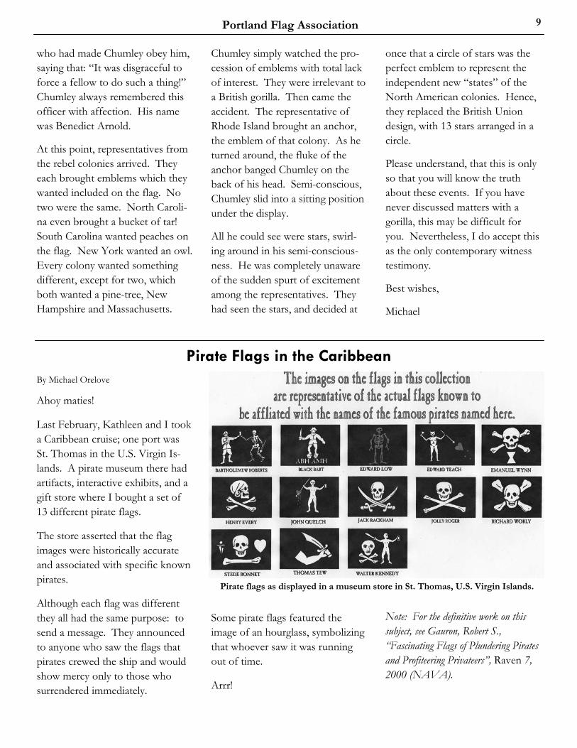
By Michael Orelove
Ahoy maties!
Last February, Kathleen and I took a Caribbean cruise; one port was St. Thomas in the U.S. Virgin Is-lands. A pirate museum there had artifacts, interactive exhibits, and a gift store where I bought a set of 13 different pirate flags.
The store asserted that the flag images were historically accurate and associated with specific known pirates.
Although each flag was different they all had the same purpose: to send a message. They announced to anyone who saw the flags that pirates crewed the ship and would show mercy only to those who surrendered immediately.
Pirate flags as displayed in a museum store in St. Thomas, U.S. Virgin Islands.
Some pirate flags featured the image of an hourglass, symbolizing that whoever saw it was running out of time.
Arrr!
Note: For the definitive work on this subject, see Gauron, Robert S., “Fascinating Flags of Plundering Pirates and Profiteering Privateers”, Raven 7, 2000 (NAVA).
Chumley simply watched the pro-cession of emblems with total lack of interest. They were irrelevant to a British gorilla. Then came the accident. The representative of Rhode Island brought an anchor, the emblem of that colony. As he turned around, the fluke of the anchor banged Chumley on the back of his head. Semi-conscious, Chumley slid into a sitting position under the display.
All he could see were stars, swirl-ing around in his semi-conscious-ness. He was completely unaware of the sudden spurt of excitement among the representatives. They had seen the stars, and decided at
once that a circle of stars was the perfect emblem to represent the independent new “states” of the North American colonies. Hence, they replaced the British Union design, with 13 stars arranged in a circle.
Please understand, that this is only so that you will know the truth about these events. If you have never discussed matters with a gorilla, this may be difficult for you. Nevertheless, I do accept this as the only contemporary witness testimony.
Best wishes,
Michael
The Vexilloid Tabloid 10
June 2019
The Red Flag By John Cartledge [commenting on the flag quote in the April issue of VT.
Red flags first appeared as symbols of political revolt in the 1790s, after the first French revolution. They were flown by protestors at many uprisings and demonstra-tions during the 19th century—including the Paris commune of 1871 and the Haymarket rally in Chicago in 1886.
Inspired by these and similar events, an Irish radical journalist named Jim Connell (1852–1929) composed the lyrics of The Red Flag in 1889 during the course of a train journey in south London after attending a lecture on socialism. The song quickly became popular with the world-wide labour move-ment, and the leaders of the Rand miners strike in South Africa went to the gallows singing it in 1922.
It has served as the anthem of the British Labour party since its formation, and is still sung with
gusto by the delegates at the close of its annual conference—to the evident distaste of some of the party’s recent leaders. It is also used by the party’s counterparts in both parts of Ireland.
Although the party held a competi-tion in 1925 to find a replacement, none of the 300 entries was accept-ed. The anthem was sung by the newly elected contingent of Labour members of Parliament as they entered the Commons chamber after the party’s victory in 1945, and it was sung there again in 2006 to mark the party’s centenary.
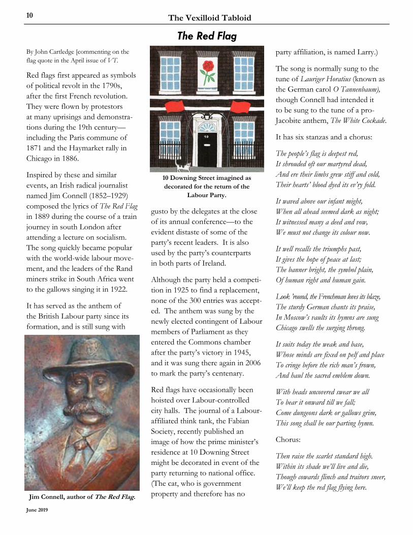
Red flags have occasionally been hoisted over Labour-controlled city halls. The journal of a Labour-affiliated think tank, the Fabian Society, recently published an image of how the prime minister’s residence at 10 Downing Street might be decorated in event of the party returning to national office. (The cat, who is government property and therefore has no
10 Downing Street imagined as decorated for the return of the
Labour Party.
Jim Connell, author of The Red Flag.
party affiliation, is named Larry.)
The song is normally sung to the tune of Lauriger Horatius (known as the German carol O Tannenbaum), though Connell had intended it to be sung to the tune of a pro-Jacobite anthem, The White Cockade.
It has six stanzas and a chorus:
The people’s flag is deepest red, It shrouded oft our martyred dead, And ere their limbs grew stiff and cold, Their hearts’ blood dyed its ev’ry fold.
It waved above our infant might, When all ahead seemed dark as night; It witnessed many a deed and vow, We must not change its colour now.
It well recalls the triumphs past, It gives the hope of peace at last; The banner bright, the symbol plain, Of human right and human gain.
Look ’round, the Frenchman loves its blaze, The sturdy German chants its praise, In Moscow’s vaults its hymns are sung Chicago swells the surging throng.
It suits today the weak and base, Whose minds are fixed on pelf and place To cringe before the rich man’s frown, And haul the sacred emblem down.
With heads uncovered swear we all To bear it onward till we fall; Come dungeons dark or gallows grim, This song shall be our parting hymn.
Chorus:
Then raise the scarlet standard high. Within its shade we’ll live and die, Though cowards flinch and traitors sneer, We’ll keep the red flag flying here.

Portland Flag Association 11
Identify these seven flags and place them in order of adoption year.
Answers in the next issue...
What Was that Flag? Answers to the last quiz
By Tony Burton
What’s that Flag?
By David Ferriday
These flags not only all bear a red cross on white, on each it is specif-ically the Cross of St. George.
Congrats to solvers John Cartledge Bill Neckrock, Michael Orelove, Wayne Raymond, and Mike Thomas.
Sark
England
Alderney
Guernsey City of London
Georgia
Northern Ireland (unofficial)
The Vexilloid Tabloid 12
June 2019
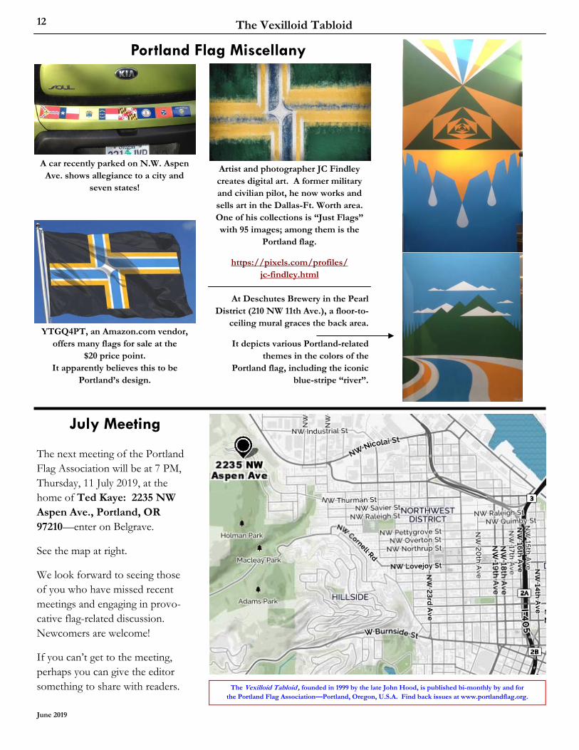
Portland Flag Miscellany
Artist and photographer JC Findley creates digital art. A former military and civilian pilot, he now works and sells art in the Dallas-Ft. Worth area. One of his collections is “Just Flags” with 95 images; among them is the
Portland flag.
https://pixels.com/profiles/ jc-findley.html
The Vexilloid Tabloid , founded in 1999 by the late John Hood, is published bi-monthly by and for the Portland Flag Association—Portland, Oregon, U.S.A. Find back issues at www.portlandflag.org.
July Meeting
The next meeting of the Portland Flag Association will be at 7 PM, Thursday, 11 July 2019, at the home of Ted Kaye: 2235 NW Aspen Ave., Portland, OR 97210—enter on Belgrave.
See the map at right.
We look forward to seeing those of you who have missed recent meetings and engaging in provo-cative flag-related discussion. Newcomers are welcome!
If you can’t get to the meeting, perhaps you can give the editor something to share with readers.
At Deschutes Brewery in the Pearl District (210 NW 11th Ave.), a floor-to-
ceiling mural graces the back area.
It depicts various Portland-related themes in the colors of the
Portland flag, including the iconic blue-stripe “river”.
A car recently parked on N.W. Aspen Ave. shows allegiance to a city and
seven states!
YTGQ4PT, an Amazon.com vendor, offers many flags for sale at the
$20 price point. It apparently believes this to be
Portland’s design.