intro to multimedia intro to typography
TRANSCRIPT

Intro to Multimedia
Intro to Typography
http://www.wordsarepictures.co.uk/

Comparing Typography
Pulp Fiction #1Pulp Fiction #2
Disclaimer:The videos you are about to watch contain vulgar language. You may opt out of this part of the presentation if you like.

Typography Defined
The art and technique of selecting and arranging type styles, point sizes, line lengths, line leading, character spacing, and word spacing for typeset applications
Conveys mood Communicates attitude
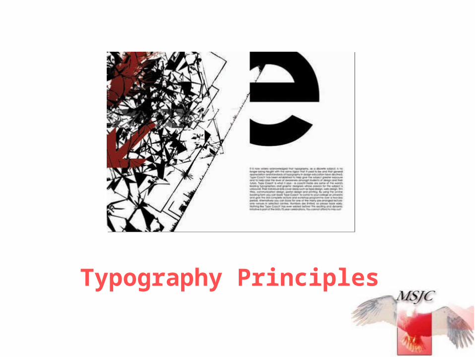
Typography Principles

Basic Principles
Proximitygroups things together
Alignmentconnects visually to everything else
Repetitionprovides consistency to the product
Contrastadds visual interest

Proximity - Illustrated
Bugs Booklouse Box Elder Bugs Carpenter ants Carpet Beetles Clothes Moths Clover Mites Cockroaches Orchard Bees Pharaoh Ants Phorid Flies Pill Bugs
Bugs Booklouse Box Elder Bugs Carpenter ants Carpet Beetles Clothes Moths Clover Mites Cockroaches
Orchard Bees Pharaoh Ants Phorid Flies Pill Bugs
Carpenter AntsReproductive winged femaleReproductive winged maleMinor workersMajor workers Carpet BeetlesVaried carpet beetlesBlack carpet beetlesPhorid FliesHumpback fliesDrain flies
Carpenter AntsReproductive winged femaleReproductive winged maleMinor workersMajor workers Carpet BeetlesVaried carpet beetlesBlack carpet beetlesPhorid FliesHumpback fliesDrain flies
Carpenter AntsReproductive winged femaleReproductive winged maleMinor workersMajor workers
Carpet BeetlesVaried carpet beetlesBlack carpet beetles
Phorid FliesHumpback fliesDrain flies
Carpenter AntsReproductive winged femaleReproductive winged maleMinor workersMajor workers
Carpet BeetlesVaried carpet beetlesBlack carpet beetles
Phorid FliesHumpback fliesDrain flies
VS:
The principle of proximity says that related items should be grouped together. Move related items close to each other and add separation between items that are not similar. This ensures that a group is formed rather than a selection of unrelated elements. The proximity of items communicates relationship.
From: Thinkgeek.com

Proximity Errors
What to avoid:Placing too many separate elements on a pageSticking element in the corners and in the middle of
the pagesLeaving equal amounts of white space between
elements (unless each group is part of a subset)Allowing confusion between related materialCreating relationships with elements that don’t belong
together

Alignment
Every element should be visually linked, or aligned, with something else. This presents a cohesive look.
Be conscious of items placed on the page
–align it with something else, regardless of the distance.
Every element should be visually linked, or aligned, with something else. This presents a cohesive look.
Be conscious of items placed on the page
–align it with something else, regardless of the distance.
Avoid: Avoid using more than one text
alignment Reduce the use of centered
alignment (especially online)

RepetitionUnify and add visual interest by repeating some aspect of the design.
Repeat anything that someone will recognize visually. This can include type styles, spatial relationships, etc.
Unify and add visual interest by repeating some aspect of the design.
Repeat anything that someone will recognize visually. This can include type styles, spatial relationships, etc.
Avoid: Too much repetition - it may annoy
or overwhelm the viewer Excessive contrast of type styles

ContrastUse contrast to design something that is strongly visual and provides organizational hierarchy.
Apply this when you want the elements to be very different.
Use size, weight, color, direction, form and structure
Use contrast to design something that is strongly visual and provides organizational hierarchy.
Apply this when you want the elements to be very different.
Use size, weight, color, direction, form and structure
Avoid: Everything having the same weight
and strength Weak contrast – make it strong

Typography Rules
Avoid using all capitals with Script fonts
Limit the number of serif fontsAlign text as much as possibleGroup text together, aligning left, center or
right
DON’T USE SCRIPTS IN ALL CAPS
Don’t use scripts in all caps
DON’T USE SCRIPTS IN ALL CAPS
Don’t use scripts in all caps

Go Forth and Communicate