introducing cartograms - suffolk...
TRANSCRIPT
Page 1 of 11
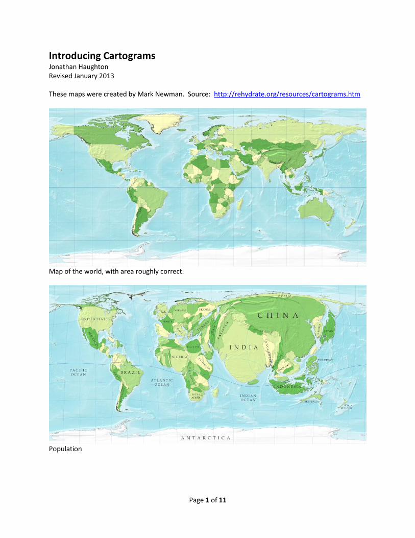
Introducing Cartograms Jonathan Haughton Revised January 2013 These maps were created by Mark Newman. Source: http://rehydrate.org/resources/cartograms.htm
Map of the world, with area roughly correct.
Population
Page 2 of 11
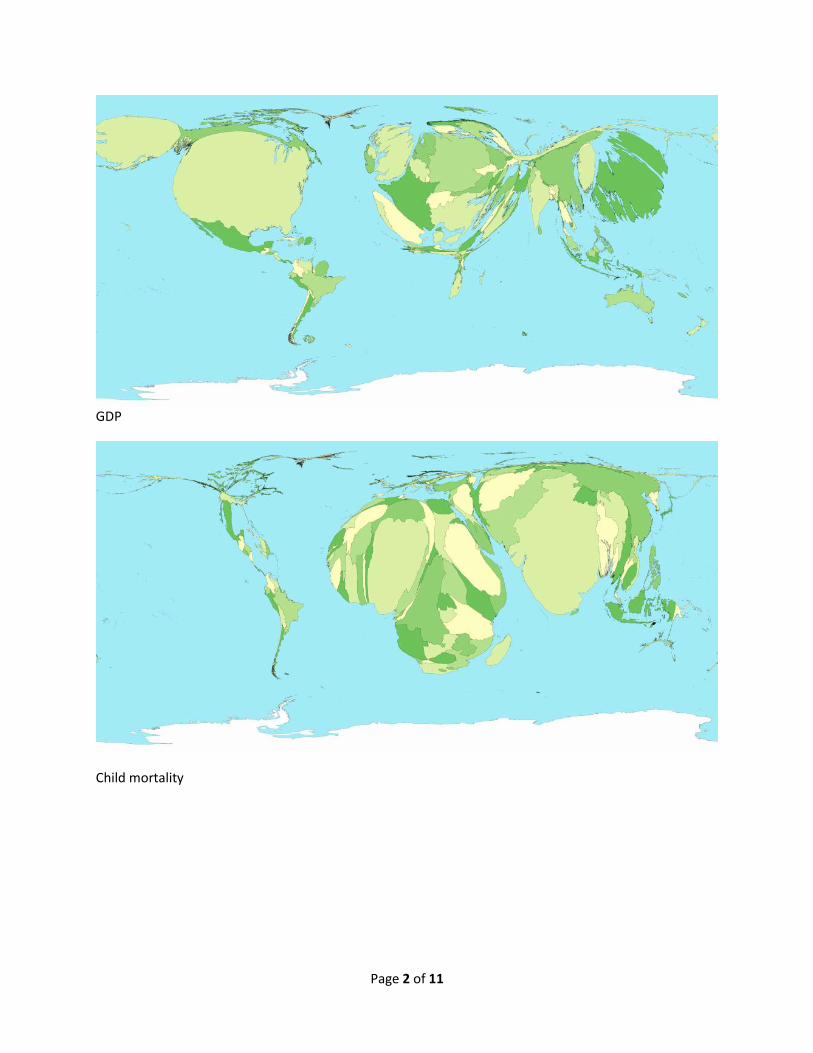
GDP
Child mortality

Page 3 of 11
Greenhouse gas emissions
Poverty ($2 per day), from http://www.sasi.group.shef.ac.uk/worldmapper/images/largepng/180.png
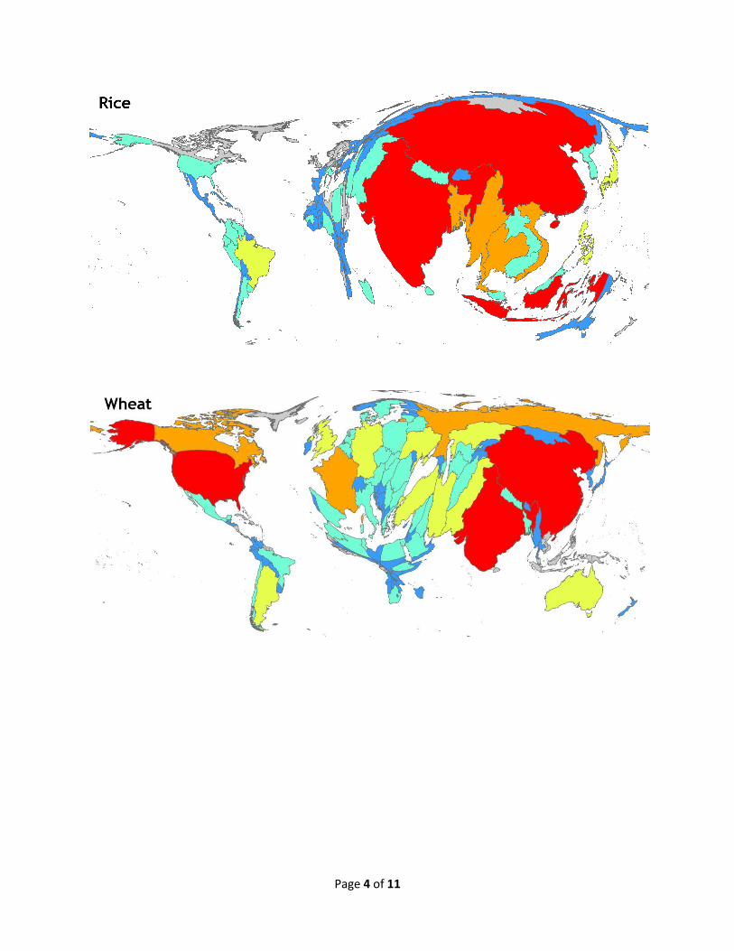
Page 4 of 11
Page 5 of 11
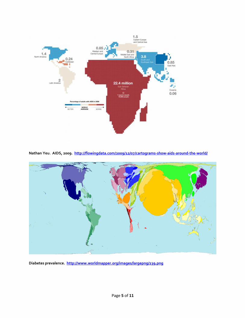
Nathan Yeu. AIDS, 2009. http://flowingdata.com/2009/12/07/cartograms-show-aids-around-the-world/
Diabetes prevalence. http://www.worldmapper.org/images/largepng/239.png

Page 6 of 11
Learn more about cartograms and cartography generally
Generating population density-equalizing maps, Michael T. Gastner and M. E. J. Newman,Proceedings of
the National Academy of Sciences of the United States of America, vol. 101, pp. 7499-7504, 2004.
They applied their methods to the results of the US presidential elections in 2004, which garnered
them quite a lot of press at the time. Here's what ScienceNews had to say about their work, for example.
There are many ways in which this kind of numerical information can be overlaid on a map, and you can
check out United States Geological Survey for a survey of this.
Michael Friendly has created a fascinating chronicle of the milestones in the history of thematic
cartography, statistical graphics, and data visualization (.)
Other potentially interesting sources of data, to me at least are:
o New England city and town areas at the US census.
o Similar information, including boundaries for Massachusetts towns and cities, is available
from MassGIS.
o Immigration data from eastern Europe to Ireland
Census data for Northern Ireland is available, but only for recent years. For reasons I don't understand,
most of the mid-century data is locked away.
The census in Scotland also included a language question starting in 1891, which would make it possible
to track the decline of Scots Gaelic. An outline map of thecounties of Scotland could be traced in much
the same way I traced the six counties of Northern Ireland. Here's an old copyright-free map of Scotland
While I generally find about.com annoying, since so much of its content is copied from elsewhere, here's
an interesting that I haven't found anyplace else, examining thereliability of Irish censuses from the very
beginning.
Here's an analysis of the change in speakers of all celtic languages in the British Isles from 1891
onwards. (PDF)
Waldo Tobler has put together a useful page of links
The National Centre for Geocomputing in Ireland has started a program called GIS into Schools, which I
think is pretty cool.
A Canadian blog about cartography
For some nice animations , see :
http://www.sasi.group.shef.ac.uk/worldmapper/

Page 7 of 11
From Mark Newman’s web site: http://www-personal.umich.edu/~mejn/election/2012/
Maps of the 2012 US presidential election results
Election results by state
Here is a typical map of the results of the 2012 election:
Click on any of the maps for a larger picture
The states are colored red or blue to indicate whether a majority of their voters voted for the Republican candidate, Mitt Romney, or the Democratic candidate, Barack Obama, respectively. Looking at this map it gives the impression that the Republican won the election handily, since there is rather more red on the map than there is blue. In fact, however, the reverse is true – it was the Democrats who won the election. The explanation for this apparent paradox, as pointed out by many people, is that the map fails to take account of the population distribution. We can correct for this by making use of a cartogram, a map in which the sizes of states are rescaled according to their population. That is, states are drawn with size proportional not to their acreage but to the number of their inhabitants, states with more people appearing larger than states with fewer, regardless of their actual area on the ground. On such a map, for example, the state of Rhode Island, with its 1.1 million inhabitants, would appear about twice the size of Wyoming, which has half a million, even though Wyoming has 60 times the acreage of Rhode Island.
Here are the 2012 presidential election results on a population cartogram of this type:

Page 8 of 11
As you can see, the states have been stretched and squashed, some of them substantially, to give them the appropriate sizes, though it's done in such a way as to preserve the general appearance of the map, so far as that's possible. On this map there is now clearly more blue than red.
The presidential election, however, is not actually decided on the basis of the number of people who vote for each candidate but on the basis of the electoral college. Under the US electoral system, each state in the union contributes a certain number of electors to the electoral college, who vote according to the majority in their state. (Exceptions are the states of Maine and Nebraska, which use a different formula that allows them to split their electoral votes between candidates.) The candidate receiving a majority of the votes in the electoral college wins the election. The electors are apportioned among the states roughly according to population, as measured by the census, but with a small but deliberate bias in favor of less populous states.

Page 9 of 11
This cartogram looks similar to the one above it, but it's not identical. Wyoming, for instance, has approximately doubled in size, precisely because of the bias in favor of small states.
Election results by county
But we can go further. We can do the same thing also with the county-level election results and the images are even more striking. Here is a map of US counties, again colored red and blue to indicate Republican and Democratic majorities respectively:
Now the effects we saw at the state level are even more pronounced: the red areas appear overwhelmingly in the majority, an appearance again at odds with the actual results of the election. Again, we can make a more helpful respresentation by using a cartogram. Here is what the cartogram looks like for the county-level election returns:
Page 10 of 11
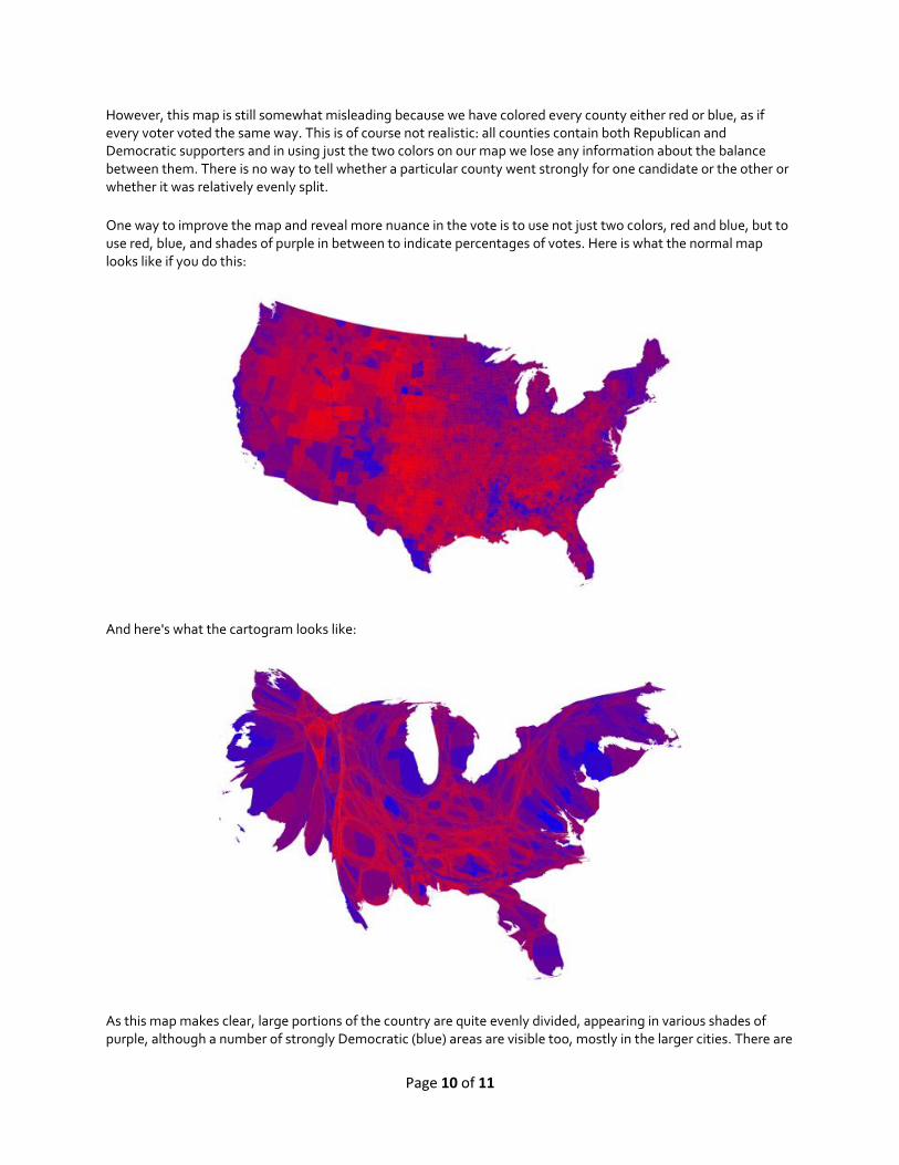
However, this map is still somewhat misleading because we have colored every county either red or blue, as if every voter voted the same way. This is of course not realistic: all counties contain both Republican and Democratic supporters and in using just the two colors on our map we lose any information about the balance between them. There is no way to tell whether a particular county went strongly for one candidate or the other or whether it was relatively evenly split.
One way to improve the map and reveal more nuance in the vote is to use not just two colors, red and blue, but to use red, blue, and shades of purple in between to indicate percentages of votes. Here is what the normal map looks like if you do this:
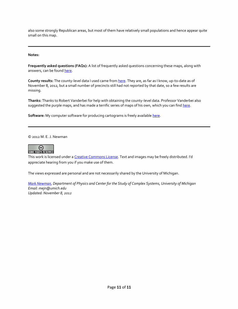
And here's what the cartogram looks like:
As this map makes clear, large portions of the country are quite evenly divided, appearing in various shades of purple, although a number of strongly Democratic (blue) areas are visible too, mostly in the larger cities. There are
Page 11 of 11
also some strongly Republican areas, but most of them have relatively small populations and hence appear quite small on this map.
Notes:
Frequently asked questions (FAQs): A list of frequently asked questions concerning these maps, along with answers, can be found here.
County results: The county-level data I used came from here. They are, as far as I know, up-to-date as of November 8, 2012, but a small number of precincts still had not reported by that date, so a few results are missing.
Thanks: Thanks to Robert Vanderbei for help with obtaining the county-level data. Professor Vanderbei also suggested the purple maps, and has made a terrific series of maps of his own, which you can find here.
Software: My computer software for producing cartograms is freely available here.
© 2012 M. E. J. Newman
This work is licensed under a Creative Commons License. Text and images may be freely distributed. I'd
appreciate hearing from you if you make use of them.
The views expressed are personal and are not necessarily shared by the University of Michigan.
Mark Newman, Department of Physics and Center for the Study of Complex Systems, University of Michigan Email: [email protected] Updated: November 8, 2012