introduction - diliara · introduction not only is it easy ... relevant recollections from mind to...
TRANSCRIPT
Chapter 1
INTRODUCTION
Not only is it easy to lie with maps, it's essential. To portray meaningful relationships for a complex, three-dimensional world on a flat sheet of paper or a video screen, a map must distort reality. As a scale model, the map must use symbols that almost always are proportionally much bigger or thicker than the features they represent. To avoid hiding critical in- formation in a fog of detail, the map must offer a selective, incomplete view of reality. There's no escape from the carto- graphic paradox: to present a useful and truthful picture, an accurate map must tell white lies.
Because most map users willingly tolerate white lies on maps, it's not difficult for maps also to tell more serious lies. Map users generally are a trusting lot: they understand the need to distort geometry and suppress features, and they believe the cartographer really does know where to draw the line, figuratively as well as literally. As with many things beyond their full understanding, they readily entrust map- making to a priesthood of technically competent designers and drafters working for government agencies and commer- cial firms. Yet cartographers are not licensed, and many map- makers competent in commercial art or the use of computer workstations have never studied cartography. Map users sel- dom, if ever, question these authorities, and they often fail to appreciate the map's power as a tool of deliberate falsification or subtle propaganda.
Because of personal computers and electronic publishing, map users can now easily lie to themselves-and be unaware of it. Before the personal computer, folk cartography consist- ed largely of hand-drawn maps giving directions. The direc- tion giver had full control over pencil and paper and usually
Chapter One / 2 Introduction / 3
had no difficulty transferring routes, landmarks, and other relevant recollections from mind to map. The computer al- lows programmers, marketing experts, and other anonymous middlemen without cartographic sawy to strongly influence the look of the map and gives modern-day folk maps the crisp type, uniform symbols, and verisimilitude of maps from the cartographic priesthood. Yet software developers commonly have made it easy for the lay cartographer to select an inap- propriate projection or a misleading set of symbols. Because of advances in low-cost computer graphics, inadvertent yet serious cartographic lies can appear respectable and accurate.
The potential for cartographic mischief extends well be- yond the deliberate suppression used by some cartographer- politicians and the electronic blunders made by the carto- graphically ignorant. If any single caveat can alert map users to their unhealthy but widespread naivet6, it is that a single map is but one of an indefinitely large number of maps that might be produced for the same situation or from the same data. The italics reflect an academic lifetime of browbeating undergraduates with this obvious but readily ignored warning. How easy it is to forget, and how revealing to recall, that map authors can experiment freely with features, measurements, area of cover- age, and symbols and can pick the map that best presents their case or supports their unconscious bias. Map users must be aware that cartographic license is enormously broad.
The purpose of this book is to promote a healthy skepticism about maps, not to foster either cynicism or deliberate dishon- esty. In showing how to lie with maps, I want to make readers aware that maps, like speeches and paintings, are authored collections of information and also are subject to distortions arising from ignorance, greed, ideological blindness, or malice.
Examining the misuses of maps also provides an interest- ing introduction to the nature of maps and their range of appropriate uses. Chapter 2 considers as potential sources of distortion the map's main elements: scale, projection, and symbolization. Chapter 3 further pursues the effects of scale by examining the various white lies cartographers justify as necessary generalization, and chapter 4 looks at common blunders resulting from the mapmaker's ignorance or over- sight. Chapter 5 treats the seductive use of symbols in adver- tising maps, and chapter 6 explores exaggeration and sup-
pression in maps prepared for development plans and envi- ronmental impact statements. Chapters 7 and 8 examine dis- torted maps used by governments as political propaganda and as "disinformation" for military opponents. The next two chapters are particularly relevant to users of mapping soft- ware and electronic publishing: chapter 9 addresses distortion and self-deception in statistical maps made from census data and other quantitative information, and chapter 10 looks at how a careless or Machiavellian choice of colors can confuse or mislead the map viewer. Chapter 11 concludes by noting maps' dual and sometimes conflicting roles and by recom- mending a skeptical assessment of the map author's motives.
A book about how to lie with maps can be more useful than a book about how to lie with words. After all, everyone is familiar with verbal lies, nefarious as well as white, and is wary about how words can be manipulated. Our schools teach their pupils to be cautious consumers who read the fine print and between the lines, and the public has a guarded respect for advertising, law, marketing, politics, public rela- tions, writing, and other occupations requiring skill in verbal manipulation. Yet education in the use of maps and diagrams is spotty and limited, and many otherwise educated people are graphically and cartographically illiterate. Maps, like numbers, are often arcane images accorded undue respect and credibility. This book's principal goal is to dispel this carto- graphic mystique and promote a more informed use of maps based upon an understanding and appreciation of their flexi- bility as a medium of communication.
The book's insights can be especially useful for those who might more effectively use maps in their work or as citizens fighting environmental deterioration or social ills. The in- formed skeptic becomes a perceptive map author, better able to describe locational characters and explain geographic rela- tionships as well as better equipped to recognize and counter the self-serving arguments of biased or dishonest mapmakers.
Where a deep mistrust of maps ,reflects either ignorance of how maps work or a bad personal experience with maps, this book can help overcome an unhealthy skepticism called car- tophobia. Maps need be no more threatening or less reliable than words, and rejecting or avoiding or ignoring maps is akin to the mindless fears of illiterates who regard books as
Chapter One / 4
evil or dangerous. This book's revelations about how maps must be white lies but may sometimes become real lies should provide the same sort of reassuring knowledge that allows humans to control and exploit fire and electricity.
Chapter 2
ELEMENTS OF THE MAP
Maps have three basic attributes: scale, projection, and sym- bolization. Each element is a source of distortion. As a group, they describe the essence of the map's possibilities and limita- tions. No one can use maps or make maps safely and effectively without understanding map scales, map projections, and map symbols.
Scale
Most maps are smaller than the reality they represent, and map scales tell us how much smaller. Maps can state their scale in three ways: as a ratio, as a short sentence, and as a simple graph. Figure 2.1 shows some typical statements of map scale.
Ratio scales relate one unit of distance on the map to a specific distance on the ground. The units must be the same, so that a ratio of 1:10,000 means that a 1-inch line on the map represents a 10,000-inch stretch of road--or that 1 centimeter represents 10,000 centimeters or 1 foot stands for 10,000 feet. As long as they are the same, the units don't matter and need not be stated; the ratio scale is a dimensionless number. By convention, the part of the ratio to the left of the colon is always 1.
Some maps state the ratio scale as a fraction, but both forms have the same meaning. Whether the mapmaker uses 1:24,000 or 1/24,000 is solely a matter of style.
Fractional statements help the user compare map scales. A scale of 1/10,000 (or 1:10,000) is larger than a scale of 1 /250,000 (or 1:250,000) because 1 /10,000 is a larger fraction than 1/250,000. Recall that small fractions have big denomi-

Chapter Two / 6
Ratio Scales Verbal Scales
1:9,600 One inch represents 800 feet.
1:24,000 One inch represents 2,000 feet.
1:50,000 One centimeter represents 500 meters.
1:250,000 One inch represents (approximately) 4 miles.
1:2,000,000 One inch represents (approximately) 32 miles, one centimeter represents 20 kilometers.
Graphic Scales
0 3 6 9 - - - - m p feet 400
I kilometers
1 1/2 0 1 2 I . 1 1 1 I I I km I 500 miles
miles 1 mile ' FIGURE 2.1. Types of map scales.
nators and big fractions have small denominators, or that half (1 /2) a pie is more than a quarter (1 /4) of the pie. In general, "large-scale" maps have scales of 1:24,000 or larger, whereas "small-scale" maps have scales of 1:500,000 or smaller. But these distinctions are relative: in a city planning office where the largest map scale is 1:50,000, "small-scale" might refer to maps at 1:24,000 or smaller and "large-scale" to maps at 1:4,800 or larger.
Large-scale maps tend to be more detailed than small-scale maps. Consider two maps, one at 1:10,000 and the other at 1:10,000,000. A I-inch line at 1:10,000 represents 10,000 inches, which is 833 1 /3 feet, or roughly 0.16 miles. At this scale a square measuring 1 inch on each side represents an area of .025 mi2, or roughly 16 acres. In contrast, at 1:10,000,000 the 1- inch line on the map represents almost 158 miles, and the square inch would represent an area slightly over 24,900 mi2, or nearly 16 million acres. In this example the square inch on the large-scale map could show features on the ground in far greater detail than the square inch on the small-scale map. Both maps would have to suppress some details, but the de- signer of the 1:10,000,000-scale map must be far more selective than the cartographer producing the 1:10,000-scale map. In the sense that all maps tell white lies about the planet, small-
Elements of the Map / 7
scale maps have a smaller capacity for truth than large-scale maps.
Verbal statements such as "one inch represents one mile" relate units convenient for measuring distances on the map to units commonly used for estimating and thinking about dis- tances on the ground. For most users this simple sentence is more meaningful than the corresponding ratio scale of 1:63,360, or its dose approximation, 1:62,500. British map users commonly identify various map series with adjective phrases such as "inch to the mile" or "four miles to the inch (a close approx- imation for 1:250,000).
Sometimes a mapmaker might say "equals" instead of "represents." Although technically absurd, "equals" in these cases might more kindly be considered a shorthand for "is the equivalent of." Yet the skeptic rightly warns of cartographic seduction, for "one inch equals one mile" not only robs the user of a subtle reminder that the map is merely a symbolic model but also falsely suggests that the mapped image is reality. As later chapters show, this delusion can be dangerous.
Metric units make verbal scales less necessary. Persons familiar with centimeters and kilometers have little need for sentences to tell them that at 1:100,000, one centimeter repre- sents one kilometer, or that at 1:25,000 four centimeters represent one kilometer. In Europe, where metric units are standard, round-number map scales of 1:10,000, 1:25,000, 1:50,000, and 1:100,000 are common. In the United States, where the metric system's most prominent inroads have been in the liquor and drug businesses, large-scale maps typically represent reality at scales of 1:9,600 ("one inch represents 800 feet"), 1:24,000 ("one inch represents 2,000 feet"), and 1:62,500 ("one inch represents [slightly less than] one mile").
Graphic scales are not only the most helpful means of com- municating map scale but also the safest. An alternative to blind trust in the user's sense of distance and skill in mental arithmetic, the simple bar scale typically portrays a series of conveniently rounded distances appropriate to the map's function and the area covered. Graphic scales are particularly safe when a newspaper or magazine publisher might reduce or enlarge the map without consulting the mapmaker. For example, a five-inch-wide map labeled "1:50,000 would have a scale less than 1:80,000 if reduced to fit a newspaper column

Chapter Two / 8 Elements of the Map / 9
three inches wide, whereas a scale bar representing a half-mile would shrink along with the map's other symbols and dis- tances. Ratio and verbal scales are useless on video maps, since television screens and thus the map scales vary widely and unpredictably.
Map Projections Map projections, which transform the curved, three-dimen- sional surface of the planet into a flat, two-dimensional plane, can greatly distort map scale. Although the globe can be a true scale model of the earth, with a constant scale at all points and in all directions, the flat map stretches some distances and shortens others, so that scale varies from point to point. Moreover, scale at a point tends to vary with direction as well.
The world map projection in figure 2.2'illustrates the often severe scale differences found on maps portraying large areas. In this instance map scale is constant along the equator and the meridians, shown as straight lines perpendicular to the equator and running from the North Pole to the South Pole. (If the terms parallel, meridian, latitude, and longitude seem puzzling, the quick review of basic world geography found in the Ap- pendix might be helpful.) Because the meridians have the same scale as the equator, each meridian (if we assume the earth is a perfect sphere) is half the length of the equator. Be- cause scale is constant along the meridians, the map preserves the even spacing of parallels separated by 30" of latitude. But on this map all parallels are the same length, even though on the earth or a globe parallels decrease in length from the equator to the poles. Moreover, the map projection has stretched the poles from points with no length to lines as long as the equator. North-south scale is constant, but east-west scale increases to twice the north-south scale at 60" N and 60" S, and to infinity at the poles.
Ratio scales commonly describe a world map's capacity for detail. But the scale is strictly valid for just a few lines on the map--in the case of figure 2.2, only for the equator and the meridians. Most world maps don't warn that using the scale ratio to convert distances between map symbols to distances between real places almost always yields an erroneous result. Figure 2.2, for instance, would greatly inflate the distance
FIGURE 2.2. Equatorial cylindrical projection with true meridians.
between Chicago and Stockholm, which are far apart and both well north of the equator. Cartographers wisely avoid deco- rating world maps with graphic scales, which might encour- age this type of abuse. In contrast, scale distortion of distance usually is negligible on large-scale maps, where the area cov- ered is comparatively small.
Figure 2.3 helps explain the meaning and limitations of ratio scales on world maps by treating map projection as a two-stage process. Stage one shrinks the earth to a globe, for which the ratio scale is valid everywhere and in all directions. Stage two projects symbols from the globe onto a flattenable surface, such as a plane, a cone, or a cylinder, which is attached to the globe at a point or at one or two standard lines. On flat maps, the scale usually is constant only along these standard lines. In figure 2.2, a type of cylindrical projection called the plane chart, the equator is a standard line and the meridians show true scale as well.
In general, scale distortion increases with distance from the standard line. The common developable surfaces-plane, cone, and cylinder-allow the mapmaker to minimize distortion by centering the projection in or near the region featured on the map. World maps commonly use a cylindrical projection, centered on the equator. Figure 2.4 shows that a secant cylin- drical projection, which cuts through the globe, yields two standard lines, whereas a tangent cylindrical projection, which merely touches the globe, has only one. Average distortion is less for a secant projection because the average place is closer

Elements of the Map / I1 Chapter Two / 10
Flattenable surfaces A
Flat maps
FIGURE 2.3. Developable surfaces in the second stage of map projection.
to one of the two standard lines. Conic projections are well suited to large mid-latitude areas, such as North America, Europe, and the Soviet Union, and secant conic projections
I offer less average distortion than tangent conic projections. Azimuthal projections, which use the plane as their develop- able surface, are used most commonly for maps of polar re- gions.
For each developable surface, the mapmaker can choose among a variety of projections, each with a unique pattern of distortion. Some projections, called equivalent or equal-area, allow
Secant cylindrical
Tangent cylindrical
FIGURE 2.4. Secant (above) and tangent (below) cylindrical projections.
the mapmaker to preserve areal relationships. Thus if South America is eight times larger than Greenland on the globe, it will also be eight times larger on an equal-area projection. Figure 2.5 shows two ways to reduce the areal distortion of the plane chart (fig. 2.2). The cylindrical equal-area projection at the top compensates for the severe poleward exaggeration by reducing the separation of the parallels as distance from the equator increases. In contrast, the sinusoidal projection below maintains true scale along the equator, all other paral- lels, and the central meridian and at the same time pulls the
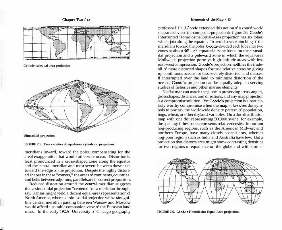
Chapter Two / 12 Elements of the Map / 13
Cylindrical equal-area projection
Sinusoidal projection
FIGURE 2.5. Two varieties of equal-area cylindrical projection.
meridians inward, toward the poles, compensating for the areal exaggeration that would otherwise occur. Distortion is least pronounced in a cross-shaped zone along the equator and the central meridian and most severe between these axes toward the edge of the projection. Despite the highly distort- ed shapes in these "corners," the areas of continents, countries, and belts between adjoining parallels are in correct proportion.
Reduced distortion around the .central meridian suggests that a sinusoidal projection "centered" on a meridian through, say, Kansas might yield a decent equal-area representation of North America, whereas a sinusoidal projection with a straight- line central meridian passing between Warsaw and Moscow would afford a suitable companion view of the Eurasian land mass. In the early 1920% University of Chicago geography
professor J. Paul Goode extended this notion of a zoned world map and devised the composite projection in figure 2.6. Goode's Interrupted Homolosine Equal-Area projection has six lobes, which join along the equator. To avoid severe pinching of the meridians toward the poles, Goode divided each lobe into two zones at about 40"-an equatorial zone based on the sinusoi- dal projection and a poleward zone in which the equal-area Mollweide projection portrays high-latitude areas with less east-west compression. Goode's projection molIifies the trade- off of more distorted shapes for true relative areas by giving up continuous oceans for less severely distorted land masses. If interrupted over the land to minimize distortion of the oceans, Goode's projection can be equally adept in serving studies of fisheries and other marine elements.
No flat map can match the globe in preserving areas, angles, gross shapes, distances, and directions, and any map projection is a compromise solution. Yet Goode's projection is a particu- larly worthy compromise when the mapmaker urses dot sym- bols to portray the worldwide density pattern of population, hogs, wheat, or other dryland variables. On a dot-distribution map with one dot representing 500,000 swine, for example, the spacing of these dots represents relative density. Important hog-producing regions, such as the American Midwest and
\ northern Europe, have many closely spaced dots, whereas hog-poor regions such as India and Australia have few. But a projection that distorts area might show contrasting densities for two regions of equal size on the globe and with similar
FIGURE 2.6. Goode's Homolosine Equal-Area projection.
Chapter Two / 14 Elements of the Map / 15
levels of hog production; if both regions had 40 dots representing 20 million swine, the region occupying 2 cm20f the map would have a greater spacing between dots and appear less intensively involved in raising pigs than the region occupying only 1 cm2. Projections that are not equal-area encourage such spurious inferences. Equivalence is also important when the map user might compare the sizes of countries or the areas covered by various map categories.
As equal-area projections preserve areas, conformal projections preserve local angles. That is, on a conformal projection the angle between any two intersecting lines will be the same on both globe and flat map. By compressing three-dimensional physical features onto a two-dimensional surface, a conformal projection can noticeably distort the shapes of long features, but within a small neighborhood of the point of intersection, scale will be the same in all directions and shape will be correct. Thus tiny circles on the globe remain tiny circles on a conformal map. As with all projections, though, scale still varies from place to place, and tiny circles identical in size on the globe can vary markedly in size on a conformal projection covering a large region. Although all projections distort the shapes of continents and other large territories, in general a conformal projection offers a less distorted picture of gross shape than a projection that is not conformal.
Perhaps the most striking trade-off in map projection is between conformality and equivalence. Although some pro- jections distort both angles and areas, no projection can be both conformal and equivalent. Not only are these properties mutually exclusive, but in parts of the map well removed from the standard line(s) conformal maps severely exaggerate area and equal-area maps severely distort shape.
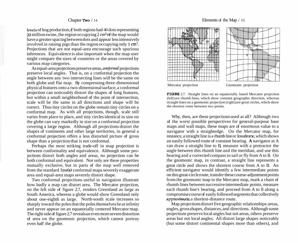
Two conformal projections useful in navigation illustrate how badly a map can distort area. The Mercator projection, on the left side of figure 2.7, renders Greenland as large as South America, whereas a globe would show Greenland only about one-eighth as large. North-south scale increases so sharply toward the poles that the poles themselves lie at infinity and never appear on an equatorially centered Mercator map. The right side of figure 2.7 reveals an even more severe distortion of area on the gnomonic projection, which cannot portray even half the globe.
Mercator projection Gnomonic projection
FIGURE 2.7. Straight lines on an equatorially based Mercator projection (left) are rhumb lines, which show constant geographic direction, whereas straight lines on a gnomonic projection (right) are great circles, which show the shortest route between two points.
Why, then, are these projections used at all? Although two of the worst possible perspectives for general-purpose base maps and wall maps, these maps are of enormous value to a navigator with a straightedge. On the Mercator map, for instance, a straight line is a rhumb line or loxodrome, which shows an easily followed route of constant bearing. A navigator at A can draw a straight line to B, measure with a protractor the angle between this rhumb line and the meridian, and use this bearing and a corrected compass to sail or fly from A to B. On the gnomonic map, in contrast, a straight line represents a great circle and shows the shortest course from A to B. An efficient navigator would identify a few intermediate points on this great-circle route, transfer these course-adjustment points from the gnomonic map to the Mercator map, mark a chain of rhumb lines between successive intermediate points, measure each rhumb line's bearing, and proceed from A to B along a compromise course of easily followed segments that collectively approximate a shortest-distance route.
Map projections distort five geographic relationships: areas, angles, gross shapes, distances, and directions. Although some projections preserve local angles but not areas, others preserve areas but not local angles. All distort large shapes noticeably (but some distort continental shapes more than others), and
Chapter Two / 16 Elements of the ,Map / 17
TWO-Pound Parcel from Syracuse Ten-Pound Parcel from Syracuse
FIGURE 2.8. Oblique azimi~thal equidistant projection centered on Chicago, Illinois, just east of the meridian at 90' W.
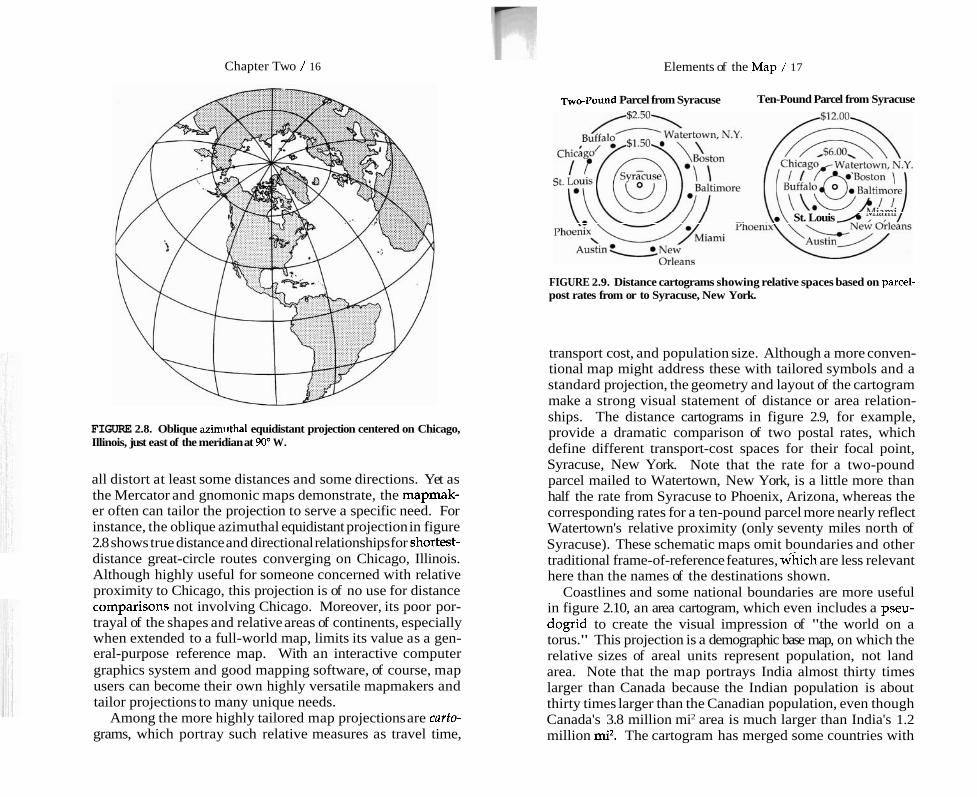
all distort at least some distances and some directions. Yet as the Mercator and gnomonic maps demonstrate, the mapmak- er often can tailor the projection to serve a specific need. For instance, the oblique azimuthal equidistant projection in figure 2.8 shows true distance and directional relationships for shortest- distance great-circle routes converging on Chicago, Illinois. Although highly useful for someone concerned with relative proximity to Chicago, this projection is of no use for distance comparisol~s not involving Chicago. Moreover, its poor por- trayal of the shapes and relative areas of continents, especially when extended to a full-world map, limits its value as a gen- eral-purpose reference map. With an interactive computer graphics system and good mapping software, of course, map users can become their own highly versatile mapmakers and tailor projections to many unique needs.
Among the more highly tailored map projections are carto- grams, which portray such relative measures as travel time,
St. Louis
FIGURE 2.9. Distance cartograms showing relative spaces based on parcel- post rates from or to Syracuse, New York.
transport cost, and population size. Although a more conven- tional map might address these with tailored symbols and a standard projection, the geometry and layout of the cartogram make a strong visual statement of distance or area relation- ships. The distance cartograms in figure 2.9, for example, provide a dramatic comparison of two postal rates, which define different transport-cost spaces for their focal point, Syracuse, New York. Note that the rate for a two-pound parcel mailed to Watertown, New York, is a little more than half the rate from Syracuse to Phoenix, Arizona, whereas the corresponding rates for a ten-pound parcel more nearly reflect Watertown's relative proximity (only seventy miles north of Syracuse). These schematic maps omit boundaries and other traditional frame-of-reference features, w%ich are less relevant here than the names of the destinations shown.
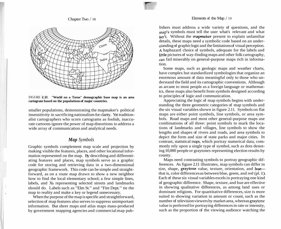
Coastlines and some national boundaries are more useful in figure 2.10, an area cartogram, which even includes a pseu- dogrid to create the visual impression of "the world on a torus." This projection is a demographic base map, on which the relative sizes of areal units represent population, not land area. Note that the map portrays India almost thirty times larger than Canada because the Indian population is about thirty times larger than the Canadian population, even though Canada's 3.8 million mi2 area is much larger than India's 1.2 million mi2. The cartogram has merged some countries with
Chapter Two / 18 Elements of the Map / 19
FIGURE 2.10. "World on a Torus" demographic base map is an area cartogram based on the populations of major countries.
smaller populations, demonstrating the mapmaker's political insensitivity in sacrificing nationalism for clarity. Yet tradition- alist cartographers who scorn cartograms as foolish, inaccu- rate cartoons ignore the power of map distortions to address a wide array of communication and analytical needs.
Map Symbols Graphic symbols complement map scale and projection by making visible the features, places, and other locational infor- mation represented on the map. By describing and differenti- ating features and places, map symbols serve as a graphic code for storing and retrieving data in a two-dimensional geographic framework. This code can be simple and straight- forward, as on a route map drawn to show a new neighbor how to find the local elementary school; a few simple lines, labels, and Xs representing selected streets and landmarks
1 should do. Labels such as "Elm St." and "Fire Dept." tie the I map to reality and make a key or legend unnecessary.
When the purpose of the map is specific and straightforward, selection of map features also serves to suppress unimportant information. But sheet maps and atlas maps mass-produced by government mapping agencies and commercial map pub-
lishers must address a wide variety of questions, and the symbols must tell the user what's relevant and what
isn't. Without the mapmaker present to explain unfamiliar details, these maps need a symbolic code based on an under- standing of graphic logic and the limitations of visual perception. A haphazard choice of symbols, adequate for the labels and little pictures of way-finding maps and other folk cartography, can fail miserably on general-purpose maps rich in informa- tion.
Some maps, such as geologic maps and weather charts, have complex but standardized symbologies that organize an enormous amount of data meaningful only to those who un- derstand the field and its cartographic conventions. Although as arcane to most people as a foreign language or mathemat- ics, these maps also benefit from symbols designed according to principles of logic and communication.
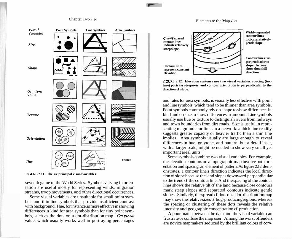
Appreciating the logic of map symbols begins with under- standing the three geometric categories of map symbols and the six visual variables shown in figure 2.11. Symbols on flat maps are either point symbols, line symbols, or area sym- bols. Road maps and most other general-purpose maps use combinations of all three: point symbols to mark the loca- tions of landmarks and villages, line symbols to show the lengths and shapes of rivers and roads, and area symbols to depict the form and size of state parks and major cities. In contrast, statistical maps, which portray numerical data, com- monly rely upon a single type of symbol, such as dots denot- ing 10,000 people or graytones representing election results by county.
Maps need contrasting symbols to portray geographic dif- ferences. As figure 2.11 illustrates, map symbols can differ in size, shape, graytone value, texture, orientation, and hue- that is, color differences as between blue, green, and red (pl. 1). Each of these six visual variables excels in portraying one kind of geographic difference. Shape, texture, and hue are effective in showing qualitative differences, as among land uses or dominant religions. For quantitative differences, size is more suited to showing variation in amount or count, such as the number of television viewers by market area, whereas graytone value is preferred for portraying differences in rate or intensity, such as the proportion of the viewing audience watching the
Chapter Two / 20 Elements of the Map / 21
Visual Point Symbols Line Symbols Area Symbols Variable:
Size
Shape Kl Graytone Value
Texture
Orientation
Hue
FIGURE 2.11. The six principal visual variables.
orange
seventh game of the World Series. Symbols varying in orien- tation are useful mostly for representing winds, migration streams, troop movements, and other directional occurrences.
Some visual variables are unsuitable for small point sym- bols and thin line symbols that provide insufficient contrast with background. Hue, for instance, is more effective in showing differences in kind for area symbols than for tiny point sym- bols, such as the dots on a dot-distribution map. Graytone value, which usually works well in portraying percentages
Closely spaced contour lines indicate relatively steep slope.
Contour lines represent constant elevation.
Widely separated contour lines indicate relatively gentle slope.
Contour lines run perpendicular to slope. Arrows show downhill direction.
FIGURE 2.12. Elevation contours use two visual variables: spacing (tex- ture) portrays steepness, and contour orientation is perpendicular to the direction of slope.
and rates for area symbols, is visually less effective with point and line symbols, which tend to be thinner than area symbols. Point symbols commonly rely on shape to show differences in kind and on size to show differences in amount. Line symbols usually use hue or texture to distinguish rivers from railways and town boundaries from dirt roads. Size is useful in repre- senting magnitude for links in a network: a thick line readily suggests greater capacity or heavier traffic than a thin line implies. Area symbols usually are large enough to reveal differences in hue, graytone, and pattern, but a detail inset, with a larger scale, might be needed to show very small yet important areal units.
Some symbols combine two visual variables. For example, the elevation contours on a topographic map involve both ori- entation and spacing, an element of pattern. As figure 2.12 dem- onstrates, a contour line's direction indicates the local direc- tion of slope because the land slopes downward perpendicular to the trend of the contour line. And the spacing of the contour lines shows the relative tilt of the land because close contours mark steep slopes and separated contours indicate gentle slopes. Similarly, the spread of dots on a dot-distribution map may show the relative sizes of hog-producing regions, whereas the spacing or clustering of these dots reveals the relative intensity and geographic concentration of production.
A poor match between the data and the visual variable can frustrate or confuse the map user. Among the worst offenders are novice mapmakers seduced by the brilliant colors of com-

Chapter Two / 22
Thousands of Inhabitants Persons per Square Kilometer - & ::Ir 51 or more
FIGURE 2.13. Graduated point symbols (left) and graytone area symbols (right) offer straightforward portrayals of population size and population density.
puter graphics systems into using reds, blues, greens, yellows, and oranges to portray quantitative differences. Contrasting hues, however visually dramatic, are not an appropriate sub- stitute for a logical series of easily ordered graytones. Except among physicists and professional "colorists," who understand the relation between hue and wavelength of light, map users cannot easily and consistently organize colors into an ordered sequence. And those with imperfect color vision might not even distinguish reds from greens. Yet most map users can readily sort five or six graytones evenly spaced between light gray and black; decoding is simple when darker means more and lighter means less. A legend might make a bad map useful, but it can't make it efficient.
Area symbols are not the only ones useful for portraying numerical data for states, counties, and other areal units. If the map must emphasize magnitudes such as the number of inhabitants rather than intensities such as the number of per- sons per square mile, point symbols varying in size are more appropriate than area symbols varying in graytone. The two areal-unit maps in figure 2.13 illustrate the different graphic strategies required for portraying population size and popu- lation density. The map on the left uses graduated point symbols positioned near the center of each area; the size of the point symbol represents population size. At its right a choropleth map uses graytone symbols that fill the areal units; the relative
Elements of the Map / 23
Thousands of Inhabitants Thousands of Inhabitants .
FIGURE 2.14. Map with graduated point symbols (left) using symbol size to portray magnitude demonstrates an appropriate choice of visual variable. Map with graytone area symbols (right) is ill suited to portray magnitude.
darkness of the symbol shows the concentration of population on the land.
Because the visual variables match the measures portrayed, these maps are straightforward and revealing. At the left, big point symbols represent large populations, which occur in both large and small areas, and small point symbols represent small populations. On the choropleth map to the right, a dark symbol indicates many people occupying a relatively small area, whereas a light symbol represents either relatively few people in a small area or many people spread rather thinly across a large area.
Figure 2.14 illustrates the danger of an inappropriate match between measurement and symbol. Both maps portray popu- lation size, but the choropleth map at the right is misleading because its area symbols suggest intensity, not magnitude. Note, for instance, that the dark graytone representing a large county with a large but relatively sparsely distributed popula- tion also represents a small county with an equally large but much more densely concentrated population. In contrast, the map at the left provides not only a more direct symbolic representation of population size but a clearer picture of area boundaries and area size. The map user should beware of spurious choropleth maps based on magnitude yet suggesting density or concentration.
Chapter Two / 24
Form and color make some map symbols easy to decode. pictorial point symbols effectively exploit familiar forms, as when little tents represent campgrounds and tiny buildings with crosses on top indicate churches. Alphabetic symbols also use form to promote decoding, as with common abbrevi- ations ("PO for post office), place-names ("Baltimore"), and labels describing the type of feature ("Southern Pacific Rail- way"). Color conventions allow map symbols to exploit ide- alized associations of lakes and streams with a bright, non- murky blue and wooded areas with a wholesome, springlike green. Weather maps take advantage of perceptions of red as warm and blue as cold.
Color codes often rely more on convention than on percep- tion, as with land-use maps, where red commonly represents retail sales and blue stands for manufacturing. Physical-political reference maps found in atlases and on schoolroom walls reinforce the convention of hypsometric tints, a series of color- coded elevation symbols ranging from greens to yellows to browns. Although highly useful for those who know the code, elevation tints invite misinterpretation among the unwary. The greens used to represent lowlands, for instance, might suggest lush vegetation, whereas the browns representing highlands can connote barren land-despite the many lowland deserts and highland forests throughout the world. Like map projections, map symbols can lead naive users to wrong con- clusions.
Chapter 3
A good map tells a multitude of little white lies; it suppresses truth to help the user see what needs to be seen. Reality is three-dimensional, rich in detail, and far too factual to allow a complete yet uncluttered two-dimensional graphic scale model. Indeed, a map that did not generalize would be useless. But the value of a map depends on how well its generalized geometry and generalized content reflect a chosen aspect of reality.
Geometry
Clarity demands geometric generalization because map sym- bols usually occupy proportionately more space on the map than the features they represent occupy on the ground. For instance, a line 1/50 inch wide representing a road on a 1:100,000-scale map is the graphic equivalent of a corridor 167 feet wide. If a road's actual right-of-way was only 40 feet wide, say, a 1/50-inch-wide line symbol would claim excess territory at scales smaller than 1:24,000. At 1:100,000, this road symbol would crowd out sidewalks, houses, lesser roads, and other features. And at still smaller scales more important features might eliminate the road itself. These more impor- tant features could include national, state, or county bound- aries, which have no width whatever on the ground.
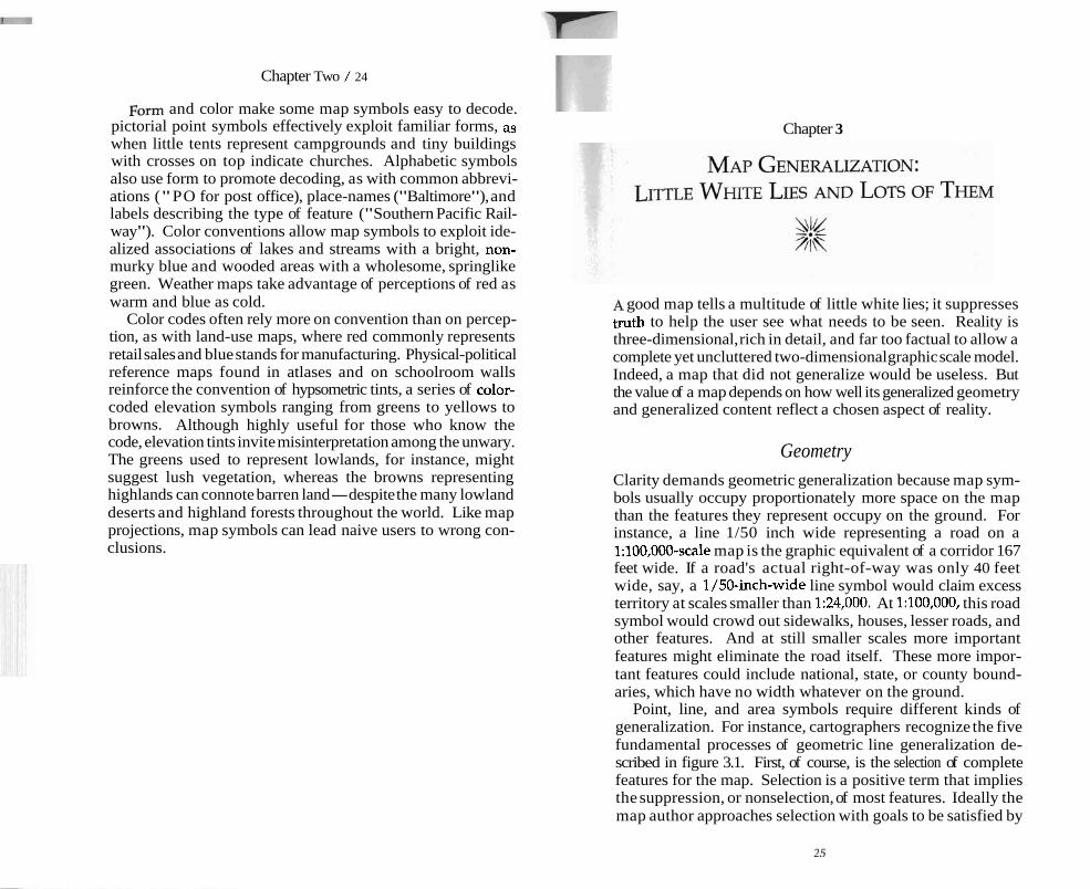
Point, line, and area symbols require different kinds of generalization. For instance, cartographers recognize the five fundamental processes of geometric line generalization de- scribed in figure 3.1. First, of course, is the selection of complete features for the map. Selection is a positive term that implies the suppression, or nonselection, of most features. Ideally the map author approaches selection with goals to be satisfied by
Chapter Three / 26
Simplification SI Smoothing
Enhancement 11 FIGURE 3.1. Elementary geometric operations in the generalization of line features.
a well-chosen subset of all possible features that might be mapped and by map symbols chosen to distinguish unlike features and provide a sense of graphic hierarchy. Features selected to support the specific theme for the map usually require more prominent symbols than background features, chosen to give a geographic frame of reference. Selecting background details that are effective in relating new informa-
Map Generalization / 27
tion on the map to the viewer's geographic savvy and existing map" often requires more insight and attention than
selecting the map's main features. In the holistic process of planning a map, feature selection is the prime link between generalization and overall design.
The four remaining generalization processes in figure 3.1 alter the appearance and spatial position of linear map features represented by a series of points stored in the computer as a list of two-dimensional (X, Y ) coordinates. Although the growing use of computers to generalize maps led to the isolation of these four generalization operations, traditional cartographers perform essentially the same operations by hand but with less structure, less formal awareness, and less consistency. Simpli- fication, which reduces detail and angularity by eliminating points from the list, is particularly useful if excessive detail was "captured" in developing a cartographic data file, or if data developed for display at one scale are to be displayed at a smaller scale. Displacement avoids graphic interference by shifting apart features that otherwise would overlap or coalesce. A substantial reduction in scale, say, from 1:25,000 to 1:1,000,000, usually results in an incomprehensibly congested collection of map symbols that calls for eliminating some features and displacing others. Smoothing, which also diminishes detail and angularity, might displace some points and add others to the list. A prime objective of smoothing is to avoid a series of abruptly joined straight line segments. Enhancement adds de- tail to give map symbols a more realistic appearance. Lines representing streams, for instance, might be given typical meander loops, whereas shorelines might be made to look more coastlike. Enhanced map symbols are more readily in- terpreted as well as more aesthetic.
Point features and map labels require a somewhat different set of generalization operators. Figure 3.2 illustrates that, as with linear features, selection and displacement avoid graphic interference when too many close symbols might overlap or coalesce. When displacement moves a label ambiguously far from the feature it names, graphic association with a tie line or a numeric code might be needed to link the label with its symbol. Abbreviation is another strategy for generalizing la- bels on congested small-scale maps. Aggregation is useful where many equivalent features might overwhelm the map if ac-

Chapter Three / 28 Map Generalization / 29
Displacement
0 Baltimore 0 Baltimore
Area Conversion
.::.\-.- .::.a. -'
FIGURE 3.2. Elementary geometric operations in the generalization of point features and map labels.
corded separate symbols. In assigning a single symbol to several point features, as when one dot represents twenty reported tornadoes, aggregation usually requires the symbol either to portray the "center of mass" of the individual sym- bols it replaces or to reflect the largest of several discrete clusters.
Where scale reduction is severe, as from 1:100,000 to 1:20,000,000, area conversion is useful for shifting the map viewer's attention from individual occurrences of equivalent features to zones of relative concentration. For example, in- stead of showing individual tornadoes, the map might define a belt in which tornadoes are comparatively common. In highlighting zones of concentration or higher density, area conversion replaces all point symbols with one or more area symbols. Several density levels, perhaps labeled "severe," "moderate," and "rare," might provide a richer, less general- ized geographic pattern.
Area features, as figure 3.3 demonstrates, require the larg- est set of generalization operators because area boundaries are
Enhancement -1 Point Conversion
Simplification m
Line Conversion l!!iiiq FIGURE 3.3. Elementary geometric operations in the generalization of area features.
subject to aggregation and point conversion and all five ele- ments of line generalization as well as to several operators unique to areas. Selection is particularly important when area features must share the map with numerous linear and point features. A standardized minimum mapping size can direct the selection of area features and promote consistency among
Chapter Three / 30 Map Generalization / 31
the numerous sheets of a map series. For example, 1:24,000- scale topographic maps exclude woodlands smaller than one acre unless important as landmarks or shelterbelts. Soil scien- tists use a less precise but equally pragmatic size threshold- the head of a pencil-to eliminate tiny, insignificant areas on soils maps.
Aggregation might override selection when a patch other- wise too small to include is either combined with one or more small, similar areas nearby or merged into a larger neighbor. On soils maps and land-use maps, which assign all land to some category, aggregation of two close but separated area features might require the dissolution or segmentation of the in- tervening area. A land-use map might, for example, show transportation land only for railroad yards, highway inter- changes, and service areas where the right-of-way satisfies a minimum-width threshold. Simplification, displacement, smoothing, and enhancement are needed not only to refine the level of detail and to avoid graphic interference between area boundaries and other line symbols, but also to reconstruct boundaries disrupted by aggregation and segmentation.
Generalization often accommodates a substantial reduction in scale by converting area features to linear or point features. Line conversion is common on small-scale reference maps that represent all but the widest rivers with a single readily recognized line symbol of uniform width. Highway maps also help the map user by focusing not on width of right-of- way but on connectivity and orientation. In treating more compact area features as point locations, point conversion highlights large, sprawling cities such as London and Los Angeles on small-scale atlas maps and focuses the traveler's attention on highway interchanges on intermediate-scale road maps. Linear and point conversion are often necessary because an area symbol at scale would be too tiny or too thin for reliable and efficient visual identification.
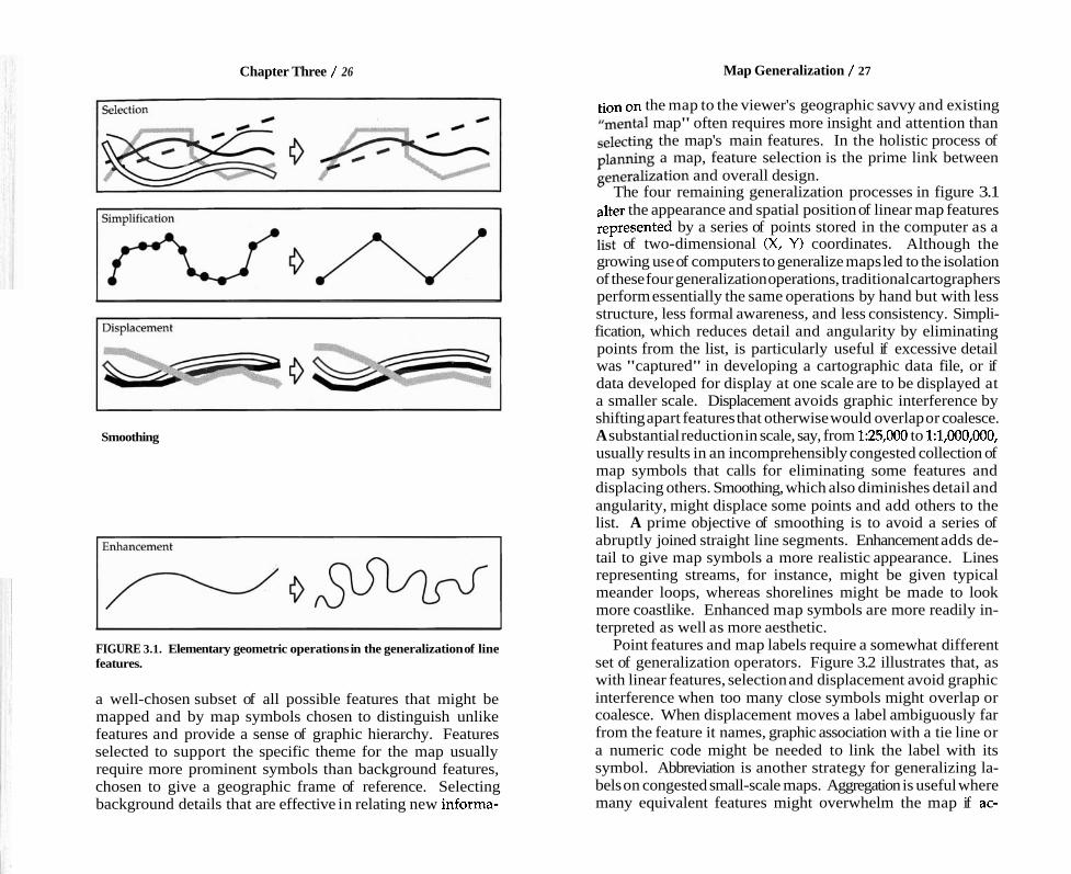
Comparing two or more maps showing the same area at substantially different scales is a good way to appreciate the need for geometric generalization. Consider, for instance, the two maps in figure 3.4. The rectangles represent the same area extracted from maps published at scales of 1:24,000 and 1:250,000; enlargement of the small-scale excerpt to roughly the same size as its more detailed counterpart reveals the need for
FIGURE 3.4. Area near Northumberland, Pennsylvania, as portrayed on topographic maps at 1:24,000 (left) anbl:250,000, enlarged to roughly 1:24,000 for comparison (right).
considerable generalization at 1:250,000. The substantially fewer features shown at 1:250,000 demonstrate how feature selection helps the mapmaker avoid clutter. Note that the smaller-scale map omits most of the streets, all labels in this area, all individual buildings, and the island in the middle of the river. The railroad and highway that cross the river are smoother and farther apart, allowing space for the bridge symbols added at 1:250,000. Because the 1:24,000-scale map in a sense portrays the same area in a space over a hundred times larger, it can show many more features in much greater detail.
How precisely are symbols positioned on maps? The U.S. Office of Management and Budget addresses this concern with the National Map Accuracy Standards, honored by the U.S. Geological Survey and other federal mapping agencies. To receive the endorsement "This map complies with the Nation-
Chapter Three / 32
a1 Map Accuracy Standards," a map at a scale of 1:20,000 or smaller must be checked for symbols that deviate from their correct positions by more than 1/50 inch. This tolerance re- flects the limitations of surveying and mapping equipment and human hand-eye coordination. Yet only 90 percent of the points tested must meet the tolerance, and the 10 percent that don't can deviate substantially from their correct positions. Whether a failing point deviates from its true position by 2/50 inch or 20/50 inch doesn't matter-if 90 percent of the points checked meet the tolerance, the map sheet passes.
The National Map Accuracy Standards tolerate geometric generalization. Checkers test only "well-defined points" that are readily identified on the ground or on aerial photographs, easily plotted on a map, and conveniently checked for horizontal accuracy; these include survey markers, roads and railway intersections, corners of large buildings, and centers of small buildings. Guidelines encourage checkers to ignore features that might have been displaced to avoid overlap or to provide a minimum clearance between symbols exaggerated in size to ensure visibility. In areas where features are clustered, maps tend to be less accurate than in more open areas. Thus Penn- sylvania villages, with comparatively narrow streets and no front yards, would yield less accurate maps than, say, Colorado villages, with wide streets, spacious front yards, and big lots. But as long as 90 percent of a sample of well-defined points not needing displacement meet the tolerance, the map sheet passes.
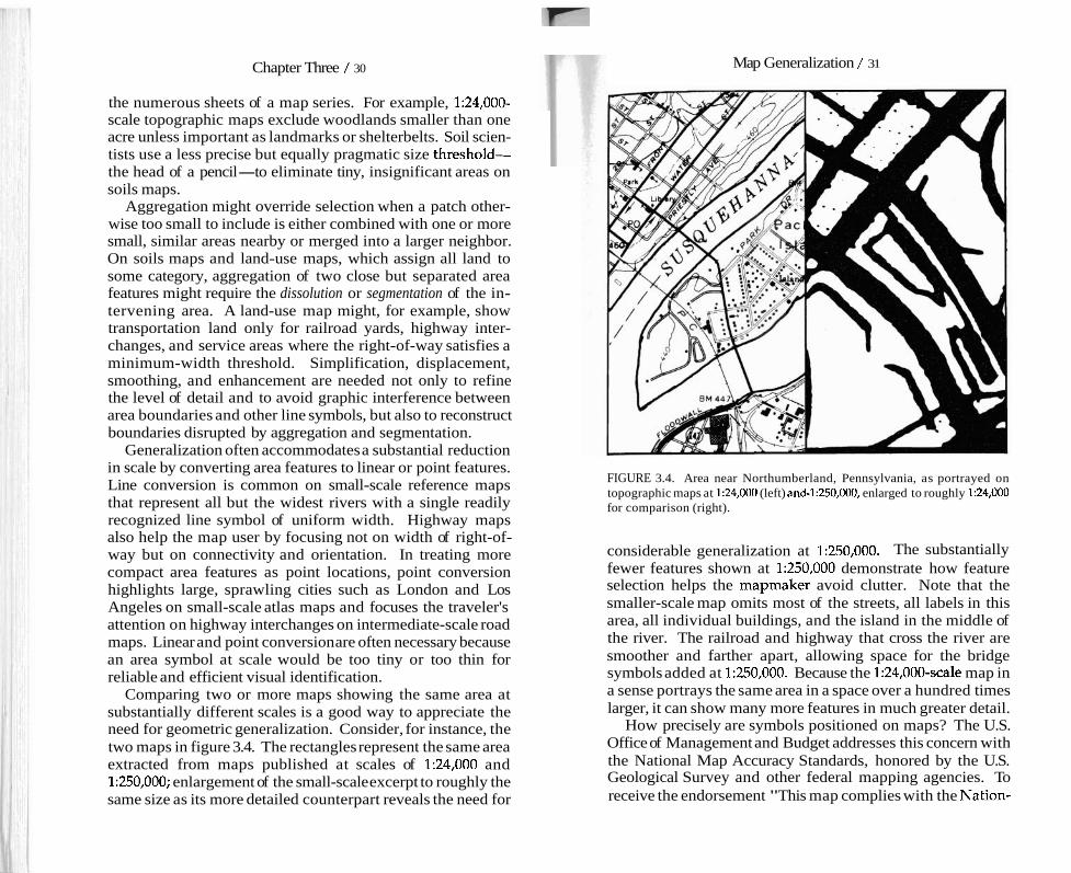
Maps that meet the standards show only planimetric distance, that is, distance measured in a plane. As figure 3.5 shows, a planimetric map compresses the three-dimensional land sur- face onto a two-dimensional sheet by projecting each point perpendicularly onto a horizontal plane. For two points at different elevations, the map distance between their "plani- metrically accurate" positions underestimates both overland distance across the land surface and straight-line distance in three dimensions. Yet this portrayal of planimetric distance is a geometric generalization essential for large-scale flat maps.
The user should be wary, though, of the caveat "approxi- mately positioned or the warning "This map may not meet the National Map Accuracy Standards." In most cases such maps have been compiled from unrectified aerial photographs,
Map Generalization / 33
Planimetric distance A' - B' underestimates terrain distance and straight-line distance from A to B. LP?f- A' B ' horizontal plane
FIGURE 3.5. Planimetric map generalizes distance by the perpendicular projection of all positions onto a horizontal plane.
air photo Air photo is a perspective view, with projection lines converging
lens through the camera's lens.
Features are displaced radially outward from their "accurate" planimetric positions.
horizontal plane
+ - Radial displacement due to relief
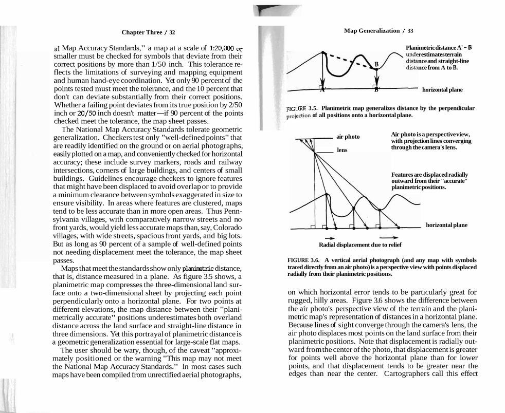
FIGURE 3.6. A vertical aerial photograph (and any map with symbols traced directly from an air photo) is a perspective view with points displaced radially from their planimetric positions.
on which horizontal error tends to be particularly great for rugged, hilly areas. Figure 3.6 shows the difference between the air photo's perspective view of the terrain and the plani- metric map's representation of distances in a horizontal plane. Because lines of sight converge through the camera's lens, the air photo displaces most points on the land surface from their planimetric positions. Note that displacement is radially out- ward from the center of the photo, that displacement is greater for points well above the horizontal plane than for lower points, and that displacement tends to be greater near the edges than near the center. Cartographers call this effect
Chapter Three / 34
etrorail System M
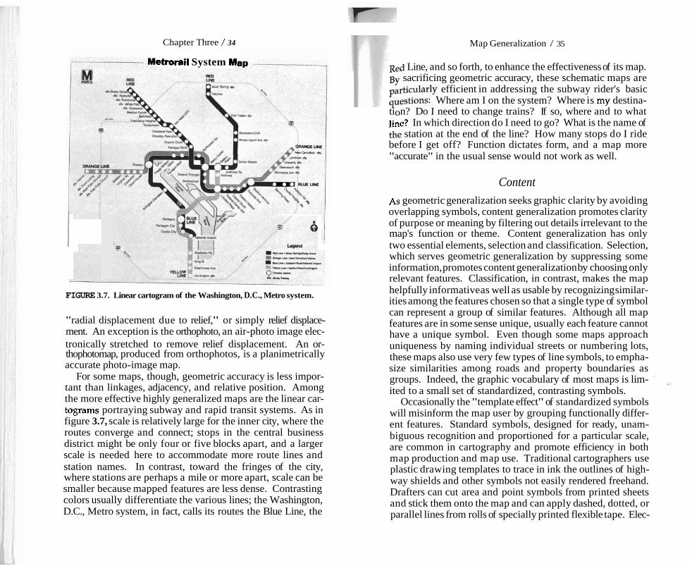
FIGURE 3.7. Linear cartogram of the Washington, D.C., Metro system.
"radial displacement due to relief," or simply relief displace- ment. An exception is the orthophoto, an air-photo image elec- tronically stretched to remove relief displacement. An or- thophotomap, produced from orthophotos, is a planimetrically accurate photo-image map.
For some maps, though, geometric accuracy is less impor- tant than linkages, adjacency, and relative position. Among the more effective highly generalized maps are the linear car- tograms portraying subway and rapid transit systems. As in figure 3.7, scale is relatively large for the inner city, where the routes converge and connect; stops in the central business district might be only four or five blocks apart, and a larger scale is needed here to accommodate more route lines and station names. In contrast, toward the fringes of the city, where stations are perhaps a mile or more apart, scale can be smaller because mapped features are less dense. Contrasting colors usually differentiate the various lines; the Washington, D.C., Metro system, in fact, calls its routes the Blue Line, the
Map Generalization / 35
Red Line, and so forth, to enhance the effectiveness of its map. BY sacrificing geometric accuracy, these schematic maps are particularly efficient in addressing the subway rider's basic questions: Where am I on the system? Where is my destina- tion? Do I need to change trains? If so, where and to what line? In which direction do I need to go? What is the name of the station at the end of the line? How many stops do I ride before I get off? Function dictates form, and a map more "accurate" in the usual sense would not work as well.
Content
As geometric generalization seeks graphic clarity by avoiding overlapping symbols, content generalization promotes clarity of purpose or meaning by filtering out details irrelevant to the map's function or theme. Content generalization has only two essential elements, selection and classification. Selection, which serves geometric generalization by suppressing some information, promotes content generalization by choosing only relevant features. Classification, in contrast, makes the map helpfully informative as well as usable by recognizing similar- ities among the features chosen so that a single type of symbol can represent a group of similar features. Although all map features are in some sense unique, usually each feature cannot have a unique symbol. Even though some maps approach uniqueness by naming individual streets or numbering lots, these maps also use very few types of line symbols, to empha- size similarities among roads and property boundaries as groups. Indeed, the graphic vocabulary of most maps is lim- '
ld+
ited to a small set of standardized, contrasting symbols. Occasionally the "template effect" of standardized symbols
will misinform the map user by grouping functionally differ- ent features. Standard symbols, designed for ready, unam- biguous recognition and proportioned for a particular scale, are common in cartography and promote efficiency in both map production and map use. Traditional cartographers use plastic drawing templates to trace in ink the outlines of high- way shields and other symbols not easily rendered freehand. Drafters can cut area and point symbols from printed sheets and stick them onto the map and can apply dashed, dotted, or parallel lines from rolls of specially printed flexible tape. Elec-
I
Chapter Three / 36 Map Generalization / 37
tronic publishing systems allow the mapmaker not only to choose from a menu of point, line, and area symbols provided with the software but also to design and store new forms, readily duplicated and added where needed. Consistent symbols also benefit users of the U.S. Geological Survey's series of thousands of large-scale topographic map sheets, all sharing a single graphic vocabulary. On highway maps, the key (or "legend) usually presents the complete set of sym- bols so that while examining the map, at least, the reader encounters no surprises. Difficulties arise, though, when a standard symbol must represent functionally dissimilar ele- ments. Although a small typeset annotation next to the fea- ture sometimes flags an important exception, for instance, a section of highway "under construction," mapmakers frequently omit useful warnings.
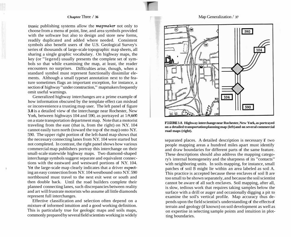
Generalized highway interchanges are a prime example of how information obscured by the template effect can mislead or inconvenience a trusting map user. The left panel of figure 3.8 is a detailed view of the interchange near Rochester, New York, between highways 104 and 590, as portrayed at 1:9,600 on a state transportation department map. Note that a motorist traveling from the east (that is, from the right) on N.Y. 104 cannot easily turn north (toward the top of the map) onto N.Y. 590. The upper right portion of the left-hand map shows that the necessary connecting lanes from N.Y. 104 were started but not completed. In contrast, the right panel shows how various commercial map publishers portray this interchange on their small-scale statewide highway maps. Two diamond-shaped interchange symbols suggest separate and equivalent connec- tions with the eastward and westward portions of N.Y. 104.
I Yet the large-scale map clearly indicates that a driver expect- ing an easy connection from N.Y. 104 westbound onto N.Y. 590 northbound must travel to the next exit west or south and then double back. Until the road builders complete their planned connecting lanes, such discrepancies between reality and art will frustrate motorists who assume all little diamonds represent full interchanges.
Effective classification and selection often depend on a mixture of informed intuition and a good working definition. This is particularly true for geologic maps and soils maps, commonly prepared by several field scientists working in widely
FIGURE 3.8. Highway interchange near Rochester, New York, as portrayed on a detailed transportation planning map (left) and on several commercial road maps (right).
separated places. A detailed description is necessary if two people mapping areas a hundred miles apart must identify and draw boundaries for different parts of the same feature. These descriptions should also address the mapping catego- ry's internal homogeneity and the sharpness of its "contacts" with neighboring units. In soils mapping, for instance, small patches of soil B might lie within an area labeled as soil A. This practice is accepted because these enclaves of soil B are too small to be shown separately, and because the soil scientist cannot be aware of all such enclaves. Soil mapping, after all, is slow, tedious work that requires taking samples below the surface with a drill or auger and occasionally digging a pit to examine the soil's vertical profile. Map accuracy thus de- pends upon the field scientist's understanding of the effects of terrain and geology (if known) on soil development as well as on expertise in selecting sample points and intuition in plot- ting boundaries.

Chapter Three / 38 Map Generalization / 39
That crisp, definitive lines on soils maps mark inherently fuzzy boundaries is unfortunate. More appalling, though, is the uncritical use in computerized geographic information systems of soil boundaries plotted on "unrectified aerial photos subject to the relief-displacement error described in figure 3.6. Like quoting a public figure out of context, extracting soils data from a photomap invites misinterpretation. When placed in a database with more precise information, these data readi- ly acquire a false aura of accuracy.
Computers generally play a positive role in map analysis and map display, the GIGO effect (garbage in, garbage out) notwithstanding. Particularly promising is the ability of computers to generalize the geometry and content of maps so that one or two geographic databases might support a broad range of display scales. Large-scale maps presenting a detailed portrayal of a small area could exploit the richness of the data, whereas computer-generalized smaller-scale displays could present a smaller selection of available features, suitably dis- placed to avoid graphic interference. Both the content and scale of the map can be tailored to the particular needs of individual users.
Computer-generalized maps of land use and land cover illustrate how a single database can yield radically different cartographic pictures of a landscape. The three maps in figure 3.9 show a rectangular region of approximately 700 mi2 (1,800 km2) that includes the city of Harrisburg, Pennsylvania, above and slightly to the right of center. A computer program gener- alized these maps from a large, more detailed database that represents much smaller patches of land and describes land cover with a more refined set of categories. The generaliza- tion program used different sets of weights or priorities to produce the three patterns in figure 3.9. The map at the upper left differs from the other two maps because the computer was told to emphasize urban and built-up land. This map makes some small built-up areas more visible by reducing the size of area symbols representing other land covers. In contrast, the map at the upper right reflects a high visual preference for agricultural land. A more complex set of criteria guided gen- eralization for the display at the lower left: forest land is dominant overall, but urban land dominates agricultural land. In addition, for this lower map the computer dissolved water
Urban Land Dominant Agricultural Land Dominant
0 Agricultural Land
Forest Land
Urban and Built-up Land
water
20 miles Forest > Urban > Agriculture
FIGURE 3.9. Land-use and land-cover maps generalized by computer from more detailed data according to three different sets of display priorities.
areas, which were discontinuous because of variations in the width of the river. These differences in emphasis might meet the respective needs and biases of demographers, agrono- mists, and foresters.
Generalized maps almost always reflect judgments about the relative importance of mappable features and details. The systematic bias demonstrated by these generalized land-cover maps is not exclusive to computer-generated maps; manual cartographers have similar goals and biases, however vaguely defined and unevenly applied. Through the consistent appli- cation of explicit specifications, the computer offers the possi- bility of a better map. Yet whether the map's title or descrip- tion reveals these biases is an important clue to the integrity of the mapmaker or publisher. Automated mapping allows ex-
Chapter Three / 40 Map Generalization / 41
perimentation with different sets of priorities. Hence comput- er generalization should make the cartographer more aware of choices, values, and biases. But just because a useful and appropriate tool is available does not mean the mapmaker will use it. Indeed, laziness and lack of curiosity all too often are the most important source of bias.
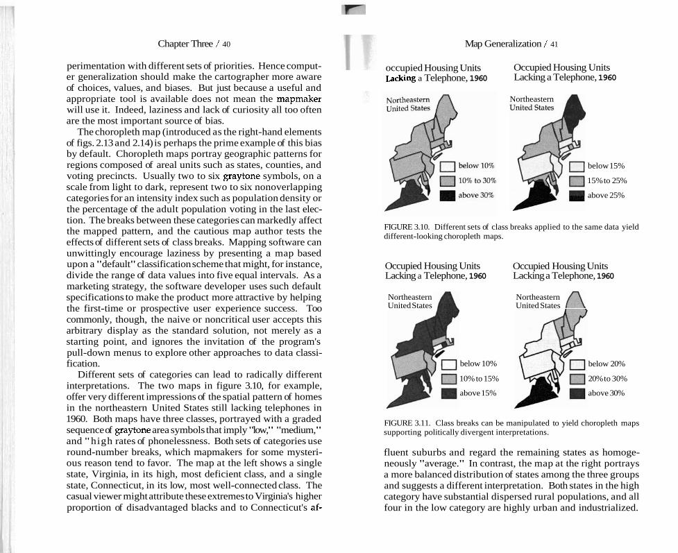
The choropleth map (introduced as the right-hand elements of figs. 2.13 and 2.14) is perhaps the prime example of this bias by default. Choropleth maps portray geographic patterns for regions composed of areal units such as states, counties, and voting precincts. Usually two to six graytone symbols, on a scale from light to dark, represent two to six nonoverlapping categories for an intensity index such as population density or the percentage of the adult population voting in the last elec- tion. The breaks between these categories can markedly affect the mapped pattern, and the cautious map author tests the effects of different sets of class breaks. Mapping software can unwittingly encourage laziness by presenting a map based upon a "default" classification scheme that might, for instance, divide the range of data values into five equal intervals. As a marketing strategy, the software developer uses such default specifications to make the product more attractive by helping the first-time or prospective user experience success. Too commonly, though, the naive or noncritical user accepts this arbitrary display as the standard solution, not merely as a starting point, and ignores the invitation of the program's pull-down menus to explore other approaches to data classi- fication.
Different sets of categories can lead to radically different interpretations. The two maps in figure 3.10, for example, offer very different impressions of the spatial pattern of homes in the northeastern United States still lacking telephones in 1960. Both maps have three classes, portrayed with a graded sequence of graytone area symbols that imply "low," "medium," and "high rates of phonelessness. Both sets of categories use round-number breaks, which mapmakers for some mysteri- ous reason tend to favor. The map at the left shows a single state, Virginia, in its high, most deficient class, and a single state, Connecticut, in its low, most well-connected class. The casual viewer might attribute these extremes to Virginia's higher proportion of disadvantaged blacks and to Connecticut's af-
occupied Housing Units Occupied Housing Units ~acking a Telephone, 1960 Lacking a Telephone, 1960
Northeastern
below 15%
15% to 25%
above 25%
FIGURE 3.10. Different sets of class breaks applied to the same data yield different-looking choropleth maps.
Occupied Housing Units Occupied Housing Units Lacking a Telephone, 1960 Lacking a Telephone, 1960
Northeastern United States
below 10%
10% to 15%
above 15%
Northeastern United States A
below 20%
20% to 30%
above 30%
FIGURE 3.11. Class breaks can be manipulated to yield choropleth maps supporting politically divergent interpretations.
fluent suburbs and regard the remaining states as homoge- neously "average." In contrast, the map at the right portrays a more balanced distribution of states among the three groups and suggests a different interpretation. Both states in the high category have substantial dispersed rural populations, and all four in the low category are highly urban and industrialized.

Chapter Three / 42
Moreover, a smaller middle group suggests less overall homo- geneity.
Machiavellian bias can easily manipulate the message of a choropleth map. Figure 3.11, for example, presents two carto- graphic treatments with substantially different political inter- pretations. The map on the left uses rounded breaks at 10 percent and 15 percent, forcing most states into its high, poorly connected category and suggesting a Northeast with general- ly poor communications. Perhaps the government is ineffec- tive in regulating a gouging telecommunications industry or in eradicating poverty. Its counterpart on the right uses rounded breaks at 20 percent and 30 percent to paint a rosier picture, with only one state in the high group and eight in the low, well-served category. Perhaps government regulation is ef- fective, industry benign, and poverty rare.
The four maps in figures 3.10 and 3.11 hold two lessons for the skeptical map reader. First, a single choropleth map pre- sents only one of many possible views of a geographic variable. And second, the white lies of map generalization might also mask the real lies of the political propagandist.
Intuition and Ethics in Map Generalization Small-scale generalized maps often are authored views of a landscape or a set of spatial data. Like the author of any scholarly work or artistic creation based on reality, the consci- entious map author not only examines a variety of sources but relies on extensive experience with the information or region portrayed. Intuition and induction guide the choice of features, graphic hierarchy, and abstraction of detail. The map is as it is
I because the map author "knows" how it should look. This I , knowledge, of course, might be faulty, or the resulting graphic I t interpretation might differ significantly from that of another
competent observer. As is often the case, two views might both be valid.
Chapter 4
BLUNDERS THAT MISLEAD
Some maps fail because of the mapmaker's ignorance or oversight. The range of blunders affecting maps includes graphic scales that invite users to estimate distances from world maps, maps based on incompatible sources, misspelled place-names, and graytone symbols changed by poor printing or poor planning. By definition a blunder is not a lie, but the informed map user must be aware of cartographic fallibility, and even of a bit of mischief.
Carfographic Carelessness Mapmakers are human, and they make mistakes. Although poor training and sloppy design account for some errors, most cartographic blunders reflect a combination of inattention and inadequate editing. If the mapmaker is rushed, if the employ- er views willingness to work for minimal wages as more important than skill in doing the job, or if no one checks and rechecks the work, missing or misplaced features and misspelled labels are inevitable.
Large-scale base maps have surprisingly few errors. A costly but efficient bureaucratic structure at government mapping agencies usually guarantees a highly accurate product. Several layers of fact checking and editing support technicians or contractors selected for skill and concern with quality. Making topographic maps is a somewhat tedious, multistep manufac- turing process, and using outside contractors for compilation or drafting requires a strong commitment to quality control buttressed by the bureaucrat's inherent fear of embarrassment. Blunders occasionally slip through, but these are rare.
Errors are more common on derivative maps-that is, maps compiled from other maps-than on basic maps compiled