introduction - sasthe visual display of quantitative information(2001) by edward tufte, visualizing...
TRANSCRIPT

Chapter 1
Introduction
1.1 Principles of Effective Graphics 3
1.2 Automatic Graphs from SAS Procedures 10
1.3 Graph Template Language 11
1.4 Statistical Graphics Procedures 11
1.5 Organization of This Book 12
1.6 Data Sets and Custom Styles 14
1.7 Color and Gray-Scale Graphs 14
1.8 Effective Graphics and the Use of Decorative Skins 15
1.9 SAS 9.2 and SAS 9.3 Features 15
Mantange, Sanjay and Dan Heath. Statistical Graphics Procedures by Example: Effective Graphs Using SAS®. Copyright © 2011, SAS Institute Inc., Cary, North Carolina, USA. ALL RIGHTS RESERVED. For additional SAS resources, visit support.sas.com/publishing.

2 Statistical Graphics Procedures by Example: Effective Graphs Using SAS
“Then there is the man who drowned crossing a stream with an average depth of six inches.”
~W.I.E. Gates
Mantange, Sanjay and Dan Heath. Statistical Graphics Procedures by Example: Effective Graphs Using SAS®. Copyright © 2011, SAS Institute Inc., Cary, North Carolina, USA. ALL RIGHTS RESERVED. For additional SAS resources, visit support.sas.com/publishing.
Chapter 1 Introduction 3
Chapter 1: Introduction
Graphs are an essential part of modern data analysis. From clinical trials to quality control, effective graphs are integral to the analysis process. Large quantities of data are collected for clinical drug trials for safety, retail sales, warranty claims, medical lab results, and financial transactions. Analysis of this data often relies on review of the data in tabular form. Viewing the data in the form of a graph along with results of the statistical analysis of the data on the same graph can significantly enhance the understanding of the data and the results. A key aspect of this process is the ability to create an effective graph that can communicate the raw data along with the statistical analysis results in a clear and concise form. These graphs can help the analyst to visualize the trends and patterns in the data and the associations between variables that are not evident in tabular form. Such insights can guide the direction of further questions and formulation of additional testing methods and gathering of more focused data.
1.1 Principles of Effective Graphics
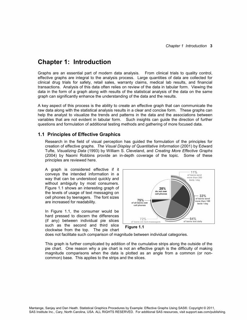
Research in the field of visual perception has guided the formulation of the principles for creation of effective graphs. The Visual Display of Quantitative Information (2001) by Edward Tufte, Visualizing Data (1993) by William S. Cleveland, and Creating More Effective Graphs (2004) by Naomi Robbins provide an in-depth coverage of the topic. Some of these principles are reviewed here. A graph is considered effective if it conveys the intended information in a way that can be understood quickly and without ambiguity by most consumers. Figure 1.1 shows an interesting graph of the levels of usage of text messaging on cell phones by teenagers. The font sizes are increased for readability. In Figure 1.1, the consumer would be hard pressed to discern the differences (if any) between individual pie slices such as the second and third slice clockwise from the top. The pie chart does not facilitate such comparison of magnitude between individual categories. This graph is further complicated by addition of the cumulative strips along the outside of the pie chart. One reason why a pie chart is not an effective graph is the difficulty of making magnitude comparisons when the data is plotted as an angle from a common (or non-common) base. This applies to the strips and the slices.
Figure 1.1
Mantange, Sanjay and Dan Heath. Statistical Graphics Procedures by Example: Effective Graphs Using SAS®. Copyright © 2011, SAS Institute Inc., Cary, North Carolina, USA. ALL RIGHTS RESERVED. For additional SAS resources, visit support.sas.com/publishing.

4 Statistical Graphics Procedures by Example: Effective Graphs Using SAS
Figure 1.2
Comparison of magnitude along a linear scale from a common base is very reliable. The same data rendered as a bar chart is much easier to decode as shown above in Figure 1.2. In this graph, the comparisons between the 2nd, 3rd and 4th bars for the % case are much easier and more reliable. The pie chart can be a useful visual for some use cases as shown in Figure 1.3. This graph shows the portion of sales for Auto as a fraction of the total sales. The pie chart can work well for visualizing such “part-to-whole” comparisons. 1.1.1 Visual Perception The concepts of attentive and pre-attentive vision are summarized by Daniel Carr in Information Visualization: Perception for Design (2004) by Colin Ware. Attentive vision requires scrutiny of the object and an active participation on the part of the observer. On the other hand, pre-attentive vision allows processing to be done prior to conscious attention. Usage of pre-attentive features helps in rapid discrimination between various artifacts of a graph. Differentiation between length of lines is pre-attentive regardless of a common baseline.
Figure 1.3
Mantange, Sanjay and Dan Heath. Statistical Graphics Procedures by Example: Effective Graphs Using SAS®. Copyright © 2011, SAS Institute Inc., Cary, North Carolina, USA. ALL RIGHTS RESERVED. For additional SAS resources, visit support.sas.com/publishing.
Chapter 1 Introduction 5
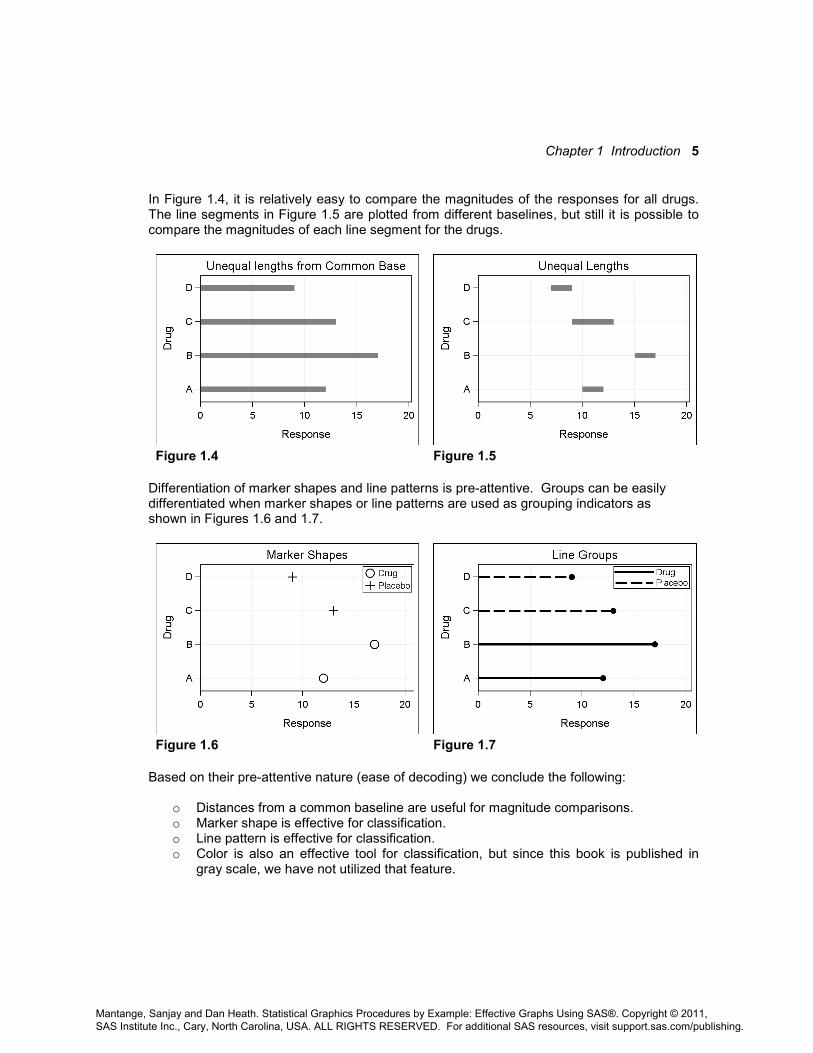
In Figure 1.4, it is relatively easy to compare the magnitudes of the responses for all drugs. The line segments in Figure 1.5 are plotted from different baselines, but still it is possible to compare the magnitudes of each line segment for the drugs.
Figure 1.4 Figure 1.5
Differentiation of marker shapes and line patterns is pre-attentive. Groups can be easily differentiated when marker shapes or line patterns are used as grouping indicators as shown in Figures 1.6 and 1.7.
Figure 1.6 Figure 1.7
Based on their pre-attentive nature (ease of decoding) we conclude the following:
o Distances from a common baseline are useful for magnitude comparisons. o Marker shape is effective for classification. o Line pattern is effective for classification. o Color is also an effective tool for classification, but since this book is published in
gray scale, we have not utilized that feature.
Mantange, Sanjay and Dan Heath. Statistical Graphics Procedures by Example: Effective Graphs Using SAS®. Copyright © 2011, SAS Institute Inc., Cary, North Carolina, USA. ALL RIGHTS RESERVED. For additional SAS resources, visit support.sas.com/publishing.

6 Statistical Graphics Procedures by Example: Effective Graphs Using SAS
1.1.2 Accuracy of Magnitude Perception Stevens' power law proposes a relationship between the magnitude of a physical stimulus and its perceived intensity or strength. The law proposes that the accuracy of magnitude perception for visual length is linear. Magnitude of a line twice as long is perceived almost as twice as long. However, the accuracy of perception of magnitude is reduced for other representations. For area, it is only about 1.6. That is, an area twice as large only seems like 1.6 times as large. So, we tend to underestimate areas.
For representation of magnitude, we can conclude the following:
o Linear distance on a common scale and base line is most effective. o Linear distance on a common but non-aligned scale is effective. o Areas are only about 70% as effective as linear distance. o Volumes are only about 60% as effective as linear distance. o Angular distance from a common base is not very effective. o Angular distance from non-common base is ineffective. o Color in general is not an effective representation of magnitude. o Color intensity can be used as a relative measure of magnitude. o Color hue is not a good representation of magnitude. o 3-D plots distort the perception of absolute magnitude.
Figure 1.8 Figure 1.9 Figure 1.8 and Figure 1.9 both display the mean MPG by type of car. Figure 1.8 uses the dot plot where the response values are plotted as a linear distance from a common baseline. It is very easy for the eye to decode the relative values of each car type. Grid lines help to line up the values. Figure 1.9 displays the same data using a pie chart. Clearly, it is much harder to decode the relative values since it is difficult to make good magnitude comparisons using angular distances, especially from different baselines.
Mantange, Sanjay and Dan Heath. Statistical Graphics Procedures by Example: Effective Graphs Using SAS®. Copyright © 2011, SAS Institute Inc., Cary, North Carolina, USA. ALL RIGHTS RESERVED. For additional SAS resources, visit support.sas.com/publishing.

Chapter 1 Introduction 7
1.1.3 Usage of 3-D Graphs Figure 1.10 and Figure 1.11 both display the mean MPG by type of car. Figure 1.10 uses a vertical bar chart to display the data. It is very easy for the eye to decode the relative values for each car type. A format is applied to the response column to reduce the clutter for the data label.
Figure 1.10 Figure 1.11 Figure 1.11 displays the same data using extruded 3-D bars. This is often referred to as a 2.5-D graph, since the data itself has only two dimensions. The third dimension is artificially added to make the bars appear like 3-D blocks. Usage of such aesthetic features can sometimes inhibit the process of decoding the data accurately. There are several potential pitfalls in the 2.5-D representation of the data. The axis values are displayed on the left at the “front” face of the bars. The grid lines are drawn along the side and back face of the graph. So to measure the value for each bar, one has to line up the correct face (front or back). Often in such representations, the bars do not occupy the full depth of the walls, thus leaving room for confusion. Even though the bar values are displayed in the 2.5-D case, some values, such as for the Truck category, can become partially hidden behind other bars. In general the following conclusions can be drawn:
o Dot plots, needle plots, and bar charts are good for representations of magnitude. o Pie charts and area plots are not ideal for representations of magnitude. o Color intensity is not an effective representation of magnitude. o 3-D representations are often not effective when the data are 2-D. o Unobtrusive grid lines can help in the decoding of the data.
Mantange, Sanjay and Dan Heath. Statistical Graphics Procedures by Example: Effective Graphs Using SAS®. Copyright © 2011, SAS Institute Inc., Cary, North Carolina, USA. ALL RIGHTS RESERVED. For additional SAS resources, visit support.sas.com/publishing.

8 Statistical Graphics Procedures by Example: Effective Graphs Using SAS
1.1.4 Proximity Increases the Accuracy of Comparisons When you compare magnitude between categories, closer proximity increases the accuracy of comparison. For an effective graph, it helps to bring the items that are to be compared as close to each other as possible.
Figure 1.12 Figure 1.13 Figure 1.12 is suitable for comparison of MPG for sedans and sports cars manufactured in different regions (origin). The comparison between car types is facilitated by bringing these categories closer in proximity. In this graph it is harder to compare “Sedan” from USA with “Sedan” from Asia. Figure 1.13 is more suitable for such a comparison where “Origin” is used as the category role. 1.1.5 Simplify and Reduce Clutter Edward Tufte’s principles for the creation of effective graphics include the following recommendations:
1. Eliminate “chart junk.” 2. Maximize “data ink.”
Often when creating graphics for marketing and sales presentations, there is a desire to make the graph visually “compelling”. To add this “Wow” factor, visual elements may be added to the graph to make it more aesthetically appealing. If one is not careful, these artifacts may introduce distractions or, worse, actually distort the data, making it harder to decode the data accurately. Effectiveness of a graph can be enhanced by removing unnecessary artifacts from the graph. Avoid usage of gradient background and images. Inclusion of embellishments like drop shadows for data markers can increase the visual appeal of the graph but can reduce the effectiveness of the graph.
Mantange, Sanjay and Dan Heath. Statistical Graphics Procedures by Example: Effective Graphs Using SAS®. Copyright © 2011, SAS Institute Inc., Cary, North Carolina, USA. ALL RIGHTS RESERVED. For additional SAS resources, visit support.sas.com/publishing.

Chapter 1 Introduction 9
1.1.6 Short-Term Memory Generally, people find it difficult to absorb and retain a large number of data values at one time. Short-term memory is limited. Arranging the data in smaller chunks can aid in the processing of information. Research in this field shows:
o An average person can easily remember 3–5 chunks of information. o An average person can mentally calculate with 2-digit numbers. o Excessive eye movement reduces efficiency of decoding a graph.
Figure 1.14 Figure 1.15 Both of the graphs above display revenues by product over time. The data are grouped by product, each series representing one product. Figure 1.14 uses a traditional legend at the bottom of the graph to identify each product. To compare revenues for desks and chairs, you have to move your eyes down to the legend and then back up to the plot. Figure 1.15 uses direct labeling for each series. This eliminates eye movement and thus facilitates easier comparisons of the data. 1.1.7 Summary You can use the above-mentioned guidelines to create graphs that convey information with maximum effectiveness and minimum distractions. In summary, we suggest that you:
o Use linear distances from a common baseline to represent magnitude. o Use marker shapes or line patterns for grouping. o Simplify the appearance of the plot and reduce unnecessary ink. o Increase proximity of data for better comparisons. o Reduce eye movement needed to decode the data.
The SG Procedures provide the features you need to implement the above guidelines.
Mantange, Sanjay and Dan Heath. Statistical Graphics Procedures by Example: Effective Graphs Using SAS®. Copyright © 2011, SAS Institute Inc., Cary, North Carolina, USA. ALL RIGHTS RESERVED. For additional SAS resources, visit support.sas.com/publishing.

10 Statistical Graphics Procedures by Example: Effective Graphs Using SAS
1.2 Automatic Graphs from SAS Procedures Now let us see how you can get effective graphs using SAS. Starting with SAS 9.2, many SAS analytical procedures use the Output Delivery System (ODS) Graphics system to automatically produce graphs. When the ODS Graphics system is enabled, such graphs are produced along with the data tables in the right order, and included in the output file such as a PDF document.
To create the graphs from SAS 9.2 analytical procedures, you only need to switch on the ODS Graphics system before running the procedure. This is done by including the following statements in your program. No additional graph code is required.
ods graphics on / < options >; < procedure statements; >
ods graphics off;
ods html; ods graphics on; ods select 'Analysis of Variance'; ods select 'Fit Plot'; proc reg data=sashelp.class; model Weight = Height; quit; ods graphics off; ods html close;
Figure 1.16 Figure 1.17 Figure 1.16 shows the usage of ODS Graphics with an example of the REG procedure. In this example, we have specifically requested the output of the Analysis of Variance table and the Fit Plot by using the ODS SELECT statements. The resulting HTML output is shown in Figure 1.17. The Analysis of Variance table and the Fit Plot are produced in the right sequence in the output HTML file.
Mantange, Sanjay and Dan Heath. Statistical Graphics Procedures by Example: Effective Graphs Using SAS®. Copyright © 2011, SAS Institute Inc., Cary, North Carolina, USA. ALL RIGHTS RESERVED. For additional SAS resources, visit support.sas.com/publishing.
Chapter 1 Introduction 11
It is worth repeating that the Fit Plot is produced automatically, without any graph coding required on the part of the user. It is useful to note that the procedures have to run additional processing steps to create these graphs. Some procedures may create a large set of graphs, which is something to consider when using this option. With SAS 9.3, running in DMS mode, the default open destination is HTML, and ODS Graphics is on by default. For line mode, the default open destination is LISTING, and ODS Graphics is off by default. This is a change from SAS 9.2, where the default open destination is LISTING, and ODS Graphics is off by default.
1.3 Graph Template Language The graphs mentioned in section 1.2 are created automatically by the procedure and do not require any additional programming by user. This is done by using predefined graphics templates that use the Graph Template Language (GTL). All templates needed to create these graphs have been supplied with the software. The graph shown in Figure 1.17 is created by the REG procedure using one of the predefined templates shipped with SAS. GTL can also be used directly by you, the SAS user, to create your own custom graph template. Then, you can use the SGRENDER procedure to associate this template with the appropriate data to produce the resultant graph. A detailed description of GTL and the SGRENDER procedure is beyond the scope of this book. However, it should be noted that all graphs created by ODS Graphics system are done using the GTL syntax at some level. This is also true of the graphs produced by the Statistical Graphics (SG) procedures, which is the topic of this book.
1.4 Statistical Graphics Procedures
The SG procedures are a set of procedures that work within the ODS Graphics system. These procedures are designed to provide the familiar procedure syntax for creation of graphs that are most commonly used in various industries such as health and life sciences, finance, banking, quality control, and more. The graphs are created using GTL behind the scene. So, these graphs have the same look and feel as the automatic graphs created from the SAS analytical procedures. These graphs are useful for visualization of the raw data or for custom graphs of analysis results. 1. Pre-analysis Data Exploration
When you receive the data from a survey or a study, often you may want to get multiple graphical views of the raw data before the analysis phase. Viewing the data using simple scatter plots, histograms, and scatter plot matrices can provide the analyst valuable insights into the data which can help in the analysis phase of the project.
Mantange, Sanjay and Dan Heath. Statistical Graphics Procedures by Example: Effective Graphs Using SAS®. Copyright © 2011, SAS Institute Inc., Cary, North Carolina, USA. ALL RIGHTS RESERVED. For additional SAS resources, visit support.sas.com/publishing.
12 Statistical Graphics Procedures by Example: Effective Graphs Using SAS
2. Analysis of Data This phase of the project involves the analysis of the data using analytical procedures and/or your own custom data steps. Automatic graphs can be obtained from individual procedures as mentioned in section 1.2. In this phase you may also need to create specialized graphs that are not currently supported by the procedure itself.
3. Post-analysis Data Presentation After the analysis phase of the project, you may need to present the results of the analysis in a form that is easily consumed by your audience. This goal is best achieved by presenting the results in the form of graphs that include the original data along with the analytical results. If the analysis requires multiple-procedure steps or custom data steps, it may be necessary to create custom graphs from the results.
For all steps in the process above, you need the ability to create graphs from the raw data or from the results of your custom analysis. You may also want to use the graphs that are automatically created for you by individual procedures in the report for the project. In this case, the SG procedures are the ideal tools for this job for the following reasons:
o Graphs created by the SG procedures are identical in look and feel to the automatic graphs created by the analytical procedures. Mixing and matching the output from the SG procedures and the analytical procedures is seamless.
o SG procedure steps can be run along with the analytical procedures and data steps
to produce a sequential output in the open ODS destination. o SG procedures provide a simple and concise syntax to create many types of graphs,
classification panels, and scatter plot matrices. o With SAS 9.3, SG procedures also provide the ability to annotate the graph with
Annotate-like functionality using a data set. Additionally, attribute maps can be used to control the usage of visual attributes like color or marker symbols in the graph. These topics will be discussed in detail in Chapter 9.
1.5 Organization of This Book
The approach taken for this book is to present the features of the SG procedures via examples. A textbook on this topic would normally take you through all the features of the procedures, and you would have to know many aspects of the procedures to be able to generate a useful graph. Instead of listing all the options and features of the procedures, we take the reverse approach. If you have an idea of the graph you want to make, you can just flip through this book and find the graph closest to what you need. Then, right alongside, you will find the code necessary to create the graph. From there, you can build on the graph by borrowing from other examples in the book.
Mantange, Sanjay and Dan Heath. Statistical Graphics Procedures by Example: Effective Graphs Using SAS®. Copyright © 2011, SAS Institute Inc., Cary, North Carolina, USA. ALL RIGHTS RESERVED. For additional SAS resources, visit support.sas.com/publishing.

Chapter 1 Introduction 13
SG procedures utilize a building-block approach to creating a graph. If you see two graphs that each individually include elements that you want in one graph, it is highly likely that you can combine the statements in one procedure step and get the combined graph you need. For example, you can combine a scatter plot, a series plot, and various regression plot statements from different examples into one procedure step. Some common combinations are as follows:
o Scatter, Series, Step, Band, Regression, Ellipse, VBarParm, and HBarParm o Histogram and Density o Bar Chart, Line Chart, and Dot Plot
This book is organized as follows:
o In Chapter 2, we start with a general description of each procedure. This will show you the structure of the syntax and the main features with a few examples. From there on, we focus on examples, starting with single-cell graphs, and then moving on to more complex cases.
o In Chapter 3, we review graphs that are commonly used in various domains. This section covers the different graph types you can create. We defer the detailed discussion of the plot options to subsequent chapters.
o In Chapters 4–7, we cover the main groups of single-cell graphs using the SGPLOT procedure. Plot statements used in these graphs can be combined within the groups to create the graph you need. Various supported options are used to demonstrate the features.
o In Chapter 8, we cover common customizations for axes, legends, and insets.
o In Chapter 9, we cover the topics of annotation and attribute maps. Annotations allow you to add custom graphical elements to a graph that may or may not be data driven. Attribute maps provide you the ability to tie the plot attributes like color, symbols, and line patterns to explicit data values. These powerful features for detailed customization of graphs are included with SAS 9.3.
o In Chapter 10, we cover classification panels using the SGPANEL procedure. This topic leverages all you have learned about single-cell graphs to produce graphs that are classified by multiple class variables.
o In Chapter 11, we cover comparative scatter plots and scatter plot matrices using the SGSCATTER procedure.
o In Chapter 12, we cover graphs commonly used in the health and life sciences industry.
o In Chapter 13, we cover some special business graphs. Here you will find detailed examples that combine features from previous chapters to create the graph.
Mantange, Sanjay and Dan Heath. Statistical Graphics Procedures by Example: Effective Graphs Using SAS®. Copyright © 2011, SAS Institute Inc., Cary, North Carolina, USA. ALL RIGHTS RESERVED. For additional SAS resources, visit support.sas.com/publishing.

14 Statistical Graphics Procedures by Example: Effective Graphs Using SAS
o In Chapter 14, we cover the topic of styles. Here you will see the inner workings of styles and the association between style elements and graph features. We will cover the basics of creating your own custom style for graphs.
o In Chapter 15, we cover the options on the ODS DESTINATION statement that have a direct bearing on the rendering of the graphs. We also review the options you can set on the ODS GRAPHICS statement to control aspects of graph rendering.
o In Chapter 16, we cover how to create graphs appropriate for different use cases. Often, graphs are created for inclusion in a full slide of a Microsoft PowerPoint presentation, or in one 3-1/4” column of a Microsoft Word document for a printed journal. We will provide some tips on how to create graphs that are suitable for such use cases.
1.6 Data Sets and Custom Styles
Most of the examples in this book use the pre-defined SAS data sets available in the SASHELP library. These include CARS, HEART, and a few others. Often, to reduce the number of classifiers, so that a graph will fit in the restricted space, modified data sets are used that contain a subset of the data from these data sets. In other cases, custom data sets are needed that are suitable for the example graph. Custom styles are sometimes used to render some of the graphs in this book. Primarily, these are necessary to reduce the font sizes to help fit the graphs into the small space available. The results you see may vary based on the active style for an ODS destination.
1.7 Color and Gray-Scale Graphs The graphs created by the SG procedures, and by the ODS Graphics system in general, use the active style of the open destination. Often, these styles are optimized for full color output. This works well when the graph is also consumed in a color medium. However, when color graphs are printed in gray scale, there is a significant loss of fidelity in the representation of distinct categories in the graph. For example, a graph with two series plots, one for Drug A and one for Drug B can be well represented in color with use of two distinct colors, say red and blue. These colors are often designed to have equal weight to avoid unintentional bias. When such a graph is printed in gray scale, these two series plots may look very similar unless they have other distinguishing features such as line patterns and marker shapes to facilitate discrimination between groups. Bar charts can benefit from use of fill patterns to facilitate such discrimination. This book is printed in gray scale, so it is important to create the graphs that will print well in a gray-scale format. To ensure this, it is best to create the original graph in the gray-scale format that maximizes the discriminability of the different categories and groups. All of the
Mantange, Sanjay and Dan Heath. Statistical Graphics Procedures by Example: Effective Graphs Using SAS®. Copyright © 2011, SAS Institute Inc., Cary, North Carolina, USA. ALL RIGHTS RESERVED. For additional SAS resources, visit support.sas.com/publishing.

Chapter 1 Introduction 15
graphs included in this book are created using gray-scale styles such as Journal, Journal2 or Journal3, or styles derived from these styles. When you run a program from this book, or one of your own, the graph will be rendered using the active style of the open destination. For SAS 9.2, this is the LISTING destination. For SAS 9.3 in DMS session, this is the HTML destination. Since both of these destinations use a default color style, you will get a graph rendered in full color. To get a gray-scale graph, use one of the styles mentioned above. The WIDTH or HEIGHT options on the ODS GRAPHICS statement have been used to render the graphs for this book. However, these options are not shown in the sample code. When you run the same code without these options, the graphs will render in the default size.
1.8 Effective Graphics and the Use of Decorative Skins As alluded to earlier, the SG procedures specifically, and ODS Graphics in general, are designed with the principles of effective graphics in mind. By default, the procedures always strive to create a graph that delivers the information with maximum clarity and minimum clutter or distraction. Though initially designed with the statistical user in mind, these procedures are finding increasing usage in non-statistical domains. In these use cases, there is often a desire for a flashier graph, even at the expense of effectiveness. In the SG procedures, the bar chart statements support an option to apply a decorative skin to a bar. This does not change the shape of the bar but provides a “flashier” rendering. This option can be used at the discretion of the user. Some examples in this book use this option to demonstrate this feature. The intention is primarily to expose these available features.
1.9 SAS 9.2 and SAS 9.3 Features This book assumes the user has the SAS 9.2 (TS2M0) or higher release. The examples in this book include the usage of SAS 9.2 (TS2M0) and SAS 9.3 features. Examples that use the features added in SAS 9.3 are marked with the 9.3 icon, and the specific statement or option is displayed in bold italics. In some cases you can remove the new option and still run the code using SAS 9.2. Note: When running SAS 9.3 in DMS mode, the default open destination is HTML. For non-DMS mode, the default open destination is LISTING. The ODS GRAPHICS feature is automatically enabled for the execution of the SG procedures.
Mantange, Sanjay and Dan Heath. Statistical Graphics Procedures by Example: Effective Graphs Using SAS®. Copyright © 2011, SAS Institute Inc., Cary, North Carolina, USA. ALL RIGHTS RESERVED. For additional SAS resources, visit support.sas.com/publishing.

16
Mantange, Sanjay and Dan Heath. Statistical Graphics Procedures by Example: Effective Graphs Using SAS®. Copyright © 2011, SAS Institute Inc., Cary, North Carolina, USA. ALL RIGHTS RESERVED. For additional SAS resources, visit support.sas.com/publishing.