introduction to bootstrap - copp-community.asu.edu · grid system css classes.container -- this is...
TRANSCRIPT
Introduction to BootstrapSteve Ryan | Stacy Holmstedt
Bootstrap: What is it?
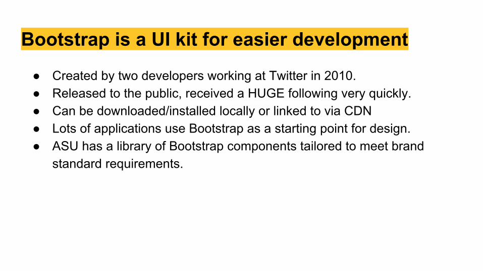
Bootstrap is a UI kit for easier development
● Created by two developers working at Twitter in 2010.● Released to the public, received a HUGE following very quickly. ● Can be downloaded/installed locally or linked to via CDN● Lots of applications use Bootstrap as a starting point for design.● ASU has a library of Bootstrap components tailored to meet brand
standard requirements.
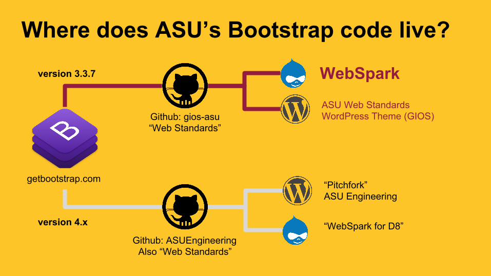
Where does ASU’s Bootstrap code live?
Github: gios-asu“Web Standards”
Github: ASUEngineeringAlso “Web Standards”
version 3.3.7
getbootstrap.com
version 4.x
WebSpark
ASU Web Standards WordPress Theme (GIOS)
“Pitchfork”ASU Engineering
“WebSpark for D8”
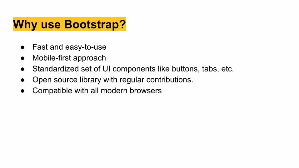
Why use Bootstrap?
● Fast and easy-to-use● Mobile-first approach● Standardized set of UI components like buttons, tabs, etc.● Open source library with regular contributions.● Compatible with all modern browsers
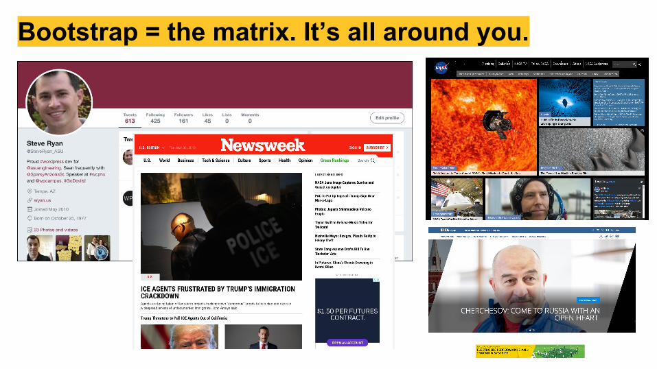
Bootstrap = the matrix. It’s all around you.
How it works
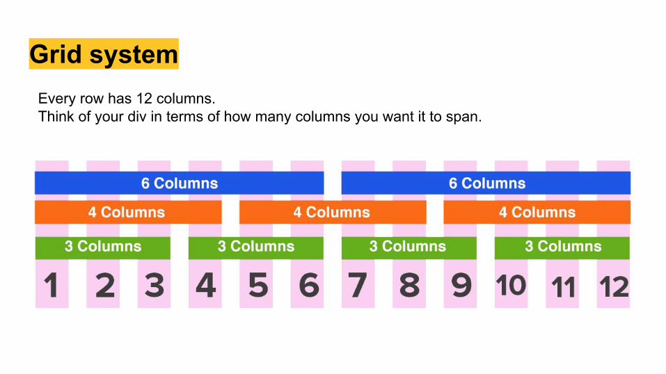
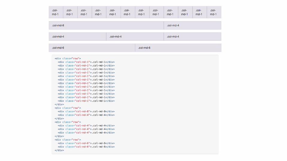
Grid systemEvery row has 12 columns.Think of your div in terms of how many columns you want it to span.
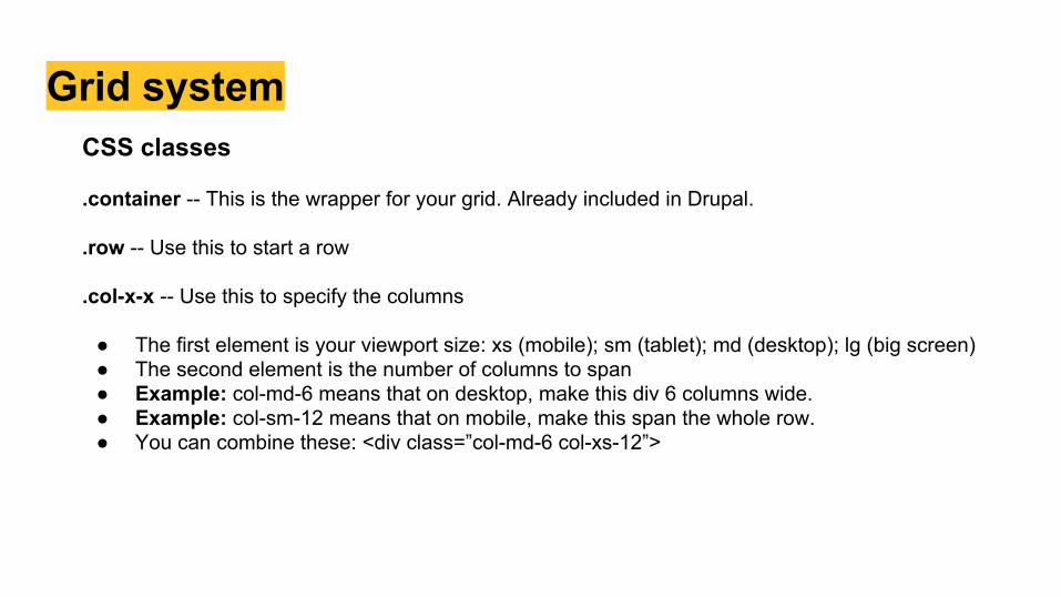
Grid systemCSS classes
.container -- This is the wrapper for your grid. Already included in Drupal.
.row -- Use this to start a row
.col-x-x -- Use this to specify the columns
● The first element is your viewport size: xs (mobile); sm (tablet); md (desktop); lg (big screen)● The second element is the number of columns to span● Example: col-md-6 means that on desktop, make this div 6 columns wide.● Example: col-sm-12 means that on mobile, make this span the whole row.● You can combine these: <div class=”col-md-6 col-xs-12”>
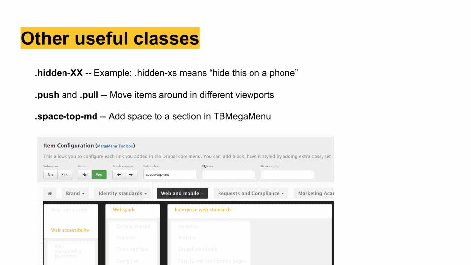
Other useful classes.hidden-XX -- Example: .hidden-xs means “hide this on a phone”
.push and .pull -- Move items around in different viewports
.space-top-md -- Add space to a section in TBMegaMenu
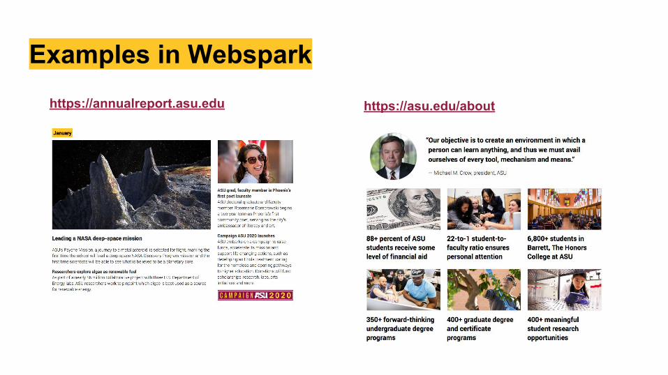
Examples in Websparkhttps://annualreport.asu.edu https://asu.edu/about
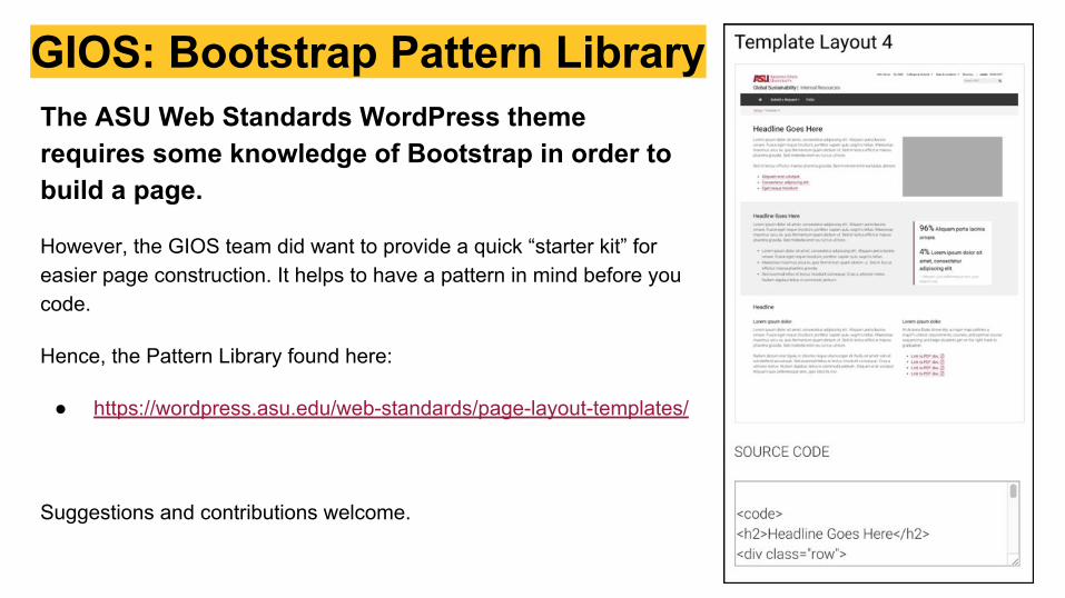
GIOS: Bootstrap Pattern LibraryThe ASU Web Standards WordPress theme requires some knowledge of Bootstrap in order to build a page.
However, the GIOS team did want to provide a quick “starter kit” for easier page construction. It helps to have a pattern in mind before you code.
Hence, the Pattern Library found here:
● https://wordpress.asu.edu/web-standards/page-layout-templates/
Suggestions and contributions welcome.
Break it down.
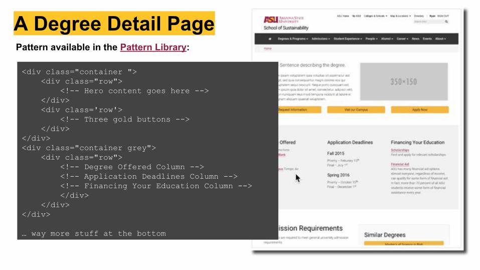
A Degree Detail PagePattern available in the Pattern Library:
<div class="container "> <div class="row"> <!-- Hero content goes here --> </div> <div class='row'> <!-- Three gold buttons --> </div></div><div class="container grey"> <div class="row"> <!-- Degree Offered Column --> <!-- Application Deadlines Column --> <!-- Financing Your Education Column --> </div> </div></div>
… way more stuff at the bottom
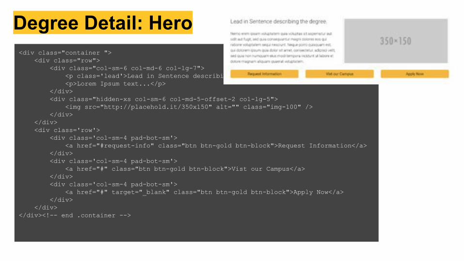
Degree Detail: Hero<div class="container "> <div class="row"> <div class="col-sm-6 col-md-6 col-lg-7"> <p class='lead'>Lead in Sentence describing the degree.</p> <p>Lorem Ipsum text...</p> </div> <div class="hidden-xs col-sm-6 col-md-5-offset-2 col-lg-5"> <img src="http://placehold.it/350x150" alt="" class="img-100" /> </div> </div> <div class='row'> <div class='col-sm-4 pad-bot-sm'> <a href="#request-info" class="btn btn-gold btn-block">Request Information</a> </div> <div class='col-sm-4 pad-bot-sm'> <a href="#" class="btn btn-gold btn-block">Vist our Campus</a> </div> <div class='col-sm-4 pad-bot-sm'> <a href="#" target="_blank" class="btn btn-gold btn-block">Apply Now</a> </div> </div></div><!-- end .container -->
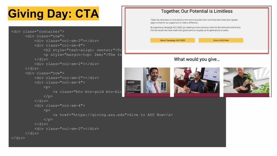
Giving Day: CTA<div class=”container”>
<div class="row"> <div class="col-sm-2"></div> <div class="col-sm-8"> <h2 style="text-align: center;">Together, Our Potential is Limitless</h2> <p style="margin-top: 2em;">The text here...</p> </div> <div class="col-sm-2"></div></div><div class="row"> <div class="col-sm-2"></div> <div class="col-sm-4"> <p> <a class="btn btn-gold btn-block">About Campaign ASU 2020</a> </p> </div> <div class="col-sm-4"> <p> <a href="https://giving.asu.edu">Give to ASU Now</a> </p> </div> <div class="col-sm-2"></div></div>
</div>
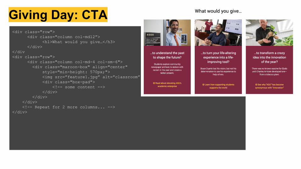
Giving Day: CTA<div class="row">
<div class="column col-md12”><h1>What would you give…</h3>
</div></div<div class="row">
<div class="column col-md-4 col-sm-6"> <div class="maroon-box" align="center" style="min-height: 570px;"> <img src=”feature1.jpg” alt=”classroom” />
<div class="box-pad"> <!-- some content -->
</div> </div> </div> <!-- Repeat for 2 more columns... --></div>
Demo time.
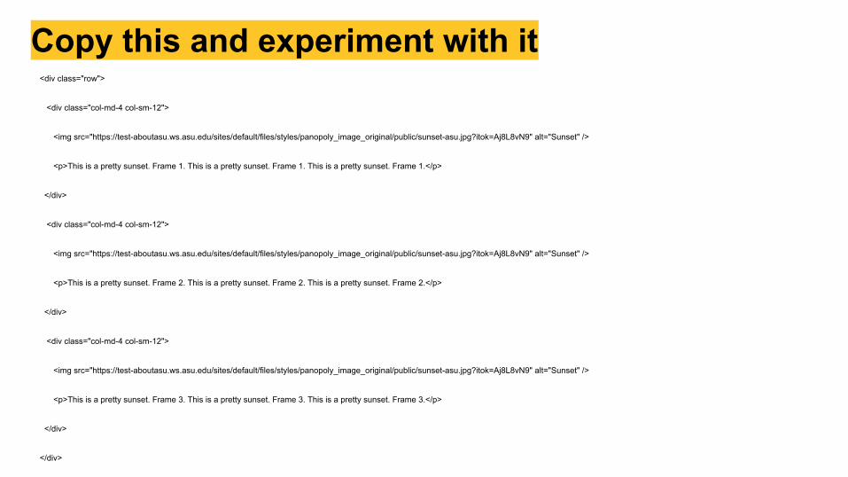
Copy this and experiment with it<div class="row">
<div class="col-md-4 col-sm-12">
<img src="https://test-aboutasu.ws.asu.edu/sites/default/files/styles/panopoly_image_original/public/sunset-asu.jpg?itok=Aj8L8vN9" alt="Sunset" />
<p>This is a pretty sunset. Frame 1. This is a pretty sunset. Frame 1. This is a pretty sunset. Frame 1.</p>
</div>
<div class="col-md-4 col-sm-12">
<img src="https://test-aboutasu.ws.asu.edu/sites/default/files/styles/panopoly_image_original/public/sunset-asu.jpg?itok=Aj8L8vN9" alt="Sunset" />
<p>This is a pretty sunset. Frame 2. This is a pretty sunset. Frame 2. This is a pretty sunset. Frame 2.</p>
</div>
<div class="col-md-4 col-sm-12">
<img src="https://test-aboutasu.ws.asu.edu/sites/default/files/styles/panopoly_image_original/public/sunset-asu.jpg?itok=Aj8L8vN9" alt="Sunset" />
<p>This is a pretty sunset. Frame 3. This is a pretty sunset. Frame 3. This is a pretty sunset. Frame 3.</p>
</div>
</div>
The end.
Share this presentation with a colleague
Steve RyanASU Engineering@SteveRyan_ASU(Web Standards Slack)
Stacy HolmstedtEnterprise Marketing Hub@stacy_holmstedt(Web Standards Slack)