introduction to human geography with...
TRANSCRIPT

IntroductiontoHumanGeographywithArcGIS
Chapter 2 Exercises
Exercise 2.1: Spatial distribution of population
Introduction
A key first step in understanding human geography is being able to map where humans
live. In this exercise, you will use ArcGIS Online to explore arithmetic density, physiographic
density, and agricultural density. You will then use a dot density map of population to compare
the spatial distribution of human populations with different environmental characteristics to
assess the role that the natural environment plays in these distributions.
Objectives
Explore map layers of population density.
Investigate the relationship between population distribution and environmental
characteristics.
Explore arithmetic, physiographic, and agricultural density maps
In this section, you will explore map layers of arithmetic density, physiological density,
and agricultural density and consider how this information helps us understand the
accomplishments and challenges facing different countries.

1. OpentheChapter2PopulationDensitiesapp:
https://learngis.maps.arcgis.com/apps/webappviewer/index.html?id=
55b7c346efd742aeb0f5ed9594110719
The app includes layers of arithmetic density, physiological density, and agricultural
density.
2. ClicktheLayerListandLegendbuttons toseethedifferentlayers
andmaplegends.
3. Zoomandscrollaroundthemaptoanswerthefollowingquestions.Youcan
alsoclickeachcountrytoseeitsnameanddensityinformation.
Question 2.1.1
Based on the textbook, define arithmetic density.
Question 2.1.2
List two countries with high arithmetic density that are richer.
List two countries with high arithmetic density that are poorer.
Question 2.1.3
Why do you think arithmetic density has no spatial relationship with level of development?
4. ClicktheLayerListbutton,thenturnofftheArithmeticDensitylayerandturn
onthePhysiologicalDensitylayer.
Question 2.1.4
Based on the textbook, define physiological density.
Question 2.1.5
List two countries where a high physiological density may be a problem.
List two countries where a high physiological density may not be a problem.
Question 2.1.6
Explain why a high physiological density can be a problem for some countries but not for
others.
5. ClicktheLayerListbutton,thenturnoffthePhysiologicalDensitylayerand
turnontheAgriculturalDensitylayer.
Question 2.1.7
Based on the textbook, define agricultural density.
Question 2.1.8
List two countries with a high agricultural density.
List two countries with a low agricultural density.
Question 2.1.9
Explain why high agricultural density can reflect low agricultural productivity.

Population distribution: How do elevation and bioclimates impact where we live?
The text described the larger population clusters found around the world. In this
section, you will explore in more detail where people are clustered and compare the clusters to
environmental and physical characteristics of the earth.
1. OpentheChapter2PopulationDistributionmapandsignintoyouraccount:
http://arcg.is/1WQBzUw
The map opens with the World Countries and World Population Estimated Density 2015
layers activated.
2. Observepopulationdistributionsbyscrollingaroundthemapandzoomingin
andout.
3. Comparepopulationdistributionstoelevationandbioclimates:
TurnonWorldElevationGMTED.
The darker shades of green represent lower elevations, while the darker shades of
brown represent higher elevations.

You can turn layers on and off to get a better view of the relationship between
population density and elevation.
Question 2.1.10
Asia:
Zoom in to China. Describe how elevation impacts population distribution. Where are
there higher densities? Where are there lower densities?
Zoom in to Northern India/Nepal/Bhutan. Describe how elevation impacts population
distribution.
What is the large high‐elevation plateau that influences population distributions in these
areas? Search online and give a short description.
Europe:
Why are there lower population densities along the northern border of Italy and the
border between Spain and France?
Africa:
Zoom to Ethiopia. Describe how elevation impacts population distribution.
Latin America:
Zoom to the capital cities of Guatemala (Guatemala City), El Salvador (San Salvador),
Nicaragua (Tegucigalpa), and Costa Rica (San Jose). Describe the elevation of these
cities.
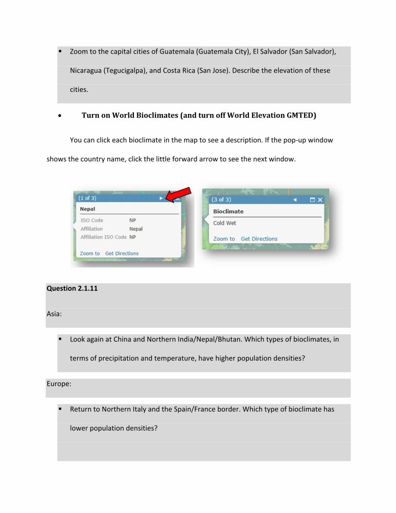
TurnonWorldBioclimates(andturnoffWorldElevationGMTED)
You can click each bioclimate in the map to see a description. If the pop‐up window
shows the country name, click the little forward arrow to see the next window.
Question 2.1.11
Asia:
Look again at China and Northern India/Nepal/Bhutan. Which types of bioclimates, in
terms of precipitation and temperature, have higher population densities?
Europe:
Return to Northern Italy and the Spain/France border. Which type of bioclimate has
lower population densities?
Africa:
Return to Ethiopia. Which types of bioclimates, in terms of precipitation and
temperature, have higher population densities?
Question 2.1.12
Based on your findings from the preceding questions, explain how elevation and
bioclimate impact human settlement patterns.
Conclusion
In this exercise, you saw how ArcGIS can be used to explore data layers, such as
population density. You also explored how environmental variables, such as elevation and
bioclimates, influence population distributions around the world.
Exercise 2.2: Fertility rates
Introduction
Fertility rates have a large spatial variation, both between countries and within them. In
this exercise, you will explore variations in fertility at a country scale and think about what may
cause this variation. You will also look at the spatial variation of teen fertility rates around your
school and discuss how neighborhoods and opportunities impact these rates.
Objectives
Explore spatial data on total fertility rates.
Hypothesize about why fertility rates may vary from place to place.
Analyze patterns of teen fertility rates in your region.

Total fertility rate at the global scale
1. OpentheChapter2–PopulationComponentsapp:
https://learngis.maps.arcgis.com/apps/webappviewer/index.html?id=
014450839ae54298bcc6b704648af1ba
At this point, you will explore the total fertility rate layer, forming hypotheses as to why
it varies around the world. More advanced analysis will come in a later exercise, after you are
armed with more knowledge about population dynamics.
2. TurnontheTotalFertilityRate2015layer.
You can click each country to see its 2015 TFR.
3. ClicktheLegendbutton toshowthelegend.
Question 2.2.1
What is the TFR for the lowest two categories? Based on the idea of replacement fertility,
explain what the long‐term prognosis may be for population size in these countries.

Question 2.2.2
There is a large cluster of high fertility rates in Africa. What economic, cultural, or political
factors may account for this?
Question 2.2.3
Zoom in to Europe. France and Ireland have higher fertility rates than the rest of the continent.
What are their rates? What could be some factors leading women in those countries to have
more children?
Question 2.2.4
In Asia, you can see that South Korea, China, and Japan have low fertility rates. What are their
rates? What could be causing this?
Question 2.2.5
What are the TFRs in the United States and Canada? Why are women having so few children in
these countries? If you live there, what affects the number of children you will have? Does this
help you understand fertility patterns in other countries?
Teen birth rates at the local scale
In this exercise, you will explore birth rates for the 15–19 age group to analyze teen
pregnancies in your region. First, it is important to understand the role that opportunity cost
plays in fertility decisions. Opportunity cost is a concept from economics that says that all
decisions have tradeoffs, or foregone opportunities. If a woman has a child, for example, she
forgoes all the other things she could do with the time and money that caring for the child

entails. As you explore the patterns of teen fertility, think about the opportunities that teens
have in areas with higher rates of teen pregnancy versus those in areas with lower rates of teen
pregnancies. What opportunities does a teen forgo when she has a child in one type of
neighborhood versus another? How can these differences in opportunities impact the fertility
rate?
The data in this map represents the proportion of women aged 15–19 who gave birth in
the previous year.
4. OpentheChapter2–TeenBirthsmapandsignintoyouraccount:
https://arcg.is/fHn9K
The map opens showing the Lexington, Kentucky, region.
5. BrowsetoacityofyourchoiceintheUnitedStatesanditssurroundingregion.
Thescalebaronthemapshouldshow4miles,asfollows.
Don’t zoom in too much, since you want to see some broader regional patterns. Also, if
you zoom out too much you may get a warning that not all features are drawn.
(Be sure to find a location where census tracts have a value over zero.)
You can also set the transparency to see the underlying basemap.

Question 2.2.6
Visually can you see any patterns? Which places seem to have higher teen birth rates and which
seem to have lower ones?
6. Runahotspotanalysis.Thismayhelpyouseemoreclearlywherethe
concentrationsofcensustractswithhighteenbirthratesareandwhere
concentrationsoflowteenbirthratesare.
ClicktheAnalysisbutton>AnalyzePatterns>FindHotSpots.
o Chooselayerforwhichhotspotswillbecalculated:TeenBirths
o Findclustersofhighandlow:Teen_Birth_Rate(Besuretouse
Teen_Birth_Rate,notTeen_Births,whichisjustacountofbirths.)
o Giveyourresultlayerauniquename.
MakesurethatUsecurrentmapextentischeckedsothatyouonly
analyzethetractsinyourmapview.
ClickShowCredits.Youshoulduselessthan2credits.Ifnot,zoominon
yourmapandthencheckcreditsagain.

ClickRunAnalysis.
You can turn off the Teen Births layer to see your new Hot Spot layer more clearly.
Question 2.2.7
Which places have clusters of higher teen birth rates and which have clusters of lower ones?
Give specific examples of cities or neighborhoods.
Question 2.2.8
What may cause these clusters? Do opportunities for young women differ in hot spot and cold
spot areas?

Conclusion
In this exercise, you explored fertility rates at a global and local scale and thought about
why they vary from place to place. Later in the chapter, you will learn some theories that
attempt to explain the reasons behind the spatial variation of fertility.
Exercise 2.3: Death rates and natural increase
Introduction
In this exercise, you will explore how measurements of death rates play out on a global
scale. First, you will observe how the age structure can affect crude death rates (CDRs) and
consider why these rates can vary among similar countries with similar structures. Next you will
look at infant mortality and how it relates to female education and economic development.
After that you will view life expectancy levels and think about why they may be higher in
countries other than yours. Last, you will calculate the natural increase rate and make a map
showing where countries are seeing growing populations and where they are seeing shrinking
populations.
Objectives
Identify countries with similar age structures.
Analyze how age structure and other variables impact the crude death rate.
Use map classification to identify quintiles.
Explore the relationship between infant mortality, economic development, and female
education.
Consider why life expectancy in your country differs from other countries.

Calculate and map natural increase rates.
What factors affect the crude death rate (CDR)?
As you now know, crude death rates can be affected by the age structure of a
population. Places with more elderly generally have higher crude death rates, while places with
more young people generally have lower crude death rates. However, even countries with
similar age structures can have very different crude death rates, due to economic, political, and
environmental factors. In this exercise, you will identify countries with similar age structures,
then explain why their crude death rates may differ.
1. OpentheChapter2–AgeStructureandCDRmapandsignintoyouraccount:
http://arcg.is/2cwD6e4
2. Identifycountrieswithold‐agestructures:
HoverovertheChapter2–AgeStructureandCDRlayerandclickShow
Table .
ClicktheAge65plusfieldheadingandchooseSortDescending.

Writedownthenameofthecountrywiththelargestproportionof
people65yearsofageorolder.Thiswillbethecountryyouusefor
findingold‐agecountries.
ClicktheAnalysisbutton>FindLocations>FindSimilarLocations.
IntheFindSimilarLocationswindow,settheparametersasfollows:
o Instep1,selectChapter_2_Age_Structure_And_CDR.
o Instep2,clicktheselectbutton .Inthemap,clickthecountry
youwrotedownpreviously.(Itwillbehighlightedonthemapandin
thetablewhenyoumaketheselection.)
o Instep3,selectChapter_2_Age_Structure_And_CDR.
o Instep4,checkAge0to14,Age15to64,andAge65plus.
o Forstep5,Showme:thetop25
o Fortheresultlayernameinstep6,giveyourlayerauniquename.

Usecurrentmapextent:unchecksothatallcountriesareusedinthe
analysis.
Checkcredits.Youshoulduselessthanonecredit.Ifnot,double‐check
thesettings.
ClickRunAnalysis.
3. MapCDRforthe25mostsimilarcountries(inotherwords,thosewithold‐age
structures).
4. HoverovertheMostSimilarlayerthatyoujustcreatedandclicktheChange
Stylebutton .
5. Instep1,selectCDR2014.
6. ClickDone.

The map now shows CDR for the 25 countries that are most like your selected country in
terms of age structure. You can view the map legend by hovering over the name of your new
layer and clicking the Show Legend button.
Question 2.3.1
Of the 25 countries with similar elderly populations, which have higher CDRs?
Question 2.3.2
Of the 25 countries with similar elderly populations, which have lower CDRs?
Question 2.3.3
Which factors may explain the differences from the previous two questions? Use ideas from the
textbook section on Deaths plus other information you can find. Remember, all 25 countries
have similar old‐age structures, so you need to consider factors other than age structure.
7. Printortakeascreenshotofyourmap.
8. Identifycountrieswithyoung‐agestructures:
TurnoffthenewMostSimilarlayeryoujustcreated.
Repeattheanalysisyoujustdid,butforcountrieswithyoung‐age
structures.
9. HoveryourcursorovertheChapter2–AgeStructureandCDRlayerandclick
ShowTable.

10. ClicktheAge0to14fieldheadingandselectSortDescending.
11. Scrolldownthetableuntilyouseethecountrywiththelargestproportionof
people0to14yearsofage.Writedownthecountry.Thiswillbethecountry
youuseforfindingyoung‐agecountriesinstep2oftheFindSimilarLocations
analysistool.
12. UsetheFindSimilarLocationsanalysistoolasfollows:
13. MapCDRforthe25mostsimilarcountries(thosewithyoung‐agestructures).
14. HoverovertheMostSimilarlayerthatyoujustcreatedandclicktheChange
Stylebutton .

15. Instep1,selectCDR2014.
16. ClickDone.
Question 2.3.5
Of the 25 countries with a similar young‐age structure, which have higher CDRs?
Question 2.3.6
Of the 25 countries with a similar young‐age structure, which have lower CDRs?
Question 2.3.7
What factors may explain the differences? Use ideas from the textbook section on Deaths plus
other information you can find. Remember, all 25 countries have similar young‐age structures,
so you need to consider factors other than age structure.
17. Printortakeascreenshotofyourmap.
Economic development and female education: Impact on infant mortality
The text explains how infant mortality is closely tied to economic development and
education, especially of women. In this section, you will examine that relationship, using map
layers on the infant mortality rate, female primary‐school completion rate, and per capita
income.
1. OpentheChapter2–InfantMortalityExercisemapandsignintoyour
account:
http://arcg.is/2di2rN0

2. LookattheInfantMortalityRatelayer.
Based on what you already know, which types of countries appear to have higher rates?
Which have lower?
Question 2.3.8
Turn off the Infant Mortality Rate layer and turn on the Per Capita Income layer. By visually
comparing the maps, does there appear to be a spatial relationship between infant mortality
and per capita income?
Question 2.3.9
Turn off the Per Capita Income layer and turn on the Female Primary School Completion Rate
layer. (Note that data is not available for all countries.) Visually, does there appear to be a
relationship between female education and infant mortality?
Now let’s quantitatively compare the layers by looking at the average value of each
variable for all countries, compared with the average value for countries with high infant
mortality rates.
3. Determinetheaveragevalueforeachvariable:
HoverovertheInfantMortalityRatelayerandclickShowTable .
Inthetable,clickthePerCapIncome2013to14fieldheadingandselect
Statistics.Writedowntheaveragevalueinthefirstrowofthetable
(question2.3.10).

4. RepeattheprocessforInfantMortality2014and
PrimarySchoolFemale2010to14.
5. Filterforthetopquintileofcountriesandfindaveragevalues.
These will then be compared with the average for all countries.
6. HoverovertheInfantMortalityRatelayerandselectFilter .
7. IntheFilterwindow,createtheexpression:
InfantMortality2014isatleast44.
This is the cutoff point for the top quintile, as seen in the map legend.
ClickApplyFilter.
You have now selected only the countries in the top quintile for infant mortality.
8. Justasyoudidpreviously,hoveryourcursorovertheInfantMortalityRate
layerandclickShowTable.
9. Inthetable,clickonthePerCapIncome2013to14filedheadingandselect
Statistics.Writedowntheaveragevalueinthesecondrowofthetable
(question2.3.10).

10. RepeatforInfantMortality2014andPrimarySchoolFemale2010to14.
Question 2.3.10
Per Capita Income
Infant Mortality Primary School Female
Average, all countries
Average, top infant mortality quintile
Question 2.3.11
In a paragraph, explain how economic development and female education relate to infant
mortality.
Question 2.3.12
What types of policies would you implement to further reduce the infant mortality rate?
Life expectancy: Where do people live longer than you?
In this short section, you will explore the life expectancy map and think about factors
that contribute to the variation in values.
1. OpentheChapter2–PopulationComponentsapp:
https://learngis.maps.arcgis.com/apps/webappviewer/index.html?id=
014450839ae54298bcc6b704648af1ba
2. TurnontheLifeExpectancy2015layer.(FirstclicktheLayerListiconon
mobiledevices .)
3. Observewherelifeexpectancyishighandwhereitislow.
4. ClicktheOpenAttributeTabletabatthebottomofthescreen to
opentheattributetable.
5. ClicktheLifeExpectancyfieldheadinginthetableandselectSortDescending.
6. ScrolldownuntilyouseetheUnitedStates(orthecountrywhereyoulive).
Makenoteofthelifeexpectancy.
7. Scrollupandobservethecountrieswithlifeexpectancieshigherthanyour
country.
Question 2.3.13
Name the countries and write a list of factors that may explain why those countries have a
higher life expectancy than yours. How do economic and lifestyle conditions differ and how
may this affect life expectancy?
Natural increase: Where are populations shrinking and growing?
In this section, you will calculate the natural increase rate for all countries of the world,
then make a map showing which countries (excluding migration) have shrinking populations,
which have stable populations, and which are growing.
1. OpentheChapter2–PopulationComponentsmapandlogintoyouraccount:
http://arcg.is/2diuhZs
2. Ifnecessary,clicktheContenttab .

3. TurnontheNaturalIncrease2015layer.Itopenswithallcountriesasasingle
color.
4. MakeachoroplethmapofNaturalIncrease.
ClickontheChangeStylebutton undertheNaturalIncrease2015
layername.
ScrolldownandselectNewExpression.
IntheCustomexpressionwindow,clicktheCBR2105(Crudebirthrate)
andCDR2015(crudedeathrate)tocalculateNaturalIncrease.
Basedonyourtextbook,selectthecorrectformulaforuseinthe
Customwindow:
o $feature.CBR2015‐$feature.CDR2015

o $feature.CDR2015‐$feature.CBR2015
OnceyouhavethecorrectformulaintheCustomexpressionwindow,
clickOK.
5. IntheChangeStylewindow:
Instep2,selectCountsandAmounts(Color),thenOptions.
NexttoTheme,clickthedrop‐downarrowandselectAboveandBelow.
Setthelowervalue(currently1)to–1,thensetthemiddlevalue
(currently9.8)to0.
ClickOK.

Your map now shows countries close to zero population growth in white (or off‐white),
with those below 0 facing shrinking populations, and those above facing growing populations.
All of these exclude the impact of migration.
Question 2.3.14
Name some of the countries with negative natural increase—in other words, those that have
shrinking populations.
Question 2.3.15
Name some of the countries that are growing at faster rates.
Question 2.3.16
Take a screenshot of your map and insert it in the document.
Conclusion
In this exercise, you saw how age structure, female education, and economic
development can impact measurements of deaths. You also considered how other factors, such
as lifestyle, can affect the longevity of a population. Finally, you used the power of ArcGIS
Online to quickly calculate and map data to show the spatial distribution of natural increase.
Exercise 2.4: Population structure
Introduction
While the number of people in a particular place is of essence when studying population
geography, equally important are the age and sex structure of that population. In this exercise,
you will first explore how population pyramids, as graphical representations of age‐sex

structure, can be used to understand local scale population patterns and inform decisions on
business site selection. You will then examine how age‐sex structures impact the dependency
ratio at a global scale of analysis.
Objectives
Explore how population pyramids can be a guide for locating business and services
establishments.
Calculate dependency ratios and describe the problems countries face due to them.
Population pyramids: A tool for site selection
The chapter describes population structure at the national scale and how it can impact
government finances and opportunities for economic growth. But population structure at a
more local scale is also of interest to geographers and others. In this section, you will look at
population structures with a 1‐mile ring at different locations in your area. Based on this
information, you will consider how this information can be useful in site selection of businesses
and services.
1. Openthefollowingmap:
https://developers.arcgis.com/javascript/3/samples/geoenrichment_i
nfographic/
2. ZoomtoacityofyourchoiceintheUnitedStates.
3. Clickanywhereonthemapandyouwillseeaninfographicwithapopulation
pyramidforthe1‐milering,alongwithacomparisontothecountyinwhich
theringislocated.

Question 2.4.1
Think about your city and other places in the United States.
Find pyramids with:
The highest proportion 65+.
The highest proportion 14 and under.
The largest female proportion.
The largest male proportion.
The lowest dependency ratio (largest 15–64 proportion).
4. UsetheWindowsSnippingtoolonyourcomputer,orascreenshot,tosavethe
imageofyourpopulationpyramids.Inserttheimageinthedocument,along
withtextstatingwhichoftheabovecategoriesitcorrespondsto.
Your instructor may have you bring printouts of your pyramids to class for a competition
on who can find the most extreme examples.
Question 2.4.2
Describe what types of businesses or services you would locate in or near each of your selected
pyramids. Explain why you chose those specific businesses and services.
Dependency ratio: Where are the largest dependent populations?
In this exercise you will calculate age dependency in three ways: the proportion of
young to working age, the proportion of old to working age, and the total dependency ratio.

1. OpentheChapter2–AgeDependencymapandsignintoyouraccount:
http://arcg.is/22ugm31
2. ClicktheContenttabifnecessary .
3. CalculatetheOldAgeDependencyRatio.
4. HoverovertheOldAgeDependencyRatiolayerandclicktheChangeStyles
button .
5. IntheChangeStylewindow:
Chooseanattributetoshow:NewExpression
IntheCustomexpressionwindow,calculatetheoldagedependency
ratio.Thisistheratioofelderlytotheworkingagepopulation:
Age65Plus/Age15to64.
ClickthefieldnamesintheCustomexpressionwindowtocreatethe
expression.
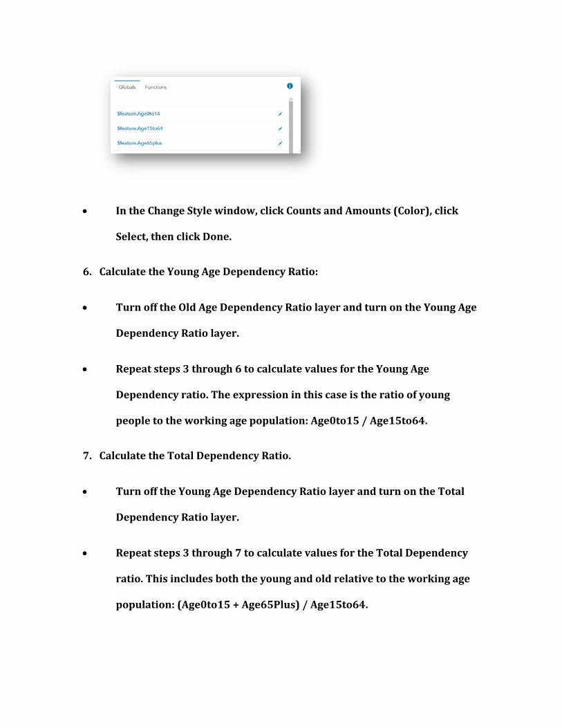
IntheChangeStylewindow,clickCountsandAmounts(Color),click
Select,thenclickDone.
6. CalculatetheYoungAgeDependencyRatio:
TurnofftheOldAgeDependencyRatiolayerandturnontheYoungAge
DependencyRatiolayer.
Repeatsteps3through6tocalculatevaluesfortheYoungAge
Dependencyratio.Theexpressioninthiscaseistheratioofyoung
peopletotheworkingagepopulation:Age0to15/Age15to64.
7. CalculatetheTotalDependencyRatio.
TurnofftheYoungAgeDependencyRatiolayerandturnontheTotal
DependencyRatiolayer.
Repeatsteps3through7tocalculatevaluesfortheTotalDependency
ratio.Thisincludesboththeyoungandoldrelativetotheworkingage
population:(Age0to15+Age65Plus)/Age15to64.

Question 2.4.3
Where are there clusters of countries with high old‐age dependency ratios?
Question 2.4.4
What are problems that these countries are facing due to their high old‐age dependency ratios?
Question 2.4.5
Where are there clusters of countries with high young‐age dependency ratios?
Question 2.4.6
What are problems that these countries are facing due to their high young‐age dependency
ratios?
Conclusion
In this exercise, you saw the importance of understanding the age‐sex structure of
populations. This type of information is useful in business site selection at a local scale, and at a
smaller scale, for investment and spending planning for countries.
Exercise 2.5: The demographic transition in Latin America
Introduction
Latin America has gone through a dramatic demographic transition since the second half
of the twentieth century. Birth rates and death rates have fallen substantially, and the days of
rapid population growth are now over. In fact, some countries are approaching situations like
many European countries, where births have fallen below replacement level. In this exercise,

you will view changes in the total fertility rate between 1960 and 2015. You will then look at
some of the variables that have been associated with falling fertility to assess their relationship
with Latin America’s decline in births.
Objectives
Explore changes in the total fertility rate in Latin America.
Apply the Demographic Transition theory to explain changes in fertility.
1. OpentheChapter2–LatinAmericanFertilityTransitionwebapp:
https://learngis.maps.arcgis.com/apps/webappviewer/index.html?id=
655243d246ae4e4881eced90ef665e71
The map opens with the Total Fertility Rate – 1960 to 2015 layer turned on.
This layer is time enabled, so you can see how the TFR changes between 1960 and 2015.
The map begins by showing total fertility rates in 1959.
2. Clickthetimesliderbutton andlookatthe1959TFRs.
3. Hoveryourcursoroverthetimesliderboxnearthebottomofthescreen.
Pausethesliderifnecessaryandusethepreviousarrowtomovethesliderto
thefarleft.

4. ClickthecountriestoseeTFRsin1959.
Question 2.5.1
How many children was the average woman having in 1959? What and where was the highest
rate? The lowest?
5. ClicktheNextandPreviousbuttonsonthetimeslideratthebottomofthe
screentomanuallychangetheyear.
6. Movetheslidertothefarrightandagainclickthecountries.
Question 2.5.2
What were some of the TFRs in 2014? What and where was the highest rate? The lowest?
7. ClickLayerListbutton ,turnoffthefirstlayer,andturnontheFertility
Transitionlayer.
This shows the TFR for 2015. The classification scheme and color are different from the
first layer so that you can see current differences between countries more easily.
8. ClicksomeofthecountriestoseetheTFR,plusdataonthepercentageofthe
populationlivinginruralareas,theinfantmortalityrate,andtheprimary
schoolcompletionrateforwomen.
Question 2.5.3
Based on the chapter reading on the Demographic Transition theory, explain why these
variables can help predict changes in fertility rates.

9. Comparetheaveragevaluesforthevariablesbygroupingcountriesintohigh
TFRsandlowTFRs.
OpentheattributetablefortheFertilityTransitionlayerbyclickingthe
threedotstoitsright,thenselectingViewinAttributeTable.
10. FilterandcalculateaveragesforthecountrieswiththehighestTFR.
First,makesurethatallcountriesareused.Intheattributetable,click
Filterbymapextentsothatitisnothighlighted.Atthebottomofthe
attributetableyoushouldsee20features0selected.Thisindicatesthat
all20countrieswillbeusedforyourcalculations.

ClickTableOptions,thenclickFilter.
ClickAddafilterexpression,andsetthefiltersothatTFR2015isat
least2.558.
This filters for the four (20 percent) countries with the highest TFRs.
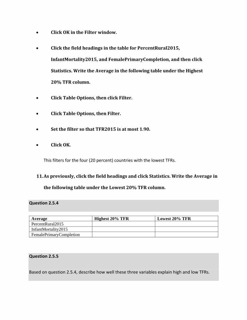
ClickOKintheFilterwindow.
ClickthefieldheadingsinthetableforPercentRural2015,
InfantMortality2015,andFemalePrimaryCompletion,andthenclick
Statistics.WritetheAverageinthefollowingtableundertheHighest
20%TFRcolumn.
ClickTableOptions,thenclickFilter.
ClickTableOptions,thenFilter.
SetthefiltersothatTFR2015isatmost1.90.
ClickOK.
This filters for the four (20 percent) countries with the lowest TFRs.
11. Aspreviously,clickthefieldheadingsandclickStatistics.WritetheAveragein
thefollowingtableundertheLowest20%TFRcolumn.
Question 2.5.4
Average Highest 20% TFR Lowest 20% TFR PercentRural2015 InfantMortality2015 FemalePrimaryCompletion
Question 2.5.5
Based on question 2.5.4, describe how well these three variables explain high and low TFRs.

Conclusion
In this exercise, you observed how the total fertility rate in Latin American has fallen
over the decades. As described in the demographic transition model, you saw how factors such
as urbanization, reductions in infant mortality, and female education influence changes in
fertility rates.