introduction to plot.ly: customizing a stacked bar chartintroduction to plot.ly: customizing a...
TRANSCRIPT
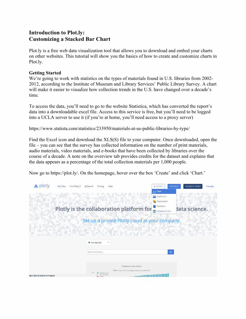
Introduction to Plot.ly: Customizing a Stacked Bar Chart Plot.ly is a free web data visualization tool that allows you to download and embed your charts on other websites. This tutorial will show you the basics of how to create and customize charts in Plot.ly. Getting Started We’re going to work with statistics on the types of materials found in U.S. libraries from 2002-2012, according to the Institute of Museum and Library Services’ Public Library Survey. A chart will make it easier to visualize how collection trends in the U.S. have changed over a decade’s time. To access the data, you’ll need to go to the website Statistica, which has converted the report’s data into a downloadable excel file. Access to this service is free, but you’ll need to be logged into a UCLA server to use it (if you’re at home, you’ll need access to a proxy server) https://www.statista.com/statistics/233950/materials-at-us-public-libraries-by-type/ Find the Excel icon and download the XLS(S) file to your computer. Once downloaded, open the file – you can see that the survey has collected information on the number of print materials, audio materials, video materials, and e-books that have been collected by libraries over the course of a decade. A note on the overview tab provides credits for the dataset and explains that the data appears as a percentage of the total collection materials per 1,000 people. Now go to https://plot.ly/. On the homepage, hover over the box ‘Create’ and click ‘Chart.’

You’ll see a new interface that allows you to upload your data. The easiest way to upload is to simply cut and paste the data – leaving out any headings or metadata – directly into Plotly’s spreadsheet.
Make sure that Column A is the year and columns B-D correspond with data on each material type.
Creating a Stacked Bar Chart

Plotly allows several types of graphs, including line plots, scatter plots, area charts and pie charts. We’re going to focus on the bar chart option. Click the drop down menu under ‘Chart Type’ and choose Bar Chart. First select year, Column A, for your X axis. Choose column B for your Y axis. You should see bars now showing the data for print materials. To add data from the other material types, click on the blue ‘Trace’ button. This allows you to include other variables to your chart. Keep the X axis the same, but now select Column C for your Y axis. Click ‘Trace’ twice more, so that you add variables from Columns D and E. Your Bar Chart should now look like this:
Your bar chart looks much like a comb, since the long blue bars representing print books bracket the shorter bars representing other media. You can play with the aesthetics of your chart by clicking on the ‘Style’ tab and selecting ‘Traces.’ You’ll see that the option ‘Grouped’ is currently selected – select ‘Stacked’ instead. You should get this result:

If you want, you can also change your chart to horizontal bars rather than vertical bars, though in this case vertical bars make the dates on the X axis easier to read as a timeline. Customizing Colors, the Legend, and Titling You can further customize your chart by changing the border and fill colors for each variable. Free users can select among a range of default colors.
You can now enter a title and label your X and Y axes by clicking on the default labels. To make the title fit, you may need to change the font size. Go to ‘Style’ à ‘Layout’ à ‘Titles and Fonts’ to change the text size.
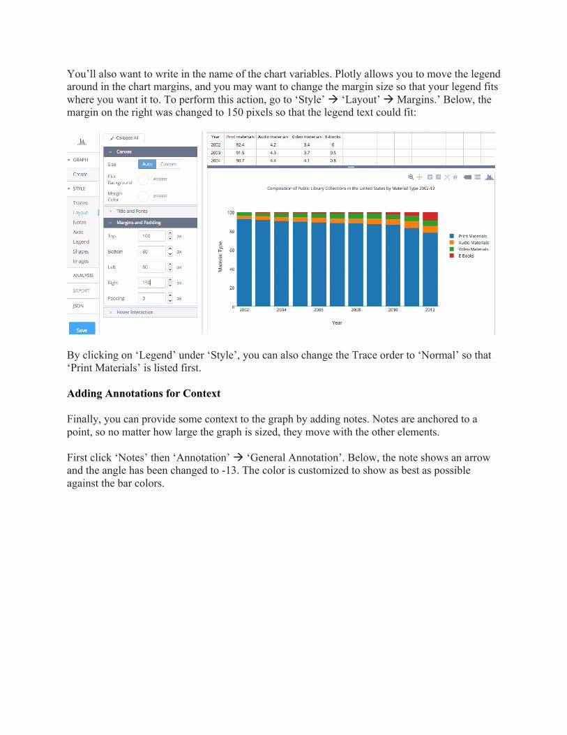
You’ll also want to write in the name of the chart variables. Plotly allows you to move the legend around in the chart margins, and you may want to change the margin size so that your legend fits where you want it to. To perform this action, go to ‘Style’ à ‘Layout’ à Margins.’ Below, the margin on the right was changed to 150 pixels so that the legend text could fit:
By clicking on ‘Legend’ under ‘Style’, you can also change the Trace order to ‘Normal’ so that ‘Print Materials’ is listed first. Adding Annotations for Context Finally, you can provide some context to the graph by adding notes. Notes are anchored to a point, so no matter how large the graph is sized, they move with the other elements. First click ‘Notes’ then ‘Annotation’ à ‘General Annotation’. Below, the note shows an arrow and the angle has been changed to -13. The color is customized to show as best as possible against the bar colors.

You may also want to clarify that your material type data are percentages. Click on ‘Annotation’ à ‘Subtitle’ to create text that you can move anywhere on the graph margins. Below, an asterix was added both to the title and before the note at the bottom of the graph. Finally, you can repeat the same action to have a source attribution, placed here on the bottom left:
Embedding the Plotly graph If you want to embed the graph, click ‘Share’ at the bottom left. Click whether you want the graph to be public or private. When you click on ‘Share’ again, you can click on the ‘Embed’ button to get a URL pointing to your graph. Credits: Written by Morgan Currie, September 2016.