introduction to user interface designafkjm/csce401/handouts/ui.pdf · • the user interface today...
TRANSCRIPT
1
Introduction to User Interface
Design
CSCE A401
Material adapted from Saul
Greenberg, Univ. of Calgary
User Interfaces
• “Today, user needs are recognized to be
important in designing interactive
computer systems, but as recently as
1980, they received little emphasis.” J.
Grudin
• “We can’t worry about these user interface
issues now. We haven’t even gotten this
thing to work yet!” Mulligan
2
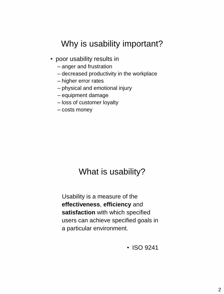
Why is usability important?
• poor usability results in
– anger and frustration
– decreased productivity in the workplace
– higher error rates
– physical and emotional injury
– equipment damage
– loss of customer loyalty
– costs money
What is usability?
Usability is a measure of the
effectiveness, efficiency and
satisfaction with which specified
users can achieve specified goals in
a particular environment.
• ISO 9241

3
UI
• The User Interface today is often one of the most critical factors regarding the success or failure of a computer system
• Good UI design:– Increases efficiency
– Improves productivity
– Reduces errors
– Reduces training
– Improves acceptance
• Approach: The UI is the system– Design with the UI in mind
• Things to consider– Technical issues in creating the UI
– User’s mental model
– Conceptual model
Human Computer Interaction
• A discipline concerned with interactive
computing systems for human use
design implementation
evaluation
4
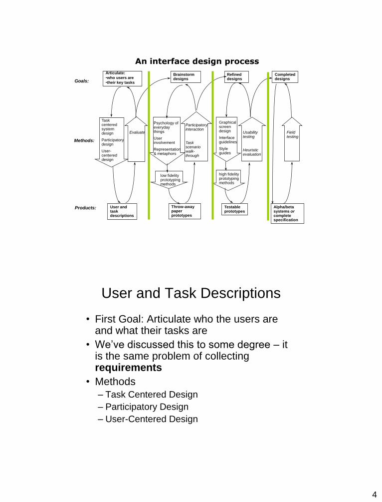
Articulate:
•who users are
•their key tasks
User and task descriptions
Goals:
Methods:
Products:
Brainstorm designs
Task centered system design
Participatory design
User-centered design
Evaluate
Psychology of everyday things
User involvement
Representation & metaphors
low fidelity prototyping methods
Throw-away paper prototypes
Participatory interaction
Task scenario walk-through
Refined designs
Graphical screen design
Interface guidelines
Style guides
high fidelity prototyping methods
Testable prototypes
Usability testing
Heuristic evaluation
Completed designs
Alpha/beta systems orcomplete specification
Field testing
An interface design process
User and Task Descriptions
• First Goal: Articulate who the users are and what their tasks are
• We’ve discussed this to some degree – it is the same problem of collecting requirements
• Methods
– Task Centered Design
– Participatory Design
– User-Centered Design
5
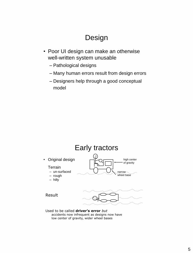
Design
• Poor UI design can make an otherwise
well-written system unusable
– Pathological designs
– Many human errors result from design errors
– Designers help through a good conceptual
model
Early tractors
• Original design
Terrain– un-surfaced
– rough
– hilly
high center
of gravity
narrow
wheel base
Result
Used to be called driver’s error butaccidents now infrequent as designs now have low center of gravity, wider wheel bases
6
Lessons Learned
• Lesson 1
– Most failures of human-machine system are
due to poor designs that don’t recognize
peoples’ capabilities and fallibilities
– This leads to apparent machine misuse and
“human error”
• Lesson 2
– Good design always accounts for human
capabilities.
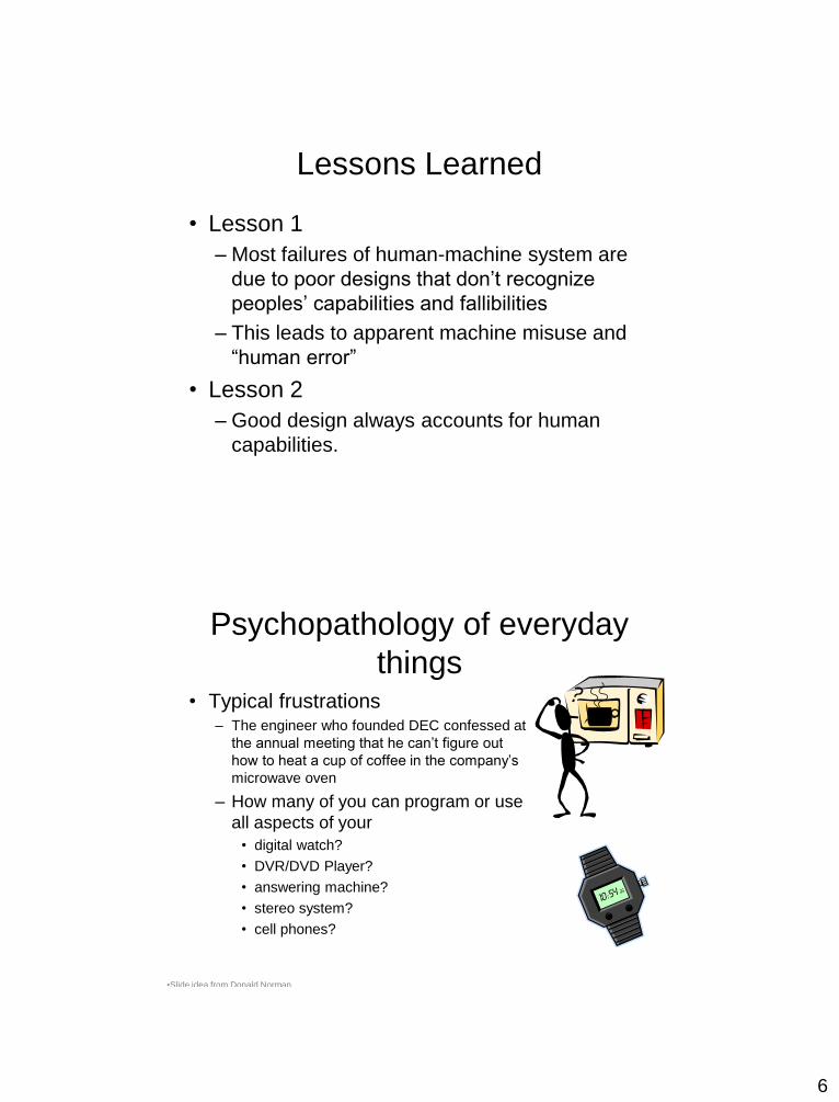
Psychopathology of everyday
things• Typical frustrations
– The engineer who founded DEC confessed at
the annual meeting that he can’t figure out
how to heat a cup of coffee in the company’s
microwave oven
– How many of you can program or use
all aspects of your
• digital watch?
• DVR/DVD Player?
• answering machine?
• stereo system?
• cell phones?
•Slide idea from Donald Norman

7
Other pathological examples:
• Remote control from Leitz slide projector
– How do you forward/reverse?
• Instruction manual:
– short press:slide change forward
– long press: slide change backward
•Slide idea from Donald Norman
Still more pathological examples
• Modern telephone systems
– standard number pad
– two additional buttons * and #
• Problem
– many hidden functions
– operations and outcome completely invisible
• *72+number = call forward
– can I remember that combination?
– if I enter it, how do I know it caught?
– how can I remember if my phone is still forwarded?
• Ok, I’ll read the manual
– but what does call park mean? what's a link?
– where is that manual anyway?
8
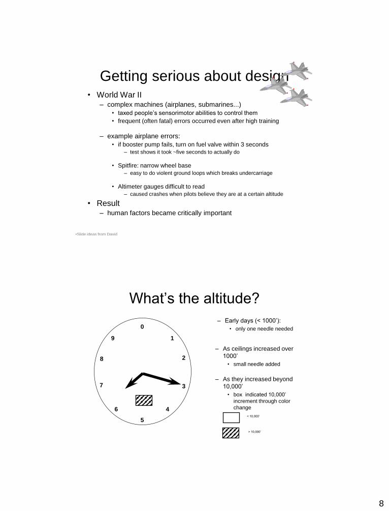
Getting serious about design• World War II
– complex machines (airplanes, submarines...)
• taxed people’s sensorimotor abilities to control them
• frequent (often fatal) errors occurred even after high training
– example airplane errors:
• if booster pump fails, turn on fuel valve within 3 seconds
– test shows it took ~five seconds to actually do
• Spitfire: narrow wheel base
– easy to do violent ground loops which breaks undercarriage
• Altimeter gauges difficult to read
– caused crashes when pilots believe they are at a certain altitude
• Result– human factors became critically important
•Slide ideas from David
Hill
What’s the altitude?
– Early days (< 1000’):
• only one needle needed0
9 1
2
3
46
7
8
5
– As ceilings increased over
1000’
• small needle added
< 10,000’
> 10,000’
– As they increased beyond
10,000’
• box indicated 10,000’
increment through color
change

9
Tape altimeter
• Human factors test
showed:
– eliminated reading errors
– was faster to read
• But not in standard use!
Why?
14000
15000
16000
17000
18000
900
000
100
200
300
400
500
600
reference
line
independentmovement
40 km Slow Down!
Fog Ahead
The Psychopathology of
computers• Britain 1976
– Motorway communication system operated 40% of it’s highways
– police controlled it in real time to
• change lane signs, direction signs, speed limits, etc
– On December 10th, police failed to change the
speed limit signs when fog descended
• 34 vehicles crashed
• 3 people killed
• 11 people injured and trapped in their vehicles
• motorway closed for 6.5 hours
•Slide ideas from David
Hill
10
Some quotes
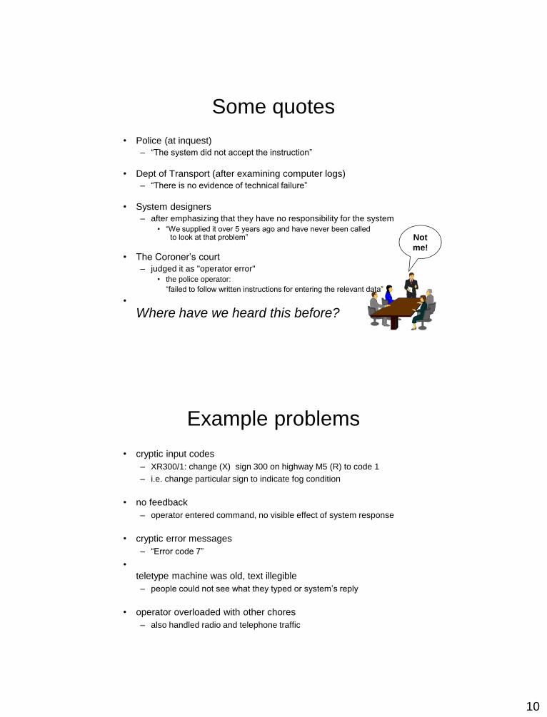
• Police (at inquest)
– “The system did not accept the instruction”
• Dept of Transport (after examining computer logs)
– “There is no evidence of technical failure”
• System designers
– after emphasizing that they have no responsibility for the system
• “We supplied it over 5 years ago and have never been called to look at that problem”
• The Coroner’s court
– judged it as "operator error"
• the police operator:
“failed to follow written instructions for entering the relevant data”
•
Where have we heard this before?
Not
me!
Example problems
• cryptic input codes
– XR300/1: change (X) sign 300 on highway M5 (R) to code 1
– i.e. change particular sign to indicate fog condition
• no feedback
– operator entered command, no visible effect of system response
• cryptic error messages
– “Error code 7”
•
teletype machine was old, text illegible
– people could not see what they typed or system’s reply
• operator overloaded with other chores
– also handled radio and telephone traffic

11
Visual Affordance
• the perceived and actual fundamental properties
of the object that determine how it could be used– Appearance indicates how the object should be used
• chair for sitting
• knobs for turning
• slots for inserting things into
• buttons for pushing
– Just by looking the user should know
• State of the system
• Possible actions
• Don’t violate these principles to make something “look cool”!
– Complex things may need explaining but
simple things should not
• when simple things need labels & instructions, then design has
failedMany ideas in this deck are adapted from Don Norman’s book: The Design of Everyday things
Poor Visual Affordance
• Trapped between
doors!
• Handles afford
pulling
• Using a flat plate
would constrain the
user to push

12
How fast are we going?
The well-trodden path

13
Fedex Dropbox
Supplies “box” is taped shut!
The unusual urinal
14
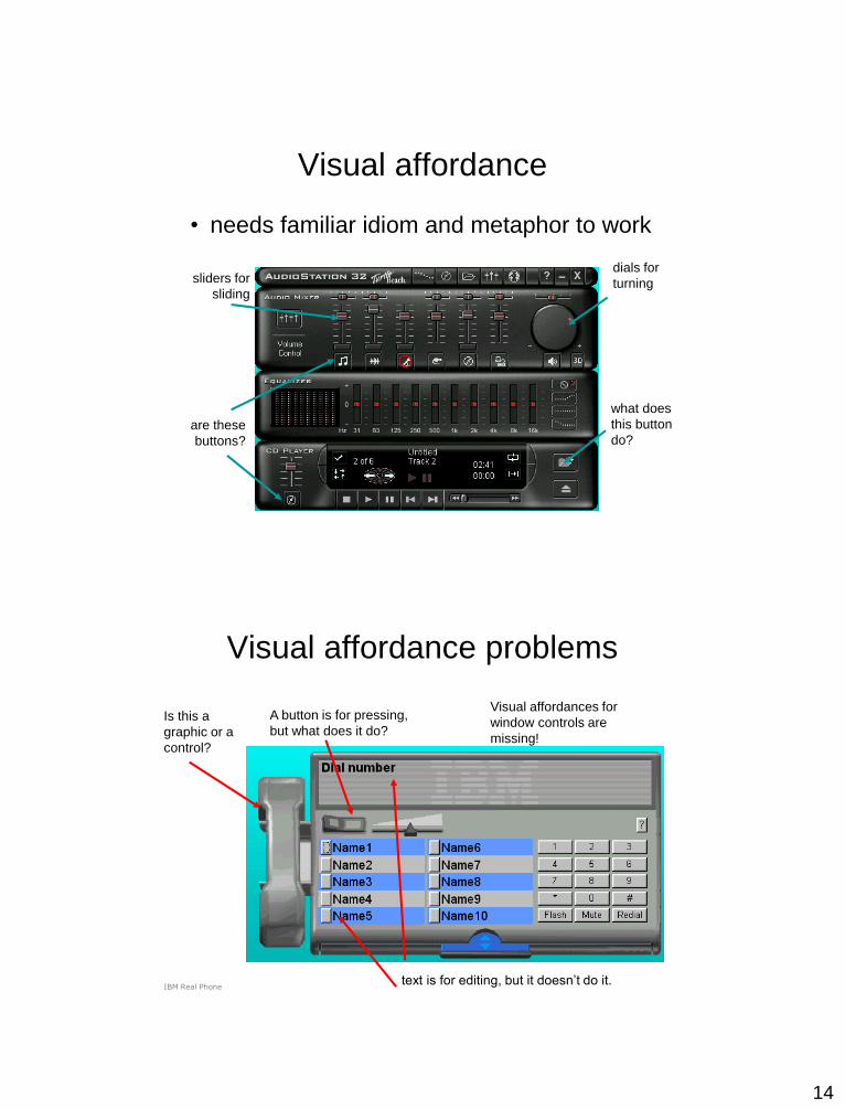
Visual affordance
• needs familiar idiom and metaphor to work
sliders for
sliding
are these
buttons?
what does
this button
do?
dials for
turning
Visual affordance problems
A button is for pressing,
but what does it do?Is this a
graphic or a
control?
text is for editing, but it doesn’t do it.
Visual affordances for
window controls are
missing!
IBM Real Phone
15
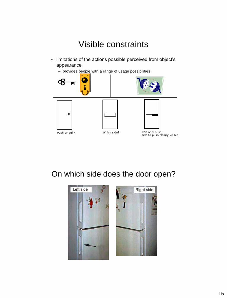
Visible constraints
• limitations of the actions possible perceived from object’s
appearance
– provides people with a range of usage possibilities
Push or pull? Which side? Can only push,side to push clearly visible
On which side does the door open?
16
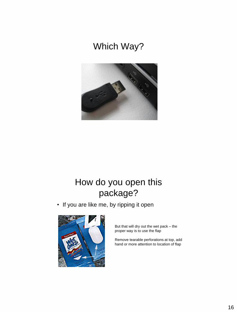
Which Way?
How do you open this
package?• If you are like me, by ripping it open
But that will dry out the wet pack – the
proper way is to use the flap
Remove tearable perforations at top, add
hand or more attention to location of flap
17
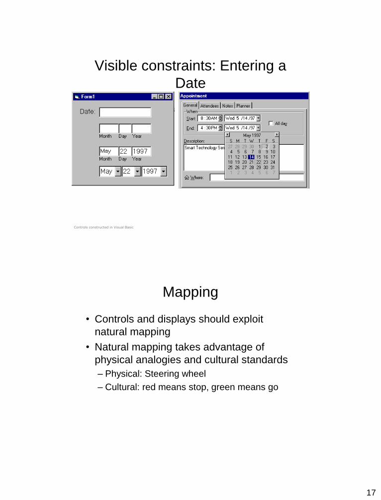
Visible constraints: Entering a
Date
Controls constructed in Visual Basic
Mapping
• Controls and displays should exploit
natural mapping
• Natural mapping takes advantage of
physical analogies and cultural standards
– Physical: Steering wheel
– Cultural: red means stop, green means go

18
Mouse or Keyboard?
What Knob Goes Where?

19
Exploiting Natural Mapping
Yellow Street Lights
• Possible to confuse with stoplight

20
How do you play the CD?
How do you turn on the shower?
• Must reach down
where the water
comes out and pull
down!Instructions!
21
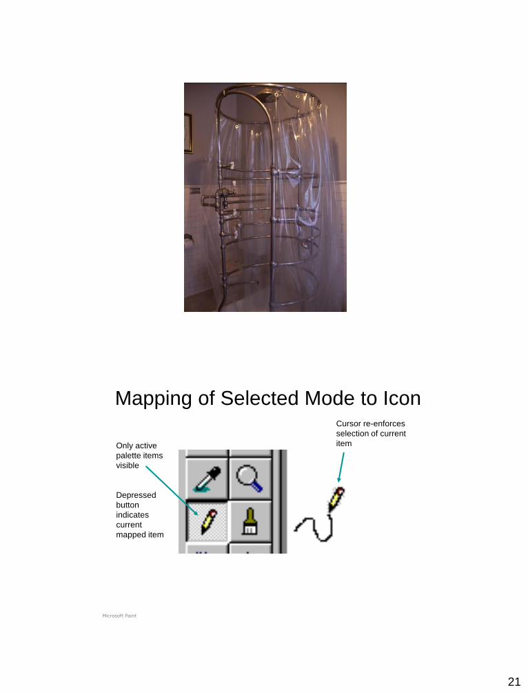
Only active
palette items
visible
Depressed
button
indicates
current
mapped item
Cursor re-enforces
selection of current
item
Microsoft Paint
Mapping of Selected Mode to Icon

22
Causality
• the thing that happens right after an action is
assumed by people to be caused by that action
– interpretation of “feedback”
– false causality
• incorrect effect
– invoking unfamiliar function just as computer hangs
– causes “superstitious” behaviors
• invisible effect
– command with no apparent result often re-entered repeatedly
– e.g., mouse click to raise menu on unresponsive system
Feedback Examples
• Telephone button press tones
– Telephone clicks
• Buzz typing virtual keys on a slate/tablet
• Clicker on your turn signal
• Animated icon while waiting for a web
page to load
23
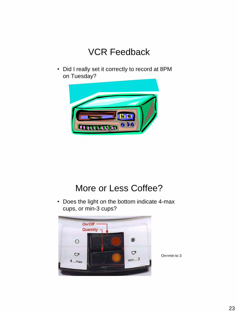
VCR Feedback
• Did I really set it correctly to record at 8PM
on Tuesday?
More or Less Coffee?
• Does the light on the bottom indicate 4-max
cups, or min-3 cups?
On=min to 3

24
Effects visible only after Exec button is pressed•Ok does nothing!•awkward to find appropriate color level
LViewPro
Poor Feedback in LViewPro
Transfer effects
• people transfer their learning/expectations of
similar objects to the current objects• positive transfer: previous learning's also apply to new
situation
• negative transfer: previous learning's conflict with the new
situation

25
Population stereotypes and
idioms• Populations learn idioms that work in a certain way
– red means danger
– green means safe
– Idioms vary in different cultures
• Light switches
– America: down is off
– Britain: down is on
• Faucets
– America: anti-clockwise on
– Britain: anti-clockwise off
Conceptual model
• People have “mental models” of how things work, built from
– affordances
– causality
– constraints
– mapping
– positive transfer
– population stereotypes/cultural standards
– instructions
– interactions
• models allow people to mentally simulate operation of device
• models may be wrong
– particularly if above attributes are misleading
26
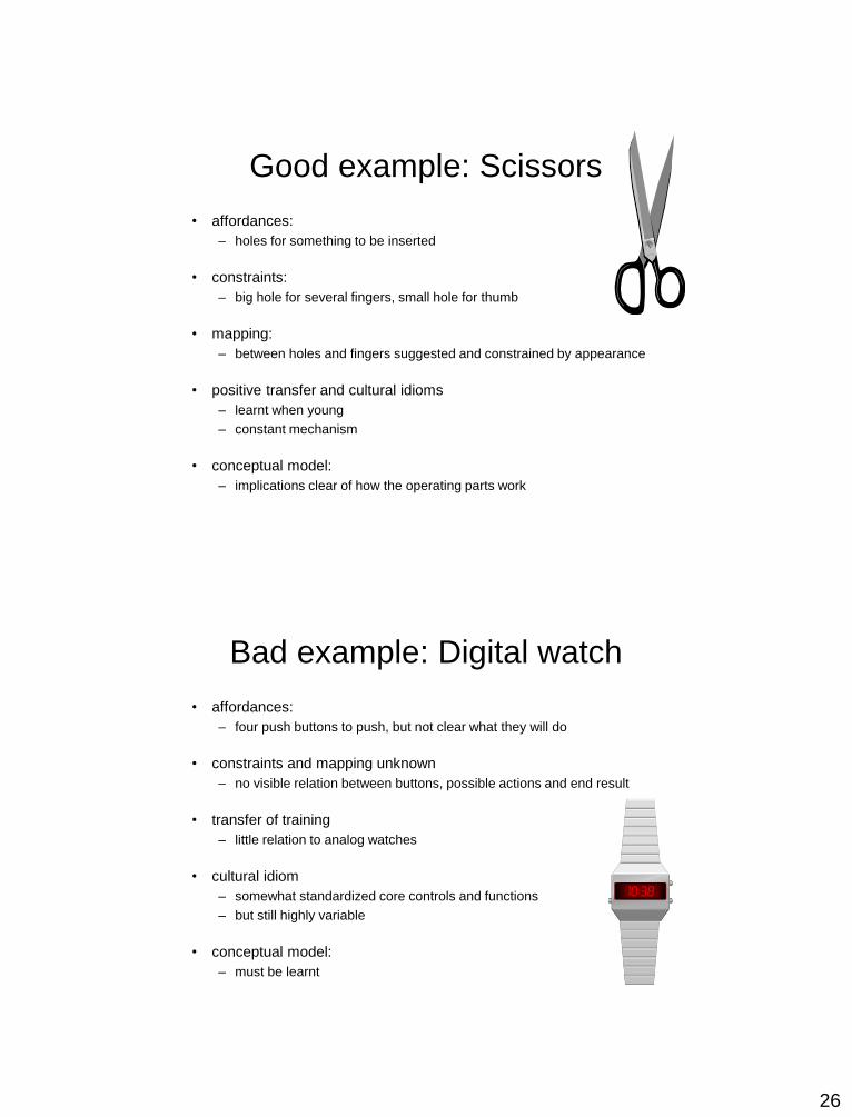
Good example: Scissors
• affordances:
– holes for something to be inserted
• constraints:
– big hole for several fingers, small hole for thumb
• mapping:
– between holes and fingers suggested and constrained by appearance
• positive transfer and cultural idioms
– learnt when young
– constant mechanism
• conceptual model:
– implications clear of how the operating parts work
Bad example: Digital watch
• affordances:
– four push buttons to push, but not clear what they will do
• constraints and mapping unknown
– no visible relation between buttons, possible actions and end result
• transfer of training
– little relation to analog watches
• cultural idiom
– somewhat standardized core controls and functions
– but still highly variable
• conceptual model:
– must be learnt
27
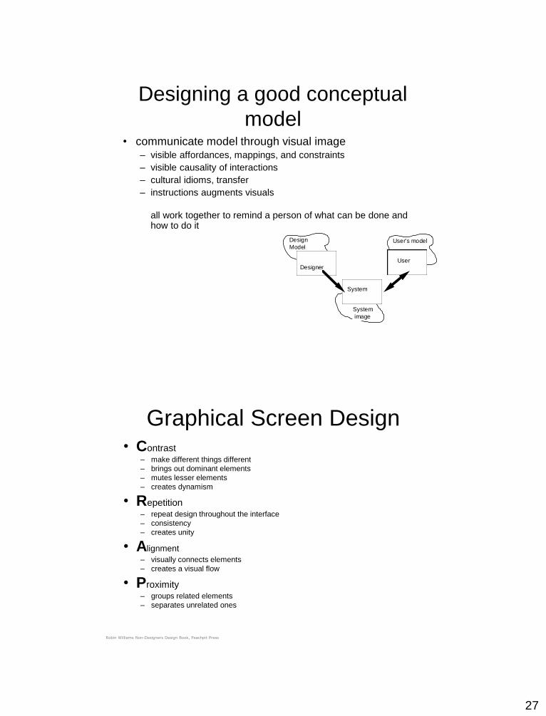
Designing a good conceptual
model• communicate model through visual image
– visible affordances, mappings, and constraints
– visible causality of interactions
– cultural idioms, transfer
– instructions augments visuals
all work together to remind a person of what can be done and how to do it
Design
Model
Designer
User's model
User
System
System
image
Graphical Screen Design• Contrast
– make different things different
– brings out dominant elements
– mutes lesser elements
– creates dynamism
• Repetition – repeat design throughout the interface
– consistency
– creates unity
• Alignment
– visually connects elements
– creates a visual flow
• Proximity – groups related elements
– separates unrelated ones
Robin Williams Non-Designers Design Book, Peachpit Press
28
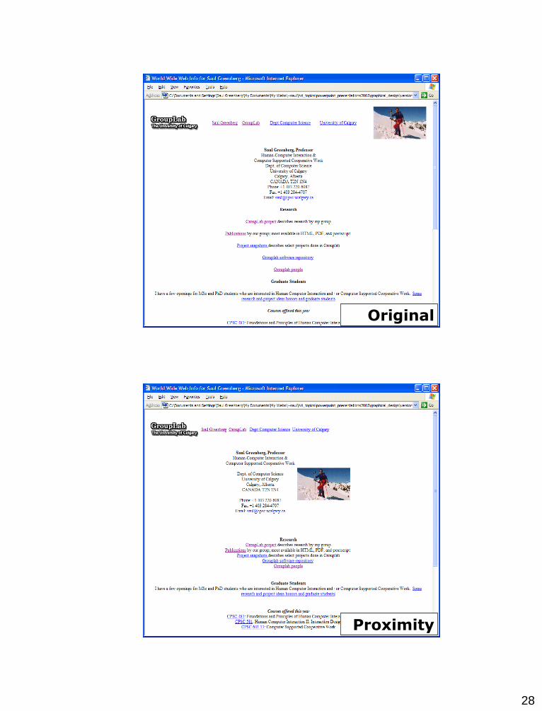
Original
Proximity

29
Alignment
Contrast

30
Repetition
Representations
• Solving a problem simply means representing it so as to
make the solution transparent
(Simon, 1981)
• Good representations
– allow people to find relevant information
• information may be present but hard to find
– allow people to compute desired conclusions
• computations may be difficult or “for free” depending on
representations
31
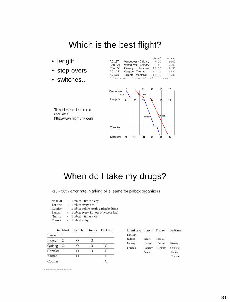
Which is the best flight?
depart arriveAC 117 Vancouver - Calgary 7:00 9:00
Cdn 321 Vancouver - Calgary 9:00 12:00
Cdn 355 Calgary - Montreal 13:30 19:30
AC 123 Calgary - Toronto 12:30 16:30
AC 123 Toronto - Montreal 16:45 17:30
*time zone: +1 van-cal, +2 cal-tor, mtl
• length
• stop-overs
• switches...
7 9 11 13 15 17
10 12 14 16 18 20
Vancouver
8 10 12 14 16 18
AC 117 Cdn 321
Cdn 355AC 123
Calgary
Toronto
Montreal
This idea made it into a
real site!
http://www.hipmunk.com
When do I take my drugs?
•10 - 30% error rate in taking pills, same for pillbox organizers
•Inderal - 1 tablet 3 times a day
Lanoxin - 1 tablet every a.m.
Carafate - 1 tablet before meals and at bedtime
Zantac - 1 tablet every 12 hours (twice a day)
Quinag - 1 tablet 4 times a day
Couma - 1 tablet a day
Breakfast Lunch Dinner Bedtime
Lanoxin O
Inderal O O O
Quinag O O O O
Carafate O O O O
Zantac O O
Couma O
Breakfast Lunch Dinner Bedtime
Lanoxin
Inderal Inderal Inderal
Quinag Quinag Quinag Quinag
Carafate Carafate Carafate Carafate
Zantac Zantac
Couma
Adapted from Donald Norman
32
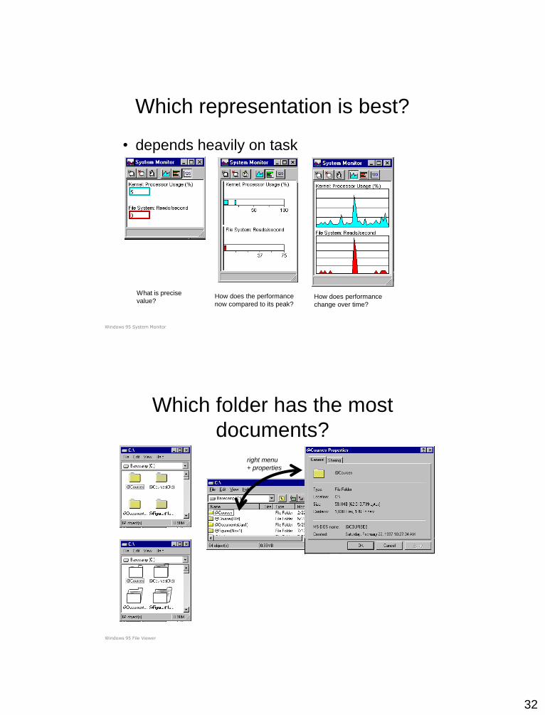
Which representation is best?
• depends heavily on task
What is precise
value?How does the performance
now compared to its peak?How does performance
change over time?
Windows 95 System Monitor
right menu
+ properties
Which folder has the most
documents?
Windows 95 File Viewer

33
Information Visualization
• Graphics should reveal the data
– show the data
– not get in the way of the message
– avoid distortion
– present many numbers in a small space
– make large data sets coherent
– encourage comparison between data
– supply both a broad overview and fine detail
– serve a clear purpose
E. Tufte Visual Display of Quantitative Information
many examples on the following slides are taken from Tufte’s books
Chart Junk: Cotton production in Brazil,
1927
E. Tufte Visual Display of Quantitative Information
34
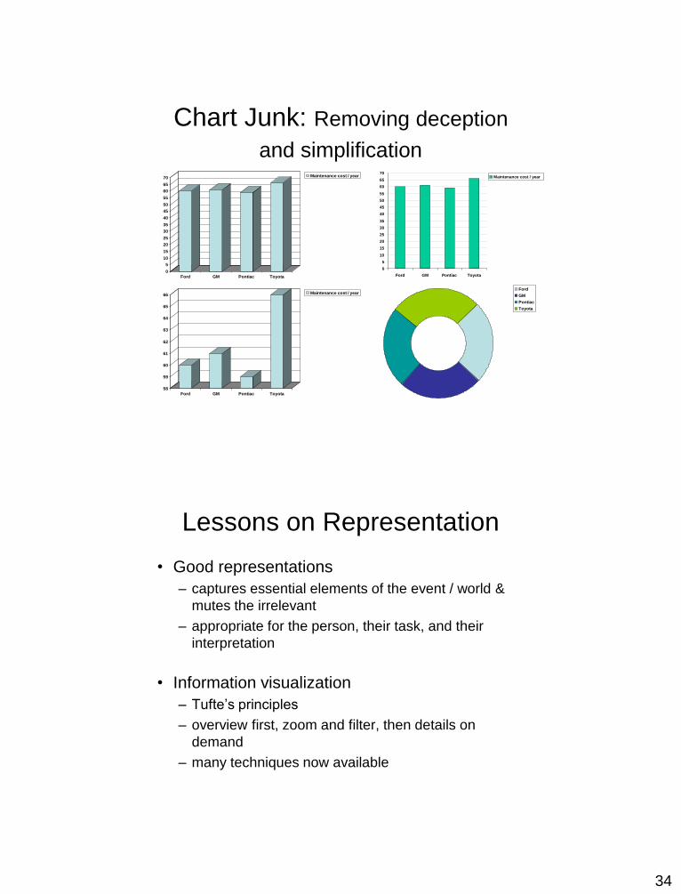
Chart Junk: Removing deception
and simplification
58
59
60
61
62
63
64
65
66
Ford GM Pontiac Toyota
Maintenance cost / year
0
5
10
15
20
25
30
35
40
45
50
55
60
65
70
Ford GM Pontiac Toyota
Maintenance cost / year
Ford
GM
Pontiac
Toyota
0
5
10
15
20
25
30
35
40
45
50
55
60
65
70
Ford GM Pontiac Toyota
Maintenance cost / year
Lessons on Representation
• Good representations
– captures essential elements of the event / world &
mutes the irrelevant
– appropriate for the person, their task, and their
interpretation
• Information visualization
– Tufte’s principles
– overview first, zoom and filter, then details on
demand
– many techniques now available
35
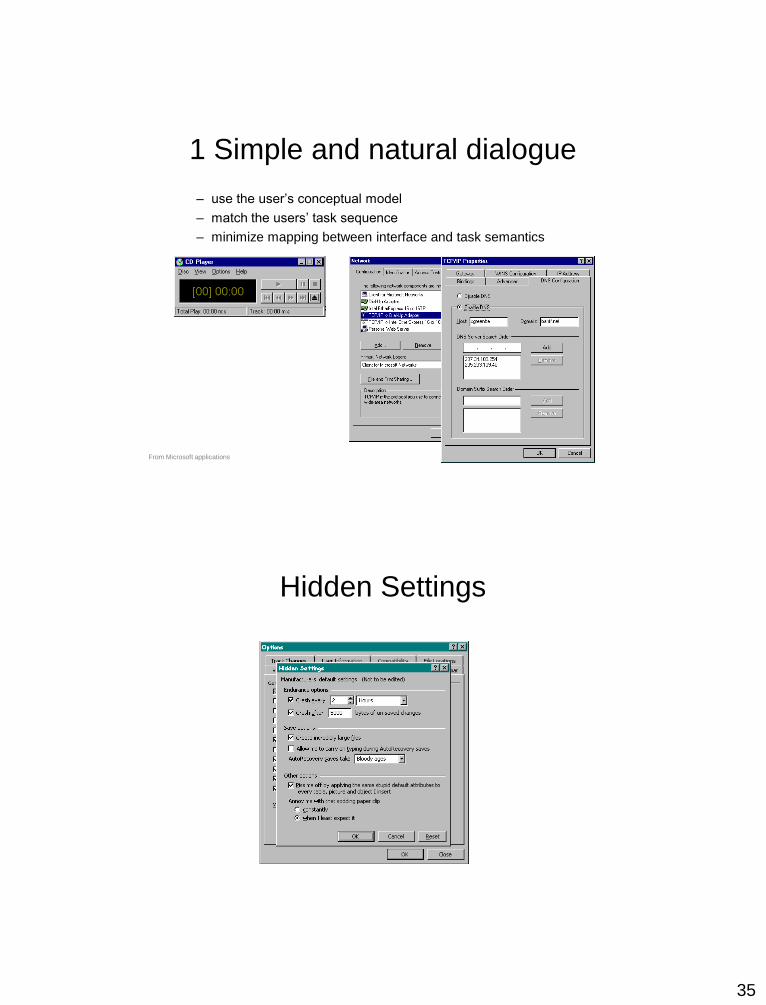
1 Simple and natural dialogue
– use the user’s conceptual model
– match the users’ task sequence
– minimize mapping between interface and task semantics
From Microsoft applications
Hidden Settings

36
1 Simple and natural dialogue
• Present exactly the information the user needs
– less is more
• less to learn, to get wrong, to distract...
– information should appear in natural order
• related information is graphically clustered
• order of accessing information matches user’s expectations
– remove or hide irrelevant or rarely needed information
• competes with important information on screen
– remove modes
– use windows frugally
• don’t add unneeded navigation and window management
2 Speak the users’ language
37
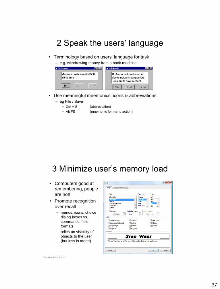
2 Speak the users’ language
• Terminology based on users’ language for task
– e.g. withdrawing money from a bank machine
• Use meaningful mnemonics, icons & abbreviations
– eg File / Save
• Ctrl + S (abbreviation)
• Alt FS (mnemonic for menu action)
3 Minimize user’s memory load
• Computers good at
remembering, people
are not!
• Promote recognition
over recall
– menus, icons, choice
dialog boxes vs.
commands, field
formats
– relies on visibility of
objects to the user
(but less is more!)
From Microsoft applications
38
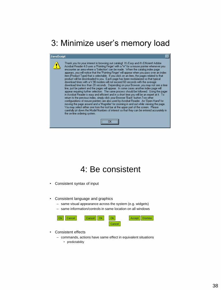
3: Minimize user’s memory load
4: Be consistent
• Consistent syntax of input
• Consistent language and graphics
– same visual appearance across the system (e.g. widgets)
– same information/controls in same location on all windows
• Consistent effects
– commands, actions have same effect in equivalent situations
• predictability
Ok Cancel OkCancel Accept Dismiss
Cancel
Ok
39
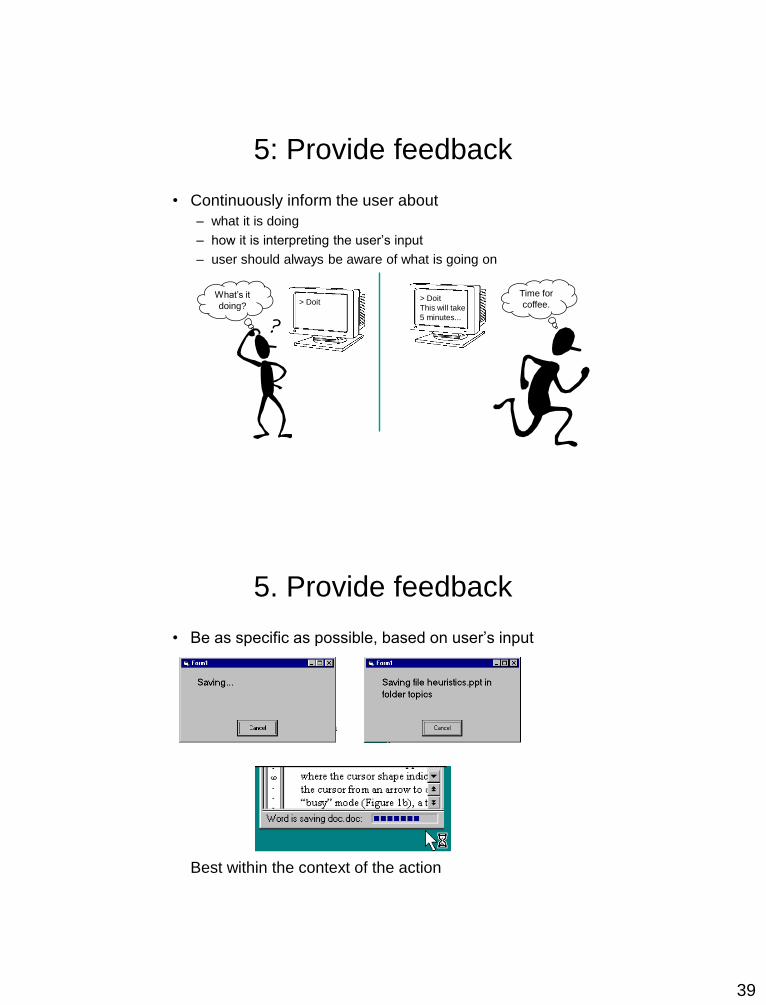
5: Provide feedback
• Continuously inform the user about
– what it is doing
– how it is interpreting the user’s input
– user should always be aware of what is going on
> DoitWhat’s it
doing?> Doit
This will take
5 minutes...
Time for
coffee.
5. Provide feedback
• Be as specific as possible, based on user’s input
Best within the context of the action

40
Provide feedback
Drawing Board LT
Multiple files being copied,
but feedback is file by file.
5. Provide feedback
• Response time
– how users perceive delays
<0.1s perceived as “instantaneous”
1s user’s flow of thought stays uninterrupted, but
delay noticed
10s limit for keeping user’s attention focused on the dialog
> 10s user will want to perform other tasks while waiting
41
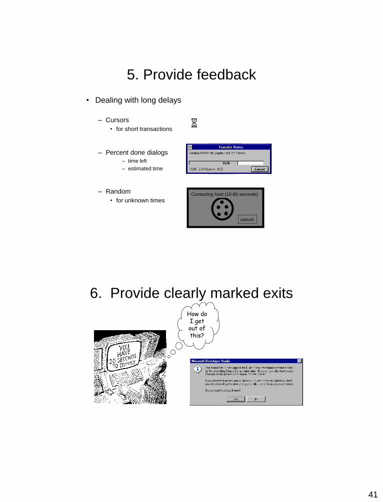
5. Provide feedback
• Dealing with long delays
– Cursors
• for short transactions
– Percent done dialogs
– time left
– estimated time
– Random
• for unknown times
cancel
Contacting host (10-60 seconds)
How do I get out of this?
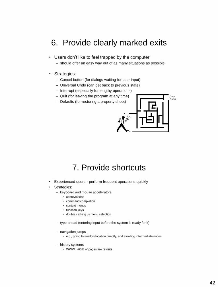
6. Provide clearly marked exits
42
6. Provide clearly marked exits
• Users don’t like to feel trapped by the computer!
– should offer an easy way out of as many situations as possible
• Strategies:
– Cancel button (for dialogs waiting for user input)
– Universal Undo (can get back to previous state)
– Interrupt (especially for lengthy operations)
– Quit (for leaving the program at any time)
– Defaults (for restoring a property sheet)
CoreDump
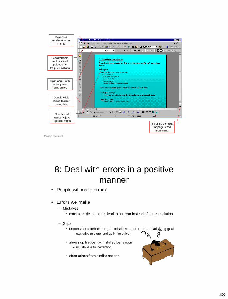
7. Provide shortcuts
• Experienced users - perform frequent operations quickly
• Strategies:
– keyboard and mouse accelerators
• abbreviations
• command completion
• context menus
• function keys
• double clicking vs menu selection
– type-ahead (entering input before the system is ready for it)
– navigation jumps
• e.g., going to window/location directly, and avoiding intermediate nodes
– history systems
• WWW: ~60% of pages are revisits
43
Keyboard
accelerators for
menus
Customizable
toolbars and
palettes for
frequent actions
Split menu, with
recently used
fonts on top
Scrolling controls
for page-sized
increments
Double-click
raises object-
specific menu
Double-click
raises toolbar
dialog box
Microsoft Powerpoint
8: Deal with errors in a positive
manner• People will make errors!
• Errors we make
– Mistakes
• conscious deliberations lead to an error instead of correct solution
– Slips
• unconscious behaviour gets misdirected en route to satisfying goal
– e.g. drive to store, end up in the office
• shows up frequently in skilled behaviour
– usually due to inattention
• often arises from similar actions

44
Designing for slips
• General rules
– prevent slips before they occur
– detect and correct slips when they do occur
– user correction through feedback and undo
Types of slips
• Capture error
– frequently done activity takes charge instead of one intended
– occurs when common & rarer actions have same initial sequence
• change clothes for dinner and find oneself in bed (William James, 1890)
• Confirm overwrite existing file when meant to save to a different file
– minimize by
• make actions undoable instead of confirmation
• allows reconsideration of action by user
– e.g. open trash to undelete a file
I can’t believe I pressed
Yes...
45
Types of slips
• Description error
– intended action similar to others that are possible
• usually occurs when right & wrong objects physically near each
other
– pour juice into bowl instead of glass
– move file to wrong folder with similar name
– minimize by
• rich feedback
• check for reasonable input, etc.
• undo
Types of slips
• Mode errors
– people do actions in one mode thinking they are in
another
• vi command mode vs. edit mode
• Refer to file that’s in a different directory
• Look for commands / menu options that are not relevant
– Minimize by
• Have as few modes as possible (preferably none)
• Make modes highly visible
46
Generic system responses for
errors• General idea: Forcing functions
– prevent / mitigate continuation of wrongful action
• Gag
– deals with errors by preventing the user from continuing
• eg cannot get past login screen until correct password entered
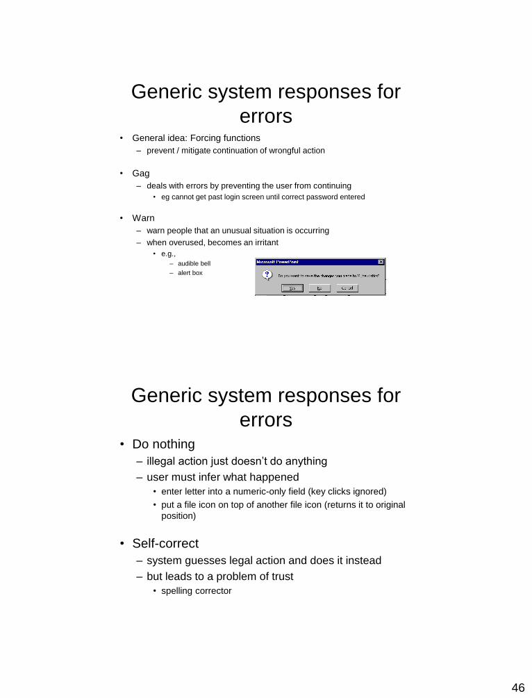
• Warn
– warn people that an unusual situation is occurring
– when overused, becomes an irritant
• e.g.,
– audible bell
– alert box
Generic system responses for
errors• Do nothing
– illegal action just doesn’t do anything
– user must infer what happened
• enter letter into a numeric-only field (key clicks ignored)
• put a file icon on top of another file icon (returns it to original
position)
• Self-correct
– system guesses legal action and does it instead
– but leads to a problem of trust
• spelling corrector
47
Generic system responses for
errors• Lets talk about it
– system initiates dialog with user to come up with
solution to the problem
• compile error brings up offending line in source code
• Teach me
– system asks user what the action was supposed to
have meant
– action then becomes a legal one
Error Dialog Boxes
• Cooper
– You should feel as guilty as for using a goto –
an admission of failure in design
• Why are they problematic?
• How related to locus of attention?
• What are the alternatives?
48
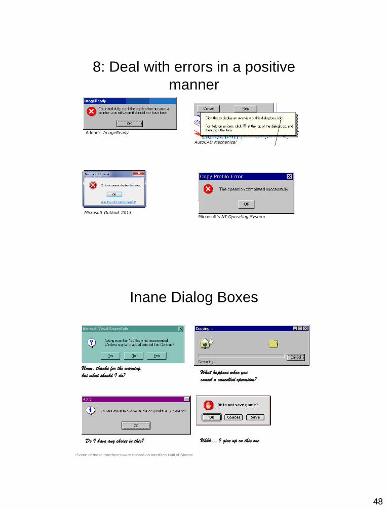
8: Deal with errors in a positive
manner
Adobe's ImageReady
AutoCAD Mechanical
Microsoft Outlook 2013Microsoft's NT Operating System
Inane Dialog Boxes
What happens when you
cancel a cancelled operation?
Do I have any choice in this?
Umm, thanks for the warning,
but what should I do?
Uhhh… I give up on this one
•Some of these interfaces were posted on Interface Hall of Shame
49
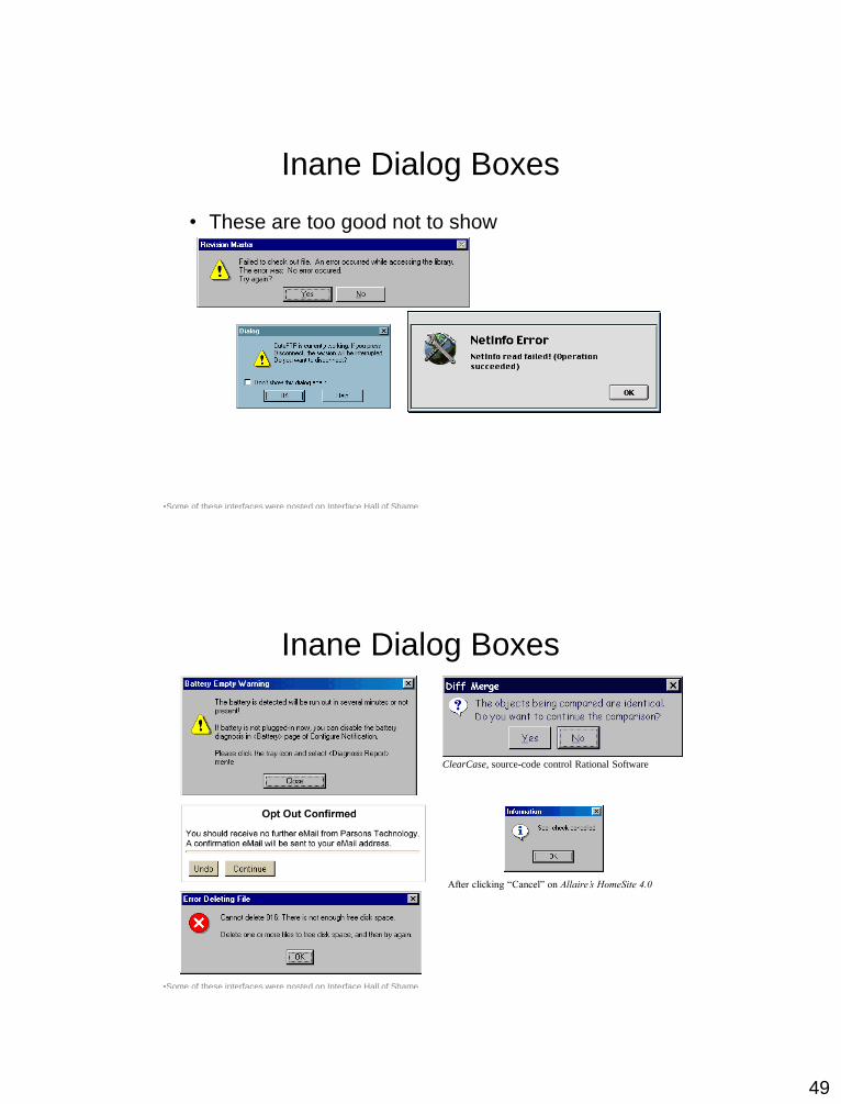
Inane Dialog Boxes
• These are too good not to show
•Some of these interfaces were posted on Interface Hall of Shame
Inane Dialog Boxes
ClearCase, source-code control Rational Software
•Some of these interfaces were posted on Interface Hall of Shame
After clicking “Cancel” on Allaire’s HomeSite 4.0
50
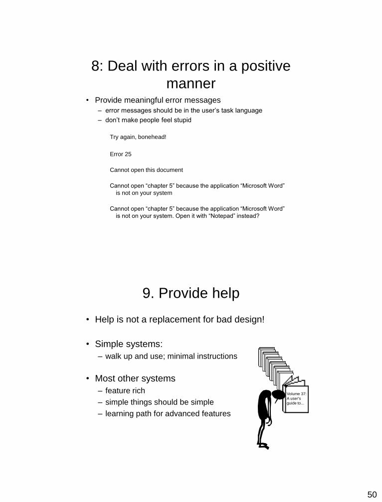
8: Deal with errors in a positive
manner• Provide meaningful error messages
– error messages should be in the user’s task language
– don’t make people feel stupid
Try again, bonehead!
Error 25
Cannot open this document
Cannot open “chapter 5” because the application “Microsoft Word”
is not on your system
Cannot open “chapter 5” because the application “Microsoft Word”
is not on your system. Open it with “Notepad” instead?
9. Provide help
• Help is not a replacement for bad design!
• Simple systems:
– walk up and use; minimal instructions
• Most other systems
– feature rich
– simple things should be simple
– learning path for advanced features
Volume 37:A user'sguide to...
51
Documentation and how it is
used• Many users do not read manuals
– prefer to spend their time pursuing their task
• Usually used when users are in some kind of panic
– paper manuals unavailable in many businesses!
• e.g. single copy locked away in system administrator’s office
– online documentation better
– good search/lookup tools
– online help specific to current context
• Sometimes used for quick reference
– syntax of actions, possibilities...
– list of shortcuts ...
Types of help
• Tutorial and/or getting started manuals
– short guides that people are likely to read when first
obtaining their systems
• encourages exploration and getting to know the system
• tries to get conceptual material across and essential syntax
– on-line “tours”, exercises, and demos
• demonstrates very basic principles through working
examples

52
Types of help
• Reference manuals
– used mostly for detailed lookup by experts
• rarely introduces concepts
• thematically arranged
– on-line hypertext
• search / find
• table of contents
• index
• cross-index
Microsoft Help
Types of help
• Wizards
– walks user through typical tasks
– but dangerous if user gets stuck
What’s my computer’s
name? Fred? Intel? AST?
Microsoft Powerpoint
53
You now know
• Nine principles of design
– Simple and natural dialog
– Speak the user’s language
– Minimize user’s memory load
– Be consistent
– Provide feedback
– Provide clearly marked exits
– Provide shortcuts
– Deal with errors in a positive manner
– Provide help
Summary
• UI Design is a creative process, with many
options
• Your design should reflect
– The results of the interviews, task analysis
– Existing conventions when applicable
– Design guidelines when applicable
• Usability testing helps you decide which of
several options to pursue

54
References
• The Design of Everyday Things
– By Donald Norman
• Bad Design Studies
http://www.baddesigns.com
• Usability Studies
http://www.useit.com/
Sources for examples:
Sachen Macdonald, Univ. of Victoria
Dey Alexander, Monash University