ixda toronto show and tell - rwd by nathalie crosbie
TRANSCRIPT

RESPONSIVE WEB DESIGN IxDA – January 29, 2014

WHAT: RWD Responsive web design (RWD) is an approach
to web design:
u aimed at crafting sites to provide an optimal viewing experience—easy reading and navigation with a minimum of resizing, panning, and scrolling—
u across a wide range of devices (from desktop computer monitors to mobile phones)
– Wikipedia
To use an example out there in the wild, it looks like….
Credit: http://link.highedweb.org/

WHAT: RWD VISUAL EXAMPLE Instead of this This
Credit: ten mile Creative

PRESENTATION SCOPE u Share: 1st hand experience leading UX/IxD Design for
complex RWD project u Based on: Project and client ask for a single RWD web
template to meet the needs of these 8 high-traffic consumer websites, while preserving their brand integrity:
http://www.chatelaine.com/
http://fr.chatelaine.com/
http://www.canadianbusiness.com/
http://www.flare.com/
http://www.lactualite.com/
http://www.moneysense.ca/
http://www.todaysparent.com/
http://www.macleans.ca/

PRESENTATION SCOPE (CONT’D)
u Will cover:
ü Why RWD ü Goals ü Success Metrics ü Complexities &
constraints
ü Approach / process ü Design examples
(wireframes, before and after)
ü Results /successes
u Will focus on UX design, not front-end/coding/development (but can share tips on those after if interested)

WHY RWD? u By 2012, it had become complex, inefficient, expensive to develop
for individual platforms u Increasing traffic from mobile; Need cross-device experience

GOALS: BUSINESS 1. Multi-screen due to growing audience engagement across
various devices
2. User-Experience: More content above the fold and clearing overall clutter
3. Improved Engagement: Implementation of usability and design best practices
4. Organic Search: Build sites to be more discoverable through Search Engine Optimization
5. Premium Advertising: Integrated placement adjacent to content and innovative multi-device ads such as full page interstitials

GOALS>SUCCESS METRICS 1. Multi-screen>RWD redesign 2. UX:
• More content above the fold>Increase engagement: +page views & +page views/Uvs (+$)
• UX: Clearing clutter>Positive user feedback 3. Implement usability/design best practices>Mobile 1st +
4. SEO>RWD; +UVs
5. Premium Advertising>Integrated placement; multi-device ads incl. full page interstitials

COMPLEXITIES / CONSTRAINTS u Balancing
• product owner goal of simple, single template • Multiple, varied brand stakeholder needs and wants
u Limited resources (team & $)
u Team new to RWD
u Prior approach more waterfall

APPROACH / PROCESS u Distill clear goals & success metrics from original ask

APPROACH / PROCESS u Request & co-locate/produce w dev and visual design
u Data-informed, forward-looking design: Used latest year to analyse: 1) current user behaviour 2) chart future trend / common paths & tasks & breakpoints (averaged: now & trending)

APPROACH / PROCESS u User research & testing: Better any/some than none
u Thorough content inventory to cover all required content & hierarchy requirements
u Frequent involvement of product owner + regular consult with other stakeholders (brand, sales, QA, Ad Ops etc.)
u RWD= 2.5x design time required

APPROACH / PROCESS u Lean design: ‘Just enough’. Artifacts needed by stakeholders
for ‘thumbs up’ vs dev for build

RESULTS: DESIGN Before (mobile) After (mobile)
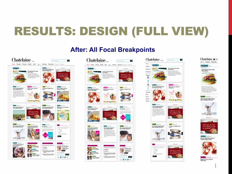
RESULTS: DESIGN (FULL VIEW) After: All Focal Breakpoints

GOALS>SUCCESS METRICS 1. Multi-screen>RWD redesign

GOALS>SUCCESS METRICS 2. UX:
• More content above the fold>Increase engagement: +page views & +page views/Uvs (+$)
+20% – Pageviews
+13% – Pageviews/Uvs

GOALS>SUCCESS METRICS 2. UX (cont’d):
• UX: Clearing clutter>Positive user feedback
“I absolutely love how it is displayed and I find it much easier to get to what I want.” - Suzanne, SK re Chatelaine.com -
“I love the new design and layout! Everything is so clean with lots of white space. On my iPhone the articles are easy to access - no need to zoom […]”
- Kelly, BC re Flare.com-
“I love how clean and crisp it looks. The simplicity works on a mobile device and it remains striking just as a web site.”
- Joanna, ON re Flare.com -
“ It looks much more modern and interactive and engaging” - Rachelle, BC re Flare.com -
“ I've accessed it on my macbook and my iPhone and it looks great on both. “ - Jeanine, ON re Flare.com -

GOALS>SUCCESS METRICS 3. Implement usability/design best practices>Mobile 1st +
Credit: http://www.smashingmagazine.com/

GOALS>SUCCESS METRICS 4. SEO>RWD; +Uvs
+10% – Visits
+8% – Unique visitors
+13% – Pageviews/Uvs

GOALS>SUCCESS METRICS 5. Premium Advertising>Integrated placement; multi-device ads incl. full page interstitials
THANK YOU! Nathalie Crosbie Twitter: @ncrosbie