jade xaml developer's reference - jade software - … · xamldevref-7.0.12 contents contents...
TRANSCRIPT

Copyright©2015 Jade Software Corporation Limited. All rights reserved.
XAML Developer's Reference VERSION 7.0.12

Jade Software Corporation Limited cannot accept any financial or other responsibilities that may be the result of your use of this informationor software material, including direct, indirect, special or consequential damages, or loss of profits. There are no warranties extended orgranted by this document or software material.
You should be very careful to ensure that the use of this software material and/or information complies with the laws, rules, and regulationsof the jurisdictions with respect to which it is used. No part of this document may be reproduced or transmitted in any form or by any means,electronic or mechanical, for any purpose, without the express written permission of Jade Software Corporation Limited.
The information contained herein is subject to change without notice. Revisions may be issued to advise of such changes and/or additions.
Copyright © 2015 Jade Software Corporation Limited.
All rights reserved.
JADE is a trademark of Jade Software Corporation Limited. All trade names referenced are the service mark, trademark, or registeredtrademark of the respective manufacturer.
For details about other licensing agreements for third-party products, you must read the JADEReadMe.txt file.
XamlDevRef - 7.0.12
Contents
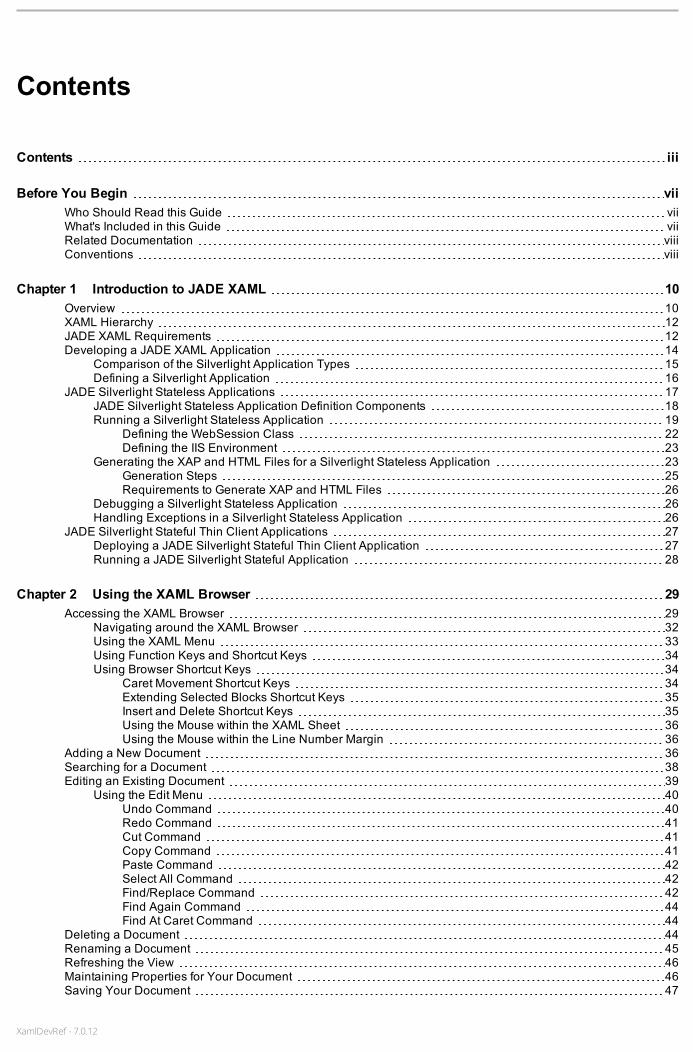
Contents iii
Before You Begin viiWho Should Read this Guide viiWhat's Included in this Guide viiRelated Documentation viiiConventions viii
Chapter 1 Introduction to JADE XAML 10Overview 10XAML Hierarchy 12JADE XAML Requirements 12Developing a JADE XAML Application 14
Comparison of the Silverlight Application Types 15Defining a Silverlight Application 16
JADE Silverlight Stateless Applications 17JADE Silverlight Stateless Application Definition Components 18Running a Silverlight Stateless Application 19
Defining the WebSession Class 22Defining the IIS Environment 23
Generating the XAP and HTML Files for a Silverlight Stateless Application 23Generation Steps 25Requirements to Generate XAP and HTML Files 26
Debugging a Silverlight Stateless Application 26Handling Exceptions in a Silverlight Stateless Application 26
JADE Silverlight Stateful Thin Client Applications 27Deploying a JADE Silverlight Stateful Thin Client Application 27Running a JADE Silverlight Stateful Application 28
Chapter 2 Using the XAML Browser 29Accessing the XAML Browser 29
Navigating around the XAML Browser 32Using the XAML Menu 33Using Function Keys and Shortcut Keys 34Using Browser Shortcut Keys 34
Caret Movement Shortcut Keys 34Extending Selected Blocks Shortcut Keys 35Insert and Delete Shortcut Keys 35Using the Mouse within the XAML Sheet 36Using the Mouse within the Line Number Margin 36
Adding a New Document 36Searching for a Document 38Editing an Existing Document 39
Using the Edit Menu 40Undo Command 40Redo Command 41Cut Command 41Copy Command 41Paste Command 42Select All Command 42Find/Replace Command 42Find Again Command 44Find At Caret Command 44
Deleting a Document 44Renaming a Document 45Refreshing the View 46Maintaining Properties for Your Document 46Saving Your Document 47

XamlDevRef - 7.0.12
Save Errors 48Invalid XAML 49Parsing Errors 50Single Quotes in the XAML 50
Comparing the XAML Changes in Parent and Subdocuments 51Saving Your Document as another Name 52Generating XAP and HTML Files 53Selecting the XAML Browser Mode 54Hiding or Showing the Toolbar 54
Chapter 3 Painting XAML Documents 56Using the XAML Painter 56Accessing the XAML Painter 57
Properties Area of the XAML Painter 59Expanding or Contracting the View of a Document 61
Painting Area of the XAML Painter 62XAML Area of the XAML Painter 62Using Function Keys and Shortcut Keys 63
Creating a XAML Document 64Adding a New XAML Document 65
Subclassing XAML Controls and Documents 67Control Subclassing 67Document Subclassing 67
Adding UI Elements to Your Document 68Selecting a UI Element 69Cloning UI Elements 70Naming a UI Element 71Adding Container UI Elements 71Changing the Caption Content of a UI Element 72Overlapping UI Elements 73Changing the Runtime Tab Sequence 74Obtaining Help for a UI Element 74
Defining the Layout of Your XAML Document 74Sizing Your UI Elements 75Aligning Your UI Elements 76Spacing Your UI Elements 76Options Panel Check Boxes 77Using Grid Lines to Position UI Elements on XAML Documents 77Locking the Position of UI Elements on Your Document 78Direct Select Functionality 78Previewing UI Elements on Your Document 79Examples of Laying Out UI Elements 80
Maintaining Properties for Your XAML Document or UI Element 81Maintaining General Properties 82Maintaining Size and Position Properties 83Maintaining Colors and Styling Properties 83
Selecting a Color 84Maintaining Font Properties 86Maintaining Grid Definitions 86Maintaining Miscellaneous Properties 87Maintaining Transformations 88
Defining Methods for Your Document 89Saving Your Document 89Editing an Existing Document in the XAML Painter 89
Using the Keyboard and Mouse to Edit Your Document 90Selecting Multiple UI Elements 90Changing the Size of Selected UI Elements 91Moving UI Elements around Your Document 91Copying UI Elements 91
XAML Developer'sReference
Contents iv

XamlDevRef - 7.0.12
Displaying the Properties for a UI Element 91Placing a UI Element on a Container UI Element 91Removing a UI Element from Your Document 92
Changing a UI Element Type 92Effects of Editing an Existing Document 93
Deleting a Document 93Layout Toolbar 93
Align Bottom Button 94Align Top Button 95Align Left Button 95Align Right Button 95Vertically Adjacent Button 95Horizontally Adjacent Button 96Align Centers Vertically Button 96Align Centers Horizontally Button 96Space Evenly Down Button 96Space Evenly Across Button 97Same Width Button 97Same Height Button 97
Chapter 4 Considerations When Developing Silverlight Applications 98Using Third-Party Controls 98
Third-Party Control Usage in JADE Silverlight Stateless Applications 98registerEventHandler Method for DataTemplate Controls 100
Third-Party Control Usage in JADE Silverlight Stateful Applications 101Abstract Classes and Third-Party Controls 101
Accessing .NET Objects 102Accessing Silverlight Fields and Properties 102Accessing Silverlight Methods 102
Overloaded .NET Methods 102Constructors 103
Specifying a Type 103Enums 103Using Layout Manager UI Element Types 104Canvas UI Element Type 105StackPanel UI Element Type 105Grid UI Element Type 106
Using the Grid Assistant 110Grid Assistant Popup Menu 112
Using Resources in XAML Documents 113Creating Controls Dynamically or from a Template 114
Use of the itemsSource Property by Different XAML Classes 115XamlSelector and XamlDataGrid Class Use of the itemsSource Property 115XamlAutoCompleteBox Use of the itemsSource Property 116
Unit Testing Silverlight Applications 117Adding Silverlight Unit Tests to the JADE Unit Testing Framework 117
Configuring a Silverlight Stateful Application to Run Unit Tests 119Configuring a Silverlight Stateless Application to Run Unit Tests 119
Running the Silverlight Application Unit Tests 121Viewing Failed and Ignored Tests 122Testing the Behavior of Silverlight UI Elements 124
Appendix A Silverlight Terms and Frequently Asked Questions (FAQs) 128Brush 128Border 128Panel 128Text Boxes and Similar Controls 129Content Control 129
XAML Developer'sReference
Contents v

XamlDevRef - 7.0.12
Scroll Viewer 129Tab Control and Tab Item 129Button, Toggle Button, Radio Button, and Check Box 130Items Control 130Shapes 130Frequently Asked Questions 130
How do I load the contents of a combo box or list box with strings? 130How do I load the contents of a combo box or list box with an image and a string? 130How do set the caption of a button? 131How do I set an image in a button? 131How do I create a layout where the controls automatically resize when the browser resizes? 131How do I set the background brush of an element in JADE logic to be a solid color, a linear image, animage, or to use a gradient? 132How can I use logic to change the way the border of a control is presented? 132What XAML UI element is most similar to the classical UI Table class, and how do I populate it? 133How do I control which document is shown to the user? 134How can I rotate text? 134How can I dynamically draw on a window? 134How do I create and use a splitter? 134How do I set up radio buttons in Silverlight? 135What is the difference between the various types of panels and how do I use them? 135How do I set the contents of a label in Silverlight? 136How do I set up and control a scrollable item in Silverlight? 136How do I use a calendar control in Silverlight? 136How do I use the date picker control in Silverlight? 136How do create a password field in Silverlight? 137What is the XamlRangeBase class and where would I use it? 137How do I control a progress bar in Silverlight? 137Is there an equivalent control to the busyIndicator in Silverlight? 137How do I detect that the Silverlight equivalent of a Folder control has changed sheets? 137How do I set up a hierarchical list box? 138What is XamlTabItem and how do I use it? 138How do I set up and use a hyperlink button? 138How do I specify an image and a label divided by 10 pixels as a content of a button? 138How do I resize the following scenario if somebody resizes the browser? 139
XAML Developer'sReference
Contents vi

XamlDevRef - 7.0.12
Before You Begin
The JADE XAML Developer’s Reference is intended as the main source of information when you are developingor maintaining JADE applications using the Extensible Application Markup Language (XAML).
This document provides reference to JADE's XAML classes, which are wrapper classes for Microsoft Silverlightfunctionality. Much of the documentation for these classes has been sourced from Microsoft's Developer NetworkLibrary Web site, available at:
http://msdn.microsoft.com/en-us/library/default.aspx
Copyright of this material remains with Microsoft Corporation.
Who Should Read this GuideThe main audience for the JADE XAML Developer’s Reference is expected to be developers of JADE applicationsoftware products using XAML.
What's Included in this GuideThe JADE XAML Developer’s Reference has four chapters and one appendix.
Chapter 1 Provides an overview of JADE XAML
Chapter 2 Provides instructions for using the XAML Browser
Chapter 3 Provides instructions about using the XAML Painter to paint XAML documents
Chapter 4 Provides details about considerations when developing a Silverlight application
Appendix A Provides Frequently Asked Questions (FAQs) and an overview of JADE XAML terminology
Example Resources
The JADE examples download contains the following example resources.
XamlStatelessSchema, which is a stateless example of the Erewhon system.
This requires the standard Erewhon schemas to be installed.
SilverlightBasic, which is a testing resource that includes an example of the handling of every type ofXamlUIElement, their properties, methods, and events.
In addition, it includes subclass handling.
The XamlStatelessSchema (and other Silverlight examples) are available from the following URL.
https://www.jadeworld.com/pdf/white-papers/examples/71/JADEExamples.exe
After you have installed the JADE_Examples.zip file, the example schemas and the JADE Erewhon SilverlightGuide are located in examples/Silverlight/examples of your JADE directory.

XamlDevRef - 7.0.12
Related DocumentationOther documents that are referred to in this guide, or that may be helpful, are listed in the following table, with anindication of the JADE operation or tasks to which they relate.
Title Related to…
JADE Encyclopaedia of XAML Classes Extensible Application Markup Language (XAML) classes
JADE Initialization File Reference Maintaining JADE initialization file parameter values
JADE Installation and Configuration Guide Installing and configuring JADE
JADE Platform Differences Guide Platform differences when running JADE applications
JADE Development Environment User’s Guide Using the JADE development environment
JADE Thin Client Guide Administering JADE thin client environments
JADE Web Application Guide Implementing, monitoring, and configuring Web applications
ConventionsThe JADE XAML Developer’s Reference uses consistent typographic conventions throughout.
Convention Description
Arrow bullet ( ) Step-by-step procedures. You can complete procedural instructions by using eitherthe mouse or the keyboard.
Bold Items that must be typed exactly as shown. For example, if instructed to type foreach,type all the bold characters exactly as they are printed.
File, class, primitive type, method, and property names, menu commands, and dialogcontrols are also shown in bold type, as well as literal values stored, tested for, andsent by JADE instructions.
Italic Parameter values or placeholders for information that must be provided; for example,if instructed to enter class-name, type the actual name of the class instead of theword or words shown in italic type.
Italic type also signals a new term. An explanation accompanies the italicized type.
Document titles and status and error messages are also shown in italic type.
Blue text Enables you to click anywhere on the cross-reference text (the cursor symbolchanges from an open hand to a hand with the index finger extended) to take youstraight to that topic. For example, click on the "What's Included in this Guide"cross-reference to display that topic.
Bracket symbols ( [ ] ) Indicate optional items.
Vertical bar ( | ) Separates alternative items.
Monospaced font Syntax, code examples, and error and status message text.
ALL CAPITALS Directory names, commands, and acronyms.
SMALL CAPITALS Keyboard keys.
XAML Developer'sReference
Before You Begin viii

XamlDevRef - 7.0.12
Key combinations and key sequences appear as follows.
Convention Description
KEY1+KEY2 Press and hold down the first key and then press the second key. For example,"press SHIFT+F2" means to press and hold down the SHIFT key and press the F2 key.Then release both keys.
KEY1,KEY2 Press and release the first key, then press and release the second key. For example,"press ALT+F,X" means to hold down the ALT key, press the F key, and then releaseboth keys before pressing and releasing the X key.
In this document, the term Microsoft Windows refers to Windows 10, Windows 8, Windows 7, Windows Server2012, Windows Server 2008, Windows Vista, or Windows Mobile. When there are differences between theversions of Microsoft Windows, the specific version of Microsoft Windows is stated.
With the exception of the jade.exe program, when referring to program executables in this document, the .exe filesuffix is omitted; for example, jadclient refers to jadclient.exe. Similarly, the .dll (Dynamic Link Library) suffix isomitted. For example, jomos refers to jomos.dll.
XAML Developer'sReference
Before You Begin ix
XamlDevRef - 7.0.12
Chapter 1 Introduction to JADE XAML
This chapter covers the following topics.
Overview
XAML Hierarchy
JADE XAML Requirements
Developing a JADE XAML Application
Comparison of the Silverlight Application Types
Defining a Silverlight Application
JADE Silverlight Stateful Thin Client Applications
Deploying a JADE Silverlight Stateful Thin Client Application
Running a JADE Silverlight Stateful Application
JADE Silverlight Stateless Applications
JADE Silverlight Stateless Application Definition Components
Running a Silverlight Stateless Application
Generating the XAP and HTML Files for a Silverlight Stateless Application
Debugging a Silverlight Stateless Application
Handling Exceptions in a Silverlight Stateless Application
OverviewIn this chapter, the term XAML indicates the Silverlight Extensible Application Markup Language (XAML)implementation. For details about XAML terminology, see Appendix A.
JADE XAML enables you to create rich Web applications that run on Windows; that is, you can developapplications that run in a browser and that use the Microsoft Silverlight presentation facilities.
Note Silverlight does not run in a 64-bit mode or from a 64-bit thin client.
As Microsoft does not yet support Silverlight in the 64-bit version, the XAML Browser or XAML Painter requires a32-bit presentation client JADE version.
User interfaces in XAML applications are:
Declared in the Windows Presentation Foundation (WPF) Extensible Application Markup Language (XAML).
Programmed using a subset of the .NET framework.
Textual content created with XAML can be searched and indexed by search engines, because it is represented asXAML text rather than being compiled.
The XAML Browser and XAML Painter JADE Silverlight applications enable you to define user interfaces in XAML.For details, see "Using the XAML Browser", in Chapter 2, and "Using the XAML Painter", in Chapter 3.

XamlDevRef - 7.0.12
Microsoft Silverlight is a browser plug-in similar to Adobe Flash. Silverlight must be installed on the clientcomputer (that is, the computer that will be using a Web browser). It can be downloaded from Microsoft. Fordetails, see "JADE XAML Requirements", later in this chapter.
A normal HyperText Markup Language (HTML) page is used to host the XAML User Interface (UI) element. An<object> tag with various information about the XAML application being referenced is present in an HTML page.Microsoft recommends that certain other HTML tags and JavaScript routines are present in this HTML file.
Depending on the Silverlight application type, JADE generates a skeleton HTML file automatically or on request,with the user XAML application embedded that conforms to these requirements. You can then alter this HTML fileto meet your requirements.
By default, the XAML application encompasses the entirety of the page, or document; however, it may be confinedto any arbitrary region of the page.
A Microsoft Silverlight application has the .xap suffix (XAML Application). You can define the following types ofSilverlight-based applications in JADE.
A stateless Web services-like version, where all presentation layout and logic handling is executed in thebrowser and requires no communication with the JADE client (standard client or application server).
Communication to the JADE system that performs the associated database logic is via Microsoft InternetInformation Server or Apache Web Server (hereafter referred to as IIS).
One or more copies of the JADE application process the requests for all users.
A Silverlight stateless application consists of the definition of:
The presentation handling that runs entirely in the browser.
The JADE logic that provides access to the database layer that runs in a standard or application serverclient.
Classes and methods that provide the communication between the two components.
Any transient objects that are created in user code should be deleted when they are no longer required. Theonly data that can be retained between requests is that data stored on the WebSession object, if that featureis configured. For details, see "Defining the WebSession Class", later in this chapter.
The JADE presentation code is translated into equivalent Silverlight C# code and compiled into a runtimeSilverlight Application (.xap) module that is loaded by the browser when the application HTML link isselected in the browser by the user.
The JadeAgl.xap file module handles the initiation process, the configuration requirements, the packagingand un-packaging of non-browser method requests, and communication with IIS via a URL that is specifiedin the HTML file.
A thin client-based version, where all JADE logic runs in the application server and communication to thebrowser hosting the content is performed via a dedicated TCP/IP connection from the workstation of the user.
A JADE Process instance is used by every connected user and the application session retains the currentstate of transient objects over subsequent transmissions from the browser. This mode of operation is referredto as the stateful mode.
Every logic reference to Silverlight GUI properties and methods is sent from the application server to thebrowser in the client’s PC. These result in a significant increase in the amount of network traffic compared tostandard thin client JADE, because the application server has no local knowledge of GUI property values. Asa result, this type of application is probably suitable only for use over a fast LAN network.
XAML Developer'sReference
Chapter 1 Introduction to JADE XAML 11
XamlDevRef - 7.0.12
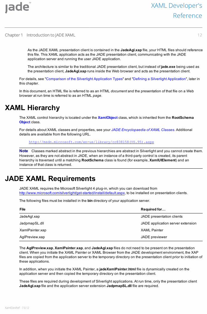
As the JADE XAML presentation client is contained in the JadeAgl.xap file, your HTML files should referencethis file. This XAML application acts as the JADE presentation client, communicating with the JADEapplication server and running the user JADE application.
The architecture is similar to the traditional JADE presentation client, but instead of jade.exe being used asthe presentation client, JadeAgl.xap runs inside the Web browser and acts as the presentation client.
For details, see "Comparison of the Silverlight Application Types" and "Defining a Silverlight Application", later inthis chapter.
In this document, an HTML file is referred to as an HTML document and the presentation of that file on a Webbrowser at run time is referred to as an HTML page.
XAML HierarchyThe XAML control hierarchy is located under the XamlObject class, which is inherited from the RootSchemaObject class.
For details about XAML classes and properties, see your JADE Encyclopaedia of XAML Classes. Additionaldetails are available from the following URL.
http://msdn.microsoft.com/en-us/library/cc838158(VS.95).aspx
Note Classes marked abstract in the previous hierarchies are abstract in Silverlight and you cannot create them.However, as they are not abstract in JADE, when an instance of a third-party control is created, its parenthierarchy is traversed until a matching RootSchema class is found (for example, XamlUIElement) and aninstance of that class is returned.
JADE XAML RequirementsJADE XAML requires the Microsoft Silverlight 4 plug-in, which you can download fromhttp://www.microsoft.com/silverlight/get-started/install/default.aspx, to be installed on presentation clients.
The following files must be installed in the bin directory of your application server.
File Required for…
JadeAgl.xap JADE presentation clients
JadpmapSL.dll JADE application server extension
XamlPainter.xap XAML Painter
AglPreview.xap JADE previewer
The AglPreview.xap, XamlPainter.xap, and JadeAgl.xap files do not need to be present on the presentationclient. When you initiate the XAML Painter or XAML Browser from the JADE development environment, the XAPfiles are copied from the application server to the temporary directory on the presentation client prior to initiation ofthese applications.
In addition, when you initiate the XAML Painter, a jadeXamlPainter.html file is dynamically created on theapplication server and then copied the temporary directory on the presentation client.
These files are required during development of Silverlight applications. At run time, only the presentation clientJadeAgl.xap file and the application server extension JadpmapSL.dll file are required.
XAML Developer'sReference
Chapter 1 Introduction to JADE XAML 12
XamlDevRef - 7.0.12
When a Silverlight application is initiated from the JADE development environment, the HTML file used to initiatethe application is dynamically generated and written to the temporary directory on the presentation client prior toinitiation of the application.
You can define your own HTML file to be used for Silverlight application initiation by setting the HtmlFileparameter in the [JadeSilverlight] section of the JADE initialization file on the application server. The HtmlFileparameter specifies the location of the HTML file to be used when the JADE XAML Painter is opened or aSilverlight application is run from the JADE development environment.
The default parameter value is <default>, which means that JADE generates an HTML file from the internallystored definition.
Specify a value other than null or <default>, to specify the location of the HTML file to be used. This parameterenables you to control the contents of the HTML. However, it must have a section of <param name="initParams"value=""/> where JADE will insert the initiation parameters required to start the Silverlight application, as shownin the following example.
[JadeSilverlight]HtmlFile=c:\JADE\Silverlightdefault.html
If the HtmlFile parameter is specified, the Silverlight <object> element must contain the following element thatcontains initParams values required to connect to the JADE application server and run an application.
<param-name="initParams" value=""/>
Any parameter specified other than App, Schema, AppServer, and AppServerPort is retained.
Notes To run a Silverlight stateless application, you must first generate the required XAP and HTML files. Fordetails, see "Generating the XAP and HTML Files for a Silverlight Stateless Application", later in this chapter.
A JADE Silverlight stateful thin client application server must be run on a port number in the range of 4502 through4534. This limitation is imposed by Microsoft, as TCP/IP connections from Silverlight applications back to the Webserver are allowed only in this range.
If a document is not defined for the current locale of your presentation client, the XAML Painter does not try to useanother locale, which is usually the default locale; that is, English (New Zealand). The XAML Browser previews adocument and loads its XAML only if there is XAML for your current (system) locale. You must therefore set yourbase locale (for example, select English (New Zealand) in the Base Locale combo box on the Miscellaneoussheet of the Preferences dialog) so that the XAML for your base locale can be located, the XAML loaded, and thedocument previewed and displayed in the XAML Painter.
By default, a Silverlight presentation client sends and receives unencrypted data over the TCP/IP connection tothe application server. As Silverlight does not support Secure Sockets Layer (SSL)-style encryption for TCP/IP, it isnot available for JADE use. You can enable encryption for all Silverlight presentation clients connecting to anapplication server by setting the TcpEncryptionType parameter in the [JadeSilverlight] section of the JADEinitialization file on the application server, as shown in the following example.
[JadeSilverlight]TcpEncryptionType=aes-128
The aes-128 value enables 128-bit Advanced Encryption Standard (AES) encryption using private/public keyexchange. A jommsg.log entry is generated confirming that encryption is in use. The other valid values are none(the default value) or empty (blank), meaning no encryption is required. Any other value reports an error and avalue of none is assumed.
XAML Developer'sReference
Chapter 1 Introduction to JADE XAML 13

XamlDevRef - 7.0.12
Developing a JADE XAML ApplicationWhen developing a JADE XAML application, you paint pages, or documents, that become subclasses of theXamlDocument class. The XamlDocument class is the Silverlight equivalent of the Form class in the classicalJADE development environment. Form classes have references to controls, and those controls have events andevent logic defined on them. This process is the same with the JADE Silverlight GUI except that you use differentclasses.
XAML documents have references to User Interface (UI) elements, which have properties, events, and event logicdefined on them. For an overview of User Interface (UI) element terminology, see Appendix A. TheXamlDocument control subclasses are in the RootSchema hierarchy under the XamlUIElement class. (See also"XAML Hierarchy", earlier in this chapter.)
HTML is a useful way of specifying graphical controls in XML. In a similar manner to HTML, Silverlight applicationsuse Extensible Application Markup Language (XAML) to specify graphical controls UI elements. Although theJADE XAML Painter provides a What You See Is What You Get (WYSIWYG) interface, it is simply dealing with anunderlying piece of XAML.
Each XamlDocument subclass in JADE is essentially a piece of XAML; that is, text in Extensible MarkupLanguage (XML) format, which you can access and edit directly through the JADE XAML Painter. (For details, seeChapter 3, "Painting XAML Documents".) This enables you to copy the XAML to third-party painters and tools andthen import them back into JADE; for example, when defining complex animations or graphics in XAML beyondthe scope of the XAML Painter.
To create a JADE XAML application, you require the following components.
1. Using the XAML Browser or the XAML Painter, or both the XAML Browser and the XAML Painter, define theSilverlight documents that make up the pages that will be displayed to the user in the browser.
2. Using the JADE development environment, define the event methods that format and process the useractions required on those documents.
For additional details about developing a Silverlight stateless application, see "JADE Silverlight StatelessApplication Definition Components", later in this chapter.
When developing a XAML application:
The debugger functions normally. For details, see "Debugging a Silverlight Stateless Application", later inthis chapter.
Although you can use app.msgBox as normal, its flags support only Okay, Cancel, Yes, and No buttons.
Note You can use app.msgBox in stateful (thin client) mode and in stateless mode.
The write statement works normally when the application is run from the JADE development environment,but when you deploy and run a XAML application from outside of the JADE development environment, itwrites to Silverlight Isolated Storage, which is a hard-to-locate directory on the presentation client thatSilverlight uses to store application information.
When you develop a XAML application using Silverlight:
Stateless mode, XAML JADE methods defined with the webServerExecution method option indicate amethod that transfers control from a browser back to JADE code via the implied Web service.
Thin client mode, XAML JADE methods defined with the browserExecution method option are converted toC# code and the compiled code is downloaded to the Silverlight client. This enables you to minimize networktraffic by performing specific user interface-related operations without requiring trips to the application server.
XAML Developer'sReference
Chapter 1 Introduction to JADE XAML 14

XamlDevRef - 7.0.12
An exception is raised when you specify the webServerExecution or browserExecution method option in amethod defined in a class that is not allowed for stateless or presentation client Silverlight processing,respectively.
Comparison of the Silverlight Application TypesThe following table compares the Silverlight presentation client-based and Silverlight stateless application types.
Silverlight Presentation Client Silverlight Stateless
A JADE process is required for each usersession.
One or more copies of the JADE process are used by allconnection clients.
Requires an application server. A standard JADE client or an application server can be used.
Communication from the browser to theJADE process is via a dedicated TCP/IPconnection.
Communication from the browser is via the standard Internetservices using IIS or Apache.
Network security is via AdvancedEncryption Standard 128
Standard browser network security via HTTPS (SSL). routines.
Stateful. All transient objects created areretained and are available during theapplication session.
Stateless. No transient object created can be retained andreused between requests sent to the JADE client. Web sessionhandling can be enabled, which provides the ability to store datapersistently on the WebSession object.
All JADE logic is executed in the applicationserver. Any reference to presentationobjects requires a transmission from theapplication server to the browser.
Presentation logic is executed entirely in the browser. Nocommunication to the JADE client is required to perform thesefunctions. All database logic is executed in the JADE client.
Not as scalable. An application server cansupport only a limited number of clients. Tosupport more clients, more applicationservers are required.
Scalable. The support of more clients requires only the initiationof more copies of the application.
Uses the standard JADE environment only. Uses the standard JADE environment. For the generation of thepresentation module, Microsoft Visual Web Developer 2010Express and Microsoft Silverlight 4 Tools for Visual Studio 2010must be installed.
No generation of the run time environmentis required.
Generation of the presentation layer is required. No generationof the JADE client application module is required.
JADE logic changes take immediate effect. JADE logic changes to the JADE client module take immediateeffect. Changes to the presentation layout and logic requirere-generation and deployment of the presentation module.
Standard JADE debugging is available. Standard JADE debugging is available for the JADE clientmodule. Debugging the presentation module can be done onlyby running a presentation client-defined version of theapplication.
XAML Developer'sReference
Chapter 1 Introduction to JADE XAML 15

XamlDevRef - 7.0.12
Defining a Silverlight ApplicationTo run a XAML application, use the Define Application dialog to specify the Silverlight application type, which canbe Silverlight (for a stateful thin client application), or Silverlight Stateless, Gui or Silverlight Stateless, Non-GUI(for a stateless application).
For details about the Application sheet of the Define Application dialog, see "Defining Applications", in Chapter 3of the JADE Development Environment User’s Guide.
To define a XAML application
1. In the Application Type combo box, select one of the following values.
Silverlight, to specify a presentation client-based JADE XAML application.
Silverlight Stateless, GUI, to specify a stateless Web services-like JADE XAML application, whichcreates the standard Web Monitor dialog that displays all received requests.
Silverlight Stateless, Non-GUI, to specify a stateless Web services-like JADE XAML application, whichdoes not create the standard Web Monitor dialog.
Notes The Silverlight Stateless, Non-GUI application type terminates only after the JADE terminateinstruction is executed.
The Application class startApplication and startAppMethod methods start only Silverlight Stateless,Non-GUI applications if they are invoked from a server method or server application. (An exception is raisedif they are invoked from a server method or a server application to start an application of a type other thannon-GUI.) On a client node, they start all types of application.
Running a JadeScript method when the currently selected application type is Silverlight or SilverlightStateless, GUI changes the application type to GUI for the execution of that method.
2. In the Startup XAML combo box, select the XAML document that is to be displayed on start up.
3. If you are defining a Silverlight stateless application, select the initialize and finalize methods to be run bythe JADE client logic when the application is initiated.
These do not apply to the presentation browser-based module. Use the start-up document create method forany initialize logic that needs to be run initially in the browser.
4. If you are defining a Silverlight stateless application, on the Web Options sheet, define:
a. The connection name and port that is used by the server application to connect to the JadeHttp.dll viaTCP/IP; for example, localhost:20002.
b. The number of the application copies to be initiated.
c. The session timeout value if sessions are enabled (for details, see the following section).
d. The scheme being used; that is, http or https (SSL).
e. The machine name to which the browser is to connect.
f. The IIS virtual directory where the HTML and XAP files are located.
XAML Developer'sReference
Chapter 1 Introduction to JADE XAML 16

XamlDevRef - 7.0.12
5. When you have saved your specified application values and clicked the OK button on the Define Applicationdialog, select the:
XAML Painter command from the File menu, to open the XAML Painter and create a new document.For details, see Chapter 3, "Painting XAML Documents".
XAML Browser command from the File menu, to open the XAML Browser; for example, if you want tonavigate to or preview an existing document. For details, see "Accessing the XAML Browser", inChapter 2.
When you have created the new document class, you can edit the document. (There will be some basic XAMLsitting in the document, based on the type of document that you specified.)
JADE Silverlight Stateless ApplicationsA JADE Silverlight stateless application is defined entirely in JADE and consists of:
The XAML documents that will be displayed to the user.
Methods to format and present XAML documents and handle GUI events.
This logic is executed entirely in the browser and these methods must have browserExecution in theirsignature and must be marked as being browserExecution. No GUI manipulation can be performed byJADE client logic; only by browserExecution logic.
In addition to primitive types and primitive type arrays, only a specific list of classes and their subclasses canuse browserExecution in their method signatures. These classes are:
XamlDocument
XamlObject
XamlManager
XamlDataObject
XamlDataObjectArray
XamlDataObjectDictionary
Application
For details, see "browserExecution Option", in Chapter 1 of the JADE Developer’s Reference.
When a class is extracted for the generation of the XAP file, only attributes (other than MemoryAddressattributes) and references of these types are extracted. All other properties are dropped from the class andare not available in the Silverlight stateless version of the class.
The value of a constant is extracted (instead of the source) when JADE generates the XAP file, so constantsthat are not extracted do not cause a problem. To use constants that are defined on classes that are notextracted for a Silverlight stateless application, redefine the constants on a class that is valid in Silverlight interms of the other (non-extracted) constant. For example:
Define the constant on the class NotExtracted as:
NotExtractedConst:Integer=123;
XAML Developer'sReference
Chapter 1 Introduction to JADE XAML 17

XamlDevRef - 7.0.12
Define the constant on the class IsExtracted as:
NotExtractedConst:Integer=NotExtracted.NotExtractedConst;
Note that the JADE compiler will check that in a browserExecution method, references are made only to:
Other browserExecution methods
webServerExecution methods on XamlDataObject subclasses in a stateless environment
A restricted set of classes, properties, and methods in the RootSchema that are marked asallowBrowserExecution
The only global class that can be referenced is the Application class. Application class property values arelocal only to where they are being referenced and they are not automatically transferred between the twomodules.
Global, Iterator, WebSession, Process, Node, and meta data (for example, Class) class references are notpermitted. When a class is extracted for the generation of the XAP file, only properties of these types areextracted. Any other properties are dropped from the class and are not available in the Silverlight version ofthe class.
You should not use properties of these classes if you intend to use the class in a stateless runtime operation.
JADE methods that will be remotely called from the browser. These are methods marked aswebServerExecution and are referenced in browserExecution methods. For details, see"webServerExecution Option", in Chapter 1 of the JADE Developer’s Reference.
These methods, which can be defined only on subclasses of XamlDataObject, can pass only parametersand a return type of the following types.
Primitives (including primitive arrays)
Subclasses of XamlDataObject
Subclasses of XamlDataObjectArray
Subclasses of XamlDataObjectDictionary (dictionaries can have one key only)
These parameters can be usage IO, input, or output.
The browser logic is always the initiator of any communication between the browser and the JADE client.This communication always takes the form of one message out from the browser and one message in replyfrom the JADE client.
Standard JADE logic associated with database access and update, called from the webServerExecutionmethods described in the previous item in this list.
JADE Silverlight Stateless Application Definition ComponentsTo create a Silverlight stateless application, you require the following components.
1. Using the XAML Browser or the XAML Painter, or both the XAML Browser and the XAML Painter, define theSilverlight documents that make up the documents that will be displayed to the user in the browser.
2. Define the event methods that format and process the user actions required on those documents.
These methods must be marked as being browserExecution. No GUI manipulation can be performed byJADE client logic; only by browserExecution logic.
XAML Developer'sReference
Chapter 1 Introduction to JADE XAML 18

XamlDevRef - 7.0.12
Notes You can subclass XamlUIElement classes and define event methods on those subclasses. Whensuch a method is present and the associated event is called, that method is called first and when that methodcalls inheritMethod, the event method associated with the actual UIElement on the document is called. Forexample, if MyXamlButton is a subclass of XamlButton and has implemented the click event, clicking abutton of that type (for example, btnOK) calls the MyXamlButton::click method and when inheritMethod iscalled, the btnOK_click method is called.
Some browsers (for example, Mozilla and Chrome) allow additional events to be processed and cause thepresentation to be repainted when a request to IIS is outstanding. For this reason, when an IIS request isoutstanding, mouse events are disabled and key events are discarded so that the user cannot affect thepresentation until the current actions are completed. This browser behavior can result in simultaneousrequests being made to IIS. For example, if a document is loaded where multiple elements implement aloaded event that references webServerExecution methods, each loaded event will effectively be sent to IISsimultaneously.
3. Define the subclasses of XamlDataObject for objects that will be passed to and returned from JADEwebServerExecution methods.
4. Define the JADE methods that will be remotely called from the browser. These are methods marked aswebServerExecution and are referenced in browserExecution methods.
These methods, which can be defined only on subclasses of XamlDataObject, can pass only parametersand a return type of the following types.
Primitives (including primitive arrays)
Subclasses of primitive arrays (for example, StringArray, StringUtf8Array, IntegerArray)
Subclasses of XamlDataObject
Subclasses of XamlDataObjectArray
Subclasses of XamlDataObjectDictionary (dictionaries can have one key only)
These parameters can be usage IO, input, or output.
The browser logic is always the initiator of any communication between the browser and the JADE client.This communication always takes the form of one message out from the browser and one message in replyfrom the JADE client.
These methods will pass the contents of the object on which the call is made, together with any parametersand any references to other objects defined. When the method returns, the content of the object on which thecall was made is updated, together with any usage IO or output parameters.
These methods:
Must delete any transient objects created, other than those passed back
Can reference any object defined within the JADE application except for any XamlDocument,XamlObject, or XamlManager classes
Running a Silverlight Stateless ApplicationYou cannot run a Silverlight stateless application in the JADE development environment. To do so, you mustcreate another application definition that is of Silverlight presentation client style; for example, to debug theapplication (for details, see "Debugging a Silverlight Stateless Application", later in this chapter).
XAML Developer'sReference
Chapter 1 Introduction to JADE XAML 19

XamlDevRef - 7.0.12
The following diagram is a depiction of the various parts of the Silverlight stateless runtime environment.
To configure the runtime environment for Silverlight stateless applications, the following components are required,after you have specified the stateless application.
To run a Silverlight stateless application
1. Configure the IIS or Apache Web Server environment in the same way that a Web service environment isdefined.
For details, see "Web Server Setup", in the Web Services Tips and Techniques white paper (available fromhttps://www.jadeworld.com/developer-center/resource-library/white-papers), and "Defining the WebSessionClass" and the IIS definition example under "Defining the IIS Environment", later in this chapter.
Note When you define the default values for your application pool, ensure that the Enable 32-BitApplications option is set to False on the Application Pool Defaults dialog, as this is the correct setting for a64-bit jadehttp.dll.
2. Copy the generated XAP and HTML files into the IIS virtual directory that is being used. For details aboutgenerating XAP and HTML files, see "Generating the XAP and HTML Files for a Silverlight StatelessApplication", later in this chapter.
3. Initiate the JADE application, ready to process requests from the users.
4. Click on a link to the HTML file that describes the application environment to be initiated.
For Microsoft security reasons, this link must be an HTTP or HTTPS link (SSL encryption) so that the domainin that link is the same domain used to obtain the XAP file. This HTML file is created by the JADEdevelopment environment during the generation process that is described under "Generating the XAP andHTML Files for a Silverlight Stateless Application", later in this chapter.
5. The browser processes the HTML file and then loads the XAP file from IIS that contains the modules requiredto be executed in the browser.
This XAP file is generated by the JADE development environment. The logic loads and displays the start-updocument defined on the JADE application.
XAML Developer'sReference
Chapter 1 Introduction to JADE XAML 20

XamlDevRef - 7.0.12
Note Browsers usually cache the XAP file, which will be downloaded again only when it is recognized asbeing different.
6. When the browser logic encounters a remote method call (a webServerExecution method), a call is made toIIS, passing the receiver object together with all of the parameter values.
The method calling the webServerExecution method could be, for example, the create method of thedocument or an event defined on the document such as the loaded event of an element or the click event ofa button.
In the following example of such a method, ShopOperator is a subclass of XamlDataObject and thegetAllOperators method is a webServerExecution method.
cmbLogonUser_loaded(control: XamlComboBox input;originalSource: XamlObject input)browserExecution, updating;
varsoperators : StringArray;shop : ShopOperator;
begincreate shop transient;operators := shop.getAllOperators();cmbLogonUser.itemsSource := operators;
epilogdelete shop;
end;
7. When IIS receives the request, it passes it to JadeHttp, which in turn passes the message to a copy of theJADE application, using the rules defined for Web services.
8. When the JADE application receives the request, it automatically creates a transient copy of the object that isthe receiver of the method to be called and any object parameters (and recursively, any references definedon those objects).
9. The JADE application then calls the requested method on the created object. That method performs theJADE logic associated with that action. For example:
getAllOperators(): StringArray webServerExecution;vars
client : Client;company : Company;result : StringArray;
begincompany := Company.firstInstance;if company <> null then
create result transient;foreach client in company.allClients do
result.add(client.name);endforeach;
endif;return result;
end;
10. When the method completes, the updated contents of the object on which the method was called are passedback to the browser, together with any parameters that were usage IO or output and the method’s returnvalue data.
XAML Developer'sReference
Chapter 1 Introduction to JADE XAML 21
XamlDevRef - 7.0.12
All transient objects created automatically in the JADE client are then deleted. It is your responsibility toensure that any other transient objects created during the execution of the JADE logic are also deleted.
11. When the reply is received in the browser logic, the objects passed back are updated and the currentmethod logic then continues its execution.
Defining the WebSession ClassIf Web session handling is not enabled, currentSession will be null in JADE logic.
If Web session handling is enabled, a unique instance of the schema WebSession subclass is created for eachuser and currentSession is set to that instance before the requested webServerExecution method is called.JADE logic can use this object to retain some state information for each user.
To enable Web session handling, use the JadeMonitorSchema schema JadeWebConfigurator application tobuild the HTML file that defines the Web environment values. For details about configuring a Web application, seeChapter 3 of the JADE Web Application Guide.
Use of this file overrides application-defined parameters. In particular, ensure that the application/web_config/web_services_provider/use_session_handling option is set to true.
Set the ApplicationConfigFile parameter value in the [WebOptions] section of the JADE initialization file to the filebeing used; for example:
[WebOptions]ApplicationConfigFile=G:\JADE\SilverlightBasic\SilverlightStatelessConfig.xml
A sample configuration is as follows.
<?xml version="1.0"?><JADE_config>
</application><application schema="SilverlightBasic" name="SilverlightBasic" id="">
<web_config><connection_name>localhost:20010</connection_name><application_copies>5</application_copies><session_timeout>10</session_timeout><minimum_response_time>0</minimum_response_time><disable_messages>false</disable_messages><output_maximum_length>0</output_maximum_length><log_file_name>c:\temp\webactivity.log</log_file_name><disable_logging>false</disable_logging><lock_retries>1</lock_retries><prompt_on_shutdown>true</prompt_on_shutdown><firewall>false</firewall><monitor_font/><base_uri>
<protocol>http</protocol><machine_name>localhost</machine_name><virtual_directory>JADE</virtual_directory>
</base_uri><support_library/><JADE_forms>
<physical_directory/><maximum_HTML_size/><scrolling_text/><show_modal/>
XAML Developer'sReference
Chapter 1 Introduction to JADE XAML 22

XamlDevRef - 7.0.12
<cross_browser/><form_style/><use_html4/><web_events>
<control_name/></web_events><image_type/><page_sequencing/>
</JADE_forms><html_documents>
<home_page/><html_page_sequencing/>
</html_documents><web_services_provider>
<read_timeout>0</read_timeout><use_session_handling>true</use_session_handling><use_document_parser>false</use_document_parser><minimum_in_use>1</minimum_in_use><maximum_in_use>1</maximum_in_use><queue_depth_limit>0</queue_depth_limit><queue_depth_limit_timeout>0</queue_depth_limit_timeout><worker_idle_timeout>0</worker_idle_timeout>
</web_services_provider></web_config>
</application></JADE_config>
Note The WebSession object for each user is a persistent object that can be updated only in transaction state.
Defining the IIS EnvironmentDefine the IIS environment as you would for a Web service application. This includes the requirement that thejadehttp.ini file contains the definition required for this application, as shown in the following example.
[SilverlightStatelessApp]ApplicationType=WebServicesTcpConnection=localhostTcpPort=20010connectionGroup=MinInuse=1MaxInuse=15CloseDelay=10MaxMessageSize=1000000MinMessageSize=5MessageTimeout=300VirtualDirectory=MaxQueueDepth=0GroupSharesConnections=false
Generating the XAP and HTML Files for a Silverlight Stateless ApplicationYou must create a Silverlight Stateless, Non-GUI or a Silverlight Stateless, Gui application type for your schemabefore you can generate the XAP and HTML files for that application. For details, see "Defining a SilverlightApplication", earlier in this chapter.
XAML Developer'sReference
Chapter 1 Introduction to JADE XAML 23
XamlDevRef - 7.0.12
The generate (XAP build) process uses the following information.
1. The JADE application definition.
2. The names that you supplied for the XAP and HTML files. By default, these are taken from the applicationname.
3. The output directory that you specified, which defines where the generated XAP and HTML files are placedat the end of a successful build. This directory name is retained in the [JadeSilverlight] section of the JADEinitialization file.
Generate the XAP and HTML files for your Silverlight stateless application in the following ways.
Using the jadclient command line (for details, see "Running a Non-GUI Client Application using jadclient", inChapter 1 of the JADE Runtime Application Guide)
From the JADE development environment
You must regenerate and redeploy the files each time you make changes to the presentation layout and logic ofthe Silverlight stateless application.
For details about generating the XAP and HTML from the JADE development environment in the XAML Browser,see "Generating XAP and HTML Files", in Chapter 2.
For details about the machine requirements, see "Requirements to Generate XAP and HTML Files", later in thischapter.
When using the jadclient command line, run the XapFileBuilder JADE schema application and provide thefollowing parameters (in the specified order).
1. Schema name
2. Application name
3. XAP file name
4. HTML file name
5. Results directory name (the directory name is retained in the [JadeSilverlight] section of the JADEinitialization file)
6. Whether the temporary build directory is retained
The following is an example of using the jadclient command line to generate the files.
jadclient path=c:\mySystem ini=c:\mySystem\JADE.ini schema=JadeSchemaapp=XapFileBuilder endJADE MySilverlightSchema MySilverlightApplicationMySilverlightApp StartupPage c:\website\bin true
The generate is performed on the client node (that is, the standard JADE client or the application server, whenrunning in presentation client mode). In Silverlight thin client mode, the XAP file is always built on the applicationserver, in the JADE work directory of that node.
However if the build does not complete successfully, the log files are copied to the location specified by theXapBuildLogDirectory parameter in the [JadeSilverlight] section of the JADE initialization file (when running inpresentation client mode, the JADE initialization file is located on the presentation client and the log files aretherefore copied to a location relative to the presentation client). If the value of this parameter is <default> or it isnot specified, any log files are copied to the JADE logs directory on the application server. The number of files thatis output depends on the phases of the XAP build process that have completed.
XAML Developer'sReference
Chapter 1 Introduction to JADE XAML 24

XamlDevRef - 7.0.12
By default, the build directory is deleted if the generate completes successfully. You can configure the XAP filegenerate process to retain the build directory, by checking the Retain XAP build directory check box on the XAPFile Generator dialog or by specifying true as the last parameter in the jadclient command line.
When the XAP file generate process is configured to retain the build directory and the build fails, the build files arecopied back to the presentation client (into the location specified by the JadeWorkDirectory parameter on the[JadeEnvironment] section of the JADE initialization file on the presentation client). The files on the applicationserver are still deleted.
The name of the retained directory has the following format.
JadXAPBuild_user-code_timestamp
If you want the retained directory to be written to a constant unique directory, specifyUniqueXapBuildDirectory=false in the [JadeSilverlight] section of the JADE initialization file on the presentationclient. This excludes the timestamp portion of the file name. However, any contents in any existing directory areoverwritten.
Generation StepsAfter starting, the XAP file generate process:
1. Extracts browserExecution methods and class definitions.
2. Generates C# code and project files for extracted methods and classes.
3. Runs the Microsoft build process over the code generated in the previous step, to build the XAP file.
4. Generates an HTML page to launch the application.
5. Copies the XAP and HTML files to the specified location, and deletes all work files and directories, ifconfigured to do so.
As each step is performed, status messages are recorded in various log files.
If the generate is successful, these files (which reside in the temporary directory created for the generate) areremoved on completion of the build process.
If the build fails, the entire temporary directory is retained. A failure is also recorded in the JADE message log (thatis, jommsgn.log file). If the build fails, the location of the temporary directory and the XAPbuild.log is reported in adialog when you run the generate process in the JADE development environment. It is also recorded in the JADEmessage log, which is useful if you run the generate process from the jadclient program. The XAPbuild.log filelists the steps being performed and whether they were successful.
If a step fails, this log file may refer to another log, which may contain more-specific details.
When you run the XapFileBuilder application from the jadclient program and the generation fails, the exit codereturned is 1; successful generation returns zero (0). Reasons for failure include:
Invalid arguments in the XAP build process
When a JADE method has not been compiled
When a JADE method is in error
When a syntax error occurs in the generated C# compile
XAML Developer'sReference
Chapter 1 Introduction to JADE XAML 25

XamlDevRef - 7.0.12
Requirements to Generate XAP and HTML FilesThe XAP and HTML files are generated on the client node (on the application server when running in thin clientmode). The machine on which the client node is running requires the following .NET and Silverlight software togenerate the XAP and HTML files used by Silverlight stateless applications.
Microsoft Visual Web Developer 2010 Express, which you can obtain fromhttp://www.microsoft.com/express/Downloads/
You can install Microsoft Visual Studio 2010 Professional instead of Microsoft Visual Web Developer 2010Express. (Microsoft SQL Server is not required to be installed.)
Microsoft Silverlight 4 Tools for Visual Studio 2010, which you can obtain fromhttp://go.microsoft.com/fwlink/?LinkID=177428
Debugging a Silverlight Stateless ApplicationTo examine the processing of requests received from the browser in the JADE debugger, initiate the applicationfrom the Run Application dialog in the JADE development environment and check the Activate Debugger checkbox.
Note In some browsers (for example, Mozilla and Chrome) some events occur asynchronously and may bedirected to application copies that are not being debugged. To avoid this situation, specify 1 in the ApplicationCopies text box on the Web Options sheet of the Define Application dialog and specify >1 in the MaxInUseparameter in the jadehttp.ini file.
To debug the presentation client logic, you must create another application definition that is of Silverlightpresentation client style. This requires use of an application server to run the application. Initiate this applicationfrom the Run Application dialog in the JADE development environment and check the Activate Debugger checkbox. Under this debugging mode, JADE will create a WebSession object to cover the case where Web sessionhandling is enabled. Debugging in this mode may not be entirely identical to running without debugging, becauseasynchronous events do not occur, the application mode will be stateful, and the thin client logic for processingGUI properties and methods is different from that used in the stateless mode.
Handling Exceptions in a Silverlight Stateless ApplicationBy default, JADE logic exceptions in the JADE client are caught by an internal global exception handler andlogged as normal. No exception dialog is displayed. The failure is also reported back to the browser client anddisplayed in the default exception dialog.
Your application could install its own global exception handler, if required.
Exceptions that occur in the Silverlight presentation logic running in the browser are displayed to the user, bydefault. This presentation includes:
The name of the method in which the exception occurred.
The type of the exception that occurred.
The text of the error message.
The stack trace of the logic exception.
A button that allows the user to copy the information to the clipboard.
XAML Developer'sReference
Chapter 1 Introduction to JADE XAML 26

XamlDevRef - 7.0.12
A button that allows the user to return to the page on which the error occurred and to try again or to performsome other option.
JADE enables you to process the exception by re-implementing the Application classhandleSilverlightException method (for Silverlight stateless applications), as follows.
app.handleSilverlightException(errorNumber: Integer;methodName: String;exceptionType: String;error: String;stackTrace: String): Boolean;
The parameters in this method are listed in the following table.
Parameter Description
errorNumber Error number, if known. This will be non-zero for known situations only; for example, arrayindex out of bounds.
methodName Name of the method in which the exception occurred. For security reasons, Silverlight doesnot let logic access the line and column number where the exception occurred.
exceptionType Name of the exception type (which can be null).
error Error message text.
stackTrace Execution method stack at the time of the exception. This can be null if the exception wasassociated with the inability to connect to the application via IIS.
A return value of true prevents the default exception dialog being displayed. A return value of false displays thedefault exception dialog.
JADE Silverlight Stateful Thin Client ApplicationsA normal HTML page is used to host the Silverlight control. Inside an HTML page is an <object> tag with variousinformation about the Silverlight application being referenced. Microsoft recommends that some other HTML tagsand JavaScript routines are present in this HTML file. On request, JADE automatically generates a skeleton HTMLfile with the user Silverlight application embedded that conforms to these requirements. You can then extend oralter this HTML file, to meet the requirements of your Web site. By default, the Silverlight application encompassesthe entirety of the page; however, it may be confined to any arbitrary region of the page.
A Microsoft Silverlight application has the .XAP suffix (XAML Application). The JADE Silverlight thin client iscontained in the file JadeAgl.xap. Your HTML files should therefore reference this file. This application acts as theJADE thin client, communicating with the JADE application server and running the user JADE application. Thearchitecture is similar to the traditional thin client, but rather than the normal use of jade.exe as a thin client,JadeAgl.xap runs inside the browser and acts as the thin client.
For details about using third-party controls in a Silverlight stateful application, see "Third-Party Control Usage inJADE Silverlight Stateful Applications", in Chapter 4.
Deploying a JADE Silverlight Stateful Thin Client ApplicationThe deployment of a JADE Silverlight presentation client application is similar to an application that is based on asystem with an application server and classical presentation clients. As in these systems, the Silverlightpresentation client is connected to the application server via TCP. This connection is retained until the applicationterminates.
XAML Developer'sReference
Chapter 1 Introduction to JADE XAML 27

XamlDevRef - 7.0.12
The difference with a Silverlight application is that there is no need for a JADE installation at the presentationclient end. The presentation client is the JadeAGL Silverlight application and does not need a JADE systeminstalled to run. The JadeAgl.xap file must be visible to the browser environments. This XAP file must match theversion running in the application server. Silverlight as a plug-in handles version changes and ensures that thelatest JadeAGL version is present at the browser end.
To deploy your XAML application, copy the HTML file and JadeAgl.xap file to the Web server, as well as anyimage and media files used by the application.
Within the Silverlight section of the HTML file is an automatically generated line; for example:
<param name="initParams" value="App=SimpleXamlShopSchema,Schema=SimpleXamlShopSchema, AppServer=appserver.jadeworld.com,AppServerPort=4531"/>
You can alter these settings, depending on the location of your application server. These settings are read byJadeAgl.xap when the application starts up and used during initial contact of the JADE application server.
Because of a security restriction imposed by Microsoft, whenever a Silverlight user application attempts to open aTCP connection back to the Web server, the system must first confirm that the Web server has given permission forthis. The Web server must therefore have a Silverlight Policy Server running that gives the appropriatepermissions. The policy server must listen for incoming connections on port 943 and respond to a policy request,by replying with the appropriate XML policy permissions file.
JADE provides you with the App=SilverlightPolicyServer, Schema=JadeSchema policy server. This is a non-GUI application that you can run by using a standard JADE shortcut or you can execute it automatically when theapplication server starts up, by using the JADE initialization file syntax for the initiation of non-GUI applications.(This policy server is used automatically when running a Silverlight application within the JADE developmentenvironment.)
For details, see "Running a Non-GUI Client Application using jadclient", in Chapter 1 of the JADE RuntimeApplication Guide, the Application class startApplication, startApplicationWithParameter, or startAppMethodmethod in Chapter 1 of the JADE Encyclopaedia of Classes, or the ServerApplication parameter in the[JadeServer], [JadeAppServer], or [NonGuiClient] section of the JADE Initialization File Reference.
Alternatively, JADE provides example C# source code, derived from a Microsoft example, which you can use torun a simple C# policy server on your Web server. If there is no policy server running on your Web server, theJADE Silverlight presentation client will fail to connect to the application server because Silverlight will deny itaccess.
Running a JADE Silverlight Stateful ApplicationRunning a JADE Silverlight presentation client application is very similar to running an application that is basedon a system with an application server and classical presentation clients. Use the Run Application button from theBrowser toolbar to run a JADE Silverlight presentation client application. The Run Application dialog is thendisplayed.
For details, see "Running an Application from the JADE Development Environment", in Chapter 1 of the JADERuntime Application Guide.
XAML Developer'sReference
Chapter 1 Introduction to JADE XAML 28
XamlDevRef - 7.0.12
Chapter 2 Using the XAML Browser
This chapter covers the following topics.
Accessing the XAML Browser
Navigating around the XAML Browser
Using the XAML Menu
Using Function Keys and Shortcut Keys
Using Browser Shortcut Keys
Adding a New Document
Searching for a Document
Editing an Existing Document
Deleting a Document
Renaming a Document
Refreshing the View
Maintaining Properties for Your Document
Saving Your Document
Comparing the XAML Changes in Parent and Sub-documents
Saving Your Document as another Name
Generating XAP and HTML Files
Selecting the XAML Browser Mode
Hiding or Showing the Toolbar
Accessing the XAML BrowserUse the XAML Browser to:
Navigate through the XAML documents in your schema
View the actual XAML or a preview of the document layout
Activate the XAML Painter (for details, see "Accessing the XAML Painter", in Chapter 3)
You can start multiple copies of the XAML Browser, which can run in parallel with one or more copies of the XAMLPainter.
Note The XAML Browser can be run from a standard or presentation client. However, you cannot toggle to thePaint mode if you are running a standard client.

XamlDevRef - 7.0.12
To access the XAML Browser
1. Select the XAML Browser command from the File menu of a standard browser window.
The XAML Browser is then displayed. When you first access the XAML Browser, no document is selected sothere is no XAML to display.
The name of the schema whose XAML documents you are browsing is displayed in the title bar of the XAMLBrowser, as shown in the following diagram.
The Navigator pane at the left of the XAML Browser provides a Class Browser that displays onlyXamlDocument subclasses.
The pane at the right of the XAML Browser displays the XAML or a preview of the selected document.
2. If you want to preview or display the XAML of an existing document in the schema, select the document inthe Navigator pane at the left of the XAML Browser. Alternatively, use the Find Document dialog to searchfor an existing document (for details, see "Searching for a Document", later in this chapter).
Click the plus sign (+) at the left of a document in the Navigator pane, to display its sub-documents. Tocollapse the display of the sub-documents for a document, click on the minus sign (-).
XAML Developer'sReference
Chapter 2 Using the XAML Browser 30

XamlDevRef - 7.0.12
XAML for the selected document is displayed, as shown in the following diagram.
The XAML sheet, in the pane at right of the XAML Browser, is displayed by default and displays the XAML ofthe XamlDocument subclass selected in the Navigator pane.
Note The colors used for elements, attributes, and attribute value on the XAML sheet are JADE defaultcolors and you cannot change them.
3. To collapse the display of an element, click on a minus sign (-) in the second column. That element,including its closing tag row, is then hidden and a plus sign (+) is displayed in the second column to indicatea hidden element.
4. Edit the XAML on this sheet, if required. For details, see "Editing an Existing Document", later in thisdocument.
We recommend that you use the XAML Painter to add and define the User Interface (UI) elements on yourdocument. For details, see Chapter 3, "Painting XAML Documents".
XAML Developer'sReference
Chapter 2 Using the XAML Browser 31

XamlDevRef - 7.0.12
5. To preview the page of a document subclass, select the Preview tab. The document is then previewed in thepane at the right of the XAML Browser, as shown in the following diagram.
6. To clear the preview or display of the XAML of the selected document in the schema, click the Clear button inthe Navigator pane at the left of the XAML Browser. The document is no longer selected in the Navigatorpane and the XAML and Preview sheets are cleared.
This does not delete the document.
7. To close the XAML Browser, click the close icon at the upper-right of the XAML Browser.
For details about accessing the XAML Painter if you are running a presentation client, see "Accessing the XAMLPainter", in Chapter 3.
Navigating around the XAML BrowserUse XAML Browser toolbar buttons to:
Quickly access commonly used functions
Switch between the Navigate and Paint modes
The toolbar buttons are a point-and-click alternative to other XAML menu actions; for example, the New orRefresh command. For details, see "Using the XAML Menu", in the following section.
XAML Developer'sReference
Chapter 2 Using the XAML Browser 32

XamlDevRef - 7.0.12
Note The toolbar is displayed, by default. To hide the toolbar display (for example, if you want to maximize thearea for XAML, preview, or painter area), click the close icon at the upper right corner of the toolbar or select theHide Toolbar command from the XAML menu.
To display the toolbar when it has been hidden, select the Show Toolbar command from the XAML menu.
The radio buttons on the toolbar enable you to specify the mode in which the XAML Browser operates. Examplesof the default Navigate mode are shown in the previous section; that is, "Accessing the XAML Browser".
In the Paint mode, the Navigator pane and the pane at the right of the XAML Browser pane are replaced by aninstance of the XAML Painter. (In Paint mode, the XAML Browser toolbar is displayed.) For details about the XAMLPainter, see "Accessing the XAML Painter", in Chapter 3. For details about selecting the Paint or Navigator mode,see "Selecting the XAML Browser Mode", later in this chapter.
Because the XAML Painter is a Silverlight application that can be run only from a presentation client, the Paintmode is disabled when you are not running as a presentation client.
When the XAML Browser is active, the XAML menu specific to the XAML Browser is displayed in the JADEdevelopment environment, to enable you to change the mode of operation and to recover a hidden toolbar, forexample.
Using the XAML MenuThe XAML menu enables you to perform XAML functions from within the XAML Browser or XAML Painter. TheXAML menu commands are listed in the following table, with their toolbar buttons, where applicable, and areference to the subsections that provide more details.
Button Command Description For details, see…
New Opens the New XAML Document dialog Adding a New Document
Edit Displays the Edit XAML Documentdialog
Editing an Existing Document
Delete Cuts (logically deletes) the document Deleting a Document
Rename Renames a document Renaming a Document
Find Document Opens the Find Document dialog Searching for a Document
Refresh Undoes all changes since the documentwas last saved and refreshes the view
Refreshing the View
Properties Accesses the Properties dialog Maintaining Properties for YourDocument
Save Saves the current document Saving Your Document
Save As Saves your document as another name Saving Your Document as anotherName
Generate XAP Generates the XAP and HTML files ofthe Silverlight stateless application
Generating the XAP and HTMLFiles for a Silverlight StatelessApplication
XAML Developer'sReference
Chapter 2 Using the XAML Browser 33

XamlDevRef - 7.0.12
Button Command Description For details, see…
Mode Selects the Navigate or Paint mode Selecting the XAML BrowserMode
Hide|Show Toolbar Toggles the display of the toolbar Hiding or Showing the Toolbar
Using Function Keys and Shortcut KeysYou can use the keyboard to perform functions to the XAML on the XAML sheet in the pane at the right of theXAML Browser. The keyboard shortcut commands on the XAML sheet follow standard conventions. Press:
F1, to display online help for the item with input focus.
F4, to display the Find Document dialog.
Using Browser Shortcut KeysUse shortcut keys to quickly perform actions on the XAML sheet of the XAML Browser.
Caret Movement Shortcut KeysThe shortcut keys listed in the following table enable you to perform caret movement functions on the XAML sheetby using the keyboard.
Key Moves the caret…
← One character to the left. When text is selected, moves the caret to the left of the selectedtext (that is, it falls off the left).
→ One character to the right. When text is selected, moves the caret to the right of theselected text (that is, it falls off the right).
CTRL+← To the beginning of the word (delimited by white space and an alphanumeric or anon-alphanumeric character) on the left.
CTRL+→ To the beginning of the word (delimited by white space and an alphanumeric or anon-alphanumeric character) on the right.
↑ Up one line.
↓ Down one line.
CTRL+↓ Scrolls down the text displayed on the XAML sheet by one line.
CTRL+↑ Scrolls up the text displayed on the XAML sheet by one line.
CTRL+[ To the top of code on the XAML sheet; that is, to the <UserControl> element.
CTRL+] To the bottom of the code on the XAML sheet; that is, to the </UserControl> element.
CTRL+/ To the previous word part (press SHIFT to extend the selection).
CTRL+\ To the next word part (press SHIFT to extend the selection).
CTRL+ENTER To a newly inserted line without performing automatic indenting.
PAGE UP Up one screen.
PAGE DOWN Down one screen.
XAML Developer'sReference
Chapter 2 Using the XAML Browser 34
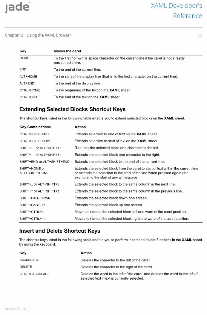
XamlDevRef - 7.0.12
Key Moves the caret…
HOME To the first non-white space character on the current line if the caret is not alreadypositioned there.
END To the end of the current line.
ALT+HOME To the start of the display line (that is, to the first character on the current line).
ALT+END To the end of the display line.
CTRL+HOME To the beginning of the text on the XAML sheet.
CTRL+END To the end of the text on the XAML sheet.
Extending Selected Blocks Shortcut KeysThe shortcut keys listed in the following table enable you to extend selected blocks on the XAML sheet.
Key Combinations Action
CTRL+SHIFT+END Extends selection to end of text on the XAML sheet.
CTRL+SHIFT+HOME Extends selection to start of text on the XAML sheet.
SHIFT+← or ALT+SHIFT+← Reduces the selected block one character to the left.
SHIFT+→ or ALT+SHIFT+← Extends the selected block one character to the right.
SHIFT+END or ALT+SHIFT+END Extends the selected block to the end of the current line.
SHIFT+HOME orALT+SHIFT+HOME
Extends the selected block from the caret to start of text within the current lineor extends the selection to the start of the line when pressed again (forexample, to the start of any whitespace).
SHIFT+↓ or ALT+SHIFT+↓ Extends the selected block to the same column in the next line.
SHIFT+↑ or ALT+SHIFT+↑ Extends the selected block to the same column in the previous line.
SHIFT+PAGE DOWN Extends the selected block down one screen.
SHIFT+PAGE UP Extends the selected block up one screen.
SHIFT+CTRL+← Moves (extends) the selected block left one word of the caret position.
SHIFT+CTRL+→ Moves (extends) the selected block right one word of the caret position.
Insert and Delete Shortcut KeysThe shortcut keys listed in the following table enable you to perform insert and delete functions in the XAML sheetby using the keyboard.
Key Action
BACKSPACE Deletes the character to the left of the caret.
DELETE Deletes the character to the right of the caret.
CTRL+BACKSPACE Deletes the word to the left of the caret, and deletes the word to the left ofselected text if text is currently selected.
XAML Developer'sReference
Chapter 2 Using the XAML Browser 35
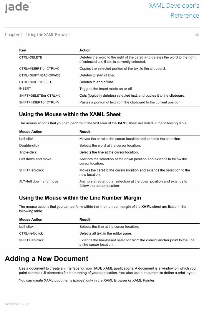
XamlDevRef - 7.0.12
Key Action
CTRL+DELETE Deletes the word to the right of the caret, and deletes the word to the rightof selected text if text is currently selected.
CTRL+INSERT or CTRL+C Copies the selected portion of the text to the clipboard.
CTRL+SHIFT+BACKSPACE Deletes to start of line.
CTRL+SHIFT+DELETE Deletes to end of line.
INSERT Toggles the insert mode on or off.
SHIFT+DELETEor CTRL+X Cuts (logically deletes) selected text, and copies it to the clipboard.
SHIFT+INSERTor CTRL+V Pastes a portion of text from the clipboard to the current position.
Using the Mouse within the XAML SheetThe mouse actions that you can perform in the text area of the XAML sheet are listed in the following table.
Mouse Action Result
Left-click Moves the caret to the cursor location and cancels the selection.
Double-click Selects the word at the cursor location.
Triple-click Selects the line at the cursor location.
Left down and move Anchors the selection at the down position and extends to follow thecursor location.
SHIFT+left-click Moves the caret to the cursor location and extends the selection to thenew location.
ALT+left down and move Anchors a rectangular selection at the down position and extends tofollow the cursor location.
Using the Mouse within the Line Number MarginThe mouse actions that you can perform within the line number margin of the XAML sheet are listed in thefollowing table.
Mouse Action Result
Left-click Selects the line at the cursor location.
CTRL+left-click Selects all text in the editor pane.
SHIFT+left-click Extends the line-based selection from the current anchor point to the lineat the cursor location.
Adding a New DocumentUse a document to create an interface for your JADE XAML applications. A document is a window on which youpaint controls (UI elements) for the running of your application. You also use a document to define a print layout.
You can create XAML documents (pages) only in the XAML Browser or XAML Painter.
XAML Developer'sReference
Chapter 2 Using the XAML Browser 36
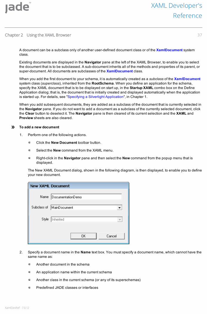
XamlDevRef - 7.0.12
A document can be a subclass only of another user-defined document class or of the XamlDocument systemclass.
Existing documents are displayed in the Navigator pane at the left of the XAML Browser, to enable you to selectthe document that is to be subclassed. A sub-document inherits all of the methods and properties of its parent, orsuper-document. All documents are subclasses of the XamlDocument class.
When you add the first document to your schema, it is automatically created as a subclass of the XamlDocumentsystem class (superclass), inherited from the RootSchema. When you define an application for the schema,specify the XAML document that is to be displayed on start up, in the Startup XAML combo box on the DefineApplication dialog; that is, the document that is initially created and displayed automatically when the applicationis started up. For details, see "Specifying a Silverlight Application", in Chapter 1.
When you add subsequent documents, they are added as a subclass of the document that is currently selected inthe Navigator pane. If you do not want to add a document as a subclass of the currently selected document, clickthe Clear button to deselect it. The Navigator pane is then cleared of its current selection and the XAML andPreview sheets are also cleared.
To add a new document
1. Perform one of the following actions.
Click the New Document toolbar button.
Select the New command from the XAML menu.
Right-click in the Navigator pane and then select the New command from the popup menu that isdisplayed.
The New XAML Document dialog, shown in the following diagram, is then displayed, to enable you to defineyour new document.
2. Specify a document name in the Name text box. You must specify a document name, which cannot have thesame name as:
Another document in the schema
An application name within the current schema
Another class in the current schema (or any of its superschemas)
Predefined JADE classes or interfaces
XAML Developer'sReference
Chapter 2 Using the XAML Browser 37

XamlDevRef - 7.0.12
The document name must start with a letter, and can be a maximum of 30 characters. It can include numbersand underscore characters, but cannot include punctuation or spaces. As documents are defined in theJADE database as classes, the first letter of the name is converted to an uppercase character, if it islowercase.
3. If you want the document to be a subclass of another document in the schema, select the superclass in theSubclass of combo box. The document inherits the style of the selected superclass and the Style combobox is then disabled.
4. If the document is not a subclass of another document, select the appropriate style in the Style combo box.The Subclass of combo box is then disabled.
The document style can be one of the following.
Grid-based, sizable and scrollable
Grid-based, of a fixed size and scrollable
Grid-based, of a fixed size
Canvas-based, of a fixed size and scrollable
Canvas-based, of a fixed size
Child window, of a fixed size
Popup window of a fixed size
Tip Position your cursor in the Style combo box, to view the default XAML that is associated with theselected style.
5. Click the OK button. Alternatively, click the Cancel button to abandon your selections.
The XAML Browser then displays the new document in Paint mode. For details, see Chapter 3, "Painting XAMLDocuments".
Searching for a DocumentUse the Find Document dialog to search for an existing XAML document and then open it in the XAML Browser.
To search for an existing document, perform one of the following actions
Select the Find Document command from the XAML menu.
Press F4.
XAML Developer'sReference
Chapter 2 Using the XAML Browser 38
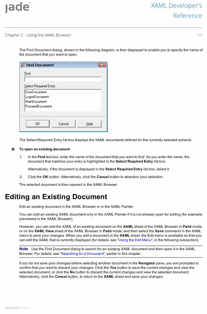
XamlDevRef - 7.0.12
The Find Document dialog, shown in the following diagram, is then displayed to enable you to specify the name ofthe document that you want to open.
The Select Required Entry list box displays the XAML documents defined for the currently selected schema.
To open an existing document
1. In the Find text box, enter the name of the document that you want to find. As you enter the name, thedocument that matches your entry is highlighted in the Select Required Entry list box.
Alternatively, if the document is displayed in the Select Required Entry list box, select it.
2. Click the OK button. Alternatively, click the Cancel button to abandon your selection.
The selected document is then opened in the XAML Browser.
Editing an Existing DocumentEdit an existing document in the XAML Browser or in the XAML Painter.
You can edit an existing XAML document only in the XAML Painter if it is not already open for editing (for example,previewed in the XAML Browser).
However, you can edit the XAML of an existing document on the XAML sheet of the XAML Browser in Paint mode,or on the XAML View sheet of the XAML Browser in Paint mode, and then select the Save command in the XAMLmenu to save your changes. When you edit a document in the XAML sheet, the Edit menu is available so that youcan edit the XAML that is currently displayed (for details, see "Using the Edit Menu", in the following subsection).
Note Use the Find Document dialog to search for an existing XAML document and then open it in the XAMLBrowser. For details, see "Searching for a Document", earlier in this chapter.
If you do not save your changes before selecting another document in the Navigator pane, you are prompted toconfirm that you want to discard your changes. Click the Yes button to save the current changes and view theselected document, or click the No button to discard the current changes and view the selected document.Alternatively, click the Cancel button, to return to the XAML sheet and save your changes.
XAML Developer'sReference
Chapter 2 Using the XAML Browser 39

XamlDevRef - 7.0.12
To edit an existing XAML document, perform one of the following actions
Select the Edit command in the XAML menu of the XAML Painter and then use the Edit Xaml Documentdialog to specify the document that you want to edit.
For details, see "Editing an Existing Document in the XAML Painter", in Chapter 3.
Select a XamlDocument subclass in the Class List of the Class Browser and then perform one of thefollowing actions.
Select the Edit XAML Document command from the Classes menu.
Right-click on the XAML document and then select the Edit XAML Document command from the popupmenu that is displayed.
Right-click on the Painter toolbar button.
This functionality is disabled if the selected class is not a XamlDocument subclass.
The XAML Painter displays the document as you edit it. You can select displayed named items and use themouse to manipulate them. For details, see "Creating a New XAML Document", in Chapter 3.
Using the Edit MenuThe Edit menu is displayed in the XAML Browser only in the XAML sheet, to enable you to edit the XAML that iscurrently displayed.
The Edit menu commands, described in the following subsections, are listed in the following table.
Command Shortcut Key Description
Undo ALT+BKSP or CTRL+Z Undoes the last action
Redo CTRL+Y Reverses the last action that was undone
Cut CTRL+X Cuts a selected portion of text and copies it to the clipboard
Copy CTRL+C Copies a selected portion of text to the clipboard
Paste CTRL+V Pastes a portion of text from the clipboard to the current caretposition
Select All CTRL+A Selects all of the text displayed in the XAML sheet
Find/Replace SHIFT+F3 Locates the specified text in the XAML sheet and optionallyreplaces that text occurrence
Find Again F3 Locates the next occurrence of the specified text
Find At Caret CTRL+F3 Locates the next occurrence of the text on which the caret ispositioned
Edit menu commands that are not available for selection are disabled. For example, if you have not selected anytext in the XAML sheet, the Cut and Copy commands are disabled, and cannot be selected.
Undo CommandUse the Undo command to undo the last action in the XAML sheet, if required, or you can perform multiple undooperations.
XAML Developer'sReference
Chapter 2 Using the XAML Browser 40

XamlDevRef - 7.0.12
To undo your last action, perform one of the following actions
Select the Undo command from the Edit menu
Right-click in the XAML sheet and then select the Undo command from the menu that is displayed
Press CTRL+Z
Press ALT+BKSP
The last action (for example, a keystroke) that you performed in the XAML sheet is then undone. This command isdisabled when there is no action that can be undone.
Redo CommandUse the Redo command to reverse the last action that was undone. You can repeat the Redo command to stepforward and redo actions that were previously undone.
To redo the last action undone, perform one of the following actions
Select the Redo command from the Edit menu
Right-click in the XAML sheet and then select the Redo command from the menu that is displayed
Press CTRL+Y
Your previously undone action is then redone.
Cut CommandUse the Cut command to cut a selected portion of text from the XAML sheet to the clipboard, if required.
To cut selected text, perform one of the following actions
Select the Cut command from the Edit menu
Right-click in the XAML sheet and then select the Cut command from the menu that is displayed
Press CTRL+X
The selected text is then cut (logically deleted) from the XAML sheet and moved to the clipboard. This command isdisabled when there is no text selected in the XAML sheet.
Copy CommandUse the Copy command to copy text selected in the XAML sheet to the clipboard, if required. This text can then bepasted at another position in the XAML sheet or in a text editor such as Notepad.
To copy selected text to the clipboard, perform one of the following actions
Select the Copy command from the Edit menu
Right-click in the XAML sheet and then select the Copy command from the menu that is displayed
Press CTRL+C
The selected text is then copied to the clipboard. This command is disabled when there is no text selected in theXAML sheet.
XAML Developer'sReference
Chapter 2 Using the XAML Browser 41

XamlDevRef - 7.0.12
Paste CommandUse the Paste command to paste text from the clipboard into the XAML sheet, if required. The pasted text can bea selection that was copied or cut from the XAML sheet.
To paste text at the current caret position, perform one of the following actions
Select the Paste command from the Edit menu
Right-click in the XAML sheet and then select the Paste command from the menu that is displayed
Press CTRL+V
The selected text is then copied from the clipboard, starting at the current caret position. This command is disabledwhen there is no text in the clipboard.
Select All CommandUse the Select All command to select all of the text that is displayed in the XAML sheet. You can then select theCopy command to copy the selected text to the clipboard.
To select all of the text on the XAML sheet, perform one of the following actions
Select the Select All command from the Edit menu
Right-click in the XAML sheet and then select the Select All command from the menu that is displayed
Press CTRL+A
All of the text in the XAML sheet is then selected.
Find/Replace CommandUse the Find/Replace command to locate text in the XAML sheet and optionally replace the located text with aspecified value.
To locate and optionally replace text in the XAML sheet
1. Perform one of the following actions.
Select the Find/Replace command from the Edit menu
Right-click in the XAML sheet and then select the Find/Replace command from the menu that isdisplayed
Press SHIFT+F3
XAML Developer'sReference
Chapter 2 Using the XAML Browser 42

XamlDevRef - 7.0.12
The Find/Replace dialog, shown in the following diagram, is then displayed.
2. In the Search Text text box, specify the text that you want to locate in the XAML sheet.
3. In the Replace Text text box, specify the text that is to replace the specified text that is found, if required.
4. If you want an exact match by case (where uppercase and lowercase is significant), check the CaseSensitive check box. A search is then performed for text with the same capitalization as the text in theSearch Text text box. By default, searching is case-insensitive; that is, this check box is unchecked.
You can optionally replace text that is located and matched by case with text with the same capitalization asthe text specified in the Replace Text text box.
5. If you want to confirm that each occurrence of the specified search text is replaced with the specifiedreplacement text, check the Prompt on Replace check box. By default, you are not prompted to confirm textreplacement; that is, this check box is unchecked.
When you select text replacement confirmation and you click the Replace All button, the Verify Replacedialog is displayed every time the search text is located. In the Verify Replace dialog, perform one of thefollowing actions.
Click the Yes button to confirm that the located text is to be replaced.
Click the No button to leave the highlighted text unchanged and continue searching for the specifiedtext.
Click the Cancel button to abandon the search and return focus to the XAML sheet.
6. If you want to search backwards through the contents of the XAML sheet from the current caret position up tothe beginning of the XAML sheet, check the Search Backwards check box. The Search Backwards checkbox is enabled only when you select the Caret option button in the Start From group box. By default,searching is performed from the current caret position to the end of the XAML sheet; that is, this check box isunchecked.
When this option is checked, you have specified your search and replacement text, and you click theReplace All button, the Verify Replace dialog is displayed every time the search text is located.
7. If you want the search to start from a specific position in the XAML sheet, select the Caret option button in theStart From Group box. The Search Backwards check box is then enabled.
By default, the Top option button is selected, indicating that the search begins at the top of the sheet.
8. To find the next occurrence of the specified text, click the Find button.
XAML Developer'sReference
Chapter 2 Using the XAML Browser 43

XamlDevRef - 7.0.12
If JADE finds the text that matches your specified options, the located text is then highlighted and focus isreturned to the XAML sheet. If JADE cannot find the text that matches your specified options, a messagedialog informs you that the search text was not found and waits for you to click the OK button in the messagedialog before returning focus to the XAML sheet.
9. To replace all occurrences of the specified text in the Search Text text box with the text specified in theReplace Text text box, click the Replace All button.
If JADE finds the text that matches your specified options, all occurrences of the located text are thenreplaced with the specified replacement text and focus is returned to the XAML sheet. If you checked thePrompt on Replace check box, you are prompted to confirm that each occurrence of the located text is to bereplaced.
10. Click the Cancel button to abandon your selection.
Find Again CommandWhen the text specified in the Find/Replace dialog has been located and focus returned to the XAML sheet, youcan make further searches for that text.
To find the next occurrence of specified text, perform one of the following actions
Select the Find Again command from the Edit menu
Right-click in the XAML sheet and then select the Find Again command from the menu that is displayed
Press F3
The next occurrence of that text is then located and highlighted or the Message dialog is displayed, advising youthat the search text was not found if no further occurrences of that text are located.
Find At Caret CommandUse the Find At Caret command to locate the next occurrence of the text on which the caret is positioned in theXAML sheet.
To locate text on which the caret is positioned, perform one of the following actions
Select the Find At Caret command from the Edit menu
Right-click in the XAML sheet and then select the Find At Caret command from the menu that is displayed
Press CTRL+F3
The next occurrence of that text in the XAML sheet is then highlighted.
Deleting a DocumentTo delete a document
1. To delete the document selected in the Navigation pane of the XAML Browser or displayed in the XAMLPainter, perform one of the following actions.
Click the Delete Document toolbar button.
Select the Delete command from the XAML menu.
XAML Developer'sReference
Chapter 2 Using the XAML Browser 44

XamlDevRef - 7.0.12
Right-click on the document in the Navigator pane and then select the Delete command from thepopup menu that is displayed.
A message box is then displayed, prompting you to confirm that you want to delete the selected document.
2. Click the Yes button to delete the document. Alternatively, click the No button to abandon the deletion.
Notes You cannot delete a document if the document has subclasses, any existing property references, or thedocument is open in the XAML Browser or XAML Painter.
When you delete a document, the corresponding class and all its methods are deleted. Any methods referencingthe deleted document are flagged as uncompiled.
Renaming a DocumentYou can change the name of an existing document in the current schema.
To rename the currently selected document
1. Perform one of the following actions.
Select the Rename command from the XAML menu.
Right-click on the document in the Navigator pane and then select the Rename command from thepopup menu that is displayed.
The Rename of Schema-name::Document-name dialog, shown in the following diagram, is then displayed.
The current name and subclass of the document are displayed in the Name text box and Subclass of combobox, respectively. You cannot update the subclass of the document.
2. In the Name text box, specify the new name for your document.
3. Click the OK button. Alternatively, click the Cancel button to abandon the operation.
When a document is renamed, JADE performs the following actions.
Updates the associated XAML.
Replaces all references with the new name in all entities that referenced the old document name.
XAML Developer'sReference
Chapter 2 Using the XAML Browser 45

XamlDevRef - 7.0.12
Note The document name replacement may not be successful in methods that are in error.
Recompiles all methods with references to the old document name.
Refreshing the ViewYou can refresh (update) the contents of the XAML Browser or XAML Painter to discard any changes that youhave made since the document was last saved.
To discard any changes since the document was last saved, perform one of the following actions
Click the Refresh – Discard any changes toolbar button.
Select the Refresh command from the XAML menu.
Right-click on the document in the Navigator pane and then select the Refresh command from the popupmenu that is displayed.
The browser or painter is then updated and any changes made to the document since you last saved it arediscarded. There may be a momentary delay while this updating occurs.
Maintaining Properties for Your DocumentTo maintain the properties associated with your document, use the Properties command from the XAML menu.Alternatively, click the Properties toolbar button.
Most of the properties have default settings and many property values are set automatically when you manipulateyour document or UI elements in the XAML Painter or you use some of the XAML Painter alignment or layoutbuttons.
In the combo box in the JADE Type column, you can select a subclass of that control, if you have defined any; forexample, the combo box for a XAML button control lists any JADE XAML button subclasses that are defined.
For details about XAML document and UI element properties, see the JADE Encyclopaedia of XAML Classes.
To access the Properties dialog for the document selected in the Navigation pane of the XAML Browser,perform one of the following actions
Click the Properties toolbar button.
Select the Properties command from the XAML menu.
Right-click on the document in the Navigator pane and then select the Properties command from the popupmenu that is displayed.
XAML Developer'sReference
Chapter 2 Using the XAML Browser 46
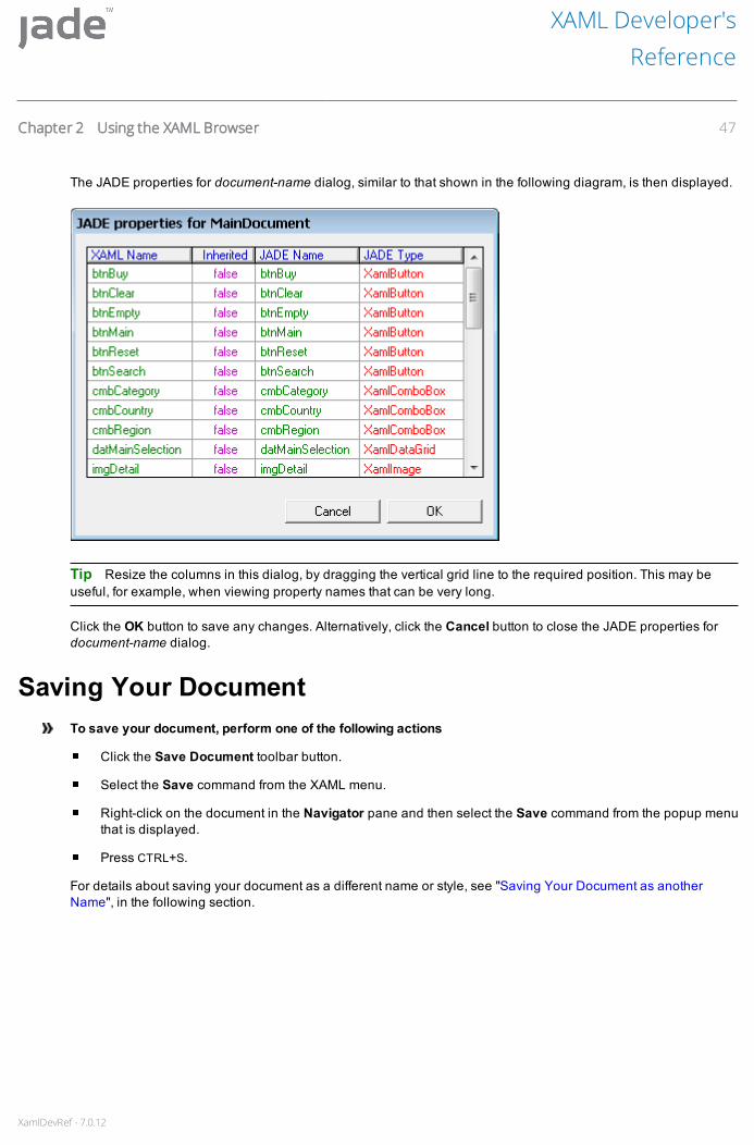
XamlDevRef - 7.0.12
The JADE properties for document-name dialog, similar to that shown in the following diagram, is then displayed.
Tip Resize the columns in this dialog, by dragging the vertical grid line to the required position. This may beuseful, for example, when viewing property names that can be very long.
Click the OK button to save any changes. Alternatively, click the Cancel button to close the JADE properties fordocument-name dialog.
Saving Your DocumentTo save your document, perform one of the following actions
Click the Save Document toolbar button.
Select the Save command from the XAML menu.
Right-click on the document in the Navigator pane and then select the Save command from the popup menuthat is displayed.
Press CTRL+S.
For details about saving your document as a different name or style, see "Saving Your Document as anotherName", in the following section.
XAML Developer'sReference
Chapter 2 Using the XAML Browser 47

XamlDevRef - 7.0.12
If you select another document to edit, or attempt to close the XAML Browser before you have saved the changesto the current document, the Query Save Changes dialog, shown in the following diagram, is displayed.
Click one of the following buttons to save or discard your changes. Click the:
Yes button, to save the current changes to the document and continue the navigation to the requestedaction.
No button, to discard the current changes to the document and continue the navigation to the requestedaction.
Cancel button, to cancels the navigation and retains all the unsaved changes.
Save ErrorsWhen you attempt to save a XAML document JADE validates the XAML. If no errors are found, the document issaved. If JADE finds an error, the appropriate dialog, which contains a description of the error, is displayed.
The following subsections describe the save errors that you might encounter (see also, "Comparing the XAMLChanges in Parent and Sub-documents", later in this chapter).
XAML Developer'sReference
Chapter 2 Using the XAML Browser 48
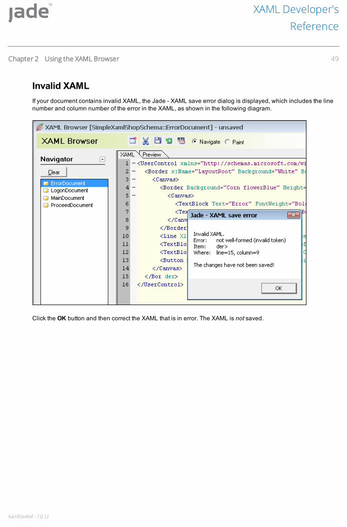
XamlDevRef - 7.0.12
Invalid XAMLIf your document contains invalid XAML, the Jade - XAML save error dialog is displayed, which includes the linenumber and column number of the error in the XAML, as shown in the following diagram.
Click the OK button and then correct the XAML that is in error. The XAML is not saved.
XAML Developer'sReference
Chapter 2 Using the XAML Browser 49
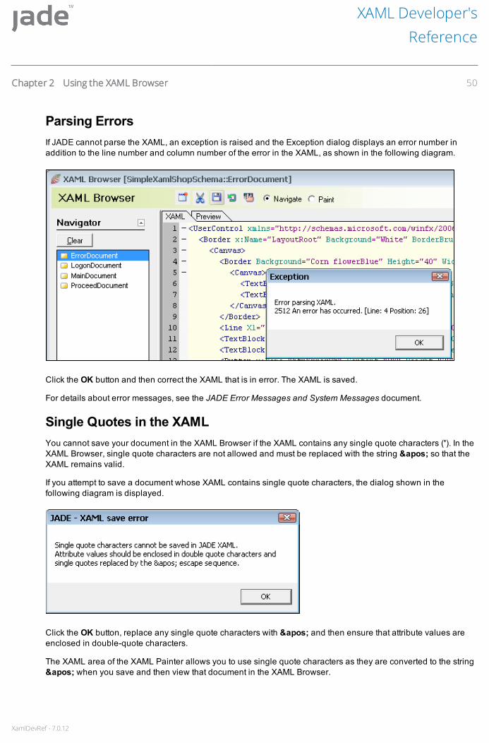
XamlDevRef - 7.0.12
Parsing ErrorsIf JADE cannot parse the XAML, an exception is raised and the Exception dialog displays an error number inaddition to the line number and column number of the error in the XAML, as shown in the following diagram.
Click the OK button and then correct the XAML that is in error. The XAML is saved.
For details about error messages, see the JADE Error Messages and System Messages document.
Single Quotes in the XAMLYou cannot save your document in the XAML Browser if the XAML contains any single quote characters ('). In theXAML Browser, single quote characters are not allowed and must be replaced with the string ' so that theXAML remains valid.
If you attempt to save a document whose XAML contains single quote characters, the dialog shown in thefollowing diagram is displayed.
Click the OK button, replace any single quote characters with ' and then ensure that attribute values areenclosed in double-quote characters.
The XAML area of the XAML Painter allows you to use single quote characters as they are converted to the string' when you save and then view that document in the XAML Browser.
XAML Developer'sReference
Chapter 2 Using the XAML Browser 50

XamlDevRef - 7.0.12
Comparing the XAML Changes in Parent andSubdocuments
The Compare XAML dialog enables you to compare the XAML of a sub-document with the XAML of the parentdocument.
When you edit a sub-document, you cannot change any of the XAML that was inherited from the parent; that is, theposition or property values of those UI elements is fixed. For details, see "Document Subclassing", in Chapter 3. Ifyou make any changes to the XAML of a sub-document that affect the parent document, the dialog shown in thefollowing diagram is displayed when you try to save your changes.
Click the No button, to return to the XAML Browser or the XAML Painter. Alternatively, click the Yes button, tocompare the changed XAML in the sub-document with that of the parent document. The Compare XAML dialog,shown in the following diagram, is then displayed.
XAML Developer'sReference
Chapter 2 Using the XAML Browser 51

XamlDevRef - 7.0.12
The Latest pane (at the left) displays the XAML of the sub-document. The Original pane (at the right) displays theXAML of the parent document (from which the sub-document is derived).
In the Latest and Original panes, the corresponding lines of XAML that have invalid changes are highlighted witha green background. As these panes are read-only, you cannot change the XAML in either of them. Use the XAMLBrowser or the XAML Painter, to change the XAML (for details, see "Editing an Existing Document", earlier in thischapter).
Click the Next button to view the next line of the XAML that has been updated and the parent document, ifapplicable, or the Previous button to highlight the previous line of XAML that has been updated and the parentdocument.
Click the Cancel button, to close the Compare XAML dialog and return to the XAML Browser or XAML Painter.
Saving Your Document as another NameUse the Save As command from the XAML menu to save your document as a new document with a differentname. Alternatively, if you have started painting a XAML document but have not yet added it, use this command tosave your document.
To save the currently selected document as a new document
1. Perform one of the following actions.
Select the Save As command from the XAML menu.
Right-click on the document in the Navigator pane and then select the Save As command from thepopup menu that is displayed.
The Save Document-name as dialog, shown in the following diagram, is then displayed.
2. In the Name text box, specify the name under which to save the copy of the document. The specified namemust be unique in the current schema.
As you cannot save your document under a different superclass or schema, the Subclass of combo box isdisabled on this dialog.
3. Click the OK button. Alternatively, click the Cancel button to abandon the operation.
XAML Developer'sReference
Chapter 2 Using the XAML Browser 52

XamlDevRef - 7.0.12
Generating XAP and HTML FilesUse the Generate XAP command to generate the XAP and HTML files for your Silverlight stateless application.
For details about generating the XAP and HTML files by using the jadclient command line, see "Generating theXAP and HTML Files for a Silverlight Stateless Application", in Chapter 1. See also, "Requirements to GenerateXAP and HTML Files", in Chapter 1.
To generate the XAP and HTML files of your Silverlight stateless application
1. Select the Silverlight stateless application for which you want to generate XAP and HTML files.
2. Select the Generate XAP command from the XAML menu of the XAML Browser. This command is disabled ifthe selected application is not a Silverlight stateless application type.
The XAP File Generator dialog, shown in the following diagram, is then displayed.
3. In the Application combo box, select the application. By default, the Silverlight stateless application isselected.
4. In the XAP File Name text box, specify the name of the XAP file that is to be generated. By default, the XAPfile name is the same as the application name.
5. In the Launching HTML File Name text box, specify the name of the HTML file that is to be generated. Bydefault, the HTML file name is the same as the application name.
6. In the Result Directory text box, specify the directory where the XAP and HTML files are placed at the end ofa successful build. Specify a directory or path relative to the machine on which you are generating the files.For details, see "Generating the XAP and HTML Files for a Silverlight Stateless Application", in Chapter 1.
Use the Browse button to search for the output directory, if required. When you click the Browse button, thecommon Browse for Directory dialog is then displayed, to enable you to select the appropriate location.
7. To retain the build directory, check the Retain XAP build directory check box. When this check box ischecked, if the build fails, the log files are not copied to the logs directory, as these files can be found in theretained build directory.
XAML Developer'sReference
Chapter 2 Using the XAML Browser 53
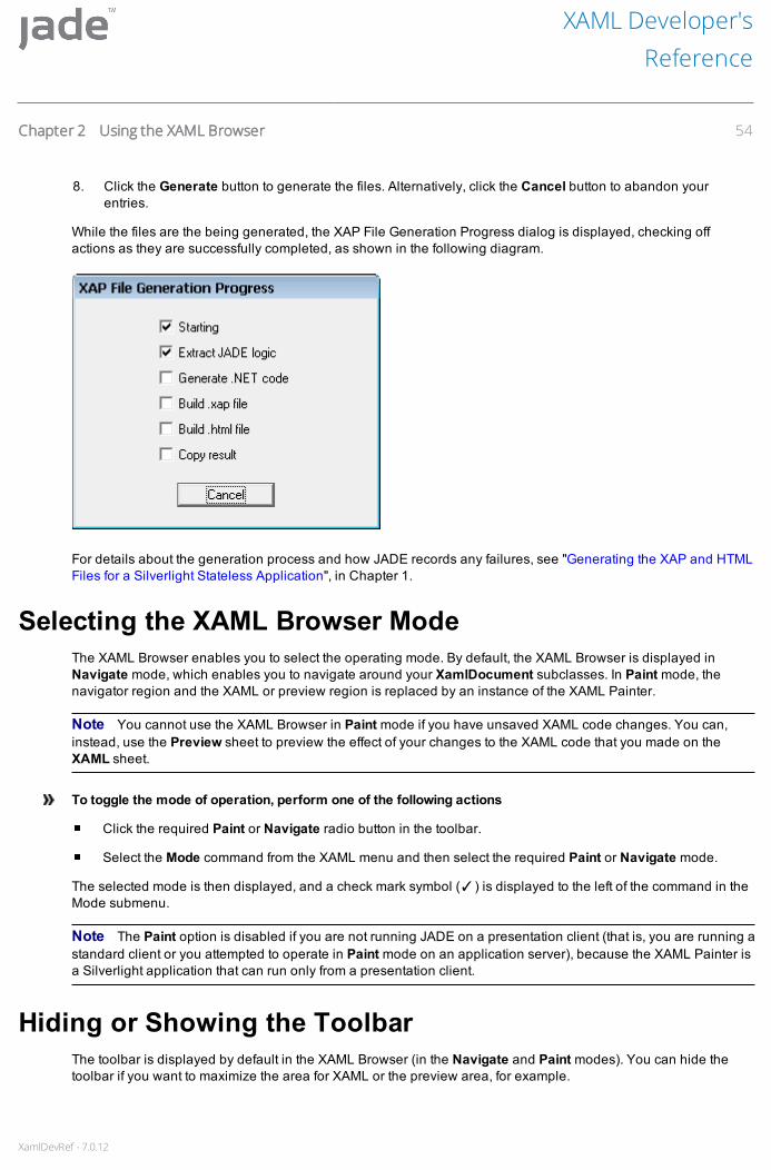
XamlDevRef - 7.0.12
8. Click the Generate button to generate the files. Alternatively, click the Cancel button to abandon yourentries.
While the files are the being generated, the XAP File Generation Progress dialog is displayed, checking offactions as they are successfully completed, as shown in the following diagram.
For details about the generation process and how JADE records any failures, see "Generating the XAP and HTMLFiles for a Silverlight Stateless Application", in Chapter 1.
Selecting the XAML Browser ModeThe XAML Browser enables you to select the operating mode. By default, the XAML Browser is displayed inNavigate mode, which enables you to navigate around your XamlDocument subclasses. In Paint mode, thenavigator region and the XAML or preview region is replaced by an instance of the XAML Painter.
Note You cannot use the XAML Browser in Paint mode if you have unsaved XAML code changes. You can,instead, use the Preview sheet to preview the effect of your changes to the XAML code that you made on theXAML sheet.
To toggle the mode of operation, perform one of the following actions
Click the required Paint or Navigate radio button in the toolbar.
Select the Mode command from the XAML menu and then select the required Paint or Navigate mode.
The selected mode is then displayed, and a check mark symbol (✓) is displayed to the left of the command in theMode submenu.
Note The Paint option is disabled if you are not running JADE on a presentation client (that is, you are running astandard client or you attempted to operate in Paint mode on an application server), because the XAML Painter isa Silverlight application that can run only from a presentation client.
Hiding or Showing the ToolbarThe toolbar is displayed by default in the XAML Browser (in the Navigate and Paint modes). You can hide thetoolbar if you want to maximize the area for XAML or the preview area, for example.
XAML Developer'sReference
Chapter 2 Using the XAML Browser 54

XamlDevRef - 7.0.12
To toggle the display of the toolbar
Select the Hide Toolbar or Show Toolbar command from the XAML menu.
When the toolbar is displayed, click the close icon at the upper right of the toolbar.
When the toolbar has been hidden, the Show Toolbar command is displayed in the XAML menu instead of theHide Toolbar command.
To display the toolbar when it has been hidden, select the Show Toolbar command from the XAML menu.
XAML Developer'sReference
Chapter 2 Using the XAML Browser 55
XamlDevRef - 7.0.12
Chapter 3 Painting XAML Documents
This chapter covers the following topics.
Using the XAML Painter
Accessing the XAML Painter
Properties Area of the XAML Painter
Painting Area of the XAML Painter
XAML Area of the XAML Painter
Using Function Keys and Shortcut Keys
Creating a XAML Document
Adding a New XAML Document
Adding UI Elements to Your Document
Defining the Layout of Your XAML Document
Maintaining Properties for Your XAML Document or UI Element
Defining Methods for Your Document
Saving Your Document
Editing an Existing Document in the XAML Painter
Using the Keyboard and Mouse to Edit Your Document
Changing a UI Element Type
Effects of Editing an Existing Document
Deleting a Document
Layout Toolbar
Using the XAML PainterUse the XAML Painter to:
Paint User Interface (UI) elements onto XAML documents in your schema
View and maintain the XAML of a XAML document
The XAML Painter enables you to create and maintain XAML documents of your Silverlight application. The XAMLPainter is a graphical user interface (GUI) painter that supports bitmaps, list boxes, button controls, and so on.XAML documents have references to UI elements, which have properties, events, and event logic defined onthem. UI elements display information and permit user input. The properties of UI elements determine aspects oftheir appearance (for example, position, size, or color) and aspects of their behavior (for example, whether theycan be resized).

XamlDevRef - 7.0.12
Note You cannot paint a XAML document until you have created that document. For details, see "Adding a NewXAML Document", later in this chapter. Alternatively, if you have started painting a XAML document but have notyet created it, use the Save As command to save your document. For details, see "Saving Your Document asanother Name", in Chapter 2.
The XAML Painter provides for "what you see is what you get" (WYSIWYG) painting of XAML documents in asimilar manner to the JADE Painter. Additionally, it enables you to view and update the XAML contained within theXAML document.
You can start multiple copies of the XAML Painter, which can run in parallel with one or more copies of the XAMLBrowser. (For details about the XAML Browser, see Chapter 2.)
Notes The XAML Painter can be run only from a presentation client and if a base locale is set for your JADEsystem. In addition, you cannot toggle to the Paint mode to preview a document in the XAML Browser if you arerunning a standard client.
You can access the XAML Painter from a user-defined schema only; that is, you cannot access it from theRootSchema.
Accessing the XAML PainterTo access the XAML Painter, perform one of the following actions
Select the XAML Painter command from the File menu of a standard browser window.
When a XamlDocument subclass is selected in the standard JADE development environment ClassBrowser, perform one of the following actions.
Select the Edit XAML Document command from the Classes menu.
Right-click on the XAML document in the Class List pane and then select the Edit XAML Documentcommand popup menu that is then displayed.
Right-click on the Painter toolbar button (you must have already selected a XAML document in theClass List pane).
XAML Developer'sReference
Chapter 3 Painting XAML Documents 57

XamlDevRef - 7.0.12
The XAML Painter is then displayed. If you accessed the XAML Painter from the Class Browser, the XAML for theselected document subclass is then displayed, as shown in the following diagram.
You can also access the XAML Painter by using the XAML Browser in Paint mode. For details, see "Selecting theXAML Browser Mode", in Chapter 2.
The XAML Painter contains the following areas.
Properties area, at the left of the painter, lists the dialogs that enable you to set the properties of the UIelements of the document that you are editing. The Controls dialog is the only dialog that is expanded whenyou first open the XAML Painter. For details, see "Properties Area of the XAML Painter", later in this chapter.
Painting area at the upper-right of the painter shows the document as you are editing it. In addition, thatPainting area has a toolbar and additional options to help you to layout the UI elements on your document.The additional options, displayed when you click the options hyperlink, are not displayed by default. Fordetails, see "Painting Area of the XAML Painter", later in this chapter.
XAML area, at the lower-right of the painter, displays the XAML code of the document that you are editing oradditional instructions about the XAML Painter. For details, see "XAML Area of the XAML Painter", later inthis chapter.
For details about the XAML menu of the XAML Painter, see "Using the XAML Menu", in Chapter 2.
XAML Developer'sReference
Chapter 3 Painting XAML Documents 58

XamlDevRef - 7.0.12
Properties Area of the XAML PainterThe left side of the XAML Painter contains dialogs that enable you to specify properties on the current documentand its UI elements, as well as additional views that allow for a variety of ways for interacting with the currentdocument. When you change a property by using a dialog in the Properties area, the associated XAML attribute isupdated and the Painting area and XAML area are updated immediately. You can also change the properties of aUI element or document by editing the code on the XAML View sheet directly (you must click the Load XAMLbutton, to see your changes) in the Painting area.
An example of the Properties area, with the Controls dialog fully expanded, is shown in the following diagram.
Expand or contract each dialog individually by clicking on the arrow at the upper left of that dialog. (When youposition your cursor over the button, the arrow turns light-blue.)
If more properties are available to view in that dialog, More… is displayed at the lower left of that dialog. Click theadjacent arrow to additionally expand that dialog.
XAML Developer'sReference
Chapter 3 Painting XAML Documents 59

XamlDevRef - 7.0.12
Alternatively, to expand or contract all of the dialogs in the Properties area, click the toggle expanders hyperlinkat the upper right of the Properties area.
Depending on the document type or UI element that you are maintaining, some or all of the following dialogs maybe displayed in the Properties area.
Controls dialog provides access to the UI elements that you can add to the current document. Add UIelements by using the Available Controls combo box, in which UI elements are sorted alphabetically, or byusing the Controls by Category tree view, which groups UI elements by type. For details about adding a UIelement to a document, see "Adding UI Elements to Your Document", later in this chapter.
Use the Page Controls combo box to search for a UI element on a document. For details, see "Selecting a UIElement", later in this chapter.
Zoom dialog enables you to zoom in and out of the current document, which is useful to see the completedocument or to concentrate on a specific part of a document. For details, see "Expanding or Contracting theView of a Document", later in this chapter.
Document Outline dialog, shown in the following diagram, provides a hierarchy view of the currentdocument.
The Page element is the highest level in the document hierarchy. The number of sub-elements depends onthe document that you are viewing. Click the unfilled arrow at the left of an element to expand it and displayits sub-elements. An element that is fully expanded displays a dark solid arrow at its left. An element that hasno sub-elements displays no arrow.
Select an item in this dialog to select the corresponding UI element in the Painting area or to edit itsproperties using the available dialogs in the Properties area. The selected UI element is then highlightedwith a red border in the Painting area.
Select multiple UI elements by holding down CTRL and then clicking on each element in the DocumentOutline dialog (or the Painting area). The master UI element is displayed with a red border and subsequentselections have a green border. Changes that you make are applied to all of the selected UI elements. Fordetails about selecting one or more UI elements, see "Selecting a UI Element", later in this chapter.
General Properties, Size and Position, Colors and Styling, Fonts, Grid Definition, Miscellaneous, andTransformations dialogs enable you to maintain properties that are specific to the selected UI element. Fordetails, see "Maintaining Properties for Your XAML Document or UI Element", later in this chapter.
XAML Developer'sReference
Chapter 3 Painting XAML Documents 60

XamlDevRef - 7.0.12
Expanding or Contracting the View of a DocumentThe Zoom dialog is useful when you require a:
Close view of a section of a document; for example, if you need to concentrate on a specific part of adocument.
Complete view of a document; for example, so that you can see the layout of the UI elements on a document.
The zoom ranges in magnification from 10 percent through 800 percent of the document size and does not affectthe saved size of the document.
Click the Reset button, to reset the zoom to 100 percent.
To expand or contract the view of a document
Click the expander button at the upper-left of the Zoom dialog, in the Properties area, to display the Zoomdialog shown in the following diagram.
The area that is currently visible in the Painter area, at the right of the XAML Painter, is represented by alight-purple shaded area, referred to as the zoom navigator overlay in this section. If the whole document is visiblein the Painter area, the zoom navigator overlay is not displayed.
To zoom in on the document, perform one of the following actions
Slide the Zoom slider to the right.
In the text box at the right of the Zoom slider, enter the magnification at which you want to view the documentin the text box and then press ENTER.
The document in the Painter area is then enlarged; that is, zoomed in.
You could have to scroll horizontally or vertically to view other parts of the document in the Painter area.Alternatively, use the Zoom navigator overlay to move around in the Painter area. Scrolling the Painter areaupdates the current view in the zoom preview window.
The zoom preview window is a live copy of the UI elements on the document that you are editing. If you areviewing a complex document, it may be advisable not to show the preview in the zoom window. The zoom andnavigation behavior is still available.
XAML Developer'sReference
Chapter 3 Painting XAML Documents 61

XamlDevRef - 7.0.12
To zoom out from the document, perform one of the following actions
Slide the Zoom slider to the left.
In the text box at the right of the Zoom slider, enter the magnification at which you want to view the documentin the text box and then press ENTER.
The document in the Painter area is then reduced; that is, zoomed out.
Painting Area of the XAML PainterThe Painting area shows the layout of the UI elements on the document that you are editing. Use the Paintingarea and the dialogs in the Properties area to manipulate the size, position, and alignment of UI elements on thedocument. You can select and manipulate items in the Painting area using the mouse. The Properties area at theleft of the XAML Painter displays the properties of the selected item (or the primary selection in amultiple-selection situation).
The Options panel, shown in the following diagram, is at the top of the Painting area and contains a set of toolsthat are frequently used when manipulating the layout of UI elements on your document.
The additional alignment check boxes, displayed when you click the options hyperlink, are not displayed bydefault.
The following table lists the hyperlinks at the left of the Options panel.
Hyperlink Description
delete Deletes the selected UI element or elements.
undo Undoes the last action that you performed. You can undo up to ten previous actions.
redo Redoes the last action that you performed. You can redo up to ten actions.
xaml Toggles (displays or hides) the XAML area.
The Layout toolbar buttons enable you to align selected UI elements on a document. For details, see "LayoutToolbar", later in this chapter.
Alignment check boxes, displayed at the bottom of the Options panel when the options hyperlink is clicked at theright of the toolbar, are enabled only for UI elements that have a Canvas parent. For details, see "Options PanelCheck Boxes", later in this chapter.
For details about using the Layout toolbar buttons and additional layout options, see "Defining the Layout of YourXAML Document", later in this chapter.
XAML Area of the XAML PainterThe XAML area, at the lower-right of the XAML Painter, contains the following sheets.
XAML View sheet, which displays the XAML code of the document that you are editing. Edit the XAML codeon this sheet manually, if required. If you edit XAML code by using the XAML View sheet, click the LoadXAML button to update your view of the Painting area.
XAML Developer'sReference
Chapter 3 Painting XAML Documents 62

XamlDevRef - 7.0.12
The code in the XAML View sheet is updated immediately, if you edit a UI element by using a propertiesdialog, or by directly interacting with the UI element in the Painting area.
Note If you edit the XAML document manually, ensure that you are making valid changes; for example, donot have duplicate names, do not duplicate any x:Uid attributes, and so on.
If you attempt to load invalid XAML, the XAML Painter may not be able to catch any exceptions raised by theSilverlight plug-in. In the worst case, Silverlight does not raise an exception that the XAML Painter can catch,it simply crashes and you must restart the XAML Painter.
The XAML that is displayed on the XAML View sheet is sent back to JADE when you save the document.That XAML is then parsed and used to build the JADE representation of the document.
General Instructions sheet, which displays an overview about how to use the Painter area to manipulate theUI elements of a document. The details on this sheet are read-only.
Hide the XAML area, if you want to maximize the Painting area for the document that you are editing.
To toggle the display of the XAML area
Click the xaml hyperlink, in the Options panel.
To select all of the XAML code that is displayed on the XAML View sheet
Click the Select All button.
You can then copy the XAML into a new document by using standard cut and paste functionality.
Using Function Keys and Shortcut KeysYou can use the keyboard to perform functions to the XAML on the XAML View sheet of the XAML Painter. Thekeyboard shortcut commands on the XAML View sheet follow standard conventions. In addition, the XAML Viewsheet uses some, but not all, of the keyboard shortcuts that the XAML Browser uses. For details, see "UsingBrowser Shortcut Keys", in Chapter 2.
Press F1 to display online help for the item with input focus.
The following table summarizes the most common keyboard and mouse interactions used to perform variousactions in the Painting area.
Key or Combination Description
CTRL+left-click Selects additional UI elements (this also applies in the Document Outline dialog).
ALT+left-click Clones the currently selected UI element (and its sub-elements), to build multiplecontrols. This enables you to build an interface quickly. For example, to copy aStackPanel that contains a TextBlock and a ComboBox:
1. Select the StackPanel.
2. Press ALT.
3. Drag the StackPanel to the new position on the document.
After you release the mouse button, the StackPanel and its child UI elements arecopied to the new position on the document.
SHIFT+left-click Attempts to re-parent the dragged UI element onto the item under the cursor.
XAML Developer'sReference
Chapter 3 Painting XAML Documents 63
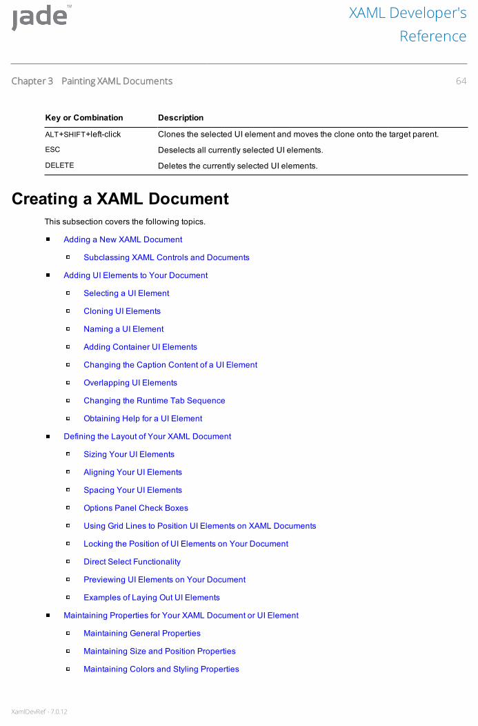
XamlDevRef - 7.0.12
Key or Combination Description
ALT+SHIFT+left-click Clones the selected UI element and moves the clone onto the target parent.
ESC Deselects all currently selected UI elements.
DELETE Deletes the currently selected UI elements.
Creating a XAML DocumentThis subsection covers the following topics.
Adding a New XAML Document
Subclassing XAML Controls and Documents
Adding UI Elements to Your Document
Selecting a UI Element
Cloning UI Elements
Naming a UI Element
Adding Container UI Elements
Changing the Caption Content of a UI Element
Overlapping UI Elements
Changing the Runtime Tab Sequence
Obtaining Help for a UI Element
Defining the Layout of Your XAML Document
Sizing Your UI Elements
Aligning Your UI Elements
Spacing Your UI Elements
Options Panel Check Boxes
Using Grid Lines to Position UI Elements on XAML Documents
Locking the Position of UI Elements on Your Document
Direct Select Functionality
Previewing UI Elements on Your Document
Examples of Laying Out UI Elements
Maintaining Properties for Your XAML Document or UI Element
Maintaining General Properties
Maintaining Size and Position Properties
Maintaining Colors and Styling Properties
XAML Developer'sReference
Chapter 3 Painting XAML Documents 64

XamlDevRef - 7.0.12
Maintaining Font Properties
Maintaining Grid Definitions
Maintaining Miscellaneous Properties
Maintaining Transformations
Defining Methods for Your Document
Adding a New XAML DocumentUse a XAML document to create an interface for your JADE applications. A XAML document is a window on whichyou paint UI elements for the running of your application. UI elements are objects such as text boxes, list boxes,buttons, check boxes, and so on.
You can create documents in the XAML Browser or the XAML Painter. If you create a document from the XAMLBrowser when in Navigate mode, the XAML Browser changes to Paint mode automatically after you click the OKbutton on the New XAML Document dialog.
All XAML documents are subclasses of the XamlDocument class. A document can be a subclass only of anotheruser-defined document class or of the XamlDocument system class. Existing documents are listed in theSubclass of combo box, to enable you to select the document that is to be subclassed.
A sub-document inherits all of the methods and properties of its parent, or super-document. For details, see"Subclassing XAML Controls and Documents", in the following subsection.
The XAML UI element hierarchy is located under the XamlObject class.
Create a new XAML document by:
Creating a new top-level document
Subclassing an existing document
If you create a top-level document, you can apply an initial structural template to the document (by using the Stylecombo box on the New XAML Document dialog). The structural template provides an initial framework on whichyou can build your document.
Note When you define an application for your schema, you must specify the XAML document that is displayedwhen the application is started. For details, see "Defining a Silverlight Application", in Chapter 1.
To create a new XAML document
1. Select the New command from the XAML menu. The New XAML Document dialog is then displayed. Fordetails, see "Adding a New Document", in Chapter 2.
2. After you click the OK button, the new document is opened in the XAML Painter, ready to be edited.Depending on the type of document that you created, some basic XAML code is displayed in the XAML Viewsheet, by default.
3. After you make your changes, press CTRL+S or select the Save command from the XAML menu, to save yourdocument.
The document is not saved automatically and displays unsaved in the title until you save it.
XAML Developer'sReference
Chapter 3 Painting XAML Documents 65

XamlDevRef - 7.0.12
If you attempt to select another document or to close the XAML Painter before you have saved the changes to thecurrent document, the Query Save Changes dialog is displayed. For details, see "Saving Your Document", inChapter 2.
An example of a new unsaved document in the Grid Based - Sizeable, Scrollable style is shown in the followingdiagram.
Note If you create the document in the XAML Painter, the Navigator pane at the left of the XAML Browser isupdated immediately after you save the document.
After you create a XAML document, you can paint UI elements onto the document, by using the Painting area orby editing the XAML on the XAML View sheet. For details, see "Adding UI Elements to Your Document", later inthis chapter. After adding UI elements, you can additionally manipulate them by using your mouse to select ormove them. The properties of the selected UI element are displayed in the Properties area.
Named UI elements only can be selected in the Painting area or the Properties area. All UI elements added in theXAML Painter are named, by default. A named UI element has a Name XAML attribute. An unnamed UI elementcannot be considered a potential parent UI element. Name a UI element manually, if required. For details, see"Naming a UI Element", later in this chapter.
All named UI elements are available as references in JADE when you save the document.
XAML Developer'sReference
Chapter 3 Painting XAML Documents 66

XamlDevRef - 7.0.12
If you want a UI element to be selectable in the XAML Painter but you do not want it to be a referenced item inJADE, clear the name of the UI element in the Name text box in the General Properties dialog. The UI element isthen assigned a painter-only name that allows for interaction in the XAML Painter; for example, _NoJadeName_1.
The base element of the document (typically the background or LayoutRoot element) can be selected, but doesnot allow itself to be moved by dragging.
The reason for this is that the layout style usually determines the position of the element in the browser at run timeand you must, therefore, make an explicit decision to set up offset margins and so on for your document;otherwise, it is easy to drag the element around, creating offsets, without visualizing what would happen to theposition at run time. To move or resize the base element, use the Size and Position dialog in the Properties area.For details, see "Maintaining Colors and Styling Properties", later in this chapter.
Tip When subclassing a document, introducing a panel or panels that will contain all of the new sub-documentUI elements reduces the number of placeholder items that need to be reflected throughout the XAML hierarchy.
To find a UI element on your document, select that UI element in the Page Controls combo box in the Controlsdialog and then click the Find button, or select that UI element in the Document Outline dialog. The selectedelement is then highlighted with a red border in the Painting area. For details, see "Selecting a UI Element", laterin this chapter.
Subclassing XAML Controls and DocumentsAlthough you can apply JADE-style subclassing to XAML controls (subclasses of UIElement) and XAMLdocuments (subclasses of XamlDocument), there are several things of which you should be aware. For details,see the following subsections.
Control SubclassingAll of the classes in the JADE hierarchy under UIElement represent controls that can be subclassed. Subclassedcontrols are listed in the Available Controls combo box in the Properties area of the XAML Painter.
In the XAML code, the type of the control is always the type that JADE uses for the superclass. For example, if yousubclass XamlButton as MyXamlButton, in the XAML Painter you can add a MyXamlButton to the document.The JADE reference created for this UI element is of the type MyXamlButton, but in the XAML code it is a Button.(The JADE class XamlButton maps to the Button XAML object.)
Control subclassing should be used only to specify special functional behavior and it should not be used toredefine the look and feel of a control. To change the look and feel of a control, you must add a resource, written inXAML, to the document and then apply this resource to the control using the style or template property of thecontrol.
Function and look and feel are completely separated in the Silverlight environment and subclassing should beused only to define different functionality.
Document SubclassingWhen you create a new XamlDocument, you can specify the document of which it will be a sub-document (orsubclass).
The points to note about subclassed documents are as follows.
A sub-document includes all of the XAML of the document from which it was created; that is, the parent orsuper-document. The sub-document, therefore, initially looks the same as the parent document and containsthe same UI elements.
When you edit a sub-document, you cannot change any of the XAML that was inherited from the parent; that
XAML Developer'sReference
Chapter 3 Painting XAML Documents 67

XamlDevRef - 7.0.12
is, the position or property values of those UI elements is fixed. You can, however, add new UI elements tothe sub-document.
New UI elements must be named and you can add additional content (which does not need to be named) tonew UI elements.
If you add content to a document that has sub-documents, those sub-documents are also updated with thenew content.
A UIElement (a control) has a property created in the corresponding JADE class for the top-most level inwhich that control is defined; for example, top-level document D1 has a button b1, and sub-document D2 hasbutton b2. In the class D1 in JADE will be a property b1, and class D2 (a subclass of D1) will have a propertyb2. However, the XAML for D2 will, by the above rules, contain a UIElement for b1.
JADE connects XAML UIElements to JADE properties by inserting a Unique Identifier (Uid) attribute into theXAML. JADE adds placeholders, with an appropriate Uid value, in the XAML of the parent document at theplace where you add the new UI element in the sub-document. This is required so that changes to the parentdocument can be populated to the XAML of the sub-document.
Caution If directly editing the XAML, take great care if you alter the Uid attribute. The Uid attribute in theXAML is updated only after you save your changes.
The Compare XAML dialog enables you to compare the XAML of a sub-document with the XAML of the parentdocument. For details, see "Comparing the XAML Changes in Parent and Sub-documents", in Chapter 2.
Adding UI Elements to Your DocumentUse the Controls dialog in the Properties area to add a new UI element to your current document. In addition toadding UI elements from the Controls dialog, you can clone the currently selected UI element (and itssub-elements), to quickly build multiple controls. For details, see "Cloning UI Elements", later in this chapter.
Note You can also add a UI element by editing the XAML directly in the XAML View sheet. If you copy and pasteUI elements within the XAML View sheet, ensure that Name attributes are unique.
For details about editing a document, see "Editing an Existing Document", later in this chapter.
All actions occur against the currently selected UI element or elements. To clear all selections in the Painting area,press the ESC key.
Note You cannot paint a XAML document until you have created that document. For details, see "Adding a NewXAML Document", earlier in this chapter. Alternatively, if you have started painting a XAML document but have notyet created it, use the Save As command to save your document. For details, see "Saving Your Document asanother Name", in Chapter 2.
To add a new UI element to your document
1. Select the level at which to add the UI element within the document; for example, if you select an existing UIelement, the one you are adding is added as a child.
Use the Document Outline dialog, to select the level at which you want to add the UI element. Alternatively,select the required UI element, in the Painting area.
XAML Developer'sReference
Chapter 3 Painting XAML Documents 68
XamlDevRef - 7.0.12
2. To specify the type of UI element that you want to add, perform the following actions in the Controls dialog.
a. In the Available Controls combo box, select the type of UI element that you want to add. Alternatively,click the More button to expand the Controls dialog and then select the required UI element under theControls by Category tree.
b. Click the Add button.
The specified UI element is then displayed at the upper left of the document in the Painting area and thecorresponding XAML code is added to the XAML area.
Note A Silverlight popup-type control cannot be directly displayed in the XAML Painter because it does nothave a development-mode operation.
The XAML Painter substitutes a XamlBorder control for the popup window when displaying the control,provided that the XamlPopup window is the direct content of a top-level <UserControl> element. If it is not,neither the popup window nor its content can be displayed or selected. When a XamlPopup control can bedisplayed using a XamlBorder control substitute, the painter operation is seamless, except that onlychanges to the Width and Height properties for the popup window are displayed in the Painting area. Youcan view other property changes to that control only at run time.
3. Select the UI element and then size and position it accordingly. To:
Size the UI element, drag the border of the UI element to the required size. When you position yourcursor over a border, it becomes a double-headed arrow indicating that you have selected a border.
Position the UI element, click inside the UI element, and then drag it to the required position on yourdocument.
For details, see "Defining the Layout of Your XAML Document", later in this chapter.
4. Apply properties to your UI element by using the dialogs in the Properties area.
For details, see "Maintaining Properties for Your XAML Document or UI Element", later in this chapter.
5. To save your document, select the Save command from the XAML menu, or press CTRL+S.
All UI elements are children of the document or container UI element on which they are painted. Being a child UIelement affects the placement of the UI element within the parent document or container.
The left and top properties of a UI element are relative to the parent UI element. Moving the document or containeralso moves the UI elements.
Tip Check the Grid Lines check box, in the Options panel, to display grid lines to assist you to position your UIelements on the document, if required. (For details, see "Defining the Layout of Your XAML Document", later inthis chapter.)
For details about changing the type of an existing UI element on a document (for example, changing aComboBox UI element to a TextBox UI element), see "Changing a UI Element Type" under "Editing an ExistingDocument in the XAML Painter", later in this chapter.
Selecting a UI ElementSelect a UI element to move or resize it on your document or to change its properties.
XAML Developer'sReference
Chapter 3 Painting XAML Documents 69

XamlDevRef - 7.0.12
Note You can select only named UI elements in the Painting area or the Properties area. All UI elements addedin the XAML Painter are named, by default. Name a UI element manually, if required. For details, see "Naming aUI Element", later in this chapter.
To select a UI element
Perform one of the following actions. In the:
Painting area, select the UI element.
To select disabled UI elements (that is, elements that you cannot select by using your mouse), use thePage Controls combo box or select it on the XAML View sheet.
Controls dialog, select the UI element in the Page Controls combo box and then click the Find button.
Note You can select the XamlMediaElement, XamlItemsControl, XamlContentControl, XamlImageUI elements using the Page Controls combo box only; that is, you cannot select them by using yourmouse. After the XamlImage and XamlMediaElement elements have content, you can select them inthe Painting area by using your mouse.
Document Outline dialog, select the UI element.
Note You could have to scroll around the Painting area until you can see the selected UI element.
The selected UI element is then highlighted by a red border if it is the first (that is, master selection) UI elementselected in a series. Properties of that UI element are then displayed in the dialogs in the Properties area. UIelements selected in addition to the master element are highlighted with a green border.
The master selection can be moved by clicking somewhere inside the red border and dragging it to the requiredposition. If you selected multiple UI elements, they are moved relative to the master selection. Similarly, if youresize the master selection, all other selected UI elements are resized accordingly.
To select additional UI elements, press CTRL and then select each UI element. Subsequent UI elements arehighlighted with a green border. If you move or resize the master UI element, all other selected UI elements aremove or resized accordingly.
In the following diagram, All items is the master selection and Retail items and Items for tender are additionalselections.
To deselect a UI element that is already selected
While holding down the CTRL key, click on the UI element that you do not require in the selection.
Cloning UI ElementsClone the currently selected UI element (and its sub-elements), to quickly build multiple controls.
XAML Developer'sReference
Chapter 3 Painting XAML Documents 70

XamlDevRef - 7.0.12
To clone one or more UI elements
1. Select the UI element or container that you want to clone. For details, see "Selecting a UI Element", earlier inthis chapter.
2. Press ALT+left-click. For details, see "Using Function Keys and Shortcut Keys", earlier in this chapter.
The cloned UI elements are then displayed at the top left of your document.
Naming a UI ElementAny UI element added directly in the XAML Painter is named. However, if you introduce code from an externaltool, the provided control elements may not be named.
To name a UI element manually
1. Edit the XAML on the XAML View sheet, to add a Name attribute to the UI element.
If you add a Name attribute, you must follow the attribute naming convention that is used in the rest of thedocument; for example, the document could use the convention Name="MyControl" orx:Name="MyControl", or some variation.
You cannot use different attribute naming conventions in the same document.
2. Click the Load XAML button, to load your changes into the current editing session.
Named UI elements display their name in square brackets in the hierarchy in the Document Outline dialog; forexample, the named Button item in the following diagram displays [btnErrorOk].
Adding Container UI ElementsJADE XAML enables you to add multiple UI elements to other UI elements. This document refers to any UIelement that contains other elements as a container.
The following are the main styles of UI element that you use in JADE XAML.
A ContentControl allows only a single piece of content; for example, a caption on a button.
An ItemsControl can display a collection of items; for example, a ListBox or a ComboBox.
The Panel is a layout manager type of control. The Canvas, Grid, and StackPanel UI elements are types ofPanel. Panels are designed to hold multiple UI elements. The layout of UI elements within the Panel
XAML Developer'sReference
Chapter 3 Painting XAML Documents 71

XamlDevRef - 7.0.12
depends on the type Panel (as each panel type exerts its own layout requirements on the UI elements itcontains). For details, see "Using Layout Manager UI Element Types", in Chapter 4.
Even though a ContentControl is allowed only one piece of content, there is no restriction on the type of content(as long as there is only one). In the XAML Painter, if you drag a UI element into a ContentControl that alreadyhas content, the painter recognizes the existing content and:
1. Removes the existing content from the UI element.
2. Adds a StackPanel in the place of the original content (respecting the rule that a ContentControl can haveonly one child item).
3. Adds the original content to the StackPanel as well as the UI element that you were trying to add.
The ContentControl has one piece of content; that is, the StackPanel. The StackPanel can contain multiple UIelements, and it now manages the content that you want to display.
A container UI element must be added before the UI elements that it is to contain. When a container UI element isin place, other UI elements can be added within its boundaries.
The following diagram shows an example of Button, CheckBox, and ListBox UI elements within a Canvascontainer.
To move an existing UI element in a container, use the mouse to drag the UI element to the required position.
Changing the Caption Content of a UI ElementThe Content property or attribute of a UI element determines the caption that is displayed on that element at runtime; for example, a button name.
To change the content of a UI element
1. Select the UI element whose content you want to specify. For details, see "Selecting a UI Element", earlier inthis chapter.
2. Perform one of the following actions. In the:
General Properties dialog, enter the content in the Content text box and then press the ENTER key orthe TAB key.
XAML Developer'sReference
Chapter 3 Painting XAML Documents 72

XamlDevRef - 7.0.12
Painting area, perform a long-left-click on the UI element. The UI element is then highlighted in orangeand the content text is selected for editing, as shown in the following diagram.
Edit the content, as required, and then click outside the element, to view your change.
XAML View sheet, edit the Content attribute of the UI element and then click the Load XAML button.
The content is then updated.
Overlapping UI ElementsWhen two or more UI elements overlap, you can specify which UI element appears on top of or behind the otherUI element or elements, by using the XAML View sheet. The UI elements on a Canvas have an additionalproperty, the zIndex, that enables you to specify which UI element sits on top of another. For details, see "CanvasUI Element Type", in Chapter 4.
UI elements are added to a document or container in controlList order (that is, the order in which you add them tothe document or container). The last UI element in the controlList order is displayed on top of any other UIelements in the document or container, by default.
In the following example, the ListBox UI element is the last in the controlList and is displayed on top of theCheckBox UI element in the container (all UI elements in the examples have the same zIndex value).
In the following example, the CheckBox UI element is the last in the controlList and is displayed on top of theListBox UI element in the container.
XAML Developer'sReference
Chapter 3 Painting XAML Documents 73
XamlDevRef - 7.0.12
Changing the Runtime Tab SequenceThe TabIndex property or attribute of a UI element determines its tab sequence order on a document at run time.
Specify the tab order of each UI element on a document individually.
To change the tab sequence that the user experiences at run time
1. Select the UI element whose tab sequence order you want to specify. For details, see "Selecting a UIElement", earlier in this chapter.
2. In the General Properties dialog, enter the tab sequence order value in the TabIndex text box. Enter a valuein the range 1 through 9999. Alternatively, edit the TabIndex attribute of the UI element on the XAML Viewsheet.
3. Press the ENTER key or the TAB key, or click the Load XAML button if you edited the value on the XAMLView sheet. The tab sequence order is then applied to the UI element.
4. Repeat steps 1 through 3 for each UI element whose tab sequence order value you want to change.
By default, JADE assigns a tab sequence order to UI elements as you define them on your document.
Each new UI element is placed last in the tab sequence order. The valid range is any integer value.
Note UI elements are added to the document in controlList order (that is, the order in which you add them to thedocument). The order in this list can change during editing, because parent UI elements must always precedetheir children. UI elements are copied to the XAML Painter clipboard in controlList order. When pasted, each UIelement has the same tab sequence order value as the original UI element.
If the tab sequence order of a UI element has not been used in the new document (that is, the document on whichyou paste the UI element), the pasted UI element retains its tab sequence order value. A UI element pasted on toa document can therefore have a tab sequence order that differs from the one that it had on the original document,although in most cases, the tab sequence order corresponds to that of the original document (particularly whenpasting controls on to new documents).
Unlike JADE, the XAML Painter does not automatically renumber the tabIndex value of other UI elements toreflect insertions, deletions, and changes that would result in a tab number conflict. The tab sequence order is aguide only and JADE XAML is not affected by a number conflict.
At run time, invisible or disabled controls and controls that cannot receive the focus (for example, Borders andTextBlocks) remain in the tab order but are skipped during tabbing.
Obtaining Help for a UI ElementPress F1 to access the page of the PDF file that provides information about the UI element type that has focus; forexample, select a combo box and then press F1. Online help that relates directly to the UI element that has focuson a document in the JADE Painter is then displayed. For example, if a TextBox control is selected, the "TextBoxClass" JADE online help topic is displayed.
Defining the Layout of Your XAML DocumentThe Layout toolbar and check boxes in the Options panel enable you to fine-tune the sizing and placement of UIelements on your painted XAML document. For example, if you have painted a row of buttons, you may want tospace them neatly on your XAML document and make them all the same size.
XAML Developer'sReference
Chapter 3 Painting XAML Documents 74
XamlDevRef - 7.0.12
The Layout toolbar and check boxes in the Options panel are intended primarily for use with the Canvas UIelement type.
Notes Some Layout toolbar buttons cannot be selected if you have not selected a group of two or more UIelements (that is, they are disabled). All alignments are relative to the whole XAML document unless you haveselected a container, in which case alignments are relative to the container. For details, see "Adding Container UIElements", earlier in this chapter.
For those Layout toolbar buttons that align relative to a master UI element, the first UI element that you select in agroup becomes the master. The master UI element is highlighted by a red border and any additional UI elementsthat you select have a green border.
The Layout toolbar buttons can be divided into the following functions.
Alignment
Spacing
Size
Tip Click the undo hyperlink in the Options panel, to undo the last action that you performed. For details, see"Painting Area of the XAML Painter", earlier in this chapter.
To select a group of UI elements and assign a master UI element
1. Click the first UI element of your proposed group.
2. While holding down the CTRL key, click the other UI elements that are to be in your group.
The first UI element that you select becomes the master UI element.
Sizing Your UI ElementsUse your mouse to resize UI elements on your document in the Painting area.
To resize the height or width of UI elements in the Painting area
1. Select a UI element. For details, see "Selecting a UI Element", earlier in this chapter.
2. Position your cursor on the side of the UI element that you want to drag to resize. Your cursor then becomesa double-headed arrow.
3. Drag the side to the require position and then release the mouse button.
To resize both height and width at the same time, move the mouse over the corner of the UI element and thendrag the corner until the element is the required size. (Your cursor becomes a double-headed diagonal arrowwhen positioned over the corner of the element.)
The Same Width and Same Height toolbar buttons, listed in the following table, enable you to standardize thesize of the UI elements on your document.
Toolbar Button Button Name Description
Same Height Makes all selected UI elements the same height
Same Width Makes all selected UI elements the same width
XAML Developer'sReference
Chapter 3 Painting XAML Documents 75

XamlDevRef - 7.0.12
You can also use the Size and Position dialog to scale a UI element so that it fits the current document.
Before you align and space the UI elements on your document, you may want to make some elements identical insize; for example, button elements. You may also want to standardize the width or the height of other UI elements.
Tip When laying out your document, standardize the size of UI elements before using the alignment andspacing layout buttons, as the size buttons can alter the spacing of your UI elements.
Aligning Your UI ElementsUse your mouse to move UI elements on your document in the Painting area. Use the check boxes in the Optionspanel to provide additional alignment functionality for documents that have a Canvas parent. For details, see"Options Panel Check Boxes", later in this chapter.
The toolbar buttons, listed in the following table, enable you to align UI elements on your document.
Toolbar Button Button Name Description
Align Bottom Aligns to the bottom edge of the master UI element
Align Top Aligns to the top edge of the master UI element
Align Left Aligns to the left edge of the master UI element
Align Right Aligns to the right edge of the master UI element
Vertically Adjacent Makes the selected UI elements vertically adjacent
Horizontally Adjacent Makes the selected UI elements horizontally adjacent
Align Centers Horizontally Centers the selected UI elements horizontally
Align Centers Vertically Centers the selected UI elements horizontally
Spacing Your UI ElementsThe Align Bottom, Align Top, Align Left, Align Right, Vertically Adjacent, Horizontally Adjacent, Align CentersHorizontally, Space Evenly Down, and Space Evenly Across toolbar buttons enable you to neatly and logicallyspace your UI elements across or down the document or container UI element.
The Space Evenly Across, Space Evenly Down, Horizontally Adjacent, Align Centers Horizontally, andVertically Adjacent toolbar buttons are disabled if you have not yet selected a group of controls. To enable theSpace Evenly Across and Space Evenly Down toolbar buttons, you must select at least three UI elements.
When using the Vertical Standard Spacing, Horizontal Standard Spacing, Vertically Adjacent, and HorizontallyAdjacent commands or toolbar buttons, the position of the master control (that is, the control that is displayed witha red border) remains unchanged and not the control that is in the top or the farthest left position.
XAML Developer'sReference
Chapter 3 Painting XAML Documents 76

XamlDevRef - 7.0.12
The toolbar buttons, listed in the following table, enable you to space UI elements on your document.
Toolbar Button Button Name Spaces the selected UI elements evenly…
Space Evenly Down Down the container
Space Evenly Across Across the container
Options Panel Check BoxesCheck boxes in the Options panel, displayed when the options hyperlink is clicked at the upper right of the XAMLPainter, are enabled only for UI elements that have a Canvas parent.
The check boxes, which are unchecked by default, are listed in the following table.
Check Box Description
Grid Lines Toggles (displays or hides) an alignment grid that has a spacing of ten pixels.
Metrics Toggles (displays or hides) the display of additional positional information for the mastercontrol, indicating the offsets and sizes of the master selected UI element.
Snap To Grid Snaps (moves) a selected UI element to the nearest grid intersection when the UIelement is moved.
Snap To Cell Modifies the width and height of the selected UI element to the nearest grid line (that is,sets its size to the nearest grid intersection). As this is applicable only when the Snap ToGrid check box is checked, it occurs after the UI element is snapped to the nearest gridintersection.
Preview Mode Enables interaction with the UI elements on the current document.
Direct Select Determines the mouse interaction with a UI element by the selection rectangle ratherthan the visual element directly under the mouse pointer.
Lock Toggles (enables or disables) the moving of UI elements by using the mouse (thecontrols can still be moved by changing positions in the property dialogs).
Using Grid Lines to Position UI Elements on XAML DocumentsGrid lines assist you to position UI elements on your XAML documents that have a Canvas parent. You can togglethe display of the alignment grid lines, as required. The superimposed grid lines are ten pixels apart. Thealignment grid is not displayed to the user at run time.
To toggle the display of alignment grid lines
Check or uncheck the Grid Lines check box, to display or hide the alignment grid lines, respectively.
To specify additional grid lines and alignment options
1. Check the Snap To Grid check box if you want to control the placement of your UI elements.
When this check box is checked, the alignment grid lines dictate the placement and movement of UI elementon your document, and elements snap to the nearest position on the grid even when the grid is notdisplayed.
2. Check the Snap To Cell check box and the Snap To Grid check box if you want to control the placement and
XAML Developer'sReference
Chapter 3 Painting XAML Documents 77

XamlDevRef - 7.0.12
size of your UI elements.
When both these check boxes are checked, the grid lines dictate the placement, movement, and size of theUI elements on your document, and snap to the nearest position on the grid and the width and height areresized to the nearest grid line even when the grid is not displayed.
Note The Snap To Cell check box has no effect unless the Snap To Grid check box is also checked.
3. Check the Metrics check box, to display additional positional information about the master control, includingoffset and size, of the selected UI element.
The following diagram shows an example of the alignment grid lines and measurements that are displayed on adocument.
Note The Grid UI element is a powerful layout manager that can resize and arrange child elementsautomatically. For details, see "Grid UI Element Type", in Chapter 4.
Locking the Position of UI Elements on Your DocumentCheck the Lock check box, displayed when the options hyperlink is clicked, to lock all of the UI elements on yourdocument so that you cannot accidentally move them by dragging.
To lock all UI element positions
Check the Lock check box.
Direct Select FunctionalityThe Direct Select check box, displayed when the options hyperlink is clicked, determines the mouse interactionwith a UI element by the selection rectangle rather than the visual element directly under the mouse pointer.
If you select a UI element, check the Direct Select check box, and then click within the boundary of the currentselection rectangle, that UI element will continue to be selected even if you click on another UI element.
If you do not check the Direct Select check box, the UI element that is currently under your cursor is selectedwhen you click the left mouse button.
XAML Developer'sReference
Chapter 3 Painting XAML Documents 78
XamlDevRef - 7.0.12
To use the direct select function
Check the Direct Select check box.
Previewing UI Elements on Your DocumentThe Preview Mode check box, displayed when the options hyperlink is clicked, enables you to test the UIelements painted on a XAML document; for example, you can enter text into a text box, click a button, or test thetabbing order.
To preview UI elements on your document
Check the Preview Mode check box.
XAML Developer'sReference
Chapter 3 Painting XAML Documents 79

XamlDevRef - 7.0.12
Examples of Laying Out UI ElementsThe following example shows the use of the layout toolbar buttons to arrange the buttons on a XAML document.The buttons were all selected and then made the same size by using the Same Height and Same Width toolbarbuttons.
With the buttons still selected (and Btn_Button2 as the master selection), use the Vertically Adjacent toolbarbutton to align your controls, as shown in the example in the following diagram.
Finally, you can then space the selected buttons neatly across the document, by using the Space Evenly Acrosstoolbar button, as shown in the example in the following diagram.
Note In this example, the buttons have been moved relative to the whole XAML document. If they had been partof a container UI element, they would have been spread evenly relative to the container, not the XAML document.
XAML Developer'sReference
Chapter 3 Painting XAML Documents 80
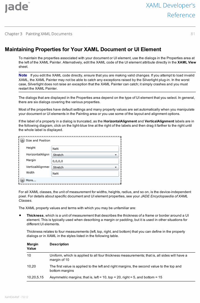
XamlDevRef - 7.0.12
Maintaining Properties for Your XAML Document or UI ElementTo maintain the properties associated with your document or UI element, use the dialogs in the Properties area atthe left of the XAML Painter. Alternatively, edit the XAML code of the UI element attribute directly in the XAML Viewsheet.
Note If you edit the XAML code directly, ensure that you are making valid changes. If you attempt to load invalidXAML, the XAML Painter may not be able to catch any exceptions raised by the Silverlight plug-in. In the worstcase, Silverlight does not raise an exception that the XAML Painter can catch; it simply crashes and you mustrestart the XAML Painter.
The dialogs that are displayed in the Properties area depend on the type of UI element that you select. In general,there are six dialogs covering the various properties.
Most of the properties have default settings and many property values are set automatically when you manipulateyour document or UI elements in the Painting area or you use some of the layout and alignment options.
If the label of a property in a dialog is truncated, as the HorizontalAlignment and VerticalAlignment labels are inthe following diagram, click on the light-blue line at the right of the labels and then drag it farther to the right untilthe whole label is displayed.
For all XAML classes, the unit of measurement for widths, heights, radius, and so on, is the device-independentpixel. For details about specific document and UI element properties, see your JADE Encyclopaedia of XAMLClasses.
The XAML property values and terms with which you may be unfamiliar are:
Thickness, which is a unit of measurement that describes the thickness of a frame or border around a UIelement. This is typically used when describing a margin or padding, but it is used in other situations fordifferent UI elements.
Thickness relates to four measurements (left, top, right, and bottom) that you can define in the propertydialogs or in XAML in the styles listed in the following table.
MarginValue
Description
10 Uniform, which is applied to all four thickness measurements; that is, all sides will have amargin of 10
10,20 The first value is applied to the left and right margins, the second value to the top andbottom margins
10,20,5,15 Asymmetric margins; that is, left = 10, top = 20, right = 5, and bottom = 15
XAML Developer'sReference
Chapter 3 Painting XAML Documents 81

XamlDevRef - 7.0.12
Whichever method you use to set the margin, the display value is displayed in the asymmetric format.
NaN, which is a unit that represents that a value is not a number. It is typically seen when the numericattribute has been removed from the XAML. When the value of that numeric property is queried, it respondsthat it is NaN – not set.
This is typically done when you want a parent container to manage the size of a child UI element. Byremoving the size attribute from the child, you allow the parent to size the child, potentially adjusting the sizeof the child as the parent itself resizes. (A Canvas parent does not adjust the size of its child elements.)
To remove the attribute from the XAML, clear the value in the property dialog and press ENTER, to update theXAML. This removes the attribute from the XAML, leaving a blank property field until next refreshed, at whichtime it will display NaN; for example, if the Height value is NaN, the attribute is not defined in the XAML andits value is not a number.
Infinity, which is a unit that represents that a value is positive or negative infinity. It is typically seen as thedefault value for items such as MaxHeight; for example, if the MaxHeight value is Infinity, this provides amaximum value for an item (in this example, the MaxHeight for the control does not need to be consideredby the layout manager).
Maintaining General PropertiesUse the General Properties dialog of the Properties area to define the common properties for your document orselected UI element. The properties that you can maintain depend on the document or selected UI element. Fordetails about using the Name text box in the General Properties dialog, see "Naming a UI Element", earlier in thischapter.
For details about specific document and UI element properties, see the JADE Encyclopaedia of XAML Classes.
To change the general properties of your document or selected UI element
1. Select the UI element whose properties you want to change. For details, see "Selecting a UI Element", earlierin this chapter.
The dialogs in the Properties area then display the properties associated with the UI element.
2. If a text box is associated with the property, make your change by overwriting the existing value in the textbox.
3. If a list box is associated with the property, click on the list box and then make your selection from the menuthat is displayed.
To change the parent of a UI element
1. Select the UI element whose parent you want to change. For details, see "Selecting a UI Element", earlier inthis chapter.
2. In the Parent combo box in the General Properties dialog, select the UI element that you want the selectedUI element to reference at run time.
The current parent of the selected UI element is displayed in the Parent combo box.
Note The display properties of a UI element are relative to the parent UI element. Changing the parent of a UIelement affects the placement and visibility of the child UI element.
XAML Developer'sReference
Chapter 3 Painting XAML Documents 82

XamlDevRef - 7.0.12
Maintaining Size and Position PropertiesUse the Size and Position dialog of the Properties area, accessed by clicking the expand icon at the upper left ofthat dialog, to change the size and position of UI elements within your document or another UI element.
The size and position properties that you can maintain depend on the type of UI element that you select.
An example of the Size and Position dialog for a Button is shown in the following diagram.
To change the Size and Position properties of your document or UI element
1. Click the property that you want to change. The property is then highlighted, enabling you to specify therequired size and position in the associated text boxes and combo boxes.
2. Make your change by overwriting the existing value in the text box, or by selecting the required value in thelist box.
Additionally, you can use the Layout toolbar to size and align selected UI elements or groups of UI elements. Fordetails, see "Layout Toolbar", later in this chapter.
For details about specific document and UI element properties, see the JADE Encyclopaedia of XAML Classes.
Maintaining Colors and Styling PropertiesUse the Colors and Styling dialog of the Properties area, accessed by clicking the expand icon at the upper left ofthat dialog, to change the color and style properties of your document or UI element.
XAML Developer'sReference
Chapter 3 Painting XAML Documents 83
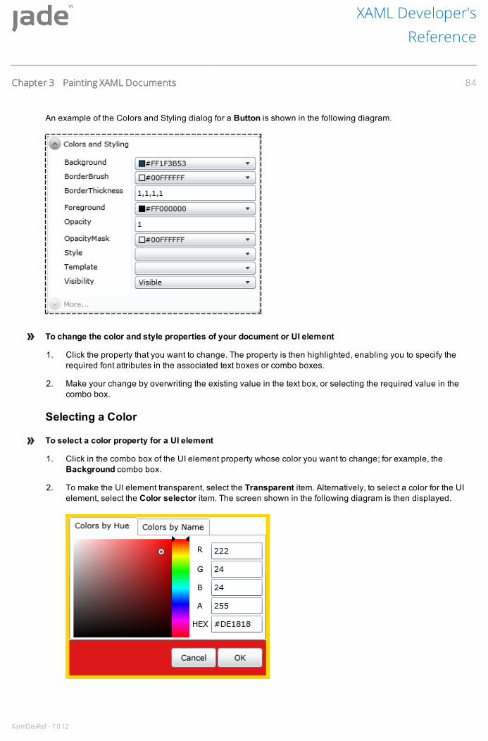
XamlDevRef - 7.0.12
An example of the Colors and Styling dialog for a Button is shown in the following diagram.
To change the color and style properties of your document or UI element
1. Click the property that you want to change. The property is then highlighted, enabling you to specify therequired font attributes in the associated text boxes or combo boxes.
2. Make your change by overwriting the existing value in the text box, or selecting the required value in thecombo box.
Selecting a Color
To select a color property for a UI element
1. Click in the combo box of the UI element property whose color you want to change; for example, theBackground combo box.
2. To make the UI element transparent, select the Transparent item. Alternatively, to select a color for the UIelement, select the Color selector item. The screen shown in the following diagram is then displayed.
XAML Developer'sReference
Chapter 3 Painting XAML Documents 84

XamlDevRef - 7.0.12
The Colors by Hue sheet, shown in the previous diagram, is displayed by default. The Colors by Namesheet enables you to select a color by name (for details, go to step 4, later in this instruction).
The currently selected color is displayed at the bottom of the screen, where the Cancel and OK buttons are.
3. To use the Colors by Hue sheet to select a color:
a. Perform one of the following actions.
In the R, G, and B fields, specify the color in terms of the proportions of red, green, and blue,respectively. Specify a value between 255, the maximum, and zero (0), the minimum, in eachfield.
In the HEX field, enter the color as a hexadecimal value.
Select the color by using the color palette, at the left of the sheet. At the right of the color palette,drag the slider, indicated by two black triangles, to the required hue.
Click in the circle at the left of the color palette and drag it to the required position, to change thesaturation (x-axis) and brightness (y-axis) accordingly.
b. The A field (alpha channel) enables you to specify the opacity of the color. A value of 255 means totallyopaque and zero (0) means totally transparent.
The selected color is displayed at the bottom of the screen, where the Cancel and OK buttons are.
4. To select a color by name:
a. Click on the Colors by Name tab to display the Colors by Name sheet, shown in the followingdiagram.
b. By default, the colors are listed in alphabetical order. To list the colors from dark to light, check the Sortdark to light check box that is displayed at the bottom of the screen.
c. Click on the color that you want to select.
The selected color is displayed at the bottom of the screen, where the Cancel and OK buttons are.
5. Click the OK button, to select that color. Alternatively, click the Cancel button, to abandon your selection.
The selected color is then displayed in the combo box in the Colors and Styling dialog.
For details about specific document and UI element properties, see the JADE Encyclopaedia of XAML Classes.
XAML Developer'sReference
Chapter 3 Painting XAML Documents 85

XamlDevRef - 7.0.12
Maintaining Font PropertiesUse the Fonts dialog of the Properties area, accessed by clicking the expand icon at the upper left of that dialog, tochange the font of your document or UI element. An example of the Fonts dialog is shown in the followingdiagram.
To change the font of your document or UI element
1. Click the property that you want to change. The property is then highlighted, enabling you to specify therequired font attributes in the associated text boxes or combo boxes.
2. Make your change by overwriting the existing value in the text box, or selecting the required value in thecombo box.
For details about specific document and UI element properties, see the JADE Encyclopaedia of XAML Classes.
Maintaining Grid DefinitionsUse the Grid Definition dialog, accessed by clicking the expand icon at the upper left of that dialog, to maintain thegrid layout of XAML documents that are based on the following styles.
Grid Based - Sizeable, Scrollable
Grid Based - Fixed Size, Scrollable
Grid Based - Fixed Size
Child Window
The grid is the most powerful of the layout managers. It is designed to be used for the layout of the user interfaceof your applications and is not intended for data display (for displaying data in a tabular fashion, you wouldtypically use a XamlDataGrid).
By default, a grid has one row and column. It is at its most useful when it contains multiple rows and columns inwhich the resulting cells manage the position and size of the child controls.
XAML Developer'sReference
Chapter 3 Painting XAML Documents 86

XamlDevRef - 7.0.12
The following diagram shows an example of the Grid Definition dialog.
Key to the flexibility of the grid are the unit of measurement options that are available when defining width andheight. These options are:
Integer, where the value is defined in pixels
Auto, where the size is determined by the size properties of the content object
Asterisk (*), where the value is expressed as a weighted proportion of available space
For details about defining a grid, see "Grid UI Element Type", in Chapter 4.
For details about specific document and UI element properties, see the JADE Encyclopaedia of XAML Classes.
Maintaining Miscellaneous PropertiesUse the Miscellaneous dialog of the Properties area, accessed by clicking the expand icon at the upper left of thatdialog, to maintain miscellaneous properties of your document or UI element.
XAML Developer'sReference
Chapter 3 Painting XAML Documents 87

XamlDevRef - 7.0.12
The properties that you can maintain depend on the UI element that you select. The Miscellaneous dialogexample shown in the following diagram is for a TextBox UI element.
Tomaintain miscellaneous properties of your document or UI element
1. Click the property that you want to change. The property is then highlighted, enabling you to specify therequired font attributes in the associated text boxes or combo boxes.
2. Make your change by overwriting the existing value in the text box, or by selecting the required value in thecombo box.
For details about specific document and UI element properties, see the JADE Encyclopaedia of XAML Classes.
Maintaining TransformationsUse the Transformations dialog of the Properties area, accessed by clicking the expand icon at the upper left ofthat dialog, to transform your document or UI element. For example, you can rotate a UI element by a specifiednumber of degrees. An example of the Transformations dialog is shown in the following diagram.
XAML Developer'sReference
Chapter 3 Painting XAML Documents 88

XamlDevRef - 7.0.12
To transform your document or UI element
1. Click the property that you want to change. The property is then highlighted, enabling you to specify therequired font attributes in the associated text boxes or combo boxes.
2. Make your change by overwriting the existing value in the text box, or by selecting the required value in thecombo box.
For details about specific document and UI element properties, see the JADE Encyclopaedia of XAML Classes.
Defining Methods for Your DocumentTo define methods to support your documents and UI elements, see the JADE Encyclopaedia of XAML Classes.
Saving Your DocumentTo save your XAML document, perform one of the following actions
Select the Save command from the XAML menu.
Press CTRL+S.
For details, see "Saving Your Document", in Chapter 2.
When you save your document in the XAML Painter, any single quote characters (') in the XAML are converted tothe string ' when you view that document in the XAML Browser. Single quote characters are not allowed inthe XAML Browser and must be replaced with the string ' so that the XAML remains valid.
To save your XAML document under a different name
Select the Save As command from the XAML menu.
The Save Document-name as dialog is then displayed. For details, see "Saving Your Document as anotherName", in Chapter 2.
The Save As command is disabled if you have changed the document without saving it. After you save yourchanges, the Save As command is enabled.
Editing an Existing Document in the XAML PainterTo load an existing document so that you can maintain it
Select the Edit command from the XAML menu of the Painter.
XAML Developer'sReference
Chapter 3 Painting XAML Documents 89

XamlDevRef - 7.0.12
The Edit Xaml Document dialog, shown in the following diagram, is then displayed to enable you to specify thename of the document that you want to load for editing.
To load an existing document
1. From the text area of the Document combo box, specify the name of the document that you want to edit orselect the document from the list box.
The list box area of the Document combo box displays the XAML documents defined for the currentlyselected schema.
2. Click the OK button. Alternatively, click the Cancel button to abandon your selection.
Using the Keyboard and Mouse to Edit Your DocumentWhen the selected document has been loaded, use combinations of keyboard and mouse actions to manipulatethe UI elements on the document in the Painting area or edit the XAML directly on the XAML View sheet.
You can also change details of a UI element or a group of UI elements by using the Properties dialog. For details,see "Maintaining Properties for Your XAML Document or UI Element", earlier in this chapter. For details aboutchanging the type of an existing UI element (for example, changing a ComboBox UI element to a TextBox UIelement), see "Changing a UI Element Type", later in this chapter.
UI elements in the document are made visible and are enabled in the XAML Painter only if the settings of theIsHitTestvisible and the IsEnabled properties of each UI element are set to True.
However, a UI element inherited from a superclass document is disabled, regardless of the setting of theIsEnabled property of that UI element on the current document. This provides you with a visual indicator in theXAML Painter that you cannot edit the UI element on the current document, as it belongs to the document of asuperclass.
Selecting Multiple UI Elements
To select multiple UI elements in the Painting area
Click on each UI element to be selected, while holding down the CTRL key.
The first (master) element that you selected is highlighted with a red border. Subsequent selections have a greenborder. For details, see "Selecting a UI Element", earlier in this chapter.
XAML Developer'sReference
Chapter 3 Painting XAML Documents 90
XamlDevRef - 7.0.12
To deselect a UI element that is already selected
While holding down the CTRL key, click on the UI element that you do not require in the selection.
Changing the Size of Selected UI Elements
To change the size of all selected UI elements
Drag a side or a corner on the master UI element.
Moving UI Elements around Your Document
Tomove one or more selected UI elements around your document
Drag the UI element or selected UI elements that you want to move.
All selected UI elements move during the drag operation.
If the UI element move lock operation is on (that is, you checked the Lock check box in the Options panel), youcannot move any UI elements.
Notes You can select the base element of the document (typically the background or root element) but youcannot move it by dragging it. To move or resize a base element, use the Size and Position property dialog.
When you add a UI element to a cell in a grid-based XAML document, its Margin property is set to 0,0,0,0. If youthen drag that element to another part of the same cell, the XAML Painter sets the Margin property so that theelement retains that position within the cell. This causes the underlying grid to change the size of the columns androws: it does not affect the size of the document, only the grid layout. This behavior is a restriction of Silverlight thatJADE is unable to change. Manually control the layout by setting the size of the columns and rows of the grid asrequired. For details, see "Grid UI Element Type", in Chapter 4.
Copying UI Elements
To copy a one or more selected UI elements that have the same parent
Hold down the CTRL+ALT keys and then drag the selected UI element or UI elements to the new location onthe document.
Displaying the Properties for a UI Element
To display the Properties for a UI element
Select that UI element. For details, see "Selecting a UI Element", earlier in this chapter.
The Properties area then displays details of the selected UI element. You can use the Properties area to changethe UI element whose details are displayed, if required. That UI element then becomes the selected UI element onthe document that you are editing.
Placing a UI Element on a Container UI ElementContainer UI elements (for example, a canvas or stack panel) allow you to place other UI elements on top of them.
XAML Developer'sReference
Chapter 3 Painting XAML Documents 91
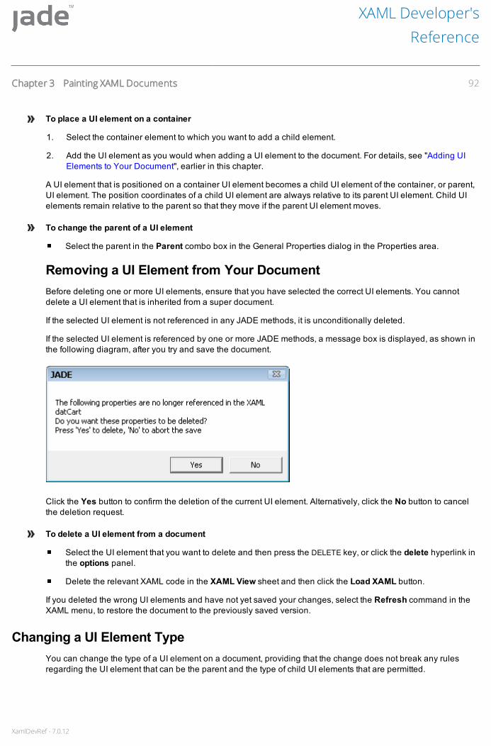
XamlDevRef - 7.0.12
To place a UI element on a container
1. Select the container element to which you want to add a child element.
2. Add the UI element as you would when adding a UI element to the document. For details, see "Adding UIElements to Your Document", earlier in this chapter.
A UI element that is positioned on a container UI element becomes a child UI element of the container, or parent,UI element. The position coordinates of a child UI element are always relative to its parent UI element. Child UIelements remain relative to the parent so that they move if the parent UI element moves.
To change the parent of a UI element
Select the parent in the Parent combo box in the General Properties dialog in the Properties area.
Removing a UI Element from Your DocumentBefore deleting one or more UI elements, ensure that you have selected the correct UI elements. You cannotdelete a UI element that is inherited from a super document.
If the selected UI element is not referenced in any JADE methods, it is unconditionally deleted.
If the selected UI element is referenced by one or more JADE methods, a message box is displayed, as shown inthe following diagram, after you try and save the document.
Click the Yes button to confirm the deletion of the current UI element. Alternatively, click the No button to cancelthe deletion request.
To delete a UI element from a document
Select the UI element that you want to delete and then press the DELETE key, or click the delete hyperlink inthe options panel.
Delete the relevant XAML code in the XAML View sheet and then click the Load XAML button.
If you deleted the wrong UI elements and have not yet saved your changes, select the Refresh command in theXAML menu, to restore the document to the previously saved version.
Changing a UI Element TypeYou can change the type of a UI element on a document, providing that the change does not break any rulesregarding the UI element that can be the parent and the type of child UI elements that are permitted.
XAML Developer'sReference
Chapter 3 Painting XAML Documents 92

XamlDevRef - 7.0.12
The UI element name, event method code, and so on, are retained, so that you do not have to first delete theexisting UI element, add the replacement UI element of the required type, and then create the appropriate eventmethods.
To change the existing type of a UI element selected on a document
Manually edit the XAML on the XAML View sheet.
Note If you edit the XAML code directly, ensure that you are making valid changes. If you attempt to load invalidXAML, the XAML Painter may not be able to catch any exceptions raised by the Silverlight plug-in. In the worstcase, Silverlight does not raise an exception that the XAML Painter can catch, it simply crashes and you mustrestart the XAML Painter.
Effects of Editing an Existing DocumentIf the document that you are editing is being used at run time, you are warned that the document cannot be saveduntil no user is using the document. If you try to save the edited document, the save action is disallowed until thedocument is not being used.
When you access an existing document in the XAML Painter, you automatically lock the document class. Althoughlocking a document prevents other users from making changes, they can view the unchanged document. Whenyou exit from Painter, the lock is released.
Deleting a DocumentUse the Delete command from the XAML menu to delete a document.
To delete a document
1. Select the Delete command from the XAML menu.
A message box is then displayed, prompting you to confirm that you want to delete the selected document.
2. Click the Yes button to delete the document. Alternatively, click the No button to abandon the deletion.
Notes You cannot delete a document if the document has subclasses, any existing property references, or thedocument is open in the XAML Browser.
When you delete a document, the corresponding class and all of its methods are deleted. Any methodsreferencing the deleted document are flagged as uncompiled.
Layout ToolbarThe buttons in the Layout toolbar enable you to size and align selected UI elements or groups of UI elements thathave the same parent. The Layout toolbar is intended primarily for use with the Canvas UI element type.
Before you align and space the UI elements on your document, you may want to make some elements identical insize; for example, button elements. You may also want to standardize the width or the height of other UI elements.
The Layout toolbar buttons normally operate only on UI elements that are in the same container.
Tip When laying out your document, standardize the size of UI elements before using the alignment andspacing layout buttons, as the size buttons can alter the spacing of your UI elements.
XAML Developer'sReference
Chapter 3 Painting XAML Documents 93

XamlDevRef - 7.0.12
The Layout toolbar buttons are listed in the following table.
Toolbar Button Button Name Description
Align Bottom Aligns to the bottom edge of the master UI element
Align Top Aligns to the top edge of the master UI element
Align Left Aligns to the left edge of the master UI element
Align Right Aligns to the right edge of the master UI element
Vertically Adjacent Makes the selected UI elements vertically adjacent
Horizontally Adjacent Makes the selected UI elements horizontally adjacent
Align Centers Horizontally Centers the selected UI elements horizontally
Align Centers Vertically Centers the selected UI elements horizontally
Space Evenly Down Spaces the selected UI elements evenly down the container
Space Evenly Across Spaces the selected UI elements evenly across the container
Same Height Makes all selected UI elements the same height
Same Width Makes all selected UI elements the same width
You cannot select the Align Bottom, Align Top, Align Left, Align Right, Vertically Adjacent, HorizontallyAdjacent, Space Evenly Down, Space Evenly Across, Same Height, or Same Width button if you have not yetselected a group of UI elements (that is, they are disabled).
To select a group of UI elements and assign a master UI element
1. Click the first UI element of your proposed group.
2. While holding down the CTRL key, click the other UI elements that are to be in your group.
The first UI element that you select becomes the master UI element and all other elements are aligned or sizedrelative to the master UI element. For details, see "Selecting a UI Element", earlier in this chapter.
Align Bottom ButtonUse the Align Bottom button in the Layout toolbar to align a group of UI elements so that the bottom edges of theselected UI elements are aligned with that of the master UI element.
To align the bottom edges of the selected UI elements
1. Select the UI elements whose bottom edges you want to align. (Select the UI element with which you want toalign the other elements first.)
XAML Developer'sReference
Chapter 3 Painting XAML Documents 94

XamlDevRef - 7.0.12
2. Click the Align Bottom toolbar button.
Align Top ButtonUse the Align Top button, in the Layout toolbar, to align a group of UI elements so that the top edges of theselected UI elements are aligned.
To align the top edges of the selected UI elements
1. Select the UI elements whose top edges you want to align. (Select the UI element with which you want toalign the other elements first.)
2. Click the Align Top toolbar button.
Align Left ButtonUse the Align Left button in the Layout toolbar to align a group of UI elements so that the left edges of theselected UI elements are aligned.
To align the left edges of your selected group of UI elements
1. Select the UI elements whose left edges you want to align. (Select the UI element with which you want toalign the other elements first.)
2. Click the Align Left toolbar button.
Align Right ButtonUse the Align Right button in the Layout toolbar to align a group of UI elements so that the right edges of theselected UI elements are aligned.
To align the right edges of the selected UI elements
1. Select the UI elements whose right edges you want to align. (Select the UI element with which you want toalign the other elements first.)
2. Click the Align Right toolbar button.
Vertically Adjacent ButtonUse the Vertically Adjacent button in the Layout toolbar to align UI elements vertically. The highest UI elementthat you select does not move when the Vertically Adjacent button is clicked. All of the selected UI elements(except for the highest UI element) are moved upward.
UI elements that are in different horizontal parts of the document are moved and they become adjacent along avertical axis.
To select this button from the Layout toolbar, you must first select a group of two or more UI elements.
Tomake your selected UI elements vertically adjacent
1. Select the UI elements that you want to be vertically adjacent.
2. Click the Vertically Adjacent toolbar button.
XAML Developer'sReference
Chapter 3 Painting XAML Documents 95

XamlDevRef - 7.0.12
Horizontally Adjacent ButtonUse the Horizontally Adjacent button in the Layout toolbar to align UI elements horizontally. The UI elementfarthest to the left does not move when the Horizontally Adjacent button is clicked. All of the selected UI elements(except for the farthest left) are moved to the left.
UI elements that are in different vertical parts of the document are moved and they become adjacent along ahorizontal axis.
To select this button from the Layout toolbar, you must first select a group of two or more UI elements.
Tomake your selected UI elements horizontally adjacent
1. Select the UI elements that you want to be horizontally adjacent. (Select the UI element with which you wantto align the other elements first.)
2. Click the Horizontally Adjacent toolbar button.
Align Centers Vertically ButtonUse the Align Centers Vertically button in the Layout toolbar to center a UI element or group of UI elementsrelative to the vertical axis of your document or container UI element.
To center the selected UI elements vertically
1. Select the UI elements that you want to center vertically.
2. Click the Align Centers Vertically toolbar button.
The selected UI elements do not move relative to each other. If you select one UI element only, it centers only thatUI element.
Align Centers Horizontally ButtonUse the Align Centers Horizontally button in the Layout toolbar to center a UI element or group of UI elementsrelative to the horizontal axis of your document or container UI element.
To center the selected UI elements horizontally
1. Select the UI elements that you want to center horizontally.
2. Click the Align Centers Horizontally toolbar button.
The selected UI elements do not move relative to each other. If you select one UI element only, it centers only thatUI element.
Space Evenly Down ButtonUse the Space Evenly Down button in the Layout toolbar to space a group of UI elements so that the verticaldistance between each UI element is the same.
The Space Evenly Down toolbar spreads the selected UI elements evenly down the whole document orcontainer.
XAML Developer'sReference
Chapter 3 Painting XAML Documents 96

XamlDevRef - 7.0.12
To space the UI elements evenly down the document or container
1. Select the UI elements that you want to space evenly down the document or container.
2. Click the Space Evenly Down toolbar button.
Space Evenly Across ButtonUse the Space Evenly Across button in the Layout toolbar to space a group of UI elements so that the horizontaldistance between each UI element is the same.
The Space Evenly Across toolbar spreads the selected UI elements evenly down the whole document orcontainer.
To space the UI elements evenly across the document or container
1. Select the UI elements that you want to space evenly down the document or container.
2. Click the Space Evenly Across toolbar button.
Same Width ButtonUse the Same Width button in the Layout toolbar to standardize the width of two or more selected UI elements.The UI elements that you select are assigned a width equal to the selected master UI element. Width truncation orextension is performed from the right.
To standardize the width of the selected UI elements
1. Select the UI elements that you want to make the same width. (Select the UI element with which you want tostandardize the widths of the other elements first.)
2. Click the Same Width toolbar button.
Same Height ButtonUse the Same Height button in the Layout toolbar to standardize the height of two or more selected UI elements.The UI elements that you select are assigned a height equal to the selected master UI element. Height truncationor extension is from the bottom.
To standardize the height of the selected UI elements
1. Select the UI elements that you want to space evenly down the document or container. (Select the UIelement with which you want to standardize the heights of the other elements first.)
2. Click the Same Height toolbar button.
XAML Developer'sReference
Chapter 3 Painting XAML Documents 97
XamlDevRef - 7.0.12
Chapter 4 Considerations When DevelopingSilverlight Applications
This chapter covers the following topics.
Using Third-Party Controls
Third-Party Control Usage in JADE Silverlight Stateful Applications
Third-Party Control Usage in JADE Silverlight Stateless Applications
Abstract Classes and Third-Party Controls
Accessing .NET Objects
Accessing Silverlight Fields and Properties
Accessing Silverlight Methods
Specifying a Type
Enums
Using Layout Manager UI Element Types
Canvas UI Element Type
StackPanel UI Element Type
Grid UI Element Type
Using Resources in XAML Documents
Creating Controls Dynamically or from a Template
Use of the itemsSource Property by Different XAML Classes
XamlSelector and XamlDataGrid Class Use of the itemsSource Property
XamlAutoCompleteBox Use of the itemsSource Property
Unit Testing Silverlight Applications
Adding Silverlight Unit Tests to the JADE Unit Testing Framework
Running the Silverlight Application Unit Tests
Using Third-Party ControlsThis section describes how to use third-party controls in your JADE Silverlight stateful and stateless applications.
Third-Party Control Usage in JADE Silverlight Stateless ApplicationsThe examples in this section use the ButtonSpinner control from the Microsoft Silverlight toolkit.

XamlDevRef - 7.0.12
Before the XAML that contains the control can be used, the DLLs defining the control must be available for JADE.You can place these DLLs in one of the following locations.
The bin directory of your application server.
In a folder that is referred to by the DefaultAssemblyLocation parameter in the [JadeSilverlight] section ofthe JADE initialization file.
To use the controls in your XAML, you must add the correct namespace declaration at the end of the openingelement of your XAML; for example, add the following to the end of the first element of the XAML.
<...xmlns:controlsToolkit="clr-namespace:System.Windows.Controls;assembly=System.Windows.Controls.Toolkit"...>
The ButtonSpinner control can then be used from this assembly, by adding a control element; for example:
<toolkit:ButtonSpinner Name="spinner" Height="40" Width="100" Content="50"FontSize="16 "/>
When the XAML is saved, in the XamlDocument subclass (created for the XAML), you will find a reference of typeXamlObject, with the name specified in the control element (in this case, spinner) that is the JADE reference tothe control. You can use this reference to access properties and call methods of the control.
You can use the XamlObject class setXamlProperty, getXamlProperty, invokeXamlMethod, andinvokeXamlMethodio methods to manipulate the control object; for example, to access the properties andmethods of the event arguments. To determine what is available, consult the documentation of the third-partycontrol.
To receive events from the controls, use the XamlDocument class registerEventHandler method to register forevent notification.
Using the ButtonSpinner in the previous example, call the registerEventHandler method to register for the"Spin" event; for example:
registerEventHandler(spinner, "Spin", ThirdPartyControls::spinnerSpun);
The first parameter indicates the control with which we are working, the second is the event name of the control,and the last parameter is the JADE method that will be called when this event is triggered. The JADE method thathandles the event (the event handler method) must have the following signature.
(sender:XamlObject input; eventArgs:XamlObject) browserExecution;
The following example of an event handler for a button spinner also demonstrates the use of thegetPropertyValue and setPropertyValue methods.
spinnerSpun(control XamlObject input; eventArgs:XamlObject) browserExecution;vars
i : Integer;spinDirection : String;
beginspinDirection := eventArgs.getXamlProperty("Direction").Stringi := control.getXamlProperty("Content").Integer;if spinDirection = "Increase" then
i := i+1;else
i := i-1;endif;control.setXamlProperty("Content", i);
end;
XAML Developer'sReference
Chapter 4 Considerations When Developing Silverlight Applications 99
XamlDevRef - 7.0.12
The Silverlight controls implemented in JADE are built on controls that are available in standard Silverlight. Thesupporting Silverlight DLLs contain many more controls than those exposed by JADE. The other controls in theseDLLs can also be accessed in a similar way to that described in this section.
However, for controls not exposed by JADE, you do not have to place a copy of the DLL in the JADE bin directoryor default assembly location, as JADE will already know how to find these. Depending on the control that you use,it may be unnecessary to include a namespace declaration.
registerEventHandler Method for DataTemplate ControlsTo generically handle the XamlDocument class registerEventHandler method for controls defined in aDataTemplate:
When you save a document, any third-party controls are investigated to determine where they fit in the JADEXamlObject hierarchy. (These controls are not generated as a XamlObject-type property.)
When you save a document, the assemblies for that control are referenced to determine whether the controlinherits from a JadeXamlControl type; for example, the RadComboBox in the Telerik Controls assemblyinherits from XamlItemsControl. As a result, the property associated with that control is created as aXamlItemsControl.
This also means that the control can be referenced via the property, as that type and the events associatedwith that control type can be directly defined rather than having to call the XamlDocument classregisterEventHandler method.
Note Any assemblies required must be located in the directory associated with theDefaultAssemblyLocation parameter in the [JadeSilverlight] section of the JADE initialization file. If therequired assemblies cannot be found, a message box advises you of the failure and asks if you want todisplay the details in an exception dialog. The exception dialog lists the assembly that could not be found.
A named item in a DataTemplate is generated as a virtual property of the defined type, which enables you todirectly define events in JADE. However, because it is virtual, any logic references will be rejected by theJADE compiler. This is deliberate, because at run time, the template can be used multiple times to generatedifferent instances of the control that all have the same name. When an event occurs on one of thesecontrols, the first parameter of the event is the control instance, which can then be referenced in logic.
For third-party controls used that are named and can be defined as a XamlUIElement subclass, you can defineevents not available in JADE by performing the following actions.
1. Define an event handler method for the event.
In the following example, the source type matches the type of the control property.
radCombo_selectionChanged(source: XamlItemsControl input;origin: XamlObject input);
2. Define a loaded event on the control in JADE that does the following (where the source type matches thetype of the control property).
radCombo_Loaded(control: XamlItemsControl input;originalSource: XamlObject input);
beginif control.tag <> "Done" then // The loaded event for a control
// can be called multiple times if// the control is hidden and then// made visible, for example.
XAML Developer'sReference
Chapter 4 Considerations When Developing Silverlight Applications 100
XamlDevRef - 7.0.12
self.registerEventHandler(source, "SelectionChanged",xaml-document-name::radCombo_selectionChanged);
control.tag := "Done";endif;
endif;
This logic will then register that event for every instance of the DataTemplate item that is created.
Third-Party Control Usage in JADE Silverlight Stateful ApplicationsThis section describes how to use third-party controls (or Silverlight controls not exposed by JADE) in your JADESilverlight stateful applications. The following examples use the Expander control from the Microsoft Silverlighttoolkit.
The JADE Silverlight runtime JadeAGL needs to be given the assembly (or assemblies) that define the control. Touse these controls, the associated assemblies must be available to the application server for downloading to theXAML Painter.
Before loading the XAML that contains the control, call the XamlManager class loadAssembly orloadAssemblyFromBinary method to pass the assembly on to JadeAGL, as follows.
app.xamlManager.loadAssembly("System.Windows.Controls.Toolkit.dll");
You must add valid XAML that uses the control directly into the XAML editing area of the XAML Browser or XAMLPainter. You cannot use the Painting area of the XAML Painter to add these controls, as it does not know aboutthem.
To use the third-party control in your XAML, perform the following actions.
1. Add the correct namespace declaration at the end of the first element of your XAML, if the namespace of thecontrol is not already included; for example:
<...xmlns:controlsToolkit="clr-namespace:System.Windows.Controls;assembly=System.Windows.Controls.Toolkit"...>
2. Insert valid XAML at the required location in your XAML; for example:
<controlsToolkit:Expander HorizontalContentAlignment="Center"><controlsToolkit:HeaderedContentControl.Header>
<TextBlock Text="Your Stickfigure life" FontSize="18"/></controlsToolkit:HeaderedContentControl.Header><controlsToolkit:HeaderedContentControl.Content>
<Button Content="Button1"/></controlsToolkit:HeaderedContentControl.Content>
</controlsToolkit:Expander>
You should now be able to run the XAML application in the usual way and find a functioning external control onthat document. Manipulate the Silverlight control object by calling the XamlObject class setXamlProperty,getXamlProperty, invokeXamlMethod, and invokeXamlMethodio methods.
Abstract Classes and Third-Party ControlsBrush, Geometry, Panel, RangeBase, Selector, Shape, Transform, and UIElement are abstract classes inSilverlight but they are not abstract in the JADE XAML framework. If you import a third-party Silverlight control thatis a subclass of one of those classes, the representation of this control is an instance of one of these abstractSilverlight classes. These classes are therefore not abstract in the RootSchema; that is, there might be realinstances of them.
XAML Developer'sReference
Chapter 4 Considerations When Developing Silverlight Applications 101

XamlDevRef - 7.0.12
You cannot create instances by user logic for these classes because this results in an exception.
Accessing .NET ObjectsThe XamlObject class provides the following methods that support access to underlying .NET objects, usuallydefined in third-party DLLs.
getXamlProperty
setXamlProperty
invokeXamlMethod
invokeXamlMethodio
These methods are called on a JADE object that is acting as a proxy for a .NET or Silverlight object. The firstparameter of these methods specifies the member of the underlying .NET object that is to be accessed or invoked.
Accessing Silverlight Fields and PropertiesCall the XamlObject class getXamlProperty and setXamlProperty methods to access Silverlight fields andproperties. The first parameter of each method specifies the name of the field or property of the current .NET objectbeing accessed.
To access a static type that is not the type of the current .NET object, see "Specifying a Type", later in this chapter.
Enumerated (enum) type values are passed as strings. The string value passed is one that matches the stringconstant of the enum value. For details, see "Enums", later in this chapter.
Accessing Silverlight MethodsCall the invokeXamlMethod or invokeXamlMethodio method to access a Silverlight method. The first parameterof each method specifies the name of the method of the current .NET object being invoked.
If the .NET method being invoked has:
No parameters or input parameters only, use the invokeXamlMethod method.
Reference or output parameters, you must use the invokeXamlMethodio method.
To access a static method on a type that is not the type of the current .NET object, see "Specifying a Type", later inthis chapter.
Enum values are passed as strings. The string value passed is one that matches the string constant of the enumvalue. For details, see "Enums", later in this chapter.
Overloaded .NET MethodsIf the .NET method is overloaded, the first parameter must also specify the arguments of the method, to identify thecorrect method to invoke, as shown in the following examples.
invokeXamlMethod("Mth(Int32)", arg);
invokeXamlMethod("Mth(System.Int32)", arg);
XAML Developer'sReference
Chapter 4 Considerations When Developing Silverlight Applications 102
XamlDevRef - 7.0.12
Prefix the types in the method with ref (for reference parameters) or out (for output parameters), as appropriate, asshown in the following example.
invokeXamlMethod("Mth(ref Int32; out Int32)", arg1, arg2);
If you specify more than one parameter in a method, separate each parameter with a semicolon character, asshown in the previous example.
Types from the system namespace do not need to specify their namespace. Other types, however, must be anassembly-qualified name, as shown in the following example. For details, see "Specifying a Type", later in thischapter.
invokeXamlMethod(("Mth(" & aqn & ")").StringUtf8, arg);
Note In the previous example, aqn is an assembly-qualified name of the parameter type.
ConstructorsConstructors can be called by specifying the special method name .ctor, which must be prefixed by the type of theobject being constructed, as shown in the following example. For details, see "Specifying a Type", later in thischapter.
invokeXamlMethod((aqn&";.ctor").StringUtf8);
Overloaded constructors are called in the same way as normal overloaded methods, as shown in the followingexample.
invokeXamlMethod((aqn&";.ctor(Int32)").StringUtf8, 64);
Note In the previous example, aqn is an assembly-qualified name of the parameter type.
Specifying a TypeWhen it is necessary to specify the type for static member access or for method parameter specification, a fully-qualified name is required. The fully-qualified name is defined in .NET and must conform to the .NET expectations.It has the following format.
<namespace-name>.<type-name>,<assembly-display-name>
For more details, see your .NET documentation.
If you specify a fully-qualified name in the getXamlProperty, setXamlProperty, invokeXamlMethod, orinvokeXamlMethodio method, separate the type and member with a semicolon character, as shown in thefollowing example.
invokeXamlMethod((aqn&";.ctor").StringUtf8);
EnumsEnums are passed between .NET and JADE as strings. The string value corresponds to the name of the constantdefined in the .NET enum. For example, where the property MyProp is of type Days, the:
C# enum definition is as follows.
public enum Days{
XAML Developer'sReference
Chapter 4 Considerations When Developing Silverlight Applications 103
XamlDevRef - 7.0.12
Saturday, Sunday, Monday, Tuesday, Wednesday, Thursday, Friday};
Corresponding JADE enum access code is as follows.
setXamlProperty("MyProp", "Monday");getXamlProperty("MyProp");
If the enum is a flags type (that is, it has the FlagsAttribute attribute), multiple values can be set by providing acomma-separated list. For example, where the property MyProp is of type Direction, the:
C# enum definition is as follows.
public enum AllowedDirection{None = 0x0,Up = 0x1,Down = 0x2,Left = 0x4,Right = 0x8}
Corresponding JADE enum access code is as follows.
setXamlProperty("MyProp", "Up, Down");
Using Layout Manager UI Element TypesThe Canvas, StackPanel, and Grid UI elements are types of Panel, which is a layout manager type of UI element.
Panels are designed to hold multiple UI elements. The layout of UI elements within the Panel depends on the typeof Panel, as each Panel type exerts its own layout requirements on the UI elements it contains.
Note Layout managers can contain other layout managers; for example, a canvas can contain a grid, and so on.
This section covers the following layout managers.
Canvas
StackPanel
Grid
The following table summarizes the differences and similarities between the layout manager types.
Canvas StackPanel Grid
Grid-based layout? No No Yes
Child elements added At upper left In the next available stack position In specified grid cell
Child elements can be No No Yes resized automatically?
Child elements can overlap? Yes No Yes
Uses zIndex? Yes No No
For details, see the following subsections.
XAML Developer'sReference
Chapter 4 Considerations When Developing Silverlight Applications 104
XamlDevRef - 7.0.12
Canvas UI Element TypeThe Canvas is the most simple of the layout managers, and is considered a layout manager only because thechildren you position on it move with the Canvas. The Canvas parent does not exert any influence over the sizeof its children if it is resized. In addition, children can overlap and be placed outside or extend beyond theboundaries of the parent (the children always move relative to the Canvas if the parent is moved).
In addition, the Layout toolbar and check boxes in the Options panel are intended primarily for use with childrenon the Canvas UI element. For details, see "Defining the Layout of Your XAML Document" and "Options PanelCheck Boxes", in Chapter 3.
An additional attribute, the zIndex, is unique to UI elements that are placed on a Canvas. The zIndex valuedetermines which UI element sits visually on top of another if both occupy the same place or overlap on theCanvas. The UI element with the larger zIndex value is displayed on top.
The default zIndex value is zero (0) and all children are added at the upper-left corner of the Canvas.
In the XAML code, the ZIndex is called an attached property, and is written as shown in the following example.
<Canvas.../><Button...Canvas.Left="30" Canvas.Top="30" Canvas.ZIndex="20" Width="20"
Height="30"/><Button...Canvas.Left="10" Canvas.Top="15" Canvas.ZIndex="10" Width="100"
Height="50"/>
In the previous example, the first button is smaller than the second one, and without a ZIndex it would beobscured. However, setting its ZIndex to a higher value than the second button means that it is displayed on top ofthe bigger button.
StackPanel UI Element TypeThe StackPanel is a layout manager that arranges child elements into a single line, which can be horizontal orvertical. The StackPanel is not a grid-based layout manager. Child elements are stacked vertically or horizontallyas they are added to the StackPanel.
UI elements move with the StackPanel parent but as a general rule are not resized if the parent is resized.
Note To get a UI element to always fill the width of the StackPanel, select that UI element, select the Stretchitem in the HorizontalAlignment combo box, and then enter NaN in the Width text box in the Size and Positiondialog.
XAML Developer'sReference
Chapter 4 Considerations When Developing Silverlight Applications 105

XamlDevRef - 7.0.12
The order in which UI elements are displayed in the StackPanel is primarily determined by the order in which theyare added, as shown in the following diagram (on the left) for which the corresponding XAML is displayed (on theright).
Although you can alter the position of a child UI element by manipulating the margins of a container to push the UIelement outside of its natural flow, it is more common to reposition the control in relation to the other controlscontained in the StackPanel.
To change the order of a UI element in the Painting area, select the UI element and drag it to the required relativeposition in the stack. In the example in the following diagram, Button_3 has been selected and dragged outbeyond the bottom of the last item in the stack in the previous diagram.
You can drop a UI element at any position within the stack. Controls in a StackPanel cannot overlap, however.Each control occupies a position in the stack relative to its neighboring controls.
Grid UI Element TypeThe Grid UI element is a grid-based layout manager. Within the Grid UI element, you can define a grid, which canbe used resize the child elements automatically. The Grid has its own properties dialog, Grid Definition, which isdisplayed when the Grid has focus.
By default, a grid has one row and column. It is at its most useful when it contains multiple rows and columns inwhich the resulting cells manage the position and size of the child controls.
XAML Developer'sReference
Chapter 4 Considerations When Developing Silverlight Applications 106

XamlDevRef - 7.0.12
The left of the following diagram shows an example of the Grid Definition dialog in the Property area of the XAMLPainter and at the right is an example of some Button controls and a GridSplitter positioned within the Painterarea.
Key to the flexibility of the grid are the unit of measurement options that are available when defining width andheight. These options are:
Integer, where the value is defined in pixels
Auto, where the size is determined by the size properties of the content object
Asterisk (*), where the value is expressed as a weighted proportion of available space
In the example in the previous diagram, the first column (that is, column 0) is 80 pixels wide, the third column (thatis, column 2) is as wide as any content added to that column (in the previous example, a GridSplitter has beenadded), and the second and fourth columns divide the remaining space evenly between themselves.
If the grid gets resized, the first column will remain 80 pixels wide, the column containing the grid splitter willremain the same size (as the grid splitter width has been fixed) and the remaining columns adjust their sizeaccordingly.
The previous diagram also shows the interaction between a grid and its child controls. By removing the height andwidth properties from the buttons, and the grid splitter, the grid becomes responsible for performing layout andsizing of the controls.
You can also manipulate the grid properties by using the grid assistant. For details, see "Using the Grid Assistant",in the following subsection.
XAML Developer'sReference
Chapter 4 Considerations When Developing Silverlight Applications 107
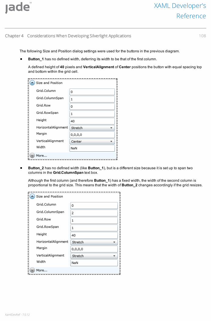
XamlDevRef - 7.0.12
The following Size and Position dialog settings were used for the buttons in the previous diagram.
Button_1 has no defined width, deferring its width to be that of the first column.
A defined height of 40 pixels and VerticalAlignment of Center positions the button with equal spacing topand bottom within the grid cell.
Button_2 has no defined width (like Button_1), but is a different size because it is set up to span twocolumns in the Grid.ColumnSpan text box.
Although the first column (and therefore Button_1) has a fixed width, the width of the second column isproportional to the grid size. This means that the width of Button_2 changes accordingly if the grid resizes.
XAML Developer'sReference
Chapter 4 Considerations When Developing Silverlight Applications 108
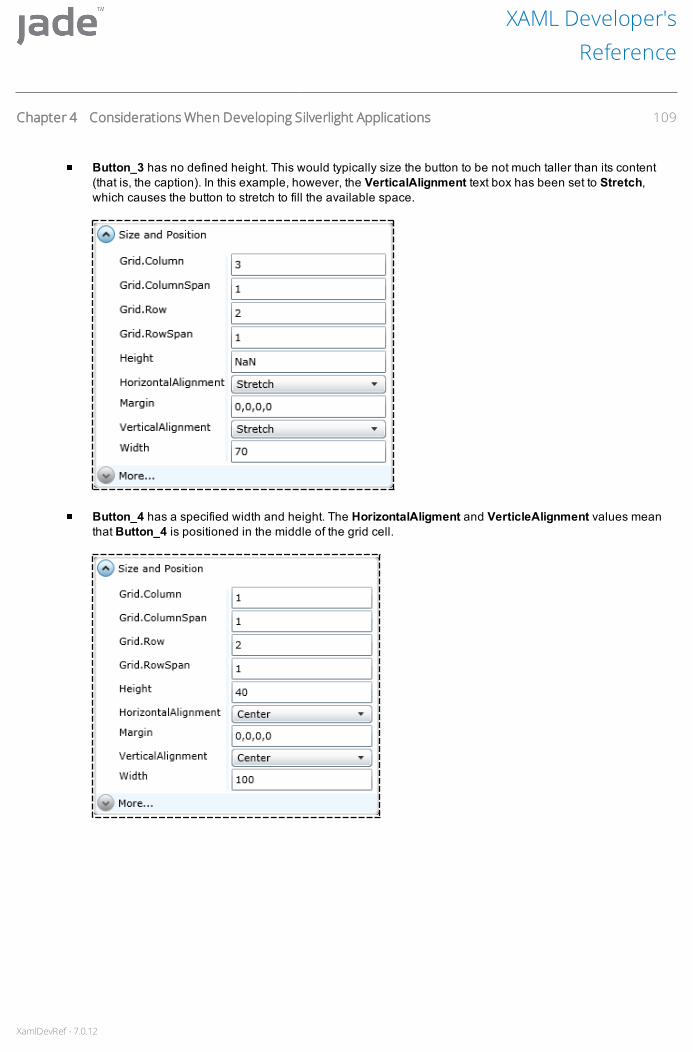
XamlDevRef - 7.0.12
Button_3 has no defined height. This would typically size the button to be not much taller than its content(that is, the caption). In this example, however, the VerticalAlignment text box has been set to Stretch,which causes the button to stretch to fill the available space.
Button_4 has a specified width and height. The HorizontalAligment and VerticleAlignment values meanthat Button_4 is positioned in the middle of the grid cell.
XAML Developer'sReference
Chapter 4 Considerations When Developing Silverlight Applications 109

XamlDevRef - 7.0.12
The GridSplitter has no defined height but has a defined width of 10 pixels. It has been placed into a columnto which automatic sizing applies; that is, the width of the column is determined by the width of its children.The Grid.RowSpan property specifies that the GridSplitter should stretch over all rows in the grid and theVerticalAlignment value specifies that the splitter is to take all available vertical space.
Using the Grid AssistantWhen you maintain the Grid UI element type, you can use the grid assistant in the Painting area in addition to theGrid Definition dialog, to manipulate the columns and rows in the grid.
To display the grid assistant
1. In the Painting area, select the Grid UI element on your document. For details, see "Selecting a UI Element",in Chapter 3.
2. Right-click and then select the Show Grid Assistant command from the popup menu that is displayed.
XAML Developer'sReference
Chapter 4 Considerations When Developing Silverlight Applications 110
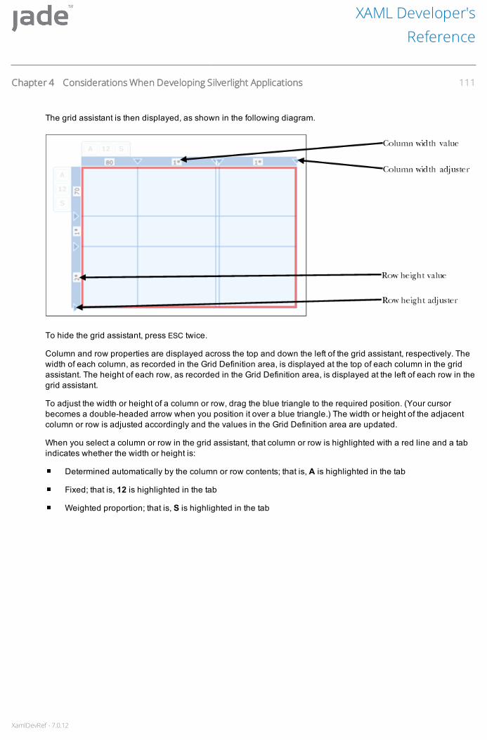
XamlDevRef - 7.0.12
The grid assistant is then displayed, as shown in the following diagram.
To hide the grid assistant, press ESC twice.
Column and row properties are displayed across the top and down the left of the grid assistant, respectively. Thewidth of each column, as recorded in the Grid Definition area, is displayed at the top of each column in the gridassistant. The height of each row, as recorded in the Grid Definition area, is displayed at the left of each row in thegrid assistant.
To adjust the width or height of a column or row, drag the blue triangle to the required position. (Your cursorbecomes a double-headed arrow when you position it over a blue triangle.) The width or height of the adjacentcolumn or row is adjusted accordingly and the values in the Grid Definition area are updated.
When you select a column or row in the grid assistant, that column or row is highlighted with a red line and a tabindicates whether the width or height is:
Determined automatically by the column or row contents; that is, A is highlighted in the tab
Fixed; that is, 12 is highlighted in the tab
Weighted proportion; that is, S is highlighted in the tab
XAML Developer'sReference
Chapter 4 Considerations When Developing Silverlight Applications 111

XamlDevRef - 7.0.12
The following diagram shows an example of a column whose width is a weighted proportion.
Grid Assistant Popup MenuThe grid assistant has a popup menu, unique to the grid assistant, that enables you to maintain rows and columnsin the Grid UI element. The commands that are available depend on whether you select one or more rows orcolumns. The following table lists the commands that could be displayed when you right-click in the grid assistant.
Command Select this command to…
Insert New Column Insert a new column. This action splits the current column at theposition of your cursor.
Insert New Row Insert a new row. This action splits the current row at the position ofyour cursor.
Insert New Column Splitter Insert a column splitter at the left of the selected column. At run time,users can use the splitter to control the width of the column.
Insert New Row Splitter Insert a row splitter at the top of the selected row. At run time, userscan use the splitter to control the height of the row.
Delete Column Delete the selected column or column splitter. You can delete onecolumn at a time.
Delete Row Delete the selected row or row splitter. You can delete one row at atime.
Make All Items AUTO Set the width of all columns or rows in the grid to automatic; that is,the width or height is determined automatically by the column or rowcontents. If the column or row has no content, it collapses to zerowidth and is not visible in the Painting area.
Make Selected Items AUTO Set the width of the selected items in a row or column to automatic;that is, the width or height is determined automatically by the columnor row contents. If the column or row has no content, it collapses tozero width and is not visible in the Painting area.
Resize Items to Fill Selected Space Resize the selected items so that they are evenly spaced.
XAML Developer'sReference
Chapter 4 Considerations When Developing Silverlight Applications 112
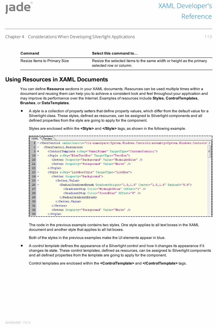
XamlDevRef - 7.0.12
Command Select this command to…
Resize Items to Primary Size Resize the selected items to the same width or height as the primaryselected row or column.
Using Resources in XAML DocumentsYou can define Resource sections in your XAML documents. Resources can be used multiple times within adocument and reusing them can help you to achieve a consistent look and feel throughout your application andmay improve its performance over the Internet. Examples of resources include Styles, ControlTemplates,Brushes, or DataTemplates.
A style is a collection of property setters that define property values, which differ from the default value for aSilverlight class. These styles, defined as resources, can be assigned to Silverlight components and alldefined properties from the style are going to apply for the component.
Styles are enclosed within the <Style> and </Style> tags, as shown in the following example.
The code in the previous example contains two styles. One style applies to all text boxes in the XAMLdocument and another style that applies to all list boxes.
Both of the styles in the previous examples make the UI elements appear in blue.
A control template defines the appearance of a Silverlight control and how it changes its appearance if itchanges its state. These control templates, defined as resources, can be assigned to Silverlight componentsand all defined properties from the template are going to apply for the component.
Control templates are enclosed within the <ControlTemplate> and </ControlTemplate> tags.
XAML Developer'sReference
Chapter 4 Considerations When Developing Silverlight Applications 113
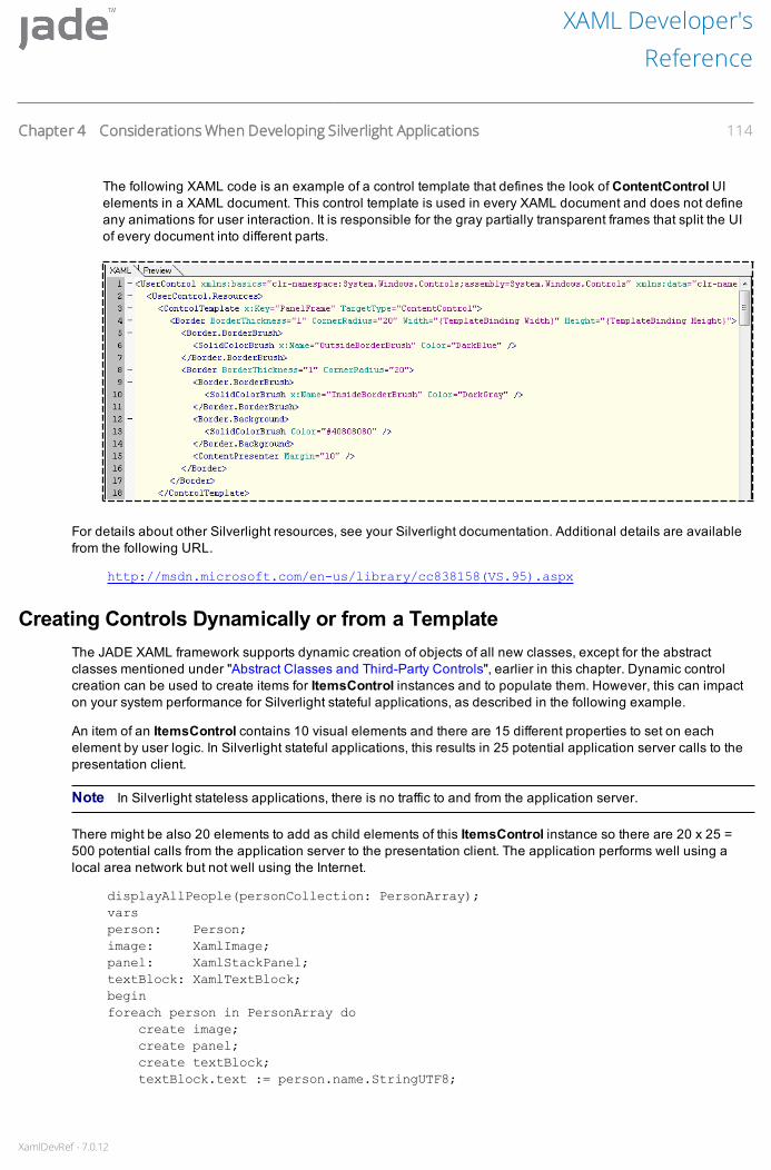
XamlDevRef - 7.0.12
The following XAML code is an example of a control template that defines the look of ContentControl UIelements in a XAML document. This control template is used in every XAML document and does not defineany animations for user interaction. It is responsible for the gray partially transparent frames that split the UIof every document into different parts.
For details about other Silverlight resources, see your Silverlight documentation. Additional details are availablefrom the following URL.
http://msdn.microsoft.com/en-us/library/cc838158(VS.95).aspx
Creating Controls Dynamically or from a TemplateThe JADE XAML framework supports dynamic creation of objects of all new classes, except for the abstractclasses mentioned under "Abstract Classes and Third-Party Controls", earlier in this chapter. Dynamic controlcreation can be used to create items for ItemsControl instances and to populate them. However, this can impacton your system performance for Silverlight stateful applications, as described in the following example.
An item of an ItemsControl contains 10 visual elements and there are 15 different properties to set on eachelement by user logic. In Silverlight stateful applications, this results in 25 potential application server calls to thepresentation client.
Note In Silverlight stateless applications, there is no traffic to and from the application server.
There might be also 20 elements to add as child elements of this ItemsControl instance so there are 20 x 25 =500 potential calls from the application server to the presentation client. The application performs well using alocal area network but not well using the Internet.
displayAllPeople(personCollection: PersonArray);varsperson: Person;image: XamlImage;panel: XamlStackPanel;textBlock: XamlTextBlock;beginforeach person in PersonArray do
create image;create panel;create textBlock;textBlock.text := person.name.StringUTF8;
XAML Developer'sReference
Chapter 4 Considerations When Developing Silverlight Applications 114
XamlDevRef - 7.0.12
image.setSource(person.photo);panel.children.add(image);panel.children.add(textBlock);myListBox.addItem(panel);endforeach;
end;
The solution for this specific problem is to use templates to create the items. An ItemsControl template is a pieceof XAML that is attached to the control and defines how each item is to look at run time. The visual componentsused to create an item are likely to be identical for each item and they are populated with a different set of data.
A template, defined in the document XAML of the control, can contain the description of how an item looks andalso contains the data binding for each item. For example, it might contain a TextBlock where the text property isbound to a JADE property of a data item.
These data items are instances of JADE classes and contain public primitive properties. All of these propertiescan be bound against properties of elements that are used inside the template. XAML:
<ListBox x:Name="myListBox" Width="200" Height="400"><ListBox.ItemTemplate>
<DataTemplate><StackPanel Orientation="Horizontal">
<Image ImageSource="{Binding-photo}" /><TextBlock Text="{Binding-name}" />
</StackPanel></DataTemplate>
</ListBox.ItemTemplate></ListBox>
The itemsSource property of the ItemsControl class is used to send an assigned collection of data items to thepresentation client. The data items are serialized and the bound property values are displayed. An example ofusing the itemsSource property is shown in the following code.
displayAllPeople(personCollection: PersonArray);begin
<myListBox.itemsSource := personCollection;end;
Use of the itemsSource Property by Different XAMLClasses
The XamlSelector and XamlDataGrid classes use the itemsSource property in a different way from theXamlAutoComplete class, as described in the following subsections.
XamlSelector and XamlDataGrid Class Use of the itemsSource PropertyThe XamlComboBox and XamlListBox classes are subclasses of the XamlSelector class, which defines how topopulate its subclasses. To populate combo box and list box controls in the classical user interface, use the:
addItem method, to add strings to the controls, as shown in the following example.
myListbox.addItem("Grapes");myListbox.addItem("Apples");
XAML Developer'sReference
Chapter 4 Considerations When Developing Silverlight Applications 115

XamlDevRef - 7.0.12
myCombobox.addItem("New Zealand");myCombobox.addItem("Paraguay");
JADE XAML enables you to add more-complex objects than strings to these controls. Any UI element can beadded as an item to a Selector instance, including complex visual trees that contain other visual elements,as shown in the following example.
myListbox.addItem(myXamlImage);myBorder.child := myTextBlock;myListbox.addItem(myBorder);
displayCollection method, to display a whole collection of items in the controls.
In the JADE XAML framework, the XamlSelector class and the XamlDataGrid class contain theitemsSource property. When a collection is assigned to this property, the collection entries are displayed asitems of these controls; for example, if a collection of strings is assigned to the itemsSource property of aXamlListBox, the strings are displayed as the items of the XamlListBox.
There are some differences between how the classical interface and the JADE XAML framework displaycollections in their controls.
If the collection used is updated by using the classical user interface, the changes are displayed in the GUI.In the JADE XAML framework, the changes are not displayed in the GUI and there needs to be anotherassignment to the itemsSource property so that the changes are displayed.
The classical user interface can handle a very large collection. This does not perform well using theitemsSource property in the JADE XAML framework because the whole assigned collection is serializedand sent to the presentation client every time a collection is assigned to the itemsSource property.
The collection assigned to the itemsSource property does not necessarily need to contain strings; it also cancontain JADE objects, the primitive properties of which can be used to display the content of an item of thesecontrols. For example, DataGrid columns can be bound to JADE object properties and the Selectorinstances can contain templates of visual elements where visual elements are bound to the properties ofthese JADE objects, as shown in the following example.
displayTwoPeople(personOne: Person; personTwo: Person);begin
personCollection.add(personOne);personCollection.add(personTwo);myDataGrid.columns[1]. XamlDataGridTextColumn.binding :=Person.name;myDataGrid.columns[2]. XamlDataGridTextColumn.binding :=Person.address;myDataGrid.itemsSource := personCollection;
end;
XamlAutoCompleteBox Use of the itemsSource PropertyThe itemsSource property of the XamlAutoCompleteBox subclass is different from the itemsSource property ofa XamlSelector or XamlDataGrid class.
An AutoCompleteBox looks like a TextBox but works like a text-based ComboBox. At run time, users enter textinto the AutoCompleteBox as they would into a TextBox, but while typing, suggestions are displayed in a popupunderneath the entry field. The user can use the arrow keys or the mouse to select one of the suggestions, likeusing a ComboBox, and the selected item is then displayed in the TextBox.
Use the itemsSource property, to assign a collection of strings that are the suggestions that populate the popup ofthe AutoCompleteBox. You cannot add any visual items other than strings to the AutoCompleteBox; that is, theAutoCompleteBox is text-based only.
XAML Developer'sReference
Chapter 4 Considerations When Developing Silverlight Applications 116

XamlDevRef - 7.0.12
Unit Testing Silverlight ApplicationsThe JADE unit testing framework supports unit testing of classes and methods in stateful and stateless Silverlightapplications. This section describes how to create and run unit tests for Silverlight applications. For details aboutthe JADE unit testing framework, see Chapter 22 of the JADE Developer’s Reference.
Adding Silverlight Unit Tests to the JADE Unit Testing Framework
To add Silverlight unit tests to the JADE unit testing framework
1. Add your test classes as subclasses of the JadeTestCase class (as you would in JADE). An example of theJadeTestCase class hierarchy is shown in the following diagram.
XAML Developer'sReference
Chapter 4 Considerations When Developing Silverlight Applications 117

XamlDevRef - 7.0.12
2. Add unit test methods to the classes that you added in step 1 of this instruction. The following code is anexample of a unit test method.
Note Include unitTest in the method signature as you would for JADE unit tests. The method in theprevious example includes browserExecution in the signature to test it under Silverlight stateless.
3. If the method does not depend on Silverlight, press F9 to run it directly from the JADE developmentenvironment.
The Unit Test Runner dialog, shown in the following diagram, then displays the results for the unit test the Resultslist box.
If the method does depend on Silverlight, you must additionally define the Silverlight application before you canrun the unit tests. For details, see the following subsections.
XAML Developer'sReference
Chapter 4 Considerations When Developing Silverlight Applications 118

XamlDevRef - 7.0.12
Configuring a Silverlight Stateful Application to Run Unit Tests
To configure a Silverlight stateful application to run unit tests
1. Use the Define Application dialog to define a (stateful) Silverlight application that has the followingparameters. In the:
a. Application Type combo box, specify the Silverlight item.
b. Startup Xaml combo box, specify the JadeTestDocument class (from the RootSchema).
An example of the Define Application dialog is shown in the following diagram.
For details, see "Defining a Silverlight Application", in Chapter 1.
2. Run the Silverlight application. For details, see "Running a JADE Silverlight Stateful Application", inChapter 1.
When you run the application, the browser in which the Silverlight application is running displays all of the testclasses and test methods available. For details, see "Running the Silverlight Application Unit Tests", later in thischapter.
Configuring a Silverlight Stateless Application to Run Unit Tests
To configure a Silverlight stateless application to run unit tests
1. Use the Define Application dialog to define a (stateless) Silverlight application that has the followingparameters. In the:
a. Application Type combo box, specify the Silverlight Stateless, Gui or theSilverlight Stateless, Non-GUI item.
XAML Developer'sReference
Chapter 4 Considerations When Developing Silverlight Applications 119
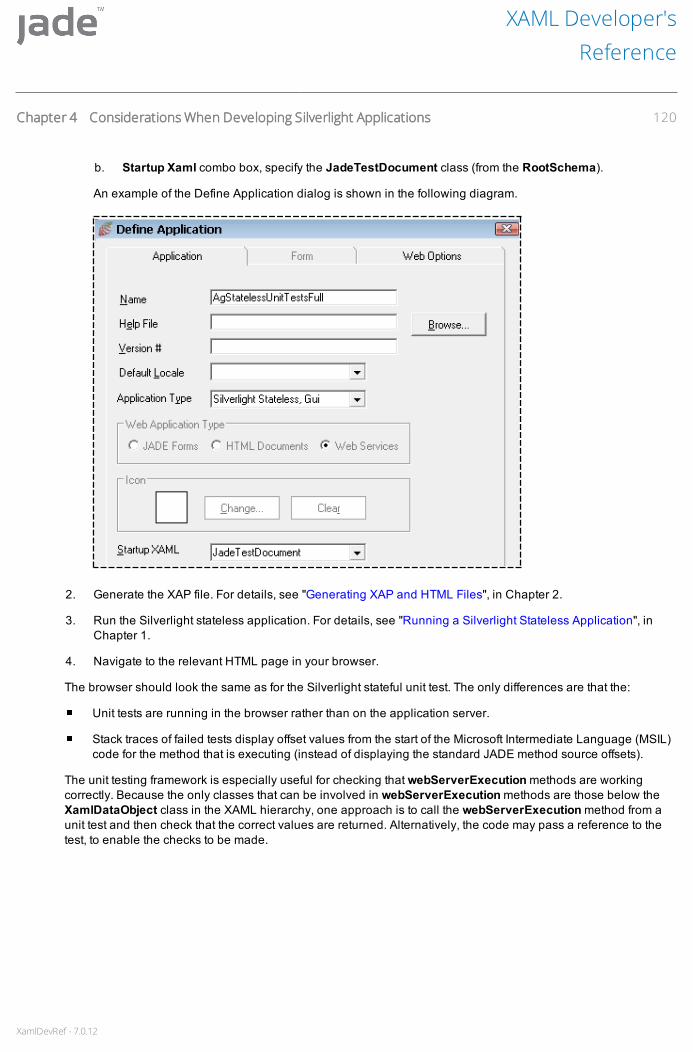
XamlDevRef - 7.0.12
b. Startup Xaml combo box, specify the JadeTestDocument class (from the RootSchema).
An example of the Define Application dialog is shown in the following diagram.
2. Generate the XAP file. For details, see "Generating XAP and HTML Files", in Chapter 2.
3. Run the Silverlight stateless application. For details, see "Running a Silverlight Stateless Application", inChapter 1.
4. Navigate to the relevant HTML page in your browser.
The browser should look the same as for the Silverlight stateful unit test. The only differences are that the:
Unit tests are running in the browser rather than on the application server.
Stack traces of failed tests display offset values from the start of the Microsoft Intermediate Language (MSIL)code for the method that is executing (instead of displaying the standard JADE method source offsets).
The unit testing framework is especially useful for checking that webServerExecution methods are workingcorrectly. Because the only classes that can be involved in webServerExecution methods are those below theXamlDataObject class in the XAML hierarchy, one approach is to call the webServerExecution method from aunit test and then check that the correct values are returned. Alternatively, the code may pass a reference to thetest, to enable the checks to be made.
XAML Developer'sReference
Chapter 4 Considerations When Developing Silverlight Applications 120

XamlDevRef - 7.0.12
Running the Silverlight Application Unit TestsWhen you run the application, the browser in which the Silverlight application is running displays all of the testclasses and test methods available, as shown in the following diagram.
Test classes are listed in the Select Tests pane, at the left of your browser. Classes and subclasses are displayedin bold text and the hierarchy of the class structure is visible, which you can collapse and expand, as required.Test methods are displayed under their defining class (they could be displayed in italicized type).
The Run all tests item, in the Select Tests pane, is selected by default. Click the Run button, to run all of the testsfor the classes that are listed in the Select Tests pane. The test results are then displayed in the Results tableand use the following color coding.
Passed tests are displayed in green
Failed tests are displayed in red
Ignored tests (that is, tests with unitTestIgnore rather than unitTest in their method signature) are displayedin yellow
XAML Developer'sReference
Chapter 4 Considerations When Developing Silverlight Applications 121

XamlDevRef - 7.0.12
An example of test results displayed in the Results table is shown in the following diagram.
The test results do not update the progress bar while they run because the Silverlight process does not refresh thebrowser. The test results, therefore, are displayed only when all of the tests have finished running.
If you select a class in the Select Tests pane before you click the Run button, all of the tests for that class and itssubclasses are run. If you select a method for a class and then click the Run button, that test only is run.
Viewing Failed and Ignored Tests
To display only failed and ignored tests in the Results table
Check the Hide Passed Tests check box, under the Results table, and then run the tests.
XAML Developer'sReference
Chapter 4 Considerations When Developing Silverlight Applications 122

XamlDevRef - 7.0.12
The Results table then displays only failed and ignored tests, as shown in the following diagram.
To view the stack trace of a failed test, click on the failed status of that test, in the Item column of the Results table.The Call stack dialog, shown in the following diagram, then displays the stack trace details.
XAML Developer'sReference
Chapter 4 Considerations When Developing Silverlight Applications 123

XamlDevRef - 7.0.12
The values in parentheses are the JADE code positions where the failure occurred for a Silverlight statefulapplication unit test. (If the unit test was for a Silverlight stateless application, the values in parentheses are MSILcode offset values and the error position is not easily determined.) Use the Find Position in Method Source dialog,shown in the following diagram, to locate the code.
Access the Find Position in Method Source dialog by selecting the Find Code Position command from theMethods menu. For details, see Chapter 4 of the JADE Development Environment User’s Guide.
Alternatively, check the Debug on: Assert check box, to display a dialog that specifies the stack trace as eachfailure occurs.
Testing the Behavior of Silverlight UI ElementsThe right side of your unit test browser (the scratchpad) can display XAML documents and their UI Elements. Forexample, if the schema you are testing has a document named TestDocument that has a XamlButton (namedbtnClickMe) and a XamlCalendar (named calendar_1) on a grid with two columns and two rows, the followingdiagram is an example of what is displayed in the right side of your browser when you run the application.
XAML Developer'sReference
Chapter 4 Considerations When Developing Silverlight Applications 124

XamlDevRef - 7.0.12
If you click the Click Me button, the following code is executed.
The code in the previous example causes the text on the button to toggle between normal type and bold italicizedtype, as shown in the following diagrams.
To test the behavior of the button, using the unit test framework
1. Add a class under the JadeTestCase class.
2. Add a testDocument reference of type TestDocument to the class and initialize it before each test on theclass is run, by using a method that includes unitTestBeforeClass in its signature, as shown in the followingdiagram.
The code in the previous diagram creates an instance of the document and then adds it as a child of the unittesting browser in the scratchpad, via the getUnitTestCanvas method on app.xamlManager.
Note You could use the method marked as unitTestAfterClass, to delete this instance after each test on theclass is run.
An example of the XAMLButton behavior test is demonstrated in the following method.
XAML Developer'sReference
Chapter 4 Considerations When Developing Silverlight Applications 125

XamlDevRef - 7.0.12
The method in the previous example finds the button in the saved testDocument and then performs the followingsteps.
1. Checks that the button is in the normal (that is non-bold italicized) state.
2. Simulates clicking the button.
3. Checks that the button is in the bold italicized state.
4. Simulates clicking the button again.
5. Checks that the button has returned to the normal state.
If the button behavior test, represented in the previous method, is run and passes, the following diagram shows anexample of the passed test for a Silverlight stateless application.
Note In the stateless version (shown in the previous diagram), the grid has been parented in the scratchpadarea at the right of the browser. If you test the stateful version of the application, you might not see this, unless thedocument is not deleted after the test.
XAML Developer'sReference
Chapter 4 Considerations When Developing Silverlight Applications 126

XamlDevRef - 7.0.12
An example of the XamlCalendar behavior test is demonstrated in the following method.
The method in the previous example finds the calendar in the saved testDocument and then performs thefollowing steps.
1. Selects the current day on the calendar.
2. Restricts the calendar display to the current week.
If the calendar behavior test, represented in the previous method, is run and passes, the following diagram showsan example of the passed test for a Silverlight stateless application.
XAML Developer'sReference
Chapter 4 Considerations When Developing Silverlight Applications 127
XamlDevRef - 7.0.12
Appendix A Silverlight Terms and FrequentlyAsked Questions (FAQs)
The following is a list of controls and visual elements that are not part of the classical JADE user interface (UI), abrief description of these controls, and the appropriate way to use them.
BrushA brush (that is, XamlBrush) and its XamlImageBrush, XamlLinearGradientBrush, and XamlSolidColorBrushJADE subclasses replace the color of the classical JADE user interface.
In Silverlight, everything can be a brush; for example, the background of a control, the look of a border, or the lookof the text of a label.
If you want to display a solid green label, set the foreground property of this label to a XamlSolidColorBrushobject, with the color property set to green.
If the text should be displayed as an image, set the foreground property of the label to a XamlImageBrush objectand use the setImageSource method to specify the picture that you want to display.
BorderMost Silverlight controls do not have a border, by default. The XamlBorder class enables you to draw borderswherever you want to have them. A border is also the appropriate element with which to draw a background brushwith rounded corners, even if there is no border line itself.
If you want to draw a border around an image, remove the image from the parent element, add a border to theplace where the image was, and then assign the image as the value of the child property of the XamlBorderinstance.
The border is a fully valid UI element, which means that properties like height and width behave the same way ascontrols. However, this means that the child element gets less space when you increase the border thickness.
PanelThe canvas (XamlCanvas class) is probably the element that you know best from JADE. It offers features like topand left position or zOrder. Most classical UI parent elements offer these properties but a canvas has no layoutmanager in Silverlight; it is a pure virtual definition of the point 0,0 and it does not even clip.
You can place an element with the coordinates of -50,-50 or 400,300 on a canvas with the height and width of200, so that the element is displayed.
If you want clippings, put the canvas into a XamlStackPanel or XamlGrid and specify the size attributes to thesepanels. The clipping is done by the layout manager. For Web development, it is better to use the XamlGrid, as itdivides the area into rows and columns makes them fully configurable. This is similar to the HTML table but morepowerful.
A XamlStackPanel is a downsized XamlGrid that is easy to use and performs faster than the XamlGrid. TheXamlGrid offers greater control over its child controls.

XamlDevRef - 7.0.12
Text Boxes and Similar ControlsLike the classical JADE user interface, Silverlight provides control classes for text input, as follows. The:
XamlTextBox class provides non-highlighted text editing with a single font.
XamlPasswordBox class for passwords has few features of the XamlTextBox, because scroll bars, textwrapping, and read-only features are not required for password entry.
XamlDatePicker class provides a user interface for every text box that is related to a date. (This classcorresponds to the classical JadeEditMask control.)
Instead of handling the behavior of text boxes with properties, Silverlight provides controls for different text boxfeatures. This has the advantage that you always know how the control is going to be used and that you have nooverlapping properties.
Content ControlAlthough the XamlContentControl control is used mainly as a superclass in Silverlight, it is also useful by itselfbecause it has the following features. It:
Has almost no appearance but you can define all font-related values for its child elements.
Contains all of the events of a control.
Contains a single element as the content and which you can configure using the properties of the baseXamlContentControl class.
The power of the XamlContentControl class is illustrated by its XamlButton subclass for which you can specifyeverything as the content of the button. Although a single string would be enough (which would be the captionproperty in the classical user interface), you can also specify a XamlGrid as the content so that a movie is playingin one cell of the grid and a rectangle is rotating in another cell.
Scroll ViewerThe XamlScrollViewer class corresponds to the BaseControl class in the classical JADE user interface. If youuse a XamlCanvas instance as the XamlScrollViewer content, the combination works exactly like the classical UIBaseControl class.
Most Silverlight controls do not have any support for scroll bars. If there is a part of a user interface that needs tobe scrollable, use the XamlScrollViewer class with the scrollable content as its content.
Tab Control and Tab ItemThe XamlTabControl and XamlTabItem classes correspond to the classical UI Folder and Sheet classes, andthey support similar functionality.
As the XamlTabItem class header is of type XamlUIElement, you can use any content as the header of a XAMLtab item; that is, a StringUtf8 value or a XamlUIElement reference.
The XamlTabItem class getHeader and setHeader methods enable you to use any content as the header of aXamlTabItem.
XAML Developer'sReference
Appendix A Silverlight Terms and Frequently Asked Questions (FAQs) 129
XamlDevRef - 7.0.12
Button, Toggle Button, Radio Button, and Check BoxThe classical JADE UI button can be a XamlButton or XamlToggleButton instance in Silverlight. A Silverlightbutton reacts to click events and toggle buttons react to click, checked, and unchecked events.
The XamlButton and XamlToggleButton controls are subclasses of the XamlContentControl class, whichenables you to define the content of each control individually.
The XamlRadioButton (the OptionButton control in the classical JADE user interface) and XamlCheckBoxcontrols are subclasses of the XamlToggleButton class.
Items ControlYou can use anything as content of XamlListBox and XamlComboBox controls; for example, a simple string or acomplex UI element.
The XamlItemsControl class addItem method item parameter is an Any primitive type value, which is interpretedas String or XamlUIElement in the JADE XAML framework. If you specify any other value, JADE tries to convert itinto a string using the display method.
ShapesThe XamlShape control base shape is a subclass of the XamlUIElement class.
A XamlRectangle control can therefore react on a loaded event; for example, it can have an opacity of 0.3, it canbe put into a grid cell, and it reacts to all of the transformations that JADE provides.
Frequently Asked QuestionsThe XAML shown in the examples in this section is the result produced from the XAML Painter.
How do I load the contents of a combo box or list box with strings?The addItem method of the XamlItemsControl class enables you to add any kind of content to these controls,including strings. Controls like XamlComboBox or XamlListBox are derived from XamlItemsControl, so they getestablished the same way. The call to add a string to a XamlCombobox would look like the following.
comboBox.addItem(stringValue);
How do I load the contents of a combo box or list box with an image and astring?
The addItem method of the XamlItemsControl class takes a single object as a parameter, so if you need to addan image and a label to a XamlItemsControl, these two components need to be put into a container that getsadded to the XamlItemsControl. The appropriate panel would be the XamlStackPanel, in this case. Thedisplayed string needs to be put into a control, which would be a XamlTextBlock, as shown in the following codefragment.
image.margin_Right := 10;textBlock.text := displayedString.StringUtf8;stackPanel.orientation := XamlStackPanel.Orientation_Horizontal;
XAML Developer'sReference
Appendix A Silverlight Terms and Frequently Asked Questions (FAQs) 130

XamlDevRef - 7.0.12
stackPanel.children.add(image);stackPanel.children.add(textBlock);comboBox.addItem(stackPanel);
How do set the caption of a button?The XamlContentControl class provides the setContent method, which enables you to specify any kind ofcontent, including single strings. The XamlButton class is derived from XamlContentControl, so the call couldlook like the following.
button.setContent(captionString);
How do I set an image in a button?The XamlContentControl class provides the setContent method, which enables you to specify any kind ofcontent, including images. As the XamlButton class is derived from XamlContentControl, the call should looksimilar to the following.
button.setContent(image);
How do I create a layout where the controls automatically resize when thebrowser resizes?
The top root element needs to be a XamlGrid, to access the resize behavior. The row and column behavior needsto be defined on the XamlGrid, using the rowDefinitions and columnDefinitions properties of the XamlGrid.
The XamlRowDefinition class contains a height property and the XamlColumnDefinition class contains a widthproperty, which enable you to define the resize behavior. An asterisk symbol is a valid value for these propertiesand it is interpreted as using the same space as the other rows or columns defined in the same grid. For details,see "Grid UI Element Type", in Chapter 4.
The controls attached to the grid need to be placed into the rows and columns after the rows and columns aredefined; for example, a defined grid with three rows, three columns, two buttons, and a list box, generated throughthe XAML Painter, would look similar to the following XAML.
<Grid Height="100"><Grid.ColumnDefinitions>
<ColumnDefinition Width="*" /><ColumnDefinition Width="*" /><ColumnDefinition Width="*" />
</Grid.ColumnDefinitions><Grid.RowDefinitions>
<RowDefinition Height="*" /><RowDefinition Height="*" /><RowDefinition Height="*" />
</Grid. RowDefinitions ><ListBox Grid.Column="0" Grid.Row="0" Grid.ColumnSpan="2" /><Button Grid.Column="0" Grid.Row="2" /><Button Grid.Column="2" Grid.Row="2" />
<Grid>
XAML Developer'sReference
Appendix A Silverlight Terms and Frequently Asked Questions (FAQs) 131

XamlDevRef - 7.0.12
How do I set the background brush of an element in JADE logic to be a solidcolor, a linear image, an image, or to use a gradient?
A better-performing way to set the background of an element would be in the XAML Painter, but if there is a needto do this in user logic, the code would look similar to the following examples.
Setting the solid color
solidColorBrush.color := #FFFFA500; // #AARRGGBBelement.background := solidColorBrush;
Setting the linear gradient
gradientStopBlue.offset := 0;gradientStopBlue.color := #FF0000FF; // #AARRGGBBgradientStopRed.offset := 0.5;gradientStopRed.color := #FFFF0000; // #AARRGGBBgradientStopGreen.offset := 1;gradientStopGreen.color := #FF00FF00; // #AARRGGBBlinearGradientBrush.startPoint_X := 0.5;linearGradientBrush.startPoint_Y := 0;linearGradientBrush.endPoint_X := 0.5;linearGradientBrush.endPoint_Y := 1;linearGradientBrush.gradientStops.add(gradientStopBlue);linearGradientBrush.gradientStops.add(gradientStopRed);linearGradientBrush.gradientStops.add(gradientStopGreen);element.background := linearGradientBrush;
Setting the image
imageBrush.setImageSource("picture.jpg");element.background := imageBrush;
How can I use logic to change the way the border of a control is presented?There are generally two ways to handle a border of a control. The control class contains two attributes, calledborderThickness and borderBrush. These two properties have default values that differ for each control.
These properties have different effects for different XamlUIElement subclasses. For example, changing the borderproperties of a XamlRadioButton changes only the appearance of the small toggle, while a change of the sameproperties for the XamlTextBox impacts the whole border around the text box.
Another way of drawing a border around a control is by using the XamlBorder class itself, and specifying thecontrol as the child element of the XamlBorder. It supports features like rounded corners, a border brush, and abackground brush that is drawn in the background of the control if the control does not take the whole space of theborder or if it is partially transparent.
A drawn border like this could appear like the following XAML and JADE code examples, the first XAML exampleproduced in the XAML Painter and the second JADE code example in your user logic.
XAML example
<Border Name="border"BorderBrush="Black"Background="Blue"BorderThickness="20,5"
XAML Developer'sReference
Appendix A Silverlight Terms and Frequently Asked Questions (FAQs) 132

XamlDevRef - 7.0.12
CornerRadius="10"Padding="5,10,15,20">
<comboBox Name="comboboxOne" /></Border>
JADE code example
border.borderBrush := blackSolidColorBrush;border.background := blueSolidColorBrush;border.borderThickness_Left := 20;border.borderThickness_Top := 5;border.borderThickness_Right := 20;border.borderThickness_Bottom := 5;border.cornerRadius_TopLeft := 10;border.cornerRadius_TopRight := 10;border.cornerRadius_BottomRight := 10;border.cornerRadius_BottomLeft := 10;border.padding_Left := 5; // will be filled with blue backgroundborder.padding_Left := 10;border.padding_Left := 15;border.padding_Left := 20;border.child := comboboxOne;
What XAML UI element is most similar to the classical UI Table class, andhow do I populate it?
The XamlGrid and the XamlDataGrid are the Silverlight controls that can be populated in a similar way to theclassical UI table. The XamlGrid offers more flexibility but it is also harder to configure compared to theXamlDataGrid.
The XamlGrid offers access to every cell. Every cell can contain different content. The rows and columns of aXamlGrid can be controlled by the rowDefinitions and columnDefinitions properties, which are collection ofobjects of the classes XamlRowDefinition and XamlColumnDefinition.
The following is an example of JADE code that populates a simple XamlGrid with two rows and two columns.
grid.columnDefinitions.add(columnDefinitionOne);grid.columnDefinitions.add(columnDefinitionTwo);grid.rowDefinitions.add(rowDefinitionOne);grid.rowDefinitions.add(rowDefinitionTwo);grid.children.add(button);grid.children.add(combobox);grid.children.add(listbox);grid.children.add(border);button.gridRow := 0;button.gridColumn := 0;combobox.gridRow := 0;combobox.gridColumn := 1;listbox.gridRow := 1;listbox.gridColumn := 0;border.gridRow := 1;border.gridColumn := 1;
XAML Developer'sReference
Appendix A Silverlight Terms and Frequently Asked Questions (FAQs) 133

XamlDevRef - 7.0.12
The XamlDataGrid is a control that enables you to display data items from the same class. Individual cells cannotbe accessed. A collection containing the data objects to display must be attached to a XamlDataGrid object.Every public primitive attribute of this data object class can be displayed within the XamlDataGrid.
The following is an example of JADE code that populates a XamlDataGrid with two columns.
dataGridTextColumnOne.binding := Person::forename;dataGridTextColumnTwo.binding := Person::surname;dataGridCheckBoxColumn.binding := Person::isTeenager;dataGrid.columns.add(dataGridTextColumnOne);dataGrid.columns.add(dataGridTextColumnTwo);dataGrid.columns.add(dataGridCheckBoxColumn);dataGrid.sendDataToClient(personArray);dataGrid.itemsSource := personArray;
For details, see "Grid UI Element Type", in Chapter 4.
How do I control which document is shown to the user?Every document has a root property that contains the XamlUIElement highest up the visual tree of the document.You can use this root element to change the current visible document by using the setXamlRootVisual method ofthe application.
app.xamlManager.rootVisual := newDocument.root;
How can I rotate text?The XamlUIElement class contains the renderTransform property, which contains a potential transformation.JADE currently supports four transformation classes, one of which is the XamlRotateTransform class thatcontains the angle attribute.
This angle specifies the rotation angle of the XamlUIElement, as shown in the following code fragment.
rotateTransform.angle := 180;textBlock.text := "Up side down".StringUtf8;textBlock.renderTransform := rotateTransform;
How can I dynamically draw on a window?The XamlShape class and its derived classes like XamlEllipse and XamlRectangle support drawing using theSilverlight framework. Shapes can be put on panels like every other visual element such as controls. The codefragment in the following example puts a rectangle on a canvas.
canvas.children.add(rectangle);rectangle.canvasLeft := 100;rectangle.canvasTop := 50;
How do I create and use a splitter?A XamlGridSplitter is a control that applies only when used inside a XamlGrid. It allows the user to resize specificgrid cells at run time. The XamlGridSplitter itself must be put into its own row or column of a XamlGrid, and itresizes the rows or columns next to it.
You can control the kind of resizing behavior with the XamlGridSplitter class horizontalAlignment andverticalAlignment properties inherited from the XamlUIElement superclass.
XAML Developer'sReference
Appendix A Silverlight Terms and Frequently Asked Questions (FAQs) 134

XamlDevRef - 7.0.12
The following is a XAML example of the XamlGridSplitter resizing columns.
<Grid Height="200" Width=500><Grid.ColumnDefinitions>
<ColumnDefinition /><ColumnDefinition Width="5" /><ColumnDefinition />
</Grid.ColumnDefinitions><GridSplitter Grid.Column="1"
HorizontalAlignment="Center"VerticalAlignment="Stretch" />
</Grid>
For details, see "Grid UI Element Type", in Chapter 4.
How do I set up radio buttons in Silverlight?If XamlRadioButton controls are placed on the same parent element, every XamlRadioButton is deselected assoon as another XamlRadioButton is selected.
In addition, you can split different XamlRadioButtons into different groups, using the groupName property. If thisproperty is set, every XamlRadioButton is deselected when a XamlRadioButton with the same group name isselected.
What is the difference between the various types of panels and how do I usethem?
JADE supports the XamlCanvas, the XamlStackPanel, and the XamlGrid panels.
XamlCanvas
The canvas is a pure definition of the point 0,0, and supports the z-order feature. A canvas has no layoutmanager to get rendered and it has neither height nor width; it is a pure definition of point 0,0, which meansthat there is no clipping support. If there is an element placed on negative coordinates or coordinates that aregreater than the size of the parent canvas, they are still drawn. A canvas is never resized, even if the size ofits parent or child elements change.
XamlStackPanel
A XamlStackPanel has a horizontal or vertical orientation, and it places its child elements next to each other.A child element is going to take its space and the next child element is going to take the space next to it. Thismeans that if the visibility of a child element is set to Visibility_Collapsed, all of the following child elementsare going to take the space that was previously taken by the collapsed child element.
If a XamlStackPanel has a defined size, the child elements get clipped if they try to use more space.
XamlGrid
The XamlGrid is the most-powerful panel. It operates on rows and columns. The XamlGrid defines its ownrows and columns, using XamlRowDefinition and XamlColumnDefinition objects in which the height andwidth of the rows and columns are defined.
You can define the size of a row or column in three different ways.
If the height or width property of a XamlRowDefinition or XamlColumnDefiniton is set to a number, it isinterpreted as a fixed size in pixels.
XAML Developer'sReference
Appendix A Silverlight Terms and Frequently Asked Questions (FAQs) 135

XamlDevRef - 7.0.12
The Auto keyword means that the row or column is supposed to take the amount of space the attachedchild element in that row or column is going to require.
The * (asterisk) operator sets all of the rows or columns with a star height or width in relation, and theyare going to share the available space.
You can combine the star operator with a number, which multiplies the amount of space the row orcolumn is going to acquire.
The following is a XAML example of a XamlGrid definition.
<Grid Height="500" Width="500"><Grid.ColumnDefinitions>
<ColumnDefinition Width="*" /><ColumnDefinition Width="50" /><ColumnDefinition Width="Auto" />
</Grid.ColumnDefinitions><Grid.RowDefinitions>
<RowDefinitions Width="*" /><RowDefinitions Width="100" /><RowDefinitions Width="Auto" /><RowDefinitions Width="5*" />
</Grid.RowDefinitions><Button Grid.Row="2" Grid.Column="2" Height="25" Width="80" />
</Grid>
For details, see "Using Layout Manager UI Element Types", in Chapter 4.
How do I set the contents of a label in Silverlight?The XamlTextBlock class supports the typical label functionality in Silverlight and its text property contains thetext to display.
How do I set up and control a scrollable item in Silverlight?If a visual item is supposed to be scrollable, it needs to be the content element of a XamlScrollViewer.
You can control the behavior of scroll bars with the verticalScrollBarVisibility and horizontalScrollBarVisibilityproperties and your user logic can be access the content using the getContent and setContent methods,because the XamlScrollViewer is a subclass of XamlContentControl.
How do I use a calendar control in Silverlight?A calendar is a control that selects single or multiple dates in Silverlight. The selection mode can be controlledusing the selectionMode property of the XamlCalendar class.
How do I use the date picker control in Silverlight?In Silverlight, a XamlDatePicker is a text box that provides the user with an easy way to choose a single date. Ithas the appearance of a text box with a small icon. A calendar is displayed when the icon is clicked, enabling aspecific date to be selected.
XAML Developer'sReference
Appendix A Silverlight Terms and Frequently Asked Questions (FAQs) 136
XamlDevRef - 7.0.12
How do create a password field in Silverlight?Silverlight provides the XamlPasswordBox class for the entering of passwords. This class has the appearance ofa text box but every typed entry is displayed as a dot so that the entered text cannot be read.
What is the XamlRangeBase class and where would I use it?The XamlRangeBase class is part of the JADE Silverlight class hierarchy so that more subclasses can be addedto the XamlProgressBar class in future releases.
In addition, if there are other controls in a Silverlight document like Sliders or ScrollBars that are not part of thecurrent JADE Silverlight hierarchy, they are recognized as objects of the XamlRangeBase class, which enablesyou to interact with these controls using standard attributes.
How do I control a progress bar in Silverlight?A progress bar can be controlled while setting the XamlRangeBase superclass inherited minimum andmaximum properties of an object of the XamlProgressBar subclass with the maximum value greater than theminimum value, and setting the XamlRangeBase superclass inherited value property to a value in the rangeminimum through maximum.
Is there an equivalent control to the busyIndicator in Silverlight?The FrameworkElement Silverlight class (a subclass of UIElement) has a Cursor property, which you should setto a cursor type (for example, Wait For Instance). When the mouse is over that UIElement or a child of thatUIElement that does not have a Cursor value set, the cursor is displayed with the specified cursor type. JADEdoes not allow direct access to that property, but it can be accessed in the following way.
1. Define a non-visible UIElement on the document and modify the XAML of that element to include thestatement Cursor="Wait", for example.
2. In the JADE event logic, specify the following.
varsany : Any;
beginany := hiddenElement.getXamlProperty("Cursor");rootElement.setXamlProperty("Cursor", any);
This works in stateful applications only.
However, the Cursor property is useful only when the UIElement is currently visible and the mouse is over it.
Alternatively, to indicate that the process is busy, you could define an element on your document that spins whenit is displayed.
How do I detect that the Silverlight equivalent of a Folder control haschanged sheets?
In Silverlight, the XamlTabControl class replaces the classical UI Folder class and the XamlTabItem classreplaces the Sheet class. There is no such event that occurs before the actual XamlTabItem is changed as is thecase in the in the classical UI. If you want to prevent a XamlTabItem from being selected, you must disable it, byusing the isEnabled property inherited from the XamlControl superclass.
The XamlTabControl fires the selectionChanged event after one of its child XamlTabItem objects is selected.
XAML Developer'sReference
Appendix A Silverlight Terms and Frequently Asked Questions (FAQs) 137

XamlDevRef - 7.0.12
How do I set up a hierarchical list box?The JADE XAML framework does not currently support hierarchical list boxes. However, you can access thebehavior by manipulating current list box items so that they appear or disappear in a hierarchical way.
Silverlight 2 did not support a hierarchical list box. The Silverlight 3 Beta release contains a Treeview control,which is a hierarchical list box in classical UI terms. JADE may include this control in the Silverlight framework in afuture release.
In the classical JADE user interface, the ListBox is a control for displaying a collection of items, which can bedisplayed in a flat hierarchy or a hierarchical order. The JADE XAML framework offers a control for each of theseapproaches, as follows. The:
XamlListBox displays items in a non-hierarchical order.
XamlTreeView displays items in a hierarchical order.
A TreeView contains multiple TreeViewItems that are assigned to the property of the item. All of these items aredirect child elements of the TreeView. If a TreeViewItem contains other child elements, they are assigned to theproperty of their item, as well. The TreeView instance and each TreeViewItem instance, therefore, know just theirimmediate child elements and there is no central place where all elements are known.
firstTreeViewItem.addItem(treeViewItemOne);secondTreeViewItem.addItem(treeViewItemTwo);secondTreeViewItem.addItem(treeViewItemThree);treeView.addItem(firstTreeViewItem);treeView.addItem(secondTreeViewItem);
What is XamlTabItem and how do I use it?The XamlTabControl and the XamlTabItem classes offer similar functionality to the Folder and Sheet controls inthe classical UI. A XamlTabControl usually contains multiple XamlTabItems.
Every tab item has a header that is always visible and its content is displayed as soon as somebody clicks on theheader. This action replaces the content of the tab item that was activated before.
How do I set up and use a hyperlink button?The XamlHyperLinkButton class supports the functionality required to navigate to an external Uniform ResourceIdentifier (URI).
The XamlHyperlink class navigateUri property contains the URI and the targetName property contains the frameof the Web page to which the Web application is navigating when the hyperlink button is clicked.
How do I specify an image and a label divided by 10 pixels as a content of abutton?
Put the XamlImage and a XamlTextBlock into a XamlStackPanel that has the orientation property set toOrientation_Horizontal. Set the inherited XamlUIElement class margin_Left property of the XamlTextBlock orthe inherited XamlUIElement class margin_Right property of the XamlImage to 10.
Assign the XamlStackPanel as the content of a button, as shown in the following XAML example.
<Button><StackPanel Orientation="Horizontal">
XAML Developer'sReference
Appendix A Silverlight Terms and Frequently Asked Questions (FAQs) 138

XamlDevRef - 7.0.12
<Image Source="picture.jpg" /><TextBlock Text="Button" Margin="10,0,0,0" />
</StackPanel></Button>
How do I resize the following scenario if somebody resizes the browser?I have five components in a row: a button, followed by a XamlContentControl, followed by a rectangle,followed by another button, and followed by another XamlContentControl. I want the controls to resize sothat the buttons remain at 200 pixels width, the other controls have a minimum width of 100 pixels but resizeso that the two XamlContentControl objects increase by 20 percent each and the rectangle by 60 percent. Ifthe rectangle reaches a width of 400 pixels, it should not increase any more, and every new space should bedivided between the XamlContentControl objects. How do I do it?
You can do all of these things with a XamlGrid and its columnDefinitions property. You must define fiveXamlColumnDefinition objects that have properties like width, minWidth, and maxWidth, which enable you todefine the required behavior.
The width of a XamlColumnDefinition can be a number, which is interpreted as pixels. It has also an asteriskoperator (*), which you can combine with a number, which describes the resize behavior in relation to otherXamlColumnDefinition objects. You need to define the columns first and put the controls into the columns later,using the attached Grid.Column property, as shown in the following XAML example.
<Grid Height="100"><Grid.ColumnDefinitions>
<ColumnDefinition Width="200" /><ColumnDefinition Width="*" MinWidth="100" /><ColumnDefinition Width="3*" MinWidth="100" MaxWidth="400" /><ColumnDefinition Width="200" /><ColumnDefinition Width="*" MinWidth="100" />
</Grid.ColumnDefinitions><Button Grid.Column="0" /><ContentControl Grid.Column="1" /><Rectangle Grid.Column="2" /><Button Grid.Column="3" /><ContentControl Grid.Column="4" />
<Grid>
For details, see "Grid UI Element Type", in Chapter 4.
XAML Developer'sReference
Appendix A Silverlight Terms and Frequently Asked Questions (FAQs) 139