john matson k young - amazon s3 · investigating performance issues pg. 20 chapter 5: visualizing...
TRANSCRIPT

Monitoring Modern InfrastructureJohn Matson K Young
“Measure what is measurable, and make measurable what is not so.”
— Galileo


TABLE OF CONTENTS MONITORING IN THE CLOUDMonitoring Modern InfrastructureJohn Matson K Young
“Measure what is measurable, and make measurable what is not so.”
— Galileo

John Matson is a technical researcher, author, and editor at Datadog, where he writes about monitoring and observability. Before joining Datadog, he was an editor at Scientific American, where he covered astronomy, planetary science, and physics. He lives with his family in Nevada City, California.
About the Authors
K Young is Director of Strategic Initiatives at Datadog. He is a former software architect who was co-founder and CEO of Mortar Data, which Datadog acquired in 2015. He lives in Manhattan with his wife and two young children.
Chapter 1: Constant Change pg. 1
Chapter 2: Collecting the Right Data pg. 6
Chapter 3: Alerting on What Matters pg. 14
Chapter 4: Investigating Performance Issues pg. 20
Chapter 5: Visualizing Metrics with Timeseries Graphs pg. 24
Chapter 6: Visualizing Metrics with Summary Graphs pg. 34
Chapter 7: Putting It All Together: How to Monitor ELB pg. 43
Chapter 8: Putting It All Together: Monitoring Docker pg. 54
Chapter 9: Datadog Is Dynamic, Cloud-Scale Monitoring pg. 73
TABLE OF CONTENTS MONITORING IN THE CLOUD


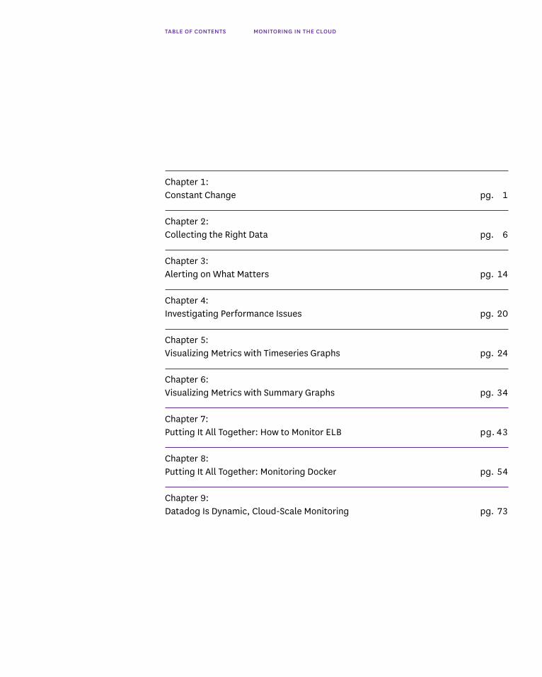
CHAPTER 1 CONSTANT CHANGE
1
Chapter 1: Constant Change
In the past several years, the nature of IT infrastructure has changed dramatically. Countless organizations have migrated away from traditional use of data centers to take advantage of the agility and scalability afforded by public and private cloud infrastructure. For new organizations, architecting applications for the cloud is now the default.
The cloud has effectively knocked down the logistical and economic barriers to accessing production-ready infrastructure. Any organization or individual can now harness the same technologies powering some of the biggest companies in the world.
The shift toward the cloud has brought about a fundamental change on the operations side as well. We are now in an era of dynamic, constantly changing infrastructure that requires new monitoring tools and methods.
CHAPTER 1 CONSTANT CHANGE
2
In this book, we will outline an effective framework for monitoring modern infrastructure and applications, however complex or dynamic they may be. With this high-level framework in place, we will dive into a key component of monitoring: metric graphing and visualization. Finally, we will ground these concepts by showing how these monitoring principles apply to two extremely popular infrastructure technologies: Amazon ELB (Elastic Load Balancing) and Docker.
Elastic, Dynamic, Ephemeral Infrastructure
Developers and sysadmins can now spin up nearly limitless cloud resources on demand, from compute instances to managed databases and other high-value hosted services.
In many cases, no manual intervention is required to provision new resources, as auto-scaling allows infrastructure to expand or contract to keep pace with changing demand. Auto-scaling is a key feature of cloud services such as Amazon’s EC2 and of container-orchestration tools such as Kubernetes.
The elastic nature of modern infrastructure also means that the individual components are often ephemeral. Cloud computing instances often run for just hours or days before being destroyed. The shift toward containerization has only accelerated this trend, as containers often have short lifetimes measured in minutes or hours.

CHAPTER 1 CONSTANT CHANGE
3
Pets vs Cattle
With dynamic infrastructure, focusing on individual servers rarely makes sense—each compute instance or container is merely a replaceable cog that performs some function in support of a larger service.
A useful analogy in thinking about dynamic infrastructure is ‟pets versus cattle.” Pets are unique, they have names, and you care greatly about the health and well-being of each. Cattle, on the other hand, are numbered rather than named. They are part of a herd. Individual members of the herd will come and go; therefore you care more about the overall health of the herd than you do about any one individual.
In most cases your servers, containers, and other infrastructure components should be thought of as cattle. Therefore you should focus on aggregate health and performance of services rather than isolated datapoints from your hosts. Rarely should you page an engineer in the middle of the night for a host-level issue such as elevated CPU. If on the other hand latency for your web application starts to surge, you’ll want to take action immediately.
Devops
As cloud and container technologies have reshaped the underlying infrastructure, software development and operations have become more dynamic as well.
The ‟devops” movement emphasizes tight collaboration between development and operations teams, which share ownership of services throughout the development, deployment, and operations phases. Devops practices focus on communication, collaboration, repeatability, and automation to ensure that software is tested, deployed, and managed efficiently and safely.
CONTINUOUS DELIVERY
Continuous delivery is a cornerstone of many devops approaches. Rather than orchestrating large, infrequent releases, teams practicing continuous delivery push small, incremental code changes quickly and frequently. This simplifies the automated testing of change sets and allows development teams to release bugfixes and new features much faster. It also enables engineers to quickly roll back any changes that cause unforeseen issues in production.
OBSERVABILITY
In control theory, ‟observability” is the property of being able to describe or reconstruct the internal state of a system using its external outputs. In practice,

CHAPTER 1 CONSTANT CHANGE
4
for an organization’s infrastructure, this means instrumenting all compute resources, apps, and services with ‟sensors” that faithfully report metrics from those components. It also means making those metrics available on a central, easily accessible platform, where observers can bring them together to reconstruct a full picture of the system’s status and operation.
Observability dovetails with the devops movement, as it represents a cultural shift away from siloed, piecemeal views into critical systems toward a detailed, comprehensive view of the infrastructure that is shared across the organization.
Modern Approaches to Monitoring
Monitoring is the part of the devops toolchain that enables developers and ops teams to build observability into their systems. In most cases, the motivation for monitoring is being able to catch and resolve performance issues before they cause problems for end users. Careful monitoring is a must now that development teams move faster than ever—some teams release new code dozens of times per day.
The core features of a modern monitoring system are outlined below.
BUILT-IN AGGREGATION
Powerful tagging or labeling schemes allow engineers to arbitrarily segment and aggregate their metrics, so they can direct their focus at the service level rather than the host level. (Remember: cattle, not pets.)
COMPREHENSIVE COVERAGE
Monitoring every layer of infrastructure allows engineers to correlate metrics across systems so they can understand the interactions between services.
SCALABILITY
Modern, dynamic monitoring systems understand that individual hosts come and go, so they scale gracefully with expanding or contracting infrastructure. When a new host is launched, the system should detect it and start monitoring it automatically.
SOPHISTICATED ALERTING
Virtually every monitoring tool can fire off an alert when a metric crosses a set threshold. But such fixed alerts need constant updating and tuning in rapidly scaling environments. More advanced monitoring systems offer flexible alerts that adapt to changing baselines, including relative change alerts as well as automated outlier and anomaly detection.
CHAPTER 1 CONSTANT CHANGE
5
COLLABORATION
When issues arise, a monitoring system should help engineers discover and correct the problem as quickly as possible. That means delivering alerts through a team’s preferred communication channels and making it easy for incident responders to share graphs, dashboards, events, and comments.
How It’s Done
In the next chapter we dive into the how-to, laying out the details of a practical monitoring framework for modern infrastructure. We’ll start with data, which is at the core of any monitoring approach. After you read the next chapter you’ll have gained techniques for collecting, categorizing, and aggregating the various types of monitoring data produced by your systems. You’ll also understand which data are most likely to help you identify and resolve issues.
This framework comes out of our experience monitoring large-scale infrastructure for thousands of customers, as well as for our own rapidly scaling application in the AWS cloud. It also draws on the work of Brendan Gregg of Netflix, Rob Ewaschuk of Google, and Baron Schwartz of VividCortex.

COLLECTING THE RIGHT DATACHAPTER 2
6
Chapter 2: Collecting the Right Data
Monitoring data comes in a variety of forms. Some systems pour out data continuously and others only produce data when specific events occur. Some data is most useful for identifying problems; some is primarily valuable for investigating problems. This chapter covers which data to collect, and how to classify that data so that you can:
1. Generate automated alerts for potential problems while minimizing false alarms
2. Quickly investigate and get to the bottom of performance issues
Whatever form your monitoring data takes, the unifying theme is this:
Collecting data is cheap, but not having it when you need it can be expensive, so you should instrument everything, and collect all the useful data you reasonably can.
Most monitoring data falls into one of two categories: metrics and events. Below we'll explain each category, with examples, and describe their uses.

COLLECTING THE RIGHT DATACHAPTER 2
7
Metrics
Metrics capture a value pertaining to your systems at a specific point in time—for example, the number of users currently logged in to a web application. Therefore, metrics are usually collected at regular intervals (every 15 seconds, every minute, etc.) to monitor a system over time.
There are two important categories of metrics in our framework: work metrics and resource metrics. For each system in your infrastructure, consider which work metrics and resource metrics are reasonably available, and collect them all.
WORK METRICS
Work metrics indicate the top-level health of your system by measuring its useful output. These metrics are invaluable for surfacing real, often user-facing issues, as we'll discuss in the following chapter. When considering your work metrics, it’s often helpful to break them down into four subtypes:
— throughput is the amount of work the system is doing per unit time. Throughput is usually recorded as an absolute number.
— success metrics represent the percentage of work that was executed successfully.
— error metrics capture the number of erroneous results, usually expressed as a rate of errors per unit time, or normalized by the throughput to yield errors per unit of work. Error metrics are often captured separately from success metrics when there are several potential sources of error, some of which are more serious or actionable than others.
— performance metrics quantify how efficiently a component is doing its work. The most common performance metric is latency, which represents the time required to complete a unit of work. Latency can be expressed as an average or as a percentile, such as ‟99% of requests returned within 0.1 seconds.”

COLLECTING THE RIGHT DATACHAPTER 2
8
SUBTYPE DESCRIPTION VALUE
THROUGHPUT REQUESTS PER SECOND 312
SUCCESS PERCENTAGE OF RESPONSES THAT ARE 2XX SINCE LAST MEASUREMENT 99.1
ERROR PERCENTAGE OF RESPONSES THAT ARE 5XX SINCE LAST MEASUREMENT 0.1
PERFORMANCE 90TH PERCENTILE RESPONSE TIME IN SECONDS 0.4
SUBTYPE DESCRIPTION VALUE
THROUGHPUT QUERIES PER SECOND 949
SUCCESS PERCENTAGE OF QUERIES SUCCESSFULLY EXECUTED SINCE LAST MEASUREMENT 100
ERROR PERCENTAGE OF QUERIES YIELDING EXCEPTIONS SINCE LAST MEASUREMENT 0
ERROR PERCENTAGE OF QUERIES RETURNING STALE DATA SINCE LAST MEASUREMENT 4.2
PERFORMANCE 90TH PERCENTILE RESPONSE TIME IN SECONDS 0.02
EXAMPLE WORK METRICS: WEB SERVER (AT TIME 2016-05-24 08:13:01 UTC)
EXAMPLE WORK METRICS: DATA STORE (AT TIME 2016-05-24 08:13:01 UTC)
Below are example work metrics of all four subtypes for two common kinds of systems: a web server and a data store.
RESOURCE METRICS
Most components of your software infrastructure serve as a resource to other systems. Some resources are low-level—for instance, a server’s resources include such physical components as CPU, memory, disks, and network interfaces. But a higher-level component, such as a database or a geolocation microservice, can also be considered a resource if another system requires that component to produce work.
Resource metrics are especially valuable for the investigation and diagnosis of problems, which is the subject of chapter 4 of this book. For each resource in your system, try to collect metrics that cover four key areas:
— utilization is the percentage of time that the resource is busy, or the percentage of the resource’s capacity that is in use.
— saturation is a measure of the amount of requested work that the resource cannot yet service. Saturation is often measured by queue length.
— errors represent internal errors that may not be observable in the work the resource produces.

COLLECTING THE RIGHT DATACHAPTER 2
9
— availability represents the percentage of time that the resource responded to requests. This metric is only well-defined for resources that can be actively and regularly checked for availability.
Here are example metrics for a handful of common resource types:
RESOURCE UTILIZATION SATURATION ERRORS AVAILABILITY
DISK IO % TIME THAT WAIT QUEUE LENGTH # DEVICE ERRORS % TIME WRITABLE DEVICE WAS BUSY
MEMORY % OF TOTAL MEMORY SWAP USAGE N/A (NOT USUALLY N/A CAPACITY IN USE OBSERVABLE)
MICROSERVICE AVERAGE % TIME # ENQUEUED # INTERNAL ERRORS % TIME SERVICE EACH REQUEST- REQUESTS SUCH AS CAUGHT IS REACHABLE SERVICING THREAD EXCEPTIONS WAS BUSY
DATABASE AVERAGE % TIME # ENQUEUED QUERIES # INTERNAL ERRORS, % TIME EACH CONNECTION E.G. REPLICATION DATABASE IS WAS BUSY ERRORS REACHABLE
OTHER METRICS
There are a few other types of metrics that are neither work nor resource metrics, but that nonetheless may come in handy in diagnosing causes of problems. Common examples include counts of cache hits or database locks. When in doubt, capture the data.
Events
In addition to metrics, which are collected more or less continuously, some monitoring systems can also capture events: discrete, infrequent occurrences that provide crucial context for understanding changes in your system’s behavior. Some examples:
— Changes: Code releases, builds, and build failures
— Alerts: Notifications generated by your primary monitoring system or by integrated third-party tools
— Scaling events: Adding or subtracting hosts or containers
An event usually carries enough information that it can be interpreted on its own, unlike a single metric data point, which is generally only meaningful in context. Events capture what happened, at a point in time, with optional additional information. For example:

COLLECTING THE RIGHT DATACHAPTER 2
10
Events are sometimes used used to generate alerts—someone should be notified of events such as the third example in the table above, which indicates that critical work has failed. But more often they are used to investigate issues and correlate across systems. Therefore, even though you may not inspect your events as often as you look at your metrics, they are valuable data to be collected wherever it is feasible.
Tagging
As discussed in chapter 1, modern infrastructure is constantly in flux. Auto-scaling servers die as quickly as they’re spawned, and containers come and go with even greater frequency. With all of these transient changes, the signal-to-noise ratio in monitoring data can be quite low.
In most cases, you can boost the signal by shifting your monitoring away from the base level of hosts, VMs, or containers. After all, you don’t care if a specific EC2 instance goes down, but you do care if latency for a given service, category of customers, or geographical region goes up.
Tagging your metrics enables you to reorient your monitoring along any lines you choose. By adding tags to your metrics you can observe and alert on metrics from different availability zones, instance types, software versions, services, roles—or any other level you may require.
WHAT’S A METRIC TAG?
Tags are metadata that declare all the various scopes that a datapoint belongs to. Here’s an example:
metric name: what?
metric value:how much?
timestamp:when?
tags:where?
metric name: what?
metric value:how much?
timestamp:when?
tags:where?
system.net.bytes_rcvd 3 2016–03–02 15:00:00 [’availability-zone:us-east-1a’, ’file-server’, ’hostname:foo’, ’instance-type:m3.xlarge’]
Datapoint
Datapoint
system.net.bytes_rcvd 4 2016–03–02 15:00:00 [’file-server’]
WHAT HAPPENED TIME ADDITIONAL INFORMATION
HOTFIX F464BFE RELEASED 2016–04–15 04:13:25 UTC TIME ELAPSED: 1.2 TO PRODUCTION SECONDS
PULL REQUEST 1630 2016–04–19 14:22:20 UTC COMMITS: EA720D6 MERGED
NIGHTLY DATA ROLLUP 2016–04–27 00:03:18 UTC LINK TO LOGS OF FAILED FAILED JOB

COLLECTING THE RIGHT DATACHAPTER 2
11
Tags allow you to filter and group your datapoints to generate exactly the view of your data that matters most. They also allow you to aggregate your metrics on the fly, without changing how the metrics are reported and collected.
FILTERING WITH SIMPLE METRIC TAGS
The following example shows a datapoint with the simple tag of file-server:
metric name: what?
metric value:how much?
timestamp:when?
tags:where?
metric name: what?
metric value:how much?
timestamp:when?
tags:where?
system.net.bytes_rcvd 3 2016–03–02 15:00:00 [’availability-zone:us-east-1a’, ’file-server’, ’hostname:foo’, ’instance-type:m3.xlarge’]
Datapoint
Datapoint
system.net.bytes_rcvd 4 2016–03–02 15:00:00 [’file-server’]
Inst
ance
Typ
e
Avail
abili
ty Zo
ne
us-east-1a
eu-west-1a
sa-east-1a
Role
database cache appserver
databasec3.largeus-east-1a
us-east-1ab3.mediumdatabase cache
b3.mediumus-east-1a
cachec3.largeus-east-1a
appserverb3.mediumus-east-1a
appserverc3.largeus-east-1a
databaset2.small
c3.large
b3.medium
t2.smallus-east-1a
cachet2.smallus-east-1a
appservert2.smallus-east-1a
Simple tags can only be used to filter datapoints: either show the datapoint with a given tag, or do not.
CREATING NEW DIMENSIONS WITH KEY:VALUE TAGS
When you add a key:value tag to a metric, you’re actually adding a new dimension (the key) and a new attribute in that dimension (the value). For example, a metric with the tag instance-type:m3.xlarge declares an instance-type dimension, and gives the metric the attribute m3.xlarge in that dimension. When using key:value tags, the “key” selects the level of abstraction you want to consider (e.g. instance type), and the “value” determines which datapoints belong together (e.g. metrics from instance type m3.xlarge).

COLLECTING THE RIGHT DATACHAPTER 2
12
If you add other metrics with the same key, but different values, those metrics will automatically have new attributes in that dimension (e.g. m3.medium). Once your key:value tags are added, you can then slice and dice in any dimension.
What good data looks like
The data you collect should have four characteristics:
— Well-understood. You should be able to quickly determine how each metric or event was captured and what it represents. During an outage you don’t want to spend time figuring out what your data means. Keep your metrics and events as simple as possible, use standard concepts described above, and name them clearly.
— Granular. If you collect metrics too infrequently or average values over long windows of time, you may lose important information about system behavior. For example, periods of 100% resource utilization will be obscured if they are averaged with periods of lower utilization. Collect metrics for each system at a frequency that will not conceal problems, without collecting so often that monitoring becomes perceptibly taxing on the system or samples time intervals that are too short to be meaningful.
— Tagged by scope. Each of your hosts operates simultaneously in multiple scopes, and you may want to check on the aggregate health of any of these scopes, or their combinations. For example: how is the production web application doing in aggregate? How about production in the AWS region ‟us-east-1?” How about a particular combination of software version and EC2 instance type? It is important to retain the multiple scopes associated with your data so that you can alert on problems from any scope, and quickly investigate outages without being limited by a fixed hierarchy of hosts. As described above, this is especially crucial for dynamic cloud infrastructure.
— Long-lived. If you discard data too soon, or if after a period of time your monitoring system aggregates your metrics to reduce storage costs, then you lose important information about what happened in the past. Retaining your raw data for a year or more makes it much easier to know what “normal” is, especially if your metrics have monthly, seasonal, or annual variations.

COLLECTING THE RIGHT DATACHAPTER 2
13
Collect ’em all
Now that we have explored the difference between events and metrics, and the further difference between work metrics and resource metrics, we will see in the next chapter how those data points can be effectively harnessed to monitor your dynamic infrastructure. But first, a brief recap of the key points in this chapter:
— Instrument everything and collect as many work metrics, resource metrics, and events as you reasonably can.
— Collect metrics with sufficient granularity to make important spikes and dips visible. The specific granularity depends on the system you are measuring, the cost of measuring and a typical duration between changes in metrics.
— To maximize the value of your data, tag metrics and events with the appropriate scopes, and retain them at full granularity for at least a year.

CHAPTER 3 ALERTING ON WHAT MATTERS
14
Chapter 3: Alerting on What Matters
Automated alerts are essential to monitoring. They allow you to spot problems anywhere in your infrastructure, so that you can rapidly identify their causes and minimize service degradation and disruption.
An alert should communicate something specific about your systems in plain language: “Two Cassandra nodes are down” or “90% of all web requests are taking more than 0.5s to process and respond.” Automating alerts across as many of your systems as possible allows you to respond quickly to issues and provide better service, and it also saves time by freeing you from continual manual inspection of metrics.
But alerts aren’t always as effective as they could be. In particular, real problems are often lost in a sea of noisy alarms. This chapter describes a simple approach to effective alerting, regardless of the scale and elasticity of the systems involved. In short:
1. Page on symptoms, rather than causes2. Alert liberally; page judiciously
CHAPTER 3 ALERTING ON WHAT MATTERS
15
Levels of Alerting Urgency
Not all alerts carry the same degree of urgency. Some require immediate human intervention, some require eventual human intervention, and some point to areas where attention may be needed in the future. All alerts should, at a minimum, be recorded in an easily accessible central location so they can be correlated with other metrics and events.
ALERTS AS RECORDS (LOW SEVERITY)
Many alerts will not be associated with a service problem, so a human may never even need to be aware of them. For instance, when a data store that supports a user-facing service starts serving queries much slower than usual, but not slow enough to make an appreciable difference in the overall service’s response time, that should generate a low-urgency alert that is recorded in your monitoring system for future reference or investigation but does not interrupt anyone’s work. After all, transient issues that could be to blame, such as network congestion, often go away on their own. But should a significant issue develop — say, if the service starts returning a large number of timeouts — that recorded alert will provide invaluable context for your investigation.
ALERTS AS NOTIFICATIONS (MODERATE SEVERITY)
The next tier of alerting urgency is for issues that do require intervention, but not right away. Perhaps the data store is running low on disk space and should be scaled out in the next several days. Sending an email or posting a notification in the service owner’s chat room is a perfect way to deliver these alerts — both message types are highly visible, but they won’t wake anyone in the middle of the night or disrupt an engineer’s flow.
ALERTS AS PAGES (HIGH SEVERITY)
The most urgent alerts should receive special treatment and be escalated to a page (as in “pager”) to urgently request human attention. Response times for your web application, for instance, should have an internal SLA that is at least as aggressive as your strictest customer-facing SLA. Any instance of response times exceeding your internal SLA would warrant immediate attention, whatever the hour.

CHAPTER 3 ALERTING ON WHAT MATTERS
16
The table below maps examples of the different data types described in the previous chapter to different levels of alerting urgency. Note that depending on severity, a notification may be more appropriate than a page, or vice versa:
Data for Alerts, Data for Diagnostics
DATA ALERT TRIGGER
WORK METRIC: PAGE VALUE IS MUCH HIGHER OR LOWER THAN USUAL, OR THERE IS AN ANOMALOUS THROUGHPUT RATE OF CHANGE
WORK METRIC: PAGE THE PERCENTAGE OF WORK THAT IS SUCCESSFULLY PROCESSED DROPS BELOW SUCCESS A THRESHOLD
WORK METRIC: PAGE THE ERROR RATE EXCEEDS A THRESHOLD ERRORS
WORK METRIC: PAGE WORK TAKES TOO LONG TO COMPLETE PERFORMANCE (E.G., PERFORMANCE VIOLATES INTERNAL SLA)
RESOURCE METRIC: NOTIFICATION APPROACHING CRITICAL RESOURCE LIMIT UTILIZATION (E.G., FREE DISK SPACE DROPS BELOW A THRESHOLD)
RESOURCE METRIC: RECORD NUMBER OF WAITING PROCESSES EXCEEDS A THRESHOLD SATURATION
RESOURCE METRIC: RECORD NUMBER OF INTERNAL ERRORS DURING A FIXED PERIOD EXCEEDS A THRESHOLD ERRORS
RESOURCE METRIC: RECORD THE RESOURCE IS UNAVAILABLE FOR A PERCENTAGE OF TIME THAT EXCEEDS AVAILABILITY A THRESHOLD
EVENT: PAGE CRITICAL WORK THAT SHOULD HAVE BEEN COMPLETED IS REPORTED AS WORK-RELATED INCOMPLETE OR FAILED

CHAPTER 3 ALERTING ON WHAT MATTERS
17
WHEN TO LET A SLEEPING ENGINEER LIE
Whenever you consider setting an alert, ask yourself three questions to determine the alert’s level of urgency and how it should be handled:
1 Is this issue real? It may seem obvious, but if the issue is not real, it usually should not generate an alert. The examples below can trigger alerts but probably are not symptomatic of real problems. Sending visible alerts or pages on occurrences such as these contributes to alert fatigue and can cause more serious issues to be overlooked:
— Metrics in a test environment are out of bounds
— A single server is doing its work very slowly, but it is part of a cluster with fast-failover to other machines, and it reboots periodically anyway
— Planned upgrades are causing large numbers of machines to report as offline
If the issue is indeed real, it should generate an alert. Even if the alert is
not linked to a notification, it should be recorded within your monitoring system for later analysis and correlation.
2 Does this issue require attention? If you can reasonably automate a response to an issue, you should consider doing so. There is a very real cost to calling someone away from work, sleep, or personal time. If the issue is real and it requires attention, it should generate an alert that notifies someone who can investigate and fix the problem. At minimum, the notification should be sent via email, chat or a ticketing system so that the recipients can prioritize their response.
3 Is this issue urgent? Not all issues are emergencies. For example, perhaps a moderately higher than normal percentage of system responses have been very slow, or perhaps a slightly elevated share of queries are returning stale data. Both issues may need to be addressed soon, but not at 4:00 A.M. If, on |the other hand, a key system stops doing its work at an acceptable rate, an engineer should take a look immediately. If the symptom is real and it requires attention and it is urgent, it should generate a page.

CHAPTER 3 ALERTING ON WHAT MATTERS
18
PAGE ON SYMPTOMS
Pages deserve special mention: they are extremely effective for delivering information, but they can be quite disruptive if overused, or if they are linked to alerts that are prone to flapping. In general, a page is the most appropriate kind of alert when the system you are responsible for stops doing useful work with acceptable throughput, latency, or error rates. Those are the sort of problems that you want to know about immediately.
The fact that your system stopped doing useful work is a symptom. It is a manifestation of an issue that may have any number of different causes. For example: if your website has been responding very slowly for the last three minutes, that is a symptom. Possible causes include high database latency, failed application servers, Memcached being down, high load, and so on. Whenever possible, build your pages around symptoms rather than causes. The distinction between work metrics and resource metrics introduced in chapter 2 is often useful for separating symptoms and causes: work metrics are usually associated with symptoms and resource metrics with causes.
Paging on symptoms surfaces real, oftentimes user-facing problems, rather than hypothetical or internal problems. Contrast paging on a symptom, such as slow website responses, with paging on potential causes of the symptom, such as high load on your web servers. Your users will not know or care about server load if the website is still responding quickly, and your engineers will resent being bothered for something that is only internally noticeable and that may revert to normal levels without intervention.
DURABLE ALERT DEFINITIONS
Another good reason to page on symptoms is that symptom-triggered alerts tend to be durable. This means that regardless of how underlying system architectures may change, if the system stops doing work as well as it should, you will get an appropriate page even without updating your alert definitions.
EXCEPTION TO THE RULE: EARLY WARNING SIGNS
It is sometimes necessary to call human attention to a small handful of metrics even when the system is performing adequately. Early warning metrics reflect an unacceptably high probability that serious symptoms will soon develop and require immediate intervention.
Disk space is a classic example. Unlike running out of free memory or CPU, when you run out of disk space, the system will not likely recover, and you probably will have only a few seconds before your system hard stops. Of course, if you can notify someone with plenty of lead time, then there is no need to wake anyone in the middle of the night. Better yet, you can anticipate some situations when disk space

CHAPTER 3 ALERTING ON WHAT MATTERS
19
will run low and build automated remediation based on the data you can afford to erase, such as logs or data that exists somewhere else.
Get Serious About Symptoms
In the next chapter we'll cover what to do once you receive an alert. But first, a quick roundup of the key points in this chapter:
— Send a page only when symptoms of urgent problems in your system’s work are detected, or if a critical and finite resource limit is about to be reached.
— Set up your monitoring system to record alerts whenever it detects real issues in your infrastructure, even if those issues have not yet affected overall performance.
CHAPTER 4 INVESTIGATING PERFORMANCE ISSUES
20
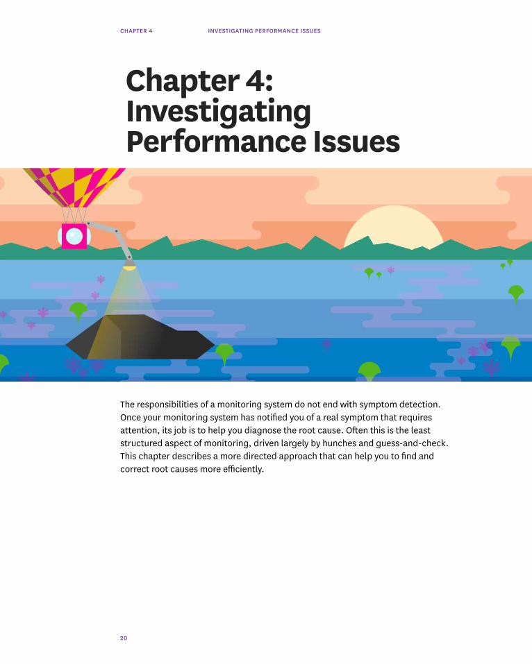
Chapter 4: Investigating Performance Issues
The responsibilities of a monitoring system do not end with symptom detection. Once your monitoring system has notified you of a real symptom that requires attention, its job is to help you diagnose the root cause. Often this is the least structured aspect of monitoring, driven largely by hunches and guess-and-check. This chapter describes a more directed approach that can help you to find and correct root causes more efficiently.

CHAPTER 4 INVESTIGATING PERFORMANCE ISSUES
21
A Brief Data Refresher
As you'll recall from chapter 2, there are three main types of monitoring data that can help you investigate the root causes of problems in your infrastructure:
— Work metrics indicate the top-level health of your system by measuring its useful output
— Resource metrics quantify the utilization, saturation, errors, or availability of a resource that your system depends on
— Events describe discrete, infrequent occurrences in your system such as code changes, internal alerts, and scaling events
By and large, work metrics will surface the most serious symptoms and should therefore generate the most serious alerts, as discussed in the previous chapter. But the other metric types are invaluable for investigating the causes of those symptoms.
IT’S RESOURCES ALL THE WAY DOWN
Most of the components of your infrastructure can be thought of as resources. At the highest levels, each of your systems that produces useful work likely relies on other systems. For instance, the Apache server in a LAMP stack relies on a MySQL database as a resource to support its work of serving requests. One level down, MySQL has unique resources that the database uses to do its work, such as the finite pool of client connections. At a lower level still are the physical resources of the server running MySQL, such as CPU, memory, and disks.
Thinking about which systems produce useful work, and which resources support that work, can help you to efficiently get to the root of any issues that surface. When an alert notifies you of a possible problem, the following process will help you to approach your investigation systematically.

CHAPTER 4 INVESTIGATING PERFORMANCE ISSUES
22
1. Start at the top with work metrics First ask yourself, “Is there a problem? How can I characterize it?” If you
don’t describe the issue clearly at the outset, it’s easy to lose track as you dive deeper into your systems to diagnose the issue.
Next examine the work metrics for the highest-level system that is exhibiting problems. These metrics will often point to the source of the problem, or at least set the direction for your investigation. For example, if the percentage of work that is successfully processed drops below a set threshold, diving into error metrics, and especially the types of errors being returned, will often help narrow the focus of your investigation. Alternatively, if latency is high, and the throughput of work being requested by outside systems is also very high, perhaps the system is simply overburdened.
2. Dig into resources If you haven’t found the cause of the problem by inspecting top-level
work metrics, next examine the resources that the system uses—physical resources as well as software or external services that serve as resources to the system. Setting up dashboards for each system ahead of time, as outlined below, enables you to quickly find and peruse metrics for the relevant resources. Are those resources unavailable? Are they highly utilized or saturated? If so, recurse into those resources and begin investigating each of them at step 1.
3. Did something change? Next consider alerts and other events that may be correlated with your
metrics. If a code release, internal alert, or other event was registered slightly before problems started occurring, investigate whether they may be connected to the problem.
4. Fix it (and don’t forget it) Once you have determined what caused the issue, correct it. Your
investigation is complete when symptoms disappear—you can now think about how to change the system to avoid similar problems in the future.

CHAPTER 4 INVESTIGATING PERFORMANCE ISSUES
23
BUILD DASHBOARDS BEFORE YOU NEED THEM
In an outage, every minute is crucial. To speed your investigation and keep your focus on the task at hand, set up dashboards in advance. You may want to set up one dashboard for your high-level application metrics, and one dashboard for each subsystem. Each system’s dashboard should render the work metrics of that system, along with resource metrics of the system itself and key metrics of the subsystems it depends on. If event data is available, overlay relevant events on the graphs for correlation analysis.
FOLLOW THE METRICS
Adhering to a standardized monitoring framework allows you to investigate problems more systematically:
— For each system in your infrastructure, set up a dashboard ahead of time that displays all its key metrics, with relevant events overlaid.
— Investigate causes of problems by starting with the highest-level system that is showing symptoms, reviewing its work and resource metrics and any associated events.
— If problematic resources are detected, apply the same investigation pattern to the resource (and its constituent resources) until your root problem is discovered and corrected.
We've now stepped through a high-level framework for data collection and tagging (chapter 2), automated alerting (chapter 3), and incident response and investigation (chapter 4). In the next chapter we'll go further into detail on how to monitor your metrics using a variety of graphs and other visualizations.

CHAPTER 5 VISUALIZING METRICS WITH TIMESERIES GRAPHS
24
Chapter 5: Visualizing Metrics with Timeseries Graphs
In order to turn your metrics into actionable insights, it's important to choose the right visualization for your data. There is no one-size-fits-all solution: you can see different things in the same metric with different graph types.
To help you effectively visualize your metrics, this chapter explores four different types of timeseries graphs: line graphs, stacked area graphs, bar graphs, and heat maps. These graphs all have time on the x-axis and metric values on the y-axis. For each graph type, we'll explain how it works, when to use it, and when to use something else.
But first we'll quickly touch on aggregation in timeseries graphs, which is critical for visualizing metrics from dynamic, cloud-scale infrastructure.

CHAPTER 5 VISUALIZING METRICS WITH TIMESERIES GRAPHS
25
Aggregation Across Space
Not all metric queries make sense broken out by host, container, or other unit of infrastructure. So you will often need some aggregation across space to sensibly visualize your metrics. This aggregation can take many forms: aggregating metrics by messaging queue, by database table, by application, or by some attribute of your hosts themselves (operating system, availability zone, hardware profile, etc.).
Aggregation across space allows you to slice and dice your infrastructure to isolate exactly the metrics that matter most to you. It also allows you to make otherwise noisy graphs much more readable. For instance, it is hard to make sense of a host-level graph of web requests, but the same data is easily interpreted when the metrics are aggregated by availability zone:
Tagging your metrics, as discussed in chapter 2, makes it easy to perform these aggregations on the fly when you are building your graphs and dashboards.

CHAPTER 5 VISUALIZING METRICS WITH TIMESERIES GRAPHS
26
Line Graphs
WHAT WHY EXAMPLE
THE SAME METRIC TO SPOT OUTLIERS AT A GLANCE CPU IDLE FOR EACH HOST IN A CLUSTER REPORTED BY DIFFERENT SCOPES
TRACKING SINGLE TO CLEARLY COMMUNICATE A KEY MEDIAN LATENCY ACROSS ALL WEB SERVERS METRICS FROM ONE METRIC'S EVOLUTION OVER TIME SOURCE, OR AS AN AGGREGATE
METRICS FOR WHICH TO SPOT INDIVIDUAL DEVIATIONS DISK SPACE UTILIZATION PER UNAGGREGATED INTO UNACCEPTABLE RANGES DATABASE NODE VALUES FROM A PARTICULAR SLICE OF YOUR INFRASTRUCTURE ARE ESPECIALLY VALUABLE
WHEN TO USE LINE GRAPHS
Line graphs are the simplest way to translate metric data into visuals, but often they’re used by default when a different graph would be more appropriate. For instance, a graph of wildly fluctuating metrics from hundreds of hosts quickly becomes harder to disentangle than steel wool.

CHAPTER 5 VISUALIZING METRICS WITH TIMESERIES GRAPHS
27
RELATED METRICS TO SPOT CORRELATIONS AT A GLANCE LATENCY FOR DISK READS AND DISK WRITES SHARING THE SAME ON THE SAME MACHINE UNITS
METRICS THAT HAVE TO EASILY SPOT SERVICE DEGRADATIONS LATENCY FOR PROCESSING WEB REQUESTS A CLEAR ACCEPTABLE DOMAIN
WHEN TO USE SOMETHING ELSE
WHAT EXAMPLE INSTEAD USE...
HIGHLY VARIABLE CPU FROM ALL HOSTS HEAT MAPS TO MAKE NOISY DATA MORE METRICS REPORTED INTERPRETABLE BY A LARGE NUMBER OF SOURCES
METRICS THAT ARE WEB REQUESTS PER SECOND OVER DOZENS AREA GRAPHS TO AGGREGATE ACROSS MORE ACTIONABLE OF WEB SERVERS TAGGED GROUPS AS AGGREGATES THAN AS SEPARATE DATA POINTS
SPARSE METRICS COUNT OF RELATIVELY RARE S3 ACCESS BAR GRAPHS TO AVOID JUMPY ERRORS INTERPOLATIONS

CHAPTER 5 VISUALIZING METRICS WITH TIMESERIES GRAPHS
28
Stacked Area Graphs
Area graphs are similar to line graphs, except the metric values are represented by two-dimensional bands rather than lines. Multiple timeseries can be summed together simply by stacking the bands.
WHAT WHY EXAMPLE
THE SAME METRIC FROM TO CHECK BOTH THE SUM AND THE CONTRIBUTION LOAD BALANCER REQUESTS PER AVAILABILITY ZONE DIFFERENT SCOPES, OF EACH OF ITS PARTS AT A GLANCE STACKED
SUMMING TO SEE HOW A FINITE RESOURCE IS BEING UTILIZED CPU UTILIZATION METRICS (USER, SYSTEM, IDLE, COMPLEMENTARY ETC.) METRICS THAT SHARE THE SAME UNIT
WHEN TO USE STACKED AREA GRAPHS

CHAPTER 5 VISUALIZING METRICS WITH TIMESERIES GRAPHS
29
Bar Graphs
In a bar graph, each bar represents a metric rollup over a time interval. This feature makes bar graphs ideal for representing counts. Unlike gauge metrics, which represent an instantaneous value, count metrics only make sense when paired with a time interval (e.g., 13 query errors in the past five minutes).
WHEN TO USE SOMETHING ELSE
WHAT EXAMPLE INSTEAD USE...
UNAGGREGATED METRICS THROUGHPUT METRICS ACROSS HUNDREDS OF LINE GRAPH OR SOLID-COLOR AREA GRAPH TO TRACK FROM LARGE NUMBERS OF APP SERVERS TOTAL, AGGREGATE VALUE HOSTS, MAKING THE SLICES TOO THIN TO BE MEANINGFUL HEAT MAPS TO TRACK HOST-LEVEL DATA
METRICS THAT CAN'T BE SYSTEM LOAD ACROSS MULTIPLE SERVERS LINE GRAPHS, OR HEAT MAPS FOR LARGE NUMBERS ADDED SENSIBLY OF HOSTS

CHAPTER 5 VISUALIZING METRICS WITH TIMESERIES GRAPHS
30
Bar graphs require no interpolation to connect one interval to the next, making them especially useful for representing sparse metrics. Like area graphs, they naturally accommodate stacking and summing of metrics.
WHAT WHY EXAMPLE
SPARSE METRICS TO CONVEY METRIC VALUES WITHOUT JUMPY OR BLOCKED TASKS IN CASSANDRA'S INTERNAL QUEUES MISLEADING INTERPOLATIONS
METRICS THAT REPRESENT TO CONVEY BOTH THE TOTAL COUNT AND THE FAILED JOBS, BY DATA CENTER (4-HOUR INTERVALS) A COUNT (RATHER THAN CORRESPONDING TIME INTERVAL A GAUGE)
WHEN TO USE BAR GRAPHS

CHAPTER 5 VISUALIZING METRICS WITH TIMESERIES GRAPHS
31
WHAT EXAMPLE INSTEAD USE...
METRICS THAT CAN'T BE AVERAGE LATENCY PER LOAD BALANCER LINE GRAPHS TO ISOLATE TIMESERIES FROM EACH ADDED SENSIBLY HOST
UNAGGREGATED METRICS COMPLETED TASKS ACROSS DOZENS OF CASSANDRA SOLID-COLOR BARS TO TRACK TOTAL, AGGREGATE FROM LARGE NUMBERS OF NODES METRIC VALUE SOURCES, MAKING THE SLICES TOO THIN TO BE MEANINGFUL HEAT MAPS TO TRACK HOST-LEVEL VALUES
WHEN TO USE SOMETHING ELSE

CHAPTER 5 VISUALIZING METRICS WITH TIMESERIES GRAPHS
32
Heat Maps
Heat maps show the distribution of values for a metric evolving over time. Specifically, each column represents a distribution of values during a particular time slice. Each cell's shading corresponds to the number of entities reporting that particular value during that particular time.
Heat maps are designed to visualize metrics from large numbers of entities, so they are often used to graph unaggregated metrics at the individual host or container level. Heat maps are closely related to distribution graphs, except that heat maps show change over time, and distribution graphs are a snapshot of a particular window of time. Distributions are covered in the following chapter.
WHAT WHY EXAMPLE
SINGLE METRIC REPORTED TO CONVEY GENERAL TRENDS AT A GLANCE WEB LATENCY PER HOST BY A LARGE NUMBER OF GROUPS TO SEE TRANSIENT VARIATIONS ACROSS MEMBERS REQUESTS RECEIVED PER HOST OF A GROUP
WHEN TO USE HEAT MAPS
CHAPTER 5 VISUALIZING METRICS WITH TIMESERIES GRAPHS
33
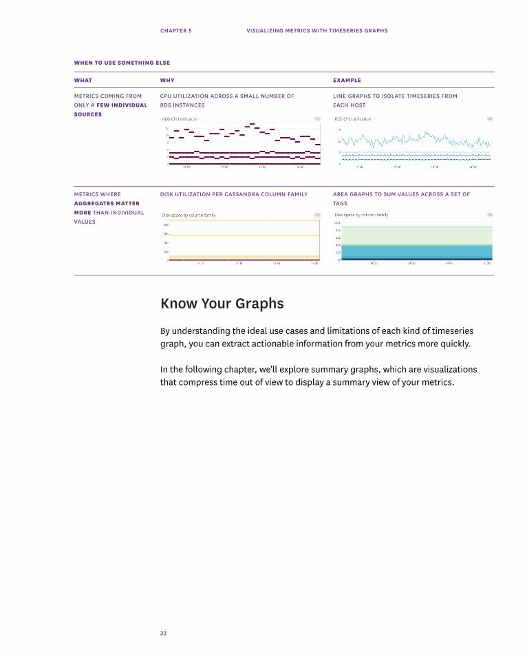
Know Your Graphs
By understanding the ideal use cases and limitations of each kind of timeseries graph, you can extract actionable information from your metrics more quickly.
In the following chapter, we'll explore summary graphs, which are visualizations that compress time out of view to display a summary view of your metrics.
WHAT WHY EXAMPLE
METRICS COMING FROM CPU UTILIZATION ACROSS A SMALL NUMBER OF LINE GRAPHS TO ISOLATE TIMESERIES FROM ONLY A FEW INDIVIDUAL RDS INSTANCES EACH HOST SOURCES
METRICS WHERE DISK UTILIZATION PER CASSANDRA COLUMN FAMILY AREA GRAPHS TO SUM VALUES ACROSS A SET OF AGGREGATES MATTER TAGS MORE THAN INDIVIDUAL VALUES
WHEN TO USE SOMETHING ELSE

CHAPTER 6 VISUALIZING METRICS WITH SUMMARY GRAPHS
34
Chapter 6: Visualizing Metrics with Summary Graphs
In chapter 5, we discussed timeseries graphs — visualizations that show infrastructure metrics evolving through time. In this post we cover summary graphs, which are visualizations that flatten a particular span of time to provide a summary window into your infrastructure. The summary graph types covered in this chapter are: single-value summaries, toplists, change graphs, host maps, and distributions.
For each graph type, we’ll explain how it works and when to use it. But first, we’ll quickly discuss two concepts that are necessary to understand infrastructure summary graphs: aggregation across time (which you can think of as ‟time flattening” or ‟snapshotting”), and aggregation across space.
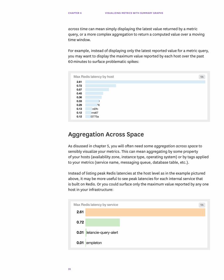
Aggregation Across Time
To provide a summary view of your metrics, a visualization must flatten a timeseries into a single value by compressing the time dimension out of view. This aggregation
CHAPTER 6 VISUALIZING METRICS WITH SUMMARY GRAPHS
35
Max Redis latency by service
2.61 sobotka
0.72 lamar
0.01 delancie-query-alert
0.01 templeton
1h
across time can mean simply displaying the latest value returned by a metric query, or a more complex aggregation to return a computed value over a moving time window.
For example, instead of displaying only the latest reported value for a metric query, you may want to display the maximum value reported by each host over the past 60 minutes to surface problematic spikes:
Aggregation Across Space
As disussed in chapter 5, you will often need some aggregation across space to sensibly visualize your metrics. This can mean aggregating by some property of your hosts (availability zone, instance type, operating system) or by tags applied to your metrics (service name, messaging queue, database table, etc.).
Instead of listing peak Redis latencies at the host level as in the example pictured above, it may be more useful to see peak latencies for each internal service that is built on Redis. Or you could surface only the maximum value reported by any one host in your infrastructure:
Max Redis latency by host2.61 i-25crx5f60.72 i-4ad7841t0.57 i-dmx3210b0.45 i-99d91x390.36 i-53b0f0e90.33 i-79cd6ma00.29 i-9cmd5o760.13 i-2bdcd2fc0.12 i-d0bnra670.12 i-nnd3775a
1h

CHAPTER 6 VISUALIZING METRICS WITH SUMMARY GRAPHS
36
Single-Value Summaries
Single-value summaries display the current value of a given metric query, with conditional formatting (such as a green/yellow/red background) to convey whether or not the value is in the expected range. The value displayed by a single-value summary need not represent an instantaneous measurement. The widget can display the latest value reported, or an aggregate computed from all query values across the time window.
431hosts
Current number of OK hosts, prod 1h
2 AGGREGATION ACROSS TIME Take the average value of that sum over the past hour
1 AGGREGATION ACROSS SPACE Sum all the hosts in our prod environment
2.61sMax Redis latency 1h

CHAPTER 6 VISUALIZING METRICS WITH SUMMARY GRAPHS
37
WHEN TO USE SINGLE-VALUE SUMMARIES
WHAT EXAMPLE EXAMPLE
WORK METRICS FROM A TO MAKE KEY METRICS IMMEDIATELY VISIBLE WEB SERVER REQUESTS PER SECOND GIVEN SYSTEM
CRITICAL RESOURCE TO PROVIDE AN OVERVIEW OF RESOURCE STATUS HEALTHY HOSTS BEHIND LOAD BALANCER METRICS AND HEALTH AT A GLANCE
ERROR METRICS TO QUICKLY DRAW ATTENTION TO POTENTIAL FATAL DATABASE EXCEPTIONS PROBLEMS
COMPUTED METRIC TO COMMUNICATE KEY TRENDS CLEARLY HOSTS IN USE VERSUS ONE WEEK AGO CHANGES AS COMPARED TO PREVIOUS VALUES
Toplists
Toplists are ordered lists that allow you to rank hosts, clusters, or any other segment of your infrastructure by their metric values. Because they are so easy to interpret, toplists are especially useful in high-level status boards.

CHAPTER 6 VISUALIZING METRICS WITH SUMMARY GRAPHS
38
Max Redis latency by availability zone
1.74 us-east-1a
0.7 us-east-1b
0.09 us-east-1e
1h
1 AGGREGATION ACROSS SPACE Take the highest-latency host from each availability zone
2 AGGREGATION ACROSS TIME Take the max instantaneous value from the past hour
Compared to single-value summaries, toplists have an additional layer of aggregation across space, in that the value of the metric query is broken out by group. Each group can be a single host or an aggregation of related hosts.
WHAT WHY EXAMPLE
WORK OR RESOURCE TO SPOT OUTLIERS, UNDERPERFORMERS, OR RESOURCE POINTS PROCESSED PER APP SERVER METRICS TAKEN FROM OVERCONSUMERS AT A GLANCE DIFFERENT HOSTS OR GROUPS
CUSTOM METRICS TO CONVEY KPIS IN AN EASY-TO-READ FORMAT VERSIONS OF THE DATADOG AGENT IN USE RETURNED AS A LIST OF (E.G. FOR STATUS BOARDS ON WALL-MOUNTED VALUES DISPLAYS)
WHEN TO USE TOPLISTS
CHAPTER 6 VISUALIZING METRICS WITH SUMMARY GRAPHS
39
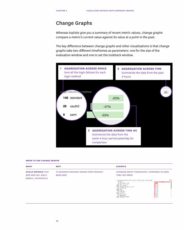
Change Graphs
Whereas toplists give you a summary of recent metric values, change graphs compare a metric's current value against its value at a point in the past.
The key difference between change graphs and other visualizations is that change graphs take two different timeframes as parameters: one for the size of the evaluation window and one to set the lookback window.
Login failures by method
148 standard
29 oauth2
9 saml
4h
-23%
-47%
-53%
1 AGGREGATION ACROSS SPACE Sum all the login failures for each login method
2 AGGREGATION ACROSS TIME Summarize the data from the past 4 hours
3 AGGREGATION ACROSS TIME #2 Summarize the data from the same 4-hour period yesterday for comparison
WHAT WHY EXAMPLE
CYCLIC METRICS THAT TO SEPARATE GENUINE TRENDS FROM PERIODIC DATABASE WRITE THROUGHPUT, COMPARED TO SAME RISE AND FALL DAILY, BASELINES TIME LAST WEEK WEEKLY, OR MONTHLY
WHEN TO USE CHANGE GRAPHS

CHAPTER 6 VISUALIZING METRICS WITH SUMMARY GRAPHS
40
Host Maps
Host maps are a unique way to see your entire infrastructure, or any slice of it, at a glance. However you slice and dice your infrastructure (by availability zone, by service name, by instance type, etc.), you will see each host in the selected group as a hexagon, color-coded and sized by any metrics reported by those hosts.
This particular visualization type is unique to Datadog. As such, it is specifically designed for infrastructure monitoring, in contrast to the general-purpose visualizations described elsewhere in this chapter.
HIGH-LEVEL TO QUICKLY IDENTIFY LARGE-SCALE TRENDS TOTAL HOST COUNT, COMPARED TO SAME TIME INFRASTRUCTURE YESTERDAY METRICS
1 AGGREGATION ACROSS SPACE Aggregate metric by host, and group hosts by availability zone
2 AGGREGATION ACROSS TIME Display the latest reported value by each host
CHAPTER 6 VISUALIZING METRICS WITH SUMMARY GRAPHS
41
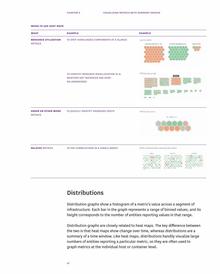
WHAT EXAMPLE EXAMPLE
RESOURCE UTILIZATION TO SPOT OVERLOADED COMPONENTS AT A GLANCE LOAD PER APP HOST, GROUPED BY CLUSTER METRICS TO IDENTIFY RESOURCE MISALLOCATION (E.G. CPU USAGE PER EC2 INSTANCE TYPE WHETHER ANY INSTANCES ARE OVER- OR UNDERSIZED)
ERROR OR OTHER WORK TO QUICKLY IDENTIFY DEGRADED HOSTS HAPROXY 5XX ERRORS PER SERVER METRICS
RELATED METRICS TO SEE CORRELATIONS IN A SINGLE GRAPH APP SERVER THROUGHPUT VERSUS MEMORY USED
WHEN TO USE HOST MAPS
Distributions
Distribution graphs show a histogram of a metric's value across a segment of infrastructure. Each bar in the graph represents a range of binned values, and its height corresponds to the number of entities reporting values in that range.
Distribution graphs are closely related to heat maps. The key difference between the two is that heat maps show change over time, whereas distributions are a summary of a time window. Like heat maps, distributions handily visualize large numbers of entities reporting a particular metric, so they are often used to graph metrics at the individual host or container level.

CHAPTER 6 VISUALIZING METRICS WITH SUMMARY GRAPHS
42
WHAT WHY EXAMPLE
SINGLE METRIC REPORTED TO CONVEY GENERAL HEALTH OR STATUS WEB LATENCY PER HOST BY A LARGE NUMBER OF AT A GLANCE ENTITIES TO SEE VARIATIONS ACROSS MEMBERS OF A GROUP UPTIME PER HOST
WHEN TO USE DISTRIBUTIONS
In Summary
As you've seen here, each of these summary graphs has unique benefits and use cases. Understanding all the visualizations in your toolkit, and when to use each type, will help you convey actionable information clearly in your dashboards.
In the next chapters, we'll make these monitoring concepts more concrete by applying them to two extremely popular infrastructure technologies: Amazon ELB load balancers and Docker containers.
1 AGGREGATION ACROSS SPACE Average the latency by host
2 AGGREGATION ACROSS TIME Take the average of that latency over the past hour
3 HISTOGRAM Plot the distribution of hosts by latency by bands

CHAPTER 7 PUTTING IT ALL TOGETHER: HOW TO MONITOR ELB
43
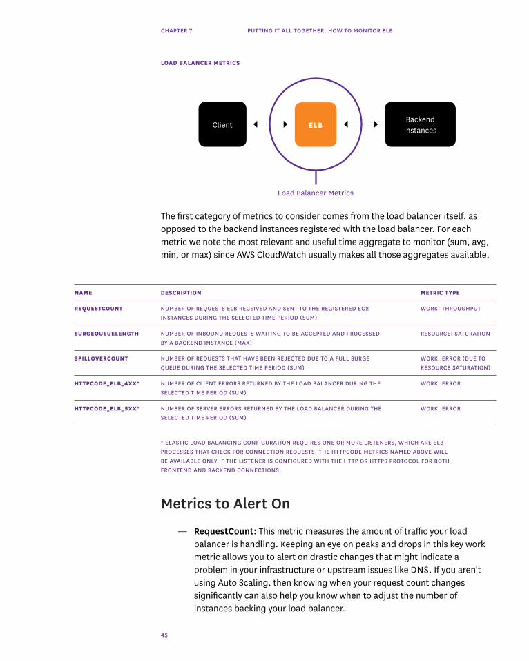
Chapter 7: Putting It All Together: How to Monitor ELB
Elastic Load Balancing (ELB) is an AWS service used to dispatch incoming web traffic from your applications across your Amazon EC2 backend instances, which may be in different availability zones.
ELB is widely used by web and mobile applications to help ensure a smooth user experience and provide increased fault tolerance, handling traffic peaks and failed EC2 instances without interruption.
ELB continuously checks for unhealthy EC2 instances. If any are detected, ELB immediately reroutes their traffic until they recover. If an entire availability zone goes offline, Elastic Load Balancing can even route traffic to instances in other availability zones. With Auto Scaling, AWS can ensure your infrastructure includes the right number of EC2 hosts to support your changing application load patterns.

CHAPTER 7 PUTTING IT ALL TOGETHER: HOW TO MONITOR ELB
44
This chapter is broken into two parts:
1. Key ELB performance metrics2. Monitoring ELB with Datadog
Key ELB Performance Metrics
As the first gateway between your users and your application, load balancers are a critical piece of any scalable infrastructure. If a load balancer is not working properly, your users can experience much slower application response times or even outright errors, which can lead to frustrated users or lost transactions. That’s why ELB performance needs to be continuously monitored and its key metrics well understood to ensure that the load balancer and the EC2 instances behind it remain healthy. There are two broad categories of ELB performance metrics to monitor:
— Load balancer metrics— Backend-related metrics
All of the metrics outlined below are available through CloudWatch, Amazon's monitoring service.
If you need a refresher on metric types (e.g., work metrics versus resource metrics), refer back to the taxonomy introduced in chapter 2.
CHAPTER 7 PUTTING IT ALL TOGETHER: HOW TO MONITOR ELB
45
LOAD BALANCER METRICS
The first category of metrics to consider comes from the load balancer itself, as opposed to the backend instances registered with the load balancer. For each metric we note the most relevant and useful time aggregate to monitor (sum, avg, min, or max) since AWS CloudWatch usually makes all those aggregates available.
NAME DESCRIPTION METRIC TYPE
REQUESTCOUNT NUMBER OF REQUESTS ELB RECEIVED AND SENT TO THE REGISTERED EC2 WORK: THROUGHPUT INSTANCES DURING THE SELECTED TIME PERIOD (SUM)
SURGEQUEUELENGTH NUMBER OF INBOUND REQUESTS WAITING TO BE ACCEPTED AND PROCESSED RESOURCE: SATURATION BY A BACKEND INSTANCE (MAX)
SPILLOVERCOUNT NUMBER OF REQUESTS THAT HAVE BEEN REJECTED DUE TO A FULL SURGE WORK: ERROR (DUE TO QUEUE DURING THE SELECTED TIME PERIOD (SUM) RESOURCE SATURATION)
HTTPCODE_ELB_4XX* NUMBER OF CLIENT ERRORS RETURNED BY THE LOAD BALANCER DURING THE WORK: ERROR SELECTED TIME PERIOD (SUM)
HTTPCODE_ELB_5XX* NUMBER OF SERVER ERRORS RETURNED BY THE LOAD BALANCER DURING THE WORK: ERROR SELECTED TIME PERIOD (SUM)
* ELASTIC LOAD BALANCING CONFIGURATION REQUIRES ONE OR MORE LISTENERS, WHICH ARE ELB PROCESSES THAT CHECK FOR CONNECTION REQUESTS. THE HTTPCODE METRICS NAMED ABOVE WILL BE AVAILABLE ONLY IF THE LISTENER IS CONFIGURED WITH THE HTTP OR HTTPS PROTOCOL FOR BOTH FRONTEND AND BACKEND CONNECTIONS.
ELBClientBackend Instances
Load Balancer Metrics
Metrics to Alert On
— RequestCount: This metric measures the amount of traffic your load balancer is handling. Keeping an eye on peaks and drops in this key work metric allows you to alert on drastic changes that might indicate a problem in your infrastructure or upstream issues like DNS. If you aren't using Auto Scaling, then knowing when your request count changes significantly can also help you know when to adjust the number of instances backing your load balancer.

CHAPTER 7 PUTTING IT ALL TOGETHER: HOW TO MONITOR ELB
46
— SurgeQueueLength: When your backend instances are fully loaded and can’t process any more requests, incoming requests are queued, which can increase latency, leading to slow user navigation or timeout errors. That’s why this metric should remain as low as possible, ideally at zero. The “max” statistic is the most relevant view of this metric so that peaks of queued requests are visible. Although this is technically a resource metric, it is worth monitoring closely because an overlong queue immediately cause work errors (see SpilloverCount below).
— SpilloverCount: When the SurgeQueueLength reaches the maximum of 1,024 queued requests, new requests are dropped, the user receives a 503 error, and the spillover count metric is incremented. In a healthy system, this metric should always be equal to zero.
— HTTPCode_ELB_5XX: This metric counts the number of requests that could not be properly handled. It can have different root causes:
— 502 (Bad Gateway): The backend instance returned a response, but the load balancer couldn’t parse it because the load balancer was not working properly or the response was malformed.
— 503 (Service Unavailable): The error comes from your backend instances or the load balancer, which may not have had enough capacity to handle the request. Make sure your instances are healthy and registered with your load balancer.
— 504 (Gateway Timeout): The response time exceeded ELB’s idle timeout. You can confirm the cause by checking if latency (see backend metric table below) is high and 5xx errors are returned by ELB. In that case, consider scaling up your backend or increasing the idle timeout to support slow operations such as file uploads. If your instances are closing connections with ELB, you should enable keep-alive with a timeout higher than the ELB idle timeout.

CHAPTER 7 PUTTING IT ALL TOGETHER: HOW TO MONITOR ELB
47
NOTE ABOUT HTTPCODE_ELB_4XX:
There is usually not much you can do about 4XX errors, since this metric basically measures the number of erroneous requests sent to ELB. If you want to investigate, you can check the ELB access logs to determine which code has been returned.
Backend-Related Metrics
CloudWatch also provides metrics about the status and performance of your backend instances, such as response latency or the results of ELB health checks. Health checks are the mechanism ELB uses to identify unhealthy instances so it can route requests elsewhere. You can use the default health checks or configure them in the AWS Console to use different protocols, ports, or healthy/unhealthy thresholds. The frequency of health checks is 30 seconds by default, but you can set this interval to anywhere between 5–300 seconds.
ELBClient Backend Instances
Backend Metrics
NAME DESCRIPTION METRIC TYPE
HEALTHYHOSTCOUNT* CURRENT NUMBER OF HEALTHY INSTANCES IN EACH AVAILABILITY ZONE RESOURCE: AVAILABILITY
UNHEALTHYHOSTCOUNT* CURRENT NUMBER OF INSTANCES FAILING HEALTH CHECKS IN EACH RESOURCE: AVAILABILITY AVAILABILITY ZONE
LATENCY ROUND-TRIP REQUEST-PROCESSING TIME BETWEEN LOAD BALANCER WORK: PERFORMANCE AND BACKEND
HTTPCODE_BACKEND_2XX NUMBER OF HTTP 2XX (SUCCESS) / 3XX (REDIRECTION) CODES RETURNED BY WORK: SUCCESS HTTPCODE_BACKEND_3XX THE REGISTERED BACKEND INSTANCES DURING THE SELECTED TIME PERIOD
HTTPCODE_BACKEND_4XX NUMBER OF HTTP 4XX (CLIENT ERROR) / 5XX (SERVER ERROR) CODES RETURNED WORK: ERROR HTTPCODE_BACKEND_5XX BY THE REGISTERED BACKEND INSTANCES DURING THE SELECTED TIME PERIOD
BACKENDCONNECTION NUMBER OF ATTEMPTED BUT FAILED CONNECTIONS BETWEEN THE LOAD RESOURCE: ERROR ERRORS BALANCER AND A SEEMINGLY HEALTHY BACKEND INSTANCE
* THESE COUNTS CAN DO NOT ALWAYS MATCH THE NUMBER OF INSTANCES IN YOUR INFRASTRUCTURE. WHEN CROSS-ZONE BALANCING IS ENABLED ON AN ELB (TO MAKE SURE TRAFFIC IS EVENLY SPREAD ACROSS THE DIFFERENT AVAILABILITY ZONES), ALL THE INSTANCES ATTACHED TO THIS LOAD BALANCER ARE CONSIDERED PART OF ALL AZS BY CLOUDWATCH. SO IF YOU HAVE TWO HEALTHY INSTANCES IN ONE AVAILABILITY ZONE AND THREE IN ANOTHER, CLOUDWATCH WILL DISPLAY FIVE HEALTHY HOSTS PER AZ.
CHAPTER 7 PUTTING IT ALL TOGETHER: HOW TO MONITOR ELB
48
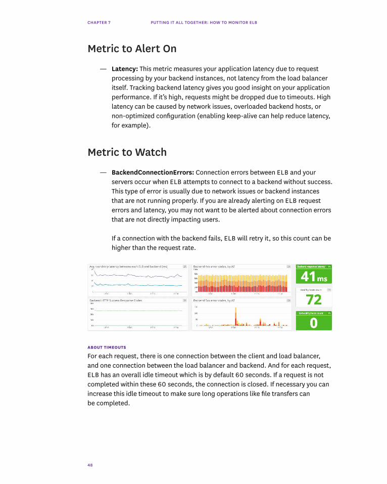
Metric to Alert On
— Latency: This metric measures your application latency due to request processing by your backend instances, not latency from the load balancer itself. Tracking backend latency gives you good insight on your application performance. If it’s high, requests might be dropped due to timeouts. High latency can be caused by network issues, overloaded backend hosts, or non-optimized configuration (enabling keep-alive can help reduce latency, for example).
Metric to Watch
— BackendConnectionErrors: Connection errors between ELB and your servers occur when ELB attempts to connect to a backend without success. This type of error is usually due to network issues or backend instances that are not running properly. If you are already alerting on ELB request errors and latency, you may not want to be alerted about connection errors that are not directly impacting users.
If a connection with the backend fails, ELB will retry it, so this count can be higher than the request rate.
ABOUT TIMEOUTS
For each request, there is one connection between the client and load balancer, and one connection between the load balancer and backend. And for each request, ELB has an overall idle timeout which is by default 60 seconds. If a request is not completed within these 60 seconds, the connection is closed. If necessary you can increase this idle timeout to make sure long operations like file transfers can be completed.

CHAPTER 7 PUTTING IT ALL TOGETHER: HOW TO MONITOR ELB
49
You might want to consider enabling keep-alive in the settings of your EC2 backend instances so your load balancer can reuse connections with your backend hosts, which decreases their resource utilization. Make sure the keep-alive time is set to be longer than the ELB’s idle timeout so the backend instances won’t close a connection before the load balancer does—otherwise ELB might incorrectly flag your backend host as unhealthy.
HOST METRICS FOR A FULL PICTURE
Backend instances’ health and load balancers’ performance are directly related. For example, high CPU utilization on your backend instances can lead to queued requests. These queues can eventually exceed their maximum length and start dropping requests. So keeping an eye on your backend hosts’ resources is a very good idea.
Furthermore, whereas the ELB metrics around HTTP codes returned by your backend provide a high-level view of your servers, monitoring your EC2 instances directly can give you more detailed insights into your servers.
For these reasons, a complete picture of ELB performance and health includes metrics from EC2 instances as well. We will detail in the next part of this chapter how correlating ELB metrics with EC2 metrics will help you gain better visibility into your infrastructure.
METRIC RECAP
In the tables above we have outlined the most important Amazon ELB performance metrics. If you are just getting started with Elastic Load Balancing, monitoring the metrics listed below will give you great insight into your load balancers, as well as your backend servers’ health and performance:
— Request count— Surge queue length and spillover count— ELB 5xx errors— Backend instance health status— Backend latency
You can check the value of these metrics using the AWS Management Console or the AWS command line interface. Full details on both approaches are available in this blog post: http://dtdg.co/collect-elb-metrics
For a more comprehensive view of your infrastructure, you can connect ELB to a dynamic, full-featured monitoring system. In the next section we will show you how you can monitor all your key ELB metrics and more using Datadog.
CHAPTER 7 PUTTING IT ALL TOGETHER: HOW TO MONITOR ELB
50
INTEGRATE DATADOG AND ELB
To start monitoring ELB metrics, you only need to configure our integration with AWS CloudWatch. Follow the steps outlined here to grant Datadog read-only access to your CloudWatch metrics: http://docs.datadoghq.com/integrations/aws/
Once these credentials are configured in AWS, follow the simple steps on the AWS integration tile in the Datadog app to start pulling ELB data.
KEEP AN EYE ON ALL KEY ELB METRICS
Once you have successfully integrated Datadog with ELB, you will see a pre-built dashboard called “AWS ELB” in your dashboard list in the Datadog app. The ELB dashboard displays all of the key metrics highlighted earlier in this chapter: requests per second, latency, surge queue length, spillover count, healthy and unhealthy hosts counts, HTTP code returned, and more.
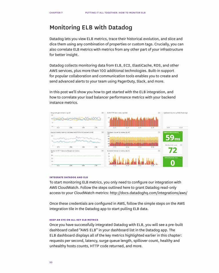
Monitoring ELB with Datadog
Datadog lets you view ELB metrics, trace their historical evolution, and slice and dice them using any combination of properties or custom tags. Crucially, you can also correlate ELB metrics with metrics from any other part of your infrastructure for better insight.
Datadog collects monitoring data from ELB, EC2, ElastiCache, RDS, and other AWS services, plus more than 100 additional technologies. Built-in support for popular collaboration and communication tools enables you to create and send advanced alerts to your team using PagerDuty, Slack, and more.
In this post we’ll show you how to get started with the ELB integration, and how to correlate your load balancer performance metrics with your backend instance metrics.

CHAPTER 7 PUTTING IT ALL TOGETHER: HOW TO MONITOR ELB
51
PRE-BUILT ELB
DASHBOARD ON DATADOG
CUSTOMIZE YOUR DASHBOARDS
Once you are capturing metrics from Elastic Load Balancing in Datadog, you can build on the template dashboard to add additional metrics from ELB or even from other parts of your infrastructure. To start customizing your dashboard, clone the template by clicking on the gear on the upper right of the dashboard.
CORRELATE ELB WITH EC2 METRICS
As explained in the first part of this chapter, CloudWatch’s ELB-related metrics inform you about your load balancers’ health and performance. ELB also provides metrics reflecting the health and performance of your backend instances. However, to fully monitor your infrastructure, you should consider collecting metrics from EC2 as well. By correlating ELB metrics with EC2 metrics, you will be able to quickly investigate whether, for example, the high number of requests being queued by your load balancers is due to resource saturation on your backend instances (memory usage, CPU utilization, etc.).
Thanks to our integration with CloudWatch and the permissions you set up, you can already access EC2 metrics on Datadog. The pre-built “AWS EC2” dashboard provides a good starting point for monitoring your EC2 resource metrics.

CHAPTER 7 PUTTING IT ALL TOGETHER: HOW TO MONITOR ELB
52
You can add graphs to your custom dashboards to view ELB and EC2 metrics side-by-side. You can then easily correlate trends in different metrics.
You can also add summary graphs such as host maps (detailed in chapter 6 of this book) to your ELB dashboards. For instance, this host map will show you at a glance if any of your backend instances have excessive CPU utilization:
TEMPLATE EC2
DASHBOARD ON DATADOG

CHAPTER 7 PUTTING IT ALL TOGETHER: HOW TO MONITOR ELB
53
NATIVE METRICS FOR MORE PRECISION
In addition to pulling in EC2 metrics via CloudWatch, Datadog also allows you to monitor your EC2 instances’ performance by pulling native metrics directly from the servers. The Datadog Agent is open-source software that collects and reports metrics from each of your hosts so you can view, monitor and correlate them in the Datadog app. The Agent allows you to collect backend instance metrics with finer granularity for a better view of their health and performance.
Once you have set up the Agent, correlating native metrics from your EC2 instances with ELB’s CloudWatch metrics will give you a full and detailed picture of your infrastructure.
In addition to system-level metrics on CPU, memory, and so on, the Agent also collects application metrics so that you can correlate application performance with resource metrics from your compute layer. The Agent integrates seamlessly with technologies such as MySQL, NGINX, Redis, and many more. It can also collect custom metrics from internal applications using DogStatsD, a tagging-enabled extension of the StatsD metric-collection protocol.
Agent installation instructions are available in the Datadog app for a variety of operating systems, as well as for platforms such as Chef, Puppet, Docker, and Kubernetes.
THE ABCS OF ELB MONITORING
In this chapter we’ve walked you through the key metrics you should monitor to keep tabs on ELB. And we've shown you how integrating Elastic Load Balancing with Datadog enables you to build a more comprehensive view of your infrastructure.
Monitoring with Datadog gives you critical visibility into what’s happening with your load balancers, backing instances, and applications. You can easily create automated alerts on any metric, with triggers tailored precisely to your infrastructure and usage patterns.
If you don’t yet have a Datadog account, you can sign up for a free trial to start monitoring all your hosts, applications, and services at www.datadog.com

CHAPTER 8 PUTTING IT ALL TOGETHER: MONITORING DOCKER
54
Chapter 8: Putting It All Together: Monitoring Docker
You have probably heard of Docker—it is a young container technology with a ton of momentum. But if you haven’t, you can think of containers as easily-configured, lightweight VMs that start up fast, often in under one second. Containers are ideal for microservice architectures and for environments that scale rapidly or release often.
In this chapter we'll explore why Docker is emblematic of dynamic infrastructure, and why it a demands modern monitoring approach. This chapter is broken into three parts:
1. The Docker monitoring problem2. Key Docker resource metrics3. How iHeartRadio monitors Docker

CHAPTER 8 PUTTING IT ALL TOGETHER: MONITORING DOCKER
55
The Docker monitoring problem
Containers address several important operational problems; that is why Docker is taking the infrastructure world by storm.
But there is a problem: containers come and go so frequently, and change so rapidly, that they can be an order of magnitude more difficult to monitor and understand than physical or virtual hosts.
WHAT IS A CONTAINER?
A container is a lightweight virtual runtime. Its primary purpose is to provide software isolation. There are three environments commonly used to provide software isolation:
1. physical machine (heavyweight)2. virtual machine (medium-weight)3. container (lightweight)
A significant architectural shift toward containers is underway, and as with any architectural shift, that means new operational challenges. The well-understood challenges include orchestration, networking, and configuration—in fact there are many active projects addressing these issues.
The significant operational challenge of monitoring containers is much less well-understood.
DOCKER MONITORING IS CRUCIAL
Running software in production without monitoring is like driving without visibility: you have no idea if you're about to crash, or how to stay on the road.

CHAPTER 8 PUTTING IT ALL TOGETHER: MONITORING DOCKER
56
However, as we describe later in this chapter, containers exist in a twilight zone somewhere between hosts and applications where neither application performance monitoring nor traditional infrastructure monitoring are effective. This creates a blind spot in your monitoring, which is a big problem for containers and for the companies that adopt them.
The need for monitoring is well understood, so traditional monitoring solutions cover the traditional stack:
— application performance monitoring instruments your custom code to identify and pinpoint bottlenecks or errors
— infrastructure monitoring collects metrics about the host, such as CPU load and available memory

CHAPTER 8 PUTTING IT ALL TOGETHER: MONITORING DOCKER
57
A QUICK OVERVIEW OF CONTAINERS
In order to understand why containers are a big problem for traditional monitoring tools, let's go deeper on what a container is.
In short, a container provides a way to run software in isolation. It is neither a process nor a host—it exists somewhere on the continuum between.
Containers provide some (relative) security benefits with low overhead. But there are two far more important reasons that containers have taken off: they provide a pattern for scale, and an escape from dependency hell.
A PATTERN FOR SCALE
Using a container technology like Docker, it is easy to deploy new containers programmatically using projects/services such as Kubernetes or ECS. If you also design your systems to have a microservice architecture so that different pieces of your system may be swapped out or scaled up without affecting the rest, you've got a great pattern for scale. The system can be elastic, growing and shrinking automatically with load, and releases may be rolled out without downtime.
ESCAPE FROM DEPENDENCY HELL

CHAPTER 8 PUTTING IT ALL TOGETHER: MONITORING DOCKER
58
HOST PROLIFERATION
The second (and possibly more important) benefit of containers is that they provide engineers with a ladder leading out of dependency hell. Once upon a time, libraries were compiled directly into executables, which was fine until sizable libraries began eating up scarce RAM. More recently, shared libraries became the norm, but that created new dependency problems when the necessary library was not available at runtime, or when two processes required different versions of the same library.
Today, containers provide software engineers and ops engineers the best escape from dependency hell by packaging up an entire mini-host in a lightweight, isolated, virtual runtime that is unaffected by other software running on the same host—all with a manifest that can be checked in to git and versioned just like code.
CONTAINER CHALLENGE: MASSIVE OPERATIONAL COMPLEXITY
We know that a container is basically a mini-host. Best practices for host ops are well-established, so you might suppose that container ops are basically the same—but they are not.

CHAPTER 8 PUTTING IT ALL TOGETHER: MONITORING DOCKER
59
The diagram above shows how a standard application stack has evolved over the past 15 years. (‟Off-the-shelf” could represent your J2EE runtime or your database.)
— Left: 15 years ago
— Middle: about 7 years ago, virtualization with a service like EC2 gained wide adoption
— Right: today a containerized stack running on virtualized hardware is gaining popularity
From our vantage point at Datadog, we're seeing that the median Docker-adopting company runs five containers simultaneously on each host. Given that containers tend to be shorter-lived than traditional hosts, the median VM runs 14 containers in its life. (More Docker facts at dtdg.co/dckr-adopt)
METRICS EXPLOSION
The use of containers multiplies the number of metrics per host severalfold. No longer are you monitoring just the operating system and an off-the-shelf component or two. With containers, you're monitoring the operating system, each of the containers on the host, and each of the components running in those containers. It's like replacing each moving piece in your infrastructure with five or six moving pieces, each reporting its own metrics.
What is more, the lifetime of a host is much longer than that of a container— 6x longer on average. Rather than having a mix of short-lived and long-lived EC2 instances with median uptime measured in days, weeks or months, instead your median uptime for containers will be measured in minutes or hours.
To make matters more complex, new versions of containers are created and ready to deploy as fast as you can git commit. You'll find yourself rotating your container fleet on a daily basis.
To manage this, you'll likely want to use Kubernetes or AWS ECS to move from manual, imperative provisioning to autonomic, declarative provisioning. This allows you to say, for example, ‟I need one container of type X per instance per zone, at all times,” and your scheduler will make sure this is always the case. This kind of automation is necessary for modern container architectures, but opens the door to fresh new kinds of chaos.
In summary, with containers you'll be doing a lot more, a lot faster.

CHAPTER 8 PUTTING IT ALL TOGETHER: MONITORING DOCKER
60
GOAL: SIMPLIFY MONITORING
HOST-CENTRIC MONITORING
If your monitoring is centered around hosts, your world looks like Ptolemaic astronomy: complicated. It's pretty hard to account for the movement of planets this way. Trying to mesh containers with a host-centric monitoring tool, you'll be left with two choices:
1. Treat containers as hosts that come and go every few minutes. In this case your life is miserable because the monitoring system always thinks half of your infrastructure is on fire.
2. Don't track containers at all. You see what happens in the operating system and the app, but everything in the middle is a gap, as discussed earlier.
If you're planning to monitor containers the same way as you've monitored hosts before, you should expect a very painful ride.

CHAPTER 8 PUTTING IT ALL TOGETHER: MONITORING DOCKER
61
This brings us back us back to our modern approach to monitoring, an approach that does not treat everything as a host.
The picture above represents Copernican astronomy. Compared with putting the earth at the center of the universe, Copernicus's radical suggestion is strikingly clear and simple.
If you forget about hosts and recenter your monitoring around layers and tags, the complexity falls away and your operations will be sane and straightforward.
LAYERS
NO GAPS
To avoid driving blind, you want your entire stack to be monitored from the top to the bottom, without gaps. If you're building on EC2, you probably use CloudWatch to monitor the VMs, infrastructure monitoring in the middle, and application performance monitoring at the top to measure throughput and help pinpoint problem areas in your code.

CHAPTER 8 PUTTING IT ALL TOGETHER: MONITORING DOCKER
62
For monitoring layers to work, the key is that you must be able to see what's happening across the layers simultaneously, and determine how problems in one part of the stack ripple to the rest of the stack. For example, if you see slow response times in your application, but can't tell that it is being caused by a spike in IO at the VM layer, then your monitoring approach isn't helping you solve your problem.
TAGS
ONE TIMELINE
To effectively monitor containers, you also need to tag (label) your containers, as described in depth in chapter 2. The good news is that you probably already use tags through AWS or server automation tools.
CHAPTER 8 PUTTING IT ALL TOGETHER: MONITORING DOCKER
63
By centering your monitoring universe on tags, you can reorient from being imperative to declarative, which is analogous to how auto-scaling groups or Docker orchestration works. Rather than instructing your system to monitor a particular host or container, you can instruct your system to monitor everything that shares a common property (tag)—for example, all containers located in the same availability zone.
Tags allow you to monitor your containers with powerful queries such as this (tags are bold):
Monitor all Docker containers running image web in region us-west-2 across all availability zones that use more than 1.5x the average memory on c3.xlarge
IN A NUTSHELL
Because containers provide both an escape from software dependency hell and scaffolding for scalable software architectures, they are already becoming increasingly common in production.
However, containers are typically used in large numbers and have a very short half-life, so they can easily increase operational complexity by an order of magnitude. Because of this, today many stacks that use containers do not monitor the containers themselves. This creates a huge blind spot and leaves the systems vulnerable to downtime.
Therefore, for effective Docker usage:
1. Monitor all layers of your stack together, so that you can see what is happening everywhere, at the same time, with no gaps
2. Tag your containers so that you can monitor them as queryable sets rather than as individuals
In the next part of this chapter, we'll explore the key metrics that are available via Docker monitoring.
Key Docker resource metrics
As you may recall, Docker can rightly be classified as a type of mini-host. Just like a regular host, it runs work on behalf of resident software, and that work uses CPU, memory, I/O, and network resources. However, Docker containers run inside cgroups which don't report the exact same metrics you might expect from a host.

CHAPTER 8 PUTTING IT ALL TOGETHER: MONITORING DOCKER
64
MEMORY
Just as you would expect, Docker can report on the amount of memory available to it, and the amount of memory it is using.
STANDARD METRICS
Just like a traditional host, Docker containers report system CPU and user CPU usage. It probably goes without saying that if your container is performing slowly, CPU is one of the first resources you'll want to look at.
One key difference with containers: unlike a traditional host, Docker does not report nice, idle, iowait, or irq CPU time.
THROTTLING
If Docker has plenty of CPU capacity, but you still suspect that it is compute-bound, you may want to check a container-specific metric: CPU throttling. If you do not specify any scheduling priority, then available CPU time will be split evenly between running containers. If some containers don't need all of their allotted CPU time, then it will be made proportionally available to other containers.
You can optionally control the share of CPU time each container should have relative to others using the same CPU(s) by specifying CPU shares ( https://docs.docker.com/reference/run/#cpu-share-constraint ).
Going one step further, you can actively throttle a container. In some cases, a container's default or declared number of CPU shares would entitle it to more CPU time than you want it to have. If, in those cases, the container attempts to actually use that CPU time, a CPU quota constraint ( https://docs.docker.com/reference/run/#cpu-quota-constraint ) will tell Docker when to throttle the container's CPU usage. Note that the CPU quota and CPU period are both expressed in microseconds (not milliseconds nor nanoseconds). So a container with a 100,000 microsecond period and a 50,000 microsecond quota would be throttled if it attempted to use more than half of the CPU time during its 0.1s periods.
Docker can tell you the number of times throttling was enforced for each container, as well as the total time that each container was throttled.
NAME DESCRIPTION METRIC TYPE
USER CPU PERCENT OF TIME THAT CPU IS UNDER DIRECT CONTROL OF PROCESSES RESOURCE: UTILIZATION
SYSTEM CPU PERCENT OF TIME THAT CPU IS EXECUTING SYSTEM CALLS ON BEHALF OF PROCESSES RESOURCE: UTILIZATION
THROTTLING NUMBER OF CPU THROTTLING ENFORCEMENTS FOR A CONTAINER RESOURCE: SATURATION (COUNT)
THROTTLING (TIME) TOTAL TIME THAT A CONTAINER'S CPU USAGE WAS THROTTLED RESOURCE: SATURATION
CPU

CHAPTER 8 PUTTING IT ALL TOGETHER: MONITORING DOCKER
65
Used memory can be decomposed into:
— RSS (resident set size) is data that belongs to a process: stacks, heaps, etc. RSS itself can be further decomposed into active and inactive memory (active_anon and inactive_anon). Inactive RSS memory is swapped to disk when necessary.
— cache memory reflects data stored on disk that is currently cached in memory. Cache can be further decomposed into active and inactive memory (active_file, inactive_file). Inactive memory may be reclaimed first when the system needs memory.
Docker also reports on the amount of swap currently in use. Additional metrics that may be valuable in investigating performance or stability issues include page faults, which can represent either segmentation faults or fetching data from disk instead of memory (pgfault and pgmajfault, respectively).
As with a traditional host, when you have performance problems, some of the first metrics you'll want to look at include memory availability and swap usage.
I/O
For each block device, Docker reports the following two metrics, decomposed into four counters: by reads versus writes, and by synchronous versus asynchronous I/O.
Block I/O is shared, so it is a good idea to track the host's queue and service times in addition to the container-specific I/O metrics called out above. If queue lengths or service times are increasing on a block device that your container uses, your container's I/O will be affected.
NAME DESCRIPTION METRIC TYPE
MEMORY MEMORY USAGE OF A CONTAINER RESOURCE: UTILIZATION
RSS NON-CACHE MEMORY FOR A PROCESS (STACKS, HEAPS, ETC.) RESOURCE: UTILIZATION
CACHE MEMORY DATA FROM DISK CACHED IN MEMORY RESOURCE: UTILIZATION
SWAP AMOUNT OF SWAP SPACE IN USE RESOURCE: SATURATION
NAME DESCRIPTION METRIC TYPE
I/O SERVICED COUNT OF I/O OPERATIONS PERFORMED, REGARDLESS OF SIZE RESOURCE: UTILIZATION
I/O SERVICE BYTES BYTES READ OR WRITTEN BY THE CGROUP RESOURCE: UTILIZATION
CHAPTER 8 PUTTING IT ALL TOGETHER: MONITORING DOCKER
66
NETWORK
Just like an ordinary host, Docker can report several different network metrics, each of them divided into separate metrics for inbound and outbound network traffic:
METRIC RECAP
Docker can report all the basic resource metrics you'd expect from a traditional host: CPU, memory, I/O, and network. However, some specific metrics you might expect (such as nice, idle, iowait, or irq CPU time) are not available, and others metrics are unique to containers, such as CPU throttling.
In the next section we'll go deep with the engineering team at an enterprise media company to find out how they make use of these metrics to monitor Docker at scale.
How iHeartRadio monitors Docker
iHeartRadio, iHeartMedia's streaming music and digital radio platform, provides personalized artist stations, thousands of live broadcast radio stations from across the country, and on-demand podcasts available anywhere in the U.S. With more than 75 million registered users and 700 million downloads, iHeartRadio is available on dozens of devices and platforms: web, mobile, tablets, automotive partners, smart TVs, gaming devices, and more.
WHY IHEARTRADIO USES DOCKER
Scaling infrastructure to reliably serve iHeartRadio's giant user base would be a challenge on its own. But there is also a platform challenge: they support 10+ mobile platforms, every major web browser, in-home connected products, in-dash auto devices, and a handful of wearables, totaling more than 60 platforms. They stream thousands of live radio stations, and integrate with many CMSes and partners.
iHeartRadio determined that a single, monolithic application to support all their users, and all their streams of data, would be untenable. But without a single platform, how would they build a stable, secure service that avoided redundancy?
They needed a simple way for small groups of engineers to build very specific
NAME DESCRIPTION METRIC TYPE
BYTES NETWORK TRAFFIC VOLUME (SEND/RECEIVE) RESOURCE: UTILIZATION
PACKETS NETWORK PACKET COUNT (SEND/RECEIVE) RESOURCE: UTILIZATION
ERRORS (RECEIVE) PACKETS RECEIVED WITH ERRORS RESOURCE: ERROR
ERRORS (TRANSMIT) ERRORS IN PACKET TRANSMISSION RESOURCE: ERROR
DROPPED PACKETS DROPPED (SEND/RECEIVE) RESOURCE: ERROR

CHAPTER 8 PUTTING IT ALL TOGETHER: MONITORING DOCKER
67
applications without rebuilding standard infrastructure services: load balancer, HTTP server, logging, database, monitoring, etc. So they put standard infrastructural services such as HAProxy, MongoDB, and Elasticsearch on traditional hosts, and made them available as a service to internal applications. They also needed each application to be siloed: there should be no dependency conflicts, and each application should have guaranteed minimum resources (CPU, memory, I/O, network) available to it. So when Docker emerged as a platform that could control dependencies and resource usage, they quickly got on board.
iHeartRadio has been quite happy with Docker—for them it ‟works as advertised.”
One key shortcoming
There was just one thing about Docker that made iHeartRadio unhappy: they had no visibility into container-level resource consumption. They were using traditional monitoring tools, which could only see host-level resource usage. Since iHeartRadio runs dozens of containers per host, this visibility was entirely insufficient.
Compounding this problem, iHeartRadio, like many companies, treats containers as cattle rather than pets—they care more about the health of a service, which is powered by redundant, often geographically distributed containers, and less about the status of the individual containers. They needed a way to aggregate their metrics using tags, as outlined in chapter 2, which would allow them to monitor service-level metrics by aggregating by Docker image.
Monitoring Docker performance with Datadog
After deep investigation of several different monitoring platforms, iHeartRadio decided to use Datadog for infrastructure monitoring. Out of the box, Datadog collects CPU, memory, I/O, and network metrics from each Docker container, and can aggregate metrics by any tag or tags. That meant that immediately the company had access to high-resolution resource metrics at the container level, at the service level, or at any other tag-defined level.
In most well-designed microservice architectures, services communicate directly with one another or via a queue—and this direct communication can be hard to monitor. There is no central load balancer to meter, and standard host-level network metrics aggregate the traffic measurements from all the services on the host. This aggregation can mask problems and hamper investigation.
One of the reasons iHeartRadio uses Datadog is that Datadog breaks down network

CHAPTER 8 PUTTING IT ALL TOGETHER: MONITORING DOCKER
68
ALERTING AND INVESTIGATION
For iHeartRadio, rapid changes in internal network traffic are the most important canary in the coalmine—this is what they use to trigger alerts that notify engineers without inducing alert fatigue. This is why visibility into both aggregated and disaggregated service-level traffic is so important, as described above. Further, Datadog can alert on rapid changes in network traffic, even before measurements cross unsafe thresholds.
The rest of the resource metrics that iHeartRadio collects from Docker are principally used to aid investigation of issues that arise (see chapter 4).
HOW TO MONITOR DOCKER PERFORMANCE LIKE IHEARTRADIO
To follow along with the next part of this chapter, you’ll need a Datadog account. If you don't have one, you can get a free trial account at www.datadog.com
We'll cover a few different options for setting up Docker monitoring with the Datadog Agent, including running the Agent in a container, running the container on the host, and using service discovery to continuously monitor your containerized services wherever they run.
A DATADOG DASHBOARD
THAT IHEARTRADIO USES
TO MONITOR DOCKER
PERFORMANCE
traffic by image and container so their engineers can immediately see exactly which service is overloaded or causing other services to fail by sending too much traffic—and they can aggregate these service metrics across any number of hosts.
Additionally, iHeartRadio uses Datadog to monitor its non-Docker services such as HAProxy, MongoDB, and Elasticsearch, which allows their engineers to correlate Docker performance metrics with health and performance throughout their infrastructure.

CHAPTER 8 PUTTING IT ALL TOGETHER: MONITORING DOCKER
69
INSTALL THE AGENT
Docker reports metrics to Datadog via an agent that runs in a container on each Docker host.
The Agent typically runs inside a container. To download and start the Agent container, execute the docker run command listed here: http://dtdg.co/docker-run
Optionally you can include -e TAGS="simple-tag-0,tag-key-1:tag-value-1" to add tags to the host.
That's all you need to do to start collecting resource metrics from your containers and their hosts. You'll immediately have a pre-built Docker dashboard like the one below, which covers the key metrics discussed at the start of this chapter. As mentioned above, iHeartRadio sets its alerts on docker.net.bytes_rcvd and docker.net.bytes_sent, aggregated by image but visible per-container. These important metrics will be automatically collected and provided.
ENABLE SPECIFIC INTEGRATIONS
If you also need to collect metrics from technologies running on the same host (NGINX, MySQL, etc.), copy the appropriate config file from the Agent to your host, edit it as appropriate, and mount it in the container as described here: dtdg.co/docker-agent#enabling-integrations

CHAPTER 8 PUTTING IT ALL TOGETHER: MONITORING DOCKER
70
RUNNING THE AGENT DIRECTLY ON YOUR HOSTS
Most companies choose to run the Datadog Agent inside a container—it’s easier to orchestrate dynamic infrastructure if everything is containerized. But there are a few limitations to running the Agent inside a container:
1. It will be able to list processes in other containers, but not on the host itself.
2. It will not report the host's network metrics, though this may be approximated by aggregating the network activity in each of the containers.
3. It will not be able to collect metrics from technologies that do not report metrics via API. If it is crucial to collect metrics from these technologies, then you must run them alongside the Agent directly on the host (not in containers).
If you chose to install the Agent directly on your host without a container, it can still collect metrics from inside Docker containers on the same host. Follow the installation instructions for your OS provided in the Datadog app, and turn on the Docker integration.
If you're running those technologies inside other Docker containers, you'll need to connect those containers to the Datadog Agent container. To do this in versions of Docker prior to 1.9, you'd use container links, but from 1.9 forward container networks are strongly recommended. Both methods will create entries in /etc/hosts inside each container so that they can communicate with other containers on the same host by name.
VERIFY THE CONFIGURATION SETTINGS
Confirm that everything is working properly, and that the integrations are collecting metrics:
docker exec dd-agent service datadog-agent info
ADDITIONAL OPTIONS
If you want to bake your configurations and integrations into your Datadog Agent image, you can do that, too: dtdg.co/docker-agent#build-an-image
If you want to access the container's logs from the host, or if you want to submit metrics directly to DogStatsD without the Agent, instructions are here: dtdg.co/docker-agent#logs

CHAPTER 8 PUTTING IT ALL TOGETHER: MONITORING DOCKER
71
SERVICE DISCOVERY
If you use a platform like Kubernetes or Amazon EC2 Container Service (ECS) to orchestrate your containers, you may not even know which hosts your containers are running on. This shifting foundation makes monitoring your services even more complex.
With Datadog's service discovery feature, your monitoring will be automatically orchestrated just like your containers. Service discovery allows you to continuously monitor your Dockerized infrastructure without interruption even as it expands, contracts, and shifts across hosts.
HOW SERVICE DISCOVERY WORKS
With service discovery enabled, Datadog continuously listens to Docker events. Whenever a container is created or started, the Agent identifies which service is running in the new container, pulls up a monitoring configuration, and starts collecting and reporting metrics. If no configuration is defined for the service, the Agent will attempt auto-configuration for several services with relatively simple configurations, including Apache, Memcached and Redis.
SETTING IT UP
To use service discovery, you first need to define the configuration templates for the images you want to monitor in your configuration store (etcd or Consul). Here is the basic structure of a configuration template:
/datadog/check_configs/docker_image_0/- check_names: ["check_name_0"]- init_configs: [{init_config}]- instances: [{instance_config}]docker_image_1/- check_names: ["check_name_1"]- init_configs: [{init_config}]- instances: [{instance_config}]...
You also need to configure the Datadog Agents to enable service discovery using the configuration store as a backend. To do so, edit the service discovery section of your datadog.conf file to reflect your setup. For instance:
service_discovery_backend: dockersd_config_backend: etcdsd_backend_host: 127.0.0.1

CHAPTER 8 PUTTING IT ALL TOGETHER: MONITORING DOCKER
72
sd_backend_port: 4001
You can also pass these configuration options to your containerized Agents as docker run parameters:
docker run -d --name dd-agent \ -v /var/run/docker.sock:/var/run/docker.sock \ -v /proc/:/host/proc/:ro -v /sys/fs/cgroup/:/host/sys/fs/cgroup:ro \ -e API_KEY=[YOUR_API_KEY] -e SD_CONFIG_BACKEND=etcd \ -e SD_BACKEND=docker -e SD_BACKEND_HOST=127.0.0.1 \ -e SD_BACKEND_PORT=4001 \ datadog/docker-dd-agent:kubernetes
GOING DEEPER ON SERVICE DISCOVERY
For a full guide to using service discovery, including an example of how to set up dynamic NGINX monitoring with Docker, go to: docs.datadoghq.com/guides/servicediscovery/
CONCLUSION
iHeartRadio uses Docker to isolate dependencies and resource usage of applications from each other, and it's worked very well for them as they’ve continued to scale up and expand the number of platforms they support. But Docker performance can be quite hard to monitor as discussed at the start of this chapter, so they use Datadog to monitor all of their infrastructure, whether containerized or not. Datadog gives them the ability to aggregate and disaggregate metrics from across hosts and containers to understand the health and performance of all their services, wherever they are running.
ACKNOWLEDGMENTS
Thanks to iHeartRadio and especially to Trey Long, Director of Engineering, for assistance with the blog post that this chapter was based on.

CHAPTER 9 DATADOG IS DYNAMIC, CLOUD-SCALE MONITORING
73
Monitoring ModernInfrastructure
“Measure what is measurable, and make measurable what is not so.”—Galileo
Chapter 9: Datadog Is Dynamic, Cloud-Scale Monitoring
In the preceding chapters we demonstrated how Datadog can help you track the health and performance of Amazon Elastic Load Balancing, Docker, and all their associated infrastructure. Whatever technologies you use, Datadog enables you to view and analyze metrics and events from across your infrastructure.
Datadog was built to meet the unique needs of modern, cloud-scale infrastructure:
— Comprehensive monitoring. Out of the box, Datadog collects monitoring data from more than 150 popular technologies. The Datadog Agent also includes a lightweight metrics aggregation server that can collect custom metrics from virtually any application.
— Flexible aggregation. Datadog’s native support for tagging allows you to aggregate metrics and events on the fly to generate the views that matter most. Tagging allows you to monitor services rather than hosts so you can focus on the performance metrics that directly impact your users and your business.
CHAPTER 9 DATADOG IS DYNAMIC, CLOUD-SCALE MONITORING
74
— Effortless scaling. Datadog scales automatically with your infrastructure, whether you have tens, hundreds, or thousands of hosts. Datadog auto-enrolls new hosts and containers as they come online, and with service discovery you can continuously monitor your containerized services wherever they run.
— Sophisticated alerting. Virtually any type of monitoring data can be used to trigger a Datadog alert. Datadog can alert on fixed or dynamic metric thresholds, outliers, events, status checks, and more.
— Collaboration baked in. Datadog helps teams stay on the same page with easily sharable dashboards, graphs, and annotated snapshots. Seamless integrations with industry-leading collaboration tools such as PagerDuty, Slack, and HipChat make conversations around monitoring data as frictionless as possible.
If you are ready to apply the monitoring and visualization principles you’ve learned in this book, you can sign up for a full-featured Datadog trial at www.datadog.com
Above all, we hope that you find the information in this book to be instructive as you set out to implement monitoring for your infrastructure, or to improve on existing practices. We have found the frameworks outlined in these chapters to be extremely valuable in monitoring and scaling our own dynamic infrastructure, and we hope that you find them equally useful. Please get in touch with us by email ([email protected]) or on Twitter (@datadoghq) if you have questions or comments about this book or about Datadog.
Happy monitoring!

datadog.com