keeping up appearances: colors and their looks · 2018. 10. 16. · 2018. 10. 16. · keeping up...
TRANSCRIPT
UNIVERSITÀ DELI STUDI DI MILANO
Doctoral School in Philosophy and Human Sciences
Department of Philosophy
Keeping up Appearances: Colors and their Looks
Kristina Pucko
Supervisor:
Clotilde Calabi
2018

ii

iii
They'll sell you thousands of greens. Veronese green and emerald green and cadmium green
and any sort of green you like; but that particular green, never.
― Pablo Picasso
It’s not easy being green.
― Kermit the Frog

iv
v
Acknowledgements
Many people have helped me with this work. My primary debt is to my supervisor, Clotilde
Calabi, who gave me guidance, support and allowed me freedom to develop my ideas. I am
especially grateful for her immense patience with my working habits.
I would like to thank Mohan Matthen for helpful comments and suggestions during my research
visit at the University of Toronto. Special shout-out also to my friends from Toronto.
I am very grateful to my friends and colleagues from the philosophy department at the
University of Milan for the supportive, fun and intellectually stimulating environment. Special
thanks go to all of my friends from Milan who contributed greatly to my ‘Italianisation’ and
made these years unforgettable.
I owe a debt of gratitude to professors of my undergraduate program at the University of
Maribor for introducing me to philosophy and sending me out into the world. Special thanks go
to Nenad Miščević and Janez Bregant.
Finally, I am most grateful to my closest friends and family for supporting me in my studies
and other sorts of adventures in these years.

vi
vii
Contents
Introduction .............................................................................................................................. 1
1 Color theories ......................................................................................................................... 5
1.1 Color Realism ................................................................................................................................. 7
1.2 Color irrealism ............................................................................................................................. 11
1.3 Color Relationalism ..................................................................................................................... 15
2 The Complexity of Constant and Variable Colors ........................................................... 20
2.1 Color constancy: invariantist and variantist approaches ............................................................ 21
2.2 The discriminatory theories ........................................................................................................ 27
2.3 On the complexity of viewing scenarios ...................................................................................... 30
2.4 Represented surfaces, transparencies and illumination ............................................................. 36
2.5 Towards the complex discriminatory view.................................................................................. 41
3 The Tricky Colors ............................................................................................................... 47
3.1 The trickiness of color experiences ............................................................................................. 47
3.2 Experiences of reddish-greens and yellowish-blues ................................................................... 47
3.3 The evidence of reddish-green experiences ............................................................................... 54
3.4 The implications of the evidence ................................................................................................ 57
4 Color Appearances .............................................................................................................. 70
4.1. Lessons from previous chapters ................................................................................................. 70
4.2 Detection and Discrimination ...................................................................................................... 72
4.3 The edibles, memory and object recognition ............................................................................. 74
4.4 Appearance-reality distinction .................................................................................................... 76
4.5 Effortlessly chic: Appearances through rose-colored glasses ..................................................... 80
Literature ................................................................................................................................ 84
viii
Table of Figures
Figure 1: The Benham disk. ................................................................................................................... 3
Figure 2: Simultaneous contrast effect 1 .............................................................................................. 16
Figure 3: Simultaneous contrast effect 2 .............................................................................................. 31
Figure 4: An example of an experimental chamber by Kraft and Brainard ......................................... 33
Figure 5: An example of the adaptation case. ...................................................................................... 39
Figure 6: The physical dimensions of achromatic experience. ............................................................ 40
Figure 7: The Natural Color System hue circle .................................................................................... 48
Figure 8: Escher’s Ascending and Descending .................................................................................... 50
Figure 9: The Hurvich-Jameson Network ............................................................................................ 52
Figure 10: Hue cancellation curves ...................................................................................................... 53
Figure 11: Joined green and red bars .................................................................................................... 54
Figure 12: An example of chromatic grid and neon spreading effect .................................................. 56
Figure 13: CIE 1931 Color space ......................................................................................................... 78
Figure 14: The Munsell color system ................................................................................................... 79
1
Introduction
Color is one of the most obvious yet tricky features of our experience of the world. On the one
hand, colors seem to be stable and reliable features of the objects around us, and on the other,
when we try to pinpoint their locations and describe them in scientific manner, they lose their
vividness. This seemingly double-nature of color stands as a theoretical divide among different
views on color. If colors are nothing but actual properties of the objects as we see them, then
one might want to commit to a form of color realism. Contrary, if colors are nothing but products
of neural activity of the viewer, one could commit to color irrealism. Far from simple as this,
the present discussion stretches among complex interpretations on the nature of color and their
appearances.
There are two intuitive ways to address the problem of color. One is to look at perceptual
variation of experienced color and the other is to look at the relation between color appearances
and their supposed physical counterparts. Perceptual variations generally come in three
dimensions: inter-species variation, interpersonal variation, and intrapersonal variation. The
inter-species variation concerns the differences between different kinds of visual systems
among a variety of organisms. While normal human visual systems are trichromatic with two
types of photoreceptors (rods and cons), pigeons and many other birds are tetrachromatic. Even
more striking is the mantis shrimp with sixteen types of photoreceptors. There is no principled
way to determine which organism perceives the world in its true colors1. The interpersonal
variation concerns the differences in experienced color among organisms with the same visual
system. The same kind of visual systems diverge in the number of photoreceptors and their peak
1 See Cohen (2009).
2
sensitivities, plus there are “anomalous” cases that do not count as deficiencies such as color
blindness. So, also for this kind of variation there is no principled way to select what counts as
a standard perceiver (concerning human color vision) beyond some statistical average.2 The
third type of variation concerns the variation in experienced color of a single stimulus within a
subject. This could be change in perspective, background, filter (e.g. tinted sunglasses) or a
consequence of aging.
The second way to address the problem of color is strictly connected to the first one in the
following way. The complexity and entanglement of the variations I have described, makes us
wonder whether the commonsensical intuition that object are bearers of color is correct, which
brings us to the problem of color appearances. How is the way in which colors appear to us
related to properties of the physical world? Given the delicate relationship between these
properties on the one hand and color experiences on the other, it comes natural to wonder what
is the status of color appearances is and what is the role of our perceptual system. This will be
the central worry of the thesis.
Color appearances are commonly featured when philosophers of perception try to secure the
place for possible perceptual errors and aim at finding a way for distinguishing between
veridical and erroneous case of perception (this typically happens in epistemological
discussions on skepticism). Concerning color, one way is to make a differentiation between
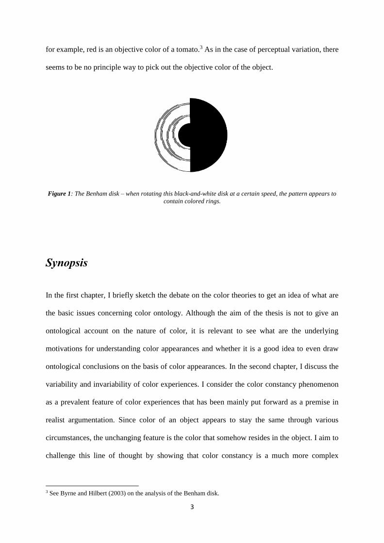
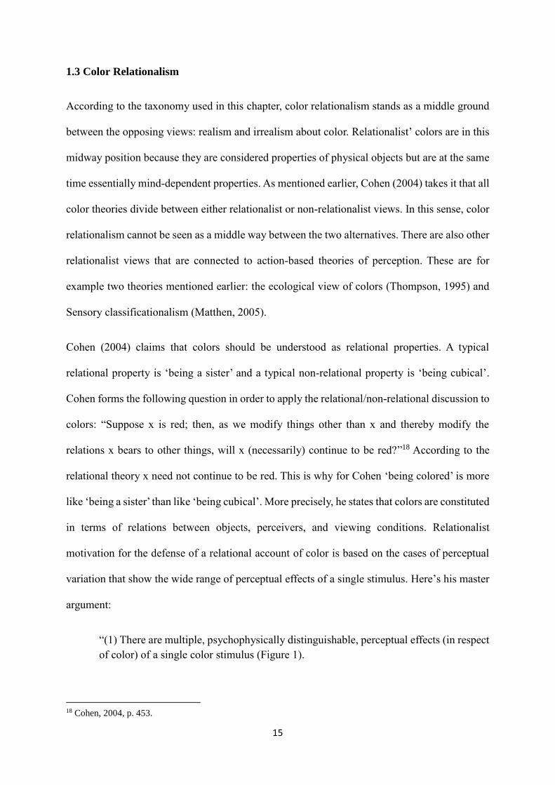
apparent and objective color. Consider the example of the Benham’s disk (Figure 1). When
viewing the rotating disk the one experiences flickering colors on the otherwise black and white
disk. In order to explain the phenomena, one can argue that this experience is a representation
of a subjective or apparent color while these colors are not an objective property of the disk as,
2 See Chirimuuta (2015), Hardin (1988) and Cohen (2009).
3
for example, red is an objective color of a tomato.3 As in the case of perceptual variation, there
seems to be no principle way to pick out the objective color of the object.
Figure 1: The Benham disk – when rotating this black-and-white disk at a certain speed, the pattern appears to
contain colored rings.
Synopsis
In the first chapter, I briefly sketch the debate on the color theories to get an idea of what are
the basic issues concerning color ontology. Although the aim of the thesis is not to give an
ontological account on the nature of color, it is relevant to see what are the underlying
motivations for understanding color appearances and whether it is a good idea to even draw
ontological conclusions on the basis of color appearances. In the second chapter, I discuss the
variability and invariability of color experiences. I consider the color constancy phenomenon
as a prevalent feature of color experiences that has been mainly put forward as a premise in
realist argumentation. Since color of an object appears to stay the same through various
circumstances, the unchanging feature is the color that somehow resides in the object. I aim to
challenge this line of thought by showing that color constancy is a much more complex
3 See Byrne and Hilbert (2003) on the analysis of the Benham disk.
4
phenomenon that has been traditionally assumed. The preferred view on color constancy should
not only acknowledge the complexity, but should be neutral on whatever ontological status of
color properties is. In the third chapter, I discuss the evidence of so-called impossible colors.
These are experiences of opposite hues: reddish-green and yellowish-blue. This phenomenon
has been considered as a counterexample to the realist account on color. I aim to demonstrate
that this inference is mistaken. Moreover, I show that reddish-green experiences tell us more
about the way our perceptual system work rather than what is the ontological status of color
properties. In the last chapter, I address the issue on color appearances in general. The
conclusions drawn from the previous chapters insinuate that color appearances do not give us
direct information about the alleged externality or internality of colors. Following this line of
thought, I propose to stay agnostic about the ontological status of colors derived from their
appearances. Moreover, I argue that the primary function of color vision is to discriminate
among rather than detect properties. I conclude by showing that color vision understood as non-
primal discriminatory capacity does nevertheless, has important roles in visual perception.
Among others, its perquisites are effortlessness and usefulnessness.
5
1 Color theories
The positions on the nature of colors differentiate depending on what kind of relation
supposedly is between color properties and color experiences. The standard view on positions
in color ontology primarily differs between realism and irrealism about color. Briefly, realist
position is that objects bear color properties, while irrealist maintains that colors are merely
properties of our experience. Moreover, realism commonly divides into two subcategories:
mentalism and externalism. According to the former account, bearers of colors are mental items
(such as sense-datum); while for the latter view colors are exemplified by physical objects.
There are three main branches of externalist view: (i) physicalism, which generally claims that
instances of color are physical; (ii) dispositionalism, according to which colors are dispositions
to affect perceivers; and finally (iii) primitivism, according to which colors are sui generis
properties. On the irrealist side of the main division, the most known view called eliminativism
holds that objects just seem to be colored because of the erroneous perceptional representations.
In this sense, nothing in the actual world is colored. What is an adequate taxonomy of positions
in color ontology is of course a subject to discussion. Alternatively, Cohen (2009) proposes a
refined taxonomy that divides theories on whether they are relational or non-relational. For him,
the standard taxonomy is problematic because, for example, irrealism is not incompatible with
physicalism, dispositionalism and primitivism. Moreover, neither are these three accounts
necessary committed to externalism. The main feature of Cohen’s novel taxonomy is the
distinction between relationalist and non-relationalist accounts. Non-relationalists in general
deny that colors are constituted in terms of relations to the perceiving subjects. Moreover, they
assume that molecular duplicates of colored things will be colored even in the worlds where
there are no perceiving subjects. Such theories are for example Identity Theory and Primitivism.
Cohen’s relationalist branch is more elaborated since this is the view he generally defends.
6
Under relationalist accounts, Cohen categorizes dispositionalism, role functionalism, ecological
relationalism, sensory classificationalism etc. Briefly, speaking, ecological relationalism
defined by Thompson (1995) and his colleagues (Thompson et al. 1992) argues against
separateness of perception and action, namely the animal and the environment. Accordingly,
colors are not properties in the world to be recovered but are rather properties that “result from
animal-environment codetermination”4. The sensory classificationalism view (Matthen, 2005),
for example, holds that stimuli of sensory perception are sorted into sensory classes: “things are
not classified as red because they look red (under normal circumstances); instead, they look red
because the visual system has determined that they are so”5.
In what follows, I will refer to taxonomy mainly adopted by Hilbert (1998). Accordingly, in the
discussion will generally differentiate between realism, irrealism and relationalism about color.
According to realism, color properties exist and are being instantiated by objects in the actual
world. On the other hand, color irrealist argue that color is not a property of an external world
and therefore no object instantiates color properties. For this reason, irrealist accounts are often
called eliminativist theories of color. Since color irrealism flies in the face of the ordinary
conception of color, a typical assumption is that one becomes its proponent after eliminating all
other theories on the basis of scientific facts. There is, however, a middle way to go:
understanding colors as properties constituted in terms of relations between objects, visual
systems, and viewing conditions. What the relationalist view has in common with realism is
that colors are considered as properties of physical objects but are mind-dependent. Rosenthal
(2001) called this similarity ‘the assumption of univocality’, according to which one uses the
same color terms to refer to the properties of objects and to color experiences. In the case of
realism, mental colors are reduced to representations of physical colors and in the case of
4 Thompson et al. 1992, p. 21 5 Matthen, 2005, p. 24
7
relationalism, physical colors are reduced to color experiences. Another alternative to the
realism/irrealism division is the double property theory, according to which there are physical
and mental colors but they do not stand in such reducible correspondent relation. For the terms
used for physical colors, refer to different things than terms used for mental colors.6
1.1 Color Realism
For realists, color properties exist and are being instantiated by objects in the actual world.
Realist generally agree on two claims about colors. First, colors are mind-independent
properties. Second, colors are properties of objects. The motivation for realism is plain simple.
Our experience of the world is such that colors do seem to be properties of the objects we
perceive. What realist strives for is that there must be some kind of micro property of the object,
which ensures the object looks that particular color. In this way, colors are mind-independent
properties because they do not depend on a perceiver or being perceived. Since realism takes
ordinary perception of the world as veridical, it faces a following puzzle:
“CS: (Ordinary) objects are colored.
CP: Ordinary objects are bundles of basic scientific objects.
PS: Basic scientific objects are not colored.”7
The realist intuition splits into two kind of views. First is physicalism and second primitivism.
There is, however, another stream of color realism according to which colors are properties of
mental objects. This, so-called sense-data theory, is perhaps the least received view since many
doubt the overall ontology of sense-data theory and its explanatory power in understanding
6 See Brown, 2006 7 Rubenstein, 2007.
8
perception. In what follows, I will focus on the two main forms of realism: physicalism and
primitivism.
For physicalist, the chromatic properties we experience are identified with physical properties.
For Byrne and Hilbert (1997), representatives of physicalism, colors are “to be identified with
properties whose natures (a) are specifiable in ways that do not employ color concepts, and (b)
are not constituted by relations to the psychological states of perceivers”8. There are different
streams of defining physicalism, depending on what that physical property is supposed to be.
Armstrong’s (1968) proposal is that the experience of color is the visual representation of the
wavelength of light. The problem with the wavelength theory is that there is no reliable
correlation between perceived color and the wavelengths of light reflected from objects falling
on the eye. For example, an object will be sending different light rays when viewed in one
setting than in the other. On the most received physicalist view, colors are identified with
spectral surface reflectance (SSR) of objects (Hilbert 1987). According to this reflectance
realism, the spectral reflectance of an object is a fixed property and it is as such illumination-
independent. Since this is among the most received views, I will in what follows, mainly discuss
the SSR-physicalist view or what is also called reductive physicalism.
Physicalists generally accept the dichotomy between what is a possible candidate for a physical
color one the one side and the experience of color on the other. For them, what gives rise to a
qualitative color experiences are the quantitative physical properties that themselves are to be
named “colors”. In this sense, Jackson (1998) argues that colors are complexes of physical
properties that make objects appear the color they normally do. Boghossian and Velleman
(1991) make a more refined distinction between kinds of physicalism: (i) identity-physicalism
and (ii) realization-physicalism. According to the identity-physicalism, color is identical with
8 Byrne and Hilbert, 1997, xxii.

9
its microphysical basis and nothing more than that. On the other hand, realization-physicalism
holds that color is realized by its physical basis: “red is envisioned as a higher-order property –
the property of having some (lower-order) property satisfying particular conditions – and the
microphysical configuration is envisioned as a lower-order property satisfying those
conditions…”9 Under this interpretation, microphysical basis is merely a way of being red.
There are several ways to object to physicalism. Among them, for example, is the question on
whether colors can be microphysical properties of objects when microphysical properties are
not observable (Boghossian and Velleman, 1991). The second issue concerns the difference
between features of experienced colors and of those that are physical properties, e.g. spectral
surface reflectance. There are different kinds of causes of colors, such as surface color, volume
color, and aperture color. Accordingly, for each color there is a set of metameres and not one
reflectance curve. Metameres are pairs of stimuli that are different in physical characteristics,
but they match in appearance under a certain illumination. This means that two objects can
appear same in color but have distinct reflectance, which is particularly troublesome for a SSR-
physicalist. The third line of objections to realism concerns the structure of the experienced
color space. Hardin (1988), for example, argues that perceived color relations should be
compatible with any color theory. Meaning that if colors are surface spectral reflectance they
should comply with the standard division between unique and binary colors. Color space
categorizations stand as phenomenological representations of a trichromatic human perceptual
similarity space of colors. Unfortunately, for a physicalist, there are no physical properties that
correspond to these kinds of divisions or relations. The fourth possible trouble for physicalism
is given by perceptual variation. Consider the case where the same chip looks greenish to me
and bluish green to my neighbour in the library. According to physicalism, the chip of the color
is a physical kind that is perceiver-independent and circumstance-independent. If so, then only
9 Boghossian and Velleman, 1991, p. 73
10
one of the two representations exemplifies the right physical kind. The question is, for what
reason one is veridical and the other not.
Now, let’s turn to a different version of color realism. For primitivist10 colors are sui generis
properties that are unanalyzable and irreducible to some other microphysical properties.
Accordingly, colors are to be understood in an ordinary or simple way, this is, objects have the
color they seem to have. However, what is called color cannot be reduced to some further
properties like a physicalist or dispositionalist would have it. It is rather that colors are
associated or correlated with some other properties that are, however, numerically distinct
properties. As Cohen (2009) points out, primitivists build their view on what colors are not
rather than what they are. For this reason, primitivism is often referred to as the last resort view.
Apart from the conceptual and semantic thesis about colors being simple-as-perceived
properties, primitivists account also for the metaphysical thesis, according to which objects
actually do have colors they seem to have (Maund, 2012). What a primitivist is pressured to
explain is how colors are connected with the physical properties, if they are not microphysical
or dispositional properties themselves.
The common criticism of primitivism is that it is an ad hoc view. This is because it seems
questionably easy to posit properties as sui generis when they are not otherwise understood
(Cohen, 2009). Apart from being in a weak dialectical position as a last resort view, primitivism
faces objections from interspecies variation. Byrne and Hilbert (2007) point out that the
goldfish, for example, are sensitive to the wavelengths in the near ultraviolet zone, which is the
area that falls out of the range to which human vision is sensitive. This is to say that two objects
with different reflectance profile near the ultraviolet zone will look different in color for the
goldfish but not for the human. Now, how can the primitivist deal with this case? Byrne and
10 Some representatives are: Campbell (1993), Westphal (1987), Gert (2008), Kalderon (2007).
11
Hilbert discuss four options, none of which seems to be a viable possibility for a primitivist
account. First, one might say that there are some colors that humans cannot represent while
goldfish can. This is a no-go for a primitivist since our experience reveals the essence of colors
(the revelation thesis) in a sense that precludes experience of any color out of the color solid.
Therefore, for the primitivist, the goldfish colors simply cannot exit since they fall out of the
color solid range. The second way for the primitivist is to say that the differences the goldfish
represents are not color differences but rather cases of systematic errors in color discrimination.
Both, the human and the goldfish, are responding to the same range of colors but one is a subject
to color illusion. This explanation is rather problematic because there is no principle way to
single out one representation as right and the other as wrong. Moreover, the fact that the humans
are not sensitive to particular differences does not entail that there are no such differences. So,
accusing goldfish of such error does not seem motivated. The third option for primitivist is to
say that only humans represent colors while goldfish represent color-like properties. These can
be, for example, some idiosyncratic properties that are not fundamentally related to human-
colors. This is a rather an ad-hoc answer since it seems hardly convincing that very similar
physiological perceptual systems detect fundamentally unrelated properties in the environment.
The answer also poses additional problems in explaining cases such as blindsight.
1.2 Color irrealism
A general assumption of color irrealism is that colors are not properties of physical objects as
we ordinarily take them to be. Since the experience of colors cannot be explained by properties
residing in the object, the physical colors cannot exist. This is to say that nothing is actually
colored even though the representation of the world is such that it looks like it is. For irrealists,
these representations are simply erroneous. Palmer (1999) neatly illustrates the conflict between
the scientific descriptions of color properties and the ordinary perception of color:
12
“People universally believe that objects look colored because they are colored, just as we
experience them. The sky looks blue because it is blue, grass looks green because it is green,
and blood looks red because it is red. As surprising as it may seem, these beliefs are
fundamentally mistaken. Neither objects nor lights are actually ‘colored’ in anything like the
way we experience them. Rather, color is a psychological property of our visual experiences
when we look at objects and lights, not a physical property of those objects or lights. The colors
we see are based on physical properties of objects and lights that cause us to see them as colored,
to be sure, but these physical properties are different in important ways from the colors we
perceive.”11
There are two main motivations for an irrealist12 account. First, perceptually speaking, colors
stand in certain kind of similarity relations. For example, orange is more similar to red than it
is to green. Moreover, orange is perceptually considered as a binary hue, mix of red and yellow,
while red or green are unique hues since they are not mixtures. However, these kind of similarity
relations do not stand when considered in surface reflectance terms, this is, perception-
independent terms. As Jakab (2001) illustrates, a surface that looks orange emits 590 nm light
is no more a mixture of lights than it is a surface that looks unique yellow emitting 577 nm
light. This is to say that there are no systematic differences when hues of surfaces are described
in non-perceptual terms. Therefore, there are no parallels in perception-independent terms with
the color relations as perceived. Second, the same surface can look different in color through
different illumination (intra-species variation) or can look different to different observers in the
same illumination (inter-species variation). Overall, this suggests that there is no one relevant
surface property that corresponds to a specific color percept. Based on these two kinds of
motivations, irrealists conclude that there are no object colors. Since objects do look colored,
11 Palmer, 1999, p. 95 12 Some of the irrealist views include works of Hardin, 1988; Boghossian and Velleman; 1997a; McGilvray, 1994.

13
irrealist theories typically turn out to be the error theories of the visual experience because our
perception falsely attributes colors to external objects when they actually belong only to the
visual experience. For this reason, color irrealism is often called illusion theory or
eliminativism.
The obvious objection such irrealist account faces is that it is severely revisionary since it
accuses the ordinary perception of colors as systematically erroneous. A quick way to reply to
this objection is to argue that there is nothing so inappropriate with deep revisions if the
alternatives come with greater costs. This is, however, a rather weak position to take since it
categorizes the view as a last resort view. An example of an irrealist account is color
projectivism. The basic idea of projectivism is that by color experience we ‘project’ the
subjective, sensory qualities onto the physical objects around us. In this respect, the experience
of color is similar to the experience of pain. Assumingly, when undergoing a toothache, the pain
is being represented as being in the tooth. Similarly, colors are being represented as properties
of the object. Averill (2011) posits the following projectivist’s claims:
“P1: the property of being red is identical to the property of being p-red13, i.e., the qualitative,
sensuous, and intrinsic property that paradigm red objects look like they have when viewed in
normal circumstances. And similarly for other colors.
P2: color properties are not instantiated by objects around us.”14
Following these two claims, our experience of color is systematically non-veridical. For this
reason, projectivism is understood as an error theory of perception. Moreover, the systematic
error is assigned as well to the usage of color attributions in ordinary language. Not just that all
color-talk is erroneous, the projectivist is unable to distinguish between correct attribution of
13 'p-red' meaning 'phenomenal red'. 14 Averill and Hazlett, 2011, p. 757.
14
color and an incorrect attribution in ordinary language. Averill (2011) suggests that this problem
can be solved by appealing to cognitively, instead of visually, represented colors. He claims that
ordinary color terms denote, so called, agreement colors instead of color properties:
“necessarily, an object is a-red15 if normal perceivers agree, or would agree, that the object looks
red under normal conditions; and similarly for other colors.”16 Therefore, according to Averill,
what is being instantiated by objects around us are a-color properties.
Now, if color projectivism holds that color properties are not being instantiated by objects
around us, then the question is where else are they instantiated. Shoemaker (1994) defined terms
'literal' and 'figurative' projectivism. These views differ in respect to whether the projected
properties are instantiated somewhere or not at all. According to figurative projectivism, our
vision represents objects as colored but these color properties are not being instantiated
anywhere. Color properties only seem to be instantiated due to the way perceiver is constituted.
On the other hand, the literal projectivism holds that the content of visual experience represents
external objects as possessing color properties that in fact belong only to visual field. One
version of such view is, for instance, defended by Averill (2005 and 2011), and more famously
by Boghossian and Velleman (1989). Despite the fact that according to projectivists, visual
experience is ordinarily naively realistic, this view does not do injustice to the ordinary color
concepts. Even if the color concepts are not being instantiated in some obvious way, our
representations can nevertheless help us to understand why we form the color concepts as we
do. This is because projectivism does not rule out cognitively represented color properties.17
15 Meaning 'agreement-red'. 16 Averill, 2011, p. 759. 17 See Averill, 2011, p. 759.
15
1.3 Color Relationalism
According to the taxonomy used in this chapter, color relationalism stands as a middle ground
between the opposing views: realism and irrealism about color. Relationalist’ colors are in this
midway position because they are considered properties of physical objects but are at the same
time essentially mind-dependent properties. As mentioned earlier, Cohen (2004) takes it that all
color theories divide between either relationalist or non-relationalist views. In this sense, color
relationalism cannot be seen as a middle way between the two alternatives. There are also other
relationalist views that are connected to action-based theories of perception. These are for
example two theories mentioned earlier: the ecological view of colors (Thompson, 1995) and
Sensory classificationalism (Matthen, 2005).
Cohen (2004) claims that colors should be understood as relational properties. A typical
relational property is ‘being a sister’ and a typical non-relational property is ‘being cubical’.
Cohen forms the following question in order to apply the relational/non-relational discussion to
colors: “Suppose x is red; then, as we modify things other than x and thereby modify the
relations x bears to other things, will x (necessarily) continue to be red?”18 According to the
relational theory x need not continue to be red. This is why for Cohen ‘being colored’ is more
like ‘being a sister’ than like ‘being cubical’. More precisely, he states that colors are constituted
in terms of relations between objects, perceivers, and viewing conditions. Relationalist
motivation for the defense of a relational account of color is based on the cases of perceptual
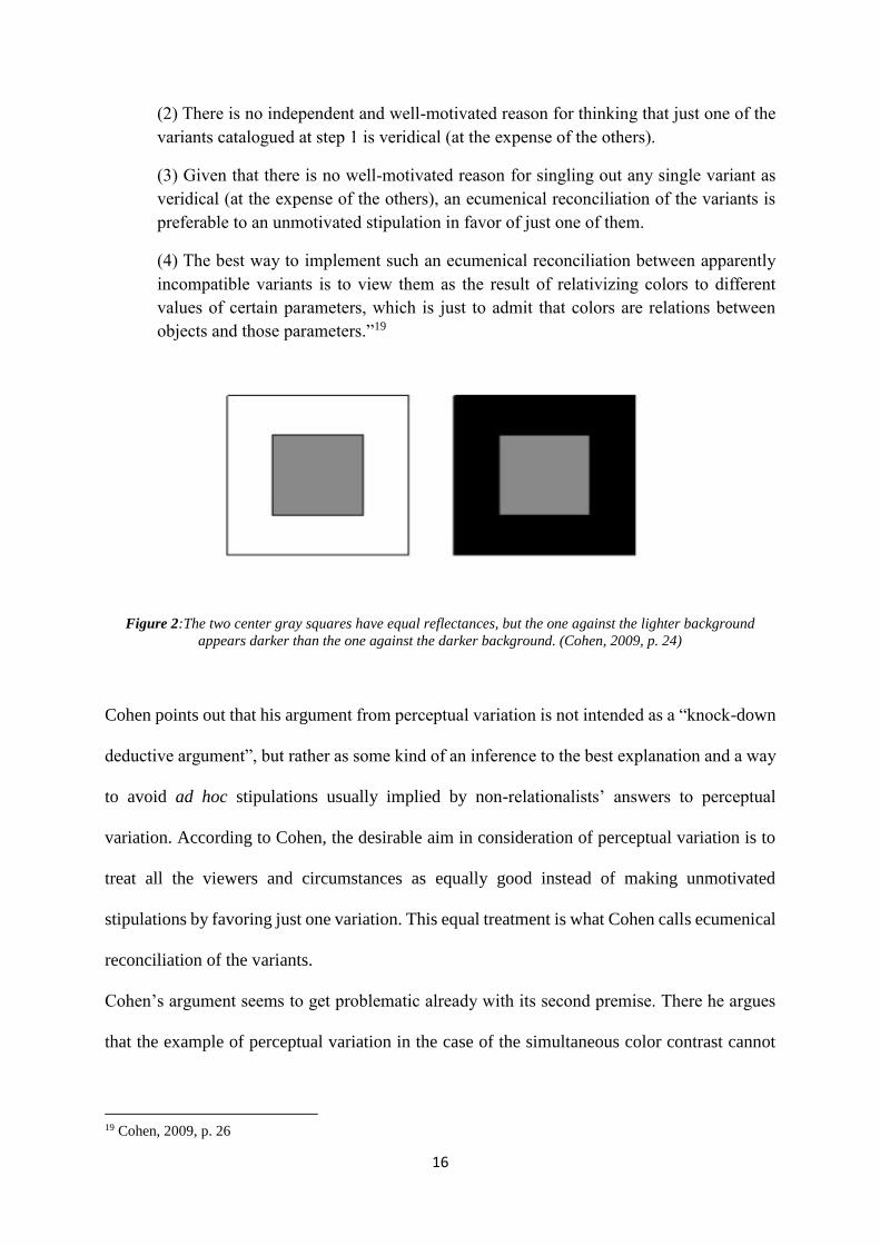
variation that show the wide range of perceptual effects of a single stimulus. Here’s his master
argument:
“(1) There are multiple, psychophysically distinguishable, perceptual effects (in respect
of color) of a single color stimulus (Figure 1).
18 Cohen, 2004, p. 453.
16
(2) There is no independent and well-motivated reason for thinking that just one of the
variants catalogued at step 1 is veridical (at the expense of the others).
(3) Given that there is no well-motivated reason for singling out any single variant as
veridical (at the expense of the others), an ecumenical reconciliation of the variants is
preferable to an unmotivated stipulation in favor of just one of them.
(4) The best way to implement such an ecumenical reconciliation between apparently
incompatible variants is to view them as the result of relativizing colors to different
values of certain parameters, which is just to admit that colors are relations between
objects and those parameters.”19
Figure 2:The two center gray squares have equal reflectances, but the one against the lighter background
appears darker than the one against the darker background. (Cohen, 2009, p. 24)
Cohen points out that his argument from perceptual variation is not intended as a “knock-down
deductive argument”, but rather as some kind of an inference to the best explanation and a way
to avoid ad hoc stipulations usually implied by non-relationalists’ answers to perceptual
variation. According to Cohen, the desirable aim in consideration of perceptual variation is to
treat all the viewers and circumstances as equally good instead of making unmotivated
stipulations by favoring just one variation. This equal treatment is what Cohen calls ecumenical
reconciliation of the variants.
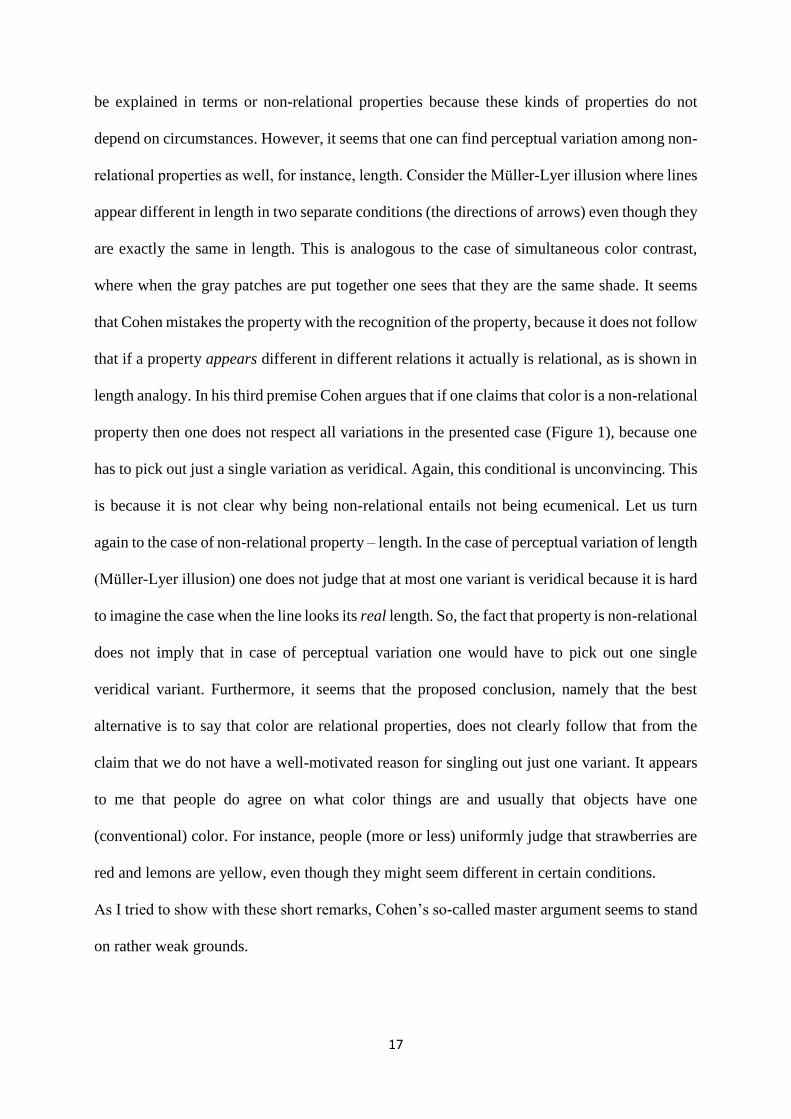
Cohen’s argument seems to get problematic already with its second premise. There he argues
that the example of perceptual variation in the case of the simultaneous color contrast cannot
19 Cohen, 2009, p. 26
17
be explained in terms or non-relational properties because these kinds of properties do not
depend on circumstances. However, it seems that one can find perceptual variation among non-
relational properties as well, for instance, length. Consider the Müller-Lyer illusion where lines
appear different in length in two separate conditions (the directions of arrows) even though they
are exactly the same in length. This is analogous to the case of simultaneous color contrast,
where when the gray patches are put together one sees that they are the same shade. It seems
that Cohen mistakes the property with the recognition of the property, because it does not follow
that if a property appears different in different relations it actually is relational, as is shown in
length analogy. In his third premise Cohen argues that if one claims that color is a non-relational
property then one does not respect all variations in the presented case (Figure 1), because one
has to pick out just a single variation as veridical. Again, this conditional is unconvincing. This
is because it is not clear why being non-relational entails not being ecumenical. Let us turn
again to the case of non-relational property – length. In the case of perceptual variation of length
(Müller-Lyer illusion) one does not judge that at most one variant is veridical because it is hard
to imagine the case when the line looks its real length. So, the fact that property is non-relational
does not imply that in case of perceptual variation one would have to pick out one single
veridical variant. Furthermore, it seems that the proposed conclusion, namely that the best
alternative is to say that color are relational properties, does not clearly follow that from the
claim that we do not have a well-motivated reason for singling out just one variant. It appears
to me that people do agree on what color things are and usually that objects have one
(conventional) color. For instance, people (more or less) uniformly judge that strawberries are
red and lemons are yellow, even though they might seem different in certain conditions.
As I tried to show with these short remarks, Cohen’s so-called master argument seems to stand
on rather weak grounds.
18
There is another version of relationalism – dispositionalist view. Dispositionalism about color
holds that red for a subject in certain circumstances is the disposition to look red to a normal
perceiver in standard conditions (mutatis mutandis for the other colors)20. The subject is usually
defined as a normal perceiver and circumstances as standard conditions. The motivation behind
dispositionalism about colors is the idea that colors are similar to properties like fragility and
solubility. This is, only when suitable circumstances obtain the characteristic manifestations of
these properties occur. Some of the major defenders of dispositionalism have been Descartes,
Locke and Newton and more recent are McGinn (1983), Peacocke (1984) and Johnston (1992).
The idea of normal perceiver and standard conditions is, according to Hardin (1988), rather
problematic because of the changes in conventions concerning who are standard observes and
which are standard viewing conditions.
Boghossian and Velleman (1989) point to two general problems with dispositionalism. First,
the dispositionalist view seems to suggest that if we turn on the light in a room, colors would
seem to come on when illuminated, just like the lamp comes on. While in the dark, colors would
then appear like they are dormant. Since colors do not seem to behave in such way,
dispositionalism conflicts with a commonsense view on color. Second, another issue is the color
of the after-images. Those are visual images that persists after the visual stimulus causing them
has ceased. Dispositionalists would have to claim that in the experience of afterimages the
appearance of color in after-images is the appearance of a disposition to look red under standard
conditions. However, for Boghossian and Velleman, colors of after-images cannot be described
in terms of dispositions since they cannot be reintroduced on any other occasion than in the
original one: “(the images) are perceived as exiting only in so far as one is perceiving them.”21
20 This definition seems obviously circular, but dispositionalists try to avoid the circularity by arguing that one has
to distinguish between two distinct notions of color: on the one side color as property of physical objects and on
the other side color as a sensation. 21 Boghossian and Velleman, 1989, p. 86

19
Among more specific problems for dispositionalism, Boghossian and Velleman address
circularity. The question is whether the word ‘red’ in the classical formulation of
dispositionalism (‘a disposition to look red is a disposition to give the visual appearance of
being red’) expresses the same property that the entire phrase purports to express.
After introducing basic tensions regarding the problem of color and the attempts to construct
an ontological view, I will now turn to a specific issue underlying the problem of color
appearances – variability and invariability of colors.
20
2 The Complexity of Constant and Variable Colors
How do colored things look? In order to understand what color appearances are and how to
categorize them, one cannot avoid the discussion on color constancy and variation. In what
follows, I will present the field of options in the recent debate on the color constancy
phenomenon. Concerning this phenomenon, Cohen (2008) points out, there are two kinds of
questions: how should we understand the phenomenon and what does the phenomenon tell us
about the nature of color. It should be noted that the color constancy phenomenon as a prevalent
feature of color experiences has been mainly put forward as a premise in realist argumentation.
Since the color of an object appears to stay the same through various circumstances, the
unchanging feature is supposedly the color that somehow resides in the object. As we shall see,
this turns out to be a rather one-sided view of the phenomenon.
In this chapter, I attempt to show that the standard discussion of the color constancy
phenomenon is unsatisfying. Although the recent trends in describing the phenomenon are
promising, my proposal is that further work has to be done to give justice to the complexity of
the constancy phenomenon. I take it that color appearances are fundamentally context-
dependent and for this reason cannot be analyzed in isolation. As we will see, this feature of
color perception cannot be fully captured in an experimental setting.22 It is unsatisfying to build
a theory based on only so-called good or standard viewing conditions. It has been shown that
the more information is available to the subject regarding illumination of the observed scene,
the less chance there is that the appearance of the target surface will be affected by changes in
illumination and spatial context. Rudd (2003), for instance, argues that: “it would be a mistake
22 See Kuehni, 2003.
21
to define color in such a way that its definition holds only under conditions that are optimal for
judging surface reflectance (where color constancy is never exact, in any case). And it would
be a mistake to construct theories of color based solely on how the visual system functions
under such conditions or even under natural conditions, more generally.”23 The idea is that the
right kind of theory should account for any kind of observed scene.
My aim in understanding color appearances is to regard both features of appearances, constancy
and variation, as equally as possible. To do so, I will first discuss the main positions regarding
color constancy: variantism and invariantism. I will also address the recent experimental data
on the color constancy phenomenon and what impact this data has on the overall discussion.
Moreover, I will discuss the positive and negative sides of the most recent approach called
discriminatory color constancy, which I take it to be a promising direction for the discussion. I
will conclude by proposing the direction of a more complex discriminatory view that is neutral
in regards to the ontological status of color.
2.1 Color constancy: invariantist and variantist approaches
The color of the couch in your living room looks different on rainy mornings than on late
summer afternoons. Yet you recognize it as the same old uncomfortable couch. Is it that when
conditions change, things look differently colored? The focus of what follows will be to clarify
this seemingly contradictory nature of color appearances. Matthen (2010) proposes the
following intuitions as roughly describing the general conflict24:
23 Rudd, 2003, p.47 24 Note that these two intuitions are both from an externalist perspective – a visual experience is in and of itself as
of an objective visual sense feature (as opposed to Isolation thesis p.6)
22
“Constancy Thesis: In good conditions of viewing, things look the way they are, even
if these conditions change (provided that they remain “good”).
Variation Thesis: When (relevant) viewing conditions change, things look different
(provided that these things themselves stay the same in the relevant respect).”25
Let’s consider what each of these intuitions brings about. If you were to look up what color
constancy is, the definition would be along these lines: color constancy is invariance of apparent
color across changes in illumination. In this sense, colors are stable, illuminant-independent
properties. When experiencing an object through different kinds of illumination, what changes
is not the color of the object but, for example, the perspective on color. Advocates of such
account are for instance, Byrne and Hilbert (1997), Tye (2000) and Gert (2010). The idea behind
this view is that in good conditions people reliably recognize the color of the object regardless
of the changes in illumination. This is to say that objects tend to look the color they are.
Various experimental data shows that invariantism is not only a feature of human perception
but that it can be found among a variety of species, such as honeybees and goldfish.26 For
instance, to test color constancy among bees, they were first trained to expect the preferable
sugar-water in yellow dishes and pure water in green ones. The yellow dishes were then made
to reflect the greenish light (a green cover was places over the dishes). Although the yellow
dish no longer looked as it did in the conditions of learning, honeybees continued to go for the
sugar-water. These experiments suggest that honeybees recognize the desired sugar-water
regardless of the changes in conditions, this is, they recognize that the dish is yellow despite
looking different.
25 Matthen, 2010, p. 10. 26 See Neumeyer (1998).
23
Brown (2014) points out two major problems with the invariantist approach. First, when
observing the object’s color in different stages of illumination (for example when we look at
the skirt inside the shop and outside in the sunlight) we do not notice only its steadiness. What
one observes is the steady and the variable features of the object’s color. In this sense, what
color constancy shows is that colors are both illumination-dependent and -independent
properties. Second, Brown argues that the provided invariantist view is unsatisfactory because
it is limited only to one kind of variable – illumination. He provides an example of a ‘filter case’
constancy. When one observes a green book through a glass of an amber beer, in such case (and
similar ones including sunglasses or tinted windows) one experiences both: the greenness of
the book and the amberness of the beer. So in order to give a complete account of the color
appearance one has to include different kinds of constancy scenarios and acknowledge
variability as much as stability. I will get back to the filter cases later on.
An alternative to the constancy intuition is variantism, the view that the object’s color varies
significantly and systematically with changes in illumination. As such, colors are illuminant-
dependent properties. For example, for a variantist, the color of the wall in my room is yellowish
in the late afternoon and whitish in the morning. As soon as conditions change, the perceived
color appearance change as well. Since what changes is the color appearance, our constancy
intuitions cannot be explained by the appeal to phenomenal invariance. In other words, as
illumination changes, so do the colors of objects, not merely the perspective on color. An
example of the variantist approach is Cohen’s (2008) counterfactualist view. He argues that
what is variable is the ‘occurrent’ experience and what is stable is the counterfactual color that
one would experience if the illumination would change. What is phenomenally present to us in
such scenarios is one of the variants while the constancy is something of a cognitive matter –
an inference from the color elements that constitute the phenomenology. For example, one
judges a white wall illuminated with yellow light as appearing yellow, but she infers that the
24
wall would look white if differently illuminated (e.g. in standard day light), which is the
counterfactual color. Such inferences can be either conscious or unconscious. Berkeley, for
example, argues that the inferences in color constancy scenarios are potentially conscious. On
the other hand, Helmholtz (1924) famously accounts for the unconscious inference in visual
perception:
“The psychic activities that lead us to infer that there in front of us at a certain place
there is a certain object of a certain character, are generally not conscious activities, but
unconscious ones. In their result they are equivalent to a conclusion, to the extent that
the observed action on our senses enables us to form an idea as to the possible cause of
this action; although, as a matter of fact, it is invariably simply the nervous stimulations
that are perceived directly, that is, the action, but never the external objects
themselves.”27
For Helmholtz, perceptual constancy is a result of the unconscious mechanisms in the sense
that the perceived color is independent from a belief about color, the process is inaccessible and
its conclusion is not under the control of the perceiver. However, Cohen proposes a so-called
neo-Helmholtzian account according to which the inference is unconscious while the premises
and conclusion are consciously accessible. He tries to find a middle ground between
unconscious processing and cognitive influence (such as instruction effects in the
experiments).28
Variantists find support for their account in a variety of matching tests. There are two kinds of
matching based arguments they usually appeal to: intuitive and psychophysical29. On the
intuitive side, Noë (2004) proposes that if we were to match color samples with the color of the
27 Helmholtz, 1924, Vol. III, p. 4. 28 See Hilbert (2005) for criticism of Helmholtz and Cohen. 29 See Davies (2016) and Matthen (2010)
25
wall in the sunlit and in the shaded part we would pick up different samples. Even though our
intuition might be that the wall is uniformly colored, the matching samples test suggests that
the difference in phenomenal character due to illumination means difference in appearance of
color. Continuing from simple intuitions, a lot of attention has been given to experiments on
the asymmetric color matching tasks. In these psychophysical tests (e.g. Wyszecki and Stiles,
1982), subjects are asked to match a ‘test patch’ under one illumination with a ‘target match’
under a different illumination. Note that both of the patches are of the same reflectance but
under different illumination. In order to do the matching, the subjects have to change the
chromaticity (or lightness) of the test patch until it matches the standard one. The achieved color
constancy degree is measured with the Color Constancy Index ranging from 1 to 0 (from perfect
to absent constancy). Subjects are given two different kind of task instructions (Arend and
Reeves, 1986/Arend et al., 1991):
(i) ‘Appearance match condition30’: make the test patch match the hue, saturation and
brightness of the target one.
(ii) ‘Surface match condition’: make the test patch look as if it is cut from the same
piece of paper as the target one.
The performance of the subjects in given tasks differs significantly. In the first one, subjects
achieved lower Color Constancy Index value than in the second task. The results in the first
task suggest that the experience of the equivalent reflectance stimuli is subject to illumination-
dependent variation. These results support the variation thesis since hue, saturation and
brightness stand as hallmarks of color appearance dimensions31 and so they represent the way
patches appear to subjects. As a variantist, Cohen (2008) takes this point to support his
counterfactualist view: “When subjects make appearance matches…they make the regions
30 Adopted from Davies, 2016. 31 For instance, HSB color space.
26
cease to be discriminable (along whatever dimension they were previously discriminable) by
adjusting the hue and saturation of one of them. Now, it is a standard assumption in visual
psychophysics that the hue and saturation of a patch are dimensions of its apparent colour; if
so, then adjusting the hue and saturation of the test patch just is adjusting the patch’s apparent
colour. Therefore, whatever the difference was in virtue of which the patches were initially
visually discriminable, that difference can be offset by a difference in apparent colour. And this,
in turn, might lead us to suspect that the difference revealed in the variance reaction is a
difference in apparent colour…”32 Taking the second task into consideration (higher success
rate), what these experiments show is that color constancy performance largely depends on the
instructions. The instruction effect shows that color constancy phenomena are much more
complex and diverse than how the variantist is trying to portray it. On the one hand, the high
success rate in the second task shows that subjects are good in determining the surface color
regardless of the change in illumination. But on the other hand, in first task they do the matching
in consideration with the change in illumination.
In more recent studies by Tokunaga and Longvilenko (2010, 2011) they argue that in order to
understand dissimilarity judgments in experiments we must add another three dimensions.
Apart from the usual material dimensions of hue, saturation and brightness, there are also
lighting color dimensions of hue, saturation and brightness. When being presented with the
stimulus, one can perceive both, a quality of the material hue and one of the lighting hue. The
lighting dimension is apparent only in some circumstances, for example, when there are
changing or multiple illuminants. According to Tokunaga and Logvilenko, this dual
phenomenology fits best with so-called discriminatory color constancy, according to which one
normally distinguishes changes in surface spectral reflectance from changes in illumination.
They take it that the two sets of dimensions of color appearance are not independent, since
32 Cohen, 2008, 67-68.
27
“both of the triplets (of hue, saturation and brightness) are determined by object and light pair
and not object separately and light separately. In this sense, the dimensions of both kinds of
triplets are ‘modelled as constituents of a single, complex object color attribute”33. Similar
views, which will be discussed later, are defended by Matthen (2010) and Davies (2016). Clark
(1993) is, however, sceptical about the interpretations of this kind34 of experiment. He argues
that the variable that is being changed is the lighting, so the subjects naturally assume that they
are looking at lighting dimensions, but the display used in the study is such that in changing the
illuminant, the authors also change the surroundings of each of the stimuli that are being
compared. So, these experiments tell us how many dimensions there must be for a subject to
make dissimilarity judgements, but they do not tell us what these dimensions mean. Overall, it
seems that the experimental outcomes suggest that color constancy and variation are much more
complex issues than the standard variantist-invariantist debate attempts to demonstrate.
For now, the discussion has shown that describing color constancy phenomena as either a matter
of variability or invariability is phenomenologically limited. In what follows, I will illuminate
the problematic parts of this rigid dichotomy and show how to incorporate both variability and
invariability in an account of color constancy.
2.2 The discriminatory theories
That color constancy is a complex phenomenon is acknowledged by positions that attempt to
preserve both intuitions about the color constancy scenarios. The motivation for abandoning
the dichotomy between variantism and invariantism is to do justice to the experience: something
stays the same while something else changes. In order to avoid one-sided explanation of the
33 Tokunaga and Longvilenko, 2010, 1744. 34 Note that this was published before the most recent experimental studies.
28
phenomenon one must take into the account both features of the experience. For example,
Davies (2016) claims that the described dichotomy between variantism and invariantism is false
since the color constancy scenarios are not about whether the color appearance is either stable
or not stable. The stability can as well be a matter of a degree. This is to say that constancy can
be more or less phenomenal. He emphasises the pluralist nature of the phenomena: “There exist
many different types of colour constancy, with differing perceptual natures, which will be given
differing psychological explanations.”35 Similar to Davies’ account are those of Matthen (2010)
and Brown (2014). They all attempt to overcome the discussion between variantists and
invariantists and rely on some sort of discriminatory capacities.
For example, the idea of Matthen’s Scene-parsing view is that “color vision system separates
information concerning illumination from information concerning color”36, while the
discriminatory color constancy view suggests that “our ability to discriminate a material change
from a lighting change reflects our ability to distinguish a change in material color appearance
from a change in lighting color appearance”37. The discriminatory color constancy view can be
understood in two ways. Davies takes it that it is “explained by perceptual capacities that
function to represent monadic properties of both surface material and lighting in the scene”38.
On the other hand, Craven and Foster (1992) argue that discriminatory color constancy is
explained by appeal to the subject’s perceptual awareness of color relations (with no
representations of surface material and lighting properties involved). These are so-called
relational capacities. For Davies both aspects are legitimate but says that Craven and Foster
cannot explain all viewing scenarios and that the notion of the relational capabilities is
extremely underdeveloped.
35 Davies, 2016, p. 11 36 Matthen, 2010, p. 22-23. 37 Davies, 2016, p. 26-27. 38 Ibid.
29
It seems to me that the problematic part of Craven’ and Foster’s explanation of discriminatory
capabilities is the requirement of the awareness of color relations. First, we might be aware or
not aware of the relations of similarity or dissimilarity surfaces stand in. Following Dretske
(1997), for example, one might be conscious of the change in appearance but not aware of being
conscious of it. Second, what does it mean to be aware of color relations? Does this mean one
has to be aware of the interaction between different features in the scene? It might be easy to
be aware of the interaction in non-complex situations such as yellow light illuminating a white
wall. However, if we find ourselves in a more complex environment, one might need more
expertise to be aware of the right color relations, such as cases with multiple illuminations and
glossy materials.
Similar to Craven and Foster, Davies’s proposal also involves awareness: “On my view, in
contrast, our ability to discriminate illuminant changes from material changes is grounded in
the subject’s capacity to perceptually discriminate changes in material properties and lighting
properties themselves, via awareness of changes in material and lighting color appearance”39.
If discriminatory color constancy works thanks to the awareness of the change in appearance
of material surface from change in appearance in lighting, then this looks like an inference
capacity of some sort. On such view, this account does not give possibility for making such
discrimination without being aware of it, something that Helmholtz defined as an unconscious40
inference, mentioned earlier. The overall awareness requirement is somewhat misleading since
the core of successful color constancy is its automaticity. For this reason, it seems important
that an account of color constancy includes the possibility of discriminatory processes that
happen unconsciously. This might as well include not being aware of the exact relations
observed surfaces stand in. As mentioned earlier, the instruction effects in matching tests rather
39 Davies, 2016, 27. 40 Note that also Cohen seems to understand ‘being conscious’ in terms of awareness (see Cohen 2008).
30
suggest that constancy processes are a matter of conscious and cognitive processes. However,
Hilbert (2005) argues that one cannot draw such a conclusion solely based on the evidence of
the instruction effects. Following this thought, it seems to me that one way to explain color
constancy might be to includethe possibility of unconscious as well as conscious processes.
One way to do so is to follow Cohen’s proposal mentioned earlier, though without committing
to variantism about color constancy.
Putting aside the trickiness of the awareness requirement, the trend of the discriminatory
accounts seems promising and refreshing in the color constancy debate. Moreover, Davies’
explanation of our discriminatory capabilities is preferable to Craven and Foster’s since he
accounts for THE subject’s capacity to merely notice a change between material color
appearance from change in lighting color appearance. The positive aspect of this view is that it
overcomes the divide in the sense that it remains neutral in respect to the variantist-invariantist
discussion. In what follows, I will address features of the discriminatory views that are either
problematic or insufficient in representing the complexity of color appearances.
2.3 On the complexity of viewing scenarios
Davies’ attempt to preserve the plurality and complexity of the constancy phenomenon is highly
promising though he misses a few important features of color appearance. My aim is to develop
Davies’ and Matthen’s views in order to give a richer account of color appearances. In my view,
the change in color appearance is not exhausted by discriminating the change between surface
and lighting appearance. For example, a common phenomenon that can significantly affect such
discriminatory judgements is the simultaneous contrast effect (scene composition and
configuration). Color simultaneous contrast effect (Figure 2) is a phenomenon in which objects
appear to be different because of the different backgrounds they are placed against, although
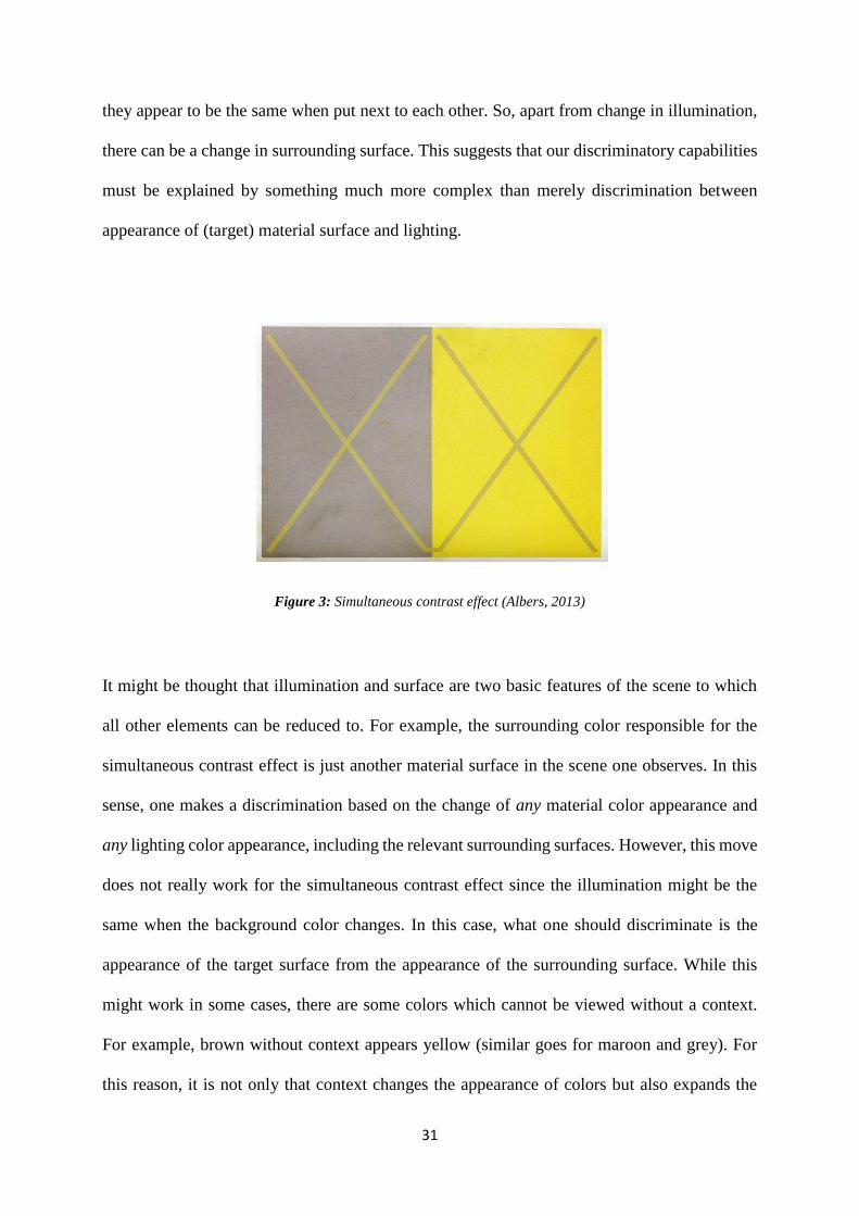
31
they appear to be the same when put next to each other. So, apart from change in illumination,
there can be a change in surrounding surface. This suggests that our discriminatory capabilities
must be explained by something much more complex than merely discrimination between
appearance of (target) material surface and lighting.
Figure 3: Simultaneous contrast effect (Albers, 2013)
It might be thought that illumination and surface are two basic features of the scene to which
all other elements can be reduced to. For example, the surrounding color responsible for the
simultaneous contrast effect is just another material surface in the scene one observes. In this
sense, one makes a discrimination based on the change of any material color appearance and
any lighting color appearance, including the relevant surrounding surfaces. However, this move
does not really work for the simultaneous contrast effect since the illumination might be the
same when the background color changes. In this case, what one should discriminate is the
appearance of the target surface from the appearance of the surrounding surface. While this
might work in some cases, there are some colors which cannot be viewed without a context.
For example, brown without context appears yellow (similar goes for maroon and grey). For
this reason, it is not only that context changes the appearance of colors but also expands the
32
variety of colors we experience.41 Furthermore, context-less color appearances seem relatively
useless in case we are trying to give an account of the way colored things appear around us.
Extracting an object from its environment in order to determine its color might certainly be
useful in some cases. It could be right though that what one usually does is try to view an object
under different illumination and not necessarily in a different background context (unless the
object is visually indistinguishable from the background).
It seems clear that color appearances are essentially context-dependent. For this reason, it is
crucial that varieties of contrast effect are included in an account on color appearances regarding
discrimination. It might even seem trivial to say that color appearances are context-dependent
since it is a banal fact about color appearances. No one would disagree that context is essential
to the surface and illumination perception. Apart from Ganzfeld42 scenarios, we never see one
color without the context of other colors. While context-dependence might seem obvious,
however, one can get information about the color of some surface without having any
information about the illuminant. As Foster (2003) notices, what the standard constancy
experiments measure is not strictly color constancy (classically thought of as constant
appearance of surface color), but other aspects of scene perception: relationship between
surface colors or illumination color. Perhaps for this reason many are tempted to explain color
constancy based on the discriminatory relation between these two features. It once again seems
that it is not enough to pick out two variables (although common) in the scene and claim that
our discriminatory capacities are to be explained by these two.
41 See Shevell and Kingdom, 2008. 42 Ganzfeld experiences are those where the whole vision field is made to be featureless and taken up with, for
example, a uniform field of a single color.
33
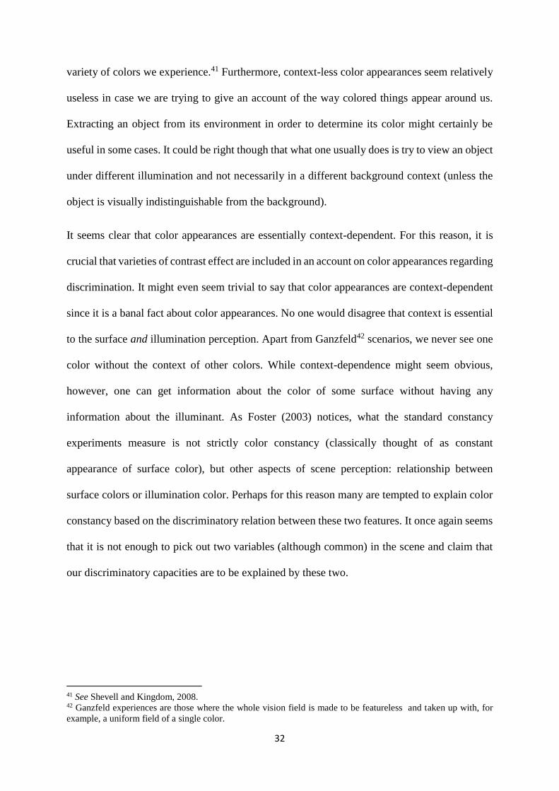
Indeed, there have been studies that tried to incorporate the complexity of the scene similar to
the natural environment. In their study, Kraft and Brainard (1999) designed an experimental
chamber (See Figure 3) that included several kind of cues in order to test three theoretical
assumptions about how much the color constancy is determined by adaption to: the brightest
surface in the scene, the mean luminance and the local contrast. These elements placed in the
experimental chamber provided cues to the illuminant: “a Macbeth Color Checker, a cylinder
covered in wrinkled aluminium foil, three objects made from gray cardboard, and one wall lined
with gray cardboard.”43
Figure 4: An example of an experimental chamber by Kraft and Brainard (1999)
The results showed that none of these alone were sufficient to achieve constancy. The highest
constancy value achieved (83%) was when the scene in the chamber included the full set of
cues. Color contrast cases mentioned earlier are considered as effects of the color constancy
mechanisms.44 As Hulbert (1999) points out, one of the most powerful contributors to constancy
43 Kraft and Brainard, 1999, p. 309. 44 See Brogaard and Garzia, 2017 and Palmer 1999.
34
is the local contrast that represents the immediate background of the object. The ratio of the
local contrast is preserved even when significant changes of the illumination occur. In their
experiment, Kraft and Brainard showed that when the effect of local contrast is silenced, the
constancy index falls to 53%. The same goes for the global contrast that concerns the overall
scene the subject is observing. The difference between the local and the global contrast is that
they function on a different level of visual processing. The local contrast operates at early
stages, while the global contrast operates in higher-order visual areas. The study by Kraft and
Brainard represents the trend in vision science that recognizes that the complexity of real world
perception cannot be captured in computer screen studies: “This limitation is especially true for
phenomenon such as colour constancy, which is evidently not a single, simple operation, but
the combined result of mechanisms that span the levels from sensation to cognition.”45
Another instance where the proposed “simple” style of discrimination capabilities might not
work are the filter color constancy cases (Brown, 2014). Filters, as already discussed, are one
of the alternative candidates for what is varying in the scene that do not necessary involve
varying illumination: tinted sunglasses, windows and fluids. As mentioned earlier, when
observing an opaque object through a tinted liquid (e.g. the amber beer) we are experiencing
the constant color of the object though through a layer of beer’s color. Brown sees such cases
as a support for his layering thesis, according to which we can simultaneously experience two
colors in a form of layers – one opaque and one transparent. Since one of these remains constant
and the other varies, we experience constancy and variability at the same time. Similarly, in the
case of illumination change one experiences the constancy of the target surface through the
“layer” of the changing illumination.46 Now, the layering thesis is not intended to explain all
kinds of constancy scenarios. What I find useful about this account is that it captures the
45 Hurlbert, 1999, p. 560. 46 The same goes for the shadows.
35
importance of both constancy and variation in the experience of the scene. Moreover, the
layering account points to the filter case of constancy that has been mainly ignored in the
literature. It opens the door to the complexity of the constancy in natural viewing conditions.
Matthen (2010) makes a step towards complexity by proposing the Scene-parsing thesis,
according to which “some features must be ascribed to other things in the scene (not only the
wall and the table): the wall looks white and the light looks pink and that's why the wall looks
as white things look in pink light.”47 It is important to note that illumination was mainly seen
as something that the visual system discards instead of acknowledging it as a stand-alone
feature. Matthen, for instance, proposes that the visual system extracts (as opposed to discards)
the illumination as well as many other features of the scene. For that reason, the scene-parsing
view is promising because it acknowledges the complexity of viewing scenarios. The idea is
that the visual system does not only gather the information about the scene but also parses the
scene into usable information about different objects in the scene (which includes glossiness,
shadows and contrast effects). It is important to note that the Scene-parsing proposal does not
regard appearances of color properties specifically. Instead, it attempt is to explain the visual
phenomenology of a large variety of properties and objects. As discussed earlier, for color
constancy phenomena to be successful48, it takes contribution from several kinds of cues and
features in the scene. Some take it that this shows that color constancy cannot be analyzed in
isolation from a variety of not-strictly-color features in the scene.
In my view, a more accurate explanation of constancy capacities needs to be more complex - it
needs to accommodate illumination change, filter effect, contrast effect as well as the effects of
the variety of cues in the scene (e.g. glossiness). In a natural situation, the scenarios include at
least two or three of those listed. For this reason, explaining discriminatory capacities as being
47Matthen, 2010, p. 3. 48 Note that color constancy is never perfect but only approximate, see Hardin 1988.
36
the source of the change in only surface-light appearance seems to underestimate the
complexity of the phenomenon - the exact same complexity Davies primarily wanted to account
for.
2.4 Represented surfaces, transparencies and illumination
At this point, what is needed is to clarify what exactly is being represented in a viewed scene.
On the one hand, there are individuals that are represented and on the other, there are features
that cue what is being represented. Now, it is possible that something can work both as a
represented individual in one viewing condition and as a cue in other. However, I will try to
categorize the represented individuals and cues in the scene. In the common debate among
discriminatory theories (Matthen and Davies) and in the classical experiments described earlier,
there are taken to be two main types of individuals represented in the scene: object and
illumination. As mentioned earlier, Davies argues that both object and illumination have their
separate set of appearance properties consisting of hue, brightness and saturation value. All
other features that might figure in the scene work as cues for the representation of these two
individuals. The illuminant cues are for example, shiny features, mean luminance, the
background (this includes the local and the global contrast mentioned in the earlier study),
shared hues, shadows, depth, etc.
The features in the scene for which is it not so obvious what category they belong to are cases
of filters and transparencies. According to Brown’s view on filter cases, one might assume that
filters are represented as basic individuals just like illumination and object surface. This is
because at times, filters seem to play similar role as that of the illumination. Now, the idea of a
complex discriminatory account I am trying to construct is to include cases that seem to fallout
37
of the simple discriminatory view: discrimination between surface and illumination. There are
at least four ways to categorize colored filter cases into complex discriminatory view.
The first option is that every scene is parsed into, on the one hand, opaque surfaces and on the
other, see-through layers or transparencies. In common circumstances, the scene would include
one kind of transparency: the illumination. In the amber beer case, though, the scene would be
made out of an additional layer – amber beer as a localized filter. Each of these two types have
their own color appearance properties (except perhaps those transparencies that are not filters
because they are completely see-through and not tinted). Under this categorization, there could
be cases where filter would be prevalent, like wearing tinted glasses or having one’s face really
close to the amber beer. Such model categorizes filter cases as the same type as illumination
since both are kinds of transparent layers. Now, the idea of this kind of scene parsing is
problematic because it suggests that in a constancy scenario what is constant are opaque
surfaces and what is variable are the layers. However, filters might equally be target surfaces
in a constancy scenario. At times, filters seem to be more similar to types of surfaces rather than
transparencies like illumination. Possible solution for this might be to look at the following
alternative.
The second option would be to say that every scene representation is parsed on the one hand
into surfaces that are either opaque or transparent and on the other hand into illumination layer.
For the amber beer case, this would mean that amber filter is represented as a type of a material
transparent surface. This kind of categorization groups together filter cases with material
objects rather than with the illumination. Considering the case of yellow-tinted sunglasses, the
ambient illumination would appear to be yellowish as of the sunglasses. This is rather
problematic since illumination appearance properties are not yellowish. For Brown, the
sunglasses case is an adaptation case “when a lightly saturated filter that spans one’s field of
38
view becomes invisible due to adaptation.”49 Accordingly, in this case, the filter is not
experienced as a surface but it is rather mistaken for the ambient illumination. One way to get
out of this situation is to say that these filter-prevalent cases are just cases of misperception
because the observer is not in a position to determine which color appearance dimensions are
caused by illumination and which by the filters.50
There is, however, a third option according to which when we experience a scene we experience
an opaque layer, an illumination layer and the transparent layer (e.g. filter). This option, I
assume, is similar to Brown’s color layering view. All three individuals are types of layers of
colors. Moreover, Brown (2014) describes three types of layered experiences: complete,
incomplete and layering failure. The complete layered experience, already discussed earlier, is
one where the subject distinctly experiences two layered colors. For example, seeing the green
book through the amber beer. The incomplete layering occurs when one fully experiences one
of the layered colors and only partly the other. The third type of layered experience is the
layering failure or fusion. This happens when no distinct colors are experienced along the line
of sight. For example, when we experience the fusion of the color of the filter with the opaque
surface (Figure 4): experiencing greenness of the yellow book through the blue filter.
49 Brown, 2014, p 16 50 Whether this is a form of misperception depends on what ontological stance one takes which is an issue I will
not deal with in this section.
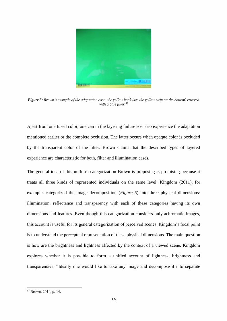
39
Figure 5: Brown’s example of the adaptation case: the yellow book (see the yellow strip on the bottom) covered
with a blue filter.51
Apart from one fused color, one can in the layering failure scenario experience the adaptation
mentioned earlier or the complete occlusion. The latter occurs when opaque color is occluded
by the transparent color of the filter. Brown claims that the described types of layered
experience are characteristic for both, filter and illumination cases.
The general idea of this uniform categorization Brown is proposing is promising because it
treats all three kinds of represented individuals on the same level. Kingdom (2011), for
example, categorized the image decomposition (Figure 5) into three physical dimensions:
illumination, reflectance and transparency with each of these categories having its own
dimensions and features. Even though this categorization considers only achromatic images,
this account is useful for its general categorization of perceived scenes. Kingdom’s focal point
is to understand the perceptual representation of these physical dimensions. The main question
is how are the brightness and lightness affected by the context of a viewed scene. Kingdom
explores whether it is possible to form a unified account of lightness, brightness and
transparencies: “Ideally one would like to take any image and decompose it into separate
51 Brown, 2014, p. 14.
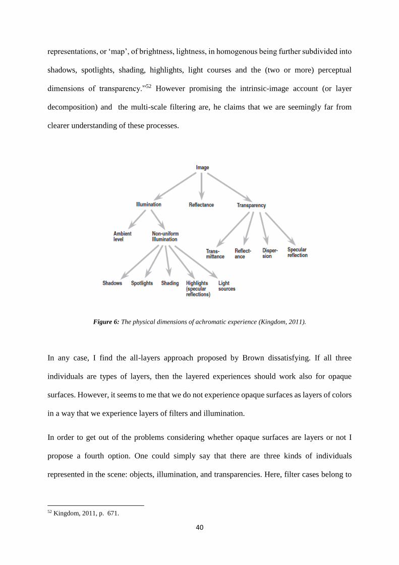
40
representations, or ‘map’, of brightness, lightness, in homogenous being further subdivided into
shadows, spotlights, shading, highlights, light courses and the (two or more) perceptual
dimensions of transparency.”52 However promising the intrinsic-image account (or layer
decomposition) and the multi-scale filtering are, he claims that we are seemingly far from
clearer understanding of these processes.
Figure 6: The physical dimensions of achromatic experience (Kingdom, 2011).
In any case, I find the all-layers approach proposed by Brown dissatisfying. If all three
individuals are types of layers, then the layered experiences should work also for opaque
surfaces. However, it seems to me that we do not experience opaque surfaces as layers of colors
in a way that we experience layers of filters and illumination.
In order to get out of the problems considering whether opaque surfaces are layers or not I
propose a fourth option. One could simply say that there are three kinds of individuals
represented in the scene: objects, illumination, and transparencies. Here, filter cases belong to
52 Kingdom, 2011, p. 671.
41
the category of transparencies. Such categorization brings about several advantages. First, this
is a viable option because it avoids the mid-ground position filter cases have. They either can
look like types of surfaces (the amber beer case) or like types of illumination (unknowingly
wearing pinkish sunglasses) but are better categorized as a stand-alone category. Second, there
are the filter-prevalent cases where the representation of the illumination is not on the first place.
For this reason, it might be better to avoid stuffing filter cases into other categories and rather
have it as a stand-alone type. In such way, one also avoids the discussion on whether filters are
more like surfaces or more like illumination. Third, this option avoids the unintuitive position
that all three represented individuals are types of layers and are experienced as such. As already
mentioned, viewing opaque surfaces does not seem to be necessary a part of a layered
experience. Moreover, illumination is not always experienced as a type of a layer. Think, for
example, of the glossy materials with strong highlight specular reflection.
2.5 Towards the complex discriminatory view
In complex scenes, rich in different kinds of light sources and filters (imagine wearing yellow
tinted glasses in a light show), it could be rather difficult to determine which individuals are
represented and how do they interact. On the one hand, filters might look like illumination, as
in the sunglasses case where we experience ambient light in the color of the tinted glasses. On
the other hand, illumination can appear as a filter. For example, consider a scene that is
uniformly illuminated without a clear light source, such as daylight on a cloudy day. This is to
say that the simple discrimination between surface and illumination is not enough as suggested
earlier. The complex view aims to explain the constancy phenomenon in simple laboratory-like
and in the richer natural-scene cases.
42
As discussed in the beginning, there is a confrontation of two strong intuitions when it comes
to color appearances. On the one hand, objects around us appear to have stable colors and are
easily recognizable. On the other hand, the colors of objects are highly variable with the changes
in illumination or filters. It seems that in order to achieve the fair treatment of the two intuitions
about the color appearance one requires an account rich in complexity. In this chapter, I
attempted to show that there are (at least) two steps to achieve such account on the looks of
colors. First, stability and change must be considered on an equal footing. This is to say that, as
we experience constancy we also experience variation in color appearance. The constancy
phenomenon obtains from the discriminatory capacities that parse the viewed scene into basic
individuals and cues. Second, for the account to be adequately rich one must accommodate
different types of viewing scenarios and different types of basic individuals represented in the
scene. The main addition towards this richness comes by adding filter cases and experiences of
layers (Brown, 2014).
The complex discriminatory view I am proposing diverges from the Brown’s view in two
senses. First, the only clear cases of layered experiences are transparencies. For this reason, the
full representation of the observed scene is not parsed into several layers of opaqueness,
transparency and illumination. Instead, it is that those three basic individuals are not layers but
stand-alone types that can either be experienced as layers or not. For example, I do not deny the
possibility that we do have layered experiences of the illumination (like at a light show).
Second, the discriminatory capacities that are responsible for the scene-parsing are subject to
both, conscious and unconscious processes.53 Brown, however, accounts for the experientially
realist view (invariantist), according to which the constant element is present and it is in this
sense part of the perceptual phenomenology. I take it that while in some scenarios the constant
element is certainly experientially present, there are also scenarios where the constant element
53 Later on I will address this issue in a greater detail.
43
is inferred (consciously or unconsciously) from the other color and non-color elements that take
part in the scene. Furthermore, as already discussed, one of the motivations for embracing the
discriminatory account is to overcome the dichotomy between variantist and invariantist
accounts.
The proposed complex discriminatory view differs from Davies’54 view in the sense that it adds
the transparencies to the basic features among which the visual system discriminates. The
upshot is that the complex discriminatory view I am proposing combines, on the one hand,
selected features of the Layering thesis with the discriminatory color constancy, on the other.
Its strongest feature is that it enhances the complexity color appearances bear in natural viewing
scenarios. However, if the discrimination depends on discriminating between number of color
and non-color features (e.g. shape) in the scene and on different kinds of discriminatory
capacities (consider again the matching experiments), then it might look like we cannot provide
a unifying account for color constancy. This is not necessary a downside, if the project is to
understand color appearances in general. The fundamental feature of the complex view I am
proposing, is that the perception of color is not a process isolated from perception of other
features. This kind of approach to the discriminatory color constancy might seem somewhat
similar to the relational capacities proposed by Craven and Foster (1992): the capacities defined
as maintaining stable relations among variety of colors perceived in a scene across lightning
conditions. Now, the relational capacities certainly do fit into the complex view. However, the
idea of the complex view is broader in a sense that it concerns relations among features in the
scene that do not merely regard colors and that these relations are not necessarily consciously
available to the perceiver.
54 Matthen is on the other hand somehow vague about which features exactly take part in the discrimination or the
parsing.
44
Moreover, I take it that it is better to stay careful when drawing ontological conclusion about
colors since the relationship between scientific evidence and ontological commitments is a
tricky ground. Taking color constancy as an example, Chirimuuta (2008) points out two features
that characterize this delicate relation: the consensus within color science and the neutrality
concerning the philosophical dispute. The idea is that when an empirical evidence is used in
discussion on color ontology, one might want to figure whether there is a consensus in scientific
community about the alleged evidence. Moreover, to avoid circularity, one might want to figure
what are the underlying philosophical assumptions scientists themselves have. Both of the
features seem understandable and perhaps practically unavoidable. For this reason, I think that
one ought to be careful when drawing ontological conclusions from empirical evidence.
Moreover, this gives us another motivation to take color constancy phenomena as ontologically
neutral. However, Chirimuuta (2015) claims also that there is a minimal epistemology of
perception that stands a background of the empirical research which she articulate with the
following truisms:
“1. Perception is an action-guiding interaction between perceiver and environment.
2. Perceptual systems do not deliver a uniquely true description of the world.
3. Each description is partial-
4. Each description is interest relative.”55
This set of assumptions formulate so-called perceptual pragmatism according to which
“perceptual systems do not deliver any uniquely true description of world; instead, each
description is partial and interest relative”.56 Motivated by perceptual pragmatism, my aim is to
55 Chirimuuta, 2015, p. 107. 56 Chirimuuta, 2015, p. 101.
45
show that the empirical evidence on the discussed phenomenon does not tell us much about the
ontological status of colors.57
To conclude, there are two things to keep in mind in continuing the discussion. The first is that
the discriminatory capabilities are more complex than simple capacity of distinguishing
material change from illumination change. The second is that the color constancy capabilities
alone do not motivate any metaphysical stance on color, as it is assumed by the invariantists.
Preferably, an account on color constancy and variation should be ontologically neutral. In other
words, to understand the (un)steady nature of color appearances we do not need to rush into
metaphysical conclusions. Although color constancy phenomena itself is ontologically neutral,
later on I discuss the issue on what ontological conclusions one can draw from color
appearances as such. Chirimuuta (2015) points out that the interesting part of the relational
color constancy approach is that it “comes with the implication that constancy works to give us
information about relative similarities and differences between objects, rather than information
about intrinsic surface properties.”58 This suggests that the primary function of constancy
capabilities might not be to represent the ‘real’ or objective properties of the objects as
invariantists wished for at first.
When trying to understand color appearances one has to take into account all other non-strictly-
color features in the scene, such as depth, texture, shadows, glossiness etc. In what follows, I
will discuss how color appearances are inseparable from their own context, this is other color
appearances. In this sense, color appearances are essentially context-dependent and are (at least
usually) not represented as atomistic properties of surface material or lighting. 59 Contrary to
Davies’ explanation of constancy capabilities that are grounded in the perceptual capacity to
57 Unlike me, Chirimuuta does not account for onotological nautrality regarding colors. In the last chapter I show
how my view diverges from hers. 58 Chirimuuta, 2015, p. 58. 59 See Morrison, 2013.
46
represent monadic properties of color appearances. Moreover, I will discuss how color
appearance properties fundamentally depend on other features in the scene and are thus
unanalyzable without the rich environment one usually encounters them. Following this line of
thought, Chirimuuta (2015) takes a holistic approach to color constancy: “If color perception
cannot be separated from perception of other properties, there is nothing to persuade us that
color experience (plus some attendant ontological commitment to perceiver-independent color),
and not object constancy, is driving the phenomenology.”60
60 Chirimuuta, 2015, p. 211.
47
3 The Tricky Colors
3.1 The trickiness of color experiences
Up until this point, I discussed common features of color experiences – constancy and variation.
Now, I would like to turn attention to a quite special case of color experiences, so-called
impossible colors. I am referring to the reported evidence of experiences of combination of
complementary hues: reddish-green and yellowish-blue. Now, to point out right at the start,
experiences of reddish-green are not like experiencing the autumn leaves where red and green
merge into each-other. They are rather like orange, a combination of red and yellow.
In this chapter, I will first enter the discussion about the impossibility of the reddish-greens and
yellowish-blues. Moreover, I will look at the empirical evidence of such experiences and
discuss their alleged implications. I will discuss the conceptual an empirical impossibilities,
ontological implications and the relation between the evidence and the color space. The
evidence of these experiences has been use to motivate irrealist accounts of color. I will show
that these is a false inference. Instead, I argue that the phenomenon tells us more about the
nature of our visual system rather than about the nature of colors.
3.2 Experiences of reddish-greens and yellowish-blues
There are some colors that do not figure in our usual perception of the world. Such as, for
example, reddish-green and yellowish-blue. Experiences of the combination of these hues have
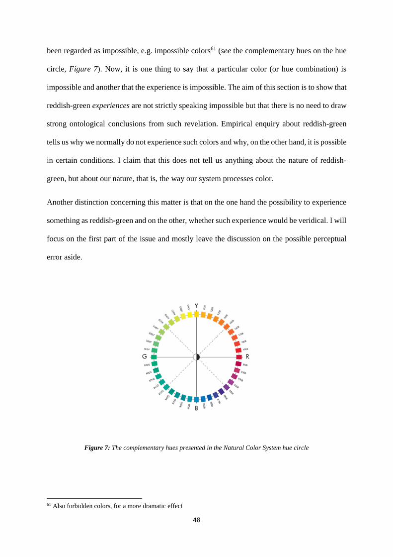
48
been regarded as impossible, e.g. impossible colors61 (see the complementary hues on the hue
circle, Figure 7). Now, it is one thing to say that a particular color (or hue combination) is
impossible and another that the experience is impossible. The aim of this section is to show that
reddish-green experiences are not strictly speaking impossible but that there is no need to draw
strong ontological conclusions from such revelation. Empirical enquiry about reddish-green
tells us why we normally do not experience such colors and why, on the other hand, it is possible
in certain conditions. I claim that this does not tell us anything about the nature of reddish-
green, but about our nature, that is, the way our system processes color.
Another distinction concerning this matter is that on the one hand the possibility to experience
something as reddish-green and on the other, whether such experience would be veridical. I will
focus on the first part of the issue and mostly leave the discussion on the possible perceptual
error aside.
Figure 7: The complementary hues presented in the Natural Color System hue circle
61 Also forbidden colors, for a more dramatic effect
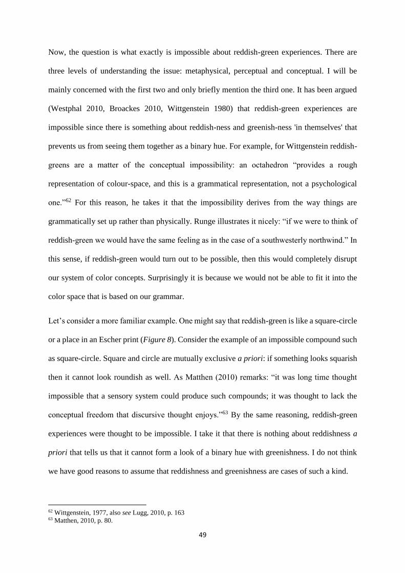
49
Now, the question is what exactly is impossible about reddish-green experiences. There are
three levels of understanding the issue: metaphysical, perceptual and conceptual. I will be
mainly concerned with the first two and only briefly mention the third one. It has been argued
(Westphal 2010, Broackes 2010, Wittgenstein 1980) that reddish-green experiences are
impossible since there is something about reddish-ness and greenish-ness 'in themselves' that
prevents us from seeing them together as a binary hue. For example, for Wittgenstein reddish-
greens are a matter of the conceptual impossibility: an octahedron “provides a rough
representation of colour-space, and this is a grammatical representation, not a psychological
one.”62 For this reason, he takes it that the impossibility derives from the way things are
grammatically set up rather than physically. Runge illustrates it nicely: “if we were to think of
reddish-green we would have the same feeling as in the case of a southwesterly northwind.” In
this sense, if reddish-green would turn out to be possible, then this would completely disrupt
our system of color concepts. Surprisingly it is because we would not be able to fit it into the
color space that is based on our grammar.
Let’s consider a more familiar example. One might say that reddish-green is like a square-circle
or a place in an Escher print (Figure 8). Consider the example of an impossible compound such
as square-circle. Square and circle are mutually exclusive a priori: if something looks squarish
then it cannot look roundish as well. As Matthen (2010) remarks: “it was long time thought
impossible that a sensory system could produce such compounds; it was thought to lack the
conceptual freedom that discursive thought enjoys.”63 By the same reasoning, reddish-green
experiences were thought to be impossible. I take it that there is nothing about reddishness a
priori that tells us that it cannot form a look of a binary hue with greenishness. I do not think
we have good reasons to assume that reddishness and greenishness are cases of such a kind.
62 Wittgenstein, 1977, also see Lugg, 2010, p. 163 63 Matthen, 2010, p. 80.
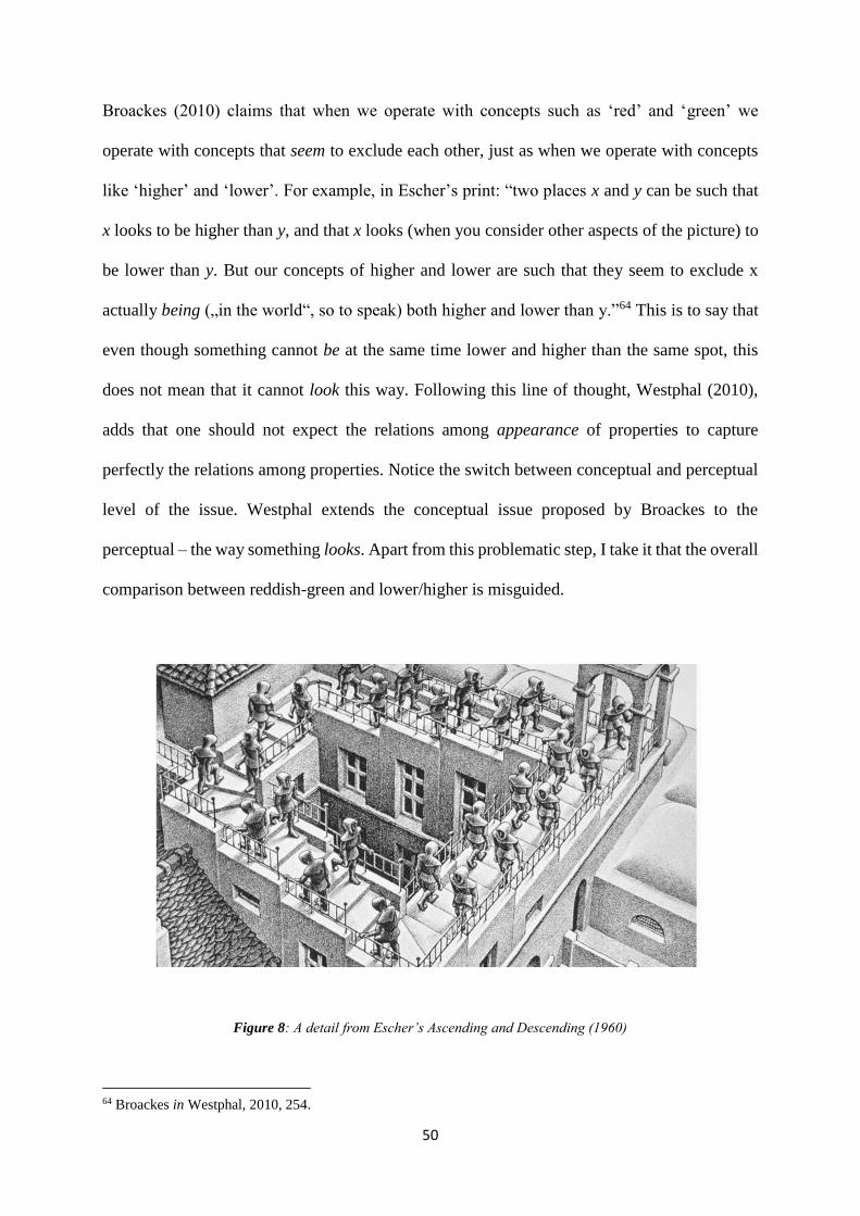
50
Broackes (2010) claims that when we operate with concepts such as ‘red’ and ‘green’ we
operate with concepts that seem to exclude each other, just as when we operate with concepts
like ‘higher’ and ‘lower’. For example, in Escher’s print: “two places x and y can be such that
x looks to be higher than y, and that x looks (when you consider other aspects of the picture) to
be lower than y. But our concepts of higher and lower are such that they seem to exclude x
actually being („in the world“, so to speak) both higher and lower than y.”64 This is to say that
even though something cannot be at the same time lower and higher than the same spot, this
does not mean that it cannot look this way. Following this line of thought, Westphal (2010),
adds that one should not expect the relations among appearance of properties to capture
perfectly the relations among properties. Notice the switch between conceptual and perceptual
level of the issue. Westphal extends the conceptual issue proposed by Broackes to the
perceptual – the way something looks. Apart from this problematic step, I take it that the overall
comparison between reddish-green and lower/higher is misguided.
Figure 8: A detail from Escher’s Ascending and Descending (1960)
64 Broackes in Westphal, 2010, 254.
51
There are two reasons why it seems to me that the reddish-green is not impossible in the same
way that an Escher print is. (i) The definition of higher and lower excludes the same thing to be
in both states at the same time in the relation to the same thing and (ii) the ‘Escher-effect’ works
only once we see x in relation to other aspects of the print. Neither of these two are part of the
impossibility of something looking reddish-green. It is not the case that the content of the
reddish-green experience it itself contradictory as, for example, when something is lower and
higher at them same time.
Although there appears to be nothing about the reddish-ness and greenish-ness that would
prevent them from forming a binary hue, we ordinarily do not experience anything as reddish-
green. We cannot even imagine something being of such hue. Now, if someone could
experience something as reddish-green this would be a good reason to assume that reddish-
green actually is empirically possible. As I will reveal shortly, reddish-green experiences are
possible in certain circumstances. The reason why we ordinarily do not encounter the reddish-
green is not because is it unimaginable. As Hardin (2014) argues, unimaginability of reddish-
green is a weak ground to suppose impossibility. The absence of such experiences is due to the
way our visual system works.
To understand the way our visual system works, we need to turn to the trichromatic theory
combined with the opponent processing. There are three types of cones each with a different
photopigment and differently sensitive to wavelengths: long (L), medium (M) and short (S).
When the cone cells are stimulated by light they emit a neural signal of strength equal to the
strength of the signal multiplied by the sensitivity of the cell to light of that frequency. The
outputs of the three cones overlap in the wavelengths of light. For this reason, the visual system
has to track the differences between the responses of the cones. This ambiguousness is solved
by subtracting the overlap of the cells’ outcome. If the difference is non-zero, then the signal
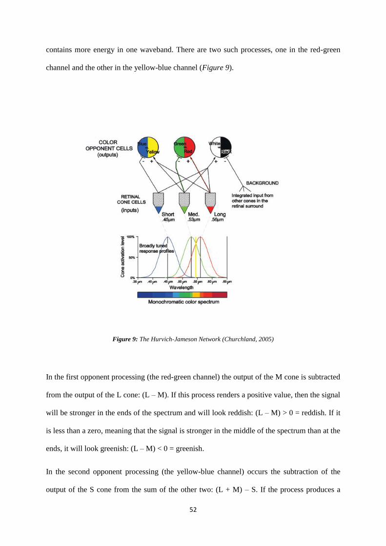
52
contains more energy in one waveband. There are two such processes, one in the red-green
channel and the other in the yellow-blue channel (Figure 9).
Figure 9: The Hurvich-Jameson Network (Churchland, 2005)
In the first opponent processing (the red-green channel) the output of the M cone is subtracted
from the output of the L cone: (L – M). If this process renders a positive value, then the signal
will be stronger in the ends of the spectrum and will look reddish: (L – M) > 0 = reddish. If it
is less than a zero, meaning that the signal is stronger in the middle of the spectrum than at the
ends, it will look greenish: (L – M) < 0 = greenish.
In the second opponent processing (the yellow-blue channel) occurs the subtraction of the
output of the S cone from the sum of the other two: (L + M) – S. If the process produces a
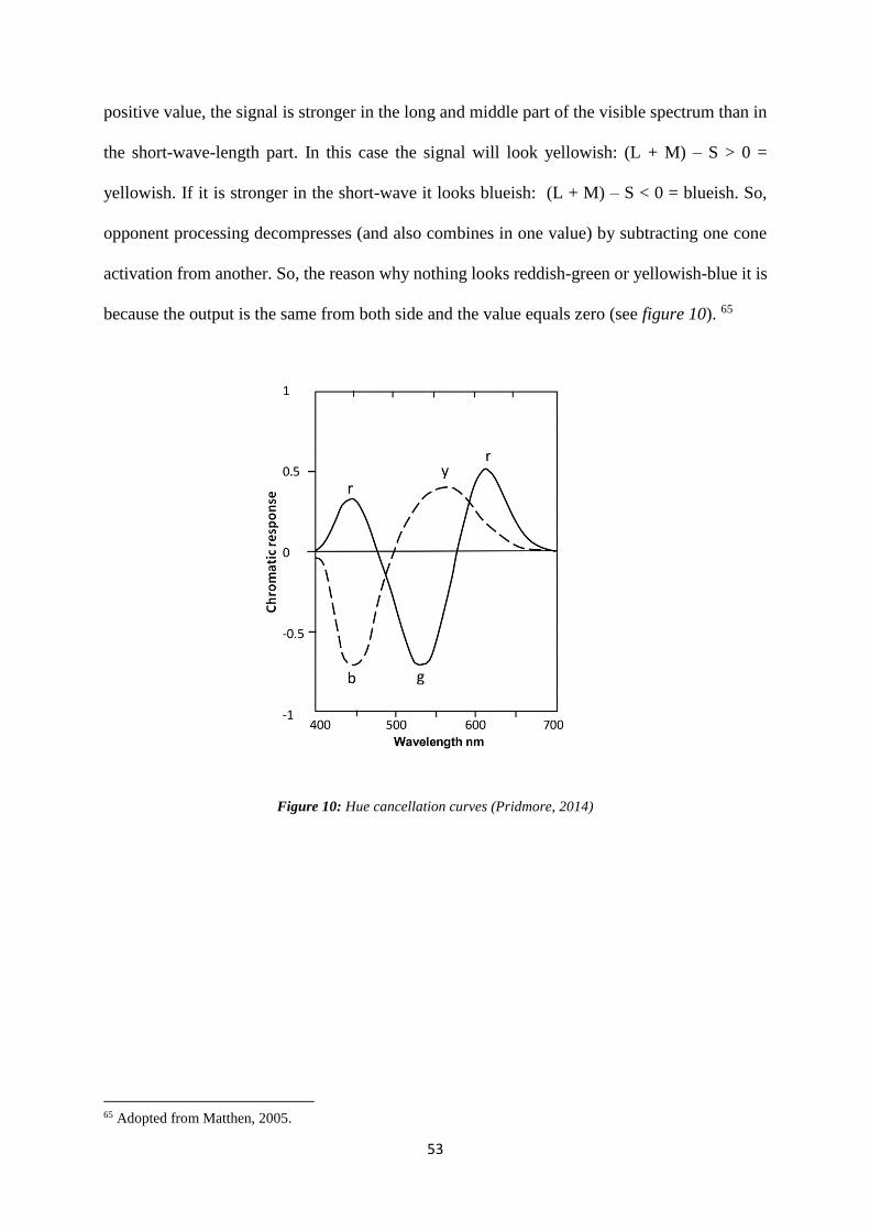
53
positive value, the signal is stronger in the long and middle part of the visible spectrum than in
the short-wave-length part. In this case the signal will look yellowish: (L + M) – S > 0 =
yellowish. If it is stronger in the short-wave it looks blueish: (L + M) – S < 0 = blueish. So,
opponent processing decompresses (and also combines in one value) by subtracting one cone
activation from another. So, the reason why nothing looks reddish-green or yellowish-blue it is
because the output is the same from both side and the value equals zero (see figure 10). 65
Figure 10: Hue cancellation curves (Pridmore, 2014)
65 Adopted from Matthen, 2005.
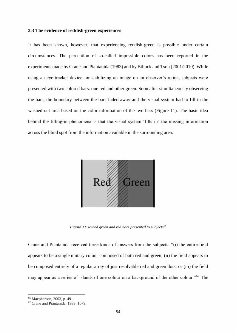
54
3.3 The evidence of reddish-green experiences
It has been shown, however, that experiencing reddish-green is possible under certain
circumstances. The perception of so-called impossible colors has been reported in the
experiments made by Crane and Piantanida (1983) and by Billock and Tsou (2001/2010). While
using an eye-tracker device for stabilizing an image on an observer’s retina, subjects were
presented with two colored bars: one red and other green. Soon after simultaneously observing
the bars, the boundary between the bars faded away and the visual system had to fill-in the
washed-out area based on the color information of the two bars (Figure 11). The basic idea
behind the filling-in phenomena is that the visual system ‘fills in’ the missing information
across the blind spot from the information available in the surrounding area.
Figure 11:Joined green and red bars presented to subjects66
Crane and Piantanida received three kinds of answers from the subjects: “(i) the entire field
appears to be a single unitary colour composed of both red and green; (ii) the field appears to
be composed entirely of a regular array of just resolvable red and green dots; or (iii) the field
may appear as a series of islands of one colour on a background of the other colour.”67 The
66 Macpherson, 2003, p. 49. 67 Crane and Piantanida, 1983, 1079.
55
majority of subjects reported to experience a binary color constituted of red and green
simultaneously.68 Considering the first group of answers, the subjects reported to see a binary
color constituted of red and green simultaneously.69 The authors’ interpretation of these reports
is that the filling-in phenomenon results from the connections between different areas of the
cortex (corticocortical connections) rather than from connections between retina and cortex
(retinocortical connections).
The experiment has been reproduced by Billock and Tsou (2001 and 2010). Subjects in their
study did report to have reddish-green experiences. While they did reproduce the experiment
by using the eye-tracker, their addition was the illuminance variation. In the study, 4 out of 7
subjects reported experiencing a homogeneous color composed of red and green in a compelling
way as the red and blue components of a purple. Some of these subjects, however, had this
homogeneous experience only after a few trials: “This bears on arguments that novel color
percepts may be precluded by lack of early experience during perceptual development. Clearly
the strongest form of this argument is not supported, but the effect of experience suggest that a
gradual sensory reorganization may be taking place.”70 The most recent experiment on reddish-
green experiences has been conducted by Livitz et al. (2011). As opposed to previous
experiments, instead of eye-tracker the authors used induction displays where the participants
had to determine the boundaries of chromatic zones in a red-green continuum (Figure 5). The
observers in the experiment reported seeing reddish-green colors. As authors claim, this is a
first study where participants reported opponent hue combinations in normal viewing
conditions (meaning not using eye-tracker for retina stabilization).
68 Others reported to experience a variety of different red and green patterns, but not reddish-green compunds. 69 The same experiments were made with yellow and blue bars. 70 Billock, et al., 2001, p. 2399
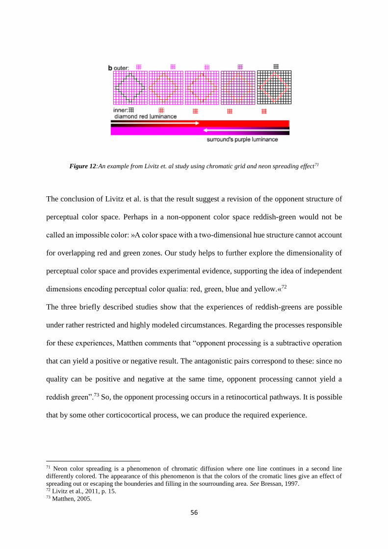
56
Figure 12:An example from Livitz et. al study using chromatic grid and neon spreading effect71
The conclusion of Livitz et al. is that the result suggest a revision of the opponent structure of
perceptual color space. Perhaps in a non-opponent color space reddish-green would not be
called an impossible color: »A color space with a two-dimensional hue structure cannot account
for overlapping red and green zones. Our study helps to further explore the dimensionality of
perceptual color space and provides experimental evidence, supporting the idea of independent
dimensions encoding perceptual color qualia: red, green, blue and yellow.«72
The three briefly described studies show that the experiences of reddish-greens are possible
under rather restricted and highly modeled circumstances. Regarding the processes responsible
for these experiences, Matthen comments that “opponent processing is a subtractive operation
that can yield a positive or negative result. The antagonistic pairs correspond to these: since no
quality can be positive and negative at the same time, opponent processing cannot yield a
reddish green”.73 So, the opponent processing occurs in a retinocortical pathways. It is possible
that by some other corticocortical process, we can produce the required experience.
71 Neon color spreading is a phenomenon of chromatic diffusion where one line continues in a second line
differently colored. The appearance of this phenomenon is that the colors of the cromatic lines give an effect of
spreading out or escaping the bounderies and filling in the sourrounding area. See Bressan, 1997. 72 Livitz et al., 2011, p. 15. 73 Matthen, 2005.
57
3.4 The implications of the evidence
Why should we still talk about reddish-green as impossible? As demonstrated, it is indeed
impossible for the opponent-processes themselves to construct reddish-green experiences.
However, I want to focus on another part of this issue by pointing out that even if it is possible
for something to look reddish-green in certain conditions that does not give grounds to assume
that something can be reddish-green.
3.4.1 Conceptual and empirical impossibilities
New discoveries on experiencing impossible colors bring up another issue - does this evidence
speak against a priori status of the proposition that nothing can be red and green all over
(reddish-green?).
After learning about the opponent processing and being confronted with the experimental data,
one could, I suppose, be tempted to conclude that an issue on reddish-green is about the
empirical impossibility rather than conceptual or even logical. Our visual system sets the limits
to the way colors appear to us, although these limits can vary depending on the conditions.
However, Brenner (1987) asks ‘what is the philosophical significance of the work of Crane and
Piantanida?’
“Normally, people cannot perceive reddish-green because of the natural opponent-process
mechanism, but when different mechanisms are at work they can. Or should we say that,
although normally we follow grammar, under very unusual circumstances many of us will
be inclined to depart from it and to use the ‘ungrammatical’ word ‘reddish-green’? – that,
58
although normally we keep within the boundaries of language, many of us will jump over
them in reaction to strikingly unusual stimulus conditions?”74
I assume that the first part of Brenner’s answer is something Hardin (2014) would adopt and
the second would be a sort of a Wittgensteinian answer. However, if put this way, it does seem
that the two Brenner’s answers or rather suggestions of interpretation are not mutually
exclusive. I shall attempt to argue that (i) while the issue on the impossibility of experiencing
reddish green is a matter of empirical investigation, (ii) the reason why the answers provided in
the experiments are so variable, ‘weird’ and seemingly unreliable might as well be due to the
grammar that we use.
Brenner (1987) argues that the opponent-process theory does not imply that reddish-green
experiences are empirically impossible. If it would be so, the experimental evidence would
disconfirm the theory. However, the theory would be refuted only if we are forced to conclude
that only the subjects who reported to experience reddish-green were right and rhose who did
not were wrong. We cannot make such a judgment because there is no standard way of
experiencing reddish-green, as there is for other colors such as pink. For Brenner, “a language
in which they [the reddish-green propositions] had an empirical function – i.e., in which they
said something true or false – would be a language that we do not speak.”75 However, the
opponent-process theory has not been disconfirmed by the experiment, which is why for
Brenner the impossibility at issue is not an empirical implication of the opponent processing.
I take it that the empirical function of the opponent-process shows that it is impossible to
experience reddish-green as solely a product of the opponent processing.76 Moreover, rightness
conditions do not apply to the case where there are some subsequent processes going on since
74 Brenner, 1987, 209. 75 Brenner, 1987, 211 76 I also wonder why would one have to speak about the empirical function of the language in this context.
59
the theory does not even predict what happens when conditions are as described in the
experiments. The only rightness condition that opponent process theory accounts for is about
the opponent-processing when concerning the usual circumstances.77 So, even if the theory is
not being disproved, the impossibility of reddish-green can be seen as an empirical implication
of the opponent-processing.
Hardin (2014) claims that the answer to the question about the proposition depends on how we
understand it. If it is understood the same as the proposition that nothing is both red and yellow
all over, then the existence of reddish-green binaries is on the same footing as the existence of
red-yellow binaries (e.g. the existence of orange). If the reason for the apriority of the
proposition is the concern about something being reddish-green instead of only looking reddish-
green then the significance of the experiment is limited. But if the reason for the proposition
that something being red and green all over is unimaginable, then the experiment is largely
essential for the discussion since “what was unimaginable proved to be perceivable and what
was then perceived came to be imaginable”78. As mentioned earlier, unimaginability is clearly
a weak ground for inferring impossibility.
The experiments on experiencing reddish-greens highlight the longstanding problem –
interpersonal variation in the perception of color. The subjects participated in the experiment
under the same conditions reported different experiences, including non-novel binaries. Our
primary worry should not be ‘how does the world look like to someone with a different visual
system’ or ‘how to reconcile the way the world is colored (if it is), with the fact that there are
many perceivers with different perceptual systems’ or ‘which system captures the world more
correctly’. Our primary concern should be of understanding interpersonal variation, since it
might be that the color space (as perceived) can be different among standard trichromats (some
77 If we even need to talk about rightness and wrongness here. 78 Hardin, 2014.
60
can see reddish-greens and some do not) and not only for someone with a different system as,
for example, someone with a tetrachromatic vision.79
Suppose, for a moment, that the issue on the impossibility is an empirical matter. There are still
some doubts left about the experimental data. What is worrisome, as Wittgensteinians like to
point out, is the extent of the variability of the reports, as well as their ‘messiness’ and
unclearness. Lugg (2010) argues that the experiments (excluding Livitz et al.) do not show that
reddish-green (properly so-called80) was perceived or show that Wittgenstein was wrong. For
example, the experimental reports do not assure that scientists’ (as subjects) own biases were
controlled. Lugg points out that “ordinary science philosophy can be as simple-minded as
ordinary language philosophy, and scientists bearing gifts should be unreservedly welcomed no
more than dictionary writers bearing them, the deliverances of common science and technical
language being no more foolproof than the deliverances of common-sense and everyday
language.”81 Moreover, he claims that Wittgenstein’s writings should not be considered anti-
scientific, since his only attempt is to “remove confusions about colour to which colour
scientists no less than the man or woman in the street are prone.”82 If it would be convincingly
shown that the new experiences are ‘real’, then all what Wittgenstein would have to say is that
we would require new vocabulary (even if perhaps just for the laboratory). Now, while it does
not seem that Wittgenstein is only up for such an ‘innocent’ consideration of reddish-green
impossibility as Lugg is saying, the variability and ‘messiness’ of the responses might rightfully
be of our concern.
The perceptual variability does seem to pose a problem. Hardin (2014) acknowledges the issue
when he asks: “if observers who are tested under the same set of conditions don’t see the same
79 There is an evidence of the first offically confermed tetrachromatic person, see Jordan, et al. (2010). 80 He claims that many are inclined to describe autumn leaves as reddish-green, even though they are not reddish-
green in the right sense. He does acknowledge that in the Billock et. al case, the subjects were color scientists and
assumingly immune to such error. 81 Lugg, 2010, 180-181. 82 Lugg, 2010, 181.
61
colors, the obvious question is which, if any of them sees the colors as they are and which, if
any of them, misperceives those colors?“.83 For him, such unusual experiences are to be treated
equally since they are all products of the normal human color perception system, just that in
this case the system might have produced experiences that are not predicted by usual processes.
Now we are left with the question as to whether the Wittgesteinians are completely wrong. To
understand the reasons why the subjects gave all sorts of responses (not just the experience of
the new binary hue), Wittgensteinian reasoning might be of some help. Our experiences are
probably somehow connected with the linguistic and grammatical usage of color concepts.
However, I see it that the variability of the reports might imply two things. First, there really is
some new experience going on (if we are ‘lucky’ it is of reddish-green). Second, we might need
to employ new vocabulary to describe those experiences in non-vague way, as Wittgenstein
would suggest, though not for his own reasons. 84 Unlike Wittgensteinians, I believe that having
to potentially modify our color vocabulary would stand as a consequence of accepting the
proposition that reddish-green is empirically impossible. If the issue really is empirical, we
should not have a problem with modifying our concepts if it turns out that non-opponent color
space is to be suggested. The authors (Livitz, et.al) of the most recent experiment even suggest
the following: “our results also support a revision of the opponent structure of perceptual color
space. Unlike classical opponent space (…), a non-opponent color space does not forbid
perception of opponent hues together and subsequently opens the possibility of perception of
colors with three and even four primary hue components.”85 If such suggestions were
convincing, Wittgenstein would have to learn the ‘new’ vocabulary, not because the reddish-
83 Hardin, 2014, 381-381. 84 New vocabulary would perhaps be useful already in order to not confuse them with the names we use for autumn
leaves. 85 Livitz, et. Al, 2011
62
green does not fit into our logic of color concepts, but because it is a consequence of the
empirical states of affairs.
3.4.2 Ontological implications
Now, experienced properties that objects cannot possess are usually considered as problematic.
Macpherson (2003) and Arstila (2005) 86, for example, argue that the evidence of reddish-green
experiences flies in the face of certain realist accounts on color. While Arstila goes as far as
claiming that, the evidence reddish-green experiences straightforwardly supports color
irrealism, Macpherson merely argues that these experience stand as a counterexample to a
representationalist view.
In an attempt to show that color irrealism is the only color theory worth adopting, Arstila
assumes that the findings of the experiment show that we can perceive the new colors that are
phenomenally equal to all other binary colors. The impossible colors are considered as such
because their experience conflicts with the well-established color theory: “The crucial
consequence of this is that these new colors cannot be explained by referring to any external
physical object–even if there could exist a physical red-green property of physical objects–our
best theories tell us that retinocortical neural processes would not let us see it. […] in order to
explain these novel colors we must turn to mechanisms that are internal to our brains.”87
Arstila claims that the impossible color phenomenon brings about good reasons against color
realism. The phenomenon suggests that colors are mind-dependent properties. This is to say
that if these impossible colors cannot be properties of external objects, then no other color can
be. It would be somehow odd that only in the case of the impossible colors phenomenology is
internal and overrules the usual channel of color information (retinocortical perception). As
86 See also Nida-Rümelin and Suarez (2010) 87 Arstila, 2005, p. 97.
63
Arstila claims: “it would be implausible to suggest that the phenomenology of some of our
mental colors is determined by the properties of physical objects, if this does not hold for
combinations of those colors.”88 This is to say that if P and Q are possible properties of real
objects, then P and Q must be a possible property. The impossibility rests on combinations of
possibilities (like P and not-P). For this reason, it is more plausible to say that all color
experiences are subjects only to internal processes. Now, considering the assumed failure of
color realism, a general suggestion of this discussion is that some sort of color irrealism holds
true.
So, one of the main claims Arstila makes is that as one can perceive (novel) colors that are not
representations of external properties, the color realist is unable to differentiate between
impossible colors and other colors. Since color realism cannot really explain the impossible
colors phenomenon, the theory must be false. Moreover, Arstila argues that the evidence that
phenomenal externalism89 does not hold for impossible colors, give us good reason for thinking
that it should not hold for all other colors: “if the phenomenology of impossible colors is
internal, why is this not the case for all colors?”90
The Arstila’s argument goes as follows. According to the opponent process theory, color
perception is part of a retinocortical processes. If one can experience impossible color (reddish-
green), then these colors cannot result from retinocortical processes but from corticocortical. If
the experiences would correspond to some physical property, subjects would not be able to
experience impossible colors on the basis of exclusively retinocortical processes in color
perception. There are reports of reddish green experiences (Crane and Piantanida). Therefore,
impossible colors are consequences of corticocortical processes. Furthermore, if there are some
88 Arstila, 2005, p. 98. 89 That the phenomenal content does not depend on anything else external (in this case, properties of physical
objects). 90 Arstila, 2005, p. 98.
64
color experiences that result from corticocortical processes, then it is reasonable to assume that
all color experiences are results of the same processes.
I see this last step in Arstila’s argument as highly problematic. Even if impossible colors are
solely a result of corticocortical processes and do not correspond to any external objects, this
does not automatically make the case that color realism cannot explain them and is therefore a
false theory. There is a possibility of experiencing certain colors in very restricted conditions
without having to change the account on perception of these features in normal conditions. For
example, the study regarding human anterior color center, by Murphey, Yoshor and Beauchamp
(2008) showed that electrical stimulation of the anterior color center is enough to produce the
conscious percept of color. This suggests that having a color sensation does not require an
external visual stimulus in standard viewing circumstances. As in the case of impossible colors
phenomenon, the color experienced by direct electrical stimulation does not follow normal
retinocortical processes. In this sense, color is nothing but a product of particular neural activity.
However, this evidence does not give us reasons to change the account of the usual perception
of color. The same counts for the impossible color experiment where authors themselves claim
that the evidence shows merely that there are circumstances in which the perception does not
follow regular retinocortical processes. For this reason, Arstila’s rejection of color realism
seems unjustified. Refuting color realism altogether based on the reddish-green experiences is
a hasty step.
Macpherson (2003), however, makes a seemingly smaller point by arguing that the evidence of
impossible colors poses a problem for a certain kind of color realism, namely naturalist
representationalism. The representationalist argues that experiences with phenomenal character
typically associated with redness represent that objective physical property which red objects
share. The problem is that there is no such objective property: „Because our visual system
detects colours on the opponent-process model, there could be no object (at least in our world)
65
that looked reddish-green, whatever combinations of physical properties it had, unless we
viewed it in non-standard conditions.“91 If there are no such properties, then how can it be
guaranteed that reddish-green experiences represent an objective physical property? So,
according to Macpherson, representationalists cannot provide a plausible candidate for
objective property that is being represented in reddish-green experiences. It seems to me that is
not exactly a good judgement. Even if it would be impossible for something to look reddish-
green, then this does not imply that there cannot be something that is reddish-green. It could be
that we just cannot see the true color of things.
The second issue is that the representationalist cannot provide an evolutionary explanation for
the phenomena. According to Dretske, an experience will represent that P if and only if it has
the function of providing information about P, which it has gained from its evolutionary history.
For this reason, Macpherson argues that representationalist cannot provide any plausible
evolutionary story to explain the advantage of being able to detect reddish-green only when
wearing an eye-tracker device. I find this criticism insubstantial. It seems that
representationalist has several other issues if she wants to account for an evolutionary
explanation. There are other visual effects, perception of which might not have a particular
selective advantage but nevertheless possibly have some physical correlations. Take an example
of chimerical colors. These are colors that can be seen only temporarily in a form of an
afterimage of the complementary color primarily observed. For instance, stygian blue is a color
that simultaneously appears blue and black. 92
The third problem Macpherson poses for the representationalist concerns the optimal
conditions. Following Tye (1995), experience will represent P if and only if it is caused by and
covaries with P, in optimal conditions. In the case of reddish-green, when wearing an eye-
91 Macpherson, 2003, p. 51. 92 See Churchland, 2005
66
tracker one is in optimal condition for seeing such color. However, Macpherson argues, there
are no such optimal conditions since not all subjects reported to see reddish-green. Moreover,
the conditions specified are ad hoc because they are too particular and gerrymandered. I take it
that this criticism is rather premature. The newer evidence from Billock et al. (2010) has shown
that almost everyone reported having reddish-green experiences. Furthermore, Livitz et al.
(2011) did not use the eye-tracker, in case this makes it less optimal. It was in fact the first study
where participants reported opponent hue combinations in normal viewing conditions93.
Macpherson proposes several ways in which the representationalist could explain the reddish-
green experiences. One way for the representationalist to is to say that what subjects experience
is the representation of reddishness and greenishness. Similarly as orange is a
phenomenological mixture of yellowishness and reddishness. For Macpherson, this is not a
viable option because we do not yet have the determinate for the particular hues in the color
space. With such a move, we only explain the binary nature of the experience but we have not
found the property that is being represented. Indeed, these are representations of something
which we yet cannot pinpoint in the color space since we do not have the determinable.
However, what the experiments suggest (Livitz et. al) is that out color space categorization
might be inadequate and for this reasons these experiences cannot be categorized in the standard
way.
The second option for representationalist is to say that these are representations of an intentional
inexistent. It is that experiences can represent physical impossibilities, such as nonactual
objects. Tye (2000), for example, make a similar move concerning the after-images. In his view,
after-images can be considered as intentional inexistents, that is, unreal, intentional objects.
Macpherson, however, argues that the reddish-green afterimage would pose a problem for
93 Meaning without the eye-tracker.
67
representationalist in a way, for example, the red after-image does not. This is because if what
is represented were the reddish-green intentional inexistent, then the original (non-illusory)
experience would need to have some content related to the reddish-green. I seems to me that
this is misguided because even if there are no reddish-green experiences proper it does not mean
that there is no representation. It is just that there are no such actual objects out there. One
option to propose for what is doing the representing (take the original experiment) are the joined
red and green patched with filling-in phenomena. It is important to notice at this point that the
expressive power of the opponent system is limited. It is, for example, unable to construct the
reddish-green. Nevertheless, we can have such experiences because the two separate opponent
processes are combined by a different set of processes that bring about the experience of
reddish-green.
To sum up, I take it that one way to explain the reddish-green experiences in the experiments
is as another kind of illusion or visual effect achieved by tricking the visual processes. This
might be a tricky case of a visual effect but it is still the same category. In this sense, the
evidence of reddish-green experiences does not pose any particularly new issues that other
theories already face (e.g. chimerical colors, hallucinations and illusions). Drawing strong anti-
realist conclusions based solely on the reported evidence seems overly hasty, if not false. First,
the supposed impossibility is for there to be a color and not an object that is experienced as
reddish-green. Second, even if it is impossible (in standard conditions) for something to look
reddish-green, this does not imply that there cannot be things that are reddish-green. It could be
that we just cannot see things in their true color due to the limitations of our visual system. The
impossibility by itself does not concern the physical objects. Moreover, the possibility of the
experience does not imply the possibility of color. Finally, the evidence does not support the
idea that reddish-green experiences are a priori or empirically impossible (in standard
conditions). Moreover, it does not stand as a direct counterexample to realist accounts on color.
68
However, what the experimental evidence of the so-called impossible colors suggests is that
some color experiences are not produced only by the opponent processing. It also shows that
the impossibility concerns the functional framework of the color processing in standard
conditions, this is opponent processing. Moreover, it is also suggestive about the categorizations
of the color space. : “our results also support a revision of the opponent structure of perceptual
color space. Unlike classical opponent space (…), a non-opponent color space does not forbid
perception of opponent hues together and subsequently opens the possibility of perception of
colors with three and even four primary hue components.”94
3.4.3 The reddish-green and the color space
As already noted, the evidence of reddish-greens might call into the question the way we
categorize color space. In this respect, Thompson (1992) argues that the new binary hues are
not truly fatal for the existing color space. What he considers inconceivable is fitting a novel
unique hue into an existing color space: “...a novel hue must reside in a novel color space and
that this novel space must contain as a component some region of our color space corresponding
to one of our hue categories.”95 Moreover, Thompson also argues that the ability of seeing new
(primary) colors would require one to have “novel perceptual systems with novel intentional
capacities”.96
In my view, the requirement of a new perceptual system seems too strong of a condition for
perceiving novel hues. According to Livitz et al., the new stronger evidence of reddish-green
experiences suggests a revision of the dimensionality and structure of perceptual color space:
“Our results also support a revision of the opponent structure of perceptual color space. Unlike
classical opponent space (…), a non-opponent color space does not forbid perception of
94 Livitz, et. Al, 2011 95 Thompson, 1992, p. 336. 96 Thompson, 1992, p. 344.
69
opponent hues together and subsequently opens the possibility of perception of colors with three
and even four primary hue components.”97 This seems to be a good reason to say that we might
have to revise our color space rather than giving conditionals that this would be necessary only
if our visual system would be different.
This discussion draws attention to another seemingly more fundamental question. This is,
whether our color experiences correspond to the way we categorize color in a color space at
first place. Mizrahi (2009) argues that distinguishing unitary and binary colors is not a matter
of our color phenomenology or color ontology but it “is an epistemological tool built to identify
and describe the variety of colours.”98 If this is so, then the evidence of experiencing novel
binaries is as relevant as it would be a discovery of a novel unitary color. Without making such
a big step as this, the experiences of reddish-green binaries seem to open up the possibility to
doubt that our color space corresponds to the phenomenology of our color experiences.
Finally, my claim is that the empirical inquiry about the reddish greens tells us why we normally
do not experience such color and why it is still possible in certain conditions. This does not tell
us anything about the nature of reddish green (or the nature of its concepts) – but about our
nature, this is, the way our system processes color. Since the evidence of reddish-green
experiences tells us more about the way our visual system works than about colors themselves,
ontological conclusions should not be drawn solely on their basis.
97 Levitz et al., 2011, p. 15. 98 Mizrahi, 2009, p. 26.
70
4 Color Appearances
4.1. Lessons from previous chapters
On the one hand, the color constancy phenomena is generally thought to motivate color realism
and on the other hand, so-called impossible color phenomena is generally thought to motivate
the irrealist accounts. I showed that none of these two gives us grounds to adopt either of the
ontological positions. Instead, both, when analyzed closely, turn out to tell us more about our
visual system rather than about the externality or internality of colors themselves.
In the second chapter, I discussed the issue on color constancy and color variation. I first make
a simple point acknowledged by many others, that when considering the constancy phenomena
in general we must attend to the experience of both, the constant and the variable element. This
line of thought brought me towards the discriminatory accounts that diverge from the classic
variantist/invariantist debate. In that chapter, I made two points. The first is that the
discriminatory account is more complex than an account that makes only a differentiation
between the material change and the illumination change. In the discriminatory account I
defend, what is represented in a given scene are three basic individuals: objects, illuminations
and transparencies. This kind of categorization makes room to all kinds of features that play a
significant role in a variety of constancy scenarios. One of the motivations for such
categorization is the fact that the perception of colors heavily depends on its context. Thus, I
make the following claim concerning color appearances: they depend on (i) on other color
appearances in the scene (background colors or colored filters); and (ii) on other non-color-
71
features in the scene (shape, texture, shadows etc.). The second point made in the chapter on
color constancy and variation regards the metaphysical issues. As already mentioned, according
to color realists constancy phenomena suggest that there is some color-related physical property
in the objects around us that makes them look the same color in different circumstances. On the
contrary, I claim that the constancy phenomenon does not by itself motivate any metaphysical
position. Ontological neutrality, I assume, is an advantage. In the present chapter, I continue
the discussion on this issue.
In the third chapter, I focus on to the exceptional color experiences. I think that to capture the
complexity of perceptual experiences one must attend to the out-of-ordinary phenomena as
much as the standard ones. I focus on the example of reddish-green (and yellowish-blue)
experiences that were thought to open up the possibility of the novel hues. The exciting
evidence seemed promising for the supporters of irrealist accounts. Since this new binary hue
does not correspond to any physical measurement out there and no object can instantiate it,
reddish-green colors are nothing but mental representations (Arstila) or are at least heavily
problematic for representationalist accounts (Macpherosn). I argued that neither Arstila nor
Macpherson give good reasons to dismiss realist intuitions based solely on the given evidence.
Moreover, the empirical evidence does not really motivate us to adopt an irrealist account.
Similar to the conclusion in the previous chapter, the evidence tells us more about our nature –
this is our visual system, rather than about the nature of color or its externality. What is
suggestive about such conclusion is that the function of our visual system is not merely to track
or detect the actual properties of the world. Nor it is its function to produce accurate
representations of the world. This is why the evidence of the reddish-green experiences should
not be regarded as such a ‘game changer’. The second suggestive thing about the evidence is
that it is the nature of the perceptual color system that sets the limits to where these (or perhaps
other) possible novel hues are to be categorized.
72
The common feature of the discussion in those two chapters is in the conclusion that to
understand the overall nature of color we need to first understand the function of our visual
system. Concerning constancy scenarios, I argued that the best is to adopt some kind of
discriminatory account. In what follows, I discuss whether this approach holds for the visual
system as a whole. I will do so by looking at two approaches to color vision – detection and
discrimination – any by discussing the usefulness of appearance-reality distinction. The overall
goal is to understand the utility of color appearances given the tricky relationship between our
visual system, the phenomenology of color experiences and the urge for the ontological status
of colors.
4.2 Detection and Discrimination
One way of understanding the color vision is to understand it in terms of detection. Akins (1996)
proposes the following description of the detectionist view: “each and every sensory system
functions to detect properties, be they narcissistic properties (defined relative to organism’s
needs), biologically salient “messy” properties (for example, the property of vertical
symmetry), or “legitimate” properties (those recognized by the other physical sciences, say, the
property of containing NaCl).”99 The underlying assumption of this view is that colors are
properties that belong to the objects out there and need to be detected by our visual systems.
Chirimuuta (2015) elaborates on this by listing several underlying assumptions of the detection
model:
1. “Our sensory organs are analogous to measuring devices;
2. perception aims to represent some of the intrinsic properties of macroscopic physical
objects;
99 Akins, 1996, p. 360.
73
3. this representation aims (as far as biology allows) at independence from any
idiosyncrasies due to the makeup of the perceiver;
4. and also at independence from modulation by recent experience;
5. failures from independence are departures from veridicality.”100
The problem the detectionist view faces is that there is no one to one correlation between
physical properties and what is detected by the visual system.101 As Thompson (1995) remarks:
“There is no single type of distal property that is the biological function of color vision to
detect.”102 The issue is not that we have some sort of detection capabilities but that it is a rather
insufficient description of the function of the color vision. Clark (1996), for example, claims
that the detection does not concern tracking properties themselves but rather the differences:
“Consider the primal scene of hunting for a banana in the dense jungle foliage. If we think of
the job as property detection, we must identify which reference property our colour vision
reliably detects: that of the banana hiding in the leaves, or of the foliage. If on the other hand
the task is merely to find the banana hiding in the leaves, we do not need to identify properties
of the target or of its surround, as long as we can detect some difference between them. The
critical task is detecting an edge: a change in the surface properties. Sensed sameness is
suspected, but the differences are real.”103
Another way to describe the function of the color vision is to say that it is a discriminatory
capacity by which one is capable of making more precise discriminations among the properties
of the objects and among objects themselves. Akins refers metaphorically to this view as
narcissistic because in such case the visual system is concerned with how some properties relate
to it rather than what is actually out there to be detected. The role of the color vision as
100 Chirimuuta, 2015, p. 29 101 See chapter 1 for the discussion on color realism 102 Thompson, 1995, p. 5. 103 Clark, 1996, p. 148.
74
discriminative is to enhance other features of the overall visual system. This is to say that it is
not the color vision that plays a primal role in, for example, object recognition.
4.3 The edibles, memory and object recognition
Here’s an obvious question. What role color has in recognizing the desired object? In their
studies, Boucart and Humphreys (1994, 1995) show that colors are not the most important
properties in the process of object recognition. Subjects in the experiments automatically
identified objects when asked to focus on the shape, size and orientation. However, such
automaticity did not take place when asked to attend to the color and luminance. It seems that
the priority of vision is space and not color perception. Mollon (1997), however, points out two
important roles of color vision: (i) perceptual segregation and grouping features that belong
together, and (ii) identification of things against the changing background. These roles are
especially important in perception of evolutionary crucial objects - the edibles. Accordingly,
Mollon supports a fruit-foraging hypothesis: “in the case of fructivorous primates, one of the
most important functions of trichromatic colour vision must be to judge the state of ripeness of
fruit from the external appearance.”104 The fact that the ripe and edible fruits change in adequate
color gives rise to the importance of color perception in this sort of object recognition. Now,
the question is how can such informationally rich and crucial roles be achieved only on the
basis of the discriminatory capacities.
First, it is not that it is just due to color that we recognize the ripeness of fruits.105 Arstila (2005)
suggests that the first step in differentiating cherries from leaves is the discriminatory capacity,
the second is the recognition of the object and only the third is recognition of the edibility,
104 Mollon, 1997, p. 384. 105 See Akins and Lamping, 1992.
75
which is a more complex cognitive process than just color based induction. There is no universal
rule that redness means ripeness regardless the type of the fruit or further context. For this
reason, it is not that the detection model – the detection of color properties that represent
ripeness – better explains the functions of the color vision. The redness of some fruits might
reliably predict ripeness in that very context. However, it is not that every reddish appearance
will predict ripeness. There is nothing about the appearance of redness that causes cherries to
be ripe and edible.
Akins and Hahn (2014) point out that the food-foraging hypothesis is not well established for
several reasons. One is that picking out fruit was only one among tasks of our ancestors since
they were omnivores. Another is that studies have shown that one can select ripe fruits on the
basis of dichromatic information and surface lightness: “one need not represent reds and greens
of fruit among the leaves to suddenly see the fruit as spectrally different or as salient.” 106
Moreover, Akins and Hahn criticize the ‘color-for-coloring hypothesis’, this is, that human
color vision is for seeing the colors. Both, the luminance and chromatic systems are for seeing
not for coloring. They show that the usefulness of the chromatic system resides in its
collaboration with the luminance system. This information gained through the chromatic
contrast may be used in parallel and in complementary ways with the luminance system. So, in
a general sense, the function of the color vision is the enhancement of the contrast and on a
specific level for discrimination of surface variations from illuminant variations (which goes
hand in hand with the discriminatory account on color constancy discussed earlier).
Another issue Arstila points out is that we re-identify objects not because of our detection
capabilities but because of the memory that is connected with the relatively stable color
appearances of objects through time. However, as it turns out, studies have shown (Troost and
106 Akins and Hahn, 2014, p. 166
76
Weert, 1991) that we are better in object recognition than in color constancy capacities (think
again of the matching experiments discussed in the second chapter). Of course, color is in many
cases needed for the object recognition, but colors do not need to remain perfectly constant to
be re-identified as colors of the same objects. Moreover, we are better in discriminating the
given stimuli than remembering it. Now, if color is not that important, then one does not have
to worry about assigning color vision mainly a discriminatory role.
4.4 Appearance-reality distinction
The importance of colors becomes clearer when trying to understand why we navigate around
the world as well as we do. This brings us to the debate on the differentiation between
appearance and reality.
One of the motivations to draw the distinction between appearance and objective color is to
differentiate veridical experiences from the erroneous ones (remember the Benham’s disk case).
Boghossian and Velleman describe the issue in the following way: “What philosophers want to
know is whether the properties that objects thus appear to have are among the ones that they
are generally agreed to have in reality.”107 The appearance-reality distinction follows the
traditional intuition that there must be some kind of systematic relations between the world out
there and our brain states that ensure our basic functionality in the world we happened to find
ourselves.108 Following this intuition, what is then the relation between ‘real’ colors and their
appearances? Gert (2017) for example, differentiates between three categories: objective color,
apparent color and color appearances. The apparent color insinuates the objective color in a
sense that apparent color is not different from the objective one; it is rather how the objective
107 Boghossian and Velleman, 1991/1997, p. 106. 108 See Churchland, 1986.
77
color of an object seems to someone. The color appearance, on the other hand, is what varies
with the changes in viewing conditions when the objective and its apparent color stay constant.
Another distinctive feature of a color appearance is that it can possibly be described with a more
exact color language than the objective color that is limited to the standard color spaces.
Peacocke and Shoemaker also make a three-way distinction of color, although they categorize
the third category in a different way. Either as a property of a portion of the visual field
(Peacocke, 1997) or as a kind of an unnamed ineffable relational property (Shoemaker, 2003
and 2006).
Perceptual illusions are commonly regarded to motivate the distinctions between apparent and
objective (or real) properties of the objects. Tye (2000) sympathises with this view when
describing the after-images: “The colors things are experienced as having as a result of the
contrast of the real color of the stimulus and the real color of the background are merely
apparent. They do not really exist. Our experiences represent them as being instantiated when
in reality they are not. Such colors on such occasions are mere intentional inexistents.”109 The
underlying assumption of appearance-reality distinction is that there is such a thing as real color
properties, that we are or perhaps not being able to reach. Now, one way to understand color
appearances is to look at the way they are categorized in the color spaces.
109 Tye, 2000, 156.
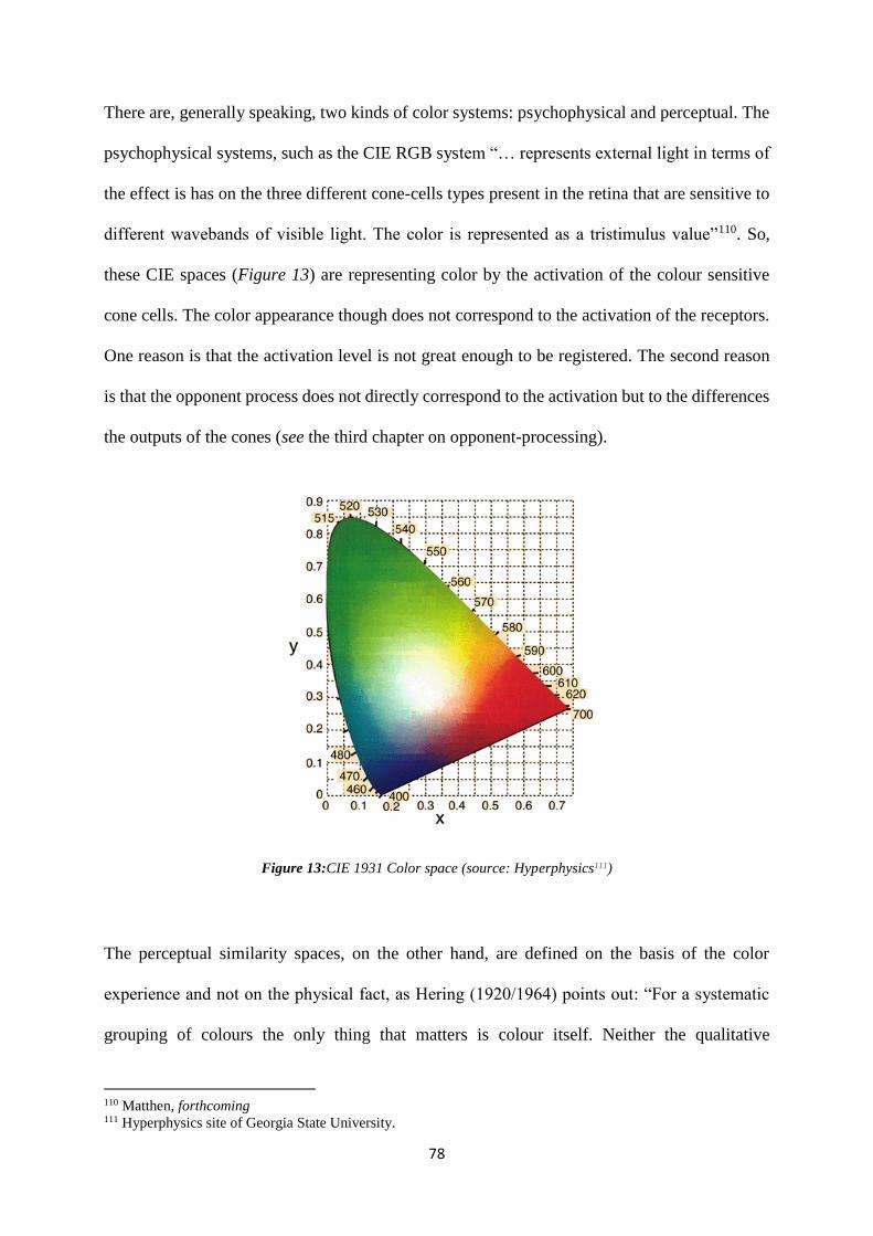
78
There are, generally speaking, two kinds of color systems: psychophysical and perceptual. The
psychophysical systems, such as the CIE RGB system “… represents external light in terms of
the effect is has on the three different cone-cells types present in the retina that are sensitive to
different wavebands of visible light. The color is represented as a tristimulus value”110. So,
these CIE spaces (Figure 13) are representing color by the activation of the colour sensitive
cone cells. The color appearance though does not correspond to the activation of the receptors.
One reason is that the activation level is not great enough to be registered. The second reason
is that the opponent process does not directly correspond to the activation but to the differences
the outputs of the cones (see the third chapter on opponent-processing).
Figure 13:CIE 1931 Color space (source: Hyperphysics111)
The perceptual similarity spaces, on the other hand, are defined on the basis of the color
experience and not on the physical fact, as Hering (1920/1964) points out: “For a systematic
grouping of colours the only thing that matters is colour itself. Neither the qualitative
110 Matthen, forthcoming 111 Hyperphysics site of Georgia State University.
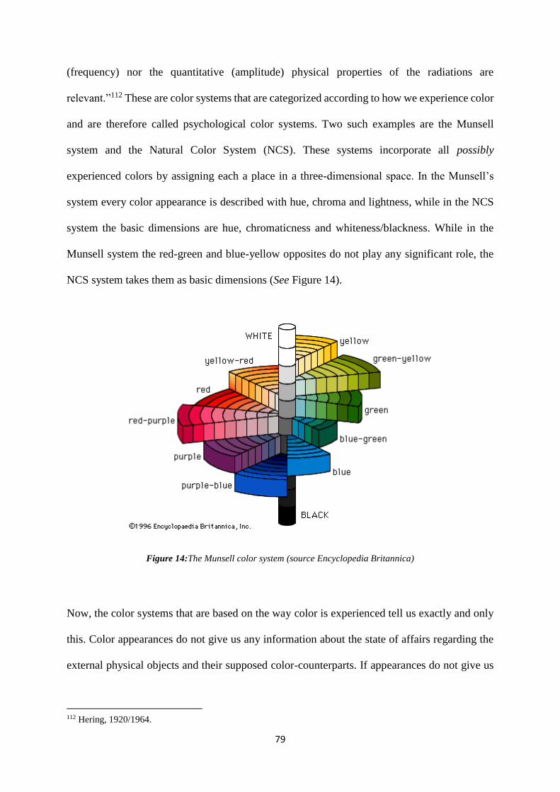
79
(frequency) nor the quantitative (amplitude) physical properties of the radiations are
relevant.”112 These are color systems that are categorized according to how we experience color
and are therefore called psychological color systems. Two such examples are the Munsell
system and the Natural Color System (NCS). These systems incorporate all possibly
experienced colors by assigning each a place in a three-dimensional space. In the Munsell’s
system every color appearance is described with hue, chroma and lightness, while in the NCS
system the basic dimensions are hue, chromaticness and whiteness/blackness. While in the
Munsell system the red-green and blue-yellow opposites do not play any significant role, the
NCS system takes them as basic dimensions (See Figure 14).
Figure 14:The Munsell color system (source Encyclopedia Britannica)
Now, the color systems that are based on the way color is experienced tell us exactly and only
this. Color appearances do not give us any information about the state of affairs regarding the
external physical objects and their supposed color-counterparts. If appearances do not give us
112 Hering, 1920/1964.
80
any information of such kind, then how can we navigate the world on the basis of properties we
perceive? One way is to follow Cohen (2009): “experience of colors does not amount to an
unmediated, acquaintance-like connection with the colors…Color phenomenology does relate
us to the colors, but it is no substitute for the hard, broadly empirical, work necessary for
determining how colors are constituted.” 113
4.5 Effortlessly chic: Appearances through rose-colored glasses
Up until this point, I have discussed the way colors generally appear to us as perceivers. I tried
to show that color appearances in usual circumstances (including constancy and variation) and
color appearances in exceptional circumstances (the reddish-green cases) do not tell us anything
about the internality or externality of colors. I have instead argued that the best way to
understand color appearances is to turn towards understanding the visual system we have
happened to be stuck with. However, when turning to the visual system we might not get much
further either. As Matthen points out: “the function of opponent processing is non-
informational: to enhance discriminability and to format colour in a way that admits of
combining distinct elements. This indicates that individual differences that relate to the
opponent representation of colour – the unique hues, the proportion of hue magnitudes in
perceived colour, the colour categories – have no significance regarding external reality.”114
Now, if the opponent processing in non-informational, then how are we able to perform color
based tasks so well. There are other processes that play this role. Matthen, for example, argues
that the difference between the opponent processing and color constancy processing is in that
113 Cohen, 2009, p. 116 114 Matthen, forthcoming.p. 24
81
the latter adds information to the incident stimuli, while the former, as already stated, is
informationally neutral.
I proposed that the best way to understand the constancy processes is to adopt the complex
discriminatory view. Moreover, the function of the overall color vision is best explained in
terms of discriminatory capacities. As suggested earlier, the color vision is not of primal
importance in object recognition processes. It is rather an add on to other visual processes. As
Chirimuuta remarks: “color vision doesn’t help us see the colors of things; it helps us see
things.”115 Discriminatory view and color vision as an add on go hand in hand in regard to the
fact that color vision merely enhances the discriminatory processes. In color constancy
scenarios it is the discrimination of color and non-color features that contribute to the
successfulness of the perceived constancy. As discussed in the second chapter, I suggest that
the color constancy phenomenon is best understood by combining the discriminatory approach
with complex scene parsing (including filter cases and layering experiences).
So far I have come to believe that the two phenomena discussed, constancy and impossible
colors, do not tell us much about the ontological status of colors. I take it that in this situation,
the best is to stay agnostic about the ontology of color.116 At this point it might seem as if color
appearances are useless since they do not put us in touch with real states of affairs. Even more,
they do not guarantee that there is such a thing as real states of affairs. I suggested that with
such realization one needs to turn to the mechanisms of our visual system as a whole. However,
when doing so we run into description of processes that bear little information (like opponent-
processing) and thus seem far from understanding our color phenomenology. In addition, we
115 Chirimuuta, 2015, p. 86. 116 Although my account it motivated by perceptual pragmatism (See Chapter 2), I diverge from Chirimuuta’s view
since she does propose a theory of color called adverbialist relationalism that claims that colors are properties of
perceptual events that involve a relation between the pyschological state and the distal item.
82
also figure that color vision sadly plays a secondary role in processes like object recognition of,
let’s say, crucial edibles. What we are left with though are discriminatory capabilities.
The situation is not as black as it is painted. The discriminatory approach to color vision brings
about two features: effortlessness and usefulness. As discussed previously, our perception of
the world affords us with a rich variety of color experiences (e.g. surface color, volume color
and transparencies). Since color appears as such a salient feature of the world, the perception
of this richness is arguably easily achieved. I take it that this chic effortlessness of color
perception comes thanks to the automaticity of color processing or rather automaticity of
discrimination that can be either conscious or unconscious (see the discussion on awareness
conditions in constancy scenarios).
Moreover, color experiences are highly useful. Although, chromatic vision is not primarily
responsible for recognition of crucial edibles, it certainly enhances the discriminatory
capabilities. However, one does not need to expect that the function of the chromatic vision is
to make veridical representations of the world. Now the question is, what is the usefulness of
color appearances if our color vision does not guarantee the veridicality of the experiences.
First, I do not find this worry too dramatic since I take it that also erroneous experiences can be
informative. They can be about some features of the world or of ourselves – like the reddish-
green experiences are somehow informative about the functions and limits about our visual
system. Second, as already stated, color appearances alone do not tell us anything about
internality or externality of colors. Accordingly, one is wrong in having expectations about
veridicality based only on the appearances. It is not that the nature of color is exhausted by its
looks. However, we cannot strip colors from their appearances. This is to say that we do not
have other means to understand what colors really are on, both, physical and phenomenal level
if not by attending to the way they appear. One way to get out of this puzzle is to abandon the
83
appearance-reality distinction altogether or to adopt some sort of phenomenal objectivism.117
However, Shevell (2012) points out that: “studying color in isolation, even if possible, would
neglect basic properties of neural pathways as well as the full role of chromatic coding in visual
perception.”118 If colors are unanalyzable without the rich context and other non-color visual
processing, then perhaps the more interesting question is not what is the exact ontological status
of colors, but rather why they keep on appearing as the do. I have showed that despite apparent
unimportance of color vision for the survival, we can find ways to see color appearances
through rose-colored glasses. Color vision enhances our discriminatory capacities and
effortlessly affords us with the richness of the color appearances. I will leave it as an open
question whether there is a way to figure out what appearances tell us about the allegedly
underlying metaphysical nature, and instead let colors keeping up appearances.
117 See Noë (2004) and for the discussion see Allen (2009). 118 Sevell, 2012, 337.
84
Literature
Albers, J. (2013). Interaction of Color. Yale University Press.
Akins, K. (1996). On Sensory Systems and the “Aboutness” of Mental States. Journal of
Philosophy, 93(7).
Akins, K. and Hahn, M. (2014). More than Mere Colouring: The Role of Spectral Information
in Human Vision. The British Journal for the Philosophy of Science. 65, 125-171.
Allen, K. (2009). Being Coloured and Looking Coloured. Canadian Journal of Philosophy.
39(4).
Arend L. and Reeves, A. (1986). Simultaneous colour constancy. Journal of the Optical Society
of America. 3(10): 1743–51.
Arend, L. et al. (1991). Simultaneous colour constancy: papers with diverse Munsell values.
Journal of the Optical Society of America. 8: 661–72.
Armstrong, D. M. (1968). The secondary qualities: an essay in the classification of
theories. Australasian Journal of Philosophy. 46, 225-41.
Arstila, V. (2005). The Paradox of colors. University of Turku. Ph.D. thesis.
Averill, E. W. (2005). Towards a projectivist account of color. The Journal of Philosophy. Vol.
102. No. 5, 217-234.
Averill, E. W. and Hazlett, A. (2011). Color objectivism and color projectivism. Philosophical
Psychology. 24:6. 751- 765.
Billock, V. A., Gleason, G. A. and Tsou, B. H. (2001). Perception of forbidden colors in
retinally stabilized equiluminant images: an indication of softwired cortical color
opponency? Journal of the Optical Society of America A. Vol. 18, No. 10, 2398-2403.
Billock, V. A. and Tsou, B. H. (2010). Seeing Forbidden Colors. Scientific American 302 (2):
72–7.
Boghossian, P. and Velleman J. D. (1989/1997). Color as a Secondary Quality, in Byrne and
Hilbert 1997a, pp. 81–104.
85
Boucart; M. and Humphreys, G. W. (1994). Attention to Orientation, Size, Luminance, and
Color: Attentional Failure Within the Form Domain. Journal of Experimental Psychology:
Human Perception and Performance. 20 (1).
Brenner, H. W. (1987). ‘Brownish-Yellow’ and ‘Reddish-Green’. Philosophical Investigations,
10, 3, 200 – 211.
Broackes, J. (1997). The Nature of Colour. Routledge.
Brogaard and Garzia B. and Garzia, D. E. (2017). Cortical Color and the Cognitive Sciences.
Topics in Cognitive Science. 9: 135-150.
Brown, H. D. (2006). On the dual referent approach to colour theory. Philosophical Quarterly.
56 (222): 95-113.
Brown, H. D. (2014). Colour Layering and colour constancy. Philosophers Imprint. Vol.14: 15.
Byrne A. and Hilbert, D. R. (1997). Readings on color, Volume 1. The philosophy of color.
The MIT Press.
Byrne A. and Hilbert, D. R. (2007). Color primitivism. Erkenntnis. 66: 73-105.
Campbell, J. (1993). A Simple view of colour. In Reality, Representation, and Projection, ed.
Haldane and Wright. Oxford: Oxford University Press. Reprinted in Byrne and Hilbert
(1997), vol. I.
Chirimuuta, M. (2008). Reflectance realism and colour constancy: What would count as
scientific evidence for hilbert’s ontology of colour? Australasian Journal of Philosophy. 86 (4).
Chirimuuta, M. (2015). Outside Color. MIT Press.
Churchland, P. (2005). Chimerical Colors: Some Phenomenological Predicitions From
Cognitive Neuroscience. Philosophical Psychology. 18 (5).
Churchland, P. (1986). “Replies to Comments” from “Symposium on Patricia Smith
Churchland’s Neurophilosophy. Inquiry. XXIX (June): 139-273.
Clark, A. (1993). Sensory Qualities. Oxford: Oxford University Press
Clark, A. (1996). True Theories, False Colors. Philosophy of Science. 63 (proceedings).
Cohen, J. (2004). Color Properties and Color Ascriptions: A relationalist manifesto. The
Philosophical Review, 113(4), 451-506.
Cohen, J. (2008). Color constancy as counterfactual. Australasian Journal of Philosophy. 86(1):
61 – 92.
Cohen, J. (2009). The Red and the Real. Oxford University Press, Oxford.

86
Crane, H. D. and Piantanida, T. P. (1983). On Seeing Reddish Green and Yellowish Blue.
Science, 221, 1078-1079.
Craven , J. and Foster, D. H. (1992). An operational approach to colour constancy. Vision
Research. 32(7): 1359–66.
Davies, W. (2016). Colour constancy, illumination, and matching. Philosophy of Science. 83,
no. 4
Dretske, F. (1997). Conscious Experience in The Nature of Consciousness, Edited by Block N.,
Flanagan. O., Guzeldere. G., MIT, Bradford.
Foster, D. (2003). Does Colour Constancy Exist? Trends in Cognitive Sciences. 7: 439–43.
Gert, J. (2008). What Colors Could Not Be: An Argument for Color Primitivism. The Journal
of Philosophy. 105 (3).
Gert, J. (2010). Color constancy, complexity and counterfactual. Nous. 44:4. 669-690
Gert, J. (2017). Primitive Colors: A Case Study in Neo-Pragmatist Metaphysics and Philosophy
of Perception. Oxford University Press.
Hardin, C. L. (1988). Color for Philosophers. Unweaving the Rainbow. Hackett Publishing
Company
Hardin, C. L. (2014). More Color for Philosophers. Perception and Its Modalities. Ed. Stokes,
M., Matthen, M. and Biggs, S. Oxford University Press.
Helmholtz, H. v. (1924). Helmholtz’s Treatise on Physiological Optics. Rochester, N.Y., The
Optical Society of America.
Hering, E. (1920, 1964). Outline of a theory of the light sense. Trans. By Hurvich and Jameson.
Cambridge, Mass.: Harvard University Press.
Hilbert, D. R. (1987). Color and Color Perception: A study in Anthropocentric Realism.
Stanford: Stanford University CSLI.
Hilbert, D. R. (2005). Colour constancy and the complexity of colour. Philosophical Topics.
33(1): 141–58.
Hulbert, A. (1999). Colour vision: Is colour constancy real? Current Biology. Vol. 9
Jackson, F. (1998). From Metaphysics to Ethics. Oxford: Clarendon Press.
87
Jakab, Z. (2001). Color Experience: empirical evidence against representational externalism.
Ph.D. Thesis.
Jameson, D. and Hurvovich, L. M. (1955). Some quantitative aspects of an opponent-colors
theory. i. chromatic responses and spectral saturation. Journal of the Optical Society of
America 45 (7).
Johnston, M. 1992. How to speak of the colors. Philosophical Studies 68, 221-63. Reprinted as
chapter 9 of Readings on Color, vol. 1.
Kalderon, M. E. (2007). Color Pluralism. Philosophical Review. 116 (4).
Kingdom, F. A. A. (2011). Lightness, brightness and transparency: A quarter century of new
ideas, captivating demonstrations and unrelenting controversy. Vision Research. Vol. 51.
Kraft, J. M. and Brainnard, D. H. (1999). Mechanisms of color constancy under nearly neutral
viewing. Proceedings of the National Academy of Science. 96: 307-312.
Kuehni, R. G. (2003). Colour Space and its Divisions: Colours order from antiquity to present.
New Yersey: John Wiley and Sons.
Livitz, G., Yazdanbakhsh, A., Eskew, R.T and Mingolla, E. (2011). Perceiving Opponent Hues
in Color Induction Displays. Seeing and Perceiving. Vol. 24 (1), 1-17.
Logvinenko A. D. and Tokunaga, R. (2011). Colour Constancy as Measured by Least
Dissimilar Matching. Seeing and Perceiving. 24: 407–52.
Lugg, A., (2010). Wittgenstein on Reddish Green: Logic and Experience in Wittgenstein on
Forms of Life and the Nature of Experience. Ed. Marques A. And Venturinha N.
Macpherson, F. (2003). Novel colours and the content of experience. Pacific Philosophical
Quarterly. 84: 43-66.
Maund, B. (2006). The illusory theory of colours: an anti-realist theory. Dialectica. Vol. 60:3,
245-268
Maund, B. (2012). Color, The Stanford Encyclopedia of Philosophy (Winter 2012 Edition),
Edward N. Zalta (ed.)
Matthen, M. (forthcoming). Unique hues and colour experience. In Routledge Handbook of the
Philosophy of Colour, ed. Macpherson, F. and Brown, D.
Matthen, M. (2005).Seeing, Doing and Knowing, Oxford: Oxford University Press.
88
Matthen, M. (2010). How things look (and what things look that way). In Perceiving the World,
ed. B. Nanay. 226-253. OUP
McGinn, C. (1983). The Subjective View. Oxford: Clarendon Press.
Mollon, J. (1997). “Tho’ she kneel’d in that place where they grew….”: The uses and origins
of primate color vision. In Readings on Color: The Science of Color, vol. 2, ed. Byrne and
Hilbert. Cambridge: MIT Press.
Morrison, J. (2013). Anti-Atomism About Color Representation. Nous. 47 (2).
Murphey, D. K., et. al (2008). Perception matches selectivity in the human anterior color center.
Current Biology. 18 (6).
Noë, A. (2004). Action in Perception. Cambridge, MA: MIT Press.
Neumeyer, C. (1998). Comparative Aspects of Colour Constancy. In Perceptual Constancy:
Why Things Look as They Do, eds. Walsh and Kulikowski, Cambridge: Cambridge
University Press: 323-51.
Nida-Rümelin, M. and Suarez, J. (2010). Reddish Green. A Challenge for Modal Claims about
Phenomenal Structure. Philosophy and Phenomenological Research. 78 (2).
Palmer, S. E. (1999). Color, Consciousness, and the Isomorphism Constraint. Behavioral and
Brain Sciences. 22, 923-943
Peacocke, C. (1984/1997). Colour Concepts and Colour Experience, in Byrne and Hilbert 1997,
pp. 51–66.
Rosenthal, D. (2001). Color, Mental Location, and the Visual Field. Consciousness and
Cognition. 10.
Rubenstein E. The Internet Encyclopedia of Philosophy http://www.iep.utm.edu/c/color.htm,
(2007).
Rudd. M. E. (2003). Reflectance-to-color mappings depend critically on spatial context.
Behavioral and Brain Sciences. 26 (1).
Shevell, S. K. and Kingdom, F. A. A. (2008). Color in complex scenes. The Annual Review of
Psychology. Vol. 59.
Shevell, S. (2012). The Verriest Lecture: Color lessons from space, time and motion. Journal
of the Optical Society of America, Series A, Optics, Image Science, and Vision. 29 (2).
89
Shoemaker, S. (1994). Phenomenal Character. Nous. 28 (1).
Shoemaker, S. (2003). Content, character, and color. Philosophical Issues. 13: 253-78.
Thompson, E. (1995). Color Vision. London: Routledge
Thompson, E. (1995). Colour Vision, Evolution, and Perceptual content. Synthese. 104.
Thompson, E. (1992). Novel Colours. Philosophical Studies. 68.
Thompson, E., Palacios, A. and Varela, F. (1992). Ways of coloring: Comparative color vision
as a case study for cognitive science. Behavioral and Brain Sciences. 15, 1-74.
Tokunaga, R. and Logvinenko, A. D. (2010). Material and lighting dimensions of object colour.
Vision Research. 50: 1740–47.
Troost, J. M. and Weert, C. M. M. d. (1991). Naming versus matching in color constancy.
Perception and Psychophysics. 50 (6).
Tye, M. (1995). Ten Problems of Consciousness, A Representational Theory of the Phenomenal
Mind. Cambridge: The MIT Press.
Tye, M. (2000). Consiousness, Color, and Content. Cambridge, MA: MIT/Bradford.
Westphal, J. (1987). Colour: Some Philosophical Problems from Wittgenstein. Oxford:
Blackwell.
Westphal, J. (2010). How Can the Logic of Color Concepts Apply to Afterimage Colors? In
Color Ontology and Color Science. Ed. Cohen, J. and Matthen, M.
Wittgenstein, L. (1977). Remarks on Colour. Ed. Anscombe, G. E. M. Oxford: Blackwell.
Wittgenstein, L. (1980). Remarks on the Philosophy of Psychology vol. 2. Ed. von Wright, G.
H. and Nyman, H. Oxford: Blackwell.
Wyszecki, G. and Stiles, W. S. (1982). Color Science: Concepts and Methods, Quantitative
Data and Formulae. Wiley.