khib with friends at london design festival 2013
DESCRIPTION
This catalogue contains texts and images of the 50 products that Bergen Academy of Art and Design (KHiB) and designers related to the Academy, showcase at London Design Festival 2013. Both products that are already being manufactured and new products will be shown at Tent London. Project leader is Professor Dave Vikøren.TRANSCRIPT


Bergen Academy of Art and Design to London Design Festival
Experiments with materials, shapes and functions
Responsibility
Business
Index of designers and manufacturers
Organisation and credits
Thanks to our sponsors, benefactors and partners
Manufacturers
006
009
051 073
124
126
127
128
Content

The exhibition “KHiB with Friends” will showcase about 50 products at this year’s London Design Festival that takes place in September. Both products that are already being manufactured and new products will be shown at Tent London. – Tent is a great opportunity for young, unestablished designers to exhibit their products side by side with established names, says Project Leader Professor Dave Vikøren. KHiB will exhibit furniture, interior architecture, lamps, clothing, textiles and graphic design developed by current and former staff members and students. Among others, these include Torbjørn Anderssen, Steinar Hindenes, Atle Tveit, Lars Tornøe, Morten Skjærpe Knarrum and Lars Beller Fjetland. In addition, a number of other Bergen-based designers connected to the Academy are invited to showcase their designs under the KHiB umbrella: T-Michael, Scandinavian Surface and Solveig Hiisdal from Oleana, to name a few. This exhibition is the latest in a series of exhibitions and activities that KHiB has organised during the past ten years to promote Norwegian design and Norwegian designers. This time the focus is on KHiB, the environment in which the design students are educated and their results, products and values they represent. KHiB will try to show our colleagues from design studios, educational institutions, manu-facturers, architects and press that the designers from KHiB – both students and members of the academic staff – are capable of providing designs that address the new challenges with regards to social awareness and the environment, by focusing on the ergonomic, durability and visual qualities of the products. This exhibition has been curated, planned and designed at Bergen Academy of Art and Design as part of the institution’s on-going artistic research, focusing on different aspects of design and communicating our values to the professional world around the institution.
Dave Vikøren and Petter Bergerud
Bergen Academy of Art and Designto London Design Festival
These days, most students enter design education institutions without any practical experience whatsoever. This is not necessarily a drawback, but for some of them it is a challenge to roll up their sleeves and start working in metal and wood workshops, experimenting with and trying out different materials, tools and techniques. These are necessary activities, however, together with acquiring knowledge about design methodology, drawing and sculpting, courses in shape and colour, 2D and 3D space creation, building construction and creating environmental tools for people to interact with. All of this is done with relatively sparse equipment, tools and machinery, but is made possible through capable workshop technicians and profes-sional designers as tutors, and under the influence of an interdisciplinary environment comprising of artists, designers and academic staff. This experimentation, building and research sometimes results in mock-ups and prototypes that, in turn, are commented on, scrutinized and criticized. Sometimes the results of this process are just a learning experience, but other times this work proves to be the first visual piece in the process of getting a product out to the market. The students are continuously exposed to and have to deal with manufactur-ers and the methods and tools of modern manufacturing. They visit the big international arenas for showcasing design by producing their own student exhibition at the Stockholm Furniture Fair and by actively participating in design contests and exhibitions, like this one, in Tent London. Some of them even have their ideas put into production while still taking their BA and MA degrees at KHiB. This part of the exhibition is dedicated to these mock-ups and prototypes.
Dave Vikøren
Experiments with materials,shapes and functions

10 11
DUNO (2013)STINE KNUDSEN AAS
H = 700D = 850W = 800
“Duno” is a friendly chair inspired by the form of a pillow. Down and feathers are used in combination with other natural fillers to evoke feelings of security and comfort. DUNO stands on turned birch legs, is dressed in felted wool and is large enough to accommodate one or two people.
It’s the quiddity* of a childhood memory embracing the contents of sideboards found in every home. With it’s homogeneous appearance in natural birch, the user experience is directed towards the moment when the doors open revealing it’s inner space covered with glowing copper, just as imagined during those childhood years.
*Quiddity (n.) - the nature or very essence of something.
QUIDDITY (2013)
LIZA FREDRIKKE ROSENKILDE
CHRISTENSEN
BIRCH AND COPPERPLATE118 X 62 X 38

12 13
“Linkki” is a shelving system developed for diverse use. Different boxes and simple shelves let you play, change and make variations within the fame of the structure. The structure is made of birch, simply linked and locked together with metal screws and it is easy to assemble and flat pack. The structure is extendible with different lengths, and the idea is to add more functions to the structure when there is a need for change.
LINKKI (2013)
SILJE NESDAL

14 15
“Furu” is a small chair with a large passion for Norwegian pine. Stripped in form, the chair immediately directs attention to its delicate wood structure, beautifully accompanied by the finest of leathers.
FURU (2013)ERIK SAND
“Gran” is a humble play on the strong visual character of woodwork. The wooden table clock is clean in silhouette yet complex in structure, allowing its material aesthetics to come together in an unexpected and visually appealing composition.
GRAN (2012)ERIK SAND

16 17
“Maple” is a wooden chair made of solid maple. It is composed of two front legs, a seat and two hind legs, which together form the back. It has been joined together only by wooden plugs, no nails were used.
MAPLE (2012)NATASHA
BENDIKSEN CRONA


20 21
“Upsilon” is a stool made from maple and held together by joints and glue. It is inspired by the letter v and w coming from Upsilon letter of the Greek alphabet. The concept behind the stool was to make it lighter than 1.5 kg and only in wood.
UPSILON (2011)
CHARLOTTE LANDE ANDERSEN The composition of strict geometrical shapes has
the ability to create different expressions. “Triangle” has a spatial transparency that constantly changes its appearance, from a heavy and solid rectangle to playful and light triangles.
TRIANGLE (2013)
HEIDI KARLSEN AARSTAD
WALNUT, MAPLE

22 23
“Tilt” is a flexible lamp with a lean design. The lamp came from the idea of something simple, but yet it’s a multi-functional product. The lamp itself is divided in two different parts joined together by magnets. The smallest part can be detached to take with you and give light where it is needed.
TILT(2013)CAROLINE
LANGFELDT CARLSEN
INSIGHT(2013)ELISABETH BARRENG
“Insight” is a serie of thin wool blankets, woven with Norwegian wool. The title is based on the meaning of the word; to see contexts not seen.
We are surrounded by woven textiles, but you may only see the colors and the superficial surface more than the construction itself. The construction is the binding which holds the fabric together and then creates structure, surface, tactility and color blends. The purpose is to make a finish where you get close to and into the textile surface to enlarge and retrieve details we might not otherwise notice.


26 27
“Vilter” is a stool-collection for both children and adults. Inspired by the Norwegian wildlife, the stool comes in the shape of animals from from nature; fox, squirrel and bear. It is based on a simple design consisting of three parts; a seat supported by two profiles, everything is made in the strong material, plywood.
VILTER(2013)
TUVA RIVEDAL TJUGEN
PLYWOOD
CLOCHE(2013)
LARS BELLER FJETLAND
Echoing an era of sophistication and grace, Lars Beller’s “Cloche” lamp curiously explores beauty, weight and balance, seeking inspiration in some of nature’s most elegant and remarkable solutions. In an effort to set free the graceful, organic flow of form, the “Cloche” lamp represents an unexpected poetry; one that can only arise from an exploration of the improbable. Unexpected combinations of size, shape and material gain from each other, each part lending its strengths to the other to create a beautifully balanced whole.
Like a bluebell flower, the lamp is firmly grounded by its cast iron roots, while gently leaning its large and seductive spun petals over any surface or object; all made possible by the flexibility of its light-weight ash wood stem.The “Cloche” lamp rediscovers the inherent qualities the materials represent, while gracefully elevating their beauty. Keeping with designer Lars Beller’s philosophy of honesty in materials and construction, the entire lamp can easily be dissem-bled into just three separate pieces.

28 29
Honoring the humble ideals of indigenous tradition and pre-industrial sobriety, the Beller leather-linking technique adds a welcomed touch of modern sophis-tication to waste reduction. Playing with the juxtaposition of luxury materials with a consumption-conscious mentality, “Link” represents a rare throwback to a considerate, machine-independent mindset in a modern design context.
Strong, versatile and ventilate, the technique can fit almost any purpose and surface, opening a vast range of possibilities only limited by imagination. Composed solely of random pieces of leather, the technique leaves each item visually unique – a desired reminder of the “Link” story and philosophy. The intuitive linking-technique allows anyone (literally anyone) to assemble pre-cut leather scraps to a range of applicable products from pillows and beanbags to daybeds and lounge chairs.
“Link” connects wholeheartedly with the philosophy of designer Lars Beller; to offer sustainable yet sophisticated solutions for a smarter tomorrow.
LINK(2010)
LARS BELLER FJETLAND
3130
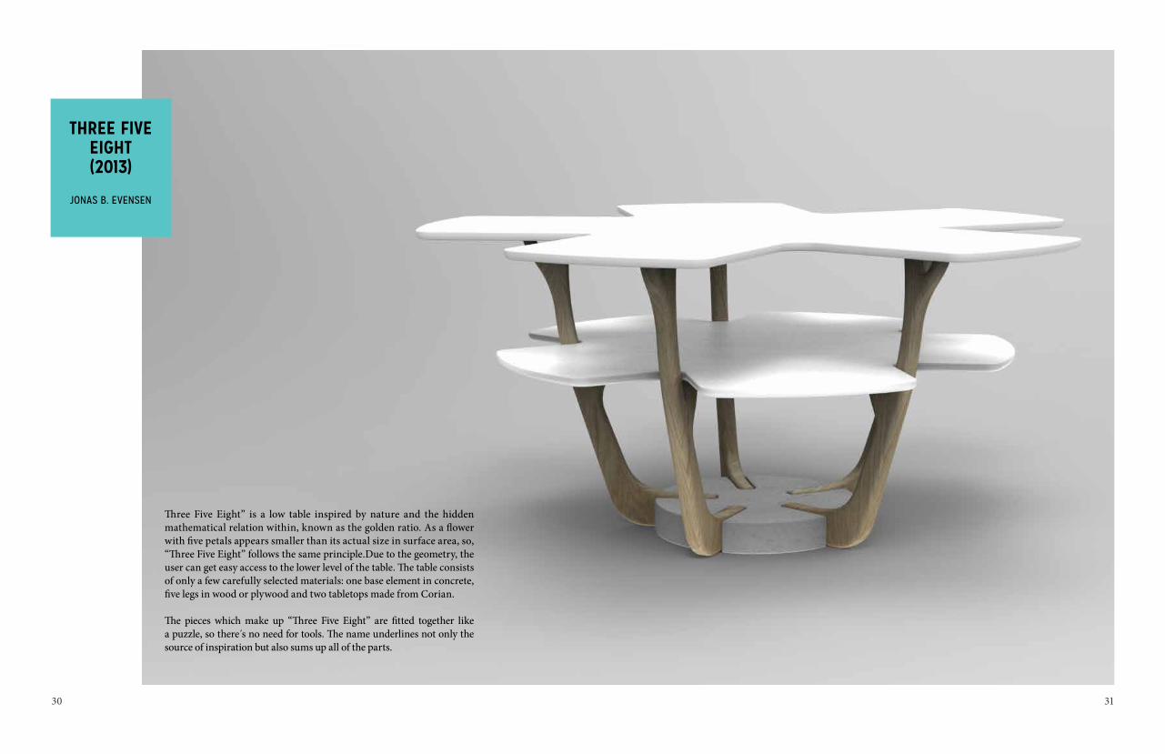
THREE FIVE EIGHT(2013)
JONAS B. EVENSEN
Three Five Eight” is a low table inspired by nature and the hidden mathematical relation within, known as the golden ratio. As a flower with five petals appears smaller than its actual size in surface area, so, “Three Five Eight” follows the same principle.Due to the geometry, the user can get easy access to the lower level of the table. The table consists of only a few carefully selected materials: one base element in concrete, five legs in wood or plywood and two tabletops made from Corian.
The pieces which make up “Three Five Eight” are fitted together like a puzzle, so there s no need for tools. The name underlines not only the source of inspiration but also sums up all of the parts.

3332
WHISKYAND WATER
(2013)VERA&KYTE
GLASSØ = 85 MM H = 100 MM
“Whisky and Water” is a duo that complement each other. With their individual shapes one glass is simply elegant and the other slightly odd. When stacked together they combine to create a sculptural feature for your table. It is the dynamic and the balance between them that makes this duo interesting.

34 35
PILAR(2013)
KNUDSEN, BERG,HINDENES
“Pilar” lamp gets its iconic theme from its simple geometric form and structure. Light is spread both up and down. Rotatable lampshade (top part) and all in die-cast aluminium. Bulb socket E27 bulb and compact fluorescent lamp 18W.
3 0’CLOCK(2013)
KNUDSEN, BERG,HINDENES
The clock has a clean, clear and simple form, where the main body and hands are as layered plans. With its few parts, it has a simple structure and composition. The material of the main body can be vacuum formed plastic, and hands in laser-cut aluminium.
The different parts can be produced in different colours, which can be combined into new colour varieties. The clock uses a standard quartz movement. Presenting “3 O’Clock” as a wall clock and wrist watch.

36 37
The chair’s inspiration and form goes back to old household traditions.
“Ekko” chair is conceived as a ‘knock down’ product, where all the parts are packaged in a simple little iconic box.
With its small volume, the chair is easy to transport, sell, buy, bring, and to put together.All components are in solid wood, and possible in different types of wood, and a variety of colour palettes.
EKKO(2013)
KNUDSEN, BERG,HINDENES The shelf is inspired by the old flower trellis (espalje) that you will find
in old gardens all covered in plants and flowers.The plants have grown into the trellis with time, like the shelves and the objects will do as the user fills it with objects. The framework is made out of steel bolts and the boxes are made out of solid pine.
GADGET(2013)MORTEN& JONAS

38 39

40 41
LAMP WORKSHOP
BAR2
COURSE LEADER: TORBJØRN
ANDERSSEN (ANDERSSEN&VOLL)
The main goals for this year’s workshop on lamps and lighting objects were to investigate design as a language, and to experience the transformation from idea to full scale object.
With dusk as our starting point, the students used their own personal understanding of this transitional moment of the day to fuel their process: the shift from daylight to dimness - from work time to leisure time - leaving the public space and entering the private zone.
Through engaging and responding objects, the students explored the possibility of experience and beauty that is latent in every repeated, daily action.
There is a broad scope of results derived from the same assignment. However there seemed to be a bigger emphasis on possibility rather than problem or need, and a joint focus on the lamp as an interactive object. Key words for the group’s work as a whole were drama, level of intimacy and the inherent possibility for change.
With its round shape and long cord, “Filo” can easily be moved, carried and placed where you wish. While it has a reference to home appliances or tools from the construction industry, the lamp has a simple and calm expression. Variable light output and ability to choose the colour of the cord mean that the lamp has an even wider range of applications. In addition, kids can combine their toys with “Filo” as part of play.
FILO(2013)
HANNE MARTHE KOMMEDAL
ALUMINUM, THERMO-PLASTIC, LED LIGHT
H: 90 D: 300

42 43
A bespoke light with the combination of balance, friction and rotation - a pendant lamp in two parts where the user physically flips the parts in the position as desired.
Two forms connected, both free to rotate independent-ly, with a translucent glass that provides a continuous illumination from the flat surface. “Flip” gives the opportunity to stage different light experiences.
FLIP(2013)TEA SKOG
COCOON(2013)
SARAH MARIA NIELSEN
Discover a balanced transformation in mind - from the dreamy universe of the night to the bright dynamics of day. “Cocoon” is a morning metamor-phosis, a mood- and wake-up lamp that is dimmable and invites you to pick up the shade and move it around as you please. The lamp’s form and texture is inspired by the silkworm cocoon and it’s marvelloustransformation from one shape to another.

44 45
TRANSITUS(2013)
LOTTE SEKKELSTEN ØSTBY
JESMONITE, STEEL, ALUMINIUM, TYVEK
This lamp is the result of a study on how you can combine a functional working lamp with a lightsource to create a friendy and relaxing atmosphere. The lampshade hides a paperbag that you can easily pull in and out – which changes the light quality from direct to more translucent.
Both the materials and form emphasize the contrasts- heavy Jesmonite and steel in the strict working lamp against fragile and voluminous Tyvek in the mood setting lamp. The lamp shade and foot rotate, which makes it even more functional and allows the user to decide where they want to direct the light.
GRIP(2013)
ANDREAS ØSTEBØ
A candleholder that grips the light like a hand that brings forward a gift.
R&R(2013)
ANN HELEN HESTAAS
A little light to help you find your balance.

46 47
The lamp is designed with the purpose to prelong the day. Through its grand size and lighting affect, the feeling of the summer sun peeking through the curtains will become a reality.
BRIGHT LIE(2013)
ANNE MJÅSETH
HAVANNA(2013)
CHRISTOPH STEIGER
“Havanna” is a classical dining table lamp. The outside is made of walnut and the reflector inside is of brass. This gives the light quality a spacial atmosphere. The distance between the light source and reflector can be changed and through this, you can decide the spread and mood of the light.
TOP(2013)
LORRAINE MARY BRACKEN
“Top” combines the contrasts of dawn and dusk. The lamp is dimmable, and can be easily manoeuvred to different levels for functional or more atmospheric light.
The spinning top shape and flat surface mean that it appears to float and alters the mood and architecture of the space.

48
MA(2013)
KAREN NAALSUND
“Ma” lamp invites you to reconnect with light and the magic of it. By moving the light source and changing the intensity, something happens in the space between.
The tactile wooden handle fits well in your hand and invites you to dim or move the light. This sits on top of a light-weight aluminium stamp that encloses the light source. Using the handle, the light source can be lifted or pressed down into the colour graded glass cylinder, and through this movement the light is altered between gentle to more intense
GLINT(2013)
RIKKE ØRSTAVIK
With its reflective, copper surface and its embracing shape, “Glint” is a small lightsource that will function in the same way as a candle in the dark. The handle is inspired by the old ways of carrying the light around the house.
>

Showing four examples of MA exam work from KHiB, the examples consist of extracts from the original works. We are sorry that we are unable to show them in full, but these displays give us some understanding of the work and the serious considerations that lie behind them. The MA candidates show great engagement and a well-developed sense of social awareness through their choice of projects.
Dave Vikøren and Petter Bergerud
Responsibility

52 53
ANTHONY QUINN
TALL TALES – AN INMATE AND STUDENT CO-DESIGN PROJECT (2013)
A co-design collaboration between, inmates of Vik Fengsel and students of KHiB conducted behind prison walls.
DESIGN PROCESS
The collaboration between KHiB and Vik Fengsel is well established now, having grown over 3 projects.
The most recent project became very focused in its approach. The student team constituted BA2 Furniture and interior architecture students. This led to a project concept “tall tales”, to make product driven by a concept or story. The focused nature of the activity was underpinned by a rigorous design methodology ensuring a process of generation, reflection and development. This design development approach allowed students and inmates to work in teams and generate concepts and ideas together with a sense of shared authorship and shared responsibility. The project was split into two phases: 1. Design Generation – 4 days, 2. Design implementation - 4 days.
The outcome of the project was a series of prototype products, illustrated here, these were supported by a coherent story that gave a resonance to the products. The Students produced a design guide and recipe book with the intention that products could be re-produced in the workshop as an educational device for the prison.
PRISON PHILOSOPHY
The educational team in the prison, have an enlightened attitude to the lives and attitudes of the inmates whilst inside the prison. They believe an active and engaged prisoner is more likely to grow as a person and have a better chance of successful return to society. They believe the engagement with design students benefits the inmates in a number of profound ways.
The design process with its reliance on trial and error, planning, iteration, research and empathy with its subject provide an illustration to the inmates of another approach to daily life. Statistically, it is recognized in the cor-rectional service that almost 85% of the crimes committed have a planning time of approx 5 minutes. Henk Seigesma the method advisor in the prison says that “teaching the inmates a process whereby they consider their actions and their implications can only benefit them on return to society”.
DESIGN PRODUCTS
There is an inventive and sometimes poetic approach that arises out of a context wherein phones are prohibited and there is no wi-fi or google. Many of the design tools that are the norm for a 21 century student are redundant in a prison. You cannot walk from the metal workshop to the wood workshop freely. Doors are locked and unlocked! And yet this stop start rhythm that sees students and inmates rely on drawing, talking, thinking and making has a lot of merit. The iterative approach to ideas, making models out of any material to hand resulted in a playful, charming and often irreverent collection of design ideas.
The most important product of this workshop is the experience that both the inmates and students have had in working with each other, one that has hopefully resulted in new perspectives and changes of attitudes.
Designers: BA2 students and inmates of Vik Fengsel. Project team: Tony Quinn Professor (project manager/teacher), Valerio Fornasini (designer/teacher). Collaborators: Kriminalsmorgen – the region west prison service, Tony Quinn.

54 55

56 57
MORTEN&JONAS
BAKE ME A CAKE (2012)
The lamp “Bake me a cake” is a further development of Morten Skjærpe Knarrum’s MA project from 2011, “Behind Bars in Vik”. The lamp was shown at the Milan Fair 2013 and is in production by Northern Lighting.“Bake me a Cake” is a charming and playful table lamp made out of oak wood and smoked tinted glass. Simply lift up the glass to change the bulb. The lamp portrays a dim light. “Bake me a cake” is manufactured by the inmates in Bergen prison in Norway through a unique collaboration between the designers, Kriminalomsorgen region vest (the Norwegian correctional services) and Northern Lighting.
The prison management and staff’s purpose is to improve the competence of the inmates, making them better fit to meet the demands of society after their release. As such the “Bake me a cake” project enables them with a more holistic, positive way of thinking to handle the challenges of inmates at different competence levels. Design is used here as a tool to build self-confidence, pride, dignity and most importantly as a relation-ship buiding tool between inmates and employees. The lamp creates and combines humour through its unique form and name, while at the same time it is quite serious in its content and underlying project goals.

58 59

60 61
HANNE KARI RAVNDAL, MA STUDENT DESIGN, KHiBEXAM PROJECT
FRUITFUL (2013)
“Matnyttig” is a project about renewing the school kitchen in lower secondary schools in Norway. There is a big need for a more holistic and comprehensive plan to teach children about nature, resources and cooking. By rethinking the design of school kitchens, and by including a greenhouse and a vegetable garden the subject will get the place it deserves. The kitchen is open planned with room for the pupils to cooperate and to learn from each other, this way cooking becomes a fun social activity. By placing a greenhouse just outside the kitchen you get a closer connection and a better understanding of how the two things are connected. The vegetable garden, which is situated on the rooftop serves as an extra classroom to be used in the subjects of nature and science, food and health, mathematics and English.
This project put a great emphasis on the meal and eating together. The furniture used in the kitchens should show the same qualities as the rest, and be a part of the same traditions. They are made out of solid wood, and are supposed to be made out of trees that have a connection to food production, such as apple- cherry- and pear trees. Torp, the dining chair has a round backrest made out of walnut, light legs made of oak and an upholstered seat with wool fabric that can be taken off for cleaning. The chair is inviting and gives the user some private space while eating. The dining table, Tun, has a sturdy tabletop made of walnut on top of legs of oak. The pieces can stand on their own or next to each other. The reason for using two types of wood and old traditional joints is to emphasise the connections, which makes for an understanding of how the furniture is composed.

62 63

64 65
KIYOSHI YAMAMOTO FARIAS
GET COLOUR-BLIND (2013)(A BLIND COLOUR RESEARCH)
Colour-blindness interests me both as social and physical behaviour. This phenome-non is proof that we all physically see differently and that we all have different contact with colours and our surroundings. Thus, we have quite a challenge to find a defini-tion for each other’s experiences and a need for classification and social placement. The expression “Colour-blindness” is a wrong grammatical definition that does not correspond to the fact of not seeing colour in the form that the majority do. We only have one word to define the colour “RED”. But we do see at least a thousand shades of red and magenta variants.
COLOUR-BLINDNESS IS A SOCIAL PROBLEM
No one wants to accept that they have a problem, or to include themselves in the row of a minority.
In conversations with colour deficient persons, I got the impression that most of them did not want to be called COLOUR-BLIND. In Norway 8% of the population have a colour deficient diagnosis (in 2015, it will be around 10%). Genetically, men make up the majority of this group, although, we can find that many females have the same deficiency.
The perception of colour in our surroundings differs for people affected with any form of colour vision deficiency, more commonly know as daltonism. In Europe, as in Norway, 8% of male Europeans and 0.5% of female Europeans have this deficien-cy, while 99% of these cases have a variation of confusion between greens and reds.
WHAT CAUSES COLOUR-BLINDNESS?
The human retina contains three classes of colour receptors, called L,M and S (not magenta, blue and yellow). These are respectively sensitive to red, green and blue LIGHT (maybe Goethe was correct). When the eye looks at a colour, the three classes of receptor respond to different degrees and send signals to the brain. The brain interprets the relative strengths of the signals as perceptions of colour.

66 67
A COLOUR CONFUSIONDaniel Fluck, a Swiss IT education professional who calls himself “red-blind”, describes the world as he sees it and on his website, colorblind.com, he writes:
– Dark red/black: “If I get and email with words highlighted in red, I can’t see them”– Grass green/orange: “I couldn’t spot an orange lying in my lawn”– Leaf green/red: “No red blossoms and no red apples in trees”– Bright green/yellow: “I can’t see if a banana is ripe or not”– Dark blue/violet: “I’ll never know what the difference is”– Cyan/grey: “All shades of blue-green look truly colorless to me”– Skin color: “I can’t see if a person looks ill or embarrassed”– Brown/green/red: “Please, don’t talk about red animals in the forest”

68 69
SO WHY DO I STILL WANT TO WORK WITH COLOUR-BLINDNESS?
I am so fascinated by this phenomenon. A large part of this probably comes from years of studying and understanding colour meanings, use and application. If we see life as taking place on a very complicated stage, then the human body is the most intricately engineered set piece. To understand colour-blindness we have to understand what it means to be part of the minority. For me, colour-blindness is like a group of minority people, and as a ho-mosexual, I feel that I can easily relate to this.
When speaking with David Bachelor, he stated that it is only three percent that cannot see colour. This fact made me feel even more strongly about my idea of placing colour-blindness in an anthropological line.
It is time for the majority to reach out and try to better understand this group who can be mistreated, or often forgotten. And so, this project wants to highlight this group in a more consensus behaviour.
To accommodate those with colour vision deficiencies, we need to apply strategies other than colour-coding or varying shades of colour to communicate a message or function. In my research, I found tools such as websites and special software to convert colour images to simulate what a colour deficient viewer would see. By working with the program, I used colour-blind people as a tool to test or question how they would prefer to determine colour in a painting or weaving.
I don’t think that anybody likes to be used as a tool, and that includes the group surround-ing me. Today I have a total of 7 friends who are colour-blind or who have a type of colour deficiency. Collaborating with them has given me further need to understand my work as a tool of communication, as a social commentator or merely as work to stand on it’s own.

70 71
ELISABETH ELLEFSEN
UPCYCLED FOOTSTOOL (2013)
Redesigning is an essential part of my work as a designer. The “hands on” process, as well as the restrictions and possibilities in an existing piece, is fun and challenging. The process is important in stimulating my creative abilities, the process has more value to me than the result itself. The pieces are one of a kind, and can be purchased directly from the designer.

72 73
Unlike other institutions educating designers, KHiB is convinced that three-dimensional space is a very important factor when creating products. The object should always be created on the basis of an understanding of who it is to serve and in what kind of space or surroundings it is intended to function and appear. In this part of the exhibition, we show some examples of designs that are already on the market. These pieces comprising of furniture, lamps and textiles are for the most part designed by BA and MA students as well as by members of the academic staff at the Department of Design at Bergen Academy of Art and Design. These objects are designed for a specific situation, for specific users in a specific space. That does not in any way exclude them from also being highly attractive in many different environments; on the contrary, the visual and technical quality of the products makes them suitable for use in a wide range of situations.
Dave Vikøren
Business

74 75
THE DERRIKMORTEN&JONAS
A sofa with a strong character and warm and soft materials. The shape of the sofa is inspired by the different
hight levels in the norwegian landscape. The base is upholstred with wool fabric and the top is upholstred with
pique leather from Elmo. The sofa consist of moduls that can be put together to create a landscape in a room.
Manufacturer: Machalkek2013

76 77
PLANKKNUDSEN BERG
HINDENES & MYHR
The concept behind “Plank” is a fascination with the massive broad floorboards from Dinesen Douglas spruce, and a wish to develop these enormous dimensions of solid wood to new products. The thick solid wooden base and back represent the main construction and create an impression of lightness and fluidity.
Manufacturer: DK3, Denmarkwww.dk3.dk
2012

78 79
BOPKNUDSEN BERG
HINDENES
Originally, “Bop” was designed for USF Verftet, an arts arena for music, theatre, film and modern art in Bergen, Norway. Delivered to USF in February 2013. USF was established in 1993 and is an important actor within arts and culture in Bergen and Norway. “Bop” lives up to the high standards of comfort, durability and adaptability required of a concert chair, but fits perfectly well in other public interiors as well.
“Bop” has a frame of stainless steel and a quilted seat and back that gives the chair an exclusive touch.
Manufacturer: Offecct, Sweden www.offecct.se
2013

80 81
CUPKNUDSEN BERG
HINDENES
The “Cup” table is a small “Coffee Table” available in two heights and different colours. The table top is made by integral foam giving it a silk soft surface. All technical and structuralcomponents are cast in the tabletops construc-tion, making the legs mounting to the table top seamless. “Cup” was launched at the Stockholm Furniture Fair in February 2013, and was origi- nally designed for the “UP Sofa”, which was launched during the Stockholm Furniture Fair 2012. Originally designed for the “UP Sofa”, launched during Stockholm Furniture Fair 2012. “CUP” is a visually simplistic table as a contrast to the voluminous sofa.
Manufacturer: Fora Form, Norway www.foraform.no
2013

82 83
TERRAELISABETH ELLEFSEN
The “Terra” module seating system has a down to earth look and feel. The idea behind the design was to create a seating system with superb comfort, flexibility and pillow-like seating. The moduels’ informal character and flexibility encourages a mix of fabrics, textures and colours. The pouf exhibited here is a part of the Terra module system, which can be added and varied, from a single seat to a full sofa.
Manufacturer: Softline A/S, Denmark2013

84 85

86 87
SOLIDLARS BELLER FJETLAND
“Solid” is a robust coffee table that sits right at the crossroads between Japanese tradition and a humble, Nordic appreciation for the forests’ finest materials. The table is designed around the principles of Torii – the gate that marks the transition from the profane to the sacred in Japanese Shinto-temples – gathering inspiration from its wood- and stone-based construction. A solid layer of marble rests firmly on a strong foundation of Nordic elm to complete the seamless marriage between Japanese and Nordic aesthetics.
Manufacturer: Normann CopenhagenLaunched 2013

88 89

90 91
DRIFTEDLARS BELLER FJETLAND
The inspiration for the “Drifted” series came from a visit to Øygarden, outside of Bergen on the coast of Norway. While walking along the waters’ edge I became aware of all the varied materials and objects that had floated ashore.Driftwood bleached and scoured by the ocean, old cork that had been ground to unrecogniza-ble shapes. These textures, shapes and material set the basis for the series. The name plays off the materials ability to drift with the current. The seat in cork represents the soft, warm and flexible, while the leg construction in ash stands as a representation for the robust, static and hardy. The fusion between these materials creates a functional, as well as visual harmony. The stool incorporates form-qualities that create remembrance to the traditional crafts-manship of Scandinavian furniture.
Manufacturer: DisciplineLaunched 2012

92 93
GOOD NEWSKARL MARIUS SVEEN
We could all do with some good news! In the newspapers we read about pollution, the melting of the polar ice, war and terror. We therefore designed a small coffee table that in an easy way stores newspapers, so the user can be updated on the latest news, hopefully some “Good News”.
Manufacturer: Mokasser Furniture

94 95
CLINTATLE TVEIT
& LARS TORNØE
“Clint” is a complete chair system that offers large variation in function, expression and price. This makes it suitable for a number of different meeting places, from the boardroom to project and assembly points, team room, traditional conference rooms and informal areas. It is available with a high or low back, 4-star base, 5-star base or stackable steel wire base and armrests of steel or upholstery.
Manufacturer: Fora Formwww.foraform.com
2009

96 97
GETZ CLUBDAVE VIKØREN
& STEINAR HINDENES(CIRCUS)
The wave-laminated shell gives the “Getz” a distinctive identity. The chairs are available with a number of different bases adapted to accommodate different needs and situations.
Manufacturer: For a Form as. Norwaywww.foraform.com
2004
98 99
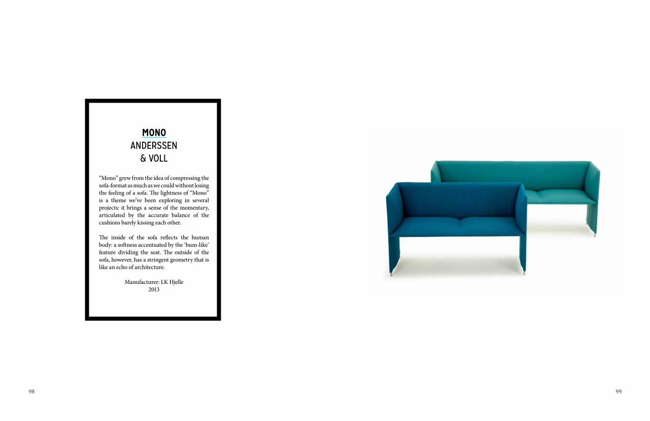
MONOANDERSSEN
& VOLL
“Mono” grew from the idea of compressing the sofa-format as much as we could without losing the feeling of a sofa. The lightness of “Mono” is a theme we’ve been exploring in several projects: it brings a sense of the momentary, articulated by the accurate balance of the cushions barely kissing each other.
The inside of the sofa reflects the human body: a softness accentuated by the ‘bum-like’ feature dividing the seat. The outside of the sofa, however, has a stringent geometry that is like an echo of architecture.
Manufacturer: LK Hjelle2013


102 103
RAINCHONORWEGIAN RAIN
T-MICHAEL/ ALEXANDER HELLE
Born on a napkin on a street café in Paris, upping the ante on the see-through poncho. This is a sculptural, Japanese inspired unisex garment that belts up to be feminine and quirky or left loose to be bold and drapey. Meet the “Raincho”.
Slowly and steadily, in Europe’s rainiest city, a rain project has evolved into an award-winning designer label based on the concept of dugnad*.
The duo are; bespoke tailor / designer T-Michael - known for his conceptual approach to his hand-craft, and creative director Alexander Helle – a business graduate, that founded the rain project based on flourishing collabora-tions between local expertise from the creative scene of Bergen.
Raining 2 out of 3 days inspired the team to balance fine tailoring techniques and 100 % waterproof, eco fabrics to create raincoats that don’t look like raincoats. Classic and experimental, come rain or shine, the high tech is hidden!

104 105

106 107
AUTUMN COLLECTION 2013, OLEANA
SOLVEIG HIISDAL
Oleana’s designer, Solveig Hisdal, has created both designs shown in the exhibition. The long cardigan is knitted in an alpaca yarn from Peru and the pullover in a silk/wool yarn from Italy.
Oleana is working at the intersection between craft and industry. We knit and sew all of our designs at our factory just outside Bergen in Norway. We have thought carefully about what we want machines to do and what we want people with nimble fingers to do.

108 109

110 111
RIHANNA CD COVERMAGNUS VOLL MATHIASSEN
As part of Rihanna’s seventh album, ‘Un-apologetic’, the illustration of Rihanna from MVM’s Rap/Pop Faces series was used as the album’s disc art and poster. The Rihanna portrait was remixed by Mario Hugo to blend in with the rest of his illustration, photo treatments and type.
Creative Direction by Rihanna and Ciarro Pardo, Island Def Jam
2012

112 113
“FROST” THROWSSCANDIVAVIAN SURFACE
(KATRINE NYLUND, KRISTINE DYBWAD, ÅSNE MIDTGARDEN, ANN-TOVE ENGENES)
Star pattern in clear, bright colours with a touch of frost, verging on snowy white. A sudden frosty night in the middle of summer creates a sprinkling of snow over wild flowers.
Manufacturer: Røros Tweed AS2012

114 115
“WEAVING WOOD”WALLPAPER
SCANDIVAVIAN SURFACE(KATRINE NYLUND, KRISTINE DYBWAD,
ÅSNE MIDTGARDEN, ANN-TOVE ENGENES)
“Weaving Wood” is inspired by tradition-al weaving patterns. A forest landscape is playfully constructed by little images of animals living there.
Manufacturer: Photowall AB

116 117
“
15 X “THE DOTS”LARS TORNØE
“The Dots” is a family of solid wood coat hooks. They come in three sizes and many colours.
Mount them separately or together, in any formation you like - the choice is yours.
“The Dots” have, since their launch in 2007, inspired an array of similar products.
Manufacturer: Muuto2007

118 119
RE-TURNEDLARS BELLER FJETLAND
The “Re-turned” concept elevates leftover wood from being merely an ignored piece of trash to becoming a desired piece of feel-good woodcraft. A 100% recycled item, perfect as a housewarming-gift to someone with a big heart for Mother Nature.
Perhaps they were once the part of a loving household as a supportive table-leg or an armrest. Perhaps they never made it from their roots in the woods and into a finished piece of furniture, but got cut off somewhere along the way. Either way, they’re given a new shot at life as a perfect starting point for a “Re-turned” - bird.
Manufacturer: DisciplineLaunched 2012

120 121
PIANISSIMOLARS BELLER FJETLAND
Seamlessly sculpted from glass and sound-absorbing cork, the soft and friendly appear-ance of the “Pianissimo” lamp invites you to come and share a quiet moment in the comfort of its gentle light.
Traditionally, the design of cork-based lamps forces an undesired downside in production; the excessive waste linked to the process of transforming a solid block of cork into a thin and hollow shade. By utilizing the flexibility of the cork to wrap the material around the glass, the “Pianissimo” lamp offers an inno-vative and material-conscious approach to its genre, dramatically reducing the total amount of used material.
A soft and smooth outer shell shelters its glowing, energy efficient heart of LEDs, while the white frosted glass gently crushes its light making it warm and welcoming.
Manufacturer: DisciplineLaunched 2013

122 123
“ACORN” PENDANT LAMPATLE TVEIT
“Acorn” is an organically shaped pendant lamp designed for Northern Lighting. The lamp is constructed of an oak wood top part and an oil painted off-white aluminium shade. The lamp is inspired by the Nordic autumn forests and the shape of the oak acorn.
Manufacturer: Northern Lighting2013

124 125
DESIGNERSHeidi [email protected]+47 473 03 790
Stine [email protected]+47 410 04 091
Charlotte Lande [email protected]+ 47 454 45 861
Anderssen & Voll AS [email protected]+47 452 42 365
Norwegian Rain T-Michael & Alexander Helle [email protected]@norwegianrain.com+47 452 34 336+47 99 60 34 11@norwegianrain@tmichael_bergen
Elisabeth [email protected]+47 980 70 839
Knudsen Berg [email protected]+47 907 92 833
Lorraine Mary Brackenlorrainembracken.wix.com/[email protected]+47 450 41 188
Caroline Langfeldt [email protected]+47 456 05 537
Liza Fredrikke Rosenkilde [email protected]+47 976 59 058
Natasha Bendiksen [email protected]+47 926 64 623
Elisabeth Ellefsenelisabethellefsen.blogspot.comelisabeth.ellefsen@gmail.com+47 997 00 863
Jonas B. [email protected]+47 979 85 156
Kiyoshi Yamamoto [email protected]+47 406 17 071
Lars Beller [email protected]+47 936 26 229
Ann Helen Hestå[email protected]+47 952 71 570
Hanne Marthe [email protected]+47 993 10 807
Anne Mjå[email protected]+47 415 40 674
Magnus Voll Mathiassenwww.themvm.com@[email protected]+47 958 76 290
Frode [email protected]+47 988 53 588
Morten&[email protected]@gmail.com+47 977 01 175+47 473 34 493
Silje [email protected]+47 907 3 5471
Sarah Maria [email protected]+47 942 56 910
Solveig Hiisdal Oleana [email protected]+ 47 553 93 220
Rikke Frafjord Ø[email protected]+47 986 30 754
Andreas Sønstabø Østebø[email protected]+47 902 79 395
Hanne Kari [email protected]+47 984 49 955
Erik [email protected]+47 454 20 621
INDEX OF DESIGNERS AND MANUFACTURERS
Scandinavian Surfacewww.scandinaviansurface.comkristine@scandinaviansurface.com+47 917 80 412
Tea [email protected]+47 948 95 426
Christoph [email protected]+47 456 67 769
Karl Marius [email protected]+47 915 98 949
Tuva Rivedal [email protected]+47 482 75 562
Lars Tornø[email protected]+47 908 87 761
Atle Tveit [email protected]+47 990 19 684
Dave Vikø[email protected]+47 901 05 348
Anne Cecilie Vemø[email protected]+47 482 19 575
Lotte Sekkelsten Ø[email protected]+47 916 27 698
Vera & [email protected]+47 977 82 675+47 984 69 845
MANUFACTURERSNorthern Lightningnorthernlighting.no
Discipline srlwww.discipline.eu
DK3, Denmarkwww.dk3.dk
LK Hjellewww.hjelle.no
Fora Form aswww.foraform.com
Machalkewww.machalke.com
Mokasser Furnituremokasser.com
Muutowww.muuto.com
Normann Copenhagenwww.normann-copenhagen.com
Norwegian Rainwww.norwegianrain.no
Offectwww.offecct.se
Oleana ASwww.oleana.no
Røros Tweed aswww.rorostweed.no
Scandinavian Surface aswww.scndinaviansurface.no
Softline ASwww.softline.dk

127
ORGANISATION AND CREDITSCurating, exhibition design and project management
Dave Vikøren and Petter Bergerud
Exhibition design, coordinator building and constructionAnders Berg
Assistant exhibition designJonas B. Evensen, Hedda Torgersen
Graphic design Sunniva S. Helland
Press, documentation, informationLorraine Mary Bracken
Astri Kamsvåg
Photo documentationBjarte Bjørkum
Hanne Marthe Kommedal
Construction and lightAnn Helen HeståsAndreas Østebø
Karen Ingeborg NaalsundChristoph Steiger
Program, network, eventsDave Vikøren
Anne MjaasethFredrik Bull
Anne-Len Thorsen
Staff coordinator and gallery listingLotte Sekkelsten Østby
Transport, deconstruction and packagingRikke Frafjord Ørstavik
Sarah Maria NielsenTea Skog
Project presentationLoftur Tor Jonsson, Senior Adviser, Hordaland County CouncilPetter Bergerud, Professor Bergen Academy of Art and Design
Leif Waage, Deputy Regional Director Correctional Service, Western Norway
Morten Knarrum, MA designerAnthony Quinn
Special photo creditsBjarte Bjørkum
Bent René SynnevågVegard Fimland
BA and MA students KHiB Discipline srl
Northern Lightning126
THANKS TO OUR SPONSORS,BENEFACTORS AND PARTNERSWe are grateful to our sponsors, benefactors and
partners. Without their support, we would not have been able to see this project through.

128
MANUFACTURERS
R
1.
2.