krist wongsuphasawat john alexis guerra gomez catherine plaisant taowei david wang ben shneiderman...
TRANSCRIPT

LifeFlow: visualizing an overview of event
sequencesKrist Wongsuphasawat
John Alexis Guerra Gomez
Catherine Plaisant
Taowei David Wang
Ben Shneiderman
Meirav Taieb-Maimon
Presented by Ren Bauer

Motivation Related Work
◦ Shortcomings Visualization Techniques Evaluation
◦ Case Studies◦ User Study
Outline

Washington Hospital Center◦ Dr. Phuong Ho◦ Bounce Backs◦ Anomalous Patient Transfer Patterns
Previously viewed sequences in an MS Excel spreadsheet
Needed a more efficient option
Motivating Case Study

Temporal◦ Timelines◦ Spirals
Hierarchical◦ Trees◦ Icicle Plots
Related Work

Temporal Data Visualization
Related Work

Hierarchical Data Visualization
Related Work

Developed at the University of Maryland Data mining tool focused on providing an
overview of events◦ Scales to any number of records◦ Summarizes all possible sequences◦ Highlights temporal spacing of events within
sequences
What is LifeFlow?
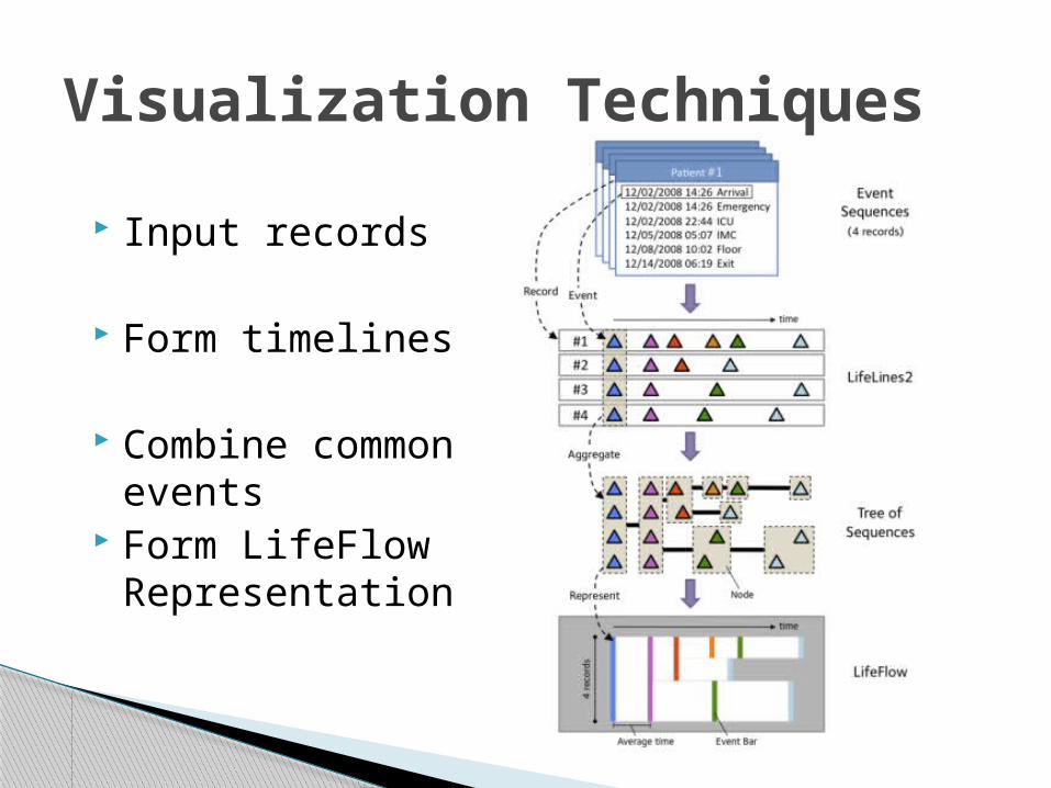
Input records
Form timelines
Combine common events
Form LifeFlow Representation
Visualization Techniques

Visualization Techniques

Visualization Techniques

Visualization Techniques

Case Study 1: Medical Domain◦ One dataset included 7,041 patients
ER patients from Jan 2010◦ Most Common: Arrival->ER->Discharge-Alive
4,591 (65.20%)◦ 193 (2.74%) Patients LWBS, 38 (0.54%) AWOL
Can be compared with hospital standard for quality control
Evaluation

Case Study 1: Medical Domain◦ Interesting Patterns
Arrival->ER->Floor->IMC/ICU “Step up”
Went from floor to ICU more quickly then floor to IMC Captured screenshots to compare with standards
◦ Found 6 patients experiencing “bounce backs”◦ Anomalous sequences
Patients being accepted into the ICU after being pronounced dead…
Evaluation

Case Study 1: Medical Domain◦ Measuring Transfer Time
Easy to make queries such as:“If patients went to the ICU, what was the average transfer time from the ER to the ICU?”
◦ Comparison Hypothesis about IMC patients being transferred
more quickly based on time of day Found no significant difference
Evaluation
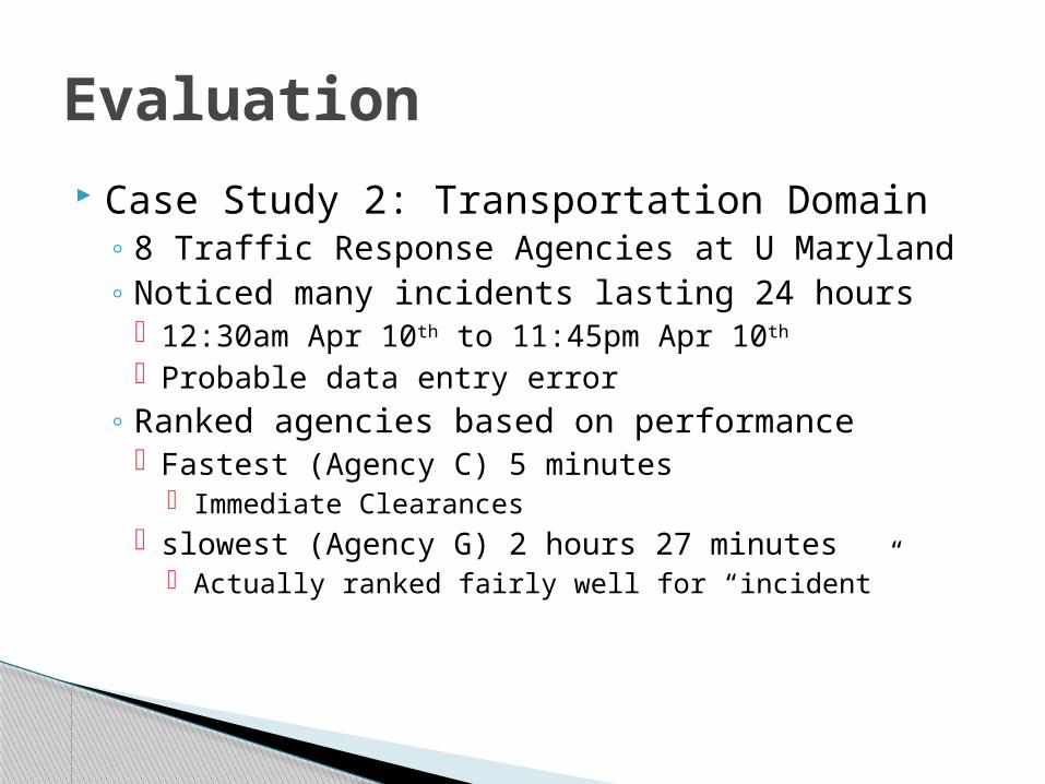
Case Study 2: Transportation Domain◦ 8 Traffic Response Agencies at U Maryland◦ Noticed many incidents lasting 24 hours
12:30am Apr 10th to 11:45pm Apr 10th
Probable data entry error◦ Ranked agencies based on performance
Fastest (Agency C) 5 minutes Immediate Clearances
slowest (Agency G) 2 hours 27 minutes Actually ranked fairly well for “incident”
Evaluation

User Study 10 Grad students examining 91 medical
records◦ 12 minute training video◦ 15 simple to complex tasks
“Where did patients usually go after they arrived” “Retrieve IDs of all patients with this transfer pattern”
◦ Most tasks performed in under 20 seconds◦ Final Task: 10 minutes to find 3 anomalies
intentionally put in data All students found first 2, most saw third but weren’t
sure it was anomalous
Evaluation

Motivation◦ Need an efficient tool to compare sets of
sequences◦ Previous work insufficient
Solution◦ LifeFlow visualization suite
Evaluation◦ Case studies show usefulness◦ User study shows usability
Conclusion

Some of this information could be found with methods as simple as SQL searches, is this technology really necessary?◦ What kind of information could it not help us find?
Traffic agencies were ‘ranked’ based on response time, but further investigation revealed these rankings may not mean anything, what are the dangers of technology such as this?
Discussion