learning objectives -...
TRANSCRIPT

Autodesk Revit for Presentations: Graphics that “POP”Jason Grant – http://jasongrant.squarespace.com/David Light – HOK - http://autodesk-revit.blogspot.com/
AB4564 This class will focus on the art of a drawing and how entourage, tweaking settings, and not using Revit out of the box can add "feeling" to your drawings rather than just displaying your walls, doors, and windows. Focusing on using Revit as your main presentation tool and output, we will explore how techniques that are applied using other graphics and modeling software can be mimicked within Revit to create a more efficient workflow as well as drawings that will impress. Custom families and settings will be shared.
Learning ObjectivesAt the end of this class, you will be able to:
Expand your knowledge of Revit and the intricacies of the settings Describe what is required to create great presentation graphics within Revit Use concepts to encourage the Revit “hold-out” designers in your firm Apply concepts in your firm
About the SpeakersJason Grant – [email protected] is the BIM specialist at Payette in Boston, Massachusetts. His experience includes over 14 years in the architecture field and he has utilized Autodesk® Revit® for the past six years. He completed 62 projects in Revit while at Colin Smith Architecture and has been managing Revit implementation, training, standards, API and content development at Payette for the past three years. With his Revit experience including health care, labs, commercial, mixed-use and residential, he understands the challenges that both small and large projects and firms face while utilizing and implementing Revit. Jason is also co-founder and advisor to the Boston Revit Users Group with more than 380 members, co-founder and co-leader of the BLUR Group (BIM Leaders Utilizing Revit), author for AUGI® AEC EDGE and an avid blogger on BIM and architecture at http://jasongrant.squarespace.com
David Light – [email protected] Light is currently employed as a BIM manager for HOK London, specializing in Autodesk Revit and Building Information Modelling as well as helping to drive forward the HOK’s global BuildingSMART principles. David started out his working career as an architectural technician, where he learnt the skill of drafting on the drawing board and construction detailing. Realising that CAD was the future, he transition to Microstation and then onto AutoCAD and 3dsMax. He was first introduced to Revit at version 4.5, just after the Autodesk acquisition and has had an unhealthy passion for the technology ever since. Before joining HOK; David worked for an the UK’s Autodesk Premier Solutions Centre providing coaching, training and consultancy in Revit Architecture and Revit Structure. David is also one of the co-founders & steering committee members of LRUG (London Revit User Group) which continues to grow in size & popularity. David has developed a reputation as one of the leading UK experts in Revit and is a popular speaker and blogger on all things Revit and BIM. http://autodesk-revit.blogspot.com/
AB4564 Autodesk Revit For Presentations: Graphics That “POP”
INTRODUCTIONArchitectural presentations always have a similar set of elements used to depict a project to audiences. One has the Architectural project which on its own does not describe the project in context or scale which leaves the observer to utilize their perception of the objects that make up the structure and their memory of sizes to understand the scale of the project. Without the context and scale elements (people, cars, furniture, trees and others), one could misinterpret the intent of the architect. Powerful presentations utilize the context, scale elements and the Architecture in an artistic way to describe the project to their audience. While photorealism is sometimes required, it is not needed to effectively convey a great design. Instead of going outside of Revit to create these stunning presentation graphics, try utilizing Revit instead. If utilized in a unique way, Revit could create a graphic that one did not think possible or easy. Let’s start using Revit for more than just the power of documentation.
KEY TOPICS OF THIS CLASS Examples of Presentation Drawing Elements How these can be represented within Revit Sharing of components with attendees High level look at how massing was used Creating custom object styles for additional control Overriding elements through visibility graphics and filters Using materials effectively Bringing it all together in a project
VISUAL DISPLAY OF ARCHITECTUREThe visual display of an architectural project is very similar to the display of any information. Drawings that display too much information are hard to read and difficult to understand. The point of a presentation drawing is not to exactly illustrate reality which can take away from the concept but to convey the vision to reinforce the concept. If the vision is successfully conveyed to the client or public then the project can continue. Typically, photorealism produces the inundation of information and focuses on the materiality, not the concept. Revit has the benefit and curse that it can easily produce the photorealistic and production drawings. Revit’s deficiency is on creating concept drawings quickly where colours of objects are overridden to show the focus on certain elements while at the same time turning all other elements to a grey scale. If one reviews presentation drawings that are considered effective, it is probably pretty easy to replicate the same within Revit. I would suggest, if in-house examples are not superb, to look at architectural magazines, websites and blogs which would give an enormous amount of examples.
2

AB4564 Autodesk Revit For Presentations: Graphics That “POP”
I would suggest looking at “The Visual Display of Quantitative Information” by Edward Tufte http://www.edwardtufte.com and the blog “Information is Beautiful” http://www.informationisbeautiful.net/ for inspiration from great examples of the display of data. The concepts in these sources can be easily applied to the display of an architecture project.
http://www.informationisbeautiful.net/2009/great-visualizers-good-magazine/
DESIGN MATTERSHow many clients are won, investors convinced to give to a project or community passionate to back a development due to the graphics in a presentation? The current world is passionate about designed products. From visually appealing graphics, to the U.S. State Department replacing their font for a more modern feel and toilet brushes being designed by Michael Graves for Target, design is an important aspect to everything we do.
“Design in its simplest form is the activity of creating solutions. Design is something that everyone does every day.” – Frank Nuovo
When one focuses on the design of the graphics and keeps the information striking, readable and limited to that which is most important, projects will be more accepted by the observer. Limiting the information is what makes napkin sketches popular as they portray the entire concept with a limited number of lines.
Covington Sketch by Daniel Libeskind
3

AB4564 Autodesk Revit For Presentations: Graphics That “POP”
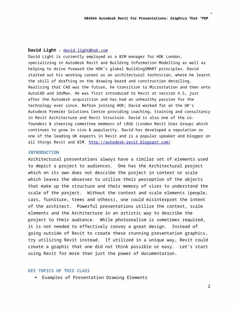
MASSINGEven though one will be duplicating work in the later phases of a project, it is usually beneficial to create semi-detailed massing elements that duplicate the shape of the walls, roofs, basic curtain wall components and other major elements. This massing can be used for the site, surrounding context and the actual concept. Simplifying the elements of design and colors that emphasise key components and recede the other elements can create a powerful graphic. Creating separate object styles for the different elements in massing can allow one to control the colors above and beyond the assigned material. In addition to colors, separate object styles will allow one to control the visibility more easily.
Images from the website ArchDaily http://www.archdaily.com/
4

AB4564 Autodesk Revit For Presentations: Graphics That “POP”
OBJECT STYLESTo provide additional presentation control of visibility and colors, creatively adding more subcategories for Object Styles can add a lot of flexibility for presentations.
To the right is an example of just a few additional categories for the context of the site that I am using for this presentation.
By creating additional subcategories, the material could be overridden by the subcategory, filters can be added, visibility graphics can be overridden by category or the category can be visible or not based on the needs of the view. Typically, I will add these subcategories at the family level and document the name and case of the subcategory for use in other families but occasionally (in-place-mass) I add them at the project level.
5
AB4564 Autodesk Revit For Presentations: Graphics That “POP”
VISIBILITY GRAPHICSWith some categories, one can override the pattern so that the color can be altered. Unfortunately, this is not typically the case with subcategories that are added but all subcategories can override the line weight, color and pattern. I will cover later how to change the color since it cannot be done through Visibility Graphics. The control of the lines though is crucial to creating stunning graphics. For example, in most cases the entourage people being used do not typically have a border line. Unfortunately, with Revit one cannot turn off the line, only the object. This is most evident with a solid white entourage person. The black border around a white fill would be distracting and not the intended look for the presentation.
Note: It should be noted that if the object has ghosting, transparency or a material of even 1% transparency then no shadows will be displayed. Visibility Graphics Override to make lines disappear.
6

AB4564 Autodesk Revit For Presentations: Graphics That “POP”
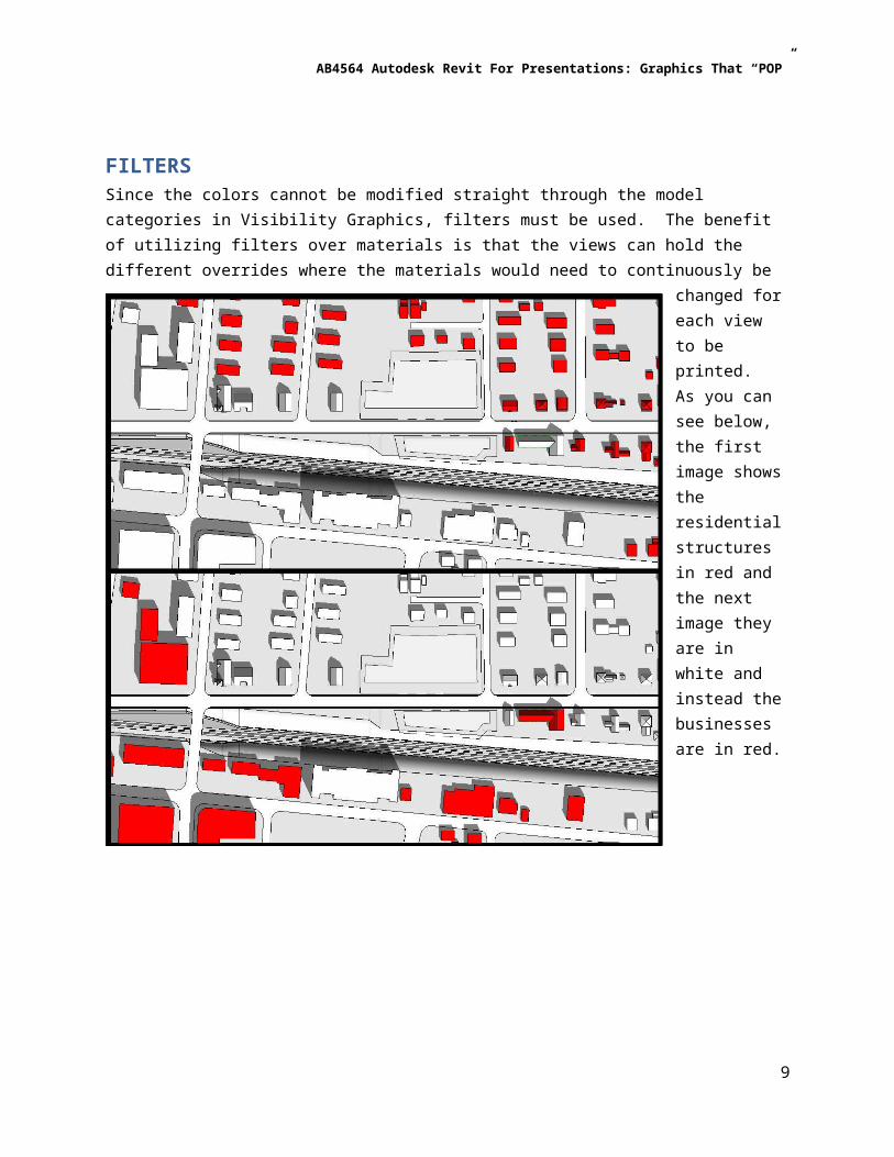
FILTERSSince the colors cannot be modified straight through the model categories in Visibility Graphics, filters must be used. The benefit of utilizing filters over materials is that the views can hold the different overrides where the materials would need to continuously be changed for each view to be printed. As you can see below, the first image shows the residential structures in red and the next image they are in white and instead the businesses are in red.
This is done with a simple override of the Projection/Surface Patterns to override the color to red and the pattern to solid.
7

AB4564 Autodesk Revit For Presentations: Graphics That “POP”
Planning for how one wants to control the coloring helps. As an example, I used the Family Type Name of the in-place mass to control the filter. Using the same logic, I could control all the masses at once by creating a filter that looks at the Type Name including Bldgs in the name. Filters are a commonly overlooked but powerful feature in your Revit toolkit.
MATERIALSSince the colors cannot be easily changed through the materials dialogue, I typically try to leave as many materials as possible in the white or light grey range. A great example of a material typically presented incorrectly which draws a lot of focus when viewing the image is a road, parking lot or driveway. Most individuals will pick a material of dark grey asphalt which may be appropriate for renderings but if the default shading for Shaded or Consistent Colors will be too high in contrast. This is sometimes desired for a solid/void analysis but if you research stunning graphics one will not notice that the roads, parking lots or driveways with a high contrast. Unless there is a need to have elements colored in Shaded or Consistent Colors, it is typically better to keep a light monotone feel.
8
AB4564 Autodesk Revit For Presentations: Graphics That “POP”
CARTOGRAPHICS AND INFOGRAPHICSAdding notes to a drawing to provide information about what the viewer is looking at is not as effective as adding a symbol that describes the drawing. Notes require reading and can get lost within the drawing unless they are relatively large. Symbols on the other hand can provide a quick understanding immediately when the viewer sees the drawing. Symbols can be powerful and should be leveraged more to portray the concept and analysis of the site.
Images from the website ArchDaily http://www.archdaily.com/
9

AB4564 Autodesk Revit For Presentations: Graphics That “POP”
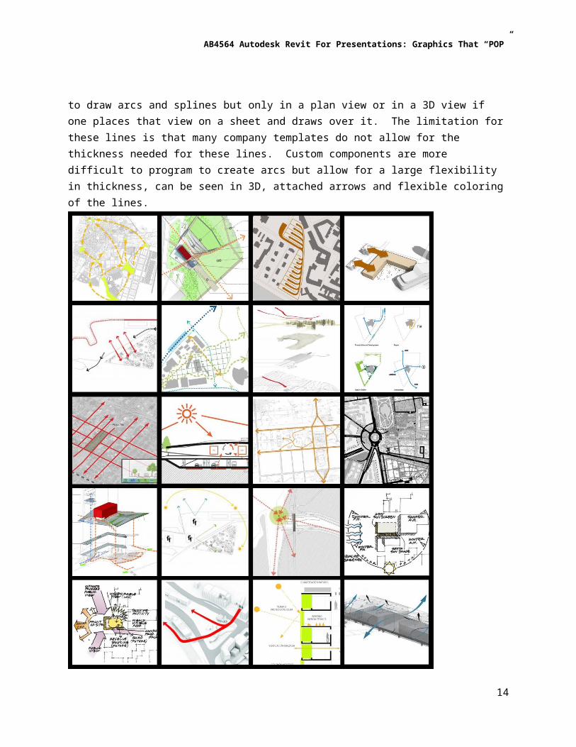
SITE ANALYSIS AND DEPICTIONSite analysis and depiction within Revit is an area that requires either custom lines or custom components. Custom lines allow for one to draw arcs and splines but only in a plan view or in a 3D view if one places that view on a sheet and draws over it. The limitation for these lines is that many company templates do not allow for the thickness needed for these lines. Custom components are more difficult to program to create arcs but allow for a large flexibility in thickness, can be seen in 3D, attached arrows and flexible coloring of the lines.
Images from the website ArchDaily http://www.archdaily.com/
10

AB4564 Autodesk Revit For Presentations: Graphics That “POP”
PEOPLE IN SECTIONS AND ELEVATIONSWith thorough research of many presentations, people are typically portrayed as silhouettes of white, grey or black with them being typically solid but sometimes semitransparent. Occasionally, people are colored to match the color scheme of the graphics. These people (and sometimes animals) within the drawings add scale as well as a sense of the unbuilt project being populated.
Images from the website ArchDaily http://www.archdaily.com/
11

AB4564 Autodesk Revit For Presentations: Graphics That “POP”
PEOPLE IN PERSPECTIVESSimilar to the people in sections and elevations, many are portrayed as silhouettes of white, grey or black. In perspective views, many more presentations add a transparency to the people occupying the drawing. Also, as the drawings become more photorealistic there is greater use of photographed people being placed in the drawings. This could be done with a creative use of decals but for this we will focus on the silhouette people.
Photorealistic people could be found here if desired:
http://www.realworldimagery.com/ - Photorealistic Entourage for Landscape & Architecture Visualization
Images from the website ArchDaily http://www.archdaily.com/
12

AB4564 Autodesk Revit For Presentations: Graphics That “POP”
TREES IN PLANTrees are typically thought of as green elements and therefore in many presentations that is how they are colored. In other instances they are shown as voids by using white to mask out the color below while some utilize simple or complex line work to represent the tree without any masking or color. Trees are an essential part of the design brining nature to the project.
Images from the website ArchDaily http://www.archdaily.com/
13
AB4564 Autodesk Revit For Presentations: Graphics That “POP”
TREES IN ELEVATIONTrees in elevation seem to have an unlimited number of ways in how they are displayed but each has a purpose based the style of the drawing being created and the type of tree being used for the project. This creates numerous possibilities to program into a component but as a firm one can reduce to a few of the most commonly used and then build from there.
Images from the website ArchDaily http://www.archdaily.com/
14

AB4564 Autodesk Revit For Presentations: Graphics That “POP”
BRINGING IT ALL TOGETHERComponent creation is easily the most time consuming aspect to creating stunning presentation graphics within Revit. With this presentation I will be providing many components that were created to achieve a similar feel to the examples shown on the previous pages. As a community, I hope that as you take these and put them into practice that you would share back and we can expand on the abilities of Revit through a community effort.
For a simple quick reference, these are the most frequently used colors from the thousands of images that I examined while preparing for this presentation.
15