learning responsive data visualization - sample chapter
TRANSCRIPT

C o m m u n i t y E x p e r i e n c e D i s t i l l e d
Master the art of building responsive visualizations on the Web
Learning Responsive Data Visualization
Christoph K
örner
Learning Responsive Data Visualization
Using D3.js and Responsive Design principles, you will not just be able to implement visualizations that look and feel awesome across all devices and screen resolutions, but you will also boost your productivity and reduce development time by making use of Bootstrap—the most popular framework for developing responsive web applications.
This book teaches the basics of scalable vector graphics (SVG), D3.js, and Bootstrap while focusing on Responsive Design as well as mobile-fi rst visualizations; the reader will start by discovering Bootstrap and learning how it can be used for creating responsive applications, and will then implement a basic bar chart in D3.js. You will learn about loading, parsing, and fi ltering data in JavaScript and then dive into creating a responsive visualization by using Media Queries, responsive interactions for mobile and desktop devices, and transitions to bring the visualization to life. In the following chapters, we build a fully responsive interactive map to display geographic data using GeoJSON and set up integration testing with Protractor to test the application across real devices using a mobile API gateway such as Browserstack.
You will fi nish the journey by discovering the caveats of mobile-fi rst applications and learning how to master cross-browser complications.
Who this book is written forThis book is for web developers and data science professionals who want to make their visualizations work for smaller screen sizes. Some basic knowledge of JavaScript and data visualization is expected.
$ 44.99 US£ 28.99 UK
Prices do not include local sales tax or VAT where applicable
Christoph Körner
What you will learn from this book
Get familiar with Responsive Design for data visualizations
Understand the main concepts of D3.js to create interactive visualizations
Unleash the power of Bootstrap to create stunning and responsive visualizations for all screen resolutions
Implement touch and mouse interactions for mobile-fi rst applications
Design transitions and animations that impress in portrait and landscape
Build a Responsive world map using GeoJSON and D3.js
Learning Responsive D
ata VisualizationP U B L I S H I N GP U B L I S H I N G
community experience dist i l led
Visit www.PacktPub.com for books, eBooks, code, downloads, and PacktLib.
Free Sample

In this package, you will find: The author biography
A preview chapter from the book, Chapter 1 'Getting Started with Responsive
Design, Bootstrap, and D3.js'
A synopsis of the book’s content
More information on Learning Responsive Data Visualization

About the Author
Christoph Körner, CTO and lead developer at GESIM, a start-up company, is a passionate software engineer, web enthusiast, and an active member of the JavaScript community with more than 5 years of experience in developing customer-oriented web applications. He is the author of Data Visualizations with D3 and AngularJS and is currently pursuing his master's degree in Visual Computing at Vienna Institute of Technology.

Preface
Data visualizations are the best way to understand complex information and data. The human brain perceives visual information easily; it can make connections and is able to understand the complete process easier than without visualizations.
I am always delighted with the positive feedback from users whenever they understand a complex system easily by looking at a data visualization, instead of going through explanatory text and raw data. With the power of the Web and modern browsers, I can share these visualizations with everyone and make them interactive and animated.
To power cross-browser interactive visualization, I didn't want any compromise with regards to performance, debugging, quality, and interactivity, which led me to SVG. After deciding for SVG, I looked for a framework for SVG transformations giving raw access to all its underlying standards while also providing a rich set of visualization features - the D3.js library provides all of these.
D3.js is a visualization toolkit that facilitates the generation and manipulation of web-based vector graphics and provides full access to underlying SVG standards. Moreover, animations and interactive visualizations change the way users perceive web applications, and D3.js offers everything you need to make a visualization interactive out of the box.
While this has been working for the last few years, I realized that users are increasingly accessing visualizations with their mobile devices, though mostly through smartphone and tables. On most tablets, visualizations looked good, though interactions did not work anymore. Smartphone users experienced this as well when they tried to zoom into a browser but it somehow interfered with the zoom of the visualization and randomly toggled interactive features instead. For me, this was the sign I needed to fi x the problem.
With the rise of responsive web design, there were already plenty of ideas for creating cross-browser and cross-platform applications that adapt to a user's device, screen size, and resolution. Apart from this, modern browsers already provide solid CSS and JavaScript functionality to implement responsive designs for all kinds of web applications.

Preface
The only logical step for me was to combine rich tools in order to create responsive applications and introduce the same ideas into data visualizations. I want my visualizations to adapt to the user's device, screen size, and resolution while providing cross-platform interactivity for mouse and touch gestures. In this book, I will share my knowledge, experience, and best practices on responsive data visualizations with you.
What this book coversChapter 1, Getting Started with Responsive Design, Bootstrap, and D3.js, gets you on track with today's concepts, technologies, and frameworks to create responsive applications.
Chapter 2, Creating a Bar Chart Using D3.js and SVG, helps you get started with D3.js and its concepts. You will learn how to draw points, shapes, and simple bar charts by the end of this chapter.
Chapter 3, Loading, Filtering, and Grouping Data, guides you so that you can get the maximum information out of real-world data.
Chapter 4, Making the Chart Responsive Using Bootstrap and Media Queries, goes through all of the steps needed to make visualizations responsive and adapt them to user devices.
Chapter 5, Building Responsive Interactions, teaches you to add truly responsive interactions to your visualization, which also makes these great to use on user devices.
Chapter 6, Designing Transitions and Animations, teaches you to make a visualization appealing to look at by adding gorgeous transitions or custom animations.
Chapter 7, Creating Maps and Cartographic Visualizations Using GeoJSON, helps you get started with geographic data processing and then visualize this data in cartographic visualizations.
Chapter 8, Testing Responsive Visualizations, shows you how to test responsive visualizations both manually and in an automated manner, and covers both unit and end-to-end testing.
Chapter 9, Solving Cross-Browser Issues, helps you avoid the most common pitfalls when dealing with cross-browser compatibility issues for responsive visualizations.
[ 1 ]
Getting Started with Responsive Design, Bootstrap, and D3.js
The best way to understand data is to visualize it and explore it using an interactive visualization. In this book, we are going to build such an interactive visualization (actually many of them) using the latest techniques and web technologies. To make the information accessible across all devices, we are going to make the visualizations responsive. However, before we can start, we need to understand what this actually means. We also want to reuse some existing frameworks to not just do a great job but also work in an effi cient way.
This chapter serves as an introduction to the methods, technologies, and frameworks that we will use throughout the book, and it will help you understand why we are using them to create data visualizations and how they work together.
In this chapter you will learn the following:
• What exactly is Responsive Design and how can it be applied to create visualizations that work across all different screen sizes and resolutions
• What is a Media Query and how it can be used to design visualizations for various devices
• Why and how we use Bootstrap to build the visualization on existing components
• Why we use vector graphics, such as SVG, for the web• Why we use D3.js for data manipulation and graphics creation

Getting Started with Responsive Design, Bootstrap, and D3.js
[ 2 ]
First, you will learn about Responsive Design and how it can be used to design a visualization for various screen sizes and resolutions. Then, we will discuss the importance of some key technologies such as CSS3 (especially Media Queries) and HTML5 (especially the viewport meta tag).
In the following chapter, we will get acquainted to the popular CSS and HTML framework called Bootstrap. Don't worry if you have never heard about it; it helps us to build the application on the existing and well-tested components, such as grids and LESS Media Queries.
In the last section of this chapter, you will learn about Scalable Vector Graphics (SVG) in the browser; and you will understand why and when it is great to use vector graphics for visualizations. Then, we will see a brief introduction to D3.js, which is a versatile JavaScript library for data transformations and graphics generation. At the end of this chapter, you will understand why SVG is a great choice for designing interactive responsive visualizations for the web.
What is Responsive Design?Responsive Design is a method for designing applications that can adapt their appearance and behavior to the user's device. It makes the application look and feel good across all different devices, and most often, it makes them usable on all devices.
An important paradigm in Responsive Design is to use relative dimensions instead of fi xed widths, heights, margins, paddings, and font sizes throughout all the application to adapt the design to the various types of devices.
For web browsers, Responsive Design was enabled through CSS3 and HTML5 features, such as Media Queries, the viewport meta tag, and new dimension units.
Conditional CSS with Media QueriesMedia Queries were introduced in CSS3 as a more fl exible extension of Media Types. They allow the developer to apply conditional CSS styles only when a statement (a so-called query) matches a certain CSS property (so-called Media Features) and a Media Type. A typical Media Query has the following structure:
@media [Media Type [and|not|only]] (Media Feature) { ...}

Chapter 1
[ 3 ]
Here is a small selection of properties that can be used as Media Features:
• width, min-width, and max-width• height, min-height, and max-height• device-width, min-device-width, and max-device-width• device-height, min-device-height, and max-device-height• resolution, min-resolution, and max-resolution
A complete list of Media Features and Types can be found on MDN at https://developer.mozilla.org/de/docs/Web/CSS/Media_Queries/Using_media_queries.
In Responsive Design, we are mostly interested in querying the min-width or max-width property to apply different styles to devices that have different widths.
Let's see an example where we can apply a different background color depending on the minimal width of the browser window:
div { background-color: blue;}@media screen and (min-width: 992px) { div { background-color: red; }}
In the preceding example, all the div elements in the page have the background color red as long as the browser window's width is larger or equal to, 992 px (see the following fi gure):
Browser window width larger than 992px

Getting Started with Responsive Design, Bootstrap, and D3.js
[ 4 ]
Once the window width is smaller than 992 px, the background color of the div elements jumps to blue (see the following fi gure):
Browser window with width smaller than 992px
As we can see in the following fi gure, Media Queries are supported across all major browsers and Internet Explorer starting from version 9:
Cross-browser compatibility Media Queries from http://caniuse.com/#feat=css-mediaqueries
Understanding BreakpointsIn Responsive Design, we call a state when a certain layout and Media Query is active, and we call a breakpoint the transition from one state to another.
Let's look at an example. First, we defi ne some screen dimensions for the following devices:
• <768px is for phones• 768px-992px is for tablets• 992px-1200px is for desktops• ≥1200px is for large devices and TVs

Chapter 1
[ 5 ]
Create a CSS snippet using Media Queries for these device dimensions:
/* phones, default no query *//* tablets */@media (min-width: 768px) { ... }/* desktops */@media (min-width: 992px) { ...}/* large devices */@media (min-width: 1200px) { ... }
In the preceding code, we defi ned four states with three breakpoints between these states where each state corresponds to a typical screen dimension and device type.
We can also see these breakpoints by reducing the size of a browser window while looking at a responsive web page; we observe how the design breaks at a certain width of the browser window. In the following fi gure, the breakpoint is visualized as a dashed line, showing the moment when one state breaks into a new one:
Breakpoint in Responsive Design
We can observe the same effect when we look at the Google Plus web page in the following fi gure. In the fi rst two fi gures, the size of browser window changes, but the three-column layout stays the same. In the third image, the design breaks into a new layout with only two columns:
Breakpoints of the Google Plus page
Getting Started with Responsive Design, Bootstrap, and D3.js
[ 6 ]
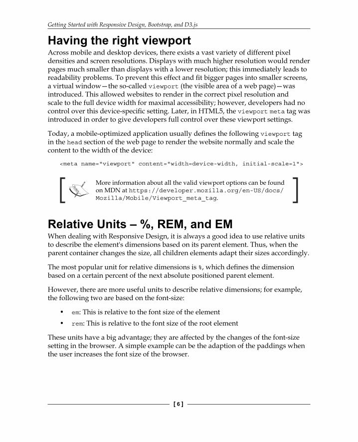
Having the right viewportAcross mobile and desktop devices, there exists a vast variety of different pixel densities and screen resolutions. Displays with much higher resolution would render pages much smaller than displays with a lower resolution; this immediately leads to readability problems. To prevent this effect and fi t bigger pages into smaller screens, a virtual window—the so-called viewport (the visible area of a web page)—was introduced. This allowed websites to render in the correct pixel resolution and scale to the full device width for maximal accessibility; however, developers had no control over this device-specifi c setting. Later, in HTML5, the viewport meta tag was introduced in order to give developers full control over these viewport settings.
Today, a mobile-optimized application usually defi nes the following viewport tag in the head section of the web page to render the website normally and scale the content to the width of the device:
<meta name="viewport" content="width=device-width, initial-scale=1">
More information about all the valid viewport options can be found on MDN at https://developer.mozilla.org/en-US/docs/Mozilla/Mobile/Viewport_meta_tag.
Relative Units – %, REM, and EMWhen dealing with Responsive Design, it is always a good idea to use relative units to describe the element's dimensions based on its parent element. Thus, when the parent container changes the size, all children elements adapt their sizes accordingly.
The most popular unit for relative dimensions is %, which defi nes the dimension based on a certain percent of the next absolute positioned parent element.
However, there are more useful units to describe relative dimensions; for example, the following two are based on the font-size:
• em: This is relative to the font size of the element• rem: This is relative to the font size of the root element
These units have a big advantage; they are affected by the changes of the font-size setting in the browser. A simple example can be the adaption of the paddings when the user increases the font size of the browser.

Chapter 1
[ 7 ]
A short summary and explanation of all different CSS units can be foun d on MDN at https://developer.mozilla.org/de/docs/Web/CSS/length.
Designing for mobile devices fi rstResponsive applications should look and feel great (or work at all) on a huge number of devices with a huge number of different screen sizes and resolutions; they usually run on mobile devices as well as big TV screens. Thus, in the beginning of a project, every developer has to choose an approach to design the responsive application to master this transition; in general, we distinguish between the following methods:
• Mobile first• Desktop first
In the desktop fi rst method, we design for desktop devices and mouse input fi rst, then we adjust and scale the design down for mobile devices and touch interactions. This often results in a web application with a reduced functionality for mobile devices due to a much smaller screen dimension and the lack of touch support.
In the mobile fi rst method, we design for mobile devices and touch interactions fi rst, and then we adjust and scale the design up for bigger devices and mouse interactions. This approach makes sure that mobile devices support a complete set of features, which can even be used on desktop clients.
Both methods are equally correct, accepted, and popular nowadays. The only exception is that mobile fi rst became a buzzword due to an increase of mobile devices accessing the web during the previous years. Throughout the book, we will choose a mobile fi rst approach and design for mobile devices and touch support. However, we will, of course, extend the visualizations to support mouse input and bigger screens. That's what the responsive design is all about.
Bootstrap – a popular mobile fi rst CSS frameworkIf we want to create responsive mobile fi rst web applications, we usually don't want to start from zero and re-implement common patterns and components; we would rather want to reuse some well-tested, existing components.

Getting Started with Responsive Design, Bootstrap, and D3.js
[ 8 ]
Bootstrap is a very popular HTML and CSS framework built by former Twitter employees for easy, fast, and modern frontend development; it provides loads of responsive CSS and LESS layouts as well as a huge collection of HTML and JavaScript components. Thanks to its MIT license, it can be used in open source and commercial software.
The current stable version 3.3.5 includes LESS styling with these features:
• Containers and grids (static and fluid)• Responsive helpers (hiding and showing elements on different breakpoints)• LESS mixins and variable declarations• Styles for common components such as forms, input fields, and tables• Icons, HTML, and JavaScript components
A complete list of features can be found on the Bootstrap website at http://getbootstrap.com/.
The new version 4 (which is currently in the alpha stage) will be shipped with SASS layouts and loads of other great features and improvements:
There also exists an offi cial fork for the SASS precompiler on GitHub at https://github.com/twbs/bootstrap-sass.
• All units are in rem an em• A new xl grid tier is added• Optional flexbox support• A Reboot module is available to reset default browser styles
A complete list of new features can be found on the Bootstrap blog at http://blog.getbootstrap.com/2015/08/19/bootstrap-4-alpha/.
Throughout this book, we will use Bootstrap 3.3.5 version (with LESS) for all the examples and explanations if they are not stated differently. We will also give some hints about the latest version where it is appropriate.

Chapter 1
[ 9 ]
Including BootstrapMake sure you have the Bower package manager installed; this can be done by running the following command from the terminal:
npm install -g bower
More information about the Bower package manager can be found on its website at http://bower.io/.
Throughout this book, we will make use of only the CSS components of Bootstrap and thus we only need to include the bootstrap.css fi le to our project. There are multiple ways of doing so:
• Use the package manager called bower (recommended)—First, fetch the library by running the following command from the terminal—bower install bootstrap#3.3.5. Then, link the minified CSS file from the bower_components/ directory in the head section of the web page: <link rel="stylesheet" href="bower_components/bootstrap/dist/css/bootstrap.min.css">.
• Use a Content Delivery Network (CDN), such as MaxCDN (this requires an active Internet connection while developing). Simply include the minified CSS file from the CDN in the head section of the web page: <link rel="stylesheet" href="https://maxcdn.bootstrapcdn.com/bootstrap/3.3.5/css/bootstrap.min.css">.
• Manually, download the 3.3.5 release from GitHub (https://github.com/twbs/bootstrap/releases) and unzip it into the libs/ directory. Then, link the minified CSS file from the libs/ directory in the head section of the web page: <link rel="stylesheet" href="libs/bootstrap/dist/css/bootstrap.min.css">.
I strongly recommend using the bower package manager to manage your frontend dependencies (or similar ones, such as npm or component). However, in the examples of this book, we will link Bootstrap directly from MaxCDN for simplicity reasons; therefore, all examples in the source of the book require an active Internet connection.
Finding additional resourcesThe ultimate resource for Bootstrap is the documentation that can be found at http://getbootstrap.com/getting-started/. Here, you will also fi nd examples and templates using the Bootstrap framework.

Getting Started with Responsive Design, Bootstrap, and D3.js
[ 10 ]
For more detailed information and examples, I recommend reading the Unraveling Bootstrap 3.3 book by Istvan Novak.
Understanding grid layoutsA popular component to organize elements in an application or visualization is a grid layout. For responsive design in particular, we are mostly interested in grid layouts that adapt their columns to the screen resolution of the client. In the following fi gure, there's an example of a responsive grid layout with three columns per row on a desktop device and one column per row on a mobile device:
Simple Responsive grid, left: desktop, right: mobile
We then distinguish two different types of responsive grids that adapt the number of columns to the screen resolution of the client:
• Normal grids with a fixed width per breakpoint (see following figure on the left)• Fluid grids that always scale to the full width of the current breakpoint
(see the following figure on the right)
Grid types—left: grid with fixed width, right: fluid grid

Chapter 1
[ 11 ]
It's actually quite simple to build a grid system yourself; let's fi rst take a look at how to create a fl uid grid layout, and afterwards, we will better understand how we can use Bootstrap components to get things done quickly and properly.
If we think about a grid as a (fl exible) table layout, we need two basic components: rows and columns. A popular approach is to use the 12-column grid where we divide the width of a row into 12 columns and defi ne column combinations that sum up to the full width of 12. The following fi gure illustrates some of these combinations: 12 columns of width 1, 6 columns of width 2, 4 columns of width 3, and so on. Also other combinations that sum up to 12 are allowed, such as 2, 6 and 4 or 1, 10 and 1 and many more.
Grid layout with 12 columns
Let's start and build the .row class that spans to the full width of the parent element:
.row { position: relative; width: 100%;}
Next, we want to create column classes .col-1, .col-2, .…, and .col-12 that defi ne the width of the column in the percent relative to the width of the row. We defi ne a text wrap with the float attribute and add padding for the cells. The float attribute indicates that the block element should not appear in the original fl ow but "fl oat" on the left side. By doing so, we align the elements in the same line instead of placing them into the normal text fl ow:
[class*="col-"] { float: left;

Getting Started with Responsive Design, Bootstrap, and D3.js
[ 12 ]
padding: 1em;}.col-1 { width: 8.33333333%;}.col-2 { width: 16.66666667%;}.col-3 { width: 25%;}.col-4 { width: 33.33333333%;}.col-5 { width: 41.66666667%;}.col-6 { width: 50%;}.col-7 { width: 58.33333333%;}.col-8 { width: 66.66666667%;}.col-9 { width: 75%;}.col-10 { width: 83.33333333%;}.col-11 { width: 91.66666667%;}.col-12 { width: 100%;}
In the preceding code, we see that we can use the wildcard attribute selector called [class*="col-"] to select all the columns at once (all the classes that contain the col- letters). The widths have to be defi ned as per column type.

Chapter 1
[ 13 ]
The only problem in the previous example is that, by default (box-sizing: content-box), the padding size of the columns adds up with the width property to determine the computed width of the element. The total width of all elements plus the padding sizes would give a number bigger than 100% of the parent element. Using the box-sizing: border-box property, we can disable this behavior and the computed width of the element equals the width property:
[class*="col-"] { -webkit-box-sizing: border-box; -moz-box-sizing: border-box; box-sizing: border-box;}
Finally, we need to clear the text-wrapping property of the columns after each row. We can do this by adding a clearfix pseudo element after each .row class:
.row:after { content: " "; display: block; clear: both;}
This is already a nice implementation of a basic grid system. Let's test this layout and create an HTML page with the following content:
<div class="row"> <div class="col-1">.col-1</div> <div class="col-1">.col-1</div> <div class="col-1">.col-1</div> <div class="col-1">.col-1</div> <div class="col-1">.col-1</div> <div class="col-1">.col-1</div> <div class="col-1">.col-1</div> <div class="col-1">.col-1</div> <div class="col-1">.col-1</div> <div class="col-1">.col-1</div> <div class="col-1">.col-1</div> <div class="col-1">.col-1</div></div><div class="row"> <div class="col-2">.col-2</div> <div class="col-2">.col-2</div> <div class="col-2">.col-2</div> <div class="col-2">.col-2</div> <div class="col-2">.col-2</div>

Getting Started with Responsive Design, Bootstrap, and D3.js
[ 14 ]
<div class="col-2">.col-2</div></div><div class="row"> <div class="col-3">.col-3</div> <div class="col-3">.col-3</div> <div class="col-3">.col-3</div> <div class="col-3">.col-3</div></div><div class="row"> <div class="col-4">.col-4</div> <div class="col-4">.col-4</div> <div class="col-4">.col-4</div></div><div class="row"> <div class="col-6">.col-6</div> <div class="col-6">.col-6</div></div><div class="row"> <div class="col-12">.col-12</div></div>
If we add a little bit of coloring (the complete example can be found in the code fi les of the book) and open the HTML page in the browser, we get a layout similar to the following fi gure:
Browser output of simple grid layout

Chapter 1
[ 15 ]
Let's take a look at the responsive grid system provided by Bootstrap, which looks very similar to the one that we have just created. Bootstrap defi nes Media Queries for four device types (the so-called grid tiers) and their corresponding typical viewport widths (in pixel) for the responsive breakpoints:
• Default for extra small devices (xs) such as phones• ≥768px for small devices (sm) such as tablets and phones in landscape mode• ≥992px for medium devices (md) such as desktops• ≥1200px for large devices (lg) such as large desktops and TVs
In Bootstrap 4, the breakpoints are now defi ned in em units:
• Default for extra small devices• ≥34em for small devices• ≥48em for medium devices• ≥62em for large devices• ≥75em for extra large devices
The grid requires three different components:
• It requires a container element with the class called .container for fixed widths or .container-fluid for fluid containers
• It requires a row element with the class .row• It requires one or more column elements:
° .col-xs-1, .col-xs-2, …, .col-xs-12 ° .col-sm-1, .col-sm-2, …, .col-sm-12 ° .col-md-1, .col-md-2, …, .col-md-12 ° .col-lg-1, .col-lg-2, …, .col-lg-12
Bootstrap 4 adds another .col-xl-* class for extra large devices.

Getting Started with Responsive Design, Bootstrap, and D3.js
[ 16 ]
Let's take a look at some code. First, we need to include the Bootstrap CSS to the header of the web page:
<!DOCTYPE html><html> <head> <link rel="stylesheet" href="https://maxcdn.bootstrapcdn.com/bootstrap/3.3.5/css/bootstrap.min.css"> <title>Simple Grid System</title> ... </head> <body> ... </body></html>
Now, we can add the grid layout according to the previous example, but this time, we need to wrap it in a fl uid container:
<div class="container-fluid"> <div class="row"> <div class="col-lg-1">.col-lg-1</div> <div class="col-lg-1">.col-lg-1</div> ... </div> <div class="row"> ... </div></div>
If we open the web page and look at the output of the web browser, we see an example similar to the following fi gure:
Browser output of grid layout with Bootstrap

Chapter 1
[ 17 ]
We remark that the preceding fi gure looks very similar to the grid layout that we created in the beginning of this section. The only small difference in the code was the .container element to wrap the rows and the usage of the .col-lg-* classes. However, Bootstrap's grid is responsive, and the columns are arranged according to the breakpoints and the browser width. If we reduce the size of the browser window smaller than 1200px, we see that the grid jumps into a different layout. We can see this effect in the following fi gure:
Browser output of grid layout with window size smaller than 1200px
The reason for this is that the browser window is no longer in the state of a very large device (greater than 1200px) and has jumped to a smaller state. Therefore, the col-lg-* columns are not applied anymore, and they appear in the full width of the row. We can now start to defi ne certain column combinations to create a fl exible responsive grid:
<div class="container-fluid"> <div class="row"> <div class="col-lg-3 col-md-6 col-sm-12"></div> <div class="col-lg-3 col-md-6 col-sm-12"></div> <div class="col-lg-3 col-md-6 col-sm-12"></div>

Getting Started with Responsive Design, Bootstrap, and D3.js
[ 18 ]
<div class="col-lg-3 col-md-6 col-sm-12"></div> </div> <div class="row"> ... </div></div>
Hiding elements on different screen resolutionsBootstrap also provides very handy and responsive utility classes to hide elements on certain browser widths. The classes are named according to the Media Query breakpoints:
• .hidden-xs
• .hidden-sm
• .hidden-md
• .hidden-lg
Hiding an element on a phone in portrait mode is as simple as adding a class to the element; let's take a look at the following example:
<ul class="nav"> <li><a href="#menu">Menu</a></li> <li class="hidden-xs"><a href="#link">Link</a></li></ul>
The classes for showing elements on certain browser widths come for each breakpoint in three different variations depending on the CSS display property of the element:
• .visible-*-block
• .visible-*-inline
• .visible-*-inline-block
The reason for these additional types is undesired line breaks and behaviors that occur when the display mode changes from none to block. Therefore, Bootstrap forces the user to specify the display property via the class name.

Chapter 1
[ 19 ]
For these three blocks, all the breakpoint classes are available:
• .visible-xs-*
• .visible-sm-*
• .visible-md-*
• .visible-lg-*
Displaying an element only on a specifi c device width is also very simple:
<ul class="nav"> <li><a href="#menu">Menu</a></li> <li class="visible-xs-block"><a href="#link">Link</a></li></ul>
Bootstrap 4 provides only the .hidden-*-down and .hidden-*-up classes across all the breakpoints to the hide elements of certain device types.
Using Bootstrap's Media Queries in LESSBootstrap's stylesheet is written in LESS and we can make use of the predefi ned breakpoints and Media Queries easily.
LESS is a CSS-like preprocessor language used to write stylesheets that support nesting, variables, functions, mixins, and much more. LESS fi les are compiled to CSS fi les during the development via the LESS compiler. If you've never heard about LESS, it is a good time to check it out via http://lesscss.org/.
Make sure you have the LESS compiler installed; this can be done by running the following command from the terminal:
npm install -g less
First, we create a style.less fi le and import Bootstrap's variables.less fi le at the beginning of the fi le. This enables us to reuse Bootstrap's declarations for colors, dimensions, and confi gurations throughout this fi le:
/* style.less */@import "bower_components/bootstrap/less/variables.less";

Getting Started with Responsive Design, Bootstrap, and D3.js
[ 20 ]
Now, we can use Bootstrap's Media Query breakpoints in our LESS fi le. Let's add some device-specifi c padding to all the div containers:
/* Extra small devices *//* No media query since this is the default in Bootstrap */div { padding: 4em;}
/* Small devices */@media (min-width: @screen-sm-min) { div { padding: 8em; }}
/* Medium devices */@media (min-width: @screen-md-min) { div { padding: 16em; }}
/* Large devices */@media (min-width: @screen-lg-min) { div { padding: 24em; }}
Now, we use the LESS compiler to compile the stylesheet with CSS by running the following command in the terminal:
lessc style.less style.css
The resulting CSS looks similar to this:
/* Extra small devices *//* No media query since this is the default in Bootstrap */div { padding: 4em;}/* Small devices */@media (min-width: 768px) { div {

Chapter 1
[ 21 ]
padding: 8em; }}/* Medium devices */@media (min-width: 992px) { div { padding: 16em; }}/* Large devices */@media (min-width: 1200px) { div { padding: 24em; }}
Perfect! This means that we can now use the predefi ned breakpoints in our LESS styles.
Sometimes, it is also necessary to limit your styles to a narrow set of devices. Therefore, one can also use the max-width Media Queries in LESS. Again, the following code snippet is taken from the Bootstrap documentation at http://getbootstrap.com/css/#grid-media-queries:
@media (max-width: @screen-xs-max) { ... }@media (min-width: @screen-sm-min) and (max-width: @screen-sm-max) { ... }@media (min-width: @screen-md-min) and (max-width: @screen-md-max) { ... }@media (min-width: @screen-lg-min) { ... }
This can be useful when we want to defi ne styles for a single device type rather than all the devices with a screen width greater than or equal to the defi ned one.
Vector graphics in the browser with SVGNow, it is time to create our fi rst visualization. In HTML5, we have plenty of options to create graphics in the browser itself:
• Canvas API (or using, for example, Paper.js, Processing.js, and more)• WebGL API (or using, for example, Three.js, Pixi.js, and more)• SVG specification (or using for example RaphaëlJS, D3.js, and more)

Getting Started with Responsive Design, Bootstrap, and D3.js
[ 22 ]
To better understand which technology suits the best for our purpose of implementing responsive visualizations, we need to take a closer look and discuss their advantages and disadvantages.
Raster/Pixel graphics with CanvasCanvas is a JavaScript API used to create Raster Graphics (often called Pixel Graphics) in the browser. As we can see in the following fi gure, it is supported in all major browsers and Internet Explorer starting from version 9:
You can fi nd detailed information about the Canvas API on MDN at https://developer.mozilla.org/en/docs/Web/API/Canvas_API.
Cross-browser compatibility Canvas from http://caniuse.com/#feat=canvas
A Pixel Graphic is an image that contains all the information about the color of each pixel of the image for a certain resolution. Let's assume we have an image with 8 x 8 pixels where each of these 64 pixels contains the information about its color; we draw a circle in this image:
<canvas id="canvas"></canvas><script> var canvas = document.getElementById("canvas"); var ctx = canvas.getContext("2d"); var centerX = 10, centerY = 10, radius = 10; ctx.beginPath(); ctx.arc(centerX, centerY, radius, 0, 2 * Math.PI, false); ctx.fillStyle = "red"; ctx.fill();</script>

Chapter 1
[ 23 ]
In the following fi gure, one can see how the so-called rasterization process defi nes which pixels of this image gets colored (pixels in the blue region) for the circle shape and which pixels stays transparent (pixels in the white region):
Rasterization of a 8 x 8 pixel circle shape
If we display this image with a high resolution (see the following fi gure at the left), we see a small circle with crisp edges. On the other hand, if we zoom into the image, we see a very pixelated 8 x 8 pixel image (see the following fi gure on the right); this effect is the direct cause of the resolution-dependent rasterization process:
Pixel graphic, left: high resolution, right: zoomed
This effect makes it really diffi cult to use Pixel Graphics for Responsive Design; we have to always generate and reload our visualization for the current resolution and screen size.
Another drawback is that the fi nal image is composed of pixels, which make it very diffi cult to attach event listeners, such as mouseover or click events, to certain components of the image. The reason for this is that there are no shapes or components encoded in the image but only color values for each pixel.

Getting Started with Responsive Design, Bootstrap, and D3.js
[ 24 ]
Hardware-accelerated Pixel Graphics with WebGLWebGL is a JavaScript API based on OpenGL ES 2 to create hardware-accelerated 3D Pixel Graphics in the browser. This technology is very powerful and allows access to the client's GPUs via so-called Shaders; the fi nal visualization is exposed in the browser via the Canvas element. However, browser support is not very good, as we can see in the following fi gure; mobile devices support the API only partially and Internet Explorer only from version 11.
You can fi nd more detailed information about the WebGL API on MDN at https://developer.mozilla.org/en/docs/Web/API/WebGL_API.
Cross-browser compatibility WebGL from http://caniuse.com/#feat=webgl
Due to WebGL's use of the Canvas element, it doesn't solve any of the limitations of Pixel Graphics that we discussed in the Canvas section. Thus, we will look at a different type of image representation next.
Vector graphics with SVGSVG is an XML specifi cation used to create and compose Vector Graphics. Thanks to HTML5, these graphics can simply be embedded into an HTML page, rendered and displayed perfectly sharp by the browser in every screen resolution. As we can see in the following fi gure, cross-browser compatibility is very good across all the major browsers and Internet Explorer starting from version 9:

Chapter 1
[ 25 ]
Cross-browser compatibility SVG from http://caniuse.com/#feat=svg
Vector Graphics are images where all the information about the image is encoded as numerical expressions of geometric shapes (such as rectangles, circles, ellipses, paths, and texts) of the elements of the image. The browser always uses this information to draw and render the graphic in the best resolution possible. In the following fi gure, we can see a Vector Graphic of a circle with a high resolution, whereas on the right, we see a zoom of the image. It's easy to see that the zoomed image is displayed with perfectly crisp edges; this effect of lossless scaling results from the resolution-dependent rendering of the browser.
You can fi nd detailed information about the SVG specifi cation on the W3 website: http://www.w3.org/Graphics/SVG/.
Vector Graphic, left: high resolution, right: zoomed
More advantages result from the fact that the visualization's elements are simply embedded in the HTML page. Now, we can easily attach native JavaScript event listeners, such as the mouseover or click events, on every component of the graphic and use CSS to style them together with the rest of the application.

Getting Started with Responsive Design, Bootstrap, and D3.js
[ 26 ]
Another great benefi t is that we can simply look into the Developer Console of the web browser, play around, and debug the visualization. We can click on each element of the image to see its attached event handlers, and we can modify the CSS styling in real time. Anyone who has ever dealt with OpenGL or WebGL debugging will agree that this is a comfort that you can't miss while developing visualizations for the web.
Now, we already have many arguments in favor of using SVG for responsive cross-browser visualizations:
• Simple debugging because the source code of the graphic is simply embedded in the HTML document
• Sharp rendering on all screen resolutions because the browser renders the graphic according to the client's screen resolution
• Cross-browser compatibility in all major browsers• Styling the visualization with CSS• Native JavaScript event handlers can be attached to all elements of the image• Debugging and live editing of the visualization in the Developer Tools
Creating graphics with D3.jsD3.js (abbreviation for Data-Driven Documents) is a JavaScript library built by Mike Bostock and other members of the Stanford Visualization Group for DOM manipulation, data transformation, and graphic creation. It uses a jQuery-like, data-driven approach and leverages all the capabilities of modern browsers and underlying web standards (such as HTML, CSS, and SVG).
D3.js is open source and hosted on GitHub (https://github.com/mbostock/d3) under a slightly modifi ed BSD 3-clause license; therefore, it can be used in open source and commercial products without being required to release any modifi cations. GitHub itself uses D3.js to visualize the contribution history of repositories.
Throughout this book, we will use the stable version 3.5.6, but most examples should also work with different minor versions.

Chapter 1
[ 27 ]
Including D3.jsThere are multiple ways to include D3.js to your project:
• Using the package manager called bower (recommended), fetch the library by running the bower install d3#3.5.6 command from the terminal. Then, link the minified CSS file from the bower_components/ directory in the head section of the web page: <link rel="stylesheet" href="bower_components/d3/d3.min.css">.
• Using a CDN, such as cdnjs (this requires an active Internet connection while developing), include the minified CSS file from the CDN in the head section of the web page: <link rel="stylesheet" href="https://cdnjs.cloudflare.com/ajax/libs/d3/3.5.6/d3.min.js">.
• Manually download the 3.5.6 release from GitHub (https://github.com/mbostock/d3/releases) and unzip it into the libs/ directory. Then, link the minified CSS file from the libs/ directory in the head section of the web page <link rel="stylesheet" href="libs/d3/d3.min.css">.
I strongly recommend using the package manager called bower to manage your frontend dependencies. However, in the examples of the book, we will link D3.js directly from cdnjs for simplicity reasons; therefore, all the examples in the source of the book require an active Internet connection.
Finding additional resourcesThe ultimate resource for D3.js is the WIKI page of the GitHub project, which can be found at https://github.com/mbostock/d3/wiki. Here, you will also fi nd examples and a detailed description of the API.
Another great resource for examples is Mike Bostock's page at http://bl.ocks.org/mbostock and his blog at http://bost.ocks.org/mike/.
For more detailed information and examples, I recommend reading the Mastering D3.js book by Pablo Navarro Castillo.

Getting Started with Responsive Design, Bootstrap, and D3.js
[ 28 ]
SummaryIn this chapter, we saw a brief introduction to Responsive Design, Media Queries, and Viewport settings. You learned about relative units and the mobile fi rst design approach for responsive applications.
Later, we introduced Bootstrap and implemented a simple grid system ourselves. This helped us to understand how the responsive fl uid grid in Bootstrap works. We saw built-in responsive utilities as well as Media Queries in LESS.
In the last section of this book, we discussed the difference between Pixel and Vector Graphics by comparing the advantages of Canvas, WebGL, and SVG for Responsive Design. We realized that SVG suits very well to implementing responsive visualizations. In the end, we saw a brief introduction to D3.js.
In the next chapter, we will get started with D3.js and implement a simple graphic using data joins, dynamic properties, and simple transformations.
Downloading the example codeYou can download the example code fi les for this book from your account at http://www.packtpub.com. If you purchased this book elsewhere, you can visit http://www.packtpub.com/support and register to have the fi les e-mailed directly to you.You can download the code fi les by following these steps:Log in or register to our website using your e-mail address and password.Hover the mouse pointer on the SUPPORT tab at the top.Click on Code Downloads & Errata.Enter the name of the book in the Search box.Select the book for which you're looking to download the code fi les.Choose from the drop-down menu where you purchased this book from.Click on Code Download.Once the fi le is downloaded, please make sure that you unzip or extract the folder using the latest version of:WinRAR / 7-Zip for WindowsZipeg / iZip / UnRarX for Mac7-Zip / PeaZip for Linux

Where to buy this book You can buy Learning Responsive Data Visualization from the Packt Publishing website.
Alternatively, you can buy the book from Amazon, BN.com, Computer Manuals and most internet
book retailers.
Click here for ordering and shipping details.
www.PacktPub.com
Stay Connected:
Get more information Learning Responsive Data Visualization