lecture 2: descriptive statistical graphs and...
TRANSCRIPT
1
Business Statistics
Lecture 2: Descriptive Statistical
Graphs and Plots
2
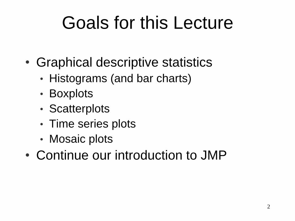
• Graphical descriptive statistics
• Histograms (and bar charts)
• Boxplots
• Scatterplots
• Time series plots
• Mosaic plots
• Continue our introduction to JMP
Goals for this Lecture
3
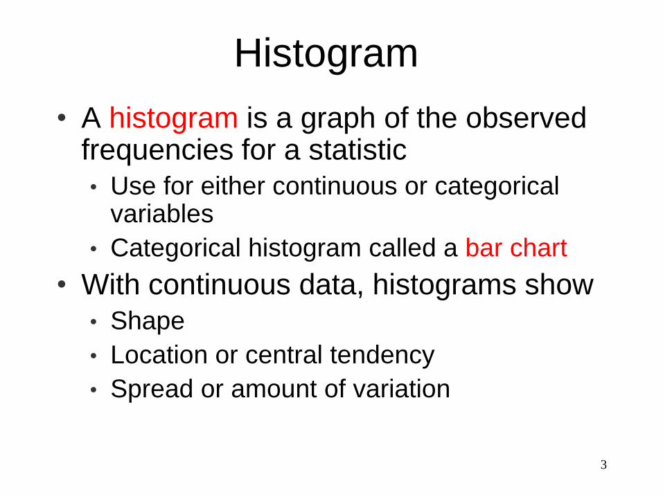
• A histogram is a graph of the observed frequencies for a statistic
• Use for either continuous or categorical variables
• Categorical histogram called a bar chart
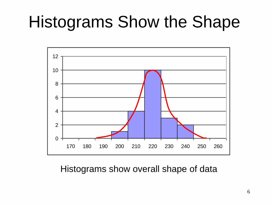
• With continuous data, histograms show
• Shape
• Location or central tendency
• Spread or amount of variation
Histogram
4
0
2
4
6
8
10
12
170 180 190 200 210 220 230 240 250 260
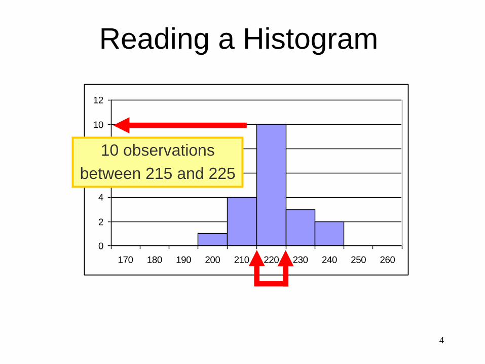
10 observations
between 215 and 225
Reading a Histogram
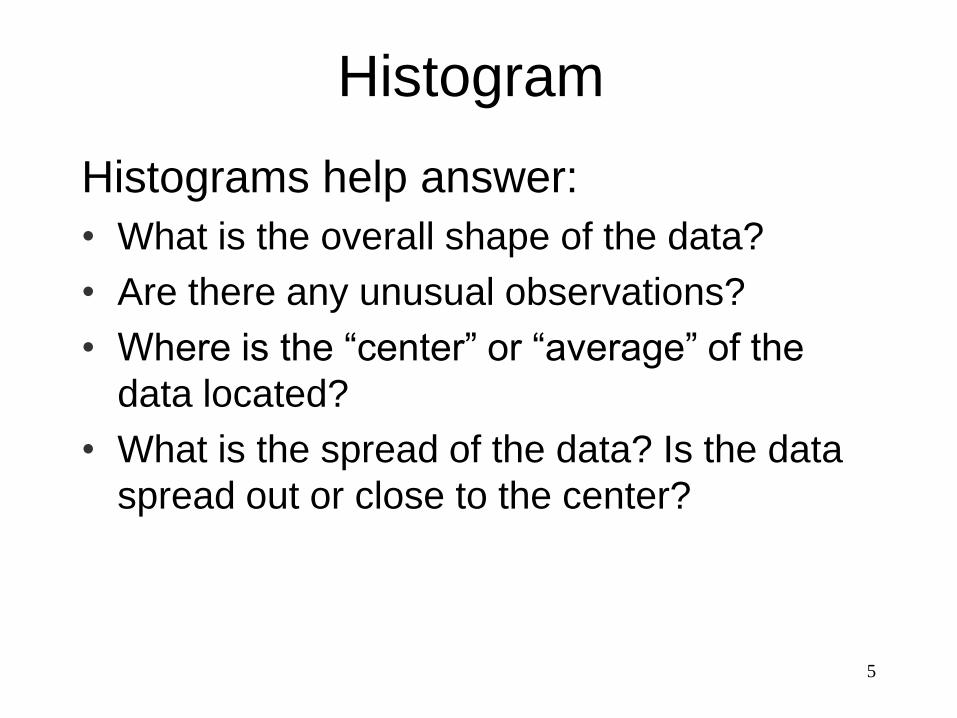
5
Histograms help answer:
• What is the overall shape of the data?
• Are there any unusual observations?
• Where is the “center” or “average” of the
data located?
• What is the spread of the data? Is the data
spread out or close to the center?
Histogram
6
0
2
4
6
8
10
12
170 180 190 200 210 220 230 240 250 260
Histograms show overall shape of data
Histograms Show the Shape
7
0
2
4
6
8
10
12
170 180 190 200 210 220 230 240 250 260
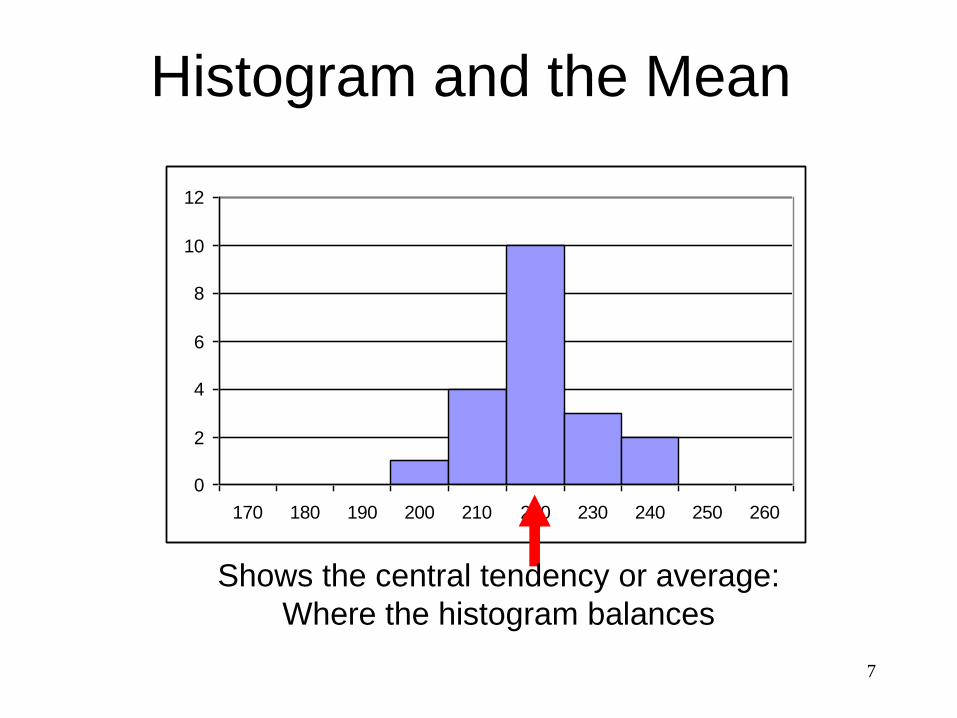
Shows the central tendency or average:
Where the histogram balances
Histogram and the Mean
8
0
2
4
6
8
10
12
170 180 190 200 210 220 230 240 250 260
0
2
4
6
8
10
12
170 180 190 200 210 220 230 240 250 260
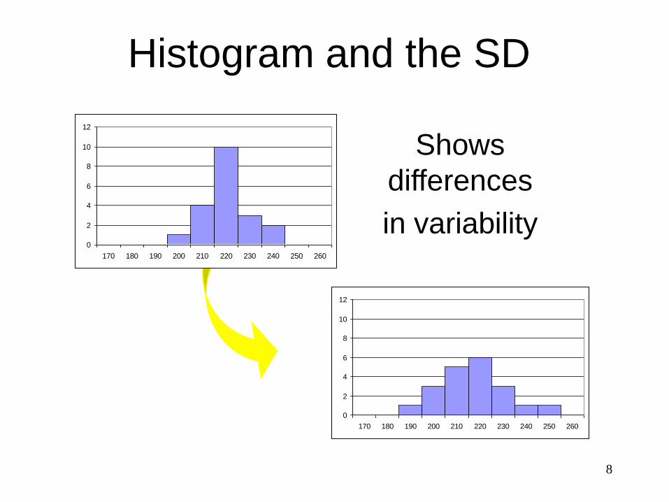
Shows
differences
in variability
Histogram and the SD
9
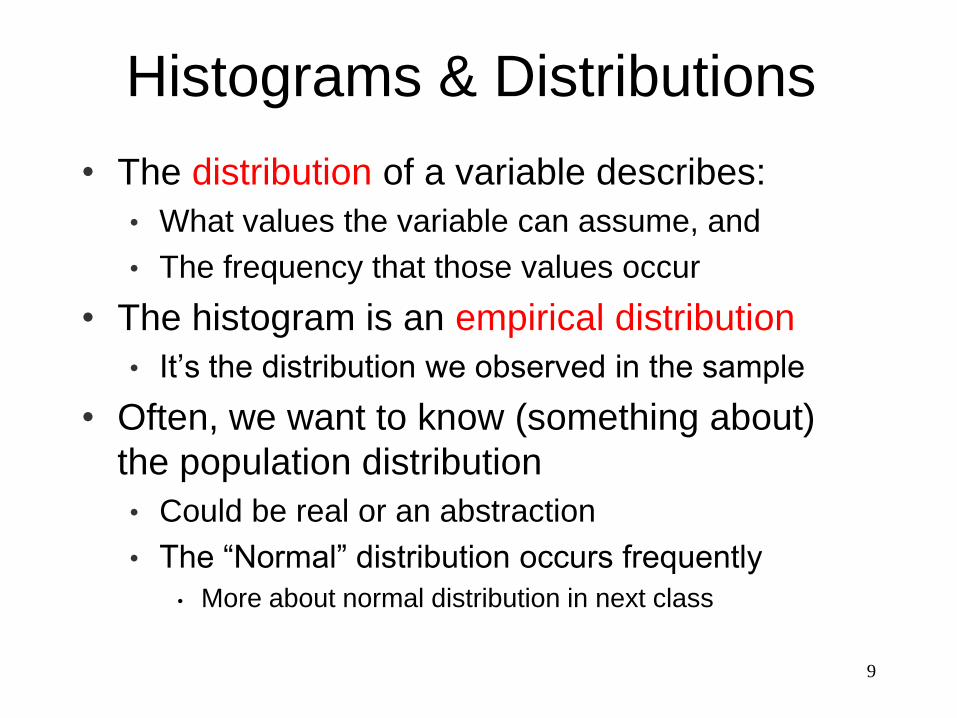
• The distribution of a variable describes:
• What values the variable can assume, and
• The frequency that those values occur
• The histogram is an empirical distribution
• It’s the distribution we observed in the sample
• Often, we want to know (something about)
the population distribution
• Could be real or an abstraction
• The “Normal” distribution occurs frequently
• More about normal distribution in next class
Histograms & Distributions
10
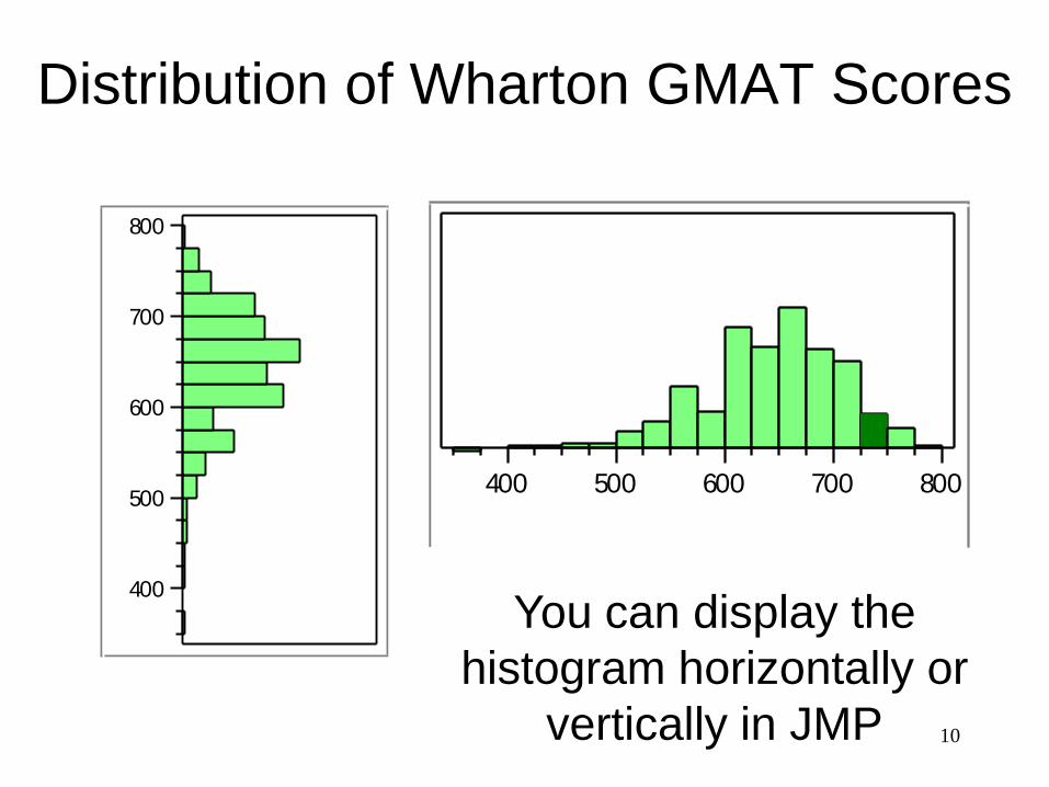
Distribution of Wharton GMAT Scores
400
500
600
700
800
400 500 600 700 800
You can display the
histogram horizontally or
vertically in JMP
11
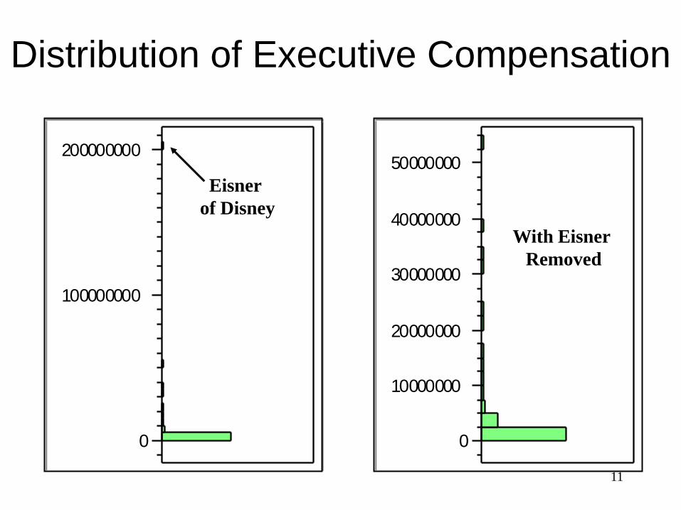
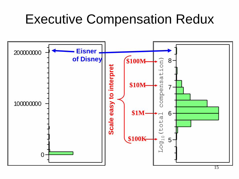
Distribution of Executive Compensation
0
100000000
200000000
0
10000000
20000000
30000000
40000000
50000000
Eisner
of Disney
With Eisner
Removed
12
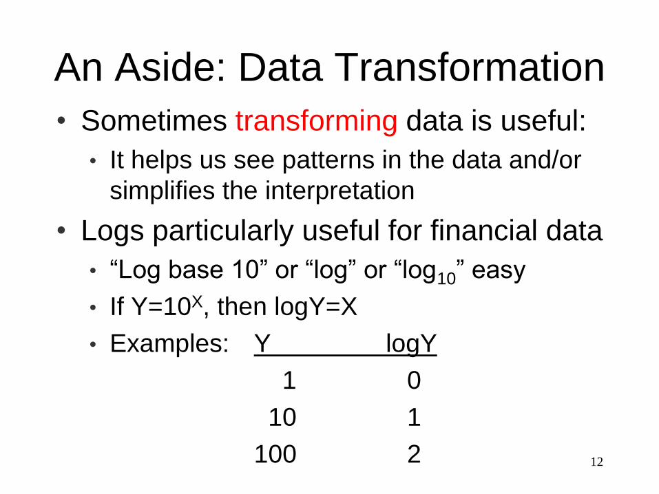
An Aside: Data Transformation
• Sometimes transforming data is useful:
• It helps us see patterns in the data and/or
simplifies the interpretation
• Logs particularly useful for financial data
• “Log base 10” or “log” or “log10” easy
• If Y=10X, then logY=X
• Examples: Y logY
1 0
10 1
100 2
13
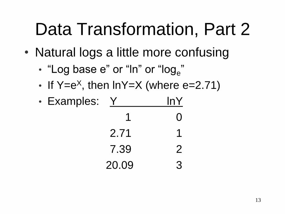
Data Transformation, Part 2
• Natural logs a little more confusing
• “Log base e” or “ln” or “loge”
• If Y=eX, then lnY=X (where e=2.71)
• Examples: Y lnY
1 0
2.71 1
7.39 2
20.09 3
14
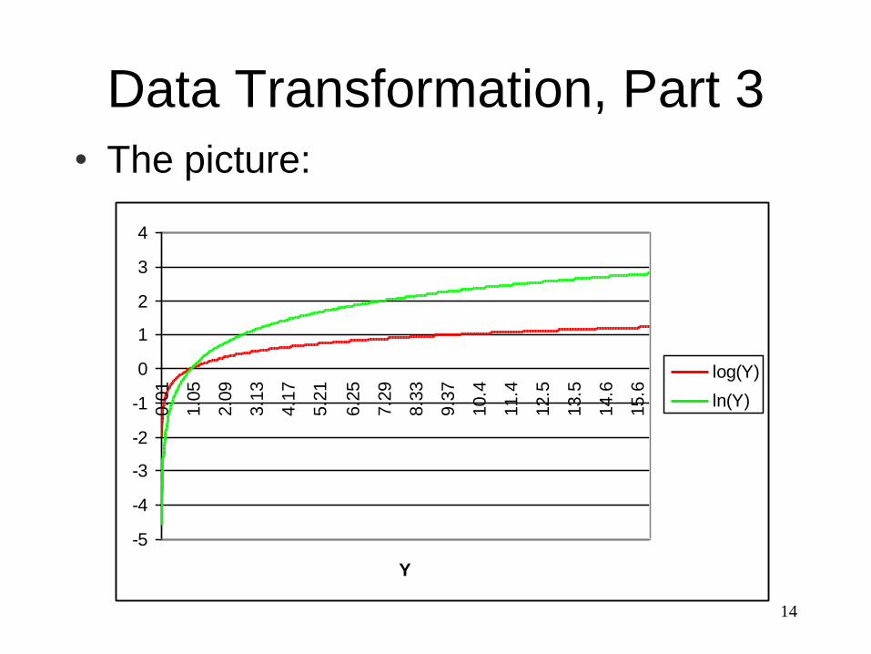
Data Transformation, Part 3
• The picture:
-5
-4
-3
-2
-1
0
1
2
3
4
0.0
1
1.0
5
2.0
9
3.1
3
4.1
7
5.2
1
6.2
5
7.2
9
8.3
3
9.3
7
10.4
11.4
12.5
13.5
14.6
15.6
Y
log(Y)
ln(Y)
15
5
6
7
8
Executive Compensation Redux
0
100000000
200000000 Eisner
of Disney
Sc
ale
ea
sy t
o in
terp
ret $100M
$10M
$1M
$100K
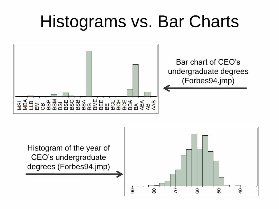
Histograms vs. Bar Charts
16
Bar chart of CEO’s
undergraduate degrees
(Forbes94.jmp)
Histogram of the year of
CEO’s undergraduate
degrees (Forbes94.jmp)
17
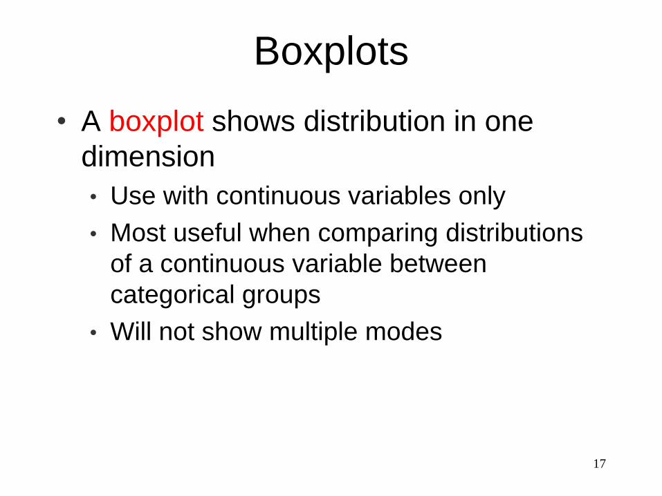
Boxplots
• A boxplot shows distribution in one
dimension
• Use with continuous variables only
• Most useful when comparing distributions
of a continuous variable between
categorical groups
• Will not show multiple modes
18
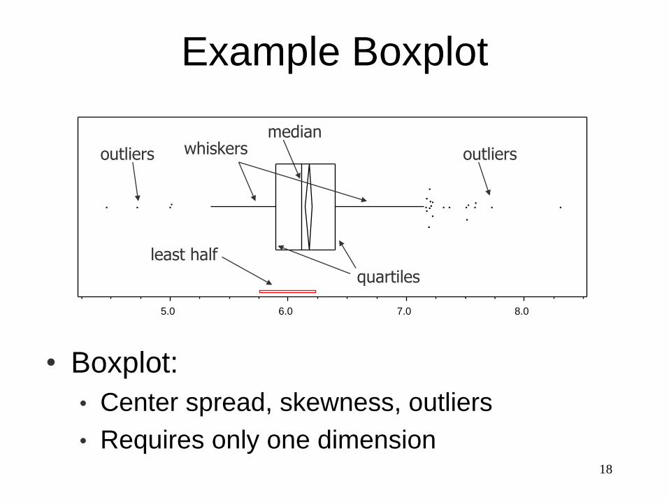
Example Boxplot
5.0 6.0 7.0 8.0
median
quartiles
whiskers outliersoutliers
least half
• Boxplot:
• Center spread, skewness, outliers
• Requires only one dimension
19
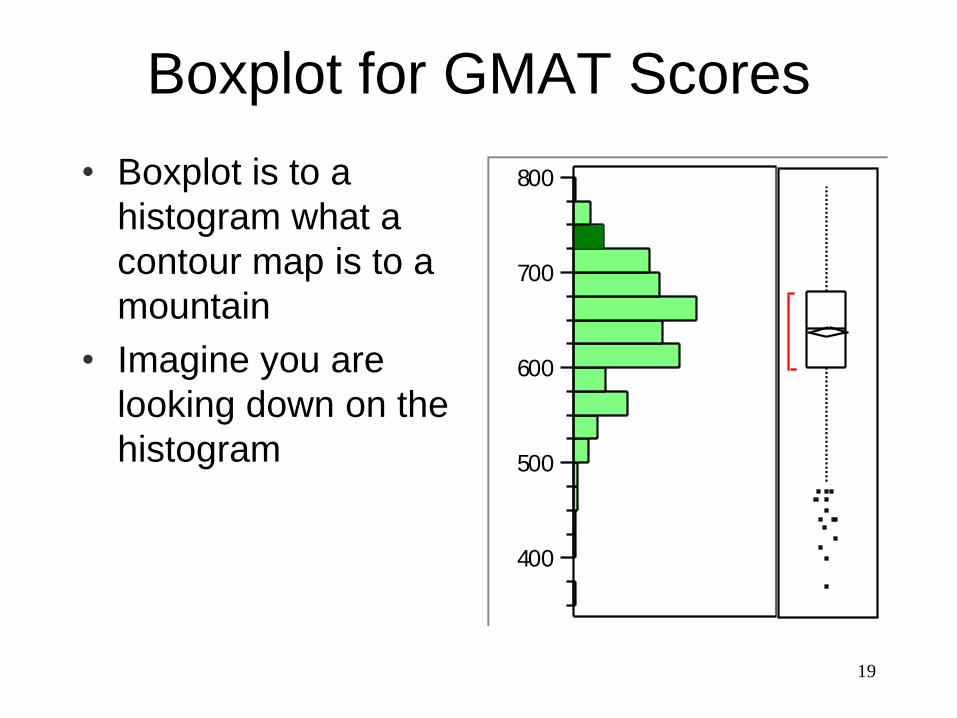
Boxplot for GMAT Scores
• Boxplot is to a
histogram what a
contour map is to a
mountain
• Imagine you are
looking down on the
histogram
400
500
600
700
800
20
5.0
6.0
7.0
8.0
Aerospacedefense
Business
Capital goods
Chemicals
ComputersComm
Construction
Consumer
Energy
Entertainment
Financial
Food Forest
Health
Insurance
Metals
Retailing
Transport
TravelUtility
WideIndustry
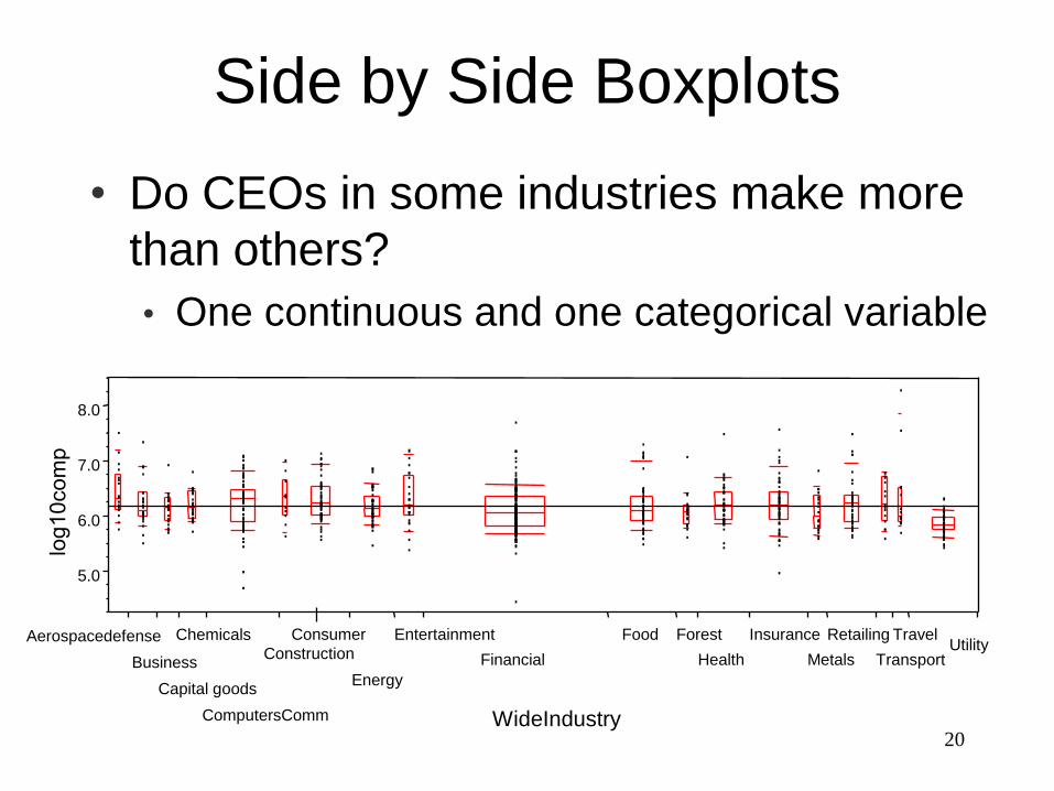
Side by Side Boxplots
• Do CEOs in some industries make more
than others?
• One continuous and one categorical variable
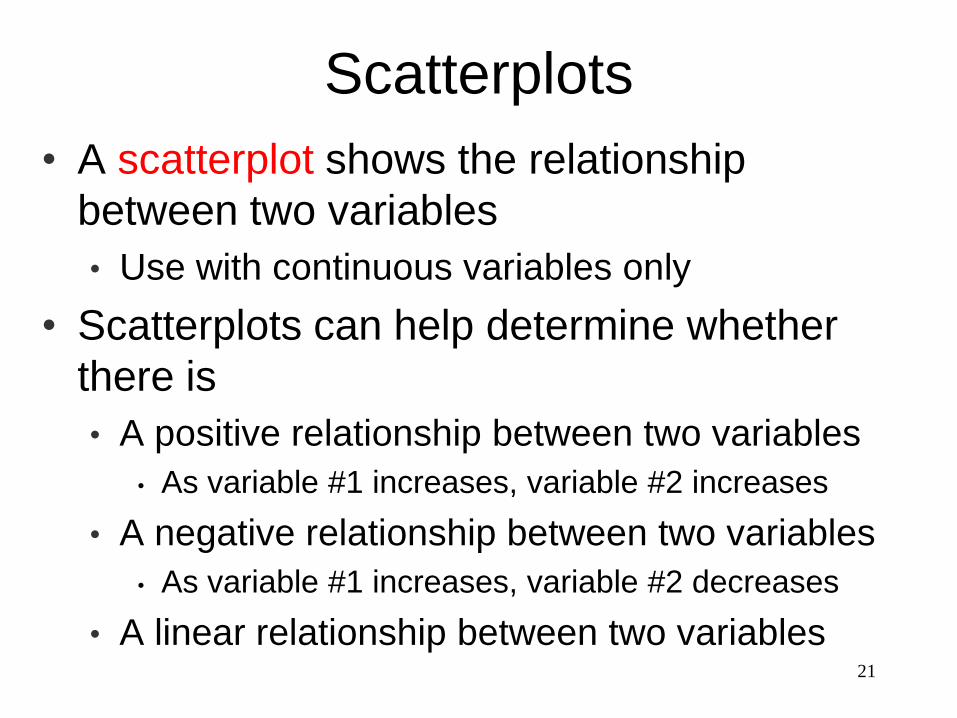
Scatterplots
• A scatterplot shows the relationship
between two variables
• Use with continuous variables only
• Scatterplots can help determine whether
there is
• A positive relationship between two variables
• As variable #1 increases, variable #2 increases
• A negative relationship between two variables
• As variable #1 increases, variable #2 decreases
• A linear relationship between two variables21
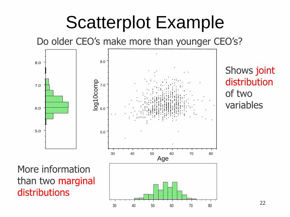
5.0
6.0
7.0
8.0
30 40 50 60 70 80
Age
Shows joint distributionof two variables
5.0
6.0
7.0
8.0
30 40 50 60 70 80
More information than two marginal distributions
Do older CEO’s make more than younger CEO’s?
log10com
p
Scatterplot Example
22
23
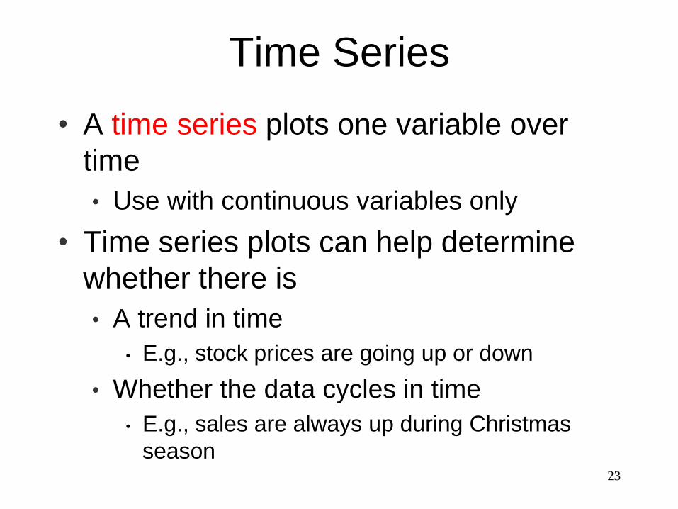
Time Series
• A time series plots one variable over
time
• Use with continuous variables only
• Time series plots can help determine
whether there is
• A trend in time
• E.g., stock prices are going up or down
• Whether the data cycles in time
• E.g., sales are always up during Christmas
season
About Time Series Data
• Often one observation tells something
about the next observation
• It’s what makes time series (longitudinal)
data interesting
• Later we’ll say that the data are not
“independent”
• How to tell if time series?
• Special knowledge (common sense?)
• Look for trends
• Look for cycles24
25
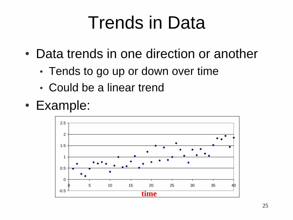
Trends in Data
• Data trends in one direction or another
• Tends to go up or down over time
• Could be a linear trend
• Example:
-0.5
0
0.5
1
1.5
2
2.5
0 5 10 15 20 25 30 35 40
time
26-1.5
-1
-0.5
0
0.5
1
1.5
0 5 10 15 20 25 30 35 40
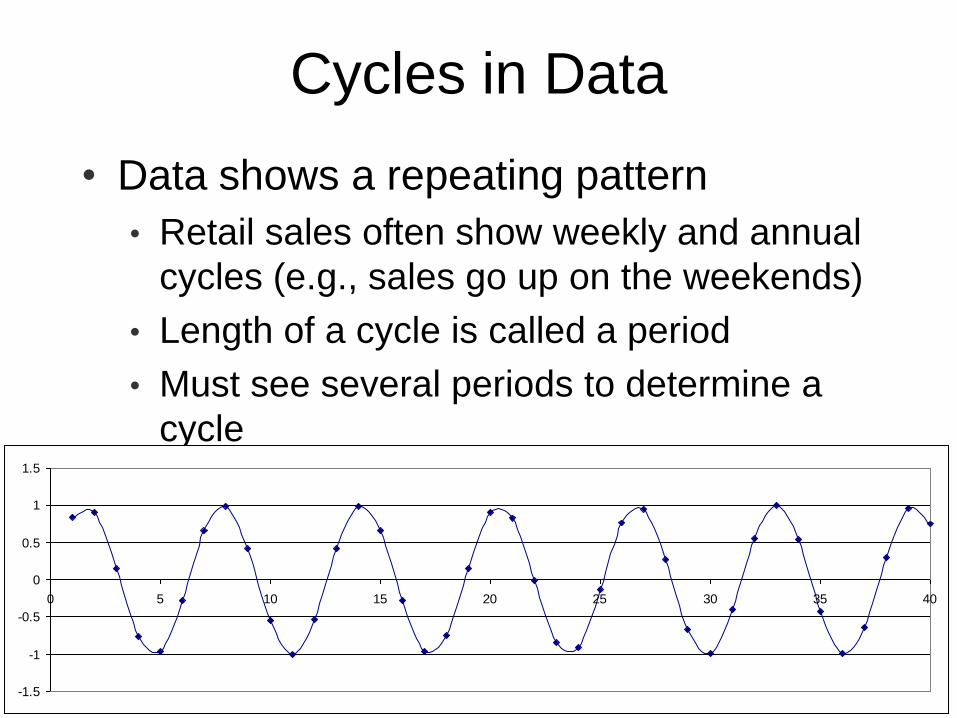
Cycles in Data
• Data shows a repeating pattern
• Retail sales often show weekly and annual
cycles (e.g., sales go up on the weekends)
• Length of a cycle is called a period
• Must see several periods to determine a
cycle
-1.5
-1
-0.5
0
0.5
1
1.5
0 5 10 15 20 25 30 35 40
27
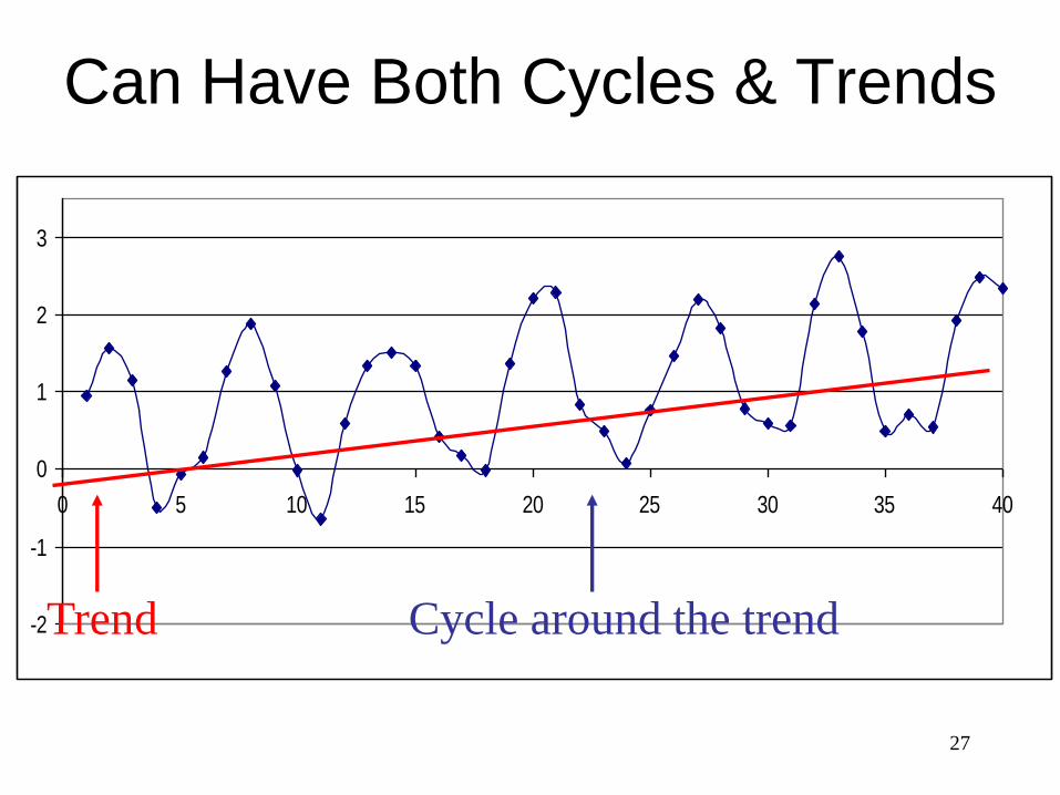
Can Have Both Cycles & Trends
-2
-1
0
1
2
3
0 5 10 15 20 25 30 35 40
Trend Cycle around the trend
28
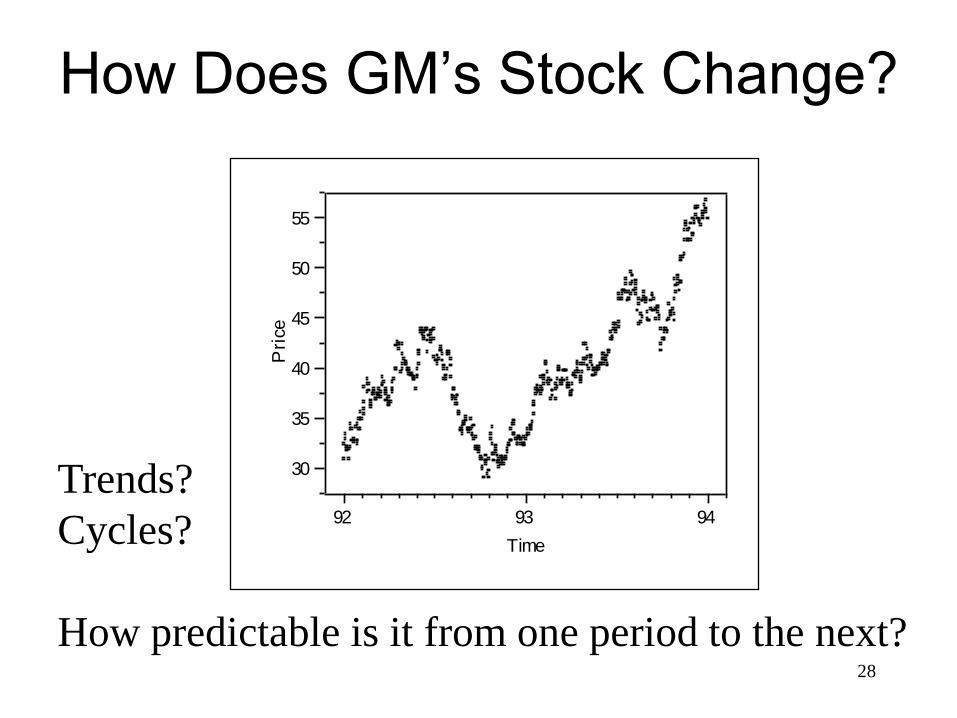
How Does GM’s Stock Change?
30
35
40
45
50
55
Pri
ce
92 93 94
Time
Trends?
Cycles?
How predictable is it from one period to the next?
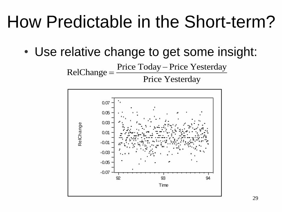
29
How Predictable in the Short-term?
• Use relative change to get some insight:Price Today Price Yesterday
RelChangePrice Yesterday
-0.07
-0.05
-0.03
-0.01
0.01
0.03
0.05
0.07
Re
lCh
ang
e
92 93 94
Time
30
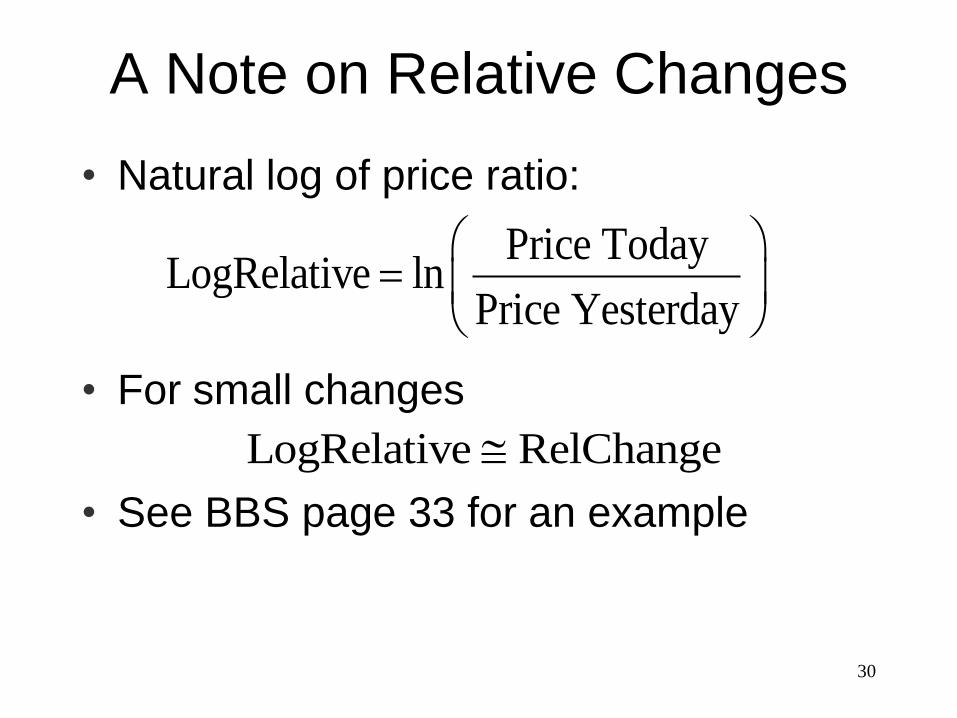
A Note on Relative Changes
• Natural log of price ratio:
• For small changes
• See BBS page 33 for an example
LogRelative RelChange
Price TodayLogRelative ln
Price Yesterday
31
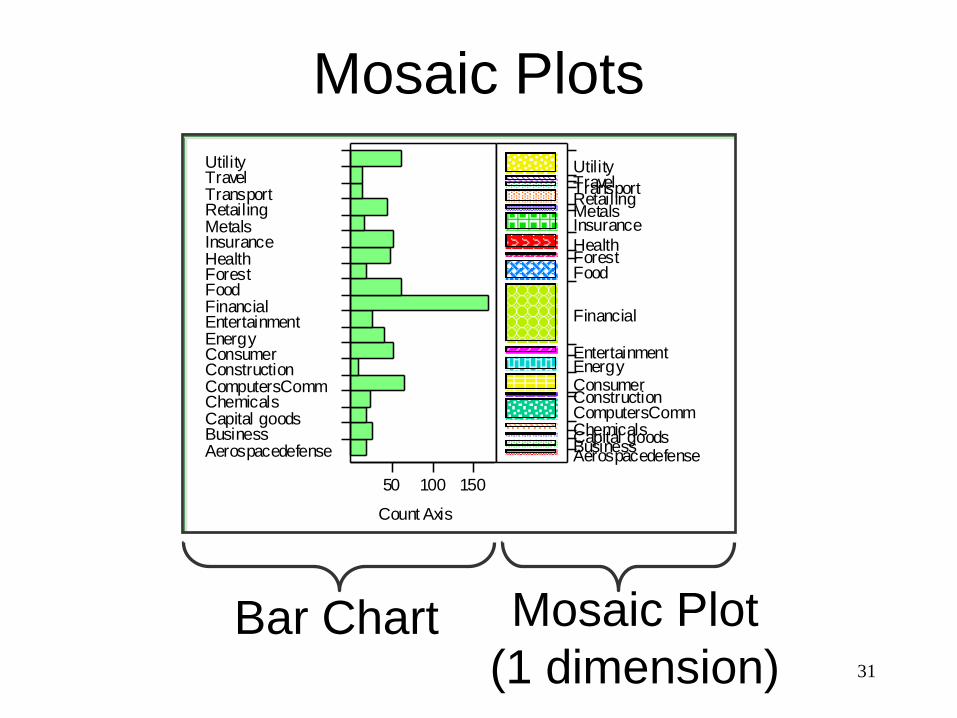
Mosaic Plots
AerospacedefenseBusinessCapital goodsChemicalsComputersCommConstructionConsumerEnergyEntertainmentFinancialFoodForestHealthInsuranceMetalsRetailingTransportTravelUtility
50 100 150
Count Axis
AerospacedefenseBusinessCapital goodsChemicalsComputersCommConstructionConsumerEnergyEntertainment
Financial
FoodForestHealth
InsuranceMetalsRetailingTransportTravelUtility
Bar Chart Mosaic Plot
(1 dimension)
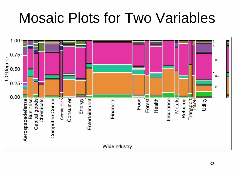
Mosaic Plots for Two Variables
32
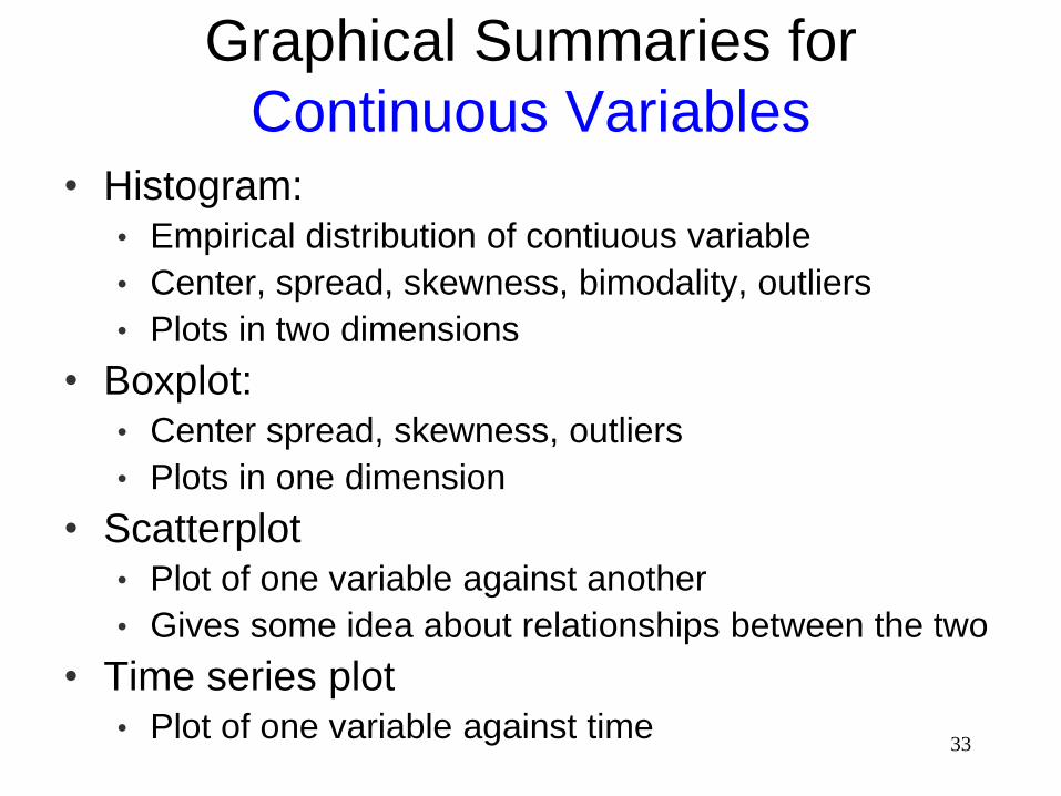
33
Graphical Summaries for
Continuous Variables• Histogram:
• Empirical distribution of contiuous variable
• Center, spread, skewness, bimodality, outliers
• Plots in two dimensions
• Boxplot:• Center spread, skewness, outliers
• Plots in one dimension
• Scatterplot• Plot of one variable against another
• Gives some idea about relationships between the two
• Time series plot• Plot of one variable against time
34
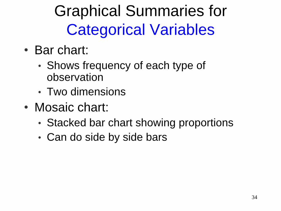
Graphical Summaries for
Categorical Variables
• Bar chart:
• Shows frequency of each type of observation
• Two dimensions
• Mosaic chart:
• Stacked bar chart showing proportions
• Can do side by side bars
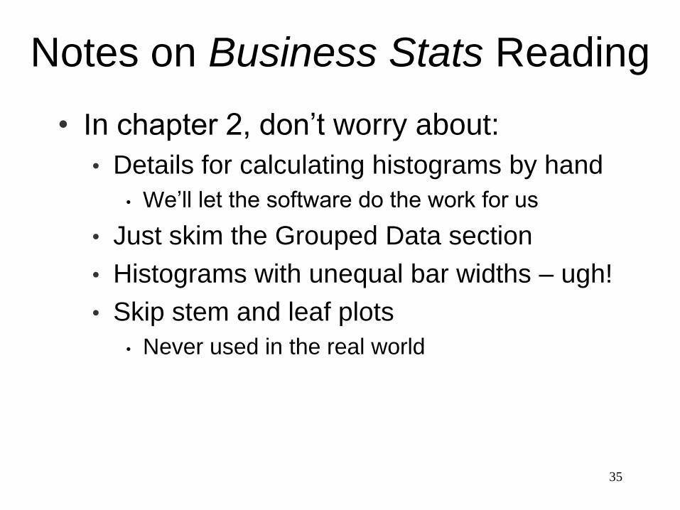
Notes on Business Stats Reading
• In chapter 2, don’t worry about:
• Details for calculating histograms by hand
• We’ll let the software do the work for us
• Just skim the Grouped Data section
• Histograms with unequal bar widths – ugh!
• Skip stem and leaf plots
• Never used in the real world
35
36
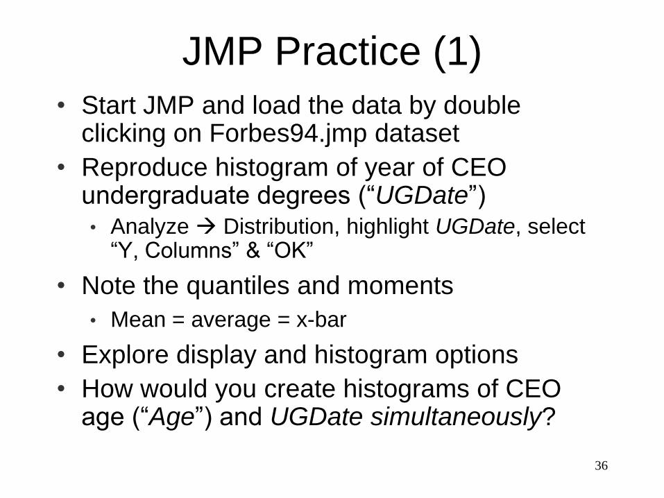
JMP Practice (1)
• Start JMP and load the data by double clicking on Forbes94.jmp dataset
• Reproduce histogram of year of CEO undergraduate degrees (“UGDate”)• Analyze Distribution, highlight UGDate, select
“Y, Columns” & “OK”
• Note the quantiles and moments
• Mean = average = x-bar
• Explore display and histogram options
• How would you create histograms of CEO age (“Age”) and UGDate simultaneously?
37
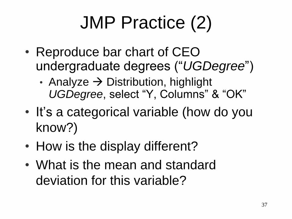
JMP Practice (2)
• Reproduce bar chart of CEO undergraduate degrees (“UGDegree”)
• Analyze Distribution, highlight UGDegree, select “Y, Columns” & “OK”
• It’s a categorical variable (how do you
know?)
• How is the display different?
• What is the mean and standard
deviation for this variable?
38
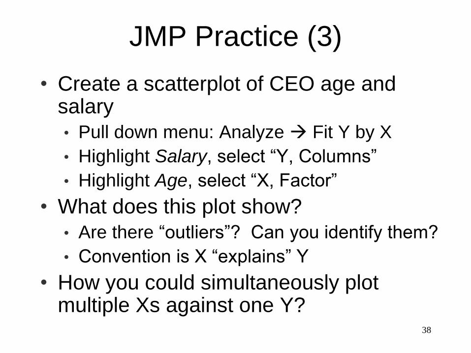
JMP Practice (3)
• Create a scatterplot of CEO age and salary
• Pull down menu: Analyze Fit Y by X
• Highlight Salary, select “Y, Columns”
• Highlight Age, select “X, Factor”
• What does this plot show?
• Are there “outliers”? Can you identify them?
• Convention is X “explains” Y
• How you could simultaneously plot multiple Xs against one Y?
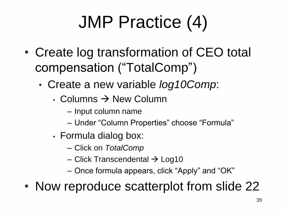
JMP Practice (4)
• Create log transformation of CEO total
compensation (“TotalComp”)
• Create a new variable log10Comp:
• Columns New Column
– Input column name
– Under “Column Properties” choose “Formula”
• Formula dialog box:
– Click on TotalComp
– Click Transcendental Log10
– Once formula appears, click “Apply” and “OK”
• Now reproduce scatterplot from slide 2239
40
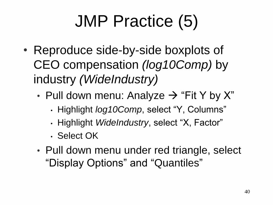
JMP Practice (5)
• Reproduce side-by-side boxplots of
CEO compensation (log10Comp) by
industry (WideIndustry)
• Pull down menu: Analyze “Fit Y by X”
• Highlight log10Comp, select “Y, Columns”
• Highlight WideIndustry, select “X, Factor”
• Select OK
• Pull down menu under red triangle, select
“Display Options” and “Quantiles”
41
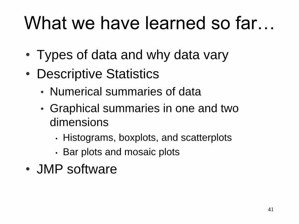
What we have learned so far…
• Types of data and why data vary
• Descriptive Statistics
• Numerical summaries of data
• Graphical summaries in one and two
dimensions
• Histograms, boxplots, and scatterplots
• Bar plots and mosaic plots
• JMP software