lecture 2: styling your pages with html and css
TRANSCRIPT
How to Create Your Own WebsiteLecture 2: Styling your pages with HTML and CSS.
Today’s Lecture:
Cascading Style Sheets (CSS): What they are. What they can do. How they interact with HTML pages. Several common CSS rules.
Color Representing color on a website. Coloring your text. Coloring the background. The “web-safe” color palette (not much of an issue anymore). Dithering.
Fonts How to use different fonts for your text. Commonly-installed (“safe”) fonts. Controlling text appearance.
Font size. Font style (bold, italic, underline)
Margins and Size Units (px, %, em…) Adding space between elements or inside of an element. Setting width and height. “Fixed-width” vs. “Fluid” designs.
Borders
Before Getting Creative
So far, we’ve seen how to place new elements on our pages. Paragraphs.
Images.
Links. But this is not design. Design involves creativity and aesthetics. To design, we’ll need to know how to change the appearance of these elements.
How to “style” them. How can we do this?
In older versions of HTML, attributes were used entirely to do this.
These attributes are still around, and still work.▪ For instance, <body> has an attribute called “bgcolor”, which allows one to set the background color of a page.
▪ <p> has an attribute called “align” that sets the alignment of a paragraph.
But as HTML evolved, people decided that it would be better to separate presentation and content.▪ The “content” of the page remains the HTML.
▪ And the presentation is stored in a separate document “linked” to the HTML.
▪ This document is called a style sheet, and is written in a language called CSS (Cascading Style Sheets).
Unfortunately, this means learning CSS as well as HTML. But CSS allows a great deal of control over the appearance of HTML elements.
Tags for Emphasizing Text
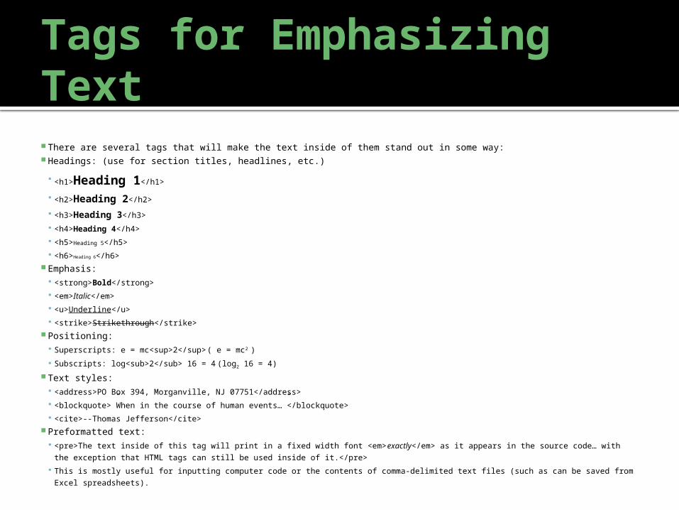
There are several tags that will make the text inside of them stand out in some way: Headings: (use for section titles, headlines, etc.)
<h1>Heading 1</h1>
<h2>Heading 2</h2>
<h3>Heading 3</h3>
<h4>Heading 4</h4>
<h5>Heading 5</h5>
<h6>Heading 6</h6> Emphasis:
<strong>Bold</strong>
<em>Italic</em>
<u>Underline</u>
<strike>Strikethrough</strike> Positioning:
Superscripts: e = mc<sup>2</sup> ( e = mc2 )
Subscripts: log<sub>2</sub> 16 = 4 (log2 16 = 4)
Text styles: <address>PO Box 394, Morganville, NJ 07751</address>
<blockquote>”When in the course of human events…”</blockquote>
<cite>--Thomas Jefferson</cite> Preformatted text:
<pre>The text inside of this tag will print in a fixed width font <em>exactly</em> as it appears in the source code… with the
exception that HTML tags can still be used inside of it.</pre>
This is mostly useful for inputting computer code or the contents of comma-delimited text files (such as can be saved from Excel
spreadsheets).
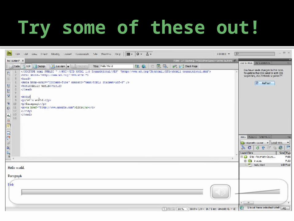
Try some of these out!
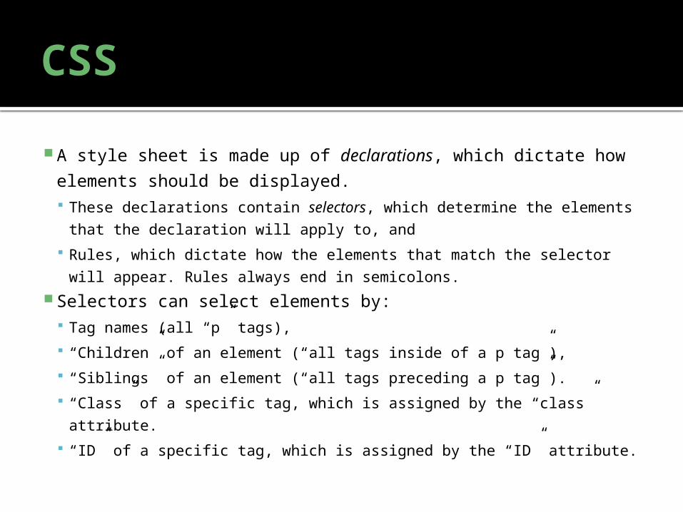
CSS
A style sheet is made up of declarations, which dictate how
elements should be displayed. These declarations contain selectors, which determine the
elements that the declaration will apply to, and
Rules, which dictate how the elements that match the selector will
appear. Rules always end in semicolons. Selectors can select elements by:
Tag names (all “p” tags),
“Children” of an element (“all tags inside of a p tag”),
“Siblings” of an element (“all tags preceding a p tag”).
“Class” of a specific tag, which is assigned by the “class” attribute.
“ID” of a specific tag, which is assigned by the “ID” attribute.
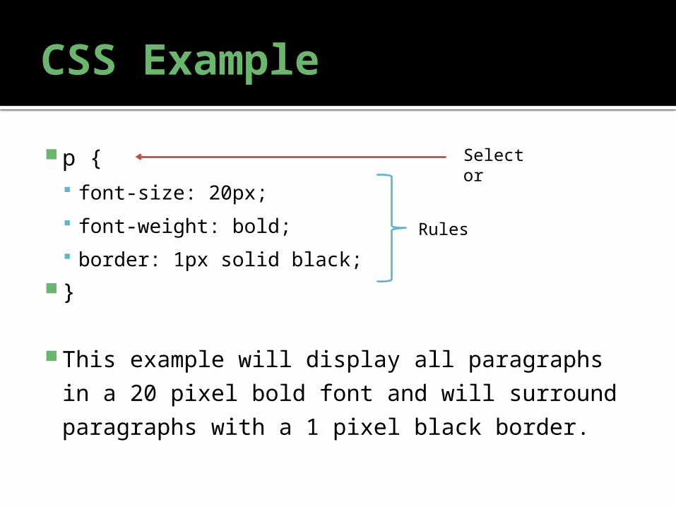
CSS Example
p { font-size: 20px;
font-weight: bold;
border: 1px solid black; }
This example will display all paragraphs in a
20 pixel bold font and will surround
paragraphs with a 1 pixel black border.
Selector
Rules
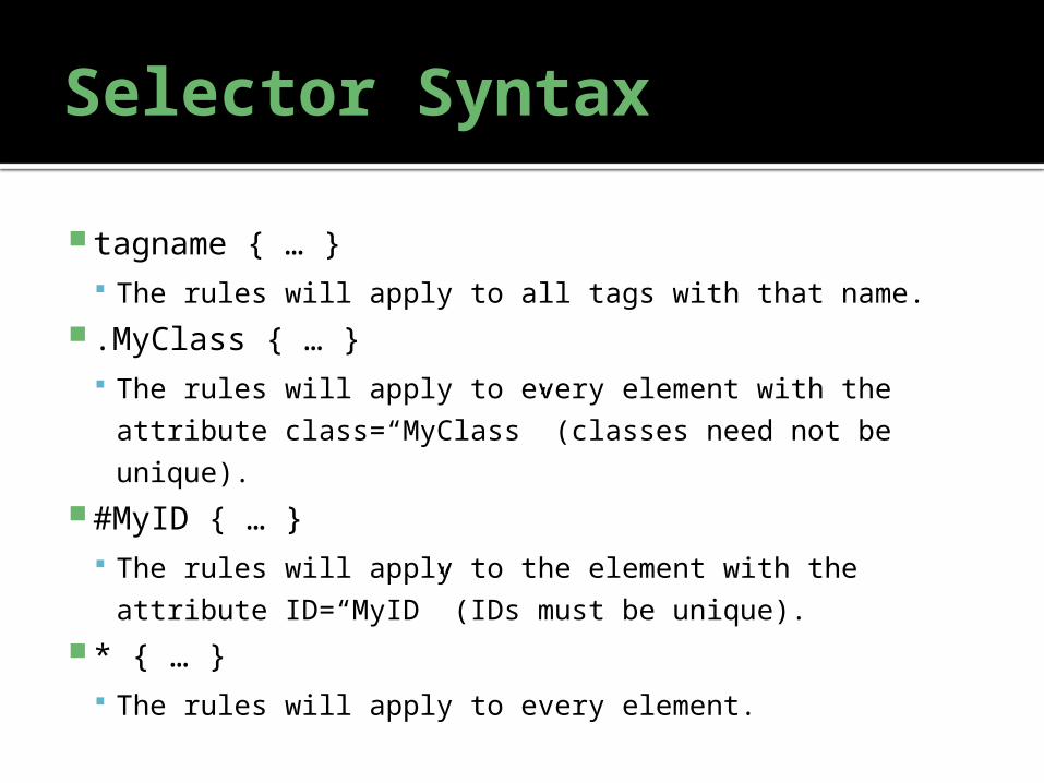
Selector Syntax
tagname { … } The rules will apply to all tags with that name.
.MyClass { … } The rules will apply to every element with the attribute
class=“MyClass” (classes need not be unique). #MyID { … }
The rules will apply to the element with the attribute
ID=“MyID” (IDs must be unique). * { … }
The rules will apply to every element.
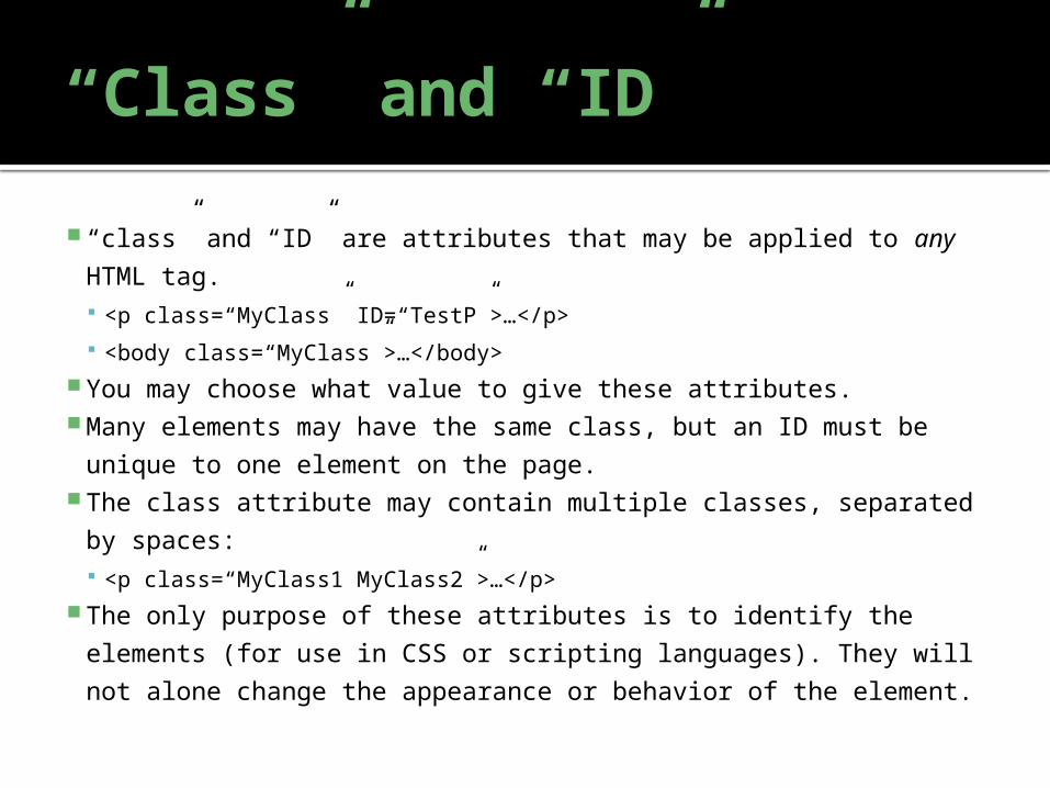
“Class” and “ID”
“class” and “ID” are attributes that may be applied to any HTML
tag. <p class=“MyClass” ID=“TestP”>…</p>
<body class=“MyClass”>…</body> You may choose what value to give these attributes. Many elements may have the same class, but an ID must be
unique to one element on the page. The class attribute may contain multiple classes, separated by
spaces: <p class=“MyClass1 MyClass2”>…</p>
The only purpose of these attributes is to identify the elements
(for use in CSS or scripting languages). They will not alone
change the appearance or behavior of the element.
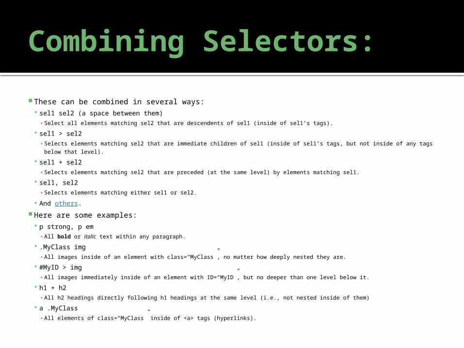
Combining Selectors:
These can be combined in several ways: sel1 sel2 (a space between them)
▪ Select all elements matching sel2 that are descendents of sel1 (inside of sel1’s tags).
sel1 > sel2▪ Selects elements matching sel2 that are immediate children of sel1 (inside of sel1’s tags, but not inside of any tags below
that level).
sel1 + sel2▪ Selects elements matching sel2 that are preceded (at the same level) by elements matching sel1.
sel1, sel2▪ Selects elements matching either sel1 or sel2.
And others. Here are some examples:
p strong, p em▪ All bold or italic text within any paragraph.
.MyClass img▪ All images inside of an element with class=“MyClass”, no matter how deeply nested they are.
#MyID > img▪ All images immediately inside of an element with ID=“MyID”, but no deeper than one level below it.
h1 + h2▪ All h2 headings directly following h1 headings at the same level (i.e., not nested inside of them)
a .MyClass▪ All elements of class=“MyClass” inside of <a> tags (hyperlinks).
Inline Stylesheets
There are three ways to insert CSS code into your page: Inline using the <style> tag.
Linked using the <link> tag.
Per-element using the “style” attribute (a common attribute to every tag, like class and ID). Both of these tags go in the <head> section. You may insert your CSS directly between <style> and </style> tags in your page. For example:
<html>
<head>
<title>Bold Test</title>
<style>
p {▪ font-weight: bold;
}
</style>
</head>
<body>▪ <p>This is in bold.</p>
▪ <p>This is also in bold.</p>
</body>
</html> Will result in:
This is in bold.
This is also in bold.
Linked Stylesheets
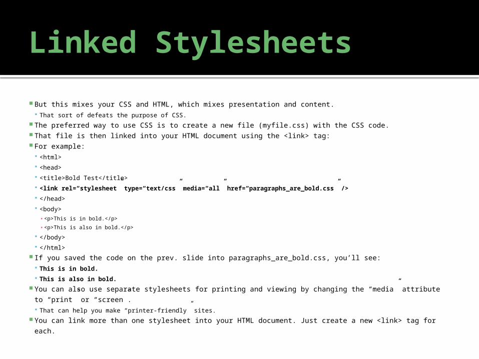
But this mixes your CSS and HTML, which mixes presentation and content. That sort of defeats the purpose of CSS.
The preferred way to use CSS is to create a new file (myfile.css) with the CSS code. That file is then linked into your HTML document using the <link> tag: For example:
<html>
<head>
<title>Bold Test</title>
<link rel=“stylesheet” type=“text/css” media=“all” href=“paragraphs_are_bold.css” />
</head>
<body>▪ <p>This is in bold.</p>
▪ <p>This is also in bold.</p>
</body>
</html> If you saved the code on the prev. slide into paragraphs_are_bold.css, you’ll see:
This is in bold.
This is also in bold. You can also use separate stylesheets for printing and viewing by changing the “media” attribute to
“print” or “screen”. That can help you make “printer-friendly” sites.
You can link more than one stylesheet into your HTML document. Just create a new <link> tag for each.
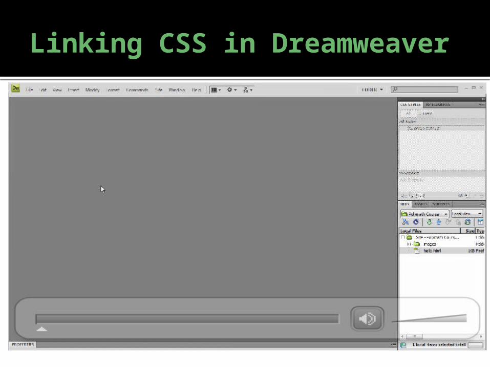
Linking CSS in Dreamweaver
The Style Attribute
The style attribute allows you to specify CSS inside
of the tag itself: <p style=“color: red”>Some red text.</p>
<img style=“margin-left: 20px” src=“mylogo.jpg”
alt=“Logo” /> No extra tags are required for this method. But this couples the CSS even more tightly to the
HTML code than the <style> tag. So it’s best to use it sparingly.
Anything specified in the “style” attribute will take
precedence over the styles in a linked stylesheet.
Block-Level vs. Inline Elements There are two types of HTML tags:
Block level
Inline Block-level elements typically represent “sections” or “blocks of text”, and usually
begin their own new lines when used. They tend to be “box-shaped” (try adding a
border around them). Inline elements typically go “inside” of a block level element; e.g., specific text inside of
a paragraph can be bolded. They tend to shape themselves to the content inside of
them. Block-level elements include <p>, <h1>…<h6>, <blockquote>, and <pre>. Inline elements include <a>, <img>, <strong>, <em>, <u>, <sup>, <sub>, and
<strike>. Typical use:
<h1><em>New</em> Section</h1>
<p><strong>Bold</strong> <a href=“#”>text</a> inside of a paragraph.</p> Changing the display of an element:
Try adding the display: block; or display: inline; rule to an element to override the default display.
This will change the appearance of the element.
<div>, <span>
On their own, these tags do nothing. They exist to be styled using CSS. They break the page down into logical “sections”, which can
each be assigned a class or ID (via the attributes). This allows you to apply individual styles to arbitrary parts of
your page. <div> is a block-level element:
<div class=“MyClass”>
<h2>Heading</h2>
<p>Hello World</p>
</div> <span> is an inline element:
<p>This is some <span style=“color: red”>red</span> text.</p>
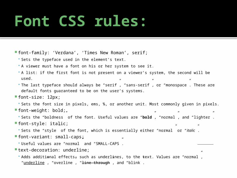
Font CSS rules:
font-family: ‘Verdana’, ‘Times New Roman’, serif; Sets the typeface used in the element’s text.
A viewer must have a font on his or her system to see it.
A list: if the first font is not present on a viewer’s system, the second will be used.
The last typeface should always be “serif”, “sans-serif”, or “monospace”. These are default
fonts guaranteed to be on the user’s systems. font-size: 12px;
Sets the font size in pixels, ems, %, or another unit. Most commonly given in pixels. font-weight: bold;
Sets the “boldness” of the font. Useful values are “bold”, “normal”, and “lighter”. font-style: italic;
Sets the “style” of the font, which is essentially either “normal” or “italic”. font-variant: small-caps;
Useful values are “normal” and “SMALL-CAPS”. text-decoration: underline;
Adds additional effects, such as underlines, to the text. Values are “normal”, “underline”,
“overline”, “line-through”, and “blink”.
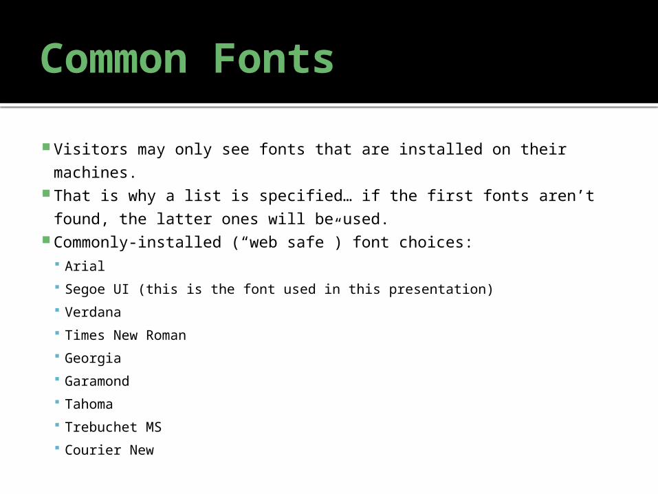
Common Fonts
Visitors may only see fonts that are installed on their machines. That is why a list is specified… if the first fonts aren’t found, the
latter ones will be used. Commonly-installed (“web safe”) font choices:
Arial
Segoe UI (this is the font used in this presentation)
Verdana
Times New Roman
Georgia
Garamond
Tahoma
Trebuchet MS
Courier New
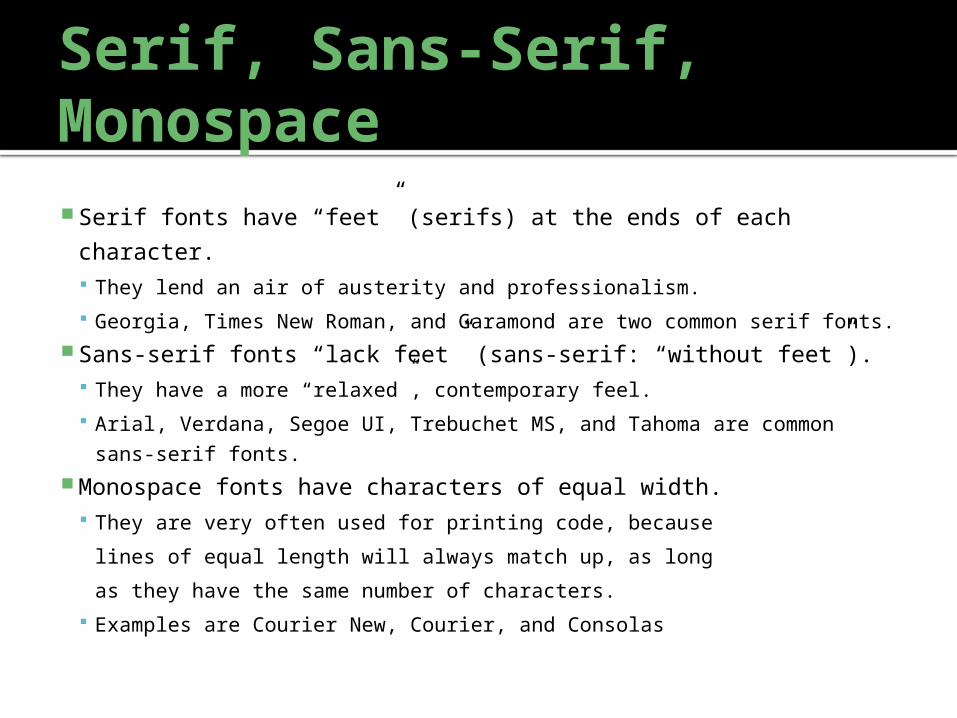
Serif, Sans-Serif, Monospace Serif fonts have “feet” (serifs) at the ends of each character.
They lend an air of austerity and professionalism.
Georgia, Times New Roman, and Garamond are two common serif
fonts. Sans-serif fonts “lack feet” (sans-serif: “without feet”).
They have a more “relaxed”, contemporary feel.
Arial, Verdana, Segoe UI, Trebuchet MS, and Tahoma are common sans-
serif fonts. Monospace fonts have characters of equal width.
They are very often used for printing code, because
lines of equal length will always match up, as long
as they have the same number of characters.
Examples are Courier New, Courier, and Consolas
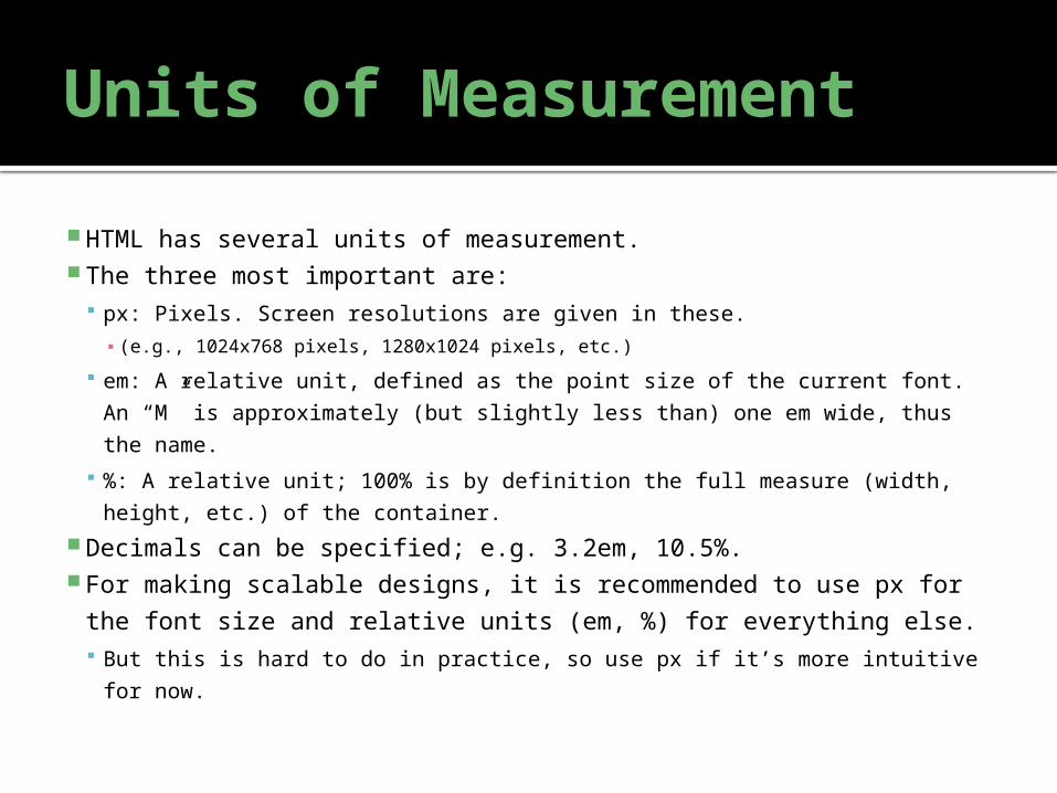
Units of Measurement
HTML has several units of measurement. The three most important are:
px: Pixels. Screen resolutions are given in these.▪ (e.g., 1024x768 pixels, 1280x1024 pixels, etc.)
em: A relative unit, defined as the point size of the current font. An “M”
is approximately (but slightly less than) one em wide, thus the name.
%: A relative unit; 100% is by definition the full measure (width,
height, etc.) of the container. Decimals can be specified; e.g. 3.2em, 10.5%. For making scalable designs, it is recommended to use px for
the font size and relative units (em, %) for everything else. But this is hard to do in practice, so use px if it’s more intuitive for now.
CSS rules that use units:
font-size: 24px; width: 50%; height: 4em;
These specify the exact width or height of a container. min-width, min-height:
These specify the minimum width of a container. Above it, the browser can control the size. max-width, max-height:
Maximum width. margin: 4px 8px 4px 16px:
Space surrounding the element, outside of its boundaries.
If four numbers are given, they represent top, right, bottom, and left margins.
If two are given, they represent mirrored vertical and horizontal margins.
If one number is given, it represents the width of all four margins.
Also can be set separately: margin-left, margin-top, margin-right, margin-bottom. padding: 1em 0.4em 1.2em 0.3em:
Whitespace surrounding the content inside of the element.
Read the units the same way as margin.
Also can be set separately: padding-left, padding-top, padding-right, padding-bottom. border-width: 1px:
Width of the border surrounding an element, if border-style isn’t “none”.
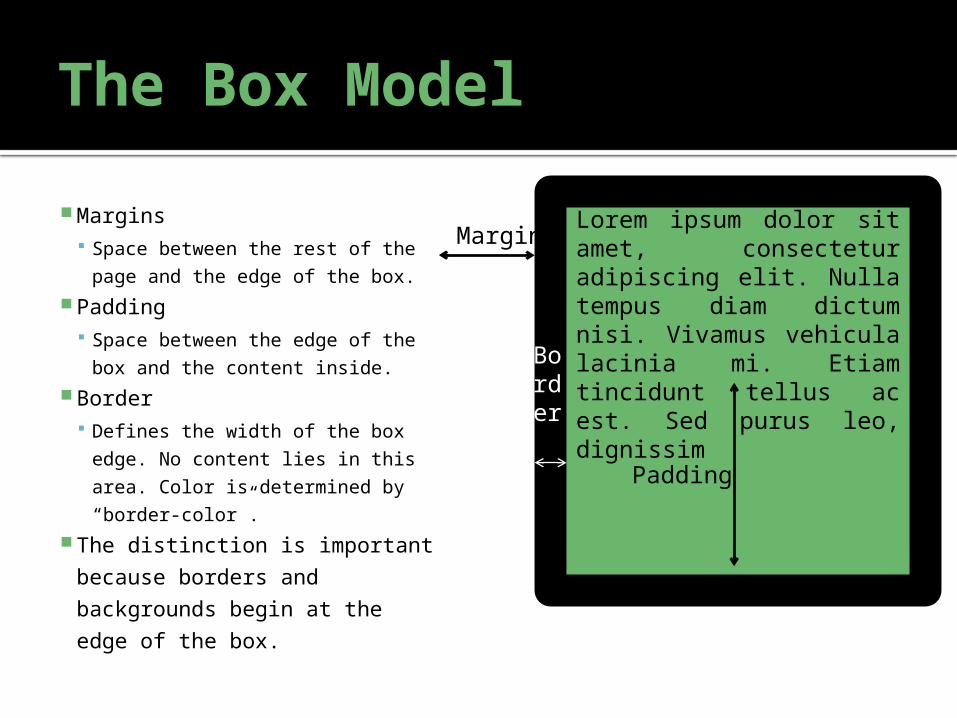
The Box Model
Margins Space between the rest of the
page and the edge of the box. Padding
Space between the edge of the
box and the content inside. Border
Defines the width of the box
edge. No content lies in this
area. Color is determined by
“border-color”. The distinction is important
because borders and
backgrounds begin at the
edge of the box.
Lorem ipsum dolor sit amet, consectetur adipiscing elit. Nulla tempus diam dictum nisi. Vivamus vehicula lacinia mi. Etiam tincidunt tellus ac est. Sed purus leo, dignissim
Padding
Margin
Border
Additive Color
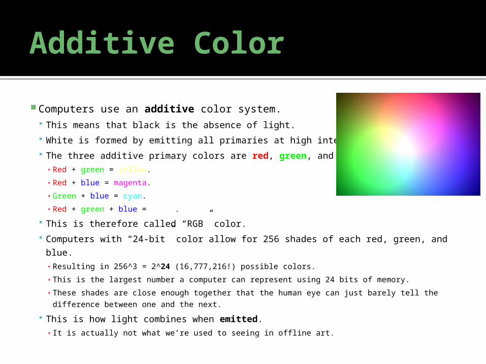
Computers use an additive color system. This means that black is the absence of light.
White is formed by emitting all primaries at high intensity.
The three additive primary colors are red, green, and blue.▪ Red + green = yellow.
▪ Red + blue = magenta.
▪ Green + blue = cyan.
▪ Red + green + blue = white.
This is therefore called “RGB” color.
Computers with “24-bit” color allow for 256 shades of each red, green, and blue.▪ Resulting in 256^3 = 2^24 (16,777,216!) possible colors.
▪ This is the largest number a computer can represent using 24 bits of memory.
▪ These shades are close enough together that the human eye can just barely tell the
difference between one and the next.
This is how light combines when emitted.▪ It is actually not what we’re used to seeing in offline art.
Subtractive Color
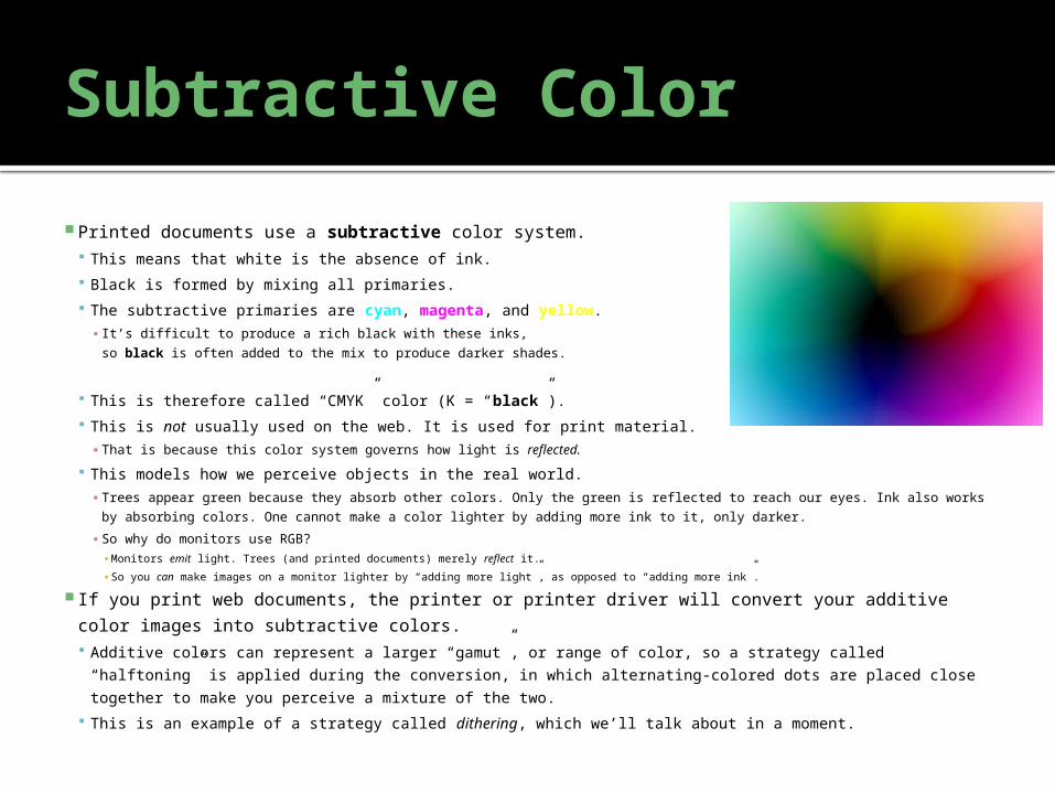
Printed documents use a subtractive color system. This means that white is the absence of ink.
Black is formed by mixing all primaries.
The subtractive primaries are cyan, magenta, and yellow.▪ It’s difficult to produce a rich black with these inks,
so black is often added to the mix to produce darker shades.
This is therefore called “CMYK” color (K = “black”).
This is not usually used on the web. It is used for print material.▪ That is because this color system governs how light is reflected.
This models how we perceive objects in the real world.▪ Trees appear green because they absorb other colors. Only the green is reflected to reach our eyes. Ink also works by
absorbing colors. One cannot make a color lighter by adding more ink to it, only darker.
▪ So why do monitors use RGB?▪ Monitors emit light. Trees (and printed documents) merely reflect it.
▪ So you can make images on a monitor lighter by “adding more light”, as opposed to “adding more ink”.
If you print web documents, the printer or printer driver will convert your additive color images
into subtractive colors. Additive colors can represent a larger “gamut”, or range of color, so a strategy called “halftoning” is
applied during the conversion, in which alternating-colored dots are placed close together to make you
perceive a mixture of the two.
This is an example of a strategy called dithering, which we’ll talk about in a moment.
Colors in HTML/CSS
The web uses the RGB color format. Colors in HTML are specified in #rrggbb format.
Unfortunately, they’re represented in hexadecimal (base 16).▪ Each digit goes from 0 to F, where “A” is 10, “B” is 11, “C” is 12, “D” is 13, “E” is 14, and “F” is 15.
▪ The first digit is the “16s” place and the second is the “1s” place. (i.e., “2A” = 16 * 2 + 1 * 10 = 42).▪ So the first digit is 16x more significant than the second. (09 and 0a is a difference of 1, 09 and 19 is a difference of 16).
256 possible shades (0-255) per color.▪ 255 = FF (15 * 16 + 15 * 1 = 255).
Examples:▪ So #ff0000 is 255 red, 0 green, 0 blue (or pure red).
▪ #32aa7c is 50 red, 170 green, 124 blue (a mix of green and blue called “sea green”).
▪ #518be9 is 81 red, 139 green, 233 blue (“sky blue”).
▪ #000000 (0 red, 0 green, 0 blue) is pure black.
▪ #646464 (100 red, 100 green, 100 blue) is gray.
▪ #ffffff (255 red, 255 green, 255 blue) is pure white.
Telling the color from the number:▪ Any color having the same intensity for R, G, and B is a shade of gray.
▪ On the opposite end, large differences between the highest and other primaries will result in deep, vivid colors.
▪ The primary with the greatest intensity tends to “dominate” the color. The greater the difference between that
color and the rest, the greater the extent to which this is true (#ff1111 is definitely going to be a shade of red).
▪ The higher the average of the three colors, the lighter the color will be.
Named Colors:
Colors may also be specified by name: “red”
“blue”
“darkgreen”
“black”
“white”
Etc. Here is a complete list of color names. These give you an easy way to input common colors, but the
numeric format is usually more useful for design! It’s usually easier to tell how colors contrast when you see how they are
mixed.
It’s harder to estimate how “green” and “darkgreen” may look together.
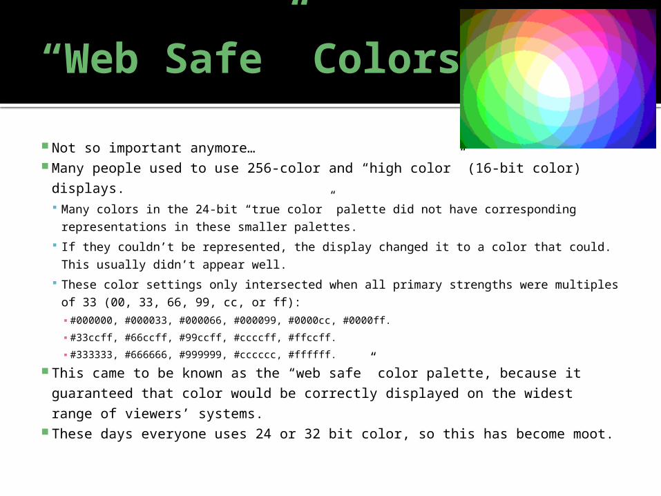
“Web Safe” Colors:
Not so important anymore… Many people used to use 256-color and “high color” (16-bit color) displays.
Many colors in the 24-bit “true color” palette did not have corresponding
representations in these smaller palettes.
If they couldn’t be represented, the display changed it to a color that could. This
usually didn’t appear well.
These color settings only intersected when all primary strengths were multiples of
33 (00, 33, 66, 99, cc, or ff):▪ #000000, #000033, #000066, #000099, #0000cc, #0000ff.
▪ #33ccff, #66ccff, #99ccff, #ccccff, #ffccff.
▪ #333333, #666666, #999999, #cccccc, #ffffff.
This came to be known as the “web safe” color palette, because it
guaranteed that color would be correctly displayed on the widest range of
viewers’ systems. These days everyone uses 24 or 32 bit color, so this has become moot.
Dithering
If using the web-safe palette (or a GIF image, which only allows 256 colors),
you may run into a serious limitation: It is not possible to represent all of the colors in your image simultaneously. If we simply shift the colors to their nearest permissible representations, the
image is distorted. Many close shades will become the same color and distinctions will be lost; this
effect is known as “banding”.
It’s quite an unpleasant effect. One way of fixing this is to “fool” the eye into seeing more colors than are
really present. We can do this by placing dots of two alternating colors closely together.
What the eye sees is not either of the dot colors, but something in-between them.
This allows us to represent more colors than the image can display.
But it’s far from perfect.
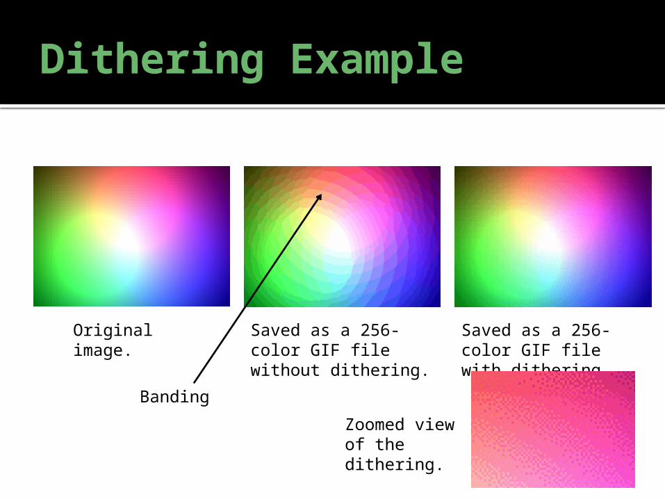
Dithering Example
Original image. Saved as a 256-color GIF file without dithering.
Saved as a 256-color GIF file with dithering.
Banding
Zoomed view of the dithering.
Using Color
Several CSS rules use these color codes: color: #000000;
▪ Sets the text color to the specified color.
background-color: #ffffff;▪ Sets the background color to the specified color.
border-color: green;▪ Sets the border color to the specified color (if a border exists;
i.e., border-style is not “none”).
Whenever you want to change the color of
anything on your page, you’ll use either the
#rrggbb color codes or the color names.
Putting it all together.
Next Time
Incorporating these elements into design. “Good design principles”/using them well:
Typography
Color theory
Site layout
Navigation
We’ll begin building an actual site out of our
“hello world” example.
Discussion Questions
How can splitting pages up into sections using <div>
and <span> help you create aesthetically pleasing
websites? Why may stylesheets be useful on a large website? Why do we need <p>, <h1>, and other block-level
tags if we have <div> and can customize its
appearance? Why is it so important that we separate the “content” of the
site from the “presentation”?
What sort of very important visitor may see the content but
ignore the presentation?▪ Hint: Not all viewers of your website are human.

http://www.projectpolymath.org
A Nonprofit Organization of New Jersey, USA