lecture 3 fundamental and technical analysis primary texts edwards and ma: chapter 16 cme: chapter 8...
TRANSCRIPT
Lecture 3Fundamental and Technical Analysis
Primary Texts
Edwards and Ma: Chapter 16
CME: Chapter 8
Web Resources
http://stockcharts.com/school

Volatile Futures Prices1/4/2010
1/10/2010
1/16/2010
1/22/2010
1/28/2010
2/3/2010
2/9/2010
2/15/2010
2/21/2010
2/27/2010
3/5/2010
3/11/2010
3/17/2010
3/23/2010
3/29/2010
4/4/2010
4/10/2010
4/16/2010
4/22/2010
4/28/2010
5/4/2010
5/10/2010
5/16/2010
5/22/2010
5/28/2010
6/3/2010
6/9/2010
6/15/2010
6/21/2010
6/27/2010
7/3/2010
7/9/2010
7/15/2010
60
65
70
75
80
85
90
Cotton Futures Prices (cents/lb)

Trading Futures…
Trading futures as a speculator is no different from trading any other commodity or asset. Success depends on the ability to
Accurately predict futures prices, and Efficiently manage risks
Two techniques are commonly used to forecast prices Fundamental Analysis Technical Analysis
There are various strategies for managing the risks associated with trading.

Fundamental Analysis
Fundamental analysis seeks to identify the fundamental economic and political factors that determine a commodity’s price.
It is basically an analysis of the (current and future) demand for and supply of a commodity to determine if
a price change is imminent, and in which direction and by how much prices are expected to change.
This approach requires gathering substantial amounts of economic data and political
intelligence, assessing the expectations of market participants, and analyzing these information to predict futures price movement

Fundamental Analysis
Fundamental analysis focuses on cause and effect — causes external to the trading markets that are likely to affect prices in the market.
These factors may include the weather, current inventory levels, government policies, economic indicators, trade balances and even how traders are likely to react to certain events.
Fundamental analysis maintains that markets may misprice a commodity in the short run but that the "correct" price will eventually be reached. Profits can be made by trading the mispriced commodity and then waiting for the market to recognize its "mistake" and correct it.

Various Techniques of Fundamental Analysis
The Demand-Supply Framework Price Elasticity
The Balance Table Stocks-to-Disappearance Ratio
The Tabular and Graphic Approach
The Regression Analysis Econometric Models
Seasonal Price Index
Fundamental Analysis …

Market Demand: Market demand represents how much people are willing to purchase at various prices. Thus, demand is a relationship between price and quantity demanded, with all other factors remaining constant.
Fundamental Analysis:The Demand-Supply Framework
The economics of consumer behavior derives the law of demand
When price of a good goes up, people buy less of that good
Leads to downward sloping demand curve

Changes in Market Demand Price change does not lead to change in demand Change in anything other than price lead to demand changes -
Entire curve shifts Income Price of related goods - Substitutes and Complements Consumer preference or Taste Sales Tax Consumer Expectations about future prices, product
availability, and income Rise in demand – the demand curve shifts to the right Fall in Demand – the demand curve shifts to the left.
Fundamental Analysis:The Demand-Supply Framework

Market Supply: Market supply represents how much producers are willing to sell at various prices. Thus, supply is a relationship between price and quantity supplied, with all other factors remaining constant.
Fundamental Analysis:The Demand-Supply Framework
The producer theory derives the law of supply
When price of a good goes up, quantity supplied goes up
Leads to an upward sloping supply curve

Changes in Market Supply Price change does not lead to change in supply Change in anything other than price lead to supply changes -
Entire curve shifts Production costs
Improvement in production technology Change in the wage rate Weather condition
Excise Tax Rise in Supply – the supply curve shifts to the right Fall in Supply – the supply curve shifts to the left.
Fundamental Analysis:The Demand-Supply Framework

Market Equilibrium: Actual price and Quantity determined by interactions between demanders (consumers) and suppliers (sellers)
Equilibrium Point: The point where the market demand and supply curves intersect Price at which quantity
demanded equals quantity supplied
Fundamental Analysis:The Demand-Supply Framework

The Effects of Supply and Demand Shifts

Although price is determined by the intersection of the market demand and supply curves, typically demand is not readily quantifiable.
The only theoretically acceptable means of quantifying demand is to estimate demand curves through a detailed analysis of historical consumption and price data.
Demand function for corn: With historical data on QCorn, PCorn, PWheat, and I, one can estimate α, β, γ,
and δ.
Similarly the supply function can also be estimated using historical data.
Fundamental Analysis:The Demand-Supply Framework
IPPQ WheatCornCorn

The law of demand implies that the demand curve is negatively sloped. However, the slope may vary.
Steeply-sloped demand curve – Inelastic demand Large change in price leads to small change in quantity
demanded Flat demand curve – Elastic demand
Small change in price leads to large change in the quantity demanded
The elasticity of demand is primarily determined by two factors Availability of substitutes Percentage of total income spent on the good
Fundamental Analysis:The Demand-Supply Framework

Fundamental Analysis:The Price Elasticity of Demand
The price elasticity of demand is a measure of the responsiveness of quantity demanded to a price change
Own Price Elasticity of Demand: The percentage change in the quantity demanded relative to a percentage change in its own price.
For a smooth (differentiable) demand curve, the price elasticity of demand is given by
D
D
D
DD Q
P
P
Q
P
P
Q
QE
D
DD Q
P
P
QE
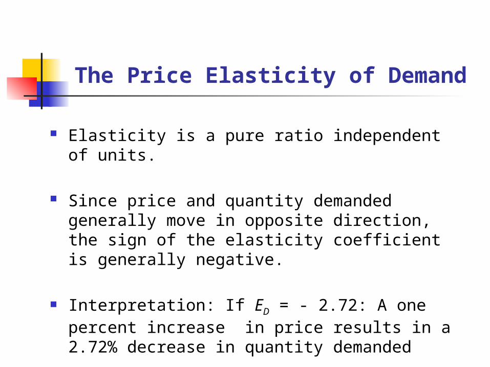
The Price Elasticity of Demand
Elasticity is a pure ratio independent of units.
Since price and quantity demanded generally move in opposite direction, the sign of the elasticity coefficient is generally negative.
Interpretation: If ED = - 2.72: A one percent increase in price results in a 2.72% decrease in quantity demanded

Example Elasticity of Demand for Cotton: Ed = − 0.67 Cotton disappeared in quarter 3 of 2010 = 6.64 bill. Lbs Cotton disappeared in quarter 4 of 2010 = 7.45 bill. Lbs % change in Eq. Quant. Dem. = ∆Q/Q = (7.45 − 6.64)/6.64 = 0.122 Ed = (∆Q/Q ) /(∆P/P ) − 0.67= 0.122 /(∆P/P ) ∆P/P = − 0.122/ 0.67= − 0.182
If price of beef in quarter 3 of 2011 is 120 cents/lb, then forecasted beef price for quarter 4 of 2011 is
P* = (1+ ∆P/P)×P = (1 − 0.182)×120 = 0.818×120 = 98.15 cents/lb.
Forecasting price using the price elasticity of demand

Fundamental Analysis:Cross Price Elasticity of Demand
The cross price elasticity of demand is a measure of the responsiveness of quantity demanded of X to a price change of Y
Cross Price Elasticity of Demand: The percentage change in the quantity demanded of X relative to a percentage change in the price of Y.
For a smooth (differentiable) demand curve, the cross price elasticity of demand for X is given by
X
Y
Y
X
Y
Y
X
XDXY Q
P
P
Q
P
P
Q
QE
X
Y
Y
XDXY Q
P
P
QE

Fundamental Analysis:Income Elasticity of Demand
The Income Elasticity of Demand is a measure of the responsiveness of quantity demanded to change in consumers’ income
Income Elasticity of Demand: The percentage change in the quantity demanded relative to a percentage change in income.
For a smooth (differentiable) demand curve, the income elasticity of demand is given by
D
D
D
DI Q
I
I
Q
I
I
Q
QE
D
DI Q
I
I
QE

Fundamental Analysis:The Price Elasticity of Supply
The price elasticity of supply is a measure of the responsiveness of quantity supply to a price change
Own Price Elasticity of Supply: The percentage change in the quantity supplied relative to a percentage change in its own price.
For a smooth (differentiable) demand curve, the price elasticity of demand is given by
S
S
S
SS Q
P
P
Q
P
P
Q
QE
S
SS Q
P
P
QE

Forecasting Price Using theEquilibrium Displacement Model
The concept of elasticity is also useful for forecasting changes in prices and quantities resulting from supply and demand curve shifts.
Supply of pork decreases due to a tougher regulation on manure treatment and disposal
Demand for pork increases due to an increase in the price of beef
If we know the elasticities of demand and supply, we can calculate the changes in price and quantity demanded (or supplied) by incorporating elasticities into a model called an equilibrium displacement model.

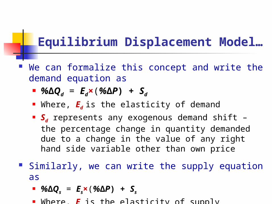
Equilibrium Displacement Model…
Demand Equation Qd = (price, income, tastes and preferences, expectations,
and prices of other goods) Demand changes (shifts) if any right hand side factor other
than price of the commodity changes
Supply Equation Qs = (price, input prices, prices of other goods,
expectations, technological change, number of producers) Supply changes (shifts) if any right hand side factor other
than price of the commodity changes

Equilibrium: Price and quantity are determined by the intersection of the demand and supply curves, where Qd = Qs (i.e., quantity demanded = quantity supplied) Equilibrium changes (gets displaced) if demand and/or
supply changes because of changes in any right hand side demand and/or supply factor other than the price of the commodity.
Suppose that an increase in income shifts the demand curve to the right, and an increase in the production cost shifts the supply curve to the left. As a result, new equilibrium price will be higher and equilibrium quantity will be lower.
Equilibrium Displacement Model…
Equilibrium Displacement Model…
We can formalize this concept and write the demand equation as %∆Qd = Ed×(%∆P) + Sd
Where, Ed is the elasticity of demand Sd represents any exogenous demand shift – the percentage change
in quantity demanded due to a change in the value of any right hand side variable other than own price
Similarly, we can write the supply equation as %∆Qs = Es×(%∆P) + Ss
Where, Es is the elasticity of supply Where, Ss represents any exogenous demand shift – the percentage
change in quantity supplied due to a change in the value of any right hand side variable other than own price

Equilibrium Displacement Model…
In equilibrium the percentage change in quantity demanded must equal the percentage changed in quantity supplied, i.e.,
%∆Qd = %∆Qs
Ed×(%∆P) + Sd = Es×(%∆P) + Ss
Es×(%∆P) − Ed×(%∆P) = Sd − Ss
[Es − Ed]×(%∆P) = Sd − Ss
%∆P = [Sd − Ss]/[Es − Ed]
Thus, once we know the values of percentage change in demand and/or supply because of an exogenous shock, we can easily calculate the percentage change in price

Equilibrium Displacement Model…
%∆P = [Sd − Ss]/[Es − Ed]
Note that the denominator [Es − Ed] is always positive, because Es is positive and Ed is negative.
If Sd >0 and Ss =0, then %∆P >0
If Sd =0 and Ss >0, then %∆P <0 If Sd >0 and Ss >0 and Sd > Ss , then %∆P >0 If Sd >0 and Ss >0 and Sd < Ss , then %∆P <0
Once we calculate the percentage change in price %∆P, we can substitute that value into the demand or supply equation to calculate the percentage change in quantity demanded or supplied %∆Qd = Ed×(%∆P) + Sd = Ed× [Sd − Ss]/[Es − Ed] + Sd

Equilibrium Displacement Model…
General steps in solving an equilibrium displacement model Step 1: Determine the values of percentage change in demand
(Sd) and supply (Ss)
Step 2: Specify the % changes in quantity demanded and supplied as
%∆Qd = Ed×(%∆P) + Sd
%∆Qs = Es×(%∆P) + Ss
Step 3: Set %∆Qd = %∆Qs and solve for %∆P
Step 4: Plug the calculated value for %∆P into the %∆Qd or %∆Qs equation to calculate the percentage change in quantity.

Equilibrium Displacement Model…
Example: Impact of manure regulation in the pork market Elasticity of pork demand, Ed = −1.96
Elasticity of pork supply, Es = 2.15 Because of a newly introduced tighter manure regulation, pork
supply falls by 4.3%, i.e., Ss= − 4.3%
There is no change in pork demand, i.e., Sd = 0 Suppose that the current price for pork is $100/cwt and the
quantity bought and sold is 1,000 cwt per day. What would be the new equilibrium price and quantity?

Equilibrium Displacement Model…
% change in pork price and quantity due to the supply shift %∆P = [Sd − Ss]/[Es − Ed] = [0 − (− 4.3)]/[2.15 − (− 1.95)]
= 4.3/4.10 = 1.05% Thus the pork price increases by 1.05% So, the new equilibrium price would be P* = (1+ %∆P)*P = (1+0.0105)*50 = 50.525/cwt. %∆Qd = Ed× [Sd − Ss]/[Es − Ed] + Sd
= (− 1.95) × [0 − (− 4.3)]/[2.15 − (− 1.95)] + 0
= (− 1.95) × 4.3/4.10 = (− 1.95) × 1.05 = 2.05% Thus the pork price decreases by 2.05% So, the new equilibrium quantity would be, Q* = (1+ %∆Q)*Q
= (1- 0.0205)*1000 = 979.5 cwt.

The Balance Table summarizes the key components of current-season supply and disappearance, along with prior-season comparisons.
Fundamental Analysis:The Balance Table
2001 1,899 9,503 10 11,412 7,911 1,905 9,815 1,5962002 1,596 8,967 14 10,578 7,903 1,588 9,491 1,0872003 1,087 10,089 14 11,190 8,332 1,900 10,232 9582004 958 11,807 11 12,776 8,844 1,818 10,662 2,1142005 2,114 11,114 9 13,237 9,136 2,134 11,270 1,9672006 1,967 10,535 12 12,514 9,086 2,125 11,210 1,3042007 1,304 13,168 15 14,487 10,240 2,350 12,590 1,897
Imports Total Dom. Use Exports TotalEnding Stocks
Corn: Supply and Disappearance, 1996-2007 (million bushels)
YearSupply Disappearance
Beg. stocks
Production
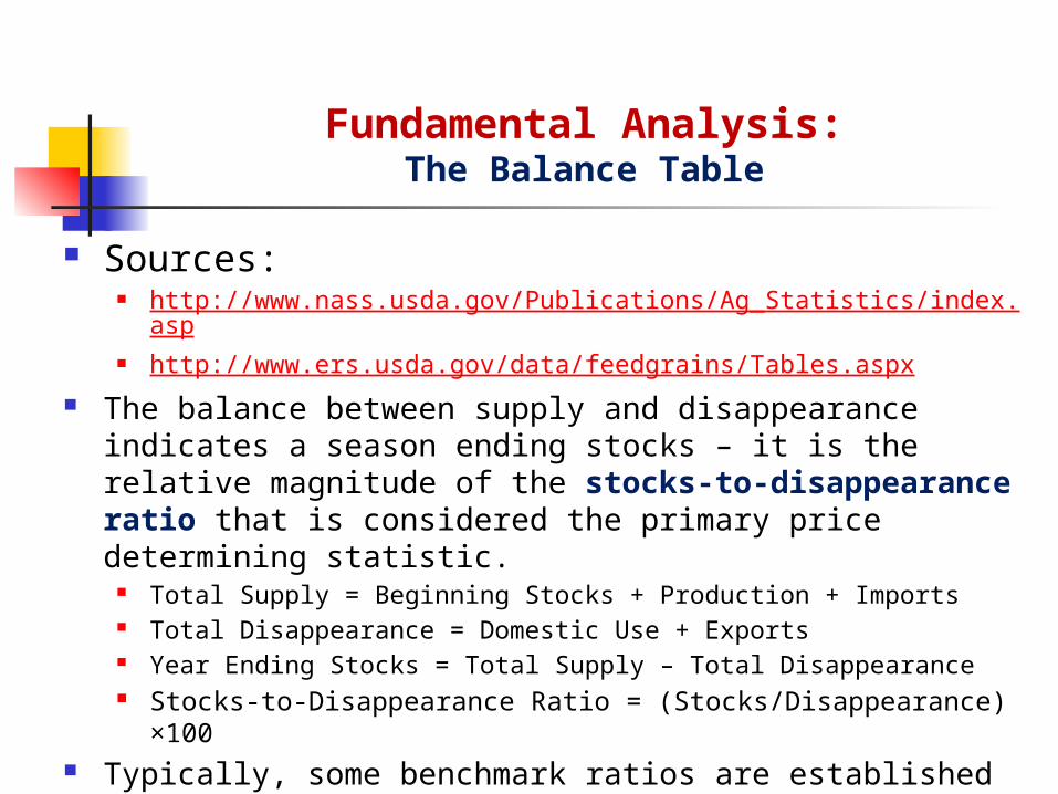
Sources: http://www.nass.usda.gov/Publications/Ag_Statistics/index.asp http://www.ers.usda.gov/data/feedgrains/Tables.aspx
The balance between supply and disappearance indicates a season ending stocks – it is the relative magnitude of the stocks-to-disappearance ratio that is considered the primary price determining statistic.
Total Supply = Beginning Stocks + Production + Imports Total Disappearance = Domestic Use + Exports Year Ending Stocks = Total Supply – Total Disappearance Stocks-to-Disappearance Ratio = (Stocks/Disappearance) ×100
Typically, some benchmark ratios are established for various crops using historical stocks and disappearance data.
By comparing the current year’s stocks-to disappearance ratio to the benchmark ratio, analysts estimate the price trend – direction and extent.
Fundamental Analysis:The Balance Table
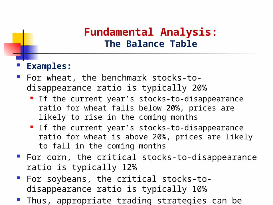
Examples: For wheat, the benchmark stocks-to-disappearance ratio is typically
20% If the current year’s stocks-to-disappearance ratio for wheat falls below
20%, prices are likely to rise in the coming months If the current year’s stocks-to-disappearance ratio for wheat is above
20%, prices are likely to fall in the coming months For corn, the critical stocks-to-disappearance ratio is typically 12% For soybeans, the critical stocks-to-disappearance ratio is typically
10% Thus, appropriate trading strategies can be developed by comparing
the current year’s stocks-to-disappearance ratio with the historical averages for different crops (USDA).
Fundamental Analysis:The Balance Table

The balance table only involves supply and disappearance statistics, without any direct consideration of price – thus, may lead to incorrect conclusions.
The tabular and graphic (TAG) approach examines the relationship between the balance table statistics along with prices.
The TAG method also considers other factors such as the supply of substitute goods and income
Using the TAG approach, analysts collect and plot historical disappearance data against corresponding prices, and analyze the correlation.
Inconsistencies are further explained by using disappearance data for substitute goods.
The TAG approach is only well-suited to situations in which price fluctuations can be largely explained by one or two variables.
Fundamental Analysis:The Tabular and Graphic (TAG) Approach

Regression analysis provides a statistical procedure that can be used to formalize the TAG approach.
For example, the price prediction equation for hogs can be expressed as follows:
The values of the coefficients α, β1, β2, and β3, can be estimated by regressing historical hog prices on hog and cattle slaughter data along with the time trend.
Given the estimates α, β1, β2, and β3, and projections for hog and cattle slaughter and the time trend, one can plug those values into the above equation and obtain a precise price forecast.
Regression analysis is probably the single most useful analytical tool in fundamental analysis.
Fundamental Analysis:The Regression Analysis
TimeCattleHogPHog 321

Example: Hog slaughter and pig crop Y = a + bX; Assume that estimates of a = 0.232, and b = 0.9256. Y = June-Nov Hog slaughter X = Dec-May Pig crop If X = 46 million, then Y = 0.232 +0.9256×46 = 42.8 million.
Econometric Models Regression analysis employs only a single equation. In some instances, it is theoretically more accurate to construct
multiple-equation models in which the equations are interrelated and must be solved simultaneously.
Such models are frequently referred to as econometric models.
Fundamental Analysis: The Regression Analysis
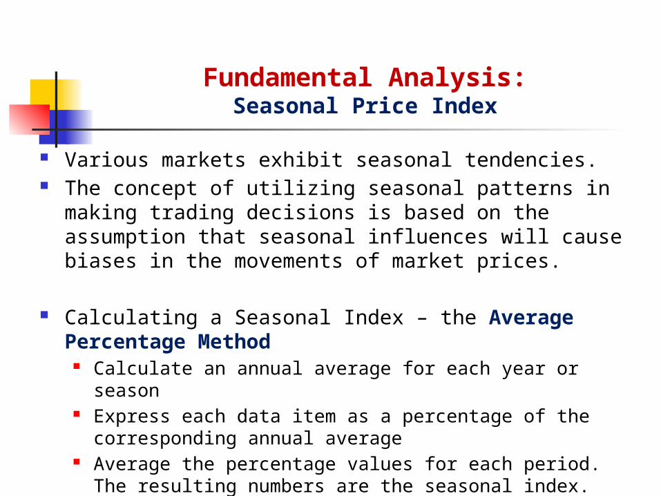
Various markets exhibit seasonal tendencies. The concept of utilizing seasonal patterns in making trading decisions
is based on the assumption that seasonal influences will cause biases in the movements of market prices.
Calculating a Seasonal Index – the Average Percentage Method Calculate an annual average for each year or season Express each data item as a percentage of the corresponding annual
average Average the percentage values for each period. The resulting numbers are
the seasonal index.
Fundamental Analysis:Seasonal Price Index

Fundamental Analysis:Seasonal Price Index
March Sugar Contract: Average Monthly Prices
Mar Apr May Jun Jul Aug Sep Oct Nov Dec Jan Feb Avg.
1998 12.8 11.4 9.9 8.8 9.3 8.4 7.5 7.1 7.8 7.2 6.7 6.7 8.6
1999 8.5 9.3 11.5 12.5 12.1 12.5 11.2 10.8 9.6 8.7 7.7 6.9 10.1
2000 9.1 8.6 7.5 7.2 6.0 5.4 5.5 5.9 5.6 4.6 4.4 4.0 6.2
2001 5.5 5.0 4.2 3.8 4.0 5.0 5.8 5.6 6.1 6.1 5.6 5.8 5.2
2002 8.3 9.0 8.6 7.5 6.8 6.9 6.1 6.6 6.8 6.5 7.0 7.6 7.3
2003 8.3 7.6 7.7 7.4 7.0 6.7 6.9 7.4 7.7 8.6 9.8 8.5 7.8
2004 8.6 8.7 9.1 10.3 12.4 10.4 9.8 9.8 10.4 11.3 10.0 10.7 10.1
2005 11.3 11.7 11.6 12.0 13.0 12.9 13.5 14.0 14.8 13.5 14.5 14.7 13.1
2006 14.0 14.4 14.1 12.3 11.4 10.7 10.7 9.7 9.9 9.7 9.0 8.7 11.2
2007 8.5 8.3 7.8 8.3 8.7 8.4 8.8 8.8 8.6 8.9 8.4 8.1 8.5
2008 8.6 8.8 9.0 9.5 9.4 9.1 8.9 8.8 8.7 8.3 8.5 8.8 8.9
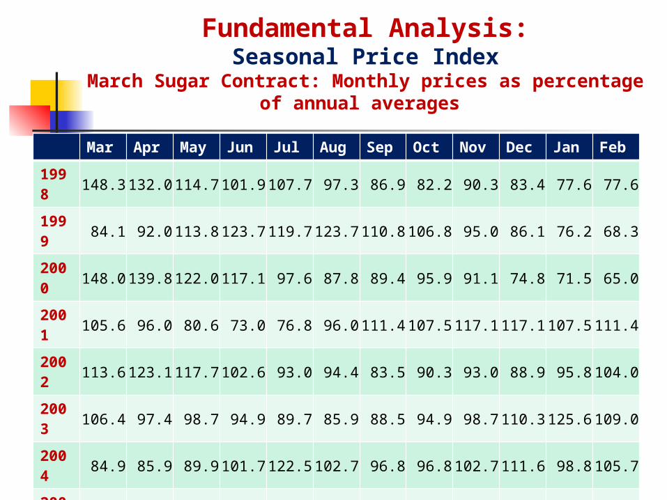
Mar Apr May Jun Jul Aug Sep Oct Nov Dec Jan Feb
1998 148.3 132.0 114.7 101.9 107.7 97.3 86.9 82.2 90.3 83.4 77.6 77.6
1999 84.1 92.0 113.8 123.7 119.7 123.7 110.8 106.8 95.0 86.1 76.2 68.3
2000 148.0 139.8 122.0 117.1 97.6 87.8 89.4 95.9 91.1 74.8 71.5 65.0
2001 105.6 96.0 80.6 73.0 76.8 96.0 111.4 107.5 117.1 117.1 107.5 111.4
2002 113.6 123.1 117.7 102.6 93.0 94.4 83.5 90.3 93.0 88.9 95.8 104.0
2003 106.4 97.4 98.7 94.9 89.7 85.9 88.5 94.9 98.7 110.3 125.6 109.0
2004 84.9 85.9 89.9 101.7 122.5 102.7 96.8 96.8 102.7 111.6 98.8 105.7
2005 86.1 89.1 88.4 91.4 99.0 98.3 102.9 106.7 112.8 102.9 110.5 112.0
2006 124.8 128.4 125.7 109.7 101.6 95.4 95.4 86.5 88.3 86.5 80.2 77.6
2007 100.4 98.0 92.1 98.0 102.8 99.2 103.9 103.9 101.6 105.1 99.2 95.7
2008 97.0 99.2 101.5 107.1 106.0 102.6 100.4 99.2 98.1 93.6 95.9 99.2
Indx 109.0 107.4 104.1 101.9 101.5 98.5 97.2 97.3 99.0 96.4 94.4 93.2
Fundamental Analysis:Seasonal Price Index
March Sugar Contract: Monthly prices as percentage of annual averages

Technical analysis is the study of historical prices for the purpose of predicting prices in the future
Technical analysts frequently utilize charts of past prices to identify historical price patterns
These price patterns are then used to forecast prices in the future A basic belief of technical analysts is that market prices themselves
contain useful and timely information Prices quickly reflect all available fundamental information, as well as
other information, such as traders’ expectations and the psychology of the market
Role of Technical Analysis Identify and predict changes in direction of price trends Determine the timing of action – entry and exit decisions
Technical Analysis:

Chart Analysis - the basic tool of technical analysis A price chart is a sequence of prices plotted over a specific time frame.
In statistical terms, charts are referred to as time series plots Chart analysts plots historical prices in a two-dimensional graph in
order to identify price patterns which can then be used to predict the futures direction of prices
The goal of any chart analyst is to find consistent, reliable, and logical price patterns with which to predict future price movements
Chart analysts rely primarily on three bodies of data Prices (monthly, weekly, daily, and intra-day) Trading volumes, and Open interest
Technical Analysis: Chart Analysis
Price Pattern Recognition Charts
Technical Analysis: Chart Analysis
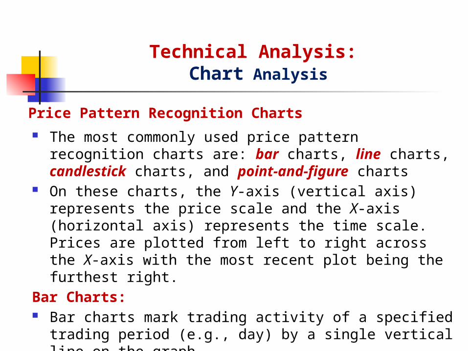
The most commonly used price pattern recognition charts are: bar charts, line charts, candlestick charts, and point-and-figure charts
On these charts, the Y-axis (vertical axis) represents the price scale and the X-axis (horizontal axis) represents the time scale. Prices are plotted from left to right across the X-axis with the most recent plot being the furthest right.
Bar Charts: Bar charts mark trading activity of a specified trading period (e.g.,
day) by a single vertical line on the graph This line connects the high and low prices for the trading period The closing price is indicated by a horizontal bar
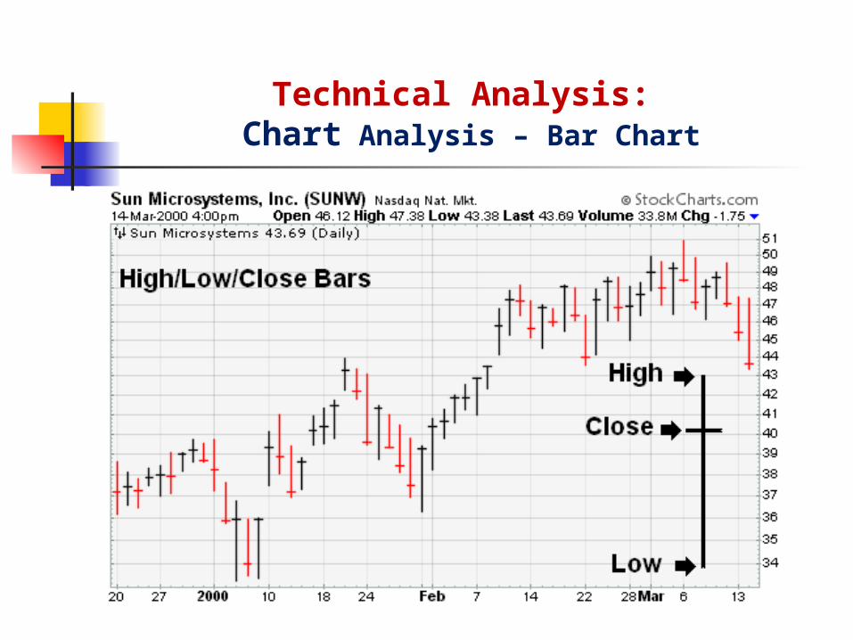
Technical Analysis: Chart Analysis – Bar Chart

Technical Analysis: Chart Analysis – Bar Chart
Bar charts can also be displayed using the open, high, low and close. The only difference is the addition of the open price, which is displayed as a short horizontal line extending to the left of the bar.

Technical Analysis: Chart Analysis – Bar Charts
Bar Charts: One-Day Price Reversals Bar charts are frequently used to identify one-day price reversals. A one-day price reversal occurs in a rising market when prices make
a new high for the current advance but then close lower than the previous day’s close
A one-day price reversal occurs in a falling market when prices make a new low for the current decline but then close higher than the previous day’s close

Technical Analysis: Chart Analysis – Line Charts
Line Charts: In a line chart, only the
closing prices are plotted for each time period.
Some investors and traders consider the closing level to be more important than the open, high or low.
By paying attention to only the close, intraday swings can be ignored.

Technical Analysis: Chart Analysis – Candlestick Charts
Candlestick Charts: Originating in Japan over 300 years ago, candlestick charts have
become quite popular in recent years. For a candlestick chart, the open, high, low and close are all required. Hollow (clear) candlesticks form when the close is higher than the
open and Filled (solid) candlesticks form when the close is lower than the open.
The white and black portion formed from the open and close is called the body (white body or black body). The lines above and below are called shadows and represent the high and low.
A daily candlestick is based on the open price, the intraday high and low, and the close. A weekly candlestick is based on Monday's open, the weekly high-low range and Friday's close.
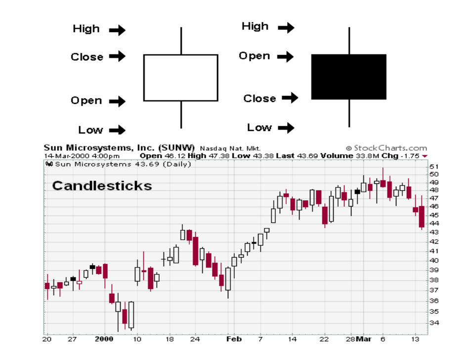
Technical Analysis: Chart Analysis – Candlestick Charts
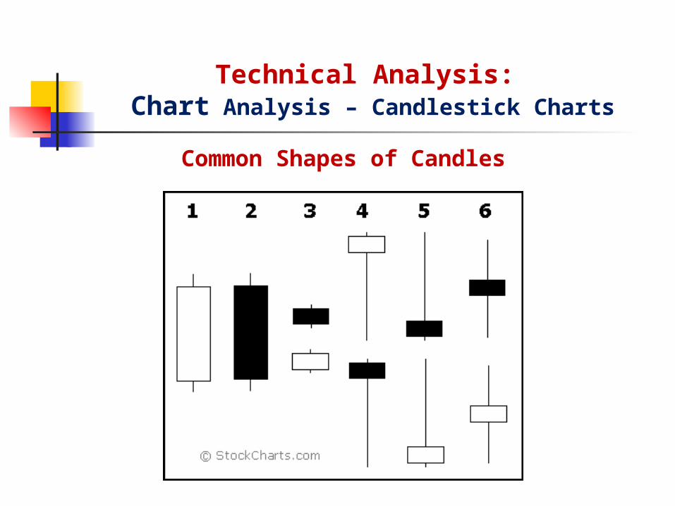
Common Shapes of Candles

Technical Analysis: Chart Analysis – Candlestick Charts
Bulls vs. Bears A candlestick depicts the battle between Bulls (buyers) and Bears (sellers) over a given
period of time.
1. Long white candlesticks indicate that the Bulls controlled trading for most of the period – buying pressure.
2. Long black candlesticks indicate that the Bears controlled trading for most of the period – selling pressure.
3. Small candlesticks indicate that neither the bulls nor the bears were in control of trading – consolidation.
4. A long lower shadow indicates that the Bears controlled trading for some time, but lost control by the end and the Bulls made an impressive comeback.
5. A long upper shadow indicates that the Bulls controlled trading for some time, but lost control by the end and the Bears made an impressive comeback.
6. A long upper and lower shadow indicates that both the Bears and Bulls had their moments during the trading period, but neither could put the other away, resulting in a standoff.

Technical Analysis: Chart Analysis – Candlestick Charts
Hollow vs. Filled Candlesticks Hollow candlesticks, where the close is higher than the open, indicate
buying pressure. Filled candlesticks, where the close is lower than the open, indicate
selling pressure.
Long vs. Short Bodies Generally speaking, the longer the body is, the more intense the
buying or selling pressure. Long white candlesticks show strong buying pressure – buyers are aggressive. Long black candlesticks show strong selling pressure – sellers are aggressive.
Conversely, short candlesticks indicate little price movement and represent consolidation.
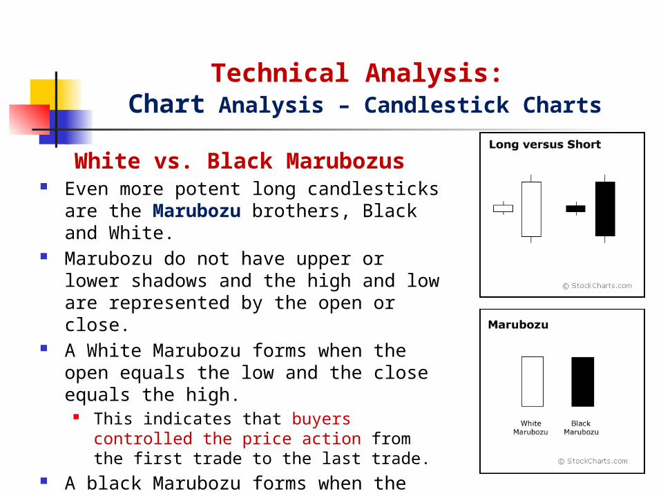
White vs. Black Marubozus Even more potent long candlesticks are the
Marubozu brothers, Black and White. Marubozu do not have upper or lower shadows
and the high and low are represented by the open or close.
A White Marubozu forms when the open equals the low and the close equals the high.
This indicates that buyers controlled the price action from the first trade to the last trade.
A black Marubozu forms when the open equals the high and the close equals the low.
This indicates that sellers controlled the price action from the first trade to the last trade.
Technical Analysis: Chart Analysis – Candlestick Charts
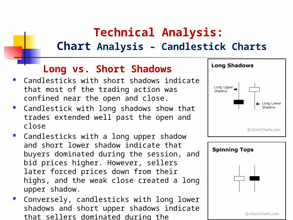
Long vs. Short Shadows Candlesticks with short shadows indicate that most of the
trading action was confined near the open and close. Candlestick with long shadows show that trades extended
well past the open and close Candlesticks with a long upper shadow and short lower
shadow indicate that buyers dominated during the session, and bid prices higher. However, sellers later forced prices down from their highs, and the weak close created a long upper shadow.
Conversely, candlesticks with long lower shadows and short upper shadows indicate that sellers dominated during the session and drove prices lower. However, buyers later resurfaced to bid prices higher by the end of the session and the strong close created a long lower shadow.
Technical Analysis: Chart Analysis – Candlestick Charts

Doji Doji form when a security's open and close are virtually
equal. The length of the upper and lower shadows can vary and the resulting candlestick looks like a cross, inverted cross or plus sign. Alone, doji are neutral patterns.
Doji convey a sense of indecision or tug-of-war between buyers and sellers. Prices move above and below the opening level during the session, but close at or near the opening level. The result is a standoff. Neither bulls nor bears were able to gain control and a turning point could be developing.
Doji indicate that the forces of supply and demand are becoming more evenly matched and a change in trend may be near. Doji alone are not enough to mark a reversal and further confirmation may be warranted. The relevance of a doji depends on the preceding trend or preceding candlesticks.
Technical Analysis: Chart Analysis – Candlestick Charts

Doji and Trend After an advance or long white candlestick, a doji
signals that buying pressure may be diminishing and the uptrend could be nearing an end. However, even after the doji forms, further downside is required for bearish confirmation. This may come as a decline below the long white candlestick's open.
After a decline or long black candlestick, a doji indicates that selling pressure may be diminishing and the downtrend could be nearing an end. However, further strength is required to confirm any reversal. Bullish confirmation could come as an advance above the long black candlestick's open.
Technical Analysis: Chart Analysis – Candlestick Charts

Long Shadow Reversal There are two pairs of single candlestick reversal patterns
made up of a small real body, one long shadow and one short or non-existent shadow. Generally, the long shadow should be at least twice the length of the real body, which can be either black or white.
Hammer and Hanging Man: consists of identical candlesticks with small bodies and long lower shadows.
The Hammer is a bullish reversal pattern that forms after a decline. A Hammer signals a potential trend reversal - that buying pressure is starting to increase. In addition, hammers can mark bottoms or support levels.
The Hanging Man is a bearish reversal pattern that forms after an advance. Hanging Man signals that selling pressure is starting to increase. It can also mark a top or resistance level.
Technical Analysis: Chart Analysis – Candlestick Charts
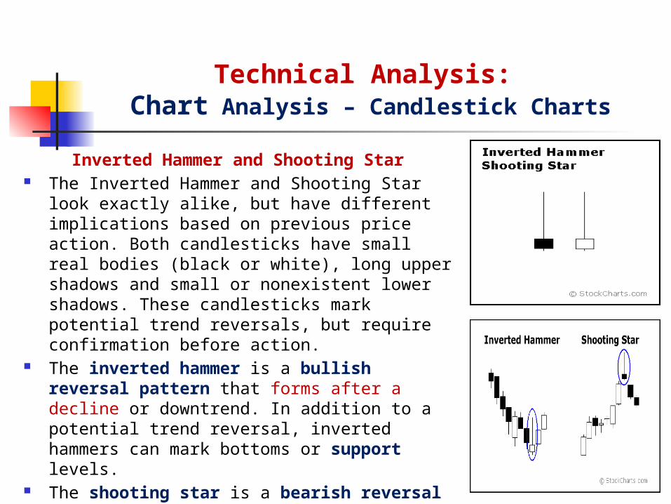
Inverted Hammer and Shooting Star The Inverted Hammer and Shooting Star look exactly alike,
but have different implications based on previous price action. Both candlesticks have small real bodies (black or white), long upper shadows and small or nonexistent lower shadows. These candlesticks mark potential trend reversals, but require confirmation before action.
The inverted hammer is a bullish reversal pattern that forms after a decline or downtrend. In addition to a potential trend reversal, inverted hammers can mark bottoms or support levels.
The shooting star is a bearish reversal pattern that forms after an advance. A shooting star signals that selling pressure is starting to increase. It can also mark a top or resistance level.
Technical Analysis: Chart Analysis – Candlestick Charts

Technical Analysis: Chart Analysis – Point-and-Figure Charts
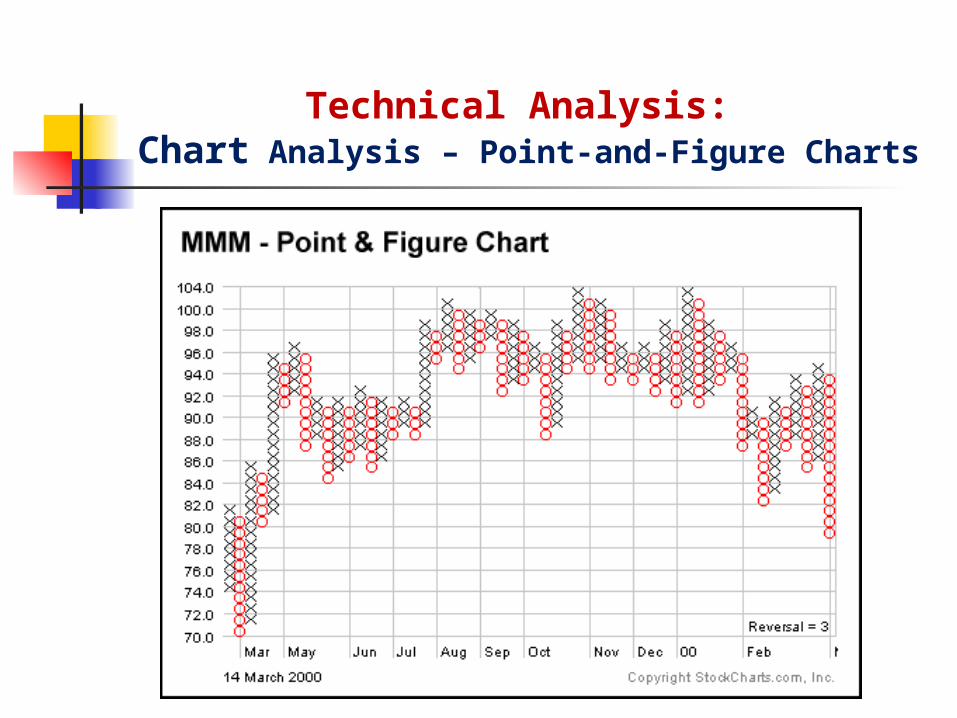
Point-and-Figure Charts: Point-and-figure charts are constructed by filling in boxes with either a
X or an O. A price increase or decrease is defined as a price change that exceeds a
specified magnitude – a price change less than that magnitude does not receive an X or O in the chart
If prices are rising, the appropriate Xs are entered in a particular column. When prices begin to decline, a new column is started, and Os are entered in that column Each price reversal results in the start of a new column
Point-and-figure Charts are based solely on price movement, and do not take time into consideration. There is an x-axis but it does not extend evenly across the chart.
Technical Analysis: Chart Analysis – Point-and-Figure Charts

Technical Analysis: Chart Analysis – Point-and-Figure Charts
Point-and-Figure Charts: The objective of point-and-figure chart is to provide a smoothing
effect on the price changes that appear in a bar chart in order to detect significant price trends and reversals.
Point-and figure charts can also be used to generate buy and sell signals.
A buy signal occurs when an X in a new column surpasses the highest X in the immediately preceding X column.
A sell signal occurs when an O in a new column is below the lowest O in the immediately preceding O column.
This focus on price movement makes it easier to identify support and resistance levels, bullish breakouts and bearish breakdowns.

Chart analysis uses both trend lines and geometric formations to predict market tops and bottoms, as well as future price movements
The most popular technical price patterns are Support and Resistance, Trend lines, Double tops and bottoms, and Head-and-shoulder.
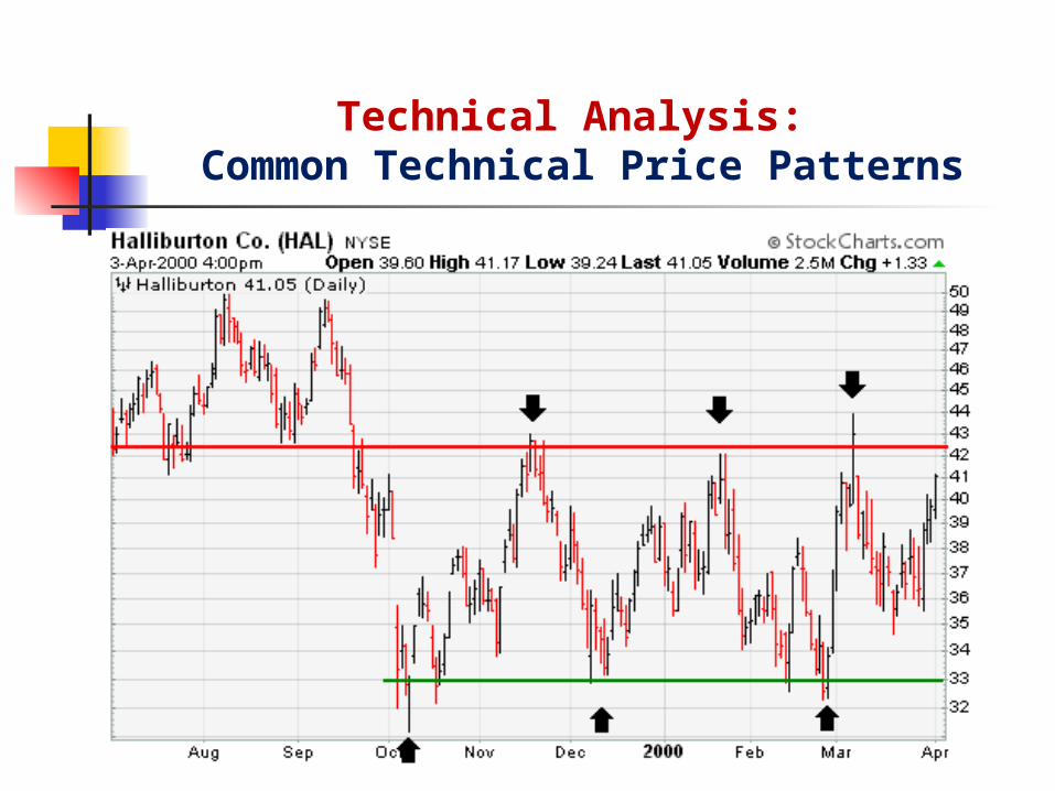
Support and Resistance A support level is a price level at which there appears to be substantial buying
pressure to keep prices from falling further A resistance level is a price level at which there appears to be substantial selling
pressure to keep prices from rising further A congestion area occurs when prices move sideways, fluctuating up and down
within a well defined range for a considerable time period
Technical Analysis: Common Technical Price Patterns

A support level is a price level at which there appears to be substantial buying pressure to keep prices from falling further
As the price declines towards support and gets cheaper, buyers become more inclined to buy and sellers become less inclined to sell. By the time the price reaches the support level, it is believed that demand will overcome supply and prevent the price from falling below support.
Support can be established with the previous reaction lows. A resistance level is a price level at which there appears to be
substantial selling pressure to keep prices from rising further As the price advances towards resistance, sellers become more inclined to sell and
buyers become less inclined to buy. By the time the price reaches the resistance level, it is believed that supply will overcome demand and prevent the price from rising above resistance.
Resistance can be established with the previous reaction highs.
Technical Analysis: Support and Resistance
Technical Analysis: Common Technical Price Patterns

Another principle of technical analysis is that support can turn into resistance and visa versa.
Once the price breaks below a support level, the broken support level can turn into resistance. The break of support signals that the forces of supply have overcome the forces of demand. Therefore, if the price returns to this level, there is likely to be an increase in supply, and hence resistance.
The other turn of the coin is resistance turning into support. As the price advances above resistance, it signals changes in supply and demand. The breakout above resistance proves that the forces of demand have overwhelmed the forces of supply. If the price returns to this level, there is likely to be an increase in demand and support will be found.
Technical Analysis: Support and Resistance

Technical Analysis: Support and Resistance

A congestion area occurs when prices move sideways, fluctuating up and down within a well defined range for a considerable time period
A congestion area signals that the forces of supply and demand are evenly balanced.
When the price breaks out of the congestion area , above or below, it signals that a winner has emerged - A break above is a victory for the bulls (demand) and a break below is a victory for the bears (supply).
When the price breaks out of the congestion area by penetrating the support it is a signal to sell.
When the price breaks out of the congestion area by penetrating resistance it is a signal to buy.
Technical Analysis: Congestion Area – Trading Range

Technical Analysis: Congestion Area – Trading Range
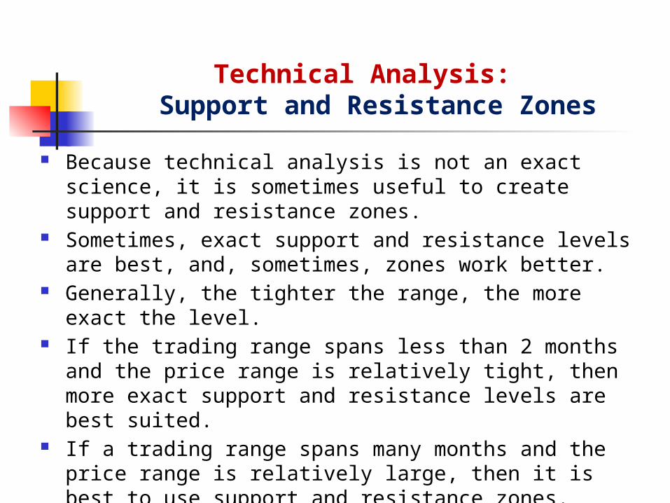
Because technical analysis is not an exact science, it is sometimes useful to create support and resistance zones.
Sometimes, exact support and resistance levels are best, and, sometimes, zones work better.
Generally, the tighter the range, the more exact the level. If the trading range spans less than 2 months and the price range is
relatively tight, then more exact support and resistance levels are best suited.
If a trading range spans many months and the price range is relatively large, then it is best to use support and resistance zones.
These are only meant as general guidelines, and each trading range should be judged on its own merits.
Technical Analysis: Support and Resistance Zones
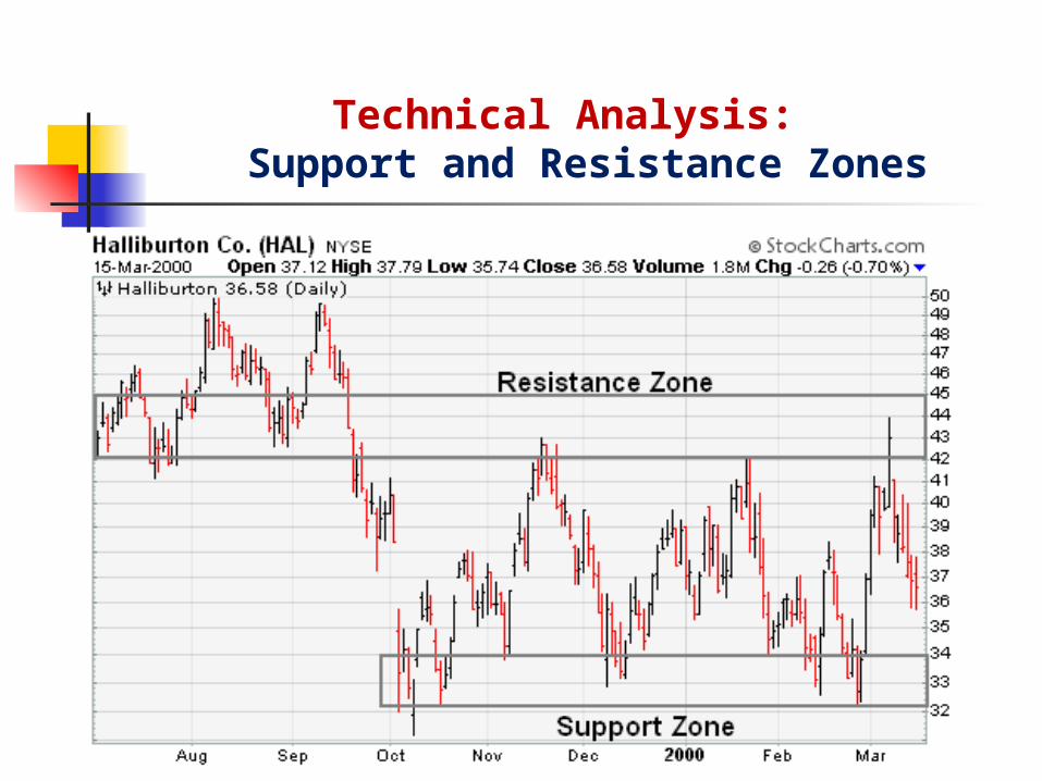
Technical Analysis: Support and Resistance Zones

Identification of key support and resistance levels is an essential ingredient to successful technical analysis.
Even though it is sometimes difficult to establish exact support and resistance levels, being aware of their existence and location can greatly enhance analysis and forecasting abilities.
If a futures contract is approaching an important support level, it can serve as an alert to be extra vigilant in looking for signs of increased buying pressure and a potential reversal.
If a futures contract is approaching a resistance level, it can act as an alert to look for signs of increased selling pressure and potential reversal. If a support or resistance level is broken, it signals that the relationship between supply and demand has changed.
A resistance breakout signals that demand (bulls) has gained the upper hand and a support break signals that supply (bears) has won the battle.
Technical Analysis: Support and Resistance

Technical analysis is built on the assumption that prices trend. A common trading strategy is to identify a price trend and then go
with the trend. A trend line is a straight line that connects periodic highs or lows on a
price chart and then extends into the future to act as a line of resistance or support.
Two common types of trend lines Uptrend lines Downtrend lines
Technical Analysis: Trend Lines

An uptrend line has a positive slope and is formed by connecting two or more low points. The second low must be higher than the first for the line to have a positive slope.
Uptrend lines act as support and indicate that net-demand (demand less supply) is increasing even as the price rises.
A rising price combined with increasing demand is very bullish, and shows a strong determination on the part of the buyers.
As long as prices remain above the trend line, the uptrend is considered solid and intact.
A break below the uptrend line indicates that net-demand has weakened and a change in trend could be imminent.
When price falls below the uptrend line, this is a signal to sell or go short.
Technical Analysis: Uptrend Lines

Technical Analysis: Uptrend Line

A downtrend line has a negative slope and is formed by connecting two or more high points. The second high must be lower than the first for the line to have a negative slope.
Downtrend lines act as resistance, and indicate that net supply (supply less demand) is increasing even as the price declines.
A declining price combined with increasing supply is very bearish, and shows the strong resolve of the sellers.
As long as prices remain below the downtrend line, the downtrend is solid and intact.
A break above the downtrend line indicates that net-supply is decreasing and that a change of trend could be imminent.
When price breaks above the downtrend line, this is a signal to buy or go long.
Technical Analysis: Downtrend Lines

Technical Analysis: Downtrend Line

The general rule in technical analysis is that it takes two points to draw a trend line and the third point confirms the validity.
It can sometimes be difficult to find more than 2 points from which to construct a trend line.
Even though trend lines are an important aspect of technical analysis, it is not always possible to draw trend lines on every price chart. Sometimes the lows or highs just don't match up, and it is best not to force the issue.
Trend lines can offer great insight, but if used improperly, they can also produce false signals
Trend lines should not be the final arbiter, but should serve merely as a warning that a change in trend may be imminent.
Technical Analysis: Trend Lines - Conclusions
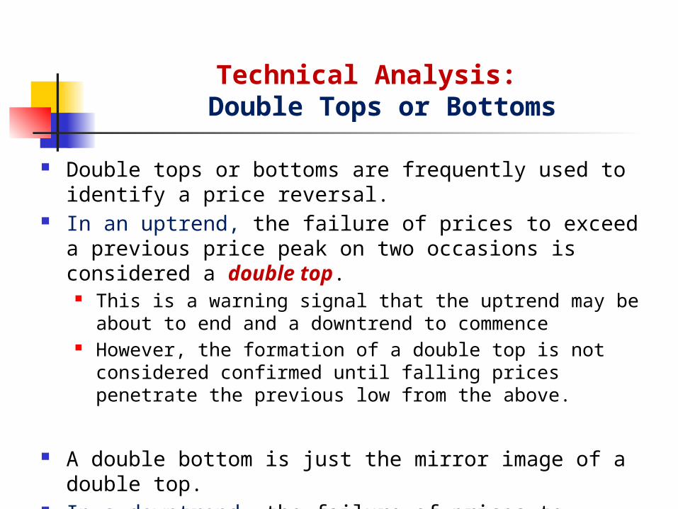
Double tops or bottoms are frequently used to identify a price reversal. In an uptrend, the failure of prices to exceed a previous price peak on
two occasions is considered a double top. This is a warning signal that the uptrend may be about to end and a
downtrend to commence However, the formation of a double top is not considered confirmed until
falling prices penetrate the previous low from the above.
A double bottom is just the mirror image of a double top. In a downtrend, the failure of prices to penetrate previous support
levels on two occasions is considered a double bottom. This is a warning signal that the downtrend may be about to end and an
uptrend to commence
Technical Analysis: Double Tops or Bottoms

Technical Analysis: Double Tops

Prior Trend: In the case of the double top, a significant uptrend should be in place. First Peak: The first peak should mark the highest point of the current trend. Trough: After the first peak, a decline takes place that typically ranges from 10 to 20%. Second Peak: The advance off the lows usually occurs with low volume and meets
resistance from the previous high. Resistance from the previous high should be expected. Usually a peak within 3% of the previous high is adequate.
Decline from Peak: The subsequent decline from the second peak should witness an expansion in volume and/or an accelerated descent, perhaps marked with a gap or two.
Support Break: Breaking support from the lowest point between the peaks completes the double top. This too should occur with an increase in volume and/or an accelerated descent.
Support Turned Resistance: Broken support becomes potential resistance and there is sometimes a test of this newfound resistance level with a reaction rally. Such a test can offer a second chance to exit a position or initiate a short.
Price Target: The distance from support break to peak can be subtracted from the support break for a price target. This would infer that the bigger the formation is, the larger the potential decline.
Technical Analysis: Double Tops

Technical Analysis: Double Bottoms

Prior Trend: In the case of the double bottom, a significant downtrend should be in place. First Trough: The first trough should mark the lowest point of the current trend. Peak: After the first trough, an advance takes place that typically ranges from 10 to 20%. Second Trough: The decline off the reaction high usually occurs with low volume and meets
support from the previous low. Support from the previous low should be expected. While exact troughs are preferable, there is some room to maneuver and usually a trough within 3% of the previous is considered valid.
Advance from Trough: Volume is more important for the double bottom than the double top. There should be clear evidence that volume and buying pressure are accelerating during the advance off of the second trough.
Resistance Break: Breaking resistance from the highest point between the troughs completes the double bottom. This too should occur with an increase in volume and/or an accelerated ascent.
Resistance Turned Support: Broken resistance becomes potential support and there is sometimes a test of this newfound support level with the first correction. Such a test can offer a second chance to close a short position or initiate a long.
Price Target: The distance from the resistance breakout to trough lows can be added on top of the resistance break to estimate a target. This would imply that the bigger the formation is, the larger the potential advance.
Technical Analysis: Double Bottoms

60-70% reliable Frequently seen in grains and livestock commodities On 2 consecutive days or across several weeks
Technical Analysis: Double Tops and Bottoms

Head-and-Shoulders formations are among the most frequently used technical patterns for identifying a price reversal.
Head-and-Shoulders formations consist of four phases: The left shoulder The head The right shoulder The penetration of the neckline
A head-and-shoulder reversal pattern is complete only when the neckline is penetrated, either in an upward or downward direction.
Head-and-Shoulder top: The formation is complete when price penetrate the neckline from above indicating a reversal from a uptrend to a downtrend.
Head-and-Shoulder bottom: The formation is complete when price penetrate the neckline from below indicating a reversal from a downtrend to an uptrend.
Technical Analysis: Head-and-Shoulders Tops or Bottoms

Technical Analysis: Head-and-Shoulders Top

Prior Trend: Without a prior uptrend, there cannot be a Head and Shoulders reversal pattern. Left Shoulder: While in an uptrend, the left shoulder forms a peak that marks the high point
of the current trend. After making this peak, a decline ensues to complete the formation of the shoulder (1). The low of the decline usually remains above the trend line, keeping the uptrend intact.
Head: From the low of the left shoulder, an advance begins that exceeds the previous high and marks the top of the head. After peaking, the low of the subsequent decline marks the second point of the neckline (2). The low of the decline usually breaks the uptrend line, putting the uptrend in jeopardy.
Right Shoulder: The advance from the low of the head forms the right shoulder. This peak is lower than the head (a lower high) and usually in line with the high of the left shoulder. While symmetry is preferred, sometimes the shoulders can be out of whack. The decline from the peak of the right shoulder should break the neckline.
Neckline: The neckline forms by connecting low points 1 and 2. Low point 1 marks the end of the left shoulder and the beginning of the head. Low point 2 marks the end of the head and the beginning of the right shoulder. Depending on the relationship between the two low points, the neckline can slope up, slope down or be horizontal.
Technical Analysis: Head-and-Shoulders Tops

Volume: As the Head and Shoulders pattern unfolds, volume plays an important role in confirmation. Ideally, but not always, volume during the advance of the left shoulder should be higher than during the advance of the head. This decrease in volume and the new high of the head, together, serve as a warning sign. The next warning sign comes when volume increases on the decline from the peak of the head. Final confirmation comes when volume further increases during the decline of the right shoulder.
Neckline Break: The head and shoulders pattern is not complete and the uptrend is not reversed until neckline support is broken. Ideally, this should also occur in a convincing manner, with an expansion in volume.
Support Turned Resistance: Once support is broken, it is common for this same support level to turn into resistance. Sometimes, but certainly not always, the price will return to the support break, and offer a second chance to sell.
Price Target: After breaking neckline support, the projected price decline is found by measuring the distance from the neckline to the top of the head. This distance is then subtracted from the neckline to reach a price target. Any price target should serve as a rough guide, and other factors should be considered as well. These factors might include previous support levels, Fibonacci retracements, or long-term moving averages.
Technical Analysis: Head-and-Shoulders Tops

Technical Analysis: Head-and-Shoulders Bottom

Prior Trend: Without a prior downtrend, there cannot be a Head and Shoulders Bottom formation.
Left Shoulder: While in a downtrend, the left shoulder forms a trough that marks a new reaction low in the current trend. After forming this trough, an advance ensues to complete the formation of the left shoulder (1).
Head: From the high of the left shoulder, a decline begins that exceeds the previous low and forms the low point of the head. After making a bottom, the high of the subsequent advance forms the second point of the neckline (2).
Right Shoulder: The decline from the high of the head (neckline) begins to form the right shoulder. This low is always higher than the head, and it is usually in line with the low of the left shoulder. When the advance from the low of the right shoulder breaks the neckline, the Head and Shoulders Bottom reversal is complete.
Neckline: The neckline forms by connecting reaction highs 1 and 2. Reaction High 1 marks the end of the left shoulder and the beginning of the head. Reaction High 2 marks the end of the head and the beginning of the right shoulder. Depending on the relationship between the two reaction highs, the neckline can slope up, slope down, or be horizontal.
Technical Analysis: Head-and-Shoulders Bottoms

Volume: While volume plays an important role in the Head and Shoulders Top, it plays a crucial role in the Head and Shoulders Bottom. Without the proper expansion of volume, the validity of any breakout becomes suspect.
Volume on the decline of the left shoulder is usually pretty heavy and selling pressure quite intense.
The advance from the low of the head should show an increase in volume Neckline Break: The Head and Shoulders Bottom pattern is not complete, and the
downtrend is not reversed until neckline resistance is broken. For a Head and Shoulders Bottom, this must occur in a convincing manner, with an expansion of volume.
Resistance Turned Support: Once resistance is broken, it is common for this same resistance level to turn into support. Often, the price will return to the resistance break, and offer a second chance to buy.
Price Target: After breaking neckline resistance, the projected advance is found by measuring the distance from the neckline to the bottom of the head. This distance is then added to the neckline to reach a price target. Any price target should serve as a rough guide, and other factors should be considered, as well.
Technical Analysis: Head-and-Shoulders Bottoms

70-80% reliable in terms of significant move after neckline is broken Time required to complete can be days or up to several weeks Frequently seen in grains and livestock commodities Easy to recognize Low trading volume on each side of the “head” confirms the formation
Technical Analysis: Head-and-Shoulders Tops or Bottoms

Market trend analyses use more complex price charts as well as volume and open interest figures to determine both the existence of price trends and the strength of these trends.
Moving Averages Rate of Change Indicators: Momentum and Oscillator Volume and Open Interest
Market Trend Analyses:
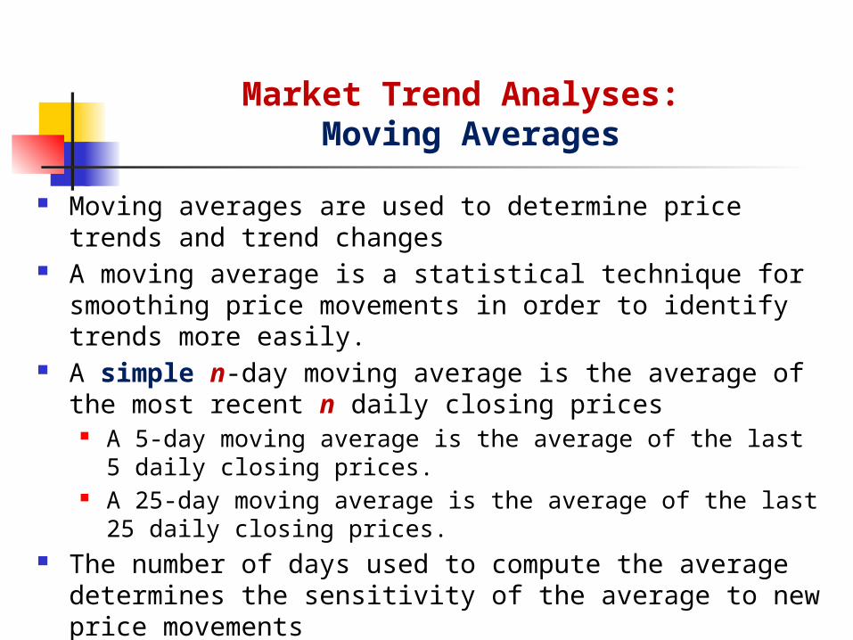
Moving averages are used to determine price trends and trend changes A moving average is a statistical technique for smoothing price
movements in order to identify trends more easily. A simple n-day moving average is the average of the most recent n
daily closing prices A 5-day moving average is the average of the last 5 daily closing prices. A 25-day moving average is the average of the last 25 daily closing prices.
The number of days used to compute the average determines the sensitivity of the average to new price movements
The more days that are used, the less sensitive is the average Weighted moving averages can also be constructed
If greater weights are given to more recent prices, the average becomes more sensitive to price change
Market Trend Analyses: Moving Averages

Market Trend Analyses: Simple Moving Averages (SMA)
Daily 5-Day 10-DayDay Close SMA SMA1 60.332 59.443 59.384 59.385 59.22 59.556 58.88 59.267 59.55 59.288 59.50 59.319 58.66 59.1610 59.05 59.13 59.3411 57.15 58.78 59.0212 57.32 58.34 58.8113 57.65 57.97 58.6414 56.14 57.46 58.3115 55.31 56.71 57.9216 55.86 56.46 57.6217 54.92 55.98 57.1618 53.74 55.19 56.5819 54.80 54.93 56.1920 54.86 54.84 55.78

Market Trend Analyses: Simple Moving Averages (SMA)
Sometimes traders use two moving averages to determine buy and sell decisions.
Using a slow moving average (more days) together with a fast moving average (fewer days) generates the following trading strategies:
Buy when the faster moving average goes above (crosses) the slower one (from below). Sell when the faster moving average goes below (crosses) the slower one (from above).
Buy when prices are above both the fast and slow moving averages. Sell when prices are below both the fast and slow moving averages.
As with most tools of technical analysis, moving averages should not be used on their own, but in conjunction with other tools that complement them. Using moving averages to confirm other indicators and analysis can greatly enhance technical analysis.
Market Trend Analyses: Moving Averages: Trading strategy

Rate of change indicators, such as momentum and oscillator indices, are used as leading indicators of price changes.
Rate of Change (ROC):
Momentum and Oscillator are based on price changes rather than price levels, and are used to determine when a price trend is weakening or strengthening, or losing or gaining momentum.
Momentum Index: A momentum index measures the acceleration or deceleration of a price advance or decline by using absolute price movements over a fixed time interval.
Oscillator Index: An oscillator index is a normalized form of a momentum index.
Market Trend Analyses: Rate of Change Indicators: Momentum and Oscillator
100'
agoperiodsnChange
agoperiodsnChangechangesTodayROC
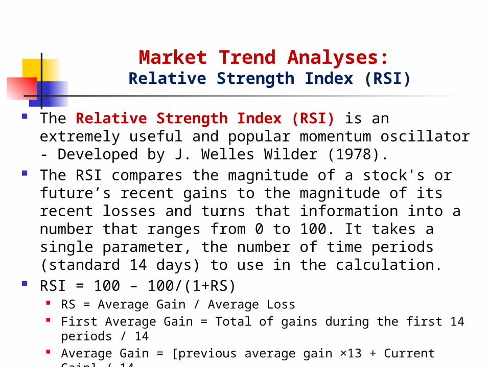
The Relative Strength Index (RSI) is an extremely useful and popular momentum oscillator - Developed by J. Welles Wilder (1978).
The RSI compares the magnitude of a stock's or future’s recent gains to the magnitude of its recent losses and turns that information into a number that ranges from 0 to 100. It takes a single parameter, the number of time periods (standard 14 days) to use in the calculation.
RSI = 100 – 100/(1+RS) RS = Average Gain / Average Loss First Average Gain = Total of gains during the first 14 periods / 14 Average Gain = [previous average gain ×13 + Current Gain] / 14 First Average Loss = Total of losses during the first 14 periods / 14 Average Loss = [previous average loss ×13 + Current Loss] / 14 Losses are also reported as positive values
Market Trend Analyses: Relative Strength Index (RSI)
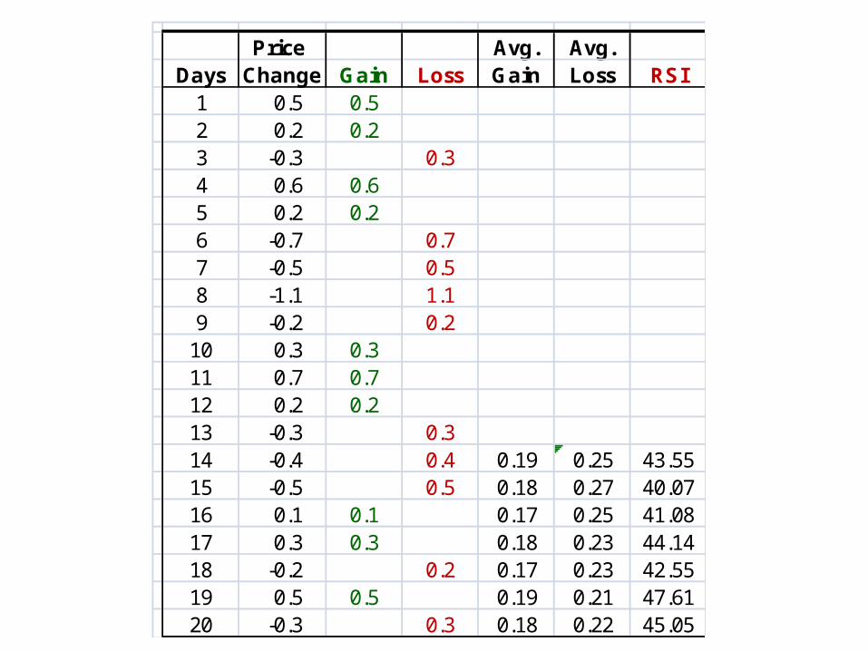
Price Avg. Avg.Days Change Gain Loss Gain Loss RSI1 0.5 0.52 0.2 0.23 -0.3 0.34 0.6 0.65 0.2 0.26 -0.7 0.77 -0.5 0.58 -1.1 1.19 -0.2 0.210 0.3 0.311 0.7 0.712 0.2 0.213 -0.3 0.314 -0.4 0.4 0.19 0.25 43.5515 -0.5 0.5 0.18 0.27 40.0716 0.1 0.1 0.17 0.25 41.0817 0.3 0.3 0.18 0.23 44.1418 -0.2 0.2 0.17 0.23 42.5519 0.5 0.5 0.19 0.21 47.6120 -0.3 0.3 0.18 0.22 45.05
Wilder recommended using 70 and 30 as overbought and oversold levels respectively.
RSI ≥ 70 => Market is overbought – Don’t buy (long) RSI ≤ 30 => Market is oversold – Don’t sell (short)
Generally, if the RSI rises above 30 it is considered bullish for the underlying stock. Conversely, if the RSI falls below 70, it is a bearish signal.
The centerline for RSI is 50. A reading above 50 indicates that average gains are higher than average losses and a reading below 50 indicates that losses are winning the battle.
Some traders look for a move above 50 to confirm bullish signals or a move below 50 to confirm bearish signals.
Market Trend Analyses: Relative Strength Index (RSI)

Market Trend Analyses: Relative Strength Index (RSI)

Technical analysts believe that volume and open interest provide information about whether a price move is strong or weak.
If prices are rising and open interest and volume are increasing – new money is thought to be flowing in the market, reflecting aggressive new buying – Bullish
If prices are rising but volume and open interest are declining – the rally is thought to be caused primarily by short covering – money is leaving rather than entering the market – the uptrend will probably end once the short covering is complete – Bearish.
If prices are falling but volume and open interest are rising – new money is thought to be flowing in the market – reflecting aggressive new short selling – the downtrend will probably continue – Bearish
If prices are falling and volume and open interest are declining – the price decline is considered to be the result of losing longs liquidating their positions - weak downtrend – the downtrend will probably end soon – Bullish
Market Trend Analyses: Volume and Open Interest