liiar analysis for fc,cp and dps
TRANSCRIPT
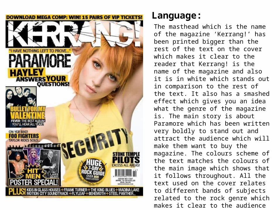
Language:The masthead which is the name of the magazine ‘Kerrang!’ has been printed bigger than the rest of the text on the cover which makes it clear to the reader that Kerrang! is the name of the magazine and also it is in white which stands out in comparison to the rest of the text. It also has a smashed effect which gives you an idea what the genre of the magazine is. The main story is about Paramore which has been written very boldly to stand out and attract the audience which will make them want to buy the magazine. The colours scheme of the text matches the colours of the main image which shows that it follows throughout. All the text used on the cover relates to different bands of subjects related to the rock genre which makes it clear to the audience that Kerrang! is a rock magazine before they even open it to read. The barcode has been printed in small at the bottom right corner so it doesn’t distract the whole front cover. The barcode also includes the price and the date of the issue which keeps it all together and easier to identify.
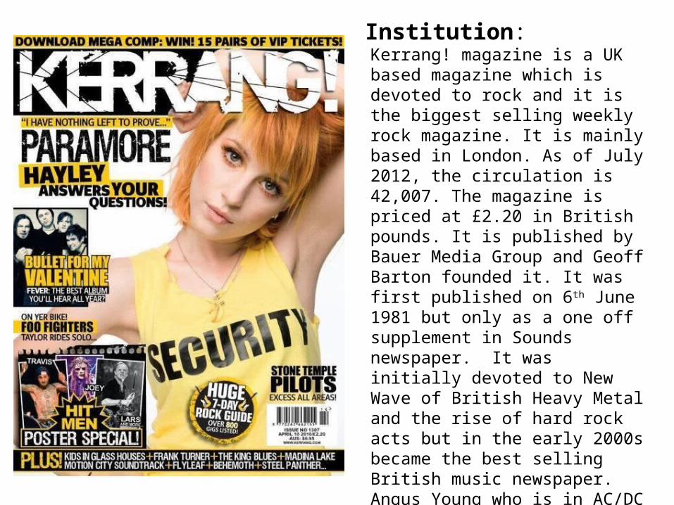
Institution:Kerrang! magazine is a UK based magazine which is devoted to rock and it is the biggest selling weekly rock magazine. It is mainly based in London. As of July 2012, the circulation is 42,007. The magazine is priced at £2.20 in British pounds. It is published by Bauer Media Group and Geoff Barton founded it. It was first published on 6th June 1981 but only as a one off supplement in Sounds newspaper. It was initially devoted to New Wave of British Heavy Metal and the rise of hard rock acts but in the early 2000s became the best selling British music newspaper. Angus Young who is in AC/DC appeared on their first cover and it first launched as a monthly magazine and in 1987 went to a weekly magazine. Kerrang! has many other things such as their own awards, radio, TV, tour, and an official rock chart.
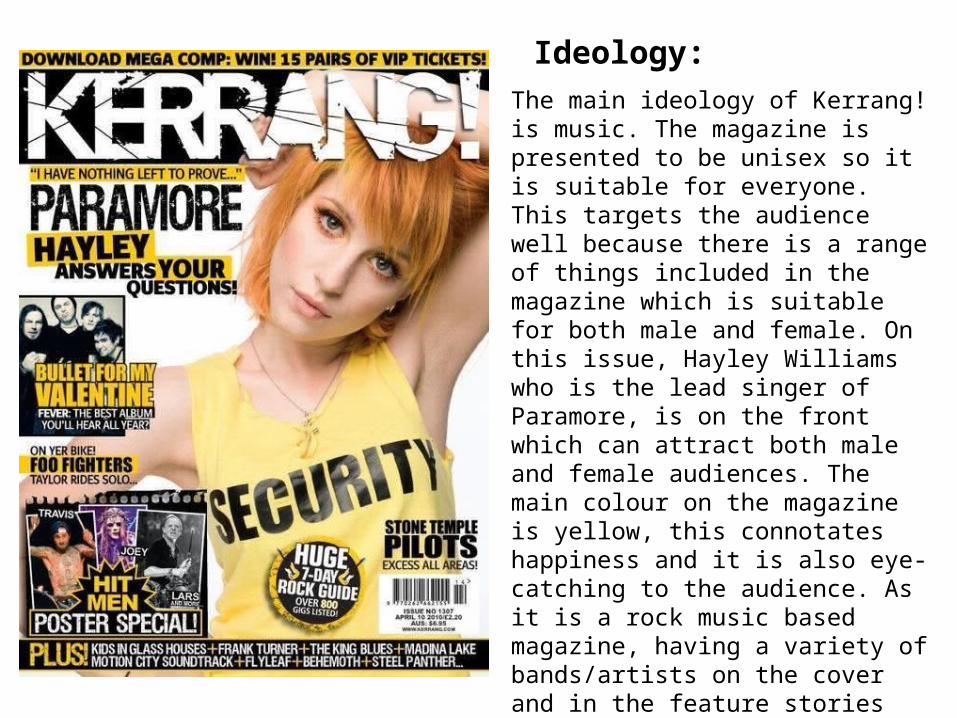
Ideology:The main ideology of Kerrang! is music. The magazine is presented to be unisex so it is suitable for everyone. This targets the audience well because there is a range of things included in the magazine which is suitable for both male and female. On this issue, Hayley Williams who is the lead singer of Paramore, is on the front which can attract both male and female audiences. The main colour on the magazine is yellow, this connotates happiness and it is also eye-catching to the audience. As it is a rock music based magazine, having a variety of bands/artists on the cover and in the feature stories shows to the reader that the magazine includes a range of different kind of bands. The bands/artists that are shown on the front are mostly well known which shows to the audience that Kerrang! is well known and it is a trustworthy source.
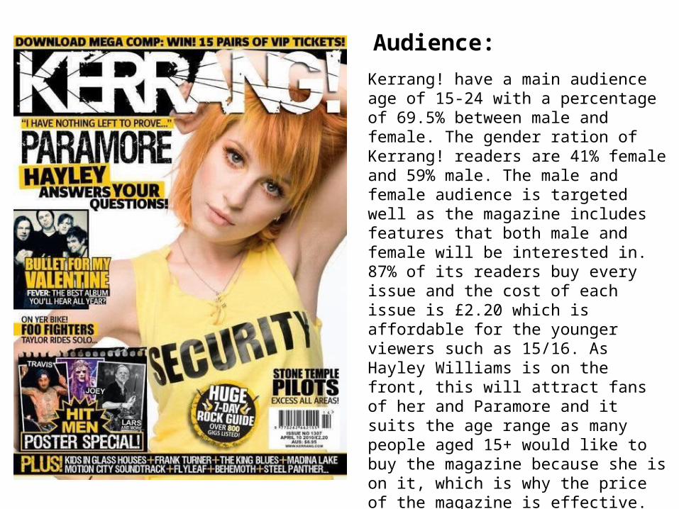
Audience:Kerrang! have a main audience age of 15-24 with a percentage of 69.5% between male and female. The gender ration of Kerrang! readers are 41% female and 59% male. The male and female audience is targeted well as the magazine includes features that both male and female will be interested in. 87% of its readers buy every issue and the cost of each issue is £2.20 which is affordable for the younger viewers such as 15/16. As Hayley Williams is on the front, this will attract fans of her and Paramore and it suits the age range as many people aged 15+ would like to buy the magazine because she is on it, which is why the price of the magazine is effective. If someone who wasn’t well known was put on the front, no one would really be interested and Kerrang! wouldn’t be very popular. Furthermore, the things advertised in the magazine are only minimum things like CD’s or band shirts or concert tickets which is suitable for students or low working class people.
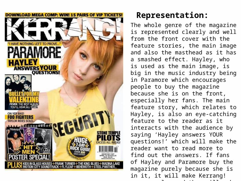
Representation:The whole genre of the magazine is represented clearly and well from the front cover with the feature stories, the main image and also the masthead as it has a smashed effect. Hayley, who is used as the main image, is big in the music industry being in Paramore which encourages people to buy the magazine because she is on the front, especially her fans. The main feature story, which relates to Hayley, is also an eye-catching feature to the reader as it interacts with the audience by saying ‘Hayley answers YOUR questions!’ which will make the reader want to read more to find out the answers. If fans of Hayley and Paramore buy the magazine purely because she is in it, it will make Kerrang! more popular and they will make more business from that. The headline also attracts the reader as it is written in bold at the top and it is a chance to win something. Also, the way the poster special part is presented will stand out which will make people want to buy it for the posters.
Language:
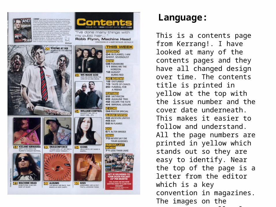
This is a contents page from Kerrang!. I have looked at many of the contents pages and they have all changed design over time. The contents title is printed in yellow at the top with the issue number and the cover date underneath. This makes it easier to follow and understand. All the page numbers are printed in yellow which stands out so they are easy to identify. Near the top of the page is a letter from the editor which is a key convention in magazines. The images on the contents page all relate to music and different bands/artists which shows that this is what the magazine will be like throughout. The layout of the contents is very organised which makes it easier to read.

Representation:The genre of the magazine is presented well within the contents page as the photos all relate to bands and artists as it is a music magazine. The page includes a range of different bands/artists which will appeal to the audience if they have different music tastes. The contents show that the magazine includes live reviews and also album reviews which shows that the magazine includes a variety of things to keep the audience interested. The way the page is set out into different sections is very organised so it is not too difficult to follow or identify if there is a mean feature the reader wants to look at. In the bottom right corner, it includes an advertisement about subscribing to the magazine to get it delivered which could also encourage the reader to buy each week so therefore Kerrang! would get more business.

Language:The text is in columns which is similar to other magazines, this makes it symmetrical to each other and makes it organised and easy to read. Also, the ‘D’ at the start of the text which is a drop cap is bigger than the rest of the text so it draws you in to the beginning of the text so you read it. In this issue, Kerrang! have used Taylor Momsen who is famous for her rock band The Pretty Reckless and the spread is about her and her music which is what the magazine is about. ‘Wild Child’ is the heading and the image which takes up one side of the page relates to that as she looks rebellious by what she is wearing.
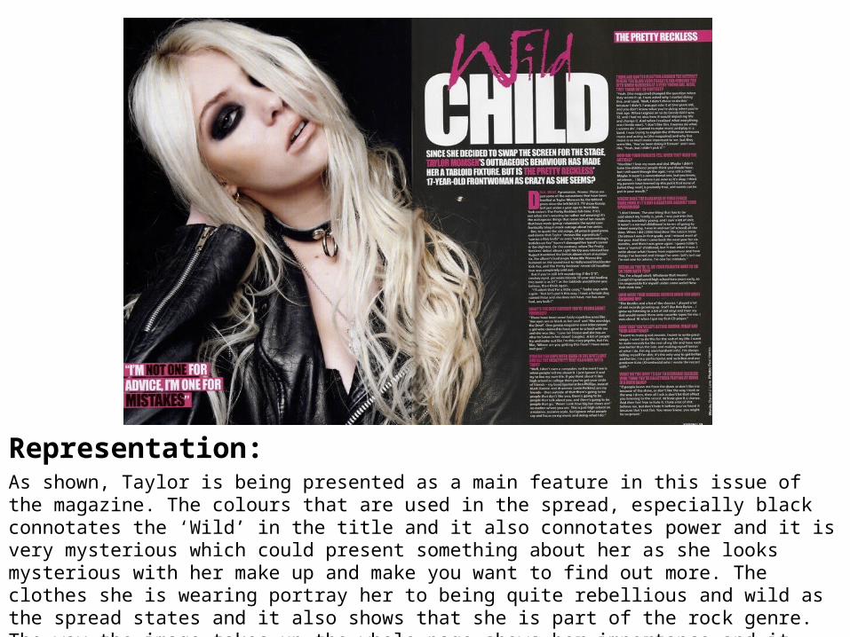
Representation:As shown, Taylor is being presented as a main feature in this issue of the magazine. The colours that are used in the spread, especially black connotates the ‘Wild’ in the title and it also connotates power and it is very mysterious which could present something about her as she looks mysterious with her make up and make you want to find out more. The clothes she is wearing portray her to being quite rebellious and wild as the spread states and it also shows that she is part of the rock genre. The way the image takes up the whole page shows her importance and it makes her stand out. Also, the way she is posed and what she is wearing relates to the whole genre of the magazine which creates and represents the ‘rock style’ image well.