m110 handout 12
DESCRIPTION
m110 Handout 12TRANSCRIPT

INTRODUCTION Why study Statistics?
Data are everywhere
o The domestic economy posted a GDP growth of 6.5 percent in the third quarter of 2010 from 0.2 percent the previous year. The honeymoon Q3 growth for President Aquino is the highest when compared with 0.4 percent for President Ramos, negative 0.7 percent for President Estrada, and 1.3 percent and 5.6 percent for the first and second terms, respectively, of President Arroyo.
o Fishermen, farmers, and children comprised the poorest three sectors in 2006 with poverty incidences of 49.9%, 44.0%, and 40.8%, respectively.
o With the government funds for infrastructure projects frontloaded in the first semester, Government Consumption Expenditure (GCE) reversed its growth by 6.1 percent from 12.1 percent
o The expenditure items that recorded higher growths compared to the previous year were: Miscellaneous expenses, 7.1 percent from 6.1 percent; Fuel, Light and Water, 8.1 percent from negative 6.3 percent; Beverages, 11.4 percent from negative 5.8 percent; Household furnishings, 9.2 percent from negative 15.3 percent; Transportation and Communication, 0.9 percent from negative 0.7 percent; and, Clothing & Footwear, 1.4 percent from 3.6 percent. (Source: http://www.nscb.gov.ph)
Statistical techniques are used to make many decisions that affect our lives o Insurance companies use statistical analysis to set rates for home, automobile, life, and health insurance. o Laguna Lake Development Authority is monitoring the water quality of Laguna Lake. They periodically take water
samples to establish the level of contamination and maintain the level of quality. o Medical researchers study the cure rates for diseases using different drugs and different forms of treatment
Knowledge of statistical methods will help you understand how decisions are made and give you a better understanding of how they affect you.
o No matter what your career is, you will make professional decisions that involve data o To make an informed decision you need to
Determine whether the existing information is adequate or additional information is required Gather additional information, if needed, in such a way that it does not provide misleading results Summarize the information is a useful and informative manner Analyze the available information Draw conclusions and make inferences while assessing the risk of an incorrect conclusion
What does statistician do?
Statistician is not just someone who calculates shooting averages at basketball games or tabulates the results of a poll. Professional statisticians are trained in statistical science. That is, they are trained in collecting numerical information in the form of data, evaluating it, and drawing conclusions from it. They also determine what information is relevant in a given problem and whether the conclusions drawn from a study are to be trusted.
Statistics is the science that deals with the collection, classification, analysis, and interpretation of information or data to make decisions, solve problems, and design products and processes
TYPES OF STATISTICS Descriptive statistics utilizes numerical and graphical methods to look for patterns in a data set, to summarize the information revealed in a data set, and to present the information in a convenient form. Inferential statistics utilizes sample data to make estimates, decisions, predictions, or other generalizations about a larger set of data or population.
population – the complete collection of individuals, items, or data under consideration in a statistical study sample – the portion of the population selected for analysis
Population Sample All registered voters A telephone survey of 600 registered voters All owners of handguns A telephone survey of 1000 handgun owners Household headed by a single parent The results from questionnaires sent to 2500 household
headed by a single parent The CEOs of all private companies The results from surveys sent to 150 CEOs of private companies All prison inmates A criminal justice study of 350 prison inmates Foreigners living in the Philippines A sociological study conducted by a university researcher of 200
foreigners in the Philippines Alzheimer patients in the Philippines A medical study of 50 such patients conducted by a university hospital Adult children of alcoholics A psychological study of 200 such individuals Variable, Observation, And Data Set A characteristic of interest concerning the individual elements of a population or a sample is called a variable. A variable is often represented by a letter such as x, y, or z. The value of a variable for one particular element from the sample or population is called an observation. A data set consists of the observations of a variable for the elements of a sample. Examples
Six hundred registered voters are polled and each one is asked if they approve or disapprove of the president’s economic policies. The variable is the registered voter’s opinion of the president’s economic policies. The data set consists of 600 observations. Each observation will be the response “approve” or the response “do not approve.’’ If the response “approve” is coded as the number 1 and the response “do not approve’’ is coded as 0, then the data set will consist of 600 observations, each one of which is either 0 or 1. If x is used to represent the variable, then x can assume two values, 0 or 1 .
A survey of 2500 households headed by a single parent is conducted and one characteristic of interest is the yearly household income. The data set consists of the 2500 yearly household incomes for the individuals in the survey. If y is used to represent the variable, then the values for y will be between the smallest and the largest yearly household incomes for the 2500 households.
The number of speeding tickets issued by 75 Nebraska state troopers for the month of June is recorded. The data set consists of 75 observations.
CLASSIFICATION OF DATA
Quantitative data are counts or measurements for which representation on a numerical scale is naturally meaningful. - Discrete - Continuous
Examples Daytime temperature readings (in degrees Fahrenheit) in a 30-day period Heights (in centimeters) of plants in a plot of land Number (0, 1, 2, or so on) of people attending a conference Distances (in miles) traveled by students commuting to school Heights (in inches) of girls in a classroom Number (0, 1, 2, or so on) of students in a classroom Number (0, 1, 2, or so on) of teachers in favor of school uniforms Ages (in months) of children in a preschool
Qualitative data consist of labels, category names, ratings, rankings, and such for which representation on a numerical scale is not naturally meaningful.
Examples Satisfaction ratings (on a scale from “not satisfied” to “very satisfied”) by users of a website Party affiliation (Liberal, Nacionalista, Pwersa ng Masang Pilipino, Lakas Kampi, Bangon Pilipinas, etc.) of voters Eye colors (blue, brown, or so on) of babies Names (first and last) of a group of students who took an exam Ten-digit Social Security numbers of a group of citizens Foremost colors (red, yellow, orange, or so on) of flowers in a garden Sex (male or female) of users of a website

Discrete data are quantitative data that are countable using a finite count, such as 0, 1, 2, and so on.
Examples Number (0, 1, 2, or so on) of people attending a conference
Number (0, 1, 2, or so on) of male children in a family Number (0, 1, 2, or so on) of students in a classroom Number (0, 1, 2, or so on) of female teachers at a school Number (0, 1, 2, or so on) of correct answers on a 20-item quiz Number (0, 1, 2, or so on) of heads in 100 tosses of a coin
Continuous data are quantitative data that can take on any value within a range of values on a numerical scale in such a way that there are no gaps, jumps, or other interruptions.
Examples Ages (in years) of participants in a survey
Heights (in inches) of plants in a plot of land Lengths (in inches) of newborn babies Distances (in miles) traveled by students commuting to school Heights (in inches) of girls in a classroom Weights (in pounds) of male police officers Daytime temperatures (in degrees Fahrenheit) over a 30-day period Lengths (in meters) of broad jumps
Recognizing quantitative data as discrete or continuous is another useful skill in statistics. Once you decide on the type of data (quantitative or qualitative) appropriate for the problem at hand, you'll need to collect the data. Generally, data can be obtained in four different ways:
Data from a published source
Data from a designed experiment
Data from a survey
Data collected observationally
Levels of Measurement
nominal scale
o the lowest level of data o applied to data that are used for category identification o characterized by data that consist of names, labels, or categories only o data cannot be arranged in an ordering scheme o arithmetic operations are not performed for nominal data
Qualitative variable Possible nominal level data values
Blood type A, B, AB, O
Province of residence Laguna, Batangas, Cavite, Rizal, Quezon
Type of crime misdemeanor, felony
Color of road signs red, white, blue, green
Religion Christian, Moslem, etc.
ordinal scale o the next higher level of data o applied to data that can be arranged in some order, but differences between data values either cannot be
determined or are meaningless o characterized by data that applies to categories that can be ranked o data can be arranged in an ordering scheme o arithmetic operations are not performed on ordinal level data

Qualitative variable Possible ordinal level data values
Product rating Poor, good, excellent
Socioeconomic class Lower, middle, upper
Pain level None, low, moderate, severe
interval scale o applied to data that can be arranged in some order and for which differences in data values are meaningful o results from counting or measuring o data can be arranged in an ordering scheme and differences can be calculated and interpreted
o the value zero is arbitrarily chosen for interval data and does not imply an absence of the characteristic being measured
o ratios are not meaningful for interval data o Example: temperature, IQ scores,
ratio scale o the highest level of measurement o applied to data that can be ranked and for which all arithmetic operations including division can be performed o results from counting or measuring o data can be arranged in an ordering scheme and differences and ratios can be calculated and interpreted o data has an absolute zero and a value of zero indicates a complete absence of the characteristic of interest o Examples: wages, units of production, weight, height, changes in stock prices, distance between branch offices,
grams of fats consumed per day, etc.
ORGANIZING DATA Raw data or ungrouped data are collected data that have not been organized numerically. FREQUENCY DISTRIBUTION FOR QUALITATIVE DATA
A frequency distribution for qualitative data lists all categories and the number of elements that belong to each of the categories. Example. A sample of city arrests gave the following set of offenses with which individuals were charged:
rape robbery burglary arson murder robbery manslaughter arson theft arson burglary theft robbery theft theft rape theft burglary murder murder theft theft theft manslaughter manslaughter
The type of offense is classified into the categories: rape, robbery, burglary, arson, murder, theft, and manslaughter. Table 1.1
The relative frequency of a category is obtained by dividing the frequency for a category by the sum of all the frequencies. The percentage for a category is obtained by multiplying the relative frequency for that category by 100.

Table 1.2
FREQUENCY DISTRIBUTION FOR QUANTITATIVE DATA
When summarizing large masses of raw data it is often useful to distribute the data into classes or categories, and to determine the number of individuals belonging to each class.
Example. The following table gives the distribution of heights in inches of 100 male students at ABC University Height (in) No. of Students 60 – 62 5 63 – 65 18 66 – 68 42 69 – 71 27 72 – 74 8
Table 1.3
Data organized and summarized as in the above frequency distribution are often called grouped data. Although the grouping process generally destroys much of the original detail of the data, an important advantage is gained in the clear "overall" picture that is obtained and in the vital relationships that are thereby made evident. Class Intervals and Class Limits
A symbol defining a class, such as 60 – 62 in the above table, is called a class interval. The end numbers, 60 and 62, are called class limits; the smaller number 60 is the lower class limit, and the larger number 62 is the upper class limit. The terms class and class interval are often used interchangeably, although the class interval is actually a symbol for the class.
A class interval that, at least theoretically, has either no upper class limit or no lower class limit indicated is called an open class interval. For example, referring to age groups of individuals, the class interval “65 years and over" is an open class interval. Class Boundaries
If heights are recorded to the nearest inch, the class interval 60-62 theoretically includes all measurements from 59.5000 to 62.5000in. These numbers, indicated briefly by the exact numbers 59.5 and 62.5, are called class boundaries, or true class limits; the smaller number 59.5 is the lower class boundary, and the larger number 62.5 is the upper class boundary.
In practice, the class boundaries are obtained by adding the upper limit of one class interval to the lower limit of the next-higher class interval and dividing by 2. Sometimes, class boundaries are used to symbolize classes. For example, the various classes in the first column of the table could be indicated by 59.5-62.5, 62.5-65.5, etc. To avoid ambiguity in using such notation, class boundaries should not coincide with actual observations. Thus if an observation were 62.5, it would not be possible to decide whether it belonged to the class interval 59.5-62.5 or 62.5- 65.5. The Size, or Width, of a Class Interval
The size, or width, of a class interval is the difference between the lower and upper class boundaries and is also referred to as the class width, class size, or class length. The Class Mark
The class mark is the midpoint of the class interval and is obtained by adding the lower and upper class limits and dividing by 2. Thus the class mark of the interval 60-62 is (60 + 62)/2 = 61. The class mark is also called the class midpoint. For purposes of

further mathematical analysis, all observations belonging to a given class interval are assumed to coincide with the class mark. Thus all heights in the class interval 60-62 in are considered to be 61 in. Class limits Class boundaries Class width Class mark 60 – 62 59.5 – 62.5 3 61 63 – 65 62.5 – 65.5 3 64 66 – 68 65.5 – 68.5 3 67 69 – 71 68.5 – 71.5 3 70 72 – 74 71.5 – 74.5 3 73 Determining the number of classes
Select the smallest positive integer k such that 2k > n where n is the number of observations. Class intervals are also
chosen so that the class marks (or midpoints) coincide with the actually observed data. This tends to lessen the so-called grouping error involved in further mathematical analysis. However, the class boundaries should not coincide with the actually observed data. Determining the class interval or width Generally, the class interval or width should be the same for all classes. The classes all taken together must cover at least
the distance from the lowest value in the raw data up to the highest value. Width is chosen such that
. In practice,
interval size is usually rounded up to some convenient number, such as multiple of 10 or 100. Unequal class intervals present problems in graphically portraying the distribution and in doing some of the computations. However, unequal intervals may be necessary in certain situations to avoid a large number of empty, or almost empty, classes. HISTOGRAMS AND FREQUENCY POLYGONS
Histograms and frequency polygons are two graphic representations of frequency distributions. A histogram or frequency histogram, consists of a set of rectangles having (a) bases on a horizontal axis (the X axis), with centers at the class marks and lengths equal to the class interval sizes, and (b) areas proportional to the class frequencies. A frequency polygon is a line graph of the class frequencies plotted against class marks. It can be obtained by connecting the midpoints of the tops of the rectangles in the histogram. The histogram and frequency polygon corresponding to the frequency distribution of heights in Table 1.3 are shown below.
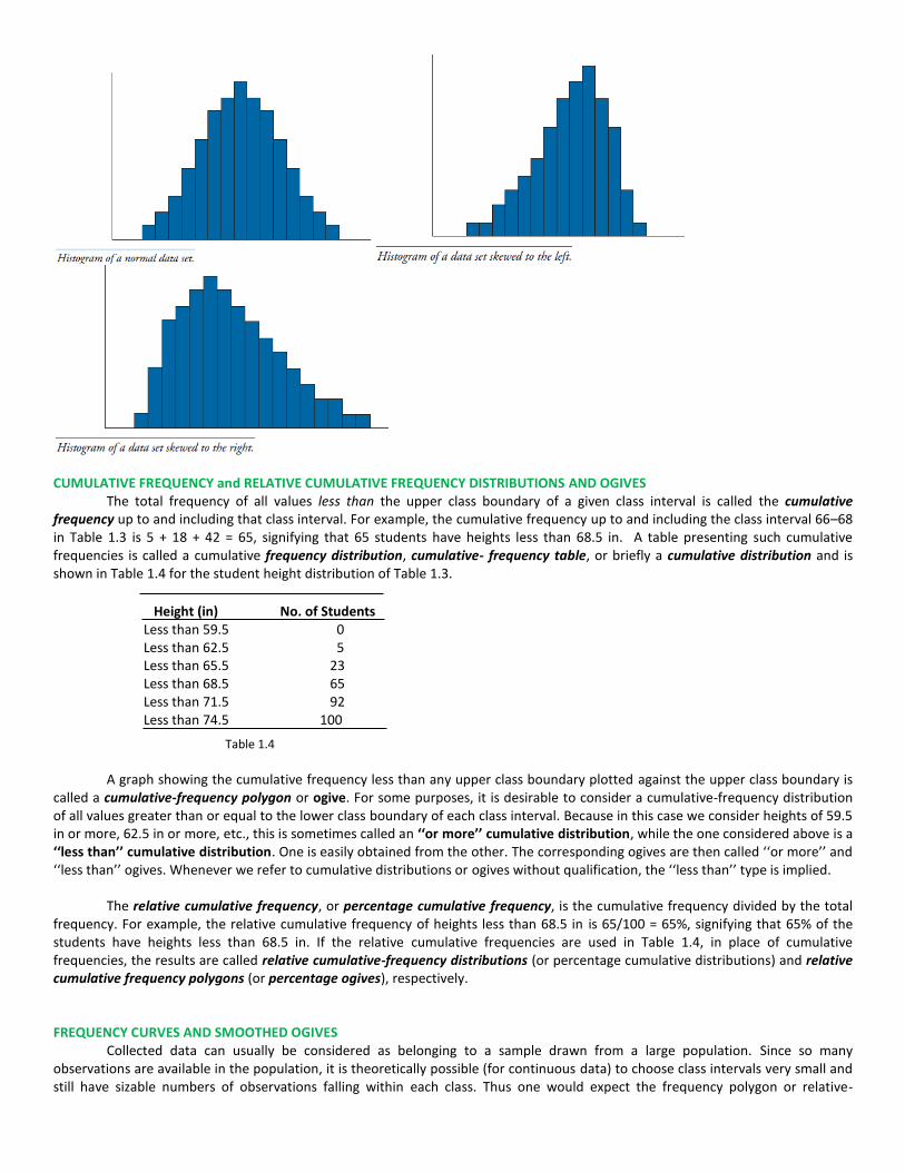
CUMULATIVE FREQUENCY and RELATIVE CUMULATIVE FREQUENCY DISTRIBUTIONS AND OGIVES
The total frequency of all values less than the upper class boundary of a given class interval is called the cumulative frequency up to and including that class interval. For example, the cumulative frequency up to and including the class interval 66–68 in Table 1.3 is 5 + 18 + 42 = 65, signifying that 65 students have heights less than 68.5 in. A table presenting such cumulative frequencies is called a cumulative frequency distribution, cumulative- frequency table, or briefly a cumulative distribution and is shown in Table 1.4 for the student height distribution of Table 1.3.
Height (in) No. of Students Less than 59.5 0 Less than 62.5 5 Less than 65.5 23 Less than 68.5 65 Less than 71.5 92 Less than 74.5 100
Table 1.4
A graph showing the cumulative frequency less than any upper class boundary plotted against the upper class boundary is
called a cumulative-frequency polygon or ogive. For some purposes, it is desirable to consider a cumulative-frequency distribution of all values greater than or equal to the lower class boundary of each class interval. Because in this case we consider heights of 59.5 in or more, 62.5 in or more, etc., this is sometimes called an ‘‘or more’’ cumulative distribution, while the one considered above is a ‘‘less than’’ cumulative distribution. One is easily obtained from the other. The corresponding ogives are then called ‘‘or more’’ and ‘‘less than’’ ogives. Whenever we refer to cumulative distributions or ogives without qualification, the ‘‘less than’’ type is implied.
The relative cumulative frequency, or percentage cumulative frequency, is the cumulative frequency divided by the total frequency. For example, the relative cumulative frequency of heights less than 68.5 in is 65/100 = 65%, signifying that 65% of the students have heights less than 68.5 in. If the relative cumulative frequencies are used in Table 1.4, in place of cumulative frequencies, the results are called relative cumulative-frequency distributions (or percentage cumulative distributions) and relative cumulative frequency polygons (or percentage ogives), respectively. FREQUENCY CURVES AND SMOOTHED OGIVES
Collected data can usually be considered as belonging to a sample drawn from a large population. Since so many observations are available in the population, it is theoretically possible (for continuous data) to choose class intervals very small and still have sizable numbers of observations falling within each class. Thus one would expect the frequency polygon or relative-

frequency polygon for a large population to have so many small, broken line segments that they closely approximate curves, which we call frequency curves or relative-frequency curves, respectively.
It is reasonable to expect that such theoretical curves can be approximated by smoothing the frequency polygons or relative-frequency polygons of the sample, the approximation improving as the sample size is increased. For this reason, a frequency curve is sometimes called a smoothed frequency polygon.
In a similar manner, smoothed ogives are obtained by smoothing the cumulative-frequency polygons, or ogives. It is usually
easier to smooth an ogive than a frequency polygon.
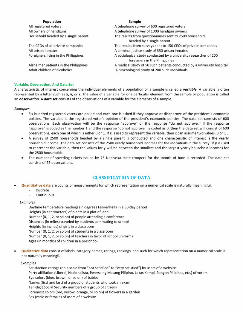
Types of Frequency Curves Frequency curves arising in practice take on certain characteristic shapes, as shown below
1. Symmetrical or bell-shaped curves are characterized by the fact that observations equidistant from the central maximum have
the same frequency. Adult male and adult female heights have bell-shaped distributions. 2. Curves that have tails to the left are said to be skewed to the left. The lifetimes of males and females are skewed to the left. A
few die early in life but most live between 60 and 80 years. Generally, females live about ten years, on the average, longer than males.
3. Curves that have tails to the right are said to be skewed to the right. The ages at the time of marriage of brides and grooms are skewed to the right. Most marry in their twenties and thirties but a few marry in their forties, fifties, sixties and seventies.
4. Curves that have approximately equal frequencies across their values are said to be uniformly distributed. Certain machines that dispense liquid colas do so uniformly between 15.9 and 16.1 ounces, for example.
5. In a J-shaped or reverse J-shaped frequency curve the maximum occurs at one end or the other. 6. A U-shaped frequency distribution curve has maxima at both ends and a minimum in between. 7. A bimodal frequency curve has two maxima. 8. A multimodal frequency curve has more than two maxima.

Examining a distribution
In any graph of data, look for the overall pattern and for striking deviations from that pattern. You can describe the overall pattern of a histogram by its shape, center, and spread. An important kind of deviation is an outlier, an individual value that falls outside the overall pattern.
Skewed distributions can show us where to concentrate our efforts.
MEASURES OF CENTRAL TENDENCY
An average is a value that is typical, or representative, of a set of data. Since such typical values tend to lie centrally within a set of data arranged according to magnitude, averages are also called measures of central tendency. The central tendency of the set of measurements is the tendency of the data to cluster, or center, about certain numerical values.
The most common types of averages are the arithmetic mean (or simply the mean), the median, and the mode. Each has advantages and disadvantages, depending on the data and the intended purpose.
MEAN, MEDIAN, AND MODE FOR UNGROUPED DATA
A data set consisting of the observations for some variable is referred to as raw data or ungrouped data. Data
presented in the form of a frequency distribution are called grouped data.
The Mean
The mean for a sample consisting of n observations is ∑
The mean for a population consisting of N observations is ∑
Example. The number of 911 emergency calls classified as domestic disturbance calls in a large metropolitan location were sampled for thirty randomly selected 24 hour periods with the following results. Find the mean number of calls per 24-hour period. 25 46 34 45 37 36 40 30 29 37 44 56 50 47 23 40 30 27 38 47 58 22 29 56 40 46 38 19 49 50
∑
Example. The total number of 911 emergency calls classified as domestic disturbance calls last year in a large metropolitan location was 14,950. Find the mean number of such calls per 24-hour period if last year was not a leap year.
∑
The Median
The median of a set of numbers arranged in increasing order is either the middle value or the arithmetic mean of the two middle values. Median splits the set of ranked data values into equal-in-numbers parts. Extreme values do not affect the median, making the median a good alternative to the mean when such values occur.

To find the median of a data set, first arrange the data in increasing order. If the number of observations is odd, the median is the number in the middle of the ordered list. If the number of observations is even, the median is the
mean of the two values closest to the middle of the ordered list. It is the (
)
th value in the ranked data set.
Examples. Find the median for each of the following data sets.
a. 25 43 40 60 12 b. –7 22 –7 8 16 1 c. 6.7 7.6 7.5 6.9 9.3 6.7 7.6 8.5
Solutions a. Arrange the numbers: 12, 25, 40, 43, 60. The median is 40, the middle number.
40, the median, is the (
)
th = (
)
th = 3rd value
b. Ranked data: –7, –7, 1, 8, 16, 22. The median is
4.5, the arithmetic average of the two middle
numbers, 1 and 8.
c. Order the numbers: 6.7, 6.7, 6.9, 7.5, 7.6, 7.6, 8.5, 9.3. The median is
7.55, the arithmetic mean of
the two middle numbers, 7.5 and 7.6.
The Mode The mode is the data value (or values) that occurs the most often. A data set in which each data value occurs the
same number of times has no mode. If only one data value occurs with the greatest frequency, the data set is unimodal; that is, it has one mode. If exactly two data values occur with the same frequency that is greater than any of the other frequencies, the data set is bimodal; that is, it has two modes. If more than two data values occur with the same frequency that is greater than any of the other frequencies, the data set is multimodal; that is, it has more than two modes.
Similar to the median, extreme values do not affect the mode; unlike the median, however, the mode can vary much more from sample to sample than the median (or mean). Examples a. The data set 25, 43, 40, 60, 12 has no mode. b. The data set –7, 22, –7, 8, 16, 1 is unimodal since it has only one mode which is –7. c. The data set 6.7, 7.6, 7.5, 6.9, 9.3, 6.7, 7.6, 8.5 is bimodal. It has two modes: 6.7 and 7.6.
For a large data set, as the number of classes is
increased (and the width of the classes is decreased), the histogram becomes a smooth curve. The smooth curve may assume shapes like that shown on the right. For a bell-shaped (symmetric) distribution, the mean, median, and mode are equal and they are located at the center of the curve. For a data set having a skewed to the right distribution, the mode is usually less than the median which is usually less than the mean. For a data set having a skewed to the left distribution, the mean is usually less than the median which is usually less than the mode.
Example. Find the mean, median, and mode for the following three data sets and confirm the relationships of the mean, median, and mode for different distributions. Data set 1: 10, 12, 15, 15, 18, 20 Data set 2: 2,4,6, 15, 15, I8 Data set 3: 12, 15, 15, 24, 26, 28 Relative positions of mean, median, and mode for different frequency curves

The table below gives the shape of the distribution, the mean, the median, and the mode for the three data sets.
MEASURES OF DISPERSION or VARIATION
In addition to measures of central tendency, it is desirable to have numerical values to describe the spread or dispersion of a data set about an average value. Measures that describe the spread of a data set are called measures of dispersion
Various measures of this dispersion (or variation) are range, variance, standard deviation, interquartile range, and coefficient of variation. Example. Jon and Jack are two golfers who both average 85. However, Jon has shot as low as 75 and as high as 99 whereas Jack has never shot below 80 nor higher than 90. When we say that Jack is a more consistent golfer than Jon is, we mean that the spread in Jack’s scores is less than the spread in Jon’s scores. A measure of dispersion is a numerical value that illustrates the differences in the spread of their scores RANGE, VARIANCE, AND STANDARD DEVIATION FOR UNGROUPED DATA
The Range
The range of a set of numbers is the difference between the largest and smallest numbers in the set. It is clear that the range is reflective of the spread in the data set since the difference between the largest and the smallest value is directly related to the spread in the data. Example. Compare the range in golf scores for Jon and Jack in the previous example. The range for Jon is 99 – 75 = 24 and the range for Jack is 90 – 80 = 10. The spread in Jon’s scores, as measured by range, is over twice the spread in Jack’s scores. Example. Find the range for each of the following data sets.
a. 25, 43, 40, 60, 12 range = 60 – 12 = 48 b. −7, 22, −7, 8, 16, 1 range = 22 – (–7) = 29 c. 6.7, 7.6, 7.5, 6.9, 9.3, 6.7, 7.6, 8.5 range = 9.3 – 6.7 = 2.6
The variance and the standard deviation of a data set measures the spread of the data about the mean of the data set. The variance of a sample of size n is represented by s2 and is given by
The variance of a sample of size n is ∑( )
The variance of a population of size N is ∑( )
( is the lowercase sigma of the Greek alphabet)

Example. The times required in minutes for five preschoolers to complete a task were 5, 10, 15, 3, and 7. The mean time for the five preschoolers is 8 minutes. The table below illustrates the computation indicated by the sample variance formula. The first column lists the observations, x. The second column lists the deviations from the mean, . The third column lists the squares of the deviations. The sum at the bottom of the second column is called the slim of the deviations, and is always equal to zero for any data set. The sum at the bottom of the third column is referred to as the sum of the squares of the deviations. The sample variance is obtained by dividing the sum of the squares of the deviations by n – 1, or 5 – 1 = 4. The sample variance equals 88 divided by 4 which is 22 minutes squared.
The sample standard deviation is √ √∑( )
The population standard deviation is √ √∑( )
The shortcut formulas for computing sample and population standard deviations are
√∑
(∑ )
√∑
(∑ )
Example. Consider the data from the table above.
∑ = 52 + 102 + 152 + 32 + 72 = 408 smaller standard deviation
(∑ ) = (5 + 10 + 15 + 3 + 7)2 = 1600
The variance is given as follows: larger standard deviation
∑
(∑ )
22
And the standard deviation is √
Since most populations are large, the computation of is rarely performed. In practice, the population variance (or standard deviation) is usually estimated by taking a sample from the population and using s 2 as an estimate
of . The use of n – 1 rather than n in the denominator of the formula for s 2 enhances the ability of s 2 to estimate .

For data sets having a symmetric mound-shaped distribution, the standard deviation is approximately equal to one-fourth of the range of the data set. This fact can be used to estimate s for bell-shaped distributions.
MEASURES OF CENTRAL TENDENCY AND DISPERSION FOR GROUPED DATA
Statistical data are often given in grouped form, that is, in the form of a frequency distribution, and the raw data corresponding to the grouped data are not available or may be difficult to obtain. The articles that appear in newspapers and professional journals do not give the raw data, but give the results in grouped form. The table below gives the frequency distribution of the ages of 5000 shoplifters in a recent psychological study of these individuals.
The mean for grouped data is given by ∑
where = class mark, = class frequency, and ∑ .
Example. The class marks in table above are
x1 = 9.5, x2 = 19.5, x3 = 29.5, x4 = 39.5, x5 = 49.5 and the frequencies are
f1 = 750, f2 = 2005, f3 = 1950, f4 = 195, f5 = 100. The sample size n is 5000. The mean is
( ) ( ) ( ) ( ) ( )
23.3 years
The median for grouped data is found by locating the value that divides the data into two equal parts. In finding
the median for grouped data, it is assumed that the data in each class is uniformly spread across the class.
Median
where L = lower class boundary of the median class, the class containing the median n = number of items in the data (i.e., total frequency) sf = sum of frequencies of all classes lower than the median class fm = frequency of the median class c = size of the median class interval Example. The median age for the data in the above table is a value such that 2500 ages are less than the value and 2500 are greater than the value. The median age must occur in the age group 15-24, since 750 are less than 15 and 2755 are 24 years or less. The class 15-24 is called the median class since the median must fall in this class. Since 750 are less than 15 years, there must be 1750 additional ages in the class 15-24 that are less than the median. In other words, we need to go the fraction 1750/2005 across the class 15-24 to locate the median. We give the value 14.5 + (1750/2OO5) x 10 = 23.2 years as the median age. To summarize, 14.5 is the lower boundary of the median class, 1750/2005 is the fraction we must go across the median class to reach the median, and 10 is the class width for the median class.
Median
= 23.2 years

The mode for grouped data is defined to be the class mark of the modal class, the class with the maximum frequency. Example. The modal class for the distribution in the table above is the class 15-24. The mode is the class mark for this class that equals 19.5 years.
The range for grouped data is given by the difference between the upper boundary of the class having the largest values minus the lower boundary of the class having the smallest values.
Example. The upper boundary for the class 45-54 is 54.5 and the lower boundary for the class 5-14 is 4.5, and the range is 54.5 - 4.5 = 50.0 years. The variance for grouped data is given by
∑
(∑ )
and the standard deviation is given by
√ Example. In order to find the variance and standard deviation for the distribution in the table above we first evaluate
∑ and (∑ )
.
∑ = 9.52 (750) + 19.52 (2005)+ 29.52 (1950) + 39.52 (195) + 49.52 (100) = 3,076,350
(∑ )
( )
2,709,792
The variance is
73.3 and the standard deviation is √ 8.6 years.
COEFFICIENT OF VARIATION
The coefficient of variation is equal to the standard deviation divided by the mean. The result is usually
multiplied by 100 to express it as a percent.
sample coefficient of variation:
population coefficient of variation:
The coefficient of variation is a measure of relative variation. It shows variation relative to mean. Whereas, the standard deviation is a measure of absolute variation. The coefficient of variation can be used to compare two or more sets of data measured in different units. Example. A regional sampling of prices for new and used cars found that the mean price for a new car is P804,000 and the standard deviation is P65,000 and that the mean price for a used car is P219,400 with a standard deviation equal to P109,200. In terms of absolute variation, the standard deviation of price for new cars is more than twice that of used cars. However, in terms of relative variation, there is more relative variation in the price of used cars than in new cars.

Z SCORES A z score is the number of standard deviations that a given observation, x, is below or above the mean. For
Sample data, the z score is
and for population data, the z score is
z scores help you determine whether a data value is an extreme value, or outlier—that is, far from the mean. As a general rule, a z score that is less than –3 or greater than +3 indicates that the data value it represents is an extreme value.
If a data set is skewed to the right or to the left, then there is a greater chance that an outlier may be in your data set. Outliers can greatly affect the mean and standard deviation of a data set. So, if your data set is skewed, you might want to think about using different measures of central tendency and dispersion!
MEASURES OF POSITION: PERCENTILES, DECILES, AND QUARTILES
Measures of position are used to describe the location of a particular observation in relation to the rest of the data set. Percentiles are values that divide the ranked data set into 100 equal parts. The pth percentile of a data set is a value such that at least p percent of the observations take on this value or less and at least (100 - p) percent of the observations take on this value or more. Deciles are values that divide the ranked data set into 10 equal parts. Quartiles are values that divide the ranked data set into four equal parts. The table below contains the aortic diameters measured in centimeters for 45 patients. Notice that the data in the table are already ranked. Raw data need to be ranked prior to finding measures of position.
The percentile for observation x is found by dividing the number of observations less than x by the total number of observations and then multiplying this quantity by 100. This percent is then rounded to the nearest whole number to give the percentile for observation x. Example. The number of observations in the table less than 5.5 is 11 . Eleven divided by 45 is 0.244 and 0.244 multiplied by 100 is 24.4%. This percent rounds to 24%. The diameter 5.5 is the 24th percentile and we express this as P24 = 5.5. The number of observations less than 5.0 is 9. Nine divided by 45 is 0.20 and 0.20 multiplied by 100 is 20%. P20 = 5.0. The number of observations less than 10.0 is 39. Thirty-nine divided by 45 is 0.867 and 0.867 multiplied by 100 is 86.7%. ince 86.7% rounds to 87% we write P87 = 10.0. The pth percentile for a ranked data set consisting of n observations is found by a two-step procedure. The first step is to
compute index
. If is not an integer, the next integer greater than locates the position of the pth percentile in
the ranked data set. If is an integer, the pth percentile is the average of the observations in positions and in the ranked data set.

Example. To find the tenth percentile for the data above, compute = 10(45)/100 = 4.5. The next integer greater than 4.5 is 5. The observation in the fifth position in the table above is 3.6. Therefore, P10 = 3.6. Note that at least 10% of the data in the table are 3.6 or less (the actual amount is 11.1%) and at least 90% of the data are 3.6 or more (the actual amount is 91.1% ). For very large data sets, the percentage of observations equal to or less than P10 will be very close to 10% and the percentage of observations equal to or greater than P10 will be very close to 90%. Example. To find the fortieth percentile for the data in the table above, compute = 40(45)/100 = 18. The fortieth percentile is the average of the observations in the 18th and 19th positions in the ranked data set. The observation in the 18th position is 6.0 and the observation in the 19th position is 6.2. Therefore P40 = (6.0 + 6.2)/2 = 6.1. Note that 40% of the data in the table are 6.1 or less and that 60% of the observations are 6.1 or more. Deciles and quartiles are determined in the same manner as percentiles, since they may be expressed as percentiles. The deciles are represented as D1, D2, . . . , D9 and the quartiles are represented by Q1 , Q2 , and Q3. The following equalities hold for deciles and percentiles:
D1 = P10 , D2 = P20 , ..., D9 = P90 The following equalities hold for quartiles and percentiles:
Q1 = P25 , Q2 = P50 , Q3 = P75 The above definitions of percentiles, deciles, and quartiles, the following equalities also hold:
Median = P50 = D5 = Q2 INTERQUARTILE RANGE
The interquartile range, designated by IQR, is defined as IQR = Q3 – Q1. The interquartile range shows the spread of the middle 50% of the data and is not affected by extremes in the data set.
Source:
Spiegel, M.R. and L. J. Stephens. 2008. Schaum’s Outline of Theory and Problems of Statistics. McGraw-Hill