making context specific card sets - a visual methodology approach · 2016-04-26 · thus, while...
TRANSCRIPT
Making Context Specific Card Sets - A Visual Methodology Approach Capturing User Experiences with Urban Public Transportation
Alma Leora Culén Department of Informatics
Design of Information Systems University of Oslo
Oslo, Norway [email protected]
Maja van der Velden Department of Informatics
Design of Information Systems University of Oslo
Oslo, Norway [email protected]
Abstract—The paper discusses the use of visual methodologies in the sense-making phases of HCI design processes. The discussion is illustrated through development of a card set, a visual tool, to explore context specific issues related to experiences with urban public transportation. The card set was intended for an open exploration of users’ experiences during different phases of a typical commute, from preparing for traveling to arriving at the destination. The paper argues in favor of increased use of visual methodologies in HCI and presents a framework for visual methodology in the production of a card set. The framework consists of seven concepts that support visual reasoning: visual immediacy, impetus, impedance, association, abduction, blending, and analogy. Our results show that these concepts were useful for finding out what types of images were communicating precisely the intended meaning and what types inspired associations, blending, and abduction.
Keywords—visual methodologies; visual methods; card sorting; service design; experience ecologies.
I. INTRODUCTION This paper extends our previous work on making and
using cards for capturing user experiences in public transportation [1], in which we described how a card set intended to capture user experiences with urban public transportation was designed.
Card sorting is a simple and frequently used method in human-computer-interaction (HCI). There are many examples of how and when cards are used in order to provide structure and guidance to design processes, e.g., [2], [3]. While card sorting is one of the basic tools in HCI, the making of card sets for an open, or semi-open, exploration within specific contexts is less frequently discussed.
This latter point, in conjunction with increasing popularity of visual methodologies as an epistemological tool in anthropology and social science [4], inspired us to look deeper into the use of visual methodologies for making card sets.
This paper, then, extends the previous work by focusing on concerns of methodology: 1) how to design a context-specific, card set usable in start phases of participatory design processes, i.e., for group-based sense-making based
on open or semi-open sorting; 2) how to make use of visual methodology in the process of the card making; and 3) what are useful concepts that support the use of visual methodologies for card sorting.
The paper is structured as follows. In Section II, we provide some background on card-based tools and their use in HCI. In Section III, we discuss visual methodologies and visual reasoning, introducing the framework consisting of seven concepts that support visual reasoning. In Section IV, we discuss the service experience design, which is the context for our specific case of card set development. Section V shows how we developed the cards for use in participatory, context-driven workshops exploring user experiences in public transportation. In Section VI, our findings are presented and discussed. Section VII concludes the paper and addresses future work.
II. THE USE OF CARDS IN HCI Card sorting is a knowledge elicitation method, initially
used to find appropriate categories in the design for the web [5]. The cards typically represented menu entries and hyperlinks, and users were asked to sort them into meaningful categories. The cards could be produced manually, or automatically using software such as that in [6].
Wölfel and Merritt provide a survey of often used card-based design tools [7]. They analyzed their use and found five categories that highlight differences among the attributes of the various tools. The categories included the intended purpose and scope for the tool, duration of use and placement in the design process, methodology of use, customization, and formal qualities. Furthermore, the tools were classified as generic, customizable, or context specific. The purpose of the cards may vary from explorative, inspirational purposes challenging designers to think in another way, to an inquiry into a very specific use context. They may be utilized in any phase of the design process, for quick insights or deeper context inquiries through, for example, workshops. The use methodology has to do with how the cards are used and results analyzed. ‘Open sort’ does not impose any rules while the ‘closed sort’ uses pre-determined categories. There is also an in-between variant,
semi-open sorting, where some suggestions on how the cards are to be used are given. Furthermore, the cards may not allow any customization, allow optional, or require full customization in order to be useful. The latter is often the case when working in a specific context, such as the service experience design for a particular type of service.
The last category, formal qualities of cards, enables researchers or designers to determine the aesthetics (colors, moods etc.), visual appearance of cards (type of representation featured on the card, such as images, graphs, text), and physical qualities (e.g., size, material, and texture). In addition, formal qualities also encompass concerns related to how many cards one should have, if there should be multiple cards, or multiple sets of cards, different categories of cards, and so on.
We have used many card sets in own work, in diverse design settings and purposes, such as future workshops, explorative workshops [8], interviews [9], etc. IDEO [10], PLEX [11] and Design with Intent [12] cards were among favorites, in particular, for reminding users of diverse design and evaluation methods. For this research, though, AT-ONE service design cards [13] were particularly inspiring.
In addition to card-based tools, there are good resources explaining how to use the cards. For instance, Spencer [14] shows how to plan and run a card sort, analyze the results, and apply the outcomes to various projects. The book has also a chapter dedicated to making of cards. However, the approach presented is different from the one we present in this paper.
The purpose of the cards made through this research is to inspire, re-imagine and inquire into experiences within the context of urban public transportation. The cards needed to be made in a way that best facilitates the inquiry. But it is the method of making them that is the main outcome of the research. Thus, visual reasoning and visual methodologies were seen as helpful to the endeavor.
In the next section, we provide a short background on visual methodologies and what makes them now into accepted research methodology.
III. VISUAL METHODOLOGY Visual methodologies are becoming more acceptable,
and central, in research within social sciences and humanities. Several books on visual methodologies, such as those by Rose and Pink [15]–[17], were recently published. They advocate the need for better understanding and further development of visual methodologies and consider the research within the field as “an area of academic and applied research that demonstrates particularly powerfully that the relationship between theory, technology and method should not be separated” [16, p. 3].
The link between the technology and visual methods has become highly relevant with the widespread use of mobile phone cameras that enable easy production of large amounts of visual material on one hand, and general availability of technological platforms that support search, manipulation, design, and analysis of visual contents on the other hand. Researchers, thus, have powerful tools at their fingertips that enable them to make sophisticated decisions based on
visual materials. These, in turn, support the emergence of new theories on how the new knowledge emerges when using visual tools and materials.
A. Visual methodologies, methods, and HCI Methodology is concerned with comprehending how
research is done and how chosen ways of doing it (methods, tools and techniques) lead to knowledge production. Methodology is also concerned with how the environment in which it is applied supports knowledge generation processes. According to Rose [17], visual material is always embedded in the social world and can only be understood when that embedding is taken into account. In HCI, technology becomes part of this relation, leading to both social and technological embedding.
In HCI, images, video, sketching, drawing, paper prototyping, and card sorting have long been used as visual methods, tools or techniques, e.g., participatory video [18], card sorting [2], Photovoice [19], collaborative drawing [20], photo-documenting and visual ethnography [21], [22]. However, a Google Scholar search with keywords “visual methodology” (ies) AND HCI doesn’t give many relevant results, indicating that, perhaps, there is room within HCI to discuss visual methodologies, both from a theoretical and a practice perspective.
Thus, while visual methods are widely used, visual methodologies are not widely discussed. The two terms, method and methodology, are often, inaccurately, taken to mean the same thing. For example, the card sorting is a visual method for achieving some pre-set goal. Visual methodology has to do with principles that guide research practices, how the research with card sorting is, or could be done. It is concerned with questions such as how are images that are used on cards made, understood and interpreted, how are cards put in use, and how one generates knowledge through their use.
In line with Pink [16], we consider visual materials to be part of the knowledge-producing processes in HCI, in which methods that inform the process, tools, people that created the visual material, technology that supports its use, and research aims cannot be separated. This stance is also in accord with theoretical shifts within HCI, towards more qualitative research including phenomenology, senses, ecologies, experiences, and practices [23], [24].
B. Visual reasoning It is often said that images (and other types of visual-
spatial materials) augment cognition [25]. In [26], Hegarty provides arguments from cognitive science as to why this is so: 1) images are external representations, freeing the working memory for other aspects of thinking; 2) grouping related information is a natural property of perceptual organization, often reflecting Gestalt principles; 3) allows for the offloading of cognitive processes onto perceptual processes; and 4) with interactivity, people can offload internal mental computations on external manipulations of images.
In proposing a visual methodology for making card sets for inquiry into specific contexts, we propose a framework
consisting of seven concepts that support visual reasoning. These seven concepts are immediacy, impetus, impedance, association, blending, analogy and abduction. They all support visual reasoning and augment cognition utilizing one or a combination of arguments presented above. We now provide definitions and use examples.
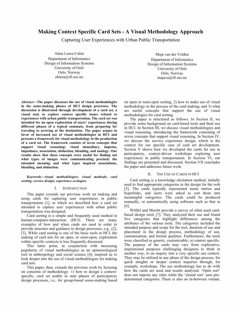
In [27], we discussed the role of information visibility in public transportation ticket systems. By contrasting the visibility of the ticket information of paper tickets and smart card tickets, we found that what people really appreciated about paper tickets was the availability of ticket information ‘at a glance’, i.e., the paper ticket had visual immediacy. What they liked the least regarding smart cards was the lack of such information. Much of our design efforts consequently focused on how to design for visual immediacy in the smart card based transport system. Diverse issues related to visibility of ticket information were considered, and diverse solutions proposed. An augmented reality application for a smart phone was prototyped, with which one could see all the information stored on the smart card ‘at a glance’, just like on the paper ticket, see Fig. 1.
Figure 1. Giving visual immediacy property to smart tickets using an app.
A language that effectively supports visual reasoning is still not sufficiently developed [28], [29]. Even common agreement on a vocabulary of concepts that are relevant for visual thinking and reasoning is lacking. An initial vocabulary for talking about visual reasoning was offered in [30]. It included concepts such as visual immediacy, impetus, impedance, and blending, analogies and associations. Visual immediacy, unlike the much discussed concept of affordance [31]–[33], facilitates reasoning and does not necessarily call for action other than the reasoning itself. Impetus nudges action and impedance, in line with affordance, is responsible for instinctual negative response to visual input. In [34], these concepts were applied to web design. A website that, at a glance, enables a user to understand what the site is about and how to navigate it has visual immediacy. It has impetus if it nudges a user to engage with the site, and impedance if there are hindrances to engagement. These three design characteristics may also be used in a wide variety of sense-making situations in HCI.
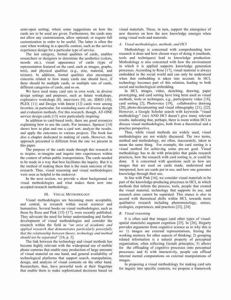
Association can be defined as “the representation of a familiar system by means of visual attributes corresponding to a different system, in order to make the user associate the two systems” [35]. This is different from visual analogy, which is defined as “the representation of a new system by means of visual attributes corresponding to a similar system, familiar to the user [35]. Abduction refers to a reasoning process in which a pre-condition is inferred from a consequence, but the pre-condition is not necessarily the only one or the right one. Lastly, blending is about blending two dissimilar concepts. These concepts are perhaps easier explained using images from Absolute advertising campaigns [36], see Fig. 2.
Figure 2. Absolute Vodka ads make great use of visual association,
analogy, abduction and blending.
IV. THE ECOLOGY OF EXPERIENCE Service Design (SD) is a multidisciplinary field that
gained momentum with the introduction of design thinking [37]–[40], where visual thinking is an important attribute of design thinking processes [41]. Service design draws often on methods familiar to HCI researchers, such as card sorting, scenarios, role-playing, personas, focus groups and observations.
The term customer experience design in SD is understood as a holistic concept, which integrates all aspects of a service. In other words, design for good customer experience implies good service design using user-centered design methods. The service may include several providers, but is considered as one service as long as customers experiences the service as one [42].
Service Design may also be defined in terms of experiences as a “design for experiences that happen over time, and across different touch points”, a definition given by Clathworthy [43]. A touch point is one of the central concepts in SD, together with customer journeys, touch points, ecology of experiences, and service design cards. We now define these concepts.
A. Customer Journeys Customer journey is one of the most effective visual tools
in service design. It is similar to storyboards and use cases in HCI, helping to visualize a service in an organization or a company. In [44], Koivisto explains customer journeys as follows: “Services are processes that happen over time, and this process includes several service moments. When all service moments are connected, the customer journey is formed. The customer journey is formed both by the service
provider’s explicit action as well as by the customer’s choices”.
We consider customer journeys to be formed not only by service moments, but also include all the experiences within and between those moments and user’s responses to those experiences.
B. Touch Points A customer journey is comprised of touch points, the
service moments as described by Koivisto [44], or nodes in a visual, graphical representation of a journey. A touch point forms a link between the provider and a customer, and as such is the origin of customer experiences with the service in question. Touch points form one of the three pillars of service design [44, p. 142].
While touch points are a fundamental part of service design and a starting point in re-design of services, we consider the intervals between them to be important for user experience design.
C. Ecology of experiences An approach to understanding experiences may be that
of Nardi and O’Day [45], who use the term ‘information ecology’ to describe an interrelated system of people, practices, values, and technologies within a particular local environment. This ecology approach, applied to service ecology [46], and the framework for studying user experiences while interacting with technology developed by Forlizzi and Battarbee [47], shaped our theoretical perspective. “Experiences and emotions are not singular events that unfold without a relationship to other experiences and emotions”, [47].
Building forth on these understandings, we define ecology of experiences as an interrelated, scalable set of experiences along a particular customer journey. In this paper, the context for creating customer journeys is that of travelling with public transportation.
D. Service Design Cards A tool to address the touch points in the initial stages of
service development is a set of service design cards, see [43]. Clathworthy provides six different use contexts for his all-purpose card set and evaluates the cards based on their intended function. The cards were found to be helpful in team-building activities in cross-functional teams. Further, they were found to be helpful in assisting with the analysis and mapping of existing situations, generating ideas for new solutions or approaches, needs elicitation and facilitation of communication.
V. DEVELOPMENT OF THE TRAVEL EXPERIENCE CARDS Tangible objects, such as cards, and the images depicted
on them, are known to facilitate visual reasoning and help with finding a common language for communication among people with diverse backgrounds [2], [14]. The common understandings are built through negotiation and discussion of associations and concepts related to images.
The Service Design AT-ONE cards described earlier, [43], provided the initial inspiration for the Travel
Experience Cards (TEC). In this section we will describe the design of the TEC card set for working with experiences in public transportation, and some of the ways in which the card set can be used.
A. Making the TEC Card Set We used participatory observation and photographic
documentation [48] to record our own and other travellers’ experiences, collecting a large number of relevant photographic images, representing touch points and experiences while commuting, using public transportation.
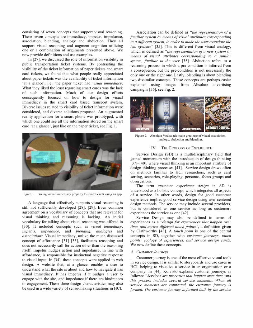
All users of urban public transportation plan their trips in some way. Perhaps the starting touch point for a commute is a smart phone app, or a web-based service. The next touch point may be purchasing the ticket on the smart phone, or on the machine at the station. Digital boards may show information on trains or other means of transportation. Whatever the touch points on a particular trip are, they are part of some phase of the commute, as shown in Fig. 3. These phases are: planning the trip, making sure one has a valid ticket, arriving to a stop, embarking, traveling (this can be interrupted by, for example an accident, a ticket control, or other forms of disruption), disembarking, perhaps repeating some of the steps if transfer was needed, arriving to a final station and arriving to a final destination.
The images for the cards in Fig. 3 were not home-made, rather they were found on the net, intentionally different in style than the images we collected. A purple colored stripe was used to further differentiate these cards and formed the background to the description on the card.
Figure 3. Cards with a purple stripe represent phases of a typical trip from
one destination to another.
The images collected as representations of touch points and user experiences in public transportation were then sorted into pre-determined categories corresponding to the phases of a typical commute. We initially had too many cards in each category and those images were selected that best represented the user experience. As most cards used in card sorting, ours consisted of the image and the text. Inspired by the Absolut concept [36] of using two words, our text was just one or two words long. The words were chosen for each image and typed on a red background. The
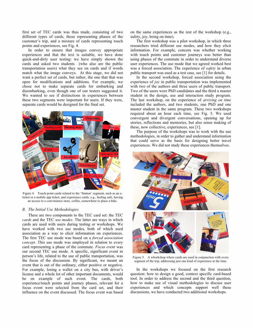
first set of TEC cards was thus made, consisting of two different types of cards, those representing phases of the customer’s trip, and a mixture of cards representing touch points and experiences, see Fig. 4.
In order to ensure that images convey appropriate experiences and that the text is suitable, we have done quick-and-dirty user testing: we have simply shown the cards and asked two students (who also are the public transportation users) what they see on cards and if words match what the image conveys. At this stage, we did not want a perfect set of cards, but rather, the one that that was open for modifications and additions. For example, we chose not to make separate cards for embarking and disembarking, even though one of our testers suggested it. We wanted to see if distinctions in experiences between these two segments were important for users. If they were, separate cards would be designed for the final set.
Figure 4. Touch point cards related to the ‘Station’ segment, such as an e-ticket or a mobile app ticket, and experience cards, e.g., feeling safe, having
an access to a convinience store, coffee, somewhere to place a bike.
B. The Initial Use Methodologies There are two components to the TEC card set: the TEC
cards and the TEC use modes. The latter are ways in which cards are used with users during testing or workshops. We have worked with two use modes, both of which used association as a way to elicit information on experiences. The first TEC use mode was based on a forced association concept. This use mode was employed in relation to every card representing a phase of the commute. Focus event was our second TEC use mode. A specific, significant event in person’s life, related to the use of public transportation, was the focus of the discussion. By significant, we meant an event that is out of the ordinary, either positive or negative. For example, losing a wallet on a city bus, with driver’s license and a whole lot of other important documents, would be en example of such event. The cards, both experience/touch points and journey phases, relevant for a focus event were selected from the card set, and their influence on the event discussed. The focus event was based
on the same experiences as the rest of the workshop (e.g., safety, joy, being on time).
The first workshop was a pilot workshop, in which three researchers tried different use modes, and how they elicit information. For example, concern was whether working with touch points and customer journeys was better than using phases of the commute in order to understand diverse user experiences. The use mode that we agreed worked best was a forced association. The experience of safety in urban public transport was used as a test case, see [1] for details.
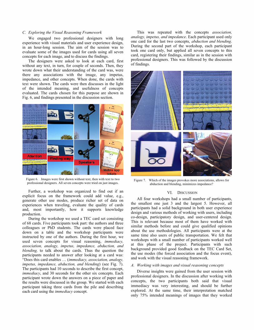
In the second workshop, forced association using the experience of joy in public transportation was implemented with two of the authors and three users of public transport. Two of the users were PhD candidates and the third a master student in the design, use and interaction study program. The last workshop, on the experience of arriving on time included the authors, and two students, one PhD and one master student in the same program. These two workshops required about an hour each time, see Fig. 5. We used convergent and divergent conversations, opening up for stories, reflections and memories, but also sense making of these, now collective, experiences, see [1].
The purpose of the workshops was to work with the use methodologies, in order to gather and understand information that could serve as the basis for designing better travel experiences. We did not study these experiences themselves.
Figure 5. A whorkshop where cards are used in conjunction with every segment of the trip, addressing just one kind of experience at the time.
In the workshops we focused on the first research question: how to design a good, context specific card-based tool. In order to address the second and the third question, how to make use of visual methodologies to discuss user experiences and which concepts support well these discussions, we have conducted two additional workshops.
C. Exploring the Visual Reasoning Framework We engaged two professional designers with long
experience with visual materials and user experience design, in an hour-long session. The aim of the session was to evaluate some of the images used for cards using all seven concepts for each image, and to discuss the findings.
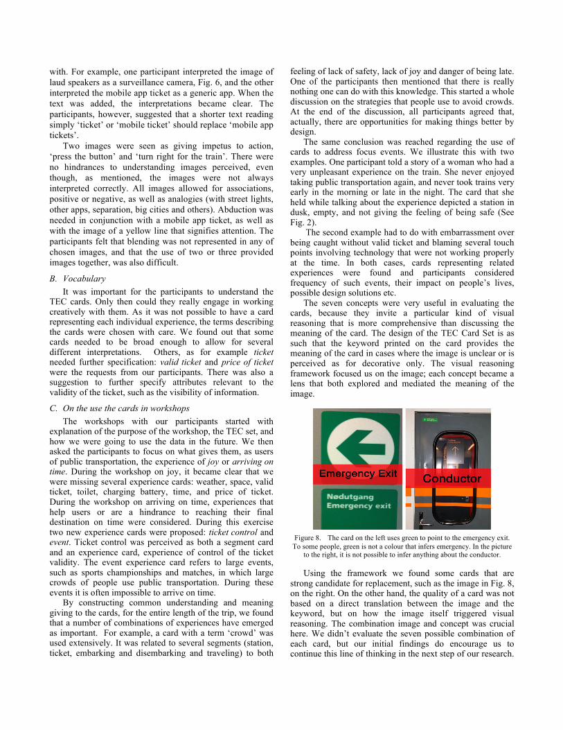
The designers were asked to look at each card, first without any text, in turn, for couple of seconds. Then, they wrote down what their understanding of the card was, were there any associations with the image, any impetus, impedance, and other concepts. When done, the cards with text were shown. The cards were then discusses in the light of the intended meaning, and usefulness of concepts evaluated. The cards chosen for this purpose are shown in Fig. 6, and findings presented in the discussion section.
Figure 6. Images were first shown without text, then with text to two professional designers. All seven concepts were tried on just images.
Further, a workshop was organized to find out if an explicit focus on the framework could add value, e.g., generate other use modes, produce richer set of data on experiences when traveling, evaluate the quality of cards and, most importantly, how it supports knowledge production.
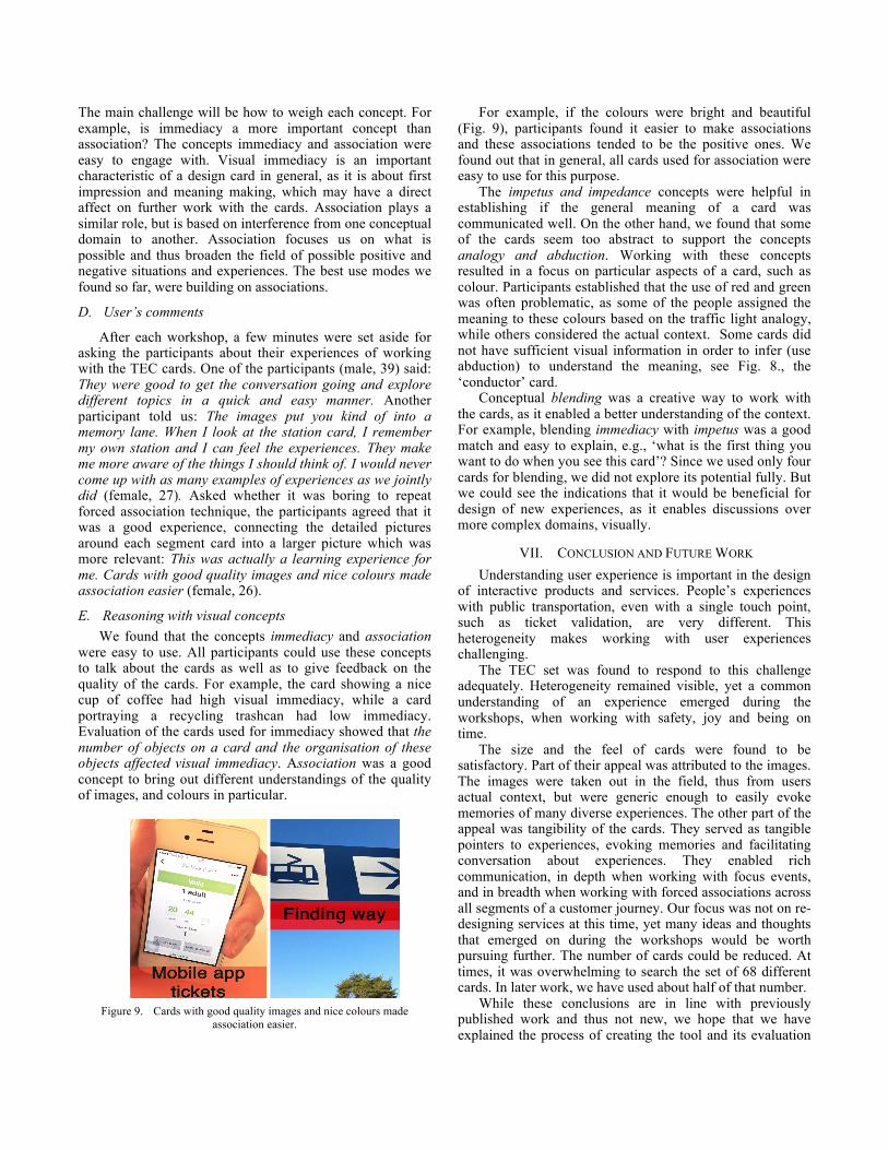
During the workshop we used a TEC card set consisting of 68 cards. Five participants took part: the authors and three colleagues or PhD students. The cards were placed face down on a table and the workshop participants were instructed by one of the authors. During the first hour, we used seven concepts for visual reasoning, immediacy, association, analogy, impetus, impedance, abduction, and blending, to talk about the cards. Thus the question the participants needed to answer after looking at a card was: “Does this card enables … (immediacy, association, analogy, impetus, impedance, abduction, and blending) (see Fig. 7). The participants had 10 seconds to describe the first concept, immediacy, and 30 seconds for the other six concepts. Each participant wrote down the answers on a piece of paper and the results were discussed in the group. We started with each participant taking three cards from the pile and describing each card using the immediacy concept.
This was repeated with the concepts association, analogy, impetus, and impedance. Each participant used only one card for the last two concepts, abduction and blending. During the second part of the workshop, each participant took one card only, but applied all seven concepts to this card, registering their findings, similar as in the session with professional designers. This was followed by the discussion of findings.
Figure 7. Which of the images provokes more associations, allows for
abduction and blending, minimizes impedance?
VI. DISCUSSION All four workshops had a small number of participants,
the smallest one just 3 and the largest 5. However, all participants had a solid background in both user experience design and various methods of working with users, including co-design, participatory design, and user-centered design. This is relevant because most of them have worked with similar methods before and could give qualified opinions about the use methodologies. All participants were at the same time also users of public transportation. We felt that workshops with a small number of participants worked well at this phase of the project. Participants with such background provided good feedback on the TEC Card Set, the use modes (the forced association and the focus event), and work with the visual reasoning framework.
A. Working with images and visual reasoning concepts Diverse insights were gained from the user session with
professional designers. In the discussion after working with concepts, the two participants both said that visual immediacy was very interesting, and should be further explored. At the same time, their interpretation matched only 75% intended meanings of images that they worked
with. For example, one participant interpreted the image of laud speakers as a surveillance camera, Fig. 6, and the other interpreted the mobile app ticket as a generic app. When the text was added, the interpretations became clear. The participants, however, suggested that a shorter text reading simply ‘ticket’ or ‘mobile ticket’ should replace ‘mobile app tickets’.
Two images were seen as giving impetus to action, ‘press the button’ and ‘turn right for the train’. There were no hindrances to understanding images perceived, even though, as mentioned, the images were not always interpreted correctly. All images allowed for associations, positive or negative, as well as analogies (with street lights, other apps, separation, big cities and others). Abduction was needed in conjunction with a mobile app ticket, as well as with the image of a yellow line that signifies attention. The participants felt that blending was not represented in any of chosen images, and that the use of two or three provided images together, was also difficult.
B. Vocabulary It was important for the participants to understand the
TEC cards. Only then could they really engage in working creatively with them. As it was not possible to have a card representing each individual experience, the terms describing the cards were chosen with care. We found out that some cards needed to be broad enough to allow for several different interpretations. Others, as for example ticket needed further specification: valid ticket and price of ticket were the requests from our participants. There was also a suggestion to further specify attributes relevant to the validity of the ticket, such as the visibility of information.
C. On the use the cards in workshops The workshops with our participants started with
explanation of the purpose of the workshop, the TEC set, and how we were going to use the data in the future. We then asked the participants to focus on what gives them, as users of public transportation, the experience of joy or arriving on time. During the workshop on joy, it became clear that we were missing several experience cards: weather, space, valid ticket, toilet, charging battery, time, and price of ticket. During the workshop on arriving on time, experiences that help users or are a hindrance to reaching their final destination on time were considered. During this exercise two new experience cards were proposed: ticket control and event. Ticket control was perceived as both a segment card and an experience card, experience of control of the ticket validity. The event experience card refers to large events, such as sports championships and matches, in which large crowds of people use public transportation. During these events it is often impossible to arrive on time.
By constructing common understanding and meaning giving to the cards, for the entire length of the trip, we found that a number of combinations of experiences have emerged as important. For example, a card with a term ‘crowd’ was used extensively. It was related to several segments (station, ticket, embarking and disembarking and traveling) to both
feeling of lack of safety, lack of joy and danger of being late. One of the participants then mentioned that there is really nothing one can do with this knowledge. This started a whole discussion on the strategies that people use to avoid crowds. At the end of the discussion, all participants agreed that, actually, there are opportunities for making things better by design.
The same conclusion was reached regarding the use of cards to address focus events. We illustrate this with two examples. One participant told a story of a woman who had a very unpleasant experience on the train. She never enjoyed taking public transportation again, and never took trains very early in the morning or late in the night. The card that she held while talking about the experience depicted a station in dusk, empty, and not giving the feeling of being safe (See Fig. 2).
The second example had to do with embarrassment over being caught without valid ticket and blaming several touch points involving technology that were not working properly at the time. In both cases, cards representing related experiences were found and participants considered frequency of such events, their impact on people’s lives, possible design solutions etc.
The seven concepts were very useful in evaluating the cards, because they invite a particular kind of visual reasoning that is more comprehensive than discussing the meaning of the card. The design of the TEC Card Set is as such that the keyword printed on the card provides the meaning of the card in cases where the image is unclear or is perceived as for decorative only. The visual reasoning framework focused us on the image; each concept became a lens that both explored and mediated the meaning of the image.
Figure 8. The card on the left uses green to point to the emergency exit.
To some people, green is not a colour that infers emergency. In the picture to the right, it is not possible to infer anything about the conductor.
Using the framework we found some cards that are strong candidate for replacement, such as the image in Fig. 8, on the right. On the other hand, the quality of a card was not based on a direct translation between the image and the keyword, but on how the image itself triggered visual reasoning. The combination image and concept was crucial here. We didn’t evaluate the seven possible combination of each card, but our initial findings do encourage us to continue this line of thinking in the next step of our research.
The main challenge will be how to weigh each concept. For example, is immediacy a more important concept than association? The concepts immediacy and association were easy to engage with. Visual immediacy is an important characteristic of a design card in general, as it is about first impression and meaning making, which may have a direct affect on further work with the cards. Association plays a similar role, but is based on interference from one conceptual domain to another. Association focuses us on what is possible and thus broaden the field of possible positive and negative situations and experiences. The best use modes we found so far, were building on associations.
D. User’s comments
After each workshop, a few minutes were set aside for asking the participants about their experiences of working with the TEC cards. One of the participants (male, 39) said: They were good to get the conversation going and explore different topics in a quick and easy manner. Another participant told us: The images put you kind of into a memory lane. When I look at the station card, I remember my own station and I can feel the experiences. They make me more aware of the things I should think of. I would never come up with as many examples of experiences as we jointly did (female, 27). Asked whether it was boring to repeat forced association technique, the participants agreed that it was a good experience, connecting the detailed pictures around each segment card into a larger picture which was more relevant: This was actually a learning experience for me. Cards with good quality images and nice colours made association easier (female, 26).
E. Reasoning with visual concepts We found that the concepts immediacy and association
were easy to use. All participants could use these concepts to talk about the cards as well as to give feedback on the quality of the cards. For example, the card showing a nice cup of coffee had high visual immediacy, while a card portraying a recycling trashcan had low immediacy. Evaluation of the cards used for immediacy showed that the number of objects on a card and the organisation of these objects affected visual immediacy. Association was a good concept to bring out different understandings of the quality of images, and colours in particular.
Figure 9. Cards with good quality images and nice colours made
association easier.
For example, if the colours were bright and beautiful (Fig. 9), participants found it easier to make associations and these associations tended to be the positive ones. We found out that in general, all cards used for association were easy to use for this purpose.
The impetus and impedance concepts were helpful in establishing if the general meaning of a card was communicated well. On the other hand, we found that some of the cards seem too abstract to support the concepts analogy and abduction. Working with these concepts resulted in a focus on particular aspects of a card, such as colour. Participants established that the use of red and green was often problematic, as some of the people assigned the meaning to these colours based on the traffic light analogy, while others considered the actual context. Some cards did not have sufficient visual information in order to infer (use abduction) to understand the meaning, see Fig. 8., the ‘conductor’ card.
Conceptual blending was a creative way to work with the cards, as it enabled a better understanding of the context. For example, blending immediacy with impetus was a good match and easy to explain, e.g., ‘what is the first thing you want to do when you see this card’? Since we used only four cards for blending, we did not explore its potential fully. But we could see the indications that it would be beneficial for design of new experiences, as it enables discussions over more complex domains, visually.
VII. CONCLUSION AND FUTURE WORK Understanding user experience is important in the design
of interactive products and services. People’s experiences with public transportation, even with a single touch point, such as ticket validation, are very different. This heterogeneity makes working with user experiences challenging.
The TEC set was found to respond to this challenge adequately. Heterogeneity remained visible, yet a common understanding of an experience emerged during the workshops, when working with safety, joy and being on time.
The size and the feel of cards were found to be satisfactory. Part of their appeal was attributed to the images. The images were taken out in the field, thus from users actual context, but were generic enough to easily evoke memories of many diverse experiences. The other part of the appeal was tangibility of the cards. They served as tangible pointers to experiences, evoking memories and facilitating conversation about experiences. They enabled rich communication, in depth when working with focus events, and in breadth when working with forced associations across all segments of a customer journey. Our focus was not on re-designing services at this time, yet many ideas and thoughts that emerged on during the workshops would be worth pursuing further. The number of cards could be reduced. At times, it was overwhelming to search the set of 68 different cards. In later work, we have used about half of that number.
While these conclusions are in line with previously published work and thus not new, we hope that we have explained the process of creating the tool and its evaluation
(by users of public transportation, with good understanding of design processes) in such a manner that it is inspirational. This methodology of creating a set of cards for studying user experiences is rather fast and fun. The set can be used to understand a range of experiences in a given context of use, both in breadth and in depth, identifying clear design and innovation opportunities.
We have tested a small number of TEC use modes (forced association and focus event). While doing that, new possibilities based on the framework concepts have opened up, and future work will explore them further. Visual immediacy and conceptual blending appear to be two strong candidates as the bases for new use modes.
Finally, we brought this visual methodology further into other context specific application areas, such as service innovation and customer experiences in the library and the experiences related to transition of young patients from children’s hospitals to adult ones. The card sets developed for these purposes have worked very well in sense-making, exploratory phases of design processes and helped shape further design efforts.
REFERENCES [1] A. L. Culén, M. van der Velden, and J. Herstad, “Travel
Experience Cards: Capturing User Experiences in Public Transportation,” in The Seventh International Conference on Advances in Computer-Human Interactions, 2014.
[2] K. Halskov and P. Dalsg\a ard, “Inspiration Card Workshops,” in Proceedings of the 6th Conference on Designing Interactive Systems, New York, NY, USA, 2006, pp. 2–11.
[3] J. Brucker, “Playing with a Bad Deck: The Caveats of Card Sorting as a Web Site Redesign Tool,” Journal of Hospital Librarianship, vol. 10, no. 1, pp. 41–53, Jan. 2010.
[4] S. Pink, “Interdisciplinary agendas in visual research: re-situating visual anthropology,” Visual Studies, vol. 18, no. 2, pp. 179–192, Oct. 2003.
[5] W. Hudson, “Playing Your Cards Right: Getting the Most from Card Sorting for Navigation Design,” interactions, vol. 12, no. 5, pp. 56–58, Sep. 2005.
[6] “The World leader in Card Sorting Tools | Optimal Workshop.” [Online]. Available: https://www.optimalworkshop.com/optimalsort. [Accessed: 10-Mar-2015].
[7] C. Wölfel and T. Merritt, “Method Card Design Dimensions: A Survey of Card-Based Design Tools,” in Human-Computer Interaction – INTERACT 2013, P. Kotzé, G. Marsden, G. Lindgaard, J. Wesson, and M. Winckler, Eds. Springer Berlin Heidelberg, 2013, pp. 479–486.
[8] A. L. Culén and A. Gasparini, “Find a Book! Unpacking Customer Journeys at Academic Library,” in The Seventh International Conference on Advances in Computer-Human Interactions, 2014, pp. 89–95.
[9] A. L. Culén, “Later Life: Living Alone, Social Connectedness and ICT,” in 6th International Conference on Digital Human Modeling and Applications in Health, Safety, Ergonomics and Risk Management, 2015.
[10] “Method Cards | IDEO.” [Online]. Available: http://www.ideo.com/work/method-cards/. [Accessed: 10-Mar-2015].
[11] “PLEX CARDS · Playful Experiences Cards.” [Online]. Available: http://www.funkydesignspaces.com/plex/. [Accessed: 10-Mar-2015].
[12] “Design with Intent | Design patterns and human behaviour.” [Online]. Available: http://designwithintent.co.uk/. [Accessed: 12-Mar-2015].
[13] “(6) The AT-ONE touch-point cards for printing | Simon Clatworthy - Academia.edu.” [Online]. Available: https://www.academia.edu/7288723/The_AT-ONE_touch-point_cards_for_printing. [Accessed: 10-Mar-2015].
[14] D. Spencer, Card Sorting: Designing Usable Categories, 1st edition. Brooklyn, NY: Rosenfeld Media, 2009.
[15] S. Pink, Doing Visual Ethnography. SAGE Publications, 2007.
[16] S. Pink, Advances in visual methodology. Sage, 2012. [17] G. Rose, Visual Methodologies: An Introduction to
Researching with Visual Materials. SAGE, 2012. [18] S. Lindsay, D. Jackson, G. Schofield, and P. Olivier,
“Engaging older people using participatory design,” in Proceedings of the 2012 ACM annual conference on Human Factors in Computing Systems, New York, NY, USA, 2012, pp. 1199–1208.
[19] “PhotoVoice : About PhotoVoice.” [Online]. Available: http://www.photovoice.org/about/. [Accessed: 10-Sep-2014].
[20] H. Ishii and M. Kobayashi, “ClearBoard: A Seamless Medium for Shared Drawing and Conversation with Eye Contact,” in Proceedings of the SIGCHI Conference on Human Factors in Computing Systems, New York, NY, USA, 1992, pp. 525–532.
[21] A. L. Culén, H. N. Mainsah, and S. Finken, “Design Practice in Human Computer Interaction Design Education,” in The Seventh International Conference on Advances in Computer-Human Interactions, 2014, pp. 300–306.
[22] S. Finken, A. L. Culen, and A. A. Gasparini, “Nurturing Creativity: Assemblages in HCI Design Practices,” in Proceedings of DRS 2014, Umeå, 2014, pp. 1204–1217.
[23] S. Bødker, “When second wave HCI meets third wave challenges,” in Proceedings of the 4th Nordic conference on Human-computer interaction: changing roles, New York, NY, USA, 2006, pp. 1–8.
[24] S. Harrison, D. Tatar, and P. Sengers, “The three paradigms of HCI,” in Alt. Chi. Session at the SIGCHI Conference on Human Factors in Computing Systems San Jose, California, USA, 2007, pp. 1–18.
[25] S. K. Card, J. D. Mackinlay, and B. Shneiderman, Readings in Information Visualization: Using Vision to Think. Morgan Kaufmann, 1999.
[26] M. Hegarty, “The Cognitive Science of Visual-Spatial Displays: Implications for Design,” Topics in Cognitive Science, vol. 3, no. 3, pp. 446–474, Jul. 2011.
[27] M. van der Velden and A. L. Culen, “Information Visibility in Public Transportation Smart Card Ticket Systems,” International Journal On Advances in Networks and Services, vol. 6, no. 3 and 4, pp. 188–197, Dec. 2013.
[28] R. E. Horn, Visual Language: Global Communication for the 21st Century, 1 edition. Bainbridge Island, Wash: MacroVU Press, 1998.
[29] E. R. Tufte, Visual Explanations: Images and Quantities, Evidence and Narrative. Cheshire, Conn: Graphics Press, 1997.
[30] A. Karabeg and N. Akkøk, “Towards a language for Talking about Visual and Spatial Reasoning,” in Visual Literacy And Development: An African Experience, R. Griffin, S. Chandler, and Cowden, Belle Doyle, Eds. The International Visual Literacy Association, 2005, pp. 109 – 115.
[31] V. Kaptelinin and B. Nardi, “Affordances in HCI: Toward a Mediated Action Perspective,” in Proceedings of the SIGCHI Conference on Human Factors in Computing Systems, New York, NY, USA, 2012, pp. 967–976.
[32] D. A. Norman, “Affordance, conventions, and design,” interactions, vol. 6, no. 3, pp. 38–43, 1999.
[33] J. J. Gibson, “The concept of affordances,” Perceiving, acting, and knowing, pp. 67–82, 1977.
[34] A. Karabeg and N. Akkøk, “Visual Representations and the Web,” in Visual Literacy And Development: An African Experience, R. Griffin, S. Chandler, and Cowden, Belle Doyle, Eds. The International Visual Literacy Association, 2005, pp. 115–123.
[35] A. Karabeg, M. N. Akkok, and K. Kristensen, “Towards a language for talking about information visualization aimed at presentation on the Web,” in Eighth International Conference on Information Visualisation, 2004. IV 2004. Proceedings, 2004, pp. 930 – 937.
[36] “Absolut Ad.” [Online]. Available: http://www.absolutad.com/. [Accessed: 10-Sep-2014].
[37] R. L. Martin, Design of business: Why design thinking is the next competitive advantage. Harvard Business Press, 2009.
[38] T. Brown, “Design Thinking,” Harvard Business Review, vol. 86, no. 6, p. 84, 2008.
[39] T. Brown, Change by design: how design thinking can transform organizations and inspire innovation. New York, NY: HarperCollins Publishers, 2009.
[40] A. Culén and M. Kriger, “HCI in IT-facilitated Business Innovation: a Design Thinking Perspective,” presented at the 16th International Conference on Human-Computer Interaction, Crete, 2014.
[41] G. Goldschmidt, “On visual design thinking: the vis kids of architecture,” Design Studies, vol. 15, no. 2, pp. 158–174, Apr. 1994.
[42] L. G. Zomerdijk and C. A. Voss, “Service Design for Experience-Centric Services,” Journal of Service Research, vol. 13, no. 1, pp. 67–82, Feb. 2010.
[43] S. Clatworthy, “Service innovation through touch-points: Development of an innovation toolkit for the first stages of new service development,” International Journal of Design, vol. 5, no. 2, pp. 15–28, 2011.
[44] S. Miettinen and M. Koivisto, Designing Services with Innovative Methods. University of Art and Design Helsinki, 2009.
[45] B. A. Nardi and V. L. O’Day, Information ecologies: using technology with heart. Cambridge, Mass.: MIT Press, 1999.
[46] A. Polaine, L. Løvlie, and B. Reason, Service design: From insight to implementation. Brooklyn, N.Y.: Rosenfeld Media, 2013.
[47] J. Forlizzi and K. Battarbee, “Understanding experience in interactive systems,” in Proceedings of the 5th conference on Designing interactive systems: processes, practices, methods, and techniques, 2004, pp. 261–268.
[48] M. Crang and I. Cook, Doing ethnographies. Los Angeles; London: SAGE, 2007.