making maps in r - kevin johnson · making maps in r kevin johnson november 1, 2014 1 introduction...
TRANSCRIPT

Making Maps in R
Kevin Johnson
November 1, 2014
1 Introduction
I make a lot of maps in my line of work. R is not the easiest way to create maps, but it is con-
venient since I do everything else in R and it allows for full control of what the map looks like.
There are tons of different ways to create maps, even just within R, but I’ll just give you my
method. I will assume you are proficient in R and have some level of familiarity with the gg-
plot2 package.
The American Community Survey provides data on almost any topic imaginable for var-
ious geographic levels in the US. For this example I will look at the 2012 5-year estimates of
the percent of people without health insurance by census tract in the state of Georgia (ob-
tained from the US Census FactFinder: http://factfinder2.census.gov/). Shapefiles were
obtained from the US Census TIGER database (http://www.census.gov/geo/maps-data/
data/tiger.html). I generally use the cartographic boundary files since they are simplified
representations of the boundaries, which saves a lot of space and processing time.
1.1 Shapefiles
Oh, right, what is a shapefile anyway? A shapefile is yet another file format that is designed to
hold geospatial vector data for us in geographic information system software. In simple terms, it
holds a bunch of information that is used to draw borders. This actually gets really complicated
really fast once you go down the rabbit hole of different projection methods and coordinate
systems. I recommend you stay far away from that.
The Mercator projection is the default for this method which works just fine for small regions
(pretty much any projection method will work fine for something as small as a state). If you want
to make a map of the entire United States then I recommend the Lambert projection with 33◦
1

and 45◦ as your input latitudes. Google is your friend here, but I must stress the importance of
not falling too deep into the world of cartography. It’s a scary place.
1.2 Required Packages
• ggplot2
• rgdal: Reads shapefiles into R (and a bunch of other functions for spatial data).
• RColorBrewer: I like colors (http://colorbrewer2.org/).
• scales: Tells ggplot2 how to properly display a map.
• ggmap: Provides a handy little function called theme_nothing() that gets rid of every-
thing on the plot except for the plot itself.
• Cairo: Lets you save higher quality png files.
• dplyr: Used to merge data frames, the default R function for merging tends to do weird
things for me.
library(ggplot2)
library(rgdal)
library(RColorBrewer)
library(scales)
library(ggmap)
library(Cairo)
library(dplyr)
2 Read in the Data
As I already mentioned, we’re going to create a map of the percent of people without health
insurance in every census tract in Georgia. This data contains 327 variables, so I’m going to
subset it to only include the variables I want. I’m also going to convert the ID of each census
tract into a character column and the percent uninsured into a numeric column. While we’re at
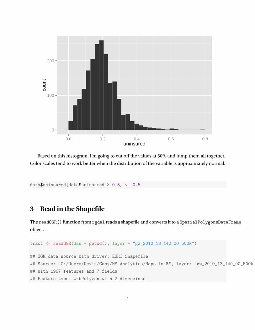
it we might as well pop out a quick histogram of what the data looks like.
2

data <- read.csv("ACS_12_5YR_S2701_with_ann.csv", stringsAsFactors = FALSE)
data <- data[,c("GEO.id2", "HC03_EST_VC01")]
colnames(data) <- c("geoid", "uninsured")
data$geoid <- as.character(data$geoid)
data$uninsured <- as.numeric(data$uninsured)/100
summary(data)
## geoid uninsured
## Length:1969 Min. :0.000
## Class :character 1st Qu.:0.130
## Mode :character Median :0.184
## Mean :0.192
## 3rd Qu.:0.242
## Max. :0.772
## NA's :14
head(data)
## geoid uninsured
## 1 13001950100 0.198
## 2 13001950200 0.275
## 3 13001950300 0.204
## 4 13001950400 0.169
## 5 13001950500 0.236
## 6 13003960100 0.303
ggplot(data = data, aes(x = uninsured)) +
geom_bar()
3
0
100
200
0.0 0.2 0.4 0.6 0.8uninsured
coun
t
Based on this histogram, I’m going to cut off the values at 50% and lump them all together.
Color scales tend to work better when the distribution of the variable is approximately normal.
data$uninsured[data$uninsured > 0.5] <- 0.5
3 Read in the Shapefile
The readOGR() function from rgdal reads a shapefile and converts it to a SpatialPolygonsDataFrame
object.
tract <- readOGR(dsn = getwd(), layer = "gz_2010_13_140_00_500k")
## OGR data source with driver: ESRI Shapefile
## Source: "C:/Users/Kevin/Copy/MS Analytics/Maps in R", layer: "gz_2010_13_140_00_500k"
## with 1967 features and 7 fields
## Feature type: wkbPolygon with 2 dimensions
4

The fortify() function from ggplot2 transforms data from shapefiles into a dataframe
that ggplot can understand. You need to supply it the region you are interested in, which for
cartographic shapefiles will generally be something like TRACT, COUNTY, STATE, etc. You need
to look at the names of the above object in order to know the right variable to pass to fortify.
names(tract)
## [1] "GEO_ID" "STATE" "COUNTY" "TRACT" "NAME"
## [6] "LSAD" "CENSUSAREA"
GEO_ID is always a good choice because it contains all of the necessary information. Using
the other variables can lead to ambiguities.
tract <- fortify(tract, region = "GEO_ID")
head(tract)
## long lat order hole piece group
## 1 -82.32 31.95 1 FALSE 1 1400000US13001950100.1
## 2 -82.31 31.95 2 FALSE 1 1400000US13001950100.1
## 3 -82.31 31.95 3 FALSE 1 1400000US13001950100.1
## 4 -82.31 31.95 4 FALSE 1 1400000US13001950100.1
## 5 -82.31 31.94 5 FALSE 1 1400000US13001950100.1
## 6 -82.31 31.94 6 FALSE 1 1400000US13001950100.1
## id
## 1 1400000US13001950100
## 2 1400000US13001950100
## 3 1400000US13001950100
## 4 1400000US13001950100
## 5 1400000US13001950100
## 6 1400000US13001950100
The key here is to create an id variable in our dataset that will match up with the id variable
in the shapefile dataframe.
5

data$id <- paste("1400000US", data$geoid, sep = "")
4 Let’s Make a Map!
Again, I’m assuming some level of familiarity with the ggplot2 package, specifically its syntax.
If you are not familiar with it then I suggest looking into an introductory tutorial before contin-
uing this one (I have a separate document on ggplot2 as a whole). Let’s start with the basics
using only the geom_map() and geom_path() functions for the colors and borders, respectively.
ggplot() +
geom_map(data = data, aes(map_id = id, fill = uninsured), map = tract) +
geom_path(data = tract, aes(x = long, y = lat, group = group),
color = "black", size = 0.1)
31
32
33
34
35
−85 −84 −83 −82 −81long
lat
0.0
0.1
0.2
0.3
0.4
0.5uninsured
We have a map! Unfortunately, there are many problems with this map that need to be
addressed, most noticeably the severe distortion of the shape of Georgia. The coord_map()
6
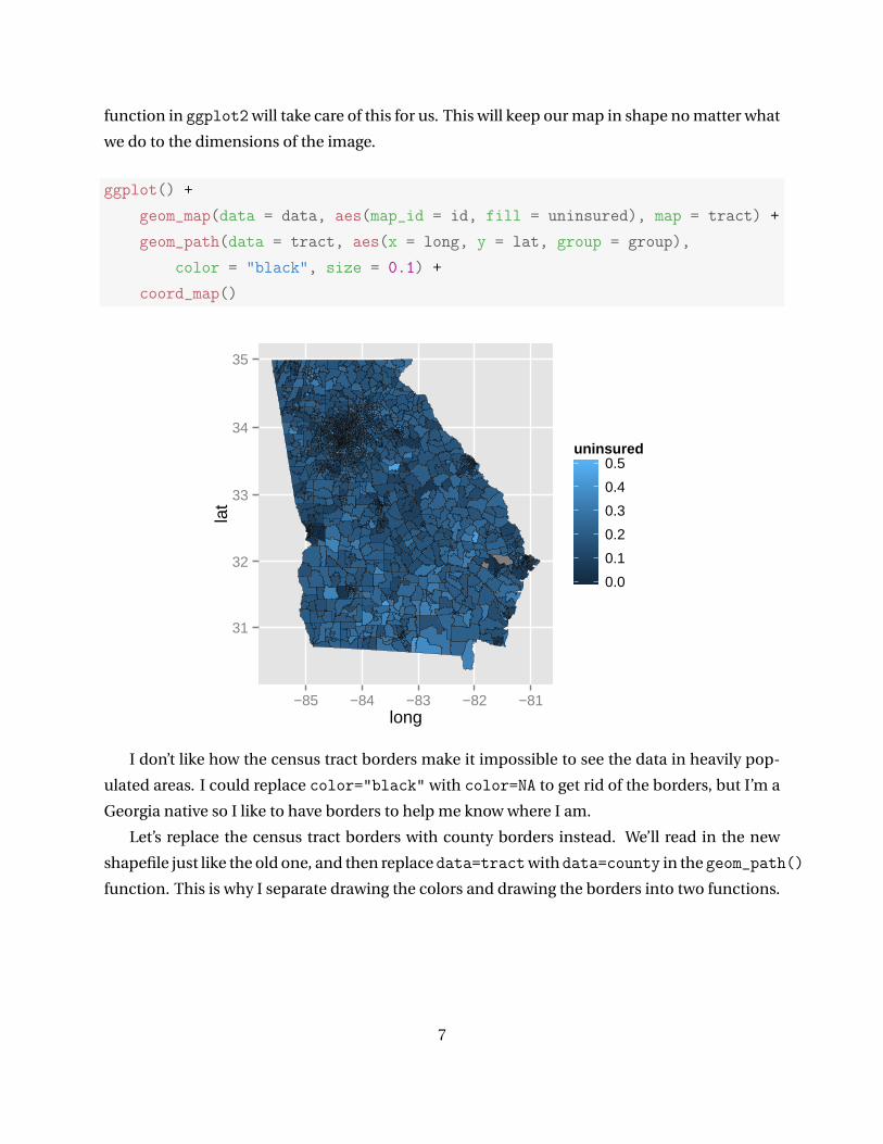
function in ggplot2 will take care of this for us. This will keep our map in shape no matter what
we do to the dimensions of the image.
ggplot() +
geom_map(data = data, aes(map_id = id, fill = uninsured), map = tract) +
geom_path(data = tract, aes(x = long, y = lat, group = group),
color = "black", size = 0.1) +
coord_map()
31
32
33
34
35
−85 −84 −83 −82 −81long
lat
0.0
0.1
0.2
0.3
0.4
0.5uninsured
I don’t like how the census tract borders make it impossible to see the data in heavily pop-
ulated areas. I could replace color="black" with color=NA to get rid of the borders, but I’m a
Georgia native so I like to have borders to help me know where I am.
Let’s replace the census tract borders with county borders instead. We’ll read in the new
shapefile just like the old one, and then replace data=tractwith data=county in the geom_path()
function. This is why I separate drawing the colors and drawing the borders into two functions.
7

county <- readOGR(dsn = getwd(), layer = "gz_2010_13_060_00_500k")
## OGR data source with driver: ESRI Shapefile
## Source: "C:/Users/Kevin/Copy/MS Analytics/Maps in R", layer: "gz_2010_13_060_00_500k"
## with 586 features and 7 fields
## Feature type: wkbPolygon with 2 dimensions
county <- fortify(county, region = "COUNTY")
ggplot() +
geom_map(data = data, aes(map_id = id, fill = uninsured),
color = NA, map = tract) +
geom_path(data = county, aes(x = long, y = lat, group = group),
color = "black", size = 0.1) +
coord_map()
31
32
33
34
35
−85 −84 −83 −82 −81long
lat
0.0
0.1
0.2
0.3
0.4
0.5uninsured
As a side note, please ignore the tiny white spaces that you see
The default colors from ggplot aren’t bad, but I’d like to be able to change them to suit
my needs. Head on over to the fantastic Color Brewer website and choose your favorite color
palette. Green is my favorite color, so I’ll use the Greens palette in this example.
8

Color Brewer was designed for use with discrete values, so we have to use the scale_fill_gradientn()
function and supply the colors manually with the RColorBrewerpackage. I also set labels=percent
so my legend labels are more intuitive.
ggplot() +
geom_map(data = data, aes(map_id = id, fill = uninsured),
color = NA, map = tract) +
geom_path(data = county, aes(x = long, y = lat, group = group),
color = "black", size = 0.1) +
coord_map() +
scale_fill_gradientn(colours=brewer.pal(9,"Greens"), labels=percent)
31
32
33
34
35
−85 −84 −83 −82 −81long
lat
0%
10%
20%
30%
40%
50%uninsured
I recently discovered the newly released (and undocumented) scale_fill_distiller()
function which seems to be made exactly for this purpose. It makes the whole process a lot
easier, so I’ve been using this ever since I discovered it. Unfortunately, it likes to put the legend
in reverse so I have to add the last line below to combat that.
9

ggplot() +
geom_map(data = data, aes(map_id = id, fill = uninsured),
color = NA, map = tract) +
geom_path(data = county, aes(x = long, y = lat, group = group),
color = "black", size = 0.1) +
coord_map() +
scale_fill_distiller(palette = "Greens", labels=percent) +
guides(fill = guide_legend(reverse = TRUE))
31
32
33
34
35
−85 −84 −83 −82 −81long
lat
uninsured
50%
40%
30%
20%
10%
0%
We’re almost done, we just need to get rid of the background, axes, and axes labels. I used to
do this with 8 lines of options that got rid of it all, but then I discovered the theme_nothing()
function available in ggmaps. Now all we have to do is add one simple line. I’ll go ahead and
change the legend label and title while I’m at it.
ggplot() +
geom_map(data = data, aes(map_id = id, fill = uninsured),
color = NA, map = tract) +
geom_path(data = county, aes(x = long, y = lat, group = group),
10

color = "black", size = 0.1) +
coord_map() +
scale_fill_distiller(palette = "Greens", labels=percent) +
guides(fill = guide_legend(reverse = TRUE)) +
theme_nothing(legend = TRUE) +
labs(fill = "Percent\nUninsured",
title = "Percentage of Population Without Health Insurance")
PercentUninsured
50%
40%
30%
20%
10%
0%
Percentage of Population Without Health Insurance
5 Bonus Wes Anderson Color Palettes!!!
Have you ever wanted your maps to have the same color palette as Fantastic Mr. Fox? Well now
you can! Install the wesanderson package for access to all sorts of Wes Anderson color palettes.
library(wesanderson)
ggplot() +
geom_map(data = data, aes(map_id = id, fill = uninsured),
11

color = NA, map = tract) +
geom_path(data = county, aes(x = long, y = lat, group = group),
color = "black", size = 0.1) +
coord_map() +
continuous_scale("fill", "distiller", gradient_n_pal(
wes.palette(3, "Darjeeling2"), values = NULL,
space = "Lab"), na.value = "grey50", labels = percent) +
guides(fill = guide_legend(reverse = TRUE)) +
theme_nothing(legend = TRUE) +
labs(fill = "Percent\nUninsured",
title = "Percentage of Population Without Health Insurance")
PercentUninsured
50%
40%
30%
20%
10%
0%
Percentage of Population Without Health Insurance
12