managing the lesson 7 graphical interface by using css...
TRANSCRIPT
The Malted Milk Media development team is ready to freshen its own Web site with a more contemporary look and feel. They’ve asked you to review the major areas of the site and suggest graphical enhancements that are based on CSS3 and will help Malted Milk stand apart from the competition.
Managing the Graphical Interface with CSS
New properties in CSS3 provide an easy means to a more graphical and appealing user interface for Web sites and applications.THE BOTTOM LINE
K E Y T E R M S
animation
border-radius property
drop shadow
gradient
keyframe
linear gradient
opacity
perspective
radial gradient
rotate
scale
skew
SVG filter
transform
transition
translate
transparency
Web Open Font Format (WOFF)
Web safe
E X A M O B J E C T I V E M A T R I X
SKILLS/CONCEPTS MTA EXAM OBJECTIVE MTA EXAM OBJECTIVE NUMBER
Managing the Graphical Interface Manage the graphical interface 3.4with CSS by using CSS.
CSS3 enables you to create stunning graphical elements for Web sites and applications, which ratchet up the satisfaction of the user experience. You can create graphics effects such as rounded corners and drop shadows, and apply 2D and 3D transformations like rotations and
Managing the Graphical Interface by Using CSS
7
159
LESSON
c07ManagingtheGraphicalInterfacebyUsingCSS.indd Page 159 10/18/12 10:48 AM c07ManagingtheGraphicalInterfacebyUsingCSS.indd Page 159 10/18/12 10:48 AM F-400F-400
LICENSED PRODUCT NOT FOR RESALE
160 | Lesson 7
scaling. Transitions and animations, performed completely with HTML and CSS3, bring life to otherwise static images, boxes, and text.
In addition, many of the same CSS3 properties apply to canvas figures, and SVG comes with a comprehensive set of filters that produce similar effects as CSS3 properties.
CERTIFICATION READYIn what ways can you manage the graphical user interface with CSS?3.4
CERTIFICATION READYWhich new graphics effects can you create with CSS3?3.4
CERTIFICATION READYWhich CSS property creates rounded corners around layout elements?3.4
CSS3 provides the border-radius property to create rounded corners, the box-shadow property for drop-shadows, the opacity property for transparency effects, and linear-gradient and radial-gradient properties for background gradients.
Creating Graphics Effects
CSS3 enables you to easily apply several new graphics effects to HTML elements, making the user interface more appealing. Some of the new graphics effects include rounded corners, drop-shadows, transparency, and background gradients. You can even apply some of these properties, like shadows, to text.
CREATING ROUNDED CORNERSYou use the CSS3 border-radius property to create rounded corners around layout ele-ments, like headers, footers, sidebars, graphics boxes, and outlines around images. border-radius is a length, which is usually expressed in pixels or ems but can be a percentage. The length is the radius of the circle that defines the “roundedness” of each box corner. The lower the number, the less rounded the corner. Some browsers have problems rendering the percentage properly, so use a pixel or em length whenever possible.
To create a box with a rounded border, the CSS code and markup might look like this:
<!doctype html><html><head> <meta charset="utf-8" /><title>Rounded Corners</title><style type="text/css"> div { padding: 40px 40px; background: dodgerblue; width: 400px; color: #fff; font-family: sans-serif; font-size: xx-large; border-radius: 25px; margin-left: auto; margin-right: auto; margin-top: 100px;}</style></head>
<body> <div>A box with rounded corners</div></body></html>
c07ManagingtheGraphicalInterfacebyUsingCSS.indd Page 160 10/18/12 10:48 AM c07ManagingtheGraphicalInterfacebyUsingCSS.indd Page 160 10/18/12 10:48 AM F-400F-400
LICENSED PRODUCT NOT FOR RESALE
Managing the Graphical Interface by Using CSS | 161
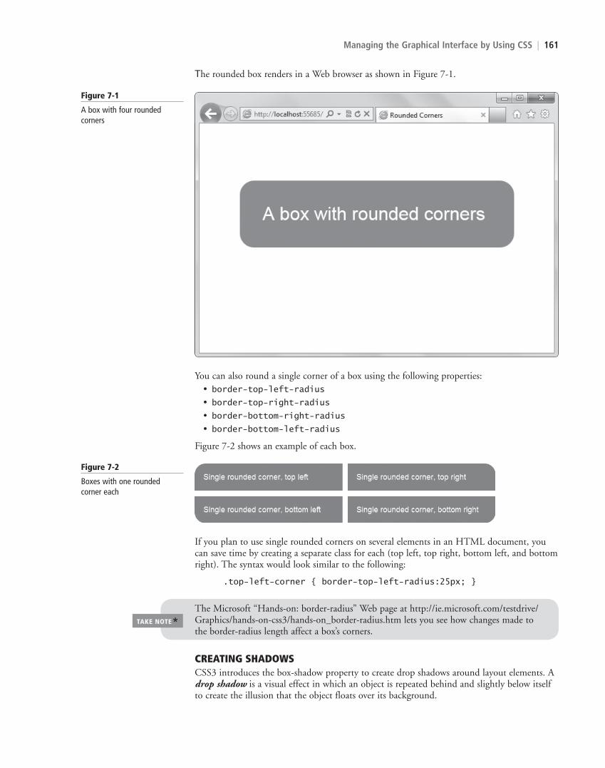
The rounded box renders in a Web browser as shown in Figure 7-1.
Figure 7-1
A box with four rounded corners
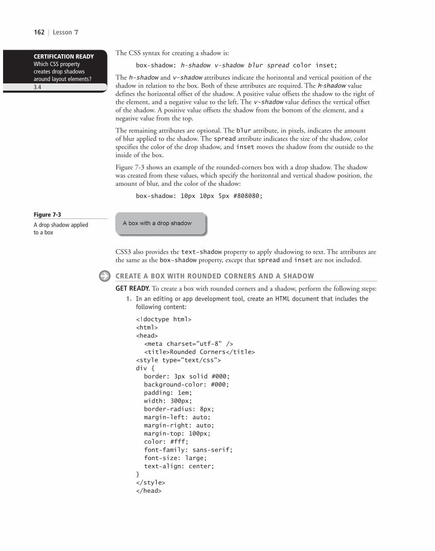
You can also round a single corner of a box using the following properties:• border-top-left-radius• border-top-right-radius• border-bottom-right-radius• border-bottom-left-radius
Figure 7-2 shows an example of each box.
Figure 7-2
Boxes with one rounded corner each
If you plan to use single rounded corners on several elements in an HTML document, you can save time by creating a separate class for each (top left, top right, bottom left, and bottom right). The syntax would look similar to the following:
.top-left-corner { border-top-left-radius:25px; }
The Microsoft “Hands-on: border-radius” Web page at http://ie.microsoft.com/testdrive/Graphics/hands-on-css3/hands-on_border-radius.htm lets you see how changes made to the border-radius length affect a box’s corners.
TAKE NOTE*
CREATING SHADOWSCSS3 introduces the box-shadow property to create drop shadows around layout elements. A drop shadow is a visual effect in which an object is repeated behind and slightly below itself to create the illusion that the object floats over its background.
c07ManagingtheGraphicalInterfacebyUsingCSS.indd Page 161 10/18/12 10:48 AM c07ManagingtheGraphicalInterfacebyUsingCSS.indd Page 161 10/18/12 10:48 AM F-400F-400
LICENSED PRODUCT NOT FOR RESALE
162 | Lesson 7
The CSS syntax for creating a shadow is:
box-shadow: h-shadow v-shadow blur spread color inset;
The h-shadow and v-shadow attributes indicate the horizontal and vertical position of the shadow in relation to the box. Both of these attributes are required. The h-shadow value defines the horizontal offset of the shadow. A positive value offsets the shadow to the right of the element, and a negative value to the left. The v-shadow value defines the vertical offset of the shadow. A positive value offsets the shadow from the bottom of the element, and a negative value from the top.
The remaining attributes are optional. The blur attribute, in pixels, indicates the amount of blur applied to the shadow. The spread attribute indicates the size of the shadow, color specifies the color of the drop shadow, and inset moves the shadow from the outside to the inside of the box.
Figure 7-3 shows an example of the rounded-corners box with a drop shadow. The shadow was created from these values, which specify the horizontal and vertical shadow position, the amount of blur, and the color of the shadow:
box-shadow: 10px 10px 5px #808080;
CERTIFICATION READYWhich CSS property creates drop shadows around layout elements?3.4
Figure 7-3
A drop shadow applied to a box
CSS3 also provides the text-shadow property to apply shadowing to text. The attributes are the same as the box-shadow property, except that spread and inset are not included.
CREATE A BOX WITH ROUNDED CORNERS AND A SHADOW
GET READY. To create a box with rounded corners and a shadow, perform the following steps:
1. In an editing or app development tool, create an HTML document that includes the following content:
<!doctype html><html><head> <meta charset="utf-8" /> <title>Rounded Corners</title><style type="text/css"> div { border: 3px solid #000; background-color: #000; padding: 1em; width: 300px; border-radius: 8px; margin-left: auto; margin-right: auto; margin-top: 100px; color: #fff; font-family: sans-serif; font-size: large; text-align: center;}</style></head>
c07ManagingtheGraphicalInterfacebyUsingCSS.indd Page 162 10/18/12 10:48 AM c07ManagingtheGraphicalInterfacebyUsingCSS.indd Page 162 10/18/12 10:48 AM F-400F-400
LICENSED PRODUCT NOT FOR RESALE

Managing the Graphical Interface by Using CSS | 163
<body> <div>A box example</div></body></html>
2. Save the file as L7-box-exercise.html. View the file in a Web browser, which should look similar to Figure 7-4.
Figure 7-4
A box with rounded corners
3. To add a drop shadow, add the following line to the style element:
box-shadow: 5px 5px 5px #999;
4. Save the file and view the results in a Web browser. The box should resemble Figure 7-5.
Figure 7-5
A box with rounded corners and a drop shadow
5. Leave the file, editing tool, and Web browser open if you complete the next exercise during this session.
APPLYING TRANSPARENCYAn opaque item does not let light pass through, whereas you can see through a transparent item. Even though the terms are opposite, by reducing the opacity of an item or increasing its transparency, you eventually reach the same point.
Figure 7-6 shows the effect of transparency (or reduced opacity) on an image. The original image is on the left; the image with a 50% transparency applied is on the right.
Figure 7-6
Transparency applied to an image
Original Illu
stra
tion
s: ©
AV
TG
/iSto
ckph
oto
With transparency
The syntax for applying a transparency to an image or other element is:
opacity: value
The value is a floating-point value between 0.0 (100% transparent) and 1.0 (100% opaque). To apply a 45% transparency, for example, you would use the value 0.55 (1.0 – 0.45).
CERTIFICATION READYWhich CSS property enables you to apply a transparency to an image or element?3.4
c07ManagingtheGraphicalInterfacebyUsingCSS.indd Page 163 10/18/12 10:48 AM c07ManagingtheGraphicalInterfacebyUsingCSS.indd Page 163 10/18/12 10:48 AM F-400F-400
LICENSED PRODUCT NOT FOR RESALE
164 | Lesson 7
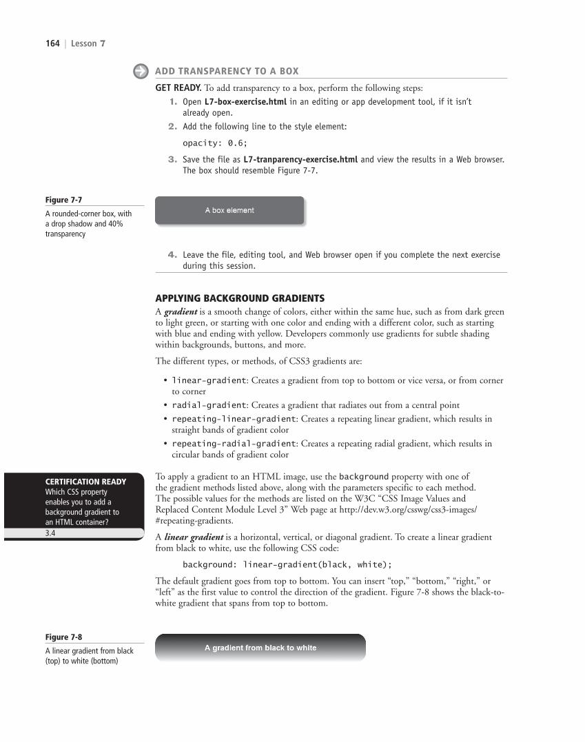
ADD TRANSPARENCY TO A BOX
GET READY. To add transparency to a box, perform the following steps:
1. Open L7-box-exercise.html in an editing or app development tool, if it isn’t already open.
2. Add the following line to the style element:
opacity: 0.6;
3. Save the file as L7-tranparency-exercise.html and view the results in a Web browser. The box should resemble Figure 7-7.
Figure 7-7
A rounded-corner box, with a drop shadow and 40% transparency
CERTIFICATION READYWhich CSS property enables you to add a background gradient to an HTML container?3.4
Figure 7-8
A linear gradient from black (top) to white (bottom)
4. Leave the file, editing tool, and Web browser open if you complete the next exercise during this session.
APPLYING BACKGROUND GRADIENTSA gradient is a smooth change of colors, either within the same hue, such as from dark green to light green, or starting with one color and ending with a different color, such as starting with blue and ending with yellow. Developers commonly use gradients for subtle shading within backgrounds, buttons, and more.
The different types, or methods, of CSS3 gradients are:
• linear-gradient: Creates a gradient from top to bottom or vice versa, or from corner to corner
• radial-gradient: Creates a gradient that radiates out from a central point
• repeating-linear-gradient: Creates a repeating linear gradient, which results in straight bands of gradient color
• repeating-radial-gradient: Creates a repeating radial gradient, which results in circular bands of gradient color
To apply a gradient to an HTML image, use the background property with one of the gradient methods listed above, along with the parameters specific to each method. The possible values for the methods are listed on the W3C “CSS Image Values and Replaced Content Module Level 3” Web page at http://dev.w3.org/csswg/css3-images/#repeating-gradients.
A linear gradient is a horizontal, vertical, or diagonal gradient. To create a linear gradient from black to white, use the following CSS code:
background: linear-gradient(black, white);
The default gradient goes from top to bottom. You can insert “top,” “bottom,” “right,” or “left” as the first value to control the direction of the gradient. Figure 7-8 shows the black-to-white gradient that spans from top to bottom.
c07ManagingtheGraphicalInterfacebyUsingCSS.indd Page 164 10/18/12 10:48 AM c07ManagingtheGraphicalInterfacebyUsingCSS.indd Page 164 10/18/12 10:48 AM F-400F-400
LICENSED PRODUCT NOT FOR RESALE
Managing the Graphical Interface by Using CSS | 165
A diagonal gradient is a type of linear gradient that extends from one corner of a container diagonally to another corner. The code for a diagonal gradient that starts in the lower-left corner and extends to the upper-right corner of a container is:
background: linear-gradient(45deg, white, black);
CSS3 gradients also support color interpolation in the alpha color space, which is part of the red blue green alpha (RGBA) color model, to produce smoother color transitions in gradients. (You’ve probably seen some gradients where you can readily see the transition from one shade to the next—they look like thin bands of color. Color interpolation in the alpha color space eliminates the “bandy” look.) You can specify multiple color stops, with an RGBA color and position for each one.
The following is an example of the use of rgba colors:
linear-gradient(to right, rgba(255,255,255,0)
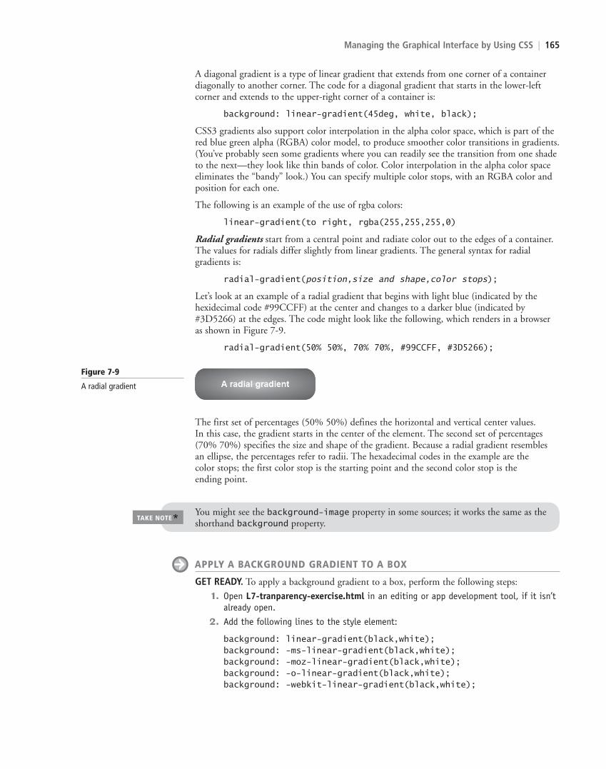
Radial gradients start from a central point and radiate color out to the edges of a container. The values for radials differ slightly from linear gradients. The general syntax for radial gradients is:
radial-gradient(position,size and shape,color stops);
Let’s look at an example of a radial gradient that begins with light blue (indicated by the hexidecimal code #99CCFF) at the center and changes to a darker blue (indicated by #3D5266) at the edges. The code might look like the following, which renders in a browser as shown in Figure 7-9.
radial-gradient(50% 50%, 70% 70%, #99CCFF, #3D5266);
Figure 7-9
A radial gradient
The first set of percentages (50% 50%) defines the horizontal and vertical center values. In this case, the gradient starts in the center of the element. The second set of percentages (70% 70%) specifies the size and shape of the gradient. Because a radial gradient resembles an ellipse, the percentages refer to radii. The hexadecimal codes in the example are the color stops; the first color stop is the starting point and the second color stop is the ending point.
You might see the background-image property in some sources; it works the same as the shorthand background property.
TAKE NOTE*
APPLY A BACKGROUND GRADIENT TO A BOX
GET READY. To apply a background gradient to a box, perform the following steps:
1. Open L7-tranparency-exercise.html in an editing or app development tool, if it isn’t already open.
2. Add the following lines to the style element:
background: linear-gradient(black,white);background: -ms-linear-gradient(black,white);background: -moz-linear-gradient(black,white);background: -o-linear-gradient(black,white);background: -webkit-linear-gradient(black,white);
c07ManagingtheGraphicalInterfacebyUsingCSS.indd Page 165 10/18/12 10:48 AM c07ManagingtheGraphicalInterfacebyUsingCSS.indd Page 165 10/18/12 10:48 AM F-400F-400
LICENSED PRODUCT NOT FOR RESALE
166 | Lesson 7
6. Close the file and the Web browsers but leave the editing tool open if you plan to complete the next exercise during this session.
Notice the use of vendor prefixes in this code. By including all of the major vendor pre-fixes, your HTML document is more likely to be rendered properly by the largest number of users. As a reminder from Lesson 5, however, including all four vendor prefixes in your code doesn’t guarantee the CSS3 feature will work within all of the browsers. A browser that doesn’t support a certain feature will not display the feature properly, even with a vendor prefix. Some browsers offer partial support for a feature, which can produce mixed results. During the transition to CSS3, you should test your code in all of the major browsers before using a certain feature in HTML/CSS documents that will be displayed to a wide audience.
TAKE NOTE*
Figure 7-10
A box with a background gradient applied
✚ MORE INFORMATIONThe Microsoft “Explore new ideas in website design and layout” Web page at http://bit.ly/KtYr1W provides links to information on creating rounded corners, drop-shadows, and much more. The W3C “CSS Color Module Level 3” Web page at http://www.w3.org/TR/css3-color/ provides the specification for color properties and opacity. You can also visit the W3schools.com Web site and search for “CSS3” and the topic of your choice.
Web developers are beginning to use the Web Open Font Format (WOFF) as a way to enhance UIs with just about any font available or custom-created fonts. The flexibility to use any font is a big change from the pre-WOFF restrictions on font usage in HTML documents.
Understanding Typography and the Web Open Font Format
Typography is the art of arranging type, historically in printed matter, and fonts play a prominent role in typography. You use CSS font-related properties such as font-family, font-size, font-style, font-variant, and font-weight to style HTML documents. For years, Web and application developers have been limited to a set of standard fonts that are considered Web safe, which means they are typically located on a user’s computer and there-fore render consistently in the majority of browsers.
Web-safe fonts don’t work in every situation. For example, many companies use particu-lar fonts as part of their brand identity, which aren’t often part of the Web-safe font set. Designers and developers strive to make sites look interesting, more appealing, and unique, which can’t always be accomplished with Web-safe fonts.
XREF
Lesson 4 discusses the CSS-related aspects of typography, such as fonts, font families, monospace, and the @font-face rule.
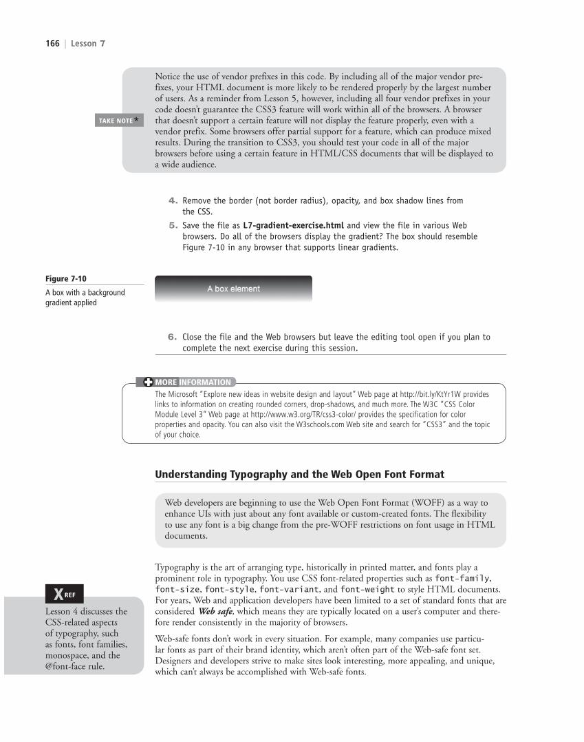
4. Remove the border (not border radius), opacity, and box shadow lines from the CSS.
5. Save the file as L7-gradient-exercise.html and view the file in various Web browsers. Do all of the browsers display the gradient? The box should resemble Figure 7-10 in any browser that supports linear gradients.
c07ManagingtheGraphicalInterfacebyUsingCSS.indd Page 166 10/18/12 10:48 AM c07ManagingtheGraphicalInterfacebyUsingCSS.indd Page 166 10/18/12 10:48 AM F-400F-400
LICENSED PRODUCT NOT FOR RESALE

Managing the Graphical Interface by Using CSS | 167
To use a non-standard font in a heading, title, or block of text, developers have had to create the content in a page layout or graphics program, save it as an image, and then use the <img> tag in an HTML document. This method has several drawbacks:
• It’s time-consuming.
• It interferes with accessibility page readers; images of text cannot be read aloud.
• It reduces the effectiveness of search engine optimization (SEO) because search engines look for text, not images of text.
Developers have also used embedded fonts, which are font sets loaded on their servers. The designer inserts a link to the font set within an HTML document or CSS file, which helps the browser render the font properly. Although embedded fonts are still widely used, a new and better technique for handling non-standard fonts is WOFF.
The Web Open Font Format (WOFF) is a means of bringing better typography to the Web. WOFF allows Web developers to use custom fonts—pretty much any font—instead of being limited to the standard Web fonts. WOFF files are compressed True Type, OpenType, or Open Font Format fonts that contain additional metadata.
To use WOFF, you can host fonts on your server or use a Web font service. Free fonts are avail-able from a variety of sources like fontsquirrel and the Open Font Library. Font services include FontFont and FontShop, among others. They require a paid subscription, which gives you full rights to use the font on your Web site as long as the subscription is current.
To use a WOFF font from a font vendor’s site, for example, include the @font-face rule in the CSS file, similar to the following:
<style>@font-face { font-family: "font-family-name"; src: url("http://website/fonts/fontfile") }</style>
Some WOFF fonts work better than others depending on the browser in which they’re being viewed. For example, where one Web browser might render the font perfectly, another browser might display the font bitmapped or with inappropriate boldface. Before purchasing a WOFF font or font package, be sure to research the font on the Web to find out if other developers have had any problems using it. Some font vendors provide a way for you to pre-view fonts in all of the major browsers before purchase.
CERTIFICATION READYWhat is the purpose of the Web Open Font Format (WOFF)?3.4
✚ MORE INFORMATIONThe WOFF specification is on the W3C Web site at http://www.w3.org/TR/WOFF/. For an easier read about WOFF, visit the “Fonts on the Web” page at http://www.w3.org/Fonts/ and the “WOFF Frequently Asked Questions” page at http://www.w3.org/Fonts/WOFF-FAQ.html.
The CSS3 transform property translates, scales, rotates, skews, and even spins 2D and 3D elements.
Applying 2D and 3D Transformations
In HTML5/CSS3, a transform is an effect that lets you change the size, shape, and position of an element. Transformations are either 2D or 3D, and include translating (moving), scaling, rotating, skewing (stretching), and spinning elements.
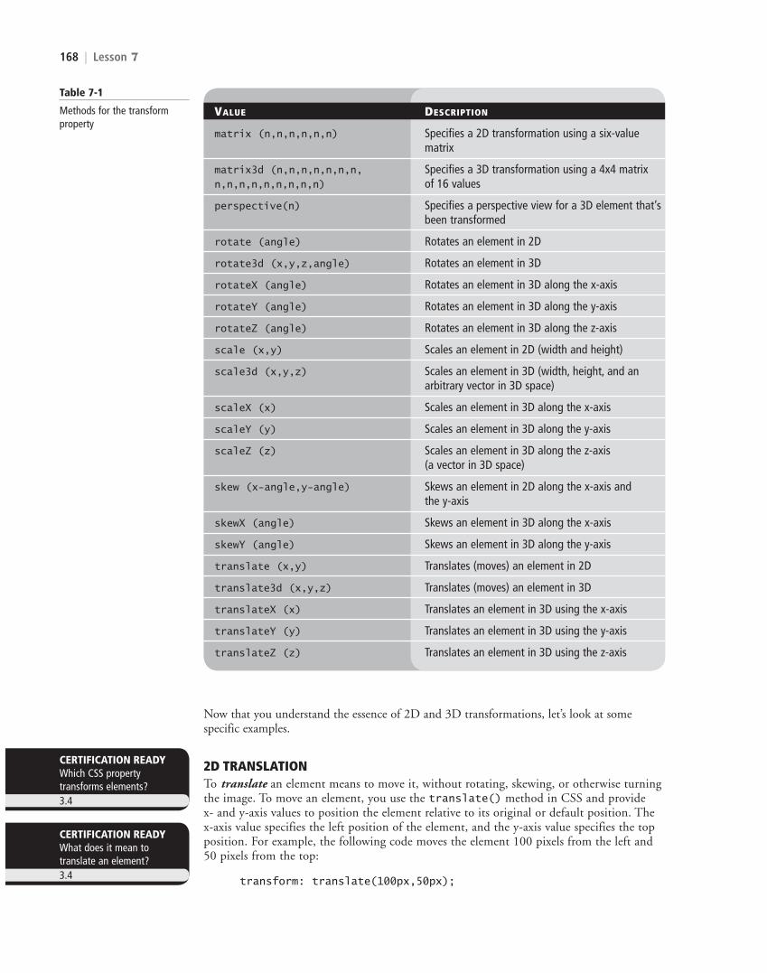
You use the CSS transform property to specify different kinds of transformations made to HTML elements. The transform property uses several methods for 2D and 3D transformations, as listed in Table 7-1.
JavaScript or some other form of scripting would be required to actually see a 2D or 3D trans-formation taking place. Without scripting, you only view the end result of a transformation.
TAKE NOTE*
c07ManagingtheGraphicalInterfacebyUsingCSS.indd Page 167 10/18/12 10:48 AM c07ManagingtheGraphicalInterfacebyUsingCSS.indd Page 167 10/18/12 10:48 AM F-400F-400
LICENSED PRODUCT NOT FOR RESALE
168 | Lesson 7
CERTIFICATION READYWhich CSS property transforms elements?3.4
CERTIFICATION READYWhat does it mean to translate an element?3.4
Table 7-1
Methods for the transform property
VALUE DESCRIPTION
matrix (n,n,n,n,n,n) Specifies a 2D transformation using a six-value matrix
matrix3d (n,n,n,n,n,n,n, Specifies a 3D transformation using a 4x4 matrix n,n,n,n,n,n,n,n,n) of 16 values
perspective(n) Specifies a perspective view for a 3D element that’s been transformed
rotate (angle) Rotates an element in 2D
rotate3d (x,y,z,angle) Rotates an element in 3D
rotateX (angle) Rotates an element in 3D along the x-axis
rotateY (angle) Rotates an element in 3D along the y-axis
rotateZ (angle) Rotates an element in 3D along the z-axis
scale (x,y) Scales an element in 2D (width and height)
scale3d (x,y,z) Scales an element in 3D (width, height, and an arbitrary vector in 3D space)
scaleX (x) Scales an element in 3D along the x-axis
scaleY (y) Scales an element in 3D along the y-axis
scaleZ (z) Scales an element in 3D along the z-axis (a vector in 3D space)
skew (x-angle,y-angle) Skews an element in 2D along the x-axis and the y-axis
skewX (angle) Skews an element in 3D along the x-axis
skewY (angle) Skews an element in 3D along the y-axis
translate (x,y) Translates (moves) an element in 2D
translate3d (x,y,z) Translates (moves) an element in 3D
translateX (x) Translates an element in 3D using the x-axis
translateY (y) Translates an element in 3D using the y-axis
translateZ (z) Translates an element in 3D using the z-axis
Now that you understand the essence of 2D and 3D transformations, let’s look at some specific examples.
2D TRANSLATIONTo translate an element means to move it, without rotating, skewing, or otherwise turning the image. To move an element, you use the translate() method in CSS and provide x- and y-axis values to position the element relative to its original or default position. The x-axis value specifies the left position of the element, and the y-axis value specifies the top position. For example, the following code moves the element 100 pixels from the left and 50 pixels from the top:
transform: translate(100px,50px);
c07ManagingtheGraphicalInterfacebyUsingCSS.indd Page 168 10/18/12 10:48 AM c07ManagingtheGraphicalInterfacebyUsingCSS.indd Page 168 10/18/12 10:48 AM F-400F-400
LICENSED PRODUCT NOT FOR RESALE

Managing the Graphical Interface by Using CSS | 169
Figure 7-11
The translated (moved) box appears in the lower right
Figure 7-12
The scaled box is two times wider and four times taller than the original box
2D SCALINGTo scale an element is to increase or decrease its size. To grow or shrink an element dynamically, you use the scale() method in CSS and provide x-axis (width) and y-axis (height) values. For example, the following code increases the width of the element two times its original size, and increases the height four times its original size:
transform: scale(2,4);
An example of a scaled element is shown in Figure 7-12.
CERTIFICATION READYWhat does it mean to scale an element?3.4
TRANSLATE AND SCALE A 2D SHAPE
GET READY. To translate and scale a 2D shape, perform the following steps:
1. In an editing or app development tool, create an HTML document that includes the following content:
<!doctype html><html><head> <meta charset="utf-8" /> <title></title><style type="text/css"> div{padding: 20px 20px; background: tomato;width: 150px;height: 75px;color: #fff;font-family: sans-serif;font-size: x-large;}</style></head>
An example of a translated element is shown in Figure 7-11.
c07ManagingtheGraphicalInterfacebyUsingCSS.indd Page 169 10/18/12 10:48 AM c07ManagingtheGraphicalInterfacebyUsingCSS.indd Page 169 10/18/12 10:48 AM F-400F-400
LICENSED PRODUCT NOT FOR RESALE
170 | Lesson 7
<body><div>This element can move</div></body>
2. Save the file as L7-translate-exercise.html and view it in at least two different Web browsers. The box should appear in the upper-left corner of the browser windows.
3. Add the following lines to the style element:
transform: translate(200px,100px);-ms-transform: translate(200px,100px);-moz-transform: translate(200px,100px);-o-transform: translate(200px,100px);-webkit-transform: translate(200px,100px);
4. Save the file and view it in the same Web browsers. The box should have moved down and to the right.
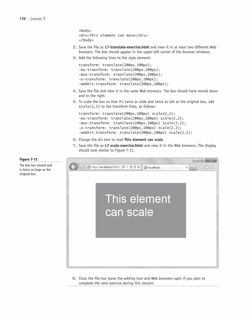
5. To scale the box so that it’s twice as wide and twice as tall as the original box, add scale(2,2) to the transform lines, as follows:
transform: translate(200px,100px) scale(2,2);-ms-transform: translate(200px,100px) scale(2,2);-moz-transform: translate(200px,100px) scale(2,2);-o-transform: translate(200px,100px) scale(2,2);-webkit-transform: translate(200px,100px) scale(2,2);
6. Change the div text to read This element can scale.
7. Save the file as L7-scale-exercise.html and view it in the Web browsers. The display should look similar to Figure 7-13.
Figure 7-13
The box has moved and is twice as large as the original box
8. Close the file but leave the editing tool and Web browsers open if you plan to complete the next exercise during this session.
c07ManagingtheGraphicalInterfacebyUsingCSS.indd Page 170 10/18/12 10:48 AM c07ManagingtheGraphicalInterfacebyUsingCSS.indd Page 170 10/18/12 10:48 AM F-400F-400
LICENSED PRODUCT NOT FOR RESALE
Managing the Graphical Interface by Using CSS | 171
2D AND 3D ROTATIONTo rotate an element turns it clockwise by a specified number of degrees. To rotate an element, you use the rotate() method in CSS and specify the degrees of rotation.
For example, the following code rotates an element by 30 degrees in the 2D plane:
transform: rotate(30deg);
An example of a 2D rotated element is shown in Figure 7-14.
Figure 7-14
The original and the 2D rotated image
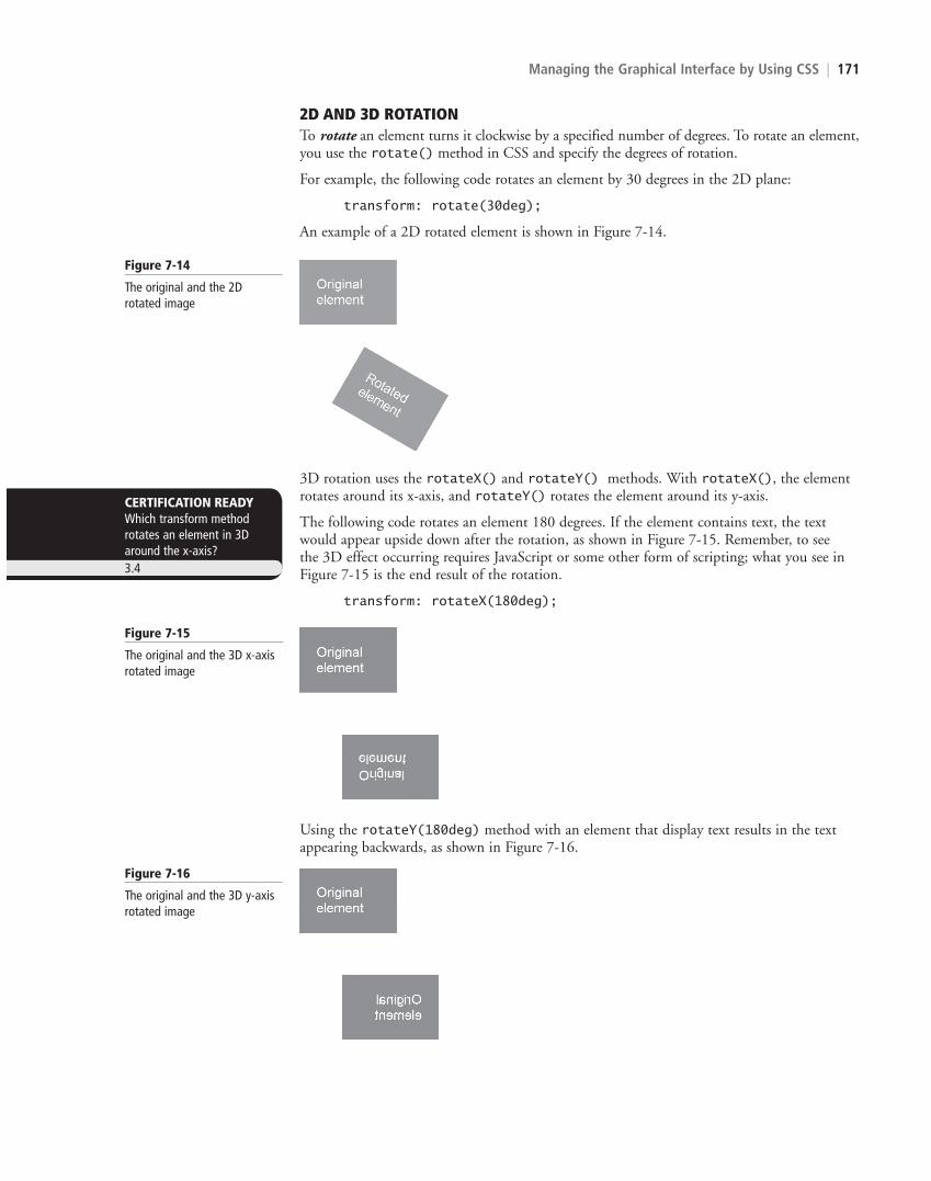
3D rotation uses the rotateX() and rotateY() methods. With rotateX(), the element rotates around its x-axis, and rotateY() rotates the element around its y-axis.
The following code rotates an element 180 degrees. If the element contains text, the text would appear upside down after the rotation, as shown in Figure 7-15. Remember, to see the 3D effect occurring requires JavaScript or some other form of scripting; what you see in Figure 7-15 is the end result of the rotation.
transform: rotateX(180deg);
CERTIFICATION READYWhich transform method rotates an element in 3D around the x-axis?3.4
Figure 7-15
The original and the 3D x-axis rotated image
Using the rotateY(180deg) method with an element that display text results in the text appearing backwards, as shown in Figure 7-16.
Figure 7-16
The original and the 3D y-axis rotated image
c07ManagingtheGraphicalInterfacebyUsingCSS.indd Page 171 10/18/12 10:48 AM c07ManagingtheGraphicalInterfacebyUsingCSS.indd Page 171 10/18/12 10:48 AM F-400F-400
LICENSED PRODUCT NOT FOR RESALE
172 | Lesson 7
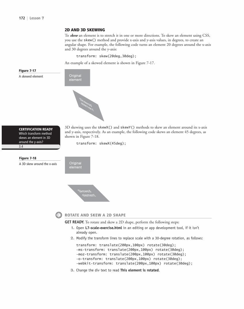
2D AND 3D SKEWINGTo skew an element is to stretch it in one or more directions. To skew an element using CSS, you use the skew() method and provide x-axis and y-axis values, in degrees, to create an angular shape. For example, the following code turns an element 20 degrees around the x-axis and 30 degrees around the y-axis:
transform: skew(20deg,30deg);
An example of a skewed element is shown in Figure 7-17.
3D skewing uses the skewX() and skewY() methods to skew an element around its x-axis and y-axis, respectively. As an example, the following code skews an element 45 degrees, as shown in Figure 7-18.
transform: skewX(45deg);
Figure 7-17
A skewed element
CERTIFICATION READYWhich transform method skews an element in 3D around the y-axis?3.4
Figure 7-18
A 3D skew around the x-axis
ROTATE AND SKEW A 2D SHAPE
GET READY. To rotate and skew a 2D shape, perform the following steps:
1. Open L7-scale-exercise.html in an editing or app development tool, if it isn’t already open.
2. Modify the transform lines to replace scale with a 30-degree rotation, as follows:
transform: translate(200px,100px) rotate(30deg);-ms-transform: translate(200px,100px) rotate(30deg);-moz-transform: translate(200px,100px) rotate(30deg);-o-transform: translate(200px,100px) rotate(30deg);-webkit-transform: translate(200px,100px) rotate(30deg);
3. Change the div text to read This element is rotated.
c07ManagingtheGraphicalInterfacebyUsingCSS.indd Page 172 10/18/12 10:48 AM c07ManagingtheGraphicalInterfacebyUsingCSS.indd Page 172 10/18/12 10:48 AM F-400F-400
LICENSED PRODUCT NOT FOR RESALE
Managing the Graphical Interface by Using CSS | 173
5. To skew the box by 45 degrees, replace rotate with skew in the transform lines, as follows:
transform: translate(200px,100px) skew(45deg);-ms-transform: translate(200px,100px) skew(45deg);-moz-transform: translate(200px,100px) skew(45deg);-o-transform: translate(200px,100px) skew(45deg);-webkit-transform: translate(200px,100px) skew(45deg);
6. Change the div text to read This element is skewed.
7. Save the file as L7-skew-exercise.html and view it in the Web browsers. The display should look similar to Figure 7-20.
Figure 7-19
A box rotated at a 30-degree angle
Figure 7-20
A box skewed at a 45-degree angle
8. Close the file but leave the editing tool and Web browsers open if you plan to complete the next exercise during this session.
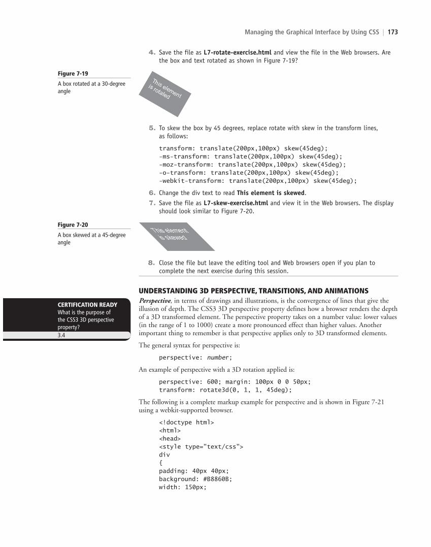
UNDERSTANDING 3D PERSPECTIVE, TRANSITIONS, AND ANIMATIONSPerspective, in terms of drawings and illustrations, is the convergence of lines that give the illusion of depth. The CSS3 3D perspective property defines how a browser renders the depth of a 3D transformed element. The perspective property takes on a number value: lower values (in the range of 1 to 1000) create a more pronounced effect than higher values. Another important thing to remember is that perspective applies only to 3D transformed elements.
The general syntax for perspective is:
perspective: number;
An example of perspective with a 3D rotation applied is:
perspective: 600; margin: 100px 0 0 50px;transform: rotate3d(0, 1, 1, 45deg);
The following is a complete markup example for perspective and is shown in Figure 7-21 using a webkit-supported browser.
<!doctype html><html><head><style type="text/css"> div{padding: 40px 40px; background: #B8860B;width: 150px;
CERTIFICATION READYWhat is the purpose of the CSS3 3D perspective property?3.4
4. Save the file as L7-rotate-exercise.html and view the file in the Web browsers. Are the box and text rotated as shown in Figure 7-19?
c07ManagingtheGraphicalInterfacebyUsingCSS.indd Page 173 10/18/12 10:48 AM c07ManagingtheGraphicalInterfacebyUsingCSS.indd Page 173 10/18/12 10:48 AM F-400F-400
LICENSED PRODUCT NOT FOR RESALE

174 | Lesson 7
Now let’s focus on transitions and animation. A transition is a change from one thing to another; in CSS, a transition is the change in an element from one style to another.
You can think of a gradient as a type of transition in that the background color of a container changes from one color to another. However, a gradient is itself a static thing—it’s either present or not. In CSS3, the action of a transition is visible. The changes render onscreen in an animated fashion as if powered by a script, but no scripts are involved.
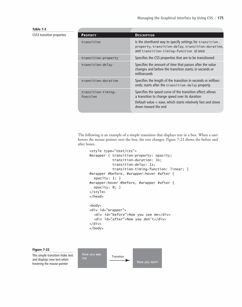
You use the transition property to create a CSS3 transition. At a minimum, you must specify the CSS property to be acted upon during the transition. This can be an ele-ment’s position, size, color, background color, letter spacing, rotation, and so on. Most transitions also specify the length (duration) of the transition. If the duration value is not set, the default is 0. You specify CSS3 transitions using the properties described in Table 7-2.
color: #fff;font-family: sans-serif;font-size: xx-large;}div#div2{margin: 100px;perspective: 600; margin: 100px 0 0 50px;-ms-perspective: 600; margin: 100px 0 0 50px;-moz-perspective: 600; margin: 100px 0 0 50px;-o-perspective: 600; margin: 100px 0 0 50px;-webkit-perspective: 600; margin: 100px 0 0 50px;
transform: rotate3d(0, 1, 1, 45deg); -ms-transform: rotate3d(0, 1, 1, 45deg); -moz-transform: rotate3d(0, 1, 1, 45deg); -o-transform: rotate3d(0, 1, 1, 45deg); -webkit-transform: rotate3d(0, 1, 1, 45deg); }</style></head>
<body> <div>Original element</div> <div id="div2">Transformed element</div></body></html>
Figure 7-21
Perspective applied with a 45-degree rotation
CERTIFICATION READYWhat is a transition?3.4
c07ManagingtheGraphicalInterfacebyUsingCSS.indd Page 174 10/18/12 10:48 AM c07ManagingtheGraphicalInterfacebyUsingCSS.indd Page 174 10/18/12 10:48 AM F-400F-400
LICENSED PRODUCT NOT FOR RESALE
Managing the Graphical Interface by Using CSS | 175
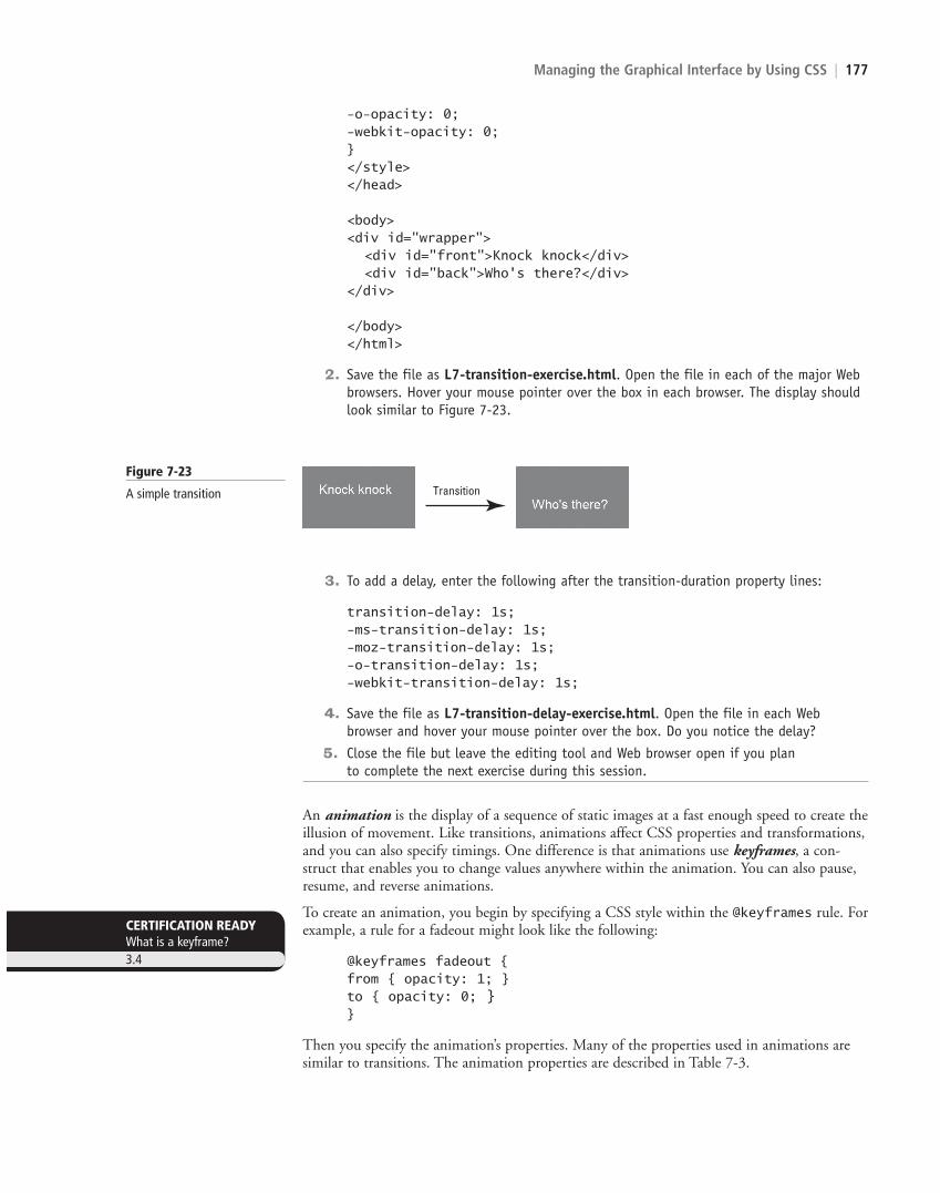
The following is an example of a simple transition that displays text in a box. When a user hovers the mouse pointer over the box, the text changes. Figure 7-22 shows the before and after boxes.
<style type="text/css">#wrapper { transition-property: opacity; transition-duration: 3s; transition-delay: 1s; transition-timing-function: linear; }#wrapper #before, #wrapper:hover #after { opacity: 1; }#wrapper:hover #before, #wrapper #after { opacity: 0; }</style></head>
<body><div id="wrapper"> <div id="before">Now you see me</div> <div id="after">Now you don't</div></div></body>
Table 7-2
CSS3 transition properties PROPERTY DESCRIPTION
transition Is the shorthand way to specify settings for transition-property, transition-delay, transition-duration, and transition-timing-function at once
transition-property Specifies the CSS properties that are to be transitioned
transition-delay Specifies the amount of time that passes after the value changes and before the transition starts; in seconds or milliseconds
transition-duration Specifies the length of the transition in seconds or millisec-onds; starts after the transition-delay property
transition-timing- Specifies the speed curve of the transition effect; allows function a transition to change speed over its duration
Default value = ease, which starts relatively fast and slows down toward the end
Figure 7-22
This simple transition hides text and displays new text when hovering the mouse pointer
Transition
c07ManagingtheGraphicalInterfacebyUsingCSS.indd Page 175 10/18/12 10:48 AM c07ManagingtheGraphicalInterfacebyUsingCSS.indd Page 175 10/18/12 10:48 AM F-400F-400
LICENSED PRODUCT NOT FOR RESALE
176 | Lesson 7
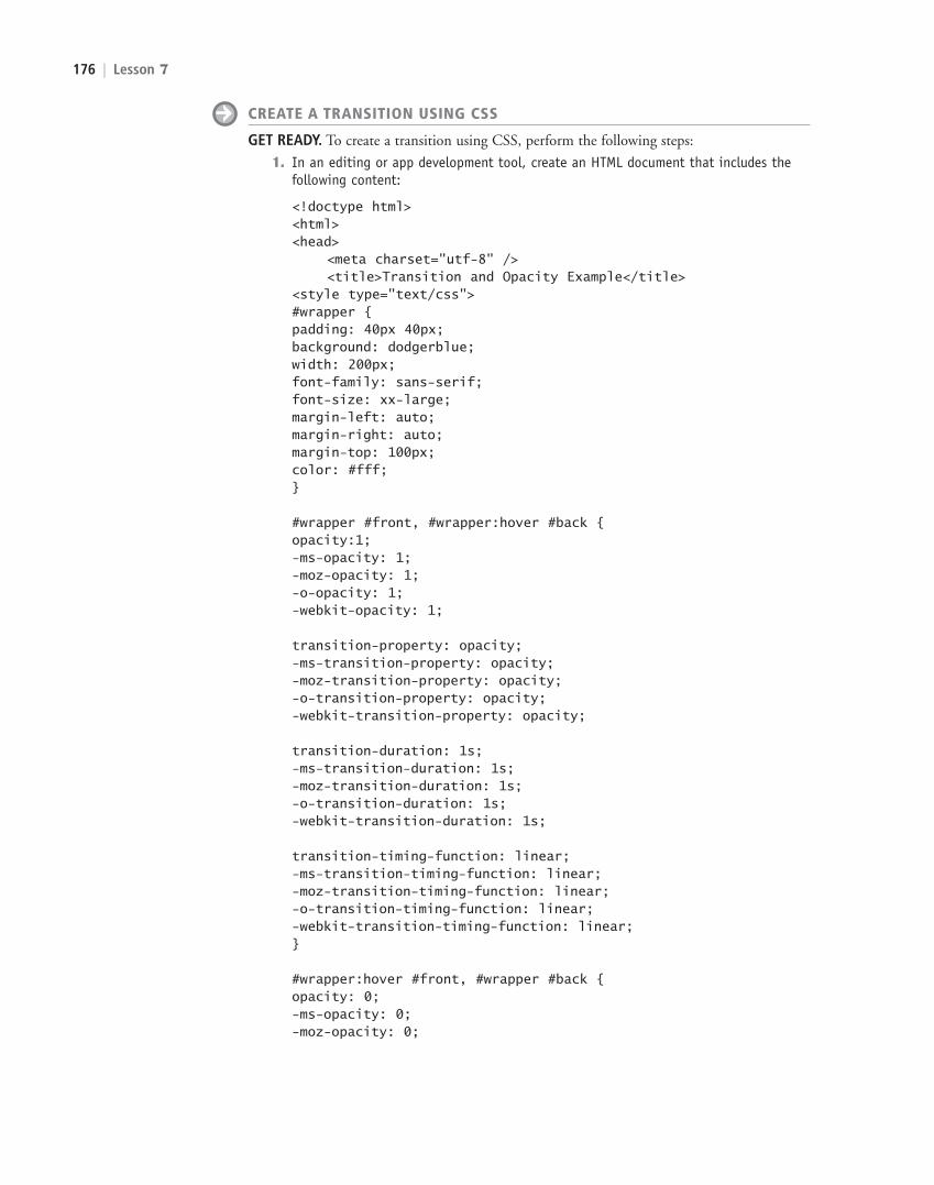
CREATE A TRANSITION USING CSS
GET READY. To create a transition using CSS, perform the following steps:
1. In an editing or app development tool, create an HTML document that includes the following content:
<!doctype html><html><head> <meta charset="utf-8" /> <title>Transition and Opacity Example</title><style type="text/css"> #wrapper {padding: 40px 40px; background: dodgerblue;width: 200px;font-family: sans-serif;font-size: xx-large;margin-left: auto;margin-right: auto;margin-top: 100px;color: #fff;}
#wrapper #front, #wrapper:hover #back {opacity:1;-ms-opacity: 1;-moz-opacity: 1;-o-opacity: 1;-webkit-opacity: 1;
transition-property: opacity;-ms-transition-property: opacity;-moz-transition-property: opacity;-o-transition-property: opacity;-webkit-transition-property: opacity;
transition-duration: 1s;-ms-transition-duration: 1s;-moz-transition-duration: 1s;-o-transition-duration: 1s;-webkit-transition-duration: 1s;
transition-timing-function: linear;-ms-transition-timing-function: linear;-moz-transition-timing-function: linear;-o-transition-timing-function: linear;-webkit-transition-timing-function: linear;}
#wrapper:hover #front, #wrapper #back {opacity: 0;-ms-opacity: 0;-moz-opacity: 0;
c07ManagingtheGraphicalInterfacebyUsingCSS.indd Page 176 10/18/12 10:48 AM c07ManagingtheGraphicalInterfacebyUsingCSS.indd Page 176 10/18/12 10:48 AM F-400F-400
LICENSED PRODUCT NOT FOR RESALE
Managing the Graphical Interface by Using CSS | 177
-o-opacity: 0;-webkit-opacity: 0;}</style></head>
<body><div id="wrapper"> <div id="front">Knock knock</div> <div id="back">Who's there?</div></div>
</body></html>
2. Save the file as L7-transition-exercise.html. Open the file in each of the major Web browsers. Hover your mouse pointer over the box in each browser. The display should look similar to Figure 7-23.
Figure 7-23
A simple transition Transition
3. To add a delay, enter the following after the transition-duration property lines:
transition-delay: 1s;-ms-transition-delay: 1s;-moz-transition-delay: 1s;-o-transition-delay: 1s;-webkit-transition-delay: 1s;
4. Save the file as L7-transition-delay-exercise.html. Open the file in each Web browser and hover your mouse pointer over the box. Do you notice the delay?
5. Close the file but leave the editing tool and Web browser open if you plan to complete the next exercise during this session.
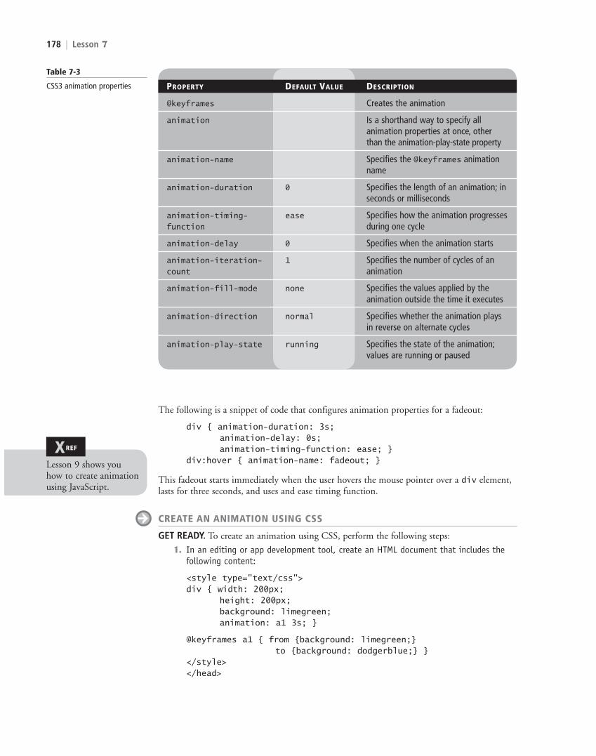
An animation is the display of a sequence of static images at a fast enough speed to create the illusion of movement. Like transitions, animations affect CSS properties and transformations, and you can also specify timings. One difference is that animations use keyframes, a con-struct that enables you to change values anywhere within the animation. You can also pause, resume, and reverse animations.
To create an animation, you begin by specifying a CSS style within the @keyframes rule. For example, a rule for a fadeout might look like the following:
@keyframes fadeout {from { opacity: 1; }to { opacity: 0; }}
Then you specify the animation’s properties. Many of the properties used in animations are similar to transitions. The animation properties are described in Table 7-3.
CERTIFICATION READYWhat is a keyframe?3.4
c07ManagingtheGraphicalInterfacebyUsingCSS.indd Page 177 25/10/12 7:12 AM user-f396c07ManagingtheGraphicalInterfacebyUsingCSS.indd Page 177 25/10/12 7:12 AM user-f396 F-403F-403
LICENSED PRODUCT NOT FOR RESALE
178 | Lesson 7
The following is a snippet of code that configures animation properties for a fadeout:
div { animation-duration: 3s; animation-delay: 0s; animation-timing-function: ease; }div:hover { animation-name: fadeout; }
This fadeout starts immediately when the user hovers the mouse pointer over a div element, lasts for three seconds, and uses and ease timing function.
CREATE AN ANIMATION USING CSS
GET READY. To create an animation using CSS, perform the following steps:
1. In an editing or app development tool, create an HTML document that includes the following content:
<style type="text/css">div { width: 200px; height: 200px; background: limegreen; animation: a1 3s; }
@keyframes a1 { from {background: limegreen;} to {background: dodgerblue;} }</style></head>
Table 7-3
CSS3 animation properties PROPERTY DEFAULT VALUE DESCRIPTION
@keyframes Creates the animation
animation Is a shorthand way to specify all animation properties at once, other than the animation-play-state property
animation-name Specifies the @keyframes animation name
animation-duration 0 Specifies the length of an animation; in seconds or milliseconds
animation-timing- ease Specifies how the animation progressesfunction during one cycle
animation-delay 0 Specifies when the animation starts
animation-iteration- 1 Specifies the number of cycles of an count animation
animation-fill-mode none Specifies the values applied by the animation outside the time it executes
animation-direction normal Specifies whether the animation plays in reverse on alternate cycles
animation-play-state running Specifies the state of the animation; values are running or paused
XREF
Lesson 9 shows you how to create animation using JavaScript.
c07ManagingtheGraphicalInterfacebyUsingCSS.indd Page 178 10/18/12 10:48 AM c07ManagingtheGraphicalInterfacebyUsingCSS.indd Page 178 10/18/12 10:48 AM F-400F-400
LICENSED PRODUCT NOT FOR RESALE
Managing the Graphical Interface by Using CSS | 179
<body><div></div></body>
2. Save the file as L7-animation-exercise.html. Open the file in each of the major Web browsers. The animation consists of a rectangular box that cycles from green to blue and back to green. Did the animation occur in all of the Web browsers? Make a note of which Web browsers support animation.
3. Replace the animation line in the CSS div section with the following:
animation-name: a1;animation-duration: 4s;animation-delay: 2s;
4. Save the file as L7-animation-mod-exercise.html. Open the file in the Web browsers in which the animation occurred originally. Do you notice the delay?
5. Close the file but leave the editing tool and Web browser open if you plan to complete the next exercise during this session.
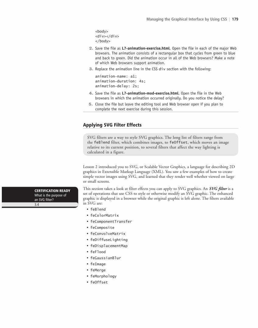
SVG filters are a way to style SVG graphics. The long list of filters range from the feBlend filter, which combines images, to feOffset, which moves an image relative to its current position, to several filters that affect the way lighting is calculated in a figure.
Applying SVG Filter Effects
Lesson 2 introduced you to SVG, or Scalable Vector Graphics, a language for describing 2D graphics in Extensible Markup Language (XML). You saw a few examples of how to create simple vector images using SVG, and learned that they render well whether viewed on large or small screens.
This section takes a look at filter effects you can apply to SVG graphics. An SVG filter is a set of operations that use CSS to style or otherwise modify an SVG graphic. The enhanced graphic is displayed in a browser while the original graphic is left alone. The filters available in SVG are:
• feBlend
• feColorMatrix
• feComponentTransfer
• feComposite
• feConvolveMatrix
• feDiffuseLighting
• feDisplacementMap
• feFlood
• feGaussianBlur
• feImage
• feMerge
• feMorphology
• feOffset
CERTIFICATION READYWhat is the purpose of an SVG filter?3.4
c07ManagingtheGraphicalInterfacebyUsingCSS.indd Page 179 10/18/12 10:48 AM c07ManagingtheGraphicalInterfacebyUsingCSS.indd Page 179 10/18/12 10:48 AM F-400F-400
LICENSED PRODUCT NOT FOR RESALE
180 | Lesson 7
• feTile
• feTurbulence
• feDistantLight
• fePointLight
• feSpecularLighting
• feSpotLight
Many of the filter names are fairly intuitive. For example, the feBlend filter combines images, feColorMatrix filters for color transformations, feOffset moves an image relative to its current position, and the last four in the list filter for lighting.
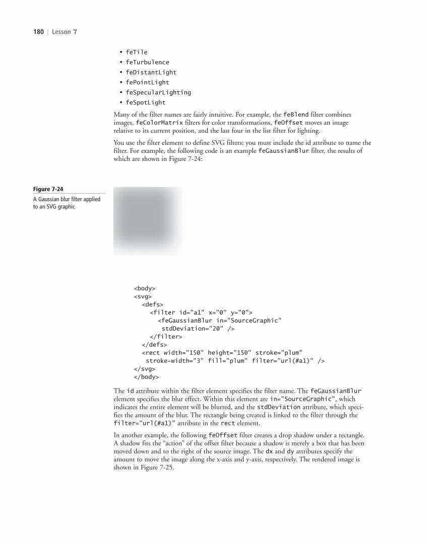
You use the filter element to define SVG filters; you must include the id attribute to name the filter. For example, the following code is an example feGaussianBlur filter, the results of which are shown in Figure 7-24:
Figure 7-24
A Gaussian blur filter applied to an SVG graphic
<body><svg> <defs> <filter id="a1" x="0" y="0"> <feGaussianBlur in="SourceGraphic" stdDeviation="20" /> </filter> </defs> <rect width="150" height="150" stroke="plum" stroke-width="3" fill="plum" filter="url(#a1)" /></svg></body>
The id attribute within the filter element specifies the filter name. The feGaussianBlur element specifies the blur effect. Within this element are in="SourceGraphic", which indicates the entire element will be blurred, and the stdDeviation attribute, which speci-fies the amount of the blur. The rectangle being created is linked to the filter through the filter="url(#a1)" attribute in the rect element.
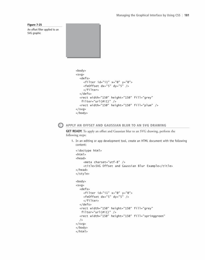
In another example, the following feOffset filter creates a drop shadow under a rectangle. A shadow fits the “action” of the offset filter because a shadow is merely a box that has been moved down and to the right of the source image. The dx and dy attributes specify the amount to move the image along the x-axis and y-axis, respectively. The rendered image is shown in Figure 7-25.
c07ManagingtheGraphicalInterfacebyUsingCSS.indd Page 180 10/18/12 10:48 AM c07ManagingtheGraphicalInterfacebyUsingCSS.indd Page 180 10/18/12 10:48 AM F-400F-400
LICENSED PRODUCT NOT FOR RESALE
Managing the Graphical Interface by Using CSS | 181
<body><svg> <defs> <filter id="i1" x="0" y="0"> <feOffset dx="5" dy="5" /> </filter> </defs> <rect width="150" height="150" fill="grey" filter="url(#i1)" /> <rect width="150" height="150" fill="plum" /></svg></body>
APPLY AN OFFSET AND GAUSSIAN BLUR TO AN SVG DRAWING
GET READY. To apply an offset and Gaussian blur to an SVG drawing, perform the following steps:
1. In an editing or app development tool, create an HTML document with the following content:
<!doctype html><html><head> <meta charset="utf-8" /> <title>SVG Offset and Gaussian Blur Example</title></head></style>
<body><svg> <defs> <filter id="i1" x="0" y="0"> <feOffset dx="5" dy="5" /> </filter> </defs> <rect width="150" height="150" fill="grey" filter="url(#i1)" /> <rect width="150" height="150" fill="springgreen" /></svg></body></html>
Figure 7-25
An offset filter applied to an SVG graphic
c07ManagingtheGraphicalInterfacebyUsingCSS.indd Page 181 10/18/12 10:48 AM c07ManagingtheGraphicalInterfacebyUsingCSS.indd Page 181 10/18/12 10:48 AM F-400F-400
LICENSED PRODUCT NOT FOR RESALE
182 | Lesson 7
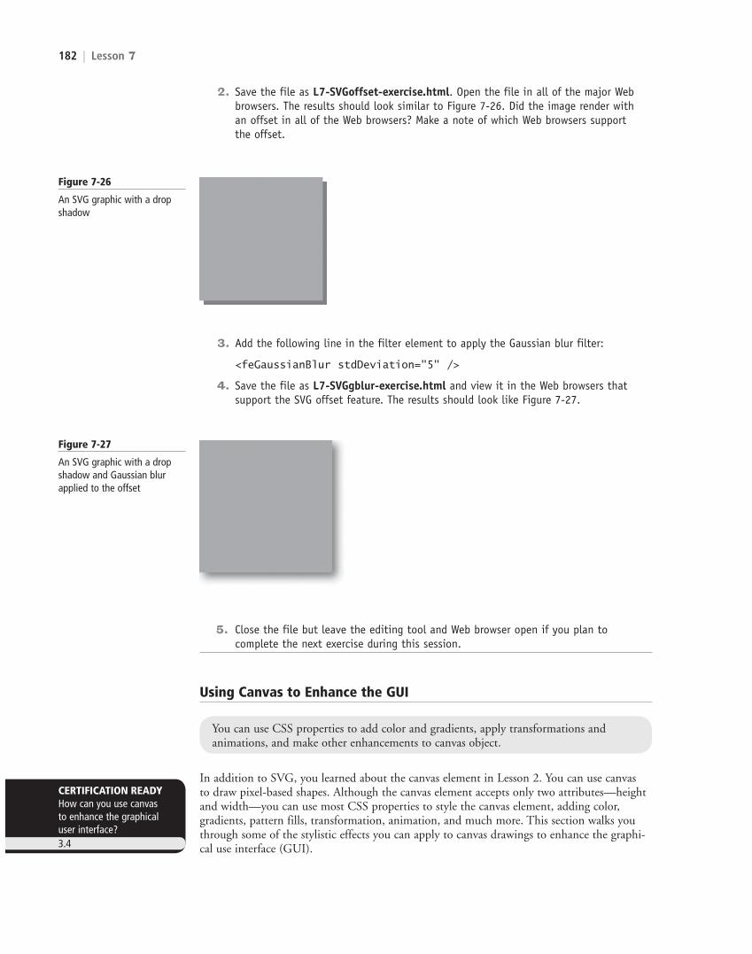
2. Save the file as L7-SVGoffset-exercise.html. Open the file in all of the major Web browsers. The results should look similar to Figure 7-26. Did the image render with an offset in all of the Web browsers? Make a note of which Web browsers support the offset.
Figure 7-26
An SVG graphic with a drop shadow
3. Add the following line in the filter element to apply the Gaussian blur filter:
<feGaussianBlur stdDeviation="5" />
4. Save the file as L7-SVGgblur-exercise.html and view it in the Web browsers that support the SVG offset feature. The results should look like Figure 7-27.
Figure 7-27
An SVG graphic with a drop shadow and Gaussian blur applied to the offset
5. Close the file but leave the editing tool and Web browser open if you plan to complete the next exercise during this session.
You can use CSS properties to add color and gradients, apply transformations and animations, and make other enhancements to canvas object.
Using Canvas to Enhance the GUI
In addition to SVG, you learned about the canvas element in Lesson 2. You can use canvas to draw pixel-based shapes. Although the canvas element accepts only two attributes—height and width—you can use most CSS properties to style the canvas element, adding color, gradients, pattern fills, transformation, animation, and much more. This section walks you through some of the stylistic effects you can apply to canvas drawings to enhance the graphi-cal use interface (GUI).
CERTIFICATION READYHow can you use canvas to enhance the graphical user interface?3.4
c07ManagingtheGraphicalInterfacebyUsingCSS.indd Page 182 10/18/12 10:48 AM c07ManagingtheGraphicalInterfacebyUsingCSS.indd Page 182 10/18/12 10:48 AM F-400F-400
LICENSED PRODUCT NOT FOR RESALE

Managing the Graphical Interface by Using CSS | 183
The following code creates a basic canvas box:
<script> function f1() { var canvas = document.getElementById("smlRectangle"); context = canvas.getContext("2d"); context.fillStyle = "blue"; context.fillRect(10, 20, 200, 100); } </script>
<body onload = "f1();"><canvas id="smlRectangle" height='300' width='500'></canvas></body>
This sample already uses the fillStyle attribute for the getContext("2d") object. Let’s change the color to apply a gradient with coral as the start color and khaki as the end color. Replace the fillStyle line with the following, which render as shown in Figure 7-28:
var grd=context.createLinearGradient(0,0,150,0);grd.addColorStop(0.3,"coral");grd.addColorStop(0.7,"khaki");context.fillStyle=grd;
Figure 7-28
A canvas object with a gradient applied
To rotate the canvas, you use the formula degrees*Math.PI/180. You must also add the rotation before the rectangle is generated. So, to rotate our canvas 20 degrees, add the following line before the context-fillRect line:
context.rotate(20*Math. PI/180);
The result is shown in Figure 7-29. You can also translate (move), scale, and skew the object similar to transforming HTML elements.
Figure 7-29
A canvas object rotated 20 degrees
Finally, let’s see how to generate text by using canvas (see Figure 7-30). You use the fillText and font methods:
<body><canvas id="myText" width="400" height="250" style="border:3px solid #0000FF;"></canvas>
c07ManagingtheGraphicalInterfacebyUsingCSS.indd Page 183 10/18/12 10:48 AM c07ManagingtheGraphicalInterfacebyUsingCSS.indd Page 183 10/18/12 10:48 AM F-400F-400
LICENSED PRODUCT NOT FOR RESALE

184 | Lesson 7
<script type="text/javascript"> var canvas = document.getElementById("myText"); context = canvas.getContext("2d"); context.font = "30px Arial"; context.fillText("Canvas-generated text", 40, 120);</script></body>
Figure 7-30
Canvas-generated text surrounded by a border
Whereas the fillText method creates solid-filled text in any color (black by default), you can replace fillText with strokeText to create bordered letters (letters without fill).
ENHANCE A CANVAS OBJECT
GET READY. To enhance a canvas object, perform the following steps:
1. In an editing or app development tool, create an HTML document that includes the following content:
<!doctype html><html><head> <meta charset="utf-8" /> <title>Canvas Exercise</title> <script> function f1() { var canvas = document.getElementById("smlRectangle"); context = canvas.getContext("2d"); context.fillStyle = "coral"; context.fillRect(10, 20, 200, 100); } </script> </head><body onload = "f1();"><canvas id="smlRectangle" height='300' width='500'></canvas></body></html>
2. Save the file as L7-canvas-exercise.html. Open the file in a Web browser to verify that you see a coral-colored rectangle.
3. Replace the solid color with a gradient that starts with light blue and ends with dark blue. To do so, replace the current fillStyle line with the following:
var grd = context.createLinearGradient(0, 0, 150, 0); grd.addColorStop(0.3, "lightblue"); grd.addColorStop(0.7, "darkblue"); context.fillStyle = grd;
c07ManagingtheGraphicalInterfacebyUsingCSS.indd Page 184 10/18/12 10:48 AM c07ManagingtheGraphicalInterfacebyUsingCSS.indd Page 184 10/18/12 10:48 AM F-400F-400
LICENSED PRODUCT NOT FOR RESALE

Managing the Graphical Interface by Using CSS | 185
4. Scale the rectangle so that it’s five times as wide and five times as tall as the original rectangle. To do so, add the following after the new fillStyle line:
context.scale(5,5);
5. Save the file again and view it in a Web browser. The results should look similar to Figure 7-31.
Figure 7-31
A canvas rectangle with a gradient and scaled to be five times larger than the original
6. Close all files and applications.
S K I L L S U M M A R Y
IN THIS LESSON YOU LEARNED:
• Some of the new graphics effects you can easily achieve with CSS3 are rounded corners, drop shadows, transparency, and background gradients.
• The border-radius property creates rounded corners, the box-shadow property creates drop shadows, the opacity property creates transparency effects, and the background property with one of the four gradient attributes creates linear and radial gradients.
• The Web Open Font Format (WOFF) is a means of bringing better typography to the Web. WOFF allows Web developers to use nearly any font instead of being limited to the standard Web fonts.
• WOFF files are compressed True Type, OpenType, or Open Font Format fonts that contain additional metadata.
• The CSS3 transform property translates, scales, rotates, skews, and even spins 2D and 3D elements.
• Perspective, in terms of drawings and illustrations, is the convergence of lines that give the illusion of depth
c07ManagingtheGraphicalInterfacebyUsingCSS.indd Page 185 10/18/12 10:48 AM c07ManagingtheGraphicalInterfacebyUsingCSS.indd Page 185 10/18/12 10:48 AM F-400F-400
LICENSED PRODUCT NOT FOR RESALE
186 | Lesson 7
• A transition is a change from one thing to another; in CSS, a transition is the change in an element from one style to another.
• An animation is the display of a sequence of static images at a fast enough speed to create the illusion of movement.
• An SVG filter is a set of operations that use CSS to style or otherwise modify an SVG graphic. The enhanced graphic is displayed in a browser while the original graphic is left alone.
• Although the canvas element accepts only two attributes—height and width—you can use most CSS properties to style the canvas element, adding color, gradients, pattern fills, transformation, animation, and much more.
Fill in the Blank
Complete the following sentences by writing the correct word or words in the blanks provided.
1. A is a smooth change of colors, either within the same hue or starting with one color and ending with another.
2. To an element is to increase or decrease its size.
3. A is a visual effect in which an object is repeated behind and moved slightly below itself to create the illusion that the object floats over its background.
4. A is a change from one thing to another; in CSS, it is the change in an element from one style to another.
5. The enables Web developers to use custom fonts—pretty much any font—instead of being limited to the standard Web fonts.
6. The CSS3 property enables you to create rounded corners around layout elements, such as headers, footers, sidebars, graphics boxes, and outlines around images.
7. is reduced opacity.
8. To an element means to move it, without rotating, skewing, or other-wise turning the image.
9. In HTML5/CSS3, a is an effect that lets you change the size, shape, and position of an element.
10. An SVG is a set of operations that use CSS to style or otherwise modify an SVG graphic.
Multiple Choice
Circle the letter that corresponds to the best answer.
1. Which of the following creates a gradient from top to bottom, left to right, or from corner to corner, without reiterating colors?a. linear-gradientb. radial-gradientc. repeating-linear-gradientd. repeating-radial-gradient
■ Knowledge Assessment
c07ManagingtheGraphicalInterfacebyUsingCSS.indd Page 186 10/18/12 10:48 AM c07ManagingtheGraphicalInterfacebyUsingCSS.indd Page 186 10/18/12 10:48 AM F-400F-400
LICENSED PRODUCT NOT FOR RESALE
Managing the Graphical Interface by Using CSS | 187
2. Which of the following is not true of the border-radius property?a. It creates rounded corners around layout elements.b. It can be expressed in pixels.c. It can be expressed as a percentage.d. It can animate an object.
3. To apply a 60% transparency to an image or element, which property do you use?a. opacity: 40b. opacity: 0.4c. transparency: 40d. transparency: 0.4
4. Which of the following are disadvantages of Web-safe fonts? (Choose all that apply.)a. They must be loaded on a Web server.b. They are limited in number and variety.c. They make brand identity difficult to achieve on the Web.d. They are expensive.
5. Keyframes are associated with which of the following?a. Rounded cornersb. Transitionsc. Animationsd. None of the above
6. When creating a transition, which of the following must be specified?a. A start delayb. The CSS property to be acted upon during the transitionc. The transition timing functiond. The keyframe
7. What is a primary advantage to using color interpolation in the alpha color space?a. It produces smoother color transitions in gradients.b. It enables you to add color to SVG drawings.c. Both a and bd. Neither a nor b
8. Which of the following do you use to add color to canvas text?a. fillStyleb. strokeStylec. textColord. strokeColor
9. What are the two play states of an animation?a. startedb. runningc. pausedd. resumed
10. In the following code sample, what controls the amount of blur?
<defs> <filter id="a1" x="0" y="0"> <feGaussianBlur in="SourceGraphic" stdDeviation="20" /> </filter></defs>
a. feGaussianBlurb. SourceGraphicc. stdDeviationd. none of the above
c07ManagingtheGraphicalInterfacebyUsingCSS.indd Page 187 10/18/12 10:48 AM c07ManagingtheGraphicalInterfacebyUsingCSS.indd Page 187 10/18/12 10:48 AM F-400F-400
LICENSED PRODUCT NOT FOR RESALE

188 | Lesson 7
■ Competency Assessment
Scenario 7-1: Troubleshooting CSS3 Code
Ali is a vintage car enthusiast who restores old cars and sells them for a profit. He posts photos and descriptions on his Web site, which he maintains himself. Ali is transitioning to HTML5 and CSS3 as much as possible. He has been trying to apply the translate and scale transformations to a 2D image on his site but neither transformation is working. This is the code he’s using:
<style>img { transform: translate(100px,50px); transform: scale(2,4); }</style>
What advice do you give to Ali?
Scenario 7-2: Displaying Before and After Images
Ali’s wife Linda thinks his vintage car Web site could use some enhancements to attract more visitors. One of her suggestions is to show before and after photos of the cars that Ali has restored. They ask you what options they have using CSS3 to make it easy on users to see the photos. What do you tell them?
■ Proficiency Assessment
Scenario 7-3: Creating Buttons with Enhancements
Edward is creating a set of buttons for a Web application and wants the buttons to have rounded corners and a small drop shadow that’s slightly blurred. He asks you which CSS3 properties to use. What do you tell him?
Scenario 7-4: Understanding 3D Perspective
Meghan is a university student who is studying for a fine arts degree. She’s learning about digital graphics in one of her courses, and a fellow student said he’s interested in the CSS3 3D perspec-tive. She hadn’t heard of it before, so she asks you to briefly explain it to her. What do you tell her?
True / False
Circle T if the statement is true or F if the statement is false.
T F 1. An opaque item does not let light pass through, whereas you can see through a transparent item.
T F 2. In CSS, to rotate an element turns it counterclockwise by a specified number of degrees.
T F 3. An animation is the display of a sequence of static images at a fast enough speed to create the illusion of movement.
T F 4. Radial gradients start from a central point and radiate color out to the edges of a container.
T F 5. Perspective, in terms of drawings and illustrations, is the convergence of lines that give the illusion of depth.
c07ManagingtheGraphicalInterfacebyUsingCSS.indd Page 188 10/18/12 10:48 AM c07ManagingtheGraphicalInterfacebyUsingCSS.indd Page 188 10/18/12 10:48 AM F-400F-400
LICENSED PRODUCT NOT FOR RESALE