marketer’s guide: complete guide to mobile responsive web design
TRANSCRIPT

A KEO Marketing Inc. Marketer’s Guide
MARKETER’S GUIDE
SEARCH - MARKETING - SOCIAL - MOBILE - ADVERTISING
December 2014 Edition
Complete Guide to Mobile Responsive Web Design

Complete Guide to Mobile Responsive Web Design
Haven’t updated your website to render well on any mobile device yet? You are likely losing a lot of leads and sending customers straight to your competitors. Read this report to learn why you must act immediately or risk getting left behind.
If you need any further convincing, remember that user experience is a factor that goes into determining your Google search rankings. A website that doesn’t provide a good mobile user experience will likely see a negative impact on search rankings.
of digital traffic online now comes from mobile devices and through mobile apps.
91% of mobile users said that after experiencing problems on one site they had turned to a competitor’s mobile site to compete a desired task
More than half of those customers want to make a pur-chase within an hour of doing their research. They’re ready to buy, and if your website doesn’t help them do that easily, they will go to another site that does.
15 Hours on Mobile Research
They also experience increases in visitor conversion rates, engagement rates and average order value.
increase in brand awareness and a 34.7% 19.7% increase in annual company revenue.
Companies that use responsive design see a
50%More than
Mobile Responsive Web Design - Current Facts
1

85% of respondents said mobile devices are a central part
of everyday life
48% of smartphone users and 70% of multi-device users have signed up for email notifications from a business
54% say mobile-optimized websites don’t give enough information
2
Why you need responsive design
In the past, a popular approach was to simply create a mobile version of the website, or of certain pages on the site. That is no longer sufficient, partly because people now use so many different devices to access online content. Responsive web design is your smartest strategy for ensuring your site works well for users of all devices.
Consider some quick stats from a recent ExactTarget survey:
In addition, a recent survey conducted by xAd and Telmetrics showed that people now use mobile devices everywhere, not just when they are on the go. Half of all smartphone-armed consumers are using their mobile devices even when at home and presumably within close proximity to a computer.

That survey also showed that the highest ratio of mobile activity happened early in the buying/shopping or research process, when people still were unsure exactly what they wanted and were most open to the influence of good marketing. This means you need to grab users quickly or risk losing a sale.
Yes, it’s true that creating a responsive website will involve some additional upfront expense, mainly in the form of time and materials, but it is much more cost-efficient than producing several different versions of the same website. More importantly, it is a much smarter move financially than risking the loss of countless website visitors, and the potential sales and ongoing business they represent. In this way, a responsively designed website will pay for itself in the long-run.
3
of the buying process is over before a person contacts a salesperson. They are researching, and probably doing so on a mobile device. It is critical that companies are visible during this research phase in order to be a part of the considered set.
Remember
60-70%

SEO benefits of responsive web design
While usability and functionality are the main priorities of a responsive site, there is also another big upside that visitors never see or don’t consciously notice. Responsive sites can offer a major search engine optimization advantage.
This SEO impact will increase. Google finds mobile responsive websites to provide a better user experience and often rank them more highly.
One site or two?
As opposed to having a mobile version of a website or other alternative that has a different URL, a responsive website uses a single URL, or web address, for all visitors. This helps you avoid the potential SEO penalty that can sometimes happen when you have several versions of the same website with different URLs.
Page load speeds
We discuss page load speeds later in this guide, but they are also relevant to SEO because Google uses page speed as a ranking factor. During the process of creating a mobile responsive website, you will analyze the components of your site and will be able to identify elements that may be negatively affecting your load times.
4

Planning is critical
When creating any type of content or web design, the planning aspect is usually the first major phase, and should also be one of the most time-consuming parts of the entire project. Too many people make the mistake of trying to rush through this phase, and they usually end up regretting it later.
Information architecture is an essential part of this process. You cannot just dive in and start throwing bits of content around. You need to take some time at the start of the project to analyze your current content and layout, think about anything that must be added or changed, and then decide where, if at all, these bits and pieces will fit in your new responsive design.
As noted later in this report, we strongly recommend focusing on the mobile experience first, and then gradually broadening the scope to encompass the desktop version of your site.
Your tech team or agency will play a pivotal role in making your responsive site look good and work well, so you will want to include them in your discussions from the start. As the website development progresses, the marketing and tech teams should work hand-in-hand in order to ensure that everyone is on the same page, and to help things move along as quickly as possible.
5

Content layout
One of the major issues to consider when designing a responsive layout is how you will arrange the content. Smartphones and other mobile devices have smaller screens so you need to make the most of that limited real estate. You want to be sure the most critical information or functions are prominently visible where mobile users can see them right away.
This may involve making some challenging decisions, particularly when it comes to evaluating your content and deciding which is most important for visitors to see. While you undoubtedly consider all of your content to be useful and relevant, it’s impossible to squeeze everything into this small window.
In citing the factors that caused mobile website disappointment, 95% of people said it was too difficult to enter information. The same number said they could not find what they were looking for on mobile websites.
Stick with the basics
You will need to put yourself in your visitors’ places and consider what their top goals or priorities will be when they arrive on your site. Figure out the most important thing visitors will want and keep that front and center. Don’t clutter up the screen with a lot of extras.
6
60-70%95%

Focus on long, vertical layouts and avoid wide arrangements that can’t be seen without swiping. Another effective trick is to use movement to draw attention to the most important elements. This can be accomplished through tactics such as text fly-ins, image sweeps and similar devices.
Use clear, short headings and descriptors
Mobile users won’t spend a lot of time scouring content hoping to find what they need. Most likely, they will just quickly scan the screen, so relevant words need to jump out at them. Break up small chunks of content, and label them with brief, easy-to-understand headings or titles and descriptive graphics.
Make the navigation simple
This is a tricky point for many marketers and tech teams. The navigation is one of the most important areas, yet it can seem to be a big challenge. Strip down your menu to its most basic fundamentals, and then expand out for the desktop version.
Think about the breakpoints
Breakpoints are, in simple terms, the parameters that determine which content will be contained within the confines of your site as seen on specific devices. This is a bit more technical than we will address here, but the important takeaway for marketers is that you will need to plan your content and design with these parameters in mind. While there are some standard breakpoints that are commonly recommended for specific devices, many businesses tweak these standards to create customized breakpoints that best meet their needs. You’ll need to establish a set of breakpoints that make sense for your design.
7

Fast load times are a must
A one-second delay in page response can result in a 7% loss in conversions. The same delay also decreases customer satisfaction by about 16%.
Mobile users won’t wait forever for your pages to load. Eliminate fancy elements that slow down load times.
Compressing images and cleaning up your code are two ways to prevent page load slowdowns. Your technical staff can likely identify a number of other strategies to help improve your load speeds.
Consider using frameworks
The foundation of a responsive design is a grid system that dictates the layout of the web page content. Many businesses design their own grid layout by creating their own unique code. This offers the highest degree of flexibility and customization options. However, it also increases the time and expense involved in getting the “skeleton” of the site created.
8
1 Sec
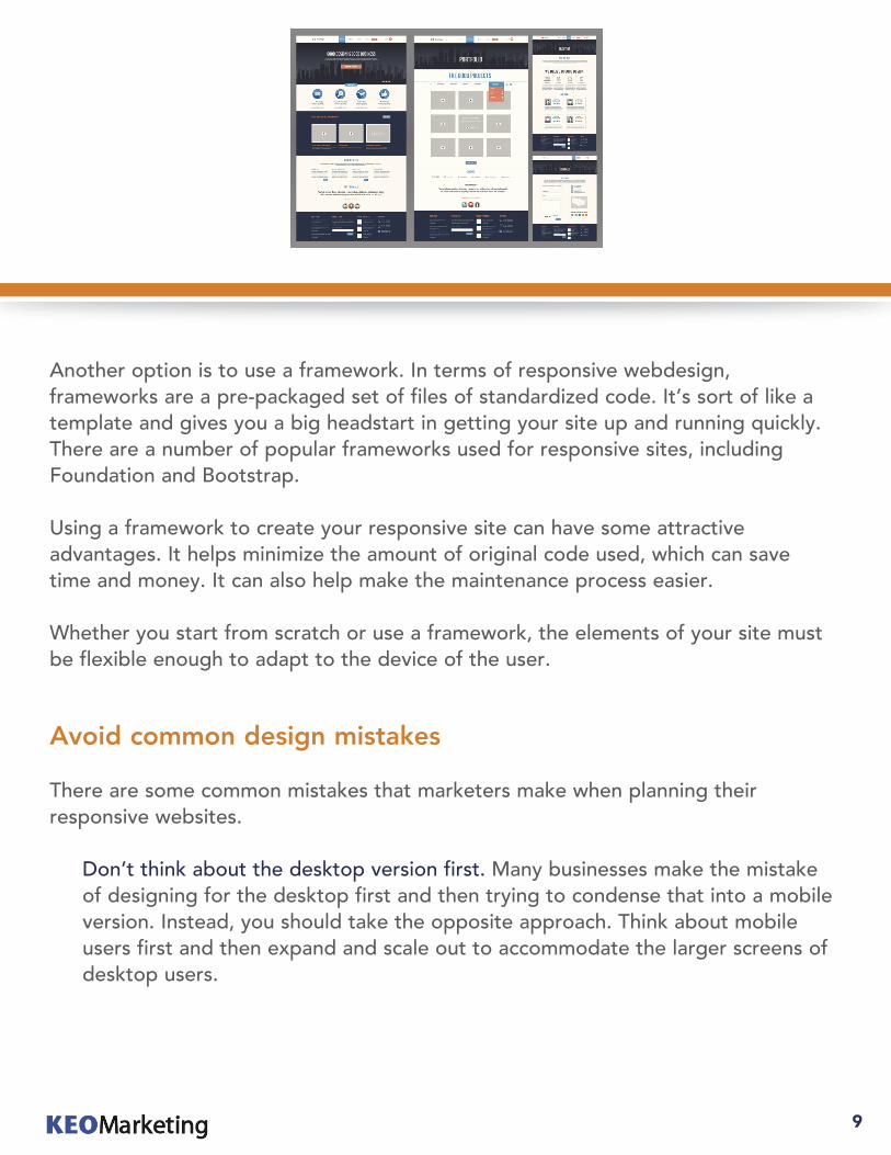
Another option is to use a framework. In terms of responsive webdesign, frameworks are a pre-packaged set of files of standardized code. It’s sort of like a template and gives you a big headstart in getting your site up and running quickly. There are a number of popular frameworks used for responsive sites, including Foundation and Bootstrap.
Using a framework to create your responsive site can have some attractive advantages. It helps minimize the amount of original code used, which can save time and money. It can also help make the maintenance process easier.
Whether you start from scratch or use a framework, the elements of your site must be flexible enough to adapt to the device of the user.
Avoid common design mistakes
There are some common mistakes that marketers make when planning their responsive websites.
Don’t think about the desktop version first. Many businesses make the mistake of designing for the desktop first and then trying to condense that into a mobile version. Instead, you should take the opposite approach. Think about mobile users first and then expand and scale out to accommodate the larger screens of desktop users.
9

Make icons and action items large enough to be thumb-friendly. Many visitors will be using devices with touchscreens, so your interactive elements should be large enough to be controlled with fingers and thumbs.
Watch out for media that doesn’t display correctly. Certain forms of content—namely, video—don’t always play nicely with responsive web design. Flash-based videos, for example, often prove to be a headache. You will need to pay particular attention to any non-text content you have on your site and test to make sure it functions correctly on all devices.
A parting thought
Need help with your website? For more information or to request a complimentary marketing audit, please visit us at KEOMarketing.com.
of mobile users said they have recommended a brand based on the mobile web experience
said that they do this often or very often
80%
29%
10

http://www.exacttarget.com/2014-mobile-behavior-report
http://www.telmetrics.com/2014/06/xad-and-telmetrics-release-3rd-annual-u-s-mobile-path-to-purchase-study-revealing-mobile-dominance-in-consumers%E2%80%99-purchase-decisions/
https://developers.google.com/web/fundamentals/layouts/rwd-fundamentals/
http://getbootstrap.com/
http://smallbiztrends.com/2014/07/online-traffic-report-mobile.html
https://www.thinkwithgoogle.com/research-studies/mobile-path-to-purchase-5-key-findings.html
http://www.netbiscuits.com/news/press/2014/10/28/brand-loyalty-dead-on-the-mobile-web-net-biscuits-peoples-web-report-ii/
https://blog.kissmetrics.com/loading-time/
http://v1.aberdeen.com/launch/report/knowledge_brief/9084-KB-responsive-design.asp
Sources
11

About KEO Marketing
4809 E. Thistle Landing Dr.Suite 100
Phoenix, AZ 85044888.702.0679
Innovative Business to Business & Inbound Marketing SolutionsLooking for significant increases in leads and sales?KEO Marketing delivers innovative marketing solutions that achieve tangible and substantial results. Some of the world’s largest brands have depended on KEO Marketing for marketing programs that drive business growth.
Specializing in business to business (B2B) marketing strategy, creative, messaging, infrastructure, execution, marketing analytics and results, KEO Marketing helps Fortune 1000 companies as well as medium sized businesses achieve and exceed their marketing and sales goals.
We start by understanding your business, your industry and your marketing plans. We build on that with research to identify how your customers find your products and services today. Then we tailor a marketing strategy for you based on proven experience and a thorough understanding of your marketplace. We take that knowledge and put it to work for your unique business situation and environment.
For more information or to request a complimentary marketing audit, please visit us at KEOMarketing.com.