marlowe album cover
TRANSCRIPT

Monday, 15 June y
Media
Marlowe
1.“It’s turning me on”
- Basic font, Simplistic.
- Girl putting on lipstick, sexualised - album
title: “It’s turning me on”
- Red colour grade - romance, sexual
- Classy
- Assume the genre is something classic/
alternative.
- Elegant - reflective of female icons like
Audrey Hepburn/Marilyn Monroe?
- Aiming at
Why choose to put this girl on the cover and not the artist?
Why such a simple font?
Why red?
Why this particular representation of a woman?
2. “Darksparklecorner”
- Home picture
- baby shocked
Is the baby purely to draw attention to the cover or does it has a deeper meaning?
Why have you chosen to make this album cover an enigma? something that the audience has to work out?
Why a home image and not a professional one?
1

Monday, 15 June y
Why is the baby so shocked?
Why is the image more prominent than the album title?
Why is the music genre so unclear?
3. “a day in july”
similar red colour theme
same font
different country - looks like Denmark
Who are the people how do they link?
Where was the picture taken and how does this relate to the artist?
Why that font?
Does the change in the album covers reflect a change in the music or is it just wierd?
Is each album aimed at a different audience or the same?
4. “Deep breathe fake air”
Why aren't you on your album covers?
Why more emphasis on the name of the artist on this one?
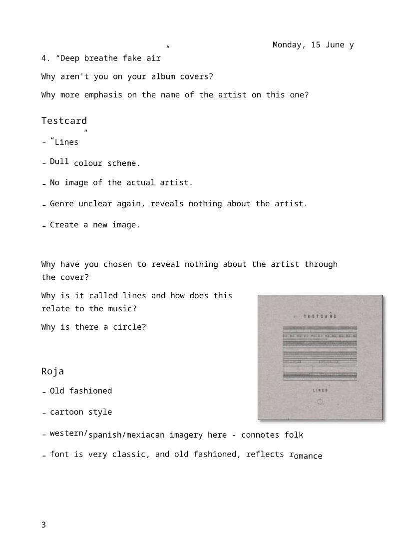
Testcard
- “Lines”
- Dull colour scheme.
- No image of the actual artist.
- Genre unclear again, reveals nothing about the artist.
- Create a new image.
2
Monday, 15 June y
Why have you chosen to reveal nothing about the artist through the cover?
Why is it called lines and how does this relate to the music?
Why is there a circle?
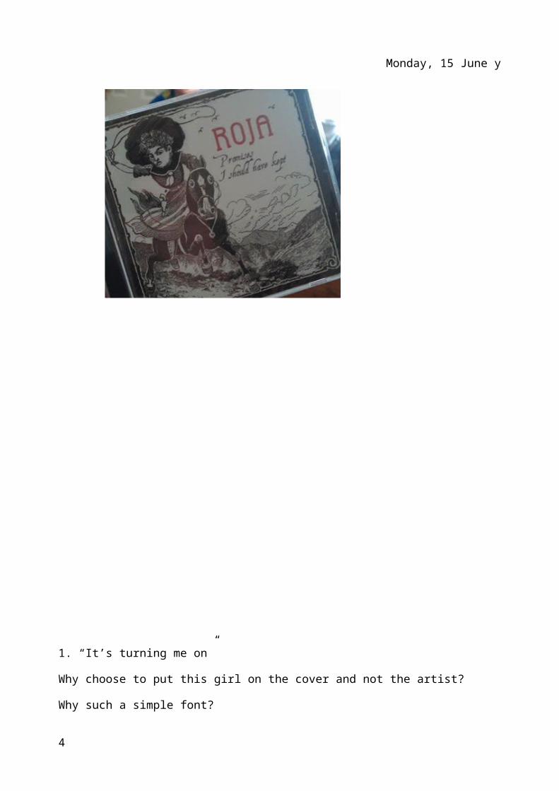
Roja
- Old fashioned
- cartoon style
- western/spanish/mexiacan imagery here - connotes folk
- font is very classic, and old fashioned, reflects romance
3
Monday, 15 June y
1. “It’s turning me on”
Why choose to put this girl on the cover and not the artist?
Why such a simple font?
Why red?
Why this particular representation of a woman?
2. “ darksparklecorner”
Is the baby purely to draw attention to the cover or does it has a deeper meaning?
Why have you chosen to make this album cover an enigma? something that the audience has to work out?
Why a home image and not a professional one?
Why is the baby so shocked?
Why is the image more prominent than the album title?
Why is the music genre so unclear?
3. “a day in july”
Who are the people how do they link?
Where was the picture taken and how does this relate to the artist?
Why that font?
Does the change in the album covers reflect a change in the music or is it just wierd?
Is each album aimed at a different audience or the same?
4. “Deep breathe fake air”
Why aren't you on your album covers?
Why more emphasise on the name of the artist on this one?
5. “Testcard”
Why have you chosen to reveal nothing about the artist through the cover?
4

Monday, 15 June y
Why is it called lines and how does this relate to the music?
Why is there a circle?
6. “Roja”
Does the romantic font reflect the genre of the music?
all the other covers are very simplistic, why isn't this one?
Why a Spanish theme?
5