martin_11.4.1_final
DESCRIPTION
Month 11 Week 4 final submissionTRANSCRIPT
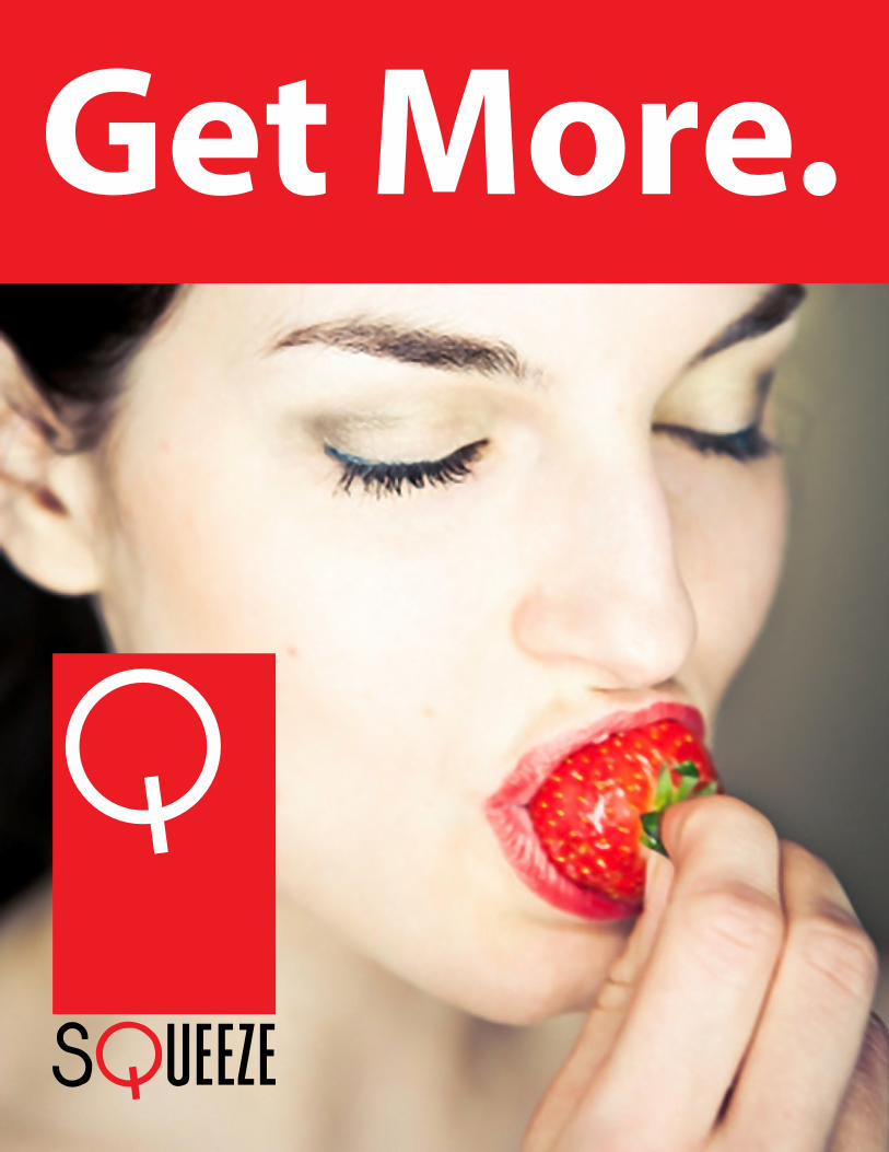
Get More.

IntroductionGet More. That’s Squeeze in a nut
shell. But where did all of that bravado,
that demanding tone, sense of justified
entitlement come from?
It came from a sign. A storefront sign
featuring a bad logo made infinitely
worse by having been partially covered
for some unknown reason. That sign
marked the front of an Inta Juice store,
and it screamed out for help. For
reinvention.
Enter Squeeze. Squeeze is Inta Juice
plus. It is everything Inta Juice is and
it’s everything Inta Juice could be.
The Squeeze brand, as presented here,
redefines the damaged Inta Juice brand
as a value-added brand. What does
that mean? It means that Squeeze is a
brand, much like Starbucks, that people
will want to be associated with.
With Squeeze, you Get More.

Get More.

Contents
ResearchResearch Abstract 1.1
Company Overview 1.3
Competitive Audit 1.5
Creative Brief 1.7
Target Demographics 1.9
SWOT Analysis 1.11
1 2ProcessCompetitive Survey 2.1
Design Research 2.3
Mood Board 2.5
Logo Development 2.7

Contents
3Tool BoxLogo 3.1
Typography 3.3
Color 3.4
Visual Elements 3.5
4SolutionsBillboard 4.1
Print Ads 4.3
Website 4.5
Social Media 4.6
Reusable Cup 4.7
5
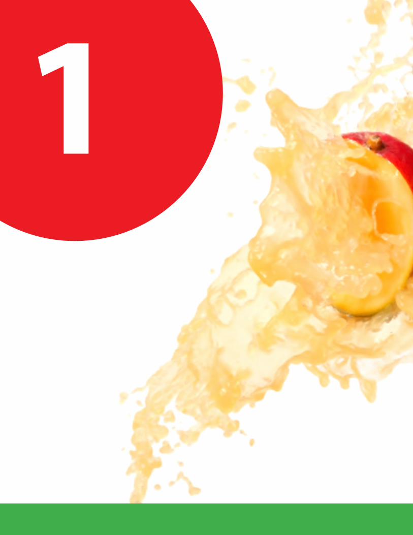
1

6
Time to take a good hard look.
Rese
arch
Research Abstract 1.1
Company Overview 1.3
Competitive Audit 1.5
Creative Brief 1.7
Target Demographics 1.9
SWOT Analysis 1.11

Research AbstractThis abstract details the weaknesses
inherent in present Inta Juice branding.
It details the reasons for a complete
rebranding, and describes a detailed
path toward that goal.
Inta Juice branding is damaged, and
at no point was it more than mediocre.
Unsophisticated messaging, amateurish
logo design, an undefined target
audience, and a redundant product
offering all played key parts in making
the Inta Juice brand a failure.
This document describes a rebranding
initiative. A change of name, visual
style, and target market will be
described. A new name, “Squeeze,” is
recommended. “Squeeze” is uniquely
well suited for a fruit and vegetable
smoothie vendor, and has strong
extandability along with connotations
from aggressive to sexy, as indicated by
context.
A focus on letting
Squeeze be
“your health and
productivity partner”
will guide marketing,
communicating to upper-
middle and upper class
professionals that Squeeze
is here to help them get the
nutrition they want (in order to both
move toward a healthy body and feel
immediately good about having made a
healthy choice) quickly, allowing them
to “squeeze in” more productivity.
“...your health and
productivity partner.”
1.1

Targeting affluent individuals is
complex, and requires sophisticated
brand design. In addition to the
above, a strong brand persona will be
developed. Advertising will be in
the voice of a person the target
audience admires. Association
with Squeeze will be a benefit
in itself. Ad language will be
witty, minimalist, elegant,
sharp, and sometimes sexy
or aggressive. Appeals to
values such as aggressive
business tactics or sex will
define an adult brand. Like
Apple or Starbucks, Squeeze
could be a brand people pay a
premium for.
“...your health and
productivity partner.”
1.2

INTA Juice started in 1996 as a single
store. Within ten years, founder Richard
Pickett had grown that single store into
30 outlets in five states (Schwab, 2006).
INTA Juice is part of the fast food indus-
try, but is also part of the health food
industry. However, branding to date has
been primarily as a fast food alternative.
Several INTA Juice franchise locations
were owned by NFL player and West
Virginia native Randy Moss. That meant
good press initially, but the franchise
locations quickly covered up the central
visual element of the INTA Juice logo,
a strawberry, with white plastic. That vi-
sual signal of branding issues preceded
the closing of some stores (hohmann,
2012). This very visual degradation had
a negative effect on public perception.
The Inta Juice brand mark is weak.
Company Overview
1.3

“Inta” is a casual misspelling of “into,”
setting a casual, childish tone. The
typeface used is both cliché and goofy.
The illustration is amateurish and clearly
childish, depicting a bland strawberry
personification with nothing to say ex-
cept that fruit is goofy.
To date, Inta Juice marketing
has been unfocused. It has featured the
wide range of fruit and juice smoothies
Inta Juice offers, touting both good taste
and health benefits. The brand has not
focused its efforts on any single market
segment, and so by default competes
in all markets, a position impossible to
sustain.
1.4

Smoothie companies are not a new
idea. “There are more than 6000
smoothie shops in the United States,
most of them franchises. With little expe-
rience needed, many smoothie franchis-
es require little or no previous business
background” (Franchise Help). However,
several stand-outs directly decrease the
access Inta Juice has to its (too broad)
target market.
Competitive Audit
1.5

Liquid Nutrition Is the smoothie opposite of Jamba Juice. This company focusing primarily on health marketing, and eschewing the bright & color children’s / fun food market.
Of the three examples given here,
Smoothie King is most similar to Inta
Juice. Down to the amateurish logo
design, Smoothie King almost identical
to Inta Juice.
Liquid Nutrition stands as a direct competitor to Inta Juice in the health food market.
Jama Juice is Inta Juice’s largest, most prominent competitor. With better identity design, branding, and market penetration, Jamba Juice dominates the Smoothie market. Jamba Juice does not
1.6
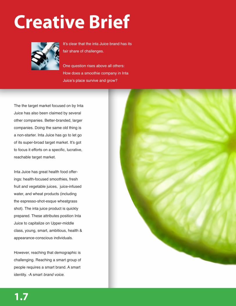
It’s clear that the inta Juice brand has its
fair share of challenges.
One question rises above all others:
How does a smoothie company in Inta
Juice’s place survive and grow?
Creative Brief
The the target market focused on by Inta
Juice has also been claimed by several
other companies. Better-branded, larger
companies. Doing the same old thing is
a non-starter. Inta Juice has go to let go
of its super-broad target market. It’s got
to focus it efforts on a specific, lucrative,
reachable target market.
Inta Juice has great health food offer-
ings: health-focused smoothies, fresh
fruit and vegetable juices, juice-infused
water, and wheat products (including
the espresso-shot-esque wheatgrass
shot). The inta juice product is quickly
prepared. These attributes position Inta
Juice to capitalize on Upper-middle
class, young, smart, ambitious, health &
appearance-conscious individuals.
However, reaching that demographic is
challenging. Reaching a smart group of
people requires a smart brand. A smart
identity. -A smart brand voice.
1.7

Unfortunately, the Inta Juice brand is
anything but smart. Before its legal
issues, the goofy logo and menu full
of silly names was produced a childish
brand identity at best. After the signage
fiasco, Inta Juice looks a bit, well, not
smart.
If Inta Juice (and its parent company,
Chandler), is going to move forward, it’s
got to let go of the Inta Juice brand and
become something much more focused,
something smart, something completely
fresh, without the Inta Juice baggage to
impede the new brand.
To that end, Squeeze.
1.8

Target DemographicsThe Squeeze brand is about con-
necting with a different demographic
than Inta juice. Inta Juice exists in a
highly-contensted market- Smoothies for
everyone, with an emphysis on childern.
That’s where Jama Juice, Smoothie
King, and others compete, too.
Squeeze repositions the Inta Juice
brand as a provider of healthy, fast, tasty
food choices (smoothies) to upper-mid-
dle class, corporate, health-conscious
adults.
This isn’t your kid’s smoothie company.
1.9

Target Persona
Target Persona
Target Persona
Name: DirkAge: 28Income: $60,000
Health-conscious
Considers himself a go-getter
Hey there.
I require optimum results.
Now, please.
Name: EddieAge: 30Income: $120,000
Wants to focus more on health
Considers himself intelligent
Name: Anne Age: 35Income: $80,000
Career-centered
Takes pride in multitasking
1.10

SWOT Analysis
StrengthsSeen as Fresh & Healthy
Genuinely tasty productQuickly prepared product
Associated with fitness
Focus on productivityAppeal to multi-taskers
Appeal to fitness buffsAppeal to go-getters
Opportunities
A SWOT analysis analyzes a brand’s
Strengths, Weaknesses, Opportunities,
and Threats. Here, a SWOT analysis of
the Inta Juice brand highlights the need
for rebranding.
1.11

StrengthsSeen as Fresh & Healthy
Genuinely tasty productQuickly prepared product
Associated with fitness
Focus on productivityAppeal to multi-taskers
Appeal to fitness buffsAppeal to go-getters
Opportunities
Redundant product offeringLack of differentiationBrand issues
Better-branded competitors (Smoothie King, Jamba Juice)Economic recession
Weaknesses
Threats
1.12

2

Change. Growtih.
Proc
ess Competitive Survey 2.1
Design Research 2.3
Mood Board 2.5
Logo Development 2.7

Competitive SurveyIn order to know what a brand should
be, one has to know what not to be. Pre-
sented here is a survey of two primary
Inta Juice competitors: Jamba Juice and
Smoothie King. These brands occupy
the same market and fight for the same
target audience as the current Inta Juice
brand.
In analyzing the advertising deliverables
presented on page 2.2, One thing be-
comes immediately clear: Jamba Juice
and Smoothie king look very similar.
In fact, compare the re-orange-yellow
stripes present in the Smoothie King bill-
board with the re-orange-yellow stripes
present in the Jamba Juice logo. Over-
all, the two brands demonstrate heavy
overlap in visual style.
What does that mean for Squeeze? It
means that if repositioning and differ-
entiation are going to happen, Squeeze
cannot occupy the space already oc-
cupied by Inta Juice, which is shared by
Jamba Juice and Smoothie King.
2.1

Website
Website
Billboard
Billboard
Ad
Ad
2.2

Design ResearchAfter deciding that Squeeze had to find a new brand voice, an exaustive search was conucted, looking for brands that had al-ready established a brand voice
sililar to what Squeeze would need to be. Mercedes-Benz is that brand.
One of the primary efforts of this cam-
paign is differentiation. Squeeze has got
to stake a claim to a target market not
yet focused on by a competitor. It’s go
tto do so in a way that resonates with
that target market. With that in mind, this
campaign looks to advertising and brand
voice created and established by a
company with which the Squeeze target
market very much would like t be associ-
ated with: Merceded-Benz.
Mercedes-Benz is an adult, smart, sexy
brand. In analyzing Mercedes-Benz de-
liverables in terms of those three terms,
“sexy” is the easiest to isolate. The pho-
tography of beautiful, sensually-curved
cars is easily characterized as sexy.
“Smart” is communicated by Mercedes-
Benz through slick, carefully constructed
aesthetics and in intelligent content. “On
average, people only look at a poster for
2.6 seconds” is the only copy (besides
a URL) given in the poster advertise-
ment shown opposite. An example of
“meta” (Cathcart, 2012) advertising, This
sort of high-brow self-referential copy
creates processing onf the deliverable
on a personal, more intellectual level,
connecting with the viewer in a context
slightly outside of the norm, creating an
impression of intelligence associated
with the brand voice.
Finally, Mercedes-Benz has an edge.
Moving clockwise from the upper left,
references to killing small animals with
one’s car, blatant sexual stereotypes,
and abusing horses are made. Present-
ed with ironic dead-pan delivery, we only
chuckle a little and revise our impression
of the brand as slightly more adult.
Squeeze will move down that same
path, developing a brand voice similar to
that of Mercedes-Benz.
2.3

2.4

Mood BoardThe Squeeze identity was developed from a broad range of imagery. Squeeze is a complex brand, and borrows themes from all of the below imagery in one way or another.
2.5

2.6

Logo DevelopmentThe iterative process is a key com-
ponent of brand and identity develp-
ment. Exploration of the possibilities
for rebranding Inta Juice were broadly
explored, and logos were developed
as part of that process. Three possible
incarnations of the Squeeze brand were
conceptualized and developed as identi-
ties, complete with logos. Each was
based on a different target market and
strategy.
A focus on the adult health and fitness
markets produced a red & green flame
pictogram. While a strong logo, this
identity did not, in the end, have enough
edgy appeal to truly stand out in the
competitive health & fitness market.
As a way of exploring the possibilities
of a simple rebranding without reposi-
tioning and differentiation, an appealing
falling wedge logo was developed. This
identity has appeal, but it doesn’t help
the Inta Juice brand at all beyond a
fresh coat of paint. The company would
still be competing with better-positioned
rivals for the exact same brand space
and market share.
2.7

Finally, the winner. A strong, proud, verti-
cal monolith displaying a modern, sim-
ple, iconic “Q.” This logo design works
well based on color and composition,
but it’s also packed with visual connota-
tions. A cherry and stem, a smoothie
with a straw, and the symbols for gender
all resemble the Squeeze Q. That along-
side the visually playful interplay of the
white Q with the Red below make this a
smart, sexy, sophisticated logo, which is
exactly what Squeeze needs.
2.8

3

Tool
Box
Logo 3.1
Typography 3.3
Color 3.4
Visual Elements 3.5
Gotta have the right tools for the job.

LogoThe Squeeze log is sophisticated. Strong red along with a proudly vertical orientation and modern, fun typography give a distinctly adult, smart impression. The offset white “Q” is a centerpiece which brings to mind looking down into a cup and straw, the power symbol on many comput-ers, and a cherry. Repetition
and smart color variation impart special importance of the Q in the logotype.
It’s a sexy, smart logo made to stand out in front of a smart, sexy brand persona. A brand persona which the Squeeze target market will want to be associated with.
Get More.
3.1

Myriad Pro Headline Tagline: Get More.
Yes. Very good.
The old logo (ug).
Yes.
Yes.
No.
Be careful.
Squeeze is never pink.
Yes, but only accent elements, and never type.
No.
Yep.
No.
Sure.
No. You’re fired.
This campaign will differentiate Squeeze from half-ass competitors with similar product offerings by focusing on guerrilla marketing techniques to express brand voice, product nutri-tion, and speed of service. It will market to working, corporate adults- people with enough income (upper-middle to upper class) to spend $10-$20 daily on smoothies, and who consider it a bad thing to not want to be a weak, sad, fat loser.
In order to communicate with a sophisticated audience, this campaign will make use of creative,
unexpected marketing vectors (guerilla marketing, internet memes, other non-advertising industry options) in order to associate the brand, put bluntly, with being smart, creating a new invisible deliver-able for the end user- exhibition.
In the same way that Apple brand loyalists take pride in being associated with the Apple brand for its smart style and high-end feel, it is the campaign’s goal to allow Inta juice followers will take pride in letting it be known that they choose Inta Juice.
Fit, driven individuals. Simple backgrounds. Dynamic compositions. Brand colors. All of those things make an image a Squeeze image. Stay away from overly complex, static, sadsack imagery.
Helvetica body copy makes use of the western world’s informational font of choice. If it’s got to be modern and no-nnsesse, it’s got to be hel-vetica. Body copy is where serious thing are said, so Squeeze employs a serious typeface.
Getting More
Med
ia M
ix
-And we do mean more. More is what the Squeeze brand is all about. Doing more. Getting more. Being more. Squeezing more from life. The following is how Squeeze will bring “more” to the masses.
Fighting the past(Base with blades)The inta Juice brand is severely damaged. Legal issues regarding brand mark element lisencing kept parts of logos on signage covered for months (and the logo was terrible to start with (see below).
Making it personal(Motor Housing)here are a couple of guesses about you we’re sure we will get right: 1) You’ve purchased Starbicks coffee. 2) Even though it was tasty, you knew that you had paid too much for that coffee. But did younfele cheated? No? Why?
Because you like being a starbucks customer, that’s why. The Starbucks brand persona fits with your own self perceptions, both actual and idealized.That’s what Squeeze is doing. Squeeze is a brand that has a voice. It is edgy, smart, sexy, and powerful. Want a piece of the intelectual property pie? Buy in.
Graph in the form of a blender showing proportions of the whole campaign that will be dedicated to individual types of media.
Description of guerrilla media plans.
Description of social media plans.
Description of print media plans.
Myriad Pro Headline Tagline: Get More.
Yes. Very good.
The old logo (ug).
Yes.
Yes.
No.
Be careful.
Squeeze is never pink.
Yes, but only accent elements, and never type.
No.
Yep.
No.
Sure.
No. You’re fired.
This campaign will differentiate Squeeze from half-ass competitors with similar product offerings by focusing on guerrilla marketing techniques to express brand voice, product nutri-tion, and speed of service. It will market to working, corporate adults- people with enough income (upper-middle to upper class) to spend $10-$20 daily on smoothies, and who consider it a bad thing to not want to be a weak, sad, fat loser.
In order to communicate with a sophisticated audience, this campaign will make use of creative,
unexpected marketing vectors (guerilla marketing, internet memes, other non-advertising industry options) in order to associate the brand, put bluntly, with being smart, creating a new invisible deliver-able for the end user- exhibition.
In the same way that Apple brand loyalists take pride in being associated with the Apple brand for its smart style and high-end feel, it is the campaign’s goal to allow Inta juice followers will take pride in letting it be known that they choose Inta Juice.
Fit, driven individuals. Simple backgrounds. Dynamic compositions. Brand colors. All of those things make an image a Squeeze image. Stay away from overly complex, static, sadsack imagery.
Helvetica body copy makes use of the western world’s informational font of choice. If it’s got to be modern and no-nnsesse, it’s got to be hel-vetica. Body copy is where serious thing are said, so Squeeze employs a serious typeface.
Getting MoreM
edia
Mix
-And we do mean more. More is what the Squeeze brand is all about. Doing more. Getting more. Being more. Squeezing more from life. The following is how Squeeze will bring “more” to the masses.
Fighting the past(Base with blades)The inta Juice brand is severely damaged. Legal issues regarding brand mark element lisencing kept parts of logos on signage covered for months (and the logo was terrible to start with (see below).
Making it personal(Motor Housing)here are a couple of guesses about you we’re sure we will get right: 1) You’ve purchased Starbicks coffee. 2) Even though it was tasty, you knew that you had paid too much for that coffee. But did younfele cheated? No? Why?
Because you like being a starbucks customer, that’s why. The Starbucks brand persona fits with your own self perceptions, both actual and idealized.That’s what Squeeze is doing. Squeeze is a brand that has a voice. It is edgy, smart, sexy, and powerful. Want a piece of the intelectual property pie? Buy in.
Graph in the form of a blender showing proportions of the whole campaign that will be dedicated to individual types of media.
Description of guerrilla media plans.
Description of social media plans.
Description of print media plans.
Myriad Pro Headline Tagline: Get More.
Yes. Very good.
The old logo (ug).
Yes.
Yes.
No.
Be careful.
Squeeze is never pink.
Yes, but only accent elements, and never type.
No.
Yep.
No.
Sure.
No. You’re fired.
This campaign will differentiate Squeeze from half-ass competitors with similar product offerings by focusing on guerrilla marketing techniques to express brand voice, product nutri-tion, and speed of service. It will market to working, corporate adults- people with enough income (upper-middle to upper class) to spend $10-$20 daily on smoothies, and who consider it a bad thing to not want to be a weak, sad, fat loser.
In order to communicate with a sophisticated audience, this campaign will make use of creative,
unexpected marketing vectors (guerilla marketing, internet memes, other non-advertising industry options) in order to associate the brand, put bluntly, with being smart, creating a new invisible deliver-able for the end user- exhibition.
In the same way that Apple brand loyalists take pride in being associated with the Apple brand for its smart style and high-end feel, it is the campaign’s goal to allow Inta juice followers will take pride in letting it be known that they choose Inta Juice.
Fit, driven individuals. Simple backgrounds. Dynamic compositions. Brand colors. All of those things make an image a Squeeze image. Stay away from overly complex, static, sadsack imagery.
Helvetica body copy makes use of the western world’s informational font of choice. If it’s got to be modern and no-nnsesse, it’s got to be hel-vetica. Body copy is where serious thing are said, so Squeeze employs a serious typeface.
Getting More
Med
ia M
ix
-And we do mean more. More is what the Squeeze brand is all about. Doing more. Getting more. Being more. Squeezing more from life. The following is how Squeeze will bring “more” to the masses.
Fighting the past(Base with blades)The inta Juice brand is severely damaged. Legal issues regarding brand mark element lisencing kept parts of logos on signage covered for months (and the logo was terrible to start with (see below).
Making it personal(Motor Housing)here are a couple of guesses about you we’re sure we will get right: 1) You’ve purchased Starbicks coffee. 2) Even though it was tasty, you knew that you had paid too much for that coffee. But did younfele cheated? No? Why?
Because you like being a starbucks customer, that’s why. The Starbucks brand persona fits with your own self perceptions, both actual and idealized.That’s what Squeeze is doing. Squeeze is a brand that has a voice. It is edgy, smart, sexy, and powerful. Want a piece of the intelectual property pie? Buy in.
Graph in the form of a blender showing proportions of the whole campaign that will be dedicated to individual types of media.
Description of guerrilla media plans.
Description of social media plans.
Description of print media plans.
Do.
Don’t.
Maintaining logo usage standards is a must. Appropriate sur-rounding white space allows the Squeeze logo to function by itself, owning the space it occupies.
Maintaining logo usage standards is a must. Appropriate sur-rounding white space allows the Squeeze logo to function by itself, owning the space it occupies.
Do not scale, do not overlay, do not rotate. It of vital importance that logo usage remains stan-dardized and correct.
Myriad Pro Headline Tagline: Get More.
Yes. Very good.
The old logo (ug).
Yes.
Yes.
No.
Be careful.
Squeeze is never pink.
Yes, but only accent elements, and never type.
No.
Yep.
No.
Sure.
No. You’re fired.
This campaign will differentiate Squeeze from half-ass competitors with similar product offerings by focusing on guerrilla marketing techniques to express brand voice, product nutri-tion, and speed of service. It will market to working, corporate adults- people with enough income (upper-middle to upper class) to spend $10-$20 daily on smoothies, and who consider it a bad thing to not want to be a weak, sad, fat loser.
In order to communicate with a sophisticated audience, this campaign will make use of creative,
unexpected marketing vectors (guerilla marketing, internet memes, other non-advertising industry options) in order to associate the brand, put bluntly, with being smart, creating a new invisible deliver-able for the end user- exhibition.
In the same way that Apple brand loyalists take pride in being associated with the Apple brand for its smart style and high-end feel, it is the campaign’s goal to allow Inta juice followers will take pride in letting it be known that they choose Inta Juice.
Fit, driven individuals. Simple backgrounds. Dynamic compositions. Brand colors. All of those things make an image a Squeeze image. Stay away from overly complex, static, sadsack imagery.
Helvetica body copy makes use of the western world’s informational font of choice. If it’s got to be modern and no-nnsesse, it’s got to be hel-vetica. Body copy is where serious thing are said, so Squeeze employs a serious typeface.
Getting MoreM
edia
Mix
-And we do mean more. More is what the Squeeze brand is all about. Doing more. Getting more. Being more. Squeezing more from life. The following is how Squeeze will bring “more” to the masses.
Fighting the past(Base with blades)The inta Juice brand is severely damaged. Legal issues regarding brand mark element lisencing kept parts of logos on signage covered for months (and the logo was terrible to start with (see below).
Making it personal(Motor Housing)here are a couple of guesses about you we’re sure we will get right: 1) You’ve purchased Starbicks coffee. 2) Even though it was tasty, you knew that you had paid too much for that coffee. But did younfele cheated? No? Why?
Because you like being a starbucks customer, that’s why. The Starbucks brand persona fits with your own self perceptions, both actual and idealized.That’s what Squeeze is doing. Squeeze is a brand that has a voice. It is edgy, smart, sexy, and powerful. Want a piece of the intelectual property pie? Buy in.
Graph in the form of a blender showing proportions of the whole campaign that will be dedicated to individual types of media.
Description of guerrilla media plans.
Description of social media plans.
Description of print media plans.
Get More.
3.2

Typography
Myriad Pro headline
Myriad Pro
Helvetica
ABCABC
Myriad Pro headlines are modern, hu-
man, and accessible. Used at higher
point values for headlines, Myriad is
attention-getting and no-nonsense.
Helvetica body copy makes use of the
world’s informational font of choice. Hel-
Typography is part of nearly every piece
of advertising. The need to establish
standards for typography is self-appar-
ent. Follow the guidelines set forth here
in order to maintain regularity in type
usage.
vetica information is correct information.
Body copy is where serious things are
said, so Squeeze employes a serious,
no-nonsense font. In terms of brand
voice, Helvetica body copy lends author-
ity and a modern feel.
Headlines No smaller than 50pt (Squeeze isn’t shy.) Body
copy no smaller than 10pt. Maintain leading of 1:1.9 ratio
(10pt type = 19pt leading).
3.3
Myriad Pro Headline Tagline: Get More.
Yes. Very good.
The old logo (ug).
Yes.
Yes.
No.
Be careful.
Squeeze is never pink.
Yes, but only accent elements, and never type.
No.
Yep.
No.
Sure.
No. You’re fired.
This campaign will differentiate Squeeze from half-ass competitors with similar product offerings by focusing on guerrilla marketing techniques to express brand voice, product nutri-tion, and speed of service. It will market to working, corporate adults- people with enough income (upper-middle to upper class) to spend $10-$20 daily on smoothies, and who consider it a bad thing to not want to be a weak, sad, fat loser.
In order to communicate with a sophisticated audience, this campaign will make use of creative,
unexpected marketing vectors (guerilla marketing, internet memes, other non-advertising industry options) in order to associate the brand, put bluntly, with being smart, creating a new invisible deliver-able for the end user- exhibition.
In the same way that Apple brand loyalists take pride in being associated with the Apple brand for its smart style and high-end feel, it is the campaign’s goal to allow Inta juice followers will take pride in letting it be known that they choose Inta Juice.
Fit, driven individuals. Simple backgrounds. Dynamic compositions. Brand colors. All of those things make an image a Squeeze image. Stay away from overly complex, static, sadsack imagery.
Helvetica body copy makes use of the western world’s informational font of choice. If it’s got to be modern and no-nnsesse, it’s got to be hel-vetica. Body copy is where serious thing are said, so Squeeze employs a serious typeface.
Getting More
Med
ia M
ix
-And we do mean more. More is what the Squeeze brand is all about. Doing more. Getting more. Being more. Squeezing more from life. The following is how Squeeze will bring “more” to the masses.
Fighting the past(Base with blades)The inta Juice brand is severely damaged. Legal issues regarding brand mark element lisencing kept parts of logos on signage covered for months (and the logo was terrible to start with (see below).
Making it personal(Motor Housing)here are a couple of guesses about you we’re sure we will get right: 1) You’ve purchased Starbicks coffee. 2) Even though it was tasty, you knew that you had paid too much for that coffee. But did younfele cheated? No? Why?
Because you like being a starbucks customer, that’s why. The Starbucks brand persona fits with your own self perceptions, both actual and idealized.That’s what Squeeze is doing. Squeeze is a brand that has a voice. It is edgy, smart, sexy, and powerful. Want a piece of the intelectual property pie? Buy in.
Graph in the form of a blender showing proportions of the whole campaign that will be dedicated to individual types of media.
Description of guerrilla media plans.
Description of social media plans.
Description of print media plans.
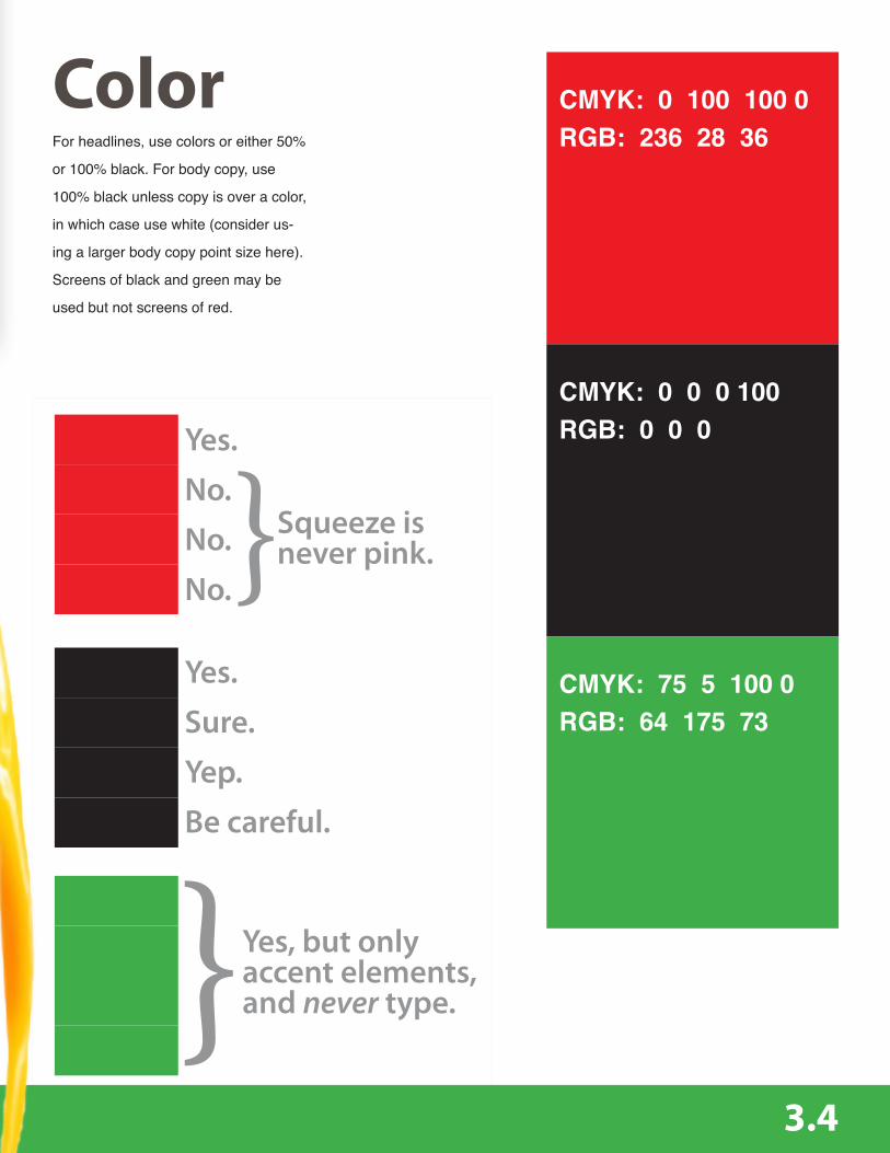
For headlines, use colors or either 50%
or 100% black. For body copy, use
100% black unless copy is over a color,
in which case use white (consider us-
ing a larger body copy point size here).
Screens of black and green may be
used but not screens of red.
Color CMYK: 0 100 100 0RGB: 236 28 36
CMYK: 0 0 0 100RGB: 0 0 0
CMYK: 75 5 100 0RGB: 64 175 73
3.4
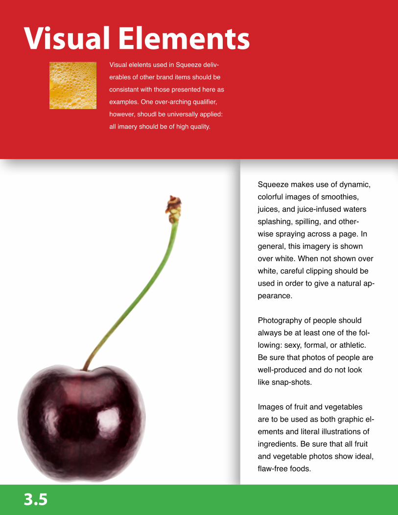
Visual elelents used in Squeeze deliv-
erables of other brand items should be
consistant with those presented here as
examples. One over-arching qualifier,
however, shoudl be universally applied:
all imaery should be of high quality.
Squeeze makes use of dynamic, colorful images of smoothies, juices, and juice-infused waters splashing, spilling, and other-wise spraying across a page. In general, this imagery is shown over white. When not shown over white, careful clipping should be used in order to give a natural ap-pearance.
Photography of people should always be at least one of the fol-lowing: sexy, formal, or athletic. Be sure that photos of people are well-produced and do not look like snap-shots.
Images of fruit and vegetables are to be used as both graphic el-ements and literal illustrations of ingredients. Be sure that all fruit and vegetable photos show ideal, flaw-free foods.
Visual Elements
3.5

Smoothies & Foods
Splashes & Splats
Sexy, formal, athletic
3.6

4

Sexy.
Solu
tion
s Billboard 4.1
Print Ads 4.3
Website 4.5
Social Media 4.6
Reusable Cup 4.7

Billboard
4.1

In order to quickly establish Squeeze
as a completely different company from
Inta Juice, advertising deliverables like
this sexy, edgy billboard were devel-
oped. This design appeals directly to
corporate go-getters while maintaining a
smart, clean layout and intriguing ambi-
guity. The question one asks on seeing
this is “oh? how do I get more?” The
answer: Squeeze.com.
4.2

As mentioned earlier in this document in
the Design Research section, Squeeze
is laying claim to a more adult, edgy
brand voice, similar to that of Mercedes-
Benz. The print ad shown opposite is
one example of an ad which speaks in
the language of corporate america (us-
ing a Venn diagram), yet says something
quite edgy within that ironically dry pre-
sentation. There is humor in that irony,
humor only those familiar with Venn
diagrams will get, making the Squeeze
brand voice pleasantly in-group.
Print Advertisement
4.3

Doesn’t taste like trash. I mean, really. Food shouldn’t be punishment. Food should be delicious.
Key:
Put this in your mouth.
Prepared quickly, yet is not pulled from a greasy aluminum sheet under a heat lamp.
Really, actually healthy. Not just “low fat” while high in every other horrible thing.
Squeeze smoothies and juices. The perfect food. You want this in your mouth.
4.4

Highlighting a “Qommunity” section
and allowing users to create their own
customizes smoothie and drink recipes,
the Squeeze website provides a connec-
tion to other Squeeze tribe members,
and the control & customization savvy
customers demand.
Website
4.5

Social media is an important part of any
serious ad campaign. Today’s custom-
ers expect to be able to make a connec-
tion with their favorite brands, especially
on Facebook.
Squeeze will make use of social me-
dia by announcing new events, menu
items, or features on Squeeze.com
on Facebook. Copy written for social
media will be brand-voice-accurate,
meaning smart, grammatically correct,
and slightly edgy. This is an important
point. In terms of brand management
and the consistency of brand voice, it is
especially important to remember that
posts made to Facebook are seen as
having been spoken by the Squeeze
brand itself. Therefor, posts to Facebook
or other social media sites should be
written by ad writers, not web adminis-
trators.
Social Media
4.6

Squeeze branded re-usable cups will be
laid out in such a way as to maximize a
user’s pride. “Get More” and the specific
purpose of that customer’s smoothie are
prominently displayed above the area of
the cup typically covered by a hand.
Below the stated “Size & Strength”
header, as both an explanatory element
and a vector to reinforce brand voice,
copy reads “smoothies designed with
this macronutrient profile are ideal for
reaching goals associated with strength,
size, and the subjugation of opposition.”
Similar to the Venn diagram print adver-
tisement, edgy copy rests ironically in
formal presentation.
Anyone who goes regularly to Starbucks
and walks away with a Starbucks cup
knows what it’s like to consider one’sself
part of a brand. Starbucks cups are tem-
porary starus symbols. Squeeze cups
will be, too.
Reusable Cup
4.7

4.8
Text References
Bonneville, D. (2011, March 21). How to choose a typeface. Retrieved June 22, 2012 from
http://www.smashingmagazine.com/2011/03/24/how-to-choose-a-typeface/
Business News. (2011, December 09). Branded mobile apps may be advertising on steroids.
Retrieved June 24, 2012 from http://www.businessnewsdaily.com/1771-branded-mobile-
smartphone-apps-powerful-advertising.html
Cathcart, G. (2012, March 11). Gone meta. Retrieved from http://www.gonemeta.com/offline/gone-meta/
Color Matters. (n.d.). The meanings of red. Retrieved June 5, 2012 from
http://www.colormatters.com/red
Franchise Help. (n.d.). Best smoothie franchises in usa in 2013. Retrieved August 12, 2012 from
http://www.franchisehelp.com/industry/smoothie-franchise
Hohmann, G. (2012, January 31). Inta juice owner opts not to renew its lease. Retrieved June 15,
2012 from http://www.dailymail.com/News/Kanawha/201201300139
Schwab, R. (2006). Inta Juce scores big. Coloradobiz, 33(4), 16.
Schwab, S. (2011, March 31). Finding your brand voice. Retrieved June 10, 2012 from
http://www.socialmediaexplorer.com/social-media-marketing/finding-your-brand-voice/
Steffens, G. (n.d.). Strategies for selling to upper class american society. Retrieved June 12,
2012 from http://www.gaebler.com/Strategies-for-Selling-to-Upper-Class-American-Society.htm
Wheeler, Alina. Designing Brand Identity: An Essential Guide for the Whole Branding Team,
3rd Edition, 3rd Edition. Wiley Custom Select, 9/7/09.

Image ReferencesImage Name Copyright/creditMartial Arts in the Desert Patrik GiardinoFruit Smoothie Mark LundFruits Irena Georgievaclose-up of a young woman drinking a smoothie with a straw StockbyteBlue paint splash Vladimir VladimirovA mid adult woman drinking a glass of fruit juice i love imageshandsome muscular man in gym Geber86Oranges with splashing orange juice on white background, close up Foodcollection RFsliced kiwi on white Siri StaffordGrapefruit juice splashing out of bottle on grapefruit Foodcollection RFred paint splash Vladimir VladimirovGlass of Milk Splash Jack Andersentomatoes sliced in half George DoyleA woman wearing red lipstick drinking from a red straw Lena ClaraSplashing orange juice (close-up) Kroeger/GrossOranges with splashing orange juice. Jack AndersenLemon on juicer Influx ProductionsOrange juice splashing out of glass, close-up Foodcollection RF Two businessmen fighting Rachel WatsonWoman sucking on a strawberry Marco JürgensTropical smoothie in a big blender Chris TurnerMango with splashing mango juice Foodcollection RFSmoothie in blender, overhead view George DieboldSliced Lime Lee PettetCherry single with stem RedHelgaRed juice anna ramon photographyDetail of classic red sports car and reflections Maciej NoskowskiYoung girl in sports car Rob McCollred paint splash Vladimir VladimirovBreakfast Beverage Pour Overhead Jack AndersenUpside Down slice of Apple Alex CaoTwo 10 Pound Chrome Dumbbells Lucidio Studio, Inc.Orange Carlos Alberto PhotoFemale athlete stretching, rear view, studio shot Siri StaffordLemon Fotosearch ValueOrange Slice Jonathan Kantor StudioClose-up of woman biting lips Irene LamprakouWheatgrass with exposed roots Thomas Northcutberries adam smigielskiLemon slice, front view Burazinred paint splash Vladimir VladimirovPear with splashing pear juice Foodcollection RFA runner stops to tie his shoe Noel HendricksonBusinessman pointing Image SourceYoung athletic couple running on lawn having fun. Sebastian PfuetzeYoung woman biting into lettuce Dimitri VervitsiotisBusinessman sitting on conference room table Monashee FrantzSlices of fruit NINA MOURIEROrange juice splashing on orange against white background Foodcollection RFSingle black cherry and stem Creative CropYoung woman exercising on an exercise bike StockbytePortrait of a girl eating strawberry Anastasia Abramova Photography
Yum.