mastering dax exercise book - amazon s3 · mastering dax exercise book. 3 exercises this document...
TRANSCRIPT

Mastering DAX
Exercise Book


3
Exercises
This document contains the exercises needed to complete the Mastering DAX Workshop. There are many
exercises in this paper, some of them you will be able to cover during the course, and some others might be
useful later, to fix some concepts in your mind.
Each lab is stored in a separate folder. In each lab, you will find the starting point of the lab (it might be an Excel
file or a Power BI file) and the final solution.
Following the exercises, you always start with the starting point and try to solve the scenario. If you are having
issues, or if you want to look at the solution, you can open our proposed solution to get some hints.
Follow the exercises with your time. There is no need to hurry. If you cannot finish one exercise, you will be able
to do it later. This is why we give all the solutions. Moreover, feel free to ask the teacher for any information
that you might require or to discuss different solutions you might have found.
Please note that, in the solution, we provide both measures and calculated columns. The difference between
the two is very subtle: we define columns using an equal sign, like in:
Sales[SalesAmount] = Sales[Quantity] * Sales[Unit Price]
Measures, on the other hand, have a different syntax, we use “:=”:
SalesAmount := SUMX ( Sales, Sales[Quantity] * Sales[Unit Price] )
At the end of this paper there is a large figure of the Contoso data model that you can use to familiarize with the
database. We use Contoso for most of the exercises, whereas some are built on AdventureWorks and others are
based on simpler educational models but, for these exercises, looking the data model is not needed.
The most important tool for this exercise book is a white
page that you use to hide the solution. Do not look at
the solution, which oftentimes is in the next paragraph.
Hide it and think, then look at the solution when you
have at least an idea on how to proceed.

5
LAB 1
First Steps with DAX
Contoso Sales Analysis
First Steps with DAX
In this exercise, you create some calculated columns and measures using Excel to perform analysis of orders.
The goal is to discover how to create calculated columns, measures and how to leverage them to solve a simple
business scenario.
Open the demo file, which contains a simplified version of the Contoso database you have seen during the
demo.
Reporting Sales
You want to prepare a report that shows yearly sales. Thus, you need a measure that computes the sales
amount. The problem is that Sales has two columns [Quantity] and [Unit Price]; a column with the sales amount
is missing.
Your task is to create a measure that computes the sales amount.
1. Start creating a calculated column that computes the sales amount, by multiplying [Quantity] and [Unit
Price]. Name it [Sales Amount]
Sales[SalesAmount] = Sales[Quantity] * Sales[Unit Price]
2. Create a measure that sums the SalesAmount column, name it [TotalSales]
TotalSales := SUM ( Sales[SalesAmount] )
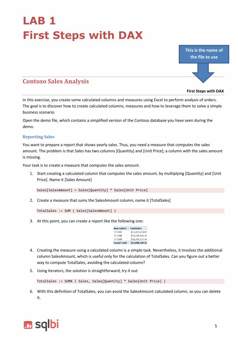
3. At this point, you can create a report like the following one:
4. Creating the measure using a calculated column is a simple task. Nevertheless, it involves the additional
column SalesAmount, which is useful only for the calculation of TotalSales. Can you figure out a better
way to compute TotalSales, avoiding the calculated column?
5. Using iterators, the solution is straightforward, try it out:
TotalSales := SUMX ( Sales, Sales[Quantity] * Sales[Unit Price] )
6. With this definition of TotalSales, you can avoid the SalesAmount calculated column, so you can delete
it.
This is the name of
the file to use

6
Analyze sales in the same city
The City column is present in Store and in Customer. You want to divide sales made to customers in the same
city of the store, against sales to customers in a different city, evaluating customers buying in different cities.
Your task is to create a calculated column, in Sales, that checks if the city of the customer is the same as the city
of the store. The only problem is that the columns are in different tables. RELATED is your best friend here:
Sales[SaleType] =
IF (
RELATED ( Customer[City] ) = RELATED ( Store[City] ),
"SAME CITY",
"DIFFERENT CITY"
)
You can use the column to analyze sales, like in the following report:
OPTIONAL: can you sort the column in a way that shows “SAME CITY” first and “DIFFERENT CITY” later?
Analyze Discounts
The solution is in the next page, don’t look at it, try to solve the problem by yourself and look at the solution
only later. In the Sales table, there are [Unit Price] and [Unit Discount] columns. Your task is to build:
One measure that reports the total discount
One calculated column, in Sales, that contains for each row:
o FULL PRICE if the discount is zero
o LOW if the discount of the sale is less than or equal to 5%
o MEDIUM if the discount of the sale is between 5% and 10%
o HIGH if the discount percentage is higher than 10%
One measure that computes the average discount percentage
Your goal is to be able to author a report like the following one:

7
1. First, you need to create a calculated column in Sales that contains the discount percentage:
Sales[DiscountPct] = DIVIDE ( Sales[Unit Discount], Sales[Unit Price] )
2. Using DiscountPct, you can create a new calculated column, also in Sales, with the DiscountCategory,
leveraging the IF function:
Sales[DiscountCategory] =
IF (
Sales[DiscountPct] = 0,
"FULL PRICE",
IF (
Sales[DiscountPct] <= 0.05,
"LOW",
IF ( Sales[DiscountPct] <= 0.1, "MEDIUM", "HIGH" )
)
)
3. The [Total Discount] measure is straightforward, using a simple SUMX:
TotalDiscount := SUMX ( Sales, Sales[Unit Discount] * Sales[Quantity] )
4. [Total Discount %] is, again, a very simple DIVIDE:
[Total Discount %] := DIVIDE ( [TotalDiscount], [TotalSales] )
5. You might notice that the, in our report, discount categories are not sorted alphabetically; they are
sorted by discount percentage. To obtain this effect, you can create a new calculated column to sort the
discount category:
Sales[DiscountCategorySort] =
IF (
Sales[DiscountPct] = 0,
0,
IF (
Sales[DiscountPct] <= 0.05,
1,
IF ( Sales[DiscountPct] <= 0.1, 2, 3 )
)
)


9
LAB 2
Table Functions
Now that you learned how to work with table functions, it is time to put them in action. You write some simple
calculations that involve filtering and iteration over filtered tables.
Analyzing Discounted Sales
Count Discounted Sales
You want to produce a report that shows the number of sales versus the number of discounted sales, along with
their respective values. In other words, you need to build a report like the following one:
The starting model already contains NumOfSales and TotalSales, can you figure out how to create the two
measures NumOfDiscountedSales and ValueOfDiscountedSales, which compute the number and the value of
only discounted sales?
1. NumOfDiscountedSales need to count only the sales where the discount is greater than zero:
NumOfDiscountedSales :=
COUNTROWS (
FILTER (
Sales,
Sales[Unit Discount] > 0
)
)
2. ValueOfDiscountedSales follows the very same pattern but, this time, instead of counting rows it sums
values:
ValueOfDiscountedSales :=
SUMX (
FILTER (
Sales,
Sales[Unit Discount] > 0
),
Sales[Quantity] * Sales[Net Price]
)
OPTIONAL: can you write a new measure that computes the percentage (in value) of discounted sales against all
the sales?

10
Count discounted products
The next step is more advanced and a bit harder. You want to count the number of products for which the
number of discounted sales is greater than the number of full price ones. In other words, if you have three
products and one of them has more discounted sales than full price ones, the result should be 1. As usual, try it
by yourself before looking at the solution.
NumOfDiscountedProducts :=
COUNTROWS (
FILTER (
Product,
COUNTROWS (
FILTER ( RELATEDTABLE ( Sales ), Sales[Unit Discount] = 0 )
)
<
COUNTROWS (
FILTER ( RELATEDTABLE ( Sales ), Sales[Unit Discount] > 0 )
)
)
)
This expression is a bit hard to catch at first sight. Look carefully at the usage of RELATEDTABLE, which returns
the sales related to the currently iterated product by the outer FILTER. Once you have a clear understanding on
the formula, move further.
Now you want to count the number of products that you never sold. The pattern is very similar to the previous
one, but this time it is a bit less intuitive. Try to figure out the formula by yourself, if you are in trouble, look at
the solution:
NumOfProductsWithNoSales :=
COUNTROWS (
FILTER (
Product,
COUNTROWS ( RELATEDTABLE ( Sales ) ) = 0
)
)
This technique, of checking that a table is empty, is very common. In DAX 2015 you can also write it in this way:
NumOfProductsWithNoSales :=
COUNTROWS (
FILTER (
Product,
ISEMPTY ( RELATEDTABLE ( Sales ) )
)
)

11
LAB 3
Evaluation Contexts
and CALCULATE
Finding the best customers
Best Customers
In this exercise, you make practice with evaluation contexts. The value to compute is an easy one: you want to
count the number of customers who bought more than the average of customers. Thus, if on average a
customer buys 1,000 USD, you want to count how many of your customers buy more than 1,000 USD.
The first measure you need to compute is the average sales per customer. The formula needs to iterate over the
customers and, for each one, compute the sales. Finally, you compute the average of this value.
There are a couple of ways to write this measure. The first, a bit more intuitive:
AvgCustomerSale :=
AVERAGEX (
Customer,
SUMX (
RELATEDTABLE ( Sales ),
Sales[Quantity] * Sales[Net Price]
)
)
The second one, much more elegant, which uses the TotalSales measure and context transition:
AvgCustomerSale :=
AVERAGEX (
Customer,
[TotalSales]
)
Being a measure, AvgCustomerSale computes the average taking into account any filter context under which it
is evaluated, and it relies on context transition to further restrict the filter context to a single customer. Once
this measure is created, it is now time to compute the other one, i.e. the number of customers who bought
more than this average. Start thinking, the solution is in the next page.

12
The correct formula is the following one:
GoodCustomers :=
VAR AvgAllSelected = [AvgCustomerSale]
RETURN
COUNTROWS (
FILTER (
Customer,
[AvgCustomerSale] >= AvgAllSelected
)
)
In this case, the usage of a variable is very important to get the average of selected customers. Without
variables, you can write it in this way:
GoodCustomers :=
COUNTROWS (
FILTER (
Customer,
[AvgCustomerSale] >= CALCULATE ( [AvgCustomerSale], ALL ( Customer ) )
)
)
This latter formula works fine but it does not take into account partial filtering that might happen on the
Customer table. It is worth noting that this other version of the formula does not work:
GoodCustomers :=
COUNTROWS (
FILTER (
Customer,
[AvgCustomerSale] >= CALCULATE ( [AvgCustomerSale], ALLSELECTED () )
)
)
The reason is that ALLSELECTED does not restore the correct filter context. Understanding the reason will take
some time, stay tuned, because we will cover that later during the workshop.
Creating a parameter table
Parameter Table
In this exercise, you create a Parameter Table. The idea of a parameter table is to create a table that is
unrelated to the rest of the data model, but you use it internally in DAX expressions to modify their behavior.
Imagine that you have created a report that shows the sum of sales amount, and because your company sells a
large quantity of goods, the numbers shown in the report are big. Because the Contoso database does not suffer
from this problem, we have modified the TotalSales measure to return total sales squared, so that numbers are
bigger and the scenario is more evident. Using that column in a PivotTable, you get this result:

13
This is the starting point of the exercise. The issue with this report is that the numbers are large, and they tend
to be hard to read: are they millions, billions, or trillions? Moreover, they use a lot of space in the report
without delivering much information. A common request for this kind of report is to show the numbers using a
different scale. For example, you might want to show the values divided by 1,000 or 1 million, so that they result
in smaller numbers that still carry out the useful information.
The idea is to let the user decide which scale to use for the report using a slicer:
1. To create this report, the first thing that you need is a table containing the values you want to show on
the slicer. This is as easy as creating an Excel table and loading it into the data model. We already
created if for you, in the Parameter tab there is a table named ShowValueAs that you need to bring into
the model using Add to Data Model from the Power Pivot tab of the ribbon.
2. Obviously, you cannot create any relationship with this table in the data model, because the
FactInternetSales table does not contain any column that can be used to relate to ShowValueAs.
Nevertheless, once the table is in the model, you can use the ShowValueAs column as the source for a
slicer. At first, you end up with a slicer that does nothing, but you can use some DAX code that will
perform the last step, i.e. reading what the user has selected in the slicer and modify the content of the
report accordingly, showing real numbers, thousands or millions, so that the slicer becomes useful.
3. Create a new measure Sales to perform this operation:
Sales :=
IF (
HASONEVALUE ( ShowValueAs[ShowValueAs] ),
[TotalSales] / VALUES ( ShowValueAs[DivideBy] ),
[TotalSales]
)
4. Now, add a slicer to the PivotTable and look how the numbers in Sales change depending on the slicer
selection. Before moving to the next exercise, look at the formula and ask yourself in which case the IF
takes the ELSE branch, i.e. does not perform any division.
5. You might notice that the slicer does not sort the values in the correct order (we would like to avoid
alphabetical sorting for this column and sort them by value); can you try to solve the issue?
6. Finally, does the ShowValuesAs column work if you put it on the rows or on the columns? And, do you
know why it behaves as it does?

14
Working with Evaluation Contexts and Iterators
Working Days
The next exercise is designed to force you thinking about filter context, row context, iterators and take
confidence with the concepts you learned so far. The formulas you will write here can be solved in a much
better way once you learn the usage of CALCULATE and the reason we want you to train with these formulas is
to better appreciate, later, the CALCULATE function.
The starting point of the exercise is the usual data model with products, sales and the calendar. There is a
column in the Date table, named Working Day, which can be “WeekEnd” or “WorkDay” depending whether the
day is a working day or not. You can easily build a PivotTable like the following one:
The exercise focus on calculation using contexts. We want to create two measures:
SalesInWorkingDays: contains the amount sold during working days
SalesInNonWorkingDays: contains the amount sold during non-working days
We want to be able to create a report like the following one:
The solution is not very difficult; you can do it by yourself with this hint: if you iterate over all the rows in Sales
and sum only the ones where the day is a working day, then you compute SalesInWorkingDays. Testing the
opposite condition, you compute SalesInNonWorkingDays.
That said, try it by yourself. If after 10 minutes you are still lost, then you can look at the solution in the next
formulas:

15
SalesInWorkingDays :=
SUMX (
Sales,
IF (
RELATED ( 'Date'[Working Day] ) = "WorkDay",
Sales[Quantity] * Sales[Net Price],
0
)
)
And, for non-working days:
SalesInNonWorkingDays :=
SUMX (
Sales,
IF (
NOT ( RELATED ( 'Date'[Working Day] ) = "WorkDay" ),
Sales[Quantity] * Sales[Net Price],
0
)
)
Did you manage to write the formulas in this way? There are other possible solutions to the same problem, so
chances are that you found a different one; you can discuss your solution with the teacher to look at it and see
which one is the best one.
It is now time to start making some exercise with CALCULATE. Let us start the simple way: by using CALCULATE
we rewrite the two measures created in the previous section. The two measures are SalesInWorkingDays and
SalesInNonWorkingDays.
Your task is indeed an easy one: rewrite the same formulas using CALCULATE instead of the SUMX iterator. You
have 10 minutes to solve this small exercise. After that, look at the solution here. Even if you fail, those 10
minutes will be well spent.
SalesInWorkingDays :=
CALCULATE (
[TotalSales],
'Date'[Working Day] = "WorkDay"
)
SalesInNonWorkingDays :=
CALCULATE (
[TotalSales],
NOT ( 'Date'[Working Day] = "WorkDay" )
)
You can appreciate that these formulas are much easier to write and to understand, when compared with the
previous versions, which is more complex to write without CALCULATE. It is interesting to note that the filter is
on Date and you sum Sales, can you explain why it works? Hint: remember the direction of automatic
propagation of the filter context and the fact that CALCULATE creates a new filter context.
Understanding CALCULATE
Basic CALCULATE
The most common scenario where CALCULATE is useful is when you need to compute ratios and percentages.
Before learning more advanced topics, it is important to spend a few minutes seeing with your eyes what
16
happens with basic CALCULATE. For educational purposes, in this model we denormalized category and
subcategory in Product, using two calculated columns. The exercise would have been tougher if we did not,
involving AutoExists logic, that we will cover only later.
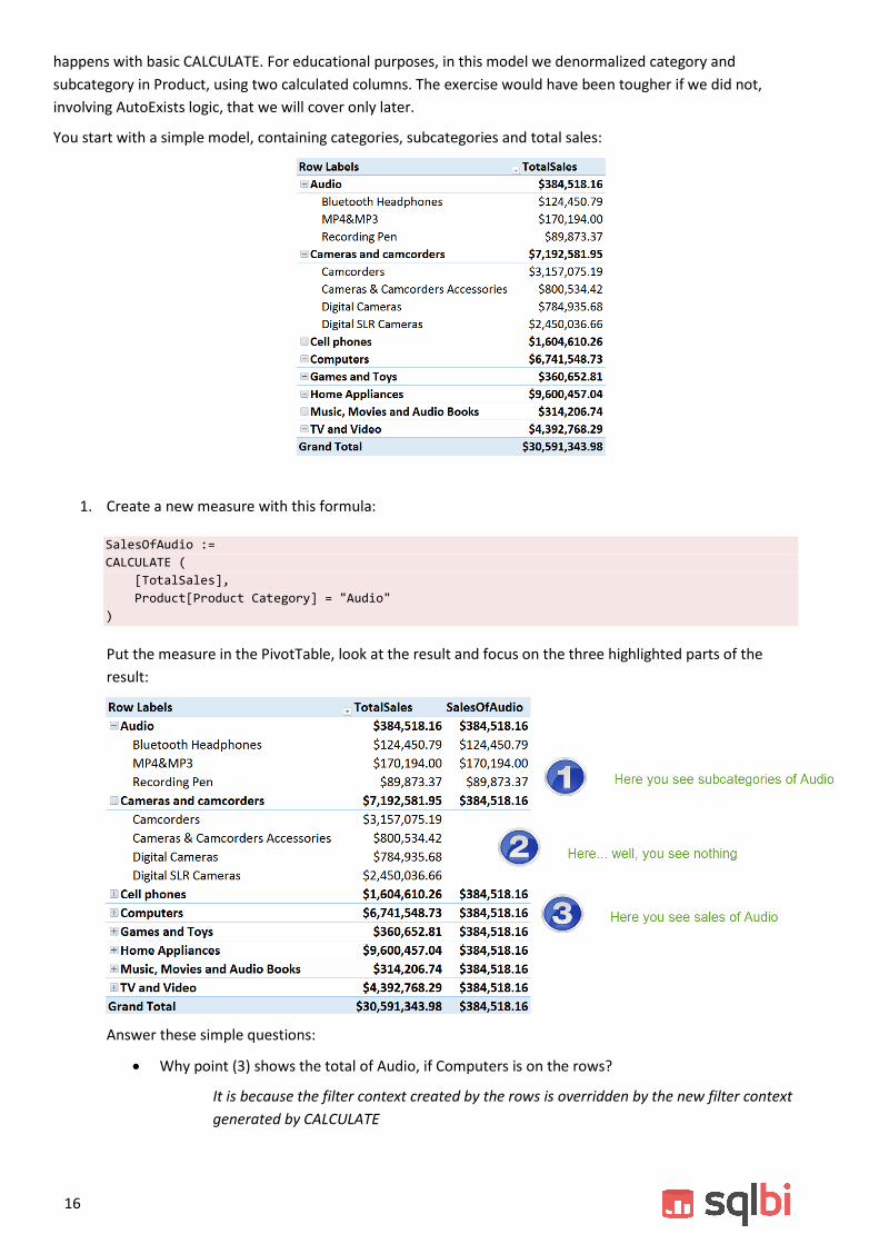
You start with a simple model, containing categories, subcategories and total sales:
1. Create a new measure with this formula:
SalesOfAudio :=
CALCULATE (
[TotalSales],
Product[Product Category] = "Audio"
)
Put the measure in the PivotTable, look at the result and focus on the three highlighted parts of the
result:
Answer these simple questions:
Why point (3) shows the total of Audio, if Computers is on the rows?
It is because the filter context created by the rows is overridden by the new filter context
generated by CALCULATE

17
Why point (2) shows nothing? How is it possible that the total of blanks results in the sum of
Audio? Hint: write down on a piece of paper the filter context of the cells, and simulate the
CALCULATE operation
Because there is a filter on the product subcategory. We override the filter on category,
but the filter on subcategory is still there and there is no product which is a Camera and,
at the same time, an Audio.
Why, if at the subcategory level in point (2) there are blanks, at the subcategory level in point
(1) there are values, and they are identical to the sales amount of the subcategories?
Because the filter on category introduced by CALCULATE, put in and with the existing
filter on subcategory, generates and empty set in (2) and a set with some elements in
(1).
2. Create a new formula:
SalesOfValuesAudio:=
CALCULATE (
[TotalSales],
Product[Product Category] = "Audio",
VALUES ( Product[Product Category] )
)
Take a look at the result:
Why are the number different, now? Can you explain what happened to the row in Computers, which
contained a value and now is blank? Hint: the conditions in CALCULATE are put in AND together…
consider the combined effects of all the filters arguments passed to CALCULATE.
3. It is time to use CALCULATE for something more useful. You want to show the value of sales as a
percentage of the grand total instead than a value. Create a SalesPct measure returning such a
calculation. As usual, spend a few minutes thinking at the formula, then move on with the solution, if
you did not find it.
The formula is not very hard:

18
SalesPct :=
DIVIDE (
[TotalSales],
CALCULATE (
[TotalSales],
ALL ( Product )
)
)
Now, put the field in a PivotTable and add a slicer on Color, this is what you see:
Looks fine. Now, select some colors from the slicer and look at the result:
What does 31.66% means as the grand total percentage? Can you explain what happened? And, once
you got the explanation, can you fix it? Take your time; it is worthwhile!
Anyway, here is the solution:
SalesPct :=
DIVIDE (
[TotalSales],
CALCULATE (
[TotalSales],
ALLSELECTED ()
)
)

19
Why is it working with ALLSELECTED? Because ALLSELECTED always returns the original filter context of
the PivotTable.
4. Ok, now remove TotalSales from the columns of the PivotTable, replacing it with the Calendar Year from
Date
5. The percentages are over the entire period. What if you want them year-by-year, so that the grand total
of each column shows 100%?
You have a couple of options here:
SalesPct :=
DIVIDE (
[TotalSales],
CALCULATE (
[TotalSales],
ALLSELECTED (),
VALUES ( 'Date'[Calendar Year] )
)
)
Or, if you prefer:
SalesPct :=
DIVIDE (
[TotalSales],
CALCULATE (
[TotalSales],
ALLSELECTED ( Product )
)
)
Both formulas work for this specific report, but their meaning is completely different, can you spot the
differences between the two formulas and explain why they provide the same result in this report?
The first formula shows the sales for the current year, restoring all filters on all the tables in the model to
the original context. The second formula shows the sales for all the products in the original filter context,
retaining all the other filters. In this report, the peculiar shape of the report makes the two formula
compute the same value, but if you put a filter, for example on the customer education, then the two
formulas will start computing different values.


21
Lab 4
Working with iterators
Compute sales per working day
Sales in Working Days
This goal of the exercise is showing how to perform some simple computation with working days. As you are
going to see, even simple calculation might hide complex scenarios, the key of which is, as usual, the
understanding of evaluation contexts.
1. In the initial solution, you have a standard model with a calendar table that contains information about
working and non-working days. You want to:
Compute the number of working days in different periods
Compute the value of sales amount divided by the number of working days
2. Because the calendar table contains a column indicating when a day is a working day or not, computing
the number of working days is easy:
WorkingDays :=
SUMX (
'Date',
IF ( 'Date'[Working Day] = "WorkDay", 1, 0 )
)
With this new column, you can build a first PivotTable, like the following one:
3. Computing the sales amount divided by the number of working days is easy too:
SalesPerWorkingDay := [TotalSales] / [WorkingDays]

22
Adding it to the PivotTable produces this result:
The numbers look correct at the month level, but the year level and the grand total show wrong values,
you can easily check it for the year 2007 and, worse, at the grand total. Before moving on, what it the
reason for the wrong value?
The problem is that years like 2007 account sales for only 7 months, not for 12 months. Thus, you
should compute the working days only for months where there are sales. Otherwise, the computation at
the year level will always be lower than expected.
Once you detected the reason, how do you solve this?
A common first trial is the following:
SalesPerWorkingDay := IF ( [TotalSales] > 0, [TotalSales] / [WorkingDays] )
However, this does not change in any way the result. Do you understand why?
The reason is that the expression is computed at the year level and, there, [Sales] is always greater than
zero. You cannot compute such an expression at the aggregate level, you need to iterate each month
and repeat the expression at the month level. Thus, the correct formulation is:
SalesPerWorkingDay :=
DIVIDE (
[TotalSales],
SUMX (
VALUES ( 'Date'[Month] ),
IF ( [TotalSales] > 0, [WorkingDays] )
)
)
4. Now, before moving on, try this equivalent expression:

23
SalesPerWorkingDay :=
DIVIDE (
[TotalSales],
SUMX (
VALUES ( 'Date'[Month] ),
IF (
[TotalSales] > 0,
SUMX (
'Date',
IF ('Date'[Working Day] = "WorkDay", 1, 0 )
)
)
)
)
The result will be this one:
Can you explain why, this time, the year level is so a low number, even worse than before?
Hint: think at row and filter context, and try to compute the expressions by yourself, writing down the
filter context and the row context during the full expression evaluation.
This formula, as you have noticed, does not work because of the missing context transition. We decided
to show it anyway, because it is a very common error forgetting the automatic CALCULATE surrounding
any measure evaluation.
5. With the correct formula, the PivotTable looks like this:

24
Even if now the year level is now correct, the grand total level is not. The reason is the same, can you
write the correct formula that shows the result as it should be?
Try to think at the result by yourself, and then compare it with the proposed solution:

25
SalesPerWorkingDay :=
DIVIDE (
[TotalSales],
SUMX (
VALUES ( 'Date'[Calendar Year] ),
SUMX (
VALUES ( 'Date'[Month] ),
IF ( [TotalSales] > 0, [WorkingDays] )
)
)
)
You see that two different iterations happening: one over the year and one over the month. They are
both needed to capture the month level at which the calculation of working days should happen.
Ranking Customers (Dynamic)
Ranking.xlsx
During the course, you have seen some examples of the RANKX function. This exercise makes you practice this
function and learn its fundamentals.
The goal of the exercise is to create a measure that provides the ranking of customers based on profitability. By
profitability, we mean simply sales minus costs.
1. We need to compute:
A measure that provides the profitability
A measure that transforms this profitability in a rank position
You can start writing the formulas by yourself. In the following part of the exercise, you can see the
solution step-by-step.
Profit is very easy to compute, by simply subtracting costs from sales:
Profit :=
SUMX (
Sales,
Sales[Quantity] * (Sales[Net Price] - Sales[Unit Cost] )
)
Ranking is a bit more complex but, if you remember the topics discussed in the course, the formula is
not very hard:
CustRankOnProfit :=
RANKX (
ALLSELECTED ( Customer ),
[Profit]
)
It is important to note a few points, here:
The usage of ALLSELECTED on Customer, to see all the customers visible in the query context
The fact that we used the [Profit] measure, which implies the automatic CALCULATE needed to
fire context transition; without it, the result would not be correct
2. You can now create a PivotTable like the following one to see the fields in action but, as you see, there
is a huge number of customers with no sales that make the PivotTable nearly impossible to use:

26
Please note that we used the customer name on the rows.
3. Can you fix the issue, showing the ranking only for rows where there are sales?
The following definition of CustRankOnProfit contains the solution:
CustRankOnProfit :=
IF (
[Profit] > 0,
RANKX (
ALLSELECTED ( Customer ),
[Profit]
)
)
Ranking Customers (Static)
Static Ranking.xlsx
In the previous exercise, you created a ranking measure that is dynamic, i.e. it computes the ranking of the
customer based upon your selection. This is fine but, sometimes, you want the ranking to be static. Said in other
words: you want to identify the top customers by profitability and then look at their behavior, analyzing sales or
doing other kinds of reporting.
The scenario now is different: you want a calculated column that contains the ranking of the customer based on
profitability. This is an easy exercise, so we strongly suggest you trying to solve it by your own before looking at
the solution.
1. The first thing you need to compute is the profitability per customer. This time it need to be static, so
you need a calculated column in the Customer table.
Customer[Profit] =
SUMX (
RELATEDTABLE ( Sales ),
Sales[Quantity] * (Sales[Net Price] - Sales[Unit Cost] )
)
2. Then, you need the ranking calculated column:
Customer[RankOnProfit] = RANKX ( Customer, Customer[Profit] )

27
Lab 5
Time Intelligence
Work with YTD, MTD, PARALLELPERIOD formulas
Time Intelligence
In this exercise, you are going to make some practice with the standard time intelligence functions in DAX.
You want to produce a report that shows, during the year, the comparison between the YTD of sales in the
current year against the YTD of the previous year, both as a value and as a percentage.
1. You start with the classical data model, with a measure (Sales) that computes the sum of sales amount.
2. The first measure you need to write is the YTD for the current year:
SalesYTD := CALCULATE ( [TotalSales], DATESYTD ( 'Date'[Date] ) )
Using this measure, you can start to create a PivotTable:
3. SalesYTD shows the YTD of the current year, you need to compare it with the YTD of the previous year.
This requires you to write a new formula that computes YTD for the previous year.
There are many ways to express the formula. Our proposal is the following:
PYSalesYTD:=
CALCULATE (
[TotalSales],
SAMEPERIODLASTYEAR ( DATESYTD ( 'Date'[Date] ) )
)

28
You might have found a different formulation, in that case, look at the differences and discuss them
with the teacher.
4. Now that you have both values, it is easy to compute the difference, both in value and as a percentage.
DeltaSales := [SalesYTD] - [PYSalesYTD]
DeltaSalesPct := [DeltaSales] / [PYSalesYTD]
You need to format the measures in a proper way in order to obtain the desired report:
5. There are a few issues with this formula:
In 2007, the previous year sales is zero, thus the result is #NUM.
Starting from September 2009, there are no sales, so you will probably want to hide the
percentages of growth, because they would lead to wrong insights.
Can you fix those issues by yourself? No solution this time! Let us try to see what happens when you are
on your own!
However, if you really want the solution, it is in the final workbook of the course. The result you want to
obtain is the following:

29
Build a KPI using ALLSELECTED
KPI
This exercise guides you through the creation of a simple KPI, showing how to define and use them. The DAX
code is simple, the goal is to be acquainted with the concept of KPI and learn how to use them.
The starting point is the data model you used so far: dates, products, sales territories. The goal is to build a
report that shows in a graphical way which periods show an increase in sales for specific countries, by
comparing their growth to the average growth in the same country (or whatever selection you want to
perform). The result is this report:
1. First, you need to create the measures needed to compute the KPI. You need Sales, SalesLastYear and
Sales Growth in percentage. The formulas are easy, you can try them by yourself. If you feel confident
you can write them, and then check with the solution. This is the basic result:
SalesLastYear := CALCULATE (
[TotalSales],
SAMEPERIODLASTYEAR ( 'Date'[Date] )
)
SalesGrowth := ( [TotalSales] - [SalesLastYear] ) / [SalesLastYear]

30
2. However, if you followed all the recommendation learned so far, you might have computed them in the
correct way, because SalesLastYear is not computing correct values for the second year, because the
first year is incomplete. The correct formulation for SalesLastYear is the following:
SalesLastYear:=
IF (
HASONEVALUE ( 'Date'[Calendar Year] ),
SUMX (
VALUES ( 'Date'[Month] ),
IF (
[TotalSales] > 0,
CALCULATE ( [TotalSales], SAMEPERIODLASTYEAR( 'Date'[Date] ) )
)
)
)
It is useful to spend some minutes looking at the formula, because it shows many patterns we have
used so far. It also makes the difference between writing the first formula that returns a number and
knowing exactly when and how the formula might fail, anticipating possible errors.
3. SalesGrowth, too, needs a small adjustment, because it needs to account for partial years in the same
way:
SalesGrowth:=
DIVIDE (
SUMX (
VALUES ( 'Date'[Month] ),
IF ( [SalesLastYear] > 0, [TotalSales] )
) - [SalesLastYear],
[SalesLastYear]
)
4. With these three measures, build this simple PivotTable, checking that the values are correct:

31
5. Now it is time to create the KPI based on the Sales Growth measure. First, we make a KPI that will show
red if growth is negative, yellow if the growth is less than 40% and green if it is more than 40%. In order
to do this, use the new KPI button and fill the invoked dialog box in this way:
6. You can then add the KPI status to the PivotTable, which looks like this:

32
7. Now, for the more complex part of the KPI: what we want to highlight is not if the growth in a specific
month was more than 40%, but if it was more than the average. Thus, you need a measure that
computes the average growth or, in other words, the average of the year.
Can you figure out the formula by yourself? It is not very easy, yet not very hard, at this point. You need
to compute the Sales Growth for the current year, i.e. remove all filters from the months and leave only
the ones for the year.
Again, there are many ways to express the formula. Our proposal is the following:
[Avg Sales Growth] :=
CALCULATE (
[SalesGrowth],
ALLSELECTED (),
VALUES ( 'Date'[Calendar Year] )
)
Note the usage of ALLSELECTED without parameters to grab the query context and the usage of VALUES
to push the filter of the year inside CALCULATE. Remember that the two filters are put in an AND
condition, before being applied to the data model.
8. Now that you have the average growth, you can compare the growth of the selected period with the
average growth, configuring the KPI window in this way:

33
This KPI says: if the growth is less than 50% of the average, then show red. If it is between 50% and
120%, then it is average (yellow). If it is more than 120%, it is outstanding (green). Unfortunately, this
calculation yields to wrong numbers, because, when both the growth and the average growth are
negative, their ratio will be positive.
9. In fact, the PivotTable now shows these values:
You can see that September 2008, which shows -27.84% of growth is green, even if its growth is less
than the average growth of the year, which is -22.20%. Using KPI with percentage is always challenging,
in this case you can solve it by creating a KPI Sales Growth measure with this code:

34
KPISalesGrowth := IF ( [SalesGrowth] <> 0, [SalesGrowth] - [Avg Sales Growth] )
Then, you base your KPI on this measure, which computes the difference between the growth and the
average growth, leading to a better representation.
Stock Exchange
Stocks
This exercise is based on stock information, thus it does not use the Contoso database. We start from an Excel
table containing stock prices and we want to compute a moving average of the price of a stock. Moreover, after
having done that, we will create an interactive PivotChart to compare the performances of two different stocks.
The result should be something like this:
In the report we provide the analysis of last three years of the Apple stock with two moving averages (one on 50
periods, the other on 200 periods).
The interesting part of the exercise is that, this time, we will not leverage the time intelligence functions to
provide the moving average. We will need to use a different technique to solve the scenario.
1. Take a look at the data in the Fixings sheet: the source Excel table is the following:
The interesting columns, for this exercise, are only the stock name, the date and the value of Close.
Other information might be useful for other purposes; we left them there because the original data
source contained them. This table is called Fixing.
2. The second worksheet contains a standard calendar table with just a few columns:

35
3. Link these tables into PowerPivot. For the sake of simplicity, you can delete from the Fixing table the
useless columns, leaving only Stock, Date and Close.
4. It is now time to compute the moving average over 50 days. We do not want to compute the average
over 50 days but over 50 “working” days, where “working” means that there is data available for that
stock.
Different stocks might have different dates where they are recorded. If, for whatever reason, the data
about Microsoft contained holes, then the values for the date range of Microsoft would be different
from the date range of Apple. Each stock needs its date ranges correctly computed.
5. Define a new calculated column named DayNumber, in the Fixing table, which assigns an incremental
number to each date, taking care of the fact that different stocks need different counters. The formula
is the following:
=COUNTROWS (
FILTER (
Fixing,
Fixing[Date] <= EARLIER ( Fixing[Date] )
&& Fixing[Stock] = EARLIER ( Fixing[Stock] )
)
)
We use a technique similar to the one used to calculate the working days but, this time, we added a
condition on the stock column. In this way, the number is assigned with different values for different
stocks. Your table should now look like this:
6. We can easily compute, for each date, the first date of the range of 50 days. It will be the only row that
has a DayNumber equals to the current one less 50. Using CALCULATE, it is easy to compute this date:
FirstDateOfRange50=CALCULATE (
VALUES ( Fixing[Date] ),
FILTER (
Fixing,
Fixing[DayNumber] = EARLIER ( Fixing[DayNumber] ) - 50
&& Fixing[Stock] = EARLIER ( Fixing[Stock] )
)
)
7. The following step is to compute the moving average over 50 days which, again, can be easily computed
leveraging CALCULATE since now we know exactly where to start to compute the average:

36
MovingAverage50=CALCULATE (
AVERAGE ( Fixing[Close] ),
FILTER(
Fixing,
Fixing[Date] >= EARLIER ( Fixing[FirstDateOfRange50] )
&& Fixing[Date] <= EARLIER ( Fixing[Date] )
&& Fixing[Stock] = EARLIER ( Fixing[Stock] )
)
)
8. Repeat the previous steps to create a moving average over 200 dates; just changing 50 into 200 will
solve the problem.
9. The final step to complete the first part of the exercise is to create a PivotChart like this:
10. You should note that we use the Calendar table to select years and dates. This will raise the need to set
proper relationships between the Fixing and the Calendar table.
11. At this point, it is interesting to create a new chart that let you compare two stocks on the same graph,
like this:
The second graph is a bit more challenging. We want to use two slicers to select two different stocks
and then showing their graph into a single PivotChart to make some sort of comparison.
37
It is clear that the slicers used to select the stocks to show cannot be based on the Stock column of the
Fixing table because, doing so, we would filter the Fixing table. On the other hand, we want to use those
slicers to collect the user selection and then, inside the DAX formulas, we will decide what kind of
filtering to define.
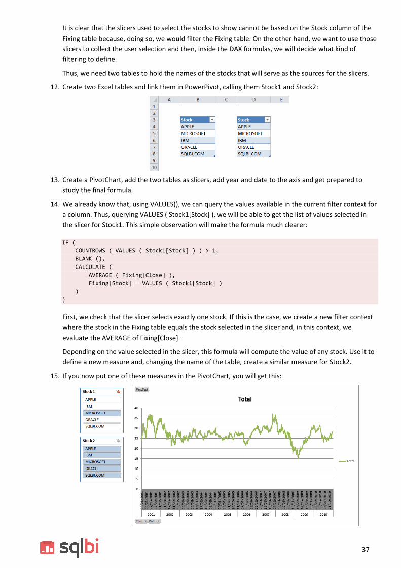
Thus, we need two tables to hold the names of the stocks that will serve as the sources for the slicers.
12. Create two Excel tables and link them in PowerPivot, calling them Stock1 and Stock2:
13. Create a PivotChart, add the two tables as slicers, add year and date to the axis and get prepared to
study the final formula.
14. We already know that, using VALUES(), we can query the values available in the current filter context for
a column. Thus, querying VALUES ( Stock1[Stock] ), we will be able to get the list of values selected in
the slicer for Stock1. This simple observation will make the formula much clearer:
IF (
COUNTROWS ( VALUES ( Stock1[Stock] ) ) > 1,
BLANK (),
CALCULATE (
AVERAGE ( Fixing[Close] ),
Fixing[Stock] = VALUES ( Stock1[Stock] )
)
)
First, we check that the slicer selects exactly one stock. If this is the case, we create a new filter context
where the stock in the Fixing table equals the stock selected in the slicer and, in this context, we
evaluate the AVERAGE of Fixing[Close].
Depending on the value selected in the slicer, this formula will compute the value of any stock. Use it to
define a new measure and, changing the name of the table, create a similar measure for Stock2.
15. If you now put one of these measures in the PivotChart, you will get this:

38
16. Unfortunately, when you put the second measure and select another stock with the slicer, the chart will
be much less appealing. In the following picture we selected just a couple of years, to make the issue
more evident.
17. There are some spikes down to zero for both stocks. Note that spikes appear if and only if two stocks
are selected, otherwise they do not appear inside the graph. The reason is that, in the data sources, the
value of Microsoft and Apple is not recorded for every day. There are some holes, for whatever reason,
and they do not appear in the same date for the two stocks.
Thus, when you select only one stock, these dates disappear from the chart, because the value of the
measure is BLANK. However, when you insert both stocks in the chart, if one stock has a value in a
specific date and the other contains BLANK, the value of the latter is considered zero and the date still
appears in the chart, to show the value of the existing stock.
Even if it can be explained, this behavior is still not very nice. We definitely need to find a way to avoid
it.
18. The solution is to hide the value of Stock1 if Stock2 is not present and, of course, do the contrary, too.
Hide the value of Stock2 if Stock1 is not present.
19. This consideration leads us to the following formula:
=IF (
COUNTROWS ( VALUES ( Stock1[Stock] ) ) > 1 || COUNTROWS ( VALUES ( Stock2[Stock] ) ) > 1,
BLANK (),
IF (
ISBLANK (
CALCULATE (
AVERAGE ( Fixing[Close] ),
Fixing[Stock] = VALUES ( Stock2[Stock] )
)
),
BLANK (),
CALCULATE (
AVERAGE ( Fixing[Close] ),
Fixing[Stock] = VALUES ( Stock1[Stock] )
)
)
)

39
20. Using this formula, and a corresponding one for Stock2, we get the result, in which the dates that do not
contain both stock values are removed from the chart, leading to a much cleaner representation of the
stock price.


41
LAB 6
DAX as a Query Language
Simple DAX queries
Querying
This set of queries requires Power BI Designer, you will use DAX Studio to connect to the Contoso database in
Power BI Designer and then write some queries.
1. Use a simple EVALUATE statement to retrieve the products
EVALUATE
Product
2. Use CALCULATETABLE to show only products of one category (Audio).
EVALUATE
CALCULATETABLE (
Product,
'Product Category'[Category] = "Audio"
)
3. Use FILTER and ADDCOLUMNS to show only product categories with at least 100 products.
EVALUATE
FILTER (
ADDCOLUMNS (
'Product Category',
"NumOfProducts", CALCULATE ( COUNTROWS ( Product ) )
),
[NumOfProducts] > 100
)

42
4. Use FILTER, ADDCOLUMNS and context transition to compute the number of categories for which there
are more than 10 products that sold more than 2000 USD. Each product need to have more than 2000
USD of sales.
EVALUATE
FILTER (
ADDCOLUMNS (
'Product Category',
"NumOfHighSalesProducts", CALCULATE (
COUNTROWS (
FILTER (
Product,
CALCULATE (
SUMX ( Sales, Sales[Quantity] * Sales[Unit Price] )
)
> 2000
)
)
)
),
[NumOfHighSalesProducts] > 10
)
5. Try SUMMARIZE to show the total sales amount of products grouped by color and brand.
EVALUATE
SUMMARIZE (
Product,
Product[Color],
Product[Brand],
"Total Sales", SUMX ( Sales, Sales[Quantity] * Sales[Unit Price] )
)
6. Find all the products that did not sell anything in 2007.
EVALUATE
FILTER (
Product,
ISEMPTY (
CALCULATETABLE ( Sales, 'Date'[Calendar Year] = "CY 2007" )
)
)
7. Find all the products that sold more than the average in 2007
DEFINE
MEASURE Sales[Amount] =
SUMX ( Sales, Sales[Quantity] * Sales[Unit Price] )
EVALUATE
CALCULATETABLE (
VAR
AverageSales = AVERAGEX ( Product, [Amount] )
RETURN
FILTER ( Product, [Amount] > AverageSales ),
'Date'[Calendar Year] = "CY 2007"
)

43
8. Find the top ten customers over all time (order by total sold over time)
DEFINE
MEASURE Sales[Amount] =
SUMX ( Sales, Sales[Quantity] * Sales[Unit Price] )
EVALUATE
TOPN (
10,
ADDCOLUMNS ( Customer, "Sales", [Amount] ),
[Amount]
)
9. Find, for each year, the top three customers (order by total sold over the year) returning, for each
customer, the calendar year, the customer code, the customer name and the sales in that year.
EVALUATE
GENERATE (
VALUES ( 'Date'[Calendar Year] ),
CALCULATETABLE (
TOPN (
3,
ADDCOLUMNS (
SELECTCOLUMNS (
Customer,
"Code", Customer[Customer Code],
"Name", Customer[Company Name]
),
"Sales", CALCULATE (
SUMX ( Sales, Sales[Quantity] * Sales[Unit Price] )
)
),
[Sales]
)
)
)


45
LAB 7
Advanced Filter Context
Distinct Count of Product Attributes
Distinct Count
This exercise aims to test your ability to use and understand cross table filtering. The formulas are neither long
nor too complex, once you look at the solution but understanding them correctly and – most important –
learning how to write them, is not easy. For this reason, we suggest you not to look at the solution immediately,
but to try to write them by yourself and then, only after a few minutes of trials, look at the solution if you are
facing some difficulties.
1. If you need to create a distinct count of customers, this is very easy indeed, thanks to the
DISTINCTCOUNT function. You can easily create a NumOfCustomers measure, as in:
NumOfCustomers := DISTINCTCOUNT ( OnlineSales[CustomerKey] )
2. Unfortunately, as easy as this formula is, it is wrong. If Customer is a slowly changing dimension, then
you should not compute the distinct count of the surrogate key, but compute the distinct count of the
customer code (or name), which is stored in the Customer table. For this example, we will use the
Customer[FullName] to count the distinct customers.
3. In the next lines we will show the formula. The key to solve is to understand that you need to count the
number of customer names for only the customers that are in the OnLineSales table. Do you know of a
method to propagate the filter from the fact table (OnlineSales) to the Customer table? Cross-table
filtering, is the key… Stop reading and think at the solution.
4. The formula, as we said in advance, is very easy:
NumOfScdCustomers := CALCULATE ( DISTINCTCOUNT ( Customer[FullName] ), OnlineSales )
Understanding it takes some time, to grab its meaning think at the expanded OnlineSales table and
check whether it will filter Customer or not and, if it filters them, which customers it is filtering.
5. The interesting part of this small formula is that you can use it to compute the distinct count of any
attribute of the customer (or product, or any other) table or – more generally speaking – of any
dimension tied to a fact table, without having to work on the data model.
6. Try, for example, to compute the distinct count of ColorName or of BrandName of the Product table and
put them in a PivotTable.
The same technique can be used to perform much more complex calculations. These kind of calculations will
become clearer when we will cover many-to-many relationships but, for now, we can already start playing with
them.

46
1. You want to compare sales performed online versus direct sales. The information is stored in two
different tables. You already know that, by filtering the product category, for example, you can see how
that category sold in the different tables. But what if you want to compute a much more challenging
value, i.e. check the direct sales of the products that have been sold online. This time, the filter cannot
be created on the Product table. What you need to compute is the direct sales of the products that have
been sold online.
2. Imagine, for example, that you filter one month. You need to compute the list of products that are sold
online in that month and, using this list of products, filter the Sales table. Again, the solution is very
compact and elegant but, understanding how it works, requires some time.
3. In the next figure you can see the final result you need to achieve, where:
a. OnlineSales is the sales of products online
b. Sales is the direct sales of products
c. DirectSales is the amount of direct sales of only the products which have been sold online
4. Your task is to write the three formulas. OnlineSales and Sales are straightforward, DirectSales is much
more challenging. Go for it. The answer, as usual, is following, but your exercise is in finding it by
yourself.
Sales := SUM ( Sales[SalesAmount] )
OnlineSales := SUM ( OnlineSales[SalesAmount] )
DirectSales := CALCULATE (
SUM ( Sales[SalesAmount] ),
CALCULATETABLE ( Product, OnlineSales )
)
Multiple many-to-many relationships
Many-to-many
This exercise is aimed to test your understanding of table expansion for many-to-many relationships. You have a
data model with a bridge table that links products and dates, meaning that, in the give date, the product was on
sale with a specific promotion:

47
Your task is to write a measure that computes the sale amount of only the product that, in a given period of
time, were on sale for the given promotion. In other words, you need to produce a report like the following one:
Where Sales Amount represents the total sales of the period, Promotion Amount is the amount of only the
product in the specific promotion and period.
As usual, the formula is very short, finding is a harder task. Start thinking and… don’t look at the solution too
early!
Promotion Amount :=
CALCULATE (
SUMX ( Sales, Sales[Quantity] * Sales[Unit Price] ),
BridgePromotionProduct
)

48
As you might notice from the formula, the expanded version of the bridge table contains both products and
dates which, in turn, are contained in Sales. Thus, it is enough to put the bridge table as a filter parameter of
CALCULATE to obtain the solution of this multiple many-to-many relationship.
You might have found a different solution, like the following one:
Wrong Promotion Amount :=
CALCULATE (
SUMX ( Sales, Sales[Quantity] * Sales[Unit Price] ),
CALCULATETABLE ( Product, BridgePromotionProduct ),
CALCULATETABLE ( 'Date', BridgePromotionProduct )
)
Can you figure what is wrong with this code? You can put it in the pivot table to see that the results produced
are wrong but… why? Remember, the teacher is there to help you understanding this.

49
Lab 8
Hierarchies
Ratio Over Parent
Ratio Over Parent
This exercise is intended to let you gain familiarity on working on hierarchies.
Using our usual data model, you want to compute a measure, named PercOverParent, which computes the
percentage of sales over the parent in the Categories hierarchy of the Product table. The result need to produce
a measure like this one:
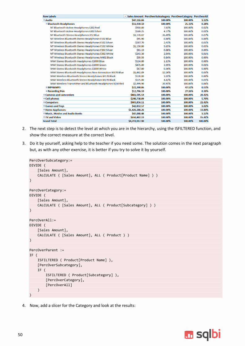
As you can see from the figure, the same measure shows different calculations, depending on the level of the
hierarchy that is visible in the PivotTable.
In order to solve this scenario, we suggest you do the following:
1. Create three different measures: PercOverSubCategory, PercOverCategory and PercOverAll using the
knowledge you gained so far. This will let you create a PivotTable like the following one:
50
2. The next step is to detect the level at which you are in the hierarchy, using the ISFILTERED function, and
show the correct measure at the correct level.
3. Do it by yourself, asking help to the teacher if you need some. The solution comes in the next paragraph
but, as with any other exercise, it is better if you try to solve it by yourself.
PercOverSubcategory:=
DIVIDE (
[Sales Amount],
CALCULATE ( [Sales Amount], ALL ( Product[Product Name] ) )
)
PercOverCategory:=
DIVIDE (
[Sales Amount],
CALCULATE ( [Sales Amount], ALL ( Product[Subcategory] ) )
)
PercOverAll:=
DIVIDE (
[Sales Amount],
CALCULATE ( [Sales Amount], ALL ( Product ) )
)
PercOverParent :=
IF (
ISFILTERED ( Product[Product Name] ),
[PercOverSubcategory],
IF (
ISFILTERED ( Product[Subcategory] ),
[PercOverCategory],
[PercOverAll]
)
)
4. Now, add a slicer for the Category and look at the results:

51
The values of PercOverAll (and PercOverParent) are wrong. Can you fix them?
5. Now, add a slicer for the Subcategory, remove any filter from the category and add a filter on the
Subcategory, filtering only Bluetooth Headphones. The numbers will be as shown:
Can you spot the problem? The PercOverParent and PercOverAll show different numbers at the
category level. Why that? How can you fix it?
Try out a few ideas, and discuss them with the teacher.

53
LAB 9
Advanced Relationships
Static Segmentation
Static Segmentation
This first exercise is aimed to show you how to solve the banding scenario, you have already seen during the
course how to write the DAX code that performs banding, now it is your turn to perform the same operation,
solving a couple of issues too.
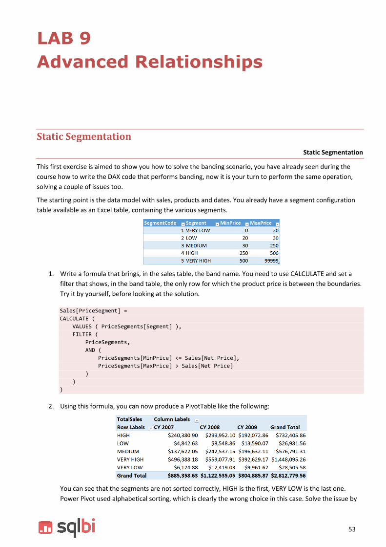
The starting point is the data model with sales, products and dates. You already have a segment configuration
table available as an Excel table, containing the various segments.
1. Write a formula that brings, in the sales table, the band name. You need to use CALCULATE and set a
filter that shows, in the band table, the only row for which the product price is between the boundaries.
Try it by yourself, before looking at the solution.
Sales[PriceSegment] =
CALCULATE (
VALUES ( PriceSegments[Segment] ),
FILTER (
PriceSegments,
AND (
PriceSegments[MinPrice] <= Sales[Net Price],
PriceSegments[MaxPrice] > Sales[Net Price]
)
)
)
2. Using this formula, you can now produce a PivotTable like the following:
You can see that the segments are not sorted correctly, HIGH is the first, VERY LOW is the last one.
Power Pivot used alphabetical sorting, which is clearly the wrong choice in this case. Solve the issue by

54
bringing the SegmentCode in the fact table, using a similar formula, and then setting the Sort By Column
option on PriceSegment. At the end, your PivotTable should look like this:
3. At this point, you can modify the configuration table and, in order to make some test, you enter a wrong
one, where the segments overlap, like in the following figure:
4. After having modified the table, you will see that the calculated column PriceSegment in Sales shows
errors. The problem is that the VALUES () call returned more than one row, due to overlapping
segments. Can you think at a way to solve the issue, showing the message “Wrong Configuration” if an
error is detected? Take your time, and think at the solution, which, as usual, we provide here:
Sales[PriceSegment] =
CALCULATE (
IFERROR (
VALUES ( PriceSegments[Segment] ),
"Wrong Configuration"
),
FILTER (
PriceSegments,
AND (
PriceSegments[MinPrice] <= Sales[Net Price],
PriceSegments[MaxPrice] > Sales[Net Price]
)
)
)
Obviously, a similar update is needed for the column you use for sorting.
5. With this new formula, now in presence of an error, you get a result, not meaningful, but that at least
shows the error, highlighted in the next figure:
6. At this point, you can modify the configuration table, update the linked table and you will see the report
showing different values, depending on the specific configuration you created.

55
Courier Simulation
Courier Simulation
This lab uses a technique, similar to the previous one, in order to solve a simulation scenario. Imagine you are in
charge of handling AdventureWorks shipments. You need to choose the courier that will handle your shipments
for the next year and you ask some couriers the cost of shipment.
You collect information about the shipments proposals in a table, which we preloaded in the solution:
Each courier states the price of shipping an order of a specific weight in a country. The weight ranges are
different for each courier and country, and this makes it hard comparing them. Thus, you want to follow a
simulation path. You simulate the adoption of each courier on the past orders, to grab an idea of what
happened in the past with the different couriers.
We have created a table (Orders) using this SQL query:
SELECT
SalesOrderNumber,
SalesTerritoryCountry,
SUM(Freight) AS Freight,
SUM(OrderQuantity * Weight) AS Weight
FROM
FactInternetSales
LEFT OUTER JOIN dbo.DimSalesTerritory
ON dbo.FactInternetSales.SalesTerritoryKey = dbo.DimSalesTerritory.SalesTerritoryKey
LEFT OUTER JOIN dbo.DimProduct
ON dbo.FactInternetSales.ProductKey = dbo.DimProduct.ProductKey
GROUP BY
SalesOrderNumber,
SalesTerritoryCountry

56
1. There is a small issue with the result. In fact, as you can see, the weight is missing for several rows. You
can easily solve it by adopting a default weight when it is unknown, through the creation of a calculated
column AdjustedWeight as follows:
AdjustedWeight = IF ( Orders[Weight] = 0, 0.75, Orders [Weight] )
The resulting Orders table looks like the following:
2. The second problem you face is the fact that there is no way to create a relationship between this table
and the Excel table containing the courier proposals. In fact, in the courier proposals table there are two
boundaries for the weight, while in this new table there is a single column Weight. Moreover, for each
order there are many rows matching the courier, namely one row for each courier.
If you take, for example, the first order (S044204), it has a weight of 20 and there are many rows in the
configuration table: one for Blue Express and one for Speedy Mail. Thus, the way of trying to create a
relationship is going to fail, because you do not have a one-to-many relationship. You need to use DAX
in order to solve this scenario.
While the problem has no solution at the aggregated level, if you focus on a single order and on a single
courier, then you can compute the freight by searching for the matching row using a pattern similar to
that of the static segmentation.
In the static segmentation pattern, you only had to search for a band name using the boundaries. Here
the formula is slightly more complex because the condition need to be set on both the weigth
boundaries and the country name. In fact, both the weight and the country define the freight.
With this idea in mind, read and get the sense out of the following formula:

57
CourierFreight :=
IF (
HASONEVALUE ( Couriers[Courier] ),
SUMX (
Orders,
CALCULATE (
VALUES ( Couriers[Freight] ),
FILTER (
Couriers,
Couriers[MinWeight] < Orders[AdjustedWeight]
&& Couriers[MaxWeight] >= Orders[AdjustedWeight]
&& Couriers[Country] = Orders[SalesTerritoryCountry]
)
)
)
)
The interesting parts of the formula are:
The initial check with HASONEVALUE to compute the value only when a single courier is visible
in the filter context.
SUMX over orders is useful because it iterates each order. By performing the following
calculation for a single order, you can then search for the freight of that specific order.
CALCULATE ( VALUES ( Couriers[Freight] ), … ) is a pattern that – in reality – means: “search for
the value of the freight in the couriers table, in the row that satisfies the CALCULATE condition,
i.e. that has min and max weight that contain the weight of the current order”. Thus, we are
using CALCULATE to search for a value.
The condition inside FILTER guarantees that a single row will be visible in the Couriers table,
making the VALUES invocation return a correct number.
Using this measure, you can easily build a PivotTable like the following:
The PivotTable makes it easy to see that Blu Express is by far your best option, even if it is higher in
some countries, it provides the overall best price.
The exercise – at this point – is solved. You might note, at this point, that we are missing date
information. If you want to see the different expenses in different years, then you will need to update
the query that generates the Orders table, bring the DateKey column in the Excel table first, in the
PowerPivot table next and create a correct relationship between the date of the order and the calendar
table.
It is interesting that, with this exercise, you mixed most of the advanced techniques learned during the
course: data modeling, DAX for simple calculated columns, missing relationships, an advanced DAX
expression that uses most of the techniques you have learned.


59
Contoso Data Model